Category: Urban Issues

  • Major Metropolitan Areas in Europe

    Eurostat, the statistical agency of the European Commission (European Union) now designates metropolitan areas (Note) for the European Union (EU) and the European Three Trade Association (EFTA). The EU has 28 members, having just added Croatia, while the EFTA has 4 members. According to the latest data, there are 99 major metropolitan areas in Europe (those more than 1,000,000 residents).  Overall, Eurostat designates 305 metropolitan areas with more than 200,000 population.

    Europe’s Largest Metropolitan Areas

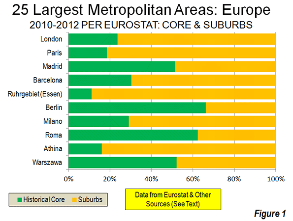
    London and Paris are by far the largest metropolitan areas in Europe. London’s population is approximately 13.6 million, of which approximately 24 percent live in the historical core of Inner London (the pre-1965 London County Council area). Paris has approximately 11.9 million residents, with 19 percent living in the historical core of the ville de Paris.

    The third and fourth largest major metropolitan areas are both in Spain. Madrid has a population of 6.4 million, more than half of which is in the historic core municipality. Barcelona ranks fourth largest, with a population of 5.4 million, with 30 percent living in the historical urban core municipality. In recent decades there has been substantial suburbanization in the valleys to the north of the city of Barcelona. Moreover, the Eurostat Milan metropolitan area definition could be too tight. The urbanization stretches into Como, Lecco and Varese and an argument could be made for inclusion of exurban Lodi and Pavia. These would raise Milan’s population to nearly that of Madrid.

    Germany has the other two metropolitan areas with more than 5 million residents, Essen (Ruhrgebiet or Rhine area) and Berlin. Both metropolitan areas have a population of 5.1 million. By some definitions, a Rhine-Ruhr metropolitan area would include Dusseldorf and even Cologne (Köln) and Bonn to the south. This wider area has a population of more than 11 million and would rank among the top three in Europe. Eurostat breaks this area into four metropolitan areas.

    Overall, approximately 1/3 of the metropolitan population lives in the historical urban cores of Europe’s 99 major metropolitan areas, with approximately 2/3 of living in the suburbs and exurbs (Figure 1). This percentage is somewhat smaller among the metropolitan areas with more than 5,000,000 population (30 percent). The 25 largest metropolitan areas are shown in the table, and all 99 metropolitan areas are listed in Europe: Major Metropolitan Areas & Historic Core Populations: 2010 to 2012.

    European Metropolitan Areas as Designated by Eurostat: Largest 25
    European Union (EU) and European Free Trade Association (EFTA)
    2010-2012 Estimates, with Historical Core Estimates
    Rank Metropolitan Area Nation Metropolitan Area (Millions) Year: Metropolitan Area Estimate Historical Core: Recent Year (Millions) Approximate % in Historical Core
    1  London   UK        13.614    2012             3.231    23.7%
    2  Paris   France        11.915    2012             2.204    18.5%
    3  Madrid   Spain          6.388    2012             3.284    51.4%
    4  Barcelona   Spain          5.357    2012             1.623    30.3%
    5  Ruhrgebiet (Essen)   Germany          5.135    2012             0.573    11.2%
    6  Berlin   Germany          5.098    2012             3.375    66.2%
    7  Milano   Italy          4.275    2012             1.242    29.1%
    8  Roma   Italy          4.234    2012             2.638    62.3%
    9  Athina   Greece          4.109    2012             0.664    16.2%
    10  Warszawa   Poland          3.272    2012             1.708    52.2%
    11  Hamburg   Germany          3.228    2012             1.734    53.7%
    12  Napoli   Italy          3.078    2012             0.959    31.2%
    13  Budapest   Hungary          2.985    2012             1.741    58.3%
    14  Brussels   Belgium          2.923    2012             0.166    5.7%
    15  Lisboa   Portugal          2.824    2012             0.548    19.4%
    16  Katowice   Poland          2.795    2012             0.308    11.0%
    17  München   Germany          2.727    2012             1.388    50.9%
    18  Stuttgart   Germany          2.692    2012             0.613    22.8%
    19  Manchester   UK          2.683    2012             0.503    18.8%
    20  Wien   Austria          2.636    2012             1.731    65.7%
    21  Lille – Dunkerque   France-Belgium          2.584    2012             0.227    8.8%
    22  Frankfurt am Main   Germany          2.575    2012             0.692    26.9%
    23  Praha   Czech Republic          2.521    2012             1.291    51.2%
    24  Valencia   Spain          2.513    2012             0.809    32.2%
    BY SIZE CATEGORY          
    Over 5,000,000 (6)       47.507              14.290    30.1%
    2,500,000 to 5,000,000 (18)       54.653              18.962    34.7%
    1,000,000 to 2,500,000 (75)     104.376              35.176    33.7%
    Total     206.536              68.428    33.1%
    Notes:            
    Metropolitan area estimates from Eurostat        
    Core estimates from multiple sources and is for 2008 or later      
    Historical Core: The smallest area corresponding or including the pre-automobile core for which data is readily available. In each case the historical core is the first named municipality (commune), except in London (where Inner London is used) and Antwerp (where the pre-1983 consolidation municipality is used).


    Enlargement Nations Compared to the EU-15 and EFTA

    The share of the population living in the historical urban cores is much higher in the generally less affluent nations that have been added to the European Union over the last decade. In the 13 enlargement nations, approximately 52 percent of the metropolitan area population lives in the historical urban core. By contrast, in the more affluent nations of the EU – 15 and the EFTA only 29 percent of the major metropolitan area population lives in the historical urban cores (Figure 2).

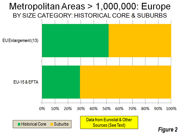
    To some degree, this difference is explained by the stronger central planning in metropolitan areas that developed in the more controlled economies in the enlargement nations before the fall of the Soviet Union. Planners were usually given larger geographical areas to control than has typically been the case in Western Europe, North America and Japan. The metropolitan areas of the enlargement nations also have substantially more dense principal urban areas, averaging 11,300 per square mile (4,300 per square kilometer), compared to 8,400 per square mile (3,200 per square kilometer) in the EU-15 and the EFTA.   

    Resurgence of the Historical Cores

    Western Europe’s historical cores experienced substantial population losses in the decades leading to 2000. This trend, similar to that in the United States, saw the population of Inner London drop 55 percent from its 1911 peak to its 1991 low. The ville de Paris lost more than one quarter of its population from 1921, a rate slightly greater than in the city of Chicago over the same years. Copenhagen lost 35 percent of its population. In the decades from the mid 20th century to 2000, virtually every major urban core municipality in Western Europe declined from its peak population, except for those that expanded their boundaries, combined with another municipality or had substantial greenfield space for suburban development within their city limits (such as Rome).

    Since 2000, as we see in the United States, many of the historical cores have begun adding population. Much of the increase has resulted from the international migration that has been spurred by the open borders of the EU’s enlargement (See: Examining Sprawl in Europe and America: Europeans are Moving to the Suburbs Too). Inner London has been a particular beneficiary of this trend, adding nearly 900,000 residents over the last two decades. Much of this gain is from international migration, as Inner London suffered a minus 1.5 percent annual domestic migration rate in the 2000s, less than that of New York City (1.8 percent), but more than that of Los Angeles County (1.4 percent). Inner London’s population remains 36 percent below its peak level of more than a century ago.

    Comparisons to the United States

    Europe has nearly twice as many major metropolitan areas as the United States. The total major metropolitan area population is also higher, at 207 million compared to 173 million in the United States. Yet the major metropolitan areas of the United States constitute a larger share of the urban population. Approximately 55 percent of the US population lives in a major metropolitan area, compared to only 40 percent in Europe. The share of major metropolitan areas in the historical urban cores is slightly higher in Europe, at 33 percent, compared to 27 percent in the United States.

    Growing Metropolitan Areas

    International migration, particularly from the enlarged EU, as well as the continuing shift from rural to urban areas has driven stronger growth throughout some metropolitan areas. Eurostat metropolitan area data is available from as early as 2003 and shows Madrid to be the fastest growing, at a 1.5 percent annual rate. Rome is not far behind, with a 1.4 percent annual rate. Brussels is growing at a 1.1 percent rate, while London, Prague and Valencia are adding 1.0 percent to their populations each year. While detailed Eurostat data is not available for earlier years in Milan, strong growth has been indicated. Even formerly moribund Vienna, which reached its population peak early in the 20th century, is growing at an unprecedented 0.8 percent annual rate.

    Other major metropolitan areas continue with slow growth or are even declining. Europe’s two largest conurbations, Essen and Katowice (the Upper Silesian metropolitan area of Poland) are losing population. Naples is simply not growing.

    Before beginning its metropolitan area estimation system, Eurostat designated similar areas as “larger urban zones.” This system continues, with considerable comparative information between areas. However, data is issued less frequently. Eurostat’s metropolitan area system, with its annual estimates and more consistent definitions is an important step forward.

    Wendell Cox is a Visiting Professor, Conservatoire National des Arts et Metiers, Paris and the author of “War on the Dream: How Anti-Sprawl Policy Threatens the Quality of Life.


    Note: Metropolitan areas are labor markets and always include both a principal urban area (contiguously built up area) and connected rural territory. Smaller urban areas may also be included. See: Definition of Terms used in The Evolving Urban Formseries.

    Photo: Belgravia, London (by author)

  • Is the Census Bureau On Track For Another Estimating Fiasco?

    When the 2010 Census results were released, a number of big cities had populations that were very off from what would have been expected based on the Census Bureau’s previous annual estimates of the population – sometimes grossly so.  Some of these were related to cities that had challenged the estimates and had adjustments made in their favor, such as Cincinnati and St. Louis. Given that the Census Bureau seems to have approved every challenge, bogus challenges were all but encouraged.  Still, there were significant variances in cities that didn’t challenge the Census, such as Chicago and Phoenix. 

    Had the estimates been correct, Atlanta would have gained over 125,000 people in the last decade – a stunning gain of 30%. But Atlanta’s actual population was nearly flat, growing less than 1%. Other cities experiencing huge swings due to misestimates were places like New York City (projected to gain 417,000, actually gained less than half that at 167,000) and Chicago (projected to lose 29,000 people, actually lost over 200,000).  I myself ended up with some egg on my face for drawing unwarranted inferences from what appear to be badly botched estimates.

    Urban advocates were quick to cry foul, alleging undercounts (though taking the strong growth counted for downtowns as gospel).  Given the much more rigorous Census standards for challenges to decennial counts, it was virtually impossible for these to succeed, but some have continued to maintain systematic undercounting in the decennial census as a matter of course.

    When the first round of new post-2010 Census estimates were released for cities, the media started crowing again about a supposed resurgence in city populations. However, this wasn’t real growth. Instead, the Census Bureau had created a new, temporary methodology to get the estimates out the door. Rather than producing real numbers, they simply took the estimates for growth at the county level and assumed every municipality in the country grew at the exact same percentage as the county as a whole.  The media missed the story because they relied on the headline data, and were attracted to the “back to the city” meme. They would have had to dig into the methodology document – something ordinarily no one would need to do for this sort of routine release – to figure this out.  This release was embarrassment number two for the municipal estimates program.

    You would think that after these two fiascos, the Census Bureau would be highly attuned to getting the municipal estimates right. Indeed, for the recently released 2012 vintage municipal estimates, they went back to using a real estimating methodology instead of the simple allocation approach from 2011. However, as with the 2000s, these are showing strong municipal population growth in places where that would represent a major discontinuity with the actual decennial Census results from the 2000-2010, and from economic conditions.

    How is it that cities, after a disappointing 2000s where some places actually underperformed versus the 1990s, in an economy that has been recessionary to sluggish the entire post-2010 person and in which the housing market that triggered the crash has also yet to recover, that these growth rates are possible? It’s certainly eyebrow-raising at a minimum.

    Consider Chicago. After losing over 200,000 people in the 2000s, Chicago supposedly gained 17,000 people between 2010 and 2012. With a highly publicized murder problem in many of the neighborhoods that saw the severest depopulation in the previous decade, where housing was whacked leaving any number of uncompleted building shells, and with a budget crunch that is squeezing service provision, this would certainly represent a remarkable accomplishment.

    Or look at Indianapolis. In its urban core area, Center Township (township data is reported in a similar manner to municipal estimates in some areas), the population declined by almost 25,000 people during the 2000s, a steep 14.5% loss that was worse than Buffalo and St. Louis and nearly as bad as Cleveland.  Center Township has lost population every decade since 1950. Yet the Census Bureau has estimated that it gained 2,300 people since the census. Though a lower total percentage due to the base, this is more physical people than was estimated to be added by all but three of Indy’s suburbs, many of which posted huge gains in the 2000s (such as Westfield, which added 20,800 during the 2000s but was only estimated to have added 1,800 since the census despite building permit issuances at all time record highs).  This sort of radical turnaround in fortunes would certainly be nearly miraculous if true.

    Amazingly, the Census Bureau actually even went back to the estimating status quo ante in Atlanta by claiming very high population growth, despite missing by a country mile last time around. Atlanta is projected to have gained almost 24,000 people since the census, even though it was nearly flat the previous decade. This is a rate very close to what the Census Bureau estimated it had in the last decade.

    You can go right down the line and find similar effects at work in other places. It raises serious questions about these estimates. Places like San Francisco, DC, and even Pittsburgh have had economic growth that might seem to underpin more robust core population growth, it’s hard to credit many of these other places with such turnaround.  Some of the analysts focused on an inability of people to move outwards because of the economy, but it’s hard to believe this alone grew the population of Atlanta by 24,000 people.

    There are red flags all over these numbers. Perhaps the urban advocates claiming dramatic undercounting in the census were right – or maybe not. Regardless, something very odd appears to have been going on with the Census Bureau’s municipal estimates and counts over the last decade or so. Until there’s reason to believe they’ve finally started getting it right, I would treat any number that comes out before the decennial census with extreme skepticism. After having fooled us not once, but twice before, smart money should apply a steep discount to any annual municipal estimates coming out of the Census Bureau.

    Aaron M. Renn is an independent writer on urban affairs and the founder of Telestrian, a data analysis and mapping tool. He writes at The Urbanophile.

    Photo: Travelin’ Librarian

  • How Can We Be So Dense? Anti-Sprawl Policies Threaten America’s Future

    Among university professors, government planners and mainstream pundits there is little doubt that the best city is the densest one. This notion is also supported by a wide number of politically connected developers, who see in the cramming of Americans into ever smaller spaces an opportunity for vast, often taxpayer-subsidized, profiteering.

    More recently density advocates cite a much-discussed study of geographic variations in upward mobility as suggesting that living in a spread-out city hurts children’s prospects in life. “Sprawl may be killing Horatio Alger,” quipped economist and New York Times columnist Paul Krugman.

    Yet the study actually found the highest rates of upward mobility not in dense cities, but in relatively spread-out places like Salt Lake City, small cities of the Great Plains such as Bismarck, N.D.; Yankton, S.D.; and Pecos, Texas — all showed bottom to top mobility rates more than double New York City. And we shouldn’t forget the success story of Bakersfield, Calif., a city Columbia University urban planning professor David King wryly labeled “a poster child for sprawl.” Rather than an ode to bigness, notes demographer Wendell Cox, the study found that commuting zones (similar to metropolitan areas) with populations under 100,000 — smaller cities that tend to be sprawled by nature  —  have the highest average upward income mobility.

    “Sprawl” did not kill Detroit, as Krugman suggests in his previously mentioned column, the city did that largely to itself. Another like-minded critic, historian Steven Conn,  blames the auto industry for the city’s problems, perhaps not recognizing Detroit would be little more than a more southerly Duluth without it.

    There are at least three major problems with the thesis that density is an unabashed good. First, and foremost, Census and survey data reveal that most people do not want to live cheek to jowl if they can avoid it. Second, most of the attractive highest-density areas also have impossibly high home prices relative to incomes and low levels of homeownership. And third, and perhaps most important, dense places tend to be regarded as poor places for raising families. In simple terms, a dense future is likely to be a largely childless one.

    Let’s start with something few density advocates consider: what people want and what they would choose if they could. Roughly four in five buyers, according to a 2011 study commissioned by the National Association of Realtors, prefer a single-family home. This preference can be seen in the vastly greater construction of single-family houses in the past decade: Between 2000 and 2011, detached houses accounted for 83% of the net additions to the occupied U.S. housing stock.  The percentage of single-family homes in the total housing mix last decade was more than one-fifth higher than in the 1960s, 1970s and 1980s.

    Contrary to the conventional wisdom, the pattern is not likely to end, barring a longer-term recession or government edict. As the number of households once again begins to rise and birthrates tick up, single-family homes are once again leading housing growth.

    Buyers of single-family homes are not necessarily embracing exurban lifestyles so much as reacting to basic economic factors. In many cases the nicest single-family districts closest to work and amenities are prohibitively expensive — think Beverly Hills or Studio City in the L.A. area, Bethesda near Washington, or Evanston outside Chicago. People move further out in order to afford something better than an apartment.

    The last decennial Census shows us definitively that people tend to head toward the periphery. Barely 6% of Americans live in densities of over 10,000 per square mile, and the fastest-growing central cities between 2000 and 2010 — such as Raleigh, Charlotte and Austin — have average densities less than a third as intense as places like New York, Chicago, Or Los Angeles.

    Overall, domestic migrants tend to be moving away from these denser metropolitan areas. Between 2000 and 2010, a net 1.9 million people left New York, 1.3 million left Los Angeles, 340,000 left San Francisco, while 230,000 left San Jose and Boston. In contrast, some of the largest in-migration has taken place over the past decade, as well as since 2010, in relatively sprawling cities, including Houston, Dallas, Ft. Worth, Tampa-St. Petersburg and Nashville.

    Our perceptions of density are often distorted by media coverage, which tends to revolve around city centers. To be sure many downtown areas have experienced impressive growth, but this accounted for less than 1% of the 27 million expansion in the U.S. population between 2000 and 2010. In reality virtually all net population growth in the nation took place in counties with under 2,500 persons per square mile. The total population increase in counties with under 500 people per square mile was more than 30 times that of the growth in counties with densities of 10,000 and greater.

    Some inner suburbs may be struggling adjacent to some hard-pressed cities, as is often highlighted by density advocates, but they are thriving in areas where prices are reasonable and the economy is strong. In Houston, arguably America’s most economically vibrant big metro area, over 80% of homes sales in 2012 were outside Beltway 8, the city’s second ring. The city’s inner ring, inside the 610 loop, has experienced an impressive revival, but still it only accounted for 6% of home sales last year.

    There is clearly a growing chasm between affordable, family-friendly cities and those that, frankly, are not. Until the 1970s, in virtually all American metropolitan areas, a median-priced home cost roughly three years’ median income. This equilibrium was smashed by the imposition in some states of “smart” land-use policies that seek to limit or even prohibit suburban building, huge impact fees, as well as in some markets,  massive investment from speculators.

    As a result, many of the metro areas beloved by density advocates, such as New York and San Francisco, now have median home price multiples well over 6 or 7; if current trends continue, they could, as occurred during the last housing boom, reach upward of 10. Not surprisingly, these areas all have low rates of homeownership compared to the national average.  For example, in New York and Los Angeles, the homeownership rate is half or less than the national figure of 65%. This is particularly true among working class and minority households. Atlanta’s African-American home ownership rate is approximately 40% above those of San Jose and Los Angeles, approximately 50% higher than Boston, San Francisco and Portland, and nearly 60%  higher than New York.

    All these factors are particularly relevant to one group: families. Much of contemporary urban theory rests on the idea of weakening family connections: fewer marriages and lower birthrates will decrease the appetite for lower-density housing. Families do not make up the prime market for dense housing; married couples with children constitute barely 10% of apartment residents, less than half the percentage for the population overall.

    Families also generally settle in less dense parts of cities, suburban or exurban areas;  the places with the lowest percentage of households with children include favored abodes of the  density lobby such as New York (particularly Manhattan), as well as Chicago, San Francisco and Seattle. In contrast the metropolitan areas with the strongest growth in their child populations — Raleigh, Austin, Charlotte, Dallas, Houston, Oklahoma City — have much lower densities and far smaller urban cores.

    This flight from density among families is not merely an American phenomena. There are far higher percentages of families with children in the suburbs of Tokyo, London and Toronto than within the inner rings. The ultra dense cities of East Asia — Hong Kong, Singapore and Seoul — have among the lowest fertility rates on the planet. Tokyo and Seoul now have fertility rates around 1 while Shanghai’s has fallen to 0.7, among the lowest of any city ever recorded, well below China’s “one child” mandate and barely one-third the number required simply to replace the current population.

    Some have suggested that the Obama administration is conspiring to turn American cities into high-rise forests. But the coalition favoring forced densification — greens, planners, architects, developers, land speculators — predates Obama. They have gained strength by selling densification, however dubiously, as what planner and architect Peter Calthorpe calls “a climate change antibiotic.” Not surprisingly, there’s less self interest in promoting more effective greenhouse gas reduction policies such as boosting  work at home and lower-emissions cars.

    The density agenda need to be knocked off its perch as the summum bonum of planning policy. These policies may not hurt older Americans, like me, who bought their homes decades ago, but will weigh heavily on the already hard-pressed young adult population. Unless the drive for densification is relaxed in favor of a responsible but largely market-based approach open to diverse housing options, our children can look forward to a regime of ever-higher house prices, declining opportunities for ownership and, like young people in East Asia, an environment hostile to family formation. All for a policy that, for all its progressive allure, will make more Americans more unhappy, less familial, and likely poorer.

    Joel Kotkin is executive editor of NewGeography.com and Distinguished Presidential Fellow in Urban Futures at Chapman University, and a member of the editorial board of the Orange County Register. He is author of The City: A Global History and The Next Hundred Million: America in 2050. His most recent study, The Rise of Postfamilialism, has been widely discussed and distributed internationally. He lives in Los Angeles, CA.

    This piece originally appeared in Forbes.

  • In the Spotlight: Higher Ed Degree Output by Field and Metro

    It might stem from the dot-com crash, the increased popularity of certifications and onsite employer training, or various other reasons. Regardless, the key finding from EMSI and CareerBuilder’s analysis of higher education degree output over the last decade is still eye-opening: Computer and IT degrees completed in the U.S. have declined 11% since 2003.

    The decrease in computer-related degrees comes at a time when the number of related computer and IT jobs grew 13% nationally, and while the number of degrees in other major fields — health, business, liberal arts and humanities, and engineering — has soared.

    Jobs-Degrees-Final

    Our analysis looked at the output of associate’s degrees and above nationally and for the nation’s largest 150 metro areas. Education completion data comes from the National Center of Education Statistics, via EMSI’s Analyst tool, and we matched the degrees to our jobs data using a customized program-to-occupation mapping. You can find a summary of the analysis in CareerBuilder’s release, and we’ve included more findings by field and metro below.

    Note: The NCES data comes from its Integrated Postsecondary Education Data System (IPEDS) and accounts for all colleges and universities that participate or are applicants for any federal financial assistance program authorized by the Higher Education Act (HEA), which includes most of the well-known federal loans (e.g., Pell Grants, Stafford Loans). All public colleges and universities and a number of private postsecondary schools accept federal assistance loans and therefore are included in this analysis. We excluded Phoenix, Davenport, Iowa, and other cities whose higher ed output is dominated by large for-profit universities. 

    Computer and IT

    Computer-related degree output at U.S. universities and colleges flatlined from 2006 to 2009 and have steadily increased in the years since. But the fact remains: Total degree production (associate’s and above) was lower by almost 14,000 degrees in 2012 than in 2003. The biggest overall decreases came in three programs — computer science, computer and information sciences, general, and computer and information sciences and support services, other.

    This might reflect the surge in certifications and employer training programs, or the fact that some programmers can get jobs (or work independently) without a degree or formal training because their skills are in-demand.

    Of the 15 metros with the most computer and IT degrees in 2012, 10 saw decreases from their 2003 totals. That includes New York City (a 52% drop), San Francisco (55%), Atlanta (33%), Miami (32%), and Los Angeles (31%).

    Here’s a look at the performance of 20 largest metros with the most computer and IT degrees in 2012:

    MSA
    Computer/IT Degrees 2003
    Computer/IT Degrees 2012
    Growth/Decline
    % Growth/Decline
    Concentration
    New York-Northern New Jersey-Long Island, NY-NJ-PA
    12,102
    5,793
    -6,309
    -52%
    0.86
    Washington-Arlington-Alexandria, DC-VA-MD-WV
    4,353
    5,697
    1,344
    31%
    2.32
    Chicago-Joliet-Naperville, IL-IN-WI
    5,403
    4,451
    -952
    -18%
    1.25
    Los Angeles-Long Beach-Santa Ana, CA
    5,088
    3,510
    -1,578
    -31%
    0.81
    Boston-Cambridge-Quincy, MA-NH
    2,625
    2,455
    -170
    -6%
    0.92
    Atlanta-Sandy Springs-Marietta, GA
    3,321
    2,229
    -1,092
    -33%
    1.77
    Pittsburgh, PA
    2,073
    2,101
    28
    1%
    2.00
    Minneapolis-St. Paul-Bloomington, MN-WI
    1,754
    2,003
    249
    14%
    1.24
    Baltimore-Towson, MD
    2,047
    1,931
    -116
    -6%
    1.85
    Philadelphia-Camden-Wilmington, PA-NJ-DE-MD
    2,316
    1,873
    -443
    -19%
    0.78
    Dallas-Fort Worth-Arlington, TX
    2,037
    1,699
    -338
    -17%
    1.00
    Miami-Fort Lauderdale-Pompano Beach, FL
    2,457
    1,670
    -787
    -32%
    0.75
    Seattle-Tacoma-Bellevue, WA
    1,793
    1,560
    -233
    -13%
    1.33
    Virginia Beach-Norfolk-Newport News, VA-NC
    942
    1,413
    471
    50%
    2.15
    San Diego-Carlsbad-San Marcos, CA
    1,573
    1,398
    -175
    -11%
    1.11
    Detroit-Warren-Livonia, MI
    1,380
    1,332
    -48
    -3%
    1.42
    Indianapolis-Carmel, IN
    447
    1,223
    776
    174%
    1.63
    Houston-Sugar Land-Baytown, TX
    1,062
    1,165
    103
    10%
    1.00
    Denver-Aurora-Broomfield, CO
    1,673
    1,114
    -559
    -33%
    1.30
    Salt Lake City, UT
    486
    1,057
    571
    117%
    1.67


    Health Professions

    Health degrees have increased by 112% since 2003 — an addition of 288,194 total degrees. Related jobs in the U.S. have increased 18.6% over that time.

    Many metros have seen their output of health degrees at least double. This includes Los Angeles (109% growth), Miami (159%), and Minneapolis (193%).

    Here’s a look at the 20 largest metros with the most health degrees in 2012:

    MSA
    2003 Health Degrees
    2012 Heath Degrees
    Growth/Decline
    % Growth/Decline
    Concentration
    New York-Northern New Jersey-Long Island, NY-NJ-PA
    16,363
    30,445
    14,082
    86%
    0.94
    Los Angeles-Long Beach-Santa Ana, CA
    7,681
    16,031
    8,350
    109%
    0.77
    Chicago-Joliet-Naperville, IL-IN-WI
    7,622
    14,128
    6,506
    85%
    0.83
    Miami-Fort Lauderdale-Pompano Beach, FL
    5,438
    14,068
    8,630
    159%
    1.31
    Philadelphia-Camden-Wilmington, PA-NJ-DE-MD
    7,593
    13,554
    5,961
    79%
    1.19
    Boston-Cambridge-Quincy, MA-NH
    6,483
    11,513
    5,030
    78%
    0.90
    St. Louis, MO-IL
    3,500
    9,760
    6,260
    179%
    1.65
    Minneapolis-St. Paul-Bloomington, MN-WI
    2,959
    8,673
    5,714
    193%
    1.12
    Dallas-Fort Worth-Arlington, TX
    3,137
    7,039
    3,902
    124%
    0.86
    Indianapolis-Carmel, IN
    1,764
    6,911
    5,147
    292%
    1.92
    Pittsburgh, PA
    3,316
    6,480
    3,164
    95%
    1.29
    Washington-Arlington-Alexandria, DC-VA-MD-WV
    2,978
    6,227
    3,249
    109%
    0.53
    Houston-Sugar Land-Baytown, TX
    3,142
    5,916
    2,774
    88%
    1.06
    Baltimore-Towson, MD
    3,241
    5,857
    2,616
    81%
    1.17
    San Francisco-Oakland-Fremont, CA
    2,965
    5,857
    2,892
    98%
    0.87
    Tampa-St. Petersburg-Clearwater, FL
    1,661
    5,593
    3,932
    237%
    1.13
    Detroit-Warren-Livonia, MI
    2,790
    5,543
    2,753
    99%
    1.23
    Seattle-Tacoma-Bellevue, WA
    2,519
    4,932
    2,413
    96%
    0.88
    Cincinnati-Middletown, OH-KY-IN
    1,829
    4,930
    3,101
    170%
    1.38
    Denver-Aurora-Broomfield, CO
    2,172
    4,696
    2,524
    116%
    1.14


    The number of registered nursing degrees has gone from 88,482 in 2003 to 193,528 in 2012, a 119% increase. Registered nursing is the third-largest degree-awarding program in the U.S., behind business administration and liberal arts and humanities.

    RN_Chart

    Engineering (and Engineering Technologies)

    The are 37,138 more engineering and engineering technology degrees in 2012 than 2003, a 37% increase. Related jobs in the U.S. have increased 5.7% during that time. The biggest degree increases have come in biomedical engineering, mechanical engineering, and civil engineering.

    Tulsa has seen the largest percentage increase (222%) of engineering/engineering technology degrees among the 150 largest metros. What explains the huge jump? It mostly stems from a massive increase in output of engineering technology degrees in the area. For example, the Spartan College of Aeronautics and Technology in Tulsa produced 454 engineering tech degrees in 2003, up from 57 in 2003.

    In San Jose, Ann Arbor, Raleigh, and Tulsa, at least 15% all associate’s-and-above degrees awarded are in engineering or engineering technologt. Raleigh has the highest concentration at 17%. The national share is 5%, so Raleigh’s concentration index is 3.36 — meaning it’s more than three times as concentrated as the national average (1.00).

    The following table gives the metros with the highest concentration of engineering and engineering technology degrees:

    MSA
    Engineering Degrees (2003)
    Engineering Degrees (2012)
    Growth/Decline
    Concentration
    Raleigh-Cary, NC
    2,091
    2,201
    5%
    3.36
    Tulsa, OK
    335
    1,079
    222%
    3.22
    San Jose-Sunnyvale-Santa Clara, CA
    2,809
    3,472
    24%
    3.08
    Ann Arbor, MI
    2,220
    2,881
    30%
    2.99
    Huntsville, AL
    409
    691
    69%
    2.75
    Dayton, OH
    1,003
    1,504
    50%
    2.25
    Worcester, MA
    568
    1,088
    92%
    2.23
    Greenville-Mauldin-Easley, SC
    715
    1,059
    48%
    2.13
    Baton Rouge, LA
    839
    1,019
    21%
    2.13
    Fayetteville-Springdale-Rogers, AR-MO
    366
    660
    80%
    2.02
    Salinas, CA
    262
    506
    93%
    1.91
    Youngstown-Warren-Boardman, OH-PA
    329
    362
    10%
    1.82
    Peoria, IL
    231
    309
    34%
    1.72
    Allentown-Bethlehem-Easton, PA-NJ
    884
    741
    -16%
    1.68
    Knoxville, TN
    597
    839
    41%
    1.67
    Atlanta-Sandy Springs-Marietta, GA
    2,851
    3,633
    27%
    1.67
    Austin-Round Rock-San Marcos, TX
    1,741
    2,136
    23%
    1.65
    Palm Bay-Melbourne-Titusville, FL
    286
    450
    57%
    1.62
    Pittsburgh, PA
    2,611
    2,886
    11%
    1.59
    Flint, MI
    488
    492
    1%
    1.58
    Beaumont-Port Arthur, TX
    293
    373
    27%
    1.56
    Wichita, KS
    329
    462
    40%
    1.55
    Madison, WI
    1,320
    1,314
    0%
    1.53
    York-Hanover, PA
    156
    151
    -3%
    1.50
    Toledo, OH
    874
    891
    2%
    1.50


    Education

    Education degrees have increased 18% since 2003. That’s an increase of 52,391 from 2003 to 2012. Related jobs in the U.S. have increased 6.3% from 2003-2012.

    Education degrees make up 8.8% of all associate’s-and-above completions nationally, down from 10.6% in 2003. The highest concentration belongs to Beaumont-Port Arthur, Texas, with 4.4 times the national average of education degrees.

    Another Texas metro, El Paso, has seen a 346% increase in education degrees since 2003, while Denver (170%), Minneapolis-St. Paul (125%), Austin (114%), and Dallas (106%) have also seen major gains.

    Ed-degrees

    Business, Management and Marketing

    There are 176,972 more degrees nationally in 2012 than 2003, a 33% increase. Related jobs in the U.S. have increased 1.2 percent from 2003-2012, an addition of 218,173 jobs.

    Nearly 1 in 5 degrees awarded in the U.S. (18.1%) are in business, management and marketing, the highest share of any major field of study. For many large metros, business degrees make up a sizable percentage of total higher education output (25% of all degrees in Chicago and Milwaukee, 24% in Washington, D.C., and 23% in Atlanta).

    MSA
    2012 Business, Managament, Marketing Degrees
    Share of Total Degrees
    Concentration
    Colorado Springs, CO
    5,099
    33%
    1.85
    Grand Rapids-Wyoming, MI
    1,939
    30%
    1.67
    Fort Wayne, IN
    1,388
    30%
    1.65
    Montgomery, AL
    946
    29%
    1.62
    Chicago-Joliet-Naperville, IL-IN-WI
    30,741
    25%
    1.39
    Milwaukee-Waukesha-West Allis, WI
    4,892
    25%
    1.36
    Canton-Massillon, OH
    843
    24%
    1.34
    Flint, MI
    1,506
    24%
    1.34
    Omaha-Council Bluffs, NE-IA
    3,368
    24%
    1.34
    Washington-Arlington-Alexandria, DC-VA-MD-WV
    20,098
    24%
    1.31
    St. Louis, MO-IL
    9,943
    23%
    1.29
    Columbia, SC
    2,529
    23%
    1.29
    Atlanta-Sandy Springs-Marietta, GA
    9,853
    23%
    1.25
    Columbus, OH
    6,600
    23%
    1.25
    South Bend-Mishawaka, IN-MI
    1,561
    22%
    1.24


    Liberal Arts and Humanities

    The U.S. produced 124,681 more degrees in 2012 than 2003, a 47% increase. This is the third fastest-growing degree category in the U.S. by total degrees added, behind health professions and business, management, and marketing.

    Liberal arts and humanities degrees make up 10% of all associate’s-and-above completions, roughly the same share as in 2003. Of the 10 metros with the highest concentrations of these degrees, seven are in Florida — led by Ocala (66% of all degrees), Port St. Lucie (64%), and North Port-Bradenton-Sarasota (50%).

    Despite growth in many metros, notable decreases in liberal arts and humanities degrees have occurred in Tulsa (51% decline), San Jose (38%), San Diego (30%), San Francisco (23%), and Ann Arbor (20%).

    LibArts

    Joshua Wright is an editor at EMSI, an Idaho-based economics firm that provides data and analysis to workforce boards, economic development agencies, higher education institutions, and the private sector. He manages the EMSI blog and is a freelance journalist. Contact him here.

    Illustration by Mark Beauchamp.

  • Distortions and Reality about Income Mobility

    A ground-breaking study of intergenerational income mobility has the enemies of suburbia falling all over themselves to distort the findings. The study, The Spatial Impacts of Tax Expenditures: Evidence from Spatial Variation Across the U.S. (by economists Raj Chetty and Nathaniel Hendren of Harvard University and Patrick Kline and Emmanuel Saez of the University of California, Berkeley). Chetty, et al. examined income mobility by comparing the income quintiles (20 percent) of households with children (between 1996 and 2000) compared to their own household income quintiles as adults in 2010/1. The children were all born in 1980 or 1981. The authors summarize their research as follows:

    “We measure intergenerational mobility at the local (census commuting zone) level based on the correlation between parents’ and children’s earnings. We show that the level of local tax expenditures (as a percentage of AGI) is positively correlated with intergenerational mobility.”

    The Over-Reach

    One of their findings was that children born in the Atlanta area had less upward income mobility than in most other metropolitan areas (Note 1). This provided all that was needed for a spin by others that distorted the findings into a completely different story than supported by the data.

    New York Times reporter David Leonhart started it, sprucing up the conclusions to produce anti-sprawl tome. He accomplishes this by unearthing anecdotes about the difficulty low income workers face getting to work in Atlanta, and blaming that urban area’s lower density suburbanization. However, the same anecdotes could have been woven from every metropolitan area in the nation (Note 2), regardless of their extent of suburbanization. More importantly, the research is not about sprawl.

    Nonetheless, Nobel Laureate Paul Krugman then piled on, writing in The New York Times that Leonhart’s article had shown “how sprawl seems to hurt social mobility.” Krugman continued the next day with his “sprawl-caused-Detroit’s bankruptcy” thesis, which relied on an apples-to-oranges comparison (See: Detroit Bankruptcy: Missing the Point). Then on July 28, Krugman wrote: “…in one important respect booming Atlanta looks just like Detroit gone bust: both are places where the American dream seems to be dying” (Note 3).  Krugman calls Atlanta the “Sultan of Sprawl.”

    Professor Steven Conn of Ohio State University took it a bit further in the Huffington Post, saying that: “One of their findings is that mobility is more restricted in places defined by suburban sprawl — like Atlanta and Columbus, Ohio — than in denser, more urban places like San Francisco and Boston. Far from being good for the nation, our love affair with the car, and the sprawl it has produced, keeps people from moving up the economic ladder.”

    The Research

    The authors of the report reached their conclusions using regression analyses and controlling for demographic factors, with the objective of identifying associations between upward income mobility and tax expenditures, not suburbanization. In fact, the very issue of transportation and density was simply not a factor.

    The authors provided additional information with 25 separate, simple correlation analyses between 25 individual variables and economic mobility (demographic factors were not controlled). Co-Author Raj Chetty described this supplemental research in a PBS interview, citing income segregation, school quality, two-parent families and measures, civic engagement, religiosity and community cohesiveness. The authors urged caution in interpreting these correlations: “For instance, areas with high rates of segregation may also have other differences that could be the root cause driving the differences in children’s outcomes.”

    Rational Responses

    The overreach was challenged by Columbia University urban planning professor David King, who pointed out that the best ranked cities in the upward mobility analysis were all “sprawling,” including Salt Lake City, Santa Barbara and Bakersfield, which he referred to as a “poster child for sprawl.” He further noted that: “…snapshot correlations really don’t mean anything and will provide evidence for whatever point of view is desired.”

    Randal O’Toole of the Cato Institute similarly questions the unfounded interpretations of the study and notes that Atlanta has invested billions in new transit systems over recent decades, but with no appreciable impact on how the poorest citizens did there.

    University of Southern California economics professor Peter Gordon suggested that: “In the fast-and-loose manner that some have digested the Chetty et al. study, we could conclude that sprawl causes upward mobility.”

    Pinnacles of Prosperity

    Interestingly, if, as Krugman alleges, Atlanta is the Sultan of Sprawl, then similarly sprawling Hartford is the “Pinnacle of Prosperity.” Hartford has the highest per capita gross domestic product of any metropolitan area in the world. Yet, the urban area density of Hartford is 1,791 per square mile (692 per square kilometer), little above Atlanta (1,707 and 659), but two-thirds less than less affluent New York (5,319 and 2,054) and three-quarters less than less affluent Los Angeles (6,999 and 2,702), according to the 2010 census (Note 4).

    The reality is that the US has the world’s most sprawling cities, yet the 50 most affluent metropolitan areas per capita in the world include 38 in the United States. This includes the top eight, such as lower density Bridgeport (urban density 1,660 per square mile/641 per square kilometer), Boston (2,232/862) and Durham (1,913/739), as well as metropolitan areas with higher urban densities, San Francisco (6,266/2,419) and San Jose (5,820/2,247). Neither high-density New York nor Los Angeles makes the top 10. America’s greater dispersal is associated with the shortest commute times in the high income world, the least intense traffic congestion and some of the most affordable housing, if metropolitan areas subject to urban containment (smart growth) policies are excluded.

    Moreover, the Chetty, et al data gives little comfort to any whose conception of good and evil depends on sprawl. The research aggregates upward mobility data for all counties within each commuting zone. Among major metropolitan areas, that includes counties from the most dense (New York County at 71,000 per square mile or 27,000 per square kilometer) to Skamania County in the Portland area, with a density of 7 per square mile or 3 per square kilometer. County level analysis could make a difference.

    This is illustrated by the New York metropolitan area, which Chetty, et al divide into multiple commuting zones. The Tom’s River commuting zone, made up of outer suburban Monmouth and Ocean counties in New Jersey showed better upward income mobility (10.4 percent) than the New York commuting zone (9.7 percent) which included the city of New York, Nassau, Suffolk and Westchester counties. It might be interesting, for example, to compare the data, say for highly urban The Bronx to suburban Suffolk County, but the data does not permit that. This is not to criticize the Chetty, et al work; it is rather to suggest caution in inventing conclusions.

    Smaller May be Better

    Further, commuting zones with smaller populations have generally better upward income mobility.  Rather than an ode to bigness, the study found that commuting zones with less than 100,000 population average have higher than average upward income mobility. Virtually all of the smaller areas are low density and have little or no transit. Indeed, the best performers were in the Great Plains, in a swath from West Texas, through Oklahoma, Kansas, Nebraska and reaching a zenith in South Dakota and North Dakota, which is about as far from dense urbanization as it is possible to get. Further, a large majority of the highest scoring commuting zones with larger populations, like Bakersfield and Des Moines, are highly dispersed (Table below). This could be an area for further research.

    Geographical Income Mobility
    Population of Commuting Zone Upward Mobility Cases
    Over 1,000,000 7.5% 62
    500,000 to 1,000,000 7.6% 60
    250,000 – 500,000 8.6% 89
    100,000-250,000 9.0% 167
    50,000-100,000 10.4% 129
    25,000-50,000 13.0% 88
    Under 25,000 13.9% 146
    Average/Total 9.5% 741
    Upward mobility: 30/31 year olds reaching top income quintile by 2010/1, from households in the bottom quintile in 1996-2000
    Commuting zones are similar to metropolitan areas


    Additional Caveats

    There is no question but that this is ground-breaking research. The authors deserve considerable credit for the unprecedented scale of their analysis, which included over 6.2 million observations. However, the available data had an important limitation. The IRS data set they used does not go back far enough to make similarly robust findings about peak adult earnings. Age 30 or 31 may premature for predicting longer run income mobility. At that age, many who will eventually earn much more are not far into their careers. This would include people who have spent longer in higher education, such as those who have earned professional degrees. Finally, the median income of households in the 30 to 31 age category is barely 1/2 of their parents in the same, which, again, is not likely to be representative of their eventual income and quintile ranking over their adult lives.

    The findings would be appropriately characterized as relating to young adult income upward mobility. Conclusions about lifetime upward mobility or peak earnings upward mobility will need to wait a decade or more.

    The Second Half of the Story: Where People Moved

    The authors use the childhood residence in the study, both for the child and the adult. This means, for example, that if a child lived in the New York metropolitan area and moved to Atlanta by 2010 or 2011, he or she would be counted in the New York data. Where people lived as children is the first half of the story. The second half is where they moved.

    This is important, because so many people moved away from places like New York, San Francisco, Los Angeles, Boston, and San Jose during the period the study covers. Approximately 10 percent of the residents of New York and Los Angeles moved elsewhere between 2000 and 2010. Approximately 8 percent left San Francisco, 13 percent left San Jose and 5 percent left Boston. These are not small numbers and indicate that more people left than moved in. A net 1.9 million left New York, 1.3 million left Los Angeles, 340,000 left San Francisco, while 230,000 left San Jose and Boston.

    Some of the metropolitan areas that have gained the most domestic migrants scored below average on upward income mobility. For example, migration from other parts of the nation added 24 percent to Raleigh’s population in the 2000s, 17 percent to Charlotte, 11 percent to Tampa-St. Petersburg, and 10 percent to Atlanta (Note 5).

    None of this contradicts the Chetty, et al findings, which did not address the question of why some many people have moved. It can be assumed that people who are doing well economically will probably stay where they are. On the other hand, most who leave might be thought of as seeking better opportunities that might elude them in the richer, slower growing, far more expensive metropolitan areas of their childhood. The idea that people left New York, Boston or Los Angeles for a less rewarding life in Atlanta, Charlotte, or Raleigh violates everything we know about human nature.

    Seeking Prosperity

    Throughout history, and especially over the last 200 years, cities have drawn people from elsewhere by facilitating opportunity. It is no different today. People move to satisfy their aspirations. This was the point of our recent "Aspirational Cities" report in The Daily Beast.

    Chetty et al conclude: “What is clear from this research is that there is substantial variation in the United States in the prospects for escaping poverty.” True. It is also clear from actual behavior that, for many, the best prospect for escaping poverty may be the better opportunities that attract them to an aspirational city.

    Wendell Cox is a Visiting Professor, Conservatoire National des Arts et Metiers, Paris and the author of “War on the Dream: How Anti-Sprawl Policy Threatens the Quality of Life.

    —-

    Note 1: Chetty, et al use “commuting zone” as their unit of geographical analysis. These areas are generally similar to metropolitan areas, but there are some important differences. For example, the New York metropolitan area is divided into three parts (New York Newark and Tom’s River). The Dallas-Fort Worth metropolitan area is divided into two. Los Angeles, Riverside-San Bernardino and Oxnard are combined as are Rochester and Buffalo. All of Connecticut, which has four metropolitan areas, is a single commuting zone. Areas outside metropolitan areas are also divided into commuting zones.

    Note 2: The overwhelming share of low income workers drive to work (see How Lower Income Citizens Commute). Even, in metropolitan Boston, with its better than average transit system, few of the city’s low income residents can reach suburban job locations in less than one hour (the average commute time for all residents is less than one-half that). Despite popular impressions to the contrary, most jobs cannot be reached in a reasonable period of time by transit in any metropolitan area, nor is there any practical (affordable) way to change that.  

    Note 3: To the contrary, the American Dream is alive and well in Atlanta. Atlanta’s housing affordability is unrivaled by nearly all major metropolitan areas. Housing is four times as expensive relative to incomes in San Francisco and San Jose as in Atlanta (measured by the “median multiple”) three times as high in New York and Los Angeles and twice as costly in Portland. This makes housing more affordable for low income households. Not surprisingly, Atlanta households with less than $20,000 in annual income (approximately the lowest quintile) have a higher home ownership rate than in New York, Los Angeles, San Francisco, San Jose, Boston and Portland. Further, the gap with respect to African-American home-ownership is substantial. Atlanta’s African-American home ownership rate is approximately 40 percent above those of San Jose and Los Angeles, approximately 50 percent higher than Boston, San Francisco and Portland and nearly 60 percent higher than New York (American Community Survey, 2011).

    Note 4: These are US Bureau of the Census urban area density figures, based upon continuous urban areas (“built-up” areas). Urban area densities are calculated using census blocks, and contain no rural land. As a result, their population densities are not distorted by jurisdictional borders. This is to be distinguished from any metropolitan area based measure. All metropolitan areas include urban areas as well as rural areas that are economically connected to the urban area. The extent of rural areas within a metropolitan area is driven by the geographical size of counties and thus varies widely. The largest major metropolitan area county, San Bernardino (California) is nearly 1,000 times as large as the smallest, New York County. If metropolitan area criteria were applied at the census block level, as is the case in urban areas, large swaths rural swaths would be removed from metropolitan areas, changing the density distribution. However, even if metropolitan areas were more appropriately defined, any measure of metropolitan density would remain a mixed urban-rural metric, not a measure of urban density. Here are the 2010 criteria for defining urban areas and metropolitan areas.

    Note 5: There is less black-white racial segregation in Atlanta than in New York, Los Angeles, San Francisco, Boston, and most other major metropolitan areas, according to 2010 data compiled by William Frey of the Brookings Institution.

  • The Childless City

    What is a city for? Ever since cities first emerged thousands of years ago, they have been places where families could congregate and flourish. The family hearth formed the core of the ancient Greek and Roman city, observed the nineteenth-century French historian Fustel de Coulanges. Family was likewise the foundation of the great ancient cities of China and the Middle East. As for modern European cities, the historian Philippe Ariès argued that the contemporary “concept of the family” itself originated in the urbanizing northern Europe shown in Rembrandt’s paintings of bourgeois life. Another historian, Simon Schama, described the seventeenth-century Dutch city as “the Republic of Children.” European immigrants carried the institution of the family-oriented city across the Atlantic to America. In the American city until the 1950s, urbanist Sam Bass Warner observed, the “basic custom” was “commitment to familialism.”

    But more recently, we have embarked on an experiment to rid our cities of children. In the 1960s, sociologist Herbert Gans identified a growing chasm between family-oriented suburbanites and people who favored city life—“the rich, the poor, the non-white as well as the unmarried and childless middle class.” Families abandoned cities for the suburbs, driven away by policies that failed to keep streets safe, allowed decent schools to decline, and made living spaces unaffordable. Even the partial rebirth of American cities since then hasn’t been enough to lure families back. The much-ballyhooed and self-celebrating “creative class”—a demographic group that includes not only single professionals but also well-heeled childless couples, empty nesters, and college students—occupies much of the urban space once filled by families. Increasingly, our great American cities, from New York and Chicago to Los Angeles and Seattle, are evolving into playgrounds for the rich, traps for the poor, and way stations for the ambitious young en route eventually to less congested places. The middle-class family has been pushed to the margins, breaking dramatically with urban history. The development raises at least two important questions: Are cities without children sustainable? And are they desirable?

    Best-selling urban booster Richard Florida, a pied piper for today’s city developers and planners, barely mentions families in his books, which focus instead on younger, primarily single populations. Eric Klinenberg, a New York University professor and author of the widely touted Going Solo, celebrates the fact that “cities create the conditions that make living alone a more social experience.” But perhaps the most cogent formulation of the post-family city comes from the sociologists Richard Lloyd and Terry Nichols Clark, who see the city, and particularly the urban core, as an “entertainment machine.” In their view, city residents “can experience their own urban location as if tourists, emphasizing aesthetic concerns.” Schools, churches, and neighborhood associations no longer form the city’s foundation. Instead, the city revolves around recreation, arts, culture, and restaurants—a system built for the newly liberated individual.

    Demographic trends seem to bear out this vision.Over the past two decades, the percentage of families that have children has fallen in most of the country, but nowhere more dramatically than in our largest, densest urban areas. In cities with populations greater than 500,000, the population of children aged 14 and younger actually declined between 2000 and 2010, according to U.S. Census data, with New York, Chicago, Los Angeles, and Detroit experiencing the largest numerical drop. Many urban school districts—such as Chicago, which has 145,000 fewer school-age children than it had a decade ago—have seen enrollments plummet and are busily closing schools. The 14-and-younger population increased in only about one-third of all census-designated places, with the greatest rate of growth occurring in smaller urban areas with fewer than 250,000 residents.

    Consider, too, the generation of Americans between the ages of 25 and 34 in 2000. By 2010, the core cities of the country’s 51 most populous metropolitan areas had lost, on average, 15 percent of that cohort, many of whom surely married and started having children during that period. While it’s not possible to determine where they went, note that suburbs saw an average 14 percent gain in that population during the same period.

    Of course, not all sections of our largest cities are equally bereft of children. Of Los Angeles County census tracts where less than 10 percent of the population was 14 and younger in 2010, a significant number were located downtown and along the coast. These are mostly high-density areas where housing is expensive. You’ll find a considerably higher proportion of children under 14 in low-income parts of South and East Los Angeles, and also in middle-class neighborhoods in the heart of the San Gabriel and San Fernando Valleys.

    Opinion polls confirm the impulse behind the child exodus. For example, in a recent survey for the Manhattan Institute by Zogby Analytics, 58 percent of people with children under 17 said that they would consider leaving New York City for better opportunities elsewhere; only 38 percent of those without children agreed. Part of the reason is surely the city’s density and cost, which make family life difficult. In Manhattan, where the average rent approaches $4,000 a month, it’s no surprise that families are waning.

    A more family-friendly city remains possible. The Brooklyn community of Flatbush—like Staten Island, Queens, and eastern portions of Brooklyn—was built in the first half of the twentieth century to appeal to families fleeing the congestion of New York’s core. Just as the suburbs do now, these new settlements revolted many urbanists, such as Lewis Mumford, who complained in 1921 that the “dissolute landscape” was “a no-man’s land which was neither town nor country.” But Flatbush’s tree-lined neighborhoods, such as Kensington and Ditmas Park, may be the city’s best hope for retaining middle-class families. These areas still have many single-family homes and low-rise apartments. And Cortelyou Road, a main drag in Ditmas Park, brims with family-friendly restaurants and shops, though it was fairly desolate just a decade ago. Young families are enthusiastic about the neighborhood. “It’s an amazing place,” says Kari Browne, co-owner of the Lark café on nearby Church Avenue. “But the key concern is: Can you afford to stay?”

    For many young families living in New York’s outer boroughs, the availability of space, particularly backyards, is deeply important. “The cost of space is the biggest issue in Brooklyn,” says resident Michael Milch, whose wife attends dental school at NYU. “The issue becomes: Can you get some personal green space?” Obviously, people who settle here are willing to make do with less space than those who, say, move to a far-flung exurb in Putnam County. But all are seeking space in communities more amenable to family life than are the contemporary city cores. Heightened family demand may be helping send housing prices steadily upward in New York’s boroughs, as young couples move from Manhattan to less dense neighborhoods. Jason Walker, a 45-year-old father of two, left Washington, D.C. (which may have the highest percentage of childless households in the nation), for Ditmas Park to escape “a culture dominated by childless people leery of the existence of kids.” The Walkers live in a two-bedroom apartment but are looking for a house in the area.

    Such opportunities exist elsewhere in America, too, in places where detached single-family homes—the preferred housing of 80 percent of American adults, according to a National Association of Realtors survey in 2011—are often just a short walk or ride from the urban core. With its broad streets and massive shopping centers, the California city of Irvine may lack the inner-ring charms of Flatbush. But families are drawn to Irvine’s amenities—especially its schools. “You really have to worry about the schools in New York,” says Walker, whose children are six and eight. “If you have to go to private schools, this makes it a struggle to stay here.” In Irvine, by contrast, “everything stems from education,” says resident Eveleen Liu. “The city draws people who are impassioned about their kids and their school. Everyone volunteers. It’s the glue that holds this place together.” Schools are particularly crucial in attracting Asians, now the country’s fastest-growing immigrant group. Safety is another big draw: Irvine consistently rates among the safest American cities with more than 100,000 residents.

    Families are also deeply attracted to open space. The great Frederick Law Olmsted–designed New York parks, including Prospect Park in Flatbush, are enormous assets for families without backyards. Irvine may lack stunning urban architecture and glorious cathedrals, but it has a magnificent park system that gives residents ideal settings for recreation, exercise, and family gatherings. “It’s an environment that is clean and nice and open to everyone,” says Veronika Kim, a mother of three and an apartment tenant in Woodbury, an Irvine neighborhood. “You can walk there with the kids and let them play. Even if you rent, you don’t feel like an outsider.” The parks are good not only for kids but for adults—for example, the members of the Woodbury Woodies, who play softball every week against teams from other neighborhoods. “There’s a deep sense of community here,” says Woody regular Julian Forniss. “Softball is part of that.” On the site of a former Marine Corps base, Irvine and Orange County are developing a “Great Park” that will be twice the size of New York’s 840-acre Central Park.

    Other family-friendly cities have embarked on ambitious park and open-space projects as well. In Raleigh, North Carolina, the nearly completed $30 million Neuse River Greenway Trail cuts through 28 miles of forest. Houston’s $480 million Bayou Greenways project will eventually add some 4,000 acres of green space across the city, from the downtown to the outer suburbs, including 300 miles of continuous hiking and bike trails. Houston’s rival, Dallas, is planning a vast 6,000-acre park.

    What families need is more affordable urban neighborhoods with decent schools, safe streets, adequate parks—and more housing space. As New York University’s Shlomo Angel points out, virtually all major cities worldwide are growing outward more than inward—and becoming less dense in the process—because density drives families away from urban cores and toward less dense peripheries. The lesson is clear: if cities want families, they should promote a mixture of density options.

    The solution is not to wage war on suburbia, as urbanists have been doing for years. Following the notions that Jane Jacobs advanced a half-century ago, contemporary urbanists argue that high density creates a stronger sense of community. (Jacobs once opined that raising children in the suburbs had to be difficult, somehow overlooking how families were flocking to those suburbs.) But that contention isn’t self-evident. The University of California’s Jan Breuckner and Ann Largey conducted 15,000 interviews across the country and found that for every 10 percent drop in population density, the likelihood of someone’s talking to his neighbor once a week went up 10 percent, regardless of race, income, education, marital status, or age.

    In California, particularly, state and local officials push policies that favor the development of apartments over single-family houses and town houses. But by trying to cram people into higher-density space, planners inadvertently help push up prices for the existing stock of family-friendly homes. Such policies have already been practiced for decades in the United Kingdom, making even provincial cities increasingly unaffordable, as British social commentator James Heartfield notes. London itself is among the least affordable cities in the world. Even middle-class residents have been known to live in garages, converted bathrooms, and garden sheds.

    A city that continues to be high-density and high-cost hasn’t necessarily signed its own death warrant. Manhattan, parts of Brooklyn, and much of San Francisco, Seattle, Boston, and other amenity-rich cities—what Tulane University geographer Richard Campanella calls “kiddie deserts”—continue to flourish. But other cities, such as Detroit, Cleveland, and Buffalo, can’t attract the same interest from young hipsters and the rich and are consequently less capable of withstanding the effects of family flight to the suburbs. Even in the most affluent cities, the dearth of families reinforces public policies incompatible with children, argues the Austrian demographer Wolfgang Lutz. For example, fewer middle-class families means less political pressure to reform education or support for tougher law enforcement.

    Ultimately, everything boils down to what purpose a city should serve. History has shown that rapid declines in childbearing—whether in ancient Rome, seventeenth-century Venice, or modern-day Tokyo—correlate with an erosion of cultural and economic vitality. The post-family city appeals only to a certain segment of the population, one that, however affluent, cannot ensure a prosperous future on its own. If cities want to nurture the next generation of urbanites and keep more of their younger adults, they will have to find a way to welcome back families, which have sustained cities for millennia and given the urban experience much of its humanity.

    Joel Kotkin is executive editor of NewGeography.com and Distinguished Presidential Fellow in Urban Futures at Chapman University, and a member of the editorial board of the Orange County Register. He is author of The City: A Global History and The Next Hundred Million: America in 2050. His most recent study, The Rise of Postfamilialism, has been widely discussed and distributed internationally. He lives in Los Angeles, CA.

    Ali Modarres is an urban geographer in Los Angeles and co-author of City and Environment.

    This piece originally appeared at The City Journal.

    Crossing the street photo by Bigstock.

  • E-Shopping Bubbling While Retail Bums Along

    We recently explored the post-recession tsunami of online retail and discovered that e-shopping’s future is anything if not bright. According to a report by Forrester Research, by 2016, not only are 192 million U.S. consumers projected to be be clicking “checkout” (up 15% since 2012), but those 192 million will also be spending an average of 44% more.

    But does this mean we should expect traditional retail to flatline? Well, no. As we showed here, the flourishing of specific retail subsectors (e.g., warehouses/supercenters) certainly cheers up total gloom-and-doom predictions.

    Nevertheless, traditional retail and e-shopping scream for comparison. Whatever their destiny, they could hardly differ more in size, stability, and growth patterns so far, and so let’s take a look.

    A Comparison

    Here’s how the two industries break down:

    Traditional retail: NAICS 44-45, except for electronic shopping and electronic auctions

    E-shopping: electronic shopping (454111) and electronic auctions (454112)

    A quick comparison between retail and e-shopping shows two very different stories. Traditional retail, of course, has been around forever with its ups and downs, while e-shopping is still technically a teenager — and like a teen, it’s growing wicked fast.

    Chart - Traditional Retail Jobs 2002-2013


    • Retail jobs declined 1% from 2002 to 2013. The industry grew 3% from 2002-2007, then tanked 7% from 2007-2010 and has yet to recover even its 2002 status.
    • The industry had 15.7 million jobs in 2002 and now has 15.5 million (loss of 200,000 jobs).
    • The average annual earnings per job is $32,433.
    • Jobs multiplier: 1.32. This means that every job in retail creates a third of another job elsewhere — or, put another way, every three jobs in retail create one job in another industry. (Note: We excluded induced effects in our calculations to avoid the double-counting that comes when looking at spending at the national level.)
    • Department stores have taken a colossal hit, dropping almost without respite from 811,000 jobs to 489,000 (40% loss).
    • In an age when manager positions are stepping on the gas, it’s troubling to see that within the retail industry, general & operations managers have declined 15% the past 10 years (a loss of 35,000 jobs).

    Chart - E-shopping Jobs 2002-2013

    • E-shopping grew 161% from 2002 to 2013 (averaging 15% a year). The industry has spiked 42% just since 2009, coming out of the recession when it still managed to inch up 4%. In fact, e-shopping isn’t far behind the fastest-growing industry sector of the past 10 years — mining, quarrying, and oil & gas extraction (NAICS 21), which has grown 60% since 2002 and 26% since 2009.
    • With 173,737 jobs, e-shopping’s labor force can’t even compare with traditional retail’s.
    • On the other hand, the jobs pay significantly more: $65,000 (annual average).
    • Jobs multiplier: 1.46, slightly higher than traditional retail’s, which is a little surprising. (Again, we left out induced effects.)

    One thing we notice is the huge discrepancy in jobs between these two industries. Traditional retail, for all its loss, is still 90 times the size of e-shopping, whose growth is not quite as jaw-dropping, perhaps, as it might seem at first. Sure, it’s booming, but then, it’s always easier to top 160% growth when you start out so tiny.

    No, the most interesting fact here is not how many jobs e-shopping is adding to the economy, but how many jobs it isn’t. It creates good consumer prices, serves more customers, makes more dough, and has completely changed the way we view products (literally and figuratively). And it does all these things with a smaller workforce.

    This trend of online-based business and a smaller, more tech-based workforce is well illustrated by the Kodak vs. Instagram conversation (read more here and here). At its peak, Kodak employed 140,000 while Instagram, at the time that it was purchased by Facebook in April 2012, employed a mere baker’s dozen. In short, the American economy has always been obsessed with efficiency. If we can do more with less, we will, and the internet is apparently accelerating that process.

    The Story in the States

    Let’s take a closer look at the top states for job growth and decline for both these industries.

    States for Top Job Growth and Decline - Traditional Retail

    Retail jobs have flourished the most in North Dakota (21%), Nevada (15%), Utah (11%), and Arizona (10%). Each of those states, it should be noted, have fast-growing populations and/or economies. The worst decline has taken place in Michigan (15%), Ohio (14%), Rhode Island (13%), and Wisconsin (10%).

    States for Top Job Growth and Decline - E-shopping

    For e-shopping, it’s mostly just a question about where it has grown a lot and where it has grown a ton. Only two states have seen an actual decline in jobs. Idaho leads the way crazy 3,370% growth (from 40 to 1,400 jobs), followed by Utah (800%, from 700 to 6,200 jobs), and Indiana (780%, from 670 to 5,900 jobs). The states that have done the least well are Alaska (20%, from 80 down to 60 jobs), South Dakota (3%, from 92 to 89 jobs), Virginia (mere 5% growth, from 2,000 to 2,140 jobs), and New Mexico (11%, from 127 to 141 jobs).

    Here’s a complete look at the growth/decline of each industry in all 50 states (plus Washington D.C.), as well as how they rank:

    State % Change in Retail Jobs Rank % Change in E-Shopping Rank
    North Dakota 21% 1 85% 37
    Nevada 15% 2 140% 31
    Utah 11% 3 804% 1
    Arizona 10% 4 37% 45
    South Dakota 9% 5 -3% 50
    Texas 8% 6 68% 42
    Idaho 7% 7 3368% 1
    Florida 7% 8 74% 39
    District of Columbia 7% 9 652% 4
    Arkansas 6% 10 134% 33
    New York 6% 11 179% 26
    Alaska 5% 12 -19% 51
    Hawaii 5% 13 125% 35
    North Carolina 4% 14 198% 24
    Washington 4% 15 271% 17
    South Carolina 1% 16 135% 32
    Tennessee 1% 17 114% 36
    Colorado 1% 18 307% 12
    Oklahoma 0% 19 277% 15
    Montana 0% 20 72% 40
    New Mexico 0% 21 11% 48
    Delaware -1% 22 126% 34
    Oregon -1% 23 456% 8
    Virginia -1% 24 5% 49
    West Virginia -1% 25 189% 25
    Vermont -1% 26 298% 14
    Wyoming -2% 27 68% 41
    New Hampshire -2% 28 334% 11
    Louisiana -2% 29 275% 16
    Georgia -2% 30 146% 29
    California -3% 31 156% 28
    Alabama -3% 32 53% 44
    New Jersey -4% 33 218% 23
    Massachusetts -4% 34 220% 22
    Missouri -4% 35 220% 21
    Iowa -4% 36 246% 19
    Kentucky -5% 37 455% 9
    Maryland -5% 38 435% 10
    Nebraska -5% 39 242% 20
    Pennsylvania -6% 40 76% 38
    Maine -6% 41 146% 30
    Minnesota -6% 42 554% 7
    Illinois -6% 43 65% 43
    Mississippi -7% 44 171% 27
    Connecticut -7% 45 13% 47
    Indiana -7% 46 781% 3
    Kansas -8% 47 21% 46
    Wisconsin -10% 48 304% 13
    Rhode Island -13% 49 634% 5
    Ohio -14% 50 572% 6
    Michigan -15% 51 255% 18

    E-Shopping Hot Spots

    E-shopping has also developed quite a few hot spots across the nation, and a handful of MSAs have very high job concentrations. Here are the MSAs where e-shopping’s concentration (measured in terms of location quotient, LQ) is highest:

    MSA 2013 Jobs 2013 Avg. Earnings Per Job 2013 National LQ
    Fernley, NV 710 $55,306 48.05
    Hannibal, MO 590 $13,789 26.83
    Galesburg, IL 426 $27,766 12.17
    Grand Forks, ND-MN 748 $43,981 10.27
    Mexico, MO 114 $22,497 9.27
    Ottawa-Streator, IL 538 $21,666 7.31
    Hood River, OR 111 $26,422 6.46
    Seattle-Tacoma-Bellevue, WA 14,515 $120,560 6.39
    Thomasville-Lexington, NC 328 $36,346 6.02
    Huntington-Ashland, WV-KY-OH 759 $30,910 5.53
    Americus, GA 84 $22,717 5.5
    Salt Lake City, UT 4,277 $64,051 5.17
    Moultrie, GA 98 $31,360 4.9
    Chico, CA 463 $68,168 4.88
    Provo-Orem, UT 1,046 $48,062 4.05
    Indianapolis-Carmel, IN 4,430 $41,354 3.96
    San Jose-Sunnyvale-Santa Clara, CA 4,608 $240,899 3.87
    Bend, OR 312 $32,260 3.72
    Port St. Lucie, FL 604 $22,611 3.72
    Meadville, PA 137 $39,731 3.34
    Mankato-North Mankato, MN 208 $18,374 3.09

    Seattle, home to Amazon.com, stands out for its sheer number of jobs (14,500). So too does San Jose, eBay’s headquarters, with 4,600. These two MSAs are also where most of the earnings are pooled.

    We should also note Indianapolis, where job growth since 2009 approaches 4,000 and tops 500%. In fact, e-shopping is Indianapolis’s fastest-growing industry of the past 10 years, climbing 4,500% since 2002. (Indiana, remember, is third in the nation for e-shopping growth: nearly 800%.)

    The city with the highest concentration of online retail jobs is Fernley, Nev., home to an Amazon distribution center. Currently the town of 53,000 is 48 times the national average for e-shopping. Moreover, about 6% of the town’s workforce (710 out of 12,800 jobs) are in the e-shopping industry.

    However, this isn’t as golden as Fernley was back in 2007, when e-shopping’s concentration was 107 times greater than the national average. During the recession, Fernley lost 30% of its e-shopping jobs, and has yet to recover them.

    Galesburg, Ill., has a similar recession story but bounced back quickly. The town of 32,000, with a concentration 12 times that of the national average, has rapidly regained its jobs — and then some — over the past year.

    E-shopping - Fernley vs. Galesburg

    For towns like Fernley and Galesburg, perhaps the lesson is that e-shopping is much less place-bound than traditional retail. All these small towns with high concentrations run a certain risk with e-shopping if the big companies were to move operations elsewhere.

    The map and table below show the 2009-2013 job performance of online retail in the towns with the highest job concentrations (containing at least 100 e-shopping jobs). We see both huge gains and huge declines (in terms of % growth):

    MSAs - 100+ E-shopping jobs


    MSA 2009 Jobs 2013 Jobs Change % Change 2013 Average Earnings 2009 LQ 2013 LQ
    Akron, OH 150 174 24 16% $34,974 0.60 0.49
    Albany-Schenectady-Troy, NY 79 102 23 29% $29,447 0.23 0.22
    Allentown-Bethlehem-Easton, PA-NJ 177 357 180 102% $32,915 0.67 0.95
    Ann Arbor, MI 50 128 78 156% $32,806 0.32 0.55
    Atlanta-Sandy Springs-Marietta, GA (12060) 1,655 2,454 799 48% $56,564 0.92 0.94
    Austin-Round Rock-San Marcos, TX 737 1,666 929 126% $48,277 1.19 1.75
    Baltimore-Towson, MD 432 478 46 11% $73,551 0.42 0.32
    Baton Rouge, LA 111 125 14 13% $46,293 0.37 0.30
    Bellingham, WA 118 158 40 34% $33,482 1.73 1.64
    Bend, OR 191 300 109 57% $33,132 3.60 4.02
    Birmingham-Hoover, AL 167 218 51 31% $35,155 0.43 0.40
    Boise City-Nampa, ID 377 895 518 137% $56,366 1.77 2.89
    Boston-Cambridge-Quincy, MA-NH 1,709 3,054 1,345 79% $67,988 0.89 1.09
    Boulder, CO (14500) 376 561 185 49% $48,869 2.88 2.89
    Bremerton-Silverdale, WA 53 116 63 119% $46,891 0.69 1.12
    Bridgeport-Stamford-Norwalk, CT 1,017 898 -119.00 -12% $111,274 3.02 1.88
    Brownsville-Harlingen, TX 103 128 25 24% $21,781 0.98 0.83
    Buffalo-Niagara Falls, NY (15380) 185 258 73 39% $26,681 0.45 0.45
    Canton-Massillon, OH 36 128 92 256% $41,449 0.28 0.69
    Cape Coral-Fort Myers, FL 176 194 18 10% $37,279 1.09 0.83
    Charleston-North Charleston-Summerville, SC (16700) 86 137 51 59% $35,397 0.37 0.40
    Charlotte-Gastonia-Rock Hill, NC-SC 277 571 294 106% $50,665 0.42 0.58
    Charlottesville, VA 191 102 -89.00 -47% $29,774 2.41 0.93
    Chattanooga, TN-GA 94 164 70 74% $31,012 0.52 0.63
    Chicago-Joliet-Naperville, IL-IN-WI 2,580 4,557 1,977 77% $59,758 0.77 0.96
    Chico, CA 243 458 215 88% $68,695 3.98 5.42
    Cincinnati-Middletown, OH-KY-IN 1,009 1,625 616 61% $39,261 1.30 1.49
    Cleveland-Elyria-Mentor, OH 770 785 15 2% $54,287 0.98 0.71
    Coeur d’Alene, ID 31 118 87 281% $22,609 0.71 1.94
    Colorado Springs, CO (17820) 233 366 133 57% $27,687 1.01 1.10
    Columbia, MO 93 153 60 65% $36,494 1.33 1.48
    Columbia, SC 59 104 45 76% $35,458 0.21 0.26
    Columbus, OH 3,094 3,324 230 7% $34,355 4.33 3.22
    Dallas-Fort Worth-Arlington, TX 2,950 3,334 384 13% $51,152 1.27 0.96
    Davenport-Moline-Rock Island, IA-IL 107 186 79 74% $50,847 0.75 0.91
    Dayton, OH 111 175 64 58% $26,891 0.38 0.43
    Deltona-Daytona Beach-Ormond Beach, FL 179 157 -22.00 -12% $36,650 1.42 0.88
    Denver-Aurora-Broomfield, CO 1,465 1,936 471 32% $54,863 1.49 1.33
    Des Moines-West Des Moines, IA 143 148 5 3% $35,543 0.56 0.40
    Detroit-Warren-Livonia, MI 712 826 114 16% $47,384 0.53 0.42
    Eau Claire, WI 131 194 63 48% $29,794 2.14 2.16
    El Paso, TX 514 791 277 54% $17,522 2.17 2.28
    Elkhart-Goshen, IN 18 124 106 589% $34,131 0.24 0.99
    Eugene-Springfield, OR 94 177 83 88% $25,883 0.81 1.08
    Fayetteville-Springdale-Rogers, AR-MO 88 162 74 84% $42,470 0.56 0.69
    Fernley, NV (22280) 704 710 6 1% $55,306 72.77 53.93
    Fort Collins-Loveland, CO 147 186 39 27% $39,192 1.35 1.16
    Fort Wayne, IN 54 207 153 283% $48,876 0.34 0.91
    Galesburg, IL 277 424 147 53% $27,835 12.45 13.61
    Grand Forks, ND-MN 268 746 478 178% $44,038 5.99 11.51
    Grand Rapids-Wyoming, MI 693 765 72 10% $85,872 2.47 1.79
    Greensboro-High Point, NC 255 177 -78.00 -31% $36,448 0.95 0.47
    Hannibal, MO (25300) 413 590 177 43% $13,789 31.34 30.11
    Harrisburg-Carlisle, PA 136 209 73 54% $31,602 0.55 0.59
    Hartford-West Hartford-East Hartford, CT 283 486 203 72% $30,435 0.59 0.72
    Honolulu, HI 116 228 112 97% $30,149 0.29 0.40
    Hood River, OR 65 110 45 69% $26,564 6.20 7.16
    Houston-Sugar Land-Baytown, TX 1,442 1,809 367 25% $40,959 0.70 0.58
    Huntington-Ashland, WV-KY-OH 181 759 578 319% $30,904 2.04 6.21
    Indianapolis-Carmel, IN 698 4,367 3,669 526% $41,569 1.03 4.38
    Jacksonville, FL 328 484 156 48% $39,193 0.70 0.72
    Kansas City, MO-KS 671 865 194 29% $38,886 0.86 0.78
    Knoxville, TN 115 226 111 97% $38,606 0.44 0.61
    Lakeland-Winter Haven, FL 97 105 8 8% $39,221 0.62 0.48
    Las Vegas-Paradise, NV 1,128 2,013 885 78% $56,095 1.71 2.15
    Lexington-Fayette, KY 177 280 103 58% $38,517 0.90 0.96
    Lincoln, NE 68 339 271 399% $48,179 0.52 1.80
    Little Rock-North Little Rock-Conway, AR 85 123 38 45% $30,742 0.32 0.33
    Logan, UT-ID 85 135 50 59% $22,246 2.10 2.30
    Los Angeles-Long Beach-Santa Ana, CA 7,839 8,519 680 9% $60,101 1.74 1.32
    Louisville/Jefferson County, KY-IN 126 201 75 60% $38,956 0.27 0.29
    Madison, WI 258 516 258 100% $58,625 0.97 1.36
    Manchester-Nashua, NH 280 353 73 26% $60,692 1.83 1.64
    Mankato-North Mankato, MN 60 206 146 243% $18,459 1.45 3.44
    Medford, OR 107 176 69 64% $39,243 1.63 1.90
    Memphis, TN-MS-AR 284 319 35 12% $34,885 0.59 0.47
    Mexico, MO 12 114 102 850% $22,497 1.54 10.40
    Miami-Fort Lauderdale-Pompano Beach, FL 2,647 3,210 563 21% $54,616 1.47 1.23
    Milwaukee-Waukesha-West Allis, WI (33340) 804 1,162 358 45% $34,887 1.28 1.30
    Minneapolis-St. Paul-Bloomington, MN-WI 611 1,130 519 85% $41,066 0.45 0.57
    Nashville-Davidson–Murfreesboro–Franklin, TN 498 785 287 58% $36,789 0.82 0.85
    New Haven-Milford, CT 110 183 73 66% $68,783 0.38 0.44
    New Orleans-Metairie-Kenner, LA (35380) 160 212 52 33% $35,863 0.38 0.35
    New York-Northern New Jersey-Long Island, NY-NJ-PA 7,402 13,923 6,521 88% $76,745 1.13 1.47
    North Port-Bradenton-Sarasota, FL 177 174 -3.00 -2% $37,516 0.88 0.62
    Ocala, FL 57 104 47 82% $39,066 0.75 0.97
    Ogden-Clearfield, UT 291 557 266 91% $39,442 1.84 2.39
    Oklahoma City, OK 97 163 66 68% $48,017 0.21 0.24
    Omaha-Council Bluffs, NE-IA 654 824 170 26% $53,708 1.80 1.60
    Orlando-Kissimmee-Sanford, FL 544 1,001 457 84% $53,066 0.70 0.88
    Ottawa-Streator, IL 297 535 238 80% $21,722 6.43 8.16
    Oxnard-Thousand Oaks-Ventura, CA 209 272 63 30% $42,119 0.81 0.74
    Palm Bay-Melbourne-Titusville, FL (37340) 143 217 74 52% $42,583 0.92 1.00
    Peoria, IL 58 149 91 157% $36,634 0.42 0.75
    Philadelphia-Camden-Wilmington, PA-NJ-DE-MD 1,335 2,372 1,037 78% $50,131 0.63 0.80
    Phoenix-Mesa-Glendale, AZ 3,332 4,062 730 22% $62,002 2.42 2.03
    Pittsburgh, PA 1,077 1,002 -75.00 -7% $50,314 1.23 0.80
    Port St. Lucie, FL 93 561 468 503% $22,448 0.92 3.87
    Portland-South Portland-Biddeford, ME 188 214 26 14% $44,201 0.88 0.72
    Portland-Vancouver-Hillsboro, OR-WA 1,202 1,944 742 62% $37,203 1.47 1.63
    Poughkeepsie-Newburgh-Middletown, NY 169 136 -33.00 -20% $35,261 0.84 0.49
    Providence-New Bedford-Fall River, RI-MA 279 306 27 10% $23,727 0.52 0.41
    Provo-Orem, UT 556 961 405 73% $49,202 3.72 4.18
    Racine, W 91 110 19 21% $28,197 1.57 1.32
    Raleigh-Cary, NC 378 537 159 42% $49,990 0.94 0.90
    Redding, CA 117 134 17 15% $57,004 2.22 1.88
    Reno-Sparks, NV (39900) 661 386 -275.00 -42% $40,630 4.29 1.81
    Richmond, VA 294 221 -73.00 -25% $36,861 0.61 0.32
    Riverside-San Bernardino-Ontario, CA 649 1,003 354 55% $38,227 0.63 0.69
    Rochester, NY 238 271 33 14% $33,405 0.62 0.50
    Sacramento–Arden-Arcade–Roseville, CA 770 1,016 246 32% $40,959 1.06 1.01
    Salem, OR (41420) 182 225 43 24% $29,941 1.42 1.28
    Salt Lake City, UT 2,006 2,654 648 32% $63,187 4.10 3.60
    San Antonio-New Braunfels, TX 1,594 926 -668.00 -42% $62,759 2.26 0.89
    San Diego-Carlsbad-San Marcos, CA 1,504 2,132 628 42% $62,877 1.34 1.32
    San Francisco-Oakland-Fremont, CA 2,919 4,010 1,091 37% $87,280 1.79 1.67
    San Jose-Sunnyvale-Santa Clara, CA (41940) 810 1,459 649 80% $102,195 1.14 1.37
    San Luis Obispo-Paso Robles, CA 139 205 66 47% $39,356 1.59 1.53
    Santa Barbara-Santa Maria-Goleta, CA 122 132 10 8% $48,521 0.79 0.60
    Santa Rosa-Petaluma, CA (42220) 111 175 64 58% $41,602 0.72 0.80
    Scranton–Wilkes-Barre, PA 247 403 156 63% $31,560 1.25 1.46
    Seattle-Tacoma-Bellevue, WA 7,570 14,226 6,656 88% $120,821 5.45 7.03
    Spokane, WA 408 502 94 23% $60,997 2.38 2.09
    Springfield, MA 88 102 14 16% $41,527 0.37 0.30
    Springfield, MO 165 136 -29.00 -18% $30,943 1.09 0.62
    St. George, UT 143 162 19 13% $30,715 3.74 2.85
    St. Louis, MO-IL 1,102 2,260 1,158 105% $50,619 1.07 1.56
    Tallahassee, FL 95 149 54 57% $40,553 0.72 0.82
    Tampa-St. Petersburg-Clearwater, FL 2,990 1,252 -1738.00 -58% $44,406 3.34 0.98
    Thomasville-Lexington, NC 10 241 231 2310% $40,154 0.30 4.97
    Toledo, OH 88 335 247 281% $29,519 0.38 1.01
    Tucson, AZ 468 373 -95.00 -20% $31,186 1.56 0.89
    Vallejo-Fairfield, CA 42 127 85 202% $18,672 0.40 0.85
    Virginia Beach-Norfolk-Newport News, VA-NC 301 241 -60.00 -20% $43,710 0.47 0.27
    Washington-Arlington-Alexandria, DC-VA-MD-WV 1,250 1,639 389 31% $64,473 0.53 0.48
    Wichita, KS 287 114 -173.00 -60% $28,774 1.22 0.35
    Wilmington, NC 65 188 123 189% $42,190 0.57 1.17
    Worcester, MA 278 653 375 135% $38,345 1.09 1.77

    Conclusion

    There’s no doubt we should keep an eye on the exciting growth in e-shopping. Yet we should also be aware that individual online companies do tend, by their very nature, to be smaller and less sturdy than traditional brick-and-mortar stores. They fluctuate rapidly and often drastically, which could be a little unsettling for towns where e-shopping is heavily concentrated.

    Gwen Burrow is an editor at EMSI, an Idaho-based economics firm that provides data and analysis to workforce boards, economic development agencies, higher education institutions, and the private sector. Contact her here.

  • Aspirational Cities: U.S. Cities That Offer Both Jobs and Culture Are Mostly Southern and Modest Sized

    A city at its best, wrote the philosopher René Descartes, provides “an inventory of the possible.” The city Descartes had in mind was 17th-century Amsterdam, which for him epitomized those cities where people go to change their circumstances and improve their lives. But such aspirational cities have existed throughout American history as well, starting with Boston in the 17th century, Philadelphia in the 18th, New York in the 19th, Chicago in the early 20th, Detroit in the 1920s and 1930s, followed by midcentury Los Angeles, and San Jose in the 1980s.

    Yes, the great rule of aspirational cities is that they change over time, becoming sometimes less entrepreneurial, more expensive, and demographically stagnant. In the meantime, other cities, often once obscure, suddenly become the new magnets of opportunity.

    To determine America’s current aspirational hotspots, we focused in large part on economic indicators, such as employment growth, per capita income, and unemployment. But we also took into account demographic factors, such as the growth of domestic migration and the movement of college-educated people and the foreign born.

    Finally, we considered quality-of-life factors such as traffic congestion, housing affordability, and crowding—which are keenly relevant to young families hunting for the places with the best “inventory of the possible.” In a sense, we believe aspirational cities reflect a kind of urban arbitrage, where people look for those places that provide not just economic and cultural opportunity but a cost structure that allows them to enjoy their success to the fullest extent.

    Our top two cities reflect the importance of this arbitrage opportunity. Both No. 1, Austin, Texas, and No. 2, New Orleans, are places where people can enjoy the cultural amenities and attitudes of “progressive” blue states but in a distinctly red-state environment of low costs, less regulation, and lower taxes. These places have lured companies and people from more expensive regions, notably California and the Northeast, by being not only culturally rich but also amenable to building a career, buying a home and, ultimately, raising a family in relative comfort.

    Like the Texas state capital and the legendary Crescent City, most of our top cities are located in the American South and lower Midwest, and they attract businesses and people not only from other sections of the country but also increasingly from abroad as well. These include No. 3, Houston, and the smaller but burgeoning oil town of No. 4, Oklahoma City. These are followed by three fast-growing, low-cost Southern cities: No. 5, Raleigh-Cary, North Carolina; No. 6, Nashville; and No. 7, Richmond, Virginia.

    Not all our top aspirational cities are in Dixie. If there’s enough growth and opportunity, solidly blue-state regions can perform well enough to stay near the top of these rankings. Such cities include No. 8, Washington, D.C., and No. 10, Minneapolis–St. Paul, as well as No. 12, Seattle; No. 16, Denver; and even No. 22, Boston. In these cities, high-tech and professional-service growth has created enough wealth to offset higher costs while offering the next generation the chance to live in a culturally vibrant place where affording a home and raising a family are still possible.

    Perhaps more surprising is the high aspirational ranking of some old Rust Belt and Great Lakes cities. The middle part of the country has been losing people and jobs for half a century, but more recently several urban areas within or bordering the Midwest have established enough of an aspirational culture to reverse the pattern of out-migration and begin luring people from the coasts. These include such diverse places as No. 15, Columbus, Ohio; No. 17 Louisville, Kentucky; No. 21 Pittsburgh; and No. 23, Indianapolis.

    Of course, not everyone will find a perfect match in one of these cities. For those with extraordinary technical skills, for example, it still may make sense to move to the hotbed of the San Francisco Bay Area—notably No. 24, San Francisco, and No. 27, San Jose—where economic opportunity partially offsets extraordinarily high costs, at least for a certain portion of the population.

    This applies as well even to cities toward the bottom of the list, including No. 46, New York, and, in last place, No. 51, Los Angeles. If you want to break into businesses such as finance, media, and entertainment, you have little choice but to concentrate on New York or Southern California. These areas may also prove more attractive to people who have inherited money (critical to affording houses or paying high rents), as well as those whose business is closely tied to these great cities’ ethnic economies.

    People must also make tradeoffs when they decide where to locate. Some value a big house and yard, while others cannot abide a city without a decent opera or good Thai food. And those obsessed with, say, their children’s educations will clearly find a broader variety of schools and cultural institutions in San Francisco or New York than in Oklahoma City.

    But for those who lack these specific demands, and for those whose priority is achieving a middle- or upper-middle-class quality of life, the less expensive, often smaller, and less congested cities seem to have the greatest appeal. This may offend the sensibilities of retro-urbanists, who tend to cluster in the great legacy cities, along with our tribes of cultural tastemakers, but the hard reality shows that, for the most part, people move to places that offer not merely the best lattes or artisanal pizzas but the great opportunity for advancement.

    The Geography of Growth

    We give economic growth roughly half of the weight in these rankings. This consists of three factors: employment growth, unemployment, and per capita income. This is where some of the coastal cities still do well, notably San Jose, whose recent job growth places it first, as well as No. 4, Washington, and No. 7, Seattle. The local economies in these areas have all been driven by the rapid expansion of high-tech and professional services, which explains their particularly high per capita GDP numbers.

    Yet most of the big winners in the economic-aspiration sweepstakes are concentrated elsewhere, notably in Texas. Since the recession, the Lone Star State has created 1 million new jobs, five times as many as New York state. In contrast, Florida and California have lost a half million positions. Not surprising, Texas accounts for four of the top 11 regions for economic opportunity (No. 2, Austin; No. 3, Houston; No. 9, San Antonio; and No. 11, Dallas).

    No big economic region outperforms Houston, a metropolitan area of more than 5 million people that boasts arguably the strongest big-city economy in the nation. Not only the global hub of the energy industry, it also boasts the nation’s largest medical center and has dethroned New York City as the nation’s leading export center. Other strong performers include No. 7, Salt Lake City; No. 8, Oklahoma City; and No. 11, New Orleans, all of which have enjoyed strong job growth over the past five years.

    What Do You Get for the Money?

    Strong economic growth—particularly high per capita incomes—represents half of our ranking, but this is balanced by considerations such as cost of living, housing, and traffic congestion. “Everyday life,” observed the great French historian Fernand Braudel, “consists of the little things one hardly notices in time and space.” This reality is particularly critical for young and prospective families, for whom a higher salary or glamorous environment may mean less than the prospect of owning a decent home, particularly without the necessity of a long, dispiriting commute.

    These factors, we believe, will become more paramount as members of the large millennial or “echo boom” generation enter their late 20s, 30s, and even 40s over the next decade. This demographic—projected by the census to expand by roughly 8 million by 2025—is likely to prove intensely interested in owning their own homes. Indeed, research by generational analysts Morley Winograd and Mike Hais demonstrates that not only do millennials aspire to homeownership, but among the oldest cohorts of this group, now just entering their 30s, interest in buying a house actually surpasses that of their boomer parents.

    This difference in the affordability of housing relative to incomes plays a major role in boosting the rankings of some strong aspirational areas, notably Raleigh; Richmond; Charlotte, North Carolina; Kansas City; and Indianapolis. Along with traffic congestion, it tends to bring down the rankings of most California metropolitan areas, including San Francisco, San Jose, Los Angeles, and San Diego, as well as such hipster hotspots as New York and Miami. We also include “doubling up,” where more than one family lives in a household, as a surrogate for poverty (since metropolitan poverty rates are not adjusted for the cost of living).

    Demographic Destiny

    The last component of our rankings, accounting for roughly a quarter, lies in demographic trends. Like playing defense in basketball, the most important thing here is to watch the feet. The question is movement: where are people going, and where are they not? This tells us much about future trends and how people, as opposed to the media, actually view the best places for them to settle.

    Our methodology concentrates on three metrics: domestic migration, growth of foreign-born population; and growth in the number of college-educated people. These groups reflect what may be thought of as “the canaries in the coal mine”—indicators of where people seeking a better life are choosing to settle. This factor seems to jibe with our overall rankings more than any other component.

    The biggest beneficiaries tend, not surprisingly, to be places that are economically vibrant but not prohibitively expensive, such as Austin, Houston, San Antonio, Dallas, Raleigh, Nashville, Richmond, and Charlotte. Over the past decade these areas have enjoyed by far the fastest growth not only in migration, but in college-educated people and perhaps most surprisingly in number of foreign-born people. Today immigrants are flocking to such unlikely places as Nashville, Richmond, Louisville, and Charlotte. As for the college-educated, they, too, are also migrating to these same aspirational cities, as well as to new hipster hotspots such as New Orleans and Nashville. The increase in B.A.-degree holders in these cities averages in the double digits or higher over the past decade, in some cases more than twice the growth in such traditional “brain gain” cities as Seattle, San Jose, San Francisco, New York, and Boston.

    The Urban Future

    As the younger generation, as well as newly arrived immigrants, begins to look for places to settle, raise families, and start businesses, they will flock increasingly to these affordable and demographically, economically dynamic regions. Yet it is likely that other factors—global economics, shifts in immigration, and technological changes—could influence the aspirational landscape in the years to come.

    In thinking about the future, then, it is important to recall that not long ago some of the cities near the top of today’s aspirational list were facing seemingly irreversible economic decline, demographic stagnation, and even loss and deterioration of basic infrastructure. You only have to recall the dismal ’70s in Seattle, where post-Vietnam budget cuts inspired some to ask that “whoever is last to leave turn out the lights,” or Houston and Dallas–Fort Worth after the oil bust in the ’80s, when those cities were widely known for their “see through” office buildings and abandoned housing complexes.

    It’s always possible that unpredictable and major shifts could topple today’s aspirational cities from the top of the list. However, given current conditions and the most likely accrual of current trends, we can expect that most of the cities at the top of the aspirational rankings will remain there for some time to come.

    Joel Kotkin is executive editor of NewGeography.com and Distinguished Presidential Fellow in Urban Futures at Chapman University, and a member of the editorial board of the Orange County Register. He is author of The City: A Global History and The Next Hundred Million: America in 2050. His most recent study, The Rise of Postfamilialism, has been widely discussed and distributed internationally. He lives in Los Angeles, CA.

    Wendell Cox is a Visiting Professor, Conservatoire National des Arts et Metiers, Paris and the author of “War on the Dream: How Anti-Sprawl Policy Threatens the Quality of Life.

    This piece originally appeared at the Daily Beast.

    Creative Commons photo “Austin Skyline” by Flickr user StuSeeger

  • Manufacturing in Los Angeles: A Test Case in Why Increasing Concentration Isn’t Always a Positive

    What comes to mind when you think of Los Angeles’ big industries? Motion pictures and other entertainment sectors, yes. Real estate and corporate headquarters, too. But probably not manufacturing.

    No other sector, however, contributes more to the Los Angeles metro area’s gross regional product – the final market value of all goods and services in a region – than manufacturing. It accounted for 11% of L.A.’s GRP in 2012, narrowly beating out the real estate and rental and leasing sector (10%).

    Manufacturing is also the fourth-largest major industry sector in Los Angeles by employment, with nearly 535,000 jobs. But the manufacturing labor market has taken a beating in L.A. — and the downward spiral began years before the Great Recession. In 2001, in fact, manufacturing was the largest sector in L.A., accounting for more than 800,000 jobs, many of which were centered in two sub-industries: computer/electronic products and apparel.

    The Apparel Manufacturing Story

    Apparel manufacturing is a particularly interesting case study for L.A. manufacturing as a whole. Nearly 10% of all manufacturing jobs in the Los Angeles metro — a little over 52,000 —  are in this subsector. And 40% of workers in apparel manufacturing are sewing machine operators whose overall median earnings in L.A. are $9.48 per hour.

    ApparelMfg

    Jobs in apparel manufacturing have declined 43% in Los Angeles since 2001, a reduction of some 40,000 jobs. But nationally, the industry has fared worse; it’s lost 63% of its workforce since 2001. This explains why the concentration of apparel manufacturing jobs in L.A., as measured by location quotient, is actually increasing, despite the heavy local cutbacks.

    ApparelMfg2L.A. has 7.8 times the national average of these jobs, after having 4.9 times the national average in 2001. Looking at it another way, a third of all apparel manufacturing jobs in America are in the Los Angeles metro (and 89% of these jobs in California are in L.A.).

    Why has L.A.’s concentration increased so much? Because location quotient compares the industry’s share of regional employment with its share of national employment. In this case, apparel manufacturing is dwindling as a share of all jobs nationally and in L.A. But the rate of decline hasn’t been as sharp in Los Angeles as it has been in the nation.

    In many cases, a high concentration like apparel manufacturing’s in L.A. signals that it’s a key local industry. And to be sure, apparel manufacturing still has a large presence and helps bring money into the region. Further, there are sub-industries inside apparel manufacturing that are adding jobs. But this is an example of why increasing concentration isn’t always a positive.

    Many firms have moved apparel manufacturing operations overseas, and the jobs that have remained in the U.S. are mostly unappealing: low-wage, low-skill, with little career potential. In L.A., the average earnings per job in apparel manufacturing is $44,859 — a figure that includes workers at all levels, from management to the production floor. That annual salary is only slightly higher than the national average ($43,947).

    Compare the above numbers to industries with increasing employment and increasingconcentration. The following are some of the real emerging industries in L.A., and most pay well, too:

    • Other scientific and technical consulting services, a professional services industry that has doubled in concentration since 2001 and added the third-most jobs of any detailed industry in L.A. over that time. This industry pays $60,828 per job and has gone from 6,900 jobs in 2001 to over 42,000 in 2013.
    • Port and harbor operations. This industry is 14 times more concentrated in L.A. than the nation, and it’s grown 27% since 2001. (Plus, average earnings are $111,650.)
    • Surgical and medical instrument manufacturing, which has more than doubled in employment and concentration in L.A. And it requires a diverse and mostly high-skilled workforce that is paid well.

    And while it’s hard to label entertainment industries in L.A. as “emerging,” there are a stream of related industries that fit the criteria of high growth and increasing specialization. Most notably, teleproduction and other postproduction services (11.5 times more concentrated than nation; 19% growth), motion picture and video production (10.3 times more concentrated; 31% growth, though it’s declined 2008), and agents and managers for artists, athletes, entertainers, and other public figures (7 times more concentrated; 59% growth) fit that mold.

    Other Manufacturing Sectors in L.A.

    We’ve focused on apparel manufacturing, and briefly touched on surgical and medical instrument manufacturing. The performance of other detailed manufacturing industries is also worth noting. In all, 352 of the 472 manufacturing subsectors classified by the U.S. Census Bureau have lost jobs since 2001 in Los Angeles. The two most notable declines have come aircraft manufacturing (-16,502 jobs, a 50% loss) and search, detection, navigation, guidance, aeronautical, and nautical system and instrument manufacturing (-15,664 jobs, a 42% loss). Both used to be major industries in L.A., and both have bled high-paying jobs.

    But there are growth areas in L.A.’s manufacturing scene. The following table shows 17 detailed industries that have added at least 500 jobs since 2001 in L.A., topped by surgical and medical instrument manufacturing:

    NAICS Code Description 2001 Jobs 2013 Jobs Change % Change 2001 National Location Quotient 2013 National Location Quotient 2013 Avg. Earnings Per Job 2012 Establishments
    Source: QCEW Employees, Non-QCEW Employees & Self-Employed – EMSI 2013.2 Class of Worker
    339112 Surgical and Medical Instrument Manufacturing 4,861 11,268 6,407 132% 1.05 2.15 $128,685 82
    315232 Women’s and Girls’ Cut and Sew Blouse and Shirt Manufacturing 2,151 7,046 4,895 228% 6.43 21.26 $49,550 165
    336414 Guided Missile and Space Vehicle Manufacturing 8,131 11,594 3,463 43% 3.54 5.11 $157,273 29
    312111 Soft Drink Manufacturing 3,089 5,398 2,309 75% 0.81 1.71 $86,690 29
    339116 Dental Laboratories 3,749 6,026 2,277 61% 1.63 2.8 $56,424 345
    311991 Perishable Prepared Food Manufacturing 1,581 3,666 2,085 132% 1.62 2.35 $39,344 50
    311941 Mayonnaise, Dressing, and Other Prepared Sauce Manufacturing 476 1,429 953 200% 0.86 2.46 $68,096 19
    334419 Other Electronic Component Manufacturing 4,647 5,563 916 20% 1.19 2.18 $80,262 90
    311811 Retail Bakeries 6,339 7,156 817 13% 1.8 2.08 $26,520 488
    336112 Light Truck and Utility Vehicle Manufacturing 13 805 792 6092% 0 0.45 $73,522 5
    333996 Fluid Power Pump and Motor Manufacturing 1,247 2,022 775 62% 1.26 2.52 $108,005 13
    332722 Bolt, Nut, Screw, Rivet, and Washer Manufacturing 6,906 7,677 771 11% 3.19 4.83 $78,025 65
    332912 Fluid Power Valve and Hose Fitting Manufacturing 3,042 3,659 617 20% 1.56 2.41 $96,089 46
    336415 Guided Missile and Space Vehicle Propulsion Unit and Propulsion Unit Parts Manufacturing 425 957 532 125% 0.82 2.2 $125,893 6
    335129 Other Lighting Equipment Manufacturing 780 1,305 525 67% 1.37 3.39 $68,257 31
    331111 Iron and Steel Mills 503 1,020 517 103% 0.1 0.27 $55,782 37
    334510 Electromedical and Electrotherapeutic Apparatus Manufacturing 4,623 5,135 512 11% 2 2.15 $99,271 70


    Notice the second industry on the list — women’s and girls’ cut and sew blouse and shirt manufacturing. It’s part of the declining apparel manufacturing sector, but it’s one of the rare growth subsectors that we mentioned above. And also of note is guided missile and space vehicle manufacturing, which has made an 86% jump in jobs since 2010 and pays big wages. This industry would no doubt also fall in the emerging category, given it’s increasing concentration and employment.

    Joshua Wright is an editor at EMSI, an Idaho-based economics firm that provides data and analysis to workforce boards, economic development agencies, higher education institutions, and the private sector. He manages the EMSI blog and is a freelance journalist. Contact him here.

  • Is the “Rust Belt” a Dirty Word?

    Many people hate the term “Rust Belt”. They dislike the aesthetics of the Rust Belt. For others, the term is less loaded, but rather a moniker denoting who we are. Consider me in the latter camp. But I often cross paths with those who loathe the term, or more exactly any notion of there being a Rust Belt culture.

    For instance, I recently ran into a top official for the City of Cleveland. We shook hands, discussed backgrounds, before the individual put a name to a book I co-edited called Rust Belt Chic: A Cleveland Anthology, which is a collection of stories detailing what it means to be a Clevelander, a Rust Belter. The official let on she didn’t care for the term “Rust Belt”, and in fact found the idea of celebrating a Rust Belt culture backwards and distasteful. I told the official there was a new generation taking ownership of having grown up in a post-industrial reality, and that make no apologies for it. The official insinuated those people are not in positions of power, so what does it matter. I responded in ten years many will be, and so it matters a lot.

    Anyway, the conversation stayed with me for a few weeks, if only because it was a living, breathing example of what needs to go in Cleveland, if not the whole of the Rust Belt; namely, shame and false pride. Both characteristics go together. Said philosopher Lao Tzu:

    Pride attaches undue importance to the superiority of one’s status in the eyes of others; And shame is fear of humiliation at one’s inferior status in the estimation of others. When one sets his heart on being highly esteemed, and achieves such rating, then he is automatically involved in fear of losing his status.

    Shame. It’s pretty thick in these parts, and it’s linked to the region’s nickname, “The Rust Belt”. After all, rust connotes disuse, or of being left behind. Yet we are only shameful because the region did have status. We were a proud region once, as our forefathers and foremothers built this country. They protected this country. They enabled the defeat of Hitler. No hyperbole on that last part.

    Specifically, before being the “Rust Belt” the region was the “Arsenal of Democracy”, which was a term coined by Detroiter Bill Knudsen in his conversation with a weary and worried President Roosevelt on the eve of WWII. At the time of the talk, May 28th, 1940, America had the 18th largest army in the world, and so what FDR needed from Knudsen was reassurance Detroit’s industrial infrastructure could produce weapons at a pace unimaginable. Knudsen replied Detroit’s manufacturing might could transform into the country’s “Arsenal of Democracy”, with term eventually gaining traction in an FDR fireside chat dated December 29, 1940. In it, the President states:

    We must be the great arsenal of democracy. For us this is an emergency as serious as war itself. We must apply ourselves to our task with the same resolution, the same sense of urgency, the same spirit of patriotism and sacrifice as we would show were we at war.

    Obviously, the area succeeded, with Pittsburgh having produced one-fifth of the Allied forces steel from 1940 to 1945 alone.


    Courtesy of Seeking Michigan

    Needless to say, the region has had a lot to be proud of. But then macroeconomic forces took hold. Things globalized, and thus the way we lived and the things we did became obsolete. Shit happened. Shit is still happening. Yet part of the reason this is so is because we cannot let go. Being proud turned into stubborn pride, particularly for the region’s leadership who is hanging on to the illusion that yesterday will happen as long as we adhere to the same thought processes and power structures that held tow during the region’s heyday. But then yesterday doesn’t happen. Year after year it doesn’t happen. The pride becomes desperation. The pride becomes false. Said William Blake:

    Shame is pride’s cloak.

    And so with the collective shame comes collective temptation and desperation. Casinos will save the cities. Convention centers will save the cities. If only the cities will beautify enough. If only we had an outdoor chandelier. Or a suburban-type downtown mall. Or a tech district. Or a critical mass of microbreweries and boutiques. Or whatever anyone else doing. Anyone else, but us.

    Meanwhile, such city transformations erode the region’s true competitive advantage, which is who we are, and the various potentials inherent in our ability to persevere, i.e., our “learned resilience”. Writes Erie, PA native and economic development blogger Jim Russell:

    What I mean is seeing opportunity hiding in a community struggling with survival. There’s just something about Youngstown that stirs passion in me. I’m not gawking at ruin porn or glossing over everything that is wrong. I love Rust Belt cities. I love Rust Belt culture. I’m proud to be from the Rust Belt. That’s what Rust Belt Chic now means to me. It’s personal. It’s who I am. For Pittsburgh, I could sense the tide turning. I see the same transformation taking place in other Rust Belt cities. A pejorative, Rust Belt-ness is an asset. It’s a starting point for moving forward, not a finish line or a civic booster campaign.

    There is indeed a growing movement of Rust Belt pride taking hold. Yet it is not a false pride, rather a pride that’s derived from an acceptance of having become rust. Such can be immeasurable for the psychogeography of the region. After all, says William James,

    Acceptance of what has happened is the first step to overcoming the consequences of any misfortune.

    Richey Piiparinen is a writer and policy researcher based in Cleveland. He is co-editor of Rust Belt Chic: The Cleveland Anthology. Read more from him at his blog and at Rust Belt Chic.