Category: Urban Issues

  • Gentrification and its Discontents: Cleveland Needs to Go Beyond Being Creatively Classed

    “Indeed, we have the know-how, but we do not have the know-why, nor the know-what-for”—Erich Fromm, social psychologist.

    The question of how you “become” as a city has been weighing on me lately. Is it enough to get people back into the emptiness? Is it enough to pretty the derelict? I mean, is the trajectory of Cleveland’s success simply a collection of micro-everythings, start-ups, and occupancy rates? That is, is Cleveland’s reward simply the benefit of being creatively classed?

    I hope not. It won’t work. Here is why.

    The problem with most city revitalization these days relates to its playbook: there are the investors who have the capital, and then the political power from which finance flows. Here, money not only talks, it builds, with investors’ wishes transcribed in how a city looks, feels, and functions. That said, the main interest of the investors is to make money, and so people are seen as consumers as opposed to citizens. Consumers that fill up real estate space. Consumers that salivate over tastes. Consumers of art and design, with the attraction to beauty meant to establish a “vibrancy for profit” mindset as opposed to experiencing beauty for the value of beauty’s sake. Come to think of it, the creative class is really just the consumer class, just like the rest of us. Yet they are anointed in status by city makers because they are thought to have more spending power than their working- and service-class counterparts.

    “Follow the creative community, and property values will rise,” states one recent article in a real estate publication. “You have given real estate developers the playbook”, echoes Albert Ratner, head of Cleveland-based Forest City, on his reading of “The Rise of the Creative Class”. The motivations, as such, are quite blatant.

    Now, why is this a problem?

    Because developers have extraordinary amounts of pull in directing where finances goes (this is particularly true in Cleveland), which means investment can get skewed to a select demographic. As such, the gap between the haves and have not’s grows and the geographic disparities begin to cement social inequities into the city’s fabric. Cracks then show: drug use, murders, alienation and disenfranchisement, growing pockets of continued disinvestment, and it won’t stop because research has consistently shown that inequity is an endless source of social ills. The only thing left to do is to compartmentalize our shadows, with “bad” kept in places away from the spots of our “hope”. This is not unique to Cleveland or to this era. It is just the way things have been, which leads me to wonder if Cleveland’s recent comeback is just a carousel in which progress is simply rearranging the broken deckchairs.

    But while the future is uncertain, failure need not be inevitable. Yet what can be done in Cleveland and other Rust Belt cities to ensure we don’t waste our opportunity? Unfortunately, little outside of a radical shift in how cities think about themselves, particularly as it relates to the notion of “revitalization”.

    This is where the concept of “Rust Belt Chic” comes in, which—when it is boiled down—is really just a process of collectively “knowing thyself” (an in depth description of Rust Belt Chic economic development will be delineated in a subsequent post). Specifically, by becoming aware of who we are as “Cleveland” we know who we are not, or more exactly: what we don’t need to be. This is important as it relieves the temptation of Cleveland trying to copy some other city’s so-called success which, in the end, is counterproductive, as such efforts—like the historic Columbia Building demolition for a Vegas-style “look”—ultimately eliminates those things like history and architecture which ties us together.

    columbia building

    The historic Columbia Building being demolished. Courtesy of the Cleveland Kid.

    This is all to say that Cleveland need not be “brochured” for the so-called creative class. That is simply objectifying your city as a product as opposed to a people, which is crude, and such posturing and posing is hardly Cleveland, besides.

    Instead, a hammering down of who we are in our process of becoming is needed. We are Clevelanders. We care and fight for this city, endlessly. We swear, shake hands, bleed, heal, work, fight, and pray—all in an environment molded more so by the reality of Mickey Rourke than the donning of Ashton Kutcher. And so while repopulating the core is needed, we also must engage in building the productive capacity of people as opposed to simply relying on a capacity to spend. Specifically, squeezing out price per sq. feet at the expense of community fabric is not true economic growth. It is mountains turned to coal.

    I cannot emphasize enough how important community development is to Cleveland’s future. For as creative classification goes main stream, more and more cities will begin looking and feeling the same, and more and more cities will be turned to products to be gobbled up by those with stars in their eyes. But this kind of thing is not for everyone, or even for most. It is for a slice, a finicky slice. And so I gather creative classification will go the way of the fad, like all styles do. Some cities will be stuck left to look at the cartoon tattoos that dot their body, while the people left longing will decompress to find something a little more real.

    Then—if we do it right—people will turn to Cleveland not because we faked the place as attractive, but because Cleveland made an effort to turn to its people.

    This post originally appeared at Cool Cleveland.

    Richey Piiparinen is a writer and policy researcher based in Cleveland. He is co-editor of Rust Belt Chic: The Cleveland Anthology. Read more from him at his blog and at Rust Belt Chic.

    Lead photo: Don’t call him creative classed. A Cleveland artist, Mac, and his rooster, Morty.

  • In California, Don’t Bash the ‘Burbs

    For the past century, California, particularly Southern California, nurtured and invented the suburban dream. The sun-drenched single-family house, often with a pool, on a tree-lined street was an image lovingly projected by television and the movies. Places like the San Fernando Valley – actual home to the "Brady Bunch" and scores of other TV family sitcoms – became, in author Kevin Roderick’s phrase, "America’s suburb."

    This dream, even a modernized, multicultural version of it, now is passé to California’s governing class. Even in his first administration, 1975-83, Gov. Jerry Brown disdained suburbs, promoting a city-first, pro-density policy. His feelings hardened during eight years (1999-2007) as mayor of Oakland, a city that, since he left, has fallen on hard times, although it has been treated with some love recently in the blue media.

    As state attorney general (2007-11) Brown took advantage of the state’s 2006 climate change legislation to move against suburban growth everywhere from Pleasanton to San Bernardino. Now back as governor, he can give full rein to his determination to limit access to the old California dream, curbing suburbia and forcing more of us and, even more so our successors, into small apartments nearby bus and rail stops. His successor as attorney general, former San Francisco D.A. Kamala Harris, is, if anything, more theologically committed to curbing suburban growth.

    Sadly, much of the state’s development "community" has enlisted itself into the densification jihad. An influential recent report from the Urban Land Institute, for example, sees a "new California dream," which predicts huge growth in high-density development based on underlying demographic trends – like shifts in housing tastes among millennials or empty-nesters rushing to downtown condos.

    Yet it’s not enough for the planners, and their developer allies, to watch the market shift and take advantage of it. That would be both logical and justified. But the planning clerisy are not content to leave suburbia die; it must, instead, be cauterized and prevented, like some plague, from spreading.

    Ironically, it turns out that the "new California dream" is more widely shared by planners and rent-seeking developers than by the consuming public. During the past decade, when pro-density sentiment has supposedly building, some 80 percent of the new construction in the state was single-family, a rate slightly above the national average. Over time, Californians continue to buy single-family houses, mostly in the suburban and exurban periphery. They do it because they are like most Americans, roughly four of five of whom prefer single-family houses, preferably closer to work but, if that proves unaffordable, further out.

    This includes both working-class and upper middle-class markets. The more-affluent, including many largely Asian immigrants, have been willing to buy high-priced homes closer to employment centers in places like Irvine or Cupertino, near San Jose. Meanwhile, the less-affluent of all ethnicities continue to move further out, to places like the Inland Empire or the further reaches of the Bay Area. These peripheral areas have continued to represent the vast majority of growth in both greater Los Angeles and around the Bay Area.

    Meanwhile, some of the urban-centric residential construction now being put up will, as occurred in the housing bust, may be fashionable but, in some cases, not so profitable over time. Construction is being driven mostly by tax breaks, Uncle Ben’s essentially ultralow-interest money for wealthy investors and, in some cases, subsidies. Overall, the Wall Street Journal notes, the rental market is beginning to "lose steam," as people again start looking into buying homes. This may suggest that new speculative building in places like downtown Los Angeles – where there’s good evidence that rents and occupancy levels are, if anything, getting weaker – may end up in tears.

    To date, the anti-suburb jihad has been somewhat constrained by the recession and the collapse of the housing bubble about five years ago. But now that there’s an incipient housing recovery in parts of the state, including Orange County, the constraints could be problematical, particularly for younger buyers about to start a family or for people migrating into the state.

    The impact may be felt first in Silicon Valley and its environs. The planners now dominating the Bay Area want only highly dense bus-stop- or train-oriented development in the valley. Yet, notes real estate consultant John Burns, this does not reflect market realities marked by what they describe "as a resilient and ongoing preference for single-family homes."

    Even more fanciful, they are promoting high density in areas, far distant from current employment centers, in dreary locales like Newark, south of Oakland, claiming workers there will take public transit to jobs in the Valley. The belief among planners and some gullible developers that aging millennials will choose to live in high density, far from costly San Francisco or Palo Alto, and commute to work by transit is somewhat north of absurd; today, a bare 3 percent of workers in Silicon Valley get to work by transit, and downtown San Jose, the logical terminus of any transit strategy, is home to barely 26,000 of the region’s 860,000 workers.

    Some tech workers may put up with a few years of high rents and shared apartments in San Francisco or Palo Alto, but not many will want to live in expensive towers far from both Silicon Valley’s primary employers and the amenities of the big city. Apple’s plans for a new headquarters in Cupertino has drawn criticism from green-minded urbanists precisely because they rest on the sensible presumption that Apple’s workforce will remain largely suburban and car-oriented. One can also wonder the effect on the start-up culture when workers have been forced to live in places lacking the proverbial garage or extra bedroom that historically have nurtured new firms.

    More important still, forced densification, by denying single-family alternatives, is likely, and in some places, already is, spiking prices, which are up $85,000 in Silicon Valley in a year. This, over time, will force millennials, as they age, to look for other locales to meet their longtime aspirations. Generational chroniclers Morley Winograd and Mike Hais, in their surveys, have found more than twice as many millennials prefer suburbs over dense cities as their "ideal place to live." The vast majority of 18-to-34-year-olds do not want to spend their lives as apartment renters; a study by TD Bank found that 84 percent of them hope to own a home.

    Much the same can be said of Asian immigrants, who are now driving much of the new-home sales, particularly in desirable places like Orange County or Silicon Valley. Nationwide, over the past decade, the Asian population in suburbs grew by almost 2.8 million, or 53 percent, while the Asian population of core cities grew 770,000, 28 percent. In greater Los Angeles, there are now three times as many Asian suburbanites as their inner-city counterparts.

    If California is not willing to meet the needs of its own emerging middle class, there’s no doubt that other states, from Arizona and Texas to Tennessee – although not as fundamentally alluring – will be, and are already, more than happy to oblige.

    Rather than seeking to destroy our suburbs, California leaders should expend their energy figuring out how to make them better. Rather than some retro-1900s urbanist vision, they need to embrace the multipolarity of our urban agglomerations. They could look to preserve open space nearby, when possible, or cultivate natural areas, parks, walking and biking trails that would appeal to families as well as to singles.

    Instead of attempting to force employment into the center city, it would make more sense to expand home-based and dispersed work in order to cut down or eliminate commuting times. These moves would create both healthier suburbs and reduce carbon emissions without devastating the natural aspirations of most California families.

    Joel Kotkin is executive editor of NewGeography.com and a distinguished presidential fellow in urban futures at Chapman University, and a member of the editorial board of the Orange County Register. He is author of The City: A Global History and The Next Hundred Million: America in 2050. His most recent study, The Rise of Postfamilialism, has been widely discussed and distributed internationally. He lives in Los Angeles, CA.

    This piece originally appeared in the Orange County Register.

    Suburb photo by BigStockPhoto.com.

  • Why The Red States Will Profit Most From More U.S. Immigration

    In recent years, the debate over immigration has been portrayed in large part as a battle between immigrant-tolerant blue states and regions and their less welcoming red counterparts. Yet increasingly, it appears that red states in the interior and the south may actually have more to gain from liberalized immigration than many blue state bastions.

    Indeed an analysis of foreign born population by demographer Wendell Cox reveals that the fastest growth in the numbers of newcomers are actually in cities (metropolitan areas) not usually seen as immigrant hubs. The fastest growth in population of foreign born residents–more than doubling over the decade was #1 Nashville, a place more traditionally linked to country music than ethnic diversity. Today besides the Grand Old Opry, the city also boasts the nation’s largest Kurdish population, and a thriving “Little Kurdistan,” as well as growing Mexican, Somali and other immigrant enclaves.

    Other cities are equally surprising, including #2 Birmingham, AL; #3 Indianapolis, IN; #4 Louisville, KY and#5 Charlotte, NC, all of which doubled their foreign born population between 2000 and 2011. Right behind them are #6 Richmond,VA, #7 Raleigh,NC , #8 Orlando, Fl, #9 Jacksonville,Fl and #10 Columbus, OH. All these states either voted for Mitt Romney last year or have state governments under Republican control. None easily fit the impression of liberally minded immigrant attracting bastions from only a decade ago.

    Although the New York metropolitan area still has the greatest numeric growth in immigrants since 2000, a net gain of more than 600,000, there’s no question that the momentum lies with these fast growing immigrant hubs.The reasons are not too difficult to fathom. In the modern global economy, migrants represent the veritable “canaries in the coalmine”. They go to economic opportunities are often the greatest, which often means thriving places like Nashville, Raleigh, Charlotte, Columbus or #11 Austin, TX. Housing prices and business climate also seem to be a factor here; all these areas have lower home prices relative to income than many traditional immigrant hubs.

    As a result, many immigrants are moving from their traditional “comfort zone” cities with historical larger immigrant populations — New York, Los Angeles, San Francisco and Chicago — to generally faster growing, more affordable cities.

    This is drastically reshaping the demographic future of the country. Over the past decade the increase in foreign born residents accounted for 44% of the nation’s overall population growth rate. With the U.S. birthrate heading downwards, at least for now, immigration represents perhaps the one way regions can boost their populations and energize their economies. It may be America’s biggest hope  as well in keeping Social Security and Medicare from collapse.

    Ironically, even as they migrate elsewhere, immigrants also may prove particularly critical in some of our older cities. Newcomers have been vital to maintaining population growth or at least fending off stagnation. Los Angeles, Miami, New York, Chicago and San Francisco metros have maintained enough growth among the foreign born to keep going negative due to significant losses in net domestic migration. Yet even among biggest metros the biggest growth has been among lower-cost, until fairly recently largely native-born, regions such as Houston, Dallas-Fort Worth and Atlanta.

    The impact on these areas is likely to be profound over time. Urbanists like to speak about the “great inversion” of upper-class professionals to cities, but it’s really the immigrants who provide the demographic and economic momentum for our largest metros. This point may be missed because many times immigrants — unlike the much cherished (and much publicized) hip, cool, largely white professionals — often do not choose to live in the overpriced, crowded urban core (although some may have businesses there).

    Instead immigrants tend to cluster in the less dense, more affordable and spacious periphery, where their “American dream” of a single family house is often far more achievable. In Southern California, for example, decidedly exurban #25 San Bernardino Riverside added three times as many foreign born than long-time immigrant hub Los Angeles, despite having only one-third the total popoulation. Los Angeles actually recorded the smallest percentage growth in foreign born of any major U.S. metro.

    Over time, the immigrant impact may prove greatest in terms of economics. Immigrants, in a word, tend to be resilient, and opportunistic by nature. Although many immigrants and their offspring still lag behind economically, over time they appear to be integrating. Overall their rate of home ownership still lags that of native born Americans, but appears to have held up better since the recession.

    Nowhere is the impact greater than in the entrepreneurial sector. Between 1982 and 2007, the number of businesses owned by the primary immigrant groups, Asian Americans and Hispanics grew by 545% and 696% respectfully. In contrast businesses owned by whites grew by only 81%.

    Perhaps more important still, even in the midst of the recession, newcomers continued to form businesses at a record rate, even as those by native-born entrepreneurs declined. The immigrant share of all new businesses, notes Kauffman, more than doubled from from 13.4% in 1996 to 29.5% in 2010.

    Some emerging tech centers are particularly dependent on foreign born migration as evidenced by rapid growth in Raleigh, Austin and Columbus. Established tech centers like San Jose, San Francisco and Seattle also all have large foreign born populations. Overall immigrants are responsible for roughly a quarter of all high-tech start ups .

    Much of this can be attributed to Asians, who constitute over 40%of all newcomers andnow stand as the fastest growing immigrant group. They now account for roughly twenty percent of all tech workers, four times their percentage of the population.

    Yet these impacts will be felt well beyond the tech community. Professionals of all kinds are moving in record numbers from the riskier political environment and pollution of China, seeking places where they can use their skills most effectively. Immigrants also play an increasingly important role in such less tech oriented industries, from the garment, carpet and furniture industries as well as small scale retail enterprise.

    Newcomers also are playing a major role in the reviving housing market, particularly in places such as New York, Los Angeles, Miami, Phoenix and the Bay Area. A house that might seem outrageously overpriced to the average American family might seem rather a bargain if you are coming from Hong Kong, Beijing or Shanghai.

    It is likely that, if sensible reform is passed, these impacts will begin to extend to other parts of country — such as Cleveland, Milwaukee and Memphis — that still get very little new foreign immigration. Like Houston in the 1990s, these areas have affordable housing to attract newcomers and, with any resurgence of economic growth, could provide opportunities for up and coming immigrants. A decade ago, after all, who would have seen Nashville, the ultimate symbol of our country heritage, as a rising immigrant hub?

    Joel Kotkin is executive editor of NewGeography.com and a distinguished presidential fellow in urban futures at Chapman University, and a member of the editorial board of the Orange County Register. He is author of The City: A Global History and The Next Hundred Million: America in 2050. His most recent study, The Rise of Postfamilialism, has been widely discussed and distributed internationally. He lives in Los Angeles, CA.

    This piece originally appeared in Forbes.

    Photo by telwink

  • Failing Economies Shorten Lives

    A recent study has come up with some shocking news: life expectancy of the least educated white Americans, both men and women, is going down. White women without a high school diploma now live five years less on the average than they did 20 years ago: for white male dropouts, the decline is three years.

    This is a calamity matched only by the six-year decline in longevity among Russian men in the waning years of Communism there. But that decline, blamed on rampant alcoholism, has been mostly reversed.

    What’s going on here? No one really knows, but my bet is that the cause is economic — the collapse of the industrial, steady, low-wage jobs that once supported even the least-educated Americans. These people once were lower middle-class. Now they’re just poor, the losers in the global economy, increasingly cut off from jobs, a steady income and, not incidentally, decent health care.

    In a sense, we’ve been here before. What’s happening to this new white underclass is a repeat of what happened to the black American underclass in the wake of the collapse of urban industry. That destroyed economy hit inner-city blacks 30 years ago, with results that echo today. Now, it’s hitting whites, with results that mostly are yet to come.

    So far as I can see, blacks never experienced the severe dip in longevity afflicting low-income whites today. According to the Center for Disease Control, average life expectancy for black men dipped by a year or two between 1984 and 1989, largely due to HIV and homicides. But black life expectancy is still shockingly low — an average of 67.6 years for black men, as opposed to nearly 75 years for white men, according to a UCLA study. Black women live nearly 75 years on the average, but this is still five years less than the 80-year average for white women.  

    I wrote about this in my book, Caught in the Middle, on the impact of globalization on the Midwest. In a chapter entitled "Left Behind," I described the plight of urban blacks, the descendants of Southerners who came north in the Great Migration between 1915 and 1970, to escape Jim Crow laws down south and to find jobs in the booming factories of Chicago, Detroit and other cities. Since the ’60s, the departure of this industry destroyed jobs, mostly held by men, and stranded families in a familiar cycle of unemployment, bad schools, crime, drugs, single-parent households and, increasingly low life expectancy.

    More recently, this industrial collapse swept through the Midwest, hitting white workers and their communities as hard as black workers and towns. Most of all, the Midwesterners now being "left behind" are rural whites, a clan about as far from urban blacks as one can imagine but now sharing the same pathology  — poverty, bad health, reliance on government handouts, high dropout rates, drugs, down-home religions, broken families, empty futures.

    Charles Murray and other writers have remarked on this growing gap between rich and poor white Americans. Murray called them virtually separate nations, with radically different patterns of marriage, work habits, education, religion, politics, even diet and TV watching. Some of Murray’s past work is suspect — he once found whites genetically superior to blacks. But his latest book, Coming Apart,  argues that "our nation is coming apart at the seams — not ethnic seams, but the seams of class." My own reporting in the left-behind stretches of the industrial Midwest supports much of this.

    Murray doesn’t think economic distress has much to do with this. He’s wrong. The economic disasters that struck inner-city African Americans 30 years ago is happening again to whites, in both cause and effect. There’s no reason to think these effects will stop with the decline in longevity among the first-hit and the worst-hit.

    The latest longevity findings were in a study led by S. Jay Olshansky, a public health professor at the University of Illinois at Chicago. They showed that white female high school dropouts lived only 73.5 years on the average in 2008, down exactly five years from the 78.5 years they could expect in 1990. For white male dropouts, the drop was three years, from 70.5 years in 1990 to 67.5 years in 2008.

    In the same period, both black and Latino life expectancy rose at all levels of education.

    Other studies have shown vast differences in life expectancy between education levels, incomes, race and other factors. If the average white male dropout can expect to live only 67.5 years, white men with a college degree have an expectancy of 80.4 years, a 13-year gap. Those white women dropouts, with an expectancy of 73.5 years, are ten years behind white women with a college degree.

    It gets worse. A National Institutes of Health study reported that black men live on the average eighteen years less than Asian females. Some geographical differences take this to even greater extremes: Native American men in one impoverished area of South Dakota live only 58 years on the average, fully 33 years less than the 91 years expected by Asian females in Bergen County, N.J., a high-rent district just across the Hudson River from Manhattan.

    Genetics may have something to do with it. But not as much as economics and the fallout from economic differences. Poor people get less schooling, which leads to worse jobs, which leads to poorer lifestyles, which leads to stress, which leads to more smoking and drinking, which increases the chances of joblessness, which means no health insurance, all of which adds up to the kind of debilitating despair that never lengthened anyone’s life.

    Will life expectancy figures for whites begin to dip toward those of blacks? Possibly. The relatively short life expectancy for black men, for instance, is the result of two centuries of reduced life chances, in which the average man moved from slavery to sharecropping to a hard but relatively secure life on assembly lines, to unemployment when those lines closed, followed by several decades now of insecure employment, no health insurance, a vanishing role as the family breadwinner, bad diet and, increasingly, heavy drug use. White men in the Midwestern industrial belt enjoyed decades of economic stability, but for many of them, that’s gone now. The least educated were hit first, and the longevity statistics illustrate the result.

    Richard Longworth is a Senior Fellow at The Chicago Council on Global Affairs. He is the author of Caught in the Middle: America’s Heartland in the Age of Globalism, now out in paperback (Bloomsbury USA). He writes at The Midwesterner: Blogging the Global Midwest, where this piece originally appeared.

  • Transit Legacy Cities

    Transit’s greatest potential to attract drivers from cars is the work trip. But an analysis of US transit work trip destinations indicates that this applies in large part to   just a few destinations around the nation. This is much more obvious in looking at destinations than the more typical method of analysis, which looks at the residential locations of commuters. This column is adapted from my new Heritage Foundation Backgrounder "Transit Policy in an Era of the Shrinking Federal Dollar."

    Transit Legacy Cities

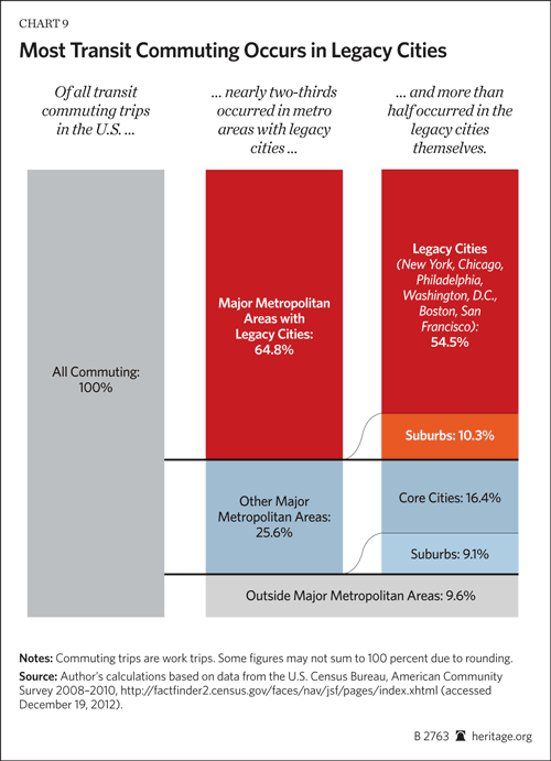
    Transit commuting is heavily concentrated to destinations in just the six core cities (historical core municipalities) of New York, Chicago, Philadelphia, San Francisco, Boston and Washington (Backgrounder Chart 9). I call them the "transit legacy cities," because their high transit market shares relate to their development before the automobile became dominant. Because there is such a lack of clarity in the use of terms that apply to cities, it is important to emphasize that the transit legacy cities are municipalities, not the surrounding metropolitan areas or urban areas, where the majority of residents live (Note 1). 


    The transit legacy cities account for nearly 55 percent of the nation’s transit commuters, by work trip destinations, according to the American Community Survey (2008-2010). By contrast, the transit legacy cities have an overall national employment market share barely one-tenth their national transit share (6 percent). Moreover, combined, the transit legacy cities cover a land area little larger than the core city (municipality) of Jacksonville, Florida.

    At the same time, the "other side of the coin" is that commuting to other destinations is dominated by the automobile, from the suburbs in metropolitan areas with transit legacy cities, and even more so in the other 45 major metropolitan areas (with more than 1,000,000 population) and the balance of the nation.

    Legacy Cities: Transit’s Strength

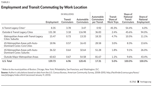
    The extent of the concentration in the six transit legacy cities is illustrated in Backgrounder Table 1. In some ways, transit is, first and foremost,  really a New York story. More than one-third of all transit work-trip commuting is to destinations in the core city of New York. The dominance is even greater for high-capacity subways/elevated services, a mode in which where New York represents two-thirds of national commuting.

    The Key: Large, Concentrated, Well Served Downtowns: The concentration of transit commuting in the six transit legacy cities reflects the factor that is probably more responsible than any other for attracting people from cars to transit. This is a highly concentrated downtown area (central business district, or "CBD") from which a dense network of rapid transit services radiates.

    The six transit legacy cities are also home to the six largest CBDs in the nation, where transit’s share of commuting is far higher than compared to the rest of the nation. Approximately three quarters of commuters to the sprawling Manhattan CBD in New York (south of 59th Street) commuted by transit in 2000. Less well known is that New York also contains the CBD with the second largest transit work trip destination, downtown Brooklyn (58 percent), which is followed by downtown Chicago (55 percent).

    In addition, between nearly 40 percent and more than 50 percent of commuters used transit to the CBDs of Boston, San Francisco, Philadelphia and Washington. While covering a land area less than one-half the size of Orlando’s Walt Disney World, these downtowns accounted for 35 percent of national transit commuting.

    Outside the Transit Legacy Cities: Automobile and Work at Home Country

    So what about the 94 percent of US commuters who work outside the transit legacy cities? The answer is that the automobile dominates, and transit has been overtaken by working at home. In the suburban areas of metropolitan areas with transit legacy cities, the car carries 18 times as many people to work locations as transit. In the core municipalities of the 45 major metropolitan areas without legacy cities, cars carry 29 times as many commuters as transit, and 51 times as many in the suburbs. Outside the nation’s major metropolitan areas, cars carry 82 times as many commuters as transit (Backgrounder Table 1)

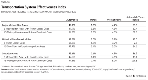
    Further, outside the transit legacy cities, working at home (including telecommuting) provides access to twenty percent more jobs than transit (Backgrounder Table 3).

    An American Love Affair with the Automobile?

    The enduring myth of the American love affair with automobile is countered by the huge transit market shares to city downtowns . For example, commuters to Manhattan are five times as likely to use transit as cars. On the other hand, commuters to the edge city of Parsippany, on the I-287 corridor in suburban New Jersey are 50 times as likely to use their cars as transit. Yet both employment centers serve the same labor market. The issue is not preferences, it is rather rational choice. It would be irrational for most people to commute to Manhattan by car, principally because of the traffic congestion and cost, particularly for parking. It would similarly be irrational for most people to commute to Parsippany by transit, because it either could not be done at all, or it would take too long.

    Transit’s work trip destination market share is an effective measure of its relevance to the market.

    And lest anyone should counter that the answer is more money, consider this.

    A Cost Not A Revenue Problem

    Portland (with a core city that is not a legacy city) has long been held out as a model for improving transit. Yet, after billions of dollars in federal and local tax subsidies, more than 50 times as many people travel to work to suburban locations by car as by transit. More than five times as many work at home as use transit, and working at home costs taxpayers virtually nothing. Yet, despite all these billions, Portland’s transit system is in crisis. Tri-Met’s  Executive Director Neil McFarlane has warned of 70 percent service cuts over 12 years without substantial changes to union contracts.

    Transit’s fundamental problem is not insufficient revenue but insufficient cost control. Since 1983, national transit expenditures have risen at an inflation-adjusted rate nine times that of its increase in commuters (Note 2). Even if costs were under control, it would be financially impossible to provide automobile-competitive transit throughout the modern urban area, as Professor Jean-Claude Ziv and I showed in our WCTRS paper (Megacities and Affluence: Transport and Land Use Considerations).

    Celebrating Transit

    Yet, beyond its inability to convert generous taxpayer subsidies into corresponding ridership increases, transit deserves credit for the large number of people it moves to jobs in the legacy cities. This success should be celebrated although it remains an impossible, prohibitively expensive, dream elsewhere.

    Wendell Cox is a Visiting Professor, Conservatoire National des Arts et Metiers, Paris and the author of “War on the Dream: How Anti-Sprawl Policy Threatens the Quality of Life.”

    —-

    Note 1: Each of the transit legacy cities has a lower population than the surrounding suburbs. This ranges from nearly 45 percent of the population in the suburbs of the New York metropolitan area to little more than 10 percent in Washington.

    Note 2: Within the first 30 days of my time on the Los Angeles County Transportation Commission, I became convinced that transit’s principal problem was cost control (see Toward More Prosperous Cities). This was then and today remains clear from the above-inflationary escalation of unit costs. Regrettably that trend continues today and has seriously impeded transit’s ability to increase ridership.

    —–

    Photo: Downtown Philadelphia (by author)

  • That Sucking Sound You Hear…Solutions to America’s Housing Crisis Are Needed

    There is a crisis in America that’s not being attended to. It is the housing crisis, and its tentacles reach deep into the decline of the American middle class. Particularly, the interlocking dynamics of foreclosure, abandonment, and blight are draining the net worth of millions of Americans. The solutions to date have been piecemeal and ineffective. One possible initiative on the radar—which will be explained further below—entails a federal investment in the strategic demolishing of thousands of “zombie properties” that are eroding equity and quality of life.

    This erosion is real. Writes Howie Kahn of his recent tour with a City of Detroit demolition crew:

    Old roofs half-collapse under the weight of snow, forcing the walls to bulge outward. Moisture eats away the insides. Mold spoils the walls, softens the floors. In the summer, the sun bakes it all to a high stink and turns it crisp as tinder. Nature takes over. Trees sprout through the dormers. Animals get comfortable. We see this everywhere we go…So many innocent onetime starter homes, built on credit and striving, now in foreclosure. The holding company writes it off as a loss. And unless some crusading neighborhood association acts as a sentry, no one’s watching the house anymore. In essence, it belongs to nobody—or to everybody. Because once a house becomes worthless and unwanted…it’s everybody’s problem. Everybody’s crime scene.

    As both a policy researcher and a Clevelander, I know these realities first hand. The city was home to over 40,000 vacant housing units in 2010, or nearly 20% of its stock. Several of these units were across a street from me, the result of a foreclosure on a rental investment purchased during housing inflation heights. Tenants were kicked out around 2009. The place sat empty, but I soon noticed people constantly disappearing into the back of the building. Drug activity I thought. Then one day I found a pile of hypodermic needles on my front lawn while cutting the grass. I have a child. The very real effect of blight acted as a drain on my property value, not to mention my quality of life.

    And while I stayed in the City of Cleveland, many don’t. Cleveland lost 17% of its population from 2000 to 2010. The population decline (which is a long-term trend)—combined with the subprime mortgage crisis—created for unprecedented amounts of oversupply. Often, with both banks and homeowners walking away, the vacant structure devolves into blight until it becomes “a disamentiy effect”, which in plain-speak simply means living near something nobody would want to, with the unappealing prospect monetized in the devaluation of the house’s market value.

    This disamentiy effect has been quantified. For instance, my colleague Nigel Griswold found that in Flint, MI each abandoned structure within 500 ft. reduced a home’s sales price by 2.27%. A study by Thomas Fitzpatrick of the Federal Reserve Bank of Cleveland showed an additional property within 500 ft. that is either delinquent or vacant reduces prices by 1.3%. In low-poverty areas the effect is greater: 4.6%.

    Of course the larger problem is the broader economic effect, as depreciation goes beyond a lower return on investment and gets at household net worth. Specifically, according to the Census Bureau, household net worth declined 20% from 2005 to 2010 (40% since 2007). Of this decline, 76% was attributed to a loss of home equity. Minorities were hardest hit, with average Black household equity falling from $70,000 to $50,000 and average Hispanic household equity falling $90,000 to $40,000.

    Such declines in net worth have swelled the number of Americans stuck in precarious economic conditions. A recent report called “Living on the Edge: Financial Insecurity and Policies to Rebuild Prosperity in America” found that nearly half of Americans are “liquid asset poor”, meaning “they lack the savings to cover basic expenses for three months if unemployment, a medical emergency or other crisis leads to a loss of stable income.”

    Vacant house in Detroit. Courtesy of Streetsblog

    Such economic figures are alarming, and they call for intensive solutions aimed at reconstituting the American middle class, if only to achieve a broader economic recovery outside of the investor class. One such solution could entail a large-scale strategic demolition of “zombie properties” in America’s hardest hit areas, such as the Rust Belt.

    Why demolition?

    It is simple, really: by removing the disamentiy effect you are giving the value of the surrounding houses a chance, and there is initial empirical proof that this does in fact occur. Specifically, in his examination of Flint, MI, Griswold found that Genesee County’s demolition investment was paying off, with $3.5 million of demolition activity producing $112 million in improved surrounding property values. Not a bad ROI, and it’s a return that positively affects homeowners, investors, and government alike.

    The question remains: why isn’t there a concerted effort to once and for all excise the hundreds of thousands “zombie properties” that are draining value from the American economy?

    The reasons are varied, but one in particular relates to a lack of empirical proof that demolition has a definitive monetary impact. One current study, spearheaded by Jim Rokakis of the Thriving Communities Institute, aims to fill the gap. The study, headed by Nigel Griswold, myself, and the Center on Urban Poverty and Community Development at Case Western Reserve University, was partly conceived out of a September 2012 interagency meeting on Residential Property Vacancy, Abandonment and Demolition in which—after hearing pleas from a largely Midwestern contingent—officials from Federal Treasury issued a challenge: show through robust empirical means that demolition (1) retains value on nearby properties, and (2) decreases the likelihood of future foreclosures. If the results prove definitive, Treasury suggested they could make a federal strategic demolition initiative a reality.

    Vacant houses in Buffalo. Courtesy of the NY Times.

    Of course the operative word here is “strategic”, as bulldozing for the sake of bulldozing does not a solution to a crisis make. As such, the intent of this research is also to help those on the ground ascertain where an investment in demolitions could pay off most. For example, there are properties—particularly architecturally-rich properties with high intrinsic value—that should be preserved and shuttled down another path. As well, there are areas in cities in which population decline is shifting ever so slightly. The area I had lived was one of them. And the house that was once vacant across from me has been renovated and is now home to a number of tenants. Thus, the authors of the study are cognizant of the contextualization that exists in various hardest hit cities, and so recommendations will be matched with an understanding as such.

    That said, the study is currently ongoing, and while the results are as yet unclear—and in fact may not be robust enough to convince D.C. to act—the effect of “zombie properties” on the financial and mental well-being of regular Americans is anything but uncertain.

    As a Clevelander, I know this all too well.

    Richey Piiparinen is a writer and policy researcher based in Cleveland. He is co-editor of Rust Belt Chic: The Cleveland Anthology. Read more from him at his blog and at Rust Belt Chic.

    Vacant Cleveland house photo by Flickr user edkohler.

  • America’s Oldest Cities

    One of the most important turning points in the social history of the United States occurred at the beginning of the 1940s. This is not about Pearl Harbor or the Second World War, but  rather about the economic, housing and transportation advances that have produced more affluence for more people than ever before in the world.

    After being delayed by World War II, people began moving from the overcrowded cities to spacious (for that time) houses in the suburbs. They increasingly traveled to work and other destinations by car. These trends were at least two decades old at the time, but had been put on hold by the Great Depression. The prewar city (metropolitan area) was considerably denser, more oriented to mass transit and largely monocentric. By 2010, all major metropolitan areas had developed an urban form that was overwhelmingly suburban and polycentric, with the rise of edge cities and the even greater dispersion of edgeless cities. On average, areas outside the traditional downtowns (central business districts) accounted for 90 percent of metropolitan employment in 2000, ranging from a high of more than 95 percent in metropolitan areas like Phoenix, San Jose and Tampa-St. Petersburg to a low of 80 percent in New York.

    Rating Metropolitan Areas by Pre-War Residential Development

    Although dense urban cores persist in most metropolitan areas, their size and significance varies greatly. This can be illustrated by data from the 2007- 2011 American Community Survey, which makes it possible to rank metropolitan areas by their shares of pre-World War II residential development.

    This article uses the percentage of dwelling units, both owner and renter occupied constructed before 1940 to rate the ages of the nation’s 51 major metropolitan areas (those with more than 1 million population in 2010).  Overall, America’s major metropolitan areas are overwhelmingly postwar in their urban development, with approximately 14% of residences built before 1940. By comparison the 1940 populations of today’s major metropolitan counties were just 35 percent of their 2010 populations.

    Oldest Metropolitan Areas

    The nation’s oldest metropolitan areas, not surprisingly, are concentrated in the Northeast and the upper Midwest. Overall population growth has been modest in these regions compared especially to the South and the West.

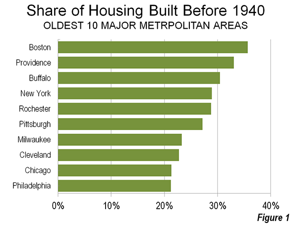
    • Boston is the oldest with 35.7% of its residences built before 1940. This varies from 55.6% in the historical core city of Boston to roughly 32 percent in the suburbs, which are the oldest themselves in the country.   
    • Nearby Providence is the second oldest metropolitan area, with 33.1% of its dwellings built before 1940. The city of Providence is also the second oldest among historical core municipalities, at 58.8%. Providence overall share of pre-1940 housing stands at 30.2%. It is notable that the Office of Management and Budget now considers Boston and Providence to be in the same combined statistical area (consolidated metropolitan area).
    • Buffalo is the nation’s third oldest metropolitan area with 30.5% of its residences preceding 1940. The core city of Buffalo is the oldest historical core municipality, with 62.8% of its housing predating 1940. Buffalo suburbs, however, are considerably newer, with only 20.1% older than 1940.
    • New York is the nation’s fourth oldest metropolitan area, with 28.9% of its dwellings having been built before 1940. The city of New York has a much lower prewar housing percentage than the top four, largely because of the substantial amount of green field housing built in the more distant sections of Queens and especially in Staten Island during the 1950s and 1960s. New York’s suburbs, which have accounted for nearly all of the growth in the metropolitan area have a pre-1940 housing share of 18.9%.
    • Rochester is the nation’s fifth-oldest metropolitan area, with 28.8% of its housing prewar. The historical core municipality of Rochester has a high 58.1% of its housing in prewar stock, while the suburbs have a 21.1% share.

    The next five oldest metropolitan areas are Pittsburgh, at 27.2%, Milwaukee and 23.3%, Cleveland 22.7% Chicago and 21.3% and Philadelphia at 21.2%. Among these, the oldest historical core municipalities are Cleveland, at 51.9% and Pittsburgh at 50.3%. Pittsburgh has the highest suburban pre-1940 housing stock, at 23.5%, the third highest in the nation after Boston and Providence (Figure 1).

    Youngest Metropolitan Areas

    The nation’s youngest major metropolitan areas are concentrated in the South and West, comprising 28 of the 51.

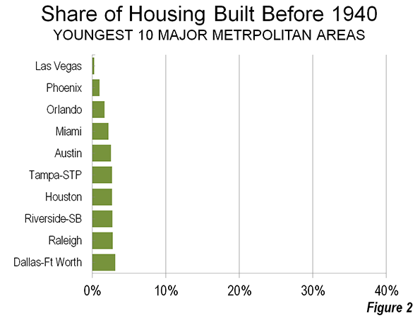
    • Las Vegas is the youngest major metropolitan area.  "Sin City" has had the greatest percentage population growth since 1940, and is now approaching a population of 2 million, compared to less than 20,000 in 1940. Only 0.3% of the housing stock in Las Vegas was built pre-war.
    • Phoenix, which is grown from little more than 200,000 people in 1940 to more than 4 million people today, has a pre-1940 housing stock of only 1.0%. The city of Phoenix has a miniscule pre-1940 housing stock of 1.9%.
    • The third youngest major metropolitan area is Orlando with 1.7% of its housing stock having been built before 1940.
    • Perhaps surprisingly, Miami is the fourth youngest major metropolitan area with only 2.2% predating 1940. The historical core municipality of Miami, however, has one of the highest densities in the United States and a comparatively strong 10.6% of its housing is prewar.
    • Austin is the fifth youngest major metropolitan area, with 2.5% of its housing predating the war.


    Tampa St. Petersburg, Houston, Riverside-San Bernardino, Raleigh and Dallas-Fort Worth round out the 10 youngest major metropolitan areas. Each of these has a pre-1940 housing stock between 2.7% and 3.1% (Figure 2).

    Data for all metropolitan areas is provided in the table.

    Table
    Share of Housing Units Constructed Before 1940
    US Metropolitan Areas Over 1,000,000 Population in 2010
    Rank Metropolitan Area Metropolitan Area Historical Core Municipality(s) Rank Suburbs Rank HCM
    1 Boston, MA-NH 35.7% 55.6% 4 32.4% 1 1
    2 Providence, RI-MA 33.1% 58.8% 2 30.2% 2 1
    3 Buffalo, NY 30.5% 62.8% 1 20.1% 5 1
    4 New York, NY-NJ-PA 28.9% 41.3% 12 18.9% 6 1
    5 Rochester, NY 28.8% 58.1% 3 21.1% 4 1
    6 Pittsburgh, PA 27.2% 50.3% 7 23.5% 3 1
    7 Milwaukee,WI 23.3% 38.9% 16 14.0% 10 1
    8 Cleveland, OH 22.7% 51.9% 6 15.4% 8 1
    9 Chicago, IL-IN-WI 21.3% 43.8% 10 11.6% 13 1
    10 Philadelphia, PA-NJ-DE-MD 21.2% 39.1% 14 14.9% 9 1
    11 San Francisco-Oakland, CA 20.4% 45.5% 9 9.2% 15 1
    12 Hartford, CT 19.3% 43.1% 11 16.7% 7 1
    13 Cincinnati, OH-KY-IN 17.2% 41.3% 13 12.6% 11 1
    14 St. Louis,, MO-IL 15.8% 54.4% 5 10.3% 14 1
    15 Minneapolis-St. Paul, MN-WI 15.0% 46.7% 8 6.1% 24 1
    16 Baltimore, MD 14.4% 39.0% 15 6.8% 22 1
    17 Portland, OR-WA 13.1% 31.8% 19 5.5% 25 2
    18 Columbus, OH 12.5% 12.6% 31 12.4% 12 2
    19 Louisville, KY-IN 12.3% 16.9% 27 8.1% 20 2
    20 Indianapolis. IN 12.1% 15.6% 28 8.8% 16 2
    21 Los Angeles, CA 12.0% 20.2% 26 8.3% 18 2
    22 Detroit,  MI 12.0% 31.7% 22 8.2% 19 1
    23 Kansas City, MO-KS 11.9% 21.5% 24 8.8% 17 2
    24 New Orleans. LA 11.7% 31.7% 21 3.0% 35 1
    25 Seattle, WA 11.1% 29.9% 23 6.1% 23 2
    26 Richmond, VA 9.0% 32.0% 18 4.1% 31 2
    27 Salt Lake City, UT 8.9% 31.8% 20 3.1% 34 2
    28 Washington, DC-VA-MD-WV 8.6% 36.1% 17 4.6% 29 1
    29 Denver, CO 7.1% 21.4% 25 2.1% 43 2
    30 Birmingham, AL 6.8% 15.6% 29 4.5% 30 2
    31 Oklahoma City, OK 6.7% 8.8% 34 4.9% 27 2
    32 Memphis, TN-MS-AR 5.6% 8.8% 35 2.3% 41 2
    33 Virginia Beach-Norfolk, VA-NC 5.4% 1.1% 50 7.0% 21 2
    34 San Jose, CA 5.3% 5.5% 42 5.1% 26 3
    35 Nashville, TN 5.1% 6.9% 39 3.9% 33 2
    36 San Antonio, TX 5.1% 5.7% 40 4.1% 32 2
    37 Sacramento, CA 4.6% 11.5% 32 2.7% 36 3
    38 San Diego, CA 4.3% 7.0% 38 2.1% 42 2
    39 Charlotte, NC-SC 4.0% 3.3% 46 4.6% 28 2
    40 Jacksonville, FL 3.8% 4.7% 43 2.3% 40 2
    41 Atlanta, GA 3.2% 14.5% 30 2.0% 45 2
    42 Dallas-Fort Worth, TX 3.1% 5.7% 41 2.5% 38 2
    43 Raleigh, NC 2.8% 3.1% 47 2.6% 37 3
    44 Riverside-San Bernardino, CA 2.7% 7.9% 37 2.5% 39 3
    45 Houston, TX 2.7% 4.6% 45 1.6% 47 2
    46 Tampa-St. Petersburg, FL 2.7% 8.4% 36 1.9% 46 2
    47 Austin, TX 2.5% 3.0% 48 2.0% 44 3
    48 Miami, FL 2.2% 10.6% 33 1.5% 48 2
    49 Orlando, FL 1.7% 4.7% 44 1.3% 49 3
    50 Phoenix, AZ 1.0% 1.9% 49 0.6% 50 3
    51 Las Vegas, NV 0.3% 0.3% 51 0.3% 51 3
    Total 13.6% 25.5% 9.0%

    Notes:
    Calculated from American Community Survey 2007-2011
    HCM: Historical core municipality category: (1) Pre-War & Non-Suburban, (2) Pre-War & Suburban, (3) Post-War Suburban. There is one HCM per metropolitan area, except in in San Francisco-Oakland (San Francisco and Oakland) and Minneapolis-St. Paul (Minneapolis & St. Paul). Otherwise, the HCM is the first named municipality in the metropolitan area name, except in Virginia Beach-Norfolk, where it is Norfolk and Riverside-San Bernardino, where it is San Bernardino.

    Not All Core Cities are the Same

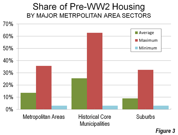
    This analysis indicates the substantial differences between not only the nation’s metropolitan areas, but even more the differences between the core municipalities. For example, the core cities of Phoenix and Philadelphia have approximately the same population. Yet they could not be more different. Philadelphia has a long history, including a time as the nation’s largest city around the period of the Revolutionary War. Phoenix, in contrast, is a product of the post-World War II boom. By 2010, Phoenix had become the nation’s 6th largest municipality. Its 65,000 population in 1940 would rank it around 600th today. Figure 3 shows the average, maximum and minimum pre-war housing stock percentages by metropolitan area, historical core municipality and suburbs.

    Categorizing Core Municipalities

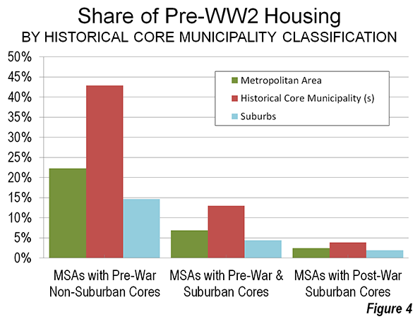
    In Suburbanized Core Cities, we classified the nation’s core municipalities into three categories, based upon the extent of their pre-automobile development (This was described further in a paper co-authored with Peter Gordon of the University of California, Cities in Western Europe and America: Do Policy Differences Matter?).

    The categories included "Pre-War Non-Suburban," which are core municipalities that were of high density in 1940 and have expanded their boundaries little since that time. Philadelphia, Baltimore and Providence are examples of these. The second category was "Post-War and Suburban," which includes municipalities that had a dense core of more than 100,000 residents in 1940, but contain large swaths of post-War suburban development (such as Los Angeles, Milwaukee and Atlanta). The third category was Post-War Suburban, which includes core cities that had little or no dense urban core in 1940 (such as Phoenix, Austin and San Jose).

    Figure 4 illustrates the huge differentials in the pre-1940 housing stock between the metropolitan areas as classified by their historical core municipalities.

    Commonalities

    Even so, metropolitan areas are much more similar than their historical core municipalities. The bottom line is one different than one tends to hear in the urban-core-oriented press. In most of America the detached house predominates and virtually all development since 1940 has been suburban, both inside and outside the historical core municipalities.

    Wendell Cox is a Visiting Professor, Conservatoire National des Arts et Metiers, Paris and the author of “War on the Dream: How Anti-Sprawl Policy Threatens the Quality of Life.”

    —-

    Photograph: Boston (by author)

  • California Becoming Less Family-Friendly

    For all of human history, family has underpinned the rise, and decline, of nations. This may also prove true for the United States, as demographics, economics and policies divide the nation into what may be seen as child-friendly and increasingly child-free zones.

    Where California falls in this division also may tell us much about our state’s future. Indeed, in his semi-triumphalist budget statement, our 74-year-old governor acknowledged California’s rapid aging as one of the more looming threats for our still fiscally challenged state.

    Gov. Jerry Brown, unsurprisingly, did not acknowledge or address the many factors driving the aging trend that include his own favored policy prescriptions. Whatever their intent, the usual "progressive" basket of policies have had regressive results: a tougher time for both the poor and middle class, and a set of density-oriented policies that are likely to drive up housing prices, particularly for the single-family houses largely preferred by people with children.

    These policies have helped turn California into a state that looks less Sunbelt and more like the long-aging centers of the Northeast and the Midwest. It also mirrors declines in fertility and marriage rates in the most-rapidly aging parts of Europe and east Asia. These regions are shifting toward what Chapman University’s recent report, in cooperation with the Civil Service College of Singapore, characterized as post-familialism. Released this past fall in Singapore, the report will be presented in Orange County this week.

    We believe that the rapid decline of marriage and fertility rates in many advanced countries inevitably leads to economic decline, reduced workforces and, likely, an inevitable fiscal disaster. This may be becoming now more true in the United States, a country which once boasted the most vibrant demographics in the high-income world but since the 2007-09 recession has seen a rapid drop in both its marriage rate and fertility rates to well below 2.1 children per female, what is generally referred to as "the replacement rate."

    Just as it differs by country, the degree of post-familialism varies among countries, but it also does among states and regions. Some states, notes a recent Packard Foundation study, such as Texas, Utah and North Carolina, have seen double-digit gains in their child populations over the past decade while California’s has dropped by over 3 percent. Some urban regions like Raleigh, Austin, Houston, Charlotte, Dallas-Fort Worth and Atlanta have also seen rises in their number of children, with population between ages 5 and 17 growing by 20 percent or more over the past decade.

    Historically, California and its regions stood among these family magnets, but no more. Like the states of the Northeast and upper Midwest, the Golden State is becoming rapidly geriatric, as families opt out, and immigration, the primary source of our growth in younger people, declines in an economy ill-suited to migrants with aspirations for a better life.

    Southern California, where immigration has dropped by roughly a third over the past decade, has shared in this decline.

    All three major regions of greater Los Angeles – the San Bernardino-Riverside area, Orange and Los Angeles counties – have seen a sharp drop in their percentages of children. Only the Inland Empire remains still relatively youthful overall, with some 26 percent of its population under 15, well above the national average. In contrast, Los Angeles and Orange counties experienced a 15.6 decline in under-15 population, highest among the nation’s metropolitan areas. Meanwhile, the over 60 population grew by 21 percent.

    One clear indicator can be seen in our declining school populations. Despite massive expenditures for new construction, over the past decade the Los Angeles Unified School District has seen enrollment drop by 7.5 percent. In that period, the student count fell by over 50,000, the largest numerical drop in the nation.

    What is leading to this exodus of families? Sacramento politicians and their media enablers blame insufficient investment in education or simply national aging trends as the root causes. But then, why are other states, including our key competitors, gaining families and children?

    Sacramento lawmakers of both parties share some responsibility. The dominant progressives’ regulatory and tax agenda continues to reduce economic prospects for younger Californians, leading many young families to exit the state. In contrast, older Anglos, the bulwark of the now largely irrelevant GOP, are committed to massive property tax breaks because of Proposition 13. Add good weather and the general inertia of age, and it’s not surprising that families might flee as seniors stay.

    Other factors work against parents, prospective or otherwise. The knee-jerk progressive response to our demographic problems usually entails more money be sent to the schools.

    But they rarely include the student-oriented reform measures such as those enacted in New Orleans (where I am working as a consultant). The poor performance of public education, clear from miserable test results and dropout rates, makes raising children in California either highly problematic or, factoring the cost of private education, extremely expensive.

    If you think Proposition 30’s higher sales and income taxes will change anything, think again.

    Much of that money will end up, almost inevitably, going toward pensions of teachers and other state workers. The hegemonic teacher unions have as their primary goal protecting the system at all costs and resisting change.

    Equally critical, the state’s "enlightened" planning policies also work to discourage families. California’s new climate-change-mandated housing regime – preferring apartments over houses – does not specifically target families, but the case for greater density is often predicated on an ever-declining number of families and an undemonstrated growing preference for density. "Singles and childless couples are the emerging household type of the future," suggests developer and smart growth guru Chris Leinberger.

    These post-familial trends have been incorporated into the influential report, "The New California Dream," widely accepted as gospel by many in our state’s development community.

    The author, the University of Utah’s Chris Nelson, interpreted early 2000s public opinion surveys to suggest a growing preference for smaller lot sizes and apartments, though the data indicate no change over the past 10 years. Developers assume that as singles, empty-nesters and childless couples become as the state’s primary market, this likely misperceived preference will gain even greater strength

    So what would a post-familial future mean for California? You don’t need a crystal ball to figure this one out. Just look at what is happening in other rapidly aging economies, especially Japan, but also much of Europe.

    Dense housing, high taxes and lack of space (such as back yards) tend to discourage family formation. Slower population and labor-force growth then slows the economic engine, which, in turn, creates a greater imbalance between workers and pensioners. The result, ultimately, could be a kind of fiscal Armageddon.

    Fortunately, none of this is inevitable. States such as Utah, Texas and North Carolina continue to attract families, bringing with them new workers, companies and customers. As their economies grow, they can generate broadly based revenue, unlike California, which is increasingly reliant on housing or stock-price bubbles that benefit the already affluent and older populations.

    It is not our karma, Gov. Brown, to submit to a Japanese-like demographic demise. But revitalizing California will require a radical reevaluation of priorities and reconsideration of policy impacts on families.

    Joel Kotkin is executive editor of NewGeography.com and a distinguished presidential fellow in urban futures at Chapman University, and a member of the editorial board of the Orange County Register. He is author of The City: A Global History and The Next Hundred Million: America in 2050. His most recent study, The Rise of Postfamilialism, has been widely discussed and distributed internationally. He lives in Los Angeles, CA.

    This piece originally appeared in the Orange County Register.

    Childhood kids photo by BigStockPhoto.com.

  • Time to Acknowledge Falling Private Car Use

    The prospect of falling car use now needs to be firmly factored into planning for western cities. 

    That may come as a bit of a surprise in light of the preoccupation with city plans that aim to get people out of their cars, but it is already happening.  And it is highly likely to continue regardless of whether or not we promote urban consolidation and expensive transit systems. 

    But not necessarily lower resource consumption
    Of course, as day-to-day travel savings are made by households these can simply result in other forms of consumption, offsetting any resource savings.  This should not be surprising.   Final demand embodies resources consumed right across the production and distribution chain.  Savings from lower transport spending (including commuting) – an intermediate input in the chain – that lead to lower prices translate into increases in discretionary spending (assuming constant or rising incomes). 

    Hence, the reduction in resource use and pollution sought by subsidising public transport and promoting higher density living may simply be spent on resource-intensive appliances, recreation, entertainment, and inter-city and international travel.

    Look to the fringe to look to the future
    Putting that inconvenient equation aside, long-term plans for cities should avoid simply projecting past behaviours into the future. Instead, we might look to changes at the margin that signal the issues, discoveries, and events that might determine the long-term outcomes we are interested in. 

    So let’s look at what’s happening at the margins of car use, focusing for the purpose of illustration on Auckland.

    First, travel demand
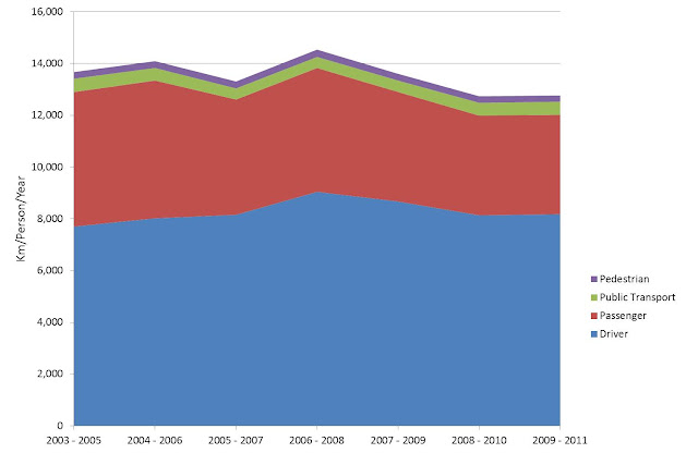
    The New Zealand Travel Survey has been conducted since 2003.  The results are published on a two-yearly rolling basis.  Using Statistics New Zealand population estimates I have calculated annual “per person” measures for Auckland from 2003 to 2011.  There are some sampling issues and qualifications regarding the survey that mean motor cycle and bicycle use statistics for Auckland are not considered reliable enough to use. Even given sampling error, the balance point to some significant and consistent shifts.

    For example, total travel (measured as annual kilometres per resident) appears to have peaked around 2007 (Figure 1). In fact, recorded travel declined by 15% over the period.  Public transport has done better, down 12% overall but actually increasing 13% between 2007 and 2011.

    Figure 1: Aucklanders’ Travel by Mode, 2003-2011


    More telling, though, has been declining car use.  The first column in Table 1 shows changes over the whole period.  The second column shows changes between the 2007 travel peak and 2011.

    The fall in car dependence since 2007 has been marked among passengers (-23%).  Perhaps that means fewer discretionary trips are being taken. This and a 14% decline in driver kilometres and 17% fewer trip legs confirms what the vehicle counts say – cars are being driven significantly less in Auckland  (particularly inner Auckland) now than they were five or ten years ago.

     
    Period

    2003-11
    Peak
    2007-11
    Driver
    Km
    -4%
    -14%
    Hours
    3%
    -12%
    Trip Legs
    1%
    -17%
    Passenger
    Km
    -33%
    -23%
    Hours
    -18%
    -17%
    Trip Legs
    -8%
    -22%
    All Car Users
    Km
    -16%
    -17%
    Hours
    -5%
    -13%
    Trip Legs
    -3%
    -19%

    Possible reasons:

    1.      We know already that an ageing population reduces car use.

    2.      Public transport is playing a growing but so far minor role (up from 3.7% to 3.9% share of all kilometres travelled).  An average 76km per person growth in public transport use since 2007 hardly offsets the 1,810km average contraction in distance travelled by car.

    3.      Lower real incomes and higher fuel prices play a part.  A sharp contraction since 2007 suggests that economic conditions have an impact on motoring far more immediate and influential than trying to reshape the shape the city and how people live in it might.   

    4.      The decentralisation of jobs, recreation and entertainment, professional services, and consumer services – including retailing – mean that people can get more done closer to where they live.  Trying to turn this clock back by pushing commercial activity back into the central city and then providing subsidised public transport to access it seems somewhat obtuse in the light of this development.

    Second, car purchases

    The Ministry of Transport publishes new car registrations (which include imported used cars).  It also provides data on the total  vehicle fleet since 2000.  

    Long-term registration statistics are interesting when related to national population data (Figure 2). Apart from a hiccup in 1991 growth in registrations was more or less continuous from 1950 until 2003.  Since then there has been a sharp decline.  Time will tell whether this is cyclical or signals a long-term shift.  It is noteable, though, that 2009, 2010, and 2011 figures fall well below trend.

    Figure 2: Trends in New Car Registrations

    This slowdown in new car registrations is reflected in two ways.  First, it is reflected in total fleet size, for which data are available from 2000 (Figure 3). This shows that  2007 was a turning point in total numbers, consistent with evidence that driving in Auckland peaked in that year.  That’s presumably good for the environment.

    Figure 3: New Car Registrations, New Zealand 2000-2011,

    Second, with the slow-down in imports, the fleet has begun to age (Figure 4).  That’s presumably bad for the environment, as older cars are less efficient and generate more emissions.

    Figure 4: New Zealand’s Ageing Car Fleet

    Third, fleet changes
    Fleet composition is changing as growth slows. The average CC rating of newly registered vehicles in 2000 was 2,127.  This climbed to 2,191 in 2005, but fell to 2,033 in 2011, an 8% fall in six years. 

    If this is a sign of things to come an increase in the turnover of vehicles would boost fleet efficiency over the medium term even without taking account of the greater engine efficiencies being delivered and gains among electric and hybrid vehicles

    Add to that the prospect supported by these numbers of increasing differentiation among vehicle styles (Figure 5).  At one end sits the large weekend recreational vehicle, perhaps falling as a share of new vehicles – or at least being down-sized.  At the other is the increasingly popular city runabout or smart car, and in the middle  the family sedan, the work horse with an engine size now likely to be well under 2,000cc.  

    Figure 5: Changes in Engine Size of Newly Registered Vehicles, 2000-2011

    So what does this all mean?
    There is evidence accumulating to suggest that significant changes are taking place at the margin of transport demand and car dependence.  If this is a sign of things to come it raises questions about long-term road expenditure, about dire predictions of road congestion, and about the benefits of adopting expensive land use and transport measures designed to force people out of their cars.

    Already, within a more constrained economy, people seem to be making their own decisions to reduce car dependence.

    In terms of city planning, it suggests that decentralisation may be more sustainable than the compact city protagonists make out.  In this respect, is interesting that motorway traffic counts show that significant reductions in inner city vehicle flows are offset by gains (albeit much smaller) in outer parts of the city – even as measured distance travelled falls. 

    And Auckland definitely needs to rethink assumptions behind spending plans for major road and rail infrastructure – and confront the risks and costs of getting them wrong. 

    And, incidentally, it’s about time New Zealand’s Ministry for the Environment updated its report card on trends in the environmental impact of vehicle travel – which only goes up to 2007, a year which may prove to be a turning point in long-term travel behaviour.

    Phil McDermott is a Director of CityScope Consultants in Auckland, New Zealand, and Adjunct Professor of Regional and Urban Development at Auckland University of Technology.  He works in urban, economic and transport development throughout New Zealand and in Australia, Asia, and the Pacific.  He was formerly Head of the School of Resource and Environmental Planning at Massey University and General Manager of the Centre for Asia Pacific Aviation in Sydney. This piece originally appeared at is blog: Cities Matter.

    Aukland harbour photo by Bigstockphoto.com.

  • The Cities Winning The Battle For The Fastest Growing High-Wage Sector In The U.S.

    In an era in which many businesses that pay high wages have been shedding jobs, the wide-ranging employment category of professional, scientific and technical services has been a relatively stellar performer, expanding some 15% since 2001. In contrast, employment dropped over 20% in such lucrative fields as manufacturing and information-related businesses (media, telecom providers, software publishing) over the same period, and finance and wholesale trade experienced small declines.

    With an average annual wage nearing $90,000, this category — which includes computer consulting and technical services, accounting, engineering and scientific research, as well as legal, management and marketing services  — increasingly shapes the ability of regions to generate higher-wage jobs. In order to determine which metropolitan areas are doing best, Mark Schill of Praxis Strategy Group compiled rankings based on both long and short-term growth, as well as the extent and growth of each region’s business service economy compared to the national average.

    Notably absent from the top 10 are Chicago and the big metropolitan areas of the Northeast and California that have traditionally dominated high-end business services. The only exception is the third-ranked San Francisco-Oakland-Fremont metropolitan statistical area, which has logged 21% growth in this sector since 2001, while expanding the proportion of such jobs in the local economy to nearly twice the national average. Over the past year alone the region added 22,000 professional and business services jobs, which was more than a quarter of all new positions during that period.

    The continuing vitality of nearby Silicon Valley, and the region’s attraction to educated workers, have made the Bay Area easily the best performer of the nation’s mega-regions. Yet the other leaders on our list are generally smaller, growing metro areas whose expansions have been propelled by a rapid increase in employment in technology and professional management services. These include our top-ranked metro area, Austin-Round Rock-San Marcos, Texas, which enjoyed over 46% growth in employment in professional services since 2001;  fourth-place Raleigh-Durham, N.C.; and No. 5 Salt Lake City, Utah. These areas have enjoyed strong net-in migration of educated workers, and have poached companies from more expensive regions.

    More surprising still has been the rapid ascent of such unheralded regions as second-place Jacksonville, Fla., and Oklahoma City (sixth place). In Oklahoma City, where business and professional services employment has grown over 30% since 2001, progress can be traced to the city’s burgeoning energy sector.

    But some other areas on our list are benefiting from a hitherto unnoted shift of high-end services to lower-cost and often lower-density regions. Jacksonville may be the poster child for this. Over the past decade, the northern Florida metro area’s population has grown 20% to over 1.3 million, but business services employment has expanded nearly 50%, the biggest jump of any of the country’s 51 largest metropolitan areas. Once a business services backwater, the share of jobs in that sector in the local economy has rapidly climbed towards the national average. This growth has been driven by management consulting as well as computer and data center services, an area in which Jacksonville has enjoyed among the highest growth rates in the country. One major player is web.com, which employs 500 people at its headquarters in south Jacksonville.

    Other industries that rely on professional and business service providers have recently added jobs in the market, including BI-LO and Winn Dixie, which moved their combined headquarters  there, as did environmental services company Advanced Disposal. Financial giant Deutsche Bank has also  expanded in the area.

    Jerry Mallot, president of the local business development group Jaxusa Partnership, suggests that low costs, a high rate of housing affordability and Florida’s lack of income tax make Jacksonville attractive to companies seeking to expand or relocate. The state, according to a recent report from New Jersey-based www.BizCosts.com, is now home to five of the country’s least expensive and most pro-business cities. Jacksonville, Orlando, and Tampa also are all among the U.S. metro areas adding college-educated residents the fastest.

    Of course up-and-comers like Jacksonville, Charlotte, and Oklahoma City, and even Portland (10th place), still lack the critical mass of high-end business services of many of the larger, more established metropolitan areas. Some have continued to see strong growth in their professional services sectors. Not surprisingly, this includes greater Washington, D.C. (11th), with 26% growth since 2001, keyed by the expansion of government and the regulatory apparat in recent years. The share of professional services jobs in the local economy is two and a half times the national average, the highest concentration in the country.

    Yet many of America’s largest metro areas, including longtime business service bastions, have lagged well behind. New York, home to Wall Street and many leading consulting, legal and professional firms, ranks a mediocre 32nd out of the 51 largest metro areas, with relatively meager growth of 8.5%. The share of professional services jobs in the New York economy fell, as it did in Los Angeles-Long Beach-Santa Ana (36th) and Chicago-Joliet-Naperville (43rd). This suggest trouble ahead for the future.

    Chicago was among the few areas that actually lost employment in this generally fast-growing field. The other big losers include Detroit-Warren-Livonia, Mich. (39th) , despite a decent  pickup in the last two years as the auto industry has rebounded;  the Cleveland metro area (47th); Milwaukee-Waukesha-West Allis, Wisc. (49th); Birmingham-Hoover, Ala. (50th); and last-place Memphis.

    What do these trends tell us about the future of high-wage employment? Certainly size is not enough, nor even the possession of strong legacy in business service industries. The relative declines of our three largest metro areas — New York, Los Angeles and especially Chicago — alone tells us that. Chicago, which has touted itself as a capital of business expertise, now seems to be falling into the nether reaches long inhabited by older Rust Belt cities and Southern backwaters. Chicago leaders such as Mayor Rahm Emanuel needs to spent less time being possessed by what Time Out Chicago called a “world class city complex” and look into why, as urban analyst Aaron Renn suggests, the city’s vaunted global economy is not enough to produce enough high-wage jobs to sustain its vast surrounding region.

    At the same time, being small and affordable, while helpful, is also not sufficient for business services success, as the presence of a number of smaller metro areas at the bottom of the list suggests. But the strong performance of many mid-sized cities  – ranging from Austin, Raleigh and Salt Lake to less-heralded Jacksonville, Kansas City, Oklahoma City and Richmond — suggest that these jobs will likely continue to migrate to smaller, less costly and generally less dense urban regions.

    Once considered the natural domain of megacities and dense urban cores, high-wage business service jobs, largely due to technology, can increasingly be done anywhere. This suggests that the playing field for such positions, rather than concentrating, will become ever wider. As the struggle for good jobs intensifies in the years ahead, expect the competition between regions to get even greater.

    Professional, Technical, and Scientific Services in the Nation’s Largest Metropolitan Areas
    Rank   Index Score 2001 – 2012 Growth 2005 – 2012 Growth 2010 – 2012 Growth 2012 LQ 2001 – 2012 LQ Change 2012 Avg. Annual Wage
    1 Austin-Round Rock-San Marcos, TX 79.6 46.9% 38.8% 13.8% 1.43 5.9% $90,649
    2 Jacksonville, FL 79.1 50.2% 17.6% 8.4% 0.99 28.6% $72,913
    3 San Francisco-Oakland-Fremont, CA 67.2 21.4% 23.6% 12.9% 1.97 11.3% $120,442
    4 Raleigh-Cary, NC 63.5 34.5% 26.1% 10.8% 1.40 0.7% $81,025
    5 Salt Lake City, UT 63.3 33.4% 26.2% 9.8% 1.10 6.8% $76,341
    6 Oklahoma City, OK 59.9 31.1% 16.6% 11.0% 0.89 8.5% $62,374
    7 Kansas City, MO-KS 59.5 24.2% 17.6% 10.4% 1.24 10.7% $82,060
    8 Richmond, VA 57.7 28.9% 16.9% 8.2% 1.01 9.8% $82,184
    9 Charlotte-Gastonia-Rock Hill, NC-SC 56.1 29.9% 24.4% 6.3% 0.97 5.4% $81,171
    10 Portland-Vancouver-Hillsboro, OR-WA 55.1 24.6% 17.3% 10.2% 1.05 5.0% $73,601
    11 Washington-Arlington-Alexandria, DC-VA-MD-WV 55.1 26.1% 11.7% 3.5% 2.45 1.7% $119,460
    12 Riverside-San Bernardino-Ontario, CA 54.6 45.5% 3.1% 2.1% 0.58 11.5% $52,617
    13 Nashville-Davidson–Murfreesboro–Franklin, TN 52.8 31.7% 11.3% 5.6% 0.88 7.3% $81,189
    14 Buffalo-Niagara Falls, NY 52.4 22.7% 19.4% 5.2% 0.93 10.7% $64,449
    15 Atlanta-Sandy Springs-Marietta, GA 52.2 18.6% 14.4% 10.7% 1.30 3.2% $87,575
    16 Columbus, OH 51.9 23.4% 17.6% 5.8% 1.16 6.4% $81,027
    17 San Diego-Carlsbad-San Marcos, CA 50.9 24.7% 13.4% 3.4% 1.51 5.6% $98,390
    18 Sacramento–Arden-Arcade–Roseville, CA 50.3 29.6% 11.0% 1.1% 1.06 10.4% $81,973
    19 San Antonio-New Braunfels, TX 48.1 30.5% 13.2% 5.3% 0.80 0.0% $69,979
    20 Baltimore-Towson, MD 47.4 20.0% 8.4% 6.1% 1.34 3.9% $93,263
    21 Seattle-Tacoma-Bellevue, WA 47.1 18.3% 21.3% 6.6% 1.21 -1.6% $88,345
    22 Tampa-St. Petersburg-Clearwater, FL 46.7 18.7% 7.6% 5.0% 1.17 8.3% $72,087
    23 Boston-Cambridge-Quincy, MA-NH 44.8 10.5% 15.5% 7.6% 1.62 -1.8% $118,694
    24 Dallas-Fort Worth-Arlington, TX 44.6 20.1% 17.1% 5.4% 1.12 -2.6% $89,392
    25 Denver-Aurora-Broomfield, CO 44.2 14.3% 16.5% 5.5% 1.44 -1.4% $91,922
    26 Las Vegas-Paradise, NV 43.6 33.4% -1.1% 1.6% 0.74 4.2% $74,939
    27 Louisville/Jefferson County, KY-IN 41.8 16.4% 13.8% 4.7% 0.82 2.5% $65,664
    28 Cincinnati-Middletown, OH-KY-IN 41.3 13.3% 7.6% 7.8% 0.96 1.1% $71,259
    29 Orlando-Kissimmee-Sanford, FL 39.9 26.6% 0.0% 3.0% 0.98 -2.0% $72,368
    30 Houston-Sugar Land-Baytown, TX 39.0 20.4% 15.0% 4.1% 1.15 -10.2% $101,352
    31 New Orleans-Metairie-Kenner, LA 38.8 6.0% 11.8% 2.5% 0.97 10.2% $78,866
    32 New York-Northern New Jersey-Long Island, NY-NJ-PA 37.5 8.5% 9.8% 7.1% 1.36 -6.2% $110,211
    33 Indianapolis-Carmel, IN 36.2 17.2% 10.6% 1.9% 0.85 -2.3% $76,393
    34 San Jose-Sunnyvale-Santa Clara, CA 35.4 -5.5% 13.7% 7.9% 2.10 -9.1% $143,640
    35 Pittsburgh, PA 35.0 6.8% 10.0% 6.4% 1.06 -4.5% $81,614
    36 Los Angeles-Long Beach-Santa Ana, CA 34.8 7.8% 4.3% 5.6% 1.22 -3.2% $89,157
    37 Minneapolis-St. Paul-Bloomington, MN-WI 32.2 4.5% 7.1% 7.8% 1.04 -8.0% $89,476
    38 Miami-Fort Lauderdale-Pompano Beach, FL 31.9 10.5% 0.4% 3.5% 1.13 -4.2% $76,567
    39 Detroit-Warren-Livonia, MI 31.6 -6.4% -2.1% 10.5% 1.48 -3.3% $87,909
    40 Philadelphia-Camden-Wilmington, PA-NJ-DE-MD 30.8 6.0% 1.0% 4.2% 1.27 -5.2% $100,423
    41 Rochester, NY 30.3 5.8% 0.7% 6.7% 0.83 -4.6% $65,787
    42 Phoenix-Mesa-Glendale, AZ 28.5 12.9% 1.3% 2.4% 0.92 -8.9% $77,201
    43 Chicago-Joliet-Naperville, IL-IN-WI 25.6 -2.1% 2.3% 5.8% 1.20 -9.8% $97,746
    44 St. Louis, MO-IL 25.5 1.0% 0.9% 4.2% 0.93 -6.1% $77,086
    45 Hartford-West Hartford-East Hartford, CT 25.1 2.9% 3.9% 2.5% 0.91 -7.1% $84,846
    46 Virginia Beach-Norfolk-Newport News, VA-NC 24.5 7.4% 1.1% -1.3% 0.89 -4.3% $71,609
    47 Cleveland-Elyria-Mentor, OH 19.9 -6.5% -3.3% 5.0% 0.92 -8.0% $75,584
    48 Providence-New Bedford-Fall River, RI-MA 19.8 4.4% -3.3% -2.2% 0.72 -4.0% $68,834
    49 Milwaukee-Waukesha-West Allis, WI 15.8 -5.0% -5.1% 2.3% 0.81 -10.0% $76,264
    50 Birmingham-Hoover, AL 4.2 -9.2% -7.8% -2.8% 0.84 -17.6% $75,561
    51 Memphis, TN-MS-AR 2.2 -8.2% -11.6% -2.2% 0.52 -17.5% $63,943


    Analysis by Mark Schill, Praxis Strategy Group
    Data Source: EMSI 2012.4 Class of Worker – QCEW Employees, Non-QCEW Employees & Self-Employed 

    The LQ (location quotient) figure in the table above is the local share of jobs that are professional, technical, and scientific services (PSVS) divided by the national share of jobs that are PSVS. A concentration of 1.0 indicates that a region has the same concentration of PSVS as the nation.

    Joel Kotkin is executive editor of NewGeography.com and a distinguished presidential fellow in urban futures at Chapman University, and a member of the editorial board of the Orange County Register . He is author of The City: A Global History and The Next Hundred Million: America in 2050. His most recent study, The Rise of Postfamilialism, has been widely discussed and distributed internationally. He lives in Los Angeles, CA.

    This piece originally appeared at Forbes.com.