Category: Urban Issues

  • Flocking Elsewhere: The Downtown Growth Story

    The United States Census Bureau has released a report (Patterns of Metropolitan and Micropolitan Population Change: 2000 to 2010.) on metropolitan area growth between 2000 and 2010. The Census Bureau’s the news release highlighted population growth in downtown areas, which it defines as within two miles of the city hall of the largest municipality in each metropolitan area. Predictably, media sources that interpret any improvement in core city fortunes as evidence of people returning to the cities (from which they never came), referred to people "flocking" back to the "city" (See here and here, for example).

    Downtown Population Trends: Make no mistake about it, the central cores of the nation’s largest cities are doing better than at any time in recent history. Much of the credit has to go to successful efforts to make crime infested urban cores suitable for habitation, which started with the strong law enforcement policies of former New York Mayor Rudy Giuliani.

    However, to characterize the trend since 2000 as reflective of any "flocking" to the cities is to exaggerate the trend of downtown improvement beyond recognition. Among the 51 major metropolitan areas (those with more than 1 million population), nearly 99 percent of all population growth between 2000 and 2010 was outside the downtown areas (Figure 1).
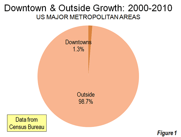
    There was population growth in 33 downtown areas out of the 51 major metropolitan areas. As is typical for core urban measures, nearly 80 percent of this population growth was concentrated in the six most vibrant downtown areas, New York, Chicago, Philadelphia, Washington, Boston and San Francisco.

    If the next six fastest-growing downtown areas are added to the list (Dallas-Fort Worth, Houston, Los Angeles, Portland, San Diego and Seattle), downtown growth exceeds the national total of 205,000 people, because the other 39 downtown areas had a net population loss. Overall, the average downtown area in the major metropolitan areas grew by 4000 people between 2000 and 2010. That may be a lot of people for a college lacrosse game, but not for a city. While in some cases these increases were substantial in percentage terms, the population base was generally small, which was the result of huge population losses in previous decades as well as the conversion of old disused office buildings, warehouses and factories into residential units.

    Trends in the Larger Urban Cores: The downtown population gains, however, were not sufficient to stem the continuing decline in urban core populations. Among the 51 major metropolitan areas, the aggregate data indicates a loss of population within six miles of city hall. In essence, the oasis of modest downtown growth was more than negated by losses surrounding the downtown areas. Virtually all the population growth in the major metropolitan areas lay outside the six mile radius core, as areas within the historical urban core, including downtown, lost 0.4 percent.

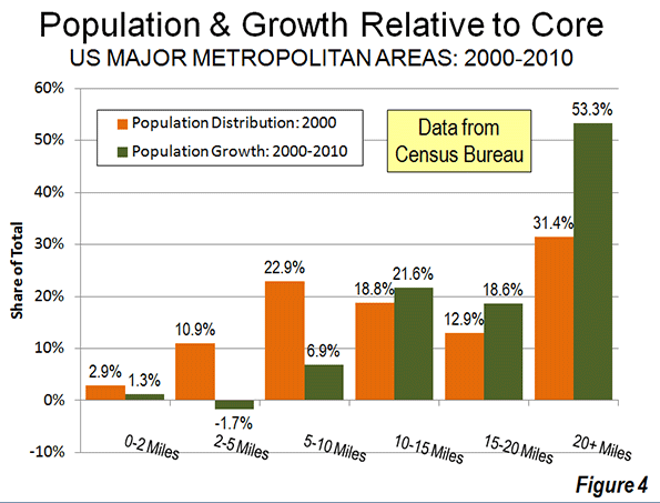
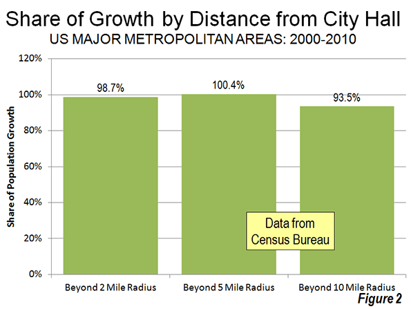
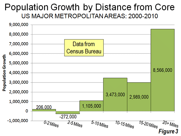
    Even when the radius is expanded to 10 miles, the overwhelming majority of growth remains outside. Approximately 94 percent of the aggregate population growth of the major metropolitan areas occurred more than 10 miles from downtown (Figure 2). Figure 3 shows that more than one-half of the growth occurred 20 miles and further from city hall. Further, the population growth beyond 10 miles (10-15 mile radius, 15-20 miles radius and 20 mile and greater radius) from the core exceeded the (2000) share of population, showing the continuing dispersal of American metropolitan areas (Figure 4).
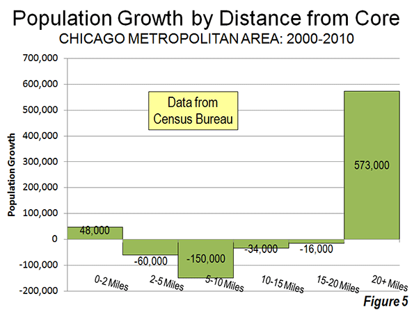
    Chicago: The Champion? The Census Bureau press release highlights the fact that downtown Chicago experienced the largest gain in the nation. Downtown Chicago accounted for 13 percent of the metropolitan area’s growth with an impressive 48,000 new residents. However, while downtown Chicago was prospering, people were flocking away from the rest of the city. Within a five mile radius of the Loop, there was a net population loss of 12,000 and a net loss of more than 200,000 within 20 miles (Figure 5). Only within the 36th mile radius from city hall is there a net population gain.
    Cleveland: Comeback City and Always Will Be? In view of Cleveland’s demographic decline (down from 915,000 in 1950 to 397,000 in 2010), any progress in downtown Cleveland is welcome. But despite the frequently recurring reports, downtown Cleveland’s population growth was barely 3,000. Despite this gain, the loss within a 6 mile radius was 70,000 and 125,000 within a 12 mile radius. Beyond the 12- mile radius, there was a population increase of nearly 55,000, which insufficient to avoid a metropolitan area population loss.

    Other Metropolitan Areas: A total of 30 major metropolitan areas suffered core population losses, despite the fact that many had downtown population increases.

    • Five major metropolitan areas suffered overall population losses (Buffalo, Cleveland, Detroit, Pittsburgh and Katrina ravaged New Orleans).
    • St. Louis, with a core city that holds the modern international record for population loss (from 857,000 in 1950 to 319,000 in 2010), experienced a population decline within a 27 mile radius of city hall. Approximately 150 percent of the growth in the St. Louis metropolitan area was outside the 27 mile radius. Even so, there was an increase of nearly 6,000 in the population of downtown St. Louis.
    • There were population losses all the way out to a considerable distance from city halls in Memphis (16 mile radius), Cincinnati (15 mile radius) and Birmingham (14 mile radius). The three corresponding downtown areas also lost population.
    • Despite having one of the strongest downtown population increases (12,000), population declined within a 10 mile radius of the Dallas city hall. This contrasts with nearby Houston, which also experienced a strong downtown increase (10,000) but no losses at any radius of the urban core.
    • Milwaukee experienced a small downtown population increase (2,000), but had a population loss within an11 mile radius.

    The other 21 major metropolitan areas experienced population gains throughout. Even so, most of the growth (77 percent) was outside the 10 mile radius. San Jose had the most concentrated growth, with only 24 percent outside a 10 miles radius from city hall. All of the other metropolitan areas had 60 percent or more of their growth outside a 10 mile radius from city hall.

    As we have observed before, 2000 to 2010 was, unlike the 1970s and other decades, more friendly to the nation’s core cities, although less so than the previous decade. Due to the repurposing of old offices and other structures, sometimes aided by subsidies, small downtown slivers may have done better than at any time since before World War II. But the data is clear. Suburban growth was stronger in the 2000s than in the 1990s. The one percent flocked to downtown and the 99 percent flocked to outside downtown.

    Population Loss Radius: Major Metropolitan Areas
    Miles from City Hall of Historical Core Municipality*
    Major Metropolitan Areas (Over 1,000,000 Population Share of Metropolitan Growth Population Loss Radius (Miles)
    "Outside Downtown" (2- Mile Radius) Outside 5-Mile Radius Outside 10-Mile Radius
    MAJOR METROPOLITAN AREAS: TOTAL 98.7% 100.4% 93.5% 6
    Atlanta, GA 99.6% 101.1% 99.9% 9
    Austin, TX 98.1% 96.7% 81.9% 0
    Baltimore, MD 106.5% 118.7% 99.5% 9
    Birmingham, AL 104.2% 132.5% 124.9% 14
    Boston, MA-NH 90.8% 76.9% 67.3% 0
    Buffalo, NY Entire Metropolitan Area Loss
    Charlotte, NC-SC 99.1% 97.4% 75.0% 3
    Chicago, IL-IN-WI 86.7% 103.3% 144.6% 35
    Cincinnati, OH-KY-IN 105.1% 126.8% 135.2% 15
    Cleveland, OH Entire Metropolitan Area Loss
    Columbus, OH 100.5% 104.3% 86.9% 7
    Dallas-Fort Worth, TX 99.0% 101.0% 100.7% 10
    Denver, CO 98.0% 100.3% 89.8% 5
    Detroit,  MI Entire Metropolitan Area Loss
    Hartford, CT 99.2% 92.7% 67.2% 0
    Houston, TX 99.2% 99.5% 98.0% 0
    Indianapolis. IN 102.1% 112.1% 89.6% 8
    Jacksonville, FL 100.2% 106.3% 85.3% 8
    Kansas City, MO-KS 99.5% 109.0% 113.3% 12
    Las Vegas, NV 101.4% 98.0% 63.6% 4
    Los Angeles, CA 97.3% 102.2% 97.6% 8
    Louisville, KY-IN 102.5% 108.5% 90.9% 8
    Memphis, TN-MS-AR 101.2% 118.5% 143.5% 16
    Miami, FL 99.4% 93.0% 91.3% 0
    Milwaukee,WI 95.9% 109.0% 107.5% 11
    Minneapolis-St. Paul, MN-WI 97.4% 99.2% 100.1% 7
    Nashville, TN 100.0% 101.4% 92.4% 7
    New Orleans. LA Entire Metropolitan Area Loss
    New York, NY-NJ-PA 93.5% 81.7% 68.9% 0
    Oklahoma City, OK 100.1% 96.8% 83.5% 2
    Orlando, FL 99.7% 99.4% 84.2% 0
    Philadelphia, PA-NJ-DE-MD 92.6% 98.8% 96.3% 7
    Phoenix, AZ 100.7% 101.8% 93.6% 6
    Pittsburgh, PA Entire Metropolitan Area Loss
    Portland, OR-WA 95.0% 91.5% 62.7% 0
    Providence, RI-MA 96.2% 91.7% 70.1% 0
    Raleigh, NC 99.6% 93.0% 67.7% 0
    Richmond, VA 95.7% 91.7% 70.2% 0
    Riverside-San Bernardino, CA 99.5% 97.2% 85.8% 0
    Rochester, NY 146.9% 149.3% 82.5% 9
    Sacramento, CA 99.9% 94.4% 79.5% 0
    Salt Lake City, UT 98.9% 95.1% 84.1% 0
    San Antonio, TX 101.1% 102.5% 86.7% 7
    San Diego, CA 96.3% 94.1% 90.1% 0
    San Francisco-Oakland, CA 90.7% 87.6% 82.2% 0
    San Jose, CA 95.1% 79.1% 24.3% 0
    Seattle, WA 96.5% 91.9% 81.4% 0
    St. Louis,, MO-IL 94.8% 119.7% 148.9% 27
    Tampa-St. Petersburg, FL 98.6% 97.8% 83.7% 0
    Virginia Beach-Norfolk, VA-NC 93.1% 90.1% 82.3% 0
    Washington, DC-VA-MD-WV 97.5% 94.5% 87.9% 0
    Calculated from Census Bureau data
    *Except in Virginia Beach-Norfolk, Where Virginia Beach is used


    ——-

    Notes:

    Population Weighted Density: In its report, the Census Bureau uses "population-weighted density," rather than average population density to compare metropolitan areas. The Census Bureau justified this use as follows:

    "Overall densities of CBSAs can be heavily affected by the size of the geographic units for which they are calculated. Metropolitan and micropolitan statistical areas are delimited using counties as their basic building blocks, and counties vary greatly across the country in terms of their geographic size. With this in mind, one way of measuring actual residential density is to examine the ratio of population to land area at the scale of the census tract, which—of all the geographic units for which decennial census data are tabulated—is typi­cally the closest in scale to urban and subur­ban neighborhoods".

    The Census Bureau rightly points out the problem with comparing metropolitan area density. However, it is a problem of the federal government’s making, by virtue of using metropolitan area building blocks (counties) that are sometimes too large for designation of genuine metropolitan areas. These difficulties have been overcome by the national census authorities in Japan in Canada, for example, where smaller building blocks are used (such as municipalities or local government authorities).

    Further, the Census Bureau already has a means for measuring population density at the census tract level, which is "the closest in scale to urban and suburban neighborhoods." This is the urban area.

    "Population-weighted density" is an interesting concept that can provide an impression of the density that is perceived by the average resident of the metropolitan area. Unfortunately, in its report, the Census Bureau is less than precise with its terminology and repeatedly fails to modify the term density with the important "population-weighted" qualification. This could lead to considerable misunderstanding.

    The Census Bureau did not provide average population densities based for the mileage radii. Because of large bodies of water (such as Lake Michigan in Chicago can reduce land areas, it was not possible to estimate population densities by radius.

    Census Bureau Revision of Incorrect Report: We notified the Census Bureau of errors in its press release and report on September 27. The problems included substitution of San Francisco population data for Salt Lake City as well as metropolitan population in the supporting spreadsheet file. On September 28, the Census Bureau issued a revised press release and report to rectify the errors. Later the erroneous spreadsheet was withdrawn and had not been re-posted as of October 1. We have made corrections to the spreadsheet for this analysis.

    Note: Larger "Downtown" Populations in Smaller Metropolitan Areas: Because of the broad 2-mile radius measure used by the Census Bureau, most of the population increase characterized as relating to downtown occurred outside the major metropolitan areas. This is simply because in smaller metropolitan areas, such an area (12.6 square miles) will necessarily contain a larger share of the metropolitan area. Further, many smaller metropolitan areas are virtually all suburban and had experienced little or no core population losses over the decades that have been so devastating to many large core municipalities. On average, 2.7 percent of the population of major metropolitan areas was within a two-mile radius of city hall in 2010. By comparison, in smaller metropolitan areas, approximately 12.7 percent of the population was within a two mile radius.

    Photograph: Chicago Suburbs: (where nearly all the growth occurred), by author
  • The Hollow Boom Of Brooklyn: Behind Veneer Of Gentrification, Life Gets Worse For Many

    After a decade of increasingly celebrated gentrification, many believe Brooklyn — the native borough of both my parents — finally has risen from the shadows that were cast when it became part of New York City over a century ago.  Brooklyn has gotten “its groove back” as a “post-industrial hotspot,” the well-informed conservative writer Kay Hymowitz writes, a perception that is echoed regularly by elements of a Manhattan media that for decades would not have sullied their fingers writing about the place.

    And to be sure, few parts of urban America have enjoyed a greater public facelift — at least in prominent places — than New York’s County of Kings, home to some 2.5 million people. The borough is home to four of the nation’s 25 most rapidly gentrifying ZIP codes, notes a recent Fordham study. When you get a call from the 718 area code these days, it’s as likely to be from your editor’s or investment bankers’ cell as from your grandmother.

    Yet there’s a darker side to the story. This became clear to me not long ago when driving with my wife and youngest daughter to a friend’s house in the Ditmas Park section of Flatbush, one of the finest exemplars of urban renaissance in the country. We encountered a huge traffic jam on the Belt Parkway, so we exited on Linden Boulevard. For the next half hour we drove through an expanse of poverty, public housing and general destitution that hardly jibes with the “hip, cool” image Brooklyn now projects around the world.

    A look at the numbers shows this was not an isolated experience. Despite the influx of hipsters and high-income sophisto professionals, Brooklyn is home to one of New York State’s poorest populations, with over one in five residents under the official poverty line, roughly 50 percent above the state average. This likely understates the problem since the cost of living in the borough is now the second-highest in the nation to Manhattan, surpassing even high-tone San Francisco.

    Overall, despite some job gains, the borough’s unemployment rate stood at 11 percent this summer, up from 9.7 percent a year ago and well above the national average. Much of recent job growth has been in lower-wage industries, notes Martin Kohli, chief regional economist with the Bureau of Labor Statistics in New York City. Despite a much celebrated start-up scene, some 30,000 of the 50,000 jobs created since the recession have been in the generally low-wage health care and social assistance sector, with another 9,000 in the hospitality industry.

    Poverty citywide, meanwhile, has been rising for three years running and the real Brooklyn, roughly half non-white, remains surprisingly poor. Brooklyn’s median per capita income in 2009 was just under $23,000, almost $10,000 below the national average.

    So what’s going on here? Urban historian Fred Siegel, a longtime Brooklyn resident, sees a classic tale of two cities. “Brownstone and Victorian Brooklyn is booming,” he says, due in part to uncle Ben Bernanke‘s inflationary policies, which have bailed out the Wall Street banks whose profits are the bedrock of New York City’s prosperity. This money has now spread to those parts of “Manhattanized” Brooklyn closest to the core of the Big Apple, with bankers, lawyers and the like opting to settle in more human-scale neighborhoods.

    But lower middle-class Brooklyn “is pockmarked with empty stores,” Siegel notes. With its once robust industrial- and port-based economy shrunken to vestigial levels, opportunities for Brooklynites who lack high-end skills or nice inheritances are shrinking. Some other areas, like Bensonhurst and Sheepshead Bay, have been revived through immigration.

    Jonathan Bowles, president of the New York-based Center for an Urban Future, sees a divide between, on the one hand, “the creative class” and some immigrant neighborhoods, and on the other, “the concentrated poverty” in many other struggling areas like Brownsville (where my mother grew up) and East New York. “There are clearly huge swaths of Brooklyn where you don’t see gentrification and there won’t be anytime soon,” Bowles observes.

    Part of the problem is structural. Many of Brooklyn’s working-class commuters — particularly in the eastern end of the borough — depend on a transit system designed to funnel people into the giant office clusters of Manhattan. Those left looking for work in the borough, often in low-paid service jobs, face long commutes or have to get a car, a big expense in a city with ultra-high rents, taxes and insurance costs.

    Mayor Michael Bloomberg’s administration identifies itself closely with Manhattan’s “luxury city” economy. Focused on finance, media and high-end business services, this approach does not offer much to blue-collar Brooklyn. New York over the past decade has suffered among the worst erosions of its industrial base of any major metropolitan area. Brooklyn alone has lost 23,000 manufacturing jobs during that time.

    Inequality in the Bloombergian “luxury city” is growing even faster than in the nation as whole. In fact, the gap between rich and poor is now the worst in a decade. New York’s wealthiest one percent earn a third of the entire city’s personal income — almost twice the proportion for the rest of the country.

    So while artisanal cheese shops serve the hipsters and high-end shops thrive, one in four Brooklynites receives food stamps.

    We see similar patterns across even the most vibrant of the nation’s urban regions. San Francisco gets richer with trustifarians, hedge fund managers and, for now at least, social media firms. Yet Oakland, just across the bay, suffers severe unemployment, rising crime and high vacancies. The cool bars and restaurants frequented by the creatives get the media attention, but as demographer Wendell Cox notes, roughly 80 percent of the population growth in the nation’s largest cities over the past decade consisted of people living below the poverty line.

    High costs and regulatory burdens make changing this reality ever more difficult; what can be borne by Manhattan or an upscale Brooklyn neighborhood like Park Slope can devastate a grittier locale like East New York. A well-heeled banker or trust-funder may find the costs of higher taxes and regulation burdensome but still relatively trivial; such factors more strongly impact a struggling immigrant entrepreneur, or a small manufacturer, construction firm or warehouse operation. Upzonings and subsidies for real estate developers — such as those around the new Nets arena — tend to work to the benefit of high-end chains, rather than smaller, often minority-owned businesses.

    Finally for all the talk, in Brooklyn and elsewhere, of a “great inversion” sending the well-to-do to cities, and what my mother would call shleppers to the suburbs, this is not the reality. Immigration and new births have supported Brooklyn’s population numbers, up 40,000 over the past decade, but as rapid outflow of Brooklynites has continued: over 460,000 more residents left than other New Yorkers or Americans moved in between 2001 and 2009, the largest loss of any borough.

    These phenomena can be seen in almost every American city; anyone traveling from west Los Angeles to the east side can see the divide between the posh shops and restaurants nearer the beach and greater commercial vacancies, abandoned factories and empty offices further inland. That this is happening as well in “booming” Brooklyn is rarely acknowledged, but worth confronting. We need to learn not only how to hype “hip” cities, but think about how to restore them as aspirational places for those who aren’t members of the privileged and cool set.

    Joel Kotkin is executive editor of NewGeography.com and is a distinguished presidential fellow in urban futures at Chapman University, and contributing editor to the City Journal in New York. He is author of The City: A Global History. His newest book is The Next Hundred Million: America in 2050, released in February, 2010.

    This piece originally appeared in Forbes.

    Brooklyn row houses photo by Bigstock.

  • A Look at Commuting Using the Latest Census Data

    Continuing my exploration of the 2011 data from the American Community Survey, I want to look now at some aspects of commuting.

    Public Transit

    Public transit commuting remains overwhelmingly dominated by New York City, with a metro commute mode share for transit of 31.1%. There are an estimated 2,686,406 transit commuters in New York City. All other large metro areas (1M+ population) put together add up to 3,530,932 transit commuters. New York City metro accounts for 39% of all transit commuters in the United States.

    If one were to guess the #2 city for transit commuting, another older, pre-auto, centralized city on the lines of New York (say Chicago) might be the obvious guess. It would also be wrong. It’s actually Washington, DC that has the second highest transit commute share among large metros at 14.8%. Here’s the complete top ten:

    Rank

    Metro Area

    2011

    1

    New York-Northern New Jersey-Long Island, NY-NJ-PA

    2,686,406 (31.1%)

    2

    Washington-Arlington-Alexandria, DC-VA-MD-WV

    439,194 (14.8%)

    3

    San Francisco-Oakland-Fremont, CA

    299,204 (14.6%)

    4

    Chicago-Joliet-Naperville, IL-IN-WI

    503,535 (11.6%)

    5

    Boston-Cambridge-Quincy, MA-NH

    267,568 (11.6%)

    6

    Philadelphia-Camden-Wilmington, PA-NJ-DE-MD

    251,285 (9.3%)

    7

    Seattle-Tacoma-Bellevue, WA

    137,858 (8.1%)

    8

    Portland-Vancouver-Hillsboro, OR-WA

    66,619 (6.3%)

    9

    Los Angeles-Long Beach-Santa Ana, CA

    355,811 (6.2%)

    10

    Baltimore-Towson, MD

    80,472 (6.1%)


    Not only are New York and Washington top two cities for public transit commuting, they are also the two cities that have been dominant in increasing transit’s market share. Both cities showed material share gains since 2000, over three and a half percentage points each, for transit. Among large cities, Seattle was the only one that managed to post a share gain of even one percent.

    Rank

    Metro Area

    2000

    2011

    Change in % of Workers Age 16 and Over

    1

    New York-Northern New Jersey-Long Island, NY-NJ-PA

    2,181,093 (27.4%)

    2,686,406 (31.1%)

    3.74%

    2

    Washington-Arlington-Alexandria, DC-VA-MD-WV

    278,842 (11.2%)

    439,194 (14.8%)

    3.61%

    3

    Seattle-Tacoma-Bellevue, WA

    106,784 (7.0%)

    137,858 (8.1%)

    1.17%

    4

    Orlando-Kissimmee-Sanford, FL

    12,601 (1.6%)

    24,901 (2.5%)

    0.91%

    5

    Hartford-West Hartford-East Hartford, CT

    15,755 (2.8%)

    21,794 (3.7%)

    0.91%

    6

    Charlotte-Gastonia-Rock Hill, NC-SC

    9,532 (1.4%)

    19,227 (2.3%)

    0.91%

    7

    San Francisco-Oakland-Fremont, CA

    278,207 (13.8%)

    299,204 (14.6%)

    0.81%

    8

    Los Angeles-Long Beach-Santa Ana, CA

    287,392 (5.6%)

    355,811 (6.2%)

    0.67%

    9

    Miami-Fort Lauderdale-Pompano Beach, FL

    67,685 (3.2%)

    95,536 (3.8%)

    0.61%

    10

    Nashville-Davidson–Murfreesboro–Franklin, TN

    5,574 (0.8%)

    10,705 (1.4%)

    0.55%


    Vaunted Portland only managed to eke out a share gain of 0.07%, which could be entirely statistical noise. Its performance lagged even auto-centric cities like Charlotte and Nashville.

    Bicycling

    Every city out there seems to be vying to be the bike friendliest city in the world. Yet bicycling has yet to make much of an impact on commuting. Only 7 out of 51 large metros even post 1% mode share for cycling:

    Row

    Geography

    2011

    1

    Portland-Vancouver-Hillsboro, OR-WA

    23,941 (2.3%)

    2

    San Francisco-Oakland-Fremont, CA

    38,419 (1.9%)

    3

    San Jose-Sunnyvale-Santa Clara, CA

    16,013 (1.9%)

    4

    Sacramento–Arden-Arcade–Roseville, CA

    15,804 (1.8%)

    5

    Austin-Round Rock-San Marcos, TX

    8,847 (1.0%)

    6

    New Orleans-Metairie-Kenner, LA

    5,307 (1.0%)

    7

    Phoenix-Mesa-Glendale, AZ

    18,007 (1.0%)

    8

    Seattle-Tacoma-Bellevue, WA

    15,949 (0.9%)

    9

    Denver-Aurora-Broomfield, CO

    12,052 (0.9%)

    10

    Los Angeles-Long Beach-Santa Ana, CA

    50,080 (0.9%)


    Portland grew bicycle mode share by 1.51% Perhaps this explains its poor transit performance. Cycling is canabalizing transit growth.

    Walking

    The low level of bicycling can perhaps best be illustrated by comparing it to walking. Even in Portland more people walk to work than ride bikes.


    Rank

    Metro Area

    2011

    1

    New York-Northern New Jersey-Long Island, NY-NJ-PA

    540,733 (6.3%)

    2

    Boston-Cambridge-Quincy, MA-NH

    121,537 (5.3%)

    3

    San Francisco-Oakland-Fremont, CA

    87,409 (4.3%)

    4

    Philadelphia-Camden-Wilmington, PA-NJ-DE-MD

    101,107 (3.7%)

    5

    Seattle-Tacoma-Bellevue, WA

    62,238 (3.7%)

    6

    Pittsburgh, PA

    36,857 (3.4%)

    7

    Portland-Vancouver-Hillsboro, OR-WA

    35,242 (3.4%)

    8

    Rochester, NY

    15,573 (3.2%)

    9

    Washington-Arlington-Alexandria, DC-VA-MD-WV

    94,698 (3.2%)

    10

    Chicago-Joliet-Naperville, IL-IN-WI

    134,399 (3.1%)


    Working from Home

    Looking at telecommuting gives a much different list of top cities, this one dominated by “wired” metros like Austin and Raleigh. The share of telecommuters in these cities is bigger than walking or biking, or even transit in many cities. This is an oft-overlooked part of the green transport agenda. The most green commute possible is the one you never have to make.

    Rank

    Metro Area

    2011

    1

    Austin-Round Rock-San Marcos, TX

    62,593 (7.1%)

    2

    Raleigh-Cary, NC

    37,030 (6.6%)

    3

    Portland-Vancouver-Hillsboro, OR-WA

    67,223 (6.4%)

    4

    San Francisco-Oakland-Fremont, CA

    131,029 (6.4%)

    5

    San Diego-Carlsbad-San Marcos, CA

    89,547 (6.3%)

    6

    Denver-Aurora-Broomfield, CO

    76,025 (5.9%)

    7

    Phoenix-Mesa-Glendale, AZ

    105,570 (5.8%)

    8

    Sacramento–Arden-Arcade–Roseville, CA

    52,143 (5.8%)

    9

    Atlanta-Sandy Springs-Marietta, GA

    132,979 (5.5%)

    10

    Seattle-Tacoma-Bellevue, WA

    87,839 (5.2%)


    Commute Times

    Unsurprisingly, large cities – including New York and Washington again at the top – feature the longest average commute times. Larger cities tend to have worse congestion and feature longer commutes. As transit commutes are generally longer than driving, the high transit mode share helps to drive up commute times in those cities.

    Rank

    Metro Area

    2011

    1

    New York-Northern New Jersey-Long Island, NY-NJ-PA

    34.9

    2

    Washington-Arlington-Alexandria, DC-VA-MD-WV

    34.5

    3

    Riverside-San Bernardino-Ontario, CA

    31.0

    4

    Chicago-Joliet-Naperville, IL-IN-WI

    30.9

    5

    Atlanta-Sandy Springs-Marietta, GA

    30.6

    6

    Baltimore-Towson, MD

    30.3

    7

    Boston-Cambridge-Quincy, MA-NH

    29.2

    8

    San Francisco-Oakland-Fremont, CA

    29.2

    9

    Los Angeles-Long Beach-Santa Ana, CA

    28.6

    10

    Philadelphia-Camden-Wilmington, PA-NJ-DE-MD

    28.5


    Whether New York might prefer a more auto-oriented layout in order to reduce commute times is a different matter. There’s no precedent for such a huge region having anything less than terrible congestion and commute times. And clearly New York would not be New York with such a radical change. The same forces that drive up commute times in places like New York and Washington are some of the same forces that sustain them as centers of elite economic production.

    Note: An early version of this piece contained an incorrect version of “Working from Home” table.

    Aaron M. Renn is an independent writer on urban affairs and the creator of Telestrian, a data analysis and mapping tool. He writes at The Urbanophile.

    Light trails photo by Bigstock.

  • The Road Less Understood

    The Economist confuses ends (objectives) and means in its current number examining the peaking of per capita automobile use in the West in two articles ("The http://www.economist.com/node/21563327" and "Seeing the Back of the Car"). In congratulating metropolitan areas for trying "to change the way people move around," The Economist reminds that Portland (Oregon) has developed light rail and that policy supports transit in Los Angeles. So much for the means, but what about the ends?

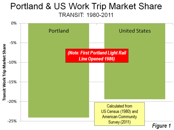
    In Portland: Transit Loses Ground and a Skeptical Public: Portland, for example, has had anything but stellar performance. Transit has not kept up with growth, having lost 25 percent of its commuting (work trip) share since before the first light rail line was opened in 1986 (Note 1). With five new light rail lines, transit in Portland not only fell short of attracting its previous bus only share of commutes, but also sustained losses greater than the national rate (Figure 1).

    The people of the Portland area may not share The Economist’s ardor. Just last week, The Oregonian headlined "Clackamas County anti-rail measure passes comfortably; effect could resonate for decades," reporting on a 60-40 vote to require referenda for future rail expenditures. As if that were not enough, a similar measure passed by a similar margin in King City, a municipality in Washington County and Tigard, one of the area’s largest municipalities, has placed the matter on the November ballot.

    But Portland does have a substantial success missed by The Economist. Working at home is growing rapidly. From 1980 to 2011, working at home (mostly telecommuting) increased by 55,000. This is more than three times the growth in rail transit commuting (17,500). During the last decade, working at home passed transit as a work access mode in Portland, and with virtually no public expenditures (as opposed to the billions for new rail lines). There has been a 375,000 increase in car use by one-way commuters since 1980, and, not surprisingly, a quadrupling of excess travel time in peak period traffic (based upon Texas Transportation Institute data). In the end, Portland built an extensive rail system and the riders have not come. Portland didn’t expand its highway system, and they came anyway (National 2010-2011 journey to work data is summarized here.).

    In Los Angeles: Long on Rail Lines, Short on Passengers: The Economist rightly points out that Los Angeles has implemented policies to get people out of cars. Indeed, Los Angeles has been the poster child for transit development. In little more than two decades, 11 metro, light rail, and suburban rail lines have been opened. Probably no metropolitan area in the world has opened more miles of new rail service in that period. Matthew Yglesias, writing in Slate was so impressed that he called Los Angeles "America’s next great mass transit city."

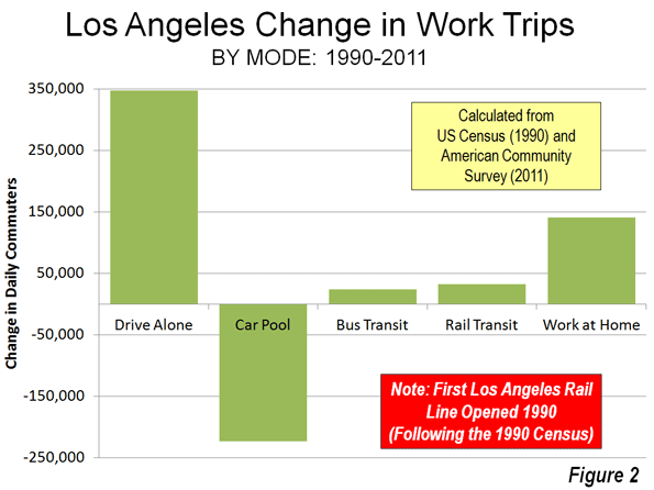
    The results are less convincing. The total daily one-way commutes on the 11 rail lines is only 32,000, smaller than the number of people carried daily on a single lane of the San Diego Freeway (I-405) where it crosses over Wilshire Boulevard. Meanwhile, working at home has risen more than four times that of rail commuting since 1990 (Figure 2). Los Angeles may be better described as “America’s next great telecommuting city." However, the auto is still king. From 1990 to 2011, solo automobile commuting increased 340,000, two percentage point gain, three times that of transit.

    Younger People: Driving More to Work and Telecommuting More

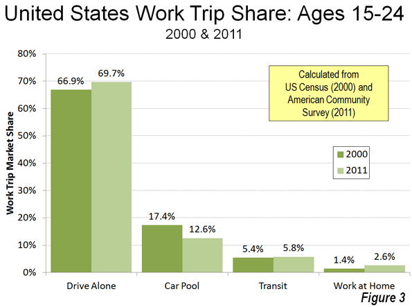
    The Economist also jumps on the "young people forsaking driving" bandwagon, a subject that has attracted the attention of others. But, young people are driving more, at least to work. Since 2000, the increase in driving alone to work by people aged 15 to 24 was nearly 260,000, compared to a 4,000 loss in transit commuting. Working at home was up almost as much as driving, at 200,000. Even so, with the declining size of the younger work force, transit’s share was up. From 2000 to 2011, the share of 15-24 year old workers rose from 5.4 percent to 5.8 percent (Figure 3), virtually the same as the overall increase in transit market share of from 4.6 percent to 5.0 percent (Note 2). As with Portland and Los Angeles, the last 11 years saw a much larger increase in working at home, from 3.3 percent to 4.3 percent.

    Further, to the extent working at home, social media and online shopping replace the need for driving among younger adults (and everyone), all the better.

    The Fantastical Claim: 50,000 Passengers Per Hour

    The Economist repeats the specious claim that rail lines can carry 50,000 passengers per hour in each direction. If your world is limited to Paris between Chatelet and Gare de Lyon and the handful of similar places, maybe so. But in most of the rest of the world, it is the stuff of fairy tales.

    The 2011 data shows the extent of the illusion.  The fantastical rail line carrying 50,000 per hour would carry the equal of all the daily rail commuters in Dallas or Miami in less than 20 minutes. It would take only about five minutes to handle the daily rail transit commuting volume in Minneapolis or Salt Lake City.

    Further, some of the new systems have been manifestly unsuccessful in attracting commuters. For example, in Charlotte, there was a strong increase in transit commuting between 2000 and 2011, with transit’s market share rising 64 percent. Yet, more than 60 percent of the new commuters were on buses, rather than on light rail, reflecting a long overdue increase in artificially low service levels. In Phoenix, 85 percent of the transit commuting increase was on buses, rather than the light rail line. The fantastical 50,000 per hour line would take only handle this load in about two minutes.

    Where Rail Works and Why

    None of this is to suggest that rail transit does not have its place. As I pointed out in a Hong Kong Apple Daily commentary, rail transit makes all the sense in the world where appropriate (see: "Hong Kong’s Rail Expansion: Avoiding Western Pitfalls"). Appropriate circumstances include huge central business districts with high employment density and radial rail transit service from throughout the metropolitan area. American Community Survey data indicates that just six municipalities (not metropolitan areas) account for 93 percent of the nation’s rail commuting destinations. The city of New York, alone is the destination of 65 percent of national rail commuters. Another 28 percent commute to the cities of Chicago, Philadelphia, Washington, Boston and San Francisco. Within these six cities, the overwhelming share of transit commuting is to the downtowns (central business districts), which, combined, cover a land area less than half the size of Orlando’s Disney World.

    Why Driving Has Peaked

    Alan Pisarski told us in 1999 "(Cars, Women and Minorities: The Democratization of Mobility in America") that the demand for driving would soon peak. Women were driving nearly as much as men and cars were becoming the dominant mode of transport for low income people. Cars already carry the overwhelming majority of low-income commuters. A "love affair with the automobile" mentality misled many who should have known better into believing that people would eventually drive 24 hours per day. In fact, the huge increase in driving to the 2000s was more about democratizing mobility and access, and as the Washington Times recently put it, prosperity (see "A world without cars:
    The internal-combustion engine has freed mankind"). If home-based access can take up the slack, it would do more for the environment and people’s lives than all the expensive, largely ineffective rail system imagined by the media and the well-financed rail lobby.

    ——

    Note 1: The data in this article is largely taken from the journey to work reports of the US Census (1980, 1990 and 2000) and the American Community Survey (one year data 2011).

    Note 2: The overall 5.0 percent transit market share figure may be high. The USDOT National Household Travel  Survey (NHTS) indicates that people who commute by transit tend to use other modes (such as automobiles) often. NHTS data indicates that, overall transit accounted for 3.7 percent of commuters and an even lower 2.7% of commuting miles in 2009.

    Photo: Harbor Freeway (I-110), Los Angeles (by author)

  • America’s Last Politically Contested Territory: The Suburbs

    Within the handful of swing states, the presidential election will come down to a handful of swing counties: namely the suburban voters who reside in about the last contested places in American politics.

    Even in solid-red states, big cities tilt overwhelmingly toward President Obama and the Democrats, and even in solid-blue ones, the countryside tends to be solidly Republican.

    What remains contested are the suburbs, which—despite the breathless talk in recent years of an urban revival—have accounted for 90 percent of metropolitan growth over the past decade.

    But as the suburbs have grown—in large part by collecting families priced out of cities or seeking more space or better schools—they’ve shifted from reliably Republican territory to contested turf. Barack Obama won 50 percent of the suburban vote in 2008, a better performance than either Bill Clinton or John Kerry.

    Obama’s success resulted from demographic changes sweeping the periphery of most major cities. Long derided by blue-state intellectuals as stultifying breeders of homogeneous white bread, the suburbs increasingly reflect and shape the country’s ethnic diversification. The majority of foreign-born Americans now live in suburbs, and many suburban towns—like Plano, Texas, outside Dallas; Cerritos, south of Los Angeles; and Bellevue, near Seattle—have become more ethnically diverse than their corresponding core cities. Among the metropolitan areas with the highest percentage of suburban minority growth are swing state regions Des Moines, Iowa; Milwaukee; and Allentown and Scranton, Pa.

    Minorities, according to a recent Brookings study now represent 35 percent of suburban residents, similar to their share of overall U.S. population.

    The suburbs of Las Vegas in hotly contested Nevada are now minority-majority, as the number of Latinos living there has shot up. Nationwide, well over 5 million Latinos moved to the suburbs during the past decade—and many more Latinos now live in suburbs than core cities. In the past, Hispanic suburbanites tended to vote somewhat more Republican than their urban counterparts. But this year, they appear to be solidly Democratic—as Latinos have been repelled by the GOP’s ugly embrace of nativism ,and drawn to Obama’s clever election-year move to offer effective amnesty to young illegal immigrants.

    Asians—another group that’s strongly favored Obama—have moved even more quickly into the suburbs. While many immigrants hail from some of the world’s densest cities, few immigrants come to America dreaming of a small apartment near a transit stop.

    “Many Asian immigrants today are bypassing the city entirely and going straight to suburban neighborhoods first to fulfill their version of the American dream,” says Thomas Tseng, a founding principal at New American Dimensions, a Los Angeles–based ethnic marketing and research firm.

    Over the past decade the Asian population in suburbs has grown at nearly four times the rate of that in cities, with 2.7 million more Asians in suburbia compared to 770,000 in the core cities. In the northern Virginia suburbs around Richmond, the number of Asian suburbanites has doubled, as it has in the suburbs around Columbus and Cincinnati. The Asian suburban population nearly tripled in the Raleigh area and doubled around Charlotte. Even in Florida, there are now well more than 100,000 more Asians in the suburbs of the Sunshine State’s four major cities—Miami, Jacksonville, Orlando, and Tampa—than there were a decade ago.

    Obama also will likely receive significant backing from white professionals, who tend to cluster in the suburbs of cities such as Columbus or around Washington, D.C. Virtually all the 10-best educated counties in America are suburban; seven are in the greater Washington area. The fact that many of these professionals work directly or indirectly for the federal government that Obama has expanded dramatically will only help him in his bid to remain in the White House.

    So what about Romney? He’s clearly a product of the suburbs, growing up in the tony periphery of Detroit and now living in leafy Belmont, Mass., a comfy close-in commuter suburb that has seen little population growth since 1950.

    In the primaries, Romney did well in suburbs, particularly upper-class ones, and those voters played a critical role in putting him over the top against Rick Santorum.

    Romney continues to score roughly 50 percent support in polls with voters making at least $100,000, a group that tends to live in affluent commuter towns ringing cities. But to win, the Republican needs to reproduce his party’s wave of 2010, when they captured roughly 55 percent of the suburban vote on their way to retaking the House. But can Romney reach beyond his classic country-club GOP base to the middle- and working-class swing state suburban voters?

    On paper, he should do well in lower density suburban areas, in large part because they tend to have far larger concentrations of married families with children, a group that tilts Republican. But despite his own family, he’s been overshadowed by Obama’s better-marketed, albeit far smaller, domestic unit.

    Romney also may be missing a chance to appeal to suburbanites on the contentious issue of “smart growth.” Opposition to suburban housing has become a favorite cause among Democratic politicians, and widely praised by the Manhattan-centric national media.

    But Romney, in his term as governor of Massachusetts, was a classic patrician corporate modernizer, showing a penchant for the kind of planning that uses strict growth controls to constrain suburban expansion.

    In this sense Romney resembles other politicians from the gentry class—such as Al Gore, Arnold Schwarzenegger, and John Kerry—who, in the name of “rational” societal objectives, make it harder for middling-class people to achieve the suburban dream they’ve taken for themselves.

    So while they represent the majority of the nation, suburban voters have no real champion in this election. Taken for granted by conservatives and betrayed by Wall Street, they have few friends in high places—except at election time. They are also increasingly detested by progressives, a long way from the days when Bill Clinton keyed in on “soccer moms.” Instead the suburbs have evolved into a shapeless political lump, divided by income and race, cultural conflict, and regional rivalries.

    On balance, this all works to the president’s favor. If Obama can manage anything close to a split in suburbia, as he did in 2008, he will surely win a second term. Such a loss, at a time of economic hardship, may be enough to force even the dullards of the GOP back to the drawing board to confront their inability to win over enough of the suburban voters (homeowners, small businesspeople, parents of any races)—who should provide the GOP an electoral majority, but so far are not.

    Joel Kotkin is executive editor of NewGeography.com and is a distinguished presidential fellow in urban futures at Chapman University, and contributing editor to the City Journal in New York. He is author of The City: A Global History. His newest book is The Next Hundred Million: America in 2050, released in February, 2010.

    This piece originally appeared in The Daily Beast.

    Suburbs photo by Bigstock.

  • Rethinking Brand Chicago

    So many Midwest places flail around looking for a brand image or identity. Not Chicago. In fact, the identity and stories of Chicago overflow the page. They are too numerous to be written in a mere blog posting.

    Yet Chicago has in effect decided to jettison that powerful, historic brand identity in favor of a type of global city genericism. This, I believe, is a mistake.

    One trend you can’t help but notice if you travel is the increasing homogenization of the urban culture and standard of urban development. Global markets demand standardized commodities that can be graded and traded. This includes cities. This forces cities increasingly into a standard model of what one expects.

    I’ve written in the past about the example of the Wallpaper guides to world cities. These travel guides, ostensibly a guide for the modern, sophisticated urban traveler to the best of each globally elite locale, often seem identical except for the name on the spine. One modern boutique hotel, one swank restaurant or bar, one fashion outlet, one bike share program, one piece of starchitecture is much the same as another in any city you visit around the world. The frosting might be different, but the cake is the same. And once you’re commoditized, you’re done.

    So it is too with Chicago. I noted in my review of the city’s street lighting what appears to be a deliberate downplaying of the city’s rough-edged, masculine past in favor of a feminized, generic, even suburban motif. You see this repeated throughout.

    It’s truly incredible. Travel anywhere in the world in mention that you’re from Chicago, and immediately the other person will mime a couple of pistols with their fingers and say, “Bang! Bang!” This is a sore spot with many local leaders, who hate the notion that it is still known more for gangsters than glitter. The city over the years has so tried to suppress its Al Capone heritage that it has obliterated many historic sites related to the mob. It’s like the city that wants to pretend it doesn’t exist.

    This sadly makes Chicago like all too many smaller cities that suppress their strongest brand assets out of embarrassment and a desire to be taken seriously by members of the cool kids club. Go talk to urban boosters in Indianapolis, and you probably won’t hear much about the Indy 500, for example. So too it is with Chicago. It’s as if to prove it’s a member of the club – i.e., is exactly like every other cool city – Chicago has to ignore its gritty past and essential culture.

    A friend of mine likes to say that “Chicago is a city that runs on testosterone.” It’s a rugged, manly city, a place where it was said high culture was just the ransom rich men paid to their waves. A place where people wore their shoe leather out trying to make a buck. The land of the hustler. A place of bellowing blast furnaces and brawny immigrants. A place where pedigree didn’t matter and crazy newcomers, dreamers, schemers, and gamblers could win or lose big. A place with audacious ambition and a relentless determination to demolish rivals, whether that be Cincinnati, St. Louis, or Milwaukee. A place that once dreamed to dethroning New York. A place of limitless imagination and inventiveness that brought us everything from the skyscraper to the futures market. A place with music like the blues made for and by the hard luck working man. And yes, a place of gangsters and crooked politicians.

    None of that is part of new Chicago, at least not the image the city wants to portray. The iconic architecture remains, but it has been drained of its cultural content. Listen to what the city tries to project of itself and see what it says. It says that Chicago has become just another way-station along the global city parade. Starchitecture (no longer architecture made in Chicago for the most part), microbrews and microroasts, culinary delights, high culture, boutique hotels, great shopping, bike infrastructure, digital startups (the exact same type every other “hub” is bragging about), music festivals by and for the high end educated hipster, global conferences, etc. Almost every box is checked, with a few exceptions like fashion and media as I highlighted earlier.

    All of this is good in a way and proof of a transformation in Chicago that is in many ways for the better. But something has been lost along the way. These items are all disconnected from the city in which they happen to reside. It’s as if they descended on the place out of the heavens like that flying saucer on top of Soldier Field. Drawing Room mixologist Charles Joly may have a Chicago flag tattooed on his arm, but his bar could be located anywhere.

    Saskia Sassen has written that the economies of global cities are not generic but are inherently linked to their histories. Chicago in the past was a great center of manufacturing, for example, and today is expert at providing global services to manufacturers. But where in underlying economic reality there may be distinctiveness, on the surface there is more homogenization. This may explain why people tend to assume all global cities are alike. To a visitor staying in the central core, the experience may well be quite similar in many ways.

    What’s more, the aspiration seems to be generic. The idea, again, is to demonstrate that you are part of the club by focusing on replicating all the same stuff everybody else is already doing and talking about yourself in much the same way. I’ve seen little in Chicago’s branding or global city rhetoric that is much different from anywhere else.

    Yet the differences remain, especially outside the rarefied precincts of the global elite. And much of that continues to inspire embarrassment to this day. Corruption and cronyism seem to continue unabated, for example.

    Yet there is good as well. Ask yourself what more than anything epitomizes Chicago. To me, it is none other than former Mayor Richard M. Daley. Listen to him speak. Barack Obama he is not. But character he had, lots of it, and what’s more, a fanatical dedication to making Chicago the best city it could possibly be. Was there a lot of corruption in Daley’s Chicago? No doubt. Did he desire to have maximum power over politics in his city? Of course. But nevertheless I get the impression of, as I said in my last piece, a guy who every morning wakes up and asked himself, “What can we do today to make Chicago a greater city?” This is a quality of leadership all too lacking in most Midwestern cities. The character of Chicago and the character of Mayor Daley himself seem to me to have so much in common.

    Ironically, under Mayor Daley, the city pursued that policy I mentioned of abandoning its past, of abandoning the image of the city as evidenced by the mayor himself. You walk down Michigan Ave., through Millennium Park, around the newly thriving neighborhoods, and you expect that city to be led by a Dr. Smooth type character, not a blunt, plainspoken man like the Mayor. But if only he had seen the value in a city that presented a face like his own. A city not ashamed but proud of its rough and tumble edge, of the fact that it was where generations of ne’er-do-wells and hustlers came to wear out their shoe leather trying to make it big, a city that both Al Capone and Paddy Bauler thought not ready for reform, a city that drew generations of farm boys off to its earthly delights, a city from Bridgeport not the Gold Coast. That’s Chicago. Not a genteel, refined metropolis, not a swank, sophisticated type of town, not a city on a hill. No, but a city of dreams nevertheless, where people came to get rich, to reinvent themselves, to change the course of world history. That’s Chicago.

    No, Chicago will never be the Chicago of Cyrus McCormick and Philip Amour and Aaron Montgomery Ward and all the rest. You can’t live off the past. That’s nostalgia and there’s no more corrosive force known to mankind. But you can know who you are, what you stand for, what your heritage is, and how it fits into the future. Not a clinging to the past, but letting your essential character be a guidepost to the future.

    The fifth Frank Gehry titanium Bilbao clone, the n-th swank restaurant or shop, the latest in Italian furniture – ultimately none of them will make Chicago Chicago. It’s going to take the real city, an expression of its own terroir and primal identity to do that.

    I happen to think Chicago can do it. If it changes course and gets way from following the trends to creating its own future. If it steps up and makes sure the world knows that Chicago, and not just yet another generic world city, is here, and determined to claim its rightful place.

    Chicago will only realize its potential for greatness if it is willing to let go of its insecurity and desire to be a member of the club, and dares once again to think of itself as it did back in the days of the Burnham Plan as a city destined to be the greatest in the world, a city proud of itself and not afraid to boldly chart its own course into the great unknown of the future.

    Is Rahm Emanuel is the person who can pull this off? He’s from the North Shore. He was a ballet dancer. He’s a man clearly most comfortable dealing with the elite. Yet he’s also got a rougher side. He’s supposedly Captain F-Bomb. He hates to lose. He mailed some dead fish to a someone once to show his displeasure with some polling. I’d say there’s more than a streak of authentic Chicago in there.

    Maybe the bigger question is whether he wants any change of course. The NATO Summit play suggests not. But it’s still early.

    I would strongly urge the city to rethink its brand and what it wants to be in the marketplace. Bottle up some that classic Chicago heritage and apply it liberally. This is a huge opportunity in the marketplace. With the vast bulk of cities trying to convince you they are all the same, this is in opportunity for Chicago to seize the advantage and stride forth with classic boldness and braggadocio, making other cities take real notice for a change. Want to actually put Chicago on the brand consciousness map? That’s the way to do it.

    In short, it’s time to stop aspiring to global city goo and instead give the world a punch in the face with a little old school Chicago.

    This is the fourth installment in my “State of Chicago” series. Read part one here, part two here, and part three here.

    Aaron M. Renn is an independent writer on urban affairs and the founder of Telestrian, a data analysis and mapping tool. He writes at The Urbanophile, where this piece originally appeared.

  • 2011 Census Sub-County Allocations Masquerade as Population Estimates

    This is by far the most difficult article I have ever had to write. I have been a fan of the US Bureau of the Census since I began following its numbers in the second grade. Much of my career has been spent analyzing these numbers and those of similar national statistical bureaus around the world. Yet, the 2011 sub-county estimates produced by the Census Bureau should never have been released, because they were not estimates, but they were rather "fair share" allocations of county population growth (or loss).

    Analysts believing the numbers to be estimates have spent considerable ink in explaining the results. Some articles noted that core cities were adding population faster than suburban areas, such as an article based on Brookings Institution research in The Wall Street Journal. Others, such as me noted that there was evidence of faster core growth in some metropolitan areas, but that core county migration data (the lowest geographical level available) continued to overwhelmingly show net domestic migration to the suburbs.

    In fact, however, it turns out that no-one knows that is happening to sub-county populations, in the historic cores or in the suburbs. Regrettably the results announced by the Census Bureau were virtually meaningless. This was revealed on newgeography.com by Chris Briem of the University of Pittsburgh just days after the release of the estimates. Briem reviewed the Census Bureau’s sub-county population estimation methodology for 2010-2011 and found that county populations had largely been allocated to sub-county jurisdictions based upon their share of the 2010 population. The result is that all sub-county jurisdictions in each country grew (or lost population) by nearly the same percentage. Obviously, this cannot be.

    Brownstown Charter Township: Rising Population in Reversal?

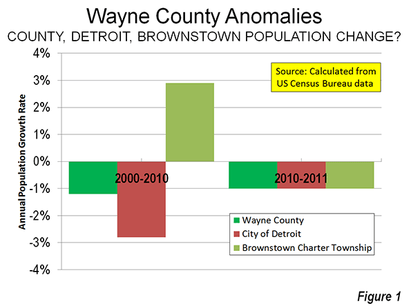
    This means, for example, that Brownstown Charter Township, a rare oasis of population growth (suburban or core city) in Wayne County, Michigan was apportioned virtually the same percentage population loss as occurred in the county. Like the city of Detroit, which since 1950 has managed to shed more people than live in all but two Canadian core cities, Brownstown is reported to have lost the same 1.0 percent that is reported to have occurred in the city and the county (Note). How different this is from the 2000s, when Brownstown grew an average of 2.9 percent annually, while Detroit lost 2.8 percent and Wayne County 1.3 percent annually (Figure 1). We hope Brownstown’s citizenry was not alarmed by this sudden turnaround.

    A One Year Change in Methodology

    The problem results because of a single year change in the way the Census Bureau estimates population below the County level. As the Bureau indicates in its methodology notes:

    "Our method of producing housing unit estimates is different this year than in years past. The Vintage 2011 housing unit estimates do not rely on the usual components of housing change (building permits, non-permitted builds, mobile home shipments, and housing loss), which we used last decade to produce the housing unit estimates. Instead, we created the Vintage 2011 estimates by extrapolating the average monthly change in housing units at the county level, then summing these estimates to create estimates for the states and nation. To produce subcounty housing unit estimates, we distributed the extrapolated county estimates down to each subcounty area within a county based on 2010 Census proportions."

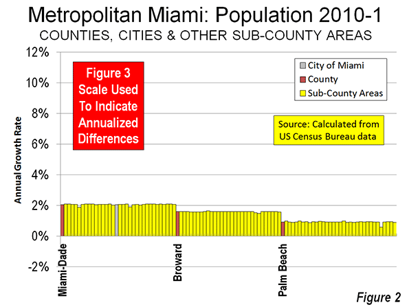
    The meaninglessness of the estimates is evident in examinations of two metropolitan areas where the core cities were reported to have grown faster than suburban areas, Miami and Orlando.

    Miami Metropolitan Area

    Figure 2 shows that in the Miami metropolitan area, the many cities and towns in the core Miami-Dade County grew at virtually the same population rate as the county overall. This means, for example, that the core city of Miami also grew at the same rate, according to the Census Bureau figures. The same thing can be seen in suburban Broward County, where all of the cities grew at virtually the same rate as the county as well as in Palm Beach County. From Figure 2, it can be seen that the estimates show the city of Miami could have grown faster than all the suburbs in Broward County and Palm Beach County, and at virtually the same rate as the suburbs and Miami-Dade County. No judgments can be made about relative population trends where estimates simply allocate the change base upon the base year distribution of population.

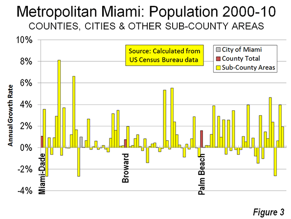
    Figure 3 indicates the extent to which this methodology varies with the more comprehensive "components of housing change" methodology previously used by the Census Bureau (above). These annual population increase rates, between 2000 and 2010 are for the very same sub-county jurisdictions in Figure 2. This kind of variation in population growth rate would be expected in any year, rather than the flat-lined Census Bureau allocations

    Orlando Metropolitan Area

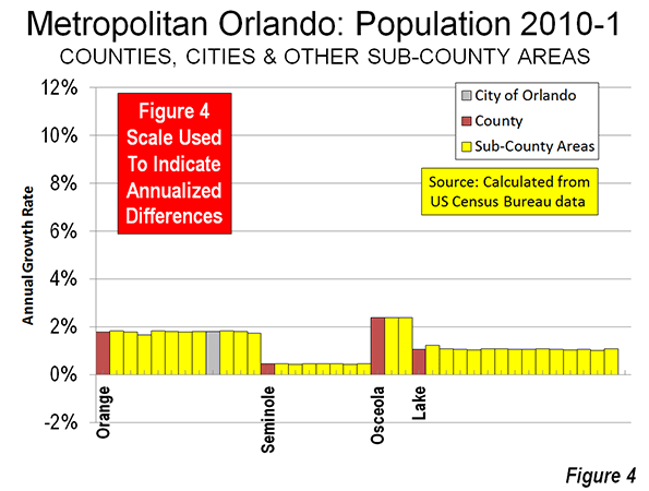
    Figure 4, covering the Orlando metropolitan area indicates the same situation. Each of the sub-county jurisdictions in the four metropolitan area counties is reported to have grown at approximately the same rate as its home county. Any conclusion that the city of Orlando grew faster than the suburbs, such as those in Lake and Seminole counties is invalid, since the city population growth is simply an allocation of the county growth.

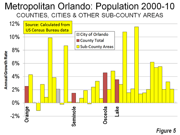
    Figure 5 shows of the annualized growth rate for the sub-county jurisdictions of the Orlando metropolitan area of between 2000 and 2011. Again, there was a huge variation in growth between the sub-county jurisdictions. A dispersion of growth rates would have had the "fair share" population estimation mythology been employed for 2010 to 2011.

    Justifying the One Year Change

    The Census Bureau indicates that it changed its methodology for the current estimation year because “we are presently evaluating the 2010 housing estimates relative to the 2010 Census results, and considering improvements to the existing housing unit method for the new decade." Fair enough. Calling allocations estimates, however, is not.

    Further, at least some at the Census Bureau perceive that these to be genuine estimates. The accompanying press release entitled "Texas Dominates List of Fastest-Growing Large Cities Since 2010 Census, Census Bureau Reports." Actually, the Census Bureau has no data on which cities grew the fastest between 2010 and 2011, nor does anyone else.

    Unfortunate Timing

    It is unfortunate that the Census Bureau determined to go forward with meaningless estimates at the very same time important statistical gathering programs such as the American Community Survey are under threat of defunding by the Congress.

    Beware: Make No Comparisons

    One of the purposes of sub-county population estimates is to provide information on the relative growth between jurisdictions. The estimates are also used in the Census Bureau’s challenge process, which allows cities to seek revision of their population estimates, leading to a greater allocation of federal funding. We assume that no population challenges will be accepted based upon these allocations. Indeed, based on the latest Census of Government counts, more than 35,000 municipalities and minor civil divisions would seem to have standing for challenges.

    Fortunately, there are plans to return to estimates rather than allocations for the 2012 round. The 2011 estimates should be withdrawn. Census Bureau should make it clear allocations did not represent genuine estimates of population change.

    We have redacted part of our article analyzing the 2011 sub-county population estimates.

    Postscript: Headline Illusions

    The misleading issue of historical core cities drawing people from suburban areas was raised anew by a recent article headlined "We’re In The Midst Of A Huge Migration From Suburbs To Cities" in The Business Insider. The article was attributed to Rolf Pendall, director of the Urban Institute Metropolitan Housing and Communities Policy Center, who said no such thing. Pendall’s article in Atlantic Cities was more appropriately headlined "The Next Big Question Facing Cities: Will Millennials Stay?" A good question.

    Wendell Cox is a Visiting Professor, Conservatoire National des Arts et Metiers, Paris and the author of “War on the Dream: How Anti-Sprawl Policy Threatens the Quality of Life.”

    —-

    Note:  There were minor variations in the second decimal digit of the growth rates because of the small group quarters portion (people in dormitories, prisons and other group housing) population change, for which the Census Bureau produced genuine estimates.

    Map photo by Bigstock.

  • The Rise of Telework and What it Means

    Teleworking (also known as telecommuting) has taken flight as a global trend. During July of 2002, European Union collectively decided on a shared framework agreement on telework, which regulates issues such as employment and working conditions, health and safety, training, and the collective rights of teleworkers. Following suit, the American the Telework Enhancement Act of 2010 served as a rallying call for federal agencies to encourage “work-at-home” employees. In the same year officials in China, eager to reduce gross national carbon emissions, chose the province of Hubei to undergo the country’s first telecommuting pilot program  

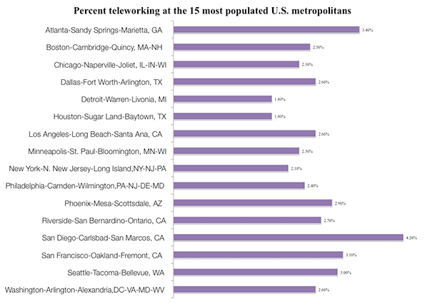
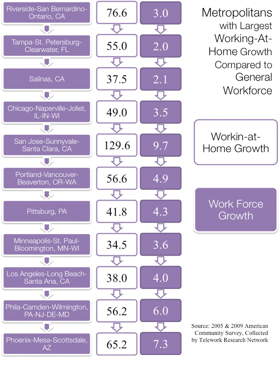
    In the United States, telecommuting is   on the clear increase.  Data from the American Community Survey estimate that the working at home population grew 61% between 2005 and 2009. The biggest increases in teleworking population compared to workforce was in Riverside-San Bernardino-Ontario, CA while the metro with the highest growth in teleworking was San Jose-Sunnyvale-Santa Clara, CA.


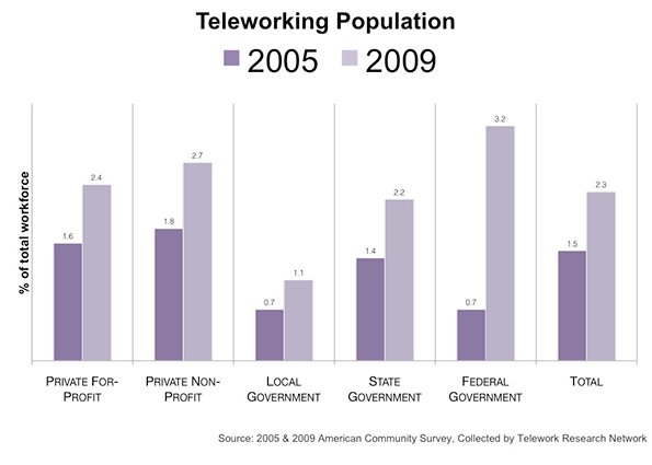
    Is the trend to telecommuting comparable between the private and public sectors? The 2009 American Community Survey gives a snapshot of the work-at-home population by class of worker in the years 2005 and 2009. Although the rise of teleworkers is across both sectors, a surge in government teleworkers indicates the public sector, notably the federal government, has made a huge effort keep staff at home to cut administrative costs.

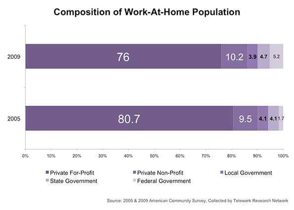
    After the federal government, the next largest increase in ratio of teleworkers is at the state level. Municipal government teleworkers showed the most modest growth and represent only 3.9% among those working at home. Though only 2.4% of private for-profit sector employees consider themselves teleworkers, by size alone they represent about three-fourths of the working-at-home population.

    Still, understanding of telework remains incomplete.   First, as President Obama’s Council of Economic Advisors stated in 2010, there remains a persistent “lack of data on the prevalence of workplace flexibility and arrangements which makes policy-making more difficult.” There are often ambiguities such as the issue of how to distinguish between part-time and full-time teleworkers. One also must separate paid work telework (such as an official flex-time work arrangement) from non-paid telework (such as a teacher grading papers at home during the weekend).   Telework’s definition is so broad that perceptions   can vary dramatically.

    New research attempts to bring clarity into whether employers should allow their employees to have a work-at-home option. Results from a recent study at Stanford partnered with Ctrip, an online travel-booking agency based in China, presented strong evidence to support the causal relationship between telework and productivity. With a turnover rate among Ctrip call center representatives hovering at around 50% per year (typical of the industry in China), retaining workers was a core objective of the experiment. Estimates by management say the typical costs of hiring and training a new representative is $2000, approximately 6 months of salary for an average employee.

    Despite initial doubt, the research provides stark insight on efficiency gains from telecommuting gains. An article from Slate summarizes the findings:

    Over the duration of the experiment, home workers answered 15 percent more calls, partly because each hour was 4 percent more productive, and partly because home office employees spent 11 percent more time answering phone calls. (Home workers took fewer breaks and sick days, rarely arrived late to their desks, and had fewer distractions.) … distractions of home life had no impact on the quality of service: The home-work group converted phone calls into sales at exactly the same rate as those in the office. And employees themselves liked the arrangement better… [and] reported less “work exhaustion,” a more positive attitude towards their jobs, and were nearly 50 percent less likely to say they were planning to quit at the end of the eight months.

    In the long run, telecommuting could generate massive changes in urban geography. As benefits of telework manifest in new research, city planners ought to observe how its impact on the geography of American cities.

    Teleworkers are more likely than not to live in the suburbs. Since teleworkers are often required to be tech-savvy with the latest mobile devices, one could expect a disproportionately high percentage of them working in hi-tech industries in sprawled tech hubs like the Silicon Valley. Most teleworkers choose to commute for a very practical reason: it would save them time and money. According to research by Kate Lister and Tom Harnish of the Telework Research Network, aside from housing preference the typical teleworker is a 49-year-old, college-educated, salaried, non-union employee in a management or professional role, earning $58,000 a year at a company with more than 100 employees. As of 2009, 76% of the total working-at-home population consists of the for-profit workers.

    Some industries will stay clustered around the city center but more jobs, especially service-oriented ones, will continue to migrate towards the suburbs.  

    Teleworking will increase the total amount of hours Americans work annually. Americans, infamous for overwork, can easily translate telework as “more work.” Data from the United Nations reports 86% of American males and 67% of American females working more than 40 hours a week. While technology has often been accused as a job-killer, it has also made jobs easier and, in some ways, more social. Employers using Cloud technology are utilizing personalized social networks in hopes of creating a more connected community in the work place. The point at which work begins and leisure ends is becoming increasingly hard to distinguish as hours spent “on the job” are elusive, and thus harder to limit.

    For urban planners, this signals new types of urban development to provide for a population of Americans that work longer hours but do so closer to home.  Food and retail establishments will be one of the first to address this trend. Coffee shops with Wi-Fi and casual dining franchises like Panera and Corner Bakery will become commonplace in middle-to-upper class suburban neighborhoods.

    These general locales could generate a privatized version of the Third Place, a milieu distinct from the two usual social environments of home and the workplace. Other urban innovations to anticipate include co-working offices, such as those offered by BLANKSPACES, and pay-as-you-go meeting services, like Liquidspace.

    The availability of affordable mobile technology has been the main contributor to the "any time, any place" lifestyle. Still, the trend is limited to a small percentage of American workers, mainly those that tend to work in service-oriented positions and, as the numbers in Silicon Valley suggest, in the service sector. As more interest and funding is directed towards nanotechnology and cloud networking, perhaps this lifestyle will propagate to become the new normal. If so, telework may someday be just a common way that people work that may change forever the urban landscape.

    Jeff Khau graduated from Chapman University with a degree in business entrepreneurship. Currently, he resides in Los Angeles where he is pursing his dual-masters in urban planning and public policy at the University of Southern California.

    Office or home signpost photo by Bigstock.

  • The Answer Is Urban Consolidation – What Was The Question?

    The New Zealand Green Party is perpetuating the claim that development beyond Auckland’s “city limits” imposes a high cost on ratepayers.  A spokesperson claims that the current Auckland plan, which allows for some new development outside the current urban area, “will cost ratepayers $42b billion to 2042, an annual levy of $200 per ratepayer” according to a report in the New Zealand Herald.   

    But is just so happens that study on which these calculations are based is a flawed commissioned report[1] rather than a peer reviewed academic study. 

    Oops – Contradictory Claims
    The authors of the Curtin report acknowledged at the outset that

    "The challenge …  is that infrastructure costs are so heavily dependent on area-specific values.  For instance, road costs among different prospective development areas may vary based on the necessity for major arterial roads, costs for sewerage and water infrastructure could vary immensely depending on terrain and trenching conditions, and many infrastructure components will differ depending on the level and degree of excess capacity” (p.4)

    So why did they try to develop a generic tool for estimating the cost of urban development in Australiancities based on a mishmash of evidence from different cities and suburbs in Australia and the United States?  And why would anyone even contemplate applying such “findings” to Auckland with its distinctive physical geography, so different from its Australian counterparts? 

    A Quick Critique
    The Productivity Commission actually considered the study, among others, in a brief review of housing costs and urban form (Appendix B of the final report).  It noted substantive differences in the physical and social settings behind the data assembled to support the study’s claim to some sort of universal cost relationship between development and distance from the city centre.

    And there are glaring methodological deficiencies:

    An obvious one is mixing discount rates (zero for infrastructure capital costs, 7% for transport-related costs, and 3% for health and emission costs), and omitting operating costs for some items (non-transport infrastructure) and not others (pp. 295-296)

    To these flaws can added the assumption of a cost of Aus$170/tonne for carbon emissions when the carbon floor price set by the Australian government (of $15) has since been rescinded and figures at or below $10.00 may be more appropriate based on today’s European prices.  So the environmental argument is seriously overstated.

    And the analysis fails to deal with the costs of expanding the capacity of ageing infrastructure in long-established urban areas, of remediating services designed for far lower loadings than they are now expected to sustain, of the health impacts of apartment living in an increasingly brown – not green – environment, and of reductions in the physical and social resilience of high density and often congested urban areas in the face of possible natural disasters or infrastructure failures.

    Penalizing the Household – is that Socially Sustainable, or Politically Justified? 
    Even if it can be proven that the balance of public benefits favours medium or high density living, is there any evidence that such savings will not be offset by the better affordability of traditional suburban housing and the benefits residents derive from living into it?

    Putting aside the flawed data and methodology for the moment, the results indicate that 70% of the differences in costs between decentralized and central locations is attributable to travel and transport.  Over half of these comprise travel costs and time carried by households.  If we take these private costs out of the equation the authors’ estimate of the difference between centralized and decentralized development falls by 40%.  

    The resulting "present cost" for the average household (whatever that might be) of A$22,000 is easily  justified by savings on land and housing in “outer” areas, the benefits households get  from  additional space, greater choice over housing style, and the security and community benefits of suburban environments.

    So who pays if we deny people the choice of living in medium to low density housing?  It’s new households due to exclusion from household ownership, or commitment to punitive mortgages, or through the insidious extension of housing poverty through ever higher income brackets. 

    So what about the Auckland case: where does the evidence really lie?
    Surprisingly, given the obstinacy of the planners and politicians pushing the consolidation barrow, no-one has actually done the analysis required to determine the relative economic benefits of different urban development paths for Auckland.  

    A technical analysis of the gaps in the Auckland Regional Growth Strategy made the point that the planning model that informed it was hardly up to the task.  The principal conclusion that came from using the Regional Councils land use and transport model was that there is “little [identified] economic difference between growth options”.[2]  

    The failure of the model to demonstrate economic differences between alternative urban forms was used to suggest that intensification imposes no additional costs than traditional decentralized development.  Of course, the converse is true – although it has been conveniently ignored – there were no demonstrable economic benefits from consolidation or net cost penalties to decentralization.  This suggests that it would make most sense to let the market prevail, subject to broad environmental standards and fiscal constraints.   

    The conclusion  that consolidation was the best option for Auckland ignores other shortcomings  in the  model that could  tip the balance  in favour of strategic decentralisation:

    • The failure to actually define realistic alternatives that would  clearly demonstrate economic differences;
    • A failure to the marginal rather than average impacts of differences in urban form;
    • Ambiguous measurement (both omissions and double counting);
    • The failure to identify the costs of implementation.

    To this list we can add underestimation of the high infrastructure and development costs associated with brownfield development and urban consolidation.  These are turning up today in high financial and development contributions for inner city projects.

    Calling for Consolidation – a Case of Artificial Intelligence
    So why is the Auckland Spatial Plan so fixated on consolidation –despite the begrudging lip service the final version pays to decentralization (and even that appears to have  upset so upsets the Green spokesperson)?

    I can only think it is "artificial intelligence": if enough people say the same thing, it must be right.  Consensus becomes an excuse for lack of evidence, critical analysis, or even common sense.  Groupthink prevails: a phenomenon defined by psychologist Irving Janis as:
    A mode of thinking that people engage in when they are deeply involved in a cohesive in-group, when the members’ strivings for unanimity override their motivation to realistically appraise alternative courses of action [3]

    Contrary evidence is dismissed while reports favouring an emerging consensus, such as the Curtin one, obtain a degree of currency which, while unjustified,  plays into the hands of policy makers looking for easy (or ideologically comfortable) answers to difficult problems.

    And so we blunder on, potentially building our cities on myth and misconception and reinforcing the gap between generations as we do it.

    Phil McDermott is a Director of CityScope Consultants in Auckland, New Zealand, and Adjunct Professor of Regional and Urban Development at Auckland University of Technology.  He works in urban, economic and transport development throughout New Zealand and in Australia, Asia, and the Pacific.  He was formerly Head of the School of Resource and Environmental Planning at Massey University and General Manager of the Centre for Asia Pacific Aviation in Sydney. This piece originally appeared at is blog: Cities Matter.

    Aukland harbour photo by Bigstockphoto.com.


    [1]         Roman Trubka, Peter Newman and Darren Bilsborough  (2008) Assessing the Costs of Alternative Development Paths in Australian Cities, Curtin University Sustainability Policy Institute, Fremantle, Report commissioned by Parsons Brinckerhoff Australia
    [2]         McDermott Fairgray Ltd (1999) Gap Analysis, Review and Recommendations: Auckland Regional Growth Strategy, Technical Report, Auckland Regional Growth Forum

    [3]        Janis, I L (1972). Victims of Groupthink Houghton Mifflin p.  9

  • The End of the Road for Eds and Meds

    In the last few decades, as suburbanization and deindustrialization devastated so many cities, they turned to two sectors that seemed not only immune to decline, but were actually growing: universities and hospitals. The so-called “eds and meds” sectors, often related through university affiliated hospitals, became a great stabilizer for many places. For example, the fabled Cleveland Clinic cushioned the blow of manufacturing decline in that city.  Après steel, a city like Pittsburgh practically saw themselves as defined by an eds and meds economy, with the new economic pillars being the University of Pittsburgh Medical Center and Carnegie-Mellon University.

    Perhaps unsurprisingly, these sectors have come to dominate so many cites’ economic development strategies. It’s harder to find a major city that isn’t touting some variation of a life sciences “cluster” as a strategic industry than one who is, and local medical schools and hospital complexes feature prominently in this. Similarly, technology transfer from schools is supposed to power startups, while in many cities growth in the number of students itself is supposed to be an engine of growth. For example, there are 65,000 students in the so-called “Loop U” collection of colleges in downtown Chicago, and education growth has been a bulwark of the Loop economy.

    Yet in reality, overreliance on eds and meds is problematic. Firstly, these tend to be non-profit, and thus reduce the tax base in cities that are dependent on them. In danger of bankruptcy, Providence, Rhode Island was forced to ask for special contributions from Brown University and RISD, for example. Also, as quasi-public sector type entities, eds and meds are seldom a source to dynamism in communities in and of themselves.  Indeed, universities are among the most conservative of institutions in many respects.  Witness the firing and re-hiring of University of Virginia president Teresa Sullivan, for example, or faculty protests against the appointment of Indiana Governor Mitch Daniels as Purdue University’s next president due to his lack of an academic background.

    But for cities hanging their hat on eds and meds growth, a more fundamental problem now looms: these industries are at the end of their growth cycle. Spending on healthcare and college tuition costs has been skyrocketing at rates greater than inflation for years.  Here’s a chart, via Atlantic Cities, showing job creation by sector since 1939:


    If eds and meds employment has been going up continuously since 1939, what’s the problem?  None, so long as it started from a low base at a time when other productive sectors of the economy were likewise growing strongly. But as sectors like manufacturing went into decline or stagnated, eds and meds has continued to increase relentlessly, accounting for an ever larger  portion of total growth.  For example, between 1990 and 2008, eds, meds, and government accounted for about 50% of all national job growth.

    Unsurprisingly, with growth in jobs exploding, costs have followed. Medical costs and tuition have been growing at twice the rate of inflation, and at an increasingly divergent rate, as this chart from Carpe Diem shows:

    Clearly, such a trend cannot go on indefinitely. As the US starts to groan under the weight of spending on health care and higher education, it’s clear that, as a society, we need to be spend less, not more on these items as a share of national output.  Some cities with unique strengths, like Boston, with its many specialized biotech firms, or Houston, with the world’s largest medical center, may thrive in this environment, but the vast majority of cities are likely to be very disappointed in where eds and meds growth will take them.

    The problem with health care is most obvious. Aggregate spending on health care has been exceeding the inflation rate for many years. According to a report by McKinsey, spending on health care has consistently grown faster than GDP:


    The net result is a sector that has been consuming an increasing portion of the national economy.  Health care spending is projected to consume fully 20% of the entire US economy by 2021.

    The health care reform act will do little to nothing to rein in this cost. It’s difficult to see how in fact the trend will slow. But with the federal government (especially through Medicare) accounting for more and more total health care coverage, $16 trillion in national debt, and large deficits and unfunded entitlements, one can safely assume that whatever can’t go on forever, won’t. Eventually the government will be forced to take action to stabilize health care spending.

    If the health care cost crisis has long been known, the public is just waking up to the crisis in higher education costs.  Skyrocketing tuition has driven the cost of many colleges through the roof.  This traditionally didn’t bother students, who were assured that a college education the key to a good job that would easily allow loans to be repaid.  In a global age where even knowledge economy jobs are subject to offshore competition, and a recession that’s kept many young people — including many now deeply in debt — unemployed or underemployed.  There is now about $1 trillion of it outstanding, much of it non-dischargeable in bankruptcy:


    This student loan spike was created by many of the same dubious forces that led to the housing crisis. Indeed, some have said that student loans are the next subprime crisis, and commentators like Glenn Reynolds talk of a higher education “bubble”.

    The overall economy will come back at some point, but it’s clear that America is reaching the point at which it can no longer pile more debt onto the backs of students. This by itself will serve to moderate tuition increases at most institutions. There is also a significant amount of reform the current system obviously needs that, if implemented, would also tend to moderate tuition increases.  For example, it doesn’t seem unreasonable to suggest that colleges ought to have some skin in the game for these loans being repaid. Or that cheaper online education might substitute for physical classrooms in some cases.

    Regardless of how it plays out, when you look at spending in aggregate in America, it’s clear increases in health care and higher education spending cannot keep increasing at current rates.  This means that it just isn’t possible for all the cities out there dreaming of eds and meds glory to realize their dream. America simply can’t afford it.

    Whether the end of the great growth phase in eds and meds comes 1, 5, or 10 years from now can’t be predicted. But come in the reasonably near future it will, and that’s when the bulk of the cities that put all their chips in those baskets will receive a very rude awakening.

    Aaron M. Renn is an independent writer on urban affairs and the creator of Telestrian, a data analysis and mapping tool. He writes at The Urbanophile, where this piece originally appeared.

    Hospital photo by Bigstock.