Blog

  • Affordable Cities are the New Sweet Spots

    I’ve lived in San Francisco long enough (I’m getting old) that I’ve seen several waves of bright young people arrive, burn out, then move away. For some they were looking for adventure, found it, and then carried on with normal life elsewhere. But for most it was simply a matter of the numbers not adding up. Working a dead end low wage job while sharing a two bedroom apartment with seven room mates is only romantic for so long. I’m fairly inquisitive so I’ve kept up with many of these folks to see how they manage after they leave. I travel a lot and pop in to visit on occasion. The big surprise is that they aren’t moving to the suburbs the way previous generations did when they were done with their youthful excursions in the city.

    Cincy 23  Cincy 3  Cincy 7

    Cincy 2  Cincy 24
    Cincy 25
    Cincy 1

    Instead, they’re seeking out smaller less expensive cities with the same basic characteristics as the pricey places that squeezed them out. I’m very fond of one young couple in particular who spent time in Los Angeles, Baltimore, and Portland before finally settling down and buying a house in Cincinnati. Why Cincinnati? It’s a great town at a fantastic price. They bought a charming four bedroom century old home in an historic neighborhood a couple of miles from downtown for $50,000. Their mortgage is $300 a month. Okay, with tax and insurance it’s more like $500. And it wasn’t a fixer-upper in a slum. It’s a genuinely lovely place with amazing neighbors.

    Cincy 6
    Cincy 5
    Cincy 51 -1
    Cincy 8

    Who needs New Urbanism or Smart Growth when so many amazing old neighborhoods are just sitting out there in under-appreciated and radically undervalued cities all across North America? The Rust Belt has long since hit bottom and has already adjusted to every indignity that the Twentieth Century could throw at it: deindustrialization, race riots, white flight to the suburbs, population shifts to the Sun Belt… Now that the unpleasantness has run its course what’s left are magnificent towns ripe for reinvention. Personally I believe many of the boom towns of the last fifty or sixty years have peaked and are about to enter the kinds of steep decline we currently associate with Detroit – except the dried up stucco and Sheetrock ruins of Phoenix and Las Vegas won’t age as well as the handsome brick buildings of the Midwest.

    Cincy 33
    3 Cincy 34
    4

    Don’t get me wrong. Cincinnati isn’t San Francisco. It isn’t Brooklyn either, although they do have an elegant bridge by the same engineer. If you want to be a Master of the Universe in international finance, or the next super genius computer whiz, or a millionaire movie star you probably need to be in a bigger place. But most of us just want ordinary comfortable rewarding lives surrounded by good people. The big question is pretty simple. Do you want that life to involve a $500,000 mortgage on a bungalow in a coastal city, or a $50,000 place in the Midwest. Will you earn less money in Ohio? Probably. But since your overhead is one tenth the California or New York price you really don’t need the big salary or the stress that comes with it. It’s like moving to the suburbs except you get to live in a great vibrant city instead of a crappy tract house on a cul-de-sac an hour from civilization.

    Cincy 46

    John Sanphillippo lives in San Francisco and blogs about urbanism, adaptation, and resilience at granolashotgun.com. He’s a member of the Congress for New Urbanism, films videos for faircompanies.com, and is a regular contributor to Strongtowns.org. He earns his living by buying, renovating, and renting undervalued properties in places that have good long term prospects. He is a graduate of Rutgers University.

  • Southern Indiana is More Than Just a Great View of Louisville

    As part of a small project I’m doing in Southern Indiana, I spent two days touring around Clark and Floyd Counties to see what was up. As a guy who grew up in the area, it was great to get to see a lot of the positive things that have been occurring there. While perhaps places like New Albany and Jeffersonville might be considered small cities, the Southern Indiana portion of the Louisville metro area has about 280,000 people and is integrated into the larger regional economy. So it is participating in the economic and urban growth that’s also happening on the Kentucky side of the river.

    The commercial development, particularly restaurants, in New Albany was impressive. Several Louisville establishments have set up shop there, joining locally-based businesses that offer a wide range of high quality goods. I’m talking about places like New Albanian, Quills Coffee, Toast, The Exchange, Bread and Breakfast, and more. There have also been a lot of infrastructure upgrades since I last lived there. For example, a recent streetscape project on New Albany’s Main Street was underway while I was visiting.

    Toast in New Albany. (Aaron Renn)Toast in New Albany is one of the city’s many retail offerings. (Aaron Renn)

    Talking with some of the employees of the various businesses, some of whom moved from out of town to the area, it was clear that many of them made a deliberate choice to pick downtown New Albany, seeing it as a place with huge upside potential—they didn’t just land there by accident.

    There are some similar developments in downtown Jeffersonville, where the impact of the full opening of the Big Four Bridge as a pedestrian and bike crossing has been huge. I’ve walked across it several times now and am always amazed by the crowds. With extremely limited commercial development on the Louisville side of the river, Jeffersonville is raking in a ton of businesses, with an ice cream stand, several quality bar and grill places, and even a cigar bar tapping in. I expect this is only the start of a significant uptick in activity there.

    The Big Four Bridge has been good for business in Jeffersonville. (Aaron Renn)The Big Four Bridge has been good for business in Jeffersonville. (Aaron Renn)

    Clarksville remains the commercial center of the region and appears to be staying strong. It’s also got a huge redevelopment opportunity on its hands with the Colgate property and other prime real estate directly across the river from downtown Louisville. Not only is this the best skyline view of the city available, it already has pedestrian access across the Second Street Bridge to Louisville, albeit on a very narrow sidewalk.

    Most people never see it since you don’t pass it on any major highways—yet—but the Port of Indiana industrial park near Utica is humming with activity. Likewise, I saw a ton of building in the River Ridge industrial park that spans Jeffersonville and Charlestown. That huge amount of space on a major highway is primed to explode when the East End Bridge opens, though tolls remain a huge question mark.

    Overall, I was happy to see the kind of redevelopment that had long been talked about when I was a kid finally happening—though I must confess I miss the “LRS 102” lights on the Big Four. I’m expecting things to only continue to get better as these developments mature and grow.

    This piece was first published by Broken Sidewalk.

    Aaron M. Renn is an independent writer on urban affairs and the founder of Telestrian, a data analysis and mapping tool. He writes at about urban affairs at The Urbanophile.

  • Real Economic Payoff from Infrastructure

    With the Obama proposal to get some money for infrastructure, it is time to revisit the payoff from investments in transportation. Investments that improve the performance of transportation in the US will pay for themselves in 17 years through increased economic activity and the resulting gains in federal tax revenue. The rate of return for national investments in transportation is 7%, significantly more than the cost of borrowing. Recently released research verbalizes a theory of why the performance of infrastructure matters for the economy.

    Transportation provides the foundation for all economic activity. Transportation is used to bring labor and inputs to places of production, to deliver final goods and services to end users and to bring customers to the market place. How well is it doing its job? In an economy the size of the US even small improvements can mean big dollar gains. Making the investment to improve transportation performance can result in a measurable return on investment with a payback period that is well short of the life-expectancy of most transportation infrastructure.

    Just as infrared is the invisible part of the spectrum of light, it often seems that infrastructure is the invisible part of the economy. It has become popular – especially since the turn of the century – to think of the economy as increasingly dependent on the insubstantial and the ethereal – emailing, e-trading, e-commerce. The reality is that all commerce – even e-commerce – eventually depends on transportation infrastructure. After all, someone has to get the computer components from the factory to the e-business; and when the computer hardware breaks down, someone will likely use transportation infrastructure to get to the place of business to fix it. No e-commerce can occur until transportation infrastructure is used to get the equipment to the location where rare earth minerals are extracted and to take those minerals to the factory – usually on another continent – where workers arrive via transportation infrastructure to build the computers in the first place. In many ways, there can be no commerce – “e“ or otherwise – without bricks-and-mortar infrastructure.

    Despite repeated outcries for additional funding, transportation spending in the US was more than $100 billion under budget in the first decade of the new century. While there is much debate about how much to spend on transportation, since 1980 (1990), federal spending on transportation in the US has been $152.3 billion ($125.5B) less than budgeted. Federal spending on transportation exceeded budget in only four years: 2011 by $6.5 billion (the most ever), 2012 by $4.4 billion, 1996 by about $3 billion, and 1995 by $50 million. The $10.9 billion spending over-budget in 2011 and 2012 was necessary to fulfill commitments from 2009, when spending was under-budget by an extraordinary $40.7 billion. Excluding 2009, the average annual under budget since 1980 (1990) was $3.5 billion ($3.8 billion).

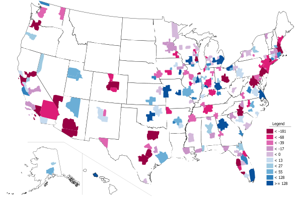
    Figure 1 Federal Spending Over/Under-Budget 1980-2012

    Screen Shot 2014-05-21 at 2.20.23 PM

    Data Source: Budget of the United States, Transportation Budget Authority FY 2011, Table 3.1 Outlays by Superfunction and function, updated with Table 5.1 from FY2014 tables; actual spending through 2012. Red on either line indicates spending over budget for that year. Author’s calculations.

    Table 1 Federal Spending Under-Budget by Decade

    Screen Shot 2014-05-19 at 5.03.29 PM

    Worse yet, transportation policy has been allowed to stagnate: the strategic economic goals and performance measures in the Department of Transportation’s 2014 performance plan are nearly identical to the 2002 plan. Economic competitiveness is one of the strategic goals set by the US Department of Transportation (Performance Plan FY2014, available at www.dot.gov). By their definition, economic competitiveness means maximizing the economic returns of the network and keeping the transportation system responsive to consumer needs. This may sound like the kind of initiative that would allow the US to stay globally competitive. However, these strategic goals are little changed from ten years ago; and most of the performance measures in the 2014 economic strategy were the same in 2002. Each strategic goal is also associated with a line-item in the federal budget, making them more than just slogans, making them actual cost centers.

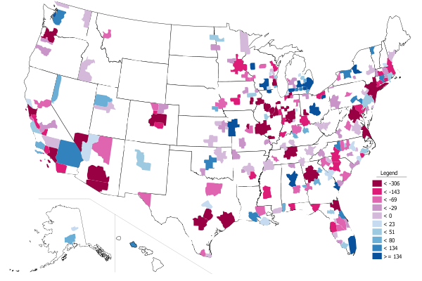
    Figure 2 Department of Transportation Performance Plans

    Screen Shot 2014-05-19 at 5.53.47 PM

    Clearly, what the US needs now is better planning and strategic project selection, plus streamlined delivery processes to increase the productivity of infrastructure investment. Most of the existing transportation infrastructure could not handle the coming surge in demand. The surge is not only the result of organic growth in the size of the country, but also from an increase in the fundamental reliance of our economy on the use of transportation infrastructure. The result will be a nation falling further and further behind our global competitors.Yet, the world that business moves in has changed significantly as has the way that business moves. The service sector – the fastest growing part of the economy – is increasingly dependent on transportation. The services sector has the second fastest growing usage of transportation services (after construction) and remains the fastest growing sector in the US economy. Measuring the economy’s response to a change in the demand for transportation services, DOT-RITA conclude that “an investment in … transportation will have a greater economic impact than an equally sized investment in trade or utilities.” Investments to improve air transportation services would have the biggest economic impact. Except for rail transportation, the impact of improving the nation’s airports is bigger than investments in government and information services.

    Table 2 World Economic Forum, Global Competitiveness Report 2009-2010


    *The European Union economy is the largest in the world (CIA, 2013).  Scores are the result of responses to questions in the format: “How would you assess the quality of  [X] in your country? (1 = extremely underdeveloped; 7 = extensive and efficient by international standards),” where [X] is “Basic Infrastructure”, “Roads”, Railroads”, etc.  Scores for 2009-2010, US rank for transportation infrastructure was little change in 2012-2013 (13th). Details available at http://www.weforum.org/

    What will it cost?

    The US has more airports, roads and railways than any other country in the world – only Russia, China and Brazil have more waterways. However, the US is not alone in needing massive investments in infrastructure.

    The total investment needed for all infrastructures worldwide is estimated at $53 trillion through 2030, with a total of $15.5 trillion just for transportation. The Organization for Economic Cooperation and Development and others estimate a cost equivalent to 3.5% of GDP to improve infrastructure across all sectors – water, energy and transportation. A report from McKinsey Global Institute (McKinsey Infrastructure Practice) calculates that this investment is 60% more than all spending in the last 18 years; and more than the estimated value of today’s worldwide infrastructure. Consulting firm Booz Allen projects the cumulative infrastructure spending needs for the US (and Canada) from 2005 to 2030 to be $936 billion for road and rail and $432 billion for airports and seaports (about $1.4 Trillion total). Dividing this between the US and Canada in proportion to real GDP, just over $1.2 trillion is needed to upgrade the performance of US transportation infrastructure to first class.

    For the purpose of demonstration, let’s assume that the entire $1.2 trillion is invested in the US in 2014. The latest models demonstrate that the economic gains would begin to appear as higher GDP per capita in 2018. The economy starts 2018 at a level that is higher than it would have been without the investment in infrastructure. By 2025, the economy is larger by an amount greater than the initial investment in 2014. In financial terms, the investment has a 17 year payback period – substantially shorter than the life expectancy of transportation infrastructure. Taking 25% of the gain each year as government revenue (average government tax revenue as a percent of GDP in the US), the cumulative increased tax revenue will exceed the cost by 2025. A standard, basic financial analysis well-understood by both business executives and policy-makers shows a 7% internal rate of return – a number significantly higher than the borrowing costs for financing transportation infrastructure investments in the United States.

    Paying For It

    But what about the rest of the story: where does the initial funding come from to make the needed performance improvements? There is no “free ride” here – the construction and renovation of transportation infrastructure carries a hefty price tag that has to be paid one way or another. The options currently under discussion among researchers and policy makers in the United States are:

    1. The status quo – which has not worked in over 20 years.

    2. Reducing demand – One way to improve performance is to discourage the use of transportation infrastructure. Joel Kotkin reports the work of demographer Wendell Cox on the new migration to America’s “Efficient Cities” – resulting in net outmigration from America’s most congested cities.  Smaller populations are one way that the demands on infrastructure may fall naturally – but with potentially undesirable consequences for economic growth. While American’s do more driving than any other nation on earth, there is some new evidence that the long standing trend of increasing driving is tailing off.

    3. Increasing user fees — Unfortunately, user fees are wrought with difficulties. First, “congestion pricing” fees are used to reduce demand rather than as a way to generate a revenue stream (with the obvious exception of some toll roads). There are several specific challenges: federal barriers to implementing fees and transaction costs are the most obvious. While the impact of fees as a revenue mechanism may be modest, there are additional implications for land use patterns and policies. Urban Land Institute provides an important cautionary note on tolling that could be applied to user fees in general. If the fees are permanent and not limited to rewarding investors in a particular facility, local policies will need to be established regarding the distribution of income beyond the designated payback period. The alternative, of course, is to tie the period of the fees to the reward and repayment of investors.

    4. Public-Private Partnerships — Also known as PPP or P3 – cover a spectrum of financing options ranging from private concession operators to privately owned roads. At the lowest level on the PPP spectrum are private operators who raise their own financing for upfront costs and ongoing operations for concessions such as food service on highway plazas or newspaper stands inside train stations. Their revenue generally comes from sales. At a higher level, risk is allocated between public and private partners (e.g., public carries demand risk, private carries construction risk). Financing is often shared and comes in the form of both equity and debt. The revenue stream to repay debt (or reward equity investors) comes from user fees. In “build, operate, transfer” (BOT) cases, the government’s role changes from manager, operator and financier to regulator. Effective government controls on safety and security, anti-competitive behavior (access, pricing, service quality, etc.) are critical to the success of these projects. The final level is a purely private project which is used for public purposes. The private owner/operator builds the facility. A revenue stream is necessary to service debt, repay financial loans/borrowings, and reward capital investment. Freight railroads in the US are a good example of privately financed infrastructure in the US.

    There is no lack of private money – especially under the current conditions of Federal Reserve intervention in the economy. According to a 2013 study by consulting firm McKinsey, an additional $2.5 trillion will be made available for infrastructure financing by 2030 if institutional investors meet their target allocations. The trouble is finding ways to direct revenue back to the private investors.

    Other Revenue StreamsUntitled

    How do we create that revenue stream to attract private investment into public infrastructure? Americans are notoriously opposed to paying for public goods. Branded revenue opportunities are just coming on the table in the US but have been used wide and far in other countries.

    Branded revenue streams – or private advertising in public spaces – has come a long way since realtors put their faces on benches or lawyers put their names on the backs of city buses. Branding now extends to the infrastructure itself. New York City’s Metropolitan Transit Authority added branding to turnstiles and train doors. More opportunities exist, including entrances, escalators, stairs, trains, overpasses, poles, walls, and even floors. Phoenix and Denver expect to earn up to $1 million in annual revenue from wrapping light rail trains in advertisements.

     Branding is not limited to print, either. New York, Chicago and Santa Monica are exploring LED advertising on the sides of busses. Dayton, Champaign-Urbana, Toledo (TARTA) and Kansas City (KCATA) have audio ads timed to promote businesses along routes. Just as advertising in metro transit is no longer limited to framed posters on subway platforms, highway advertising is no longer just for billboards. Why not, as pictured here, allow branding on overpasses? In November 2010 (USA Today November 22), cash-strapped California considered generating a much-needed revenue stream by allowing advertisements on emergency (“Amber-alert”) highway signs. But even these signs are virtual antiques. Ideas for where and what can accommodate an attractive yet discrete opportunity for a branded revenue stream are only limited by the number of pixels that can be used in an electronic display.

    The Way Forward

    All is not doom and gloom. There is a new, improving trend in the performance of transportation infrastructure in the United States. These improvements are a reflection of broad-based initiatives on both the supply and the demand sides. Meanwhile, the US continues to decline in the global rankings for poor transportation infrastructure (World Economic Forum, Global Competitiveness Index, shown earlier). Although US road, rail and even port rankings manage to stay in or near the top 20 in the world in the rankings, the US airport infrastructure quality ranking fell from 9th in the world in 2007-2008 to 32nd in 2010-2011 (currently at 30th).

    The underlying question is not how much to invest it is how that investment can deliver improvements in infrastructure. Analysts at McKinsey estimate that streamlining infrastructure delivery alone could generate 15% in cost savings. Clearly, additional funding alone is not enough. We also need innovative ways to fund, build, maintain and operate the vital transportation structures that support economic activity.

    Acknowledgements: Some of this material was previously published as STP Working Paper 2014_02, Calculating the Real Economic Payoff of Infrastructure. The Let’s Rebuild America initiative at the US Chamber of Commerce is headed by Janet Kavinoky. Funding for the project was also provided by the National Chamber Foundation in Washington, D.C. The original project team for developing indices to measure the performance of infrastructure in the United States was led by Michael Gallis and Associates of Charlotte, NC. The author is grateful to Kamna Pandey in New Dehli (India) for her slide show on revenue streams.

    Susanne Trimbath, Ph.D. is CEO and Chief Economist of STP Advisory Services. Dr. Trimbath’s credits include appearances on national television and radio programs and the Emmy® Award nominated Bloomberg report Phantom Shares. She appears in four documentaries on the financial crisis, including Stock Shock: the Rise of Sirius XM and Collapse of Wall Street Ethicsand the newly released Wall Street Conspiracy. Dr. Trimbath was formerly Senior Research Economist at the Milken Institute. She served as Senior Advisor on United States Agency for International Development capital markets projects in Russia, Romania and Ukraine. Dr. Trimbath teaches graduate and undergraduate finance and economics.

    This piece was originally published by IO Sustainability.

  • The Decline of the Midwest, the Rise of the South

    The New York Times ran an article recently that’s nominally about football, but really gives insight into the decline of the Midwest and the rise of the South. Called “As Big Ten Declines, Homegrown Talent Flees,” this piece ties in perfectly with my recent essay on the differing social states of the Midwest and South. The NYT’s money quote says it all:


    The SEC sold excellence. The Big Ten sold tradition.

    Ironically, it is the formerly stigmatized “backwoods” South that has embraced excellence while the former industrial champion of the Midwest has spurned it. I don’t think that Midwesterners understand how much things have changed in the South. I hear the same stereotypical view of the South that might have had a lot of truth decades ago but have changes substantially. For example, those who think it is both a good thing and bad have quipped that Indiana is like an extension of the South into the Midwest. I don’t think so.

    For example, Charlotte built a light rail system. Dallas has poured a billion dollars into a downtown arts district. Atlanta has a multi-billion infill strategy around its former Belt Line railroad. Nashville eliminated downtown parking minimums and implemented a form based code. South Carolina has its German style apprenticeship program. North Carolina built Research Triangle Park – in 1959. Southern cities like Atlanta have proudly claimed and built success around their black heritage. And Charlotte’s Chamber of Commerce CEO said, “To understand Charlotte, you have to understand our ambition. We have a serious chip on our shoulder. We don’t want to be No. 2 to anybody.” Outside of Chicago, does anybody in the Midwest talk like that?

    Sure, there are bits and pieces here and there in the Midwest that speak to excellence. But they are the anomalies in a region that has retrogressed. Whereas in the South they’ve massively elevated their game in the last 40 years and are working hard to keep getting better. Sure, low costs and taxes play a role in their success. Climate and the universality of air conditioning as well. But they aren’t content to rest on just that. They want to get better. Meanwhile the Midwest is regressing towards what the South used to be such as, for example, by turning paved roads back to gravel because they can’t afford the maintenance.

    The NYT piece brings up an interesting factor driving the rise of the SEC vs. the Big Ten, namely the shift in underlying population ratios over time: “An instructive comparison is Michigan and Georgia. In 1960, Michigan had twice Georgia’s population; in 1990, it was nearly one and a half times as big; today, their populations are roughly equivalent.”

    The decline in Midwest population and economic heft brings with it a price that has to be paid. It’s showing up in the football world today. But it’s sure to hit the academic prowess of the Midwest’s major state schools as well. How long can these places maintain their relative rankings of excellence without the financial firepower to play in the big leagues? There’s more inertia on the academic side, but don’t think it won’t eventually happen here as well. The same is true in many other aspects of civic life. Even mighty Chicago has nearly bankrupted itself in its efforts to keep up with other global cities.

    The Big Ten obviously saw the writing on the wall and decided to expand outside the region. I dislike this for reasons of, naturally, tradition. But it’s a rational response to a declining marketplace. Similarly, the Cleveland Orchestra established a Miami residency in the pursuit of cash to keep its artistic excellence intact. Might some of these institutions at some point become Midwest in name only? Time will tell.

    Not everyone agrees with the idea that the SEC vs. Big 10 comparison is a relavent proxy, basically saying that it’s ludicrous to say that football proves anything. I don’t think that it does. But I will make three points:

    1. The differing fortunes of the two conference is yet another in an extremely long series of data points and episodes that demonstrate a shift in demographic, economic, and cultural vitality to the South.
    2. Sports is one of the many areas in which Midwestern states have clung to traditional approaches, even though those approaches haven’t been producing results.
    3. Demographic and economic changes have consequences. It’s not realistic to expect that the Midwest’s excellent institutions will necessarily be able to retain excellence when supported by hollowed out economies.

    I’d like to throw up a couple of charts to illustrate the longer term trends at work. The first is a comparison of per capita personal income as a percent of the US average for Illinois vs. Georgia since 1950:


    il-vs-ga

    Here’s the same chart of Ohio vs. North Carolina:


    oh-vs-nc

    If I put up the population or job numbers, the same charts would show the South mutilating the Midwest. (Indiana, Georgia, and North Carolina were all about the same population in 1980, but the latter two have skyrocketed ahead since then for example). What’s more, the South’s major metros score better on diversity and attracting immigrants than the Midwest’s major metros as a general rule.

    These charts show the convergence in incomes over time. The decline in relative income of the Midwest is possibly in part to increases elsewhere, not internal dynamics. But think about what the Midwest looked like in 1950, 60, or 70 vs the South, then think about it today and it’s night and day. The Midwest may still be endowed with better educational and cultural institutions than the South, but we can see where the trends are going. Keep in mind that those things are lagging indicators. Chicago didn’t get classy until after it got rich, for example.

    Now we see that Southern income performance hasn’t been great since the mid to late 90s. This is a problem for them. As is their dependence on growth itself in their communities. I won’t claim that the South is trouble free or will necessarily thrive over the long haul. But they seem to have a clearer sense of identity, where they want to go, and what their deficiencies are than most Midwestern places.

    Richard Longworth seems to buy the decline theory but has a different explanation of the source, namely that Chicago has sucked the life out of other Midwestern states:

    In the global economy, sheer size is a great big magnet, drawing in the resources and people from the surrounding region. We see this in the exploding cities of China, India and South America. We see it in Europe, where London booms while the rest of England slowly rots.

    And we see it in the Midwest where, as the urbanologist Richard Florida has written, Chicago has simply sucked the life – the finance, the business services, the investment, especially the best young people – out of the rest of the Midwest.

    To any young person in Nashville or Charlotte, the home town offers plenty of opportunities for work and a good life. To any young person stuck in post-industrial Cleveland or Detroit, it’s only logical to decamp to Chicago, rather than to stay home and try to build something in the wreckage of a vanished economy.

    This seems to be a common view (see another example), even in the places that would be on the victim side of the equation. But I’ve never seen strong data that suggests this is actually the case. Are college grads and young people getting sucked out of the rest of the Midwest into Chicago?

    Thanks to the Census Bureau, we now have a view, albeit limited, into this. The American Community Survey releases county to county migration patterns off of their five year surveys sliced by attribute. There seems to be some statistical noise in these, and for various reasons I can’t track state to metro migrations, but thanks to my Telestrian tool, I was able to aggregate this to at least get metro to metro migration. So here is a map of migration of adults with college degrees for the Chicago metro area from the 2007-2011 ACS:


    degree-migration
    Net migration of adults 25+ with a bachelors degree or higher with the Chicago metropolitan area. Source: 2007-2011 ACS county to county migration data with aggregation and mapping by Telestrian

    This looks like a mixed bag to me, not a hoover operation. What about the “young and restless”? Here’s a similar map of people aged 18-34:


    ya-migration
    Net migration of 18-34yos with the Chicago metropolitan area. Source: 2006-2010 ACS county to county migration data with aggregation and mapping by Telestrian

    This is an absolute blowout, with a massive amount of red on the map showing areas to which Chicago is actually losing young adults. Honestly, this only makes sense given the well known headline negative domestic migration numbers for Chicago.

    I do find it interesting that there’s a strong draw from Michigan. Clearly Michigan has taken a decade plus long beating. There’s been strong net out-migration from Michigan to many other Midwestern cities during that time frame, and its the same in Cleveland, which also took an economic beating in the last decade. This is just an impression so I don’t want to overstate, but it seems to me that a disproportionate number of the stories about brain drain to Chicago give examples from Michigan. Longworth uses the examples of Detroit and Cleveland. These would appear to be the places where the argument has been truly legitimate, but that doesn’t mean you can extrapolate generally from there.

    What’s more, even if a young person with a college degree does move to Chicago from somewhere else, will they stay there long term? They may circulate out back to where they came from or somewhere else after absorbing skills and experience. It’s the same with New York, DC, SF, etc. I’ve said these places should be viewed as human capital refineries, much like universities. That’s not a bad thing at all. In fact, it’s a big plus for everybody all around. Chicago is doing fine there. But it’s a more complex talent dynamic than is generally presented, a presentation that does not seem to be backed up by the data in any case.

    Aaron M. Renn is an independent writer on urban affairs and the founder of Telestrian, a data analysis and mapping tool. He writes at The Urbanophile, where this piece originally appeared.

    Photo courtesy of BigStockPhoto.com.

  • Housing Affordability in China

    Finally, there is credible housing affordability data from China. For years, analysts have produced "back of the envelope" anecdotal calculations that have been often as inconsistent as they have been wrong. The Economist has compiled an index of housing affordability in 40 cities, which uses an "average multiple" (average house price divided by average household income) (China Index of Housing Affordability). This is in contrast to the "median multiple," which is the median house price divided by the median household income (used in the Demographia International Housing Affordability Survey and other affordability indexes). The Demographia Survey rates affordability in 9 geographies, including Hong Kong (a special administrative region of China). The average multiple for a metropolitan market is generally similar to the median multiple.

    The Economist Data and Methodology

    The Economist develops its ratio from central government data on house sales and incomes in individual cities. Like the Demographia Survey, The Economist provides estimates for housing affordability from the perspective of the average urban household, as opposed to the "ex-pat" or "luxury" markets that are typically reported by real estate commentators. The Economist also estimates its price to income ratio using an average house size of 100 square meters (approximately 1,075 square feet). This is larger than the average new house size in the United Kingdom, but smaller than those in the United States, Australia, Canada and New Zealand.

    With an overall average multiple of 8.8, China’s housing is less affordable (Figure 1) than all of the nine geographies rated in the Demographia Survey, except for Hong Kong (14.9). Even so, China’s housing affordability has improved from a national average multiple of 11.7 in April of 2010.

    Affordability by City

    It appears that if The Economist had included Hong Kong in its China ranking, it would have been ranked the most unaffordable in the country. Hong Kong houses are much smaller than the Chinese average, at 45 square meters (480 square feet). This would have given Hong Kong, with an unadjusted multiple of 14.9, a house size adjusted multiple of more than 30.

    For years, there have been press reports of astronomic price to income multiples in China. The Economist data indicates that in some cities (Shenzhen, Beijing, Hanghzou and Wenzhou) this has indeed been true. But incomes have risen faster than house prices in recent years, and average multiples above 20 are, for now, a thing of the past.

    Shenzhen, the "instant" megacity next to Hong Kong, is ranked as the least affordable with an average multiple of 19.6. The Economist indicates that this may be the result of demand from Hong Kong residents. Shenzhen had reached an average multiple of nearly 25 in 2010. An even higher average multiple was recorded in Beijing, which reached 27 in 2010. Beijing house prices have fallen substantially, however, dropping to 16.6 in 2014, the second most unaffordable in China.

    China’s other megacities (over 10 million population) have lower average multiples than Shenzhen and Beijing. Shanghai has an average multiple of 12.8 and Guangzhou has an average multiple of 11.4. Tianjin, approximately 100 miles (140 kilometers) from Beijing and China’s newest megacity has an average multiple of 11.2.

    China’s most affordable city is Hohhot, capital of Inner Mongolia (Nei Mongol), with an average multiple of 4.9. Generally, interior cities had better housing affordability than those along the east coast. For example, Changsha (capital of Hunan) has an average multiple of 5.9, Kunming 6.6, while the two leading cities of China’s Red Basin, Chongqing and Chengdu, were somewhat higher (7.1 and 7.4).

    Comparison to Other Demographia Cities

    Yet the multiples for many Chinese cities are no worse than highly unaffordable cities in Australia, New Zealand, Canada, the United States, and the United Kingdom.

    Outside Hong Kong, the other most expensive cities in the Demographia Survey would rank in the second 10 of Chinese cities. Vancouver, with a median multiple of 10.3, is more expensive than all but 12 of the 40 cities rated in China. San Francisco, with a median multiple of 9.3, would rank 15th. Sydney, with a median multiple of 9.0, would rank in a 16th tie with Dalian. San Jose, at 8.7, would rank in a 19th place tie for unaffordability with Wuhan and Ningbo.

    A sampling of cities from China and the Demographia Survey is illustrated in Figure 2.

    Toward an Affordable China

    One of rapidly urbanizing China’s biggest challenges is to improve housing affordability. This is an imperative, with easing of the hukou internal resident permit system and the one-child policy. United Nations projections indicate that China’s urban areas will add another third to their population in the next 25 years, an increase of more than 250 million. China is better housed today than perhaps at any time in its history. But it needs to be still better housed, as internal migrants become permanent urban residents and as rural citizens move to the cities for better lives.

    Wendell Cox is principal of Demographia, an international public policy and demographics firm. He is co-author of the “Demographia International Housing Affordability Survey” and author of “Demographia World Urban Areas” and “War on the Dream: How Anti-Sprawl Policy Threatens the Quality of Life.” He was appointed to three terms on the Los Angeles County Transportation Commission, where he served with the leading city and county leadership as the only non-elected member. He was appointed to the Amtrak Reform Council to fill the unexpired term of Governor Christine Todd Whitman and has served as a visiting professor at the Conservatoire National des Arts et Metiers, a national university in Paris.

    Photo: Jinan

  • Look Out for Obama’s Legacy

    With public support for Barack Obama recently at low ebb, some might suggest that his will be a weak political legacy. But, in reality, the president’s legacy may prove profoundly important in having helped usher into power a new dominant political configuration whose influence will survive for decades to come.

    In “The New Class Conflict,” I describe this alliance as the New Clerisy, which encompasses the media, the academy and the expanding regulatory bureaucracy. This Clerisy already dominates American intellectual and cultural life and increasingly has taken virtual control of key governmental functions, as well as the educations of our young people.

    The Clerisy’s ascendency was predicted more than 40 years ago by the great sociologist Daniel Bell. The rise of knowledge-based industries, he predicted in his landmark 1973 book, “The Coming of Post-Industrial Society,” would establish the “pre-eminence of the professional and technical class.” This new “priesthood of power,” he suggested, would aim for the rational “ordering of mass society.”

    Although usually somewhat progressive by inclination, the Clerisy actually functions much like the old First Estate in France – the clergy – helping determine the theology, morals and ideals of the broader population.

    Nowhere is this function clearer than in the university itself, from which Barack Obama sprang, and which has become an essential part of his political coalition.

    Campus intolerance

    In allying with academia, the president has hitched himself to a sector that has, at least till now, enjoyed rapid growth. In 1958, universities and colleges employed under 370,000 people. By 2014 that number had expanded to roughly 1.7 million. Over that time, academe – once a true battleground of ideas – has become about as ideologically diverse as the medieval Catholic Church. President Obama, for example, reaped a remarkable 96 percent of all presidential campaign donations from Ivy League employees, a margin more reminiscent of Soviet Russia than a properly functioning pluralistic academy.

    This level of unanimity, a recent University of California study suggests, is actually becoming more marked, with barely 12 percent of all faculty self-identifying as right of center. As in medieval academies, such uniformity feeds an attitude of intolerance toward other perspectives, as revealed in the cancellations of commencement speaker invitations this spring. More troubling still is a 2012 study finding that roughly two of five professors would be less well-inclined to hire an evangelical or conservative colleague than a more conventionally liberal one.

    Saddest of all is the impact on students. Longtime civil libertarian Nat Hentoff notes a2010 survey of 24,000 college students, which found that barely a third thought it “safe to hold unpopular views on campus.” Recent years have seen the rise of such things as speech codes and the introduction of “trigger warnings” to alert students about what might be objectionable ideas or phrases, even in American classics.

    Imbalanced media

    We see a similar, if less well-enforced, spirit of uniformity running through the news media. There remain strong conservative outposts (largely the News Corp. empire), but a detailed UCLA study found that, of the 20 leading U.S. news outlets, 18 were left of center. A recent Indiana University study found that barely 7 percent of journalists in 2013 were Republican, compared with nearly a quarter in 1971.

    Even Arnold Brisbane, a former ombudsman of the country’s premier news source, the New York Times, admits that group-think now increasingly overshadows objectivity. Brisbane says so many staffers at the newspaper “share a kind of political and cultural progressivism – for lack of a better term.” He suggests “that this worldview virtually bleeds through the fabric of the Times.”

    One key part of Obama’s legacy is an ever-closer marriage between the organs of the Democratic Party and the press. At least 16 prominent journalists have joined the Obama administration, something of a record. Just this past week, the president’s former longtime press secretary, Jay Carney, announced he would become a commentator on CNN.

    “This press corps,” acidly notes the former Jimmy Carter pollster Pat Caddell, “serves at the pleasure of this White House and president.”

    Over the past few months, the president’s off-kilter performance and slipping popularity has irked even some of his loyalist media backers. But this shrinking fealty toward the Obama personage does not suggest an ideological shift from conventional progressive opinion on everything from women’s or minorities issues to the environment.

    This is perhaps most evident with climate change, a critical issue, to be sure, where reporting about the decades-long “pause” in rising temperatures, or the recentexpansion of Arctic sea ice, has been left primarily to the right-wing media, who have their own agenda. The mainstream media seem to view anyone skeptical about any aspect of the climate change agenda – in good medieval fashion – as heretics, deluded or corrupt “deniers.” The Los Angeles Times, as well as the website Reddit, have chosen to exclude contributions from climate change skeptics.

    Sometimes, you have to wonder what happened to an objective press. USA Today’s media columnist, Rem Reider openly justified limiting or eliminating coverage of “reality-challenged people” who refuse to accept what he calls “established truth.” I imagine there were cardinals and bishops saying much the same thing in 15th century Paris.

    ‘Vast left-wing conspiracy’

    Much the same brain lock can be attributed to the entertainment media. When not indulging in portraying sex and violence, our television and movie people reliably push the same basic agenda as the rest of the media. As the liberal author Jonathan Chaitsuggests, the entertainment industry has come to constitute something of “a vast left-wing conspiracy.”

    Theoretically, the third part of my New Clerisy – the government bureaucracy – could be impacted by election results. But even if Republicans or a center-right majority were to gain control of both houses of Congress, the president seems determined to grant “progressive” bureaucracies more direct power, allowing them to become something of an unelected permanent government. An electoral defeat this November, if anything, might make him even bolder to push rule by decree.

    Like the members of the old First Estate, or the Soviet nomenklatura, the upper bureaucracy has evolved into a privileged – and cossetted – caste, with huge benefits and higher pay than their similarly educated private-sector counterparts, a status secured by their vast political influence. Since 1989, public-sector unions have been among the largest contributors to campaigns, giving overwhelmingly to Democrats.

    Nowhere is this permanent government increasingly more evident than in the expansive agenda of the Environmental Protection Agency. Working intimately with allied environmental groups – but without congressional approval – EPA has been reaching to control the nation’s energy policy through administrative diktat.

    Although a low priority for voters, climate change matters much to the Clerisy, perhaps, at least unconsciously, because it creates a perfect raison d’etre for more expansive control. But the EPA is no outlier; other agencies chafe to extend their power over information, immigration, transportation, education and even such functions of government as land use, traditionally determined by local elected officials. By 2016, our daily lives may be controlled more by unelected agencies than through the legislative process.

    This is more than a reaction to Republican obstructionism, although that bears some of the blame. It also reflects a more authoritarian view among the Clerisy that democracy is too unruly, too determined by human passions and loyalties, to address the most serious issues. Former White House budget director Peter Orszag, for example, thinks we need to become “less democratic.” New York Times columnist Thomas Friedman, another key figure of the Clerisy, has praised the Chinese authoritarian system as better-suited to meet new challenges than is our clunky system.

    Against such established and accumulated power, even a strong November showing by the GOP may have surprisingly little effect. Indeed, even with a Republican in the White House, the Clerisy’s ability to shape perceptions, educate the young and control key regulatory agencies will not much diminish. The elevation of the Clerisy to unprecedented influence may prove this president’s most important “gift” to posterity.

    This piece first appeared at the Orange County Register.

    Joel Kotkin is executive editor of NewGeography.com and Roger Hobbs Distinguished Fellow in Urban Studies at Chapman University, and a member of the editorial board of the Orange County Register. His newest book, The New Class Conflict is now available at Amazon and Telos Press. He is author of The City: A Global History and The Next Hundred Million: America in 2050. His most recent study, The Rise of Postfamilialism, has been widely discussed and distributed internationally. He lives in Los Angeles, CA.

    Barack Obama photo by Bigstock.

  • A Newer Geography of Jobs: Where Workers with Advanced Degrees Are Concentrating the Fastest

    This is a new report brief from the Center for Population Dynamics at Cleveland State University, download the pdf version here. The report was authored by Richey Piiparinen, Jim Russell, and Charlie Post.

    In 1963, nearly 75% of America’s top 50 companies owned and extracted natural resources1. By 2013, only 20% of top firms were natural resource-based. Today, knowledge-focused industries such as IBM comprise over 50% of America’s top 50 firms. Translation: talent is the new oil.

    But not every region has reservoirs of human capital. Historically, knowledge economies have gathered in select top-tier metros, termed “Islands of Innovation”2. Think Boston and San Francisco. There are numerous reasons for this, including access to select research institutions, as well as the productivity effects that arise when a cluster economy is formed3.

    For scholars such as economist Enrico Moretti, this “Great Divergence”4 between “the best” and “the rest” will continue. “More than traditional industries,” writes Moretti in his book The New Geography of Jobs, “the knowledge economy has an inherent tendency toward geographical agglomeration.”

    But is this trend inevitable? Will the divergence remain? One line of thought is that the cost of living in top-tier metros will inevitably lead to “capital equalization”5—loosely defined as the “convergence” between regions in job and income growth. Capital equalization was a key factor in the decline of the Rust Belt. Here, manufacturing jobs became automated or moved down South or overseas to cut labor costs. One could argue that capital equalization will re-map the geographies of the knowledge economy in a similar manner.

    “The prediction of this view is the convergence of American communities,” writes Moretti. “Low-cost areas will attract more and more of the new, high-paying jobs. Cities that have been lagging behind-the Clevelands, the Topekas, and the Mobiles-will grow much faster. Bogged down by their high costs, San Francisco, New York, Seattle, and similar cities will decline.” That said, Moretti does not believe convergence is taking shape. “[T]he data don’t support this view,” Moretti continues. “In fact, the opposite has been happening.”

    But there is data that do support this view, and it begins to sketch a newer geography of jobs that is enabling an increasing concentration of highly-skilled workers in America’s second-tier cities. AOL Co- Founder Steve Case has dubbed this convergence back into Middle America “the Rise of the Rest”6.

    Where are America’s Highest-Skilled Jobs Clustering?

    The most common measure of human capital is educational attainment, or the percent of a population  with a college degree. Not all human capital is equal. Generally speaking, the higher the degree conferred, the more productive the worker, and this is reflected in pay. For example, the national median income by education level is as follows: $27,350 for a high school graduate, $50,050 for a person with a 4-year degree, and $65,565 for a person with an advanced degree7. The fact that those with a graduate or professional degree are paid highest is indicative of their productive capacity in the knowledge economy.

    Specifically, a region’s highest-educated workers are likely to be job creators, not just job consumers. This primarily comes about two ways: (1) through direct job creation, such as a research doctor starting a biotech spin-off firm; and (2) through indirect job creation, particularly relating to the “downstream” effect a high- paying job has on the local service economy. Put simply, more income, more spending, equals more jobs.

    What metros are experiencing the fastest growth in its concentrationof workers with advanced or professional degrees? To answer this, the analysis used data from the Current Population Survey (CPS) to compare the educational attainment rates of the nation’s largest laborforcesfrom 2005 to 2013. Of particular concern was the percentage of people in a regional labor force with an advanced or professional degree, and whether or not top-tier metros gained higher- skilled workers at a faster rate than second-tier metros. Here, the rate was calculated as the percent point change between a region’s 2013 educational attainment rate and its 2005 educational attainment rate for workers with an advanced degree.

    Table 1 shows the results. In line with the Great Divergence, Washington, D.C. and San Francisco are experiencing the 1st and 4th fastest rates of change in the employment of high- skilled workers, respectively. However, three of the top five fastest-growth metros are second tier: Providence, Indianapolis, and Cleveland— each with over a 5% percent point change. While these metros cannot match the top-tier metros in the number of advanced degree jobs gained— e.g., Cleveland gained nearly 44,000 grad-level jobs compared to 157,000 for San Francisco— the data nonetheless speak to a number of second-tier metros converging, or “moving up”, into the knowledge economy hierarchy.

    Table 1 Percentage of Workers with Advanced Degree, 2005 Percentage of Workers with Advanced Degree, 2013 Percent Point Change
    Source: CPS 2005, 2013
     
    Washington, DC 21.58% 27.48% 5.90%
    Providence 10.71% 16.30% 5.59%
    Indianapolis 11.63% 17.08% 5.45%
    San Francisco 17.49% 22.88% 5.39%
    Cleveland 11.68% 17.00% 5.32%
    Kansas City 10.88% 15.49% 4.61%
    Jacksonville 7.54% 12.07% 4.52%
    San Antonio 8.52% 12.32% 3.80%
    Denver 12.75% 16.54% 3.78%
    Sacramento, CA 9.07% 12.78% 3.72%
    Detroit 12.66% 16.26% 3.60%
    Minneapolis 12.30% 15.55% 3.25%
    Riverside, CA 5.08% 8.09% 3.01%
    Pittsburgh, PA 13.66% 16.57% 2.91%
    Chicago 14.70% 17.55% 2.84%
    Philadelphia 13.52% 16.22% 2.70%
    Charlotte 7.62% 10.14% 2.52%
    Orlando 9.28% 11.73% 2.45%
    Boston 21.03% 23.41% 2.37%
    Seattle 15.34% 17.71% 2.36%
    Phoenix 10.19% 12.50% 2.31%
    Milwaukee 12.32% 13.87% 1.55%
    Las Vegas 7.08% 8.56% 1.48%
    Portland 13.52% 14.98% 1.46%
    New York 17.14% 18.56% 1.42%
    Columbus, OH 12.95% 14.35% 1.40%
    St. Louis 11.91% 13.20% 1.29%
    Dallas 10.89% 12.16% 1.28%
    Baltimore 17.12% 18.28% 1.17%
    Virginia Beach 9.62% 10.57% 0.96%
    Houston 9.65% 10.60% 0.95%
    Miami 10.83% 11.68% 0.85%
    San Diego 14.27% 15.03% 0.75%
    Los Angeles 11.65% 12.38% 0.73%
    San Jose 23.33% 23.52% 0.20%
    Nashville 12.02% 11.70% -0.32%
    Atlanta 14.08% 13.36% -0.72%
    Cincinnati 10.23% 9.22% -1.01%
    Tampa 11.30% 10.05% -1.25%
    Austin 17.92% 16.35% -1.57%


    To further illustrate this point, rankings were calculated to show the metros with the highest concentration of advanced-degreed workers in the labor force for 2005 and 2013. Change rankings were then calculated to determine just how far converging metros like Cleveland and Indianapolis were rising in the knowledge economy hierarchy. Figure 1 displays the results. Notice the top of the rankings are comprised of traditional top-tier metros. Also, the change in these metro rankings from 2005 showed no variance (ranging from -1 to +1), indicating little “wiggle room” in the top echelon from 2005 to 2013. The exception, here, was Austin, which dropped 9 spots to 13th. Moreover, two metros—Indianapolis and Cleveland—moved up from the middle of the pack to rank 9th and 10th, respectively. Providence also made a large leap: from 29th in 2005 to 14th in 2013. These figures indicate there is a notable economic restructuring occurring in Indianapolis, Cleveland, and Providence that is perhaps forming a next generation of innovation nodes.

    Now, in the case of Cleveland, do the results mean the gritty Rust Belt metro is experiencing robust job growth? Not exactly. From 2005 to 2013, 78% of the nearly 54,782 jobs added for college graduates in Greater Cleveland were for those with advanced degrees—meaning job growth for people with only a bachelor’s degree was sluggish at best. What’s more, job losses for Greater Clevelanders without college degrees was substantial: a decline over 83,000 jobs from 2005 to 2013. In other words, while the region’s highest-skilled workforce is converging into the ranks of the national elite, the effect has yet to be found “downstream” in direct or indirect job creation.

    This is not unexpected. Specifically, economic restructuring, particularly for manufacturing-based regions, is a process, and a working theory for the Center for Population Dynamics is that a concentration of advanced-degree workers is an important leading indicator to more widespread growth8. As this line of inquiry evolves, an eventual step is to set up a policy framework so that the region’s growing concentration of high-skilled workers can be strategically catalyzed to lead to broader economic opportunities, rather than missed opportunities. The Center for Population Dynamics is currently constructing a working policy paper that will help drive this effort.

    This is a new report brief from the Center for Population Dynamics at Cleveland State University, download the pdf version here. The report was authored by Richey Piiparinen, Jim Russell, and Charlie Post.

    2 Hilpert, Ulrich. Archipelago Europe: islands of innovation: synthesis report. FAST, Commission of the European Communities, 1992.

    3 Porter, Michael E. "Location, competition, and economic development: Local clusters in a global economy." Economic development quarterly 14.1 (2000): 15-34.

    4 Moretti, Enrico. The new geography of jobs. Houghton Mifflin Harcourt, 2012.

    7 Source: American Community Survey 1-Year Estimates, 2013

    8 See: http://engagedscholarship.csuohio.edu/urban_facpub/1177/

  • Should the Gas Tax Go Local?

    After approving yet another general budget stopgap for highway construction in July, legislators across the country are acknowledging the obvious: The Federal Highway Trust Fund, the primary pot of federal roadway dollars, is nearly out of gas.

    The fund has been fed for decades by the federal taxes on gasoline and diesel fuel. But the gas tax hasn’t been raised in 21 years. At the same time, people are driving less, and using more fuel-efficient cars. As a result, federal fuel tax revenues have fallen to just 60 to 70 percent of gross federal highway expenditures.

    The resulting fiscal dilemma has kickstarted a debate among policymakers on how to get the fund solvent again. Simultaneously, it’s also attracted attention from many planners looking for an opportunity to stress what they perceive as the unsustainability of America’s suburban low-density development.

    The core of the argument by these critics is that current infrastructure funding policies do not hold drivers accountable for the costs of the roads. Nationally, gas taxes and vehicle fees cover just half of total local, state, and federal road spending. They contend that if roads had to be paid for directly by those who used them, we’d likely have denser development and fewer cars, and that planning policy should embrace an ambitious course to implement that future through centralized land use regulation and urban design.

    But this approach is neither desirable nor necessary. Instead, there are ways to restructure infrastructure funding to make roads accountably solvent without turning society upside down.

    A first step would be to reduce the enormous control the federal government has over road construction. When first created, the federal highway trust fund was designed to ensure only the maintenance of the national interstate highway network.

    But today, the fund, which accounts for a quarter of all American roadway spending, is used for numerous other projects that can’t be justified as national priorities. As of 2011 20 percent of federal highway spending went to federal priority DOT projects. The remaining 80 percent was divvied out to states and communities via grants, many of them for capital outlays for new roads at the suburban edges of expanding regions. Communities should be expected to pay for these kinds of roads themselves, especially as the number of local projects continues to grow.

    This federal spending has encouraged a lack of accountability at the local level. While it has given the federal government the freedom to address concerns about existing infrastructure projects — since 1990 Washington has reduced the share of bridges deemed “structurally deficient” from 25 percent to 11 percent – it has done little to ensure that local projects will be prioritized responsibly in the future. Instead, cities and states have accrued federal dollars primarily on the basis of marketing, regardless of whether the costs and benefits actually add up.

    Balancing those costs and benefits is a crucial issue because, in the eyes of many planners, auto-dependent suburbanites are getting a free ride while urbanites who drive less are being unfairly taxed. Meanwhile, there is no clear answer to the question of how much people would be willing to pay for infrastructure in order to live at low densities if they were shouldering the costs directly.

    Polling data does little to resolve the uncertainty. When asked, a majority say that they like their commutes, that they would rather drive than travel by other modes, and that they greatly value the positive attributes of living at low densities in detached homes with yards and privacy from their neighbors. This suggests they would be hard-pressed to relinquish the status quo. Simultaneously, however, they also overwhelmingly oppose raising the federal gas tax.

    So where do the public’s priorities really fall? This question could be better answered if more infrastructure were funded locally. Not only would it allow more accountability between those providing the funding and those accruing the costs and benefits, it would more democratically help solve the density issue by letting people vote with their feet. People would be free to choose between the wide-ranging densities and tax rates that compose the many competitive municipalities of most regions.

    There are other benefits to concentrating road spending locally. Foremost among them is that communities and states are better equipped than the federal government to tackle congestion, one of the costliest contributors to road degradation

    Since 1982, the primary federal approach to combat congestion costs through the gas tax has been to redirect an increasing portion of revenues to a Mass Transit Account under the principle of encouraging alternative modes of transportation. It hasn’t worked. Between 1978 and 1995 transit funding increased eightfold, while ridership increased just two percent. And by 2005 Americans indicated they still overwhelmingly rejected transit, even when both driving and transit were available.

    Much of the gas tax has been wasted. The American Public Transit Association reports that about 15 percent of the gas tax is used for mass transit. Roads carry just 51 percent of their own costs. Ports, airports, and parking facilities, by contrast, paid for 80 to 100 percent of their own costs when measured the same way.

    Cutting off the transit syphon would free up significant capital to patch gaps in the Highway Fund. Meanwhile, more effective approaches to reducing congestion could be tackled at the state and local level. These include regulations to stagger travel times and routes, clearing breakdowns more quickly, improving traffic light engineering, providing better traffic alerts, and limiting truck traffic (one of the worst congestion offenders) at certain times of day.

    Most of the public debate has been on ways the gas tax itself could be restructured to keep the highway fund afloat. In addition to simply raising the gas tax, universal tolling and taxing people per mile driven are popular ideas for directly funding roads.

    While popular, such “miles-based” approaches may not improve a roadway system that is a crucial tool for facilitating economic growth. Housing prices in the United States are lower than nearly anywhere else in the world in part because of roads that facilitate cost-efficient transportation between locations more efficiently than places where most residents are dependent on transit. This creates choice in where to live and work, and facilitates ladders out of poverty.

    There are practical concerns as well. When polled, people have overwhelmingly indicated that their primary personal method for alleviating congestion is to take a less direct route to work. Discouraging indirect travel by taxing drivers per mile could actually end up exacerbating congestion, rather than relieving it.

    The way the tax is designed now is a solid middle-ground approach, simultaneously charging users while incentivizing fuel-efficiency. If only the revenues were spent more efficiently, recent dips in Highway Fund revenues due to a drop in driving and an uptick in miles per gallon might be celebrated, not maligned.

    It’s clear that roadway funding needs a second look. And while a more accountable approach would be a breath of fresh air, accountability may not resemble the high-density, high-tax, transit-rich future that some planners assume.

    Roger Weber is a city planner specializing in global urban and industrial strategy, urban design, zoning, and real estate. He holds a Master’s degree from the Harvard Graduate School of Design. Research interests include fiscal policy, demographics, architecture, housing, and land use.

    Flickr photo by Neff Conner: Highway traffic jam and construction in Bedford, Texas.

  • Metropolitan Populations from 1900 Posted (Current Geographies)

    We have posted population data for the nation’s major metropolitan areas for censuses from 1900 to 2010 and as estimated in 2013. These data are use the current (2013) boundaries to define metropolitan areas. There is no consistent list historical listing of metropolitan area populations using the commuting criteria that define the 2010 and 2013 metropolitan areas. Thus, in using the data in this new report, caution should be employed.