Blog

  • Large Cities Business Services Jobs – 2017 Best Cities Rankings

    Read about how we selected the 2017 Best Cities for Job Growth

    2017 MSA Prof & Bus Svcs Ranking among Large MSAs Area Weighted INDEX 2016 Prof & Bus Svcs  Emplmt (1000s) Total Prof &
    Bus Svcs Emplmt Growth Rate 2015-2016
    Overall Rank Change
    2016 to 2017
    1 Nashville-Davidson–Murfreesboro–Franklin, TN 89.7 160.3 5.2% 0
    2 Kansas City, MO 85.3 99.6 9.0% 13
    3 Austin-Round Rock, TX 81.7 171.1 3.7% 0
    4 San Francisco-Redwood City-South San Francisco, CA Metro Div 79.5 274.4 2.8% (2)
    5 Dallas-Plano-Irving, TX Metro Div 79.3 482.8 5.5% 0
    6 San Antonio-New Braunfels, TX 79.2 134.0 5.5% 19
    7 San Jose-Sunnyvale-Santa Clara, CA 79.0 227.5 2.6% (3)
    8 Charlotte-Concord-Gastonia, NC-SC 76.3 198.9 4.8% 1
    9 Salt Lake City, UT 76.2 126.1 4.4% 15
    10 Orlando-Kissimmee-Sanford, FL 75.6 209.6 4.8% (3)
    11 Tampa-St. Petersburg-Clearwater, FL 75.2 236.6 5.2% 0
    12 Atlanta-Sandy Springs-Roswell, GA 75.1 503.7 4.6% 1
    13 Louisville/Jefferson County, KY-IN 74.8 91.8 5.2% (1)
    14 Fort Lauderdale-Pompano Beach-Deerfield Beach, FL Metro Div 74.3 151.2 4.1% 6
    15 Las Vegas-Henderson-Paradise, NV 73.8 136.8 4.6% 2
    16 Sacramento–Roseville–Arden-Arcade, CA 71.9 131.3 6.7% 30
    17 Raleigh, NC 71.5 115.2 4.7% (11)
    18 Philadelphia City, PA 69.9 97.6 4.9% 31
    19 Portland-Vancouver-Hillsboro, OR-WA 69.6 176.6 1.8% (9)
    20 New York City, NY 68.9 735.3 3.1% (6)
    21 Seattle-Bellevue-Everett, WA Metro Div 67.2 250.9 2.6% (3)
    22 Miami-Miami Beach-Kendall, FL Metro Div 66.5 170.8 2.6% 7
    23 West Palm Beach-Boca Raton-Delray Beach, FL Metro Div 64.2 111.1 3.3% (1)
    24 Boston-Cambridge-Newton, MA NECTA Div 64.2 354.4 2.7% 8
    25 Phoenix-Mesa-Scottsdale, AZ 63.8 348.7 3.3% 3
    26 Middlesex-Monmouth-Ocean, NJ 62.8 155.7 1.9% 1
    27 Indianapolis-Carmel-Anderson, IN 62.4 169.9 0.8% (6)
    28 Denver-Aurora-Lakewood, CO 61.0 257.1 1.7% (12)
    29 Oakland-Hayward-Berkeley, CA Metro Div 60.7 182.4 2.4% 1
    30 Hartford-West Hartford-East Hartford, CT NECTA 60.6 73.7 2.1% (7)
    31 Orange-Rockland-Westchester, NY 58.3 92.2 4.2% 22
    32 Anaheim-Santa Ana-Irvine, CA Metro Div 57.0 299.2 2.2% 7
    33 Providence-Warwick, RI-MA NECTA 56.7 71.0 1.0% (2)
    34 Warren-Troy-Farmington Hills, MI Metro Div 55.3 269.7 1.9% 1
    35 Columbus, OH 54.4 182.3 1.6% (2)
    36 Omaha-Council Bluffs, NE-IA 52.5 74.5 1.3% 1
    37 Nassau County-Suffolk County, NY Metro Div 52.3 176.5 3.2% 21
    38 St. Louis, MO-IL 52.3 211.1 1.4% 12
    39 Camden, NJ Metro Div 51.4 78.6 -0.1% (5)
    40 Chicago-Naperville-Arlington Heights, IL Metro Div 51.2 689.7 0.5% 3
    41 Grand Rapids-Wyoming, MI 51.1 79.1 1.8% 23
    42 Richmond, VA 50.4 110.7 -4.5% (34)
    43 Washington-Arlington-Alexandria, DC-VA-MD-WV Metro Div 50.1 615.4 2.4% (1)
    44 Northern Virginia, VA 49.5 398.9 2.6% 3
    45 Minneapolis-St. Paul-Bloomington, MN-WI 49.3 321.9 1.9% 3
    46 Houston-The Woodlands-Sugar Land, TX 48.6 470.6 0.0% (10)
    47 Montgomery County-Bucks County-Chester County, PA Metro Div 48.6 202.4 1.7% (6)
    48 Jacksonville, FL 48.0 102.3 1.2% (22)
    49 San Diego-Carlsbad, CA 47.5 234.8 0.2% (4)
    50 Pittsburgh, PA 47.4 183.2 1.0% (10)
    51 Albany-Schenectady-Troy, NY 47.3 55.4 2.8% 18
    52 Bergen-Hudson-Passaic, NJ 45.5 145.8 2.3% 11
    53 Los Angeles-Long Beach-Glendale, CA Metro Div 45.0 610.7 1.1% 7
    54 Memphis, TN-MS-AR 44.8 98.3 -3.2% (35)
    55 Urban Honolulu, HI 44.5 67.9 0.7% (11)
    56 Kansas City, KS 43.8 92.9 -0.6% (18)
    57 Cincinnati, OH-KY-IN 43.7 170.4 1.6% 5
    58 Fort Worth-Arlington, TX Metro Div 43.6 112.4 0.7% (3)
    59 Detroit-Dearborn-Livonia, MI Metro Div 42.2 125.5 2.2% (5)
    60 Silver Spring-Frederick-Rockville, MD Metro Div 41.6 128.1 2.0% 8
    61 New Orleans-Metairie, LA 40.0 74.8 0.6% (10)
    62 Birmingham-Hoover, AL 38.4 65.9 0.4% (1)
    63 Buffalo-Cheektowaga-Niagara Falls, NY 38.2 72.4 2.3% 7
    64 Cleveland-Elyria, OH 37.7 148.7 0.9% 1
    65 Milwaukee-Waukesha-West Allis, WI 37.3 124.1 -1.6% (8)
    66 Rochester, NY 37.0 68.2 -1.4% 1
    67 Riverside-San Bernardino-Ontario, CA 36.5 146.8 -6.9% (15)
    68 Virginia Beach-Norfolk-Newport News, VA-NC 34.6 103.7 -0.6% (2)
    69 Newark, NJ-PA Metro Div 32.7 216.2 -0.8% (13)
    70 Oklahoma City, OK 31.6 78.7 -1.7% (11)
  • Mid Sized Cities Business Services Jobs – 2017 Best Cities Rankings

    Read about how we selected the 2017 Best Cities for Job Growth

    2017 MSA Prof & Bus Svcs Ranking among Midsized MSAs Area Weighted INDEX 2016 Prof & Bus Svcs  Emplmt (1000s) Total Prof & Bus Svc Emplmt Growth Rate 2011-2016 Overall Rank Change
    2016 to 2017
    1 Provo-Orem, UT 89.0 32.9 40.1% 3
    2 Fayetteville-Springdale-Rogers, AR-MO 85.5 51.1 33.7% 1
    3 Deltona-Daytona Beach-Ormond Beach, FL 81.5 23.9 34.3% 3
    4 Augusta-Richmond County, GA-SC 81.3 38.4 25.1% 52
    5 Boise City, ID 79.9 46.7 21.7% 72
    6 North Port-Sarasota-Bradenton, FL 78.9 45.8 48.1% 12
    7 Myrtle Beach-Conway-North Myrtle Beach, SC-NC 78.2 14.5 33.4% 38
    8 Sioux Falls, SD 74.9 15.2 22.9% (7)
    9 Ann Arbor, MI 73.8 30.8 24.7% 12
    10 Charleston-North Charleston, SC 73.3 54.1 20.8% 22
    11 Cape Coral-Fort Myers, FL 71.8 34.9 34.4% (6)
    12 Savannah, GA 70.5 20.9 16.1% 19
    13 Tacoma-Lakewood, WA Metro Div 70.4 29.2 25.7% 13
    14 Durham-Chapel Hill, NC 70.2 42.5 17.4% 34
    15 Eugene, OR 69.6 18.1 24.0% 23
    16 Santa Rosa, CA 68.7 21.8 24.9% 14
    17 Tallahassee, FL 68.3 21.0 17.1% 58
    18 Boulder, CO 67.8 36.1 17.7% 39
    19 Reno, NV 67.6 31.6 23.8% 5
    20 Ogden-Clearfield, UT 67.5 29.1 26.3% (8)
    21 Madison, WI 67.4 52.4 18.8% 6
    22 Des Moines-West Des Moines, IA 66.1 48.1 20.9% (13)
    23 Lowell-Billerica-Chelmsford, MA-NH NECTA Div 66.1 23.9 14.7% 62
    24 Gary, IN Metro Div 65.1 24.3 17.6% 55
    25 Hickory-Lenoir-Morganton, NC 64.8 14.7 12.2% 61
    26 Asheville, NC 64.7 18.5 16.6% (13)
    27 Lincoln, NE 64.3 19.8 14.6% 19
    28 Modesto, CA 63.6 15.1 20.2% 15
    29 Salem, OR 63.0 13.6 25.8% (4)
    30 El Paso, TX 62.5 34.9 16.0% 24
    31 Lakeland-Winter Haven, FL 62.0 29.9 20.6% 5
    32 Lexington-Fayette, KY 61.9 42.6 28.2% (3)
    33 Montgomery, AL 61.0 22.5 10.9% 52
    34 York-Hanover, PA 59.7 21.9 15.1% 10
    35 Jackson, MS 59.3 34.8 18.4% 14
    36 Fort Collins, CO 59.2 20.3 16.9% 25
    37 Toledo, OH 59.2 38.9 17.5% 28
    38 Wichita, KS 58.8 34.3 16.5% (1)
    39 Spokane-Spokane Valley, WA 58.8 26.2 15.4% (22)
    40 Springfield, MO 58.2 25.1 21.4% (21)
    41 Huntsville, AL 57.7 55.0 14.4% (1)
    42 Trenton, NJ 57.6 43.6 18.7% (40)
    43 Reading, PA 55.0 23.8 17.5% (27)
    44 Chattanooga, TN-GA 54.9 29.3 13.1% (30)
    45 Baton Rouge, LA 53.3 48.8 14.1% (25)
    46 Framingham, MA NECTA Div 52.5 36.4 13.8% (24)
    47 Akron, OH 52.5 54.0 10.7% 20
    48 Fresno, CA 52.3 31.9 21.0% 16
    49 McAllen-Edinburg-Mission, TX 50.5 16.4 8.6% 10
    50 Springfield, MA-CT NECTA 49.2 26.7 9.9% (11)
    51 Fort Wayne, IN 47.8 21.7 6.9% 15
    52 Calvert-Charles-Prince George’s, MD 47.5 49.2 7.1% 0
    53 Baltimore City, MD 47.1 47.7 15.5% 20
    54 Peoria, IL 46.8 23.9 2.9% 6
    55 Knoxville, TN 46.8 61.9 10.9% (40)
    56 New Haven, CT NECTA 46.6 30.3 10.2% (9)
    57 Delaware County, PA 45.9 32.1 8.0% (23)
    58 Colorado Springs, CO 45.9 43.3 10.8% (3)
    59 Scranton–Wilkes-Barre–Hazleton, PA 45.6 30.6 13.2% (26)
    60 Stockton-Lodi, CA 45.6 19.2 22.1% (53)
    61 Little Rock-North Little Rock-Conway, AR 45.1 47.0 10.2% 7
    62 Winston-Salem, NC 44.6 35.1 9.4% (39)
    63 Portland-South Portland, ME NECTA 44.1 27.4 5.9% (10)
    64 Canton-Massillon, OH 43.9 14.6 7.9% 24
    65 Harrisburg-Carlisle, PA 43.8 47.1 12.2% (37)
    66 Dayton, OH 43.4 51.4 8.7% (4)
    67 Rockford, IL 43.4 16.5 6.2% (32)
    68 Lansing-East Lansing, MI 42.5 22.3 7.7% 1
    69 Mobile, AL 42.3 22.8 5.1% 7
    70 Lancaster, PA 41.7 23.9 13.8% 1
    71 Palm Bay-Melbourne-Titusville, FL 41.1 30.6 3.1% 15
    72 Greenville-Anderson-Mauldin, SC 40.4 68.1 10.2% (62)
    73 Oxnard-Thousand Oaks-Ventura, CA 40.0 36.6 6.6% 21
    74 Syracuse, NY 39.6 34.0 2.7% 24
    75 Roanoke, VA 38.9 21.8 6.7% (33)
    76 Lake County-Kenosha County, IL-WI Metro Div 38.8 69.2 8.1% (2)
    77 Evansville, IN-KY 37.5 18.8 -0.2% 4
    78 Greensboro-High Point, NC 37.4 50.2 6.6% (67)
    79 Bakersfield, CA 37.4 26.4 2.7% 5
    80 Pensacola-Ferry Pass-Brent, FL 36.6 22.1 2.9% (39)
    81 Davenport-Moline-Rock Island, IA-IL 35.6 24.5 8.7% (11)
    82 Albuquerque, NM 34.7 58.1 3.0% 5
    83 Corpus Christi, TX 32.8 16.6 8.8% (32)
    84 Santa Maria-Santa Barbara, CA 32.4 22.1 0.9% (2)
    85 Worcester, MA-CT NECTA 31.5 26.7 -0.6% 10
    86 Tulsa, OK 31.1 57.8 6.0% 4
    87 Columbia, SC 30.1 47.2 8.8% (37)
    88 Wilmington, DE-MD-NJ Metro Div 27.0 54.0 5.5% (16)
    89 Tucson, AZ 26.0 49.9 2.2% (31)
    90 Allentown-Bethlehem-Easton, PA-NJ 25.9 47.6 2.5% (7)
    91 Beaumont-Port Arthur, TX 25.6 14.5 -1.4% (28)
    92 Youngstown-Warren-Boardman, OH-PA 25.1 21.7 -3.1% 1
    93 Shreveport-Bossier City, LA 23.2 16.7 -6.7% 3
    94 Elgin, IL Metro Div 21.2 33.5 2.4% (14)
    95 Lafayette, LA 17.3 19.9 -6.9% (17)
    96 Anchorage, AK 17.1 18.8 -9.5% (7)
    97 Gulfport-Biloxi-Pascagoula, MS 16.8 14.8 -10.5% 0
    98 Bridgeport-Stamford-Norwalk, CT NECTA 16.7 63.5 -4.7% (7)
    99 Green Bay, WI 16.2 18.6 -7.0% (7)
  • Small Cities Business Services Jobs – 2017 Best Cities Rankings

    Read about how we selected the 2017 Best Cities for Job Growth

    2017 MSA Prof & Bus Svcs  – Small MSAs Area Weighted INDEX 2016 Prof & Bus Svcs  Emplmt (1000s) Total Prof &
    Bus Svcs Emplmt Growth Rate 2015-2016
    Overall Rank Change
    2016 to 2017
    1 Wausau, WI 92.5       7.2 13.8% 50
    2 Monroe, MI 91.1       5.3 4.6% 0
    3 College Station-Bryan, TX 89.6       9.0 8.9% 6
    4 Jackson, TN 88.9       7.3 10.0% 3
    5 Salisbury, MD-DE 88.1     13.3 14.0% 13
    6 Grants Pass, OR 87.8       2.3 14.8% 54
    7 Bend-Redmond, OR 86.7       9.4 5.6% 8
    8 Topeka, KS 85.8     14.9 7.5% 51
    9 Clevel&, TN 84.2     10.5 12.5% 105
    10 Lynn-Saugus-Marblehead, MA NECTA Div 84.1       3.3 5.3% 146
    11 Olympia-Tumwater, WA 83.8     11.5 3.6% 28
    12 Gainesville, FL 83.5     14.2 7.1% 22
    13 Elizabethtown-Fort Knox, KY 82.8       7.1 5.4% (8)
    14 Laredo, TX 82.0       9.8 11.3% (2)
    15 Oshkosh-Neenah, WI 81.9     12.7 4.1% 92
    16 St. George, UT 80.2       4.9 2.1% (8)
    17 Morristown, TN 78.6       4.1 15.1% 92
    18 Springfield, IL 78.2     14.9 14.4% 39
    19 State College, PA 77.7       6.9 7.8% 46
    20 Lubbock, TX 76.0     12.8 7.3% 20
    21 Elkhart-Goshen, IN 75.9     10.7 7.0% 26
    22 Crestview-Fort Walton Beach-Destin, FL 75.7     15.6 4.0% 27
    23 Spartanburg, SC 75.7     17.9 8.9% 68
    24 Yuba City, CA 75.3       3.3 13.6% 19
    25 Redding, CA 75.2       6.7 7.4% (3)
    26 Kalamazoo-Portage, MI 73.2     18.3 10.9% 41
    27 Port St. Lucie, FL 71.7     17.5 6.7% 2
    28 Fort Smith, AR-OK 71.7     12.9 2.4% 83
    29 Waco, TX 71.6     12.5 0.0% (15)
    30 Kankakee, IL 69.8       3.6 18.5% 62
    31 Monroe, LA 69.6       8.8 5.2% 90
    32 Naples-Immokalee-Marco Island, FL 69.4     16.1 1.3% 21
    33 Charlottesville, VA 67.8     15.3 1.8% (20)
    34 Ocala, FL 67.0     10.0 10.7% 94
    35 Dover, DE 66.6       4.6 4.5% 1
    36 Wilmington, NC 66.6     16.0 5.5% 22
    37 Athens-Clarke County, GA 66.6       8.0 3.0% 9
    38 Flagstaff, AZ 65.8       3.3 8.9% (15)
    39 Brownsville-Harlingen, TX 65.6     12.3 4.2% 11
    40 Taunton-Middleborough-Norton, MA NECTA Div 65.4       6.3 4.4% 15
    41 Jackson, MI 64.4       4.8 3.6% 111
    42 Watertown-Fort Drum, NY 64.3       2.4 0.0% 129
    43 Bowling Green, KY 64.1       9.3 6.1% (13)
    44 Greeley, CO 64.0       9.8 2.1% (28)
    45 Yuma, AZ 63.6       7.1 7.0% 16
    46 Lawton, OK 62.7       4.6 3.0% (42)
    47 Janesville-Beloit, WI 62.5       6.1 2.2% (41)
    48 Panama City, FL 62.0     10.9 -0.9% 0
    49 Atlantic City-Hammonton, NJ 61.7     10.4 6.8% 40
    50 Napa, CA 61.3       6.9 3.0% (40)
    51 San Luis Obispo-Paso Robles-Arroyo Grande, CA 61.0       9.9 -3.2% (20)
    52 Tuscaloosa, AL 59.5     10.7 1.3% (32)
    53 Johnson City, TN 59.4       8.8 6.9% 77
    54 Salinas, CA 58.7     13.2 -0.5% (10)
    55 Prescott, AZ 58.5       3.5 3.9% (22)
    56 South Bend-Mishawaka, IN-MI 57.9     14.0 2.4% 17
    57 Lake Charles, LA 57.8       9.4 -1.1% (54)
    58 Yakima, WA 57.7       4.2 13.4% 8
    59 Ithaca, NY 56.7       3.5 1.0% 4
    60 Haverhill-Newburyport-Amesbury Town, MA-NH NECTA Div 56.4       5.6 3.7% (23)
    61 Killeen-Temple, TX 56.0     10.2 3.0% 14
    62 Logan, UT-ID 55.9       6.1 1.7% 0
    63 New Bedford, MA NECTA 55.2       5.7 -7.6% (62)
    64 Leominster-Gardner, MA NECTA 54.9       3.9 0.0% 21
    65 Bloomsburg-Berwick, PA 54.8       4.3 3.2% 32
    66 Appleton, WI 54.5     13.9 3.0% 51
    67 Clarksville, TN-KY 54.4       8.9 3.5% 16
    68 Sebastian-Vero Beach, FL 54.3       5.4 4.5% 45
    69 Amarillo, TX 53.4       9.8 2.8% 8
    70 Idaho Falls, ID 53.3     13.7 5.1% 28
    71 Nashua, NH-MA NECTA Div 53.0     15.4 -0.2% (1)
    72 Morgantown, WV 52.9       6.6 -0.5% (55)
    73 Muskegon, MI 52.5       3.7 5.8% 3
    74 Bangor, ME NECTA 51.8       6.7 1.0% 5
    75 Kingston, NY 51.8       4.6 3.0% 13
    76 Springfield, OH 51.2       4.7 -2.1% (65)
    77 Bellingham, WA 49.9       8.0 -0.8% (9)
    78 Burlington-South Burlington, VT NECTA 49.9     14.2 -0.5% (43)
    79 Auburn-Opelika, AL 49.3       7.4 0.5% (58)
    80 Lake Havasu City-Kingman, AZ 48.0       3.4 14.6% 40
    81 Iowa City, IA 47.9       7.0 4.5% 1
    82 Brockton-Bridgewater-Easton, MA NECTA Div 47.8       7.1 0.9% 19
    83 Manchester, NH NECTA 47.2     16.0 -0.8% (56)
    84 Peabody-Salem-Beverly, MA NECTA Div 46.8     10.3 2.0% 50
    85 Barnstable Town, MA NECTA 46.6       8.7 1.6% 15
    86 Fargo, ND-MN 46.4     15.8 0.2% (67)
    87 Billings, MT 46.4       9.1 4.6% 109
    88 Waterloo-Cedar Falls, IA 46.1       7.7 0.0% (24)
    89 Mansfield, OH 45.6       5.6 3.1% 93
    90 Lafayette-West Lafayette, IN 45.3       7.7 4.0% 12
    91 Kahului-Wailuku-Lahaina, HI 45.3       7.2 2.4% (19)
    92 Coeur d’Alene, ID 45.1       6.3 1.1% 93
    93 Cedar Rapids, IA 45.1     14.3 3.4% 53
    94 East Stroudsburg, PA 44.8       3.5 0.0% 12
    95 Battle Creek, MI 44.4       6.2 0.5% 31
    96 Vineland-Bridgeton, NJ 43.9       4.3 -3.7% 80
    97 Corvallis, OR 43.6       4.3 -2.3% (69)
    98 Macon, GA 43.2     11.6 0.3% (60)
    99 Victoria, TX 42.9       2.6 5.3% (13)
    100 Portsmouth, NH-ME NECTA 42.5     11.5 -2.8% (48)
    101 Punta Gorda, FL 42.2       4.5 -2.9% (47)
    102 Fond du Lac, WI 41.8       2.7 -1.2% (70)
    103 Michigan City-La Porte, IN 41.4       2.8 5.0% 16
    104 Bismarck, ND 41.1       7.9 -5.2% (86)
    105 Burlington, NC 40.4       5.5 -0.6% (63)
    106 Danbury, CT NECTA 40.3       9.3 -1.1% (12)
    107 Medford, OR 40.1       7.1 1.4% 32
    108 Columbus, IN 40.0       5.4 -0.6% (63)
    109 Dalton, GA 39.8       6.2 3.3% 29
    110 Grand Forks, ND-MN 39.7       3.1 2.2% 19
    111 Huntington-Ashland, WV-KY-OH 39.5     12.6 1.3% 20
    112 Tyler, TX 39.3       8.9 0.4% 38
    113 San Rafael, CA Metro Div 39.3     18.6 1.5% (14)
    114 Rapid City, SD 39.0       5.1 1.3% 10
    115 Pittsfield, MA NECTA 38.2       4.0 0.0% 25
    116 Owensboro, KY 37.7       3.9 -0.8% (45)
    117 Lewiston, ID-WA 37.5       1.4 2.5% 66
    118 Kingsport-Bristol-Bristol, TN-VA 37.4       9.7 1.7% (6)
    119 Lawrence, KS 37.1       5.6 -2.9% 50
    120 Abilene, TX 37.0       5.5 -0.6% (12)
    121 Kennewick-Richland, WA 36.7     21.2 1.8% (16)
    122 Pueblo, CO 36.4       6.8 -1.0% (96)
    123 Texarkana, TX-AR 36.0       4.3 -0.8% (67)
    124 Bay City, MI 35.8       3.3 3.2% (43)
    125 Sioux City, IA-NE-SD 35.6       8.1 3.9% 64
    126 Terre Haute, IN 35.4       5.3 4.6% 21
    127 Chico, CA 35.1       5.4 -0.6% (43)
    128 Saginaw, MI 34.8     11.2 -0.3% (87)
    129 Decatur, IL 34.6       3.3 -2.9% 16
    130 St. Cloud, MN 34.3       8.5 0.0% (26)
    131 Utica-Rome, NY 33.9       8.5 2.0% 56
    132 Walla Walla, WA 33.9       0.9 0.0% (37)
    133 Eau Claire, WI 33.8       9.0 0.4% (18)
    134 Altoona, PA 33.4       5.4 0.0% (1)
    135 Lewiston-Auburn, ME NECTA 33.3       6.8 -0.5% (48)
    136 Lima, OH 33.0       4.7 -4.8% (58)
    137 Columbus, GA-AL 32.3     12.9 -0.8% (1)
    138 Glens Falls, NY 32.3       5.6 0.6% (28)
    139 Las Cruces, NM 31.5       6.8 -0.5% 25
    140 Hagerstown-Martinsburg, MD-WV 31.3       9.2 -4.2% (44)
    141 Bloomington, IN 31.3       4.7 4.5% 53
    142 Duluth, MN-WI 31.2       8.1 -0.8% 13
    143 Niles-Benton Harbor, MI 31.2       5.6 -1.8% (27)
    144 Hanford-Corcoran, CA 31.2       1.3 0.0% 7
    145 Gadsden, AL 31.0       3.8 -8.1% (121)
    146 Dothan, AL 31.0       4.4 1.5% 35
    147 Champaign-Urbana, IL 30.3       7.8 1.7% 30
    148 Santa Fe, NM 30.2       4.5 -0.7% (26)
    149 Waterbury, CT NECTA 29.7       5.4 -1.8% 19
    150 Erie, PA 29.3     10.0 1.0% (1)
    151 Pocatello, ID 28.5       3.6 -5.3% (77)
    152 Racine, WI 28.1       6.3 2.2% 9
    153 Santa Cruz-Watsonville, CA 27.4       9.4 -2.4% (63)
    154 Chambersburg-Waynesboro, PA 26.8       5.4 -13.0% (129)
    155 Sherman-Denison, TX 26.8       2.8 -6.7% 17
    156 El Centro, CA 26.7       2.2 -6.9% 10
    157 Carson City, NV 26.3       1.9 3.7% 33
    158 Bremerton-Silverdale, WA 26.3       6.9 -3.7% (5)
    159 Cheyenne, WY 26.3       3.2 -1.0% 21
    160 Norwich-New London-Westerly, CT-RI NECTA 26.0       8.7 -1.1% 0
    161 Rochester, MN 25.3       5.5 -2.4% 13
    162 Anniston-Oxford-Jacksonville, AL 25.3       4.5 2.3% 36
    163 Dutchess County-Putnam County, NY Metro Div 25.0     11.5 -0.3% 23
    164 Rocky Mount, NC 24.9       5.2 0.0% (5)
    165 Missoula, MT 24.9       6.2 -2.1% 10
    166 Flint, MI 24.8     15.3 -0.9% (8)
    167 Dover-Durham, NH-ME NECTA 24.5       3.6 -10.7% (98)
    168 Greenville, NC 24.4       6.6 0.5% (27)
    169 Great Falls, MT 24.3       3.0 -2.2% (37)
    170 Danville, IL 23.9       2.0 1.7% (35)
    171 Sheboygan, WI 23.6       4.0 -0.8% (4)
    172 Fayetteville, NC 23.5     12.2 -5.7% (29)
    173 Grand Junction, CO 23.3       5.1 -3.2% (31)
    174 La Crosse-Onalaska, WI-MN 22.8       6.1 -0.5% 18
    175 Decatur, AL 22.6       5.2 -2.5% 3
    176 Vallejo-Fairfield, CA 22.3       9.9 -3.9% (73)
    177 Visalia-Porterville, CA 22.3     10.4 -8.3% (54)
    178 Midland, TX 21.2       8.2 -8.9% (98)
    179 Bloomington, IL 21.2       9.6 -2.4% 14
    180 Longview, TX 21.0       8.4 -4.2% (53)
    181 Lawrence-Methuen Town-Salem, MA-NH NECTA Div 20.7       9.7 -0.7% (18)
    182 San Angelo, TX 20.0       3.6 -2.7% (17)
    183 Binghamton, NY 19.9       8.9 -2.6% 1
    184 Lynchburg, VA 18.7     11.4 -3.9% 4
    185 Fairbanks, AK 18.4       2.1 -4.6% (48)
    186 Albany, OR 17.7       2.9 -11.1% (68)
    187 Charleston, WV 17.4     13.5 -5.6% (33)
    188 Madera, CA 17.0       2.2 -1.5% (95)
    189 Wichita Falls, TX 16.5       3.6 -5.2% 2
    190 Odessa, TX 15.2       3.7 -8.3% (17)
    191 Florence-Muscle Shoals, AL 14.0       3.8 -4.2% (21)
    192 Sierra Vista-Douglas, AZ 12.8       3.8 -4.2% 3
    193 Johnstown, PA 12.8       5.1 -9.5% (45)
    194 Merced, CA 12.0       3.5 -7.9% 3
    195 Elmira, NY 11.1       2.2 -7.1% (70)
    196 Casper, WY 10.8       2.6 -8.3% (17)
    197 Weirton-Steubenville, WV-OH 9.9       1.6 -17.5% (53)
  • New Infrastructure in Sub-Saharan Africa

    This post will be continuously updated as we learn about new projects.

    On the three main vectors of wealth creation, African countries have lagged other developing nations for several decades. Sub-Saharan Africa is the poorest region of the world and suffers from poor infrastructure, uneven literacy, endemic corruption, political instability and war. While this is problematic for the present, improving conditions are pointing to a more promising future.

    In particular, sub-Saharan Africa could have a unique opportunity to realize a demographic dividend if its elevated fertility rate and dependency ratio decline in the same way as have those of other countries in the past.

    The experience of China shows that a significant dividend can be reaped if other conducive factors are also present. Most important among them are a growing workforce that is more literate and productive, and an institutional framework that is supportive of economic development.

    Innovation-based productivity gains as we understand them in the West can be scarce in the poorest developing countries. But productivity can be improved quickly through educational programs and through well targeted infrastructure projects.

    There is much to do given that Africa has a large infrastructure deficit. A World Bank Fact Sheet provides the following numbers:

      • Electricity: The 48 countries of Sub-Saharan Africa (with a combined population of 800 million) generate roughly the same amount of power as Spain (with a population of 45 million).

      • Roads: Only one-third of Africans living in rural areas are within two kilometers of an all-season road, compared with two-thirds of the population in other developing regions.

      • Water: Water storage capacity is currently 200 cubic meters per capita and needs to increase to at least 750 cubic meters per capita, a level currently found only in South Africa. Only six million hectares, concentrated in a handful of countries, are equipped for irrigation. Though less than five percent of Africa’s cultivated area, the irrigation-equipped area represents 20 percent of the value of agricultural production.

      • The cost of redressing Africa’s infrastructure deficit is estimated at US$38 billion of investment per year, and a further US$37 billion per year in operations and maintenance; an overall price tag of US$75 billion. The total required spending translates into some 12 percent of Africa’s GDP. There is currently a funding gap of US$35 billion per year.

      Below are some recently announced projects in sub-Saharan Africa that will likely have a large impact on nearby populations. (Some of the links are behind a paywall).

      Uganda-Tanzania pipeline

      Tanzania and Uganda signed on May 26 an intergovernmental agreement for the construction of the world’s longest electrically heated crude-oil export pipeline, which is being designed by Houston-based Gulf Interstate Engineering Co.


      The 1,445-kilometer East Africa Crude Oil Pipeline (EACOP) project, which is being developed by France’s Total SA, China’s CNOOC and UK’s Tullow Oil, would enable the commercialization of the estimated 6.5 billion barrels of crude-oil reserves in Uganda’s Albertine basin. (link)

      Tanzania rail project

      A joint venture of Portuguese and Turkish construction firms has been awarded a $1.2-billion contract for a new 202-kilometer, single-track, 1,435-millimeter-gauge railway line, in Tanzania. The segment is part of the 1631-km Dar es Salaam-Isaka-Kigali and Keza-Musongati railway project connecting the country to neighboring Burundi and Rwanda. (link)

      Landlocked Ethiopia seeking stake in Somali port

      Ethiopia is in talks to acquire shares in a joint venture involving DP World Ltd. that will manage a port in northern Somalia, a Somali official said, a move that could give the fast-growing yet landlocked Horn of Africa economy its first stake in foreign docks. (link)

      Mozambique suspension bridge

      Chinese crews, with the help of German supervisors, are building what will be Africa’s largest suspension bridge, in Mozambique. Slated for completion in the third quarter of this year, the 3,003-meter-long, $725-million Maputo Bridge and Link Roads project will strengthen north-south connections and provide a new road link to South Africa and Swaziland. (link)

      East African Power Plant

      Two foreign-led consortiums have been awarded contracts to build the East Africa-sited, 80-MW Rusumo hydropower project, which is intended to reduce electricity costs and promote renewable power in Tanzania, Rwanda and Burundi. (link)

      Rwanda Airport

      The South African subsidiary of a Portuguese civil construction company has won a two-phase, $818-million contract to construct Bugesera International Airport in Rwanda under a build-own-operate-transfer model, with a view to turning it into central Africa’s premier air transport hub by 2018. (link)

      Tallest Building in Africa

      Kenyan President Uhuru Kenyatta recently laid the foundation stone for what will be the tallest building in Africa in the Upper Hill neighborhood of Nairobi. Construction is underway at the development site, and slated for completion by December 2019.


      The ambitious project will see twin glass-facade towers rise above the city, the larger standing at 300 meters tall, far surpassing the continent’s current leader — Johannesburg’s 223-meter Carlton Centre. (link)

      Zimbabwe Road Expansion

      Zimbabwe has signed an agreement with a Chinese-Austrian consortium to resume the delayed $2.7-billion rehabilitation and expansion of the 971-kilometer Beitbridge-Harare-Chirundu highway, which links landlocked Zimbabwe and Zambia to the ports of Durban and Richards Bay in South Africa. (link)

      Dams in Ethiopia

      Italy’s Milan-based industrial group Salini Impregilo has been awarded a $2.8-billion hydropower project by the Ethiopian Electric Power Corp., a state-controlled company that produces, transmits, distributes and sells electricity in Ethiopia.


      The contract involves the construction, with financing from Italy’s credit agency Servizi Assicuative de Commerce Estero, of the 2,200-MW Koysha Dam on the Omo River in the southern part of the country.


      Salini currently is constructing Ethiopia’s 6,000-MW Grand Ethiopian Renaissance Dam, which, when commissioned in 2017, will be Africa’s largest and the world’s No. 11 largest hydropower project. The Italian construction firm last year completed the 1,870-MW Gibe III hydroelectric power project at a cost of $1.6 billion. (link)

      These are only a few examples of the new infrastructure in Africa. The need for new roads, power plants, rail connections, harbors, water and wastewater facilities, telecommunications etc. is very large and presents a significant opportunity for investors, under the proper governance preconditions.

      This piece originally appeared on Populyst.

      Sami Karam is the founder and editor of populyst.net and the creator of the populyst index™. populyst is about innovation, demography and society. Before populyst, he was the founder and manager of the Seven Global funds and a fund manager at leading asset managers in Boston and New York. In addition to a finance MBA from the Wharton School, he holds a Master’s in Civil Engineering from Cornell and a Bachelor of Architecture from UT Austin.

      Photo: Al Gesh Road, Sahara. (Photo by KaiAbuSir via Wikimedia Commons)

  • Want to be Green? Forget Mass Transit. Work at Home.

    Expanding mass-transit systems is a pillar of green and “new urbanist” thinking, but with few exceptions, the idea of ever-larger numbers of people commuting into an urban core ignores a major shift in the labor economy: More people are working from home.

    True, in a handful of large metropolitan regions — what we might call “legacy cities” — trains and buses remain essential. This is particularly true of New York, which accounts for a remarkable 43% of the nation’s mass-transit commuters, and of other venerable cities, such as San Francisco, Washington, Boston, Philadelphia and Chicago. Together, these metros account for 56% of all mass-transit commuting. But for most of the rest of the country, transit use — despite often-massive infrastructure investment — has either stagnated or declined. Among the 21 metropolitan areas that have opened substantially new urban-rail systems since 1970, mass transit’s share of work trips has declined, on average, from 5.3% to 5%. During the same period, the drive-alone share of work trips, notes demographer Wendell Cox, has gone up from 71.9% to 76.1%.

    Meantime, the proportion of the labor force working from home continues to grow. In 1980, 2.3% of workers performed their duties primarily at home; by 2015, this figure had doubled to 4.6%, only slightly behind the proportion of people who commute via mass transit. In legacy core-metropolitan statistical areas (MSAs), the number of people working from home is not quite half that of those commuting by transit. In the 47 MSAs without legacy cores, according to the American Community Survey, the number of people working from home was nearly 250% higher than people going to work on trains or buses.

    In the greater Los Angeles area, roughly 1.5% of people worked from home in 1980; today about 5% do. Meanwhile, despite significant expenditures, the share of people using mass transit went from slightly over 5% to slightly less than 5%.

    The areas with the thickest presence of telecommuters — including cities such as Austin, Raleigh-Durham, San Diego, Denver, and Seattle — tend to have the greatest concentration of tech-related industries, which function well with off-site workers. In San Jose, the epicenter of the nation’s tech industry, 4.6% of people work from home, exceeding the 3.4% who take mass transit. Other telecommuting hot spots include college towns like Boulder, where over 11.6% of workers work from home, and Berkeley, where the share is 10.6%.

    Leading telecommuting centers tend to be home to many well-educated, older and wealthy residents. Communities such as San Clemente, Newport Beach and Encinitas in Southern California, as well as Boca Raton in Florida, all have telecommuting shares over 10%. Perhaps older, well-connected people are more inclined to avoid miserable commutes, given the chance to do so. As the American population skews older, the economy will likely see more workers making such choices.

    Another important demographic force contributing to the work-from-home inclination is Americans’ continuing move to lower-density cities, which usually lack effective transit, and to the suburbs and exurbs — where 81% of job growth occurred between 2010 and 2014. While most metropolitan regions can be called “polycentric,” they are actually better described as “dispersed,” with central business districts (CBDs) and suburban centers (subcenters) now accounting for only a minority of employment. By 2000, more than three-quarters of all employment in metropolitan areas with populations higher than 1 million was outside CBDs and subcenters.

    Home-based work could be the logical extension of this dispersal — and modern technologies, from ride-sharing services to automated cars, will probably accelerate the trend. A recent report by the global consulting firm Bain suggested that greater decentralization is likely in the coming decades. A 2015 National League of Cities report observes that traditional nine-to-five jobs are on the decline and that many white-collar jobs will involve office-sharing and telecommuting in the future. The report also predicts that more workers will act as “contractors,” taking on multiple positions at once.

    Some see these developments as ominous, but greens and urbanists shouldn’t: Telecommuting will, among other things, reduce pollution. It may be that the shift to home-based work will prove the ultimate in mixed use — albeit for workers in their pajamas.

    This piece originally appeared on the Los Angeles Times.

    Joel Kotkin is executive editor of NewGeography.com. He is the Roger Hobbs Distinguished Fellow in Urban Studies at Chapman University and executive director of the Houston-based Center for Opportunity Urbanism. His newest book is The Human City: Urbanism for the rest of us. He is also author of The New Class ConflictThe City: A Global History, and The Next Hundred Million: America in 2050. He lives in Orange County, CA.

    Photo from Picjumbo.

  • Moving to the More Suburban Metropolitan Areas

    A review of the most recent US Census Bureau population estimates and components of population change indicates that US residents are overwhelmingly moving to the most suburban cities (metropolitan areas). We previously rated the 53 major metropolitan areas (over 1 million population) using the City Sector Model (see America’s Most Suburbanized Cities), which classifies small areas (zip codes) into five urban core and suburban categories based on factors such as density, transit use, and age of housing stock.(Figure 1). This article examines net domestic migration based on the extent of suburbanization identified in the previous article.

    In this decade to date, the 30 most suburbanized cities gained 2.3 million net domestic migrants. These cities are from 94.8 percent to 100.0 percent suburban. The 23 cities that are less suburban had, overall, loss of 2.1 million net domestic migrants. Overall, the 53 major metropolitan areas gained 200,000 net domestic migrants.

    The First Quintile: 100 Percent Suburban Cities

    A total ten cities are rated 100 percent suburban this means that they have virtually no population densities high enough to qualify for urban cores in any zip code. This indicates that virtually all of their development has occurred during the post-World War II period and that any historical high density zip codes have experienced a decline to below 7500 persons per square mile. The most suburban of these cities is determined by the percentage of exurban population, since there is a 10 way tie for 100 percent suburbanization. This article examines net domestic migration trends in relation to the suburban character of the major metropolitan areas. Net domestic migration counts the number of US residents who move between counties (which are also the building block components of metropolitan areas).

    Charlotte is the most suburban and the other nine cities that are 100 percent suburban all located in the South or West (Table 1).
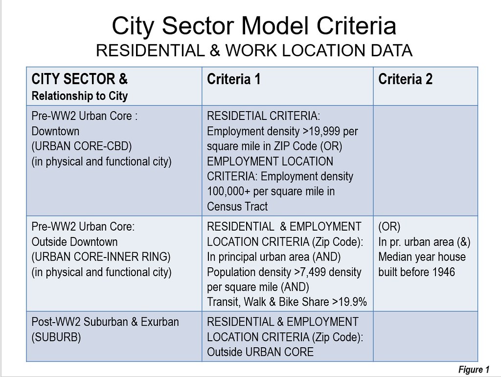
    Table 1
    Most Suburban Cities: (Metroplitan Areas)
    1 Charlotte, NC-SC
    2 Riverside-San Bernardino, CA
    3 Raleigh, NC
    4 Orlando, FL
    5 Birmingham, AL
    6 Jacksonville, FL
    7 Phoenix, AZ
    8 San Antonio, TX
    9 Tampa-St. Petersburg, FL
    10 Tucson, AZ
    Out of 53 with more than 1,000,000 population


    For the purposes of analyzing domestic migration, these 10 cities are considered to be the top quintile in suburbanization. With 53 cities overall, two quintiles are one city short, the first and the fifth.

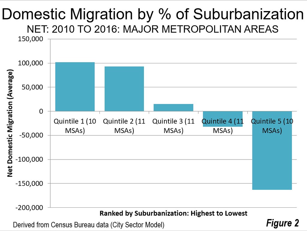
    The all suburban cities had an average positive net domestic migration of 93,000 persons between the 2010 census (April 1) and the 2016 Census Bureau population estimates (Figure 2). Their total net domestic migration was 1,016,000.

    Not all of the most suburbanized cities experienced positive net domestic migration. Birmingham, rated as the fifth most suburbanized city, lost 5000 net domestic migrants. But that’s an exception. Five fully suburban cities gained more than 100,000 net domestic migrants, including Phoenix (215,000), Tampa – St. Petersburg (163,000), San Antonio (146,000), Charlotte (143,000) and Orlando (132,000). Three of the other all suburban cities gaining domestic migrants added more than 50,000 including Raleigh, Jacksonville and Riverside – San Bernardino). Tucson gained only 3000 (Table 2).

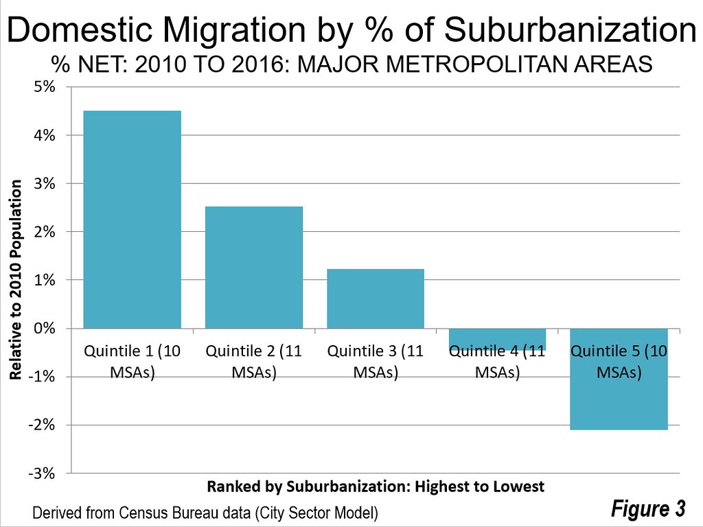
    Overall the net domestic migration averaged 4.5 percent relative to their 2010 Census population (Figure 3). Raleigh had the highest percentage net domestic migration gain at 8.3 percent, followed by San Antonio at 6.9 percent, Charlotte at 6.5 percent and Orlando at 6.1 percent (Figure 3).
    The Second Quintile

    The second quintile includes cities that are from 97.6 percent suburban to 99.8 percent suburban.

    With 11 cities, the second quintile attracted more net domestic migrants than the top quintile (1,023,000), which has only 10 cities. The per city average was somewhat lower than in the first quintile, at 93,000. Five of the cities in the second quintile added more than 100,000 net domestic migrants, including Dallas – Fort Worth at 304,000 (the highest of any city), Houston at 283,000 Austin at 192,000, Atlanta at 153,000 in Nashville at 104,000. Three cities in the quintile lost net domestic migrants, including San Jose, Virginia Beach – Norfolk and Memphis.

    The net domestic migration in second quintile averaged 2.5 percent of the 2010 population. Austin had the highest net domestic migration gain of any city at 11.2 percent. Nashville gained 6.2 percent.

    Like the first quintile, all cities in the second quintile are in the South or West.

    The Third Quintile

    The third quintile includes cities that are from 91.2 percent suburban to 97.2 percent suburban.

    The third quintile had an average net domestic migration of 15,000 per city and an average of 66,000 overall for the 11 cities. The largest gainers were Denver, at 155,000 and Oklahoma City at 52,000. Only two of the city’s lost net domestic migrants, Detroit at 131,000 and Miami at 7000.

    On average, the third quintile added 1.2 percent to their 2010 population through domestic migration. The largest gain was in Denver, at six percent, followed by Oklahoma City at 4.2 percent. The largest loss was in Detroit at 3.0 percent.

    The third quintile has cities from the Midwest as well as from the South and the West.

    The Fourth Quintile

    The fourth quintile includes cities that are from 84.1 percent suburban to 90.0 percent suburban.

    Overall these cities lost 352,000 net domestic migrants, for an average of a 32,000 loss per city. The largest gainers were Seattle, at 106,000 and Portland at 94,000. The growth of these cities is being strengthened by the strong outmigration from California with its horrendously expensive housing costs. The largest loser in the fourth quintile was Los Angeles, at 373,000 which ranks it the third largest losing major metropolitan area.

    Overall, the average city lost 0.5 cent of its population to net domestic migration. The largest gain was in Portland, at 4.3 percent and in Seattle at 3.1 percent. The largest losses were in Hartford, 3.9 percent and Rochester at 3.0 percent.

    The Fifth Quintile

    The fifth quintile includes cities that are from 83.3 percent suburban to New York, at 46.7 percent suburban ; the only city with a dominant urban core. Only one of these cities, San Francisco – Oakland gained net domestic migration, at 43,000 the largest net domestic migration losses were in New York at minus 903,000 and Chicago at minus 409,000.

    San Francisco – Oakland had a net domestic migration gain of 1.0 percent relative to its 2010 population, though in the last year has fallen into decline as house prices continue to rise to the stratosphere. New York had the largest percentage loss of any city due to net domestic migration at minus 4.6 percent. Chicago’s loss was minus 4.3 percent.

    Moving to the Suburbs and to the Most Suburban Cities

    A couple of months ago we and others reported on the resurgence of suburban population growth in net domestic migration compared to that of the urban cores (see “Flight from Urban Cores Accelerates: 2016 Census Metropolitan Area Estimates”). When examined relative to the extent of suburbanization, the trend is even more significant, with strong net domestic migration to the most suburbanized cities. America continues to evolve, often not following the densification and anti-suburban proclivities of many planners and media outlets.

    Table 2
    Domestic Migration in Relation to Suburbanization of Cities
    Major Metropolitan Areas: 2010 Census to 2016 Population Estimates
    Rank Metropolitan Area % Suburban Net Domestic Migration Net Domestic Migration %
    1 Charlotte, NC-SC 100.0%        142,873 6.5%
    2 Riverside-San Bernardino, CA 100.0%          59,453 1.4%
    3 Raleigh, NC 100.0%          90,756 8.3%
    4 Orlando, FL 100.0%        131,588 6.1%
    5 Birmingham, AL 100.0%           (5,122) -0.5%
    6 Jacksonville, FL 100.0%          68,237 5.1%
    7 Phoenix, AZ 100.0%        215,447 5.1%
    8 San Antonio, TX 100.0%        146,511 6.9%
    9 Tampa-St. Petersburg, FL 100.0%        163,157 5.9%
    10 Tucson, AZ 100.0%            3,372 0.4%
    11 Nashville, TN 99.8%        104,331 6.2%
    12 San Jose, CA 99.8%         (47,033) -2.5%
    13 Houston, TX 99.6%        283,239 4.8%
    14 Dallas-Fort Worth, TX 99.5%        304,468 4.7%
    15 Virginia Beach-Norfolk, VA-NC 99.5%         (41,540) -2.5%
    16 Atlanta, GA 99.2%        153,366 2.9%
    17 San Diego, CA 98.9%         (15,477) -0.5%
    18 Sacramento, CA 98.3%          38,745 1.8%
    19 Memphis, TN-MS-AR 98.1%         (36,854) -2.8%
    20 Austin, TX 97.9%        192,375 11.2%
    21 Las Vegas, NV 97.6%          87,856 4.5%
    22 Oklahoma City, OK 97.2%          51,983 4.2%
    23 Miami, FL 97.1%           (6,762) -0.1%
    24 Denver, CO 96.9%        154,847 6.1%
    25 Grand Rapids, MI 96.5%            8,480 0.9%
    26 Salt Lake City, UT 96.5%            2,006 0.2%
    27 Richmond, VA 95.6%          21,389 1.8%
    28 Columbus, OH 95.3%          29,167 1.5%
    29 Indianapolis. IN 95.0%          21,365 1.1%
    30 Kansas City, MO-KS 94.8%            5,866 0.3%
    31 Detroit,  MI 93.7%       (130,532) -3.0%
    32 Louisville, KY-IN 91.2%            8,475 0.7%
    33 Cincinnati, OH-KY-IN 90.0%         (23,149) -1.1%
    34 Portland, OR-WA 90.0%          94,284 4.3%
    35 Los Angeles, CA 89.4%       (372,990) -2.9%
    36 Seattle, WA 89.3%        105,516 3.1%
    37 New Orleans. LA 89.1%          27,417 2.3%
    38 Hartford, CT 88.7%         (46,980) -3.9%
    39 Rochester, NY 88.6%         (32,196) -3.0%
    40 St. Louis,, MO-IL 88.4%         (57,902) -2.1%
    41 Minneapolis-St. Paul, MN-WI 86.8%           (8,015) -0.2%
    42 Baltimore, MD 84.3%         (26,498) -1.0%
    43 Pittsburgh, PA 84.1%         (11,742) -0.5%
    44 Washington, DC-VA-MD-WV 83.3%         (46,264) -0.8%
    45 Cleveland, OH 78.3%         (58,375) -2.8%
    46 Milwaukee,WI 76.6%         (42,639) -2.7%
    47 Chicago, IL-IN-WI 74.2%       (409,167) -4.3%
    48 Philadelphia, PA-NJ-DE-MD 74.1%       (127,868) -2.1%
    49 Providence, RI-MA 73.9%         (28,789) -1.8%
    50 San Francisco-Oakland, CA 73.0%          42,847 1.0%
    51 Buffalo, NY 71.0%         (22,091) -1.9%
    52 Boston, MA-NH 64.3%         (36,483) -0.8%
    53 New York, NY-NJ-PA 46.7%       (902,616) -4.6%
    Derived from 2010 Census and American Community Survey using City Sector Model

    Wendell Cox is principal of Demographia, an international public policy and demographics firm. He is a Senior Fellow of the Center for Opportunity Urbanism (US), Senior Fellow for Housing Affordability and Municipal Policy for the Frontier Centre for Public Policy (Canada), and a member of the Board of Advisors of the Center for Demographics and Policy at Chapman University (California). He is co-author of the "Demographia International Housing Affordability Survey" and author of "Demographia World Urban Areas" and "War on the Dream: How Anti-Sprawl Policy Threatens the Quality of Life." He was appointed to three terms on the Los Angeles County Transportation Commission, where he served with the leading city and county leadership as the only non-elected member. He served as a visiting professor at the Conservatoire National des Arts et Metiers, a national university in Paris.

    Photograph: Downtown Dallas in the metropolitan area with the largest gain in net domestic migrants (by author)

  • Seattle’s Minimum Wage Killing Jobs Per City Funded Study

    A report by University of Washington economists has concluded that the most recent minimum wage increase in the city of Seattle is costing jobs. The Seattle Times reported:

    “The team concluded that the second jump had a far greater impact, boosting pay in low-wage jobs by about 3 percent since 2014 but also resulting in a 9 percent reduction in hours worked in such jobs. That resulted in a 6 percent drop in what employers collectively pay — and what workers earn — for those low-wage jobs.”

    According to the Times, this translates into a pay reduction of $125 per month for a low wage earner. This can be a lot of money, according to a study author, Mark Long, who noted that “It can be the difference between being able to pay your rent and not being able to pay your rent.”

    The study also indicated that there were 5,000 fewer low-wage jobs in the city as a result of the minimum wage increase. This is more than one percent of the approximately 440,000 private sector jobs in the city of Seattle in 2015, according to the American Community Survey. It is likely that most of the job losses occurred in the private sector, as opposed to government.

    The study was partially funded by the City of Seattle, which enacted the minimum wage increase.

  • How to Take Advantage of the Retail Apocalypse

    Amazon’s stunning acquisition last week of Whole Foods signaled an inflection point in the development of retail, notably the $800 billion supermarket sector. The massive shift of retail to the web is beginning to claw into the last remaining bastions of physical space. In the last year alone, 50,000 positions were lost in the retail sector, and as many as 6 million jobs could be vulnerable nationwide in the long term. Store closings are running at a rate higher than during the Great Recession.

    Yet, there’s an opportunity opening for cities and regions to take advantage of new space for churches, colleges, warehouse space and, most importantly, housing. Nationally, an estimated 15 percent of all mall space will need to find new uses within the next decade. As many as 275 malls, according to Credit Suisse, will close in the next five years — roughly a quarter of the total. America already has four to five times as much retail space per capita as countries such as the United Kingdom or Japan.

    The infill opportunity

    The biggest opportunity for Southern California lies in the production of new housing, which would help to make up for providing less than half the needed supply for the past decade. To date, misguided state policy has created a raft of poor outcomes — rising prices, low inventory, declining affordability, the second-lowest homeownership rate in the nation — in effect, chasing middle-class, younger families out of the state.

    State policy has made things worse by putting ever more regulatory burdens on housing, particularly for those who build single-family homes on the peripheral areas, where lower-cost residences have historically been built. But the state’s policy of pushing “infill” development has also foundered, as the price of new apartments has shot up, in part due to the limited land for developments.

    These policies understandably upset residents of many urban neighborhoods, who feel that developers are seeking carte blanche to make their areas ever more congested and uniform. In contrast, a strategy of focusing on redundant retail properties — think attached townhomes or detached townhouses — would actually produce fewer cars than even a poor-performing mall, and would appeal to such key demographics as first-time homebuyers, immigrants, minorities and downshifting baby boomers.

    Read the entire piece at The Orange County Register.

    Joel Kotkin is executive editor of NewGeography.com. He is the Roger Hobbs Distinguished Fellow in Urban Studies at Chapman University and executive director of the Houston-based Center for Opportunity Urbanism. His newest book is The Human City: Urbanism for the rest of us. He is also author of The New Class ConflictThe City: A Global History, and The Next Hundred Million: America in 2050. He lives in Orange County, CA.

    Photo by Mike Mozart, via Flickr, using CC License.

  • Future Work: What, Where, and Why

    The growth industries and professions of the future will shape our cities in very different ways to the industries and professions that shaped our cities in the past. There are profound implications for urban planning and property, if we’re ready for them.

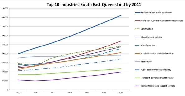
    The biggest growth industry for coming years and for the foreseeable future, the official forecasts all seem to agree on, will be in health care and social assistance. This includes professions from surgeons to GPs to nurses to child care or aged care, various therapies and counsellors, dental, and even laundry workers, cleaners and administrative support roles. Already our biggest single industry, it employs more than 1.5 million Australians. It grew by over 20% in the five years to 2015 and that rate of growth is unlikely to change going forward. Nearly half of everyone in this industry has a bachelor’s degree or some higher education qualification so they’re not all hospital cleaners – many will be skilled professionals.

    This will be followed by the professional, scientific and technical services industry and very close behind that, the education and training industry. Construction, manufacturing (yes, still growing despite all attempts to kill it off) and accommodation and food services round up the top six biggest growth industries of the future.

    This is important because the nature of the growth industries of the future and where they will be located is going to reshape our cities in a very different way to the industries that grew with and shaped our cities in the past. This was highlighted in a recent report on employment in the growing region of South East Queensland, prepared by Macroplan for The Suburban Alliance.

    The health care and social assistance industry is predicted by government authorities to grow more than any other industry in the years to 2041, producing around 220,000 extra jobs. But this industry has very different spatial needs to, say, the legal industry which has the highest inner city concentration of any occupation in the region. In health and social assistance, 200,000 of those 220,000 jobs will likely be in suburban business districts or otherwise scattered across suburbia. The biggest growth industry has little need or preference for clustering in the inner city.

    Consider the implications for transport networks, property development and urban planning. Our urban model, reflecting a 100 years of employment centralization, is changing to one of employment dispersal. Jobs are not moving from the city centre to the suburbs but the industries which fuel growth are changing, and with them, the patterns of employment location.

    Even in the professional, scientific and technical services industry, much of that future growth will occur outside the inner city. Take the generically titled occupation of “professional.” There were 284,300 of these in the South East Queensland region but only 24% of them in the inner city. A further quarter were in a number of defined suburban business districts and the balance – half – elsewhere in suburbia. This is our second biggest growth industry and those patterns of employment distribution are unlikely to change meaning of the 146,000 new jobs in this industry to be created to 2041, the clear majority will likely be suburban based.

    The third biggest growth industry with education professionals also shows little evidence of centralization – only 7% of educators are inner city workers the rest are suburban. Even for those who describe their occupation as “Chief executives, general managers or legislators” there are only 21% of them in the inner city. And for clerical and administrative workers, it’s a similar picture: only 22% are inner city workers. The rest are suburbia based.

    Engineers appear to have a preference for central locations with 42% of the 16,639 engineers of South East Queensland in the inner city as do the lawyers with 65% of them in the entire region to be found in the inner city. But there are only (fortunately?) just over 9,000 lawyers in the entire region so unless there’s to be an unpredicted explosion of work in the legal profession in the future it’s hard to see this occupation fueling demand for space and transport in the inner city of the future.

    Fifty years ago, cities were full of clerical and administrative, managerial and professional workers, shuffling in to centralized offices on trams or trains or buses to clock on at 9am and clock off at 5pm. In the suburbs there were centres of manufacturing and heavy industry. In fifty years’ time, our cities will have different industries generating the bulk of jobs and many of those jobs will need to be based in suburban centres to be closer to their markets or regional transport arteries.

    What’s that going to mean for urban planning, transport systems or property development? Will we see existing commercial and retail centres in the suburbs expand to accommodate a growing need for premises associated with health or medical professions, education or professional suites? Will our city centres evolve to become more entertainment, recreational and culture based hubs for the regions they serve, rather than largely just places of work?

    There’s much more to be explored in this because the implications are profound. Sadly, much of our thinking around urban planning seems firmly rooted in traditional models which owe more to a sentimental rear vision view of urban development rather than a forward looking one.

    Footnote: If you or your organization is interested in exploring what this means in more detail, or for specific regions, please just drop me an email. I’d be very interested to discuss with you. I’ve got a handy presentation which runs through all this in a bit more detail which I’d be happy to share.

    Ross Elliott has more than twenty years experience in property and public policy. His past roles have included stints in urban economics, national and state roles with the Property Council, and in destination marketing. He has written extensively on a range of public policy issues centering around urban issues, and continues to maintain his recreational interest in public policy through ongoing contributions such as this or via his monthly blog, The Pulse.

  • Urban Talent Sheds Say a Lot About Cities

    Jim Russell pointed me as the workforce report program that LinkedIn runs.  They use their data to show trends in 20 major job markets.

    For each market they track, they put together a map of the 10 cities that market gains the most workers from and the ten in loses the most workers too.

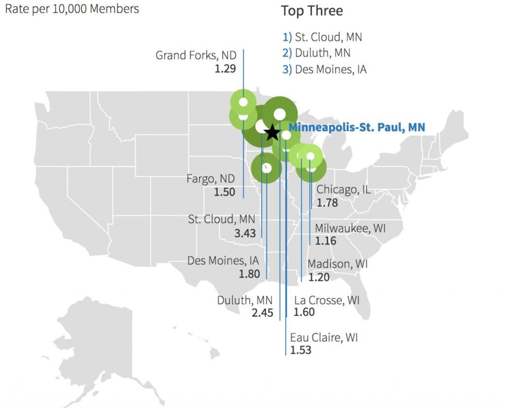
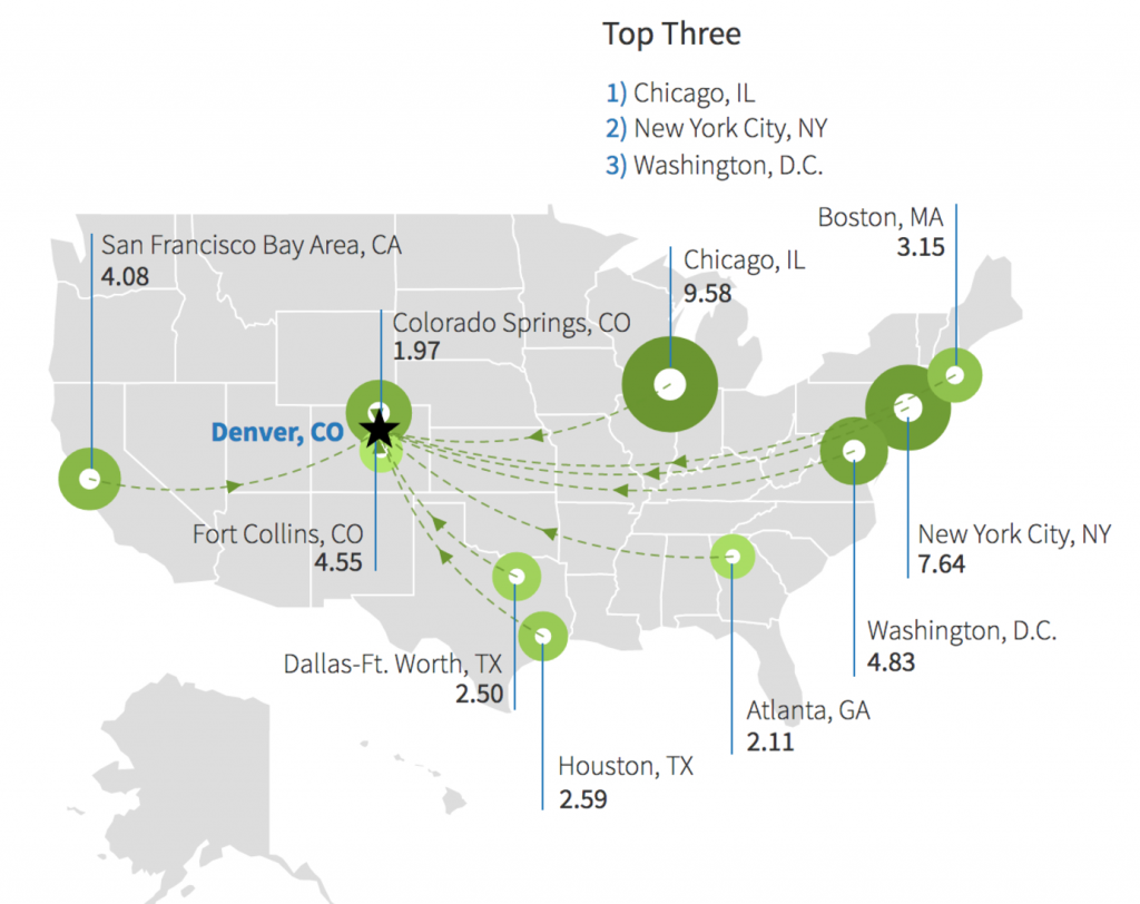
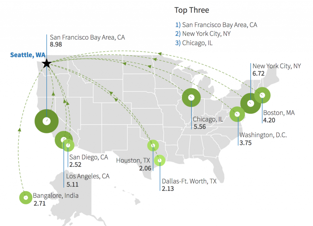
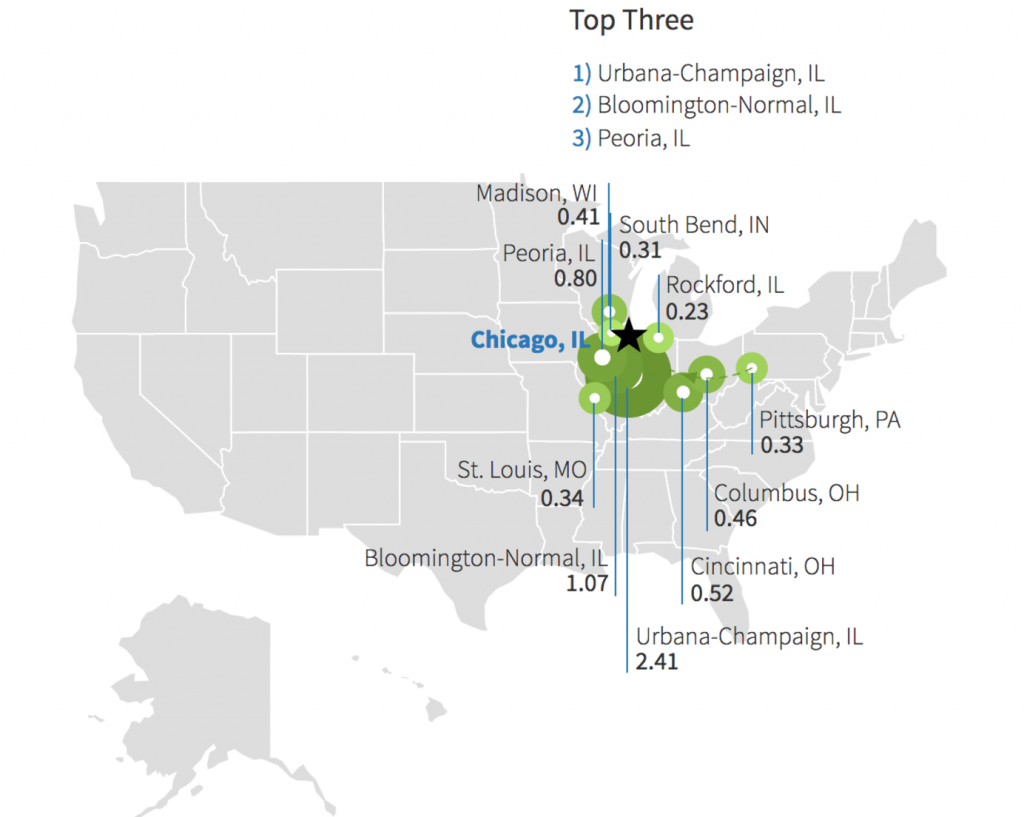
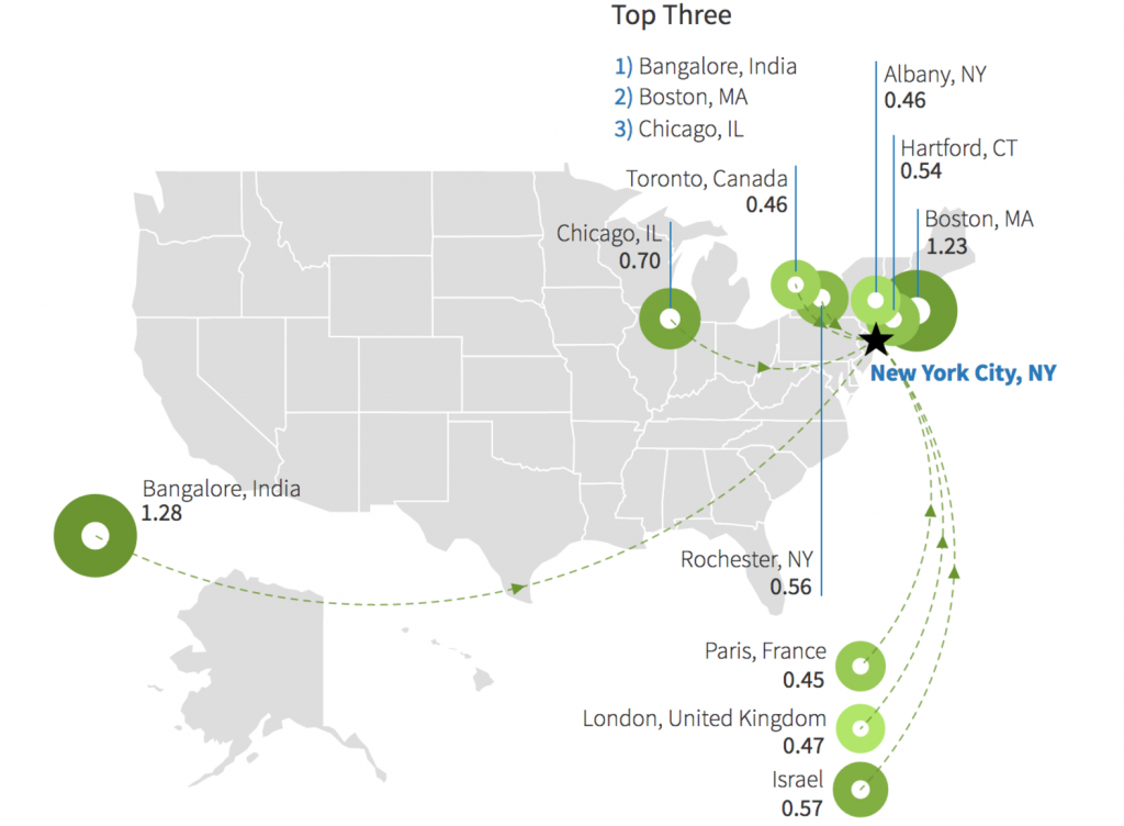
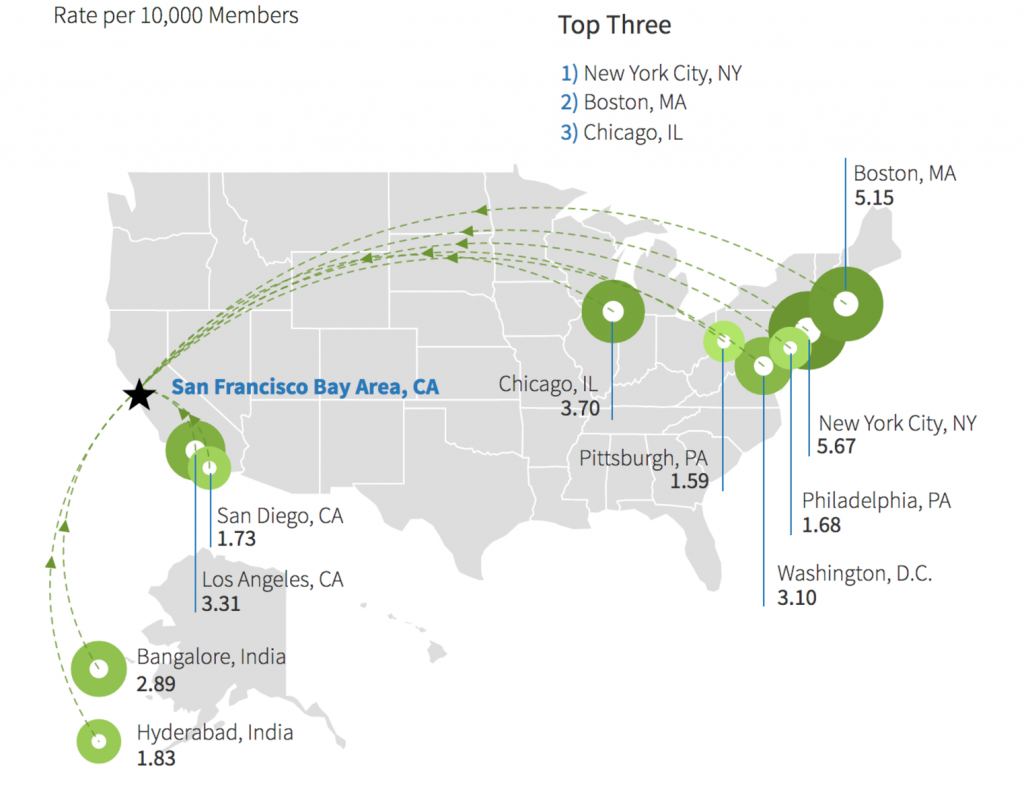
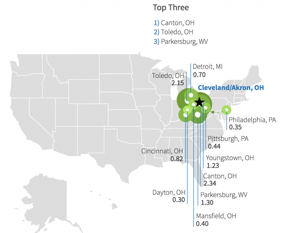
    These are interesting maps in their own right. They also highlight the extremely parochial nature of the talent flows into Midwestern cities. It’s pretty stark, actually. Here’s a set of comparisons, looking strictly at inflows. There are also outflow and gross migration charts and more information that’s interesting too, but I’ll leave you to dig into that yourself.

    Minneapolis vs. Denver vs. Seattle

    Let’s take a look at these three roughly peer cities. First, the top ten cities for Minneapolis.

    Despite the Twin Cities enjoying a high reputation withing the Midwest region, their draw remains highly regional. Their top draws are from adjacent states plus Chicago.

    By contrast, here’s Denver.

    And here’s Seattle:

    The difference is stark.

    Chicago vs. New York vs. San Francisco

    Living up to its reputation as the capital of the Midwest, Chicago’s draw is from a tightly focused region.

    Now, here’s New York:

    Four of New York’s top ten draws are actually from outside the country. That’s pretty amazing.

    And here’s San Francisco.

    You see the flows in mostly from other major tech hubs and big cities.

    Again, a pretty start difference.

    Cleveland vs. Nashville

    We see the same thing in smaller tier cities. Here’s Cleveland.

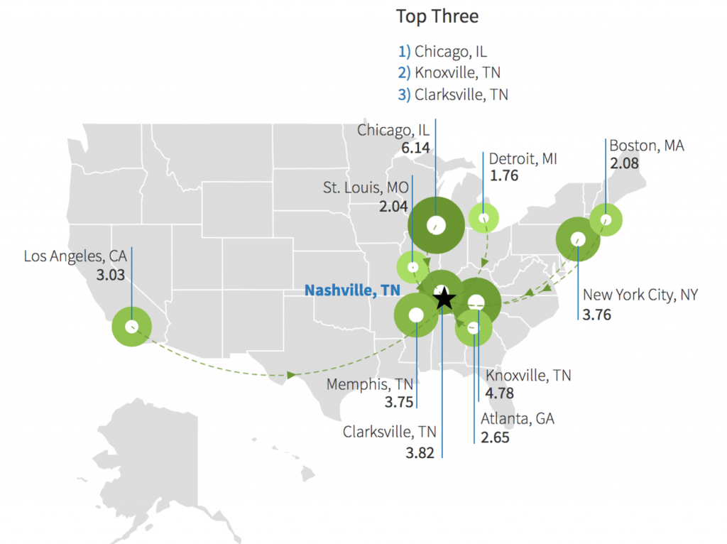
    And here’s Nashville.

    Again, I’d encourage you to spend some time over at LinkedIn. You can tell a lot about these cities and their economies just by their migration maps. You can also instantly see another dimension of the challenge facing Midwestern cities.

    This piece originally appeared on Urbanophile.

    Aaron M. Renn is a senior fellow at the Manhattan Institute, a contributing editor of City Journal, and an economic development columnist for Governing magazine. He focuses on ways to help America’s cities thrive in an ever more complex, competitive, globalized, and diverse twenty-first century. During Renn’s 15-year career in management and technology consulting, he was a partner at Accenture and held several technology strategy roles and directed multimillion-dollar global technology implementations. He has contributed to The Guardian, Forbes.com, and numerous other publications. Renn holds a B.S. from Indiana University, where he coauthored an early social-networking platform in 1991.