Blog

  • Underemployment in America

    The nation’s lackluster economic performance continues to be a concern. This is evident in stubbornly high unemployment rates (See: Suburban and Urban Core Poverty: 2012 Special Report),which continue to be well above historic norms. There is another indicator, which may be even more important – underemployment. This figure, 80 percent above the unemployment rate, can be used as a measure of the “output gap,” which a Congressional Research Service (CRS) report refers to as “the rate of actual output (economic) growth compared with the rate of potential output growth.” CRS continues: “Potential output is a measure of the economy’s capacity to produce goods and services when resources (e.g., labor) are fully utilized” (Note 1).

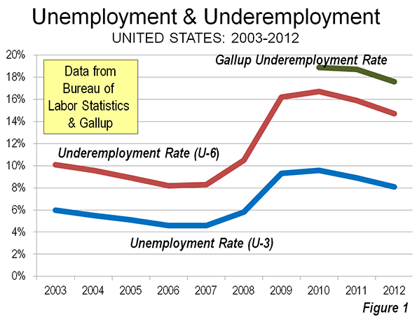
    Both rates are reported by the Department of Labor, Bureau of Labor Statistics (BLS). The national underemployment rate (BLS “U-6” labor underutilization measure) is far higher than the unemployment rate (BLS “U-3” labor underutilization measure). The 2012 underemployment rate was 14.7 percent, compared to the unemployment rate of 8.1 percent. The total unemployed population was 12.5 million in 2012, while the total underemployed population was 23.1 million.

    The difference between underemployment and unemployment comes by adding two groups: marginally attached workers and workers on part-time schedules for economic reasons. According to BLS, marginally attached workers are not counted as unemployed because they have not looked for work within the last four weeks, but they have sought work within the last year and are available for employment. Marginally attached workers include “discouraged” workers, who are not looking for work “because they believe there are no jobs available or there are none for which they would qualify.” In 2012, there were approximately 2.5 million marginally attached workers, including 900,000 “discouraged” workers.

    However, there was a much larger number of involuntary part time workers, at 8.1 million in 2012. This is nearly two-thirds of the 12.5 million workers unemployed in 2012.

    The number of underemployed may be higher. Gallup estimated the nation’s underemployment rate at 17.4 percent in August, well above the BLS August figure of 14.7 percent. The Gallup estimate would place underemployed workers at more than 27 million. This is approximately equal to all of the combined employment in the first and second largest states, California and Texas, as well as Colorado (Figure 1).

    Indeed, the number of underemployed could be higher yet. Economists Richard Vedder, Christopher Denhart, and Jonathan Robe at the Center for College Affordability and Productivity have estimated that 48 percent of employed college graduates hold jobs that do not require college degrees, using BLS data. None of these, as long as they are full time employees, would be included in the underemployment figures.

    Underemployment by State

    In addition to its monthly national estimates, BLS provides quarterly, year-on-year estimates by state, but only for Los Angeles County and New York City below the state level. Data is shown for 2006, the year of the best underemployment rate in the last decade, 2010, with the worst underemployment rate and the most recent year for which data is available, ending June 30, 2013 (Table).

    Underemployment Rates 
    by State, Los Angeles County & New York City
      2006 2010 2013q2* Rank
    United States 8.2% 16.7% 14.3%  
    Alabama 7.3% 17.3% 13.0% 22
    Alaska 11.8% 14.3% 12.4% 16
    Arizona 7.6% 18.4% 15.7% 42
    Arkansas 9.1% 14.5% 13.6% 25
    California 9.1% 22.1% 18.3% 50
    Colorado 7.9% 15.4% 13.8% 28
    Connecticut 7.8% 15.7% 14.6% 37
    Delaware 6.4% 14.3% 14.1% 30
    District of Columbia 9.8% 14.0% 14.1% 30
    Florida 6.2% 19.3% 15.1% 39
    Georgia 8.1% 17.9% 15.6% 40
    Hawaii 6.2% 16.9% 11.4% 12
    Idaho 6.9% 16.3% 13.6% 25
    Illinois 8.1% 17.5% 16.1% 47
    Indiana 8.1% 17.4% 14.5% 36
    Iowa 6.7% 11.6% 9.5% 5
    Kansas 7.4% 12.4% 10.9% 9
    Kentucky 9.3% 16.4% 14.3% 34
    Louisiana 8.1% 12.9% 12.5% 18
    Maine 8.2% 15.2% 14.2% 32
    Maryland 6.5% 13.0% 12.0% 15
    Massachusetts 8.2% 14.3% 13.3% 23
    Michigan 12.2% 21.0% 16.1% 47
    Minnesota 7.9% 13.8% 11.2% 11
    Mississippi 10.2% 17.6% 15.8% 45
    Missouri 8.0% 15.8% 12.4% 16
    Montana 6.9% 14.9% 12.7% 20
    Nebraska 6.1% 8.6% 8.7% 3
    Nevada 6.8% 23.6% 19.0% 51
    New Hampshire 6.1% 11.8% 11.1% 10
    New Jersey 7.8% 15.7% 15.7% 42
    New Mexico 7.5% 15.6% 13.7% 27
    New York 7.7% 14.8% 14.2% 32
    North Carolina 8.6% 17.4% 15.6% 40
    North Dakota 6.2% 7.4% 6.2% 1
    Ohio 9.7% 16.9% 13.5% 24
    Oklahoma 7.3% 11.4% 10.0% 6
    Oregon 10.4% 20.0% 16.9% 49
    Pennsylvania 8.0% 14.7% 13.8% 28
    Rhode Island 8.9% 19.2% 15.9% 46
    South Carolina 10.8% 18.1% 15.0% 38
    South Dakota 6.2% 9.7% 7.8% 2
    Tennessee 8.7% 16.6% 14.3% 34
    Texas 8.6% 14.4% 11.6% 13
    Utah 5.8% 15.1% 10.5% 7
    Vermont 6.4% 12.5% 10.5% 7
    Virginia 6.0% 12.9% 11.6% 13
    Washington 9.4% 18.4% 15.7% 42
    West Virginia 8.8% 14.0% 12.5% 18
    Wisconsin 8.1% 14.8% 12.9% 21
    Wyoming 5.8% 11.5% 9.0% 4
    Los Angeles County 9.1% 24.3% 20.5%
    New York City 8.7% 15.6% 15.1%
    Source: Bureau of Labor Statistics
    *2013q3: Year ended June 30, 2013


    Worst Performing States

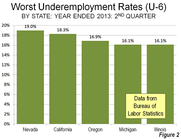
    Underemployment in the states is highest in some Western and Midwestern states. For the 12 months ended June 30, Nevada had the highest underemployment rate, at 20.3 percent. California was second, at 19.3 percent, while Oregon had the third highest underemployment rate, at 16.9 percent. Michigan and Illinois were tied for fourth highest, at 16.1 percent (Figure 2).

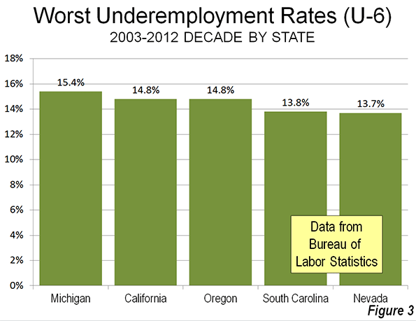
    Over the past decade (2003 through 2012), four of these states were among the five with the highest underemployment rates. Michigan, hard hit by manufacturing losses, had the highest average underemployment rate (15.6 percent), followed by California and Oregon (both at 14.8 percent), South Carolina (13.8 percent) and Nevada (13.7 percent). For the most part, underemployment has become intractable in these states. Only Nevada, with its precipitous decline from the housing crisis ranked better than 40th worst in underemployment in any year between 2003 and 2012 (Figure 3).

    Best Performing States

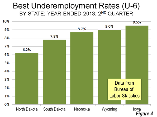
    The best underemployment rates were literally concentrated in five adjacent states with strong energy sector states, principally in the Great Plains. North Dakota led the nation for the year ended June 30, 2013, with an underemployment rate of 6.2 percent, less than one-half the national rate (14.7 percent) and less than one-third the rates of Nevada and California. North Dakota’s neighbor to the south, South Dakota had the second best rate, at 7.8 percent, while   Nebraska ranked third at 8.7 percent. On Nebraska’s western border, Wyoming, the only non-Plains state in the top five, ranked fourth with an underemployment rate of 9.0 percent. Nebraska’s eastern neighbor, Iowa, ranked fifth, at 9.5 percent (Figure 4).

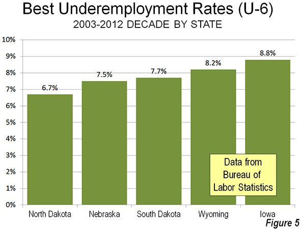
    As with the states with the worst underemployment rates over the last decade, those with the lowest  current figure also did best from 2003 and 2012. North Dakota is again number one, with an underemployment rate of 6.7 percent. Nebraska (7.5 percent), South Dakota (7.7 percent) and Wyoming (8.2 percent) follow, with New Hampshire ranking fifth best, at 8.8 percent (Figure 5).

    Underemployment in New York City and Los Angeles County

    For the year ended June 30, 2013, the city of New York had an underemployment rate of 15.1 percent, somewhat above the national rate of 14.3 percent. Over the past decade, the state of New York’s underemployment rate has been lower than that of the city in every year.  

    Los Angeles County is the largest county in the United States and if it were a state would rank eighth in population, between Ohio and Georgia. Further, it Los Angeles County were a state, it would have had the worst underemployment rate in every year from the 2008 to the present. For the year ended June 30 2013, Los Angeles County had an underemployment rate of 20.8 percent, nearly 1/2 higher than the national underemployment rate 14.7 percent and above the highest state rate of 20.3 percent in Nevada.

    Closing the Productivity Gap

    The productivity gap that results from underemployment constrains the US economy at a time of unusually severe financial challenges. College graduates face not only a grim employment market, but have student loan repayments that require good jobs. The nation continues to spend more than it collects in taxes. The inability of state and local governments to fund their government employee pension programs could lead, in the worst case, to much higher taxes or severe service cutbacks.

    Yet things could get worse. The soon to be implemented “Patient Protection and Affordable Care Act” (“Obamacare”) has a built-in incentives for employers to shift workers to part time status (weekly schedule of fewer than 30 hours of work per week). The law exempts them from providing health insurance for employees who work part time and so some establishments are shifting full time employees to part time status. Others establishments may substitute hiring part time employees instead of full time to reduce their expenses. This incentive is not just being executed by private companies seeking to maintain profitability. It extends to state and local government agencies, which unlike the federal government, must balance their books each year. According to a running of enterprises announcing shifts to part-time by Investors Business Daily, more than 75 percent are government agencies.

    All of this points to two important policy implications. The first is the necessity of focusing on the underemployment measure, the improvement of which is so crucial to maintaining and improving the standard of living and reducing poverty (by reducing the productivity gap). The second is that, with such a focus, policy makers from Washington to Sacramento, Lansing, and Carson City must pursue policies that encourage investment and employment.

    Wendell Cox is a Visiting Professor, Conservatoire National des Arts et Metiers, Paris and the author of “War on the Dream: How Anti-Sprawl Policy Threatens the Quality of Life.

    Note 1: A detailed comparison of the unemployment (U-3) and underemployment (U-6) rates is provided by economist Ed Dolan. A useful chart comparing the two indicators, with numbers from June 2012 will be found on qz.com.

    Note 2: Vedder, Denhart and Robe also suggest the possibility of “over-investment,” as more students may have been encouraged to higher education levels than there are likely to be correspondingly appropriate jobs. The extent of such over-investment is not known.

    Unemployed woman photo by BigStockPhoto.com.

  • Fixing California: The Green Gentry’s Class Warfare

    Historically, progressives were seen as partisans for the people, eager to help the working and middle classes achieve upward mobility even at expense of the ultrarich. But in California, and much of the country, progressivism has morphed into a political movement that, more often than not, effectively squelches the aspirations of the majority, in large part to serve the interests of the wealthiest.

    Primarily, this modern-day program of class warfare is carried out under the banner of green politics. The environmental movement has always been primarily dominated by the wealthy, and overwhelmingly white, donors and activists. But in the past, early progressives focused on such useful things as public parks and open space that enhance the lives of the middle and working classes. Today, green politics seem to be focused primarily on making life worse for these same people.

    In this sense, today’s green progressives, notes historian Fred Siegel, are most akin to late 19th century Tory radicals such as William Wordsworth, William Morris and John Ruskin, who objected to the ecological devastation of modern capitalism, and sought to preserve the glories of the British countryside. In the process, they also opposed the “leveling” effects of a market economy that sometimes allowed the less-educated, less well-bred to supplant the old aristocracies with their supposedly more enlightened tastes.

    The green gentry today often refer not to sentiment but science — notably climate change — to advance their agenda. But their effect on the lower orders is much the same. Particularly damaging are steps to impose mandates for renewable energy that have made electricity prices in California among the highest in the nation and others that make building the single-family housing preferred by most Californians either impossible or, anywhere remotely close to the coast, absurdly expensive.

    The gentry, of course, care little about artificially inflated housing prices in large part because they already own theirs — often the very large type they wish to curtail. But the story is less sanguine for minorities and the poor, who now must compete for space with middle-class families traditionally able to buy homes. Renters are particularly hard hit; according to one recent study, 39 percent of working households in the Los Angeles metropolitan area spend more than half their income on housing, as do 35 percent in the San Francisco metro area — well above the national rate of 24 percent.

    Similarly, high energy prices may not be much of a problem for the affluent gentry most heavily concentrated along the coast, where a temperate climate reduces the need for air-conditioning. In contrast, most working- and middle-class Californians who live further inland, where summers can often be extremely hot, and often dread their monthly energy bills.

    The gentry are also spared the consequences of policies that hit activities — manufacturing, logistics, agriculture, oil and gas — most directly impacted by higher energy prices. People with inherited money or Stanford degrees have not suffered much because since 2001 the state has created roughly half the number of mid-skilled jobs — those that generally require two years of training after high-school — as quickly as the national average and one-tenth as fast as similar jobs in archrival Texas.

    In the past, greens and industry battled over such matters, which led often to reasonable compromises preserving our valuable natural resources while allowing for broad-based economic expansion. During good economic times, the regulatory vise tended to tighten, as people worried more about the quality of their environment and less about jobs. But when things got tough — as in the early 1990s — efforts were made to loosen up in order to produce desperately needed economic growth.

    But in today’s gentry-dominated era, traditional industries are increasingly outspent and out maneuvered by the gentry and their allies. Even amid tough times in much of the state since the 2007 recession — we are still down nearly a half-million jobs — the gentry, and their allies, have been able to tighten regulations. Attempts even by Gov. Jerry Brown to reform the California Environmental Quality Act have floundered due in part to fierce gentry and green opposition.

    The green gentry’s power has been enhanced by changes in the state’s legendary tech sector. Traditional tech firms — manufacturers such as Intel and Hewlett-Packard — shared common concerns about infrastructure and energy costs with other industries. But today tech manufacturing has shrunk, and much of the action in the tech world has shifted away from building things, dependent on energy, to software-dominated social media, whose primary profits increasingly stem from selling off the private information of users. Servers critical to these operations — the one potential energy drain — can easily be placed in Utah, Oregon or Washington where energy costs are far lower.

    Even more critical, billionaires such as Google’s Eric Schmidt, hedge fund manager Thomas Steyer and venture firms like Kleiner Perkins have developed an economic stake in “green” energy policies. These interests have sought out cozy deals on renewable energy ventures dependent on regulations mandating their use and guaranteeing their prices.

    Most of these gentry no doubt think what they are doing is noble. Few concern themselves with the impact these policies have on more traditional industries, and the large numbers of working- and middle-class people dependent on them. Like their Tory predecessors, they are blithely unconcerned about the role these policies are playing in accelerating California’s devolution into an ever more feudal society, divided between the ultrarich and a rapidly shrinking middle class.

    Ironically, the biggest losers in this shift are the very ethnic minorities who also constitute a reliable voter block for Democratic greens. Even amid the current Silicon Valley boom, incomes for local Hispanics and African-Americans, who together account for one-third of the population, have actually declined — 18 percent for blacks and 5 percent for Latinos between 2009 and 2011, prompting one local booster to admit that “Silicon Valley is two valleys. There is a valley of haves, and a valley of have-nots.”

    Sadly, the opposition to these policies is very weak. The California Chamber of Commerce is a fading force and the state Republican Party has degenerated into a political rump. Business Democrats, tied to the traditional industrial and agricultural base, have become nearly extinct, as the social media oligarchs and other parts of the green gentry, along with the public employee lobby, increasingly dominate the party of the people. Some recent efforts to tighten the regulatory knot in Sacramento have been resisted, helped by the governor and assisted by the GOP, but the basic rule-making structure remains, and the government apparat remains highly committed to an ever more expansive planning regime.

    Due to the rise of the green gentry, California is becoming divided between a largely white and Asian affluent coast, and a rapidly proletarianized, heavily Hispanic and African-American interior. Palo Alto and Malibu may thrive under the current green regime, and feel good about themselves in the process, but south Los Angeles, Oakland, Fresno and the Inland Empire are threatened with becoming vast favelas.

    This may constitute an ideal green future — with lower emissions, population growth and family formation — for whose wealth and privilege allow them to place a bigger priority on nature than humanity. But it also means the effective end of the California dream that brought multitudes to our state, but who now may have to choose between permanent serfdom or leaving for less ideal, but more promising, pastures.

    Joel Kotkin is executive editor of NewGeography.com and Distinguished Presidential Fellow in Urban Futures at Chapman University, and a member of the editorial board of the Orange County Register. He is author of The City: A Global History and The Next Hundred Million: America in 2050. His most recent study, The Rise of Postfamilialism, has been widely discussed and distributed internationally. He lives in Los Angeles, CA.

    This piece originally appeared at U-T San Diego.


  • Bridges Boondoggle, Portland Edition

    A couple weeks ago I outlined how the Ohio River Bridges Project in Louisville had gone from tragedy to farce. Basically none of the traffic assumptions from the Environmental Impact Statements that got the project approved are true anymore. According to the investment grade toll study recently performed to set toll rates and sell bonds, total cross river traffic will be 78,000 cars (21.5%) less than projected in the original FEIS. What’s more, tolls badly distort the distribution of traffic that will come such that the I-65 downtown bridge, which is being doubled in capacity, will never carry just what the existing bridge carries right now anytime during the study period, and won’t exceed the design capacity even slightly until 2050. Meanwhile, the I-64 bridge that will remain free will grow in traffic by 55% by 2030, when it will be 34% over capacity.

    A nearly identical scenario is playing out in Portland with the $2.75 billion I-5 Columbia River Crossing. Joe Cortright of Impresa consulting unearthed the information through freedom of information requests looking into the investment grade toll study on that is being conducted for that bridge. You can see his report here (there’s also a summary available).

    I’ll highlight some of his truly eye-popping findings. Traffic forecasts are inflated, of course. The toll study is suggesting traffic increases of 1.1% to 1.2% per year when over the last decade traffic has actually declined by 0.2% per year on average even though there are no tolls. But it’s the addition of tolls that badly distort cross-river traffic and make a mockery out of the EIS. Here’s the money chart for the I-5 bridge itself:


    How is it possible that after building a gigantic multi-billion dollar bridge traffic declines? For the same reason as Louisville: tolling will cause huge amounts of traffic to divert to the I-205 free bridge. By 2016 traffic on I-205 would rise from 140,000 per day to 188,000 – and up to 210,000 by 2022 (full capacity).

    This is so eerily similar to the Louisville situation, that someone suggested, only half in jest I suspect, that they must be having “how to” training sessions on this stuff over at AASHTO HQ.

    Unlike Louisville, where a docile press is basically in cahoots with the state DOTs pushing the project, Portland’s media started asking questions. And one local paper even caught a civil engineering professor from Georgia serving on the independent review board for the project labeling the tolling scheme “stupid.” (Louisvillians take note).

    Oregon DOT director Matt Garrett released a letter in response in which he says, “This work is fundamentally different than the traffic analysis completed for the Final Environmental Impact Statement, and with very different goals in mind.” I agree. The FEIS was performed with the goal of getting this bridge the DOT wanted built approved. The toll study was designed to withstand financial scrutiny on Wall Street and be relied on in selling securities. I’ll let you be the judge of which is more likely to be closer to the truth. What’s more, Cortright addresses this very issue by saying in his report, “Neither federal highway regulations nor federal environmental regulations authorize or direct using multiple, conflicting forecasts for a single project, or using one set of traffic numbers for one purpose, and a different set for another.” I might also add that the DOTs in Louisville have not to the best of my knowledge made similar claims to explain away an identical discrepancy there. Nevertheless, the rest of Garrett’s letter acknowledges that I-5 will see a big traffic drop and there will be diversion from tolling. So he appears to just be doing the bureaucratic equivalent of “pay no attention to that man behind the curtain.”

    Again, want to know how it is that we spend so much money on transport infrastructure and get so little value? It’s because far too many of our highway dollars go into boondoggle mega-projects ginned up through political pressure (watch this space as I have another example coming soon) instead of into projects that make transportation sense. It may well be that there are legitimate problems with the existing I-5 river crossing, but these numbers give no confidence that the Oregon DOT has come up with a good or cost-effective plan for dealing with them. Unlike some, I do think we need to build more roads in America. Unfortunately our system is set up to ensure the survival of the unfittest instead of projects that make actual transportation and economic sense.

    Aaron M. Renn is an independent writer on urban affairs and the founder of Telestrian, a data analysis and mapping tool. He writes at The Urbanophile, where this piece originally appeared.

    Photo of current Columbia River crossing by Jonathan Caves.

  • The Cities Creating The Most Middle-Class Jobs

    Perhaps nothing is as critical to America’s future as the trajectory of the middle class and improving the prospects for upward mobility. With middle-class incomes stagnant or falling, we need to find a way to generate jobs for Americans who, though eager to work and willing to be trained, lack the credentials required to enter many of the most lucrative professions.

    Mid-skilled jobs in areas such as manufacturing, construction and office administration — a category that pays between $14 and $21 an hour — can provide a decent standard of living, particularly if one has a spouse who also works, and even more so if a family lives in a relatively low-cost area. But mid-skilled employment is in secular decline, falling from 25% of the workforce in 1985 to barely 15% today. This is one reason why middle- and working-class incomes remain stagnant, well below pre-recession levels.

    Over the past three years, high-wage professions have accounted for 29% of new jobs created, while the lowest-paid jobs (under $13 an hour) have grown to encompass roughly half of all new jobs. Net worth-wise, as a recent Pew study notes, the wealthy — the top 7% — are thriving due to the rebound of the stock and bond markets; the bottom 93%, whose wealth is more tied up in their homes,  is still feeling the hangover from the cratering of housing prices in the recession.

    No surprise then that about a third of all Americans now consider themselves lower class, according to another Pew study, up from a quarter before the recession.

    But middle-income employment has not vanished everywhere.  An analysis of the distribution of new jobs since 2010 by Economic Modeling Specialists, Inc. found a wide disparity among the states. Between 34% and 45% of all new jobs have been mid-wage in Wyoming, Iowa, North Dakota, Michigan and Arizona. The worst performers: Mississippi where only 10% of new jobs have been middle-income, followed by New York, New Hampshire, New Jersey and Virginia, all with 14% or less. (Note: I use the terms “mid-skill” and “middle-income” interchangeably; recent research suggests pay is a reasonable proxy for skill.)

    Generally speaking mid-skilled employment is expanding the most in states with strong overall job growth, and less in high-cost, high-tax states, with the notable exception of Mississippi. The EMSI data also suggest that states with expanding heavy industries such as oil and manufacturing generate more positions for mid-level workers such as machinists, truck drivers, welders and oil roustabouts. At the same time, the states with a bifurcated combination of low-wage industries, like hospitality or retail, and high-paid professions, like software engineers or investment bankers, tend to have fewer opportunities for middle-income workers.

    This pattern becomes clearer if we look at metropolitan areas, the level at which most economic activity takes place. Mark Schill at the Praxis Strategy Group crunched the data for us on employment trends over the five years since the recession in the 51 metropolitan statistical areas with over 1 million people. It’s not a pretty picture. Three years since employment hit bottom, the U.S. still has 2 million fewer mid-income jobs than at the onset of the financial crisis in 2007; half of that deficit is in the largest metro areas.

    But the pain is not evenly distributed. There are eight metro areas that boast more mid-level jobs today than in 2007. The list is dominated by Texas cities, led by Austin-Round Rock-San Marcos, which has added 17,000 mid-skill jobs — an increase of 7.6%  – among the 95,000 new jobs generated in the region. The largest numeric increase is in Houston-Sugarland-Baytown, which has 60,810 more mid-skilled jobs, up 7.4%. The Houston metro area also has easily led the nation in overall job growth since 2007, adding a net 280,000 positions.

    Texas metro areas also come in third and fourth: in San Antonio-New Braunfels, middle-income employment rose 3.4%; in Dallas-Ft. Worth-Arlington , 3.1%. Nearby Oklahoma City comes in fifth with 2.1% growth in middle-income employment, sharing the merits of relatively low costs and a strong energy economy.

    The working class and  the endangered middle class may be favored topics of discussion in the deepest blue regions, but for the most part these metro areas have failed to bolster their middle-skilled labor forces. Los Angeles-Long Beach leads the league with the biggest net loss of mid-skilled jobs since 2007, down by 112,300, or 6.1%. Chicago had the second-largest numerical decline, some 102,100, or 7.6%, followed by New York, which lost 82,350 such jobs, 3.4% of its total in 2007. In contrast, notes economist Tyler Cowen, Texas has not only created the most middle-income jobs, but a remarkableone-third of all net high-wage jobs created over the past decade.

    The loss of manufacturing jobs is clearly part of the problem here; despite the recent resurgence in the industrial sector, the U.S. still has 740,000 fewer middle-skill manufacturing jobs than in 2007. Chicago and Los Angeles remain the nation’s largest industrial regions, but they are also among the most rapidly de-industrializing areas in the country. New York City, once among the world’s leading industrial centers, with roughly a million manufacturing workers in 1950, is down to around 75,000. In contrast, industrial employment has been expanding in the Houston, Seattle and Oklahoma City metro areas, and recently even Detroit.

    In contrast, New York, Chicago and L.A. have seen job gains in such low-wage areas as hospitality and retail, as well as a smaller surge in high-end employment — notably in information and business services. But the welcome growth in these positions is not enough to make up for the big hole in middle-class employment. Since the recession, for example, New York has lost manufacturing and construction jobs at a double-digit rate while hospitality employment grew 18% and retail 10%. Los Angeles and Chicago showed similar patterns, but actually did worse in higher-wage sectors, like professional business services.

    Another major area of lost middle-class jobs has been construction. The U.S. is still down 1.2 million middle-skill construction jobs since 2007 and 125,000 in real estate. These losses have inflicted the most pain in the boom towns that grew fastest in the early 2000s. The biggest loser of mid-skill jobs in percentage terms is Las Vegas-Paradise, Nev., which has suffered a staggering 16.1% loss in such jobs since 2007. It’s followed by Riverside-San Bernardino-Ontario, Calif. (-10.6%); Sacramento-Arden-Arcade-Roseville, Calif., (-10.4%); Tampa- St. Petersburg- Clearwater, Fla. (-9.7%); and Phoenix-Mesa- Scottsdale, Ariz. (-9.3%).

    Whether in the biggest cities, or Sun Belt boom towns, the issue of increasing middle-income employment should be as much of a priority for policymakers as attracting glamorous high-wage jobs or helping the poor. America’s identity has been built around the idea that hard work, particularly with some study for a particular skill, should be rewarded with decent pay. Boosting employment in mid-skill professions, from construction and manufacturing to logistics and energy, is critical to achieving this goal.

    If we fail to stem the erosion of middle-income jobs, we will be faced with a continued descent into a Latin American style society divided largely between an affluent elite and multitudes of the poor, with a thin layer in the middle. This promises miserable consequences for most Americans and the future of our democracy.

    Note: An early version of this table listed incorrect figures in the 2013 total jobs column.

    Middle-skill Employment in U.S. Metropolitan Areas
    Metropolitan Statistical Area Name 2013 Middle Skill Jobs 2007-2013 Change % Change % Change Rank 2013 Location Quotient 2013 LQ Rank
    Austin-Round Rock-San Marcos, TX 248,988 17,485 7.6% 1 0.93 41
    Houston-Sugar Land-Baytown, TX 878,038 60,810 7.4% 2 1.00 17
    San Antonio-New Braunfels, TX 310,920 10,316 3.4% 3 1.07 3
    Dallas-Fort Worth-Arlington, TX 959,326 29,178 3.1% 4 0.98 23
    Oklahoma City, OK 198,944 4,113 2.1% 5 1.05 8
    New Orleans-Metairie-Kenner, LA 177,207 2,676 1.5% 6 1.05 8
    Nashville-Davidson–Murfreesboro–Franklin, TN 263,022 2,309 0.9% 7 1.02 12
    Salt Lake City, UT 221,892 476 0.2% 8 1.07 3
    Denver-Aurora-Broomfield, CO 390,661  (2,824) -0.7% 9 0.96 31
    Indianapolis-Carmel, IN 274,996  (3,143) -1.1% 10 0.98 23
    Boston-Cambridge-Quincy, MA-NH 700,371  (9,683) -1.4% 11 0.90 46
    San Jose-Sunnyvale-Santa Clara, CA 233,796  (5,012) -2.1% 12 0.78 51
    Louisville/Jefferson County, KY-IN 199,292  (4,669) -2.3% 13 1.04 10
    Charlotte-Gastonia-Rock Hill, NC-SC 267,840  (6,888) -2.5% 14 0.98 23
    Pittsburgh, PA 358,823  (9,301) -2.5% 15 1.03 11
    Rochester, NY 147,269  (4,325) -2.9% 16 0.97 28
    Raleigh-Cary, NC 153,838  (4,854) -3.1% 17 0.93 41
    Baltimore-Towson, MD 391,208  (12,532) -3.1% 18 0.95 34
    Washington-Arlington-Alexandria, DC-VA-MD-WV 764,805  (25,078) -3.2% 19 0.80 50
    San Diego-Carlsbad-San Marcos, CA 492,724  (16,382) -3.2% 20 1.09 2
    New York-Northern New Jersey-Long Island, NY-NJ-PA 2,336,777  (82,350) -3.4% 21 0.88 48
    Columbus, OH 272,821  (9,829) -3.5% 22 0.95 34
    Buffalo-Niagara Falls, NY 159,658  (5,770) -3.5% 23 0.99 20
    Richmond, VA 193,104  (7,081) -3.5% 24 1.00 17
    San Francisco-Oakland-Fremont, CA 583,934  (21,618) -3.6% 25 0.87 49
    Seattle-Tacoma-Bellevue, WA 543,988  (21,651) -3.8% 26 0.97 28
    Minneapolis-St. Paul-Bloomington, MN-WI 507,261  (20,643) -3.9% 27 0.91 45
    Portland-Vancouver-Hillsboro, OR-WA 337,705  (19,386) -5.4% 28 1.02 12
    Hartford-West Hartford-East Hartford, CT 179,653  (10,578) -5.6% 29 0.95 34
    Philadelphia-Camden-Wilmington, PA-NJ-DE-MD 789,395  (49,105) -5.9% 30 0.95 34
    Atlanta-Sandy Springs-Marietta, GA 692,336  (44,530) -6.0% 31 0.95 34
    Los Angeles-Long Beach-Santa Ana, CA 1,731,419  (112,332) -6.1% 32 0.96 31
    St. Louis, MO-IL 393,900  (27,502) -6.5% 33 0.98 23
    Kansas City, MO-KS 302,025  (21,222) -6.6% 34 0.98 23
    Memphis, TN-MS-AR 192,693  (14,600) -7.0% 35 1.02 12
    Detroit-Warren-Livonia, MI 517,098  (39,268) -7.1% 36 0.93 41
    Orlando-Kissimmee-Sanford, FL 304,724  (23,533) -7.2% 37 0.95 34
    Cincinnati-Middletown, OH-KY-IN 302,932  (24,111) -7.4% 38 1.00 17
    Chicago-Joliet-Naperville, IL-IN-WI 1,249,263  (102,122) -7.6% 39 0.94 40
    Jacksonville, FL 200,324  (16,482) -7.6% 40 1.06 6
    Virginia Beach-Norfolk-Newport News, VA-NC 298,352  (25,147) -7.8% 41 1.19 1
    Miami-Fort Lauderdale-Pompano Beach, FL 706,788  (60,373) -7.9% 42 0.97 28
    Milwaukee-Waukesha-West Allis, WI 237,871  (20,489) -7.9% 43 0.96 31
    Cleveland-Elyria-Mentor, OH 304,167  (27,158) -8.2% 44 0.99 20
    Birmingham-Hoover, AL 162,440  (15,437) -8.7% 45 1.07 3
    Providence-New Bedford-Fall River, RI-MA 206,473  (20,670) -9.1% 46 0.99 20
    Phoenix-Mesa-Glendale, AZ 578,767  (59,101) -9.3% 47 1.02 12
    Tampa-St. Petersburg-Clearwater, FL 365,043  (39,371) -9.7% 48 1.02 12
    Sacramento–Arden-Arcade–Roseville, CA 259,792  (30,200) -10.4% 49 0.92 44
    Riverside-San Bernardino-Ontario, CA 431,892  (51,373) -10.6% 50 1.06 6
    Las Vegas-Paradise, NV 234,340  (44,849) -16.1% 51 0.89 47
    Total 23,210,895  (1,045,210) -4.3%      
    Source: EMSI Class of Worker – QCEW Employees + Non-QCEW Employees + Self-Employed
    Analysis by Mark Schill, Praxis Strategy Group

    This story originally appeared at Forbes.

    Joel Kotkin is executive editor of NewGeography.com and Distinguished Presidential Fellow in Urban Futures at Chapman University, and a member of the editorial board of the Orange County Register. He is author of The City: A Global History and The Next Hundred Million: America in 2050. His most recent study, The Rise of Postfamilialism, has been widely discussed and distributed internationally. He lives in Los Angeles, CA.

  • Cities and Sustainability: Is Intensification Good Policy?

    This post examines the idea that we can promote sustainability by increasing the densities of large cities around their centres.  This compact city paradigm presumes that we can reshape the consumption of citizens in environmentally benign ways by reshaping the cities they live in.  

    The sustainability challenge is the challenge of consumption: how much and what we consume drives our impact on the planet.  But presuming that by enforcing urban intensification we will transform ingrained patterns of consumption in favour of the environment may be a step too far.  Will obliging more citizens to live at higher densities in smaller dwellings around city centres really pave the way to environmental salvation?

    Some evidence of urban impacts

    The Australian Conservation Foundation is committed to ecological sustainability, tackling the social and economic causes of environmental problems.  Among other things, the Foundation publishes the onlineAustralian Consumption Atlas. This is a useful source for addressing the role of urbanisation and urban form.

    The Atlas is based on methodology which traces the direct and indirect demands on the environment of different goods and services.  Consumption patterns from Household Expenditure Surveys are related to household size and type, members’ age structure, incomes and education, and the statistical areas they live in. Using this information the environmental impacts of individuals living in different areas can be mapped. 

    Three indicators of impact are displayed in the atlas: tonnes of greenhouse gas emitted, litres of water consumed, and ecological footprint.  The latter estimates the area of resources required to support a person’s lifestyle.  You can read more about the methodology here.

    The data underlying the atlas is dated – based on the 2001 Census and 1999 Household Expenditure Survey, among other things.  But I do not expect the relativities it demonstrates, or the conclusions it supports, to have changed much.

    Cities don’t consume; people do

    Here is the authors’ key conclusion. Our urban planners, designers, and politicians should consider carefully:

    despite the lower environmental impacts associated with less car use, inner city households outstrip the rest of Australia in every other category of consumption. Even in the area of housing, the opportunities for relatively efficient, compact living appear to be overwhelmed by the energy and water demands of modern urban living, such as air conditioning, spa baths, down lighting and luxury electronics and appliances, as well as by a higher proportion of individuals living alone or in small households.

    In each state and territory, the centre of the capital city is the area with the highest environmental impacts, followed by the inner suburban areas. Rural and regional areas tend to have noticeably lower levels of consumption.

    (Consuming Australia: Main Findings, 2007, Australian Conservation Foundation, p.10)

    Looking inside Sydney

    I explored the indicators for different parts of Sydney.  Here are some results.

    Indicators of Environmental Impacts: Sydney Centre and Suburbs

    People in Inner Sydney generate 92% more greenhouse gas than the New South Wales Average, and well over twice as much as people in the lower income western suburbs, like Penrith and Blacktown. The levels are a bit higher for people in the more prosperous northern suburbs. Despite proximity to major employment centres, and an efficient commuter rail service, the consumption patterns of Willoughby and Ku-ring-gai residents generate high levels of air pollution. 

    Looking East to Sydney CBD
    (Source: www:freeaussiestock.com)

    A similar pattern is evident for water consumption – residents of the hot, dry, western suburbs account for the least consumption, Inner and North Sydney residents the most.  They also have the biggest ecological footprint.

    So what does this tell us?

    The lesson is not necessarily that location in the CBD is less sustainable; but that the lifestyle associated with it is. 

    I have discussed the potential inefficiency of small, multi-unit dwellings elsewhere.  Over and above that, the high cost of redevelopment in central locations calls for housing construction strategies that add little to sustainability.  

    One strategy is to build to modest standards.  This keeps the price down and rental yield up for investors; or creates opportunities for ownership by low income earners.  Another strategy is to adopt high standards of fit-out and install luxury appliances in favoured locations to make multi-unit dwellings attractive to wealthier households. 

    Neither option is particularly environmentally sympathetic.  

    Smaller is still better

    I also reviewed the indicators for smaller cities and towns in New South Wales.  (In some cases these included surrounding rural settlement).  

    Indicators of Environmental Impacts: New South Wales Towns and Small Cities

    This suggests that smaller towns hold the key to environmentally sustainable lifestyles, even more than city suburbs.  For example,  Coffs Harbour’s 73,000 residents generate greenhouse emissions at 88% of the state average, and just 46% of inner Sydney residents.  They consume water at 81% of the State rate (and 60% of North Sydney), and have an ecological footprint just 60% of their inner Sydney counterparts.  Similar patterns are evident in coastal settlements like Byron Bay (33,000 residents), Ballina (42,000), and Port Macquarie (77,000) and inland towns such as Griffith (26,000), Tamworth (60,000), and Wagga Wagga (64,000).

    What does it all add up to?

    A simple overview can be derived by summing the percentage deviations of each area from the New South Wales average across the three measures. Admittedly this is a course approach: it weights each indicator equally, and ignores differences in how much centres vary across each individually.  Nevertheless, it provides a sufficiently meaningful overview to confirm that towns and small cities are generally more sustainable than a large city, and that the suburbs perform better than the inner city. 

    Summary Index of the Environmental Impact of Urbanisation

    Explaining the sustainability dividend of small towns

    There can be any number of explanations for this, the obvious one being that it is all about income.  Perhaps the advantages of lifestyles outside Sydney simply reflect lower average incomes in smaller cities and towns.  As people become more affluent or seek more income, they migrate into the main cities taking their high consumption expectations with them; or by living in large cities they are more likely to earn – and consume – more. 

    Conversely, living in smaller cities and settlements may reflect lifestyle preferences which are intrinsically less environmentally intrusive.  At the same time. small settlements make less travel demands given the greater proximity to work, shopping, service, and recreation opportunities.  In addition, lower density housing may provide more opportunities for passive energy efficiency, directly reducing resource consumption for comparable activities.  

    Flawed policy

    Until we know more, however, we need to avoid the trap of determinism.  It would be short-sighted simply to invert the current paradigm, for example, and decide that policies to encourage people to live outside large cities and city centres will somehow enhance sustainability. 

    Ultimately, how we live is more important than where we live.  What the evidence here confirms, though, is that under current patterns of consumption promoting large scale urban consolidation is flawed as environmental as well as urban policy. 

    Phil McDermott is a Director of CityScope Consultants in Auckland, New Zealand, and Adjunct Professor of Regional and Urban Development at Auckland University of Technology.  He works in urban, economic and transport development throughout New Zealand and in Australia, Asia, and the Pacific.  He was formerly Head of the School of Resource and Environmental Planning at Massey University and General Manager of the Centre for Asia Pacific Aviation in Sydney. This piece originally appeared at is blog: Cities Matter.

    Aukland harbour photo by Bigstockphoto.com.