Blog

  • Land Planners Dig In Again

    In the housing industry, land planners are the first to be dropped during a downturn… and the first needed in an upturn. A good way to monitor the optimism of the housing development market is to monitor the volume of land planning.

    The land plan is the beginning of a long and arduous process. Unlike architecture, which is relatively quick from design to construction, land planning takes patience. It can easily consume a year or two (or more) for a US neighborhood to go from the initial design stages to the beginning of construction.

    Typically, but not always, national recessions coincide with downturns in the construction industry. For example, housing growth in the Minneapolis region leaped to the far outer suburban regions because we had an urban boundary that raised raw land prices and made unsubsidized affordable housing within the core unattainable. To get a financially attainable home for a middle-class family meant a 30 mile trek to the suburbs, typically in that shiny new gas guzzler SUV.

    About a year before the national recession, when local gas prices exceeded three dollars a gallon, homes sales in the outer reaches of the Twin Cities (Minneapolis-St. Paul) came to a standstill. This halt impacted the low-value suburban cookie cutter bland developments. Planning consultants that simply followed the regulatory minimums saw their workload come to a screeching halt.

    Around that same time, our unique land planning business grew 30%. Our clients were savvy developers and builders who knew that they needed an edge to entice buyers back into new purchases. Unfortunately, development redesign takes time to go through the approval processes. When the banking collapse triggered the national recession and the housing collapse, we had 105 neighborhoods going through the approval process. Within a 48 hour period, all 105 neighborhoods either went dead or dormant. The building industry Armageddon had begun.

    Most design professionals we knew reduced overhead to survive or went out of business. We weren’t aware of any that took the time or money to re-educate or re-tool. On the other hand, during the five year downturn we invested more time, money, and energy than we had in the past into improving design models, software technology (and related patents). This depleted our personal and corporate resources, because no bank or investor was interested in a company that served the home building industry. Our work outside the US kept us (barely) afloat.

    During the recession years we had only two jobs within the US: A single master planned community of 1,900 units, and a 20 lot subdivision. That was it. When 2012 began, the phone started ringing with requests for the planning of new domestic developments. The preparations to invest in the recovery were underway.

    In the years before the recession it had become increasingly more time consuming and difficult to gain approvals. The US is the only country in which we work where neighbors have input into development decisions, even when a project clearly meets all required regulations. But now, we are witnessing quicker approvals than before, as citizens (I think) recognize that their net worth, income potential, and perhaps their job (or that of a family member) is tied to getting the housing industry healthy again.

    When suburbia imploded, urban planners and architects rejoiced and announced a resurgence of urban growth that promised an era of utopian living. People were going to walk, bike, or be bused to nearby jobs in gentrified (i.e. expensive and exclusive) neighborhoods. Instead of decaying urban blight, we were going to see suburban blight. To be sure, urban economic growth areas such as Washington DC saw reinvestment and positive redevelopment, but for the most part, the promising urban rebirth miscarried.

    In the 45 years that I’ve been in the planning, engineering, and software side of land development, I’ve continually read about the death of the suburbs and the major change in the housing market. Most of the predictions have proven to be false. Terms like ‘cocooning’ and ‘clustering’ failed to catch on, and are no longer commonly used.

    More recently, I’ve seen a projection that 50% of all households will be single person entities in the not too distant future. I’m from the hippie generation. If, in 1969, forecasters judged that we represented future housing needs, everyone would surely have foreseen an upcoming growth in communal neighborhoods, marriages with multiple sex partners, and children raised in flower gardens. Yet most of our generation grew to be conservative, short haired, well behaved, religious suburbanites and business leaders.

    I’m certainly not an economist, a demographer, or a professor, but my projection is that the idealistic young people of any generation will eventually marry and desire (for the most part) a home with a yard in which to raise their children. A home they are proud to pull up to in a neighborhood that is beautiful, safe, connective, and functional. In addition, I believe that they will want a lower-maintenance home that consumes little energy for heating and cooling. That home could very well be in a redeveloped urban environment, or in a suburban setting.

    Those that qualify for a mortgage today want to arrive at an individual home that elevates their sense of self-worth, especially after experiencing the recession. Instead of a 10mpg SUV, they are likely to drive home in a vehicle that gets three to five times that efficiency, making the cost per gallon not so critical, even if we go beyond five dollars a gallon.

    The resurgence in development is sprouting in many regions. North Dakota, for example, desperately needs to house its workers in cities that offer enough of a living standard to entice families. Before the boom, the minimalistic regulations worked well. But that approach is far behind the curve to create competitive, sustainable towns during the current population explosion. The number of new development submittals and the demand for housing is overwhelming both the city staff and the local engineering firms.

    To make matters worse, developers and builders flooding into the area to make a quick buck have built some truly terrible dwelling places. The result has been a sense of caution that is preventing quick approvals. Many consulting firms that used to prepare farm property splits or new utility easements are now planning large scale developments. They are either unqualified or ill-prepared for designing new cities.

    Regulations such as streets with 66-foot wide right-of-ways and absurdly wide local paving widths (often over 40 feet) go unchallenged because consultants do not want to deviate from obsolete regulations in fear of further delaying approvals.

    Moving forward as the housing market recovers, if we simply repeat the same solutions that we used prior to the recession, growth will be slow but steady. If we add significantly more value by advancing both home and neighborhood design, efficiency, and value we can accelerate economic recovery and leave a better legacy for future generations. At the same time, we would increase developers’ profitability, and decrease municipal maintenance burdens. As with any product, demand is created or re-energized when the product is significantly improved.

    Rick Harrison is President of Rick Harrison Site Design Studio and Neighborhood Innovations, LLC. He is author of Prefurbia: Reinventing The Suburbs From Disdainable To Sustainable and creator of Performance Planning System. His websites are rhsdplanning.com and pps-vr.com.

    Flickr photo by outtacontext, ‘A few acres of suburban land, previously a high school… becoming a housing development.’

  • Major Metropolitan Areas in Europe

    Eurostat, the statistical agency of the European Commission (European Union) now designates metropolitan areas (Note) for the European Union (EU) and the European Three Trade Association (EFTA). The EU has 28 members, having just added Croatia, while the EFTA has 4 members. According to the latest data, there are 99 major metropolitan areas in Europe (those more than 1,000,000 residents).  Overall, Eurostat designates 305 metropolitan areas with more than 200,000 population.

    Europe’s Largest Metropolitan Areas

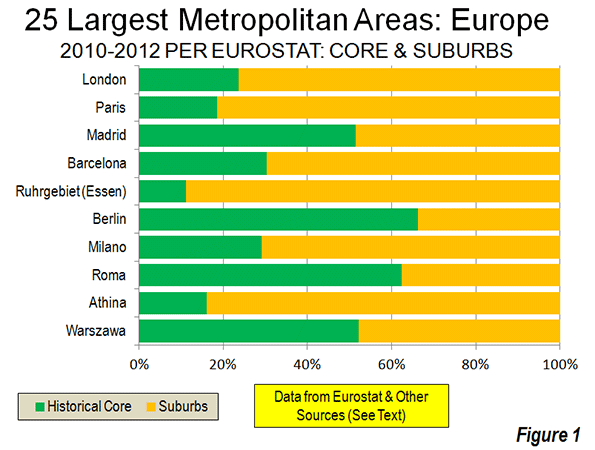
    London and Paris are by far the largest metropolitan areas in Europe. London’s population is approximately 13.6 million, of which approximately 24 percent live in the historical core of Inner London (the pre-1965 London County Council area). Paris has approximately 11.9 million residents, with 19 percent living in the historical core of the ville de Paris.

    The third and fourth largest major metropolitan areas are both in Spain. Madrid has a population of 6.4 million, more than half of which is in the historic core municipality. Barcelona ranks fourth largest, with a population of 5.4 million, with 30 percent living in the historical urban core municipality. In recent decades there has been substantial suburbanization in the valleys to the north of the city of Barcelona. Moreover, the Eurostat Milan metropolitan area definition could be too tight. The urbanization stretches into Como, Lecco and Varese and an argument could be made for inclusion of exurban Lodi and Pavia. These would raise Milan’s population to nearly that of Madrid.

    Germany has the other two metropolitan areas with more than 5 million residents, Essen (Ruhrgebiet or Rhine area) and Berlin. Both metropolitan areas have a population of 5.1 million. By some definitions, a Rhine-Ruhr metropolitan area would include Dusseldorf and even Cologne (Köln) and Bonn to the south. This wider area has a population of more than 11 million and would rank among the top three in Europe. Eurostat breaks this area into four metropolitan areas.

    Overall, approximately 1/3 of the metropolitan population lives in the historical urban cores of Europe’s 99 major metropolitan areas, with approximately 2/3 of living in the suburbs and exurbs (Figure 1). This percentage is somewhat smaller among the metropolitan areas with more than 5,000,000 population (30 percent). The 25 largest metropolitan areas are shown in the table, and all 99 metropolitan areas are listed in Europe: Major Metropolitan Areas & Historic Core Populations: 2010 to 2012.

    European Metropolitan Areas as Designated by Eurostat: Largest 25
    European Union (EU) and European Free Trade Association (EFTA)
    2010-2012 Estimates, with Historical Core Estimates
    Rank Metropolitan Area Nation Metropolitan Area (Millions) Year: Metropolitan Area Estimate Historical Core: Recent Year (Millions) Approximate % in Historical Core
    1  London   UK        13.614    2012             3.231    23.7%
    2  Paris   France        11.915    2012             2.204    18.5%
    3  Madrid   Spain          6.388    2012             3.284    51.4%
    4  Barcelona   Spain          5.357    2012             1.623    30.3%
    5  Ruhrgebiet (Essen)   Germany          5.135    2012             0.573    11.2%
    6  Berlin   Germany          5.098    2012             3.375    66.2%
    7  Milano   Italy          4.275    2012             1.242    29.1%
    8  Roma   Italy          4.234    2012             2.638    62.3%
    9  Athina   Greece          4.109    2012             0.664    16.2%
    10  Warszawa   Poland          3.272    2012             1.708    52.2%
    11  Hamburg   Germany          3.228    2012             1.734    53.7%
    12  Napoli   Italy          3.078    2012             0.959    31.2%
    13  Budapest   Hungary          2.985    2012             1.741    58.3%
    14  Brussels   Belgium          2.923    2012             0.166    5.7%
    15  Lisboa   Portugal          2.824    2012             0.548    19.4%
    16  Katowice   Poland          2.795    2012             0.308    11.0%
    17  München   Germany          2.727    2012             1.388    50.9%
    18  Stuttgart   Germany          2.692    2012             0.613    22.8%
    19  Manchester   UK          2.683    2012             0.503    18.8%
    20  Wien   Austria          2.636    2012             1.731    65.7%
    21  Lille – Dunkerque   France-Belgium          2.584    2012             0.227    8.8%
    22  Frankfurt am Main   Germany          2.575    2012             0.692    26.9%
    23  Praha   Czech Republic          2.521    2012             1.291    51.2%
    24  Valencia   Spain          2.513    2012             0.809    32.2%
    BY SIZE CATEGORY          
    Over 5,000,000 (6)       47.507              14.290    30.1%
    2,500,000 to 5,000,000 (18)       54.653              18.962    34.7%
    1,000,000 to 2,500,000 (75)     104.376              35.176    33.7%
    Total     206.536              68.428    33.1%
    Notes:            
    Metropolitan area estimates from Eurostat        
    Core estimates from multiple sources and is for 2008 or later      
    Historical Core: The smallest area corresponding or including the pre-automobile core for which data is readily available. In each case the historical core is the first named municipality (commune), except in London (where Inner London is used) and Antwerp (where the pre-1983 consolidation municipality is used).


    Enlargement Nations Compared to the EU-15 and EFTA

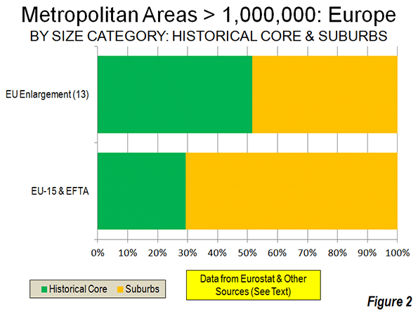
    The share of the population living in the historical urban cores is much higher in the generally less affluent nations that have been added to the European Union over the last decade. In the 13 enlargement nations, approximately 52 percent of the metropolitan area population lives in the historical urban core. By contrast, in the more affluent nations of the EU – 15 and the EFTA only 29 percent of the major metropolitan area population lives in the historical urban cores (Figure 2).

    To some degree, this difference is explained by the stronger central planning in metropolitan areas that developed in the more controlled economies in the enlargement nations before the fall of the Soviet Union. Planners were usually given larger geographical areas to control than has typically been the case in Western Europe, North America and Japan. The metropolitan areas of the enlargement nations also have substantially more dense principal urban areas, averaging 11,300 per square mile (4,300 per square kilometer), compared to 8,400 per square mile (3,200 per square kilometer) in the EU-15 and the EFTA.   

    Resurgence of the Historical Cores

    Western Europe’s historical cores experienced substantial population losses in the decades leading to 2000. This trend, similar to that in the United States, saw the population of Inner London drop 55 percent from its 1911 peak to its 1991 low. The ville de Paris lost more than one quarter of its population from 1921, a rate slightly greater than in the city of Chicago over the same years. Copenhagen lost 35 percent of its population. In the decades from the mid 20th century to 2000, virtually every major urban core municipality in Western Europe declined from its peak population, except for those that expanded their boundaries, combined with another municipality or had substantial greenfield space for suburban development within their city limits (such as Rome).

    Since 2000, as we see in the United States, many of the historical cores have begun adding population. Much of the increase has resulted from the international migration that has been spurred by the open borders of the EU’s enlargement (See: Examining Sprawl in Europe and America: Europeans are Moving to the Suburbs Too). Inner London has been a particular beneficiary of this trend, adding nearly 900,000 residents over the last two decades. Much of this gain is from international migration, as Inner London suffered a minus 1.5 percent annual domestic migration rate in the 2000s, less than that of New York City (1.8 percent), but more than that of Los Angeles County (1.4 percent). Inner London’s population remains 36 percent below its peak level of more than a century ago.

    Comparisons to the United States

    Europe has nearly twice as many major metropolitan areas as the United States. The total major metropolitan area population is also higher, at 207 million compared to 173 million in the United States. Yet the major metropolitan areas of the United States constitute a larger share of the urban population. Approximately 55 percent of the US population lives in a major metropolitan area, compared to only 40 percent in Europe. The share of major metropolitan areas in the historical urban cores is slightly higher in Europe, at 33 percent, compared to 27 percent in the United States.

    Growing Metropolitan Areas

    International migration, particularly from the enlarged EU, as well as the continuing shift from rural to urban areas has driven stronger growth throughout some metropolitan areas. Eurostat metropolitan area data is available from as early as 2003 and shows Madrid to be the fastest growing, at a 1.5 percent annual rate. Rome is not far behind, with a 1.4 percent annual rate. Brussels is growing at a 1.1 percent rate, while London, Prague and Valencia are adding 1.0 percent to their populations each year. While detailed Eurostat data is not available for earlier years in Milan, strong growth has been indicated. Even formerly moribund Vienna, which reached its population peak early in the 20th century, is growing at an unprecedented 0.8 percent annual rate.

    Other major metropolitan areas continue with slow growth or are even declining. Europe’s two largest conurbations, Essen and Katowice (the Upper Silesian metropolitan area of Poland) are losing population. Naples is simply not growing.

    Before beginning its metropolitan area estimation system, Eurostat designated similar areas as “larger urban zones.” This system continues, with considerable comparative information between areas. However, data is issued less frequently. Eurostat’s metropolitan area system, with its annual estimates and more consistent definitions is an important step forward.

    Wendell Cox is a Visiting Professor, Conservatoire National des Arts et Metiers, Paris and the author of “War on the Dream: How Anti-Sprawl Policy Threatens the Quality of Life.


    Note: Metropolitan areas are labor markets and always include both a principal urban area (contiguously built up area) and connected rural territory. Smaller urban areas may also be included. See: Definition of Terms used in The Evolving Urban Formseries.

    Photo: Belgravia, London (by author)

  • Young Tech Tycoons Pushing Left Coast Ahead Of East In Democratic Power Structure

    There are two deep-blue regions that are critical to the Obama administration: the Northeast and the coastal region between San Jose and Seattle that truly deserves the moniker of the Left Coast. They dominate the Democratic donor list, and provide the administration with most of its appointees and much of its ideological moorings.

    Yet this common ground conceals a shift in the balance of power between these two blue strongholds. The power of the high-tech heavy Left Coast is waxing while the old Boston-to-Washington corridor is waning. Jeff Bezos’ purchase of The Washington Post simply confirms this movement of the political tectonic plates.

    The Rise of the Tech Oligarchs

    Wall Street was the star of the 1980s, but today, it’s the tech industry that offers “the same heady mix of mystery, power and money,” as Om Malik puts it. The Left Coast’s ascendency is based largely on its increased domination of this critical sector. Thirty years ago, East Coast giants such as ITT and Eastman Kodak ranked among the largest tech firms, with little representation from the Left Coast. Today the region accounts for seven of the top 10 tech companies.

    The Left Coast is also home to four of the world’s top seven software companies. The software for most of the world’s computers comes from either Microsoft in Seattle or Google and Apple in the Bay Area. Search is almost completely dominated by Google, social media by Facebook. Bezos’ Amazon overwhelms its e-tailing competitors.

    This has generated an enormous shift in the geography of American wealth. In 1990 most of the richest Americans lived in the Northeast or were part of the old energy/agriculture economy in the middle of the country. Today five of the nation’s 15 wealthiest people reside in the Bay Area or the Puget Sound; only two, Michael Bloomberg and George Soros, come from Wall Street. More importantly, the Left Coast oligarchs tend to be much younger than their East Coast counterparts; six of the world’s 29 billionaires under 40 hail from the Left Coast, three from Wall Street.

    Seizing the Means of Communications

    The best historical analogy can be found at the turn of the 20th century as entrepreneurs from America’s industrial expansion — John D. Rockefeller, Andrew Carnegie, E.H. Harriman and JP Morgan — moved to influence government and politics, first by buying political influence and later through foundations. Many of the great newspaper tycoons of the time, for example William Randolph Hearst, heir of a great Colorado mining fortune, also used their money in influence mass opinion, a pattern repeated, ironically in 1933, when Wall Street financier Eugene Meyer bought the moribund Washington Post, greatly enhancing his family’s influence for decades.

    But these newbies come with an extra media advantage: they dominate virtually all the emerging transmission systems for information. Google, Apple and Facebook all are emerging as major disseminators of entertainment as well. This shift promises to inflict collateral damage on both Hollywood and the Manhattan-centered advertising industry. The recent shotgun merger of Omnicom and Plublicis reflects the weakened position of traditional ad firms at a time that Google alone has more ad revenues than the entire print publishing industry combined.

    Reshaping the Political Landscape

    Once largely divorced or distant from politics, the Left Coasters such as Amazon, Apple, Facebook and Google have all greatly expanded their lobbying operations. Many tech firms, notably Facebook and Apple, pay minimal taxes, meaning they have a strong stake in defending their current privileges . They also have reason to work to make it difficult to protect the privacy of netizens since so much of their profit depends on selling personal information to corporations.

    This fluency with data has also made the Left Coasters critical contributors of campaign expertise for President Obama and other Democrats. Now they are starting to fund the next generation of pliable favorites, most recently Newark Mayor and senatorial aspirant Cory Booker.

    The rise of the Left Coast oligarchs will likely accelerate the extinction of the traditional working-class Democratic Party. Bezos and other Left Coasters tend to be progressive on social issues, but vehemently opposed to unions, here and abroad.

    Bezos and other online retailers will need to defend themselves against attacks on the job-destroying aspects of their shops; since 2003 there has been a loss of roughly 800,000 retail jobs while the electronic side of the industry has generated less than 180,000.

    Mark Zuckerberg and others leading the charge for immigration reform also have an interest in assuring a steady supply of lower cost, lower hassle “techno-coolies” for their software shops.

    This may not endear the oligarchs to a large part of American middle class who would prefer those jobs go to themselves, or their children. Left Coasters also embrace green policies that entail high energy prices, arguably more acceptable in the mild, if a bit, wet climate of the Left Coast but economically disadvantageous to far less temperate middle America.

    Conservatives, for their part, hope that the Left Coast moguls prove more libertarian than statist. But they may miss the fundamental law of oligarchy: when a company dominates a sector, they usually seek to use the government to consolidate their position. Google and other tech firms, for example, have been more than happy to feed off the crony capitalist trough — for example in backing renewable energy schemes — when opportunity strikes.

    What’s the Future?

    Demography is working against the East Coast, now the oldest part of the country, with the smallest population under 20. The region’s aging population will likely blunt innovation there. In contrast, despite high housing prices, the Left Coast’s population grew 10%  in the last decade compared to 6% for the Northeast; Census projections to 2023 suggest the Northeast will continue to lag as well over the next ten years.

    As urban analyst Aaron Renn has noted, Seattle, Portland and San Francisco also boast a very politically incorrect advantage. Despite their worship at the altar of diversity, these cities have smaller populations of African-Americans and Latinos, who tend to be more economically disadvantaged. The Northeast is three times as black as the Left Coast. In contrast, the Left Coast’s largely upwardly mobile Asians account for 15% of the local population, three times their proportion on the East Coast.

    The Left Coast also enjoys by far the highest concentration of people engaged in STEM jobs — roughly 50% higher the national average. Since 2005 STEM employment has expanded by double-digit percentages in Seattle, San Jose and San Francisco, compared to much more modest gains in New York and Boston. In some fields like e-tailing, the Left Coast, not surprisingly, dominates, with Seattle and San Jose leading the way.

    Given the current economic trajectory, more traditional East Coast dominated-industries — from brick and mortar retail to publishing and media — can be expected to crumble before the onslaught of the Bay Area and Seattle. The old cities of the East may hold their social prestige and legacy well into the current century, but the blue balance of power seems destined to keep tilting toward the Left Coast.

    Joel Kotkin is executive editor of NewGeography.com and Distinguished Presidential Fellow in Urban Futures at Chapman University, and a member of the editorial board of the Orange County Register. He is author of The City: A Global History and The Next Hundred Million: America in 2050. His most recent study, The Rise of Postfamilialism, has been widely discussed and distributed internationally. He lives in Los Angeles, CA.

    This piece originally appeared at Forbes.

    Facebook photo by BigStockPhoto.com.

  • Is the Census Bureau On Track For Another Estimating Fiasco?

    When the 2010 Census results were released, a number of big cities had populations that were very off from what would have been expected based on the Census Bureau’s previous annual estimates of the population – sometimes grossly so.  Some of these were related to cities that had challenged the estimates and had adjustments made in their favor, such as Cincinnati and St. Louis. Given that the Census Bureau seems to have approved every challenge, bogus challenges were all but encouraged.  Still, there were significant variances in cities that didn’t challenge the Census, such as Chicago and Phoenix. 

    Had the estimates been correct, Atlanta would have gained over 125,000 people in the last decade – a stunning gain of 30%. But Atlanta’s actual population was nearly flat, growing less than 1%. Other cities experiencing huge swings due to misestimates were places like New York City (projected to gain 417,000, actually gained less than half that at 167,000) and Chicago (projected to lose 29,000 people, actually lost over 200,000).  I myself ended up with some egg on my face for drawing unwarranted inferences from what appear to be badly botched estimates.

    Urban advocates were quick to cry foul, alleging undercounts (though taking the strong growth counted for downtowns as gospel).  Given the much more rigorous Census standards for challenges to decennial counts, it was virtually impossible for these to succeed, but some have continued to maintain systematic undercounting in the decennial census as a matter of course.

    When the first round of new post-2010 Census estimates were released for cities, the media started crowing again about a supposed resurgence in city populations. However, this wasn’t real growth. Instead, the Census Bureau had created a new, temporary methodology to get the estimates out the door. Rather than producing real numbers, they simply took the estimates for growth at the county level and assumed every municipality in the country grew at the exact same percentage as the county as a whole.  The media missed the story because they relied on the headline data, and were attracted to the “back to the city” meme. They would have had to dig into the methodology document – something ordinarily no one would need to do for this sort of routine release – to figure this out.  This release was embarrassment number two for the municipal estimates program.

    You would think that after these two fiascos, the Census Bureau would be highly attuned to getting the municipal estimates right. Indeed, for the recently released 2012 vintage municipal estimates, they went back to using a real estimating methodology instead of the simple allocation approach from 2011. However, as with the 2000s, these are showing strong municipal population growth in places where that would represent a major discontinuity with the actual decennial Census results from the 2000-2010, and from economic conditions.

    How is it that cities, after a disappointing 2000s where some places actually underperformed versus the 1990s, in an economy that has been recessionary to sluggish the entire post-2010 person and in which the housing market that triggered the crash has also yet to recover, that these growth rates are possible? It’s certainly eyebrow-raising at a minimum.

    Consider Chicago. After losing over 200,000 people in the 2000s, Chicago supposedly gained 17,000 people between 2010 and 2012. With a highly publicized murder problem in many of the neighborhoods that saw the severest depopulation in the previous decade, where housing was whacked leaving any number of uncompleted building shells, and with a budget crunch that is squeezing service provision, this would certainly represent a remarkable accomplishment.

    Or look at Indianapolis. In its urban core area, Center Township (township data is reported in a similar manner to municipal estimates in some areas), the population declined by almost 25,000 people during the 2000s, a steep 14.5% loss that was worse than Buffalo and St. Louis and nearly as bad as Cleveland.  Center Township has lost population every decade since 1950. Yet the Census Bureau has estimated that it gained 2,300 people since the census. Though a lower total percentage due to the base, this is more physical people than was estimated to be added by all but three of Indy’s suburbs, many of which posted huge gains in the 2000s (such as Westfield, which added 20,800 during the 2000s but was only estimated to have added 1,800 since the census despite building permit issuances at all time record highs).  This sort of radical turnaround in fortunes would certainly be nearly miraculous if true.

    Amazingly, the Census Bureau actually even went back to the estimating status quo ante in Atlanta by claiming very high population growth, despite missing by a country mile last time around. Atlanta is projected to have gained almost 24,000 people since the census, even though it was nearly flat the previous decade. This is a rate very close to what the Census Bureau estimated it had in the last decade.

    You can go right down the line and find similar effects at work in other places. It raises serious questions about these estimates. Places like San Francisco, DC, and even Pittsburgh have had economic growth that might seem to underpin more robust core population growth, it’s hard to credit many of these other places with such turnaround.  Some of the analysts focused on an inability of people to move outwards because of the economy, but it’s hard to believe this alone grew the population of Atlanta by 24,000 people.

    There are red flags all over these numbers. Perhaps the urban advocates claiming dramatic undercounting in the census were right – or maybe not. Regardless, something very odd appears to have been going on with the Census Bureau’s municipal estimates and counts over the last decade or so. Until there’s reason to believe they’ve finally started getting it right, I would treat any number that comes out before the decennial census with extreme skepticism. After having fooled us not once, but twice before, smart money should apply a steep discount to any annual municipal estimates coming out of the Census Bureau.

    Aaron M. Renn is an independent writer on urban affairs and the founder of Telestrian, a data analysis and mapping tool. He writes at The Urbanophile.

    Photo: Travelin’ Librarian

  • Entrepreneurs Turn Oligarchs

    For a generation, most Americans, whatever their politics, have largely admired Silicon Valley as an exemplar of enlightened free-market capitalism. Yet, increasingly, the one-time folk heroes are beginning to appear more like a digital version of President George W. Bush’s “axis of evil.” In terms of threats to freedom and privacy, we now may have more to fear from techies in Palo Alto than the infinitely less-competent retro-Reds in North Korea.

    Once, we saw the potential unsurpassed human liberation available through information technology. However, Silicon Valley, as shown in the NSA scandal, increasingly has become intimately tied to the surveillance state. Technology has enabled powerful firms – including Verizon, Apple, Facebook, Microsoft and Google – to channel everyone’s email and cellphone calls to the national security apparatus.

    “It’s as bad as reading your diary,” Joss Wright, a researcher with the Oxford Internet Institute, recently told the Associated Press, adding, “It’s far worse than reading your diary. Because you don’t write everything in your diary.”

    Nor does the snooping relate only to national security. If my emails to friends and family arguably constitute a potential threat to national security, that’s one thing. The massive monitoring and largely unapproved tapping into our data for profit is quite another.

    Google, which, in the first half of 2012, took in more advertising dollars than all U.S. magazines and newspapers combined, has amassed an impressive list of privacy violations, notes the Huffington Post. Even the innocent-seeming Gmail service is used to collect and sell information; Google’s crew in Palo Alto may know more about the casual user than most of us suspect.

    Even Apple, arguably the most iconic Silicon Valley firm, has been hauled in front of courts for alleged privacy violations. For its part, Consumer Reports recently detailed Facebook’s pervasive privacy breaches, including misuse of information as detailed as health conditions, details an insurer could use against you, when someone is going out of town (convenient for burglars), as well as information pertaining to everything from sexual orientation to religious and ethnic affiliation.

    Despite ritual denials about such invasions of privacy, the new communications moguls have little reason to stop, and lots of financial reasons to continue. As for concerns over privacy, the new oligarchs take something of a blasé attitude. Eric Schmidt, Google’s chairman, in 2009 responded to concerns over privacy with this gem: “If you have something that you don’t want anyone to know, maybe you shouldn’t be doing it in the first place.”

    First came the engineers

    These autocratic sentiments have evolved over time. Initially, Silicon Valley was dominated by engineers whose primary obsession was using information technology to make the physical world work better. Many of them from Midwestern schools, that early workforce came to the Santa Clara Valley for the same suburban, middle-class lifestyle that earlier brought millions to the aerospace hubs of the Los Angeles Basin and Long Island. They may have been nerds, but not a class apart.

    The early Valley deserved our admiration for taking new technologies – semiconductors, in particular – and applying them to practical concerns ranging from machine tools to spacecraft and defense. The Internet itself was not invented by swashbuckling entrepreneurs but evolved from the Pentagon’s Defense Advanced Research Projects Agency – DARPA. Eric Schmidt and Mark Zuckerberg did not pay to build the Internet; the taxpayers did.

    The new Valley elite are simply the latest to refine and exploit information technology for their own, often enormous, personal benefit. Nothing wrong with making money, to be sure, but this ambition is no different than those of Cornelius Vanderbilt, E.H. Harriman, J.P. Morgan, Andrew Carnegie, John D. Rockefeller, Henry Ford and Thomas Watson. Each innovated in a key industry, established oligarchic control and became fantastically rich.

    But even by the standards of bygone moguls, the new oligarchs’ wealth has not been widely shared. Big Oil and the Big Three automakers created hundreds of thousands of jobs for a wide range of workers. In contrast, the tech oligarchs’ contributions to American employment are relatively negligible.

    Google, for example, employs 50,000 people; Facebook, 4,600; Twitter, less than a thousand, while GM employs 200,000; Ford, 164,000; and Exxon, more than 100,000. Even in the current boom, new job creation has been relatively insipid. From 1959-71, Silicon Valley produced 100,000 tech jobs; by 1990 it generated an additional 150,000 and, in the 1990s boom, another 170,000. After losing more than 108,000 high-tech jobs from 2000-08, there has been a net gain of no more than 20,000 to 30,000 positions since 2007.

    The geographical area enriched by the oligarchs has also narrowed. In previous Silicon Valley booms, outlying areas such as Sacramento and Oakland also benefited; not so much this time. Nor is the population expanding much, as one would expect from an economic boom. Although the massive outflow of domestic migrants over past decade – more than 20,000 annually – has slowed, still, more domestic migrants are leaving than coming. Part of this has to do with having the nation’s highest housing prices relative to income, more than twice that of competitor regions like Austin, Texas, Raleigh, N.C., or Salt Lake City.

    Rather than a place of aspiration, the Valley increasingly resembles an extremely expensive gated community, with prices set impossibly high particularly for all but the most affluent new entrants.

    What Needs to Be Done?

    Americans need to wake up to the reality of this new, and increasingly ambitious, ruling class. “The sovereigns of cyberspace,” like the all-powerful Skynet computer system in the “Terminator” series, are only recently focused on politics, and have concentrated largely in the Democratic Party (where the price of admission tends to be cheaper than in the old-money-dominated GOP). And it’s not just money they are throwing at the game, but also the skillful political use of technology, as amply demonstrated in President Obama’s re-election.

    Like the moguls of the early 20th century, who bought and sold senators like so many cabbages, the new elite constitute a basic threat to democracy. They dominate their industries with market shares that would make the old moguls blush. Google, for example, controls some 80 percent of search, while Google and Apple provide the operating system software for almost 90 percent of smartphones. Similarly, more than half of Americans, and 60 percent of Europeans, use Facebook, making it easily the world’s dominant social media site. In contrast, the world’s top 10 oil companies account for barely 40 percent of the world’s oil production.

    Like the Gilded Age moguls, the tech oligarchs also personally dominate their companies. Sergey Brin, Larry Page and Eric Schmidt, for example, control roughly two-thirds of the voting stock in Google. Brin and Page each is worth more $20 billion. Larry Ellison, the founder of Oracle, owns just under 23 percent of his company; worth $41 billion, Forbes ranked him the country’s third-richest person. Bill Gates, the richest, is worth a cool $66 billion and still controls 7 percent of his firm. Newcomer Mark Zuckerberg’s 29.3 percent stake in Facebook was worth $16 billion as of July 25, according to Bloomberg.

    This combination of market and ownership concentration needs to be curbed. Taking a page from the Progressive Era, author and historian Michael Lind suggests that companies like Google, given their enormous market share, should be regulated like utilities. Others, within the European Union and elsewhere, look to apply antitrust legislation, once used to break up Standard Oil. One innovative approach, as Jaron Lanier suggests in his new book, “Who Owns the Future,” includes forcing companies to pay for the privilege of using your data, thereby “spreading the wealth” from a few hegemons to the wider populace.

    Threat is bipartisan

    These changes will require both Left and Right to change their attitudes. Progressives, for example, have tended to embrace the Valley’s population for its generally “liberal” views on social issues and the environment. They have largely ignored the industry’s poor record on hiring non-Asian minorities and the lavish, energy-consuming lifestyles of the oligarchs themselves.

    Some on the left are seeing the light. Britain’s left-leaning Guardian newspaper has been in the forefront unveiling the NSA scandals and the complicity in them of the tech giants. Credit belongs to the EU, which, particularly in contrast with our government, has been asking the toughest questions about loss of privacy and the dangers of oligopolistic control. With Barack Obama secure in the White House, some American leftists have also begun to recognize the extreme inequality that has accompanied, and likely been worsened by, the ascendency of the digital aristocracy.

    Conservatives, for their part, can only face up to the new “axis of evil” by stepping outside their ideology strictures and instinctive embrace of wealth. The increasingly monopolistic nature of the high-tech community, and its widespread disregard for the privacy of the individual, should concern conservatives, as it would have the framers of the Constitution.

    What needs to be accepted, by both conservatives and liberals, is that privacy matters, as does the threat posed to democracy by oligarchy. Until people focus on the potential for evil before us and discuss ways to curb abuses, this small and largely irresponsible class, likely in league with government, will usher in not the promised cornucopia but a gilded-age reign of Big Brother.

    Joel Kotkin is executive editor of NewGeography.com and Distinguished Presidential Fellow in Urban Futures at Chapman University, and a member of the editorial board of the Orange County Register. He is author of The City: A Global History and The Next Hundred Million: America in 2050. His most recent study, The Rise of Postfamilialism, has been widely discussed and distributed internationally. He lives in Los Angeles, CA.

    This piece originally appeared in The Orange County Register.

    Official White House Photo by Pete Souza.

  • Can Kamaishi, Japan Recover From the Tsunami?

    KAMAISHI, Japan – Two years after the disastrous 2011 earthquake and tsunami, most of the debris from the deluge has been cleared away in this small city on the northern edge of Japan’s tsunami coast. The cars and vans once piled on top of each other like some kind of apocalyptic traffic jam have been sorted out or sold for scrap. My guide, a local teacher who lost three of her aunts in the deluge, drives us up to a lookout. Spread out below us is the coastal village of Unosumai, or, more accurately, what once was the village of Unosumai. The view reminds me of pictures taken of Hiroshima after the atomic bomb had flattened almost everything. The only exception there was one surviving building, the former Industrial Promotion Hall in Hiroshima’s Peace Garden.

    In Unosumai, the village hall is still standing, broken windows and all, with the huge clock over the main entrance still fixed forever on 3:25 p.m., the time on March 11 of 2011 when an enormous wall of water washed into the building, drowning many of the village workers. A small shrine with flowers is set in front. While we stopped there, several people arrive to pray and give obeisance.

    Kamaishi is a hilly city with little flat land. Rising directly behind the central business district are three steep hills, covered with a network of wooden ladders, stairways and pathways that have long provided a natural shelter against tsunami, a kind of local version of the storm shelters in Oklahoma. Tsunami is an historic threat here in the same way that deadly tornadoes are there.

    These routes upward were critical in saving many lives. The town is extremely proud that not one of the approximately 3,000 elementary through high school children was killed in the surge, even though their schools, located along the shore, were inundated. It is often called the “Kamaishi Miracle.” By all accounts, the teachers and students performed admirably in the thirty minutes or so between the earthquake and the tsunami. Teachers had the presence of mind to tell their charges to literally ‘take to the hills’. Don’t wait. Older students carried the younger elementary school children on their backs as they climbed to safety.

    Kamaishi was famous for its network of seawalls, built at considerable expense before the tsunami. The seawalls utterly failed to hold back the surging tide. Plans to rebuild or strengthen them, using money from the national reconstruction fund, have become a source of controversy. Why spend so much money on a system that demonstrably failed its ultimate test?

    Some argue that the sea walls gave the residents a false sense of security. “I do believe that, unconsciously, the breakwater’s presence did give people a false sense of security,” says Mayor Takenori Noda. Loud speakers all over the city had warned people to flee, with enough time to get to higher ground. Most of the town is within about two hundred yards of the nearest evacuation stairway.

    Today, there isn’t much evidence of new construction going on. The national government has appropriated billions of yen to facilitate rebuilding in the tsunami-devastated zone, but not much is being spent in this town. When the slate is wiped totally clean, it is not surprising that it takes time to decide what to write as a replacement.

    Kamaishi and other Japanese towns along the northeastern tsunami coast need something more basic than millions of yen in reconstruction aid sunk into greater seawalls, namely, a rationale for their existence. For more than a hundred years, the city’s reason for being was grounded on its famous Steel Works.

    The location of Japan’s first steel mill blast furnace, Kamaishi started to rise even before the Meiji Restoration began Japan’s transformation into a modern, industrial society. Built in 1857, the furnace was initially established to provide the steel needed for modern artillery to defend the country.

    The city’s heyday was probably in the 1950 and 1960s, when some 12,000 people were employed by the mill, and the town had a population or more than 90,000. Nippon Steel closed the works in 1988, putting thousands out of work. The town’s population has steadily declined, and is now around 40,000.

    Kamaishi Steel Works never found a niche to justify itself, unlike Japan Steel Works a little further north on the island of Hokkaido. It, too, supplied the steel needed to build the large guns for the Imperial Japanese Navy, but it then evolved into a lucrative niche business to forge reactor pressure vessels for nuclear power plants, which it developed into virtually a global monopoly.

    Kamaishi struggled to find a substitute for defense production. It recruited various metal-working enterprises. Some stayed, but others left because the location was too far from regular supply networks. The small harbor was thought to have container-ship potential, but it never developed into the kind of terminal that some of the city fathers had envisioned. The day I visited it was quiet and empty of ships.

    In 2010, Foreign Policy Magazine used Kamaishi as an exemplar of what it thought ailed Japan’s economy, especially the propensity to spend billions of yen on unneeded and ultimately useless public works projects, including Kamaishi’s famous city breakwater.

    Has Kamaishi’s story changed since then? One element of the town’s new reconstruction plan involves a request for funds to build a rugby stadium. With the once formidable Kamaishi Nippon Steel Rugby team long gone, one has to wonder who would play there.

    Todd Crowell is a Tokyo-based journalist.

    Flickr photo by Master Sgt. Jeremy Lock, 1st Combat Camera Squadron 1. Posted by DVIDSHUB: “Petzel, a search and rescue dog with the Fairfax County, Va., Task Force 1 Urban Search and Rescue team waits for his master before heading out to search structures and debris on March 17, 2011, in Unosumai, Japan. A 9.0 earthquake hit Japan on March 11 that caused a tsunami that destroyed anything in its path.” Related Photos: dvidshub.net/r/sojri7.

  • Wall Street Journal Reports Reverse of Boomer Moving Trend

    An article by Nancy Keates in today’s The Wall Street Journal indicates that more than 1,000,000 baby boomers moved to within the downtowns of the 50 largest cities between 2000 and 2010. The article quoted Redfin.com as the source for the claim.

    In fact, the authoritative source for such information is the United States Census. The Journal’s claim is at significant variance with Census data.

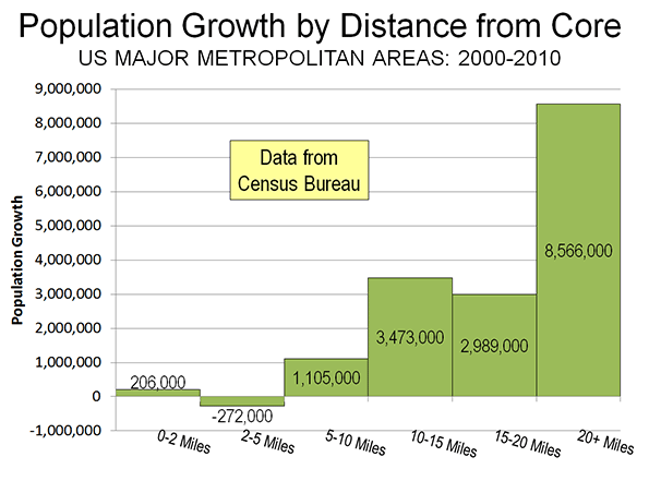
    First of all, according to US Census Bureau data, the areas within 5 miles of the urban cores of the 51 metropolitan areas with more than 1,000,000  population lost 66,000 residents between 2000 and 2010 (See Flocking Elsewhere: The Downtown Growth Story). It is implausible for 1,000,000 boomers to have moved into areas that lost 66,000 residents (Figure).

    Secondly rather than flock to the city, as the Journal insists, baby boomers continued to disperse away from core cities between 2000 and 2010, as is indicated by data from the two censuses. The share of boomers living in core cities declined 10 percent. This is the equivalent of a reduction of 1.2 million at the 2010 population level (Note). The share of the baby boomer population rose 0.5 percent in the suburbs, the equivalent of 175,000. Outside these major metropolitan areas, the share of baby boomers rose three percent, which is the equivalent of 1,050,000. All of the net increase in boomers , then, was in the suburbs or outside the major metropolitan areas, while all of the loss was in the core cities.

    Among the 51 major metropolitan areas, only seven core cities gained baby boomers (See table at Demographia.). Among these seven, only two had larger percentage gains than the suburbs in the same metropolitan areas. One of these was Louisville, which accomplished the feat by a merger with Jefferson County. Louisville’s gain appears to have been simply the result of moving boundaries, not moving people.

    Note: The age groups used are 35 to 55 in 2000 and 45 to 65 in 2010, which approximate the baby boomers. There was a decline in the number of baby boomers between 2000 and 2010 (largely due to deaths). The figures quoted in this article allocate the same percentage loss from this reduction to the 2000 baby boomer population for each core city and metropolitan area (the national rate).

  • How Can We Be So Dense? Anti-Sprawl Policies Threaten America’s Future

    Among university professors, government planners and mainstream pundits there is little doubt that the best city is the densest one. This notion is also supported by a wide number of politically connected developers, who see in the cramming of Americans into ever smaller spaces an opportunity for vast, often taxpayer-subsidized, profiteering.

    More recently density advocates cite a much-discussed study of geographic variations in upward mobility as suggesting that living in a spread-out city hurts children’s prospects in life. “Sprawl may be killing Horatio Alger,” quipped economist and New York Times columnist Paul Krugman.

    Yet the study actually found the highest rates of upward mobility not in dense cities, but in relatively spread-out places like Salt Lake City, small cities of the Great Plains such as Bismarck, N.D.; Yankton, S.D.; and Pecos, Texas — all showed bottom to top mobility rates more than double New York City. And we shouldn’t forget the success story of Bakersfield, Calif., a city Columbia University urban planning professor David King wryly labeled “a poster child for sprawl.” Rather than an ode to bigness, notes demographer Wendell Cox, the study found that commuting zones (similar to metropolitan areas) with populations under 100,000 — smaller cities that tend to be sprawled by nature  —  have the highest average upward income mobility.

    “Sprawl” did not kill Detroit, as Krugman suggests in his previously mentioned column, the city did that largely to itself. Another like-minded critic, historian Steven Conn,  blames the auto industry for the city’s problems, perhaps not recognizing Detroit would be little more than a more southerly Duluth without it.

    There are at least three major problems with the thesis that density is an unabashed good. First, and foremost, Census and survey data reveal that most people do not want to live cheek to jowl if they can avoid it. Second, most of the attractive highest-density areas also have impossibly high home prices relative to incomes and low levels of homeownership. And third, and perhaps most important, dense places tend to be regarded as poor places for raising families. In simple terms, a dense future is likely to be a largely childless one.

    Let’s start with something few density advocates consider: what people want and what they would choose if they could. Roughly four in five buyers, according to a 2011 study commissioned by the National Association of Realtors, prefer a single-family home. This preference can be seen in the vastly greater construction of single-family houses in the past decade: Between 2000 and 2011, detached houses accounted for 83% of the net additions to the occupied U.S. housing stock.  The percentage of single-family homes in the total housing mix last decade was more than one-fifth higher than in the 1960s, 1970s and 1980s.

    Contrary to the conventional wisdom, the pattern is not likely to end, barring a longer-term recession or government edict. As the number of households once again begins to rise and birthrates tick up, single-family homes are once again leading housing growth.

    Buyers of single-family homes are not necessarily embracing exurban lifestyles so much as reacting to basic economic factors. In many cases the nicest single-family districts closest to work and amenities are prohibitively expensive — think Beverly Hills or Studio City in the L.A. area, Bethesda near Washington, or Evanston outside Chicago. People move further out in order to afford something better than an apartment.

    The last decennial Census shows us definitively that people tend to head toward the periphery. Barely 6% of Americans live in densities of over 10,000 per square mile, and the fastest-growing central cities between 2000 and 2010 — such as Raleigh, Charlotte and Austin — have average densities less than a third as intense as places like New York, Chicago, Or Los Angeles.

    Overall, domestic migrants tend to be moving away from these denser metropolitan areas. Between 2000 and 2010, a net 1.9 million people left New York, 1.3 million left Los Angeles, 340,000 left San Francisco, while 230,000 left San Jose and Boston. In contrast, some of the largest in-migration has taken place over the past decade, as well as since 2010, in relatively sprawling cities, including Houston, Dallas, Ft. Worth, Tampa-St. Petersburg and Nashville.

    Our perceptions of density are often distorted by media coverage, which tends to revolve around city centers. To be sure many downtown areas have experienced impressive growth, but this accounted for less than 1% of the 27 million expansion in the U.S. population between 2000 and 2010. In reality virtually all net population growth in the nation took place in counties with under 2,500 persons per square mile. The total population increase in counties with under 500 people per square mile was more than 30 times that of the growth in counties with densities of 10,000 and greater.

    Some inner suburbs may be struggling adjacent to some hard-pressed cities, as is often highlighted by density advocates, but they are thriving in areas where prices are reasonable and the economy is strong. In Houston, arguably America’s most economically vibrant big metro area, over 80% of homes sales in 2012 were outside Beltway 8, the city’s second ring. The city’s inner ring, inside the 610 loop, has experienced an impressive revival, but still it only accounted for 6% of home sales last year.

    There is clearly a growing chasm between affordable, family-friendly cities and those that, frankly, are not. Until the 1970s, in virtually all American metropolitan areas, a median-priced home cost roughly three years’ median income. This equilibrium was smashed by the imposition in some states of “smart” land-use policies that seek to limit or even prohibit suburban building, huge impact fees, as well as in some markets,  massive investment from speculators.

    As a result, many of the metro areas beloved by density advocates, such as New York and San Francisco, now have median home price multiples well over 6 or 7; if current trends continue, they could, as occurred during the last housing boom, reach upward of 10. Not surprisingly, these areas all have low rates of homeownership compared to the national average.  For example, in New York and Los Angeles, the homeownership rate is half or less than the national figure of 65%. This is particularly true among working class and minority households. Atlanta’s African-American home ownership rate is approximately 40% above those of San Jose and Los Angeles, approximately 50% higher than Boston, San Francisco and Portland, and nearly 60%  higher than New York.

    All these factors are particularly relevant to one group: families. Much of contemporary urban theory rests on the idea of weakening family connections: fewer marriages and lower birthrates will decrease the appetite for lower-density housing. Families do not make up the prime market for dense housing; married couples with children constitute barely 10% of apartment residents, less than half the percentage for the population overall.

    Families also generally settle in less dense parts of cities, suburban or exurban areas;  the places with the lowest percentage of households with children include favored abodes of the  density lobby such as New York (particularly Manhattan), as well as Chicago, San Francisco and Seattle. In contrast the metropolitan areas with the strongest growth in their child populations — Raleigh, Austin, Charlotte, Dallas, Houston, Oklahoma City — have much lower densities and far smaller urban cores.

    This flight from density among families is not merely an American phenomena. There are far higher percentages of families with children in the suburbs of Tokyo, London and Toronto than within the inner rings. The ultra dense cities of East Asia — Hong Kong, Singapore and Seoul — have among the lowest fertility rates on the planet. Tokyo and Seoul now have fertility rates around 1 while Shanghai’s has fallen to 0.7, among the lowest of any city ever recorded, well below China’s “one child” mandate and barely one-third the number required simply to replace the current population.

    Some have suggested that the Obama administration is conspiring to turn American cities into high-rise forests. But the coalition favoring forced densification — greens, planners, architects, developers, land speculators — predates Obama. They have gained strength by selling densification, however dubiously, as what planner and architect Peter Calthorpe calls “a climate change antibiotic.” Not surprisingly, there’s less self interest in promoting more effective greenhouse gas reduction policies such as boosting  work at home and lower-emissions cars.

    The density agenda need to be knocked off its perch as the summum bonum of planning policy. These policies may not hurt older Americans, like me, who bought their homes decades ago, but will weigh heavily on the already hard-pressed young adult population. Unless the drive for densification is relaxed in favor of a responsible but largely market-based approach open to diverse housing options, our children can look forward to a regime of ever-higher house prices, declining opportunities for ownership and, like young people in East Asia, an environment hostile to family formation. All for a policy that, for all its progressive allure, will make more Americans more unhappy, less familial, and likely poorer.

    Joel Kotkin is executive editor of NewGeography.com and Distinguished Presidential Fellow in Urban Futures at Chapman University, and a member of the editorial board of the Orange County Register. He is author of The City: A Global History and The Next Hundred Million: America in 2050. His most recent study, The Rise of Postfamilialism, has been widely discussed and distributed internationally. He lives in Los Angeles, CA.

    This piece originally appeared in Forbes.

  • In the Spotlight: Higher Ed Degree Output by Field and Metro

    It might stem from the dot-com crash, the increased popularity of certifications and onsite employer training, or various other reasons. Regardless, the key finding from EMSI and CareerBuilder’s analysis of higher education degree output over the last decade is still eye-opening: Computer and IT degrees completed in the U.S. have declined 11% since 2003.

    The decrease in computer-related degrees comes at a time when the number of related computer and IT jobs grew 13% nationally, and while the number of degrees in other major fields — health, business, liberal arts and humanities, and engineering — has soared.

    Jobs-Degrees-Final

    Our analysis looked at the output of associate’s degrees and above nationally and for the nation’s largest 150 metro areas. Education completion data comes from the National Center of Education Statistics, via EMSI’s Analyst tool, and we matched the degrees to our jobs data using a customized program-to-occupation mapping. You can find a summary of the analysis in CareerBuilder’s release, and we’ve included more findings by field and metro below.

    Note: The NCES data comes from its Integrated Postsecondary Education Data System (IPEDS) and accounts for all colleges and universities that participate or are applicants for any federal financial assistance program authorized by the Higher Education Act (HEA), which includes most of the well-known federal loans (e.g., Pell Grants, Stafford Loans). All public colleges and universities and a number of private postsecondary schools accept federal assistance loans and therefore are included in this analysis. We excluded Phoenix, Davenport, Iowa, and other cities whose higher ed output is dominated by large for-profit universities. 

    Computer and IT

    Computer-related degree output at U.S. universities and colleges flatlined from 2006 to 2009 and have steadily increased in the years since. But the fact remains: Total degree production (associate’s and above) was lower by almost 14,000 degrees in 2012 than in 2003. The biggest overall decreases came in three programs — computer science, computer and information sciences, general, and computer and information sciences and support services, other.

    This might reflect the surge in certifications and employer training programs, or the fact that some programmers can get jobs (or work independently) without a degree or formal training because their skills are in-demand.

    Of the 15 metros with the most computer and IT degrees in 2012, 10 saw decreases from their 2003 totals. That includes New York City (a 52% drop), San Francisco (55%), Atlanta (33%), Miami (32%), and Los Angeles (31%).

    Here’s a look at the performance of 20 largest metros with the most computer and IT degrees in 2012:

    MSA
    Computer/IT Degrees 2003
    Computer/IT Degrees 2012
    Growth/Decline
    % Growth/Decline
    Concentration
    New York-Northern New Jersey-Long Island, NY-NJ-PA
    12,102
    5,793
    -6,309
    -52%
    0.86
    Washington-Arlington-Alexandria, DC-VA-MD-WV
    4,353
    5,697
    1,344
    31%
    2.32
    Chicago-Joliet-Naperville, IL-IN-WI
    5,403
    4,451
    -952
    -18%
    1.25
    Los Angeles-Long Beach-Santa Ana, CA
    5,088
    3,510
    -1,578
    -31%
    0.81
    Boston-Cambridge-Quincy, MA-NH
    2,625
    2,455
    -170
    -6%
    0.92
    Atlanta-Sandy Springs-Marietta, GA
    3,321
    2,229
    -1,092
    -33%
    1.77
    Pittsburgh, PA
    2,073
    2,101
    28
    1%
    2.00
    Minneapolis-St. Paul-Bloomington, MN-WI
    1,754
    2,003
    249
    14%
    1.24
    Baltimore-Towson, MD
    2,047
    1,931
    -116
    -6%
    1.85
    Philadelphia-Camden-Wilmington, PA-NJ-DE-MD
    2,316
    1,873
    -443
    -19%
    0.78
    Dallas-Fort Worth-Arlington, TX
    2,037
    1,699
    -338
    -17%
    1.00
    Miami-Fort Lauderdale-Pompano Beach, FL
    2,457
    1,670
    -787
    -32%
    0.75
    Seattle-Tacoma-Bellevue, WA
    1,793
    1,560
    -233
    -13%
    1.33
    Virginia Beach-Norfolk-Newport News, VA-NC
    942
    1,413
    471
    50%
    2.15
    San Diego-Carlsbad-San Marcos, CA
    1,573
    1,398
    -175
    -11%
    1.11
    Detroit-Warren-Livonia, MI
    1,380
    1,332
    -48
    -3%
    1.42
    Indianapolis-Carmel, IN
    447
    1,223
    776
    174%
    1.63
    Houston-Sugar Land-Baytown, TX
    1,062
    1,165
    103
    10%
    1.00
    Denver-Aurora-Broomfield, CO
    1,673
    1,114
    -559
    -33%
    1.30
    Salt Lake City, UT
    486
    1,057
    571
    117%
    1.67


    Health Professions

    Health degrees have increased by 112% since 2003 — an addition of 288,194 total degrees. Related jobs in the U.S. have increased 18.6% over that time.

    Many metros have seen their output of health degrees at least double. This includes Los Angeles (109% growth), Miami (159%), and Minneapolis (193%).

    Here’s a look at the 20 largest metros with the most health degrees in 2012:

    MSA
    2003 Health Degrees
    2012 Heath Degrees
    Growth/Decline
    % Growth/Decline
    Concentration
    New York-Northern New Jersey-Long Island, NY-NJ-PA
    16,363
    30,445
    14,082
    86%
    0.94
    Los Angeles-Long Beach-Santa Ana, CA
    7,681
    16,031
    8,350
    109%
    0.77
    Chicago-Joliet-Naperville, IL-IN-WI
    7,622
    14,128
    6,506
    85%
    0.83
    Miami-Fort Lauderdale-Pompano Beach, FL
    5,438
    14,068
    8,630
    159%
    1.31
    Philadelphia-Camden-Wilmington, PA-NJ-DE-MD
    7,593
    13,554
    5,961
    79%
    1.19
    Boston-Cambridge-Quincy, MA-NH
    6,483
    11,513
    5,030
    78%
    0.90
    St. Louis, MO-IL
    3,500
    9,760
    6,260
    179%
    1.65
    Minneapolis-St. Paul-Bloomington, MN-WI
    2,959
    8,673
    5,714
    193%
    1.12
    Dallas-Fort Worth-Arlington, TX
    3,137
    7,039
    3,902
    124%
    0.86
    Indianapolis-Carmel, IN
    1,764
    6,911
    5,147
    292%
    1.92
    Pittsburgh, PA
    3,316
    6,480
    3,164
    95%
    1.29
    Washington-Arlington-Alexandria, DC-VA-MD-WV
    2,978
    6,227
    3,249
    109%
    0.53
    Houston-Sugar Land-Baytown, TX
    3,142
    5,916
    2,774
    88%
    1.06
    Baltimore-Towson, MD
    3,241
    5,857
    2,616
    81%
    1.17
    San Francisco-Oakland-Fremont, CA
    2,965
    5,857
    2,892
    98%
    0.87
    Tampa-St. Petersburg-Clearwater, FL
    1,661
    5,593
    3,932
    237%
    1.13
    Detroit-Warren-Livonia, MI
    2,790
    5,543
    2,753
    99%
    1.23
    Seattle-Tacoma-Bellevue, WA
    2,519
    4,932
    2,413
    96%
    0.88
    Cincinnati-Middletown, OH-KY-IN
    1,829
    4,930
    3,101
    170%
    1.38
    Denver-Aurora-Broomfield, CO
    2,172
    4,696
    2,524
    116%
    1.14


    The number of registered nursing degrees has gone from 88,482 in 2003 to 193,528 in 2012, a 119% increase. Registered nursing is the third-largest degree-awarding program in the U.S., behind business administration and liberal arts and humanities.

    RN_Chart

    Engineering (and Engineering Technologies)

    The are 37,138 more engineering and engineering technology degrees in 2012 than 2003, a 37% increase. Related jobs in the U.S. have increased 5.7% during that time. The biggest degree increases have come in biomedical engineering, mechanical engineering, and civil engineering.

    Tulsa has seen the largest percentage increase (222%) of engineering/engineering technology degrees among the 150 largest metros. What explains the huge jump? It mostly stems from a massive increase in output of engineering technology degrees in the area. For example, the Spartan College of Aeronautics and Technology in Tulsa produced 454 engineering tech degrees in 2003, up from 57 in 2003.

    In San Jose, Ann Arbor, Raleigh, and Tulsa, at least 15% all associate’s-and-above degrees awarded are in engineering or engineering technologt. Raleigh has the highest concentration at 17%. The national share is 5%, so Raleigh’s concentration index is 3.36 — meaning it’s more than three times as concentrated as the national average (1.00).

    The following table gives the metros with the highest concentration of engineering and engineering technology degrees:

    MSA
    Engineering Degrees (2003)
    Engineering Degrees (2012)
    Growth/Decline
    Concentration
    Raleigh-Cary, NC
    2,091
    2,201
    5%
    3.36
    Tulsa, OK
    335
    1,079
    222%
    3.22
    San Jose-Sunnyvale-Santa Clara, CA
    2,809
    3,472
    24%
    3.08
    Ann Arbor, MI
    2,220
    2,881
    30%
    2.99
    Huntsville, AL
    409
    691
    69%
    2.75
    Dayton, OH
    1,003
    1,504
    50%
    2.25
    Worcester, MA
    568
    1,088
    92%
    2.23
    Greenville-Mauldin-Easley, SC
    715
    1,059
    48%
    2.13
    Baton Rouge, LA
    839
    1,019
    21%
    2.13
    Fayetteville-Springdale-Rogers, AR-MO
    366
    660
    80%
    2.02
    Salinas, CA
    262
    506
    93%
    1.91
    Youngstown-Warren-Boardman, OH-PA
    329
    362
    10%
    1.82
    Peoria, IL
    231
    309
    34%
    1.72
    Allentown-Bethlehem-Easton, PA-NJ
    884
    741
    -16%
    1.68
    Knoxville, TN
    597
    839
    41%
    1.67
    Atlanta-Sandy Springs-Marietta, GA
    2,851
    3,633
    27%
    1.67
    Austin-Round Rock-San Marcos, TX
    1,741
    2,136
    23%
    1.65
    Palm Bay-Melbourne-Titusville, FL
    286
    450
    57%
    1.62
    Pittsburgh, PA
    2,611
    2,886
    11%
    1.59
    Flint, MI
    488
    492
    1%
    1.58
    Beaumont-Port Arthur, TX
    293
    373
    27%
    1.56
    Wichita, KS
    329
    462
    40%
    1.55
    Madison, WI
    1,320
    1,314
    0%
    1.53
    York-Hanover, PA
    156
    151
    -3%
    1.50
    Toledo, OH
    874
    891
    2%
    1.50


    Education

    Education degrees have increased 18% since 2003. That’s an increase of 52,391 from 2003 to 2012. Related jobs in the U.S. have increased 6.3% from 2003-2012.

    Education degrees make up 8.8% of all associate’s-and-above completions nationally, down from 10.6% in 2003. The highest concentration belongs to Beaumont-Port Arthur, Texas, with 4.4 times the national average of education degrees.

    Another Texas metro, El Paso, has seen a 346% increase in education degrees since 2003, while Denver (170%), Minneapolis-St. Paul (125%), Austin (114%), and Dallas (106%) have also seen major gains.

    Ed-degrees

    Business, Management and Marketing

    There are 176,972 more degrees nationally in 2012 than 2003, a 33% increase. Related jobs in the U.S. have increased 1.2 percent from 2003-2012, an addition of 218,173 jobs.

    Nearly 1 in 5 degrees awarded in the U.S. (18.1%) are in business, management and marketing, the highest share of any major field of study. For many large metros, business degrees make up a sizable percentage of total higher education output (25% of all degrees in Chicago and Milwaukee, 24% in Washington, D.C., and 23% in Atlanta).

    MSA
    2012 Business, Managament, Marketing Degrees
    Share of Total Degrees
    Concentration
    Colorado Springs, CO
    5,099
    33%
    1.85
    Grand Rapids-Wyoming, MI
    1,939
    30%
    1.67
    Fort Wayne, IN
    1,388
    30%
    1.65
    Montgomery, AL
    946
    29%
    1.62
    Chicago-Joliet-Naperville, IL-IN-WI
    30,741
    25%
    1.39
    Milwaukee-Waukesha-West Allis, WI
    4,892
    25%
    1.36
    Canton-Massillon, OH
    843
    24%
    1.34
    Flint, MI
    1,506
    24%
    1.34
    Omaha-Council Bluffs, NE-IA
    3,368
    24%
    1.34
    Washington-Arlington-Alexandria, DC-VA-MD-WV
    20,098
    24%
    1.31
    St. Louis, MO-IL
    9,943
    23%
    1.29
    Columbia, SC
    2,529
    23%
    1.29
    Atlanta-Sandy Springs-Marietta, GA
    9,853
    23%
    1.25
    Columbus, OH
    6,600
    23%
    1.25
    South Bend-Mishawaka, IN-MI
    1,561
    22%
    1.24


    Liberal Arts and Humanities

    The U.S. produced 124,681 more degrees in 2012 than 2003, a 47% increase. This is the third fastest-growing degree category in the U.S. by total degrees added, behind health professions and business, management, and marketing.

    Liberal arts and humanities degrees make up 10% of all associate’s-and-above completions, roughly the same share as in 2003. Of the 10 metros with the highest concentrations of these degrees, seven are in Florida — led by Ocala (66% of all degrees), Port St. Lucie (64%), and North Port-Bradenton-Sarasota (50%).

    Despite growth in many metros, notable decreases in liberal arts and humanities degrees have occurred in Tulsa (51% decline), San Jose (38%), San Diego (30%), San Francisco (23%), and Ann Arbor (20%).

    LibArts

    Joshua Wright is an editor at EMSI, an Idaho-based economics firm that provides data and analysis to workforce boards, economic development agencies, higher education institutions, and the private sector. He manages the EMSI blog and is a freelance journalist. Contact him here.

    Illustration by Mark Beauchamp.

  • Distortions and Reality about Income Mobility

    A ground-breaking study of intergenerational income mobility has the enemies of suburbia falling all over themselves to distort the findings. The study, The Spatial Impacts of Tax Expenditures: Evidence from Spatial Variation Across the U.S. (by economists Raj Chetty and Nathaniel Hendren of Harvard University and Patrick Kline and Emmanuel Saez of the University of California, Berkeley). Chetty, et al. examined income mobility by comparing the income quintiles (20 percent) of households with children (between 1996 and 2000) compared to their own household income quintiles as adults in 2010/1. The children were all born in 1980 or 1981. The authors summarize their research as follows:

    “We measure intergenerational mobility at the local (census commuting zone) level based on the correlation between parents’ and children’s earnings. We show that the level of local tax expenditures (as a percentage of AGI) is positively correlated with intergenerational mobility.”

    The Over-Reach

    One of their findings was that children born in the Atlanta area had less upward income mobility than in most other metropolitan areas (Note 1). This provided all that was needed for a spin by others that distorted the findings into a completely different story than supported by the data.

    New York Times reporter David Leonhart started it, sprucing up the conclusions to produce anti-sprawl tome. He accomplishes this by unearthing anecdotes about the difficulty low income workers face getting to work in Atlanta, and blaming that urban area’s lower density suburbanization. However, the same anecdotes could have been woven from every metropolitan area in the nation (Note 2), regardless of their extent of suburbanization. More importantly, the research is not about sprawl.

    Nonetheless, Nobel Laureate Paul Krugman then piled on, writing in The New York Times that Leonhart’s article had shown “how sprawl seems to hurt social mobility.” Krugman continued the next day with his “sprawl-caused-Detroit’s bankruptcy” thesis, which relied on an apples-to-oranges comparison (See: Detroit Bankruptcy: Missing the Point). Then on July 28, Krugman wrote: “…in one important respect booming Atlanta looks just like Detroit gone bust: both are places where the American dream seems to be dying” (Note 3).  Krugman calls Atlanta the “Sultan of Sprawl.”

    Professor Steven Conn of Ohio State University took it a bit further in the Huffington Post, saying that: “One of their findings is that mobility is more restricted in places defined by suburban sprawl — like Atlanta and Columbus, Ohio — than in denser, more urban places like San Francisco and Boston. Far from being good for the nation, our love affair with the car, and the sprawl it has produced, keeps people from moving up the economic ladder.”

    The Research

    The authors of the report reached their conclusions using regression analyses and controlling for demographic factors, with the objective of identifying associations between upward income mobility and tax expenditures, not suburbanization. In fact, the very issue of transportation and density was simply not a factor.

    The authors provided additional information with 25 separate, simple correlation analyses between 25 individual variables and economic mobility (demographic factors were not controlled). Co-Author Raj Chetty described this supplemental research in a PBS interview, citing income segregation, school quality, two-parent families and measures, civic engagement, religiosity and community cohesiveness. The authors urged caution in interpreting these correlations: “For instance, areas with high rates of segregation may also have other differences that could be the root cause driving the differences in children’s outcomes.”

    Rational Responses

    The overreach was challenged by Columbia University urban planning professor David King, who pointed out that the best ranked cities in the upward mobility analysis were all “sprawling,” including Salt Lake City, Santa Barbara and Bakersfield, which he referred to as a “poster child for sprawl.” He further noted that: “…snapshot correlations really don’t mean anything and will provide evidence for whatever point of view is desired.”

    Randal O’Toole of the Cato Institute similarly questions the unfounded interpretations of the study and notes that Atlanta has invested billions in new transit systems over recent decades, but with no appreciable impact on how the poorest citizens did there.

    University of Southern California economics professor Peter Gordon suggested that: “In the fast-and-loose manner that some have digested the Chetty et al. study, we could conclude that sprawl causes upward mobility.”

    Pinnacles of Prosperity

    Interestingly, if, as Krugman alleges, Atlanta is the Sultan of Sprawl, then similarly sprawling Hartford is the “Pinnacle of Prosperity.” Hartford has the highest per capita gross domestic product of any metropolitan area in the world. Yet, the urban area density of Hartford is 1,791 per square mile (692 per square kilometer), little above Atlanta (1,707 and 659), but two-thirds less than less affluent New York (5,319 and 2,054) and three-quarters less than less affluent Los Angeles (6,999 and 2,702), according to the 2010 census (Note 4).

    The reality is that the US has the world’s most sprawling cities, yet the 50 most affluent metropolitan areas per capita in the world include 38 in the United States. This includes the top eight, such as lower density Bridgeport (urban density 1,660 per square mile/641 per square kilometer), Boston (2,232/862) and Durham (1,913/739), as well as metropolitan areas with higher urban densities, San Francisco (6,266/2,419) and San Jose (5,820/2,247). Neither high-density New York nor Los Angeles makes the top 10. America’s greater dispersal is associated with the shortest commute times in the high income world, the least intense traffic congestion and some of the most affordable housing, if metropolitan areas subject to urban containment (smart growth) policies are excluded.

    Moreover, the Chetty, et al data gives little comfort to any whose conception of good and evil depends on sprawl. The research aggregates upward mobility data for all counties within each commuting zone. Among major metropolitan areas, that includes counties from the most dense (New York County at 71,000 per square mile or 27,000 per square kilometer) to Skamania County in the Portland area, with a density of 7 per square mile or 3 per square kilometer. County level analysis could make a difference.

    This is illustrated by the New York metropolitan area, which Chetty, et al divide into multiple commuting zones. The Tom’s River commuting zone, made up of outer suburban Monmouth and Ocean counties in New Jersey showed better upward income mobility (10.4 percent) than the New York commuting zone (9.7 percent) which included the city of New York, Nassau, Suffolk and Westchester counties. It might be interesting, for example, to compare the data, say for highly urban The Bronx to suburban Suffolk County, but the data does not permit that. This is not to criticize the Chetty, et al work; it is rather to suggest caution in inventing conclusions.

    Smaller May be Better

    Further, commuting zones with smaller populations have generally better upward income mobility.  Rather than an ode to bigness, the study found that commuting zones with less than 100,000 population average have higher than average upward income mobility. Virtually all of the smaller areas are low density and have little or no transit. Indeed, the best performers were in the Great Plains, in a swath from West Texas, through Oklahoma, Kansas, Nebraska and reaching a zenith in South Dakota and North Dakota, which is about as far from dense urbanization as it is possible to get. Further, a large majority of the highest scoring commuting zones with larger populations, like Bakersfield and Des Moines, are highly dispersed (Table below). This could be an area for further research.

    Geographical Income Mobility
    Population of Commuting Zone Upward Mobility Cases
    Over 1,000,000 7.5% 62
    500,000 to 1,000,000 7.6% 60
    250,000 – 500,000 8.6% 89
    100,000-250,000 9.0% 167
    50,000-100,000 10.4% 129
    25,000-50,000 13.0% 88
    Under 25,000 13.9% 146
    Average/Total 9.5% 741
    Upward mobility: 30/31 year olds reaching top income quintile by 2010/1, from households in the bottom quintile in 1996-2000
    Commuting zones are similar to metropolitan areas


    Additional Caveats

    There is no question but that this is ground-breaking research. The authors deserve considerable credit for the unprecedented scale of their analysis, which included over 6.2 million observations. However, the available data had an important limitation. The IRS data set they used does not go back far enough to make similarly robust findings about peak adult earnings. Age 30 or 31 may premature for predicting longer run income mobility. At that age, many who will eventually earn much more are not far into their careers. This would include people who have spent longer in higher education, such as those who have earned professional degrees. Finally, the median income of households in the 30 to 31 age category is barely 1/2 of their parents in the same, which, again, is not likely to be representative of their eventual income and quintile ranking over their adult lives.

    The findings would be appropriately characterized as relating to young adult income upward mobility. Conclusions about lifetime upward mobility or peak earnings upward mobility will need to wait a decade or more.

    The Second Half of the Story: Where People Moved

    The authors use the childhood residence in the study, both for the child and the adult. This means, for example, that if a child lived in the New York metropolitan area and moved to Atlanta by 2010 or 2011, he or she would be counted in the New York data. Where people lived as children is the first half of the story. The second half is where they moved.

    This is important, because so many people moved away from places like New York, San Francisco, Los Angeles, Boston, and San Jose during the period the study covers. Approximately 10 percent of the residents of New York and Los Angeles moved elsewhere between 2000 and 2010. Approximately 8 percent left San Francisco, 13 percent left San Jose and 5 percent left Boston. These are not small numbers and indicate that more people left than moved in. A net 1.9 million left New York, 1.3 million left Los Angeles, 340,000 left San Francisco, while 230,000 left San Jose and Boston.

    Some of the metropolitan areas that have gained the most domestic migrants scored below average on upward income mobility. For example, migration from other parts of the nation added 24 percent to Raleigh’s population in the 2000s, 17 percent to Charlotte, 11 percent to Tampa-St. Petersburg, and 10 percent to Atlanta (Note 5).

    None of this contradicts the Chetty, et al findings, which did not address the question of why some many people have moved. It can be assumed that people who are doing well economically will probably stay where they are. On the other hand, most who leave might be thought of as seeking better opportunities that might elude them in the richer, slower growing, far more expensive metropolitan areas of their childhood. The idea that people left New York, Boston or Los Angeles for a less rewarding life in Atlanta, Charlotte, or Raleigh violates everything we know about human nature.

    Seeking Prosperity

    Throughout history, and especially over the last 200 years, cities have drawn people from elsewhere by facilitating opportunity. It is no different today. People move to satisfy their aspirations. This was the point of our recent "Aspirational Cities" report in The Daily Beast.

    Chetty et al conclude: “What is clear from this research is that there is substantial variation in the United States in the prospects for escaping poverty.” True. It is also clear from actual behavior that, for many, the best prospect for escaping poverty may be the better opportunities that attract them to an aspirational city.

    Wendell Cox is a Visiting Professor, Conservatoire National des Arts et Metiers, Paris and the author of “War on the Dream: How Anti-Sprawl Policy Threatens the Quality of Life.

    —-

    Note 1: Chetty, et al use “commuting zone” as their unit of geographical analysis. These areas are generally similar to metropolitan areas, but there are some important differences. For example, the New York metropolitan area is divided into three parts (New York Newark and Tom’s River). The Dallas-Fort Worth metropolitan area is divided into two. Los Angeles, Riverside-San Bernardino and Oxnard are combined as are Rochester and Buffalo. All of Connecticut, which has four metropolitan areas, is a single commuting zone. Areas outside metropolitan areas are also divided into commuting zones.

    Note 2: The overwhelming share of low income workers drive to work (see How Lower Income Citizens Commute). Even, in metropolitan Boston, with its better than average transit system, few of the city’s low income residents can reach suburban job locations in less than one hour (the average commute time for all residents is less than one-half that). Despite popular impressions to the contrary, most jobs cannot be reached in a reasonable period of time by transit in any metropolitan area, nor is there any practical (affordable) way to change that.  

    Note 3: To the contrary, the American Dream is alive and well in Atlanta. Atlanta’s housing affordability is unrivaled by nearly all major metropolitan areas. Housing is four times as expensive relative to incomes in San Francisco and San Jose as in Atlanta (measured by the “median multiple”) three times as high in New York and Los Angeles and twice as costly in Portland. This makes housing more affordable for low income households. Not surprisingly, Atlanta households with less than $20,000 in annual income (approximately the lowest quintile) have a higher home ownership rate than in New York, Los Angeles, San Francisco, San Jose, Boston and Portland. Further, the gap with respect to African-American home-ownership is substantial. Atlanta’s African-American home ownership rate is approximately 40 percent above those of San Jose and Los Angeles, approximately 50 percent higher than Boston, San Francisco and Portland and nearly 60 percent higher than New York (American Community Survey, 2011).

    Note 4: These are US Bureau of the Census urban area density figures, based upon continuous urban areas (“built-up” areas). Urban area densities are calculated using census blocks, and contain no rural land. As a result, their population densities are not distorted by jurisdictional borders. This is to be distinguished from any metropolitan area based measure. All metropolitan areas include urban areas as well as rural areas that are economically connected to the urban area. The extent of rural areas within a metropolitan area is driven by the geographical size of counties and thus varies widely. The largest major metropolitan area county, San Bernardino (California) is nearly 1,000 times as large as the smallest, New York County. If metropolitan area criteria were applied at the census block level, as is the case in urban areas, large swaths rural swaths would be removed from metropolitan areas, changing the density distribution. However, even if metropolitan areas were more appropriately defined, any measure of metropolitan density would remain a mixed urban-rural metric, not a measure of urban density. Here are the 2010 criteria for defining urban areas and metropolitan areas.

    Note 5: There is less black-white racial segregation in Atlanta than in New York, Los Angeles, San Francisco, Boston, and most other major metropolitan areas, according to 2010 data compiled by William Frey of the Brookings Institution.