Blog

  • The Evolving Urban Form: Toronto

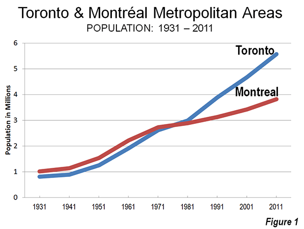
    Toronto is the largest city (metropolitan area) in Canada and its principal commercial center. However, this is a relatively recent development. Toronto displaced Montréal is Canada’s largest city during the 1960s. Since the 1971 census, when the two Metropolitan areas were nearly identical size, Toronto has added approximately 3 million people, while Montréal has added approximately 1,000,000 (Figure 1).

    This shift is exceptional within the high-income world over the past half century.  Toronto’s ascendancy was in large part precipitated by the move by Québec, in which Montréal is the largest city, to assert the primacy of the French language even though much of the Montréal business community was Anglophone. Many of these businesses, and some of their employees, decamped to Toronto.

    Metropolitan, Suburban and Core Population Growth: 1931-2011

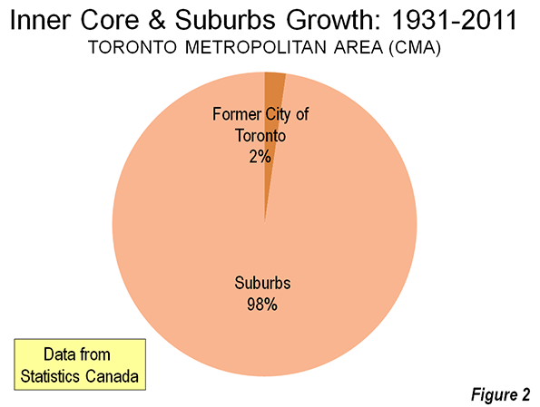
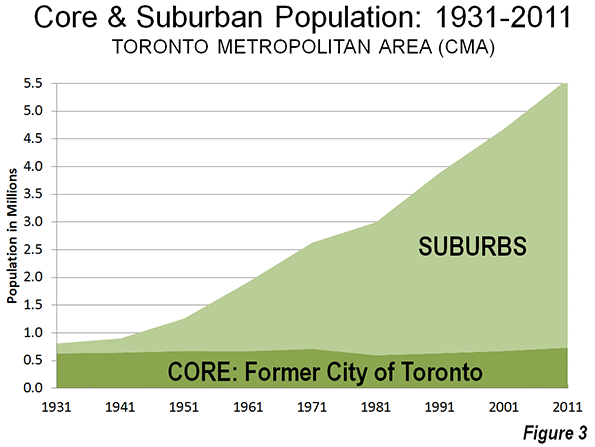
    Toronto has grown very rapidly. In 1931, the metropolitan area had little more than 800,000 residents. About 80% of these (630,000) lived in the former city of Toronto. Since that time, nearly all of the growth in the Toronto metropolitan area has been in the suburbs (Figure 2). The area of the former city of Toronto (abolished in 1998 as a part of a six jurisdiction amalgamation, see Note on the Toronto Amalgamation) has added little more than 100,000 residents while the suburban areas have added approximately 4.7 million. By 2011, the metropolitan area had grown to a population of 5.5 million (Figure 3).


    In recent decades, Toronto has been among the fastest-growing larger metropolitan areas in the high income world.

    The Larger Region: The Golden Horseshoe

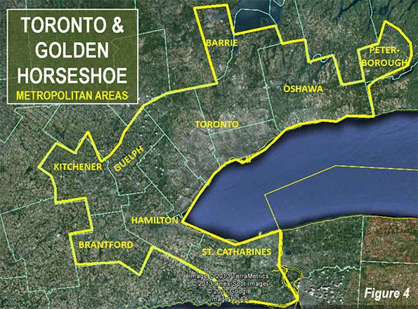
    The Toronto metropolitan area is at the core of a much larger region of urbanization that is referred to as the Golden Horseshoe. The Golden Horseshoe stretches in the shape of a horseshoe from the US border at Niagara Falls (St. Catharine’s metropolitan area) through the Hamilton metropolitan area to Toronto and on to the Oshawa and Peterborough metropolitan areas to the east. The Golden Horseshoe (which can be defined in various ways), also includes the Kitchener, Brantford, Guelph, and Barrie metropolitan areas.

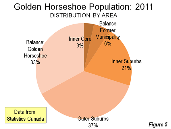
    Overall the Golden Horseshoe registered a population of approximately 8.1 million in the 2011 census. Approximately 9% of the population lives in the former city of Toronto, 3% in the inner core federal electoral districts of Toronto – Centre and Trinity – Spadina and another 6% in the balance of the former city. Approximately 91% of the population is in the rest of the Golden Horseshoe (Figure 5).
    Like many other metropolitan areas, Toronto’s core has experienced a resurgence. Between 2006 and 2011, the inner core two districts added 16.2% to their population (Figure 6). This was a much stronger increase than occurred in the federal electoral districts that roughly correspond to the balance of the former city of Toronto, which grew 1.8%. The inner suburbs grew somewhat more strongly, at 4.2%. This rate of growth, barely one-quarter that of the inner core districts, was a more than 1.5 times the actual population increase of the inner core districts.


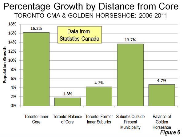
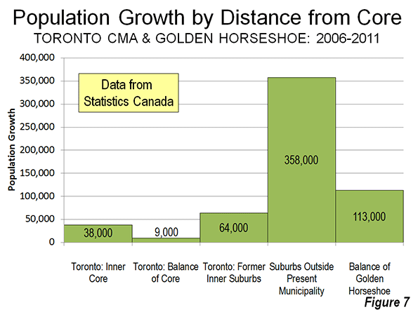
    The outer suburbs within the metropolitan area grew 13.7%. While the outer suburban growth rate was less than that of the inner core districts, the actual population increase was more than nine times as great. The balance of the Golden Horseshoe grew 4.7%, slightly more than the inner suburbs.

    Between 2006 and 2011 the overwhelming majority – 92 percent – of population growth was outside the core roughly corresponding to the former city of Toronto. This is less than the percentage of the total population represented by the inner core in the 2006 census. This is similar to the dynamics of metropolitan population growth in the United States, where inner core districts dominated central city growth, but produce little or none of the overall growth because of the stagnant or declining populations in the areas immediately outside the inner core.

    The Urban Area

    The Toronto urban area (called “population centre” by Statistics Canada) had a population of approximately 5.1 million according to the 2011 census. With a land area of 675 square miles (1,750 square kilometers), Toronto’s population density is 7,590 per square mile (2,930 per square kilometer). Toronto is the only major urban area in the New World (Australia, Canada, New Zealand and the United States) that is more dense than Los Angeles, which had 7,000 residents per square mile (2,700 per square kilometer), according to the 2010 census (Note on extended urban areas).

    Canada’s Largest Employment Center

    It is not surprising that Canada’s largest employment center should be in its largest metropolitan area. Surprisingly it is not downtown Toronto, but rather the Pearson International Airport area, which is shared between the municipalities of Mississauga, Brampton, and Toronto that is the top job center. This large area covers approximately 45 square miles (120 square kilometers), an area as large as either the municipalities of Vancouver or San Francisco. The center is largely made up of low rise transportation and distribution facilities that stretched far from the airport itself. Overall, the Pearson International Airport center has an employment level of more than 350,000.

    In contrast  downtown Toronto has  approximately 325,000 jobs crammed into  an area of 2.3 square miles (6 square kilometers). This highly concentrated area is, however, the focal point of transit’s largest commuting market in Canada.

    The contrast between these two employment markets vividly illustrates the substantial strengths of transit in serving highly concentrated employment centers, like downtown Toronto, and its virtual inability to provide automobile competitive service in more highly dispersed employment centers (see Note on Transit and Employment Concentration)

    Overall, only 13 percent of the employment in the metropolitan area (as opposed to the Golden Horseshoe) is in downtown Toronto.

    As Goes Toronto, So Goes Canada

    Toronto and the Golden Horseshoe are particularly important to Canada. The Golden Horseshoe has more than one quarter of Canada’s population. This is an unusually high proportion of a nation’s population for one highly urbanized region and boasts an even larger share of its economic output. By comparison, the largest metropolitan region in the United States, New York, represents barely 7% of the nation’s population. In many ways, Canada’s prosperity, which has been impressive in recent years, depends on the success of Toronto and the Golden Horseshoe.

    See Also: A Toronto Condo Bubble?

    ————–

    Note on the Toronto Amalgamation: The former city of Toronto and five other municipal jurisdictions were amalgamated under an act of the Ontario government in 1998. The amalgamation was promoted by the government on efficiency grounds, claiming that hundreds of millions annually would be saved. I was hired by the former city to assist it in an effort to defeat the amalgamation proposal. Our side argued that the cost savings would not occur because of the necessity of harmonizing (the leveling up) labor costs and service levels. Despite advisory referendums that receive a minimum of a 70% no vote, the amalgamation went forward.

    The amalgamation is still a controversial subject. The financial argument appears to have been resolved in the favor of the position of the former city. A major Toronto business organization, the Toronto City Summit Alliance reported “The amalgamation of the City of Toronto has not produced the overall cost savings that were projected. Although there have been savings from staff reductions, the harmonization of wages and service levels has resulted in higher costs for the new City. We will all continue to feel these higher costs in the future.” My commentary  in the National Post on the tenth anniversary of the amalgamation summarized the experience.

    In a spirited debate in 2001 at Ryerson University, in downtown Toronto with a former Toronto transit commission official, my opponent and I agreed on one issue, that the amalgamation of Toronto had been a mistake.

    Note on Extended Urban Areas: In fact, the continuous urbanization of Toronto extends further, to the west into the Hamilton metropolitan area and to the east into the Oshawa metropolitan area. If these areas are combined into a single urban area, the population density falls to 7000 per square mile (2,700 per square kilometer). Even with this extension, Toronto would be more dense than an extended Los Angeles urban area (extending to include Mission Viejo and the western Inland Empire, at 6,200 per square mile or 2,400 per square kilometer (These larger urban area definitions are used in Demographia World Urban Areas)).

    Note on Transit and Employment Concentration: It is virtually impossible for employees throughout the metropolitan area to reach the airport area on transit that is time-competitive with the automobile. This disadvantage is not easily solved. If grade-separated rapid transit lines (such as a subway or busway) were built to the area, only a small percentage of the jobs would be within walking distance (within one quarter mile or 400 metres). Walks of up to 5 miles (8 kilometers) could be necessary from stations to employment locations.  This compares with the virtually 100 per cent of downtown jobs that are accessible by walking from subway and commuter rail (Go Transit) stations (See Improving the Competitiveness of Metropolitan Areas)

    Wendell Cox is a Visiting Professor, Conservatoire National des Arts et Metiers, Paris and the author of “War on the Dream: How Anti-Sprawl Policy Threatens the Quality of Life.

    Photograph: Google Earth Image of the Pearson Airport employment area (Canada’s largest employment area)

  • America’s Off-The-Radar Tech Hubs

    At the moment, the technology sector is the focus of a lot of attention — and with good reason. Tech industries have helped turn San Jose and Austin into major economies and brought other large metros, like Detroit, through tough spells. But which small, off-the-radar towns out there also deserve recognition as technology hubs?

    To explore this question, we analyzed 70 high-tech occupations identified by BLS economist Daniel E. Hecker. The list includes everything from computer systems analysts to forest and conservation technicians. Many of the highlighted economies contain a strong contingent of one or two of these occupations, while other occupations may not be especially concentrated in the region.

    In order to locate these economies, we had to explore some obscure parts of EMSI’s extensive database. For one thing, we removed cities with very large populations since many of them would come as no surprise. (We already know that Seattle, San Jose, and Austin are capitals of the tech sector.) Cities with very small numbers of tech workers were also cut from the list; if an influx of 10 tech workers could radically shift the economy, it can be hard to gauge whether or not the industry is really growing.

    We chose to highlight MSAs that have 1,000-50,000 jobs in the industry, have grown by more than 10% since 2001 and more than 0% since 2010, and also have promising concentration (measured by location quotient, LQ). Another factor that we took into account is whether or not the industry grew during the recession (2007-09). After applying all these filters to our data, we chose 11 MSAs which have exhibited impressive growth but which have also, for the most part, sneaked under the radar.

    The list starts with Los Alamos, N.M., and Williston, N.D., which have already gained attention for their growing economies. Then we’ll move from smallest to largest MSA, examining a key tech occupation in each.


    Los Alamos, New Mexico

    Population: 18,294

    Tech workers: 4,559 jobs

    Highlighted tech occupation: Biochemists and Biophysicists (410)

    Why you should be watching: Tech occupations in Los Alamos have skyrocketed in the last 11 years, with a gobsmacking 325% growth since 2001. Currently, the city has a concentration of tech workers almost six times that of the nation. The median wage of these workers is $51.47/hr, which is much higher than the average for the occupation.

    Between 2005 and 2007, Los Alamos gained 3,750 jobs in the tech sector. The occupations barely dipped during the recession and have remained steady since, with only a slight decline in the last year.

    What’s causing all these insane numbers? Obviously, the Los Alamos National Laboratory. As an example of just how unique this city is, consider this fact: there are 252 nuclear technicians in Los Alamos. The LQ for that occupation in the region is 254.42. Basically, this means that if nuclear technicians were as concentrated nationwide as they are in Los Alamos, they would make up the 10th largest occupation in the United States, with 2,184,588 jobs.

    Williston, North Dakota

    Population: 25,107

    Tech workers: 926 jobs

    Highlighted tech occupation: Petroleum Engineers (211)

    Why you should be watching: The number of tech workers in Williston has grown 324% since 2001, and 93% in the last three years. Although there are only 928 workers, they are getting paid a median hourly wage of $46.29 and those paychecks have already had significant economic impact on the state. That’s what an oil boom will do for you.

    As you can see, there are twice as many petroleum engineers as the next largest tech occupation. And the second largest occupation is geological and petroleum technicians, which are also involved in the oil industry.

    Los Alamos and Williston are not really surprises when it comes to tech centers. Both have appeared in the news for several years now as emerging economies. As we look at these other regional economies and evaluate them as potential tech hubs, we can compare them to the exploding economies of Los Alamos and Williston.

    Susanville, California

    Population: 34,019

    Tech workers: 1,258 jobs

    Highlighted tech occupation: Forest and Conservation Technicians (761)

    Why you should be watching: Susanville is another one of those cities with growth in a lot of different areas. The fact that it is a logging town keeps the economy tied to local industries and helps it stay well-rounded. The most impressive thing about Susanville is that during the recession, the number of tech workers grew by 18%.

    Whenever we find an industry or occupation that grew during the recession, we usually discover that it was strongly supported by the government. Susanville is no different. According to EMSI’s inverse staffing pattern, the government sector accounts for 95% of all tech-related occupations. Below are the three government industries and their portions of tech occupations:

    • Federal government, civilian, excluding postal service (65.7%)
    • State government, excluding education and hospitals (25.6%)
    • Local government, excluding education and hospitals (3.2%)

    It’s not too surprising that the regional economy has been doing so well.

    Pullman, Washington

    Population: 45.4K

    Tech workers: 1,299 jobs

    Highlighted tech occupation: Electrical Engineers (163)

    Why you should be watching: Small economies sometimes have a better chance of withstanding economic recession because they can be self-contained. This is especially true of Pullman, where the economy is almost entirely driven by two forces: Washington State University and Schweitzer Engineering Laboratories. Even with a mere 1,283 tech jobs in the area, the sector grew 38% since 2001 and, more impressively, 9% during the recession.

    The line graph displays the increase of electrical engineers since 2001. While 163 jobs might not seem like very much, the growth is dramatic enough to warrant comment.

    St. Marys, Georgia

    Population: 50,957

    Tech workers: 992 jobs

    Highlighted tech occupation: Civil Engineers (136)

    Why you should be watching: Out of the MSAs we examined for this report, St. Marys has the most consistent growth across the board. The tech sector has grown 88% since 2001 and 50% since 2010, increasing the LQ by 0.53 in the last eleven years. Most of this growth is probably caused by the Naval Submarine Base Kings Bay, but the occupations that have grown are quite varied.

    The table below shows the top five industries for tech occupations in St. Marys. As you can see, engineering services is at the top of the list, followed by federal government, civilian.

    NAICS Industry Occupation Group Jobs in Industry (2012) % of Occupation Group in Industry (2012) % of Total Jobs in Industry (2012)
    541330 Engineering Services 468 47.2% 52.3%
    901199 Federal Government, Civilian, Excluding Postal Service 194 19.6% 8.5%
    336414 Guided Missile and Space Vehicle Manufacturing 100 10.1% 18.9%
    541519 Other Computer Related Services 37 3.8% 42.7%
    524114 Direct Health and Medical Insurance Carriers 29 2.9% 8.1%

    Engineering services accounts for the most tech jobs in the region (468 jobs), and government jobs come next with 194 tech jobs. Guided missile and space vehicle manufacturing are tied to the government as well, as most of that research is probably happening at the Naval Submarine Base.

    Helena, Montana

    Population: 76,801

    Tech workers: 3,109 jobs

    Highlighted tech occupation: Forest and Conservation Technicians (371)

    Why you should be watching: Helena is another one of those plucky economies that refused to buckle during the recession. Helena has a quite a few tech workers (3,144 in 2012), but they are spread out evenly over many occupations. Since Helena is the state capital, the largest employer of tech workers is the state government (comprising 1,321 jobs), but the tech sector as a whole grew almost 12% in the last three years.

    Forest and conservation technicians account for 371 jobs in the tech sector, followed by civil engineers at 336 jobs. Forest and conservation technicians grew 48% growth since 2001 (most of that taking place 2005-2009. It’s easier to understand this growth knowing that 96% of the forest and conservation technician jobs in Helena are in state or federal government.

    Dubuque, Iowa

    Population: 95.5K

    Tech workers: 3,041 jobs

    Highlighted tech occupation: Software Developers, Systems Software (430)

    Why you should be watching: Dubuque has seen strong growth among tech workers in the last ten years, especially in software developers. Since 2010, the tech economy has increased by 3,126 jobs. Many of these jobs are due to the presence of IBM’s Global Delivery Center and other developing tech companies. Dubuque is currently #8 on Forbes’ list of best small places for businesses and careers.

    Lexington Park, Maryland

    Population: 109,409

    Tech Workers: 7,789 jobs

    Highlighted tech occupation: Electronics Engineers, Except Computer (1,438)

    Why you should be watching: During the recession, Lexington Park’s proximity to D.C. propped up its economy. The city grew 9% from 2007 to 2009, but its tech industry has grown 5.2% since then. Tech workers are 3.48 times more concentrated in Lexington Park than in the rest of the nation, for which the city can thank the Patuxent Naval Air Station.

    This graph represents the top industries for electronics engineers, except computer engineers, in Lexington Park. All together, the industries staffed by electronics engineers have increased 56%, compared to 16% in the 50 largest metropolitan statistical areas and 19% in the nation as a whole. Most of this growth has occurred in research and development in the physical, engineering, and life sciences (NAICS 541712), which has seen 93% since 2001, and in engineering services, which has seen 84% growth since 2001.

    Midland, Texas

    Population: 143.4K

    Tech workers: 4,484 jobs

    Highlighted tech occupation: Petroleum Engineers (927)

    Why you should be watching: The 4,484 tech jobs in Midland aren’t the most impressive thing about the city. What is impressive is the 23.4% growth in the last three years and the $42.76 hourly wage. A increase of 83% since 2001 is nothing to snort at either. That’s what the oil industry will do for you.

    The line graph below represents the growth of petroleum engineers since 2001. The blue line stands for the Midland MSA. Green stands for all 11 tech centers highlighted in this post. Brown and red stand for the 50 largest MSAs in the nation and the nation as a whole, respectively.

    Despite the fact that petroleum engineers drive the Midland economy, the 11 tech centers have increased in petroleum engineers slightly faster. Both are significantly ahead of the nation as a whole, however. What’s not reflected on this chart is the fact that the petroleum engineers occupation in Midland has a regional LQ of 45.16. With such a high concentration of a single occupation, Midland’s economy is primed for expansion as other industries and occupations rush in to support the oil industry.

    Trenton, New Jersey

    Population: 368.9K

    Tech workers: 17,573 jobs

    Highlighted tech occupation: Software Developers, Applications (2,899)

    Why you should be watching: The Trenton-Ewing area used to be a big hub for manufacturing jobs, but has since shifted its focus. Government, health care, and technology are currently the largest industries in the area. Tech workers have increased 11% since 2001 and grew 3% during the recession, and workers earn a median wage of $41.23/hr.

    Trenton’s highlighted tech occupation is software developers, which is spread out over several different industries. Here are the five industries that employ the most software developers in Trenton-Ewing.

    Custom computer programming services has gained quite a few software developers and investment banking and securities dealing has more than doubled its numbers. Software publishers take the cake with an increase of zero to 160 since 2001.

    Madison, Wisconsin

    Population: 583.8K

    Tech workers: 25,597 jobs

    Highlighted tech occupation: Computer Support Specialists (3,827)

    Why you should be watching: Madison has 26,722 tech workers and grew 28% over the last 10 years. It could be hard to maintain such a high concentration of tech workers, but the LQ of tech workers in Madison has grown from 1.31 in 2001 to 1.61 in 2012. Madison is currently #89 on Forbes’ list of the Best Places for Business and Careers and #38 in job growth.

    The complete data is reproduced below.

    Metropolitan Statistical Area 2012 Jobs 2001-12 % Change 2007-09 % Change 2010-12 % Change Median Hourly Earnings 2001 Location Quotient 2012 Location Quotient LQ Change
    Source: QCEW Employees, Non-QCEW Employees & Self-Employed – EMSI 2013.1 Class of Worker
    Los Alamos, NM (31060) 4,585 325% -2% -3.8% $51.47 2.42 5.91 3.49
    Williston, ND (48780) 928 324% 24% 93.7% $46.29 0.47 0.65 0.18
    St. Marys, GA (41220) 974 88% -3% 49.8% $34.02 0.55 1.08 0.53
    Midland, TX (33260) 4,488 83% 4% 23.4% $42.76 0.88 1.17 0.29
    Susanville, CA (45000) 1,246 74% 18% 0.7% $22.42 1.42 2.41 0.99
    Dubuque, IA (20220) 3,126 63% 1% 12.8% $30.96 0.75 1.10 0.35
    Lexington Park, MD (30500) 7,659 55% 9% 5.2% $45.26 2.62 3.48 0.86
    Helena, MT (25740) 3,144 39% 7% 11.9% $25.99 1.36 1.53 0.17
    Pullman, WA (39420) 1,283 38% 9% 9.3% $33.67 1.10 1.37 0.27
    Madison, WI (31540) 26,722 28% 2% 5.7% $32.57 1.31 1.61 0.30
    Trenton-Ewing, NJ (45940) 17,887 11% 3% 0.2% $41.23 1.48 1.59 0.11

    Christian Leithart is a tech writer with EMSI. Follow them on Twitter @DesktopEcon.

  • America’s New Manufacturing Boomtowns

    Conventional wisdom for a generation has been that manufacturing in America is dying. Yet over the past five years, the country has experienced something of an industrial renaissance. We may be far from replacing the 3 million industrial jobs lost in the recession, but the economy has added over 330,000 industrial jobs since 2010, with output growing at the fastest pace since the 1990s.

    Looking across the country, it is clear that industrial expansion has been a key element in boosting some of our most successful local economies. The large metro areas with the most momentum in expanding their manufacturing sectors also rank highly on our list of the cities that are generating the most jobs overall, including Houston-Sugarland-Baytown, Texas, which places first on our list of the big metro areas that are creating the most manufacturing jobs; Seattle-Bellevue-Everett, Wash. (third); Oklahoma City, Okla. (fourth), Nashville-Davidson-Murfreesboro-Franklin, Tenn. (No. 6); Ft. Worth, Texas (No. 9); and Salt Lake City, Utah (No. 10).

    Our rankings factor in manufacturing employment growth over the long-term (2001-12), mid-term (2007-12) and the last two years, as well as momentum. They identify those places where the market tells us the best storylines for manufacturing are being written.

    Best Cities for Manufacturing Jobs

    The Energy Boom and Industrial Growth

    What is striking about this revival is both its sectoral and geographic diversity. For Houston, the booming energy industry is driving job growth in metal fabrication, machinery and chemicals. Since 2009, Houston industrial employment has grown 15%, almost three times as fast as the overall economy. Of course, industrial growth also tends to create jobs in other sectors, notably construction and professional and business services.

    Much the same pattern of energy-driven growth can be seen in Oklahoma City, where the number of industrial jobs is also up 15% since 2009. This dynamic is also occurring in smaller metro areas. Energy cities did particularly well on our ranking of mid-sized metro areas (those with between 150,000 and 450,000 jobs overall), including third-place Lafayette, La.; Tulsa, Okla (fifth); Anchorage (sixth); Baton Rouge, La. (eighth); Bakersfield-Delano, Calif. (No. 13); and Beaumont-Port Arthur, Texas (No. 14).

    On our small cities list (under 150,000 jobs), two energy cities stand out, No. 4 Odessa and No. 7 Midland.

    The Great Lakes Revival

    The other big story in manufacturing has been the recovery of the auto industry. Essentially we see two parallel expansions, one based around the revival of U.S. automakers and their suppliers, particularly around the Great Lakes, and another that’s keyed by foreign-based firms, particularly in the Mid-South and Southeast.

    Among the larger metro areas, the star of the U.S.-led recovery is No. 5 Warren-Troy-Farmington Hills, Mich., an area that is widely known as “automation alley.” This region epitomizes the transition of manufacturing to more automated, high-tech production methods. After decades of losses, the area’s industrial employment increased 26% from 2009 through 2012.

    More hopeful still has been the industrial recovery of the quintessential factory region, Detroit-Livonia-Dearborn, No. 8 on our large metro area list. The Detroit resurgence is for real, with manufacturing employment up 18% since 2009. The industrial expansion has also sparked high-tech employment growth across Michigan that in 2010-2011 stood at almost 7% compared to 2.6% nationwide.

    Another big winner from the auto rebound has been Louisville-Jefferson County, Ky., No. 2 on our large cities list. Industrial employment in the area has expanded nearly 15% since 2009. Smaller cities in the region have also staged an impressive recovery. Columbus, Ind., No. 1 on our small city list, is benefiting from the growth of auto suppliers such as PMG Group as well as the expansion of a nearby Honda facility.

    The South Rises Again

    Many “progressive” intellectuals love to hate the South. The region, industrializing rapidly for decades, took a big hit when the recession devastated the manufacturing sector everywhere.

    But more recently many Southern areas have enjoyed considerable growth in a host of industries, from petrochemicals and autos to aerospace. This can be seen in two of the South’s largest metropolitan regions, Nashville, Tenn. (No. 6 on our list), and Virginia Beach, Va. (No. 7 ). In Nashville, much of the manufacturing job growth is auto-related, sparked in large part by the expansion of smaller plants and the nearby Nissan facilities.

    In contrast, Virginia Beach’s manufacturing job growth has been very diverse, reaching into fields as broad as fabricated metals and autos. Expanding investment from abroad, notably in aerospace and autos, has paced growth in other southern cities, notably Mobile, Ala., No. 1 in the mid-sized category, which has become a major production hub for Europe-based Airbus. Similarly, in Florence-Muscle Shoals, Ala., No. 3 on our small city list, industrial employment growth has been paced by the expansion of Navistar, as well as a host of smaller specialized manufacturers.

    Western Movement

    The West is often identified as a key high-tech and lifestyle mecca, but it also includes some of the nation’s top industrial growth centers. At the top of the pile sits No. 3 Seattle-Bellevue-Everett, home to Microsoft, Amazon and Starbucks SBUX, but also the birthplace of Boeing and its primary manufacturing location. Although the aerospace giant has moved some production elsewhere, Seattle has enjoyed nearly 13% growth in manufacturing employment since 2009.

    But the Emerald City is not the only western hotspot for manufacturing growth. Aided by low hydro-electric energy prices — as much as a third less than historic rival California –Washington State boasts several thriving industrial areas. Kennewick-Pasco-Richland earned the No. 2 spot in our small city rankings while Wenatchee comes in at No. 11. Low energy prices helps attract firms in diverse industries ranging from metals to food processing.

    The other western manufacturing hotspot is Utah, which also has low energy prices and a favorable business climate. Salt Lake City, which is becoming a perennial on many of our lists, has enjoyed a rapid expansion of technology-driven manufacturing, most notably a huge Intel-Micron flash memory plant, aerospace and recreation sports equipment industries. Also in the Beehive State, Ogden-Clearfield ranks No. 8 on our mid-sized list.

    Who’s Losing Ground?

    The bottom of our list generally divides into two categories: long-declining industrial hubs and places that are starting to de-industrialize rapidly. In many ways California represents the antithesis of the other western manufacturing economies, with its lethal combination of high energy prices and strict regulation. According to the California Manufacturing and Technology Association, the Golden State lost a full third of its industrial base from 2001 to 2010, and has yet to participate in the nation’s industrial recovery. Since 2010, manufacturing employment nationwide has grown more than 4% while in California industrial jobs have barely grown.

    With the exception of oil-rich Bakersfield, no California metro area approaches the top rungs of our manufacturing list. Most worrisome is the poor performance of Los Angeles-Long Beach, which ranked 46th out of 66 large metro areas. Still the nation’s largest manufacturing region, L.A. has lost some 4.7% of its industrial jobs since 2010, declining as the nation’s factory economy surged forward. Doing even worse is neighboring San Bernardino-Riverside, traditionally where L.A. firms expand, ranking a dismal 64th.

    But not all the bad news is in California. The most poorly performing manufacturing metro areas include such old industrial hubs as Camden-Union, rock bottom at No. 66, which has lost 7% of its manufacturing jobs since 2009 and a remarkable 23% since 2007. Both No. 62 Newark-Union, N.J., and No. 56 Rochester, N.Y., are also rapidly becoming industrial has-beens.

    Clearly America’s nascent industrial revival still has not reached many parts of the country. But given the evident relationship between growing economies generally and a vibrant manufacturing sector, perhaps more regions will place greater emphasis on industrial employment as they seek to recover from the Great Recession.

    Best Cities for Manufacturing Jobs

    2013  Mfg Rank – Large MSAs Area 2013 Weighted MFG INDEX 2012 MFG Employment (1000s) 2012  Mfg Rank – Large MSAs 2013 Mfg Rank Change from 2012
    1 Houston-Sugar Land-Baytown, TX 87.1         248.3 4 3
    2 Louisville-Jefferson County, KY-IN 82.2           72.5 47 45
    3 Seattle-Bellevue-Everett, WA Metropolitan Division 80.4         169.9 1 (2)
    4 Oklahoma City, OK 79.1           35.6 2 (2)
    5 Warren-Troy-Farmington Hills, MI Metropolitan Division 77.2         143.3 5 0
    6 Nashville-Davidson–Murfreesboro–Franklin, TN 75.7           70.4 48 42
    7 Virginia Beach-Norfolk-Newport News, VA-NC 75.4           55.1 33 26
    8 Detroit-Livonia-Dearborn, MI Metropolitan Division 71.0           80.4 24 16
    9 Fort Worth-Arlington, TX Metropolitan Division 70.1           92.8 9 0
    10 Salt Lake City, UT 67.8           55.7 3 (7)
    11 San Antonio-New Braunfels, TX 64.9           47.0 7 (4)
    12 Birmingham-Hoover, AL 64.5           37.5 46 34
    13 Charlotte-Gastonia-Rock Hill, NC-SC 64.3           71.0 22 9
    14 Milwaukee-Waukesha-West Allis, WI 59.5         119.5 10 (4)
    15 Minneapolis-St. Paul-Bloomington, MN-WI 59.2         181.5 15 0
    16 Austin-Round Rock-San Marcos, TX 59.2           51.1 8 (8)
    17 Fort Lauderdale-Pompano Beach-Deerfield Beach, FL Metropolitan Division 58.0           26.7 16 (1)
    18 San Jose-Sunnyvale-Santa Clara, CA 57.7         156.5 11 (7)
    19 Omaha-Council Bluffs, NE-IA 57.4           31.6 14 (5)
    20 Santa Ana-Anaheim-Irvine, CA Metropolitan Division 56.9         158.0 20 0
    21 Phoenix-Mesa-Glendale, AZ 56.6         117.8 43 22
    22 Denver-Aurora-Broomfield, CO 56.3           63.4 34 12
    23 Indianapolis-Carmel, IN 55.3           83.7 50 27
    24 Portland-Vancouver-Hillsboro, OR-WA 54.8         114.7 19 (5)
    25 Cincinnati-Middletown, OH-KY-IN 54.7         106.0 6 (19)
    26 Pittsburgh, PA 54.1           89.3 28 2
    27 Cleveland-Elyria-Mentor, OH 53.9         122.4 18 (9)
    28 Columbus, OH 53.0           65.6 21 (7)
    29 Sacramento–Arden-Arcade–Roseville, CA 52.6           34.1 57 28
    30 San Diego-Carlsbad-San Marcos, CA 52.5           93.1 29 (1)
    31 Honolulu, HI 52.4           10.8 36 5
    32 Atlanta-Sandy Springs-Marietta, GA 51.6         148.8 25 (7)
    33 Raleigh-Cary, NC 51.2           27.2 45 12
    34 Chicago-Joliet-Naperville, IL Metropolitan Division 50.9         324.7 26 (8)
    35 Nassau-Suffolk, NY Metropolitan Division 49.3           73.4 35 0
    36 Buffalo-Niagara Falls, NY 49.0           50.9 12 (24)
    37 Jacksonville, FL 47.6           28.0 53 16
    38 Boston-Cambridge-Quincy, MA NECTA Division 47.2           91.5 23 (15)
    39 Hartford-West Hartford-East Hartford, CT NECTA 46.7           56.8 27 (12)
    40 Bergen-Hudson-Passaic, NJ 46.5           60.2 17 (23)
    41 San Francisco-San Mateo-Redwood City, CA Metropolitan Division 44.9           36.2 37 (4)
    42 Oakland-Fremont-Hayward, CA Metropolitan Division 43.5           79.9 44 2
    43 St. Louis, MO-IL 42.0         109.0 31 (12)
    44 Providence-Fall River-Warwick, RI-MA NECTA 41.6           50.8 36 (8)
    45 Dallas-Plano-Irving, TX Metropolitan Division 40.9         164.2 30 (15)
    46 Los Angeles-Long Beach-Glendale, CA Metropolitan Division 40.8         362.7 49 3
    47 Memphis, TN-MS-AR 40.2           43.7 42 (5)
    48 Las Vegas-Paradise, NV 39.0           20.2 51 3
    49 Orlando-Kissimmee-Sanford, FL 38.7           37.7 40 (9)
    50 Philadelphia City, PA 38.6           23.1 55 5
    51 West Palm Beach-Boca Raton-Boynton Beach, FL Metropolitan Division 37.1           15.2 56 5
    52 New York City, NY 35.7           75.2 58 6
    53 Edison-New Brunswick, NJ Metropolitan Division 34.0           58.4 64 11
    54 Richmond, VA 33.9           31.9 65 11
    55 Tampa-St. Petersburg-Clearwater, FL 33.3           58.9 41 (14)
    56 Rochester, NY 32.9           57.9 32 (24)
    57 New Orleans-Metairie-Kenner, LA 32.1           29.8 38 (19)
    58 Northern Virginia, VA 30.7           21.9 39 (19)
    59 Bethesda-Rockville-Frederick, MD Metropolitan Division 30.5           15.8 54 (5)
    60 Kansas City, MO 29.6           37.8 13 (47)
    61 Putnam-Rockland-Westchester, NY 27.7           24.5 63 2
    62 Newark-Union, NJ-PA Metropolitan Division 27.5           63.4 52 (10)
    63 Miami-Miami Beach-Kendall, FL Metropolitan Division 26.8           35.0 59 (4)
    64 Riverside-San Bernardino-Ontario, CA 25.5           86.4 62 (2)
    65 Washington-Arlington-Alexandria, DC-VA-MD-WV Metropolitan Division 24.6           32.0 61 (4)
    66 Camden, NJ Metropolitan Division 21.9           35.3 60 (6)

    Manufacturing rankings by Michael Shires.

    Joel Kotkin is executive editor of NewGeography.com and a distinguished presidential fellow in urban futures at Chapman University, and a member of the editorial board of the Orange County Register. He is author of The City: A Global History and The Next Hundred Million: America in 2050. His most recent study, The Rise of Postfamilialism, has been widely discussed and distributed internationally. He lives in Los Angeles, CA.

    Michael Shires, Ph.D. is a professor at Pepperdine University School of Public Policy.

    This piece originally appeared at Forbes.com.

    by Angry Aspie.

  • How Electricity and TV Diffused the “Population Bomb”

    In the late sixties, India was the poster child of Third World poverty. In 1965, the monsoon rains failed to arrive, food production crashed, and much of the country was on the brink of starving. Asked for help, President Lyndon Johnson is reported to have told an aide, “I’m not going to piss away foreign aid in nations where they refuse to deal with their own population problems.” Johnson came around, but by the end of the decade India was viewed in the West as, at best, a basket case and, at worst, a “population bomb” that threatened the entire planet.

    Given this history, it’s hard not to see the success India has had feeding its people and slowing population growth as the finale to a Bollywood movie — one most Americans stopped watching in 1970. “In a recent exercise,” Stanford’s Martin Lewis writes in a new article for The Breakthrough, “most of my students believed that India’s total fertility rate was twice that of the United States. Many of my colleagues believed the same. In actuality, it is only 2.5, barely above the estimated U.S. rate of 2.1 in 2011, and essentially the replacement level.”

    What did it? Lewis created a series of fascinating maps comparing Indian fertility rates to per capita wealth, female education level, electrification, access to TV, and other metrics to answer this question. His first map is one of the most striking. It shows the entire southern half of the country, plus the northern pan handle, as having fertility rates below replacement levels. 

    Wealth, electricity, education, and moving to the city are all loosely correlated with lower fertility, but the strongest correlation is watching television. “The map of television ownership in India,” writes Lewis, “does bear a particularly close resemblance to the fertility map.” He notes that two Indian states with a low level of female education, which is traditionally inversely correlated with low fertility, still had low fertility rates, a fact that may be explained by its high levels of TV penetration. Lewis bolsters his argument by pointing to a study from India that found declining fertility after cable TV was introduced into poor neighborhoods.

    How does TV act as a contraceptive? Lewis notes it may be because “many of its offerings provide a model of middle class families successfully grappling with the transition from tradition to modernity, helped by the fact that they have few children to support.” It may not be TV generally, but rather soap operas specifically that paint a vision for poor women of how much better life with fewer kids might be.

    Maybe the reason the West has been so slow to appreciate this Indian success story, Lewis speculates, is because it contradicts everything we’ve come to believe about overpopulation. Back in the late sixties, some prominent Western ecologists called for the sterilization of Indian men and the halting of food aid, so as to not prolong the suffering. A book called The Population Bomb that proposed these things sold four million copies. 

    Hopefully now, anyone concerned about both human development and the environment will come to see electricity, rising wealth for the poor, and even TV not as anathema to human development but, at least in many parts of the world, essential to it.

    Read the article at The Breakthrough: "Population Bomb? So Wrong, How Electricity, Development, and TV Reduce Fertility"

  • A Toronto Condo Bubble?

    Toronto has experienced a virtual explosion in high rise condominium construction in recent years, especially in the downtown area. According to Bloomberg, Toronto has the largest number of high-rise condominium towers under construction in the world.

    However concerns are being expressed that the market may be saturated and that a housing bubble is developing. The Toronto Starreports that new condominium sales declined 55 percent in the first quarter of 2013, compared to last year.

    At the same time, a huge number of new condominium units is under construction in Toronto. According to The Star, 57,000 units were being built during the first quarter. The first quarter build rate is reported as the largest rate ever. For their part, builders have scaled back plans for new towers

    Who is Buying?

    In an article entitled, “Toronto Condo Investors Under Water,” the Toronto Condo Bubble|Toronto Housing Bubble website (subtitled Largest Housing Bubble Except for Vancouver of Course) asked:  “… if condo living is the way of the future, then why is it that the majority of people who buy condos never actually live in them?”

    The question was in the context of a report by Scotiabank that between 45% and 60% of Toronto condominium purchasers were investors, rather than people who actually intended to live in the housing.

    Single Family Housing in Toronto: The Holy Grail

    At the same time, The Star points to indicators that the single family housing market retains considerable strength. Part of the reason is that this most desired type of housing is made far more difficult to build as a result of provincial land-use policies (urban containment, including the Toronto "greenbelt").According to The Star, "That’s made detached homes, in particular, the coveted Holy Grail of housing."

    Despite the explosion in condominium units, Statistics Canada data indicates that 71 percent of net new occupied housing in the Toronto metropolitan area was detached between 2006 and 2011.

    These market dynamics, rising detached house prices relative to incomes and heightened speculation are predictable outcomes of urban containment (land rationing) policies.

  • America’s New Oligarchs—Fwd.us and Silicon Valley’s Shady 1 Percenters

    When Steve Jobs died in October 2011, crowds of mourners gathered outside of Apple stores, leaving impromptu memorials to the fallen businessman. Many in Occupy Wall Street, then in full bloom, stopped to mourn the .001 percenter worth $7 billion, who didn’t believe in charity and whose company had more cash in hand than the U.S. Treasury while doing everything in its power to avoid paying taxes.

    A new, and potentially dominant, ruling class is rising. Today’s tech moguls don’t employ many Americans, they don’t pay very much in taxes or tend to share much of their wealth, and they live in a separate world that few of us could ever hope to enter. But while spending millions bending the political process to pad their bottom lines, they’ve remained far more popular than past plutocrats, with 72 percent of Americans expressing positive feelings for the industry, compared to 30 percent for banking and 20 percent for oil and gas. 

    Outsource Manufacturing, Import Engineers

    Perversely, the small number of jobs—mostly clustered in Silicon Valley—created by tech companies has helped its moguls avoid public scrutiny. Google employs 50,000, Facebook 4,600, and Twitter less than 1,000 domestic workers. In contrast, GM employs 200,000, Ford 164,000, and Exxon over 100,000. Put another way, Google, with a market cap of $215 billion, is about five times larger than GM yet has just one fourth as many workers.

    This is an equation that defines inequality: more and more wealth concentrated in fewer hands and benefiting fewer workers.

    While Facebook and Twitter have little role in the material economy, Apple, which continues to collect the bulk of its profit from physical goods—computers, iPads, iPhones and so on—has outsourced nearly all of its manufacturing to foreign companies like Foxconn that employ workers, often in appalling conditions, in China and elsewhere. About 700,000 people work on Apple’s physical products for subcontractors, according to the New York Times, but almost none of them are in the U.S. “The jobs aren’t coming back,” Jobs bluntly told President Obama at a 2011 dinner in Silicon Valley.

    Not so much anti-union as post-union, the tech elite has avoided issues with labor by having so few laborers who could be organized. Andrew Carnegie and Henry Ford exploited workers in Pittsburgh and Detroit, and had to deal with the political consequences; the risks are much less if the exploited are in Chengdu and Guangzhou.

    “There doesn’t seem to be a role” for unions in this new economy, explained Internet entrepreneur and venture capitalist Marc Andreessen, because people are “marketing themselves and their skills.” He didn’t mention what people without skills in demand at tech companies might do.

    But Americans with those skills shouldn’t rest easy, either. These same companies are always looking to cut down their domestic labor costs. Mark Zuckerberg, in particular, is pouring money into a new advocacy group, Fwd.us, with a board consisting of big-name Valley luminaries, to push “comprehensive immigration reform” (read: letting Facebook bring in a cheaper labor force). In a remarkably cynical move, Fwd.us has separate left- and right-leaning subgroups to prod politicians across the political spectrum to sign on to the bill that would pad the company’s bottom line.

    Ostensibly, the increase in visas for high-skilled computer workers is a needed response to the critical shortage of such workers here—a notion that has been repeatedly dismissed, including in a recent report from the Obama-aligned Economic Policy Institute, which found that the country is producing 50 percent more IT professionals each year than are being employed in the field. The real appeal of the H1B visas for “guest workers”—who already take between a third and half of all new IT jobs in the States—is that they are usually paid less than their pricy American counterparts, and are less likely to jump ship since they need to remain employed to stay in the country. Facebook’s lobbyists, reports the Washington Post, have pressed lawmakers to remove a requirement from the bill that companies make a “good faith” effort to hire Americans first.

    The Valley of the Oligarchs

    Even as market caps rise, the number of Americans collecting any cut of that new wealth has scarcely moved. Since 2008, while IPOs have generated hundreds of billions of dollars of paper worth, Silicon Valley added just 30,000 new tech–related jobs—leaving the region with 40,000 fewer jobs than in 2001, when decades of rapid job growth came to an end.

    The good jobs that are being created are also heavily clustered in one region, the west side of the San Francisco peninsula—a distinct and geographically constrained zone of privilege. The area boasts both formidable technical talent and, more important still, roughly one third of the nation’s venture funds along with the world’s most sophisticated network of tech-savvy investment banks, publicists, and attorneys.

    But little of the Valley’s wealth reaches surrounding communities. Just across the bridge to the East Bay are high crime rates and an economy that’s lost about 60,000 jobs since 2001 with few signs of recovery. Inland, in the central Valley, double-digit unemployment is the norm and local governments are cutting police and other core services and even trying to declare bankruptcy.

    “We live in a bubble, and I don’t mean a tech bubble or a valuation bubble. I mean a bubble as in our own little world,” Google’s Schmidt boasted to the San Francisco Chroniclein 2011. “And what a world it is. Companies can’t hire people fast enough. Young people can work hard and make a fortune. Homes hold their value. Occupy Wall Street isn’t really something that comes up in a daily discussion, because their issues are not our daily reality.”

    Inside the bubble zone, centered around the bucolic university town of Palo Alto, employees at firms like Facebook and Google enjoy gourmet meals, child-care services, even complimentary house-cleaning. With all these largely male, well-paid geeks around, there’s even a burgeoning sex industry, with rates upwards of $500 an hour.

    Those at top of the tech elite live very well, occupying some of the most expensive and attractive real estate in the country. They travel in style: Google maintains a fleet of private jets at San Jose airport, making enough of a racket to become a nuisance to their working-class neighbors. They have even proposed an $85 million flight center, called Blue City Holdings, to manage airplanes belonging to Google’s founders, Larry Page and Sergey Brin, and its executive chairman, Eric Schmidt. Like the Russian oligarchs, currently making a run on Tuscany’s castles and resorts, the Valley elite have embraced conspicuous consumption, albeit dressed up in California casual. In San Francisco, San Mateo, and Santa Clara counties combined, luxury vehicles accounted for nearly 21 percent of new car registrations from April 2011 to March 2012, more than twice the national average. Home prices in places like Palo Alto and the fashionable precincts of San Francisco go for well over a million—and routinely trigger all-cash bidding wars.

    We’re the best thing happening in America,” one tech entrepreneur told the Los Angeles Times. Even a reporter for the New York Times, usually worshipful in its Valley coverage, described the spending as “obscene.” An industry party he attended included a 600-pound tiger in a cage and a monkey that posed for Instagram photos.

    But past the conspicuous consumption, the most outstanding characteristic of the new oligarchs may be how quickly they have made their fortunes—and how much of the vast wealth they’ve held on to, rather than paid out to shareholders or in taxes. Ten of the world’s 29 billionaires under 40 come from the tech sector, with four from Facebook and two from Google. The rest of the list is mostly inheritors and Russian oligarchs.

    Tech oligarchs control portions of their companies that would turn oilmen or auto executives green with envy. The largest single stockholder at Exxon, CEO and chairman Rex Tillerson, controls .04 percent of its stock. No direct shareholder owns as much as 1 percent of GM or Ford Motors. In contrast, Mark Zuckerberg’s 29.3 percent stake in Facebook is worth $9.8 billion. Sergey Brin, Larry Page and Eric Schmidt control roughly two thirds of the voting stock in Google. Brin and Page are worth over $20 billion each. Larry Ellison, the founder of Oracle and the third richest man in America, owns just under 23 percent of his company, worth $41 billion. Bill Gates, who’s semi-retired from Microsoft, is worth a cool $66 billion and still controls 7 percent of his firm. 

    The concentration of such vast wealth in so few hands mirrors the market dominance of some of the companies generating it. Google and Apple provide almost 90 percent of the operating systems for smart phones. Over half of Americans and Canadians and 60 percent of Europeans use Facebook. Those numbers dwarf the market share of the auto Big Five—GM, Ford, Chrysler, Toyota, and Honda—none of whom control much more than a fifth of the U.S. market. Even the oil-and-gas business, associated with oligopoly from the days of John Rockefeller, is more competitive; the world’s top 10 oil companies collectively account for just 40 percent of the world’s production.

    Greater Representation with Minimal Taxation

    Despite this vast wealth, and their newfound interest in lobbying Washington, the tech firms are notorious for paying as little as possible to the taxman. Facebook paid no taxes last year, while making a profit of over $1 billion. Apple, “a pioneer in tactics to avoid taxes,”has kept much of its cash hoard abroad, out of reach of Uncle Sam. Microsoft has staved off nearly $7 billion in tax payments since 2009 by using loopholes to shift profits offshore, according to a recent Senate panel report.

    And now, these 1 percenters—who invested heavily in Obama—are looking to help shape the “public good” in Washington and, as with Fwd.us, what they’re selling as good for us all is what aligns with their interests.

    There’s been a huge surge of Valley investment in Washington lobbying, not just on immigration but also on issues effecting national, industrial, and science policy. Facebook’s lobbying budget grew from $351,000 in all of 2010 to $2.45 million in just the first quarter of this year. Google spent a record $18 million last year. In the process, they have hired plenty of professional Washington parasites to make their case; exactly the kind of people Valley denizens used to demean.

    The oligarchs believe their control of the information network itself gives them a potential influence greater than more conventional lobbies. The prospectus for Fwd.usheaded up by one of Zuckerberg’s old Harvard roommates—suggests tech should become “one of the most powerful political forces,” noting “we control massive distribution channels, both as companies and individuals.”

    One traditional way the wealthy attain influence is purchasing their own news and media companies. Facebook billionaire and former Obama tech guru Chris Hughes (who owes his fortune to having been another of Zuckerberg’s college roommates) has already started on this road by buying the New Republic. (His husband, perhaps not incidentally, is running for the New York State Assembly.) Leaving old-media legacy purchases aside, Yahoo is now the most-read news site in the U.S., with over 100 million monthly viewers, and the Valleyites are also moving into the culture business with both Google-owned YouTube and Netflix getting into the entertainment-content business.

    Great wealth, and high status, particularly at a young age, often persuades people that they know best about the future and how we should all be governed. Twitter founder Jack Dorsey, a 37-year-old resident of San Francisco, recently announced on 60 Minutes that he’d like to be mayor—of New York, a city he’s never lived in.

    Expect more of this kind of hubris from the new oligarchs. Some cities, ranging from Seattle, where Amazon is leading the charge, to Las Vegas and even Detroit now are counting on tech giants to expand or restore their damaged central cores.

    But if those oligarchs do come, they will have little interest in retaining or expanding blue-collar jobs in construction or manufacturing, which they see as passé; the housing they build and even the public amenities they invest in will be for their own employees and other members of the “creative class.” The best the masses can hope for are jobs cutting hair, mowing grass, and painting the toenails of the oligarchs and their favored minions. You won’t see much emphasis, either, on basic skills training and community colleges, which are critical to auto manufacturers, oil refiners, and other older businesses and can provide opportunity for upward mobility for middle- and working-class youth.

    Yet these limitations will not circumscribe the ambitions of the new oligarchs, who see their triumph over cyberspace as a prelude to a power grab in the real world, a proposition they’ve tested over the last three presidential cycles. “Politics for me is the most obvious area [to be disrupted by the Web],” suggests former Facebook president and Napster founder Sean Parker.

    If You’re the Customer, You’re the Product

    Perhaps an even bigger danger stems from the ability of “the sovereigns of cyberspace” to collect and market our most intimate details. Moving beyond the construction of platforms for communication, the oligarchs trade on the value of the personal information of the individuals using their technology, with little regard for social expectations about privacy, or even laws meant to protect it. Google has already been caught bypassing Apple’s privacy controls on phones and computers, and handing the data over to advertisers. The Huffington Post has constructed a long list of the firm’s privacy violations. Apple is being hauled in front of the courts for its own alleged violations while Consumer Reports recently detailed Facebook’s pervasive privacy breaches—culling information from users as detailed as health conditions, details an insurer could use against you, when one is going out of town (convenient for burglars), as well as information pertaining to everything from sexual orientation to religious affiliation to ethnic identity.

    As Google’s Eric Schmidt put it: “We know where you are. We know where you’ve been. We can more or less know what you’re thinking about.”

    But while Facebook and Google have been repeatedly cited both in the United States and Europe for violating users’ privacy, the punishments have been puny compared to the money they’ve made by snatching first and accepting a slap on the wrist later. 

    It’s no surprise then that Silicon Valley firms have been prominent in trying to quell bills addressing Internet privacy, both in Europe and closer to home. Washington is where big firms have always gone to change the rules to protect their own prerogatives and pull the ladder up on smaller competitors. Like previous oligarchical interests, the Valley, predictably, has become a regular and crucial fundraising stop for Obama and other Democrats crafting those rules.

    Al Gore—who owes much of his Romney-sized fortune to lucrative positions on the board of Apple and as a senior adviser to Google, as well as to energy investments heavily backed by federal funds—has emerged as the symbol of the lucrative, if shady, intersection of those two worlds.

    Green is an easy sell in the Valley. If California electricity is too unreliable or expensive, firms will just shift their power-consuming server farms to places with cheap electricity, such as the Pacific Northwest or the Great Plains. Middle-class employees who, in part due to green “smart growth” policies, can no longer afford to live remotely close to Palo Alto or in San Francisco, can be shifted either abroad or to more affordable locales such as Salt Lake City, Phoenix, or Austin, Texas. Meanwhile, with supply restricted, the prices on houses owned by the oligarchs and their favored employees continue to rise into the stratosphere.

    What we have then is something at once familiar and new: the rise of a new ruling class, arrogant and self-assured, with a growing interest in shaping how we are governed and how we live. Former oligarchs controlled railway freight, energy prices, agricultural markets, and other vital resources to the detriment of other sectors of the economy, individuals, and families. Only grassroots opposition stopped, or at least limited, their depredations.

    But today’s new autocrats seek not only market control but the right to sell access to our most private details, and employ that technology to elect candidates who will do their bidding. Their claque in the media may allow them to market their ascendency as “progressive” and even liberating, but the new world being ushered into existence by the new oligarchs promises to be neither of those things.

    Joel Kotkin is executive editor of NewGeography.com and a distinguished presidential fellow in urban futures at Chapman University, and a member of the editorial board of the Orange County Register. He is author of The City: A Global History and The Next Hundred Million: America in 2050. His most recent study, The Rise of Postfamilialism, has been widely discussed and distributed internationally. He lives in Los Angeles, CA.

    This piece originally appeared in the The Daily Beast.

    Official White House Photo by Pete Souza.

  • Why Gentrification?

    The mostly commonly chosen means, or at least attempted means, of revitalizing central cities that have fallen on hard times is gentrification.  Gentrification is the process of replacing the poor population of a neighborhood with the affluent and reorienting the district along upscale lines.  This has seen enormous success in large swaths of New York and Chicago, but even traditionally struggling cities like Cleveland have seen pockets of this type of development downtown.

    What makes gentrification so attractive as a redevelopment strategy? There are many reasons.

    The first and most easily understandable is that is works, at least in a given geographic area. There’s a proven track record and model for redeveloping cities on an upscale basis. It may do very little for the rest of the city, but it does work for those who live, work, and, perhaps most importantly, invest in them.

    But perhaps the best question is: are there any other success models? It’s hard to point to many other successful models for redeveloping urban cores. The only alternative, and one that cities generally pursue in parallel, is attracting immigrants who seek out and revitalize out of fashion districts, often in outlying precincts of the city or the inner ring suburbs. Where there are successful working class districts in cities today, most of them are older neighborhoods that have hung on, not new ones birthed out of decline.

    In a modern America where income equality and class divisions are a huge problem, it’s definitely mission critical for America to restart the middle class jobs engine and renew our metro regions as engines of upward mobility. But that’s easy to say and hard to do, at least from an inner city perspective.

    The manufacturing jobs that previously supported a middle and comfortable working class lifestyle are gone and likely are not coming back. Public sector employment, traditionally another way to a middle class life in the city, is under extreme pressure due to fiscal mismanagement. Key services like the public schools remain intractably broken in most places. Segregation remains entrenched. What is the basis on which a middle or working class life will be re-established in the city? It isn’t clear.  Untold billions pumped into various Great Society type programs accomplished little that was sustainable. Indeed, many programs like urban renewal, yesterday’s urban planning conventional wisdom, turned out to be disasters for cities. Community organizing may have launched the career of President Obama, but it’s not clear how it has helped Chicago’s marginalized communities.  Given the paucity of models other than gentrification, it’s easy to see the attraction.

    Other reasons also drive cities toward gentrification. Clearly with a fiscal crisis, attracting more high income taxpayers (even where local taxes are predominantly on property) is clearly attractive. And the existing affluent residents need to have some assurance that they are being taken seriously by the city and aren’t just being used as ATM machines for redistribution.

    The change in the macro-economy that led to the income gap, including national policies that favor finance and technology rather than traditional manufacturing and energy type sectors, plays a huge role as well. These elite industries require a highly educated, highly skilled workforce and they are subject to clustering economics. Theories like “Creative Class” that describe this phenomenon suggest that this is a fickle group of people who seek out a gentrified neighborhood consisting largely of people like themselves. This has been glommed onto by the elite themselves – the various politicians, the wealthy, business executives, cultural leaders, academics and others. They hold power in cities  and use this to justify further investment in gentrification related programs – that is, their own class interest – although these programs do little for anyone who is not elite.

    Lastly, changes in the composition of local elites favor the publicly subsidized luxury real estate projects aimed at gentrification. In previous generations the CEOs of local operating businesses like banks and utilities were major power players. These tended to be fragmented industries and predominantly local in focus, so the overall civic health – in everything from education to infrastructure – was critical to the health of their core business. The interests of the community and CEOs were aligned.

    Today, most large-scale, and even many smaller, businesses have been nationalized or globalized, and the local power players are increasingly people like lawyers, real estate developers, and construction magnates who make money by the hour or project. The shift from locally focused operating businesses to national or global operating businesses, with remaining locally owned and focused businesses tending to be of the transactional type, produced a local elite who prefers doing deals than building broad community success. Unsurprisingly, they’ve doubled down on high end luxury developments, often subsidized by the government. 

    Lastly, once the ball gets rolling on gentrification, market forces can sustain it provided that the overall policy set remains favorable to elite type development. And having a lot of high end, swanky type development generates buzz for a city, something more prosaic, and more broadly based, working class success never does.

    Given the lack of proven alternative models and the alignment of multiple incentives behind it, there’s no surprise gentrification is the almost universal aspirational choice for cities in redevelopment.  But the gentrification model in most places is simply too narrow to move the needle or produce any benefits down the economic ladder. It is imperative that urban thinkers and leaders try harder to find models that provide more inclusive and broadly-based and socially sustainable benefits.

    Aaron M. Renn is an independent writer on urban affairs and the founder of Telestrian, a data analysis and mapping tool. He writes at The Urbanophile.

    Photo by Dom Dada.

  • Housing Market Fringe Movement

    A year or two ago, pundits and planners, in California and elsewhere, proclaimed – and largely celebrated – the demise of suburbia. They were particularly heartened by a report, financed by portions of the real estate industry, that predicted the market for single-family homes in the state was hopelessly flooded, with a supply overhang of up to 25 years. The "new California dream" would supplant the ranch house with a high-density apartment, built along a transit or bus line.

    So much for the grand theory. As the economy has begun to recover from its nadir, single-family home sales have taken off, both in California and across the country. In 2012, prices rose by 6 percent nationwide, and pent-up demand has spurred interest among investors and buyers.

    In California, the new dream imagined by planners, pundits and their real estate backers is being supplanted by, well, a more traditional aspiration. In our state, hard hit by the most-recent housing bubble, single-family home prices surged 24 percent over the past year as inventories dropped precipitously. In some particularly desirable areas, such as Irvine, the supply constraints are at levels lower than experienced even in boom times.

    We are beginning to see a resurgence – which we were told never to expect – in new projects. The government reported recently that housing permits, still well below their peak, surged in February to their highest level since June 2008, an increase of nearly 34 percent from a year earlier.

    In Southern California, prospects for new single-family home construction are beginning to gear up. Toll Brothers, for example, recently bought into a new 2,000-home development in Lake Forest. Developers are turning over land across a vast portion of the state, particularly in places like Riverside-San Bernardino, which were at the epicenter of the housing bust but are now showing signs of recovery.

    The media’s surprise at these developments reflects the disconnect between the perceptions of planners, academics and some developers and reality on the ground. In the past decade or two, a huge industry has arisen, proclaiming the end of the single-family home and heralding the rise of densely populated urban cores. Yet, an analysis of the 2010 Census shows that growth in the suburbs, as opposed to core cities, actually rose from 85 percent to 91 percent from the previous decade.

    So, too, did the proportion of detached single-family homes, which grabbed 80 percent of the market during 2000-10, leaving 20 percent for multifamily buildings and townhouses. And now, with the market recovering, single-family homes in 2012 accounted for nearly two of three homes sold. Overall, sales of single-family homes in the past year were roughly seven times those for co-ops and condos nationwide.

    What’s behind this? It may have something to do with a little thing called consumer preference. Overall surveys tend to show that roughly 80 percent of adults prefer single-family houses, usually in either suburbs or exurbs.

    Of course, many insist that, in the aftermath of the 2007 housing bust, Americans now are finally unlearning their bad habits. In 2010, U.S. Housing and Urban Development Secretary Shaun Donovan, pointing to the flood of foreclosures in suburban reaches of Phoenix, claimed that the die, indeed, was already cast. "We’ve reached the limits of suburban development," Donovan claimed. "People are beginning to vote with their feet and come back to the central cities."

    Yet, although the Great Recession certainly slowed overall migration to suburbs, numbers for 2011, the most recent available, showed domestic migrants continued to head away from core counties and toward those in the suburbs and exurbs. Now that the economy is improving, this trend seems likely to continue, or even accelerate.

    Core cities may be reviving, but this is still a suburban nation; conservative estimates indicate than more than 70 percent of residents in major metropolitan areas live in suburbs. To be sure, areas within three miles of an urban core grew 4.7 percent in the past decade, or 206,000, a nice reversal from previous declines. Yet this represented less than one-half the metropolitan growth rate of 10.6 percent. Further, this growth was more than negated by a 272,000 loss of people living from two miles to five miles from the urban core.

    Contrast this with fringe growth. Over the past decade, for example, areas five to 10 miles further from the core expanded their populations by 1.1 million. Areas further out, 10 to 20 miles, added 6.5 million residents. Areas beyond 20 miles from the urban core saw the largest growth, 8.6 million – 40 times the growth in the urban core and nearly four times the percentage growth (18.0 percent).

    It does not appear that the Great Recession reversed these trends. An analysis of population growth in 2011-2012 by Jed Kolko, chief economist for the real estate website Trulia, found that the old patterns reinforced themselves, with strong, but numerically small, growth in the core, but the most robust expansion at the fringes. "The suburbanization of America," Kolko suggests, "marches on."

    In Southern California, this also is the pattern. From 2000-10, the Riverside-San Bernardino metropolitan area added twice as many people as did Los Angeles and three times that of San Diego. Overall growth in Los Angeles has been strongest toward its urban fringe. Although media coverage has focused on the growing residential population of Los Angeles’ downtown, which expanded from 35,884 to 51,329 over the decade, this population is actually smaller than that of the San Fernando Valley neighborhood of Sherman Oaks. It is also more than 5,000 fewer people that in the Riverside County community of Eastvale, once primarily an area of dairy farms that incorporated only in 2010 and whose population has increased eight-fold since 2000.

    The geography of the post-crash economy, despite the strong losses in suburban industries like manufacturing and construction, also has remained much as it was before the recession, and may begin to assert itself more in the future. A new report from the urban-core-oriented Brookings Institution found that the percentage of jobs within three miles of the urban core dropped in all but nine of the nation’s 100-largest metropolitan areas; only Washington, D.C., saw strong relative growth in its core.

    Overall, the periphery is now the dominant job center in metropolitan America, with more than 65 percent of all jobs in the largest metropolitan areas and with twice as many jobs 10 miles from the urban core as in the core itself. This undercuts the assertions by planners and retro-urbanists that we can cut commutes by coercing people to live closer to the core. The real trend is that many historically bedroom communities are nearing parity between jobs and resident employees. The jobs/housing balance, which measures the number of jobs per resident employee in a geographical area, has reached 0.89 (jobs per resident workers) in the suburbs of the country’s 51 major metropolitan areas, according to American Community Survey 2011 data.

    This proportion is greater in Southern California, where numerous job centers compete with downtown Los Angeles, which holds barely 3 percent of the region’s employment. Instead, many of the region’s strongest job centers – Ontario, Burbank, West Los Angeles, Valencia – are themselves suburban in nature. Overall, the strongest office markets remain in places like around John Wayne Airport and West Los Angeles, which have recovered much more than downtown Los Angeles, despite that area’s much ballyhooed "vibrancy."

    If the goal is to reduce both commute times and energy use, perhaps these dispersed centers may offer the best hope. In Irvine, for example, by 2000 there were three jobs for every resident; roughly two in five residents worked in the city. Commutes for Irvine residents are among the shortest in the Los Angeles basin, notes Ali Modarres, chairman of the Geography Department at Cal State Los Angeles.

    There’s also a danger that policies seeking to restrict construction of single-family homes could further inflate housing prices and thus also create a potential oversupply of the multifamily product that the planners and many developers want to push. This is particularly true here in sunny Southern California, where the single-family house represents, in historian Sam Bass Warner’s phrase, "the glory of Los Angeles and an expression of its design for living."

    Given these deep-seated preferences, perhaps it would make more sense if our planners, and some developers, would awake from their dogmatic slumbers. Their job should be to facilitate the quality of life that people seek, not to tell them how to live. That means admitting that the future of both America and, particularly, Southern California, is likely to remain largely suburban for years to come.

    Joel Kotkin is executive editor of NewGeography.com and a distinguished presidential fellow in urban futures at Chapman University, and a member of the editorial board of the Orange County Register. He is author of The City: A Global History and The Next Hundred Million: America in 2050. His most recent study, The Rise of Postfamilialism, has been widely discussed and distributed internationally. He lives in Los Angeles, CA.

    This piece originally appeared in the Orange County Register.

    Suburbs photo courtesy of BigStockPhoto.com.

  • 9-Year Run: CEOs Rank Texas #1, California #50

    Each year, chiefexecutive.net ranks states based upon their business competitiveness. The latest rankings have just been published in 2013: Best and Worst States for Business.

    Texas on Top: For the 9th Year in a Row

    For the ninth year in a row, chiefexecutive.net ranks Texas as the most business friendly state. Noting the Texas cost of living advantage, chiefexecutive.net points out that “Young programmers and engineers can actually afford to live well in Austin, where the housing cost index is 300 percent lower than in San Francisco.” 

    It is not surprising that Austin has emerged as the fastest growing metropolitan area in the United States adding 3.1 percent to its population annually since 2010. This is an astounding rate of growth — twice that of the San Jose IT behemoth, which at current rate of growth will fall behind Austin in population by 2015. Austin’s growth rate is faster than some of the fastest growing developing world cities, such as Mumbai, Dhaka and Manila.

    However there is much more to Texas Austin. Dallas-Fort Worth is the fastest growing metropolitan area with more than 5 million people in the high income world, though at an average annual growth rate since 2010 of 1.9234 percent retains only a narrow lead over similar sized Houston (1.9227 percent). Smaller San Antonio is growing marginally more quickly both Dallas-Fort Worth and Houston (though less than 2 percent).

    Texas was joined in the top five by the South’s Florida, North Carolina and Tennessee, as well as Indiana, from the Midwest. Three of the top five (Texas, Florida and Tennessee) do not have a state income tax and chiefexecutive.net notes that other states are looking at tax reform that would improve the business climate.

    California: Bringing Up the Rear for the 9th Year in a Row

    Just as predictably as Texas ranking first, California has secured the bottom position for the ninth year in a row. A California CEO told chiefexecutive.net“On any particular element, if New Jersey is an ‘8’ on the pain-in-the-ass scale, California is a ‘9 … It’s an ungovernable state, and there’s no movement that will change that, though there are people who want to…” 

    Nearly as predictably, California is joined in the bottom five by older northeastern states New York, New Jersey and Massachusetts as well as Illinois, from which, like California, hundreds of thousands, even millions of people have fled since 2000.

    The complete state rankings can be viewed at http://chiefexecutive.net/best-worst-states-for-business-2013.

  • Slow the Presses!

    It has been a difficult time for newspapers. The industry has experienced serious challenges due to multiple factors going back at least to the early 1960s when the three major television networks began their extensive and widely popular evening news programs, with the likes of Walter Cronkite, Chet Huntley and David Brinkley.

    Recent Setbacks

    The rise of the Internet over the last two decades has posed a much larger challenge. More people were able to access more interactive news sources, including the Internet editions of major newspapers, nearly all of which were free in the beginning. Then there was Apple, with its ground-breaking iPad which made accessing news sources more user-friendly. Newspapers competed hard to design their own applications, which often required paid subscriptions. Of course, Ipad has competitors now and many newspapers have implemented paid firewalls for their Internet sites.

    However, the Great Recession may have dealt the most important blow to the print edition. The collapse of the housing market brought a catastrophic decline in real estate and help wanted classified advertisements, a key source of revenues. Added to this was a drop in overall business, which also reduced advertising revenues.

    Some large newspapers such as The Wall Street Journal,and The New York Times claim they have gained circulation. However, looking beneath the gross numbers provided by the Alliance for Audited Media, it is clear that virtually all of the gains are in on line editions, while print editions continue to decline. Even the online gains may be overstated, because a print edition subscriber who is also an online edition subscriber gets counted twice for the same newspaper.

    Smaller Press Runs

    A review of the change in circulation in the nation’s 20 largest newspapers since 1998 indicates the depth of the losses. The year 1998 is chosen because newspaper circulations remained at high levels and the losses to Internet editions and other media sources has not yet occurred.

    From 1998 to 2013, the 20 largest newspapers lost more than 5 million of their 13.4 million weekday print subscribers, a loss of nearly four out of ten subscribers (39 percent). At the same time, there were substantial differences among the top 20 papers in their losses (Table).

    Top 15 Newspapers in 1998: 1998-2013 Print Circulation
    Newspaper 1998 2013 % Change
    The Wall Street Journal      1,740      1,481 -14.9%
    USA Today      1,653      1,424 -13.8%
    The New York Times      1,067         731 -31.5%
    Los Angeles Times      1,068         433 -59.5%
    The Washington Post         759         431 -43.2%
    New York Post         438         409 -6.6%
    Chicago Tribune         673         368 -45.3%
    New York Daily News         723         360 -50.1%
    Arizona Republic         435         286 -34.3%
    Newsday (Long Island)         572         266 -53.5%
    Houston Chronicle         551         231 -58.0%
    Minneapolis Star Tribune         335         228 -32.0%
    The (Cleveland) Plain Dealer B.         382         216 -43.4%
    The Denver Post         342         214 -37.5%
    San Diego Union-Tribune         378         194 -48.7%
    The Dallas Morning News         480         191 -60.3%
    The Philadelphia Inquirer         429         185 -56.9%
    Chicago Sun-Times         486         185 -62.0%
    Newark Star-Ledger         407         180 -55.7%
    The Boston Globe         471         172 -63.5%
    Total    13,389      8,185 -38.9%
    In thousands
    Source: Alliance for Audited Media & predecessor


    Losers and Catastrophic Losers

    All of the newspapers lost subscribers, but some lost many more than others. The New York Post, a tabloid owned by Rupert Murdoch, posted the smallest loss, less than 30,000 of its 1998 subscriber base of 438,000.

    USA Today, Gannett’s unique national general-interest newspaper, experienced the second smallest loss, at 13.8 percent. USA Today, also the newest newspaper on the list (1982), is the nation’s second-largest newspaper and fell from a circulation of 1.65 million in 1990 to 1.42 million in 2013.

    Another Murdoch title, The Wall Street Journal, purchased in 2007, did a third-best in holding onto its print readership. The Journal retained its position as the largest daily newspaper in the nation, with circulation dropping from 1.74 million in 1998 to 1.48 million in 2013. This amounted to a small loss compared to other newspapers (14.9 percent). The 260,000 loss in actual subscribers was larger than the total current daily circulation of 10 of the top 20 US newspapers (such as the Houston Chronicleand The Boston Globe).

    The nation’s third largest newspaper, The New York Times, lost nearly one-third of its print circulation between 1998 and 2013. Even so, this was less than the loss rate of all but three newspapers (The New York Post, The Wall Street Journal and USA Today).

    The largest relative circulation loss was atThe Boston Globe, which saw a departure of nearly two-thirds (63.5 percent) of its subscribers. This was more than double the losses by its owner, The New York Times.

    Two other newspapers lost 60 percent or more of their readers between 1998 and 2013. The Chicago Sun-Times experienced a loss of 62 percent while The Dallas Morning News saw 60 percent of its subscribers flee. This huge loss is particularly notable, given that the Dallas-Fort Worth metropolitan area is one of the fastest growing regions in the world. For example, in Phoenix, which has also grown very rapidly, theArizona Republic lost only one third of its readership, having taken advantage of the rapidly expanding market.  

    Perhaps most disastrous has been the decline at the Los Angeles Times. For more than two decades, the LA Times had been the nation’s third or fourth largest newspaper, following The Wall Street Journal, USA Today and sometimes The New York Times. This ranking was not much changed in 2013, as the LA Times was the fourth largest newspaper.

    However, over 15 years, the LA Times lost nearly 6 out of every 10 of its subscribers. In 1998, the LA Times had 1,000 more subscribers than The New York Times, at 1,088,000. By 2013, print subscriptions at LA Times had fallen to 433,000. Over the period, The New York Times managed to secure a stranglehold on third position, opening a nearly 300,000 subscriber lead over the LA Times. Should the losses at the LA Times continue at this rate, it could be passed by both The Washington Post and the New York Post within a couple of years (Figure).

    In raw subscriber numbers, the LA Times losses were the most precipitous by far at 635,000, compared to second largest loss at the New York Daily News at 363,000. The Daily News continues a long slide,   having been the nation’s largest newspaper for decades to the 1970s. It is now the third-largest paper in the three paper New York City market, having been passed by the New York Post some time ago. The Daily News, however, still leads the suburban Newsdayand Newark Star-Ledger.

    Even Bigger Losses

    Some of the larger declines in newspaper circulation are not evident in the latest data. For example, The San Francisco Chronicle experienced a drop of 65 percent in its circulation from 1998 to 2012 (2013 data not available). The spectacular decline of Detroit’s two metropolitan dailies has outstripped all of the others over a longer period of time. In the middle 1980s, the Detroit Free Press and the Detroit News each had circulations of approximately 650,000. By 2012, the Free Press had fallen to approximately 135,000 and the News to under 80,000. These drops were much larger than the city of Detroit’s population loss. Now, the two papers offer home delivery only three days of the week (Thursday, Friday and Sunday), while subscribers are encouraged to use internet editions on other days.

    Of course, over the last 15 years, a number of familiar titles have been closed, such as the Rocky Mountain News (Denver), the separate Atlanta Journal and Constitution (now combined as the Atlanta Journal-Constitution) and the Cincinnati Post. The Seattle Post-Intelligencer took the intermediate step of shutting down its print edition, but retaining an Internet edition, which has remained a strong presence online.

    Where from Here?

    There have been other changes as well. Virtually all of the US broadsheets (the wide, familiar print format) are now printed in more compact editions, having been reduced from approximately 15 inches wide to 12 or even 11 inches wide (28, 30.5 and 38 centimeters). There are international format changes, as well. The Times of London (weekday edition) converted from broadsheet to tabloid in 2004, while The Sydney Morning Herald and Melbourne’s uniquely named The Age switched to tabloid format in March.

    The communications business has changed   over the past two decades. Newspapers have been trying to cope, but it   seems unlikely that print editions will experience any resurgence. The open question is whether the newer online strategies will save them from oblivion, but that’s hard to predict.

    Wendell Cox is a Visiting Professor, Conservatoire National des Arts et Metiers, Paris and the author of “War on the Dream: How Anti-Sprawl Policy Threatens the Quality of Life.

    Photo: Los Angeles Times headquarters courtesy of WikiCommons