Blog

  • The Gun Control Debate That Went MIA

    Intellectually — despite the events in Newtown, Connecticut — I can appreciate that the “right to bear arms” is a fundamental constitutional guarantee, inherited from both the Glorious (1688) and American revolutions. I still wonder, though, whether it applies to a society in which most people live in suburban condos and tract houses, which are largely absent of Redcoats or the Hole in the Wall gang. Why have guns in our lives? We know the status quo ante of the 18th century Second Amendment isn’t working. The issues surrounding guns failed to make even a cameo appearance in the recent election, and, when they have been raised in the recent past they certainly did not elicit the same tears that they did at the Newtown press conferences.

    Americans own 300 million guns, which kill about 30,000 people each year; about half of the deaths are suicides. Teenagers are involved in a disproportionate number of the shootings and deaths in the violent exchanges, and teens and children are at high risk from all gun violence, which in 2007 and 2008 claimed the lives of 5,740 young victims across the United States (that’s almost three “Newtowns” a week). What has become of the original intent of gun rights, if in those years firearms wounded 34,387 teens and children?

    Ironically, gun legislation is not much of a deterrent to loss of life from gunshot wounds. In 2008, shooting deaths per thousand in Vermont, with few gun laws, were about the same as those in nearby Massachusetts, which has some of the most strict gun-control laws in the country. The gun laws in the District of Columbia do little to prevent criminals from carrying them into the capital from nearby Virginia or Maryland.

    On average about 24 Americans are murdered every day with a gun, and since 9/11 some 300,000 have been gunned down. I came to many of these statistics and reflections while reading Craig Whitney’s Living with Guns: A Liberal’s Case for the Second Amendment, which searches for the middle ground between the National Rifle Association “standing its ground,” and those that would wish away the 300 million firearms that are in American hands.

    I had turned to the book hoping to find an argument that the gun right of the Second Amendment was tied to militia enlistment, and that without a call to arms at Lexington or Concord few outside of law enforcement officers needed firearms. What I got instead was a well-reasoned argument for gun ownership, provided that the firearms are handled, bought and sold with care.

    Whitney, a former New York Times editor, argues that guns are synonymous with the founding of the American republic, and that the only way to reduce gun violence is to see that firearms, like the equally deadly automobile, are only used in safe hands and in a responsible manner. He believes strict laws that prevent ordinary citizens from having guns to ward off intruders and attackers are unproductive and unconstitutional.

    Among his suggestions for ways to keep guns out of the hands of those that would open fire in malls and schools are tighter background checks for buyers and sellers, including at gun shows; nationwide standards to teach responsible gun handling and the issuance of permits for owners who complete rigorous courses; better data bases to trace missing or stolen guns; harsher penalties for illegal gun use; and easier methods to trace bullets and handguns discharged in a criminal act.

    My own view of guns is that they scare me. Before moving to Europe in 1991, we lived in New York City. One evening, standing on the doorstep of our Flatbush brownstone, I heard the firing from an automatic weapon on a nearby block and decided that maybe there were other places to raise my children.

    Living in Brooklyn didn’t give me much sympathy for the NRA, given that the borough has more liquor stores than deer, and that most local weapons are used during open seasons on shop owners. I constantly had in mind a newspaper report about teenagers carrying concealed weapons on the subway. A police detective interviewed for the story said, “I can’t say that every fourteen-year-old on the subway is carrying a gun. But I can say that every other kid has one.”

    Part of the reason I react so negatively to guns is because I came of age between the assassinations of John and Robert Kennedy in, respectively, 1963 and 1968. By chance, I saw each one in person just before he was killed, so the image of their head wounds (from cheap mail-order or pawn shop guns) contrasted vividly with my recent memories of their thick, wavy hair and broad smiles.

    Like many, I only think about guns after hearing about shootings like those at Sandy Hook Elementary, or that a madman went berserk at Virginia Tech or at the movies in Colorado, sacrificing dozens of innocent lives on an altar that is later covered with flowering clichés from the Second Amendment (“If only the Batman moviegoers had been armed…”). Does a linebacker for the Kansas City Chiefs really need nine guns for protection, especially when he is only hunting down his girlfriend?

    Despite these negative feelings, I listened carefully to Whitney’s arguments that gun control has little effect on preventing murders or crimes, and that guns are in America to stay, whatever the consequences. I found myself uncomfortably weighing his long interview with a gun advocate who believes that the only deterrence to gun violence is to have everyone packing heat. Could he be right?

    Although I can accept hunting rifles over the hearth and even registered handguns for home defense, I have a harder time with “the right to bear arms” when I think how easy it is anywhere in the country for a lunatic to buy an automatic weapon and use it on school kids or postal coworkers. Better registration procedures and tracking of guns might keep them away from the likes of Tucson’s Jared Lee Loughner. But do we really want the dress code at places like Sandy Hook elementary to include full metal jackets?

    Flickr photo: Newtown, Connecticut, Bus Arriving by AskJoanne.

    Matthew Stevenson, a contributing editor of Harper’s Magazine, is the author of Remembering the Twentieth Century Limited, a collection of historical travel essays. His next book is Whistle-Stopping America.

  • Aging America: The Cities That Are Graying The Fastest

    Notwithstanding plastic surgery, health improvements and other modern biological enhancements, we are all getting older, and the country is too. Today roughly 18.5% of the U.S. population is over 60, compared to 16.3% a decade ago; by 2020 that percentage is expected to rise to 22.2%, and by 2050 to a full 25%.

    Yet the graying of America is not uniform across the country — some places are considerably older than others. The oldest metropolitan areas, according to an analysis of the 2010 census by demographer Wendell Cox, have twice as high a concentration of residents over the age of 60 as the youngest. In these areas, it’s already 2020, and some may get to 2050 aging levels decades early.

    For the most part, the oldest metropolitan areas — with the exception of longtime Florida retirement havens Tampa-St. Petersburg and Miami — tend to be clustered in the old industrial regions of the country. These are regions that have suffered mightily from deindustrialization and the movement of people toward the South and West. These metro areas now make up eight of the 10 oldest among the nation’s 51 largest metropolitan statistical areas.

    The oldest city in America is Pittsburgh, where 23.6% of the metro area’s population is over 60 (see the full list in the table below). The old steel capital is followed by such former robust manufacturing hubs as Buffalo (No. 3 on our list), Cleveland (fifth), and Detroit (ninth).

    How did these places get so old? The biggest factor: migration deficits. More Americans have been leaving these cities than moving there, and people who move tend to be younger. Meanwhile these graying cities attract relatively few immigrants from abroad. Pittsburgh, for example, ranks 34th among the 51 biggest metro areas in net domestic migration, losing some 2% of its population to other places over the past decade. It also stands 50th in foreign immigration over the same period. Buffalo has fared even worse: it’s 40th in domestic migration and 49th in new foreign-born residents.

    Another factor is low birth rates. An aging population, not surprisingly, does not produce many children. In 2000 only three U.S. metro areas had more elderly than children under the age of 15 (Pittsburgh, Miami and Tampa-St. Petersburg, Fla.). The 2010 Census showed we now have 10, with the addition of Buffalo, Boston, Cleveland, Hartford, Providence, Rochester and San Francisco to the first three. Thus the elderly population is overtaking the younger population not only in Florida’s retirement havens, but in a number of Rust Belt and Northeastern cities — and the West Coast may not be far behind.

    The graying trend, like aging itself, is pervasive. The number of children relative to elderly declined over the past decade in every one of the 51 largest major metropolitan areas.

    But not all of America’s most rapidly aging cities are in Florida and the Rust Belt. Even the New York metro area, usually associated with the “young and restless,” is also getting senescent, with an elderly population nearly equal to that of the young. It ranks 15th on our list of the grayest cities. This is surprising, since like more-old-than-young San Francisco (17th place), immigration from abroad has been strong.

    Other metropolitan areas widely celebrated as magnets for the young and hip are also aging rapidly. For example, while Portland remains younger than average, it rose from 36th oldest in 2000 to 29th oldest in 2010. Even Seattle got older, rising from 39th place in 2000 to 34th in 2010.

    This pattern is surprisingly prevalent even in the urban cores that are at the heart of these regions. In New York County, better known as Manhattan, roughly 19% of the population is over 60, well above the national average. In San Francisco the percentage of elderly is a tad higher at 19.2%. These choice places are expensive to move into, so getting there some decades ago is a big plus. As the entrenched populations age, these places may become far more geriatric than commonly assumed.

    But it’s not just the core cities that are getting older. In fact, in terms of rate of aging, some of the places going gray the fastest include suburbs of these cities that used to be the primary destinations of young families. Among the most rapidly aging places within the country’s largest metro areas are New York City’s bedroom communities of Nassau County, N.Y., and Bergen County, N.J.; Middlesex outside of Boston; and suburban St. Louis County.

    What does this mean to employers, investors, and, most importantly, residents of these regions? In some cases there are positives in the near-term economic picture. Some aging metro areas like Pittsburgh and Boston have done relatively well over the course of the recent long recession. This may be in part because older homeowners were less impacted by the housing bubble than younger ones, who tend to cluster in Sun Belt cities such as Atlanta.

    In some cases, inertia from a large employed base of older skilled workers may have also insulated local economies. Older workers have tended to weather the recession better than younger ones and a surprising number have managed to stay in the workforce. Indeed, senior employment has jumped 27% in the last five years while that of younger and middle aged workers has fallen notably.

    Seniors may also become something of an entrepreneurial engine for local economies, notes one recent Kauffman Foundation Study. In fact, the share of new entrepreneurs who are 55 to 64 year old has risen from 14.3% in 1996 to 20.9% in 2011.

    Yet there are also long-term problems implicit in too rapid graying, chiefly in the prospect of a deficient future workforce. In Massachusetts, known among some demographers as “the granny state,” the population under 18 fell 5% over the past decade and there was a slightly larger drop in the 18 to 44 demographic. As the population of those 45 and older grows, there may not be sufficient new income to cover the rising costs for elder care.

    More troublesome may be the labor force impacts of rapid aging, as there is a shortage of some skilled workers, both in the Rust Belt and tech centers, particularly younger ones. This reality is already causing problems in Europe, particularly in the economically devastated south, and also more prosperous East Asia, particularly Japan.

    An older population, and fewer families, tend to depress economic growth, consumer demand and entrepreneurial creativity. Japan today is not only much older, but also more financially hard-pressed than in its ’80s heyday, heavily in debt and losing its once dominant position in several critical industries.

    It is conceivable that some now rapidly aging metropolitan areas will be able to shrug off these effects, by attracting immigrants and newcomers from other parts of the country. But to do so, they will have to become more attractive to families, by creating more affordable, lower density housing and growing the local economy.

    This, however, may prove difficult to achieve, especially in cities that seeking to severely limit or even outlaw “family friendly” detached housing (such as in California and the Northwest). Economic growth could also be hampered as the electorate ages and political pressure builds to increase support for the elderly (a dynamic already evident in Europe and Japan), even at the expense of future generations.

    Major Metropolitan Areas Ranked by 60 & Over Share of Population
    Metropolitan Area 2000 Rank 2010 Change
    1 Pittsburgh, PA 22.1% 2 23.6% 6.8%
    2 Tampa-St. Petersburg, FL 23.8% 1 23.5% -0.9%
    3 Buffalo, NY 19.9% 4 21.6% 8.6%
    4 Miami, FL 20.6% 3 21.3% 3.5%
    5 Cleveland, OH 18.6% 5 21.2% 14.0%
    6 Hartford, CT 17.9% 7 20.0% 11.7%
    7 Providence, RI-MA 18.1% 6 19.9% 9.8%
    8 Rochester, NY 16.5% 12 19.8% 20.0%
    9 Detroit,  MI 15.6% 18 18.9% 21.5%
    10 St. Louis,, MO-IL 16.8% 9 18.9% 12.2%
    11 Birmingham, AL 16.8% 10 18.8% 11.8%
    12 Philadelphia, PA-NJ-DE-MD 17.2% 8 18.7% 8.7%
    13 Louisville, KY-IN 16.2% 14 18.7% 14.9%
    14 Boston, MA-NH 16.3% 13 18.6% 13.9%
    15 New York, NY-NJ-PA 16.6% 11 18.4% 11.1%
    16 Baltimore, MD 15.9% 17 18.2% 14.9%
    17 San Francisco-Oakland, CA 15.4% 20 18.1% 17.6%
    18 New Orleans. LA 15.0% 25 18.0% 19.4%
    19 Jacksonville, FL 14.7% 28 17.9% 21.6%
    20 Richmond, VA 15.1% 23 17.9% 18.2%
    21 Milwaukee,WI 16.1% 16 17.8% 10.4%
    22 Cincinnati, OH-KY-IN 15.4% 21 17.7% 15.0%
    23 Orlando, FL 16.2% 15 17.6% 8.8%
    24 Phoenix, AZ 15.5% 19 17.5% 12.6%
    25 Sacramento, CA 14.9% 27 17.3% 16.2%
    26 Kansas City, MO-KS 15.2% 22 17.2% 13.8%
    27 Oklahoma City, OK 15.1% 24 17.0% 12.7%
    28 Las Vegas, NV 14.9% 26 16.9% 13.1%
    29 Portland, OR-WA 13.6% 36 16.8% 22.9%
    30 Virginia Beach-Norfolk, VA-NC 13.8% 34 16.7% 21.2%
    31 Chicago, IL-IN-WI 14.4% 29 16.4% 14.0%
    32 San Diego, CA 14.3% 30 16.1% 12.7%
    33 San Antonio, TX 14.3% 31 16.0% 12.4%
    34 Seattle, WA 13.4% 39 15.9% 18.6%
    35 Nashville, TN 13.9% 33 15.9% 14.4%
    36 Indianapolis. IN 14.1% 32 15.8% 12.0%
    37 Memphis, TN-MS-AR 13.5% 38 15.8% 17.4%
    38 Los Angeles, CA 13.0% 41 15.7% 21.0%
    39 Columbus, OH 13.5% 37 15.7% 16.3%
    40 San Jose, CA 12.9% 42 15.7% 21.6%
    41 Minneapolis-St. Paul, MN-WI 12.8% 43 15.6% 22.1%
    42 Denver, CO 12.1% 45 15.2% 25.6%
    43 Washington, DC-VA-MD-WV 12.4% 44 15.0% 21.2%
    44 Charlotte, NC-SC 13.2% 40 15.0% 13.6%
    45 Riverside-San Bernardino, CA 13.7% 35 15.0% 9.5%
    46 Atlanta, GA 10.8% 48 13.8% 28.2%
    47 Raleigh, NC 11.0% 46 13.6% 23.7%
    48 Dallas-Fort Worth, TX 10.8% 47 13.3% 23.2%
    49 Houston, TX 10.8% 49 13.2% 23.0%
    50 Salt Lake City, UT 10.7% 50 12.7% 19.3%
    51 Austin, TX 9.8% 51 12.4% 26.4%
    Data from US Census


    Joel Kotkin is executive editor of NewGeography.com and is a distinguished presidential fellow in urban futures at Chapman University, and contributing editor to the City Journal in New York. He is author of The City: A Global History. His newest book is The Next Hundred Million: America in 2050, released in February, 2010.

    This piece originally appeared at Forbes.com.

    “Senior Citizens Crossing” photo by Flickr user auntjojo.

  • Is the Acela Killing America?

    Has the finance industry trainjacked America?

    By all accounts the Acela has been a success. Thought it is far from perfect and constitutes moderate speed rail for the most part, it seems to have attracted strong ridership. A midday train was totally packed on both the BOS-NYC leg and NYC-DC leg the last time I rode it. I didn’t see an empty seat anywhere. Which is pretty amazing given how much more expensive it is than the regional, and frankly not that much faster. It does seem to have accomplished its mission of more closely linking Boston, New York, and Washington.

    The question is, is that actually a good thing? Or has the improved connectivity the Acela brings had unforeseen negative consequences? I believe you can make an argument that the Acela has actually helped birth the stranglehold the finance industry has over federal fiscal and monetary policies, and thus has hurt America.

    I don’t have time to fully develop that here, but to anyone who has been following any of the many excellent sites tracking the financial crisis over the last few years, it is obvious.

    There is now a near merger between Wall Street and K Street. During the financial crisis, the government and the Fed have kept Wall Street well supplied with bailouts and nearly free access to capital that allows them to literally print risk free profits by recycling in the free loans into interest bearing government debt, all while Main St. businesses and homeowners have borne the full brunt of a credit crunch, state and local governments fiscally starve, and infrastructure funds dry up. Finance industry insiders have now obtained a near lock on the position of Treasury Secretary. When a president like Bush dares to appoint someone with actual industrial experience, Wall Street’s displeasure is made manifest, and it generally succeeds in undermining him. New laws like Dodd-Frank strangle new entrants to the field while enshrining the privileged status of the too big to fail. The fact that it allows government to seize these “systematically important financial institutions” shows not the industry’s weakness but its strength, as big banks de facto function as instrumentalities of the state, but with profits privatized and losses socialized. Not a single major figure in the events causing the financial meltdowns has gone to jail or even been prosecuted (only a collection of ponzi schemers and insider traders who, despite their criminality, had no systematic impact – the crisis blew up their scams, their scams did not cause the crisis). The list goes on.

    The geographic proximity of New York to Washington, with quick trips back and forth on the Acela, facilitates this. Clearly, you could get back and forth on the shuttle without it, but given the Acela’s popularity, it does seem to have some big benefits in shrinking the distance between New York and DC. I’d argue this has been unhealthy for America. If true high speed rail ever came to the NYC-DC corridor, who knows what might happen?

    Perhaps you don’t agree and will feed me to the dogs for this post. But I think it’s very clear that transportation networks have vast impact on the structure of society, not just how people and goods get from Point A to Point B. The interstate highway system is proof of that. Indeed, advocates of high speed rail (and I’ve been a qualified one myself, supporting it clearly in the Northeast Corridor but being skeptical about most others) boast of the positive transformational effects of HSR as one of the reasons to build it. But as with the interstate highway system, we need to be aware of the hidden risks as well.

    The Acela is perhaps living proof that high speed rail can reshape America. It is literally helping rewrite the geographic power map of America. Unfortunately, at this point don’t think that’s been a good thing.

    This piece originally appeared at The Ubanophile.

  • Entrepreneurial Software Developers and the App Economy

    The New York Times continued its excellent iEconomy series with an article on the job prospects for app developers. The lengthy piece gives a few snippets of labor market data for software developers and touches on the work of economist Michael Mandel in measuring the “App Economy.”

    The gist of the NYT piece, and something that Mandel doesn’t go along with, is that the majority of entrepreneurs in the app writing realm have a difficult time making a living — despite all the buzz that surrounds the growing field.

    Mandel’s recent paper (PDF) on the subject “makes it clear that large companies are hiring droves of app developers in-house to create and maintain apps,” he writes on his blog. (Note: Mandel’s paper was written for a software development industry association, and his previous App Economy paper was written for advocacy group TechNet.)

    Using all this as a jumping-off point, we explored EMSI’s data on software developers — both those in traditional employment settings and those who are self-employed or write code on the side. Our analysis shows that while wages for independent app developers significantly lag those of salaried employees in the field, proprietors have grown at a faster pace than their salaried counterparts in app development over the last decade.

    Mandel relied on job posting data for his research. For this post, we used standard labor market data from EMSI — understanding its limitations in measuring relatively new occupations such as this one — and specifically focused on application software developers (SOC 15-1132). Not all these workers create mobile apps for the iPhone or Android mobile operating system, but this is the closest we can get to approximating the labor market characteristics of app developers with historic, detail-rich data.

    Background & Wage Comparison

    Mandel estimates there are 519,000 jobs in the App Economy, with only a portion of those being app developers. Meanwhile, as the Times writes, there are roughly one million software developer jobs in the U.S., and the growth has been robust outside hiccups during the 2001 and 2007-2009 recessions (see the image to the left). When we narrow our focus to application software developers, removing systems software developers from the picture, the national job total shrinks to fewer than 570,000. Self-employed app developers and those who work on the side on top of their primary job (what EMSI refers to as “extended proprietors”) account for another 40,000-plus estimated jobs, or 7% of the total app developer workforce as of 2012.

    We should note here that EMSI’s proprietor datasets offer a window into entrepreneurial activity for app developers and any other occupation, but we caution against labeling all workers in the self-employed or extended proprietor classes as entrepreneurs. More accurately, inside the extended proprietors dataset are those who pursue extra work opportunities while maintaining their day job, while the self-employed dataset includes those who have taken the additional step and are primarily on their own. Once start-up owners incorporate their business, they fall under the traditional wage-and-salary worker datasets.

    SOC Description Salaried Jobs (2012) Proprietor Jobs (2012) Proportion of Proprietors
    Source: QCEW Employees, Non-QCEW Employees, Self-Employed & Extended Proprietors – EMSI 2012.3 Class of Worker
    15-1132 Software Developers, Applications 568,953 42,819 7%
    15-1133 Software Developers, Systems Software 410,202 27,983 6%
    15-1131 Computer Programmers 330,067 82,802 20%
    15-1179 Information Security Analysts, Web Developers, and Computer Network Architects 285,478 115,136 29%
    Total 1,594,700 268,741 14%

    The U.S. has nearly twice as many proprietors classified as generic computer programmers (SOC 15-1131) as app developers — and nearly three times as many proprietors in SOC 15-1179: information security analysts, web developers, and computer network architects. Still, with proprietors and salaried employees taken together, there are more app developers than any programming-related occupation, and it’s the second-highest paying programming-related occupation behind systems software developers.

    What’s really eye-opening, however, is the difference in hourly earnings for salaried app developers and independent app developers. As shown in the chart below, the wages for proprietors are substantially lower than their traditional counterparts. The earnings disparity for app developers at the bottom 10% in wages — what can be considered entry level — isn’t huge, but it quickly escalates. At the median wage level, salaried app developers make 1.5 times more than proprietors ($43.18 vs. $28.22 per hour); that jumps to almost twice as much among the top 10% of earners ($63.45 vs. $32.13).

    This wage gap isn’t confined to app developers; across the board, self-employed workers and extended proprietors make far less (see “Characteristics of the Self-Employed” for more). But what stands out for application developers is how dramatically the gap widens for salaried workers from the bottom to top 10th percentile of workers, and how comparatively small that gap is for proprietors. The top earners among proprietors make just $8 more per hour more than the bottom 10th percentile; for salaried workers, the difference is $36 per hour (or an additional $75,000 per year).

    Job Growth and Proprietor Breakdown by State

    We’ve already mentioned that 7% of application software developers nationwide are either self-employed or write code as a side gig. That’s up from 6.8% in 2001. Not a huge bump. But this segment of the app developer workforce has grown 13% since 2001, compared to 9% growth for standard salaried workers. Since 2007, when the App Economy took off, each group of workers has grown 6%.

    The following table provides the salaried employee/proprietor breakdown by state. It also gives the median hourly earnings and top 10% earnings for both classes of workers.

    A few items of note:

    • Wyoming (22.7%) and Nevada (21%) have the largest share of proprietors in app development. Both have small app developer workforces, a common thread among the other top states in this category (Montana, Louisiana, Mississippi, Hawaii, New Mexico, and Idaho). With fewer established software companies in these states, developers could be more likely to go at it on their own (though we should mention: many software developers can work from anywhere).
    • Washington (3.8%) and Virginia (3.9%) have the smallest proportion of proprietors. These two states have also seen the largest percentage increase in salaried app developers since 2001, at 35% and 38% respectively.
    • In addition to having the second-highest percentage of proprietors in app development, Nevada has seen the fastest proprietor growth since 2001 (52%). Among states with more than 1,000 self-employed and extended proprietors in this field, Georgia has increased the fastest (39%), followed by Florida (36%), Texas (32%), and Michigan (31%).
    • While Michigan’s proprietor growth has been strong, salaried app developers there have declined 11% since ’01. At least some of those laid-off developers could be fueling the proprietor growth by starting their own businesses.
    • For salaried app developers in the top percentile for wages, California ($71.00) and Maryland ($70.27) lead the U.S. with the most lucrative wages. It’s not a surprise to see either of these state at the top: California has the most developers in the nation, many of which are clustered around San Jose, the nation’s highest-paying metro area; part of Maryland feeds into the high-paying Washington, D.C., metro area.
    • For proprietors in the top percentile for wages, New Jersey ($41.02) is the highest-paying state. According to Mandel’s latest study, the App Economy has a more than $1 billion annual impact in New Jersey, based on wages generated in the sector. That’s the sixth-highest impact in the nation. New Jersey is also fifth among all states in its concentration of app developers, at 68% more per capita than the national average.
    APPLICATION SOFTWARE DEVELOPERS
    Source: QCEW Employees, Non-QCEW Employees, Self-Employed & Extended Proprietors – EMSI 2012.3 Class of Worker
    SALARIED EMPLOYEES PROPRIETORS
    State Name 2012 Jobs % Job Change (2001-12) Median Hourly Earnings Top 10% Hourly Earnings 2012 Jobs % Job Change (2001-12) Median Hourly Earnings Top 10% Hourly Earnings Proportion of Proprietors (vs. Total Workforce)
    Wyoming 214 -10% $29.52 $41.29 63 15% $25.89 $29.47 22.7%
    Nevada 1,520 8% $38.40 $55.09 404 52% $30.96 $35.26 21.0%
    Montana 555 3% $28.29 $50.62 145 37% $22.52 $25.64 20.7%
    Louisiana 1,373 -12% $34.58 $55.34 355 18% $29.00 $33.02 20.5%
    Mississippi 905 -8% $33.37 $52.31 177 30% $24.81 $28.25 16.4%
    Hawaii 749 6% $37.43 $60.07 145 -3% $27.79 $31.64 16.2%
    New Mexico 1,328 2% $37.31 $56.69 225 22% $22.82 $25.98 14.5%
    Idaho 1,390 -12% $30.83 $50.86 232 41% $27.57 $31.39 14.3%
    Tennessee 4,978 0% $36.77 $51.50 717 34% $25.68 $29.24 12.6%
    Rhode Island 979 4% $45.67 $63.27 136 12% $28.53 $32.49 12.2%
    Maine 1,355 -9% $35.04 $55.23 187 21% $22.32 $25.41 12.1%
    Oklahoma 2,531 -10% $31.26 $48.06 337 6% $23.18 $26.39 11.8%
    West Virginia 835 10% $38.51 $56.25 112 11% $20.80 $23.68 11.8%
    Arkansas 1,773 3% $34.81 $47.36 234 42% $24.04 $27.37 11.7%
    Alaska 697 24% $35.27 $53.22 86 18% $26.40 $30.06 11.0%
    Utah 4,801 18% $38.49 $55.51 587 40% $22.95 $26.13 10.9%
    Vermont 939 14% $34.87 $65.49 104 11% $23.88 $27.19 10.0%
    Kansas 2,901 -11% $39.30 $61.35 317 8% $27.35 $31.14 9.9%
    Florida 22,102 14% $36.68 $56.37 2,411 36% $25.29 $28.20 9.8%
    Georgia 12,450 2% $40.86 $56.96 1,347 39% $27.86 $31.72 9.8%
    Connecticut 6,441 -1% $43.78 $59.87 691 14% $33.66 $38.33 9.7%
    Oregon 7,632 4% $41.57 $61.26 786 28% $21.86 $24.89 9.3%
    South Dakota 809 -14% $33.84 $52.85 83 20% $21.83 $24.85 9.3%
    Arizona 8,822 13% $42.05 $62.32 885 25% $26.79 $30.50 9.1%
    South Carolina 3,853 15% $35.42 $52.29 384 42% $24.66 $28.08 9.1%
    Michigan 12,865 -11% $36.02 $54.46 1,228 31% $27.02 $30.77 8.7%
    Indiana 6,189 12% $34.08 $51.57 585 9% $25.33 $28.84 8.6%
    Pennsylvania 16,123 6% $40.93 $58.46 1,460 8% $27.36 $31.15 8.3%
    Texas 40,230 15% $43.17 $64.35 3,590 32% $30.82 $35.09 8.2%
    Alabama 4,295 8% $40.13 $58.05 381 30% $23.81 $27.12 8.1%
    Maryland 13,183 25% $43.61 $70.27 1,086 16% $29.93 $34.08 7.6%
    Illinois 19,390 -1% $42.78 $67.65 1,581 2% $27.55 $31.37 7.5%
    Kentucky 4,100 16% $33.66 $49.69 328 21% $25.85 $29.43 7.4%
    California 91,783 5% $49.69 $71.00 6,813 -5% $30.66 $34.91 6.9%
    New York 33,554 2% $44.44 $70.12 2,325 -11% $29.27 $33.33 6.5%
    Wisconsin 9,682 16% $36.75 $52.95 658 36% $22.10 $25.16 6.4%
    North Dakota 970 20% $30.38 $41.90 64 28% $20.22 $23.03 6.2%
    North Carolina 16,122 13% $41.49 $58.84 1,044 24% $24.85 $28.30 6.1%
    Delaware 2,072 0% $43.28 $64.27 130 43% $33.01 $37.59 5.9%
    Iowa 4,574 15% $34.54 $49.23 280 8% $25.58 $29.12 5.8%
    New Hampshire 4,412 -3% $44.45 $65.62 274 -8% $28.08 $31.97 5.8%
    New Jersey 27,617 5% $44.89 $68.60 1,631 15% $34.38 $39.14 5.6%
    Colorado 19,887 -3% $42.75 $62.44 1,156 16% $28.58 $32.54 5.5%
    Ohio 23,378 19% $38.56 $54.45 1,305 8% $27.77 $31.62 5.3%
    Massachusetts 25,567 0% $46.04 $67.52 1,385 1% $27.23 $31.01 5.1%
    Minnesota 14,893 4% $42.59 $58.43 776 13% $26.56 $30.24 5.0%
    District of Columbia 2,720 33% $45.28 $67.89 138 10% $36.03 $41.02 4.8%
    Missouri 12,671 11% $39.57 $56.53 603 11% $25.18 $28.67 4.5%
    Nebraska 4,128 10% $34.43 $51.57 193 21% $27.55 $31.37 4.5%
    Virginia 33,599 38% $47.87 $69.49 1,350 20% $31.72 $36.12 3.9%
    Washington 33,016 35% $46.34 $65.56 1,305 23% $27.26 $31.04 3.8%
    Total 568,953 9% $43.18 $63.45 42,819 13% $28.22 $32.13 7.0%

    Further Reading

    Measuring the Impact of Apple and the App Economy

    An IT Worker Shortage? It Depends on the State

    INDUSTRY REPORT: Internet Publishing, Broadcasting, and Search Engines

    The Emerging Professional, Scientific, and Technical Sector

    Data and analysis for this infographic came from Analyst, EMSI’s web-based labor market tool. Follow us on Twitter @desktopecon. Email Josh Wright if you have any questions or comments, or would like to see further data.

    Illustration by Gabe Stevenson

  • Hong Kong’s Decentralizing Commuting Patterns

    Hong Kong is a city of superlatives. Hong Kong has at least twice the population density of any other urban area in the more developed world, at 67,000 per square mile or 25,900 per square kilometer. The Hong Kong skyline is rated the world’s best by both emporis.com (a building database) and diserio.com, which use substantially different criteria. This is an honor that could not have been bestowed on any city outside New York for most of the 20th century.

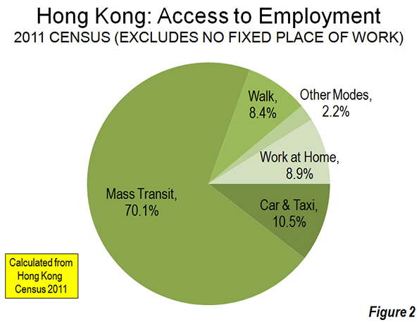
    No world city is better suited to mass transit than Hong Kong. Hong Kong may also be the best served — it has the transit usage levels to prove it. According to Hong Kong 2011 census data, 87 percent of combined transit and car work trip travel in Hong Kong is by transit, though this is a small decline from the 90 percent of 2001. This is the highest transit market share of any high-income world metropolitan area.

    Change in Work Access Patterns

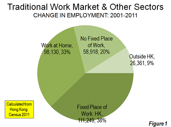
    Between 2001 and 2011 Hong Kong’s employment increased nine percent. Most of these new workers (38 percent), however, did not travel to fixed work locations in Hong Kong. Reflecting continuing decentralization and the impact of information technology, 62 percent of the new workers (1) worked at home, (2) had no fixed place of work or (3) worked outside Hong Kong, especially in Macau and the province of Guangdong, principally in Shenzhen (Figure 1). The 2001 and 2011 census data is summarized in the table below.

    HONG KONG WORK ACCESS: METHODS: 2001 AND 2011
    2001 2011 Change % Change Share: 2001 Share: 2011
    MASS TRANSIT   2,091,552  2,226,818    135,266 6.5% 70.4% 70.1%
    Bus & Coach  1,400,770  1,188,897  (211,873) -15.1% 47.2% 37.4%
       Large Bus   1,118,388     938,467   (179,921) -16.1% 37.7% 29.5%
       Minibus (Public Light)      226,646     217,219      (9,427) -4.2% 7.6% 6.8%
       Residential Coach       55,736       33,211    (22,525) -40.4% 1.9% 1.0%
    Rail     690,782  1,037,921   347,139 50.3% 23.3% 32.7%
       Metro (Original MTR)      495,128     697,475    202,347 40.9% 16.7% 21.9%
       Suburban Rail (Original KCR)      195,654     297,416    101,762 52.0% 6.6% 9.4%
       Light Rail              –         43,030     43,030 NA 0.0% 1.4%
    CAR & TAXI      232,978     333,192    100,214 43.0% 7.8% 10.5%
    WALK      335,859     266,574    (69,285) -20.6% 11.3% 8.4%
    OTHER      123,455       68,509    (54,946) -44.5% 4.2% 2.2%
    TRAVEL TO HK FIXED PLACE OF WORK   2,783,844  2,895,093    111,249 4.0% 93.8% 91.1%
    WORK AT HOME      185,367     283,497     98,130 52.9% 6.2% 8.9%
    FIXED PLACE OF WORK   2,969,211  3,178,590    209,379 7.1% 100.0% 100.0%
    NO FIXED WORK PLACE      188,998     247,916     58,918 31.2%
    WORK IN HONG KONG   3,158,209  3,426,506    268,297 8.5%
    WORK OUTSIDE HONG KONG       94,497     120,858     26,361 27.9%
    WORKING RESIDENTS   3,252,706  3,547,364    294,658 9.1%
    EXHIBIT
    Travel to Work in Hong Kong   2,783,844  2,895,093    111,249 37.8%
    Home, No Fixed Place, Outside HK      468,862     652,271    183,409 62.2%
    TOTAL   3,252,706  3,547,364    294,658 100.0%
    Source: Hong Kong Census, 2001 & 2011
    No Fixed Place of Work: Access method not determined


    The Shift from Bus to Rail: Transit’s overall share of work trip access was 70.1 percent in 2011 (all methods). This is a slight decline from the 70.4 percent in 2001. Over the last decade, Hong Kong has substantially expanded its urban rail system, including major improvements such as a new tunnel under Hong Kong Harbor and the new West rail line (former Kowloon Canton Railway) to Yuen Long and Tuen Mun. I wrote a supporting commentary in the Apple Daily (Hong Kong’s largest newspaper) supporting the rail expansion program in 2000.

    The results are apparent in the ridership data. The rail work access market share rose nearly 10 points to 32.7 percent. At the same time, the bus market share dropped nearly 10 points to 37.4 percent. Overall, in a modestly growing labor market, transit added 135,000 new one away work trips.

    Car Commuting Up: Cars and taxis experienced a much larger percentage gain, largely as a result of starting from a much smaller base. The car and taxi work trip access market share rose from 7.8 percent to 10.5 percent. Overall, approximately 100,000 more people commuted one way by car to work in 2011 than in 2001. The median incomes of car and taxi commuters are the highest, at more than twice that of rail and bus users.

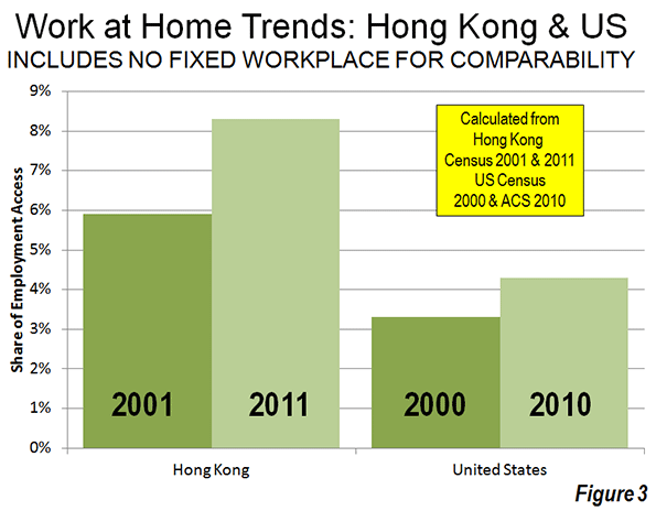
    More Working at Home:Hong Kong’s working at home grew the most of any category, rising 53 percent from 185,000 to 283,000 daily. As a result, working at home now accounts for 8.9 percent of work access, compared to 6.2 percent in 2001. Hong Kong’s reliance on working at home was greater than that of the United States in the early 2000s. Over the last decade Hong Kong’s 53 percent increase in working at home was well above the 41 percent increase in the United States. In Hong Kong, 33 percent of new employment was home-based work between 2001 and 2011. This is greater than in the US, where 20 percent of new jobs involved working at home as the usual mode of access between 2000 and 2010.

    The Decline of Walking: Given Hong Kong’s intensely high densities, it may come as a surprise that there was a huge loss in walking to work. Nearly 70,000 fewer people walked to work in 2011 than in 2001, as the walking market share dropped 21 percent. In 2011, commuters who walked (and those who used light rail) had the lowest incomes. In 2001, more people walked to work than either travelled by car or work at home. By 2011, fewer people walked to work than travel by car or work at home.

    There was also a nearly 55,000 loss in work access by other modes (such as ferries, motorized 2-wheelers and cycling).

    Finally, Hong Kong separately categorizes workers without a fixed place of employment and does not obtain information on how they access work. This category experienced an increase of nearly 60,000 from 2001 to 2011.

    The Decentralization of Hong Kong’s Labor Markets

    The distribution of employment changed little over the 10 years, with Hong Kong Island and Kowloon sectors retaining two-thirds of the jobs. These two areas also have more than one-half of the population.  Even so, the Hong Kong labor market followed the global pattern of decentralization.   More people traveled outside their home areas in 2011 than in 2001. Among resident workers living on Hong Kong Island and in Kowloon, there was an 18 percent increase in working outside these home sectors. Further, the increase in people with no fixed place of work reflects greater mobility and labor force decentralization.

    Jobs-Housing Balance? Not Much

    The high density of jobs and population, its short trip distances, its extraordinary transit system and its high transit market share would seem to make Hong Kong a poster city for the jobs – housing balance ("self containment") that urban planners seem so intent to seek. The data indicates no such thing.

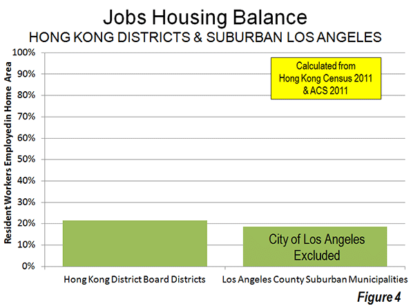
    Hong Kong’s 18 districts illustrate a comparatively low rate of self containment. Only 21.4 percent of working residents are employed in their home districts, including those who work at home. This is only slightly higher than in highly decentralized suburban Los Angeles County, where 18.5 percent of resident workers are employed in their home municipalities. With far lower population and employment densities and a 50 percent smaller geographical size, the suburban municipalities of Los Angeles County (city of Los Angeles excluded, see Note below) nearly equal the local-area jobs-housing balance of the Hong Kong districts (Figure 4).

    This tendency to work away from home districts contributes to Hong Kong’s extraordinarily long average commute times. In 2002, the average work trip was 46 minutes, longer than any high-income world metropolitan area except Tokyo. By comparison, Dallas-Fort Worth, with a similar population and a population density less than 1/20th that of Hong Kong, has an average work trip travel time of 26 minutes. Los Angeles, with its world-class traffic congestion has a work trip travel time of 27 minutes, principally because its automobile dominant commuting is much faster than Hong Kong’s world class, rail based transit system.

    These data, both in Hong Kong and Los Angeles, show that, within a metropolitan area (labor market),  people will tend to seek the employment that best meets their needs, just as employers will hire the people best suited to theirs. Within a labor market, this can be anywhere, subject to the preferences of people and employers, not of planners. This is the basis of former World Bank principal planner Alain Bertaud’s caution that a city’s economic efficiency requires … avoiding any spatial fragmentation of labor markets.

    The Mistake of Trying to Emulate the Unique

    It is a mistake to think that urban planning can emulate Hong Kong. Besides its superlatives, Hong Kong did not become so dense as a result of urban planning or the unfettered preferences of people (market forces). Hong Kong’s uniqueness is the result of unique geo-political influences. This history forced an unprecedented accommodation of millions in a small space, especially in the third quarter of the 20th century when it stood as a capitalist island in the midst of a Communist sea.

    Hong Kong is unique and will be for a long time.

    Note: The city Los Angeles has a very high jobs-housing balance (61 percent). However, this is largely due to its huge geographic size (more than 40 times the average suburban jurisdiction).

    Wendell Cox is a Visiting Professor, Conservatoire National des Arts et Metiers, Paris and the author of “War on the Dream: How Anti-Sprawl Policy Threatens the Quality of Life.”

    —-

    Photo: West Rail Line, Tin Shui Wai Station bus interchange, Yuen Long (by author)

  • Exodus to Suburbs Continues Through 2012

    The latest US Census Bureau migration data shows that people continue to move from principal cities (which include core cities) in metropolitan areas to what the Census Bureau characterizes as "suburbs" (Note). Between 2011 and 2012, a net 1.5 million people moved from principal cities to suburbs (principal cities lost 1.5 million people to the suburbs). The movement to the suburbs was pervasive. In each of the age categories, there was a net migration from the principal cities to the suburbs. There was also net migration to the "suburbs" in all categories of educational attainment.

    These data are in contrast to claims that people are moving from a suburbs to central cities. Virtually none of the migration data has shown any such movement. Moreover, the city population estimates produced for 2011 by the Census Bureau, which indicated stronger central city growth have been shown to be simply allocations of growth within counties, rather than genuine estimates of population increase.

    —-

    Note on Census Bureau "Suburbs:"

    The movement to the suburbs is undoubtedly understated in the Census Bureau estimates, because many jurisdictions included in the "principal city" classification are in fact suburbs. The Real State of Metropolitan America showed that virtually all population growth in principal cities was either in suburban jurisdictions classified as principal cities, or in cities with substantial expenses of post-World War II automobile oriented (or suburban) land-use patterns. The remaining core cities that are largely only urban core in land use accounted for only 2% of principal city growth from 2000 to 2008.

    For a decade, the Census Bureau has used a "principal city" designation instead of the former "central city" term. All former "central cities" are "principal cities." The Census Bureau characterizes all other areas of metropolitan areas as "suburbs." In fact, many of the principal cities are functionally suburbs, having barely existed or not existed at all at the beginning of the great automobile oriented suburban exodus following World War II.

    Examples of such suburban principal cities, with their metropolitan areas in parentheses, are Hoffman Estates (Chicago), Arlington (Dallas-Fort Worth), Aurora (Denver), Fountain Valley (Los Angeles), Eden Prairie (Minneapolis-St. Paul), Mesa (Phoenix), Hillsboro (Portland), San Marcos (San Diego), Pleasanton (San Francisco), Kent (Seattle), Virginia Beach (Virginia Beach-Norfolk) and many others.