Blog

  • Manila Shantytown Fire: 800 Homes Destroyed, 10,000 Homeless

    London’s Daily Mail reports upon a May 11 fire in a shantytown (informal, illegal settlement) destroyed 800 dwellings and left 10,000 people homeless. The Mail article included 17 photographs of the fire, the ruins  people looking for belongings in ash suffused waters and man who has rescued a cat in debris filled waters. The fire occured in the Tondo district, which is two miles from downtown Manila on Manila Bay and two miles from the Doroteo Jose station on the Manila urban rail system as well as the principal commuter rail station.

    More than 4,000,000 – more than one-third – of Manila’s (National Capital Region) residents live in slums, shantytowns and informal settlements. Government projections indicate that the slum population will rise to 9,000,000 by 2050. More than one-half of Manila’s population will be in slums.

  • Smart-Growth and Smarter Technology

    If you’re an enviro-regulator with a mission, preventing “sprawl” has been ideologically trendy in recent decades. You have successfully predicated your argument on past-history soils-management technological inadequacy, it must be enormously threatening to look back and realize that technology has been gaining on you and is now capable (in engineering terms) and affordable (in end-user cost terms) of enabling just the sorts of rural development the majority of the market-for-housing wants, but you’ve been trying so hard to prevent: Currier-and-Ives-tradition large-lot houses in the countryside.

    Case in point: the inadequate-soils argument long used by anti-rural-housing-and-business advocates to demand that buildings not be built anywhere soils aren’t naturally capable of environmentally-sound management of on-site sewage flows, and connection to a piped municipal sewer system isn’t feasible.

    One way to win the sewage-flow argument is to control the information flow so that targets of your engineering-inadequacy argument don’t get to know about technologies they might employ, passing all tests of environmental quality and product affordability, to build and occupy the house and-or business in the countryside they want and you don’t want them to have.

    If you’re good at it, you can keep the new technologies pretty much unknown to the public long after they’ve ceased being new. For example: chances are your local and regional planners and zoners never passed along to you the Winter 1996 issue of “Pipeline,” a quarterly effort of the National Small Flows Clearinghouse, a Federally-funded enterprise of the National Environmental Services Center within the U.S. Department of Agriculture and headquartered at West Virginia University. That issue was devoted almost entirely to a then-quite-innovative alternative to traditional septic-tank-and-disposal-field design: it was labeled “aerobic” to reflect its use of electric-powered air flows to enable oxygenated digestion, in contrast to the anaerobic design for traditional septic tanks.

    As the text explains, “aerobic…a good option…where soil quality…isn’t.” The Aerobic Wastewater Treatment module can be installed and used irrespective of natural site conditions. That was 26 years ago. Last month, the State of Maryland adopted legislation to advance “Smart-Growth” and prevent rural development by establishing new and more rigorous criteria for septic (anaerobic) tank installations. Not a word in the press releases about aerobic technology. Irony: your tax dollars pay for “Pipeline,”  which describes its objective as “small community wastewater issues explained to the public,” but in the last 26 years there’s been zero effort, on the part of your planners and zoners to assist in that effort. Have they actually worked to suppress such (in their opinion) non-useful information, possible counterpoints to their growth-control doctrines? You decide.

    It was (and still is) understandable that land with low-permeability clay soils, high water tables, shallow depth to bedrock, and similar negative qualities would be disqualified for in-ground septic systems on the grounds of predictable system failure. If non-soil-based systems didn’t exist, the logic of rural-development-prevention (no access to municipal piped systems) would prevail. That’s why Denver, back in the 80s, mounted a regional green-belt anti-sprawl campaign by curtailing municipal system expansion into previously-unserved real estate. It’s not understandable that development controls based on soil (in)capabilities should still be in place long after non-soils-based technologies have been engineered, manufactured, and marketed. Unless, of course, the soil-capability argument was an excuse, not a real reason.

    * * * * * *

    Before these little AWT packages became available (and have been unsuccessfully publicized by the Feds since the 90s) the industry was already interested in an even lower-tech non-soils-based design: the evapo-transpiration concept, where primary-treated effluent coming from a traditional septic tank is released into an under-sealed heavily-vegetated patch (in some designs, a shallow lagoon) where about two feet of vertical evaporation will take place annually if rain and snow are kept off. That’s a typical number for northern New England.

    Depending on location with respect to septic-tank discharge, electric power for pumping may or may not be needed. But industry interest was pretty much trumped by regulator hostility. Many fruitless meetings were held in Montpelier and Waterbury on the subject, even one at which copies of the 1980 Environmental Protection Agency Design Manual were handed around the table, to no avail.

    This raises the basic Smart-Growth question: can it be sold to (or forced on) a generally unwilling public only by pretending that the engineering basis for “sprawl” doesn’t work? There’s ample historical evidence –see Chapter 5, Ben Wattenberg’s “The First Measured Century”, for example—that “…the preference for the single-family detached house was even higher at the end of the 20th century than at the beginning…” but the top-down campaign against just such “sprawl” continues anyway.

    It doesn’t seem to matter that such exemplars of Smart-Growth as Portland, OR now show some of the highest housing costs in the nation; or that a new Cal State report on housing costs and young-adult out-migration speaks to a preference “…for raising children on backyards rather than condominium balconies.” One way to counter that, of course, would be to make the backyard even more expensive than the condo by pretending that the traditional on-site sewage system for the former is an engineering health hazard, and that no environmentally-acceptable customer-affordable alternates exist.

    To advance Smart-Growth it helps to keep the research and publications of the National Small Flows Clearinghouse as hidden as possible. There are some things, you understand, that the natives are better off not knowing, lest it make them restless.

    Martin Harris is a Princeton graduate in architecture and urban planning with a range of experience in fields ranging from urban renewal and air-industrial parks to the trajectory of small-town planning and zoning in States like Vermont.

    Rural Vermont home photo by Bigstockphoto.com.

  • London’s Social Cleansing

    Unscrupulous landlords are forcing poorer tenants out of their London homes, freeing them up to rent out to visitors to the Olympics this summer, according to the housing charity Shelter. At the same time, the government’s cap on rent subsidies (Housing Benefits) for those out of work or on low incomes threaten to force less well-off tenants out of the capital. Newham Mayor Sir Robin Wales says that they will have to move people as far afield as Stoke-on-Trent if they are to meet their obligations to house the homeless. Fears of ‘social cleansing’ featured in the Mayoral election where Tory incumbent Boris Johnson made sure to distance himself from his own government’s policy to beat off the challenge from veteran left-winger Ken Livingstone.


    Inner London, outer London (Newham in red); London, Stoke-on-Trent

    Critics of London’s ‘Social Cleansing’ have fixed on the changes to the law regarding housing benefits and the Olympics, but failed to notice that working class Londoners have been being forced out of the nation’s capital for some time now – thanks to the ceaseless rise in house prices. On the London Programme in 2003, I said that without opening up more land to building in the green belt, house prices would spiral out of control, pricing ordinary Londoners out of the capital. Mayor Ken Livingstone slapped me down saying that he would never sanction building on the green belt.

    Today Eva Wiseman, a commissioning editor on the upmarket broadsheet, the Observer, says that she cannot afford to rent in London’s once poorest borough, Tower Hamlets, let alone buy a house. She cites Shelter’s estimate that you would need an income of £67,669 to rent there (average income is £26,244).1

    It is not hard to understand why prices are so steep. Housebuilding in the UK has failed to keep pace with demand. New housing starts are slightly up after the crash, but overall they are woefully short of actual need. The reason is that Britain has among the most stringent laws on building – the ‘planning laws’ – which stop building on the ever-growing ‘green belts’ that surround our cities.

    Given that the working class are the Labour Party’s natural constituency, you might have thought that its years in government (1997-2010) would have seen more homes built for working people. But Labour turned its back on the working classes a long time ago, while keeping its neurotic interest in regulating the economy. The outcome was a re-vamped planning system that put the brakes on home building. This time this was done in the name of the environment, not to protect the Tory Shires from ‘bungaloid sprawl’, as it was originally intended. Housebuilding fell below the bare minimum of 250,000 you would need just to replace the increasingly dilapidated stock.

    When David Cameron’s Conservative-Liberal coalition came to power in 2010, his Communities Minister Eric Pickles and Housing Minister Grant Shapps had promised a large scale liberalisation of the planning laws – and even blamed their predecessors for doing more damage than the Luftwaffe to Britain’s housing stock. But the fine print on Shapps’ new planning law proved as prohibitive as what went before. Even those champions of the Green Belt at the Guardian were moved to editorialise that ‘these convoluted and qualified planning laws will become another aid to the big-money lawyers’. 2

    The Conservative government’s commitment to liberalisation is like its Labour predecessor’s commitment to the working class, theoretical. Home building remains stalled, and prices have not seriously fallen despite the shortage of credit). Governments of all stripes are most committed to orderly regulation of change, and dread the unsupervised activity of their citizens – a prejudice which has only led to chaos.

    The short supply/rising price dilemma is particularly intense in London. A metropolis of nine million creates a fierce competition for prime sites. Even putting aside the super-rich boroughs, like Kensington and Chelsea, where average prices are £1.3 million (roughly $2 million US), the overall London average is £406,000 ($770,000 US) .

    Besides being the most logical place for real estate speculation from around the world, London also has been in the grip of the planning system. It was in London that the Labour mayor took on architect Richard Rogers as an advisor, and committed the capital to a programme of building only on brownfield (already developed) land, ‘building up, not out’. The result is not much building at all, except to pack more four and five storey blocks into what few pockets of green space can be grabbed. His successor Boris Johnson has avoided challenging the Livingstone system, preferring a quiet life to any hint of controversy.

    Rather than face the problem of the absolute shortfall in new homes, most critics have fixated on peripheral issues, such as the number of empty homes (which, despite the attention they receive, are, because of high prices, at an all-time low). Easy credit, too, has been blamed for high prices, which is true, but the shortage of credit has not led to a great fall in prices, because the underlying problem was the absolute shortage of homes. Others have argued that the British are too wedded to the idea that they should own their own homes, and could rent, like the Germans, failing to understand that the availability of homes to rent depends on their being built, and rents tend to move in the same direction as prices, as The Observer’s Eva Wiseman has discovered. London’s Mayors have dedicated much attention to schemes to build ‘affordable homes’ – sometimes reserved for occupations like teachers and firefighters – though these are too few in number to have much impact on prices overall.

    Over time, this means working people are being priced out of central London. Tim Butler, Chris Hamnett and Mark Ramsden’s analysis of London’s employment in the 2001 census shows that outer London and the South East is more working class than inner London. Inner London had more large employers, professionals and managers than outer London and the South East. Outer London had more routine, semi-routine and technical or lower supervisory workers. Inner London did have more unemployed than outer London, and outer London had more self-employed than inner London. This employment profile was new, following changes that took place after fifteen years of economic growth, say Butler and his colleagues, though many have noted the sharper contrasts between wealthy enclaves and impoverished housing estates dogged by underemployment. 3

    These social changes show inner London’s parallel embourgeoisment and deepening social poverty. Of course, those who live in the outer suburbs scoff at the protests from well-heeled social commentators about the prices in inner London as ‘Zone Six snobbery’. Still the changes go some way to explaining why Ken Livingstone was unable to sustain the traditional City Hall machine he built consolidating constituencies among inner London’s poor immigrant and residual working class   communities while Tory Boris Johnson won  over the more working and middle class outer suburbs.

    In his last term Livingstone concentrated on winning over London’s bloated financial service sector more than he did on popular support – but the City of London switched its allegiances to the Tory Johnson, who champions it as an engine of growth. Neither candidate has understood that the skew towards the overheated financial service sector creates a weakness in the London economy, with manufacturing having moved out to the surrounding South East and a growing lack of upwardly mobile jobs for all but the most skilled or privileged.

    The housing benefit cap clearly is a problem for welfare-dependent families who are caught in the poverty trap and cannot earn enough to pay the rent. But the problem of the less well-off being priced out of London began long before the changes in housing benefit rules, or London’s winning the Olympic bid. The city the world will visit this summer increasingly resembles not the social democracy imagined after the Second World War, but increasingly a social bifurcated place increasingly resembling that of Victorian times.

    James Heartfield is the author of Let’s Build: Why we need five million new homes, a director of Audacity.org, and a member of the 250 New Towns Club.

    ————————————–

    A Mile High Tower for London

    One imaginative solution to London’s housing problem was proposed by Ian Abley and Jonathan Schwinge of the 250 New Towns Club. Abley and his colleagues have been pressing for new building in Britain’s green spaces to meet housing need.

    Taking on the challenge of building up as well as out, Ian unveiled a plan for a tower one mile high for London at the Building Centre, which could house 90,000 people.


    ‘Locked out of the Property Market’, Observer,  6 May 2012

    27 March 2012, http://www.guardian.co.uk/commentisfree/2012/mar/27/planning-builders-charter-lawyers-delight-editorial, and see ‘Coalition of the Unwilling’, New Geography, 1 July 2011, http://www.newgeography.com/content/001966-coalition-unwilling

    Inward and Upward: Marking Out Social Class Change in London, 1981–2001, Urban Studies 45(1) 67–88, January 2008, 72

    London photo by Bigstockphoto.com.

  • Observations on Exurban Trends

    Getting the Migration Story Straight: Analysts continue to misunderstand the recent metropolitan area census estimates. Much of the misunderstanding arises from a misinterpretation of a chart produced by the Brookings Institution, which indicates that the rate of population growth has fallen in exurban counties and was, last year, less than the rate of growth in what Brookings calls emerging suburbs and "city/high density suburbs." However, the Brookings chart characterizes  only total population growth, which is the combination of the natural growth rate, net international migration and net domestic migration. In other words, the Brookings Institution chart includes both people who move between areas of the United States and the net of those who move from outside the United States, are born or died.

    Perhaps the most befuddled was the Arch Daily, which says that "people are leaving the suburbs and once again flocking to the cities…"  In fact exurban and suburban areas continue to grow, though their growth rates have fallen. The highly touted decline in exurban growth rates is for one year only (2010-2011) and represents only the first year in the last 20 that the exurban has trailed that of the "city/high density suburbs." It is also the first year out of the last 20 that the "city/high density suburbs" did not trail both the suburbs and exurbs.

    However, aggregate growth rates say nothing about moving to or from cities. Only one of the components of population change, domestic migration, can possibility indicate movement from the suburbs and exurbs to the cities. People who migrate from outside the nation, for example, are not moving from suburbs to the city (the suburbs of Paris don’t count). People who are born or die are not migrating from the suburbs to the cities (where they might come from or are going has been the source of endless debate through history). The only people who can possibly be moving from suburbs and exurbs to the city are domestic migrants —people who move within the United states.

    Figure 1 indicates the components of population change in the core counties of the nation’s 51 metropolitan areas with more than 1,000,000 population (there are no city level migration data).

    • There was a net gain in natural growth of 556,000 (births minus deaths)
    • There was a net gain in international migration of 295,000 (people who moved from outside the nation to the core counties.
    • There was a net loss in domestic migrants of 67,000. These US residents moved  away from the core counties.

    As we indicated in Still Moving to the Suburbs and Exurbs: The 2011 Census Estimates, there was net domestic migration to the suburbs and exurbs between 2010 and 2011. There was net domestic migration out of the central counties (there is no "city" migration data). This is illustrated in Figure 2, which has been annotated to make the actual moving of people clear.

    If it should ever occur, it will be very clear when people are moving to the cores from the suburbs and exurbs. There will be PLUS domestic migration numbers to the core counties and MINUS domestic migration numbers from the suburbs and exurbs. Until that time any flocking (though that is too strong a word for current trends) will be away from the cores and to the suburbs and exurbs.

    Of course, in the greatest economic downturn in more than 75 years, domestic migration has slowed considerably. It is not surprising, therefore that population growth rates in the exurbs and suburbs have fallen, since far fewer people are moving.

    All Domestic Migration was to the Suburbs: Finally, all of the net domestic migration in the nation was to the suburbs and exurbs of the nation’s major metropolitan areas (Also see Figure 2).

    On the Health of Exurban Housing Markets

    On a related subject, University of South Florida Professor Steven Polzin offered an interesting comment on the Planetizen site:

    While I have not explicitly researched the distribution of home foreclosures as a function of the transportation costs of residents, I would caution analysts to more fully explore the nature of the housing foreclosure trend before jumping to the assumption that transportation costs were a significant contributor to geographically differential rates of foreclosure. Foreclosures were more prominent in homes purchased more recently relative to the housing crash. These new home purchasers were more often highly leveraged, had little equity in their home, and in many cases younger workers with less job seniority and more susceptible to layoffs. In addition, in fringe areas that had been growing there was a high concentration of homes all purchased recently. Thus, new growth areas were more susceptible to both foreclosures and the cascading effect of home depreciation spreading based on nearby foreclosed properties.

    In a new suburb a young financially extended family may lose their job, have no equity in the house and quickly lose their house. Its depreciated value is soon reflected in adjacent appraisals cascading the stress throughout relatively fragile neighborhoods. On the other hand in established neighborhoods only a relatively small share of the homes changed hands near the peak of the building bubble. Thus, many of those homeowners had far more equity in their home and perhaps more job seniority and security enabling them to whether a housing downturn. In addition, the diversity of home ages and types and the less frequent occurrence of foreclosed properties will control the pace at which home value depreciation will cascade through the neighborhood.

    If commuting cost was as big a contributor to suburban fringe foreclosure rates then one would have expected downtown condominiums to weather the housing bubble. In many locations like Florida large clusters of new downtown residential properties suffered the same rapid depreciation as did suburban fringe areas. The concentration of new units seemed to be more critical than the location.

    Similar sentiments have been posted on these pages from time to time, such as here and here.

  • Homebuilding Recovery: A Zoning & Planning Overhaul

    Part III of the Recovery Blueprint for homebuilding. Defining good zoning and good planning, and a look at how social engineering plays in.

    What exactly is ‘planning’?

    It can be government creation of an Interstate Highway, or a city council vote on a new park. For the purposes of this blueprint, planning refers to the design of a new land development or a design for redevelopment. In both cases, the land plan is the developer’s business plan. The design will either be positive or negative for the sustainability — long-term health — of the city.

    Typically, the ‘planner’ will be an engineer or surveyor if the development is suburban, or an architect or ‘urban planner’ designing an urban redevelopment. In any case, the planner will follow regulations that set ‘minimums,’ such as a minimum on lot size, side yards, front and rear setbacks, and so forth. There are a few major problems with this ‘minimums’ based system.

    In order to maximize profits for the client (the builder or developer), the planner is encouraged to squeeze as many units as possible within the available land. The design of the development becomes a mathematical exercise, more than an attempt to create an attractive and functional neighborhood design.

    The result becomes a monotonous, cookie-cutter solution. It maximizes not just density, but also construction costs, with a high volume of streets, utility mains, and sidewalks.

    Technology made the situation worse, with software not only limiting creativity, but also influencing the planning to correspond with the predetermined, robotic functions of the widely used software.

    A minimums-based design is quite rigid. In the long run, if a design is driven only by density, the development can be far less profitable for the developer, despite the original intention to economize. Builders who buy lots from the developer also end up paying more than they would have with a different approach. When topography and the overall property configuration are more complex, and as restrictions on wetlands and tree ordinances increase, it gets worse. Rigid designing is like trying to fit a square peg in an odd shaped hole, increasing waste.

    Development after development becomes a clone, because of the way regulations are written and interpreted. This monotony can then only be broken up with a much greater attention to architecture and landscaping. The ‘geometry’ of each development remains similar.

    This is where the confusion between good planning and good architecture comes in. An example is New Urbanism, with architecture as its key component. A coherent architectural theme, full front porch, and street trees are typical of these developments. Compare that to the vinyl sided, bland subdivision where the three-car garage is the dominant feature. New Urbanism typically wins the curb appeal beauty contest. (Of course, in upscale suburban communities where every home showcases great architecture and landscaping, that is not necessarily the case.)

    Underlying New Urbanism is the implication that certain design elements will change behavior and solve social problems. Neighbors will want to interact regardless of income, race, religion, and so on. Many think this ‘Stepford Wife’ approach places design as a tool to implement mind control. Is it?

    Those who reside in New Urban communities desire the more attractive setting. The architectural and landscaping control creates a welcoming and cohesive community appearance, compared to the garage snout vinyl cladded subdivision. These developments are typically more expensive per home square foot, thus your neighbor is likely to be somewhat successful, just like you. This is no more social engineering than is providing any market for successful people who value appearance and like to live among others with similar values.

    Within a city, other planning solutions can result in social change. Replacing a blighted, high crime neighborhood with a gentrified urban mecca for wealthy residents that enjoy the nightlife is one sure formula to do so. But is it a change in the right direction for a city?

    What happens to those low-income families that are displaced? How are their lives improved? Theoretically, they could move to a safer, less blighted area, like many who were displaced by Katrina. Instead of displacing poor families, there are viable solutions based on rebuilding blighted areas and maintaining affordability. Not the typical ‘smart growth’ solutions, though; those often add significantly to redevelopment costs. Compressing these families into dense, high-rise structures does nothing to foster pride, thus, high-density low-income housing could be considered unsocial engineering.

    Zoning gets attacked, but the truth is that it tends to preserve property values better than intermixed usage does. New Urbanism offers the promise that the rich and poor can all live on the same block. That would be marketing suicide for the developer and builder. Suburban zoning can also be a terrible model. It places the strip mall or multi-family homes along arterial roads, then transitions to the large single family lots and homes as one drives deeper into the subdivision or the ‘master planned’ community (i.e., ‘larger’ subdivision). Showcasing the cheapest housing, and placing the most families in the worst places is land use madness. To highlight inexpensive homes and strip malls cheapens the development and the city as a whole.

    A blueprint for recovery without class barriers, one that benefits all income levels, can easily be accomplished today. To start, the suburban zoning pattern is in serious need for an overhaul. Reversing the pattern would increase property values and profitability, and values would be more stable over time.

    A less rigid geometric pattern would reduce monotony, while allowing the development design to adhere to the natural terrain. An adherence to the natural terrain allows surface flow, which reduces the expense and negative impact of traditional storm sewer systems.

    How can all of the above be expedited? Cities can be proactive by writing regulations that reward better solutions. That particularly includes a modification of their existing minimums-based regulations.

    Flickr photo by infomatique (William Murphy): “Discussion: ‘Can Zoning Be Bad For You?’ All land in Dublin City is zoned for one particular use or another, some more restrictive than others…”

    Rick Harrison is President of Rick Harrison Site Design Studio and Neighborhood Innovations, LLC. He is author of Prefurbia: Reinventing The Suburbs From Disdainable To Sustainable and creator of Performance Planning System. His websites are rhsdplanning.com and pps-vr.com.

  • Right in the Middle: The Midwest’s Growth Lessons for America

    The Midwest’s troubles are well-known. The decline of manufacturing has resulted in job losses and dying industrial towns. The best and brightest have fled the flatlands for more exciting, sunnier, mountainous, or coastal places where the real action is. Even Peyton Manning has left the heartland for the Rockies.

    This narrative is so deeply embedded both in and outside of the Midwest that many people overlook the ways in which parts of the region are bouncing back. The Midwest’s story is important because it serves in significant ways as a regional microcosm of how growth and opportunity should look in America today.

    In a recent study we look at trends that upend the conventional wisdom about the Midwest. We find that it is neither doomed to a slow and dirty demise like an old house on an eroding slope, nor forced to reinvent itself Dubai-style in order to compete with Silicon Valley or Manhattan. The Midwest’s future is rooted very much in its past—but with some important updates.

    What do we mean? For starters, this means capitalizing on Americans’ desire to reside where the cost of living and doing business is favorable. As the last Census showed, Americans move in droves to regions where the cost of living is low, businesses face fewer obstacles, and workers have choices. As Wendell Cox and Joel Kotkin have shown, this goes for 25- to 35-year-olds as well as 55- to 65-year-olds. People want options and a good quality of life at a price they can afford.

    In the Midwest, these trends have favored placed like Columbus, Ohio, and Indianapolis, Indiana. When people hear “Midwest,” they are more likely to think of this kind of picture:

    The blue areas show destinations to which people from Detroit have moved between 2000 and 2010. The brown shades are the areas from which Detroit has drawn people. Given Detroit’s well-publicized decline, all the blue should be no surprise.

    But a respectable portion of the Midwest looks like this:

    And this:

    Like most parts of America, Columbus and Indianapolis have seen a net outmigration southward to Florida and Texas. No surprise there. But note how both cities are stealing population from Chicago, Detroit, New York, and even southern California and Miami in Indianapolis’s case. The maps also show how intense interstate competition within the Midwest is right now.

    One important measure of the cost of living is housing affordability, which is typically set at 3.0 as a measure of median housing price divided by median income. Compared to San Francisco at 7.2, New York at 6.1, Los Angeles at 5.9, and Miami at 4.7, Columbus stands at 2.8 and Indianapolis at 2.4. Charlotte, which has been an exemplary Sun Belt growth magnet for a while, stands at 3.9, a slight click above the Chicago area’s 3.8.

    Affordability and overall quality of life as measured by schools and greater disposable income matter a lot—even to technology entrepreneurs. Some Midwestern areas are outpacing coastal areas on this front. In a recent Forbes ranking of tech growth in the nation’s largest 51 metro areas, the Midwest had three cities within the top 15, with Columbus in third position, followed by Indianapolis and St. Louis.

    But it would be wrong for tech boosters to think the Midwest’s future rests in harnessing the power of this sector alone. Rather, it’s a combination of brains and brawn that signify the Midwest’s core strength. When we look at Midwestern areas that have experienced above-average growth in bachelor’s degrees, there are important overlaps with areas experiencing above-average growth in manufacturing, too.

    In the corridor from Madison to Milwaukee, or the outlying areas around Chicago, or the Indianapolis metro area, or even in the Quad Cities on the Iowa-Illinois border, we see higher educational attainment and manufacturing growth occurring together. Cedar Rapids, Iowa, had the highest GDP growth from 2000 to 2010 of any metro area in the Midwest. A new corridor has grown up between Cedar Rapids and Iowa City, home to the University of Iowa; it takes advantage of the region’s historical manufacturing capacity and blends it with new technology. Peoria, Illinois, is second to Cedar Rapids in GDP growth. Peoria is home to 200 manufacturing firms, and it is also a Midwestern leader in college degree attainment.

    Manufacturing continues to be part of the regional DNA in the Midwest. Trying to move away from it would be a fool’s errand, as this picture shows:

    The concentration of manufacturing in middle America is a real asset, especially when combined with higher levels of educational attainment, as we have seen. The Midwest is still home to much of the nation’s skilled labor force. And contrary to the declinist narrative mentioned at the outset, the region has added 50,000 “heavy metal” manufacturing jobs since 2009.

    The challenge for the region, actually, will perhaps be filling manufacturing jobs rather than creating them. A recent Deloitte survey found that 83 percent of manufacturers nationwide suffered a moderate or severe shortage of skilled production workers. The Midwest is poised to establish what we call a “new industrial paradigm,” characterized by a blend of heavy manufacturing, new technology, a more highly educated industrial labor base, and lighter labor restrictions (Indiana just became a right-to-work state, and the much-publicized debates in Wisconsin and Ohio over labor laws have only served to draw more attention to the need for reform, whatever the near-term effects). When you add to all of this the new energy sources discovered in some parts of the Midwest—such as new finds in Utica shale in Ohio—a new industrial paradigm in the region could end up being a large source of new wealth creation in the coming generation.

    So why might the Midwest be something of a microcosm for how growth and opportunity look in America as a whole, given its idiosyncratic reliance on manufacturing not shared by other regions? The main reason is that middle America is a clear picture of how much the basics matter: Cost of living, job quality, schools, and opportunities to develop the right skills for the best jobs. The areas within the Midwest that have gotten the basics right are poaching people and companies from the areas that haven’t. Any economic development strategy that ignores the basics in favor of a more stylized theory of growth will usually run off the rails before too long. Americans, at the end of the day, want the places they live to get the basics right so they themselves can build their lives, start their businesses, and raise their children as they wish.

    This piece originally appeared at The American.

    This peice was adapted from a recent report: "Clues from the Past: The Midwest as an Aspirational Region." Download the full pdf version of the report, including charts and maps about the Great Lakes Region.

    Joel Kotkin is executive editor of NewGeography.com and is a distinguished presidential fellow in urban futures at Chapman University, and contributing editor to the City Journal in New York. He is author of The City: A Global History. His newest book is The Next Hundred Million: America in 2050, released in February, 2010.

    Mark Schill is Vice President of Research at Praxis Strategy Group, an economic development and research firm working with communities and states to improve their economies.

    Ryan Streeter is Distinguished Fellow for Economic and Fiscal Policy at the Sagamore Institute. You can follow his work at RyanStreeter.com and Sagamoreinstitute.org.

    Great Lakes Freighter photo by BigStockPhoto.com.

  • The Export Business in California (People and Jobs)

    California Senate President Pro-Tem Darrell Steinberg countered my Wall Street Journal commentary California Declares War on Suburbia in a letter to the editor (A Bold Plan for Sustainable California Communities) that could be interpreted as suggesting that all is well in the Golden State. The letter suggests that business are not being driven away to other states and that the state is "good at producing high-wage jobs," while pointing to the state’s 10 percent growth over the last decade. Senate President Steinberg further notes that the urban planning law he authored (Senate Bill 375) is leading greater housing choices and greater access to transit.

    This may be a description of the California past, but not present.

    Exporting People

    Yes, California continues to grow. California is growing only because there are more births than deaths and the state had a net large influx of international immigration over the past decade. At the same time, the state has been hemorrhaging residents (Figure 1).

    Californians are leaving. Between 2000 and 2009 (Note), a net 1.5 million Californians left for other states. Only New York lost more of its residents (1.6 million). California’s loss was greater than the population of its second largest municipality, San Diego. More Californians moved away than lived in 12 states at the beginning of the decade. Among the net 6.3 million interstate domestic migrants in the nation, nearly one-quarter fled California for somewhere else.

    The bulk of the exodus was from the premier coastal metropolitan areas. Since World War II, Los Angeles, San Francisco, San Diego and San Jose have been among the fastest growing metropolitan areas in the United States and the high-income world. Over the last decade, this growth has slowed substantially, as residents have moved to places that, all things being considered, have become their preferences.

    More than a net 1.35 million residents left the Los Angeles metropolitan area, or approximately 11 percent of the 2000 population. The San Jose metropolitan area lost 240,000 residents, nearly 14 percent of its 2000 population. These two metropolitan areas ranked among the bottom two of the 51largest metropolitan areas (over 1,000,000 population) in the percentage of lost domestic migrants during the period. The San Francisco metropolitan area lost 340,000 residents, more than 8 percent of its 2000 population and ranked 47th worst in domestic migration (New York placed worse than San Francisco but better than Los Angeles). Each of these three metropolitan areas lost domestic migrants at a rate faster than that of Rust Belt basket cases Detroit, Cleveland and Buffalo.

    San Diego lost the fewest of the large coastal metropolitan areas (125,000). Even this was double the rate of Rust Belt Pittsburgh.

    Exporting Jobs

    California is no longer an incubator of high-wage jobs. The state lost 370,000 jobs paying 25 percent or more of the average wage between 2000 and 2008. This compares to a 770,000 increase in the previous 8 years. California is trailing Texas badly and the nation overall in creating criticial STEM jobs and middle skills jobs (Figures 2 & 3) Only two states have higher unemployment rates than California (Nevada and Rhode Island) . California has the second highest underemployment rate (20.8 percent), which includes the number of unemployed, plus those who have given up looking for work ("discouraged" workers) and those who are working only part time because they cannot find full time work. Only Nevada, with its economy that is overly-dependent on California, has a higher underemployment rate.


    Business relocation coach Joseph Vranich conducts an annual census of companies moving jobs out of California and found a quickening pace in 2012. Often these are the very kinds of companies capable of creating the high-wage jobs that used to be California’s forte. Vranich says that the actual number may be five times as high, which is not surprising, not least because there is no reliable compilation of off-shoring of jobs to places like Bangalore, Manila or Cordoba (Argentina).

    To make matters worse, California is becoming less educated. California’s share of younger people with college degrees is now about in the middle of the states, while older, now retiring Californians are among the most educated in the nation (Figure 4).

    Denying Housing Choice

    It is fantasy to believe, as Steinberg claims, that there are enough single family (detached) houses in the state to meet the demand for years to come. More than 80 percent of the new households in the state chose detached housing over the last decade. People’s actual choices define the market, not the theories or preferences of planners often contemptuous of the dominant suburban lifestyle.

    In contrast, however, the regional plans adopted or under consideration in the Bay Area, Los Angeles and San Diego would require nearly all new housing be multi-family, at five to 10 times normal California densities (20 or more units to the acre are being called for). New detached housing on the urban fringe would be virtually outlawed by these plans. And, when Sacramento does not find the regional plans dense enough, state officials (such as the last two state Attorneys General) are quick to sue. If the "enough detached housing" fantasy held any water, state officials and planners would not be seeking its legal prohibition. To call outlawing the revealed choice of the 80 percent (detached housing) would justify the equivalent of a Nobel Prize in Doublespeak.

    At the same time by limiting the amount of land on which the state preferred high density housing must be built, land and house prices can be expected to rise even further from their already elevated levels (already largely the result of California’s pre-SB 375 regulatory restrictions).

    Transit Rhetoric and Reality

    Transit is important in some markets. About one-half of commuters to downtown San Francisco use transit. The assumptions of SB 375 might make sense if all of California looked like downtown San Francisco. It doesn’t, nor does even most of the San Francisco metropolitan area. Only about 15 percent of employment is downtown, while the 85 percent (and nearly all jobs in the rest of the state) simply cannot be reached by transit in a time that competes with the car. Even in the wealthy San Jose area (Silicon Valley), with its light rail lines and commuter rail line, having a transit stop nearby provides 45 minute transit access to less than 10 percent of jobs in the metropolitan area.

    A recent Brookings Institution report showed that the average commuter in the four large coastal metropolitan areas can reach only 6.5 percent of the jobs in a 45 minute transit commute. This is despite the fact that more than 90 percent of residents can walk to transit stops. Even when transit is close, you can’t get there from here in most cases in any practical sense (Figure 5).

    SB 375 did little to change this. For example, San Diego plans to spend more than 50 percent of its transportation money on transit over the next 40 years. This is 25 times transit’s share of travel (which is less than 2 percent). Yet, planners forecast that all of this spending will still leave 7 out of 8 work and higher education trips inaccessible by transit in 30 minutes in 2050. Already 60 to 80 percent of work trips in California are completed by car in 45 minutes and the average travel time is about 25 minutes.

    For years, planners have embraced the ideal of balancing jobs and housing, so that people would live near where they work, while minimizing travel distances. This philosophy strongly drives the new SB 375 regional plans. What these plans miss is that people choose where to work from the great array of opportunities available throughout the metropolitan area. These varied employment opportunities that are the very reason that large metropolitan areas exist, according to former World Bank principal planner Alain Bertaud.

    People change jobs far more frequently than before and multiple earners in households are likely to work far apart. Similar intentions led to the development up to four decades ago of centers like Tensta in Stockholm, which ended up as concentrated low income areas (Photo). It California, such a concentration would do little to improve transit ridership, even low-income citizens are four to 10 times as likely use cars to get to work than to use transit.


    Tensta Transit Oriented Development: Stockholm

    All of this means more traffic congestion and more intense local air pollution, because higher population densities are associated with greater traffic congestion. Residents of the new denser housing would face negative health effects because there is more intense air pollution, especially along congested traffic corridors.

    Self-Inflicted Wounds

    Worst of all, California’s radical housing and transportation strategies are unnecessary. The unbalanced and one-dimensional pursuit of an idealized sustainability damages both quality of life and the economy. This is exacerbated by other issues, especially the state’s dysfunctional economic and tax policies. It is no wonder California is exporting so many people and jobs. California’s urban planning regime under SB 375 is poised to make it worse.

    Wendell Cox is a Visiting Professor, Conservatoire National des Arts et Metiers, Paris and the author of “War on the Dream: How Anti-Sprawl Policy Threatens the Quality of Life”.

    Net Domestic Migration: 2000-2009
    Rank Metropolitan Area Net Domestic Migration Compared to 2000 Population
    1 Raleigh, NC         194,361 24.2%
    2 Las Vegas, NV         311,463 22.4%
    3 Charlotte, NC-SC         248,379 18.5%
    4 Austin, TX         234,239 18.5%
    5 Phoenix, AZ         543,409 16.6%
    6 Riverside-San Bernardino, CA         469,093 14.3%
    7 Orlando, FL         225,259 13.6%
    8 Jacksonville, FL         126,766 11.3%
    9 Tampa-St. Petersburg, FL         260,333 10.8%
    10 San Antonio, TX         177,447 10.3%
    11 Atlanta, GA         428,620 10.0%
    12 Nashville, TN         123,199 9.4%
    13 Sacramento, CA         141,117 7.8%
    14 Richmond, VA           75,886 6.9%
    15 Portland, OR-WA         121,957 6.3%
    16 Dallas-Fort Worth, TX         317,062 6.1%
    17 Houston, TX         243,567 5.1%
    18 Indianapolis. IN           72,517 4.7%
    19 Oklahoma City, OK           41,082 3.7%
    20 Denver, CO           66,269 3.0%
    21 Louisville, KY-IN           34,381 3.0%
    22 Birmingham, AL           26,934 2.6%
    23 Columbus, OH           34,204 2.1%
    24 Kansas City, MO-KS           31,747 1.7%
    25 Seattle, WA           40,741 1.3%
    26 Minneapolis-St. Paul, MN-WI          (19,731) -0.7%
    27 Memphis, TN-MS-AR            (8,583) -0.7%
    28 Hartford, CT            (9,349) -0.8%
    29 Cincinnati, OH-KY-IN          (17,648) -0.9%
    30 Virginia Beach-Norfolk, VA-NC          (20,005) -1.3%
    31 Baltimore, MD          (36,407) -1.4%
    32 St. Louis, MO-IL          (43,750) -1.6%
    33 Philadelphia, PA-NJ-DE-MD        (115,890) -2.0%
    34 Pittsburgh, PA          (52,028) -2.1%
    35 Washington, DC-VA-MD-WV        (107,305) -2.2%
    36 Providence, RI-MA          (49,168) -3.1%
    37 Salt Lake City, UT          (34,428) -3.5%
    38 Rochester, NY          (40,219) -3.9%
    39 San Diego, CA        (126,860) -4.5%
    40 Buffalo, NY          (55,162) -4.7%
    41 Milwaukee,WI          (74,453) -5.0%
    42 Boston, MA-NH        (235,915) -5.4%
    43 Miami, FL        (287,135) -5.7%
    44 Chicago, IL-IN-WI        (561,670) -6.2%
    45 Cleveland, OH        (136,943) -6.4%
    46 Detroit,  MI        (366,790) -8.2%
    47 San Francisco-Oakland, CA        (347,375) -8.4%
    48 New York, NY-NJ-PA     (1,962,055) -10.7%
    49 Los Angeles, CA     (1,365,120) -11.0%
    50 San Jose, CA        (240,012) -13.8%
    51 New Orleans, LA        (301,731) -22.9%
    Data from US Census Bureau


    —–

    Note:  2000 to 2010 data not available

    Lead photo: Largely illegal to build housing under California Senate Bill 375 planning

  • Small Cities Are Becoming a New Engine Of Economic Growth

    The conventional wisdom is that the world’s largest cities are going to be the primary drivers of economic growth and innovation. Even slums, according to a fawning article in National Geographic, represent “examples of urban vitality, not blight.” In America, it is commonly maintained by pundits that “megaregions” anchored by dense urban cores will dominate the future.

    Such conceits are, not surprisingly, popular among big city developers and the media in places like New York, which command the national debate by blaring the biggest horn. However, a less fevered analysis of recent trends suggests a very different reality: When it comes to growth, economic and demographic, opportunity increasingly is to be found in smaller, and often remote, places.

    Read about how we selected the 2012 Best Cities for Job Growth

    This year’s edition of Forbes’ Best Cities For Jobs survey, compiled with Pepperdine University’s Michael Shires, found that small and midsized metropolitan areas, with populations of 1 million or less, accounted for 27 of the 30 urban regions in the country that are adding jobs at the fastest rate. The three largest metropolitan statistical areas that made the top 30 — Austin, Houston and Salt Lake City — are themselves highly dispersed with sprawling employment sheds.

    Rather than the products of “smart growth” and intense densification, almost all of the fastest-growing metropolitan areas — including larger ones like Silicon Valley and Raleigh — tend to be dominated by suburban-style, single-family homes and utterly dependent on the greatest scourge of the urbanist creed: the private car. But many of the smaller areas also punch above their weight in myriad ways, spanning a host of industries.

    Among the 398 MSAs we ranked for the list, energy towns dominate the top of the table:  Odessa, Texas (100,000), took first place; followed by Midland, Texas (population: 111,000), in second place; Lafayette, La. (fourth, 114,000); Corpus Christi, Texas (sixth, 287,000); San Angelo, Texas (seventh, 92,000); Casper, Wyo. (10th, 54,000); and Bismarck, N.D. (21st, 61,000). These cities’ economies have expanded steadily over the last few years, beneficiaries of a great boom in fossil fuels that, unless derailed by regulators, will continue for the foreseeable future.

    But some of the other best cities for jobs make their livings in different ways, such as No. 12 Glens Falls, N.Y., riding growth in business services and tourism; and No. 15 Columbia, Mo., which is primarily a college and government town. Several smaller communities have bounced back strongly with the recovery of manufacturing, including No. 3 Columbus Ind., No. 11 Williamsport, Pa., and No. 19 Holland-Grand Haven, Mich.

    This shift in opportunity also parallels some compelling demographic trends. In the 1990s, the rate of population growth of areas over 1 million and those below was essentially similar. In contrast, in the subsequent decade, urban areas with fewer than a million people expanded by 15%, compared to barely 9% for larger urban areas, notes demographer Wendell Cox. In those 10 years, areas with fewer than a million people accounted for more than 60% of urban growth. Essentially more Americans are now moving to smaller regions than to larger ones.

    We  see is a very different reality than that often promoted by big city boosters. Large, dense urban regions clearly possess some great advantages: hub airports, big labor markets, concentrations of hospitals, schools, cultural amenities and specific industrial expertise. Yet despite these advantages, they still lag in the job creation race to unheralded, smaller communities.

    Why are the stronger smaller cities growing faster than most larger ones? The keys may lie in many mundane factors that are often too prosaic for urban theorists. They include things such as strong community institutions like churches and shorter commutes than can be had in New York, L.A., Boston or the Bay Area (except for those willing to pay sky-high prices to live in a box near downtown). Young families might be attracted to better schools in some areas — notably the Great Plains — and the access to natural amenities common in many of these smaller communities.

    Perhaps another underappreciated factor is Americans’ overwhelming preference for a single-family home, particularly young families. A recent survey from the National Association of Realtors found that 80 percent preferred a detached, single-family home; only a small sliver, roughly 7 percent, wanted to live in a dense urban area “close to it all.” Some 87 percent expressed a strong desire for greater privacy, something that generally comes with lower-density housing.

    This trend towards smaller communities — unthinkable among big city planners and urban land speculators — is likely to continue for several reasons. For one thing, new telecommunications technology serves to even the playing field for companies in smaller cities. You can now operate a sophisticated global business from Fargo, N.D., or Shreveport, La., in ways inconceivable a decade or two ago.

    Another key element is the predilections of two key expanding demographic groups: boomers and their offspring, the millennials. Aging boomers are not, in large part, hankering for dense city life, as is often asserted. If anything, if they choose to move, they tend toward less dense and even rural areas. Young families and many better-educated workers also seem to be moving generally to less dense and affordable places.

    Perhaps even more surprising, this tendency toward decentralization can be seen around the world: much of the new growth is in smaller cities, with India as a prime example. A recent McKinsey study found that “middle-weight” cities, many of them well under a million, have already started taking a larger percentage of the world’s urban growth.

    McKinsey suggests that the notion that megacities will dominate the urban future constitutes “a common misconception.” Instead surging smaller cities will constitute well over half of the world’s urban growth, gaining ever more share from the megacities over time. This is particularly true in the U.S. which constitutes the epicenter for the new smaller city economy. Of the world’s 600 “middleweight” cities, the U.S. is home to 257. Together they generate 70% of U.S. GDP.

    What does this mean for investors, companies and individuals in the coming decades? For one thing, Wall Street, which tends to obsess over a handful of high-cost, dense, urban markets, may seek out new opportunities in faster-growing smaller cities. Prices tend to be lower and competition for prime space less intense, and the demographic wind is at their backs. Companies looking to expand may find not only a welcome mat from the locals, but also an expanding workforce in these generally more affordable places.

    Finally, particularly for the next generation, the shift to smaller cities provides a whole realm of new options for sinking roots, starting business or a family and owning a home. Smaller city life certainly does not appeal to everyone, or every business, but their growing dynamism provides a welcome option for people who want to get a leg up in the next decade.

    Read about how we selected the 2012 Best Cities for Job Growth

    This piece originally appeared in Forbes.

    Joel Kotkin is executive editor of NewGeography.com and is a distinguished presidential fellow in urban futures at Chapman University, and contributing editor to the City Journal in New York. He is author of The City: A Global History. His newest book is The Next Hundred Million: America in 2050, released in February, 2010.

    Photo: Glens Falls, NY

  • The OECD Reviews Chicago

    “Although still high in absolute terms, GDP and labor productivity growth rates are sluggish – both by US and international standards. The Chicago Tri-State metro-region’s contribution to national growth has slowed over the past decade and the region does not stand out as a top knowledge hub. Despite a dynamic and numerically large labor force, the region has experienced virtually no growth in the size of its prime working-age population and displays limited ability to attract and retain talent when compared to its US peers. More worrisome are the persistence of unemployment and the lack of sufficient job creation.” – OECD Territorial Review, The Chicago Tri-State Metropolitan Area

    The Organization for Economic Cooperation and Development (OECD) is an international organization that has its roots in the administration of Marshall Plan aid to rebuild Europe after World War II. The OECD was invited by the Chicagoland Chamber of Commerce* to perform a “territorial review” of Chicago’s regional economy. I believe this is the first such review the OECD has ever undertaken in the United States. The results were released a couple months ago. Unfortunately, the OECD doesn’t make its reports available for free online, but the Chicagoland Chamber graciously sent me a copy. I did a read through of this inch-thick, 332-page report and wanted to share a few observations about it. As the quote at the top might indicate, this report, like Rahm Emanuel’s economic strategy, was fairly gloomy. My points will be topical and not an integrated narrative as I did not get to undertake as thorough a review as I might like.

    Performing the Study Demonstrates the Challenge

    The review focused on the Chicago metropolitan area, though frequently included the Milwaukee metro area as well. Wisconsin and Indiana were invited to participate in the project, which was notable given the city-centric nature of most civic development initiatives in Chicago and the fact that the lion’s share of the people and economic output are in Illinois. It’s a recognition of the need to think regionally. Wisconsin did participate, but Indiana declined. Explaining why, Indiana economic development chief Mitch Roob said, “We don’t do studies, we do deals.” Indiana also made it clear that it intended to differentiate itself from Illinois to attract jobs, and that luring jobs across the border from Illinois was a core plank in their economic development strategy. (Interestingly, as I’ve documented elsewhere, Indiana has rolled over and actually allowed Kentucky to financially exploit it on the other side of the state, so the behavior is not consistent).

    Indiana Governor Mitch Daniels loves to criticize Northwest Indiana for not getting its act together. Indeed, much of that criticism is fully warranted and Daniels has spent enough time up there to get an up close and personal look at regional dysfunction. Nevertheless, NWI functions as part of the metro Chicago economy. Its success is ultimately tied to Chicagoland’s overall success, not luring jobs from a stagnated region across the border. Indiana may have a few huge gas stations and liquor stores right on the border, but you can’t build an economy on that. (From 2004-2011, Mitch Daniels term in office, Indiana has actually lost a greater percentage of its jobs than Illinois and the migration of people from Illinois to Indiana also slowed, so the “Illinoyned” strategy obviously isn’t working). Indiana should clearly have come to the table for this review.

    The fact that Indiana wouldn’t even participate in a study just goes to show how difficult regional cooperation can be. In that regard, the undertaking of the OECD review itself shows the challenge facing the region. I should note that the report authors did a good job of trying to fairly include and represent Indiana despite the state government’s lack of participation.

    Interesting Statistics

    The OECD review amassed quite a bit of interesting statistical data on Chicago and puts them in the context of other major cities in the 34 countries that comprise in the OECD. I think that by itself made the review worth doing. I might suggest other cities take a look at this to determine if such a study would be relevant to them, particularly as international comparisons can be difficult to pull off.

    This report is a goldmine of stats and there’s way too much to list here, but a few things that jumped out at me:

    • The OECD report benchmarked labor productivity, which is less commonly looked at in economic studies. Chicago’s is above average but growing more slowly than average.
    • Chicago has trailed the nation in job growth. Had Chicago simply matched the national average in job growth since 1990, the region would have 600,000 more jobs than it does today.
    • There was quite a bit of sectoral analysis of Chicago’s economy. In fact, they actually normalize the sectoral composition of Chicago’s economy when looking at job growth to see if its under performance in job growth was due to concentration in slow growing sectors – but it was not.
    • Chicago is known for having America’s second largest business district, but it ranks only fifth out of the top ten regions in America for the percentage of its jobs in the core city. Between 1960 and 1990, over 96% of new regional jobs were created outside downtown.
    • There were many other interesting statistics around labor force participation, mobility of educated labor, elderly dependency ratios, educational attainment, poverty, patents, the structure of governments, taxation, etc.

    Excess High End Talent

    According to the OECD, Chicago suffers from a skills mismatch in its workforce. This is not just true at the bottom end of the economy as might be expected, but also at the top end, where there is a surplus of highly skilled labor:

    At the high end, there is a large pool of high-skilled, highly educated workers, in principle more than sufficient to fill the jobs available at that level … at the high-skill end, data for the tri-state region points to an apparent oversupply.

    To some extent this shouldn’t be a surprise. Chicago is a desirable city for people to live in, particularly for educated workers inside its heartland catchment area. As with other big city talent magnets, the economy doesn’t always supply the right employment for all the people who want to live there. The many articles about unemployment in Portland, for example, illustrates this, and Chicago is similar. In that regard, you might see the skills surplus as a sign of local strength.

    However, the skill concentration in Chicago isn’t producing the type of high end innovation economy seen elsewhere. As the OECD notes, “Indicators suggest that the Chicago Tri-State metro-region does not rank as highly among the US knowledge hubs as one might expect, given the size of its economy and population and its concentration of world-class research universities.”

    Also, Chicago may not be as attractive a talent hub as its aggregate numbers indicate. Again per the OECD:

    To be sure, the Chicago Tri-State metro-region remains an attractive place for many migrants, but it is less attractive than many of its US metro-region peers. Moreover, if the analysis is confined to highly educated people of prime working age (25+, with at least a bachelor’s degree), then the picture is even more problematic. During 2005-09, more such people moved into the area than left it, but the net gain was relatively small compared with other large US metro-regions. Los Angeles, for example, benefited from a net gain of nearly 80,000 highly educated people in 2009, compared with 3,500 for the Chicago Tri-State metro-region.

    When you under-perform as a talent magnet and still can’t put high skilled labor to good use, that’s a definite sign of trouble. This was one thing that was eye opening for me in the study as I’d previously assumed the high end of the market was in pretty good shape and that skill mismatch problems were the result of a large under-educated population vs. open jobs requiring mid-tier skills.

    Policy Prescriptions

    The OECD’s recommendations were not nearly as strong as its assessment of the region’s conditions. This shouldn’t be surprising as it is easy to look at data and see what may be wrong, but it is not always obvious what to do about it. The recommendations fall into five broad categories:

    • Better Skills Matching
    • Improving Innovation and Entrepreneurship
    • Investments in Transportation and Logistics
    • More Green Industry Growth
    • More Effective Institutional Arrangements

    First off, including “green growth” as one of only five major chapter headings is a joke. The aggregate number of jobs identified as specifically green is small. And as I’ve noted many times, there’s no such thing as green industry. Pretty soon there will just be industry again – it will all be green. So if Chicago and the US aren’t doing well at today’s industries, why would we think they would do any better at tomorrow’s? “Green” isn’t some sort of fairy dust you can sprinkle on and work wonders with. If anything, the acceleration of transition to more green practices will only drive more manufacturing offshore, exactly as it did with light bulbs. The track record of trying to create “green jobs” almost everywhere has been poor and has failed to live up to the hype, so I can’t believe the OECD is doubling down on this snake oil.

    For the other areas, the OECD doesn’t break much new ground, though does highlight some interesting international case studies of regions getting it right. The sections more or less regurgitate the laundry list of organizations and initiatives already in place, then tag on “do more and coordinate better.” Examples include, “create region-wide capacity to match skills supply with demand” and “broaden the innovation focus [to include] non-science-and-technology-based innovation.”

    By contrast, there was little focus on what counterproductive initiatives might be trimmed. While, for example, the report notes that many of the excessive numbers of local governmental units probably should be eliminated or merged, it doesn’t really look at how many of the alphabet soup of various non-governmental civic development groups might likewise be better off euthanized. Given the unified civic leadership nexus of Chicago, this should in theory be much easier than killing off governments, which are famously resistant to elimination. It’s hard for civic sector leadership to scold state legislatures about the need to consolidate when they can’t even do it themselves. This shows that the OECD had to deal with local political reality, so it probably pulled a lot punches in the recommendations. Statements of raw flattery such as “All key public and private stakeholders are keenly aware of what needs to be done to address these issues effectively” show the extent to which the OECD wanted to avoid ruffling feathers and challenging the Chicagoland status quo, which is disappointing.

    I might also take issue with the way the problems were attributed to these structural factors without addressing at any great length many of the clear drivers of Chicago’s under-performance. For example, Chicago is the regional capital of a greater Midwest that has been struggling as a whole. It’s tough to swim upstream against that. (I’ll have more to say on other underlying factors in a subsequent analysis of my own).

    In short, this report got it half right in giving us a very good look at the current conditions, strengths, challenges, and international comparisons. Where it lagged was in fully articulating the structural landscape driving the under-performance and developing compelling strategies for turning the ship around. Still, if I were a region out there looking for a good snapshot of where I stood in the marketplace, the OECD would be on my list of people to call.

    * Disclosure: I won a competition sponsored by the Chicagoland Chamber in 2009.

    Aaron M. Renn is an independent writer on urban affairs and the founder of Telestrian, a data analysis and mapping tool. His writings appear at The Urbanophile.

    Chicago skyline photo by Bigstockphoto.com.

  • Is Negative Population Growth Upon Us? Deaths Exceed Births in One Third of U.S. Counties

    Population change has short run and long run effects. Short run effects include changes in fertility rates that can result from economic fluctuations. For example, during a recession, couples may delay having children until economic conditions improve.  Once job growth has begun and expectations rise, birthrates can increase The correlation is not perfect and other demographic factors could come into play.   

    Yet it seems increasingly true that for a rapidly increasing portion of the American landscape, deaths will routinely exceed births. Indeed, total births in the USA peaked at 4,316,000 in 2007, before dropping in the last four years. Recently released provisional birth data by the CDC (Center for Disease Control) show that births in 2011 are preliminarily estimated to be 3,961,000, the lowest figure since 1999. Reviewing the data month by month, we seem to be experiencing continued downward momentum this year. With deaths hitting an all time high of 2,507,000 in 2011, the natural rate of increase for 2011 looks to have dropped to .0047 percent (slightly less than half a percent per year).

    With the expectation that the world’s population will stabilize mid-century, eventually every country’s population – with few exceptions in Africa and elsewhere – will stop increasing. Deaths will exceed births in most countries, and future growth may become more a function of shifting migration patterns. 

    This reality can already be seen in parts of the United States. In one third of the 3,141 counties deaths now exceed births. In the next nine years, the number of counties in this category will expand, which could result in a markedly lower population count in the 2020 census. In contrast, a number of counties continue to experience significant natural rate of increase, and a handful of places experience the triad of dynamic change: births exceeding deaths, immigration, and positive net migration from other parts of the USA.

    The Census recently released population estimates for America’s 3,141 counties.  We can compare the estimates of July 1, 2011 with those of July 1, 2010, by visualizing a series of maps.

    Map Figure One: Estimated Population by County as of July 1, 2011

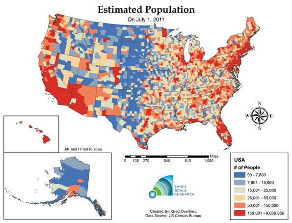
    The first map shows the distribution of population by county: revealing concentrations in the coastal areas, and lower population in the central regions. Los Angeles County, California had the most persons:9,889,056 persons; Kalawao County, Hawaii had the fewest: 90 persons.

    Map Figure Two: Estimated Absolute Change in Population from July 1, 2010 to July 1, 2011

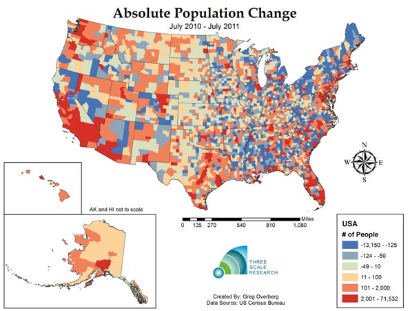
    The second map shows the pattern of population change during one year.  A total of 1,494 counties lost population, or about 47% of America’s 3,143 counties. This number is an increase from the change from 2000-2010, where 1,103 counties lost population. As one third of counties are experiencing greater deaths than births, another twelve percent are experiencing losses due to net migration. The county that gained the most people from 2010 to 2011 was Harris County, Texas (Houston), which added 71,532 persons.  The county that lost the most people was Wayne County, Michigan (Detroit), with a decline of 13,150 persons.

    Map Figure Three: Estimated Relative Change in Population from July 1, 2010 to July 1, 2011

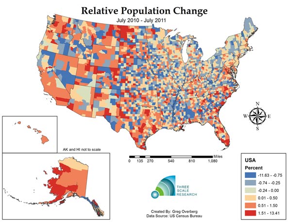
    The third map shows relative population change in the United States. This reveals  quite a varied landscape. Western North Dakota, experiencing rapid growth of its energy sector, is experiencing fast population growth, along with metropolitan counties in Texas, Colorado, North Carolina and Florida. The county with the fastest population growth is Loving County, Texas, in the rural and isolated West Texas panhandle,  with a 13.25% growth rate resulting from the population increasing from 83 to 94 persons.  The county with the fastest shrinking population is Roberts County, Texas, in the equally rural and isolated North Texas panhandle with a decline of -11.69%.  Counties with very small populations can be subject to rapid change due to the effects of migration.

    Map Figure Four: Estimated Relative Births minus Deaths (Natural Rate of Absolute Population Change) from July 1, 2010 to July 1, 2011

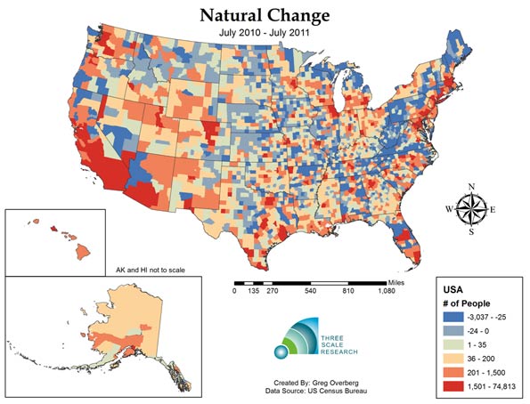
    The fourth map shows the landscape of births minus deaths, or natural change, without the effects of migration. In 2011, one third of counties, or 1,041 out of 3,143 have deaths exceeding births. At the same time, counties with positive natural change, or births exceeding deaths, are concentrated, with half of all net natural change occurring in only 61 counties. The county with the highest level of natural change is Los Angeles County, with a 74,813 natural increase. The county with the highest negative level is Pinellas, Florida (Tampa- St. Petersburg area), with a decrease of 3,037 persons.

    Map Figure Five: Estimated Relative Births minus Deaths (Natural Rate of Relative Population Growth) from July 1, 2010 to July 1, 2011

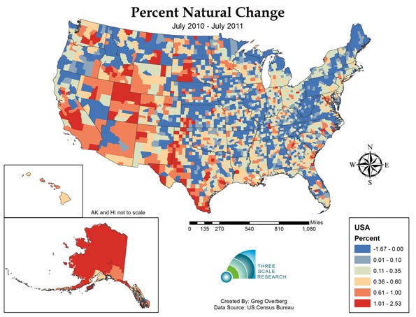
    The fifth map show relative natural rate of population change, and the extensive area of slow and negative natural population decrease.  Most of the Appalachian counties have deaths exceeding births, along with extensive areas in the Great Plains states and at least parts of all 48 lower states. Only Alaska and Hawaii have positive natural increase across all of their respective counties. The fastest growing natural population is in Northwest Arctic Borough, Alaska, growing at a rapid 2.53% per year.

    Despite this expansive landscape of 1,041 counties that now have deaths exceeding births, and hundreds of counties approaching this status, there are 162 counties that exceed 1% growth per year, or are growing at about the global average rate. On the other hand, only 11 counties are declining faster than 1% a year, indicating that most of the impact is gradual.

    Map Figure Six: Estimated Domestic Migration from July 1, 2010 to July 1, 2011

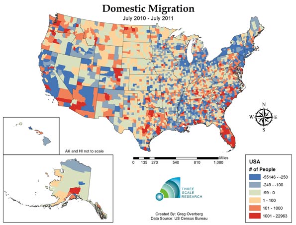
    The sixth map shows domestic migration, or net moves from one county to another. The top 159 counties received a net of 1,000 domestic migrants or more, and these areas include Florida, the Front Range Counties of Colorado, and the major metropolitan counties of Texas.  Overall, 1,229 counties had positive domestic migration, while 1,914 counties had negative domestic migration. Hillsborough, Florida (Tampa area), had the highest positive migration with 22,963 net movers, while Los Angeles County, California had the greatest number of net leavers with a total of 55,146 net departing residents.

    Map Figure Seven: Estimated International Migration from July 1, 2010 to July 1, 2011

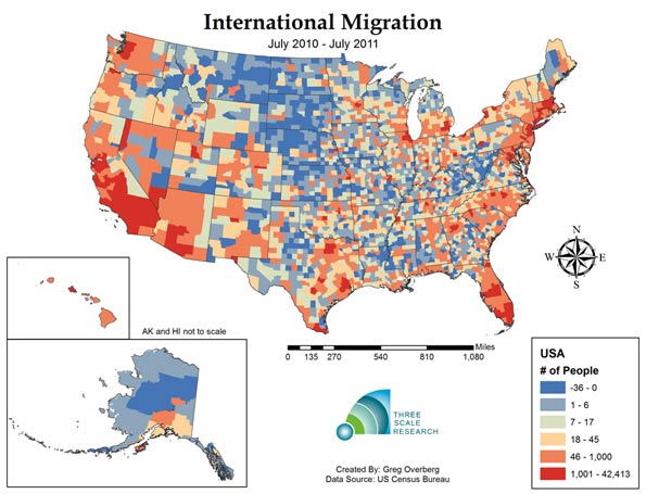
    The seventh map shows the coastal pattern of international migration.  International migration is most visible in California, Arizona and Nevada, and in a number of metropolitan areas including the Northeast and the Chicago area.  One-hundred and thirty- two counties experienced more than 1,000 immigrant arrivals, and these counties received 74 percent of immigrants, indicating that immigration is concentrated. On the other hand, immigration is also widespread, as all but 520 counties received one or more immigrants during the year.

    The top county for international immigration was Los Angeles, California, with a total of 42,413 immigrants.  The next four counties were Miami-Dade, Florida, with 19,996; Harris, Texas (Houston), with 19,558, Cook, Illinois (Chicago) with 17,208 and Queens, New York with 15,949 immigrants.

    Map Figure Eight: Estimated Net Migration (Combined International and Domestic) from July 1, 2010 to July 1, 2011

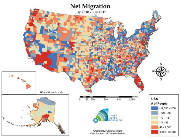
    The eighth and final map shows the combined effect of domestic and international migration.  Net migration is positive in areas of the Southwest, Texas metropolitan areas and most of Florida. A total of 1,403 counties had positive net migration, while 1,740 counties experienced negative net migration. The top county in America for positive net migration was Miami-Dade county in Florida, with a net migration of 38,382 persons. The county with the highest negative net migration was Wayne County, Michigan, with a net migration rate of -19,580 persons.

    Today one third of United States Counties appear to have entered the stage of zero population and perhaps even negative population growth, but only 31.4 million people or ten percent of the American population lives in these mostly rural counties. Given our concentration in metropolitan areas, the expansion to an ever larger group of counties might continue all the way up to about eightly percent of our land area, before the momentum of this effect manifests into the major population clusters. Fertility rates by race and Hispanic origin of the mother may play a role, but it should be noted that the Hispanic fertility rate has dropped from 2.53 in 2009 to 2.35 in 2010, and may have further declined in 2011. The impact of reduced immigration might also play a role in depressing population growth.

    The first estimate of county population change, the period from July 1, 2010 to July 1, 2011, shows a mixed picture of dynamic activity; there are a set of counties still experiencing robust population growth, but a third and perhaps increasing number of counties undergoing negative natural population growth.  These changes can be compared with 2012 county estimates in a year from now, and we can look for the diffusion process associated with population slowdown to continue. We will update our maps as further information becomes available.

    Ron McChesney is a Geographer with Three Scale Strategy and Research in Columbus, Ohio. Ron received a PhD in Geography at The Ohio State University in 2008.

    Greg Overberg is a City and Regional Planner with Three Scale Strategy and Research in Columbus Ohio.  Greg received a MA in City and Regional Planning at The Ohio State University in 2011.

    Sources:

    Centers for Disease Control (CDC), 2012: Provisional monthly and 12-month ending number of live
    births, deaths, and infant deaths and rates: United States, January 2010 – December 2011. Provisional
    data from the National Vital Statistics System, National Center for Health Statistics.

    Statistical Abstact of the United States, 2011. Table 78. Live Births, Deaths, Marriages and Divorces.

     US Census Bureau, 2011 County Total Population Estimates:
    Web Site:  http://www.census.gov/popest/
    Accessed April 30, 2012

    US Census Bureau, 2000 and 2010 Census by County:
    Web  Site: http://www.census.gov/popest/data/intercensal/county/county2010.html
    Accessed April 30, 2012