Blog

  • Housing Affordability: St. Louis’ Competitive Advantage

    Things are looking better in St. Louis. For decades, St. Louis has been one of the slowest-growing metropolitan areas of the United States. Its historical core city has lost more than 60 percent of its population since 1950, a greater loss than any other major core municipality in the modern era.  Nonetheless, the metropolitan area, including the city, added nearly 50 percent to its population from 1950. The fate of St. Louis has been similar to that of Rust Belt metropolitan areas in the Midwest and East, as the nation has moved steadily West and South since World War II (Note).

    Expensive Housing and Driving People Away: During the past decade, high house prices have driven residents away from areas with better amenities, especially California’s coastal metropolitan areas and metropolitan New York. Between 2000 and 2009, Los Angeles exported 1.4 million domestic migrants, the San Francisco Bay Area 600,000 (San Francisco and San Jose) and San Diego 125,000. New York lost nearly 2,000,000. St. Louis did much better, losing less than 45,000 domestic migrants. On a per capita basis, St. Louis also performed better, losing 1.6 domestic residents per capita to migration, compared to 4.5 in San Diego, 10 in the San Francisco Bay Area and 11 in New York.   This may not sound like an accomplishment, but the St. Louis area has probably not outperformed California in terms of migration since it entered the Union in 1850.

    The big change between the 2000s and previous decades lies in housing price. It is in this period that America became effectively two nations in housing affordability. The major metropolitan areas that experienced that largest housing bubble lost 3.2 million domestic migrants, while those with lesser or no bubble gained 1.5 million. Demonstrating the preference of people for more dispersed surroundings, even more (1.7 million) moved to smaller metropolitan areas. Housing affordability has emerged as a principal competitive factor among metropolitan areas.

    Superior Housing Affordability: This is where St. Louis excels. As of the third quarter of 2011, the median house price was 2.6 times the median household income in St. Louis, according to the 8th Annual Demographia International Housing Affordability Survey, which covered seven nations (the United States, United Kingdom, Canada, Australia, Ireland, New Zealand and Hong Kong, in China). Dividing the median house price by the median household income gives St. Louis an affordability rating (Median Multiple) of 2.6. By comparison the Median Multiple was 4.2 in Portland (60 percent more expensive ), 4.5 in Seattle (75 percent more),  6.1 in San Diego (135 percent more) and 6.9 in San Jose (175 percent more. While other metropolitan areas were reeling from house price increases that still have not returned to normal, St. Louis (and other metropolitan areas, like Dallas-Fort Worth, Houston and Indianapolis) have continued to experience affordable and far more steady house prices (Figure 1).

    Lowest Cost of Living: Affordable house prices are associated with a lower cost of living. St. Louis does very well here. According to the latest data from the US Bureau of Economic Analysis regional price parity program, the cost of living in St. Louis is the lowest among major metropolitan areas (those with more than 1,000,000 population). In St. Louis, the cost of living is:

    • 29 percent less than in New York.
    • 31 percent less than in San Jose.
    • 23 percent less than in San Diego.
    • 19 percent less than in Seattle.
    • 12 percent less than in Portland.

    Things Could Get Better for St. Louis: Moreover, the gap could become larger, especially as governments in California try to outlaw new detached housing, under Senate Bill 375. None of this is good for young households or less affluent households who will have to leave to find housing that meets their desires. Many will need to leave to fulfill their dreams.

    Inevitably, the higher housing costs associated with these policies (called by various names, such as "livability," "smart growth" and "growth management") fall hardest on lower income households (often minorities), who have less to spend, are forced to move away or cannot afford to move in. The consequences were articulated by California’s Hispanic oriented Tomas Rivera Policy Institute (Figure 2):

    While there is little agreement on the magnitude of the effect of growth controls on home prices, an increase is always the result.

    The Secret: Just what did the St. Louis leadership do to improve its competitiveness so much? Nothing. They just stayed out of the way. Unlike their counterparts where house prices exploded, St. Louis officials did not prohibit people from living where they wanted on the urban fringe and they did not force new houses to be built on postage stamp lots. Nor did they adopt land use regulations that drive up the price of land (Figure 3) and, in consequence housing), just as an OPEC embargo would raise the price of gasoline. When the easy money came and lenders were begging households with insufficient resources to take mortgages, the planning embargoes drove up house prices and invited undue participation by speculators who know the difference between a competitive and a rigged market.

    There are positive signs as a result of this affordability advantage. St. Louis has been attracting more young residents. Recent data indicates that St. Louis ranked 15th in high tech job growth out of the 51 metropolitan areas with more than 1,000,000 over the past decade. It would be expected that St. Louis would trail fast growing Seattle, Raleigh and Charlotte and perennial tax consumer Washington. However, St. Louis can be placed better than perennial leaders San Jose, Boston, Portland, Austin and New York. Budding local efforts are aimed at encouraging entrepreneurship, even as California and New York search for new ways to say "no."

    Succeeding by Being St. Louis: The improving prospects of St. Louis are not the result of a taxpayer financed marketing campaign or a payoff from the usual "let’s copy Portland" strategies (or even Cleveland, as one analyst put it a couple of decades ago). St. Louis cannot compete with the weather in the Bay Area, does not have San Diego’s beaches, the mountains near Denver nor the natural beauty surrounding Seattle. But it does have an affordable life style.

    St. Louis can succeed only by being St. Louis. It is a metropolitan area with a great past, and many fine civic institutions, including great parks, sports teams and a world class orchestra. This long laggard Midwestern metropolitan area may face its best competitive prospects since Chicago passed it in population in 1870. Local and state leaders need to stay away from the policies that would dilute St. Louis’ principal competitive advantage, a low cost of living, due to a housing market left to operate without destructive distortion.

    Wendell Cox is a Visiting Professor, Conservatoire National des Arts et Metiers, Paris and the author of “War on the Dream: How Anti-Sprawl Policy Threatens the Quality of Life

    —-

    Photo: Cathedral Basilica of St. Louis (by author)

    Note: This is adapted from a policy study by the author for the Show Me Institute: Housing Affordability The St. Louis Competitive Advantage

  • Commuting in New York City, 2000-2010

    New York City is infamous for congestion and long commutes. At 34.6 minutes, it has the longest average commute time in the United State. The region is also America’s top user of public transportation, with 30.7% of all metro area commutes made by transit. Nearly 40% of all transit commuters in the United States are in the metro New York. As transit commutes generally take longer than driving, one might be tempted to link these facts. But commute times also seem to correlate with city size, and bedevil big cities with limited public transit too.

    New York’s commutes improved a bit over the 2000s, however. The average commute time declined in every borough, in the city as a whole, and in the region. Overall US commute times fell as well, but less than New York’s:


    Source: Census 2000, American Community Survey 2010 1-yr

    In addition to showing the decline, this chart also highlights disparity in commute times between the subareas of New York. Manhattanites have far shorter commutes than those who live in the outer boroughs. In fact, the outer boroughs actually have longer commutes than far-flung outer suburban areas. The areas just outside the urban core of New York are some of the most disadvantaged for regional commuting

    The commute time decline is particularly noticeable when looking at ultra-long commutes, those that are 90 minutes are longer:


    Source: Census 2000, American Community Survey 2010 1-yr

    Here again we see both a decline in long commutes and a higher concentration in the outer boroughs.

    New York also managed to finish out the decade with no increase in traffic congestion. According to the Texas Transportation Institute, the region ended the decade with the same Travel Time Index it had when it started, 1.28:


    Source: Texas Transportation Institute, Urban Mobility Report 2011

    What has caused this?  Firstly, given that the data is collected in surveys with a margin of error, one shouldn’t read too much into any given year’s value. However, the decline was fairly consistently reflected in the later decade surveys and doesn’t appear to be an anomaly of just 2010.

    Assuming some legitimate improvement, one obvious potential explanation is the economy. Metro New York did lose 99,000 jobs in the 2000s. This was only a decline of 1.2% however, which actually bettered the US as a whole. But given the extreme congestion in the region, it clearly could have played a role. Also not to be dismissed are toll increases in the regions, and even potentially changes resulting from 9/11.

    Given the focus of the Bloomberg administration on non-auto forms of transportation, it is also worth looking at changes there.  Public transit usage grew strongly in New York over the decade, with regional trips increasing by 23%.


    Source: Texas Transportation Institute Urban Mobility Report 2011

    This increase is also reflected  an increase in public transportation commuting mode share over the past decade.


    Source: Census 2000, American Community Survey 2010 1-yr

    So should increased public transit ridership get the credit for commute time reductions? To some extent perhaps. But remember that New York has both the nation’s longest commutes and highest public transit ridership. Also keep in mind that public transit commutes are longer than driving commutes. The average commute time in metro New York for those driving alone is 30 minutes. For those riding public transportation it is 51.2 minutes. But transit riders affect drivers too. Public transit saves drivers in the New York area nearly $8 billion per year in congestion costs.  So while public transit can’t be necessarily given the credit for commute time improvements, it’s certainly possible it contributed to them .

    The same is not true, however, for other alternative transport modes. Here is the change in bicycle commuting over the decade:


    Source: Census 2000, American Community Survey 2010 1-yr

    Bicycling gets a lot of press in New York, and while the increases look impressive on a chart like the one above, the reality is that this is a trend that enjoys only a bit more than half a percentage point gain in mode share. Bicycling may be on an upswing, and may be of great help recreationally and for non-commute trips, but it is not yet a major force in commuting.

    Walking is actually far more prevalent than bicycling for commuting in New York. But the mode share for walking actually declined over the decade:


    Source: Census 2000, American Community Survey 2010 1-yr

    While walking is generally seen as a good thing in urbanist circles, some people can end up walking to work simply because they have no other alternatives. People who obtain access to a car, or who are able to use transit to get a job outside of their neighborhood, may in fact be improving their economic prospects. Some people who previously walked may be riding transit or biking to work today. Also, some walkers may have switched to driving. Interestingly, the number of households without a vehicle declined in metro New York, though some boroughs saw increases. The changes are very small, however.


    Source: Census 2000, American Community Survey 2010 1-yr

    Lastly, as you might expect with transit going up, the percentage of commuters driving alone declined nearly across the board in New York, though it increased nationally:


    Source: Census 2000, American Community Survey 2010 1-yr

    In short, New York retains America’s longest commutes and highest public transport usage. But in the last decade there have been increases in public transport commuting and declines in people driving alone, while overall commute times have improved, fewer people with ultra-long commutes, and road congestion has stayed flat. The 2000s were perhaps an unusual decade in America and New York. And the changes are fairly small so far.  The future will tell whether this is the start of a long term trend or merely a short term reversal.

    Aaron M. Renn is an independent writer on urban affairs based in the Midwest. His writings appear at The Urbanophile. Telestrian was used to analyze data and to create maps for this piece.

  • The State of the Anglosphere

    The world financial crisis has provoked a stark feeling of decline among many in the West, particularly citizens of what some call the Anglosphere: the United States, Canada, the United Kingdom, Ireland, Australia, and New Zealand. In the United States, for example, roughly 73 percent see the country as on the wrong track, according to an Ipsos MORI poll—a level of dissatisfaction unseen for a generation.

    Commentators across the political spectrum have described the Anglosphere as decadent, especially compared with the rising power of China. New York Times columnist Thomas Friedman praises the “reasonably enlightened group of people” who make up China’s one-party autocracy, which, he feels, provides more effective governance than the dysfunctional democracy of Washington, a point echoed in a recent Wall Street Journal op-ed by former Service Employees International Union boss Andy Stern. On the conservative side, author Mark Steyn sees the U.S. and its cultural mother in England as “facing nothing so amiable and genteel as Continental-style ‘decline,’ but something more like sliding off a cliff.” Even Australia, arguably the strongest economy in the Anglosphere, is increasingly troubled, with local declinists decrying the country’s growing dependence on commodity exports to developing nations—above all, to China. “We are to be attendants to an emerging empire: providers of food, energy, resources, commodities and suppliers of services such as education, tourism, gambling/gaming, health (perhaps), and lifestyle property,” frets the Australian’s Bernard Salt.

    It’s indisputable that the Anglosphere no longer enjoys the overwhelming global dominance that it once had. What was once a globe-spanning empire is now best understood as a union of language, culture, and shared values. Yet what declinists overlook is that despite its current economic problems, the Anglosphere’s fundamental assets—economic, political, demographic, and cultural—are likely to drive its continued global leadership. The Anglosphere future is brighter than commonly believed.

    Start with economics. Like Germany in the 1930s or Japan in the 1970s, China has found that centrally directed economic systems can achieve rapid, short-term economic growth—and China’s has indeed been impressive. But over time, the growth record and economic power achieved by the free-market-oriented English-speaking nations remain peerless. A little-noted fact these days is that the Anglosphere is still far and away the world’s largest economic bloc. Overall, it accounts for more than one-quarter of the world’s GDP—more than $18 trillion. In contrast, what we can refer to as the Sinosphere—China, Hong Kong, Taiwan, and Macau—accounts for only 15.1 percent of global GDP, while India generates 5.4 percent (see Chart 1). The Anglosphere’s per-capita GDP of nearly $45,000 is more than five times that of the Sinosphere and 13 times that of India (see Chart 2). This condition is unlikely to change radically any time soon, since the Anglosphere retains important advantages in virtually every critical economic sector, along with abundant natural resources and a robust food supply.

    Graph by Robert Pizzo

    Graph by Robert Pizzo

    Not surprisingly, Anglosphere countries retain close cultural and economic ties with one another. In making foreign direct investments, the United States shows a strong preference for Anglosphere countries, especially the United Kingdom and Canada (see Chart 3). The same is true for Australia, a nation whose economic future might seem to lie with Asia’s budding economic superpowers. Notwithstanding its worries about becoming a mere attendant to a rising China, Australia tilts its overseas investment heavily toward the United Kingdom, the United States, Canada, and New Zealand.

    Graph by Robert Pizzo

    Anglosphere countries possess overwhelming military superiority to protect their economic interests. While the United States dominates military technology and hardware, Britain ranks fourth in military spending, with both Australia and Canada ranking in the top 15. The U.S. is headquarters to the world’s three largest defense companies: Lockheed, Northrop Grumman, and Boeing. America’s Anglosphere ally Australia has joined informally with Singapore and the Philippines (both are nations where English is spoken widely) to provide a potential regional military counterweight to China.

    Anglosphere economic and military leadership is reflected in, and grows out of, the English-speaking world’s remarkable technological leadership. The vast majority of the world’s leading software, biotechnology, and aerospace firms are concentrated in English-speaking countries. Three-fifths of global pharmaceutical-research spending comes from Britain and America; more than 450 of the top 500 software companies in the world are based in the Anglosphere, mainly in the U.S., which hosts nine of the top ten. Out of the ten fastest-growing software firms, six are American and one is British. Internet giants like Apple, Google, Facebook, Microsoft, and Amazon have no foreign equivalents remotely close in size and influence.

    Graph by Robert Pizzo

    English is an ascendant language, the primary global language of business and science and the prevailing tongue in a host of key developing countries, including India, Nigeria, Pakistan, South Africa, Kenya, Malaysia, and Bangladesh. Over 40 percent of Europeans speak English, while only 19 percent are Francophone. When German, Swedish, and Swiss businesspeople venture overseas, they speak not their home language but English.

    Long-run trends in the developing world also point to the expansion of the English language. French schools have been closing even in former French colonies, such as Algeria, Rwanda, and Vietnam, where students have resisted learning the old colonial tongue. English is becoming widely adopted in America’s biggest competitor, China, and it dominates the Gulf economy, where it serves as the language of business in hubs such as Dubai. The Queen’s tongue is, of course, broadly spoken in that other emerging global economic superpower, India, where it has become a vehicle for members of the middle and upper classes to communicate across regional boundaries. In Malaysia, too, English is the language of business, technology, and politics.

    With linguistic ascendancy comes cultural power, and the Anglosphere’s remains uncontested. In total global sales of media, movies, television, and music, it has no major competitor. Its exports of movies and TV programs dwarf those of established European powers like France and Germany and upstarts such as China, Brazil, and India (see Chart 5). Exports from Hollywood and the cultural capitals of other Anglosphere countries are growing enormously in developing countries: Hollywood box-office revenues grew 25 percent in Latin America and 21 percent in the Asia-Pacific region (with China accounting for 40 percent of that region’s box office). The hit movie Avatar made over $2 billion outside North America; in Russia, Hollywood films earn twice as much as their domestic counterparts. Anglophone preeminence extends to pop music, with Americans Eminem, Lady Gaga, and Taylor Swift, along with the U.K.’s Susan Boyle, ruling global charts. Japanese, Korean, and Chinese pop artists do have large followings in Asia, but the biggest global stars continue to originate in the Anglosphere. This is true of fashion trends, too: Los Angeles, New York, and London dominate fashion for everything from sportswear to lingerie in the increasingly global “mall world.”

    Graph by Robert Pizzo

    Much has been made of the aging of the West, but the English-speaking countries are not graying as rapidly as their historical European rivals are—notably, Germany and Italy—or as Russia and many East Asian countries are. Between 1980 and 2010, the U.S., Canada, and Australia saw big population surges: the U.S.’s expanded by 75 million, to more than 300 million; Canada’s nearly doubled, from 18 million to 34 million; and Australia’s increased from 13 million to 22 million. By contrast, in some European countries, such as Germany, population has remained stagnant, while Russia and Japan have watched their populations begin to shrink.

    The U.S. now has 20 people aged 65 or older for every 100 of working age—only a slight change from 1985, when there were 18 for every 100. By 2030, the U.S. will have 33 seniors per 100 working Americans. But consider the numbers elsewhere. In the world’s fourth-largest economy, Germany already has 33 elderly people for every 100 of working age—up from only 21 in 1985. By 2030, this figure will rise to 48, meaning that there will be barely two working Germans per retiree. The numbers are even worse in Japan, which currently has 35 seniors per 100 working-age people, a dramatic change from 1985, when the country had just 15. By 2030, the ratio is expected to rise to 53 per 100.

    Meanwhile, the nation that so many point to as the twenty-first-century superpower—China—now has a fertility rate of 1.6, even lower than that of Western Europe. Over the next two decades, its ratio of workers to retirees is projected to rise from 11 to 23. Other countries, such as Brazil and Iran, face similar scenarios. These countries, without social safety nets of the kinds developed in Europe or Japan, may get old before they can get rich.

    These figures will have an impact on the growth of the global workforce. Between 2000 and 2050, for example, the U.S. workforce is projected to grow by 37 percent, while China’s shrinks by 10 percent, the EU’s decreases by 21 percent, and, most strikingly, Japan’s falls by as much as 40 percent.

    In this respect, immigration presents the most important long-term advantage for the Anglosphere, which has excelled at incorporating citizens from other cultures. A remarkable 14 million people immigrated to Anglosphere countries over the last decade. The United States, in particular, remains a powerful magnet: in 2005, it swore in more new citizens—the vast majority from outside the Anglosphere—than the next nine countries put together. The U.K. last year also experienced the strongest immigration in its history.

    In sum, post-financial-crisis reports of the Anglosphere’s imminent irrelevance have been exaggerated—wildly.

    This piece originally appeared in The City Journal.

    Joel Kotkin is executive editor of NewGeography.com and is a distinguished presidential fellow in urban futures at Chapman University, and contributing editor to the City Journal in New York. He is author of The City: A Global History. His newest book is The Next Hundred Million: America in 2050, released in February, 2010.

    Shashi Parulekar is the director of global sales and marketing and chief technology officer for Zemarc Corporation.

    Graphs by Robert Pizzo

  • The Growth In Science & Research Occupations

    Local economic developers and policy pundits often point to scientific and research jobs as an important part of regional economies and a critical driver of innovation for the nation’s economy. As we continue to filter through the data in our latest release (built on nearly 90 federal and state data sources), we notice that many occupations related to science and research are doing quite well.

    The actual category of occupations is referred to as “life, physical, and social science occupations,” by Bureau of Labor’s Standard Occupational Classification System (SOC 19). This group includes 44 occupations from the associate’s degree to doctorate level, ranging from medical technicians to market research analysts. In this post, we will look at how states compare in this job category and highlight some of the jobs that are most notable since ’07.

    OVERVIEW

    First, here is a quick overview of the sector. There are currently 1.3 million jobs in this category, and since 2007 there has been 3.3% growth at the national level. In 2010, over 500,000 students completed education and training related to these jobs, according to the IPEDS database from the National Center for Education Statistics. (Note: These graduates would also be pursuing occupations that we are not measuring in this analysis, so this data doesn’t necessarily say that overtraining is occurring). We estimate that in 2011 there were nearly 70,000 openings for science and research occupations in this category.

    The median hourly wage for this category is nearly $30 per hour and there is a pretty even split between males and females. Also, nearly 50% of the people who work in this sector are between the ages of 25 and 44.

    STATE-BY-STATE LOOK

    • Not surprisingly, California has the highest number of these jobs (nearly 200,000). From 2007 to 2011, the state gained over 8,000 jobs. The state also has a jobs concentration (LQ) of 1.24, higher than than the national average (1.0).
    • North Dakota and South Dakota had the highest percent growth for these jobs (12% and 10%, respectively). However, because employment was relatively low to begin with, each state added less than 500 jobs.
    • The District of Columbia has the highest concentration of these jobs as well as the highest pay. From 2007 to 2011, about 1,500 new jobs were created. The concentration of these jobs in DC is more than three times greater than the national average.
    • Other states with relatively high concentrations of these jobs are Alaska (2.0), Delaware (1.9), Montana (1.89), Wyoming (1.73), Massachusetts (1.7), New Mexico (1.6), Idaho (1.58), Maryland (1.57), Washington (1.56), Colorado (1.28), Vermont (1.26), Oregon (1.24), New Jersey (1.24), New York (1.14), and Minnesota (1.12).
    • Perhaps surprisingly, New Jersey is one of only six states to have lost jobs in this occupation sector over the past five years. In New Jersey, the job loss was actually quite substantial––3,400 jobs, a 7.4% decline. Also of note, the states with the lowest concentration of these jobs tend to be in the South: Tennessee, Alabama, South Carolina, Florida, Kentucky, Georgia, and Mississippi (among other states) are all well below the national average for these occupations.

    Below is a table of all the states, sorted from the most to the least concentrated. The data comes from EMSI’s 2011.4 Covered dataset.

    State Name 2007 Jobs 2011 Jobs Change % Change 2011 Median Hourly Wage 2007 National LQ
    Total 1,279,078 1,321,345 42,267 3.3% $29.50
    District of Columbia 20,395 21,920 1,525 7.5% $42.43 3.16
    Alaska 6,344 6,836 492 7.8% $28.73 2.02
    Delaware 7,659 7,144 (515) -6.7% $32.07 1.90
    Montana 7,955 8,152 197 2.5% $21.25 1.89
    Wyoming 4,659 4,922 263 5.6% $22.86 1.73
    Massachusetts 51,381 54,568 3,187 6.2% $33.21 1.70
    New Mexico 12,555 12,709 154 1.2% $29.68 1.60
    Idaho 9,875 9,944 69 0.7% $21.86 1.58
    Maryland 38,229 40,791 2,562 6.7% $35.27 1.57
    Washington 43,250 46,353 3,103 7.2% $30.92 1.56
    Colorado 27,947 29,304 1,357 4.9% $32.58 1.28
    Vermont 3,587 3,688 101 2.8% $25.66 1.26
    California 182,821 191,357 8,536 4.7% $32.81 1.24
    Oregon 19,998 21,028 1,030 5.2% $25.42 1.24
    New Jersey 45,876 42,485 (3,391) -7.4% $34.46 1.24
    New York 91,307 92,552 1,245 1.4% $29.28 1.14
    Minnesota 28,474 29,484 1,010 3.5% $29.89 1.12
    Pennsylvania 57,545 58,368 823 1.4% $29.20 1.08
    Utah 11,985 12,885 900 7.5% $23.17 1.04
    Hawaii 6,541 6,713 172 2.6% $27.83 1.04
    Virginia 36,864 40,063 3,199 8.7% $33.14 1.03
    North Carolina 39,857 40,847 990 2.5% $27.17 1.02
    South Dakota 3,787 4,171 384 10.1% $20.82 1.01
    Connecticut 15,164 15,144 (20) -0.1% $31.49 0.96
    Iowa 13,463 13,809 346 2.6% $24.37 0.96
    Wisconsin 24,921 25,844 923 3.7% $26.36 0.95
    Texas 89,518 96,626 7,108 7.9% $29.62 0.93
    North Dakota 3,033 3,387 354 11.7% $22.66 0.90
    West Virginia 5,935 6,186 251 4.2% $21.69 0.88
    Michigan 33,820 33,310 (510) -1.5% $25.99 0.86
    Nebraska 7,456 7,989 533 7.1% $24.64 0.85
    Illinois 46,289 46,701 412 0.9% $30.86 0.84
    Arizona 20,486 20,869 383 1.9% $25.29 0.82
    Kansas 10,705 11,143 438 4.1% $25.06 0.82
    Maine 4,643 4,729 86 1.9% $24.49 0.82
    Rhode Island 3,669 3,636 (33) -0.9% $27.46 0.81
    New Hampshire 4,467 4,610 143 3.2% $26.88 0.76
    Missouri 19,013 19,145 132 0.7% $26.17 0.74
    Ohio 36,798 37,410 612 1.7% $27.42 0.74
    Indiana 19,744 19,771 27 0.1% $23.80 0.72
    Arkansas 7,814 8,390 576 7.4% $23.49 0.70
    Oklahoma 9,933 10,512 579 5.8% $25.93 0.68
    Louisiana 11,944 12,416 472 4.0% $26.73 0.67
    Nevada 7,844 7,674 (170) -2.2% $27.88 0.65
    Mississippi 7,111 7,186 75 1.1% $23.65 0.65
    Georgia 25,071 25,245 174 0.7% $27.72 0.65
    Kentucky 10,746 11,347 601 5.6% $23.13 0.62
    Florida 45,819 46,374 555 1.2% $25.72 0.61
    South Carolina 10,881 11,277 396 3.6% $23.81 0.60
    Alabama 10,405 10,461 56 0.5% $24.41 0.56
    Tennessee 13,493 13,871 378 2.8% $24.72 0.52

    TOP PERFORMERS

    Altogether there are 44 distinct occupations captured in this category. We have selected the top 14 jobs based on total number of jobs, growth (% and total), and earnings. The data has been organized based on educational level. The 14 occupations we selected added over 42,000 jobs, which is 7% growth in five years. Average earnings are about $32 per hour. There is also an even distribution between associate’s, bachelor’s, master’s, and doctoral education levels.

    SOC Code Description 2007 Jobs 2011 Jobs Change % Change 2011 Avg Hourly Wage Education Level
    Source: EMSI Covered Employment – 2011.4
    19-4041 Geological and petroleum technicians 13,805 15,258 1,453 11% $27.99 Associate’s degree
    19-4093 Forest and conservation technicians 29,306 31,577 2,271 8% $17.65 Associate’s degree
    19-4099 Life, physical, and social science technicians, all other 59,353 60,501 1,148 2% $21.60 Associate’s degree
    19-4021 Biological technicians 71,269 75,215 3,946 6% $19.90 Bachelor’s degree
    19-3022 Survey researchers 19,716 21,693 1,977 10% $20.39 Bachelor’s degree
    19-3021 Market research analysts 225,271 230,358 5,087 2% $32.47 Bachelor’s degree
    19-2099 Physical scientists, all other 24,343 25,382 1,039 4% $44.66 Bachelor’s degree
    19-2041 Environmental scientists and specialists, including health 81,070 83,675 2,605 3% $32.41 Master’s degree
    19-2042 Geoscientists, except hydrologists and geographers 30,504 32,602 2,098 7% $44.99 Master’s degree
    19-3099 Social scientists and related workers, all other 28,226 31,068 2,842 10% $35.12 Master’s degree
    19-1029 Biological scientists, all other 27,425 30,380 2,955 11% $33.30 Doctoral degree
    19-1042 Medical scientists, except epidemiologists 95,226 105,224 9,998 10% $40.67 Doctoral degree
    19-3031 Clinical, counseling, and school psychologists 94,123 97,347 3,224 3% $34.74 Doctoral degree
    19-1021 Biochemists and biophysicists 21,762 23,504 1,742 8% $42.58 Doctoral degree
    Total 821,399 863,784 42,385 7% $32.17

    OBSERVATIONS

    • HIGHEST-PAYING – The highest-paying jobs on the list are geoscientists and physical scientists. Both average over $44 per hour. It is interesting to note that these are jobs associated with master’s and bachelor’s degree education rather than doctoral degrees. Most would just naturally assume that the doctoral degrees would have higher wages. Geoscientists gained 2,000 jobs (7% growth) and physical scientists gained 1,000 jobs (3% growth).
    • FASTEST-GROWING – The fastest-growing jobs on the list have been geological and petroleum technicians and biological scientists. They both grew by 11% over the past five years and added 1,500 and 3,000 jobs respectively. They each average about $30 per hour. The average ed level for geological and petroleum techs is an associate’s, and biological scientists typically have doctoral degrees. Again notice the similarity in wages; a higher average education level doesn’t necessarily result in higher wages. Other occupations that experienced higher levels of growth were survey researchers, social scientists, and medical scientists, which all had 10% growth.
    • MOST NEW JOBS – Medical scientists (doctoral degree level) added 10,000 jobs in five years, which is the largest number of new jobs. Medical scientists average about $40 per hour and there are over 100,000 working across the nation. The next occupation is market research analysts, which added 5,000 jobs (2% growth). Market research analysts make just over $30 an hour and typically have bachelor’s degrees.
    • MOST JOBS – Market research analysts also have the highest level of employment on this list: 230,000 jobs are classified under this title. The typical ed level for this job is a bachelor’s degree.

    If you would like to take a closer look at each of the jobs, including what industries they work in, simply click the links below. The data and analysis comes straight from Analyst, EMSI’s web-based labor market analysis tool. With Analyst, users can look at over 800 occupations and 1,100 industries for any geography in the US. Data is also available for the UK.

    Rob Sentz is the marketing director at EMSI, an Idaho-based economics firm that provides data and analysis to workforce boards, economic development agencies, higher education institutions and the private sector. He is the author of a series of green jobs white papers. For more, contact Rob Sentz (rob@economicmodeling.com). You can also reach us via Twitter @DesktopEcon.

    Illustration by Mark Beauchamp.

  • Clues from the Past: The Midwest as an Aspirational Region

    This piece is an except from a new report on the Great Lakes Region for the Sagamore Institue. Download the pdf version for the full report including charts and maps on the region.

    The American Great Lakes region has long been a region defined by the forces of production, both agricultural and industrial. From the 1840s on, the region forged a legacy of productive power, easily surpassing the old northeast as the primary center of American industrial and agricultural might.

    The Rise of the Great Lakes

    Natural forces shaped the region, from its waterways and mineral resources, which made it ideal for industrial development. The lakes themselves are the largest sources of freshwater on the planet; the five lakes together are twice the size of England. This “fresh water Mediterranean” provided an essential pathway for transport between the various regions of the Great Lakes, as well as a connection to the northeast and, through the Saint Lawrence and the Erie Canal, to New York and the Atlantic.

    But more than anything, it has been the people of the Great Lakes that proved its greatest resource. In the early 19th Century, the region’s development was paced by migrants from New England, who brought with them their values of thrift, hard work and a passion for education and self-improvement. Later others, notably Germans and Scandinavians, injected a similar culture of self-improvement to the area.

    Like New England, the Great Lakes, noted author John Gunther, was possessed with a “gadget mind” that sparked the innovations that gave America command of the industrial revolution. Much of the brawn for this came from the poorer parts of Europe — Russia, Italy, and most particularly Poland, which led one observer to call Chicago “a mushroom and a suburb of Warsaw.” By 1920 one third of third of the population of Chicago, Cleveland and Detroit was foreign born.

    Initially based largely on agricultural exports, by 1860 the region had blossomed into an urbanized industrial powerhouse. “All over the Middle West,” wrote historians Charles and Mary Beard, “crossroads hamlets grew into trading towns, villages spread into cities, cities became railway and industrial centers.” The area’s rapid growth sparked great optimism; in 1841 journalist and land speculator predicted that by 1940 Cincinnati would be the largest city in North America and by 2000 “the greatest city in the world.” Cleveland, Cincinnati, Toledo, Milwaukee and most of all Chicago stood at the center of a “web of steel” that marked the region as the world’s preeminent industrial center. It also sparked other innovations, from the auto assembly line and the high-rise building to the mail order catalog.

    This growth cascaded in the early years of the last century. It became the nation’s primary growth engine. Between 1900 and 1920 Chicago added a million people while Cleveland doubled its population and Detroit, epicenter of the emerging “automobile revolution”, grew three fold. In everything from architecture and city planning to literature, the Great Lakes stood at the national, even global, cutting edge.

    A Half Century of Decline

    By the 1970s, the Great Lakes region, including Ontario, accounted for two-thirds of the North America’s automobile production, 70 percent of pig iron and three quarters of its steel. Yet by that time, this close tie to industry was seen not as an advantage but as a curse, driving the region towards precipitous decline.

    By then America was widely seen as entering a “post-industrial era,” and the Great Lakes, the former bastion of the manufacturing economy, seemed the odd region out. Defined as the “foundry” in Joel Garreau’s Nine Nations of North America, it was the only one he identified as in decline. He described the region’s inner cities as “North America’s Gulag Archipelago.”

    Once a magnet for newcomers, the region now took a back seat as a place that attracted domestic or foreign migrants.10 With the exception of Chicago, the Lakes region have continues to lag both in domestic migration and foreign immigrants. Newcomers were reinventing places like Los Angeles, Houston, Miami and New York, but relatively few were coming to Cleveland, Detroit or Cincinnati.

    The Great Lakes cities, also with the sometimes exception of Chicago, also found themselves increasingly regarded as cultural backwaters. Occasional stories of restoration and renaissance made the rounds in the media, but the trend was to greater obsolescence, to becoming permanently “a cultural colony” of the coasts. “To a Californian or a New Yorker,” noted Indiana-based historian Jon Teaford, “Cleveland, Detroit, Indianapolis and Saint Louis were down-at-the-heel, doughty matrons, sporting last year’s cultural fashions.”

    Until recently there has been ample reason to believe this decline would continue. Only nine of the Midwest’s 40 largest metropolitan areas have a higher per capita GDP than the national average. This reflected a deep seated loss of jobs paced by industrial decline but not made up for by gains in other fields.

    During this period the region not only lost many of its industrial jobs but, more pointedly, failed to replace them with the technology and service jobs that grew rapidly elsewhere. As a result, the region’s percentage of the national workforce dropped steadily over the past half century. In 1966, the Great Lakes region possessed one in four jobs in the country; by 2010 that percentage had fallen to less than one in five.

    As a response to the perception of industry-led decline, some Great Lakes leaders sought out other sources of employment and growth. In Detroit, for example, much emphasis was placed on casino development. Michigan’s former Governor Jennifer Granholm, sought to reverse decline by targeting the so-called “creative class” by turning its hard-hit towns into “cool cities.” Across the region, others focused on convention centers, arts attractions such as museums and other entertainment venues as the way to improve their sagging fortunes.

    Seeds of Resurgence
    None of these efforts – although much heralded throughout the 1980s and 1990s – did much to reverse the region’s decline. Notes Jim Russell, author of the widely read Burgh Diaspora website:

    Should Akron start putting more money in skateparks or global warming?

    There are huge problems in spending money in order to attract the geographically fickle. Fads fade and the mobile – largely people under 30 – will move again…Tying up the urban budget with projects aimed at retaining the creative class has its own perils. There is little, if any, evidence indicating that this policy will decrease the geographic mobility of the well-educated. Many cities stuffed with cultural amenities also sport high rates of out-migration. Furthermore, tastes change. “Best places to live” lists change quite a bit from one year to the next.

    Instead, the region’s current rebound is occurring in surprising fashion. The real lure of the Great Lakes lies in its own fundamental advantages: lower housing prices, business climate and perhaps, more importantly, a nascent industrial rebound.

    This can be seen, most importantly, in employment numbers. Starting in the last few years, the area’s share of jobs has remained steady. The highest unemployment rates in the country are no longer concentrated in the Great Lakes region, but in states such as California and Nevada. In many Great Lakes states, unemployment rates have been dropping more rapidly than the national average.

    Critically this resurgence has not resulted in a shift away from industrial growth. Instead, we are witnessing the early stages of what could be a profound increase in both the economic heft and job creation tied to the industrial sector. But the Great Lakes rebound is not merely a cyclical, one dimensional rise; it also includes growth in a host of other sectors, including in the information area and, perhaps even more remarkably, in energy, particularly shale gas.

    At the same time the rise in non-industrial jobs also should testify to the growing attractiveness of the region, particularly for young families. After decades of mass outmigration, the region has begun to achieve a more favorable balance with the rest of country. Outmigration rates for states in the region are at or below national levels.

    Migration in the Midwest, as Russell and others have pointed out, should be regarded more from the vantage point of recruitment, not retention. By promoting its affordability and improving economy, the region could improve its trailing inmigration rates. As people vote with their feet for the region, they are laying down the foundation for the area’s resurgence in the coming decades.

    The Rise of New Growth Nodes

    The Great Lakes demographic and economic turnaround does not mean that growth has occurred in the pattern of the early 20th Century. Instead we see the emergence of a new set of leadership cities. If Akron, Detroit, Cleveland and Chicago paced the region’s early 20th century ascendency, the new “winners” appear to include affordable, attractive cities, many of whom are home to major universities, state capitals and key research institutions.

    These areas have done well in attracting many people from the less successful metropolitan areas of the region. Columbus, for example, evidenced strong growth from the rest of Ohio and other parts of the Midwest, notably Michigan and Illinois. But perhaps more importantly, the area enjoys strong in-migration from those parts of country — notably the Northeast and California — that have traditionally dominated knowledge-intensive industries.

    A similar pattern can be seen in Indianapolis. In recent years, as urban analyst Aaron Renn notes, the Indiana capital has enjoyed “a profile closer to the Sun Belt than the Rust Belt.” It grew its population at a rate 50 percent greater than the national average, and also had strong net inmigration, with almost 65,000 net people deciding to pack up and move to the Indiana capital.

    Already a center of regional culture and services, the area has succeeded as well in attracting new migrants not only from big Midwestern cities such as Chicago, but also from the two coasts.

    By way of contrast, Chicago’s migration patterns look much different than those in Columbus and Indianapolis. Many other regions around the country benefited from people leaving the Windy City than Chicago gained from them. Chicago’s biggest gains have come from other, more troubled Great Lakes regions, while Indianapolis, for instance, has taken advantage of Chicagoans looking for more opportunity elsewhere.

    Behind this shift in migration from the coasts lie many factors, such as taxes and regulations.
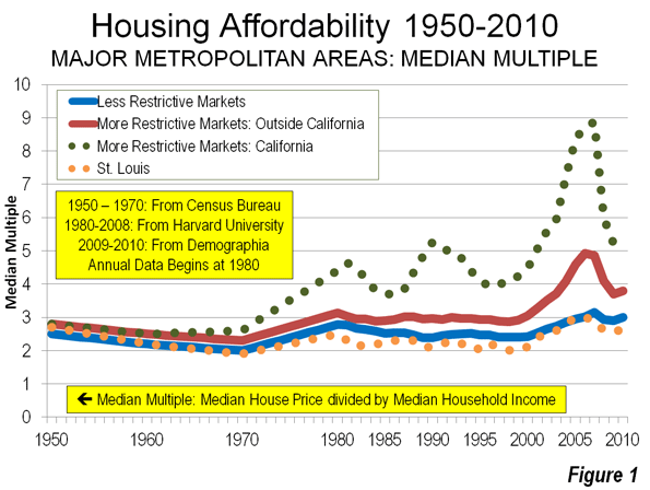
    But perhaps most important may be the region’s greater affordability. Even after the bubble, for example, many key eastern and west coast regions suffer a ratio housing prices to annual incomes of five, six or even seven to one. For the most part, virtually all parts of the Great Lakes have ratios of three or less.

    Over time, this could prove a critical advantage to the Great Lakes. As the current millennial generation – the largest generation in American history – enters their 30s, it is likely that they will seek out places where they can afford to buy a home and enjoy a middle class quality of life. The Great Lakes will be one place that can offer that opportunity.

    Key to recovery: Both Brain and Brawn

    The future of the Great Lakes region lies neither in simply the “information” economy nor in the brute force of manufacturing. Instead it is as a result of a combination both of the industrial sector and the high-value service sectors that feed into it.

    Critically, the region boasts many areas where the information and service economies are particularly strong. Of the nine Midwestern metropolitan areas with per capita GDP growth above the national average, four are capital cities and six are home to major universities. Given governmental involvement in two of the fastest-growing sectors of the economy, health care and education, it is no surprise that seats of government and large state-funded research universities – which also double as the hotbeds of medical services – are growing ahead of other regions with a more traditional, and perhaps outdated, economic base.

    Indeed, some Midwestern areas are outperforming the coastal economies even in the realm of high-tech. In a recent ranking by Forbes magazine of best areas for tech growth among the nation’s 51 largest metropolitan areas, the region boasted three of the top fifteen areas, led by #3 Columbus, followed by Indianapolis and St. Louis.

    However, it would be inaccurate to portray the Midwest as depending purely on a service or information economy. Producing things for sale and export is still alive and well, and the Midwestern regions that have blended their traditional capacity for manufacturing with newer fast-growing sectors of the economy.

    Cedar Rapids, Iowa enjoyed the highest rate of GDP growth from 2001-2010 of any metropolitan area in the Midwest. Between Cedar Rapids and Iowa City, home to the University of Iowa, a new high-tech corridor has grown up that takes advantage of the area’s historical manufacturing capacity and the new technology driven through the university.

    Terre Haute, Indiana, fifth on the list of GDP leaders, reflects even more completely the blending of the “old” Midwest with the emerging one. Manufacturing has held steady as a share of the local economy at about 15.5 percent since 1991, but health and education have jumped from 14 to 17 percent, while wholesale services and agriculture have dropped. Terre Haute is home to Indiana State University and Rose-Hulman Institute of Technology, a regional leader in engineering, science, and mathematics education.

    Peoria, Illinois is second behind Cedar Rapids in GDP growth the past ten years. It is home to more than 200 manufacturing firms, two of the world’s largest earth-moving equipment makers, and coal fields. Peoria is also a leader in college degree attainment in the Great Lakes. While its absolute attainment levels are still low, its college educated population is growing faster than nearly every community in the Midwest. Peoria is one example of how brains + brawn, and not just brains, is the key to Midwestern growth going forward.

    Consider what we might call the dynamic of the Badgers and the Wolverines. In Wisconsin, home of the Badgers, there exists an east-west corridor between Madison, home to the state university and state capital, and Milwaukee, the state’s historical center of industry and commerce. In Michigan, home of the Wolverines, an east-west corridor stretches between Ann Arbor, home to the University of Michigan, and Detroit, the state’s historical center of industry and commerce.

    In Figure 14 we see that both Ann Arbor and Madison have high levels of bachelor degrees compared to the national average. But Madison is leading the Midwest in bachelor degree growth while Ann Arbor rate remains fairly static. Meanwhile, even though Detroit surprises with a fairly high rate of bachelor degree growth, Milwaukee stays in front of the national average in both growth and absolute numbers of college-educated workers.

    Some might say that the Badgers are beating the Wolverines in the knowledge-intensive sectors of the economy, but that the lead manufacturing is up for grabs. But the truth is that the Wisconsin corridor also enjoys positive marks in manufacturing.

    Milwaukee, for example, leads Detroit in the growth of manufacturing jobs. And Madison is emerging as a manufacturing center while Ann Arbor lags far behind. The knowledge economy and the old-time manufacturing economy can work happily together, in the case of Madison Milwaukee, or so far less so in the case of Ann Arbor-Detroit.

    The New Industrial Paradigm

    Despite the attempts to write it off as a spent force, manufacturing will remain a key driver of Midwestern and national growth. Despite the many job losses that impacted this sector over the past generation, American manufacturing remains remarkably resilient, with a global market share similar to that of the 1970s.

    More recently, however, American industrial base has begun to expand and begin to gain on its competitors. This places the Great Lakes in an advantageous position. American manufacturing after a decade of decline has outpaced the overall recovery over the two years, in part due to soaring exports. In 2011 American manufacturing continued to expand even as Germany, Japan and Brazil all weakened in this vital sector.

    Many factors are driving this change. One is a tie to the growing domestic energy industry, which has already sparked growth in the shale areas of eastern Ohio and other parts of the Great Lakes region. The United States together now boast the largest natural gas reserves in the world. In Ohio alone, new finds in the Utica shale could be worth as much as $500 billion; one energy executive called it “the biggest thing to hit Ohio since the plow.”

    The boom in natural gas has already sparked a considerable industrial rebound including the building of a new $650 million steel plant for gas pipes in the Youngstown area.18 Karen Wright, whose Ariel Corporation sells compressors used in gas plants, has added more than 300 positions over the past two years. “There’s a huge amount of drilling throughout the Midwest,” Wright says. “This is a game changer.”

    It also leads to the prospect that as coal-fired plants become more expensive to operate due to concerns over greenhouse gas emissions, the region will have a new, cleaner and potentially less expensive power source.

    Another critical factor has been the rise of wage rates in both Europe and East Asia. Increasingly, American-based manufacturing is in a favored position as a lower cost producer. Concerns over “knock offs” and lack of patent protection in China may also be sparking a “back to USA” trend, something particularly favorable to the Great Lakes region.

    Yet the new industrial base will not resemble old one. We are seeing both an industrial renaissance in the country and one that is heavily concentrated in the Great Lakes region. But it is a resurgence that is as much brain as brawn; an industry increasingly dependent not just on hard work, but skilled labor.

    This pattern cuts across industry lines. Indeed even as the share of the workforce employed in manufacturing has dropped from 20 percent to roughly half that, high skilled jobs in industry have soared 37 percent. Even after years of declining employment, manufacturers in heavy industry, such as automobiles, are running short on skilled workers. Industry expert David Cole predicts there could be demand for 100,000 new workers by 2013. Overall, 83 percent of all manufacturers, according to Deloitte Touche, suffer a moderate or severe shortage of skilled production workers.

    This remains a fundamental strength of the region. Much of the skilled labor base in the nation remains in the Midwest. The region is also home to four of the highest ranked, according to US News, industrial engineering schools in the nation: the University of Michigan at Ann Arbor, Northwestern, the University of Wisconsin at Madison and Purdue.

    Equally important for the region will be replacing the large cadre of skilled workers, many of whom are entering the late 50s and early 60s. “We have a very skilled workforce, but they are getting older,” says Ariel Wright, who employs 1,200 people at three Ohio factories. “I don’t know where we are going to find replacements.”

    For now the very culture of production – often seen as a liability in the past – could prove a key to the Great Lakes’ future resurgence. These advantages are already redounding to the region. Indeed a recent Forbes survey of “heavy metal” industries – that is those involved heavy industry, metals, vehicles and complex machinery – found the region in surprisingly good shape.

    The Milwaukee area, for example, ranked number 2 among the 50 metropolitan areas on the list, while Detroit clocked in with a respectable 6 placed finish. Cincinnati, Kansas City and Cleveland all ranked well within the top 20. In all, the 40 Great Lakes metropolitan areas added 50,000 heavy metal industry jobs since 2009.

    Looking Forward

    For the first time in a generation, the Great Lakes are experiencing demographic and economic trends in their favor. Yet in everything from migration to industrial growth, the region can expect to face strong competition from other areas, most notably Texas, the Southeast, the Great Plains and the Intermountain West for new jobs and production.

    To meet this challenge, and truly take advantage of improved conditions, the region must develop a strategy that is suited to its particular advantages. There is no need to try to compete with Manhattan on urban chic, with Silicon Valley in high-tech startups or with Hollywood in entertainment – as some growth theorists would likely recommend.

    The Great Lakes needs to focus primarily on those very values of production and community that sparked its original ascendance. Once these are identified and strengthened, the region can once again not only rebound, but define its own space in the national and global economy.

    Perhaps the first priority has to do with education. The Great Lakes has an enormous edge in terms of first-class engineering schools, and needs to become more focused on these programs and those associated with them, including the information sciences. It needs to supplement this focus on the top echelon with a greater effort — as we can now see in Ohio — in training more of the skilled workforce desperately needed for the region’s resurgent manufacturers.

    By 2018, 63 percent of the nation’s jobs will require some type of post-high school training credential. Increasingly successful education programs have to focus on aligning with jobs available within a state or region. This can only occur with explicit cooperation between education, government, and the business community.

    Likewise, business collaboration with universities can boost the amount and the impact of industry R&D investments that fosters innovation. University-based research and technology development can yield fast-growing, high-technology firms that create higher-paying middle skill and professional, scientific and technical jobs.

    The second priority lies in developing critical infrastructure to keep the region’s economy humming. This includes a greater emphasis on developing energy resources, rebuilding and modernizing the freight rail, waterways and ports, as well as highways that connect the Great Lakes to the rest of the country and the world.

    In the modern economy, creating economic advantage also includes paying attention to specialized infrastructure such as university and lab facilities, technology and training centers, multi-modal shipping and logistics facilities, and research parks. These infrasystems – integrated fusions of facilities, technology and advanced socio-technical capabilities – can drive innovation, particularly for future higher-value industries and higher-paying jobs. The full range of today’s infrastructure assets is shown in the figure below.

    Third, and perhaps most important, the region needs to maintain the housing affordability and other quality of life attributes critical to attracting both immigrants and domestic migrants. As Millennials enter their 30s in large numbers over the next decade, the region needs to improve its public schools, parks and other amenities to attract them.

    Ultimately, this represents a distinctly common-sense means to overcome a legacy of failure and create a new paradigm of success for the region. The Great Lakes, rather than trying to arrest its decline by completely running away from its past, can now recover the great sense of potential so evident in its heroic history.

    Download the full pdf version of the report, including charts and maps about the Great Lakes Region. The report was authored for the Sagamore Institute with support from the Lynde and Harry Bradley Foundation.

    Joel Kotkin is executive editor of NewGeography.com and is a distinguished presidential fellow in urban futures at Chapman University, and contributing editor to the City Journal in New York. He is author of The City: A Global History. His newest book is The Next Hundred Million: America in 2050, released in February, 2010.

    Mark Schill is Vice President of Research at Praxis Strategy Group, an economic development and research firm working with communities and states to improve their economies.

    Ryan Streeter is Distinguished Fellow for Economic and Fiscal Policy at the Sagamore Institute. You can follow his work at RyanStreeter.com and Sagamoreinstitute.org.

    Photo courtesy of BigStockPhoto.com.

  • The White House Transportation Re-authorizaion: An “Unserious” Proposal

    The Administration’s $476 billion six-year transportation reauthorization proposal —included as part of its FY 2013 budget submission —has met with indifference if not outright skepticism in the transportation community. For one thing, the proposal comes at a time when both houses of Congress have already developed and are actively pursuing their own versions of reauthorization legislation. For another thing, the White House proposal is a close replica of the FY 2012 reauthorization proposal — a proposal that had been soundly rejected last year by the Republican House and the Democratic-controlled Senate alike. Lastly, the White House proposal is viewed –both in its levels of spending and its approach to funding — as totally disconnected from political reality The New York Times called it “more a campaign document than a legislative proposal.”

    The six-year budget provides a total of $305 billion for highways, $108 billion for transit and $47 billion for high-speed rail. It calls for an average funding level of $79 billion/year — almost double the $40-42 billion/year proposed in the House and Senate reauthorization bills.

    The total spending authority over six years would exceed the expected revenues by $231 billion. To offset this deficit, the Administration proposes to use “savings” achieved from “reduced Overseas Contingency Operations”— bureaucratic jargon for ending military operations in Iraq and Afganistan. Such offsets have been dismissed as “an accounting gimmick,” “imaginary” and “meaningless” by both Republicans and Democrats on the Senate Budget committee during recent hearings on the Administration’s bill.

    The White House has not helped itself by announcing that “After the six-year reauthorization period, the Administration is committed to working with the Congress on a financing mechanism.” (p.158 of the DOT budget). In effect, the White House is saying, Let the next Administration figure out how to pay for the program. For our part, let’s just pretend it’s paid for with an imaginary “peace dividend” from ramping down overseas military operations.

    Senate Minority Leader Mitch McConnel (R-KY) has called the FY 2013 budget submission “so unserious and political that even members of the President’s own party don’t want to have anything to do with it.” Sen. Jeff Sessions (R-AL), the Budget Committee’s ranking member, described the proposal as “not connected to reality.” Few Congressional aides we have talked to had anything charitable to say about it. In sum, the White House reauthorization proposal, like its FY 2012 version, is considered “dead on arrival.”

    As one Washington wit put it, “it makes you wonder why the Administration keeps coming up with the same proposals over and over again and expecting different results. Didn’t Einstein say…?

  • Academics Find Chicago Most Corrupt Big City

    One of the great failures in studying the politics of American cities has been the assumptions political scientists have used. Many academics assume that politicians work toward serving the public interest. In this naïve or dishonest world, an informed public (aided by a vigilant press) votes for candidates that rise above petty self interest to promote the common good. Recently, The University of Illinois-Chicago Political Science department released an impressive empirical study on corruption. Chicago is number one in public corruption. The facts are rather disturbing, “Since 1973, 31 more aldermen have been convicted of corruption. Approximately 100 aldermen have served since then, which is a conviction rate of about one-third.”

    The study shows that Chicago city council isn’t the only place in Illinois racking up felony convictions. Illinois Governors have an “ethics problem”:

    Since 1970, four Illinois governors have been convicted of corruption. Yet only seven men have held this office in this time, meaning more than half of the state’s governors have been convicted in the past forty-two years. Otto Kerner, who served from 1961 until his resignation in 1968 to accept a federal judgeship, was convicted in 1973 of mail fraud, bribery, perjury, and income tax evasion while governor. Dan Walker, who served from 1973 – 1977, was convicted in 1987 of obtaining fraudulent loans for the business he operated after he left office.

    George Ryan, who served from 1999 – 2003, was found guilty in 2006 of racketeering, conspiracy and numerous other charges. Many of the charges were part of a huge scandal, later called “Licenses for Bribes,” which resulted in the conviction of more than 40 state workers and private citizens. The scandal involved unqualified truck drivers receiving licenses in exchange for bribes that would ultimately end up in Ryan’s campaign fund. The scandal came to light when a recipient of one of these licenses crashed in to a van and killed six children. But perhaps the most famous of all Illinois corrupt officials is Rod Blagojevich, who served from 2003 until his impeachment in 2009. Blagojevich was ultimately convicted in 2011 of trying to sell the U.S. Senate seat vacated by Barack Obama. Other charges included his attempting to shake down Children’s Memorial Hospital for a campaign contribution in return for funding and his trying to extort a racetrack owner.

    When Rod Blagojevich reports in March  to Littleton, Colorado, American history will be made. Illinois will have to back-to- back Governors in jail at the same time. What is it about Chicago and Illinois voters that gets them to vote for crooks? The data in the study is based on Justice Department numbers going back to 1976.

    As we move closer to the next Presidential election, Barack Obama’s association with Chicago’s political culture is bound to be an issue once again. How could a Chicago politician rise so far, so fast, without questioning the corrupt part of the country he comes from? It’s something to keep in mind when you read this study.

  • China’s Expanding Motorways

    In some ways, it has been an "annus horribilis" for transport in China (Note). There was the tragic high-speed rail accident in Wenzhou (Zhejiang), the fastest trains were slowed, construction was slowed or, in some cases stopped, and a top railway official was removed for misappropriation of at least a billion Yuan (more than $150 million).

    However, China’s freeway (motorway) system has achieved a milestone even Deng Xiaoping might have dreamed. In 2011, The Beijing Review reports that China’s intercity freeway system became the longest in the world, longer that of the United States, which had been the undisputed leader for at least 50 years.

    China added 11,000 kilometers (7,000 miles) of freeway (grade separated and dual carriage expressway) to its national interstate expressway system (National Trunk Highway System) in 2011. With a length of 85,000 kilometers (53,000 miles), China’s intercity freeway system exceeds that of the US interstate highway system by 10,000 kilometers (6,000 miles). At the end of 2008, the US interstate highway system was 75,000 miles long.

    China has built 83,000 kilometers (52,000 miles) of interstate freeway in just 11 years. Much of the US interstate construction was completed over a period of 25 years, from 1956 to the early 1980s.

    It is unclear whether the total length of freeways in China is greater than that in the United States. In China, many urban freeways are not included in the National Trunk Highway System. There are also non-interstate freeways in the United States.  Complete data on these roadways is not available.

    —–

    Note: This characterization of a "horrible year" was made famous by Queen Elizabeth II in a major speech in 1992.

    See also: China Expressway System to Exceed US Interstates, January 21, 2011.

  • The Evolving Urban Form: Moscow’s Auto-Oriented Expansion

    Moscow is bursting at the seams. The core city covers more than 420 square miles (1,090 kilometers), and has a population of approximately 11.5 million people. With 27,300 residents per square mile (10,500 per square kilometer), Moscow is one percent more dense than the city of New York, though Moscow covers 30 percent more land. The 23 ward area of Tokyo (see Note) is at least a third more dense, though Moscow’s land area is at least half again as large as Tokyo.

    All three core areas rely significantly on transit. Muscovites use the Metro at about the same rate as New Yorkers use the subway, taking about 200 trips each year. Tokyo citizens use their two Metro systems at nearly 1.5 times the rate used in Moscow.

    But there are important differences. Moscow officials indicate that approximately two-thirds of Moscow’s employment is in the central area. This is a much higher figure than in the world’s two largest central business districts — Tokyo’s Yamanote Loop and Manhattan — each with quarter or less of their metropolitan employment. Both New York City and Tokyo’s 23 wards have extensive freeway lengths in their cores, which help to make their traffic congestion more tolerable.

    Moscow’s arterial street pattern was clearly designed with the assumption that the dominant travel pattern would be into the core. Major streets either radiate from the core, or form circles or partial circles at varying distances from it. In New York City and Tokyo’s  23 wards there are radial arterials, but,the major streets generally form a grid, which is more conducive to the cross-town traffic and the more random trip patterns that have emerged in the automobile age.

    Moscow has become much, more reliant on cars,  following the examples of metropolitan areas across Europe. The old outer circular road, which encloses nearly all of the central municipality, was long ago upgraded to the MKAD, a 10 lane freeway as long as Washington’s I-495 Capital Beltway (65 miles or 110 kilometers). The MKAD has become a primary commercial corridor, with large shopping centers and three nearby IKEAs.

    It is not surprising, therefore, that traffic congestion and air pollution became serious problems in Moscow. The road system that had been adequate when only the rich had cars was no longer sufficient. The "cookie-cutter" apartment blocks, which had served Iron Curtain poverty, had become obsolete. The continued densification of an already very dense core city led to an inevitable intensification of intensification of traffic congestion and air pollution.

    Transit-oriented Moscow was not working, nor could "walkability" make much difference. In such a large urban area, it is inevitable that average travel distances, especially to work, will be long. Geographically large employment markets are the very foundation of major metropolitan areas. If too many jobs are concentrated in one area, then the traffic becomes unbearable, as many become able to afford cars and use them. Traffic congestion was poised to make Moscow dysfunctional.

    Expanding Moscow

    The leadership of both the Russian Federation and the city of Moscow chose an unusual path, in light of currently fashionable urban planning dogma. Rather than making promises they could not keep about how higher densities or more transit could make the unworkable city more livable, they chose the practical, though in urban planning circles, the "politically incorrect" solution:  deconcentrating the city and its traffic.

    Last year, Russian President Dmitry Medvedev proposed that Moscow be expanded to a land area 2.3 times as large. Local officials and parliament were quickly brought on board. The expanded land area is nearly double that of New York’s suburban Nassau County, and is largely rural (Note 2). Virtually all of the expansion will be south of the MKAD.

    The plan is to create a much larger, automobile-oriented municipality, with large portions of the Russian government to be moved to the expanded area. Employment will be decentralized, given the hardening of the transport arterials that makes the monocentric employment pattern unsustainable. Early plans call for commercial construction more than four times that of Chicago’s loop.

    At the same time, the leadership does not intend to abandon the older, transit-oriented part of the municipality. Mayor Sergei Sobyanin has voiced plans to convert central area government buildings into residences and hotels, adding that there will be the opportunity to build underground parking facilities as refurbishments proceed. Moscow appears to be preparing to offer its citizens both an automobile-oriented lifestyle and a transit-oriented one. The reduced commercial traffic should also make central Moscow a more attractive environment for tourists, who spend too much time traveling between their hotels and historic sites, such as the Kremlin and St. Basil’s.

    Expanding the Family?

    As Moscow expands, the national leadership also wants the Russian family to expand. Russia has been losing population for more than 20 years. Since 1989, the population of the Russian Federation has dropped by 4.5 million residents. When the increase of 3.0 million in the Moscow area is considered, the rest of the nation has lost approximately 7.5 million since 1989. Between the 2002 and the 2010 censuses, Russia lost 2.2 million people and dropped into a population of 142.9 million. Russia’s population losses are pervasive. Out of the 83 federal regions, 66 lost population during the last census.

    Continued population losses could significantly impair national economic growth. The projected smaller number of working age residents will produce less income, while a growing elderly population will need more financial support. This is not just a Russian problem, but Russia is the first of the world’s largest nations to face the issue while undergoing a significant population loss.

    The government is planning strong measures to counter the demographic decline, increase the birth rate, and create a home ownership-based "Russian Dream". Families having three or more children will be granted land for building single-family houses across the nation., including plots of up to nearly one-third of an acre (1,500 square meters).  Many of these houses could be built in Moscow’s new automobile- oriented two-thirds, as well as in the extensive suburbs on the other three sides of the core municipality.

    Expanding Outside the Core

    While population decline is the rule across the Russian Federation, the Moscow urban area has experienced strong growth. Between 2002 and 2010, the Moscow urban area grew from 14.6 million to 16.1 million residents (Note 3). This 1.3 percent annual rate of increase  exceeds the recently the recently announced growth in Canada (1.2 percent). This rate of increase exceeds that of all but 8 of the 51 major metropolitan areas (Note 4) in the United States between 2000 and 2010.

    While the core district grew 6 percent  and added 41,000 residents, growth was strongest outside the core, which accommodated 97 percent of the new residents (See Table). Moscow’s outer districts grew by nearly 1.1 million residents, an 11 percent increase, and its suburbs continued to expand, adding 400,000 residents, an increase of 10  percent. These areas have much lower densities than the city, with many single-family houses.

    Table
    Moscow Urban Area Population
    2002 2010 Change % Change Share of Growth
    Inner Moscow 701,000 743,000 41,000 5.9% 2.7%
    Outer Moscow 9,681,000 10,772,000 1,090,000 11.3% 70.3%
    Suburban 4,198,000 4,617,000 420,000 10.0% 27.0%
    Total 14,581,000 16,132,000 1,551,000 10.6% 100.0%
    Note: Suburban population includes the total population of each district and city that is at least partially in the urban area.


    Moscow, like other international urban areas, is decentralizing, despite considerable barriers. The expansion will lead to even more decentralization, which is likely to lead to less time "stuck in traffic" and more comfortable lifestyles. Let’s hope that Russia’s urban development policies, along with its plans to restore population growth, will lead to higher household incomes and much improved economic performance.

    Wendell Cox is a Visiting Professor, Conservatoire National des Arts et Metiers, Paris and the author of “War on the Dream: How Anti-Sprawl Policy Threatens the Quality of Life

    —–

    Note 1: The 23 ward (ku) area of Tokyo is the geography of the former city of Tokyo, which was abolished in the 1940s. There is considerable confusion about the geography of Tokyo. For example, the 23 ward area is a part of the prefecture of Tokyo, which is also called the Tokyo Metropolis, which has led some analysts to think of it as the Tokyo metropolitan area (labor market area). In fact, the Tokyo metropolitan area, variously defined, includes, at a minimum the prefectures of Tokyo, Kanagawa, Chiba and Saitama with some municipalities in Gunma, Ibaraki and Tochigi. The metropolitan area contains nearly three times the population of the "Tokyo Metropolis."

    Note 2: The expansion area (556 square miles or 1,440 square kilometers) has a current population of 250,000.

    Note 3: Includes all residents in suburban districts with at least part of their population in the urban area.

    Note 4: Urban area data not yet available.

    Photo: St. Basil’s Cathedral (all photos by author)

  • Unintended Consequences of the Neo-Traditional City Planning Model

    Since the early 20th century, the almost universal adoption of the automobile by US residents has had a profound impact on how we plan and design communities. The widespread use of the auto not only spurred development outside of traditional urban centers, it minimized the need to blend multiple land uses into compact areas.

    In contrast, traditional neighborhood design, especially in the northern Midwest and Northeast, accommodated a microcosm of commerce including grocery, butcher, hardware, tavern, cafe and dining establishments to serve relatively small markets living and working within walking distance of the neighborhood.

    The advent of the automotive age has spurred the development of suburbs outside the urban core that are characterized by carefully separated land uses, especially between residential and non-residential uses. Most cities developed zoning ordinances which created barriers to ‘protect’ residential sanctity. In contrast to this style of development, a new school of thought began to evolve in the early 90s, which followed the principles used to guide urban development prior to the dominance of the automobile.

    Neo-traditional is the favored label for this new school of planning thought; however, the terms Transit Oriented Design (TOD), New Urbanism, Walkable Communities, Smart Growth and Sustainable Communities are also used to identify subcomponents of this form of urban growth. The basic principles behind the neo-traditional movement include:

    • enhanced walkability
    • mixed land uses
    • ease of access to public transit
    • sustainability
    • high density residential
    • defined town/commerce center
    • mixture of housing types

    Each of these principles has merit and plays a valid role in the development decision making process. However, in the dash to adopt the neo-traditional model for suburban development, planners have attempted to create a formula of inflexible planning techniques that establishes a one-size-fits-all model with the goal of curing all of the ills attributed to suburban growth.

    This tactical criteria of the Neo-traditional model, however, can create unintended negative consequences. The criteria to which I refer includes:

    • grid street patterns
    • connectivity to adjacent neighborhoods
    • mixed, non-residential land uses
    • alley access/rear loaded house

    The inflexible application of these tactical criteria enhances opportunities for criminal activities to occur.

    Predictable Criminal Behavior
    To understand how a space can facilitate criminal activity, it is important to understand the relative opportunities and risks perceived in the criminal mind. 

    There are many factors which contribute to criminal activity; however there are four factors a “thinking” criminal evaluates prior to engaging in crimes against property, especially home burglary. The first factor is anonymity; more specifically the ability to engage in a criminal act without being easily identified by potential witnesses. The second factor is the ability to study and evaluate a potential target prior to initiating the specific act. By integrating themselves and their vehicles into a neighborhood’s daily routine, criminals can identify potential targets by determining the occupancy of residences or operating patterns of commercial establishments. The third factor is the ability for a quick, inconspicuous departure which is enhanced by the ability to easily flee the scene via multiple exit routes. The fourth factor is accessibility by car. Certainly some crimes are committed on foot, however a vehicle is predominately used to facilitate a hasty retreat and remove stolen goods from a burglary site.

    Grid Street Patterns
    As early as the 12th century urban design was used to discourage patterns of criminal activity in London. In the 1970s, studies began to document criminal activities and how they were facilitated by the design decisions that shape our everyday environment. The practice of utilizing design decisions to minimize criminal activity became known as “Crime Prevention through Environmental Design” (CPTED).  The CPTED Guidelines were developed through extensive study of criminal activities. I want to stress that environmental design decisions do not cause the criminal activity, but they can facilitate a more accommodating environment for it to occur. Oscar Newman explains in Design Guidelines for Creating Defensible Space how thoughtful design of the places in which we live, work, play and learn as well as the routes which connects them can significantly reduce the occurrence of crime against property. Google lists over 13 million sites on the topic “street design and crime”. Simply stated, communities with greater street complexity (fewer exit routes) and fewer common destinations (land uses which attract non-residents) have lower rates of crime as noted in a study by Daniel Beaverton for the School of Criminology at Simon Fraser University. The grid street pattern combined with high level of connection to adjacent neighborhoods provides maximum opportunities for non-residents to enter and leave a neighborhood with minimal notice.

    Advocates for highly connected neighborhoods contend that dispersing driving patterns over a greater number of neighborhood streets minimizes traffic congestion. However, it also creates a means for non-residents to traverse neighborhoods without undue notice. These dispersed travel patterns also allow potential criminals easy access and familiarization with neighborhoods in which they have little first hand knowledge.

    In Newman’s study for the U.S. Department of Housing and Urban Development, Defensible Space – Crime Prevention Through Urban Design, he notes that criminals seldom conduct their activity in areas not familiar to them.  Newman’s theory concurs with the study prepared by C. Bevis and J. B. Nutter, Changing Street Layouts to Reduce Residential Burglary that burglars tend to victimize areas with which they are familiar.

    Simply put, increased criminal activity is enhanced in communities where transient traffic is encouraged and increased street connectivity allows for ease of access, observation and escape. The practice of merging homes and businesses into a single community to reduce the reliance on the automobile has validity.  However, it also provides anonymity for criminals as they become cloaked within the community. The neo-traditional design relies on straight streets, rectangular blocks and interlinking grids to connect adjacent neighborhoods and provide numerous access and departure points for residents and non-residents. The grid system also provides criminals a means to anonymously cruise their target without detection.

    The consequences of the neo-traditional community design are underscored by the National Crime Prevention Council’s research that shows a correlation between the increase in accessibility for any street segment and the increase in the crime rate. 

    To better illustrate the point, the Los Angeles Metropolitan Area is generally designed on the grid system. The network of streets allows traffic to leave congested roadways and traverse neighborhoods as an alternate route of movement. In 1996, the Los Angeles Police Department studied the effects of roadways on criminal activity, establishing barricades to stop thru traffic in high crime areas. The study concluded “closing thru streets makes offenders escape more problematic”. For the two years after the barriers were put in place drug activity, residential break-ins, drive-by shootings and homicides were reduced by 65%. Many other inner cities’ designs are based on grid patterns, New York City, Denver, Phoenix, Chicago, et al. This design increases the susceptibility to criminal activities in areas where poor maintenance, vacant buildings and low street traffic compound the pattern of crime.

    Common Destinations Attracting Non-Residents
    The principle of multi-use communities may provide a reduction of vehicular traffic, however multi-family and commercial uses draw non-residents into the neighborhood. Convenience stores, clubs and taverns operating well into the night provide a convenient venue for potential criminals to congregate and hang out.

    Land uses which attract individuals from outside the community provide a neutral location to observe the adjacent neighborhoods as well as a cloak of activity for criminals to remain unnoticed.

    Alley Access
    Many neo-traditional communities require alley access behind all single-family dwellings. Although this creates a more aesthetically pleasing streetscape and enhances walkability, it also increases the street permeability and opportunity to observe all sides of the house as a potential target for burglary. Alleys also provide an additional means of escape as well as a venue for criminal activity as its utilitarian design discourages social interaction providing a welcome area to foster and avoid detection for criminal enterprise.

    The current status of neo-traditional community planning is entering a crucial stage. The imposition of planning techniques to shape our future communities is forcing suburban growth into a dictated one-size-fits-all planning model endorsed and promoted at the federal level and enthusiastically supported by many states, local governments and most of academia. Without the flexibility to incorporate factors such as local values, market preferences and geographic character; future communities may result in higher housing costs, limit the selection of housing types while simultaneously enhancing the opportunity for criminal activity.

    Obviously, the negative consequences identified can be mitigated.  However, the key here lies in planning flexibility. Many communities enamored with neo-traditional concepts seek to impose absolute formulaic solutions which offer little flexibility in compliance with the technical standards rather than focusing on achieving the guiding principles which form the basis of the neo-traditional movement.

    Joe Verdoorn, a Principal at SEC Planning, LLC, has over 40 years land planning and development experience working with clients such as Pulte/Del Webb, Motorola, Apple and Hunt Investments.  He is a pioneer in the field of active adult community design who continues to research the retiree market to understand their evolving wants and needs. 

    Photo courtesy of BigStockPhoto.com.