Blog

  • How Phoenix Housing Boomed and Busted

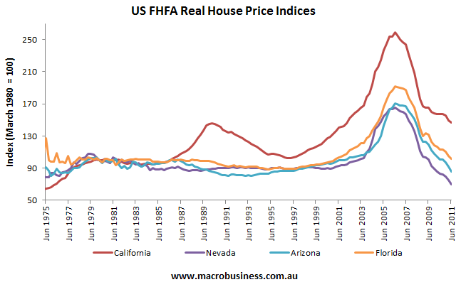
    When analysing the US housing bubble, four states stand-out for the way in which home values rose into the stratosphere before crashing and burning: California, Nevada, Florida and Arizona (see below chart).


    Since I covered three markets were covered in previous posts at Macrobusiness (see above links), I now want to analyse the Arizona housing market – with particular emphasis on its largest city, Phoenix – to determine why prices bubbled and then burst in such a violent manner.

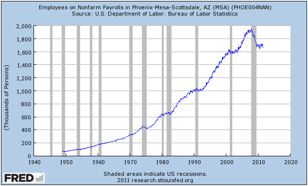
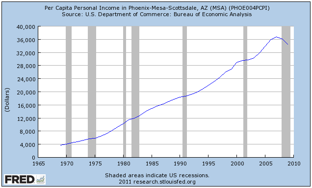
    In the lead-up to the crash, Phoenix’s economy was booming. New jobs were being added at a fast pace and per capita incomes were growing strongly:


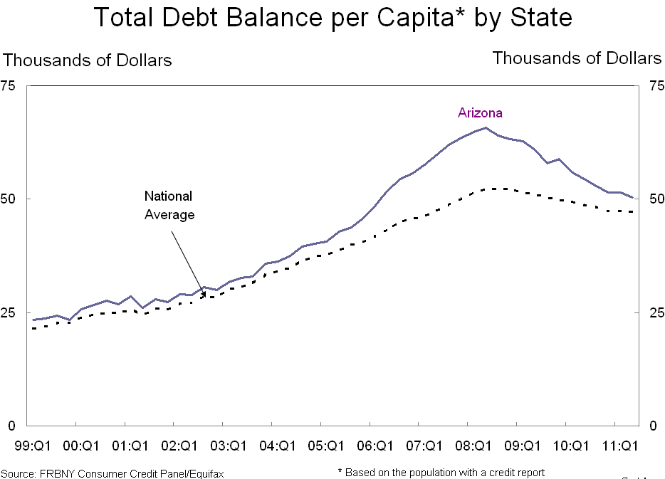
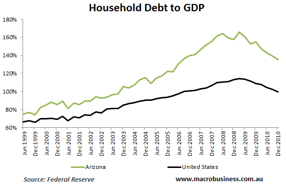
    With confidence riding high on the back of seemingly solid fundamentals and rising asset prices, along with easy access to credit, Arizona households borrowed heavily. Per capita debt accumulation surged in the mid-2000s to levels far in excess of the national average:


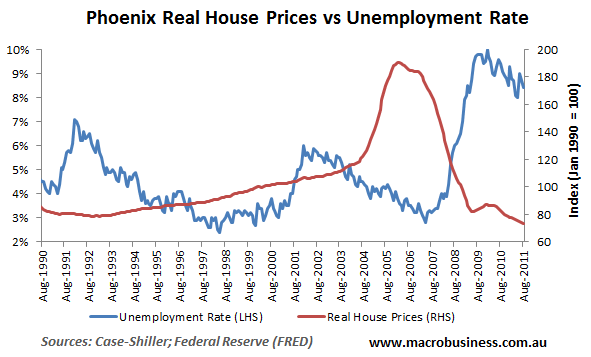
    But Phoenix was living on borrowed time. With the national economy turning south in the wake of the sub-prime crisis and the collapse of Lehman Brothers, Phoenix home prices, which had already been falling gradually, began to slide fast. After home prices peaked in May 2006, it took another 18 months before Phoenix’s unemployment rate began rising:


    The rest is history. Home prices continued falling, unemployment kept rising, and nominal per capita incomes fell for the first time in at least 40 years.

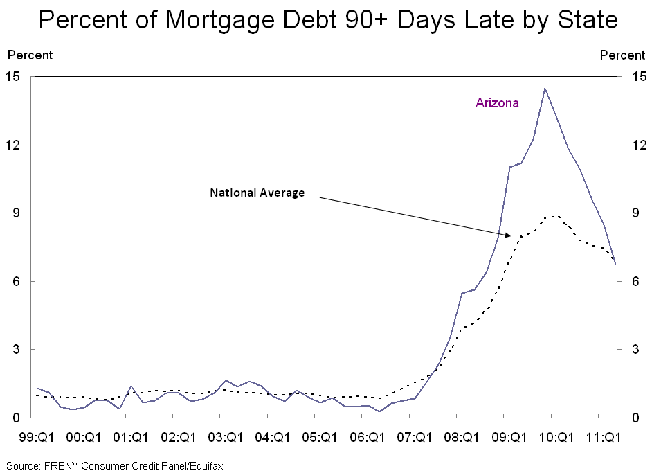
    And the pain is widespread, with around one in seven mortgages 90 days in arrears – well in excess of the national average:


    So what went wrong? Could anything have been done differently to prevent the housing bubble/bust?

    Certainly, if credit was less readily available, households would have been constrained in their ability to bid-up prices. But easy credit was only part of the problem. Another key driver of the rampant price escalation and then collapse was the way in which land was supplied for housing.

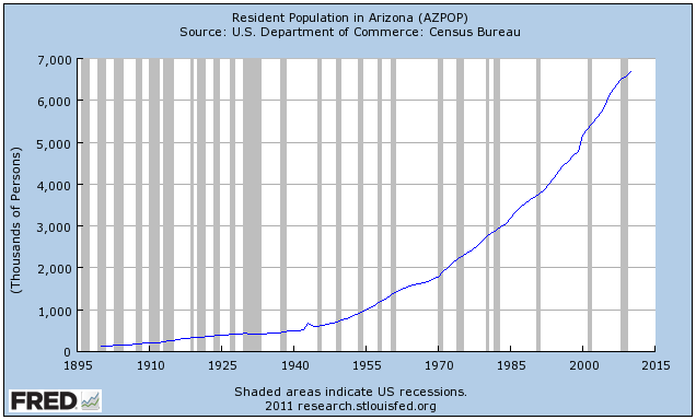
    Throughout the 2000s, Arizona was one of the fastest growing metropolitan area in the United States with more than 1,000,000 population (see below chart).


    However, despite there being ample developable land on the urban fringe to accomodate this population growth, the actual quantity of land available for development was heavily restricted on two counts:

    1. The State of Arizona passed statewide planning laws in 1998 and 2000, which included the implementation of high impact fees on new development and urban containment devices. In a 2006 study of land-use policies in the 50 largest metropolitan areas of the US, the Brookings Institution ranked Phoenix as ‘growth management’, which is the same ranking as Florida and California.
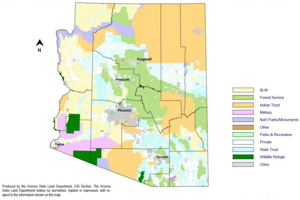
    2. The overwhelming majority of potential developable land in Arizona is either owned by the state and federal governments, preserved for conservation, or otherwise off-limits to development.

    On the second point – the lack of available land for development – the below graphics highlight the land supply situation in Phoenix.

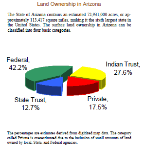
    First, a pie diagram, extracted from the Arizona State Land Department Annual Report, showing how only 17.5% of land in Arizona is privately owned:


    Second, a map showing the lack of developable land around Phoenix:


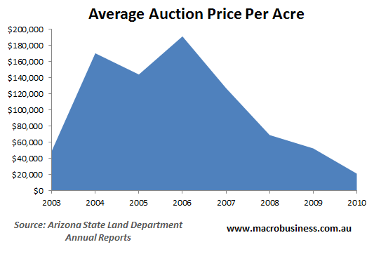
    There is evidence that the Arizona State Land Department, whose mission is to “optimize economic return for the Trust beneficiaries”, heavily restricted sales of land to the market in an effort to maximise revenues, causing builders and developers to bid-up land price in period auctions to ensure their supply of land for construction (called ‘land banking’).

    Whereas the price of land for housing sold for around $40,000 per acre immediately prior to the bubble, at the peak average land prices fetched nearly $200,000 (see below chart).


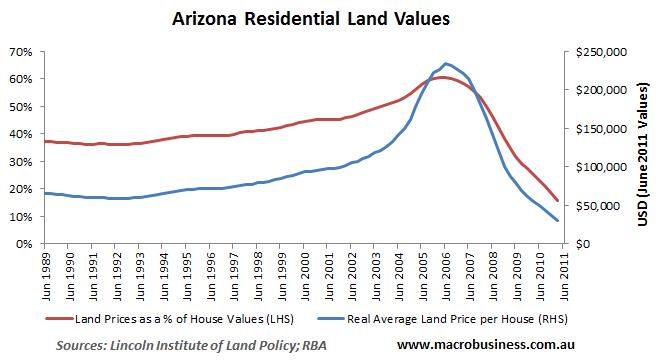
    And with the state rationing the supply of fringe land, average residential land prices rose throughout Arizona:


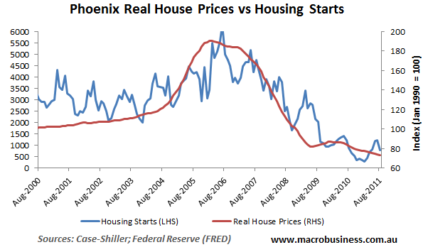
    Obviously, this land price inflation was a principal cause of the house price escalation as well as the delayed supply response to the rapidly growing population and rising house prices (see below chart).


    Had land around Phoenix been freely available for development, developers would likely not have paid such high prices for the land sold by the state government and Phoenix home prices would never have risen to such heights or crashed as violently.

    Phoenix is yet another example of where excessive government interference in the supply of land has combined with easy credit to create a speculative bubble followed by a painful bust.

    This piece originally appeared at Macrobusiness.

    Leith van Onselen writes daily as the Unconventional Economist at MacroBusiness Australia. He has held positions at the Australian Treasury, Victorian Treasury and currently works at a leading financial services company. Follow him @leithVO.

  • Occupy Wall Street: About D@%& Time!

    "Privileged people don’t march and protest; their world is safe and clean and governed by laws designed to keep them happy. I had never taken to the streets before; why bother? And for the first block or two I felt odd, walking in a mass of people, holding a stick with a placard…" Michael Brock in John Grisham’s The Street Lawyer (Doubleday, 1998).

    I’ve been waiting for three years for Americans to get out in the street and protest the actions that created the Financial Crisis that sparked the Great Contraction. As ng.com frequent commenter Richard Reep put it back at the beginning: “What happened to people’s outrage? Where are the torch-bearing citizens marching on Washington?” If some third-world leader had pillaged the national treasury on their way out of town the way Hank Paulson did – with the full and enthusiastic support of New York Fed chief and now Treasury Secretary Timothy Geithner – when he convinced Congress to spend $750 billion to bailout the Wall Street banks, there would be angry mobs, riots and possibly UN Peacekeepers.

    Three years later, all we can muster is a sort of hippy sit-in – but I’ll take it! It’s better than letting it run over us, drip-by-drip, until there is no middle in our increasingly bifurcated economy.

    Let me summarize what 99% of Americans should protest. It started in the early 2000s with good intentioned policies directed toward leveling the playing field by re-designing consumer credit ratings to allow more Americans to own homes. The move was embraced by Mike Milken and his followers as a way to further the cause of The Democratization of Capital – oddly enough, an idea born out of the outrage of the Watts Riots of August 1965.

    Republicans and Democrats alike joined in the movement and a great boom in home prices was born. Expanding homeownership opportunities, especially for minorities, was a fundamental aim of the Bush Administration’s housing policy, one strongly supported by Democrats in Congress. Then everyone got greedy, including wanna-be real estate moguls who started flipping houses instead of working for their living.

    Banks that were writing mortgages soon turned to securitization – bundling mortgages into bonds called mortgage-backed securities – so they could use the proceeds to lend more money to subprime borrowers. The banks were collecting fees at every step. They charged fees for making the mortgage loan and for putting together the bond deal; then they charged commissions for trading the bonds. The interest paid on the bonds was high because the interest charged on the mortgages was high – after all, these were less-than-credit worthy borrowers by traditional standards.  The banks wanted to be compensated for taking the risk – even though they were selling the risk to someone else. It was all about making money on money and eventually demand overtook supply. But that didn’t stop Brother Banker!

    According to a story on PBS (originally aired November 21, 2008), managers at Standard & Poor’s credit rating agency were pressured to give mortgage bonds triple-A ratings in the pursuit of ever higher fees. In essence, the banks paid credit rating agencies to get triple-A ratings for their mortgage bonds so that insurance company and pension fund money could be added to the scheme. Insurance companies and pension funds are highly regulated in order to protect investors who rely on them for compensation in disasters and retirement.

    If the bank couldn’t get the top credit rating for some mortgage bonds, they turned to selling an unregulated kind of insurance called Credit Default Swaps. The swaps became so popular that people who didn’t even own the bonds were buying the swaps. Eventually, there were more credit default swaps than there were bonds – and the banks were making fees on top of fees with no incentive to stop. In the end, there was more money to be made in mortgage defaults than mortgage payoffs and some banks even stopped taking mortgage payments to force the defaults. It was a little like the failing businessman who burns down his own shop because he can make more on the insurance than he can trying to sell it.

    When the swaps came due, companies like AIG collapsed under the pressure of the payments – and American taxpayers were left holding the bag. Using your insurance and pension benefits to create their bonfire, Wall Street staged a weenie-roast! Two years ago you could have purchased all the common stock of Lennar Homebuilders for $1.2 billion – but if they went bankrupt you could collect $40 billion on the swaps. (The European Union fixed this problem in their markets – the US did not.) Like any Ponzi scheme, this one also required that “new money” continue to flow in so that the early investors could receive payouts – hence the need to get your benefit money invested in these things. When Uncle Sam took 80% ownership of AIG in Hank Paulson’s bailout scheme, again approved by our current administration’s financial geniuses, the US Treasury in combination with the Federal Reserve provided an unlimited source of new money. THAT is what you should be protesting today because it can – and probably will – happen again.

    Critics of the protesters like to equate Wall Street with all the companies that create jobs. This ignores how the stock market works. The only time that a company gets money from its stock is in the initial public offering. Those shares are mostly sold to syndicates, underwriters, and primary dealers, not the general public. What happens day in and day out on Wall Street is simply stirring the pot. When the company’s stock goes up, it is the next seller and his broker that make money, not the company. The stock market should have everything to do with jobs. When households have excess earnings – more money than they need for their expenses – they make savings deposits or investments in the stock market through banks. Banks channel savings from households to entrepreneurs and businesses. Entrepreneurs use the money to create new businesses which employ more people, thus increasing the earnings that households have available for savings and investment, which would bring the process fully around the virtuous circle. But Wall Street doesn’t exactly do that anymore. It just makes jobs for Wall Street.

    The other argument is that the problem isn’t Wall Street, it’s the government. Anyone who thinks that only one or the other is to blame doesn’t understand how politics is financed. According to the MAPLight.org’s analysis, Senator Barack Obama’s presidential campaign received more money in 2007-2008 from Wall Street than anyone else, but it was only $2 million more than the $22,108,926 that went to Senator John McCain.

    Blame the government and blame the Wall Street banks that sponsor their political campaigns – they are blaming each other anyway. The occupy protestors – with the possible exception of the violent black band anarchists – are not the perpetrators we need to put in handcuffs.

    The sad fact is that nothing in Washington, D.C. or Wall Street, NYC has changed since that day in September 2008 when Hank Paulson told Congress that the world would end if they didn’t give him $750 billion to spread around Wall Street. For many people, like a Michael Brock, it takes a life-changing event to make you look at the truth all around you. Fixing our broken financial markets requires systemic reform of a great scale.  

    I think a lot of people who joined the 2008 tea parties – myself included – thought we were mounting a petition against bank bailouts and the misuse of public funds. The U.S. Government Accountability Office audit of the Federal Reserve, released in July 2011, proves that petition failed. Call your Representative, write to your Senator, and show up for the #Occupy or Tea Party events in your city. Like Michael Brock, you may find yourself savoring the exercise in civil protest.

    A version of this article appeared in the Omaha World Herald on November 4, 2011.

    Susanne Trimbath, Ph.D. is CEO and Chief Economist of STP Advisory Services. She participated in an Infrastructure Index Project Workshop Series throughout 2010. Her training in finance and economics began with editing briefing documents for the Economic Research Department of the Federal Reserve Bank of San Francisco. She worked in operations at depository trust and clearing corporations in San Francisco and New York, including Depository Trust Company, a subsidiary of DTCC; formerly, she was a Senior Research Economist studying capital markets at the Milken Institute. Her PhD in economics is from New York University. In addition to teaching economics and finance at New York University and University of Southern California (Marshall School of Business), Trimbath is co-author of Beyond Junk Bonds: Expanding High Yield Markets

    Occupy Wall Street Photo by Paul Stien.

  • Back to the City?

    The 2010 Census results were mostly bleak for cities, especially for those who believed the inflated hype about the resurgence of the city at the expense of the suburbs.  Despite claims of an urban renaissance, the 2000s actually turned out to be worse than the 1990s for central cities.  The one bright spot was downtowns, which showed strong gains, albeit from a low base.  The resurgence of the city story seemed largely fueled by intra-census estimates by the government that proved to be wildly inflated when the actual 2010 count was performed.

    But beyond the headline numbers, there is intriguing evidence of a shift in intra-regional population dynamics in the migration numbers. The Internal Revenue Service uses tax return data to track movements of people around the country on a county-to-county and state-to-state basis. These can be used to look at movements of people within a metro area.

    Because this data is at the county level, it does not map directly to what we might think of as the “urban core” as most counties that are home to central cities contain large suburban areas as well. There are also areas inside many central cities themselves that are suburban in their built form.

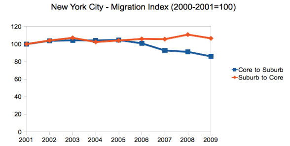
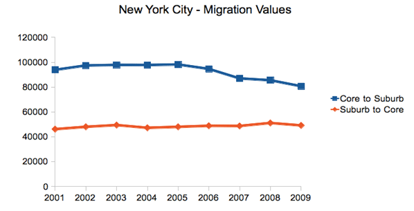
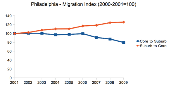
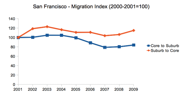
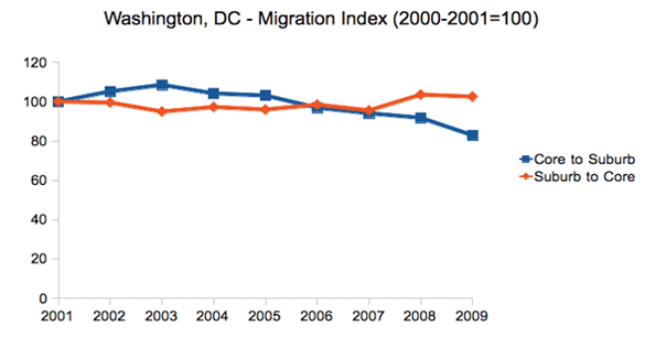
    However, there are a limited number of cities that have combined city-county definitions that approximate the urban core. Looking at a few of these – New York, Philadelphia, San Francisco, and Washington, DC – we see that over the 2000s out-migration from the core to the suburban counties was relatively flat or even declined late in the decade as general mobility declined in the Great Recession. In contrast, migration from the suburban counties to the core stayed flat or actually increased, even late in the decade when again overall migration declined nationally.

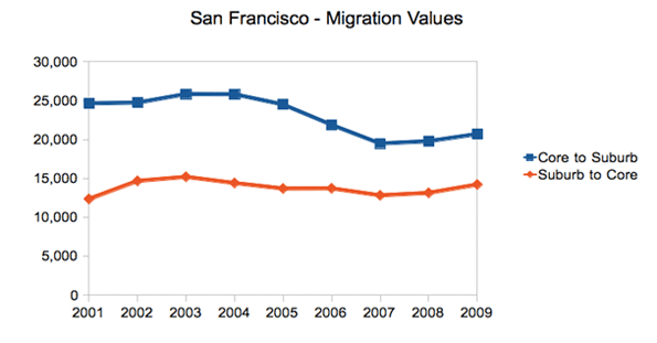
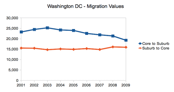
    It should be stressed that the overall trend is still that of net out-migration from the core to the suburbs. But in searching for any potential inflection point, changes in the dynamics are clearly of interest.

    New York City

    First let us look at New York City. The city proper consists of five boroughs, each of which is a separate county. Treating the city as a whole as the core reveals these migration trends during the 2000s:


    Note: Core defined as the five boroughs of New York City

    This chart renders migration as an index, to show changes in in- and out-migration on the same scale. This should not be confused with the total number of people moving, which still shows overall net out-migration, though the trend lines show the same dynamic as above:


    Note: Core defined as the five boroughs of New York City

    Philadelphia

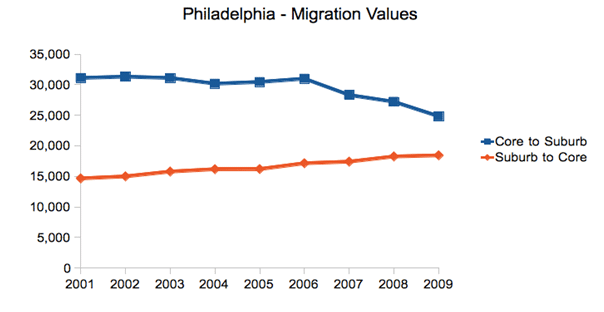
    Perhaps the most dramatic shift in these four cities was in Philadelphia, where the central city actually gained population for the first time since 1950.

    Here are the raw migration numbers, which again show net out-migration, but a distinct shift over the decade.

    San Francisco

    The Bay Area has been divided into two metro areas by the government, San Francisco and San Jose. Therefore, an intra-regional migration analysis looking at San Francisco alone will miss certain migration within the broader Bay Area. With that caveat in mind, we see again the same trend, albeit somewhat less pronounced:

    And here are the total migrants:

    Washington, DC

    Due to its very nature as a government town, Washington’s migration patterns differ from the many other cities. However, it has still experienced the same suburbanization phenomenon as the rest of America, and the same changes in intra-regional migration dynamics as the other cities highlighted here, though we see the shift beginning only in mid-decade:

    And the raw values:

    Conclusion

    Given the overblown triumphalist rhetoric about the urban core that ultimately hasn’t been backed up by the data, we should be cautious about reading too much into this. Again, net migration remains outward towards the suburbs and away from denser cities to smaller, generally less dense ones (from Chicago to Indianapolis or New York to Raleigh). Overall city population figures were disappointing. And the housing crash and the Great Recession have clearly wreaked havoc with migration patterns on a national level.

    Still, these are clearly figures that should inspire some at least small-scale optimism in urban advocates.  There has clearly been a shift affecting the net migration in these cities. And the same pattern is visible, though less easily attributable to just the urban core, in a large number of other metros around the country.  In particular, the fact the in-migration from the suburbs to the core held steady or even increased is a sign of some urban health.

    Back to the city as a mass movement?  Not yet.  But it’s certainly an improvement. These intra-regional migration statistics are key figures to keep an eye on as we look for any sign of a true inflection point in the overall population trends for America’s urban centers. The whole pattern could also shift again — in one direction or the other — as the economy, albeit slowly, comes back to life and people once again get back into the housing market.

    Aaron M. Renn is an independent writer on urban affairs based in the Midwest. His writings appear at The Urbanophile, where this piece originally appeared. Telestrian was used to analyze data and to create charts for this piece.

    Chicago photo by Storm Crypt / Flickr

  • Brand Loyalty Dominates Trip to Work

    Many public sector mavens watch like the Dow Jones average the shares of workers using various modes of transportation on work trips to see how their favorite mode is doing.  One shouldn’t be surprised when a certain hyperbole creeps into the interpretation of the trends.   But in reality not a whole lot is changing, despite many assertions of ballooning growth from some sectors. 

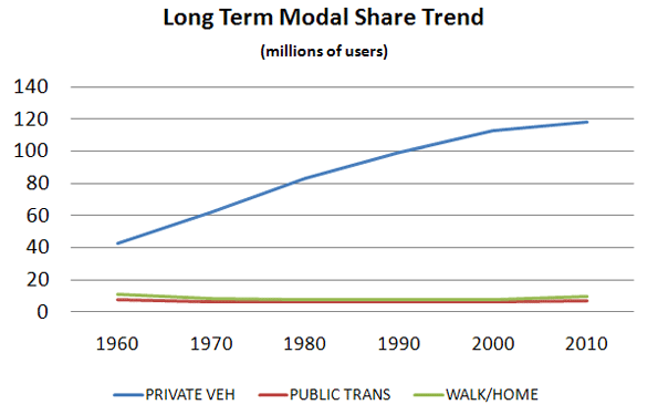
     We should start in 1960 with the first census to cover the Journey to Work.  Back then about two-thirds of workers used a car or truck. More interestingly 13% were on transit, 10% walked and 7% worked at home (think farmers).   As Figure 1 indicates, effectively all of the growth in the last 50 years has occurred in the private vehicle mode.  The melding here of walking and working at home misleads a bit because walking has continually declined while, due to the internet, working at home – once the farm decline reached bottom – has been the “mode” with the greatest and most consistent share of growth in the period.


    Source: 1960-2000 decennial Census; 2010 ACS

    Meanwhile the transit and walk modes have declined in share since the last half century but seem more recently to have bottomed out and reached some base level. 1

    Table 1 shows the relatively stable pattern for the last 20 years in broad terms. 

    1990 decennial

    2000 decennial

    2010

    ACS

    WORKERS

    100%

    100%

    100%

    DRIVE ALONE

    73%

    76%

    77%

    CARPOOL

    13%

    11%

    10%

    TRANSIT

    5%

    5%

    5%

    TAXI 

    0%

    0%

    0%

    BICYCLE

    0%

    0%

    0%

    WALKED

    4%

    3%

    3%

    OTHER

    1%

    1%

    1%

    WORKED AT HOME

    3%

    3%

    4%


    For Figure 1 and Table 1, the 2000 and earlier data are from the decennial censuses. The 2010 data are from a new source, the American Community Survey, which seeks to replicate the census structure.   These data are therefore not strictly comparable.  It has been observed that the ACS has tended to understate carpooling and overstate transit despite best efforts to assure comparability.

    Given the breadth of coverage of the census, it has immense value but a better handle on the mode share question can be found in the National Household Travel Survey (NHTS) of the Federal Highway Administration.  It replicates the census question asking about the usual mode of commuting, but it asks it as part of a collection of a complete diary of a day’s travel for each member of the household. It gets the what did you do yesterday response as well for the same person.   That means we can compare the person’s responses to the two separate queries and learn a great deal about the relationships between the responses. 

    This comparison between census and NHTS products helps state and metro planners know how their surveys might map to the census and helps test the utility of the census products. Just as importantly, it provides a comparison between what people say they do and what they actually do and it tells more about what alternatives travelers shift to when they don’t do “the usual”.   

    When the NHTS asks the question in the “actually-did-yesterday” format things change, in some cases appreciably.

    ‘Usual’

    On  Travel  Day Commuted   by:

    Commute

     Mode:

    Drove Alone

    Carpool

    Transit

    Walk

    Bike

    Other

    Drove Alone

    93.5

    5.6

    0.1

    0.5

    0.1

    0.4

    Carpool

    42.9

    54.8

    0.5

    1

    0

    0.8

    Transit

    13.2

    9.2

    68.3

    6.6

    0.8

    1.9

    Walk

    6.1

    9.3

    3.4

    80.2

    0.2

    0.7

    Bike

    13.8

    3.3

    6

    2.6

    73

    1.4

    Other

    64.1

    19

    4.2

    4.3

    0.3

    8

    Source: NHTS 2009

    Quick Findings

    If we study the yellow boxes we see the “loyalty” relationship between what people say they do and what they actually do.   There are some interesting stories here.

    Drove alone:  According to the NHTS, 93.5% of the people who said they usually drive alone to work actually did.  When they didn’t they almost exclusively shifted to carpooling, with only about 1% shifting out of the auto mode.  This is basically identical to the responses in the 2001 NHTS.2

    Transit:  Only about 68.3% of usual transit users actually used it on a specific day.  The big shift is to the auto-based modes, solo driving or pooling, accounting for more than three quarters of the shift, with the remainder largely shifting to walking.  This is almost the identical loyalty share observed in 2001, but with greater shifts to the auto instead of walking.

    Walking:  Surprisingly about 80% of those who say they usually walk actually do.  Again, when these commuters don’t walk, about three/quarters of the shift is to the private vehicle, with the remainder largely shifting to transit. Also very similar in loyalty to 2001 measures, but showing some increase in transit shifts.  

    Bicycle:   biking exhibits a little less “loyalty” than walking and a little more than transit.   Biking showed a decrease in loyalty from the 77% observed in 2001, perhaps reflecting that the increases in biking we have seen among less inveterate bikers.  The shift to the auto-based modes is less pronounced than the other cases with about a 63% share of the shift.  Transit and walking each obtain appreciable shares of the remainder.   Use of the auto modes as an alternative increased substantially from 2001. 

    Carpooling:  Carpooling is the great surprise.  While transit exhibited the lowest level of loyalty of all modes in 2001 it was surpassed by carpooling in 2009.  Carpooling showed a dramatic decrease in loyalty from 75% in 2001 to 55%, in 2009.  The dominant shift is to driving alone with only about 2% shifting to non-auto modes.  So the auto-based share remains about the same as in 2001. 

    What to Make of All This

    In today’s world we have seen substantial increases in variability in trips to work  – variability  in time of departure, arrival, choice of route to work, even a choice as to whether or not one travels to work at all  with telecommuting becoming more significant every day.  We should not be surprised that there is variability in choice of mode of travel.  Some part of this may simply be that some workers see transit, biking, or walking as the socially preferred modes and will state so when asked – kind of the “good citizen” response – they know what they are supposed to want – “but yesterday was different!”    

    Clearly, auto users tend to remain auto users, with a 98-99% loyalty whether in a carpool or driving solo.  Shifting either way often means things like: the car is in the shop, my wife needs the car, or carpool buddy is on leave, lost a job, or busy doing something else.  This does tell us that carpooling is becoming less formal and more of an occasional and more flexible activity, abetted by cell phones and apps.  One could speculate that these workers often do not have a serious option to the auto.   

    Transit users’ swing is substantial, with significant implications.  Actual users come in at 3.7% of travel rather than the 5% shown for the “usually use” response.  About 3.5% are the usual transit riders who are actually using transit. In terms of survey response reliability we are dancing on the thin edge of trustworthy responses in terms of observation density.    But even with that caveat it would seem appropriate for transit providers to recognize that a significant portion of their riders are “in for the day” because their usual circumstance changed.  Also worth noting is that given that auto users are about 20 times the number of transit riders, an insignificant shift from auto to transit – unnoticeable on the roads – could swamp transit use.   If all the car users had their car in the repair shop once a month it could double transit use in most regions.

    Walkers and bikers, who are those most likely to be affected by weather, both do better than transit in terms of brand loyalty.  This may all be a product of trip length. It has been observed in the past that walkers have an average trip length that is typically so short (circa 15 minutes or about a mile)  that transit (given typical wait times of close to 15 minutes) is not a realistic option so on bad weather days the car may be the substitute. Bike trip lengths to work may be significantly longer than walking so that transit can become a viable option, depending on wait times and routing.    

    Alan E. Pisarski is the author of the long running Commuting in America series. A consultant in travel behavior issues and public policy, he frequently testifies before the Houses of the Congress and advises States on their investment and policy requirements.

    Photo by Nathan Harper, Bottleleaf

    —————–

    Wendell Cox covered this topic in greater detail in a recent New Geography posting Oct 17 2011

    Commuting in America III pg 63

  • Gas Against Wind

    Which would you rather have in the view from your house? A thing about the size of a domestic garage, or eight towers twice the height of Nelson’s column with blades noisily thrumming the air. The energy they can produce over ten years is similar: eight wind turbines of 2.5-megawatts (working at roughly 25% capacity) roughly equal the output of an average Pennsylvania shale gas well (converted to electricity at 50% efficiency) in its first ten years.

    Difficult choice? Let’s make it easier. The gas well can be hidden in a hollow, behind a hedge. The eight wind turbines must be on top of hills, because that is where the wind blows, visible for up to 40 miles. And they require the construction of new pylons marching to the towns; the gas well is connected by an underground pipe.

    Unpersuaded? Wind turbines slice thousands of birds of prey in half every year, including white-tailed eagles in Norway, golden eagles in California, wedge-tailed eagles in Tasmania. There’s a video on YouTube of one winging a griffon vulture in Crete. According to a study in Pennsylvania, a wind farm with eight turbines would kill about a 200 bats a year. The pressure wave from the passing blade just implodes the little creatures’ lungs. You and I can go to jail for harming bats or eagles; wind companies are immune.

    Still can’t make up your mind? The wind farm requires eight tonnes of an element called neodymium, which is produced only in Inner Mongolia, by boiling ores in acid leaving lakes of radioactive tailings so toxic no creature goes near them.

    Not convinced? The gas well requires no subsidy – in fact it pays a hefty tax to the government – whereas the wind turbines each cost you a substantial add-on to your electricity bill, part of which goes to the rich landowner whose land they stand on. Wind power costs three times as much as gas-fired power. Make that nine times if the wind farm is offshore. And that’s assuming the cost of decommissioning the wind farm is left to your children – few will last 25 years.

    Decided yet? I forgot to mention something. If you choose the gas well, that’s it, you can have it. If you choose the wind farm, you are going to need the gas well too. That’s because when the wind does not blow you will need a back-up power station running on something more reliable. But the bloke who builds gas turbines is not happy to build one that only operates when the wind drops, so he’s now demanding a subsidy, too.

    What’s that you say? Gas is running out? Have you not heard the news? It’s not. Till five years ago gas was the fuel everybody thought would run out first, before oil and coal. America was getting so worried even Alan Greenspan told it to start building gas import terminals, which it did. They are now being mothballed, or turned into export terminals.

    A chap called George Mitchell turned the gas industry on its head. Using just the right combination of horizontal drilling and hydraulic fracturing (fracking) – both well established technologies — he worked out how to get gas out of shale where most of it is, rather than just out of (conventional) porous rocks, where it sometimes pools. The Barnett shale in Texas, where Mitchell worked, turned into one of the biggest gas reserves in America. Then the Haynesville shale in Louisiana dwarfed it. The Marcellus shale mainly in Pennsylvania then trumped that with a barely believable 500 trillion cubic feet of gas, as big as any oil field ever found, on the doorstep of the biggest market in the world.

    The impact of shale gas in America is already huge. Gas prices have decoupled from oil prices and are half what they are in Europe. Chemical companies, which use gas as a feedstock, are rushing back from the Persian Gulf to the Gulf of Mexico. Cities are converting their bus fleets to gas. Coal projects are being shelved; nuclear ones abandoned.

    Rural Pennsylvania is being transformed by the royalties that shale gas pays (Lancashire take note). Drive around the hills near Pittsburgh and you see new fences, repainted barns and – in the local towns – thriving car dealerships and upmarket shops. The one thing you barely see is gas rigs. The one I visited was hidden in a hollow in the woods, invisible till I came round the last corner where a flock of wild turkeys was crossing the road. Drilling rigs are on site for about five weeks, fracking trucks a few weeks after that, and when they are gone all that is left is a “Christmas tree” wellhead and a few small storage tanks.

    The International Energy Agency reckons there is quarter of a millennium’s worth of cheap shale gas in the world. A company called Cuadrilla drilled a hole in Blackpool, hoping to find a few trillion cubic feet of gas. Last month it announced 200 trillion cubic feet, nearly half the size of the giant Marcellus field. That’s enough to keep the entire British economy going for many decades. And it’s just the first field to have been drilled.

    Jesse Ausubel is a soft-spoken academic ecologist at Rockefeller University in New York, not given to hyperbole. So when I asked him about the future of gas, I was surprised by the strength of his reply. “It’s unstoppable,” he says simply. Gas, he says, will be the world’s dominant fuel for most of the next century. Coal and renewables will have to give way, while oil is used mainly for transport. Even nuclear may have to wait in the wings.

    And he is not even talking mainly about shale gas. He reckons a still bigger story is waiting to be told about offshore gas from the so-called cold seeps around the continental margins. Israel has made a huge find and is planning a pipeline to Greece, to the irritation of the Turks. The Brazilians are striking rich. The Gulf of Guinea is hot. Even our own Rockall Bank looks promising. Ausubel thinks that much of this gas is not even “fossil” fuel, but ancient methane from the universe that was trapped deep in the earth’s rocks – like the methane that forms lakes on Titan, one of Saturn’s moons.

    The best thing about cheap gas is whom it annoys. The Russians and the Iranians hate it because they thought they were going to corner the gas market in the coming decades. The greens hate it because it destroys their argument that fossil fuels are going to get more and more costly till even wind and solar power are competitive. The nuclear industry ditto. The coal industry will be a big loser (incidentally, as somebody who gets some income from coal, I declare that writing this article is against my vested interest).

    Little wonder a furious attempt to blacken shale gas’s reputation is under way, driven by an unlikely alliance of big green, big coal, big nuclear and conventional gas producers. The environmental objections to shale gas are almost comically fabricated or exaggerated. Hydraulic fracturing or fracking uses 99.86% water and sand, the rest being a dilute solution of a few chemicals of the kind you find beneath your kitchen sink.

    State regulators in Alaska, Colorado, Indiana, Louisiana, Michigan, Oklahoma, Pennsylvania, South Dakota, Texas and Wyoming have all asserted in writing that there have been no verified or documented cases of groundwater contamination as a result of hydraulic fracking. Those flaming taps in the film “Gasland” were literally nothing to do with shale gas drilling and the film maker knew it before he wrote the script. The claim that gas production generates more greenhouse gases than coal is based on mistaken assumptions about gas leakage rates and cherry-picked time horizons for computing greenhouse impact.

    Like Japanese soldiers hiding in the jungle decades after the war was over, our political masters have apparently not heard the news. David Cameron and Chris Huhne are still insisting that the future belongs to renewables. They are still signing contracts on your behalf guaranteeing huge incomes to landowners and power companies, and guaranteeing thereby the destruction of landscapes and jobs. The government’s “green” subsidies are costing the average small business £250,000 a year. That’s ten jobs per firm. Making energy cheap is – as the industrial revolution proved – the quickest way to create jobs; making it expensive is the quickest way to lose them.

    Not only are renewables far more expensive, intermittent and resource-depleting (their demand for steel and concrete is gigantic) than gas; they are also hugely more damaging to the environment, because they are so land-hungry. Wind kills birds and spoils landscapes; solar paves deserts; tidal wipes out the ecosystems of migratory birds; biofuel starves the poor and devastates the rain forest; hydro interrupts fish migration. Next time you hear somebody call these “clean” energy, don’t let him get away with it.

    Wind cannot even help cut carbon emissions, because it needs carbon back-up, which is wastefully inefficient when powering up or down (nuclear cannot be turned on and off so fast). Even Germany and Denmark have failed to cut their carbon emissions by installing vast quantities of wind.

    Yet switching to gas would hasten decarbonisation. In a combined cycle turbine gas converts to electricity with higher efficiency than other fossil fuels. And when you burn gas, you oxidise four hydrogen atoms for every carbon atom. That’s a better ratio than oil, much better than coal and much, much better than wood. Ausubel calculates that, thanks to gas, we will accelerate a relentless shift from carbon to hydrogen as the source of our energy without touching renewables.

    To persist with a policy of pursuing subsidized renewable energy in the midst of a terrible recession, at a time when vast reserves of cheap low-carbon gas have suddenly become available is so perverse it borders on the insane. Nothing but bureaucratic inertia and vested interest can explain it.

    Matt Ridley’s is a journalist and author. His books have sold over 850,000 copies, been translated into 30 languages, been short-listed for seven literary prizes and won three. His latest book “The Rational Optimist: How Prosperity Evolves” argues that human beings are not only wealthier, but healthier, happier, cleaner, cleverer, kinder, freer, more peaceful and more equal than they have ever been.

    Photo “Natural Gas Well at Sunset” by Rich Anderson
  • Political Footballs: L.A.’s Misguided Plans For A Downtown Stadium

    Over the past decade Los Angeles has steadily declined. It currently has one of the the highest unemployment rates (roughly 12.5%) in the U.S, and there’s little sign of a sustained recovery. The city and county have become a kind of purgatory for all but the most politically connected businesses, while job creation and population growth lag not only the vibrant Texas cities but even aged competitors such as New York.

    Rather than address general business conditions, which sorely need fixing, L.A. Mayor Mayor Antonio Villaraigosa and the other ruling elites have instead focused on revitalizing the city’s urban core, which has done little to boost the region’s overall economy in generations. The most recent example of such foolishness is a $1.5 billion plan to build a football stadium, named Farmers Field, downtown,unanimously approved by the city’s City Council and backed by the city’s “progressive” state delegation.

    Like most of  the dominant political class, California Senator and former City Council member  Alex Padilla cites the sad state of the local economy as justification for approving the plan. But, in reality, it’s hard to find something more profoundly irrelevant than a football stadium.

    Indeed years of independent investigations have discovered that urban vanity projects like sports teams and convention centers add little to permanent employment or overall regional economic well-being. As a Minneapolis Fed study revealed, consumers simply shift their expenditures from other activities to the new stadium. Certainly mega-stadiums have done little to boost sad-sack, depopulating cities such as St. Louis, Baltimore or Cleveland.

    Commitments to mega-projects tend to further drive urban areas into debt, largely by issuing more bonds that taxpayers are obligated to pay back. One particularly gruesome case can be found in Harrisburg, Pa., whose underwriting of a minor league baseball team helped push the city into bankruptcy. To get the stadium deal, Los Angeles, already over-indebted and suffering a poor credit rating, will issue another $275 million.

    Such projects often obscure the real and more complex challenge of nurturing broad-based economic growth. This would require substantive change in a city or regional political culture. Instead the football stadium services two basic political constituencies: large unions and big-time speculators, particularly in the downtown area. The fact that the stadium will be built with union labor, for example, all but guaranteed its approval by the city’s trade union-dominated council.

    Downtown developers and “rent-seeking” speculators, the other group behind the project, have siphoned hundreds of millions in tax breaks and public infrastructure in the past decade. They have done so – subsidizing companies from other parts of Los Angeles, entertainment venues and hotels — in the name of a long-held, impossible dream of turning downtown Los Angeles into a mini-Manhattan. Perhaps no company has pushed this more effectively than the stadium developer Anschutz Entertainment Group, a mass developer of generic entertainment districts around the world. AEG has expanded its influence by doling out substantial financial donations to Mayor Villaraigosa and others in the city’s economically clueless political class.

    This explains how the stadium was exempted from the state’s draconian anti-greenhouse gas legislation. The city promises that the stadium will be the “most transit-friendly” football stadium in the nation, which strikes locals as absurd. Football crowds tend to be drawn largely from  affluent types who don’t live anywhere close to downtown and rarely take public transit to their jobs, much less over the weekend. D.J. Waldie, a leading Los Angeles writer, described the entire project as “cloaked in green snake oil.

    An even more nebulous claim is that downtown needs the investment in order to drive regional growth. To be sure, recent years have seen the growth of a central city restaurant scene, and some 30,000 residents now live in the area compared to closer than 20,000 a decade ago. Yet just outside the immediate, highly-subsidized core, population growth in the surrounding parts of central city over the past decade stood at a mere 0.7%, the lowest rate since the 1950s. The vast majority of the region’s population growth took place in the far-flung regions of the San Fernando Valley.

    As an economic engine, downtown LA simply does not warrant the attention, nor the special treatment,  that the city’s ruling elites give it. For one thing, it represents a far smaller part of the city’s economy when you compare it to the urban cores of Washington, D.C., or New York City. Indeed, in New York and D.C. roughly 20% of all employment is in the central core; in Los Angeles it’s barely 2.5%.

    And, despite all the hype, fewer people now work in downtown L.A than in the 1980s and 1990s, when the area was populated by corporations and small businesses, many in manufacturing and trade, instead of hip hangouts. A more recent analysis shows that, despite all the hype, the downtown area has created virtually no new net jobs over the past decade.

    LA’s leaders should therefore focus on the systematic causes for the region’s ailing economy. One source of the problem lies in tough environmental rules that, although lifted on behalf of football, clamp on growth of virtually every other industry, including the city’s port and manufacturing sector. Powerful green interests, for example, make any plan to modernize the port all but impossible. This could prove catastrophic when the widening of the Panama Canal will allow aggressive, cheaper posts in the Gulf or Southeast U.S. to compete with the Pacific Asian trade that has driven LA’s port economy for decades.

    Los Angeles’ huge industrial sector has also been a victim of the regulatory tsunami. Manufacturers have lost roughly one-third of their jobs over the past decade as firms head out to more congenial regions with less onerous regulatory burdens. Sadly, Los Angeles has benefited little from the recent upsurge in manufacturing nationwide when compared with metropolitan areas such as Detroit, Salt Lake City and San Antonio.

    Even Hollywood, an industry less affected by green regulations, has begun to lose steam. Film production has dropped by more than half over the past 15 years. LA’s share of film and television production has eroded as well, with much  of the new work headed to Toronto, New Mexico, New Orleans, New York and Atlanta. All these cities offer richer incentives to attract productions than the world’s self-proclaimed “entertainment capital.”

    Faced with these serious regional challenges, officials should place less emphasis on football and creating another generic downtown and more on the city’s uniquely vibrant and heavily immigrant-driven small-business sector, which has been stifled by the state’s regulatory excess as well as the city’s legendary bureaucracy. Business consultant Larry Kosmont notes that the system is particularly tough on smaller, less politically connected firms. “It usually takes two to three times more to process anything in L.A., compared even to surrounding cities,” Kosmont told the Wall Street Journal. “It makes a big difference if you are a major Korean airline or AEG or if you are an independent entrepreneur.”

    Yet to date these entrepreneurs  receive little respect from City Hall. They  are unlikely to be granted the sort of papal dispensations from green legislation so readily given to the football stadium and other downtown projects. Until the disconnect of the leaders from the city’s real economic essence ends, Los Angeles, a city uniquely blessed by its population, climate and location, will continue to flounder, a perpetual underperformer among America’s great urban areas.

    This piece originally appeared at Forbes.com.

    Joel Kotkin is executive editor of NewGeography.com and is a distinguished presidential fellow in urban futures at Chapman University, and an adjunct fellow of the Legatum Institute in London. He is author of The City: A Global History. His newest book is The Next Hundred Million: America in 2050, released in February, 2010.

    Photo "LA Night Lights" by flickr user Steve Jurvetson

  • If Wishes Were Iron Horses: Amtrak Gaining Airline Riders?

    Andy Kunz of the U.S. High Speed Rail Association commented to Fox Business News on the recently announced record ridership on Amtrak that, "At the very least, the increased demand offers another sign travelers are getting fed up with soaring airline fares and fight cancellations."  In the article, which read more like an Amtrak or high speed rail press release than a news story, reporter Jennifer Booton made what Gulliver, in The Economist, called "a fairly convincing argument that Americans are turning to trains as an alternative to driving and air travel." The Economist should have known better.

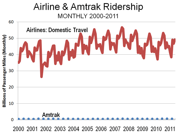
    Yes, Amtrak ridership is up and airline patronage has been up and down in recent years. But, trains as an alternative to air travel? In fact, Amtrak’s ridership is so small that distinguishing between the bottom of the graph below and the Amtrak ridership is difficult (see Figure). While Amtrak ridership rose five percent last year, the same number of new airline passengers would have constituted only 0.06 percent increase (or nearly 1/100th the impact on Amtrak). Amtrak’s ridership is so low that the monthly change (increase or decrease) in airline patronage has exceeded  total 2011 Amtrak ridership in 120 of the last 125 months.

    Booton and Gulliver may imagine business travelers abandoning frequent airline service to board trains slower than cars that run once daily. Or perhaps they imagine faux-high speed rail service that will still be too slow or too infrequent. Airline executives aren’t losing sleep over potential losses to trains.