Blog

  • Interactive Data Visualization: The Connection Between Manufacturing Jobs and Exports

    By Hank Robison and Rob Sentz

    We recently observed that there are only about 50 manufacturing sectors out of 472 (6-digit NAICS) that actually gained jobs over the past 10 years. This made us wonder because we keep hearing that manufacturing output is actually improving. Politicians and policymakers tend to assume that an uptick in output would naturally result in an uptick in employment. So we investigated.

    What we found

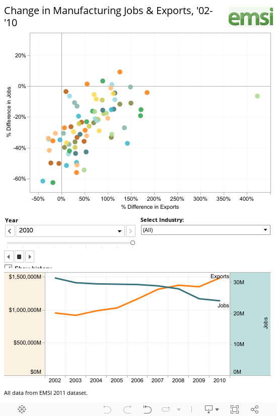
    We placed national export data on top of job totals for each of the 472 manufacturing sectors, and found that manufacturing exports (inflation-adjusted) actually grew by 56% from 02-10 while manufacturing jobs contracted by 23%. Growth in exports have clearly not resulted in more domestic jobs. See the interactive graphic at the bottom of this post for a visualization.

    Across the manufacturing sectors we are actually seeing a predominantly inverse relationship between jobs and exports. To explore this further, we placed each of the 472 industries into one of four categories (again see the graphic):
    1) Those that gained both exports and jobs,
    2) Those that gained exports but lost jobs,
    3) Those that lost exports but gained jobs, and
    4) Those that lost both exports and jobs.

    Some observations

    Those advocating for increased exports as a way of resuscitating jobs in manufacturing need to look at this data. Only 11% of all manufacturing sectors showed gains in jobs and exports, which is not a huge surprise given manufacturing decline. 19% lost jobs AND exports at the same time. Now here is the stat really worth noting — 71% of all manufacturing sectors increased their exports while decreasing their domestic workforce.

    There are some political ramifications here. The Obama Administration has proposed exports as a key to kick-starting the U.S. labor market (see this post from Brookings). Economists and policy experts as well as all of us here at EMSI are huge fans of improving exports. Exports are a principal source of foreign exchange and an important driver for U.S. goods. Export industries also tend to pay higher wages and connect with the rest of the economy through greater multiplier effects, which mean they are key for income and job formation.

    However, as the data suggests things are not that simple. Domestic manufacturers appear to be outsourcing large parts of their work to foreign suppliers. In the process, they employ fewer domestic workers but become more competitive in foreign markets. As a result, exports go up while employment goes down. This is something that policymakers need to consider before pinning too much hope on exports as a way of reviving manufacturing sector employment.

    Conclusion

    There may be a conflict of goals here. On one hand we want high-wage, high-benefit jobs; on the other, “full employment.” But in manufacturing can we have both? If wages, and benefits are pushing producers to outsource then either wages go down (an unattractive prospect), or we adopt policies that spawn productivity growth needed to support high-wages. Are there any other choices?

    Data Graphic

    In this interactive graphic, you can explore EMSI’s data on manufacturing jobs and exports. The data is based on 4-digit NAICS manufacturing sectors. NOTE: 6-digit data was used in the previous analyis.

    Click on the chart to highlight an industry or use the drop-down box. Data in the top half of the graphic shows percentage change in jobs (on the y-axis) and exports (on the x-axis). The bottom line graph simply compares manufacturing jobs and exports over time.

    As we highlighted above, 71% of all manufacturing sectors increased their exports while decreasing their domestic workforce from 2002 to 2010.

    For more information, email Rob Sentz.

  • Development Plans for Old Hong Kong Airport Announced

    The government of the Hong Kong Special Administrative Region has outlined plans to create a "second central business district" at Kai Tak in eastern Kowloon, site of the now former international airport. Kai Tak airport was abandoned in 1998 when the new Hong Kong International Airport at Chep Lap Tok opened.

    Kai Tak is in the middle of the most dense urban development in the high income world. The government intends that the development will have 43 million square feet of office space (4 million square meters) and will cost HK$100 Billion (approximately $13 billion).

    The development would be served by a monorail, which would connect with MTR (metro) lines at Kwun Tong and to a proposed central link MTR line to the new town of Sha Tin.

    Photo: Kai Tak Airport and East Kowloon (by author)

  • A Century of Change in the US Black Population, 1910 to 2010

    2010 was the 100th anniversary of the start of the “Great Migration” of the “Negro” population to northern cities from the mainly rural South. The midway point occurred in 1960 when black urban population was beginning to peak.   

    Since then redistribution had taken several forms. First, we see some return migration to the South, but to metropolitan, but not to the rural small town “Black Belt” of the past but to the sprawling metropolitan regions. Second, there is a decline of black population in metropolitan core cities and counties because of suburbanization. Third, we see a more dispersed growth of the Black population to a wider set of large metropolitan areas across the country.

    In this essay I map and discuss first state level change in the Black population for 1910, 1960 and 2010, then concentrate on US counties which were majority Black in 1910, 1960 or 2010 or housed over 100,000 Black population in 2010, whatever the share. Special note is made of counties which were majority in combinations of the three times, 1910, 1960 and 2010.

    For states I map and discuss change for two critical 50 year periods, 1910 through 1960 and 1960 through 2010. The first encloses both the Great Migration from World War One and the equally large migration from south to north and west in World War II still firmly within the unreconstructed Jim Crow segregation era.  The past 50 years coincides with the rise of the South economically and demographically. Changes wrought by the Civil Rights Revolution brought the at least formal achievement of greater equality—culminated symbolically by the election of a Black President.

    In 1910 the South had 8.75 million of nation’s 9.83 million “Negroes”, an 89 percent share. By 1960 the southern share had fallen to under 60%  with 11.31 of 18.97 million Black population. By 2010 the South had 22 of 39 million Blacks, for 56 percent, still a sizeable majority.

    For 1910 to 1960 absolute and relative changes are depicted in Figure 1. In absolute numbers New York gained the most, 1.3 million, but California and especially Michigan  had the highest rates of growth, with 40 times their 1910 population in 1960. The largest   absolute gains, after New York, were in Illinois (Chicago), California, Michigan, Ohio and Pennsylvania.  Note that the highest growth was in industrial belt states.  In the South, Texas, Louisiana, North Carolina and Virginia – growing and industrializing – experience growth but at modest rates as Black people moved to the growing cities. The Deep South states, with the highest Black shares in 1910, Arkansas, Mississippi, South Carolina, Georgia and even Kentucky experienced absolute losses of Black people over the 50 years.

    For 1960 to 2010, changes are depicted in Figure 2, The highest rates of growth were in states historically very low in Black shares, as Minnesota, Utah, Arizona, New Hampshire and Vermont, with fairly large numbers for Minnesota, Arizona, the Dakotas and Nevada. Remarkably high rates and amounts of growth ocurred in Florida and Maryland (suburbanization from Washington, DC) and substantial growth occurred in the metropolitan dynamos of the South, Georgia (Atlanta) and Texas (especially Houston).

    Growth slowed in mostof the northern industrial belt. Only West Virginia experienced a decline in the Black population (Washington DC lost via gentrification and Black suburbanization). The percent Black fell in AL, AR, DC, MS, NC, SC, VA and WV, most of the South, and even in FL and TX, despite large absolute gains. The highest increase in the Black population (number of times higher) were in mainly white NV, MN, VT and ND.

    Over the full century, among the 27 states with the largest total Black population, the highest rates of change were for Wisconsin, California, Michigan, Connecticut and New York, and the highest absolute growth were in New York, Florida, Texas and California. The lowest   rate was for Arkansas, barely above the 1910 level, followed by Kentucky and Mississippi.

    I do offer two maps at the county level for Black population change 1960 to 2010, but only for a select set of 359 counties, those with a majority Black in 1910, 1960 or 2010, or with at least 100,000 Black persons in 2010.

    As can be seen from the map, all counties (288) with a majority Black at one or more of the three times (1910, 1960 or 2010) are located in the South, including 18 which also had over 100,000 Black persons in 2010  Of the 71 counties that were never a majority Black but had over 100,000 Black population in 2010, 30 more are in the South. Those outside the South (42) are basically the rest of the country’s largest metropolitan counties.

    The majority Black counties define the traditional “Black Belt” of slavery and plantation agriculture across the US South from east Texas to Maryland. The micro-geography of Black majority counties is amazingly unchanged. The dominant areas: the Mississippi Delta and the states Alabama, Georgia, South Carolina, North Carolina and Virginia show cores of 177 counties that have had a Black majority in all three censuses, surrounded by a set of 66 with a Black majority in two of the three census counts, and at the fringe the 128 counties which had a Black majority only in 1910.

    The only area with over 100,000 Black persons and with a Black majority in 1960 and 2010 was Washington, DC, the only one in 1910 and 2010 was Hinds county (Jackson, Mississippi), and the only in all three censuses was Montgomery, Alabama, all government-centered  cities in the South,

    But although the South is still dominant, most of the largest absolute totals are outside the South. New York City alone has over 2 million Black persons, Cook county (Chicago) 1.3 million, Los Angeles, 857,000. Southern metropolises are increasingly important. Harris County Texas (Houston), for example, has more African-Americans (775,000) than Detroit or Philadelphia. Suburban Prince George, MD, 557,000, Dallas, 528,000 and Miami-Dade, 473,000 and Fulton (Atlanta, 466,000, plus 376,000 in De Kalb) all contain large black populations. Only in the South are there high Black populations in rural, small town to small city counties typically in the traditional areas. In the North, Black persons are highly concentrated in the largest core metropolitan counties. Metropolitan Black populations have grown greatly in the South as well, including more suburbanization than in the North.

    Conclusion
    The overall story of the American Black population is one of great change and of continuity—a dramatic spread from the rural South to the large metropolitan North, followed more recently by a partial return to the South’s expanding metropolitan areas. It also reflects growing suburbanization in both the North and the South, and a moderate spread to metropolitan areas in less traditionally Black parts of the country.

    Richard Morrill is Professor Emeritus of Geography and Environmental Studies, University of Washington. His research interests include: political geography (voting behavior, redistricting, local governance), population/demography/settlement/migration, urban geography and planning, urban transportation (i.e., old fashioned generalist).

  • Have i-Phone, Will Travel

    Much in the way that fax machines, Fed Ex, and home computers changed residential living several decades ago, portable technology is now changing how we spend our time when moving from place to place. To better understand traveler behavior in the digital age, our DePaul University team has been tracking how passengers on intercity trips engage with technology. We’ve compiled data using (ironically) hand-held electronic devices on 112 air, bus and rail departures encompassing 18,000 passengers.

    Technology usage rose sharply among travelers on all modes of transportation between late 2009 and the beginning of this year. The percentage of passengers using technology at randomly selected points rose to 43 percent on curbside buses and 36 percent on conventional Amtrak trains. Airlines and Greyhound buses also saw sharp increases in tech usage. And almost 90% of passengers today use a portable digital-communication device at some point during their trip. Travelers have increasingly switched from simple audio devices to complex “visual” devices with LCD screens that can’t be effectively used behind the wheel when driving.

    The latest technology developments seem to favor common carriers. Drivers cannot text, tweet or catch up on Facebook when behind the wheel, unless of course, they are willing to put themselves and others at risk. This is a contrast from the earliest advances in portable electronic technology, which tended to favor automobile travel. Cellular phones were useful in cars, but their bulk and their weak batteries, along with the frequency of ‘dead spots,’ rendered them impractical on buses and trains, and in airports.

    Although the first commercial cellular phone service was introduced on Metroliner trains in 1969, the widespread installation of pay phones (particularly the Airphone) on commercial flights did not occur until 1984, and even then they were seen as an expensive luxury.

    As recently as the start of this century, traveling on a common carrier often meant going “incommunicado” for long periods of times. Business flyers who ventured “out of the loop” dashed for pay phones after arriving. Weary motorists fumbled for change at truck stops to place pay phone calls.

    Megabus and Boltbus, both curbside operators, have been the most adept at riding the personal technology wave. These curbside operators offer a trifecta of amenities — free Wi-Fi, power outlets accessible from every seat, and continuously strong cellular signals (due to their use of interstate highways) — that no other major transportation mode has yet to provide. They generally serve a younger demographic, so it’s not surprising that passengers on curbside buses are more likely to be engaged with technology than travelers on any other major mode. On curbside buses, it is common for more than 60% of passengers to be engaged with electronic technology at any given point.

    A survey we administered to riders waiting at curbside boarding locations showed that almost half consider Wi-Fi important when they choose a travel mode, and about 55% plan to send texts or emails on their trip. The ability to freely use portable devices, while undoubtedly less important than the low fares, helps explain why so many affluent travelers now hop on curbside buses, even when travel times are longer. With more than 400 daily departures, this sector has grown by more than 25% annually over the past several years.

    We also observed that many technology users on buses take advantage of adjacent empty seats. This opportunity is increasingly rare when flying. Our results shows that technology usage declines significantly on both airplanes and buses as conditions on board become more crowded.

    Amtrak is also benefiting from the technology wave, offering generous seating and tray tables that are attractive to technology users. Nevertheless, there are far more dead spots on trains than on buses, and Amtrak has not fulfilled its goals of making Wi-Fi widely available, in part due to the technological challenges associated with simultaneously serving hundreds of travelers along freight-oriented corridors. Wi-Fi is provided on Acela high-speed trains, but on very few other routes. Moreover, most long-distance trains still lack readily-available power outlets in coach class, sometimes leaving travelers in the dark after only a few hours.

    Even more perplexing is the absence of Wi-Fi and power outlets at most major rail stations, where installation is relatively cheap. Last summer, for example, I scrambled to find an outlet in San Diego—even searching the restrooms—to no avail, before reluctantly starting a long commuter train ride with a dead battery.

    Airlines face entirely different challenges. Only 24 percent of flyers in coach cabins were engaged with technology at randomly selected points during our observations. Crowded conditions and prohibitions during takeoffs and landings—which can be in effect for almost half of a flight—discourage use. Nevertheless, use of technology grew sharply during 2010. Airlines have invested heavily in airport lounges, gate areas, outlets and interactive on-board systems that support portable devices and in-flight Wi-Fi. Inflight cell phone calls also could be a game-changer in the not-so-distant future.

    It would be a stretch to argue that portable technology will appreciably diminish the share of travel by car anytime soon. Technology has accelerated the pace of life, making many people less tolerant of trains and buses operating on slow and unreliable schedules. As digitally connected lives in decentralized environments become more feasible, many people find it difficult to travel other than in private cars.

    And cars, too, are becoming more technology friendly. Bluetooth-equipped steering wheels allowing for hands-free phone use and voice activated dialing; power outlets and input jacks for i-Pods and satellite radio are on the rise. Built-in Wi-Fi is also now available in cars.

    Portable technology is making us rethink how we travel. The winner of the first round of innovation was the private automobile. The winner of the second was arguably the curbside bus. The next winner remains to the seen.

    Photo by Ben Dodson

    Joseph Schwieterman is a professor in the School of Public Service and director of the Chaddick Institute for Metropolitan Development at DePaul University in Chicago.

  • Placing Amtrak Records in Context

    The state of Michigan recently announced record ridership on three routes supported by Michigan taxpayers. Records mean little when the numbers are insignificant.

    That, to say the least, is the situation with Amtrak in Michigan. For example, the additional passengers (this year versus last) on the Pere Marquette (between Chicago and Grand Rapids) was small enough to be carried in a once daily round trip by an airport shuttle van. The additional passengers on the Wolverine, which operates from Detroit to Chicago would not have filled a single intercity bus operating each way on a daily basis. The same is true of the Blue Water, which operates between Port Huron and Chicago.

    But there’s more. High quality bus service, featuring on-board high speed wireless internet (wi-fi), costs passengers less between Detroit and Chicago and takes about the same time. There is a big difference, however. Train riders are subsidized by taxpayers, while bus riders pay their full fare. Even so, the unsubsidized bus fares are lower than the subsidized train fares.

    In a nation that needs to cut spending, unnecessary transportation subsidies, such as for intercity rail services should be at the top of the list.

  • OECD Cites Shorter US Work Trip Travel Times

    Catherine Rampell of The New York Times describes a new Organization for Economic Cooperation and Development report concluding that Americans have among the shortest work trip travel times in the developed world (Link to chart in The New York Times).

    Out of 23 OECD nations, only three have shorter one way work trip travel times than in the United States. These are Sweden, Denmark and Ireland. These are nations without the larger metropolitan regions that characterize the United States and some other nations. For example, the largest metropolitan area in these three nations, Stockholm, with barely rate among the top 30 in the United States.

    The OECD report confirms similar earlier data, such as from Eurostat on the relative ease of commuting in the United States.

    The US average of 28 minutes to and from work was 10 minutes less than the OECD average and 9 minutes less than Canada. South Korea, with the highest urban densities in the high income world, had an average one-way commute time approximately double that of the United States.

    Among the nations in the survey, the United States has the lowest urban population densities. This reality is at odds with the contentions of some analysts who have associated longer travel times and greater traffic congestion with lower urban population densities.

    But shorter commute times are about more than density. This is illustrated by comparing the Los Angeles and Toronto urban areas. The two urban areas have almost identical population densities, at 7068 and 7040 persons per square mile respectively (2,729 and 2,718 per square kilometer). The density of the core areas is similar with proportions of land areas at above 10,000 persons per square mile (4,000 per square kilometer). The most important differences are that in Los Angeles, the transit commuting share is one third that of Toronto, and automobile commuting is more prevalent. Employment in Los Angeles is much more dispersed, with less than 5% of jobs being in the downtown area (central business district), compared to approximately 15% in Toronto.

    Each of these factors might be thought to contribute to longer commuter times for those in Los Angeles. However, one way commute times in Los Angeles are nearly one-third less than in Toronto. The latest data indicates that the work trip averages 28 minutes in Los Angeles and 40 minutes in Toronto.

    This illustrates important dynamics of commuting and mobility. The keys to shorter commutes in the US are adequate roads, personal mobility (the US has the highest share of travel by automobile) and decentralization (lower density) of both jobs and housing.

    ——
    Addendum:

    Commenting on the same report, the Washington Post’s Brad Plumer stumbled into fantasyland:

    The Department of Transportation found that, in 2009, commutes by private car took, on average, 23 minutes. Public transportation, by contrast, took an average of 53 minutes. You could read that as an argument that more people should drive so that their commutes are shorter or as an argument that we need to bolster public transportation.

    The idea of bolstering transit to equal car travel times is empty romanticism. Today, only 7 percent of metropolitan area workers can reach their jobs in 45 minutes by transit, according to the Brookings Institution (see Transit: The 4 Percent Solution). To cut transit travel times in half, and making it available to all of the metropolitan area is unrealistic.

  • Dense Urban Thinking Down Under

    Ku-ring-gai is a piece of suburban paradise in the inner rings of Sydney. A district of modest homes and quaint small-scale shopping districts, it sits near one of the last remaining stretches of blue-gum forest inside Australia’s largest city. You can still catch the occasional cockatoo luxuriating on a branch.

    First built around 1900, the neighborhood of 106,000 boasts all the charms of the classic “garden city,” balancing nature with modestly scaled development. Yet today the Ku-ring-gai community — including the remaining flora and fauna — is threatened with extinction by planners and developers seeking to pack the district with non-descript apartment tracks and ten-story commercial structures.

    “They’re doing everything they can to destroy this area,” says long-time community activist Kathy Cowley, a founding member of both Save Our Suburbs and Friends of Ku-ring-gai over lunch of meat pies and salad at her cottage. “They approach it as if it was a greenfield [or previously undeveloped] site for high-density housing. They are trying to destroy everything with bad planning.”

    Cowley speaks bitterly about how the state government of New South Wales, which controls development, cares little about disturbing a sensitive human as well as natural urban environment. Most of the new apartment dwellers, she notes, tend to be recently arrived residents. Many appear to be Chinese students, who ride on the surprisingly rickety trains largely to schools closer to Sydney’s center city.

    This assault on Cowley’s neighborhood reflects a peculiar density ideology that, although present in the United States, is far more powerful in New Zealand, Great Britain and Australia. Density advocates swear that everything from the necessities of economic competition to limited resources require “cramming” future populations in ever smaller spaces. It doesn’t matter that the population might object.

    In contrast, suburbs are constantly painted as on the verge of extinction. They are destined to become the dull victims of everything from demographics, “cool” migration, green ideology and the rise of “rentership” over home ownership to the ever-present, never-quite-happening “peak oil” that is destined to drive people out of their cars and into the inner cities.

    Economically, the density industry emphasizes the central city’s producer of high-end jobs tied particularly to financial services and its role as home to most universities, government institutions and media. But in the future, even elite industries seem more likely to disperse than concentrate. Look at high tech, where the vast majority of employment tends to be in suburban areas such as Silicon Valley, the counties surrounding Washington, D.C., and sprawling Durham, N.C.

    The same can be said in terms of demographics. Rather than becoming more dense, the vast majority of American cities have become more spread-out. The same has happened in many major metropolitan areas in advanced countries worldwide.

    The density obsession seems particularly ill-suited to Australia, a sparsely populated country where less than 0.2% of the land is urbanized, compared with less than 3% in the U.S. and around 6% for Great Britain.  But such thinking has taken root in this vast continent — to the detriment of many of its people.  ”The writing is on the wall for the Australian dream,” says Joe Flood, professor at the Flinders University Institute for Housing, Urban and Regional Research.

    Perhaps the biggest impact of pro-density policies has been rising land prices. State governments, which control most planning in Australia, along with their developer allies have discouraged development of new houses on greenfield sites, preferring to see the next generation of Australians living cheek to jowl close to the urban core.

    Because of this Australia, once a bastion of middle class aspiration, has suffered some of the world’s highest housing prices.  Sydney itself ranks second, behind Vancouver, in the English-speaking world’s unaffordability sweepstakes. In 1990 a Sydney household median income required five years wages; today it requires almost ten.

    Prices have been shaky recently, but current planning strictures will likely keep them artificially high. In America you can escape California or New York prices by heading south or inland. Even Australia’s second-tier, slow-growing  burgs like isolated Adelaide are more expensive than larger economically vibrant cities like Seattle and more than double as costly relative to incomes as Indianapolis, Dallas-Fort Worth or Houston.

    As a result, many younger Australians — and their parents — have reason to wonder if the next generation will ever be able to own a home. What they call the “Great Australian Dream” — with a backyard and shady streets — is being supplanted by the planner’s utopia of dense urban dwellers. Nothing wrong with having a dense option, but this is not about choice; it’s about coercion. The feisty New City Journal, edited by onetime Labour Party activists, described the process as “ruining our cities in order to save them.”

    Sadly much of the densification policy is based on faulty logic, increasingly justified by climate change. It’s ironic hearing pious greenhouse gas obsessions in a country dependent on exports of raw materials, most prominently coal, to China, the world’s biggest emitter. And a domestic reordering would have little to no impact on climate change since Australia generates barely 1% of the world’s greenhouse gases.

    But even if you agree Australia must do its part against climate change, many policy recommendations are based on a total misreading of modern urban form. Planners and media pundits assume, for example, that people can save energy by taking the train downtown; but even in Sydney, Australia’s largest and oldest big city, barely 12% of the labor force works in the central district, well below the levels decades ago.

    There’s also a presupposition that people living in downtown apartments are inherently less energy consumptive than their suburban counterpart. Yet a recent study done by researchers at the University of South Australia showed that overall urban dwellers — who travel, eat out more and consume more goods per capita — also consume more energy, once things like elevators and common areas are factored in, than the suburbanites living in townhouses or single-family homes.

    A similar finding was also made by the Australian Conservation Foundation. But in this particular battle, facts rarely intrude. Who needs to think after you have spent years in college being conditioned to believe that all density is good, the denser the better?   And for the big urban landowner, what could be better than stating a moral cause for limiting the suburban competition, thus spiking property  prices?

    What is happening to lovely Ku-ring-gai and the Great Australian Dream should stand as a warning of what happens if planners, and their big developer allies, gain total sway.  Let’s just hope America’s traditional decentralization of authority will prevent our middle class dream from following the sad trajectory of our hitherto lucky friends down under.

    This piece originally appeared at Forbes.com.

    Joel Kotkin is executive editor of NewGeography.com and is a distinguished presidential fellow in urban futures at Chapman University, and an adjunct fellow of the Legatum Institute in London. He is author of The City: A Global History. His newest book is The Next Hundred Million: America in 2050, released in February, 2010.

    Photo "Cockatoo in Sheldon Forest" by flickr user AussieGold