Blog

  • Six Adults and One Child in China

    On a Saturday afternoon at The Bund, Xiao Ming (or “Little Ming”) clings tightly onto the hands of his paternal grandparents. His maternal grandparents walk slightly ahead, clearing a path for him in the midst of all the buzz and traffic. Retracing the imprints of their imaginary footsteps, Xiao Ming takes his first tentative steps as a three year old in town for the first time. Slightly behind him, the watchful eyes and ready hands of his own parents spur him on. 1

    Xiao Ming’s personal parade epitomises the popular quip in Shanghai and across China, that “it takes six adults to raise one child”. These six individuals form the unspoken support structure of China’s youth: While the OECD points out that 80% of students in Shanghai attend after-school tutoring, it fails to capture the “soft factors” behind Shanghai’s top rankings in the Program for International Student Assessment (PISA). Popular Chinese dramas such as <<房奴>> (House Slave) depict this in meticulous detail: Grandparents spend hours brewing “brain tonics” for their grandchildren, and parents pack austere work lunchboxes to save up for their child’s tuition fees.

    LOW FERTILITY AND THE DEMOGRAPHIC DIVIDEND

    Fifty-five years ago, China’s fertility rate was 6.1. This had fallen to 1.8 in 2010. This means that in 1955, the typical female in China would have had, on average, six children during her productive life cycle; in 2010 she would have had less than two. If Xiao Ming were born in the 1950s, he would probably have had to vie for attention and resources with at least five other siblings. Today, he has the devoted attention and care of two generations before him. Overall, the number of Chinese under 14 has declined by 6.3 percent over the last decade. (Pierson and David, 2011).

    And to be sure there are short and medium term advantages to this situation. These anecdotal observations point to demographic trends that ultimately contribute to the optimal development of a nation’s trajectory. Children may be a blessing, but in many cases too many of them overburden the working population. Indeed some describe this combination of low-fertility with a large workforce as the “demographic dividend” (RAND, 2002).

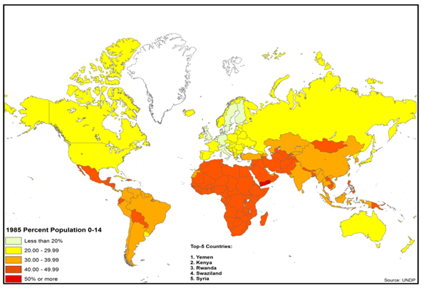
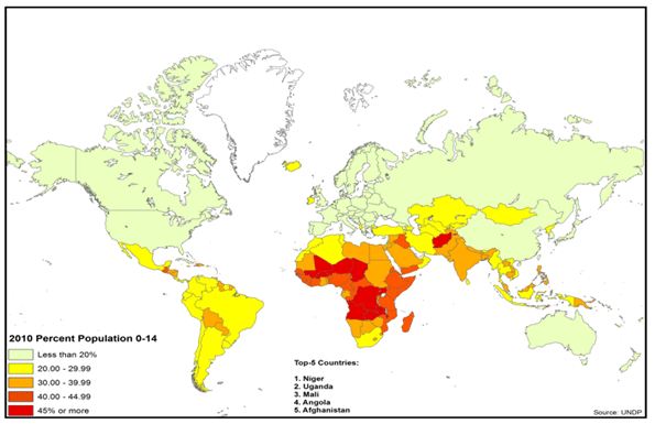
    It is of little surprise that countries with a high Youth Dependency Ratios (children under 15 per 100 persons of working age, or 15 to 64) are less stable, and turn up as hotspots on the world map (Figures 1 & 2). Liberia for instance has a 5.1 percent annual natural population increase rate, 81 children per 100 of working age, and a fertility rate of 4.7. In contrast, prosperous Denmark has a 0.3 percent annual natural population increase rate, 28 children per 100 of working age and a fertility rate of 1.9 (UNDP, 2010).

    Figure 1: Global Youth Dependency Ratio (1985)


    Figure 2: Global Youth Dependency Ratio (2010)

    As population increases outpace economic opportunities and growth, nations at risk fail to accommodate new entrants into the workforce. In addition, caring for children requires a high proportion of resources, thus depressing the rate of economic growth. (Bloom et.al., 2001).

    A low median age is thus a harbinger of impending stresses, where in extreme cases at least 50% of the population is below 20 years of age (UNDP, 2010). In comparison, the median age of the developed world averages 30 – 40 years. This forms the foundational basis of several youth bulge studies of late, explaining demographic factors behind the Arab Spring (Anderson, 2011), that was in part driven by massive increase in youth (Hvistendahl, 2011; Fuller, 2003) and the youth workforce (Kuhn and Korbel, 2011; Schwartz, 2011), much of whom are unemployed and underemployed (Bajora, 2011).

    THE FERTILITY IMPLOSION

    Yet there is a distinct disadvantage as well to ever lower birthrates. Globally population growth rates are likely to continue dropping – to less than 0.8 percent worldwide by 2025 – largely due to an unanticipated drop in birthrates in developing countries such as Mexico and Iran. These declines are in part the result of increased urbanization, the education of women, and higher property prices. Already the global fertility rate, including the developing countries, has dropped in half to an estimated 2.5 today (Longman, 2010a). Close to half the world’s population lives, notes demographer Nicholas Eberstadt, in countries with below replacement rate birth-rates. The world, he suggests, is experiencing a “fertility implosion” (Eberstadt, 2010).

    Like a population explosion, a demographic implosion has consequences. Countries that have previously engineered reductions in the fertility rates – Singapore (Yap, 2003), Hong Kong (FPAHK, 2011), Vietnam (Bennett-Jones, 2000), India (WHO, 2011) and Indonesia (Hull, 2007) – have done so to achieve more manageable economic conditions. Similar initiatives are being debated, even in the in the Philippines (Pernia et. al., 2011), where religious interpretations are being contested. China’s “one child policy” represented just a more authoritarian expression of a widespread global process. Yet this process often includes many unintended and potentially damaging consequences. However, elsewhere, virtually the same results were replicated without government policy direction, such as in Brazil (Gomey, 2011).

    Chinese “fertility implosion” is already having profound impact on marriage in China. Today researchers characterize declining fertility in China into “waves of singletons” (单身潮). While the first three, distinct “waves” or phases since 1950 are well established (王霞, 2006),it has recently been noted that the fourth (第四次单身潮) is currently in progress(陈亚亚, 2011). In the fourth and current wave, women increasingly view child-bearing and marriage as a form of entrapment and a burden that can interfere with aspirations of affluence (杨燕明  2011; 黄蓉芳 and 杨励潮, 2011).

    Not surprisingly this is most evident in the advanced urbanized parts of China, such as Shanghai, where there are already three million people over 60, or 2l percent of the population, roughly equal to the share in many advanced countries (McCartney, 2009).

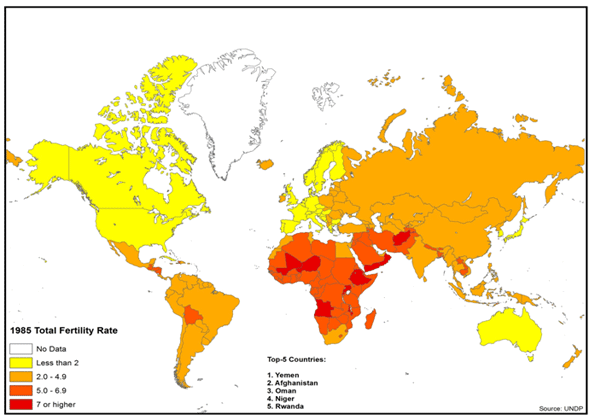
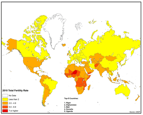
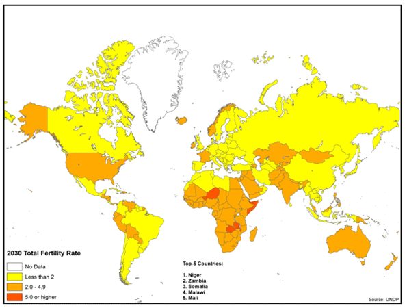
    China now has a fertility rate of 1.6, below that of Western Europe. Nor is China alone. Other middle income nations and even low income nations are experiencing significant declines in fertility rates. Brazil and Iran already have fertility rates less than that of the United States. In Bangladesh and Indonesia, fertility rates are projected to drop below replacement rates (2.1) by 2030. Around the world, increasing affluence has been associated with fewer children, as is indicated in Figures 1 – 3. The longer run implications of these less than replacement fertility rates (2.1) is smaller and much older populations (Figures 3, 4 &5).

    Figure 3: Global Total Fertility Rate (1985)

    Figure 4: Global Total Fertility Rate (2010)

    Figure 5: Global Total Fertility Rate (2030)


    GRAYING OF THE WORLD

    Here’s the big issue down the historical road: Thirty years from now, how will Xiao Ming handle six elderly parents and grandparents, all by himself? Xiao Ming’s impending dilemma is not unique to China.

    Overall what author Phil Longman calls a “gray tsunami” will be sweeping the planet, with more than half of all of population growth coming from people over 60 while only six percent will be from people under 30. The battle of the future – including in the developing world – will be, in large part, how to maintain large enough workforces required for the economic growth needed to, among other things, take care of and feed the elderly (Longman, 2011b). The National Bureau of Research (NBER) further notes that similar to child dependents, a large elderly population similarly requires a large proportion of resources, which likewise can inhibit economic growth (Bloom et. al., 2001).

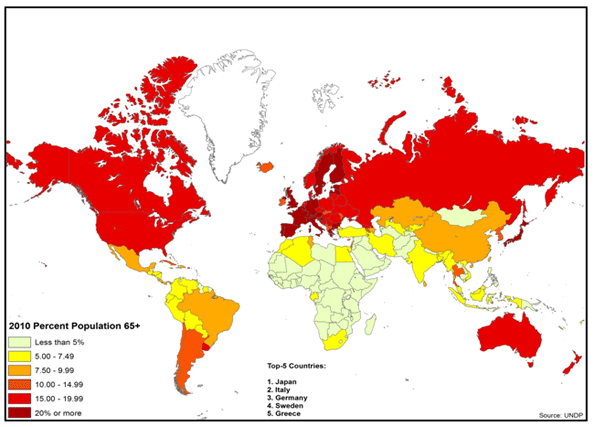
    Right now the situation seems dire. Fertility rates are projected to continue their decline. Increasing life expectancy is contributing to a substantial increase in the elderly population. In many nations, the size of the elderly population will exceed that of the under 15 population for the first time.

    This could not have happened at a worse time, because the elderly have become ever more dependent on the state in many nations. Supporting a larger elderly population requires a larger work force, however it will be smaller.

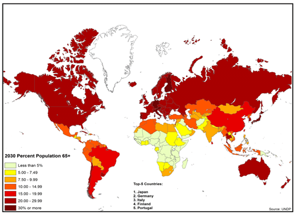
    All of this leads to a demographic future that promises to challenge the nations of the world as never before. This is illustrated by rising Old Age Dependency Ratios in Figures 6, 7 & 8.

    Figure 6: Global Old Age Dependency Ratios (1985)

    Figure 7: Global Old Age Dependency Ratios (2010)


    Figure 8: Global Old Age Dependency Ratios (2030)

    High income countries are projected to experience elderly population increases on the order of 60 percent in relation to the working age population (15 – 64) by 2030. In the United States, there are now 20 people 65 or over for every 100 of working age; little changed since 1985, when it was 18. However, by 2030 there will be 33 seniors per 100 working people. More extreme will be the fates of the world’s third and fourth largest economies. Germany’s ratio of elderly to working age individuals is already 33, compared to 21 in 1985. In 2030 this ratio will rise to an almost unimaginable 48, meaning that there will be only two working people per retiree. Japan’s situation is even worse. As recently as 1985, Japan had a relatively healthy 15 retirees for every working age person. Today this ratio is one the world’s most extreme: with 35 seniors per 100 working age people. In 2030, this ratio is expected to rise to 53.

    Things will be a bit better, at least in the next two decades, in middle income countries such as China and Brazil. But the rate of aging will be even greater than in the high income nations. Both China and Brazil will experience a doubling of their Old Age Dependency Ratios; both will rise slightly above current US levels by 2030. China is projected to rise from 11 to 23, while Brazil’s will increase from 10 to 20. Despite its theological regime, which might be seen as working against smaller families, middle-income Iran is also aging rapidly. It should see a doubling of its Old Age Dependency Ratio, but from a low 7 to a manageable 14. 

    There will be a mix of results in the lower income countries, as illustrated by the Philippines and Nigeria. In the Philippines, the fertility rate is expected to remain high by current global standards, at 2.6 in 2030, only a modest drop from the present 2.9. However, the elderly will increase 60 percent relative to the working age population (from an Old Age Dependency Ratio of 6 to 10 in 2030). Similarly, in Nigeria the fertility rate is expected to decline only slightly, from 4.8 to 4.5. Alone among the group of nations reviewed, Nigeria is expected to experience only a negligible increase in the Old Age Dependency Ratio, remaining at 6. In 1985, these nations had Old Age Dependency Ratios of between 5 to 7 (UNDP, 2010).

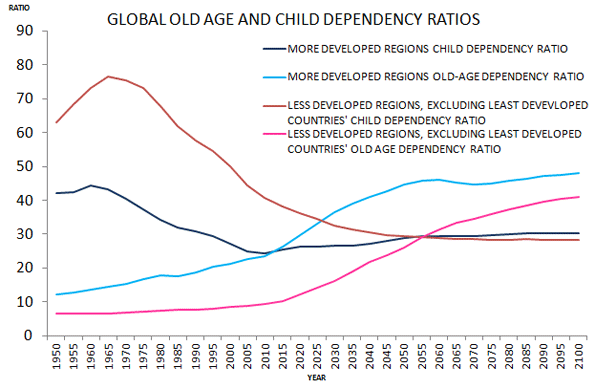
    Even if we were to discount population projections going forward (Shahani, 2011), the world is on the verge of a global demographic precipice (Figure 9) – one in which the the increase in proportion of elderly far outweighs that of the increase in proportion of children. A world which Andrew Blechman terms, “a world without children” (Blechman, 2009), and that Ted Fishman describes as one which “pits young against old, child against parent, worker against boss, company against rival, and nation against nation” (Fishman, 2009).

    Figure 9: UNDP global old age and child dependency ratios. In the developed world, child dependency will equal old-age dependency within the next 5 years. In the developing world this will happen in the next 40 years.

    FINANCING THE UNFINANCABLE?

    Where there is Virtually Universal State Support.The options available for addressing increasing old age dependency are not very attractive. Older people require considerably more in terms of overall support, particularly for health care, than younger generations (Feinberg et. al., 2011). This is a crisis particularly in demographically declining countries with well-developed social welfare nets. A recent Bank of International Settlements study found that, due to these pressures, Germany’s ratio of public debt to gross domestic product could exceed 200 percent in 2030, with annual debt service approach 10% of GDP. This would be a fiscal burden twice that of Greece today (Eberstadt and Hans, 2010).

    Where there is Less State Support: In many nations, state retirement systems often fail to cover a large share of the elderly population. While arrangements vary widely, many elderly must find their own ways to survive, such as by working longer or by relying on families. As emerging nations consider establishing or expanding social safety nets for the elderly, they need to consider the experience of the high-income world welfare states.

    Family Support: Given the stresses on public systems, it might be hoped that the elderly could be supported by their children. But this solution has been losing hold throughout the developed world. The mathematics cannot work in any of the challenged nations, at whatever income level: As the elderly population increases relative to the working population, an adult Xiao Ming is unlikely to be able, or willing, to support six parents or grandparents or even two or three.

    Reduce Benefits? The accounting answer may be simple – limit elderly benefits to what society can afford. But the politics do not work. Concentrated, organized interests, such as the elderly who receive state benefits, are likely to block any such reforms. The difficulty of dealing with today’s challenges, which are modest compared to the future, is illustrated by recent developments in Western Europe and the United States, where recipients of state aid have fought, often successfully, to retain their benefits even in the face of significant funding challenges.

    Increase the Birth Rate? A substantial increase in the birth rate in low fertility nations could help, but it would need to happen immediately. This would require broad acceptance of earlier and more frequent child-bearing women, many of whom are increasingly finding a life of affluence to be preferable to one of child-raising. Some projections show increases in the fertility rate in future years, however it could be too little-too late (UNDP HDI, 2010).

    More Migration? Increased migration from poorer countries could help richer countries finance the needs of their elderly. However, migration rates are dropping even in the United States, which is by far the world’s largest country for immigration. Although the US foreign born population grew by 10 million over the past decade, both illegal and legal immigration have been dropping. In 2008 there were over one million naturalizations; last year there were barely 600,000, a remarkable 40% drop (Ohlemacher, 2006).

    Working Longer: As life expectancy has increased in recent decades, retirement ages have changed little. For example, in the United States, since the establishment of the state retirement system, life expectancy at birth has increased 16 years, while the retirement age has increased only two years.   Generally, every additional year in life expectancy is an additional year of state support. One possible solution would be to extend retirement ages beyond the 65 years common in the high income world. Yet while life expectancy has increased, perhaps in 2030, the standard Old Age Development Ratio should be calculated using the population that is more than 75 years old instead of 65.

    More Women in the Work Force: Another factor that could assist in meeting the daunting financial challenge of supporting the elderly would be for an increase in female participation in the workplace. The extent to which such an expansion is theoretically possible varies significantly by nation, but this could be part of the solution. There is an important caveat, however. Increasing the supply of workers does not automatically create wealth. Western Europe has had intractable unemployment rates for decades and has been joined in recent years by the United States. More workers, of either sex, will require strong enough economic growth to generate sufficiently high paid employment.

    Affordable Housing:One reason for lower birthrates may be the cost of housing. Many of the countries, and regions, with the most expensive housing also tend to experience the lowest fertility – Taiwan, Singapore, Hong Kong, and much of Western Europe. Across China, for example, it is generally agreed that apartment sales prices are exceedingly high relative to incomes (Pierson, 2011). In a number of places with considerable land for new development, like the United Kingdom, Australia and some metropolitan areas of the United States and Canada, researchers have connected substantially increasing prices and housing shortages with overly-restrictive land use regulation. Any strategy that would encourage greater fertility might need to address this issue. Further, the artificially higher house prices consume discretionary income that could be better put to encouraging economic growth by increasing the demand for other goods and services.

    Economic Growth: Economic growth represents the best hope. Chinese-level GDP increases would better position to countries for demographic challenges than the Japanese or European rates of the last two decades. Clearly, economic expansion would ameliorate the pre-occupation with splitting the economic pie. It will also be important to pursue policies that minimize costs for households. If, for example, the cost of housing or food is less, more money will be available for necessary social programs (and there will be less resistance to funding them). In a sense, the difference between laggard and strong economic growth can make a huge difference. For example, economist Bret Swanson has shown that the United States could conquer its well-publicized debt burden with economic growth rates of 4 percent (Swanson, 2011).

    This Issue Must be Addressed: No one can accurately predict the future, but it is necessary to focus on the issue of aging and declining fertility. In advanced countries, if the elderly retain their state benefits and economic growth continues to be modest or even stagnant, the pressure on economies will be severe. There will be, to put it simply, less money to go around. Those who primarily fund the state – the working population – will have to pay more and could see material reductions to their standards of living. Central Bankers could yield to the temptation to print enough money to seemingly hyper-inflate away the problem, but that could lead to a lower standard of living for all.

    Overall our research suggests several possible solutions, including extending work and careers into the 70s; means tested benefits; greater incentives for having children; and measures to keep housing more affordable and family friendly wherever possible. But the ultimate issue will be maintaining economic growth.   

    The future of Xiao Ming and billions more will depend upon the result.

    Emma Chen is a Senior Strategist at the Centre for Strategic Futures, Singapore. The views expressed within this article are solely her own. Publication does not constitute an endorsement by the Centre for Strategic Futures, Singapore.

    Wendell Cox is a consultant specializing in demographics and urban issues, principal of Demographia and a visiting professor at the Conservatoire National des Arts et Metiers in Paris.

    This project was supported by the Legatum Institute. Maps designed by Ali Modarres, chairman, Geography Department, California State University, Los Angeles.


    REFERENCES

    王霞. 2006. “第三次单身潮解析 (Analysis of Youth Single Phenomenon in the Third Bachelor Trend).”中国青年研究(China Youth Study) 2006(12).

    杨燕明. 2011. “大家谈中国:第四次单身潮反映家庭婚姻危机 (Everybody Discusses China: Fourth Wave of Singles Reflects Family and Marriage Crises).” BBC News. Accessed September 19, 2011.
    http://www.bbc.co.uk/zhongwen/simp/comments_on_china/2011/07/110720_coc_marriage_byyangminyan.shtml.

    陈亚亚. 2011. “都市单身女性的生存状态考察 (Observations on the living status of urban single females).” 华人社会和谐家庭论坛暨第九届全国家庭问题学术研讨会(The Ninth National Conference on Family Issues, The Forum for Chinese Societal Harmony and Family), hosted in Guang Dong, 2011.

    黄蓉芳 and 杨励潮. 2011. “中国将迎第四次单身潮 近4%的女性因性取向单身 (China Will Meet its Fourth Wave of Singles – Nearly Four Percent of Females are Single Due to Sexual Orientation).” Xinhua, July 19.

    Anderson, Lisa. 2011. “Demystifying the Arab Spring.” Foreign Affairs May/June 2011 2-7.

    Bajoria, Jayshree. 2011. “Demographics of Arab Protests.” Council on Foreign Relations. Accessed September 19, 2011. http://www.cfr.org/egypt/demographics-arab-protests/p24096.

    Bennett-Jones, Owen. 2000. “Vietnam’s Two-Child Policy.” BBC News. Accessed September 19, 2011. http://news.bbc.co.uk/2/hi/asia-pacific/1011799.stm.

    Blechman, Andrew D. 2009. Leisureville: Adventures in a World Without Children. New York: Grove Press.

    Bloom, David E., David Canning, and Jaypee Sevilla. 2001. “Economic Growth and the Demographic Transition.” NBER Working Paper Series. Accessed September 19, 2011. http://www.nber.org/papers/w8685.pdf.

    Eberstadt, Nicholas, and Hans Groth. 2010, “Time for Demographic Stress Test.” Wall Street Journal, November 27.

    Eberstadt, Nicholas. 2010. “The Demographic Future.” Foreign Affairs 89:54-64.

    Feinberg, Lynn, Susan C. Reinhard, Ari Houser, and Rita Choula. 2011. “Valuing the Invaluable: 2011 Update – The Growing Contributions and Costs of Family Caregiving.” AARP Public Policy Institute. Accessed September 9, 2011. http://assets.aarp.org/rgcenter/ppi/ltc/i51-caregiving.pdf.

    Fishman, Ted. 2010. Shock of Gray. New York: Scribner

    Friedman, Benjamin. 2005. The Moral Consequences of Economic Growth. New York: Alfred A. Knopf.

    Fuller, Graham E. 2003. “The Youth Factor: The New Demographics of the Middle East and the Implications for U.S. Policy”. Brookings Institute. Accessed September 19, 2011.
    http://www.brookings.edu/~/media/Files/rc/papers/2003/06middleeast_fuller/fuller20030601.pdf.

    Gorney, Cynthia. 2011. “Brazil’s Girl Power.” National Geographic, September.

    Hvistendahl, M. 2011. “Young and Restless can be a Volatile Mix.” Science 333:552-4.

    Hull, Terence H, “Formative Years of Family Planning in Indonesia,” in The Global Family Planning Revolution: Three Decades of Population Policies, edited by Warren C. Robinson and John C. Warren (Washington: The World Bank, 2007), 246.

    Kuhn, Randall, and Josef Korbel. 2011. “On the Role of Human Capability in the Arab Spring.” Working paper, University of Colorado Boulder. Accessed September 19, 2011. http://www.colorado.edu/ibs/pubs/pop/pop2011-0011.pdf.

    Longman, Phillip. 2010. “Think Again: Global Aging.” Foreign Policy. Accessed September 19, 2011. http://www.foreignpolicy.com/articles/2010/10/11/think_again_global_aging.
    Longman, Phillip. 2011. “The World Will be More Crowded – With Old People.” Foreign Policy. Accessed September 19, 2011. http://www.foreignpolicy.com/articles/2011/08/15/the_world_will_be_more_crowded_with_old_people.

    McCartney, Jean. 2009. “China Steps Back from One Child Policy.” Times, July 24.

    Ohlemacher, Stephen. 2006. “3M a Year Leave Developing Countries.” Associated Press, August 17.

    Pernia, Ernesto M., Stella Alabastro-Quimbo, Maria Joy V. Abrenica, Ruperto P. Alonzo, Agustin L. Arcenas, Arsenio M. Balisacan, Dante B. Canlas, Joseph J. Capuno, Ramon L. Clarete, Rolando A. Danao, Emmanuel S. de
    Dios, Aleli dela Paz-Kraft, Benjamin E. Diokno, Emmanuel F. Esguerra, Raul V. Fabella, Maria Socorro Gochoco-Bautista, Teresa J. Ho, Dennis Claire S. Mapa, Felipe M. Medalla, Maria Nimfa F. Mendoza, Solita C. Monsod, Toby Melissa C. Monsod, Fidelina Natividad-Carlos, Cayetano W. Paderanga, Gerardo P. Sicat, Orville C. Solon, and Edita A. Tan. 2011. Discussion paper, University of the Philippines. Accessed September 19, 2011. http://www.econ.upd.edu.ph/dp/index.php/dp/article/viewFile/670/132.

    Pierson, David. 2011. “In China, Having Children is no Longer a Given.” Los Angeles Times, September 2.

    RAND Corporation. 2002. “Banking the ‘Demographic Dividend’.” Accessed September 19, 2011. http://www.rand.org/pubs/research_briefs/RB5065/index1.html.

    Shahani, Lila Ramos. 2011. “Whither the RH Bill”. BusinessWorld Online. Accessed 19 September, 2011. http://www.bworldonline.com/content.php?section=Opinion&title=Whither-the-RH-bill?&id=38459

    Schwartz, Stephanie. 2011. “Youth and the ‘Arab Spring’.” United States Institute of Peace. Accessed September 19, 2011. http://www.usip.org/publications/youth-and-the-arab-spring.

    Swanson, Bret. 2011. “The Growth Imperative.” Presentation to the National Chamber Foundation, Washington D.C., May 24. Accessed September 19, 2011. http://entropyeconomics.com/wp-content/uploads/2011/05/EE-NCF-Growth-Imperative-05.24.11-v1.9.pdf.

    The Family Planning Association of Hong Kong. 2011. “Family Planning Milestone.” Accessed September 19, 2011. http://www.famplan.org.hk/fpahk/en/template1.asp?style=template1.asp&content=about/history.asp.

    United Nations Development Programme. 2010. “International Human Development Indicators.” New York: UN Human Development Report Office. Accessed September 19, 2011. http://hdr.undp.org/en/statistics.

    U.S. Department of Homeland Security. 2010. “Table 20 – Petitions for Naturalization Filed, Persons Naturalized, and Petitions for Naturalization Denied: Fiscal Years 1907 to 2010.” Washington D.C.:  U.S. Department of Homeland Security. Accessed September 19, 2011. http://www.dhs.gov/files/statistics/publications/YrBk10Na.shtm.

    United Nations Development Programme. 2010. “International Human Development Indicators.” New York: UN Human Development Report Office. Accessed September 19, 2011. http://hdr.undp.org/en/statistics.

    United Nations Development Programme. 2010. “International Human Development Indicators.” New York: UN Human Development Report Office. Accessed September 19, 2011. http://hdr.undp.org/en/statistics.

    United Nations Development Programme. 2010. “International Human Development Indicators.” New York: UN Human Development Report Office. Accessed September 19, 2011. http://hdr.undp.org/en/statistics.

    World Health Organization Regional Office for South-East Asia. “India and Family Planning: An Overview.” Accessed September 19, 2011. http://www.searo.who.int/LinkFiles/Family_Planning_Fact_Sheets_india.pdf

    Yap, Mui Teng. 2003. “Fertility and Population Policy: The Singapore Experience.” Journal of Population and Social Security (Population) 1:643-58.
    1: Based on personal history of a co-author

  • Australia’s Carbon Tax Battle: Where it Fits into the Global War

    Next week Australia’s Parliament is set to pass a carbon tax that has proven so divisive it may bring down the Labor-Green government. By setting a low price on carbon, returning the money raised to industry and consumers, and relying so heavily on offsets, the legislation is further proof of the iron law of climate policy. A better way forward would be for Australia to impose a modest fee on coal mining and use the money to support its advanced manufacturing industries and innovation to make clean energy cheap. Below is our take on the legislation in Australia’s news magazine, Crikey.

    As two Americans watching from the sidelines as Australia tears itself apart over a carbon tax, it is impossible not to be reminded of our own country’s self-destructive battle over cap and trade in 2009 and 2010. And little wonder why: the Left and Right parties in Australia have adopted virtually wholesale the positions taken by Left and Right parties in America.

    The Labor Party has borrowed from American Democrats the strategy of giving out money to win over consumers, powerful industries, and unions. The Liberal Party has borrowed from American Republicans the strategy of attacking climate scientists and mobilising a populist backlash.

    Of course, the great difference is that while Democrats did not get their cap and trade law, it now seems that the Australian Labor-Green coalition will get its carbon tax. But Australia’s populist backlash against the legislation will, at minimum, slow its implementation and, at most, result in a change of government and its ultimate repeal.

    Not that its rapid implementation would have any effect on emissions. The carbon tax will be far too small to make clean energy cost-competitive with coal. And the government has announced it will give back to consumers more than it collects through redistributive tax policies. As in Europe, Australia can meet its emissions targets only by purchasing dubious carbon offsets.

    While the Liberal Party has, like the Republican Party, behaved badly and rejected good science in reaction to bad policy, the real blame for the inevitable policy failure lies with the green movement. In Europe, the US and Australia, environmental NGOs and the center-left generally has grossly oversold the impact of pricing carbon, the readiness of renewable energy, and the political sustainability of their schemes.

    Though some greens try to fudge the numbers, no climate or energy analyst today can credibly claim that renewables are cheap enough to compete broadly with fossil fuels. Solar is three to five times more expensive than coal, and that’s not counting the high cost of storage and transmission. No nation — not Australia, not Germany, not China — will raise carbon prices significantly enough to make solar and wind competitive with coal, much less natural gas.

    For this reason, every framework to mandate emissions reductions — whether Europe’s Emissions Trading Scheme (ETS), cap and trade, or Labor’s carbon tax — contains numerous loopholes designed to rebate or otherwise blunt higher energy costs to industry and consumers, greatly lowering the effective carbon price.

    The right-wing everywhere blusters that efforts to price carbon will destroy the economy. This is nonsense. Everywhere the carbon prices have been too low to have any discernible impact. Australia’s carbon price would cost households less than $5 per week more in groceries. Many households will get back in assistance more than the carbon tax costs. If the plan applied to petrol, it would raise the cost per litre by a few cents. In any case, in recent years the price of most fossil fuels has already increased by much more than any proposed carbon tax, and we still see economic growth coupled with increasing use of those fuels.

    Climate analyst Roger Pielke, Jr. calls this “the iron law of climate policy.” Governments might impose a carbon tax, but never high enough to actually send the “market signals” the Labor-Green alliance has come to believe it will. That would be political suicide.

    Europe has convinced Labor and the Greens that it has reduced its emissions, but it can only make this claim because it arranged for Kyoto to count reductions beginning in 1990, not in 2000, when the treaty was implemented. This allowed Britain to count as part of its reductions its move to natural gas and Germany to count the closure of inefficient Eastern Bloc coal plants — both of which happened for reasons that had nothing to do with global warming.

    To avoid the economic pinch, the carbon tax legislation will allow half of emissions reductions to come from offsets. But it is hard, after more than three years of investigative reporting and reports by independent auditors, to conclude that carbon offsetting is little more than an elaborate scam — some companies and landowners get paid for doing what they would have done anyway, and others game the system.

    Advocates for the carbon tax defensively insist that, though Australia’s contribution to global emissions is, for all practical purposes, nil, it is important to join up with the international community.

    But the international community is more divided than ever, with China, the world’s largest emitter and energy user, insisting that only rich countries should be required to reduce its emissions, so it supports extending the Kyoto protocol, which exempts China from making any reductions. Europe mostly sides with China on extending Kyoto, but Japan and Canada side with the United States on the need for any agreement to include China.

    These differences will not be resolved in Durban, later this year. The idea that the United Nations will oversee shared economic sacrifice through higher energy prices — the idea that captivated greens in the developed world over the last decade — is dead.

    While the carbon tax allows the Labor-Green coalition to show Australia’s cosmopolitan face to the world, the loopholes and carve-outs reveal the reality of Australia’s mining economy. Australia exports more emissions every year in the form of coal sent to Japan, China and elsewhere than it generates domestically. Given the importance of coal to the Australian economy, it’s little wonder that Labor will allow coal exports to double over the next 10 years.

    But Labor need not worry that Europe will make note of its hypocrisy. The German environment minister famously boasted that the great thing about carbon offsets is that they allowed Germany to keep building coal plants. Over the last decade Germany has brought 11 gigawatts of coal-fired generation online, about six times the electricity it gets from its much-vaunted solar panels. Today, having shut down its nuclear plants in a reaction to Fukushima, Germany’s dependence on fossil fuels will only deepen.

    There is a better way. Instead of trying to make fossil energy more expensive, Australia should work to make clean energy cheap. This can be done through a concerted R&D and innovation push funded by the government. A much smaller fee levied on coal production could generate $10 to $20 billion a year for Australia to spend on research labs, prizes, and procurement contracts with private firms, all aimed at getting the technological breakthroughs needed for renewables to be in a position where they can compete with fossil fuels. Such a strategy might also help Australia reduce its dependence on mining and start to engage in more advanced technology manufacturing and innovation.

    The climate war between greens and skeptics will rage on, but there is no reason a reasonable bloc of centrist thinkers inside and outside of the Labor and Liberal parties cannot put forward a new, more pragmatic approach. Perhaps Australia can be the first to move the international focus away from unrealistic dreams and economic sacrifice and toward technological innovation and economic opportunity.

    Shellenberger and Nordhaus are co-founders of the Breakthrough Institute, a leading environmental think tank in the United States. They are authors of Break Through: From the Death of Environmentalism to the Politics of Possibility, and will be appearing at the Adelaide Festival of Ideas, which runs Oct 7 – 9. Check out the full festival program here, most sessions are free.

    Photo by Jarrod Carruthers

  • Florida Repeals Smart Growth Law

    The state of Florida has repealed its 30-year old growth management law (also called "smart growth," "compact development" and "livability"). Under the law, local jurisdictions were required to adopt comprehensive land use plans stipulating where development could and could not occur. These plans were subject to approval by the state Department of Community Affairs, an agency now abolished by the legislation. The state approval process had been similar to that of Oregon. Governor Rick Scott had urged repeal as a part of his program to create 700,000 new jobs in seven years in Florida. Economic research in the Netherlands, the United Kingdom and the United States has associated slower economic growth with growth management programs.

    Local governments will still be permitted to implement growth management programs, but largely without state mandates. Some local jurisdictions will continue their growth management programs, while others will welcome development.

    The Need for A Competitive Land Supply: Growth management has been cited extensively in economic research because of its association with higher housing costs. The basic problem is that, by delineating and limiting the land that can the used for development, planners create guides to investment, which shows developers where they must buy and tells the now more scarce sellers that the buyers have little choice but to negotiate with them. This can violate the "principle of competitive land supply," cited by Brookings Institution economist Anthony Downs. Downs said:

    If a locality limits to certain sites the land that can be developed within a given period, it confers a preferred market position on those sites. … If the limitation is stringent enough, it may also confirm a monopolistic powers on the owners of those sites, permitting them to raising land prices substantially.

    This necessity of retaining a competitive land supply is conceded by proponents of growth management. The Brookings Institution published research by leading advocates of growth management, Arthur C Nelson, Rolf Pendall, Casey J. Dawkins and Gerrit J. Knapp that makes the connection, despite often incorrect citations by advocates to the contrary.   In particular they cite higher house prices in California as having resulted from growth management restrictions that were too strong.

    even well-intentioned growth management programs … can accommodate too little growth and result in higher housing prices. This is arguably what happened in parts of California where growth boundaries were drawn so tightly without accommodating other housing needs

    Nelson, et al. also concluded that “… the housing price effects of growth management policies depend heavily on how they are designed and implemented. If the policies tend to restrict land supplies, then housing price increases are expected” (emphasis in original). 

    In other words, if growth management policies do not maintain a competitive land supply, house prices are likely to rise in response. This is basic economics. Restricting the supply of any good or service in demand is likely to lead to higher prices, all things being equal.

    The loss of a competitive land supply was seen during the real estate bubble in the unprecedented escalation of house prices in California (which was already high), Oregon, Washington, Phoenix, Las Vegas, parts of the Northeast and Florida. In these markets, the demand from more liberal lending standards was much greater than the land available for development under growth management plans and government land auctions.  By contrast, house prices generally stayed within historic norms in metropolitan areas where land supplies were not constrained by growth management programs, such as Dallas-Fort Worth, Houston, Atlanta, Austin, Indianapolis, Kansas City and elsewhere.

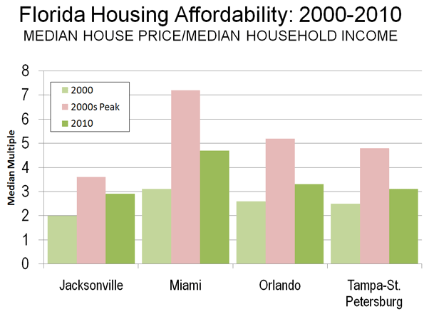
    Housing Price Escalation in Florida: In 2000, the four Florida metropolitan areas with more than 1,000,000 population had Median Multiples (median house price divided by median household income) near or below the historic norm of 3.0. By late in the next decade, all four metropolitan areas reached unprecedented levels of unaffordability. In Miami, the Median Multiple reached 7.2. In Orlando, the Median Multiple peaked at 5.2, 70 percent above the historic norm. In Tampa-St. Petersburg, the Median Multiple peaked at 4.8, 60 percent above the historic norm. The peak in Jacksonville was a more modest 3.6, though this was still an 80 percent increase.

    By 2010, the Median Multiple has declined to hear the historic norm in Orlando and Tampa-St. Petersburg and slightly below in Jacksonville. The Median Multiple remained well above the historic norm in Miami, at 4.7.

    When Supply Lags Behind Demand: Florida’s housing cost escalation may have been surprising, since Florida has a reputation for liberal land-use regulation. However, the growth management act had long since turned the state toward a shortage of land supply relative to demand as described by Wachovia Bank in a 2005 analysis.

    "While all the stars seem to be perfectly aligned on the demand side, the supply of housing in Florida has been much more problematic. Even though residential construction has soared to new highs recently, the supply of housing has lagged woefully behind demand in recent years. This has been particularly true for single-family homes, where population growth, a rising homeownership rate, and strong demand for second homes and vacation properties created a demand for 560,000 new single-family homes between mid 2000 and mid 2004. During this period builders only delivered 540,000 units. When you add in the growing demand for townhouses and condominiums, buyers were looking to purchase 675,000 new homes during this period, while builders were supplied just 570,000 units. No wonder prices have been surging!

    The chief impediment to new construction has been a shortage of developable land. The shortage primarily results from a growing resistance to new development. The state is not running out of space. Nearly every community in Florida and the state itself are looking at some type of limitations on new residential development. While well intentioned, these initiatives are making it more time consuming and expensive to build homes in Florida. Others are taking land off the market, designating areas for green space, or preserving space for industrial development. The net result has been dramatically higher land prices across much of the state."

    The point of the Wachovia analysis is that unless there is a sufficient supply of land, the price of housing is likely to rise. Having a lot of land is not enough. There must be enough land to accommodate demand at affordable land and housing prices (Note).

    The Florida action is the most successful reversal of house price increasing growth management regulations to date.

    Other Advances: There have, however, then more modest advances.

    After taking office in 2003, Minnesota Governor Tim Pawlenty replaced the board of directors of the Metropolitan Council in Minneapolis-Saint Paul. The previous board had been spent on the following Portland style growth management policies, including the enforcement of a variant of the urban growth boundary. The new board exhibited more liberal attitudes toward residential development, and the housing bubble did not produce the extent of housing affordability in the Twin Cities that occurred in growth management areas such as Portland, California and Florida.

    The Conservative- Liberal coalition government of the United Kingdom has proposed modest relaxation of some of the world’s most restrictive land use regulations, which could lead to an improvement of housing affordability in the nation. Kate Barker, who was then a member of the Monetary Policy Committee of the Bank of England was commissioned to examine land-use regulation and housing affordability in England and found a strong association between the loss of housing affordability and restrictive land use policies. This association between Britain’s strong land use regulation and higher house prices was noted in the early 1970s research led by Sir Peter Hall of the University College, London.

    For the Future: The relaxation of overly restrictive growth management policies could not have come at a better time. With the squeeze on the middle-class getting tighter, fewer households can afford higher   housing costs associated with growth management areas. Moreover, responsive to the political consensus for job creation, more home construction will bring return more good-paying construction jobs in Florida.

    Wendell Cox is a Visiting Professor, Conservatoire National des Arts et Metiers, Paris and the author of “War on the Dream: How Anti-Sprawl Policy Threatens the Quality of Life

    —–

    Note: There has been a similar misunderstanding of the housing markets in Las Vegas and Phoenix, where developable land appears to stretch virtually to the horizon. However, what is usually missed is that both metropolitan areas are hemmed in by government land, some of which is periodically auctioned. During the housing bubble, the price per acre of residential land at auction in both metropolitan areas rose as much as the price for land rose over a similar period in Beijing, with its huge land price increases.

    Photo: Orlando (by author)

  • Housing Bottom? Not Yet.

    Weakness in housing activity and in housing prices continues to be a major drag on the overall economy. My colleagues at California Lutheran University’s Center for Economic Research and Forecasting have long maintained that the home ownership rate (HOR) needs to fall back to its historical norm of 64% before housing can recover. Their view has been that the attempt to increase the HOR by loosening credit standards contributed to creating financial instability. In a classic case of unintended consequences, the attempt to improve the home ownership rate contributed to rising home prices which ended up lowering affordability for first-time buyers.

    A rising home ownership rate has been a major goal of public policy for several decades under both Republican and Democratic administrations. The rationale was multi-part. First, it was believed that communities are stronger where home ownership is greater. Second, building equity in a home was viewed as the primary path to improving a family’s financial condition. Finally, lower home ownership among minorities was felt to be an indicator of bias.

    Policies directed towards increasing the rate of home ownership included subsidizing first time home buyers, reducing required down payments, and streamlining the application process. Weaker underwriting standards increased the effective demand for housing and helped propel a boom in housing activity and home price appreciation between 1995 and 2006. The overall HOR rose from 65% in 1990 to 69% in 2006 which was applauded on both sides of the political aisle.

    However, rising home prices eventually reduced affordability and, along with excess supplies of housing due to overbuilding, led to a peak and then a decline in housing prices. The price decline eventually set in motion forces that generated severe losses to mortgage investors and homeowners alike. The underwriting pendulum shifted from easy to tight, and effective demand for houses plummeted. Millions of people have lost their homes, and many more have zero or negative equity in their homes. The homeownership rate has now declined from 69% to 66%, and appears to be headed lower.

    Another fundamental indicator of housing weakness is the large number of delinquent mortgages and the implied backlog of future foreclosures. Of course, as the foreclosure backlog is worked through, the result will be a decline in the home ownership rate, as newly foreclosed-upon home owners become renters. Thus, this issue is not separate from the HOR issue.

    The large number of vacant homes is also a measure of housing market health. During the period of 2002 through 2005 the housing industry massively overbuilt. The degree of overbuilding can seen by comparing the rate of household formation (about 1.1 million new households per year during this period) with total housing starts, which is the number of new units (including rentals) completed each year.

    This number exceeded two million units per year during the boom. Since the end of the housing boom, total starts have fallen dramatically to around 600,000 per year. If the rate of household formation had remained at 1.1 million per year, then the surplus developed during the boom would have been eliminated by now. However, an important yet obscure statistic maintained by the Census Department, the Vacant Homes For Sale (VHFS), remains at more than one million above its long-term average. What is going on?

    I suspect that the rate of household formation dramatically declined following the crisis and subsequent recession because more young adults returned to their family homes, and because multiple families are occupying the same housing unit.

    The problem of too much housing stock and too few households will not be resolved purely by a lower home ownership rate. It will be resolved by rising household formation , even if the new households are renters instead of owners. What we need is more people. One strategy to accelerate the process is to streamline legal immigration and to lift or eliminate quotas on the number of people who can legally come to this country.

    Jeff Speakes is Executive in Residence at California Lutheran University, and Lecturer in economics at the University of Southern California.

  • Brain Drain or Birth Dearth?

    Observers and advocates on Long Island — New York’s Nassau and Suffolk counties — have repeatedly used age group population estimates to bolster land use policies based on their preferred narrative. The assumption? Young adults are moving away from the region in large numbers due to the high cost of living, particularly housing prices. So, the story goes, the suburban pattern must be broken, and small, high density housing units must replace detached, single-family homes as the dominant urban form if young adults are to be retained.

    When the Long Island Housing Partnership dedicated a dozen affordable housing units in Southampton town in 2007, a spokesperson explained. “We’re losing our young from the ages of 20 to 34 at five times the national average. People can’t stay because of the high cost of living.” The region’s premiere daily, Newsday, editorialized a few years later, “Unless Long Island stops this brain drain, it won’t prosper.”

    In reality, explanations for the changes in the size of age cohorts from decade to decade amount to little more than speculation. Census estimates of the population by age group tell us next to nothing about if, when, where, or why people are moving or “disappearing.” The data is a static picture of population age groups as they exist in a given geography on a given day.

    Demographers have long believed that the primary driver of changes in age cohorts are changing patterns of birth and death rates. For example, in 1980, there were 141,917 fewer children below the age of 10 than in 1970 in Nassau-Suffolk (484,145 vs. 342,228). This correlates roughly with the decline of 150,262 in the number of 10-19 year-olds between 1980 and 1990, the decline of 110,663 in the number of people between 20 and 29 years of age in the 1990s, and the decline of 107,657 in the number of people between the ages of 30 and 39 in the 2000s (441,008 vs. 333,351).

    This makes perfect sense. Individuals born in the 1970s would be in their teens in the 1980s, in their 20s in the 1990s, and in their 30s in the 2000s. If there were 150 thousand fewer children aged 0-9 in the 1970s, one would expect there to be over 100 thousand fewer people in their 30s in the 2000s.

    It is, in other words, the case that the sharp decline of twenty-somethings in the 1990s and of thirty-somethings in the 2000s is largely the result of the “birth dearth,” a sharp decline in the birth rate that Nassau-Suffolk experienced in the 1970s, the decade after the “baby boom” from 1947 to 1964. The 1970s birth cohort is wending its way through the life cycle.

    Indeed, even as critics decry the “brain drain,” it looks like this pattern has started to partially reverse in Nassau-Suffolk. Because birth rates rose in the late 1980s and early 1990s, there has been a substantial increase in the number of people between 15 and 24 years of age in the past decade. The population aged 15-19 increased by 17.4 percent, between 2000 and 2010, while the 20-24 year-old group increased by 18 percent, for a total increase of 15-24 year-olds of 54,726 over the last ten years. If the correlation between housing costs and people in their early 20s was strong, it is unlikely that during a period when the median price of a single-family home increased by 66 percent (from $220,000 in 2000 to $366,000 in 2010), that the population in their early twenties would increase as well.

    All of this is not to discount the importance of migration patterns, or the attractiveness of a particular region to those in a particular age group. But the misinterpretation of data can lead to misplaced policy priorities. In this case, it’s generally believed that when young adults move away from a region it’s unhealthy for the area, and that policies that encourage a reversal of the trend — “hip” downtowns, sports stadiums, entertainment venues, small attached housing units — should be put in place.

    But numbers from the U.S. Census Bureau’s American Community Survey, recently crunched for the Suffolk County Comprehensive Plan, show that 74.1 percent of 15-24 year-olds who move out of Suffolk are enrolled in college. When looking at only 18-21 year-olds, the primary college-aged group, the percentage of those leaving Suffolk because they’re enrolled in college rises to 85.4 percent (see Figure 1).

    Suffolk County had a college-going rate among high school graduates of 86.5 percent in 2010. Is this high rate something that needs to be reversed? Many of these college goers return to Long Island, sometimes after stints in New York or other cities as young careerists, and help to raise the median household income of migrants coming into Suffolk county to $81,471 (2008 dollars), compared to only $67,241 for those leaving Suffolk.

    One more finding from the Suffolk Comprehensive Plan on domestic migration —movement within the United States — seems to mitigate against received wisdom. While the college-goers age group had the largest net domestic migration out of Suffolk, the second largest group was the 55-64 year-olds. (see Figure 2)

    In other words, the age groups widely believed to be the most in danger of shrinking or “disappearing” due to outmigration are, according to the best available data, the least in danger of doing so. In general, the 25-34 and 35-44 year-old age groups are the smallest net domestic migration “losers,” because it is a relatively stable time in life. If people marry, and/or care for young children, move up the ranks of a career, or invest in a home, it is typically in these years that they do so.

    As far back as 1978, Newsday screamed that “An Exodus of the Young Threatens Life-Style.” In fact, the 1970s saw a sharp increase in the number of young adults in Nassau-Suffolk; as the population aged 15-39 grew by 178,179, or 21 percent, from 846,070 in 1970 to 1,019,249 in 1980.

    Demographic data can be a useful tool for policy makers attempting to clarify complicated public issues. But when data is not properly understood, or it is misinterpreted, then public policy debate is stymied.

    Seth Forman, Ph.D, AICP, is author of American Obsession: Race and Conflict in the Age of Obama and Blacks in the Jewish Mind: A Crisis of Liberalism, among other books. His work has appeared in publications that include National Review, Frontpagemag.com, The Weekly Standard, and The American. He is currently Research Associate Professor at Stony Brook University, and the Chief Planner for the Long Island Regional Planning Council. His opinions are not associated with any of these institutions. He blogs at www.mrformansplanet.com.

    Photo by SaraPritchard, Warped Tour’10, Long Island, New York

  • Are We Headed For China’s Fat Years?

    Chan Koonchung’s chilling science fiction novel The Fat Years — already an underground sensation in China — will be published in the U.S. January 2012. The book, first published in Hong Kong in 2009, is partly so chilling because it reveals a scenario that is all too plausible. Set in 2013, it takes place after a second financial crisis  (euros, anyone?) that all but destroys the Anglo-American economies and ushers in “China’s golden age of ascendancy.”

    The nation that leads the world in The Fat Years is less bleakly dystopian than the Stalinist state portrayed in George Orwell’s 1984 or the biologically controlled society of Aldous Huxley’s Brave New World. Yet it is supremely authoritarian — harassing and even executing the rare dissident and putting drugs in the water supply to inflate a sense of well-being among the masses.

    This all-powerful Chinese state looks very familiar. It pursues a commercial strategy of plundering resource-rich regions around the world, often working with the most despicable of regimes such as Zimbabwe. And it harnesses and promotes information technology while maniacally censoring the Internet, rendering cyberspace just another outlet for propaganda.

    It is also increasingly self-confident. As one character — a highly placed party cadre in the story — suggests, this new Chinese model represents “the best option in the world as it really exists.”

    Many in the West already accept this notion. According to a recent Pew survey, nearly half of all Americans believe China will surpass America as the world’s leading power. The same poll found that roughly two-thirds of Britons — and many Europeans — believe similarly.

    The higher circles in Washington and New York generally view the Anglo-Saxon democracy as unable to compete with the more ordered, authoritarian Chinese model. Thrilled by what he sees as “China’s green leap forward,” New York Times columnist Thomas  Friedman proclaims the greater advantages of “one-party autocracy.” After all, Chinese autocrats can adopt “policies needed to move a society forward in the 21st century” without needing to check in with the voters. Even conservative pundit Francis Fukuyama, once a believer in the inevitable triumph of market liberalism, feels that “Anglo Saxon capitalism” has squandered its historic moment. “Democracy in America,” he notes, “has less than ever to teach China.”

    Former Obama Management and Budget chief Peter Orszag is the latest to endorse the down-with-democracy movement. Concerned with our inability to deal with our fiscal problems, climate change and rebuilding the economy, Orszag proposes shifting power from Congress to more “independent institutions” made up of unelected policymakers.  He argues that democracy can be “too much of a good thing.”  Comfortably ensconced at bailed-out Citigroup, Orszag has benefited from a financial system that increasingly resembles China’s, with its intimate ties between the state and banks. Crony capitalism, on both sides of the Pacific, it appears, has its rewards.

    Yet perhaps it is too early for the English-speaking democracies to throw in the towel.  Many who now espouse Chinese supremacy previously argued that Japan, and even Europe, was destined to dominate the world.  Yet Pax Niponica never got past the early 1990s; one former inevitable global hegemon has been downgraded to the sick man of Asia.

    Like Japan, China faces many great, if often overlooked, challenges. There’s a devastated environment, growing social unrest and rising competition from other countries, notably the Indian subcontinent. Labor force growth is slowing rapidly, and the country now has up to 30 million more marriage-age boys than girls, an all but certain spur to political unrest. Misallocation of resources by both central and local authorities threatens to create a major property bubble.

    Throughout modern history authoritarian and more centrally controlled countries have proved very good at playing “catch up” and impressing journalists. China’s Communist regime can order investment into everything from high-speed trains to green technology and massive dam construction. The results — like those previously seen in Nazi Germany and Soviet Russia — are often as physically and technologically impressive, although often cruel to both the environment and people stuck in the way.

    But once a country reaches a certain plateau of development, as Japan did in the 1990s, the nature of the competition changes; it becomes harder to target industries that are themselves in constant flux. Workers who have already achieved considerable affluence tend to be harder to bully or motivate.

    Take the battle for cyberspace. Japan’s ballyhooed bureaucracy sought to conquer this frontier through traditional channels. This allowed the internet to become a competition largely among relative young U.S. companies such as Apple, Amazon, Google and Facebook. The much-feared Japanese takeover of the computer and cultural industries back in the 1980s now has petered out into a historical footnote.

    And despite the recent, often spectacular gains of China , the primary English-speaking countries — the  U.S., U.K., Canada, Australia and New Zealand — still control a quarter of the world’s GDP, compared with 15% for the Sinosophere. Their combined per capita income is six times higher.

    Critically the U.S. and its closest cultural allies — New  Zealand, Australia and Canada —  also have enormous physical advantages. These four countries all stand among the eight largest food exporters in the world.  Recent discoveries on the energy front have made North America, particularly the Great Plains, a potentially dominant force in the global oil and gas industries. China lacks the water, and likely to resources, to match up.

    But the real edge lies with culture, particularly the English language, which has decimated all its traditional competitors — French, German and Russian — over the past two decades.  Difficult to learn, Chinese is not likely to replace English any time soon as the dominant language of culture, air travel, science and technology.

    This cultural dominion can be seen in the media as well. The U.S. and its English-speaking allies account for roughly half of all the world’s audio-visual exports. To an extent never seen before, Anglophones dominated how people think, dress and recreate.

    Arguably our biggest advantage lies in the very thing our upper echelons increasingly disdain — our messy multicultural democracy and our addiction to the rule of law. “The secret of U.S. success is neither Wall Street or Silicon Valley but its long-surviving rule of law and the system behind it,” Liu Yazhou, a Chinese two-star general, recently said. “The American system…is designed by genius and for the operation of the stupid.”

    The stunning lack of such constitutional guarantees is just one reason why many of China’s entrepreneurial elite seek to immigrate to the U.S., Canada or Australia.   Indeed, among the 20,000 Chinese with incomes over 100 million Yuan ($15 million), 27% have already emigrated and another 47% have said they were considering it, according to an April report by China Merchants Bank and U.S. consultants Bain & Co.

    To be sure, the U.S. and its allies need to change in order to compete.  Greater incentives for savings, investments and productive industries must supplant those that promote asset speculation and financial manipulation. But we can do this without importing Asia’s   hierarchical structures. Rather than trying to outdo the Politburo in developing crony capitalism we should seek to reinvigorate our diverse, grassroots economy.

    In any competitive race you do not win by emulating your rivals but by building on your intrinsic strengths.  The best way to avoid the scenario laid out in The Fat Years lies not in abandoning the very strengths that drove our historic ascendancy, but by tweaking and enhancing them so that they propel us in the coming decades.

    This piece originally appeared at Forbes.com.

    Joel Kotkin is executive editor of NewGeography.com and is a distinguished presidential fellow in urban futures at Chapman University, and an adjunct fellow of the Legatum Institute in London. He is author of The City: A Global History. His newest book is The Next Hundred Million: America in 2050, released in February, 2010.

    Shanghai photo by flickr user Sprengben

    .

  • For High-Speed Rail It Looks Like the End of the Line

    With its vote on September 21, the Senate Appropriations Committee ended the rail boosters’ hopes of getting a meaningful appropriation for high-speed rail in the new (FY 2012) fiscal year. It probably also dealt a decisive death blow to President Obama’s loopy goal of "giving 80 percent of Americans access to high-speed rail."

    By including only a token $100 million for high-speed rail as a "placeholder" in their FY 2012 budget recommendations (a sum that is likely to be further cut in the House-Senate negotiations on the FY 2012 appropriations), Senate appropriators have done more than merely declare a temporary slowdown in the high-speed rail program. They have effectively given a vote of "no confidence" to President Obama’s signature infrastructure initiative. Along with their House counterparts who had denied the program any new money, the Senate lawmakers have sent a bipartisan signal that Congress has no appetite for pouring more money into a venture that many lawmakers have come to view as a poster child for wasteful government spending.

    Their posture is understandable. After committing $8 billion in stimulus money and an additional $2.5 billion in regular appropriations, the Administration has little to show for in terms of concrete results or accomplishments. Aside from an ongoing project to upgrade track between Chicago and St. Louis (a $1.1 billion venture that promises to offer a mere 48 minute reduction in travel time between those two cities), no significant construction has begun on any of the authorized rail projects.

    In the meantime, the Department of Transportation has rushed to distribute the balance of the authorized HSR dollars, lest Congress decides to rescind any funds that remain unobligated. Continuing its practice of scattering money far and wide rather than focusing it on one or two worthwhile projects, the Federal Railroad Administration approved in September over $480 million worth of planning, engineering and construction grants "to improve high-speed and intercity passenger rail service" in 11 states. The beneficiaries are New York, Texas, New England (Maine, Vermont, Rhode Island, Connecticut), North Carolina, Virginia, Washington State, Oregon and Pennsylvania. The awards range from $149 million to New York State to as little as $13 million to the state of Oregon, and they average under $40 million per individual grant. It remains to be seen how quickly the recipient states will put these funds to work—and what kind of service improvements these grants will bring about.

    From an examination of the grant announcements it becomes clear that none of the grants will help to bring true "high-speed" rail service to America. At best, they will permit modest incremental improvements in speed and frequency of existing Amtrak services by helping to upgrade railway tracks of Class One railroads on which Amtrak runs its trains. The U.S. Department of Transportation (DOT) has implicitly acknowledged to have revised its program objective.  It has dropped its earlier rhetoric that high-speed rail "is just around the corner" (Secretary LaHood’s words) or that "80 percent of Americans will have access to high-speed rail" (repeated assertions by LaHood and DOT press releases).  

    Instead, the DOT (through its Federal Railroad Administration) is trying to lower the expectations by stating that "the true potential of high-speed rail will not be achieved or realized overnight." (FRA’s "vision statement") It’s a welcome sign that the Department has abandoned its quixotic goal of revolutionizing rail travel overnight. It may also signal the Administration’s realization that it cannot unilaterally force its vision upon a fiscally conservative Congress, a largely indifferent public and a skeptical, risk-averse investment community. If high-speed rail is eventually to find its place in America, it will be because market conditions will create a favorable climate for its development and acceptance – not because Washington in its wisdom has decided that the country needs it – and needs it now!    

    California’s Bullet Train beset by mounting political and financial problems

    Meanwhile, the one true U.S. high-speed rail project – California’s LA-to-San Francisco bullet train – is beset by mounting political and financial problems.  Nearly three years after the passage of the enabling Proposition 1A and less than a year before construction is scheduled to start on the first line segment in the Central Valley, construction costs have doubled the 2008 estimate. There is no evident source of where the additional funds to complete Phase One (LA-SF) system will come from since the prospect of both further federal money and private risk capital is remote. As one recent report put it, the project is being pursued "in the confident hope of a miracle."

    The systems’ first stage – a $10-14 billion 160-mile line segment in the Central Valley from Bakersfield to Merced – has run into determined opposition from local residents and farming interests during the ongoing environmental impact review. The possibility of lengthy court challenges could delay construction, thus increasing costs, eroding political support and putting federal money at risk.

    At the policy level, the project has been subject recently to several analyses. First came a critical report by California legislature’s fiscal watchdog, the non-partisan Legislative Analyst’s Office (LAO). It questioned the Rail Authority’s cost estimates and its decision to build the first segment in a sparsely populated region where travel demand is not expected to be sufficient to cover operating expenses. The LAO concluded that if the total cost of building the Phase One system were to grow as much as the revised Authority estimate for the Central Valley segment (an increase of 57%), the whole system would cost not $43 billion as originally estimated, but $67 billion. Concern about escalating costs and overly optimistic ridership forecasts were echoed by an independent Peer Review Group and numerous newspaper editorials. Even some of the state former legislative supporters, such as state Senators Joe Simitian, Alan Lowenthal and Mark DeSaulnier, have begun to express reservations and urge the Authority to rethink its direction. (See, "California’s Bullet Train – On the Road to Bankruptcy," InnoBriefs, May 31, 2011).

    A more recent challenge to the project’s financial credibility came from a team of respected independent experts, Alain Enthoven, William Grindley and William Warren, who cooperate with a citizen watchdog group, the Community Coalition on High Speed Rail. The team has concluded that without further federal aid (which almost certainly can no longer be counted upon) the project stands no chance of meeting its legislative requirements and the conditions of the enabling bond initiative (Proposition 1A). Nor is reliance on private financial participation a credible option.  In the authors’ judgment, private risk capital hasn’t to date and will not come in the future without revenue guarantees (aka public subsidy).

    The authors conclude: "With highly questionable prospects for federal grants or private ‘at risk’ construction funds, but the certainty that costs will continue to increase, the logic for continuing the largest project in California’s history is highly questionable."  (Alain Enthoven, William Grindley and William Warren, The Financial Risks of California’s Proposed High-Speed Rail Project, September 14, 2011, www.cc-hsr.org ). (Note: The report’s financial analyses and conclusions have been reviewed in detail and verified by high ranking California State officials, according to reliable sources.)

    But politically the most damaging blow to the project has come from a just released opinion survey. According to this poll, nearly two-thirds of California’s likely voters (62.4%) would stop the bullet train project from proceeding further. Virtually the same number said they are unlikely to ever travel on the train between Los Angeles and San Francisco, thus casting doubt on the Authority’s optimistic ridership forecasts. What is more, the project came in dead last (at 11%) in a list of voters’ spending priorities, according to the Irvine-based Probolsky Research polling outfit (as reported in The Sacramento Bee, September 29, 2011). With declining public support as evidenced by this poll, and with the State coming to a point where it will have to prioritize future public spending, enthusiasm for the project among politicians in Sacramento could evaporate.

    Given the possibility of the California bullet train’s demise, the attention and hopes of high-speed train advocates probably will (and should) turn to the Northeast Corridor – the nation’s most likely travel corridor where high-speed rail can eventually succeed and prosper.

    Ken Orski has worked professionally in the field of transportation for over 30 years.

    ~~~~~~~~~~~~~~~~~~~~
    Note: the NewsBriefs can also be accessed at www.infrastructureUSA.org
    A listing of all recent NewsBriefs can be found at www.innobriefs.com

  • Los Angeles Downtown Stadium Cloaked in ‘Green’ Snake Oil

    AEG’s downtown stadium in Los Angeles isn’t just a playground for really big guys or just another site for really rich guys to consume conspicuously in luxury boxes. If you believe the chorus of hype, Farmers Field also grows good jobs, solves the city’s debt crisis, transforms downtown Los Angeles into a nicer version of Manhattan, and builds strong bodies eight ways. It may even cure cancer.

    But the downtown stadium – if it’s built – isn’t going to be particularly “green” in ways that matter.

    According to a report by David Futch in the L.A. Weekly:

    AEG has promised to build a “carbon-neutral” Farmers Field football stadium that will add no extra emissions to the current load in polluted downtown Los Angeles. But there’s no way to accomplish that, according to environmental lawyers, climate researchers and traffic engineers who’ve seen it all before.

    Claiming “carbon neutrality” for a massive construction project that will have a usable life measured in decades is beyond the ability of good science (and common sense), but it sounds good in press briefings. “Most labels are nonsense, dreamed up by marketing departments,” Konstantin Vinnikov, a University of Maryland climatologist and atmospheric scientist, told Futch.

    In defense of green nonsense, the state Legislature has put on Governor Brown’s desk SB 292, a special bill that would permit the city of Los Angeles and AEG to declare Farmers Field a model of environmental sensitivity while shutting out critics of the project, whose ability to force a real review of the stadium’s environmental impact would be severely limited.

    Under SB 292, legal challenges would have to go directly to the state Court of Appeals, where bringing suit is much more expensive.

    In exchange for giving AEG a fast track to judicial review in a favorable setting, the downtown stadium would have to show zero net emissions of new greenhouse gases from automobile trips and achieve a ratio of automobile trips to attendance that is at least ten percent lower than other NFL stadiums.

    Since nearly all NFL stadiums are not in downtowns but at the suburban fringe, where tailgaters gather in massive parking lots, this last criterion is essentially meaningless.

    But AEG has another out. If cutting more automobile trips isn’t “feasible” (a very slippery term), AEG can buy carbon credits to reduce emissions somewhere else – even in another state – rather than cut the stadium’s emissions downtown.

    Certifying that AEG’s trip reduction measures have met the goal of greenhouse gas emissions (to the extent “feasible”) is the responsibility of the city – not the state agencies that currently oversee air quality. In fact, all of the mitigation measures promised by AEG are equally squishy, hedged with qualifiers that permit AEG and the city to quietly waive costly mitigations and allow others to be achieved without measurable improvements. That’s just standard operating procedure at city hall, which explains why state regulators are cut out of the process.

    Santa Monica environmental attorney Doug Carstens reminded Futch, “When developers (like AEG) start shedding mitigation like crazy, then instead of revoking approval, public agencies tend to forgive and forget.”

    SB 292 is almost certain to be signed into law. And it’s so perfect a model of environmental duplicity that other developers demanded and a got a companion bill – SB 900 – that gives every big project in California generally the same benefits. SB 900 is sure to be signed into law, too.

    Farmers Field won’t be environmentally neutral in the context of downtown’s crowded streets and neighborhoods and, say many experts, can’t possibly be “carbon neutral” overall. As one traffic engineer asked, “Do they include the carbon dioxide emitted by all of the additional motor vehicles, buses and trains serving fans going to and from the games? Do they count the carbon dioxide emitted by the power plants supplying the electricity for the billboards?”

    Actually, AEG doesn’t have to count anything, except the profits it intends to make. And the only green that will wrap Farmers Field will shine from its gigantic LED billboards.

    This piece originally appeared at KCET.org.

    D. J. Waldie is a contributing editor at the Los Angeles Times and a contributing writer for Los Angeles magazine. He is the author most recently of California Romantica with Diane Keaton. He blogs for KCET TV at http://www.kcet.org/user/profile/djwaldie.

    Photo by Pete Prodoehl

  • A Decade in College Degree Attainment

    This week the Census Bureau released its 2010 data from the American Community Survey. The ACS is what contains many of the core demographic characteristics that are frequently opined upon, such as college degree attainment, commute times, etc.

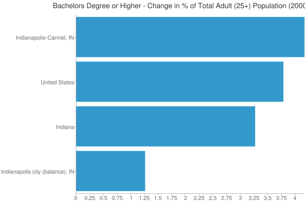
    It used to be that the Census Bureau collected this information during the decennial census using the so-called “long form” that went to one out of every ten households. But that was discontinued as of this census and has been replaced with with the ACS. The ACS reports data more frequently (annually for geographies larger than a certain size), but has a smaller sample size and so there’s lot of statistical noise that I don’t think we are used to dealing with yet. For example, in 2008 the Indianapolis metro area ranked #3 in the US for growth in college degree attainment over the course of the decade to date among metros greater than one million people. But in the 2010 data Indy ranked #28 on the same measure. There are fluctuations year to year and the margin of error needs to be accounted for in serious statistical analysis. Nevertheless, this is what we have to work with.


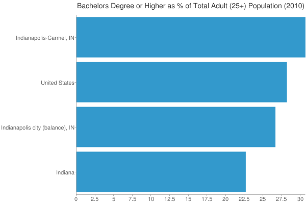
    Metro area college degree attainment, 2010

    I’m going to roll out a series of posts covering the highlights of some of this data. I’ll start with educational attainment, since that is something that is so key to upward social mobility and urban economic success.

    But first I’ll put in a brief plug for my Telestrian tool. The Census Bureau site for distributing this data is a disaster. As one Brookings senior fellow put it, “Lots of Census data yesterday, today. Lots of angles, stories, conclusions. One shared sentiment: new American Factfinder is AWFUL” and “New Factfinder making mainframe punchcards look appealing.” Telestrian is designed for very rapid basic analysis and comparative benchmarking moreso than simple fact lookups (though it can do that do). In fact, I generated every table, graph and map in this post in ten total minutes with it. Even if you aren’t in the market for a commercial product, there’s a no credit card required free trial period, so if you are interested in perusing the ACS data and don’t want to beat your head against the wall with the Census Factfinder, I encourage you to check it out. Telestrian doesn’t have every data element, but it has a lot of interesting stuff.

    College Degree Attainment

    College degree attainment (the percentage of adults with a bachelors degree or higher), is one of the most critical factors in urban success. If you’d like to know more, just check out all the great research on it under the heading of “talent dividend” over at CEOs for Cities.

    The map at the top of the post is 2010 college degree attainment for metro areas. Here are the top ten, among those with a population greater than one million, showing total number of people with degrees and the attainment percentage:


    Row Metro Area 2010
    1 Washington-Arlington-Alexandria, DC-VA-MD-WV 1,758,297 (46.8%)
    2 San Jose-Sunnyvale-Santa Clara, CA 558,519 (45.3%)
    3 San Francisco-Oakland-Fremont, CA 1,317,354 (43.4%)
    4 Boston-Cambridge-Quincy, MA-NH 1,335,276 (43.0%)
    5 Raleigh-Cary, NC 301,012 (41.0%)
    6 Austin-Round Rock-San Marcos, TX 429,163 (39.4%)
    7 Denver-Aurora-Broomfield, CO 651,661 (38.2%)
    8 Minneapolis-St. Paul-Bloomington, MN-WI 822,321 (37.9%)
    9 Seattle-Tacoma-Bellevue, WA 867,193 (37.0%)
    10 New York-Northern New Jersey-Long Island, NY-NJ-PA 4,613,445 (36.0%)

    And here’s the bottom ten:


    Row Metro Area 2010
    1 Riverside-San Bernardino-Ontario, CA 499,663 (19.5%)
    2 Las Vegas-Paradise, NV 278,387 (21.6%)
    3 Memphis, TN-MS-AR 209,987 (25.1%)
    4 San Antonio-New Braunfels, TX 344,247 (25.4%)
    5 Louisville/Jefferson County, KY-IN 224,392 (25.8%)
    6 Tampa-St. Petersburg-Clearwater, FL 513,182 (26.2%)
    7 Birmingham-Hoover, AL 198,856 (26.3%)
    8 New Orleans-Metairie-Kenner, LA 209,916 (26.8%)
    9 Jacksonville, FL 241,801 (26.9%)
    10 Phoenix-Mesa-Glendale, AZ 731,643 (27.2%)

    While we are on the topic, here is a map of college degree attainment by state:


    State college degree attainment, 2010

    And here is county level college degree attainment for those counties covered by the 1-year ACS:


    County college degree attainment, 2010

    Changes in College Degree Attainment

    Beyond just the raw 2010 numbers, it’s interesting to look at which places are growing their college degree attainment the most. That is, which places are growing their talent base. So here’s a look at metros by their change in college degree attainment over the last decade:


    Change in percentage of adults with college degrees, 2000-2010.

    Some places already have very high college degree attainment, which can make it tougher to grow even higher. Speaking of which, the US as a whole raised its college degree attainment as well. To some extent, this is purely a function of demographics. Older generations have lower educational levels than younger ones. (None of my grandparents had a college degree, and my father’s parents never even finished high school. I don’t think that was atypical for their day).

    What might be more interesting to look at is whether places are increasing their college degree attainment faster or slower than the US overall. There’s a measure that does capture that. It’s called location quotient, and is used in economic analysis to measure the concentration of industries in certain locations.

    An economist told me once that he likes to look at this for all sorts of things, not just industry clusters. The formula works for other stuff. I really haven’t seen this used before, so caveat emptor, but here’s a look at shifts in location quotient for metro areas over the course of the decade:


    Metro area change in location quotient for college degree attainment, 2000-2010. Increase in LQ in blue, decrease in red.

    The blue metro areas had a higher concentration of college degrees relative to the nation as a whole in 2010 than they did in 2000. The red ones a lower concentration. This is certainly an interesting area for further exploration.

    While I’m on the topic, here’s the same chart, only limited to graduate and professional degrees. There’s some interesting variability here.


    Metro area change in location quotient for graduate and professional degree attainment, 2000-2010. Increase in LQ in blue, decrease in red.

    A Closer Look at Indianapolis

    Just as one more granular example, I wanted to take a look at the Indianapolis vertical. Here’s 2010 college degree attainment for the city, metro, state, and America as a whole:


    College degree attainment, 2010

    As we know, urban regions tend to be more highly educated. Here we see that while Indiana is one of the lowest states in terms of college degree attainment, the Indy metro area actually beats the US average. However, the city of Indianapolis falls short of the US average. Because Indy is a consolidated city-county government that includes a lot of inner ring suburban areas, it’s hard to draw conclusions about the true urban core, but it does seem clear that the center is less educated than the periphery of the metro.

    Now lets look at the change in attainment for the decade:


    Change in the percentage of adults with a college degree, 2000-2010.

    Here we see that the rich get richer, as Indy metro not only started out on a higher base, but had the best showing in attainment growth as well. OTOH, going back to our LQ measure, Indiana actually boosted its LQ while the Indy region was stagnant. That’s because this is a percentage point change, not a percentage change, and growing from a low base makes it easier to boost LQ. It’s one of the quirks of that formula.

    The poor showing of the city of Indianapolis is something that should definitely be worrying. It would be interesting to do a similar analysis for other metros, but alas that’s all for today.

    Aaron M. Renn is an independent writer on urban affairs based in the Midwest. His writings appear at The Urbanophile, where this piece originally appeared. Telestrian was used to analyze data and to create charts for this piece.

  • States with Largest Presence of STEM-Related Jobs

    Few would argue that STEM-educated workers are vital to advancing innovative ideas and new products. But here’s another fact borne out by labor market data: The regions with the strongest presence of STEM-related employment are heavily dependent on government funding.

    Washington, D.C. has more than two times the concentration of STEM (science, technology, engineering, and math) jobs than the national average, according to EMSI’s latest employment estimates. Fairfax and Arlington counties — whose economies are interconnected to D.C.’s — have helped Virginia expand its presence of STEM-related workers, on a per-capita basis, more than any other state in the last decade.

    Meanwhile, the two counties in the U.S. with the most STEM workers per capita — Los Alamos, N.M., and Butte, Idaho — are home to major Department of Energy national laboratories.

    Defining STEM Employment

    Before we go further, though, we should discuss how we define STEM-related jobs. Just like green jobs or creative workers, there are many definitions of STEM occupations — often different from state to state. Here we used the definition developed by Praxis Strategy Group, an EMSI client and North Dakota growth strategy firm that has co-written the U.S. Chamber of Commerce’s “Enterprising States” report the last two years.

    The definition consists of eight high-level categories (see here for all 93 five-digit occupations):

    • Computer specialists (SOC 15-1)
    • Mathematical science occupations (15-2);
    • Engineers (17-2);
    • Drafters, engineering, and mapping technicians (17-3);
    • Life scientists (19-1);
    • Physical scientists (19-2);
    • Social scientists and related occupations (19-3);
    • Life, physical, and social science technicians (19-4).

    Given this  definition, here are some key facts about STEM-related employment in the US:

    • There are just over eight million estimated jobs in these fields as of 2011. Keep in mind that at this point all 2011 EMSI job figures are estimates.
    • Overall this group has grown by 3.7% since 2001; there were significant dips in the early 2000s and at the onset of the recession. 
    • Men hold nearly three of every four STEM-related jobs (73%). 
    • Nearly 20% of the STEM workforce is 55 years old and above (and 26.6% are between 45-54). This  points a fairly substantial number of potential retirements hitting these fields in the next five to 10 years.

    Praxis includes technicians jobs that typically require two-year degrees because they are often overlooked in the STEM conversation.

    States Gaining/Losing STEM Concentration

    Generally, states that have had the biggest percentage increases in employment in the last decade have also seen modest to healthy gains in their STEM workforces. North Dakota’s STEM employment has soared 31% (compared to 15% across all occupations). Alaska and Utah’s STEM jobs have each grown 18%, while both states have seen double-digit percentage increases in all jobs.

    Results for every state are detailed in the table below. We also included  the change in concentration (measured by location quotient, or LQ) for STEM-related workers from ’01 to ’11 across every state. Using our GIS tool, we were able to compare all 50 states (plus D.C.) by their LQ to see which have gained a comparative advantage.

    Outside D.C., Virginia, Washington State — where more than 70% of STEM workers are located in the Seattle area — Maryland, and North Dakota have seen the biggest increases in STEM concentration in the last decade. Other states who have performed well: Alaska, Rhode Island, Arkansas, and West Virginia.

    California, on the other hand, still has more than 13% of the nation’s overall STEM-related workforce (just over 1 million estimated jobs). But it shed 19,000 STEM jobs in the last decade (a 1.75% decline) and saw its above-average concentration slightly decline.

    Note: A location quotient of 1.00, like Arizona has in 2011, means that state has the same relative concentration of STEM workers as the national average.

    State 2001-2011 STEM Job Change % Change (STEM) 2001-2011 Overall Change % Change (Overall) 2001 STEM LQ 2011 STEM LQ
    District of Columbia (DC) 13,758 20% 78,562 11% 2.00 2.20
    Washington (WA) 36,362 16% 314,900 9% 1.42 1.53
    Virginia (VA) 47,728 17% 348,387 8% 1.35 1.49
    Maryland (MD) 27,826 14% 241,837 8% 1.38 1.48
    Massachusetts (MA) -9,569 -3% 71,653 2% 1.53 1.48
    Colorado (CO) -2,654 -1% 181,752 6% 1.45 1.36
    New Jersey (NJ) -8,979 -3% 174,439 4% 1.23 1.16
    California (CA) -18,996 -2% 471,154 2% 1.18 1.15
    Delaware (DE) -4,459 -14% 25,280 5% 1.38 1.14
    Minnesota (MN) 1,730 1% 84,854 3% 1.12 1.12
    New Hampshire (NH) -955 -2% 41,818 5% 1.18 1.11
    Michigan (MI) -52,084 -17% -369,217 -7% 1.22 1.10
    New Mexico (NM) 6,423 14% 90,068 9% 1.05 1.10
    Alaska (AK) 3,539 18% 51,864 13% 1.02 1.09
    Connecticut (CT) -2,849 -3% 71,855 3% 1.13 1.07
    Texas (TX) 86,347 14% 2,179,616 18% 1.06 1.04
    Utah (UT) 11,969 18% 248,910 18% 1.03 1.04
    Oregon (OR) 4,456 4% 125,822 6% 1.03 1.03
    Idaho (ID) -697 -2% 93,579 12% 1.14 1.02
    Arizona (AZ) 8,975 7% 350,216 13% 1.04 1.00
    Vermont (VT) 623 3% 21,017 5% 0.99 0.99
    Pennsylvania (PA) 11,961 4% 212,861 3% 0.94 0.96
    New York (NY) 974 0% 524,666 5% 0.97 0.94
    Ohio (OH) 515 0% -226,628 -3% 0.88 0.93
    Rhode Island (RI) 1,760 7% 7,036 1% 0.87 0.93
    Illinois (IL) -17,404 -5% -45,841 -1% 0.94 0.91
    Kansas (KS) -2,818 -4% 19,642 1% 0.93 0.90
    North Carolina (NC) 18,377 9% 319,803 7% 0.87 0.90
    Wisconsin (WI) 8,050 6% 65,922 2% 0.82 0.87
    Georgia (GA) 6,447 3% 332,612 7% 0.87 0.85
    Missouri (MO) 1,385 1% 19,824 1% 0.83 0.85
    Florida (FL) 26,341 8% 760,396 9% 0.80 0.81
    Montana (MT) 2,834 14% 62,699 11% 0.78 0.81
    Alabama (AL) 8,153 10% 117,917 5% 0.75 0.80
    Nebraska (NE) 3,326 8% 49,749 4% 0.74 0.78
    Indiana (IN) 1,880 2% -68,167 -2% 0.74 0.77
    Maine (ME) 178 1% 13,400 2% 0.76 0.77
    Wyoming (WY) 2,839 26% 60,177 18% 0.72 0.77
    Iowa (IA) 4,852 8% 46,353 2% 0.69 0.74
    Oklahoma (OK) 6,730 10% 138,146 7% 0.69 0.72
    South Carolina (SC) 8,944 12% 214,997 10% 0.69 0.72
    Hawaii (HI) 4,022 17% 73,132 10% 0.66 0.71
    Kentucky (KY) 6,252 9% 58,998 3% 0.63 0.68
    Arkansas (AR) 5,901 14% 65,655 4% 0.61 0.67
    North Dakota (ND) 3,683 31% 67,224 15% 0.58 0.66
    West Virginia (WV) 3,215 13% 35,869 4% 0.60 0.66
    Louisiana (LA) 5,642 8% 148,018 6% 0.63 0.65
    South Dakota (SD) 1,737 12% 38,620 8% 0.62 0.65
    Tennessee (TN) 5,888 6% 119,340 4% 0.60 0.63
    Nevada (NV) 6,580 19% 214,697 17% 0.59 0.61
    Mississippi (MS) 2,957 8% 41,833 3% 0.52 0.55
    Source: EMSI Complete Employment 2011.3

    STEM-Related Earnings Much Higher In Most States

    STEM-related occupations pay on average between $8 to $18 per hour more than all other jobs looking the nation. This isn’t a surprise, but the disparity in wages is startling in some cases. Consider Virginia, where average hourly earnings in STEM-related employment are almost twice that of all other occupations, according to EMSI’s latest  employment data. The difference is almost as large in California, Colorado, and Maryland. (These are disturbing numbers for California, considering the drop-off of STEM jobs we highlighted earlier. Simply, these high-wage jobs have declined while lower-paying jobs have grown).


    It’s also interesting that most states at the other end of spectrum — those where the difference in STEM-related earnings and all others isn’t as severe –  are sparsely populated. This includes Wyoming, Montana, the Dakotas, and Idaho.

    State 2011 Hourly Earnings (STEM Jobs) 2011 Hourly Earnings (Non-STEM Jobs) Difference
    Wyoming (WY) $26.32 $18.37 $7.95
    Montana (MT) $23.71 $15.74 $7.97
    South Dakota (SD) $23.70 $15.27 $8.43
    North Dakota (ND) $25.25 $16.54 $8.71
    Idaho (ID) $27.07 $16.77 $10.30
    West Virginia (WV) $25.83 $15.44 $10.39
    Mississippi (MS) $25.80 $15.35 $10.45
    Kentucky (KY) $27.39 $16.93 $10.46
    Maine (ME) $28.30 $17.47 $10.83
    Arkansas (AR) $26.46 $15.57 $10.89
    Wisconsin (WI) $29.26 $18.14 $11.12
    Indiana (IN) $28.43 $17.25 $11.18
    Vermont (VT) $29.69 $18.27 $11.42
    New York (NY) $34.02 $22.52 $11.50
    Hawaii (HI) $31.13 $19.60 $11.53

    County-Level Look At Stem Jobs

    Los Angeles County has the largest number of STEM jobs in the U.S. (more than 235,000). But when it comes to job concentration, Santa Clara County overwhelms LA County, largely because of the influence of Silicon Valley. Beyond pockets in California and Washington, however, most of the top counties have some kind of heavy government influence.

    As we mentioned earlier, Los Alamos County, N.M. (with an LQ of 7.10) and Butte County, Idaho (with an LQ of 6.83) have huge STEM presences given their overall workforces. The Idaho National Laboratory is located partially in Butte County — in windswept southeastern Idaho — and employs approximately 4,000 people. The Los Alamos National Lab is the largest employer in northern New Mexico, with an estimated budget of $2.2 billion.

    Virginia has three of the top 10 most concentrated counties in the US (King George, Arlington, and Fairfax). King George County, home to the the U.S. Naval Surface Warfare Center Dahlgren Division, has the fourth-highest earnings for STEM workers of any U.S. county and is five times more concentrated than the national average.

    Martin County, Indiana (pop. 10,334), the fourth-most concentrated county in the nation, is also the site of another Naval Surface Center. And it’s not a surprise that Durham County, N.C., is is also in the top 10 given the Research Triangle.


    Joshua Wright is an editor at EMSI, an Idaho-based economics firm that provides data and analysis to workforce boards, economic development agencies, higher education institutions, and the private sector. He manages the EMSI blog and is a freelance journalist. Contact him here.

    Lead illustration by Mark Beauchamp