Blog

  • Smart Growth (Livability), Air Pollution and Public Health

    In response to the outcry by job creators about proposed new Nitrogen Oxides emission regulations, the Obama Administration has suspended a planned expansion of these rules.

    The Public Health Risks of Densification

    The purpose of local air pollution regulation is to improve public health. For years, regional transportation plans, public officials, and urban planners have been seeking to densify urban areas, using strategies referred to as “smart growth” or “livability.” They have claimed that densifying urban areas would lead to lower levels of air pollution, principally because it is believed to reduce travel by car. In fact, however, EPA data show that higher population densities are strongly associated with higher levels of automobile travel and more intense air pollution emissions from cars and other highway vehicles. In short, higher emissions cause people to breathe more in air pollution, which can be unhealthful. To use a graphic example, a person is likely to encounter a greater chance of health risk by breathing intense smoke from a fire than if they are far enough from the fire to dilute the intensity of the smoke.

    Overall, more intense air pollution detracts from public health. To put in the economic terms that appear so often in planning literature on "urban sprawl," more intense traffic congestion and the consequent higher air pollution emissions are negative externalities of smart growth and densification.

    This is illustrated by county-level data for nitrogen oxides (NOx) emissions, which is an important contributor to ozone formation. This analysis includes the more than 420 counties in the nation’s major metropolitan areas (those with more than 1 million in population).

    Seven of the 10 counties with the highest NOx emissions concentration (annual tons per square mile) in major metropolitan areas are also among the top 10 in population density (2008). The densest, New York County (Manhattan), has by far the most intense NOx emissions. Manhattan also has the highest concentration of emissions for the other criteria air pollutants, such as carbon monoxide, particulates, and volatile organic compounds (2002 data). New York City’s other three most urban counties (Bronx, Kings, and Queens) are more dense than any county in the nation outside Manhattan, and all land among the top 10 in NOx emission density (Table 1).

    Table 1
    Intensity of Nox Emissions (per Square Mile)
    NOx Emissions
    Rank County Compared to Average
    1 New York Co, NY           23.8
    2 San Francisco Co, CA           14.7
    3 Bronx Co, NY           13.7
    4 Washington city, DC           13.1
    5 St. Louis city, MO           12.4
    6 Arlington Co, VA           11.3
    7 Cook Co, IL           10.0
    8 Suffolk Co, MA             9.5
    9 Kings Co, NY             8.7
    10 Queens Co, NY             8.7
    Calculated from 2008 EPA Data


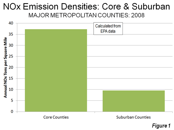
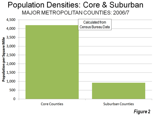
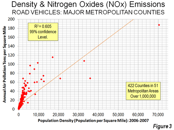
    NOx emission density data by county is provided in the document below, Annual Density of Highway Vehicle NOx Emissions by County: 2008. Overall, this data indicates that the average core county had a NOx density 3.9 times that of the average suburban county (Figure 1). By contrast, the average core county density is 4.5 times that of the average suburban county (Figure 2), indicating a strong relationship that is also shown in Figure 3.

    For example, in the New York metropolitan area, core New York County has NOx emissions that are nearly 15 times as intense in a given volume of air as suburban Morris County. In the Cleveland metropolitan area, core Cuyahoga County has a NOx emissions intensity 12 times that of suburban Geauga County. Charlotte’s core Mecklenberg County has a NOx emissions intensity more than five times that of suburban Union County.

    Traffic and Air Pollution

    More concentrated traffic also leads to greater traffic congestion and more intense air pollution, according to data available from EPA. The data for traffic concentration is similar to population density. Manhattan – despite its huge transit complex – has by far the greatest miles of road travel per square mile of any county, while seven of the densest counties are among the top ten in traffic intensity. As in the case of NOx emissions, the four highly urbanized New York City counties are also among the top 10 in the density of motor vehicle travel (Table 1).

    Table 2
    Intensity of Traffic (per Square Mile)
    Motor Vehicle Travel
    Rank County Compared to Average
    1 New York Co, NY 37.8
    2 Bronx Co, NY 22.3
    3 Fredericksburg city, VA 19.9
    4 Alexandria city, VA 15.8
    5 San Francisco Co, CA 15.6
    6 Arlington Co, VA 15.1
    7 Suffolk Co, MA 14.4
    8 Queens Co, NY 14.3
    9 Kings Co, NY 13.8
    10 Washington city, DC 13.1
    Calculated from 2005 EPA Data


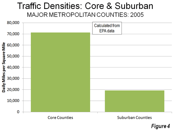
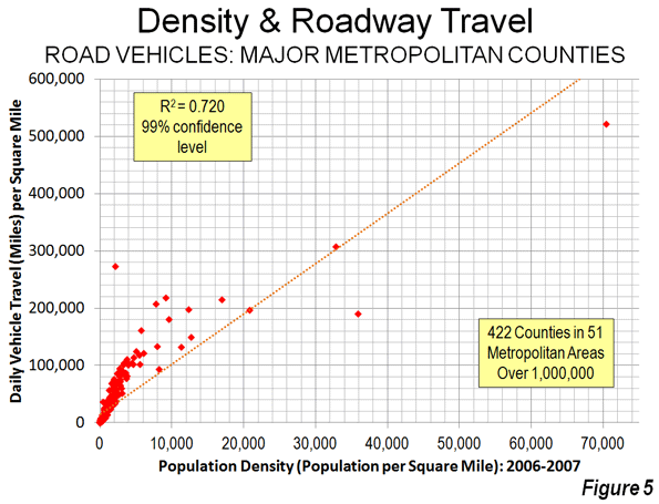
    Traffic density data by county is provided in the second document below, Daily Density of Road Vehicle Miles by County: 2005. Overall, this data indicates that the average core county had a traffic density 3.7 times that of the average suburban county (Figure 4), again a difference similar to the difference in density (Figure 5).

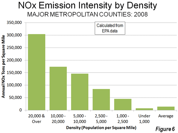
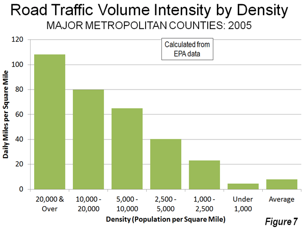
    The overall relationship between higher population densities and both NOx concentration and motor vehicle traffic intensity is illustrated in Figure 6 and Figure 7. There is a significant increase in the concentration of both NOx emissions and motor vehicle travel in each higher category of population density. For example, the counties with more than 20,000 people per square mile have NOx emission concentrations 14 times those of the average county in these metropolitan areas, and motor vehicle travel is 22 times the average. A smaller sample of the most urbanized counties (those with 90 percent or more of the land urbanized) showed a stronger association. This findings are consistent with research by the Sierra Club and a model derived from that research by ICLEI–Local Governments for Sustainability, both strong supporters of the livability and smart growth strategies of densification.

    A Caution: The air pollution data contained in this report is for emissions, not for air quality. Air quality is related to emissions and if there were no other intervening variables, it could be expected that emissions alone would predict air quality. However there are a number of intervening variables, from climate, wind, topography and other factors. Again, Los Angeles County makes the point. As the highest density large urban area in the nation   Los Angeles under any circumstances would have among the highest density of air pollution emissions. However, the situation in Los Angeles is exacerbated by the fact that the urban area is surrounded by mountains which tend to trap the air pollution that is blown eastward by the prevailing westerly winds.

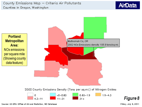
    The EPA data for 2002 can be used to create maps indicating criteria pollutant densities within metropolitan areas. An example is shown of  the Portland (OR-WA) metropolitan area (Figure 8), with the latter indicating the data illustration feature using Multnomah County (the central county of the metropolitan area), which is the most dense county and has the greatest intensity of NOx emissions and traffic congestion.

    The Goal: Improving Public Health

    These data strongly indicate that the densification strategies associated with smart growth and livability are likely to worsen the intensity of both NOx emissions and congestion of motor vehicle travel.

    But there is a more important impact. A principal reason for regulating air pollution from highway vehicles is to minimize public health risks. Any public policy that tends to increase air pollution intensities will work against the very purpose of air pollution regulation: public health. The American Heart Association found that air pollution levels vary significantly in urban areas and that people who live close to highly congested roadways are exposed to greater health risks. The EPA also notes that NOx emissions are higher near busy roadways. The bottom line is that all – things being equal – higher population density, more intense traffic congestion, and higher concentrations of air pollution go together.

    All of this could have serious consequences as the EPA seeks to expand its misguided regulations. For example, officials in the Tampa-St. Petersburg area have expressed concern that the metropolitan area will not meet the new standards, and they have proposed densification as a solution, consistent with the misleading conventional wisdom. The reality is that this is likely to make things worse, not better.  

    Less Livable

    There are myriad difficulties with smart growth and livability policies, not least their association with higher housing prices, a higher cost of living, muted economic growth, and decreased mobility and access to jobs in metropolitan areas. As the EPA data show, the densification policies of smart growth and livability also make air pollution worse for people at risk.

    Virtually all urban areas of Western Europe, North America and Oceania principally rely on cars for their mobility and there is no indicate that this will change. The air is less healthful for residents where traffic intensity is greater. As the air pollution intensity data shows, cars need space.

    Wendell Cox is a Visiting Professor, Conservatoire National des Arts et Metiers, Paris and the author of “War on the Dream: How Anti-Sprawl Policy Threatens the Quality of Life

    —–

    Note 1: The city (county level jurisdiction) of Fredericksburg, Virginia surprisingly ranks third in its concentration of motor vehicle travel yet ranks eighth much lower in population density. This reflects the high volumes of traffic through the  small municipality (and county-equivalent jurisdiction) carried on two of the East’s busiest roadways, Interstate 95 and US-1.

    Note 2: Additional analysis and information is available at Air Pollution, NOx Emissions, Traffic Congestion and Higher Population Density: The Association in Major Metropolitan Areas of the United States.

    Adapted from an article published by the Heritage Foundation.

    Photo of Manhattan traffic by carthesian.

  • Gassing Up: Why America’s Future Job Growth Lies In Traditional Energy Industries

    In his new book, The Coming Jobs War, Gallup CEO James Clifton defines what he calls an “all-out global war for good jobs.” Clifton envisions a world-wide struggle for new, steady employment, with the looming threat of “suffering, instability, chaos and eventually revolution” for those who fail to secure new economic opportunities.

    In the U.S., this conflict can be seen as a kind of new war battle the states, each fighting not only for employment but for jobs that pay enough to support a middle-class lifestyle.

    My colleagues at Praxis Strategy Group and I have looked over data for the period after the economy started to weaken in 2006. Using stats from EMSI, based on data from the Bureau of Labor Statistics, we compared sectors by growth, and then by average salary.

    Not surprisingly “recession-proof” fields such as health care and education expanded some 11% over the past five years. More inexplicably, given its role in detonating the Great Recession, the financial sector expanded some 10%.

    But the biggest growth by far has taken place in the mining, oil and natural gas industries, where jobs expanded by 60%, creating a total of 500,000 new jobs. While that number is not as large as those generated by health care or education, the quality of these jobs are far higher. The average job in conventional energy pays about $100,000 annually — about $20,000 more than finance or professional services pay. The wages are more than twice as high as those in either health or education.

    Nor is this expansion showing signs of slowing down. Contrary to expectations pushed by “peak oil” enthusiasts, overall U.S. oil production has grown by 10% since 2008; the import share of U.S. oil consumption has dropped to 47% from 60% in 2005.  Over the next year, according to one recent industry-funded study, oil and gas could create an additional 1.5 million new jobs.

    This, of course, violates the widespread notion that the future lies exclusively in the information and technology industries. While technology may well be ubiquitous, as a sector it is far from a reliable creator of high-wage jobs. Since 2006 the information sector has hemorrhaged over 330,000 jobs. And those who do have jobs make on average about $20,000 less than their oil-stained counterparts per year.

    How about those “green jobs” so widely touted as the way to recover the lost blue-collar positions from the recession? Since 2006, the critical waste management and remediation sector — a critical portion of the “green” economy — actually lost over 480,000 jobs, 4% of its total employment. Pay here is lower still, averaging something like $32,000 annually, about one-third that of the conventional energy sector.

    The future of the rest of the “green” sector seems dimmer than widely anticipated. One big problem lies in cost per kilowatt, where wind is roughly twice as expensive and solar at least three times as expensive as electricity produced with natural gas. Given the Solydra   bankruptcy  and their inevitable impact on the renewables industry, it’s also pretty certain that the U.S., at least in the near term, will not be powered by windmills and solar panels.

    So instead of tilting windmills or taking out the trash, what about joining the much ballyhooed “creative class”?  Not so great a bet for those limited in talent or nepotism. The arts, entertainment and recreation sector gained about half as many total jobs as energy, and the pay is nothing to write home about. The average salary for these creative souls is about $27,000, slightly higher than for food service workers, but barely a quarter of the average salary for the oil and gas-dominated sector.

    The relative strength of the energy sector can be seen in changes in income by region over the past decade. For the most part, the largest gains have been heavily concentrated in the energy belt between the Dakotas and the Gulf of Mexico. Energy-oriented metropolitan economies such as Houston, Dallas, Bismarck and Oklahoma City have also fared relatively well. In energy-rich North Dakota there’s actually a huge labor shortage, reaching over 17,000 — one likely to get worse if production expands, as now proposed, from 6000 to over 30,000 wells over the next decade.

    What message does this send to politicians seeking to turn around our moribund economy? Perhaps   they should target oil and gas development as a spur not only to new employment, but to the kind of “good jobs” that Gallup’s Clifton speaks about. With the proper environmental controls, these industries could provide a major jolt to the economy while cutting down on energy imports, reducing debts and bringing jobs back home. As long as Americans consume oil and gas, why not produce close to the market and with reasonable environmental controls?

    The monthly proliferation of new energy finds can provide a much brighter future than many have anticipated. Industry experts say that the shift in energy exploration is moving from the Middle East to the Americas, with rich deposits of oil and gas uncovered from Brazil to the Canadian oil sands.

    Much of the new action is on the U.S. mainland, including the Dakotas, Montana and Wyoming. Increasingly, there’s excitement about finds in long-challenged sections of the Midwest such as Ohio. The Utica shale formation, according to an estimate by Chesapeake Energy, could be worth roughly a half trillion dollars and be, in the words of CEO Aubrey McClendon, “the biggest to hit Ohio, since maybe the plow.”

    Ohio now has over 64,000 wells, with five hundred drilled just year. Recent and potential finds, particularly in the Appalachian basin, could transform the Buckeye State into something of a Midwest Abu Dhabi, creating more than 200,000 jobs over the next decade. The new finds could also help Ohio fund its depleted state coffers without imposing either debilitating budget cuts or economically self defeating new taxes.

    The energy boom also has sparked a spate of new factory expansions, including a $650 million new steel mill to make pipes for gas pipelines. Other local firms are gearing up to make up specialized equipment like compressors.

    Michigan, another perennially hard hit state, is also looking at new energy finds to turbocharge its gradually recovering industrial sector.  While risible former Gov. Jennifer Granholm pushed the notion that Michigan’s recovery lay in “cool cities” and green jobs, the state’s current leaders are focusing on more down-to-earth — and under-the-earth — solutions as part of a strategy to revive industrial production.

    Such growth anywhere is good news, particularly in Midwestern blue-collar towns that have borne the brunt of the recession. Since 2006 manufacturing and construction have shed some 5 million jobs combined — jobs that pay above-average wages, far better than those earned in growing fields such as health care, education or the lower-end service sector.

    The surest road to recovery does not lie in the chimera of “green jobs” or by magically harvesting riches from social networks. It’s in making America a more self-reliant and productive power. The new spate of energy in the Midwest and elsewhere in the country may be one way to do this, if we have the will to take full advantage.

    This piece originally appeared at Forbes.com.

    Joel Kotkin is executive editor of NewGeography.com and is a distinguished presidential fellow in urban futures at Chapman University, and an adjunct fellow of the Legatum Institute in London. He is author of The City: A Global History. His newest book is The Next Hundred Million: America in 2050, released in February, 2010.

    Analysis and charts by Mark Schill, Praxis Strategy Group.

    Photo by flickr user thorinside

  • First Step for California: Admit There’s a Problem

    The October 29, 2009 issue of Time Magazine had an article titled “Why California is America’s Future.”  I sure hope not.  California is fast becoming a post-industrial hell for almost everyone except the gentry class, their best servants, and the public sector.

    We only need a few numbers to demonstrate that California is clearly on the wrong track:

    • California’s unemployment rate is over 12 percent, about a third higher than the United States.
    • Only eight of California’s 58 counties have unemployment rates in single digits.
    • California has lost jobs in four of the past six months for which we have data, while the United States has gained or had no change in jobs in each month over that period.
    • California’s poverty rate is 16.1 percent compared to the United States 15.1 percent.  The rate goes way up when adjusted for the cost of living.  For example, the respected Public Policy Institute of California estimated that Los Angeles County’s 2007 poverty rate increased 11 percentage points from 15 to 26 percent, when adjusted for cost of living. 
    • Two California cities, Fresno and San Bernardino, are among the ten poorest American cities with populations over 200,000.  In fact, San Bernardino’s 34.6 poverty rate is the second highest of these cities, exceeded only by Detroit.
    • Unemployment among college educated is 34 percent higher in California than in the United States, while Los Angeles’s college educated unemployment rate is almost a whopping 80 percent above the United States’ rate.
    • According the California Department of Education, California’s public colleges and universities graduate over 150,000 students a year, while California’s Economic Development Department is forecasting less than 50,000 openings a year for jobs that require a college degree.

    Of course, that’s not the future that Time was selling.  Time’s future was a “dream state,” a magical place where enlightened pioneers, guided by their superior vision and funded by venture capital, would lead the world in innovation and environmental bliss.  California firms, like Solyndra, would lead the competition to a competitive new green economy.  No kidding, they named Solyndra:

    "It’s (California) building massive power plants for utilities, as well as roof panels for big-box stores, complete subdivisions and individual homes. Prices are plummeting, and competition is fierce, most of it from California firms like BrightSource, Solar City, eSolar, Nanosolar and Solyndra." 

    Along the way to this brave new world, there would be a new, “green” gold rush “beckoning dreamers who want to cook Korean tacos or convert fuel tanks into hot tubs.”

    That vision turned out to be about as real as Disneyland – but not as profitable. 

    Time wasn’t alone.  Brett Arends had a similar piece, The Truth about California, in November 2010, and the ever-optimistic duo of Bill Lockyer and Stephen Levy had a December 2010 piece, California isn’t Broken.

    Visitors can be forgiven for seeing California as a bit of paradise on earth.  It is.  I  am a native myself who could not wait to return from my job at the Federal Reserve in Washington, DC.  I remember going to Santa Barbara in October for my UCSB job interview.  Santa Barbara was magical to me, after enduring weeks of dreary and increasingly cold East Coast weather.  Santa Barbara was warm and sunny, and people were wearing the minimum legal requirements, and State Street was alive and vibrant with a happy energy I hadn’t seen since I’d left California for my East Coast job over a year before. 

    I wanted that job.

    You can still have that experience in certain spots in California.  There’s no doubt, California has abundant charms.  It can seduce almost anyone. 

    But there is a lot of California that visitors don’t see.  They don’t see the many communities in California’s central valley where unemployment rates of over 15 percent are typical, where people live in substandard housing and face the prospect of a lifetime in an ignored underclass.

    Well, they are not exactly ignored.  They receive food stamps and other subsidies, but they are denied opportunity, social mobility, or the confidence and pride that come with self-sufficiency.

    You don’t have to leave Santa Monica or Santa Barbara to see poverty without opportunity though.  Just blocks from Santa Barbara’s State Street or Santa Monica’s Third Street Promenade, over-crowded units , packed sometimes by several families, are the norm, because Coastal California’s housing prices are not related to the local economy. Statewide, 28 percent of California’s children live in crowded housing.  This is the highest rate in the nation, tied only with Hawaii. 

    When you live here, you can’t avoid the signs of California’s decline.  Beaches I walked with High School dates are no longer safe at night.  Water lines in Los Angeles burst with alarming frequency.  Our roads are approaching gridlock and are littered with potholes.  Electrical cutbacks are common in hot weather.  Water is increasingly scarce, except in very rainy years.  Our primary schools are clearly in decline.  Even California’s higher education system, once the envy of the world, has passed its prime. Places like the University of Texas or University of North Carolina are now real competitors.

    It wasn’t always this way, and it doesn’t have to be in the future.  When I started my career, California was a place of opportunity.  One could have a career, own a home, and raise a family. 

    Not any more – not unless you have a trust fund or a secure pensioned public employee job. 

    That’s why California’s middle class is leaving, looking for opportunity and affordable housing.  The evidence is in the migration data.  Domestic migration has been negative for over a decade.  Perhaps even more telling, only 23 percent of U.S. illegal immigrants are coming to California today, down from about 42 percent in 1990.  Even the lowest skilled newcomers know there’s shrinking opportunity here.

    California has a problem, and it’s high time the political class accepted the fact.

    Two steps need to be taken before any problem can be solved.  You need to recognize you have a problem.  Then you need to identify the problem.  Unfortunately, it appears that among Sacramento’s leadership, only Gavin Newsom even recognizes that California has a problem.  Governor Brown gives lip service to jobs, but like Schwarzenegger before him, identifies the failed command and control policies of the green movement as the source of the new jobs.  Solyndra has become the poster child for this fantastical policy failure.

    California’s economic future is pretty grim, until Sacramento takes off the blinders and admits it has a problem. Until then, things are likely to get much worse before they get better.

    Bill Watkins is a professor at California Lutheran University and runs the Center for Economic Research and Forecasting, which can be found at clucerf.org

    Photo illustration by krazydad/jbum.

  • Comparing Perry’s Texas to Romney’s Massachusetts

    Republican primary front-runners Rick Perry and Mitt Romney are each basing a large part of their campaigns on their economic track records. So who is better when it comes to jobs and the economy — Romney or Perry?

    Let’s put each of their states under the microscope to see what the data says. In this exercise we will use Analyst, EMSI’s web-based labor market analysis tool, to help us see the ins and outs of the Massachusetts and Texas economies.

    Notes:
    1. All data, graphs, and tables are from Analyst’s 2011.3 dataset, which is based on BLS, Census, BEA, and nearly 80 other sources.

    2. As an economics firm we want to stress this point — businesses and economic activity create jobs, not politicians.

    3. Gov. Perry (2000-current) and Romney (Massachusetts Governor from 2003-2007) do not have perfectly overlapping times in office, so we are going to consider the 10-year time frame and then look at how the states have performed during the recession, which would tend to reflect the legacy of each politician (e.g., politicians always inherit the blessings or curses of the previous administration).

    4. Performance during the recession is the key point of data we want to look at. Which state is strong when tough times arise?

    TEN-YEAR TRENDS
    Right off the bat we see that the Texas economy is the clear leader. The state grew by 18%, or about 2.2 million jobs, in the last 10 years. Over that same time period Massachusetts grew by 2%, or less than 100,000 jobs.

    (click images to enlarge)


    Almost every industry sector in Texas grew from 2001 to 2011. Agriculture, information, and manufacturing were the only ones to actually decline. The big leaders were health care (43% growth, 421,000 jobs), government (17% growth, 282,000 jobs), oil and gas (111% growth, 257,000 jobs), finance and insurance (38% growth, 216,000 jobs), and professional and technical services (29% growth, 210,000 jobs).

    NAICS Code Description 2001 Jobs 2011 Jobs Change % Change 2011 Earnings
    62 Health Care and Social Assistance 985,667 1,407,160 421,493 43% $49,118
    90 Government 1,679,431 1,961,341 281,910 17% $59,455
    21 Mining, Quarrying, and Oil and Gas Extraction 231,809 488,494 256,685 111% $136,302
    52 Finance and Insurance 575,109 791,054 215,945 38% $69,091
    54 Professional, Scientific, and Technical Services 713,722 923,621 209,899 29% $74,784
    72 Accommodation and Food Services 789,913 987,746 197,833 25% $19,814
    56 Administrative and Support and Waste Management and Remediation Services 744,446 932,960 188,514 25% $33,979
    53 Real Estate and Rental and Leasing 410,363 559,112 148,749 36% $31,946
    81 Other Services (except Public Administration) 592,116 708,981 116,865 20% $28,597
    23 Construction 849,097 950,903 101,806 12% $54,438
    61 Educational Services 148,927 214,526 65,599 44% $36,378
    55 Management of Companies and Enterprises 41,840 105,073 63,233 151% $102,137
    71 Arts, Entertainment, and Recreation 171,298 230,177 58,879 34% $24,422
    44-45 Retail Trade 1,350,407 1,400,681 50,274 4% $30,803
    48-49 Transportation and Warehousing 506,512 553,486 46,974 9% $60,395
    42 Wholesale Trade 508,024 552,876 44,852 9% $80,704
    22 Utilities 52,813 55,870 3,057 6% $118,804
    11 Agriculture, Forestry, Fishing and Hunting 345,303 319,410 (25,893) (7%) $20,912
    51 Information 299,481 227,513 (71,968) (24%) $73,610
    31-33 Manufacturing 1,066,622 871,533 (195,089) (18%) $79,460
    Total 12,062,901 14,242,517 2,179,616 18% $53,493
    Source: EMSI Complete Employment – 2011.3

    Massachusetts’ growth sprung primarily from health care (24% growth, 111,000 jobs), professional and technical services (10% growth, 37,000 jobs), educational services  (19% growth, 35,000 jobs), and real estate (27% growth, 34,000 jobs). A big thing to note is that nine industry sectors — utilities, government, transportation, retail trade, management of companies, wholesale trade, information, construction, and manufacturing — lost jobs from 2001-2011.

    NAICS Code Description 2001 Jobs 2011 Jobs Change % Change 2011 Earnings
    62 Health Care and Social Assistance 468,668 579,523 110,855 24% $60,616
    54 Professional, Scientific, and Technical Services 363,592 400,919 37,327 10% $96,534
    61 Educational Services 184,644 220,002 35,358 19% $56,621
    53 Real Estate and Rental and Leasing 125,313 159,096 33,783 27% $32,018
    72 Accommodation and Food Services 249,024 277,782 28,758 12% $22,995
    81 Other Services (except Public Administration) 179,165 203,904 24,739 14% $33,199
    71 Arts, Entertainment, and Recreation 84,064 105,900 21,836 26% $28,814
    52 Finance and Insurance 232,356 253,578 21,222 9% $115,262
    56 Administrative and Support and Waste Management and Remediation Services 212,872 213,893 1,021 0% $39,572
    21 Mining, Quarrying, and Oil and Gas Extraction 2,604 3,398 794 30% $148,741
    11 Agriculture, Forestry, Fishing and Hunting 20,552 20,373 (179) (1%) $33,359
    22 Utilities 12,332 11,383 (949) (8%) $135,669
    90 Government 432,156 426,859 (5,297) (1%) $66,827
    48-49 Transportation and Warehousing 124,887 111,495 (13,392) (11%) $52,693
    44-45 Retail Trade 406,859 393,365 (13,494) (3%) $32,842
    55 Management of Companies and Enterprises 72,884 58,796 (14,088) (19%) $125,760
    42 Wholesale Trade 150,660 134,602 (16,058) (11%) $91,749
    51 Information 122,543 100,471 (22,072) (18%) $100,676
    23 Construction 219,882 195,324 (24,558) (11%) $66,726
    31-33 Manufacturing 398,839 264,887 (133,952) (34%) $94,358
    Total 4,063,896 4,135,549 71,653 2% $63,647
    Source: EMSI Complete Employment – 2011.3

    Since much of the discussion in the Republican primary has to do with the nation’s more recent economic turmoil, let’s refocus our analysis to 2007 – 2011.

    MASSACHUSETTS FACTS
    The current population of Massachusetts is 6.6 million with 4.1 million jobs. The unemployment rate is 7.6%, and average earnings in the state are more than $63,000 per year. The gross regional product (GRP), which is the value of all goods and services produced in a region by all industries, is $378 billion per year.

    In Massachusetts, nearly 80% of the population is White, Non-Hispanic. The age demographics tell us the state is pretty balanced, and educational attainment is high.


    Massachusetts ’07-11

    From 2007-2011, jobs declined by 1% (overall loss of 34,000). All things considered — not bad. The biggest losses were felt in construction and manufacturing (total losses of 82,000 jobs). The biggest gains were in health care (45,000 jobs), educational services (11,000 jobs), professional and technical (11,000 jobs), and accommodation and food services (10,000 jobs).

    NAICS Code Description 2007 Jobs 2011 Jobs Change % Change 2011 Earnings
    62 Health Care and Social Assistance 534,634 579,523 44,889 8% $60,616
    61 Educational Services 209,184 220,002 10,818 5% $56,621
    54 Professional, Scientific, and Technical Services 390,170 400,919 10,749 3% $96,534
    72 Accommodation and Food Services 267,731 277,782 10,051 4% $22,995
    52 Finance and Insurance 245,717 253,578 7,861 3% $115,262
    81 Other Services (except Public Administration) 196,358 203,904 7,546 4% $33,199
    71 Arts, Entertainment, and Recreation 98,450 105,900 7,450 8% $28,814
    22 Utilities 10,653 11,383 730 7% $135,669
    21 Mining, Quarrying, and Oil and Gas Extraction 2,854 3,398 544 19% $148,741
    11 Agriculture, Forestry, Fishing and Hunting 19,934 20,373 439 2% $33,359
    51 Information 100,643 100,471 (172) 0% $100,676
    90 Government 427,688 426,859 (829) 0% $66,827
    53 Real Estate and Rental and Leasing 162,635 159,096 (3,539) (2%) $32,018
    55 Management of Companies and Enterprises 62,367 58,796 (3,571) (6%) $125,760
    48-49 Transportation and Warehousing 116,671 111,495 (5,176) (4%) $52,693
    44-45 Retail Trade 404,423 393,365 (11,058) (3%) $32,842
    42 Wholesale Trade 148,614 134,602 (14,012) (9%) $91,749
    56 Administrative and Support and Waste Management and Remediation Services 227,964 213,893 (14,071) (6%) $39,572
    23 Construction 236,308 195,324 (40,984) (17%) $66,726
    31-33 Manufacturing 306,523 264,887 (41,636) (14%) $94,358
    Total 4,169,521 4,135,549 (33,972) (1%) $63,647
    Source: EMSI Complete Employment – 2011.3

    Also, here is a view of 6-digit (NAICS) industries that grew and declined from 2007-11. In the table above we looked only at 2-digit NAICS. When we use the 6-digit sectors we can see much more specific industry detail. Portfolio management was the highest growing industry from 2007-11 in Massachusetts.


    Here is a list of occupations that grew and declined from ’07-11. These are 5-digit occupations (SOC codes). Consistent with the industry data, the fastest-growing occupation is personal financial advisors.


    TEXAS FACTS

    Texas has a total population of 25.6 million with 14.2 million jobs. The average earnings is $53.5K per year, and the unemployment is 972,000. The unemployment rate is 8.4%, which is a tad higher than Massachusetts’. The state’s GRP is $1.2 trillion per year.


    In terms of demographics, Texas is 46% White, Non-Hispanic, 36% Hispanic, and 11% Black or African American. Educational attainment is lower than Massachusetts. Texas also appears to have a slightly younger population when compared to Massachusetts.


    Texas ’07-11

    From 2007-2011, the Texas economy grew by 3% (391,000 jobs gained overall). The state had huge job gains in oil and gas extraction (56% growth and 175,000 jobs), health care (14% growth and 171,000 jobs), and government (7% growth and 125,000 jobs). Other sectors like finance and insurance, accommodation and food, professional and technical, and educational services all had decent gains. Losses occurred in construction and manufacturing (about 192,000 jobs), retail trade (41,000 jobs or -3%), information (35,000 jobs or -13%), transportation (24,000 jobs or – 4%) and wholesale trade (13,000 jobs or -2%).

    NAICS Code Description 2007 Jobs 2011 Jobs Change % Change 2011 Earnings
    21 Mining, Quarrying, and Oil and Gas Extraction 313,502 488,494 174,992 56% $136,302
    62 Health Care and Social Assistance 1,235,840 1,407,160 171,320 14% $49,118
    90 Government 1,836,081 1,961,341 125,260 7% $59,455
    52 Finance and Insurance 717,799 791,054 73,255 10% $69,091
    72 Accommodation and Food Services 943,336 987,746 44,410 5% $19,814
    54 Professional, Scientific, and Technical Services 892,977 923,621 30,644 3% $74,784
    61 Educational Services 192,643 214,526 21,883 11% $36,378
    55 Management of Companies and Enterprises 83,783 105,073 21,290 25% $102,137
    81 Other Services (except Public Administration) 689,944 708,981 19,037 3% $28,597
    71 Arts, Entertainment, and Recreation 215,084 230,177 15,093 7% $24,422
    22 Utilities 50,935 55,870 4,935 10% $118,804
    11 Agriculture, Forestry, Fishing and Hunting 317,762 319,410 1,648 1% $20,912
    56 Administrative and Support and Waste Management and Remediation Services 934,474 932,960 (1,514) 0% $33,979
    53 Real Estate and Rental and Leasing 564,471 559,112 (5,359) (1%) $31,946
    42 Wholesale Trade 565,616 552,876 (12,740) (2%) $80,704
    48-49 Transportation and Warehousing 577,467 553,486 (23,981) (4%) $60,395
    51 Information 262,342 227,513 (34,829) (13%) $73,610
    44-45 Retail Trade 1,441,632 1,400,681 (40,951) (3%) $30,803
    23 Construction 1,025,977 950,903 (75,074) (7%) $54,438
    31-33 Manufacturing 989,430 871,533 (117,897) (12%) $79,460
    Total 13,851,095 14,242,517 391,422 3% $53,493
    Source: EMSI Complete Employment – 2011.3

    Here is a look at 6-digit industries and 5-digit occupations that grew and declined at the largest clip in Texas from ’07-11. As you can see, oil and natural gas extraction is a very big driver for the state. Under Perry, the state also picked up quite a few local government jobs during the recession.


    CONCLUSION

    Based on job numbers, both candidates do have legitimate claims that their states have done well through the recession. In this comparison — Texas really benefits from the huge grow within oil and natural gas. See this recent interactive display to better visualize this trend.

    When looking at data like this, it is important to keep in mind that the economies of states (and these two states in particular) are quite different in terms of total population, demographics, and industry composition. Both states have some strong qualities, but based on raw numbers, Texas is the obvious choice.

    Rob Sentz is the marketing director at EMSI, an Idaho-based economics firm that provides data and analysis to workforce boards, economic development agencies, higher education institutions and the private sector. He is the author of a series of green jobs white papers. Email Rob with questions at rob@economicmodeling.com.

    Lead illustration by Mark Beauchamp

  • UK Moves to Reform Planning Disaster

    This piece originally appeared at Macrobusiness.

    The United Kingdom (UK) housing system is arguably the worst in the world because of a myriad of policies that work to severely restrict supply, pump demand, and make renting a highly undesirable substitute for home ownership. These policies have led to the UK housing market experiencing:

    1) a higher level of house price inflation than most other European nations:


    2) Relatively expensive housing on a price-to-earnings basis:


    3) Extreme house price volatility:


    4) Which has also increased the volatility of the economic cycle due to the positive effects on consumer spending of equity withdrawals from rising home values and heightened austerity in the bust phase:


    At the core of the UK’s housing problems is the straightjacket that was placed on housing supply following the passage of the Town and Country Planning Act in 1947, which nationalised development rights. Essentially, the pre-existing right of landowners to build-on or re-develop their land was removed and handed to the state, thereby requiring land owners to seek planning permission before anything other than minor renovation work was undertaken.

    UK housing supply effectively became a centrally planned system whereby government bureacrats would attempt to predict some years ahead the required numbers of dwellings that ought to be built in an area to meet demand. However, as explained brilliantly in a detailed paper by the Policy Exchange, the key outcome from the UK planning system has been a housing market that has delivered some of the oldest, smallest and most expensive homes in Europe of a type that are least preferred by households. Put simply, UK households are paying more for housing than their European counterparts and receiving less in return:

    Central planning attempts to ensure that what is thought best for the people by the central planners is what is produced. So, as we showed earlier, the system currently attempts to produce exactly the number of dwellings which are estimated to be required from calculations of need, calculations involving assessments of demographic change, household formation, household splits, migration, deaths, births, etc. Built into the system is a pressure at all levels to provide the minimum. Using green field sites is politically problematic. The cry goes up that the countryside is being buried under tarmac. And anyway, as we have shown, the system adjusts. If too little housing is provided, house prices rise and housing becomes expensive. When it is more expensive, people can afford less and so buy smaller homes. With smaller homes, more dwellings can be provided on less land because homes can be built at higher densities, namely flats or houses with tiny gardens.

    But is this really what people want? In March 2005, a widely reported survey carried out by MORI on behalf of the Commission for Architecture and the Built Environment found that over 50 per cent of those questioned wanted a detached house and 22 per cent preferred a bungalow. Only 2 per cent per cent expressed a preference for a low rise flat and less than 1 per cent a flat in a high rise block. But since detached houses and bungalows use more land than other kinds of house, fewer and fewer are built each year. And many are also demolished to make way for terraced houses or blocks of flats. So while as recently as 1990 only about an eighth of newly built dwellings were apartments, by 2004 the proportion had increased to just under a half…

    So whilst people may not want to live in them or want them built where they live,more and more blocks of flats of just this type are being built because the central planners think that they should have them, and because the production norms are filled more easily in this way than by building houses or bungalows…

    The British planning system means that the most important thing the developer has to do is to obtain planning permission. Once this has been obtained, given the demand for housing, whatever is built can be sold. So the way to make the greatest profit, having obtained permission, is to produce the permitted dwellings at the lowest possible cost. Adding good design is an unnecessary expense because whatever is built will sell. So the constraints imposed by the planning system work against the achievement of a better architectural environment, something which might be achieved with less pressure to build at the lowest possible cost. Competition between developers on design becomes largely unnecessary because they know that they will be able to sell whatever they produce.

    So the current position is that what people want, when asked, is lower density housing. What they get, what the planning system now insists upon, is high density development, much of it in the least desired form – blocks of flats…

    British housing tends to be older than elsewhere in Western Europe. Because they are older their efficiency, in terms of heating for example, tends to be less. The houses [also] tend to be smaller… New houses tend to be even smaller on average than existing houses. In addition, house prices rise faster in the UK so that, year on year, housing in Britain has been getting more expensive relative to that in the rest Europe…

    If fifty years of planning has achieved one thing… Britain [now] has the oldest, pokiest, housing in Europe.

    Compounding the above regulatory constraints on land/housing supply are the greenbelts that have been errected around all of the UK’s major housing markets, which have excluded large swathes of agricultural land from urban development and helped to push-up land prices. A map of the UK’s greenbelts is provided below:


    In addition, the overriding planning objective in the UK has increasingly become one of ‘urban containment and ‘densification’. In the 1990s, the Central Government explicitly required that 60% of all new land for housing must be brownfield land – i.e. land which has already been developed for some other purpose.

    This 60% in-fill requirement necessarily meant the restriction of land supply and higher land prices. It has also produced some perverse outcomes owing to the fact that many brownfield sites that come onto the market for redevelopment are not necessarily located where there is demand for housing. Key amongst these perverse outcomes are the construction of high density developments in poorly located areas as well as ‘leapfrog’ developments far away from the existing urban fringe:

    In southern England, where demand is great, the brown fields norm is complied with by constructing high-density developments whenever and wherever the land has become available, whether centrally, in the inner suburbs, in the outer suburbs, or in the middle of the country miles away from public transport. So the site of a house or hotel in the middle of the London Green Belt may be redeveloped to provide more houses or a larger hotel. The development is on a brown field site so that fulfils the production norm, to be sure. But the development neither preserves the countryside, nor does it reduce the use of private transport. Indeed, it actually increases it above what might have been achieved on a green field site bordering the town.

    A final related roadblock to housing supply in the UK is its centralised fiscal system, whereby local authorities – which are the primary decision makers on development and have statutory obligations to provide services for new houses – receive very little revenue from increased population and housing. As such, these local authorities tend to be biased against development.

    Combined, these regulatory constraints on new housing construction have meant that housing supply in the UK has been incapable of responding quickly and efficiently to changes in demand, thus placing upward pressure on prices and creating expectations of future capital growth.

    According to the Joseph Rowntree Foundation’s (JRF) Housing Market Taskforce report on reducing volatility in the UK housing market, only an average of around 180,000 homes per annum were completed in the UK over the past two decades – only slightly above construction volumes in Australia, despite the UK having nearly triple the population (around 62 million).

    And as shown below, despite the massive run-up in prices between 2000 and 2007, there was only a minimal supply response towards the end of the latest housing bubble, confirming that UK housing supply is highly unresponsive (‘inelastic’) to changes in demand.


    More worryingly still, new home construction has reportedly fallen to its lowest level since the 1920s, with just 105,000 new homes completed in 2010.

    The supply constraints present in the UK housing market ensured that the extra demand arising from the UK’s deregulated mortgage market – where lenders were offering 100% plus LVR (i.e. no deposit) mortgages to first-time buyers at the height of the most recent housing bubble – manifested into escalating prices rather than new home construction. By contrast, in the wake of the global financial crisis, UK lenders rationed credit and demanded higher deposits (reduced LVRs), which contributed to the falling prices.

    In a similar vein, the UK’s deregulated rental market and lack of security of tenure (whereby six month leases are the norm) has ensured that renting is a second rate option, thereby encouraging residents to strive (and borrow big) for owner occupancy. With this extra demand for owner-occupied housing not met by increased supply, the inevitable result has been ’panic buying’ from first-time buyers when house prices are rising and the opposite when prices are expected to stagnate or fall.

    Change in the air?

    The concerns about the UK housing situation appear to have come to a head, with the Central Government moving to reform the planning system by:

    1. streamlining the development process by reducing more than 1,000 pages of regulations and red tape to just 52 pages; and
    2. implementing a “presumption in favour of sustainable development”, which has the potential to open up the greenbelts to new housing development.

    The UK Prime Minister, David Cameron, has described the planning system as “slow and bureaucratic” and argues that reform is essential. He also laments the fact that the average first-time buyer without parental help in the UK is 37 years of age.

    However, conservationists and NIMBY groups have rallied against the changes arguing that the reforms risk concreting over the UK’s precious country side and robbing the nation of productive farmland – a ridiculous claim when you consider that:

    1. only around 8% of UK land is urbanised, which is lower than the Netherlands (15%), Belgium (15%), Germany (13%), and Denmark (9%); and
    2. the proportion of UK land used for agriculture is among the highest in the old European Economic Community: 78% compared with an average of 64%.

    According to Dr Oliver Marc Hartwich, an economist and planning expert at Sydney’s Centre for Independent Studies, concerns that the UK will concrete over the country side if the proposed planning reforms are implemented are misguided:

    Dr Oliver Hartwich, an economist with the Centre for Independent Studies, who has studied the British system, believes that without the postwar planning system, the UK would only “look slightly different, but not much”.

    Instead, he suggests the real impact of the green belt has been to fuel house price inflation and push development further into the “real” countryside beyond the green belt, leading to more commuting, fuel use and stress.

    “No-one wants to concrete over the countryside,” he adds. But British cities are overcrowded.

    “What this sort of planning does is encourage a system where bubbles are likely. The idea that you need to get into the property market in your early 20s is very harmful but it’s something that this planning system promotes.”

    Dr Hartwich is particularly well placed to comment on the UK planning system given that he was born and educated in Germany – a country regarded as having one of the best planning systems in the world – before residing in England in the 2000s. He has also written detailed studies of planning systems from around the world (for example, see Why Some Countries Plan Better than others).

    Whether the UK Central Government will ultimately succeed in reforming the UK planning system remains to be seen. Nevertheless, it is heartening to see it taking on vested interests and fighting the good fight.

    Photograph: New, smaller exurban housing in the London area (by Wendell Cox).

    Leith van Onselen writes daily as the Unconventional Economist at MacroBusiness Australia. He has held positions at the Australian Treasury, Victorian Treasury and currently works at a leading financial services company. Follow him @leithVO.

  • Are 20th Century Models Relevant to 21st Century Urbanization?

    Analysis of the state of the world’s cities 2010/2011 by UN-Habitat focused on the narrowing urban divide, with 227 million people moving out of slum conditions over the preceding decade.  While acknowledging uncertainty over cause and effect, the report notes that:

    urbanization … is associated in some places with numerous, positive outcomes such as technological innovation, forms of creativity, economic progress, higher standards of living, enhanced democratic accountability and women’s empowerment. … the report calls for policy-makers and planners to understand that urbanization can be a positive force for economic development, leading to desirable social and political outcomes.

    The North Atlantic solution

    The report acknowledges the diversity of urbanisation[1], making its authors’ somewhat singular approach to managing it (more density) incongruous.  Their prescription is based on resisting urban sprawl, reflecting the experience of North America.  They also suggest that sprawl is a sign of “divided cities”, translating into

    an increase in the cost of transport, public infrastructure and of residential and commercial development. Moreover, sprawling metropolitan areas require more energy, metal, concrete and asphalt than do compact cities because homes, offices and utilities are set farther apart.

    The report denounces sprawl in suburban zones of high and middle income groups and in extensive slums on the city edge.  On the latter, they invoke issues of governance, saying it occurs because

    authorities pay little attention to slums, land, services and transport. Authorities lack the ability to predict urban growth and, as a result, fail to provide land for the urbanizing poor.

    Can one size fit all?

    It is difficult to accept prescription predisposed to a particular view. Urbanisation is not a single condition. Differences in the stage of urbanisation, vastly different physical, cultural and economic settings of “urban” settlement, and different institutional arrangements belie the idea of a universal response or that any particular form is best for all cities. 

    Apart from anything else, “western” cities [2] don’t really feature in 21st century urbanism.  Consider the figures.  In 1950 western cities accounted for 43% of the world’s urban population.  This was down to 23% in 1990 and 18% in 2010. UN projections have the figure down to 15% in 2030, accounting for between just 3% and 4% of all urban growth between now and then.

    What Size City?

    This post looks at some more numbers that help illustrate the diversity of urbanisation – the size of urban settlements. 

    According to UN figures,  8% of the world’s population lives in 53 cities housing over 5 million people; 12% in 388 cities of between 1 and 5 million; and 31% in cities of under 1 million. Any prescriptions for urban governance and urban form need to reflect quite extreme divergence between the few megacities and the many smaller settlements where the majority of urbanites live.

    The Urban Growth Trajectory

    Urbanisation experiences vary, also.  The different national experiences of the past 60 years can be illustrated using ten quite different countries (Chart 1).  By 2010, Brazil, US, UK, Mexico, and Iran were all heavily urbanised.  But the level of urbanisation changed little for the US and the UK over thelate 20th century, while it grew rapidly in the others.

    In yet another trajectory, erstwhile rapid urbanisation in Russia stalled after the mid 1980s. 


    Chart 1: Urbanisation Trends, Selected Nations, 1950-2010

    Urbanisation is accelerating in China, but has flattened off in Indonesia.  It has been increasing steadily in Nigeria and slowly but still steadily in India.

    Most people moving into smaller cities

    Chart 2 shows shares of growth by city size groups over the last twenty years. (Russia is omitted because urbanisation actually declined by 5.5%.) 

    Cities of under 1 million residents dominate gains, strongly favouring developing countries.  They accounted for 90% of urban growth in Indonesia, 71% in Nigeria and 66% in Iran. 

    US experienced growth more or less across all size categories, although Chicago went from the 7m-8m to the 8m plus category, reducing down the former.

    Chart 2: Where Populations Grew – Cities by Size Category, 1990-2010

    Brazil, China, and Indonesia saw significant growth across the most size groups.  There appears to be a contrast within these countries between the centralising influence of few large cities and dispersed urbanisation in many much smaller settlements.

    (The picture for the UK reflects a gain of around 1 million people in London — to 8.6m — shifting it between categories.  Smaller cities actually accounted for 82% of the net UK gain in urban population, suggesting a duality between the growth of the capital and decentralisation through growth in smaller settlement). 

    So where are the big cities?

    The US has five urban agglomerations with a population of more than 5m, centred on New York, Los Angeles, Chicago, Philadelphia and Detroit (Chart 3).  Compare this with China, with twelve cities of over 5m, and five cities of more than 8 million people (Shanghai, Beijing, Chongqing, Shenzhen, and Guangzhou); or India, with eight over 5m and three over 8m (Mumbai, Kolkata, and Chennai).

    At the same time, China has 90 cities of between 750,000 and 2m, India 44 and the US 66.  Mexico has 15, Russia 14 and Brazil 13. 

    Chart 3: Number of Cities by Size Category, Ten Nations 2010

    Primacy – a mixed picture

    Single centres that dominate national populations are termed “primate”.  Their rise and fall may be symptomatic of national economic fortunes.  Excessive primacy may increase economic volatility because the contrast between a rich centre and poor periphery is politically destabilising. One centre dominating financial, human, and intellectual resources may also increase national vulnerability to structural decline.

    The picture is mixed across our sample (Chart 4).  Mexico City and London stand out.  High levels of primacy are also evident in Iran and Indonesia, but have been easing, contrasting with Nigeria where it is increasing.  It is least pronounced in the countries with the largest urban populations – China and India — suggesting a strong population pull from a number of state or provincial capitals, as well as a host of much smaller cities.

    Chart 4: Population Share of Largest City, Ten Nations, 1990 and 2010

    So what does all this mean?

    The data confirms huge diversity in the sizes of cities people live in across and within nations.  It generates more questions than answers, though, the main one being whether it is relevant simply to transfer urban governance, management, or planning models from one place to another.  Apart from contrasts within and between nations, it is clear that the west is no longer the focus of urbanisation and is unlikely to hold many of the answers to today’s urban growth challenges.

    The evidence also indicates a tendency for urbanisation to take place in small, dispersed settlements rather than mega-cities.  More modest scale makes different demands on infrastructure and institutions.  It may also help manage urbanisation and ensure that benefits can be better accessed by larger numbers of people.  Small cities, sub-centres in large cities, and districts of modest scale may be better suited to adaptable and innovative planning and management than large scale, extensive cities with their more centralised, remote, and inevitably bureaucratic political and administrative systems. 

    Very large agglomerations do exist, even if they are not as dominant in the wider urban picture as their size and profiles might suggest.  The question they raise is whether they should continue to dominate national and international agenda for urban growth and management.  Dispersed urbanisation may better reflect the resources and capacities needed to support an exploding urban population in the 21st century.

    Phil McDermott is a Director of CityScope Consultants in Auckland, New Zealand, and Adjunct Professor of Regional and Urban Development at Auckland University of Technology.  He works in urban, economic and transport development throughout New Zealand and in Australia, Asia, and the Pacific.  He was formerly Head of the School of Resource and Environmental Planning at Massey University and General Manager of the Centre for Asia Pacific Aviation in Sydney. This piece originally appeared at is blog: Cities Matter.


    [1]  The lowest level of urbanisation incorporated by the UN depends on the conventions of individual nations but may refer to settlements with as few as 2,000 people.

    [2] Treated here as North America, Northern Western and Southern Europe, and Australasia

    Photo by NASA’s Marshall Space Flight Center.

  • Private Investors Shun Brazil High Speed Rail Bid

    In April of 2011 the California High Speed Rail Authority held a meeting of potential investors and vendors interested in participating in the proposed Los Angeles to San Francisco high-speed rail project. Project sponsors have insisted they could gain substantial private investment for the project. The Authority indicated that the meeting drew 2000 attendees at the Los Angeles Convention Center, which supporters indicated was proof of the interest of private investors in the project.

    Apparently believing the claims that high-speed rail is "profitable," the Brazilian government set about planning a line stipulating that private investors would build the infrastructure and operate a line, at their own risk.

    The federal government offered private investors the opportunity to bid on a concession for the proposed Rio de Janeiro to Sao Paulo and Campinas high-speed railroad (Trem de Alta Velocidade). None of the Los Angeles attendees or any others submitted a bid for the concession. It is also reported that two previous opportunities attracted no bidders.

    In reviewing the project documents for the high-speed rail line in Brazil, it is easy to understand why the 510 kilometer (310 mile) route drew no interest. In Brazil, investors would be required to put their own money at risk with no revenue guarantees. Rising capital costs could be a problem as well since California’s high speed rail costs have doubled in just three years, a line that virtually everyone understands will require heavy public subsidies, despite being far richer than Brazil.

    Capital Costs: The winning bidder in Brazil would have been granted a 40 year concession and would have been required to provide substantial funding toward the $20 billion (34 billion in Brazilian Reals) capital cost. If the international experience holds in Brazil, that cost could escalate to $40 billion (70 billion Reals) or more.

    The Rio de Janeiro to Campinas line would not be easy to construct. The mountains south of Rio will be challenging. Unlike California, little of the route is as flat as Kansas. The line would operate through two of the world’s megacities, Rio de Janeiro and São Paulo as well as two other large urban areas, Campinas and San Jose dos Campos. Unlike Los Angeles and San Francisco, Sao Paulo and Rio de Janeiro do not have well placed existing rail corridors that can (at least theoretically) be expanded to handle the fast trains. The urban densities are much higher in Brazil than in California, which means that the construction will be more disruptive. The Los Angeles and San Francisco urban areas have densities of from 6,000 to 7,000 per square mile (2,100 to 2,700 per square kilometer) while those in Sao Paulo and Rio de Janeiro range from 15,000 to 18,000 per square mile (6,000 to 7,000 per square kilometer).

    Protecting the Taxpayers: Interested in protecting Brazilian taxpayers, the government has required that any cost overrun be paid for by the winning bidder. This, combined with the requirement to support the capital costs and debt service out of passenger fares and other commercial revenues seems, likely to have discouraged bidders, who in other places – from France and the United Kingdom to Korea – can rely on taxpayers to cover the inevitable cost overruns.The lesson of Taiwan, where private investors have already lost most of their capital is likely fresh in the minds of potential bidders.

    Responsibility for Cost Overruns: Moreover, it is not realistic to expect a private concessionaire to have sufficient capital to pay for the extent of cost overruns. If there a concessionaire is ever selected for the Rio to Campinas line, it will likely be a limited liability firm, specifically designed to shield investors from the very kind of risk that the Brazilian government expects it to shoulder.

    Thus, as would likely have been the case in Florida if Governor Scott had not canceled the Tampa to St. Petersburg line, taxpayers can expect to pay for cost overruns, despite the best intentions and good faith of the Brazilian government. No private concessionaire has funds stashed away for losses like that.

    Ridership and Revenue: The ridership projections for the line appear to be aggressive. This is typical of the international experience in high-speed rail projects, where ridership projections average 65 percent higher than eventual ridership, according to investment grade research by Bengt Flyvbjerg of Oxford University, Nils Bruzelius of the University of Stockholm and Werner Rottengather of the University of Karlsruhe (Megaprojects and Risk: An Anatomy of Ambition). Ridership is forecast to be greater than the widely criticized California projections.

    Nonstop fares between Rio de Janeiro and São Paulo are projected at approximately US$100, similar to the fares that would be charged in California. The demand for travel at such a price is likely to be considerably less in Brazil, where the incomes are a fraction of those in California. Project documents indicate that large numbers of people will switch from other modes of transport.

    Two such modes, the car and bus, are used by people needing to travel as inexpensively as possible (whether in Brazil or the United States). The project assumes a unprecedented 50 percent of car travel would be diverted to the train. Reality is likely to be a small fraction of this. The potential for attracting bus riders was also exaggerated, projecting that 65 percent of this less affluent market would pay two to three times as much as current bus fares to ride the train.

    Next Steps: The government intends to restructure the bidding process and try again. Brazil had hoped that the high-speed line would be running in time for the 2014 FIFA World Cup (soccer) and then be available for the 2016 Olympics in Rio de Janeiro. Even 2016 may even prove an impossible challenge at this point.

    China Daily caught the reality of the situation in commenting on the missing bidders for the Rio to Campinas high speed rail line:

    ….the high-speed rail dream may be one area where the government will have to assume more of the risk … because of the long term investment and delay in making a profit.

    In a nation in which 11 of the 26 states have a gross domestic product less than the cost of the train, "investment" in high speed rail might not be the top priority. It is not surprising that no private investor is willing to take the risk for the potentially enormous losses, nor should taxpayers.

    —-

    Photograph: Avenida Paulista, Sao Paulo (by author)

    Wendell Cox served as a member of the Amtrak Reform Council. He authored high speed rail feasibility studies in Florida (The 1997 Evaluation of the FDOT-FOX Miami-Orlando-Tampa High Speed Rail Proposal for the James Madison Institute and the 2011 Reason Foundation report, The Tampa to Orlando High Speed Rail Project: A Taxpayer Risk Assessment) and North Carolina (Should North Carolina Add More Piedmont Trains, 2011,for the John Locke Foundation) and was co-author of the Reason Foundation’s The California High Speed Rail Proposal: A Due Diligence Report, with Joseph Vranich (2008).

  • The Demise Of The Luxury City

    The Republican victory in New York City’s ninth congressional district Sept. 13 — in a special election to replace disgraced Rep. Anthony Weiner — shocked the nation.  But more important, it also could have signaled the end of the idea, propagated by Mayor Michael Bloomberg, of New York’s future as a “luxury product.”

    For a decade, the Bloomberg paradigm has held the city together: Wall Street riches fund an expanding bureaucracy that promotes social liberalism and nanny-state green politics. Indeed, Wall Street’s fortune — guaranteed by federal bailouts and monetary policy under both Presidents George W. Bush and Barack Obama — has been the key to the mayor’s largely self-funded political success. Under Bloomberg, Wall Street’s profits allowed city expenditures to grow 40% faster than the rate of inflation. Bloomberg was also able to buy political peace by bestowing raises two to three times the rate of inflation on the city’s unionized workers.

    Now this calculus is falling apart. Layoffs are mounting on Wall Street, while bonuses — the red meat that fuels everything from high-end condos to expensive boutiques and restaurants — are expected to drop 30% from last year.

    The newly Republican ninth district — stretching from south Brooklyn through the upper-middle-class strongholds around Forest Hills, Queens — reflects growing unease in the non-luxury parts of the city. The area is decidedly middle class, but with a median income of $55,000 it is the city’s least wealthy white district. For the most part, its residents have not benefited from Bloomberg’s management nor from Obama’s economic policies.

    Rather, the district reflects the kind of anxiety that is sweeping middle class areas across the country. “These people are worried about their kids and their future,” says Seth Bornstein, executive director the Queens Economic Development Corp. “The fire may not be in the backyard, but it’s around the corner.”

    Like many native New Yorkers, Bornstein sees Manhattan — the epicenter of the “luxury city” — as something of a “fantasy land,” inhabited by those who, despite living in Gotham’s historic core, are “not really New Yorkers.” Most Manhattanites, he notes, did not grow up in New York, and a majority live in single households. They largely either go to school, work in media or Wall Street, or make their livings servicing the rich.

    The ninth district is different socially as well. It is family-oriented. Barely one-third live in single households, compared with a near majority in Manhattan. Unlike the tony Upper East Side or trendy Soho, there are few celebrities or multi-millionaires. Although some of the ninth district’s inhabitants do work in the financial sector, many are tied to industries such as garments, work as professionals, such as doctors or accountants, or own their own small businesses.

    Some Democrats like California Rep. Henry Waxman have another explanation for the vote: greed. “They want to protect their wealth,” he explained, “which is why a lot of well-off voters vote for Republicans.” You almost have to admire the chutzpah of such views from a man who represents Beverly Hills.

    Waxman, of course, is wrong. This election was driven not by desertions of the rich but by the shift to the GOP among largely middle or working class voters. In many ways this election followed the pattern established by Sen. Scott Brown’s stunning 2009 Massachusetts victory, which came largely from middle-income voters. The ninth district’s new representative, Bob Turner, won big in modest Middle Village and South Brooklyn, while losing decisively in the wealthiest precincts such as Forest Hills and some minority, immigrant-oriented enclaves.

    The big story here, as Bornstein suggests, lies in the growing unease about the national and New York economies among large sections of the city’s beleaguered middle class. Despite the enormous wealth generated on Wall Street, New York’s middle class has been fleeing the city at breakneck speed for decades.

    According to the Brookings Institution, New York has suffered the fastest declines of middle class neighborhoods in the U.S.: Its share of middle income neighborhoods is roughly half that of Seattle or the much maligned Long Island suburbs. Twenty-five percent of New York City was middle-class in 1970, but by 2008 that figure had dropped to 16%.

    Even the young, who so dominate parts of lower Manhattan and Brooklyn, do not appear to be hanging around once they get into their 30s, particularly after their children reach school age. One reason: Bloomberg’s much touted school reforms have been, for the most part, ineffective in turning the bulk of the city’s public schools around.

    Ultimately, the basic truth is this: Bloomberg’s luxury city has failed most of its citizens. Despite its self-celebrated “progressive” image, New York has the most unequal distribution of income in the nation. The bulk of the job growth has not been on Wall Street, where employment has declined over the decade, but in hospitality and restaurants, which pay salaries 60% below the city average. In fact, restaurants are now the largest single private employers in Manhattan, with more people serving tables than trading equities.  As the New York Post quipped: “If you can make it here, you can make it anywhere — as a waiter.”

    It gets worse for the poor. One in five New Yorkers lives in poverty. Black male joblessness hovers at around 50%. Overall, New York’s household income, based on purchasing power, ranks 21st in the nation, behind not only such rich areas as San Francisco or Washington, but also places like Houston, Dallas, Indianapolis, Kansas City and even Pittsburgh.

    Ultimately, suggests Jonathan Bowles, president of the Center for an Urban Future, the future of New York’s middle class depends on reducing dependence on Wall Street.  The city needs to focus on industries and niches outside finance, including education, health, design, high-tech services, media and smaller businesses, many of them owned by immigrants.

    Bowles suggests diversification needs to speed up particularly now that Wall Street, the very engine of the “luxury” economy, is sputtering. Such a change will require a new political climate.  Voter engagement and political choice in New York have atrophied under the Medici-like Bloomberg, who has managed to pay off many interest groups with a combination of his own and the city’s money. Combined with a union-financed get-out-the-vote, the choices offered by the city’s once contentious politics have become increasingly constricted.

    But something is stirring in the boroughs.  The district’s voters not only embarrassed their civic betters by voting Republican, but they also demonstrated that New York’s middle class, politically quiescent under Bloomberg, may need to be taken seriously again.

    This gives hope for what Bornstein calls “the real New York” — a place that is neither particularly glamorous nor severely bifurcated between the rich and those who service their needs. With a more diversified economy and family orientation, this unexpected rebellion could represent the first step toward restoring New York’s roots as a city not of luxury but of aspiration.

    This piece originally appeared at Forbes.com.

    Joel Kotkin is executive editor of NewGeography.com and is a distinguished presidential fellow in urban futures at Chapman University, and an adjunct fellow of the Legatum Institute in London. He is author of The City: A Global History. His newest book is The Next Hundred Million: America in 2050, released in February, 2010.

    Photo by flickr user zoonabar

  • Suburban “End-Times” Reality Check

    The Atlantic’s Alex Madrigal announces "The Beginning of the End for Suburban America," a wish and hope long dressed-up as reality by a well-placed few who believe that the "be – all and end – all" is living anywhere but the suburbs. This is not to suggest that there is anything wrong with living in the core urban core if that is what one wants to do. I certainly have enjoyed living part-time in the inner core of the ville de Paris for some years. At the same time, however, the behavior of people has revealed an overwhelming preference for more space. From New York to Paris and Tokyo, some people choose to live in dense urban cores and a lot more choose to live in suburbs (and exurbs).

    What data does Madrigal cite to show "the beginning of the end for suburban America"? Driving is down from a peak in 2007, also the year that employment peaked. These are not disconnected events. With the total unemployed now about equal to the number of employed workers in the New York and Chicago metropolitan areas, work trips that are not made nearly equal the decline in driving. The higher gas prices appear to have induced people (in the suburbs and in the dense cores) to make modest reductions in discretionary trips or to more efficiently organize their shopping trips.

    Madrigal also points out that in 2010 new houses were smaller than their peak (also 2007). The median house size was still larger than any year before 2005 and 100 square feet larger than 2000. Madrigal cites declining rates of demand increase for electricity.
    The connection between these trends and the suburbs is unclear. Madrigal does not separate the trends by residential geography, the more dense cores of metropolitan areas, the suburbs and exurbs of metropolitan areas and the balance of the nation. Granted, the data is not immediately available for such analysis.

    Fortunately, there is more precise data that differentiates between dense core and suburban trends. It is the United States Census, conducted every 10 years and most recently in 2010. Between 2000 and 2010, the core municipalities of the 51 metropolitan areas with more than 1 million population captured 9% of the population growth, while the suburbs and exurbs captured 91%. The suburbs actually did better in the 2000s than in the 1990s, when they accounted for only 85 percent of the growth.

    True, the relative decline of the denser cores did not resemble the disastrous decade of the 1970s. Further, the gains made by very small areas of the core over the past 10 years have been an important advance. But to suggest that the 2000s represent "the beginning of the end for suburban America" is profoundly at odds with reality.

    So, the decade of the 2000s was another false start for the heralds of the suburban "end-times." The wishing and hoping has to be delayed yet again.