Blog

  • The Shifting Geography of Black America

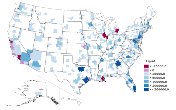
    Black population changes in various cities have been one of the few pieces of the latest Census to receive significant media coverage.  The New York Times, for example, noted that many blacks have returned to the South nationally and particularly from New York City.  The overall narrative has been one of a “reverse Great Migration.”  But while many northern cities did see anemic growth or even losses in black population, and many southern cities saw their black population surge, the real story actually extends well beyond the notion of a monolithic return to the South.

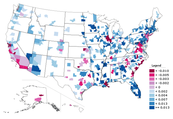
    The map below, showing total growth in Black Only population from 2000 to 2010, indeed shows that northern and west coast cities had low or even negative growth while various southern cities boomed.


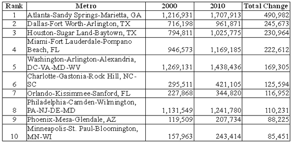
    Here is a list of the top ten metro areas (among those with more than a million total people) for black population growth:


    And here are the bottom ten (among those with more than one million people):


    Of course, looking at total population numbers can mislead. Some cities grew slowly or lost people as a whole while others boomed. With Houston, Dallas, and Atlanta all adding over a million people each, it’s no surprise these regions added lots of blacks. Working and middle class African-Americans likely shared many of the same motivations to move to these cities – such as lower housing prices – as Americans of other ethnicities. In that light, a look at change in black population share (the percentage of the population that is black) provides additional perspective:


    Here we see not a single-minded return to the South, but a complex mixture of shrinking and growing regions in various parts of the country.  This includes some surprising places, like Minneapolis-St. Paul, which was one of the top ten metros in the country for total black population growth, and also saw its black population share grow strongly.  Now the Twin Cities, along with Columbus, Ohio, another strong performer, are two of the top destination for African immigrants from Somalia and elsewhere, which doubtless accounts for part of that strong growth. But anecdotal reports indicate that they are also benefitting from Chicago’s expanding black diaspora, along with places like Indianapolis and various Downstate metros.

    Atlanta, well known as America’s premier metro area for blacks, continued to dominate the charts. Not only far and away the leader in adding raw numbers of blacks, the African-American share also grew share strongly too. Charlotte is also clearly emerging as another key black population hub, ranking #6 in America for total black population growth, which is impressive for a smaller city, and adding nearly two percentage points in black population share.  It grew its black population much faster than other fast growing small cities like Raleigh or Nashville, and added share at more than three times as fast.

    By contrast, Houston, which grew total black population significantly, had a much lower share gain. Austin, one of America’s fastest growing metros, added only 28,000 blacks and actually lost black population share. And Washington, DC, despite being a traditional black population and cultural hub, also lost black population share regionally as gentrification in the District resulted in its loss of its black majority for the first time in decades, according to the Brookings Institution. 

    So even among rapidly growing metro areas in the South, the appeal to black population is selective, favoring places like Atlanta, Charlotte, Florida cities, and even slower growing cities along the length of the Mississippi River like Memphis.  Even some cities in the North are retaining their allure to blacks as well. Less favored or even out of favor are metros like DC, Dallas, and Houston as well as cities such as Charleston and Savannah along the southeast coast.

    Slow or negative black population growth is particularly concentrated in traditional tier one “global cities”, as well as those facing economic or other hardship like Detroit, Cleveland, and immediate post-Katrina New Orleans.

    The latter may be understandable – whites have been leaving these regions as well – but the former is quite troubling.  The global city model, focused on high end and creative services, is supposedly the bright and shining savior of American urbanism. Indeed, it’s hard to find a city that doesn’t have some aspect of that as a core plank in its civic strategy. Yet the cities that have been most focused at promoting this notion – such as New York, San Francisco, and Chicago – are generally those  disproportionately driving blacks away. The reasons for this aren’t clear, but the high and increasing cost of living in those places seems like one logical explanation.

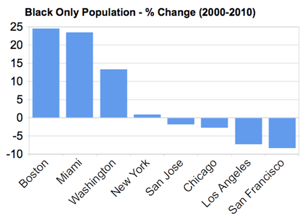
    Here’s a more detailed look at the percentage growth in Black Only population in some tier one global type metros:


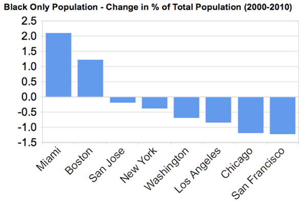
    New York barely broke even on black population, while Chicago, LA, and the Bay Area all actually lost black residents, a stunning reversal from their past as black magnets. However, Boston, not a traditional black population hub, grew its black population strongly on a percentage basis, as did Miami and DC, though as noted before, the share change in DC was negative.  Here is that metric for the same metros:


    With the notable exceptions of Boston and Miami – and Philadelphia, seldom ranked highly as a global city but still a traditional large northern metropolis – most global city regions appear to be increasingly inhospitable to Blacks.  Thus their model of success, whatever its appeal to some, at a basic level simply lacks inclusiveness. This shows its clear limits as an overall model for America’s urban centers as a whole.

    Aaron M. Renn is an independent writer on urban affairs based in the Midwest. His writings appear at The Urbanophile. Data analysis, maps, and charts in this piece were prepared with Telestrian.

  • A Detailed Look at Workforce Skill Shortages

    As the United States continues to fight its way out of the Great Recession, more attention has been directed to the question of why is has taken so long for workers to find re-employment. In economist parlance, this is primarily a question of “structural unemployment.” This describes the type of unemployment that results from a mismatch of worker skills and the skills demanded by employers.

    As of April 2011, there were 13.2 million unemployed workers and 2.9 million unfilled job openings. In other words, April’s bulky 8.7% unemployment rate could have been lowered one percentage point (to 7.7%) if just half of the advertised job vacancies were filled by unemployed workers. Obviously, it is not realistic for every position to be filled immediately—it takes time for employers to find the right workers, and vice versa. But the odd pairing of high unemployment and high job vacancies illustrates a structural employment issue, which may have worsened in recent years.

    Historically, when the economy is growing, the unemployment rate is relatively low and the job vacancy rate is relatively high, indicating more job openings than there are workers to fill those positions. Likewise, when the economy is shrinking, the unemployment rate is relatively high and the vacancy rate is relatively low, because there are more workers looking for work than there are jobs. This pattern held between 2008 and mid-2009 but from the second half of 2009 through mid-2011, the vacancy rate has remained surprisingly high when compared to the unemployment rate. 1

    A question that has perplexed jobseekers and economists alike is how there can be so many people looking for work and yet so many unfilled positions in the economy? In an attempt to answer this question, EMSI has taken a fresh look at the skill gap issue using historic jobs and earnings data to determine which segments of the labor market are growing and which are diminishing. Often when examining shifts in the labor market, analysts will look solely at employment changes and highlight the occupations that have increased or declined in total employment, but we believe this is somewhat shortsighted. This method may not tell the whole story. For example, it is possible for employer demand for a certain occupation to increase or remain the same while actual employment levels drop. 2  Therefore, the addition of the earnings measurement over time adds a great deal to this analysis.

    In order to describe this method, a bit of basic economic theory needs to be explained. One of the chief tenants of economics is that in a market that is not exceedingly manipulated by outside forces, demand and supply will meet at a point that is mutually beneficial for both producers and consumers. To put this in labor market economics terms, producers are individuals offering their time and labor for a wage, and consumers are employers seeking the labor of workers in exchange for a wage. The magical meeting place where both groups settle is called “market equilibrium.” Although both parties may not be completely satisfied with the arrangement, they are at least content enough to accept the terms of employment.

    Aggregating the data shows that of all occupations in the potential skills shortages category, 66% are in the fields of healthcare; education; business and finance; and architecture and engineering. Conversely, of all occupations in the potential surpluses category, 63% are in the fields of production; construction and extraction; and installation, maintenance and repair.

    Following this theory, we can expect that any given occupational category (SOC code) will have a wage and employment level that best represents the demand for workers, and the required compensation level for employees. 3 To complicate matters, the economy is never stationary but is in a continuous state of adjustment and realignment. Although the market for certain workers may be at equilibrium in the fourth quarter of one year, changes influencing supply and demand will likely cause that equilibrium to shift such that the equilibrium will be different in the first quarter of the following year. (Think of the demand for commercial fishermen in the Gulf Coast before and after Hurricane Katrina in 2005).

    Based on these theories, EMSI has dug into historic labor market data to look for two characteristic groups:

    1. Potential skill shortages: where employer demand had pushed both employment and earnings upward over time
    2. Potential skill surpluses: where worker availability has exceeded demand and pushed both employment and earnings down over time

    The key word in both of these categories is “potential.” These shortage/surplus measurements are, in fact, only half of the equation. A “skill shortage” only exists if workers have failed to acquire the requisite skills to perform the required tasks at a rate equal to demand. Likewise, a “skill surplus” exists only if workers have failed to retrain and find employment elsewhere after losing their jobs. Both of these measurements are difficult to pin down. In the next post, we will examine whether the potential shortage/surplus occupations have received the requisite amount of workers over the past couple of years, but for the moment it will suffice to examine these increases and decreases in demand over time.

    To perform this analysis, EMSI analyzed 661 SOC codes in terms of jobs and earnings between 1999 and 2010. In order to get the data to line up properly, self-employed workers and every SOC code that ends with “all other” have been excluded. An occupation appears in the potential shortage category if the wage and employment growth between 1999 and 2010 have exceeded the average by a significant degree; and an occupation classifies in the surpluses category if both wages and employment have decreased by a significant degree. 4

    Tables 1 and 2 show the results of this analysis. These tables are ranked by employment in 2010 to provide some gauge of the significance of the potential shortage or surplus. Percent change in employment and percent change in earnings are also shown in these tables.

    Table 1: Top 25 Occupations Facing Potential Skill Shortages

    SOC Description 2010 Employment 1999-2010 Employment % Change 1999-2010 Median Wages % Change
    29-1111 Registered Nurses 2,655,020 20% 17%
    13-2011 Accountants and Auditors 1,072,490 27% 18%
    13-1111 Management Analysts 536,310 78% 11%
    41-4011 Sales Representatives, Wholesale and Manufacturing, Technical and Scientific Products 381,080 11% 23%
    13-2072 Loan Officers 283,330 42% 11%
    11-9111 Medical and Health Services Managers 282,990 23% 20%
    13-1023 Purchasing Agents, Except Wholesale, Retail, and Farm Products 272,370 22% 9%
    29-1051 Pharmacists 268,030 18% 27%
    13-1031 Claims Adjusters, Examiners, and Investigators 262,540 70% 15%
    17-2051 Civil Engineers 249,120 19% 10%
    17-2141 Mechanical Engineers 234,400 16% 7%
    13-2051 Financial Analysts 220,810 55% 15%
    13-1041 Compliance Officers 204,000 65% 16%
    29-2021 Dental Hygienists 177,520 97% 10%
    29-2011 Medical and Clinical Laboratory Technologists 164,430 13% 11%
    25-1071 Health Specialties Teachers, Postsecondary 144,780 101% 6%
    25-2043 Special Education Teachers, Secondary School 141,420 18% 11%
    17-2072 Electronics Engineers, Except Computer 133,660 25% 11%
    11-9151 Social and Community Service Managers 116,480 32% 20%
    29-1127 Speech-Language Pathologists 112,530 31% 12%
    33-3021 Detectives and Criminal Investigators 110,640 33% 14%
    11-9033 Education Administrators, Postsecondary 110,360 15% 16%
    29-1126 Respiratory Therapists 109,270 36% 15%
    25-2042 Special Education Teachers, Middle School 100,510 16% 20%
    29-1122 Occupational Therapists 100,300 27% 12%

    Table 2: Top 25 Occupations Facing Potential Skill Surpluses

    SOC Description 2010 Employment 1999-2010 Employment % Change 1999-2010 Median Wages % Change
    43-5081 Stock Clerks and Order Fillers 1,795,970 0% -6%
    53-3032 Heavy and Tractor-Trailer Truck Drivers 1,466,740 -6% -6%
    47-2031 Carpenters 620,410 -20% -5%
    53-7051 Industrial Truck and Tractor Operators 518,350 -12% -5%
    47-2111 Electricians 514,760 -16% -7%
    53-3031 Driver/Sales Workers 371,670 -4% -15%
    41-9041 Telemarketers 288,760 -41% -8%
    43-9041 Insurance Claims and Policy Processing Clerks 231,570 -14% -8%
    47-2051 Cement Masons and Concrete Finishers 140,950 -7% -5%
    49-3021 Automotive Body and Related Repairers 129,730 -28% -7%
    51-3021 Butchers and Meat Cutters 125,910 -9% -6%
    49-2011 Computer, Automated Teller, and Office Machine Repairers 110,320 -15% -4%
    51-3023 Slaughterers and Meat Packers 88,500 -24% -6%
    47-2081 Drywall and Ceiling Tile Installers 82,320 -30% -11%
    47-2021 Brickmasons and Blockmasons 68,520 -30% -11%
    51-4111 Tool and Die Makers 66,530 -50% -7%
    43-5111 Weighers, Measurers, Checkers, and Samplers, Recordkeeping 66,480 -21% -9%
    19-4031 Chemical Technicians 59,440 -25% -6%
    47-2221 Structural Iron and Steel Workers 58,460 -32% -5%
    13-2082 Tax Preparers 56,990 -2% -13%
    27-2011 Actors 54,740 -35% -22%
    51-4034 Lathe and Turning Machine Tool Setters, Operators, and Tenders, Metal and Plastic 40,970 -51% -7%
    49-9044 Millwrights 36,670 -54% -5%
    51-3093 Food Cooking Machine Operators and Tenders 32,220 -27% -13%
    27-1021 Commercial and Industrial Designers 28,670 -25% -3%

    Analysis

    So what can be gleaned from this analysis? To start at the highest level, this certainly indicates employers’ preferences are shifting away from manual labor occupations and toward knowledge-based occupations. Aggregating the data shows that of all occupations in the potential skills shortages category, 66% are in the fields of healthcare; education; business and finance; and architecture and engineering. Conversely, of all occupations in the potential surpluses category, 63% are in the fields of production; construction and extraction; and installation, maintenance and repair.

    Potential Shortages

    To examine some more specific cases, it is interesting that two of the occupations regularly at the center of skill-shortage discussions, registered nurses and accountants, are at the top of this list. (We must emphasize again that this does not indicate that there is a skills shortage for these occupations but rather that the demand for such workers has increased at a rapid rate over the past 11 years; whether or not the output of students has remained apace with this demand will be explored in the next piece.) It is also not surprising that 10 other healthcare positions land on this list, including occupations such as medical managers, pharmacists, and speech-language pathologists.

    There are also some surprises on this list, such as the contingent of occupations in the business and financial operations category (e.g., loan officers, claims adjusters, and financial analysts). The prevailing theme with these occupations is that each requires individuals with strong interpersonal skills, as well as strong computational and analytical skills. Over the past decade, both the increase in the rate of information sharing and increased complexity of this information can likely explain why employers have been investing higher wages in these workers.

    Management analysts, for example, experienced a wage increase of 11% and employment increase of 78% over the past decade. Their presence on this list highlights the importance of technology in creating job change, as well as changes in business trends. In the past decade, businesses in the professional and technical services sectors have been increasingly hiring businesses and consultants from outside of their own companies to handle departmental work such as advertising, payroll, and human resources. We can account this change, in large part, to the power of technology to move information quickly and efficiently.

    Potential Surpluses

    Many occupations in the manufacturing category have declined sharply in both wages and employment due to offshoring. On this point, we must specifically state that manufacturing skills are not declining on the global scale. Looking worldwide, there are likely more individuals working as industrial truck and tractor operators and tool and die makers in 2010 than there were in 1999, but today many of these positions are now in developing countries. These reflect situations where without the effect of protectionist policies (such as quotas or tariffs) foreign competition has a competitive advantage over American workers because foreign workers are willing to work for lower wages.

    Offshoring is not the only reason that occupations on this list have declined. Just as with the potential surpluses list, technology is the catalyst for many notable changes. Occupations such as stock clerks and order fillers have become less valued in the labor market due to labor-saving technology that efficiently catalogs inventory and computer programs that allow people to make orders for equipment and merchandise without the aid of a middle-man. Likewise, positions such as telephone operators and desktop publishers are quickly becoming obsolete due to advancements that have made telecommunications more accessible for a wider audience.

    The large cohort of construction jobs on this list are a consequence of the precipitous drop in construction employment between 2007 and 2010, and these may or may not represent an actual skill surplus. For example, employment for carpenters had increased every year between 1999 and 2007, but between 2008 and 2010 employment decreased by an average of 14% per year; indicating that this may represent a temporary, or cyclical change. On the other hand, wages consistently decreased for all construction jobs by about 0.5% per year over the last decade. This could indicate that a sustained oversupply issue among construction occupations has allowed employers to pay workers slightly less for their labor. Time will tell whether there are too many or just the right number of people in the workforce with construction skills, but it is difficult to say right now.

    Conclusion

    The dynamic nature of the economy causes routine changes in labor market demand. These data illustrate an important and often overlooked fact: the labor market is driven by all other markets (e.g., markets for cellular phones, houses, and doctor’s office visits, etc.). Over time, we can see labor market changes occurring, for instance, when the number of product orders conducted over the internet increase because there are jobs required to support that increase. At the same time, there are jobs that will be lost because they are no longer the most efficient way to address consumer demand. It is easy to see how skills shortages naturally arise in a market-based economy. When such changes occur, it is imperative that public education, the workforce system, and economic development agencies are able to cope with the changes, and assist workers in the process of moving from areas of skill surplus into areas of skill shortage.

    In the next blog post we will analyze these potential skill gaps from the supply perspective to see whether or the supply of talent has grown at the same rate as the demand for the workers identified here. We will also analyze the knowledge, skills, and abilities (KSAs) that are incumbent to the potential skill shortage occupations in order to see which KSAs could be undersupplied in the labor market.

    Points, a consultant and project manager at EMSI, can be contacted at brian.points@economicmodeling.com. Read more about him here and EMSI Consulting here.

    Illustration by Mark Beauchamp

    1. See page 5 of the Bureau of Labor Statistics’ Job Openings and Labor Turnover highlights from May 2001 for an up-to-date illustration of this relationship: http://www.bls.gov/web/jolts/jlt_labstatgraphs.pdf). It is also worth mentioning that some economists point to the special extension of unemployment benefits that occurred during the recession as a contributing factor to unexpectedly high unemployment. back
    2. This situation occurs when either a) supply drops due to workers’ unionization or the advent of new worker certification requirements that did not previously exist, and/or b) the skills for a certain job category become so specific and technical that only a select group of workers can perform them. back
    3. With this theory, it is assumed that each group of workers is “homogenous.” In other words, no one worker in any occupational category is more knowledgeable or skilled than any other. Of course, in the real labor market some workers are much more capable than others. In such cases, the higher skilled and lower skilled workers each belong to their own occupational groups, which have their own market equilibrium points with different wage and employment levels. back
    4. All wages are in real terms, adjusted for inflation to 2010 dollars. The cut-off point for significance is 0.5 standard deviations from the median. Please be aware: we are not treating this as a standard econometric model in which we are attempting to show a consistent relationship between earnings change and employment change. For this reason, we are not utilizing the same measures for statistical significance that are common to econometric models. back
  • Banana-nomics

    The price of bananas is again making headlines as it pushes up inflation and threatens rising interest rates. But what’s the price of the humble ‘nana got to do with property markets? Plenty.

    Banana prices have risen almost 500% since Cyclone Yasi wiped out much of north Queensland’s banana crop earlier this year. The immutable laws of supply and demand dictate that when supply falls relative to demand, prices will rise. Which is what they have done, and as they did a few years ago when the same thing happened after Cyclone Larry. As banana supply was restored, prices fell. As they will again.

    Banana prices are a self-evident, every day example of supply and demand at work. They’re the sort of example understood by consumers and even school children with no formal economic training. But clearly the lessons are beyond the capacity of some Australian politicians, most land regulators and many town planners. In the very same way that constraints on supply create scarcity value for every day commodities, constraints on supply and scarcity equate to rising prices for all types of real estate, not just housing.

    It starts with misguided planning schemes that aim to direct consumer behaviour and distort their purchasing decisions by limiting choice. This has become commonplace in planning to the point of representing accepted wisdom. One of the most obvious examples has been the continued efforts by some regulators and planning authorities to attack the detached house as a choice – however best suited to the needs of young families – which ‘Australia can no longer afford.’ Like a contemporary version of Stalinist central command, housing choice is distorted via planning schemes that are biased to high density apartments in central locations (that consumers are told is good for society), as opposed to detached housing on the urban boundary (that remains the majority consumer preference). Faced with little choice, more people are forced to choose the option deemed appropriate by higher authorities than themselves, and when this is later reflected in data, the regulators hail this as some sort of fundamental change in consumer preferences. You’re seeing this type of shallow analysis in the media, pushed by various interest groups, on a regular basis now.

    An equally significant consequence of using planning ideology to achieve social engineering outcomes has been the impact on prices. In the case of raw land for housing, we have succeeded in the unimaginable – needlessly elevating prices far beyond the reach of average Australians, on the basis that we may run out of land, in a country where land is plentiful. This has been achieved simply by making raw land for detached housing development scarce because permission is not allowed outside artificially drawn urban planning boundaries. (On top of creating scarcity, of course, new land supply is taxed more aggressively than existing supply, via upfront levies. This is no doubt because there are fewer votes at risk in taxing new housing lots as opposed to raising council rates or other broad based revenue measures. Plus, new supply is tied up in a regulatory tangle which now means it can take 5 or 10 years just to get permission to develop land in areas already described as intended for future housing. Go figure).

    The proof is readily available. In the Brisbane region, for example, the price of vacant land per metre is now 2.3 times (230%) what is was a decade ago. Established house prices also increased, but at a lower rate – they are 1.5 times (150%) the price a decade ago. Average weekly earnings, just to bring it back to earth, are 0.6 times (60% higher) what they were a decade earlier.

    In Melbourne, where supply constraints have been more sensibly managed, land for housing is 1.3 times the price of a decade earlier. Little wonder developers are giving up hope for south east Queensland and focussing their energies in Victoria.

    If the fundamentals of supply and demand (let’s call it banana-nomics) are so obvious in the market for new land for housing, where else are they revealing themselves?

    Recent reports have noted that Australian retail property rents (a lot like our housing prices) are amongst the highest in the world. Research by CB Richard Ellis suggests that rents in Sydney, Melbourne and Brisbane are higher than the better shopping strips in Los Angeles or Milan. How can this be? Los Angeles County has a population of around 10 million people, some of whom are noted big spenders. Retail demand there would dwarf that of Brisbane’s retail spend.

    Once again, the answer lies in supply. LA’s ‘sprawl’ is arguably more about the historically easy dispersion of retail and commercial space along high streets and back roads throughout the metro area, as it is about expanding housing. As LA developed, it was relatively easy to create new retail space, and there is plenty of redundant retail space in older strip areas where secondary traders can operate at low market rents. In Australia, by contrast, planning constraints have been much more onerous. The major retail centres, developed from the 1960s to the late 1990s throughout metropolitan areas largely remain the same major centres we have today. Finding new opportunities for retail expansion is a large hurdle which few clear – protection of the retail hierarchy and existing centres, and preventing a dispersal of retail activity beyond existing areas, is the deliberate intention of urban planning schemes.

    The result has been that those with the existing retail centres have paid for, and now own, a precious commodity: the permission to conduct retail activity, with limited threat of competition in that catchment. Our retail rents have grown because retailers – and consumers – have had limited alternative choices. New retail operators have encountered barriers to entry in the form of planning laws and no-compete clauses, once again reinforcing the value of existing permissions. Just ask Aldi or Costco what they think our planning schemes are doing for competition if you don’t believe it.

    City carparking is another example of banana-nomics at work. A study by Colliers International reveals that city parking costs in Sydney and Melbourne are more expensive than London, Tokyo or New York. Brisbane came in at 14th most expensive on a global list of 156 central business districts. How can it be? The answer is simply that the anti-car crusade has led to planning policies which deliberately seek to limit CBD parking spaces, in the futile hope that this will somehow force people to abandon the convenience (and frequently the necessity) of private transport in favour of buses or trains.

    Those ambitions have never come to much, so regulators then resort to the blunt weapon of taxes – with car parking levies now common in many cities and the prospects of congestion charging for access to CBDs frequently rearing its ugly head. This deliberate attempt to restrict (and then punitively tax) the supply of city parking spaces has the inevitable effect of raising prices.

    But there is one fundamental difference between how banana-nomics works for banana growers and property developers. Banana growers can grow more plants and create more supply. The same can’t be said for developers of property. In housing, new supply is likely to remain constrained by growth boundaries and the preference of regulators towards higher and medium density within existing areas. This will create a floor under the cost of new supply which means that prices are unable to fall (they can’t fall below the cost of production). So raw land is unlikely to get much cheaper, unless there are some radical (and many would say much needed) reforms to planning policies around Australia.

    The same applies to retail property. Retailers (most recently evidence by Solomon Lew’s Just Group comments about retail rents) may object to high rentals, but they won’t get much option. Major retail centres are where the action is, and the alternative (on-line retail) isn’t sufficiently appealing to the majority of consumers, who get more from their shopping trip than just a retail transaction. New shopping centres won’t be created within existing urban boundaries because planning schemes are unlikely to allow further retail dispersion away from existing centres. In the limited cases where approval is granted, existing centre owners will play hard ball, arguing fervently against the free market (witness Westfield’s objections to a new Aldi Store, approved by Brisbane City Council, north of Brisbane). Their actions are understandable, given they’ve outlaid very large investments that are contingent on the existing planning scheme remaining.

    And the same applies to car parking. Unless there’s a monumental shift in policy attitudes to private transport and city car parking, we aren’t going to see multiple new above or below ground public car parks being created in our cities, no matter how much the demand. That will mean prices remain high.

    In all cases, it has been the planning regulations that restrict supply and limit choice, not demand, that have been responsible for making our housing, our retail rents, our car parking and so much more, amongst the costliest in the world. And given that those constraints are unlikely to change, you’re unlikely to see that position reverse itself any time soon.

    The burning question, of course, is how long can it last? If supply costs elevate prices beyond the capacity or desire to pay, people stop buying. Economies slow down. The music stops.

    How do you like them apples?

    Ross Elliott has more than 20 years experience in property and public policy. His past roles have included stints in urban economics, national and state roles with the Property Council, and in destination marketing. He has written extensively on a range of public policy issues centering around urban issues, and continues to maintain his recreational interest in public policy through ongoing contributions such as this or via his monthly blog The Pulse.

    Photo by Fernanado Stankuns.

  • Things They Don’t Tell You About GDP

    I was watching Book TV on C-SPAN last week and I came upon Mr. Ha-Joon Chang talking about his book “23 Things They Don’t Tell You About Capitalism.” For example, Thing #1 is “there is no such thing as a free market.” I actually use this line in my finance and economics courses. If someone thinks there is, I tell them to walk into the office of any securities lawyer and look at the books on the shelf – there are a mountain of regulations just for the stock market. There wasn’t anything in Ha-Joon’s book that I didn’t already know about capitalism – but I spent 11 years in college earning 3 university degrees to learn it. I’m assuming most of my readers have had better things to do than spend that much time in the library.

    It got me thinking. What else doesn’t the general public know about economics? I decided to let you in on some secrets you may not know about the Gross Domestic Product (GDP), a number you see every day in the news as a measure of the performance of the national economy.

    Many people believe that the GDP comes from something like an income statement prepared by accountants.  It does not.  The GDP is an estimate of the total output of all production that occurs in the nation.  The Bureau of Economic Analysis (BEA) estimates the GDP using a variety of assumptions based on information reported from surveys conducted by the Census Bureau and from tax returns submitted to the Internal Revenue Service (IRS).

    The BEA began by creating concepts and a structure of accounts to create an idea for implementing a theoretical income statement for the nation. If the data were 1) accurate, 2) always available, and 3) fit their definitions exactly, then the estimate of income would always equal the estimate of output.  It does not, however.  The “statistical discrepancy” between estimated income and output for the first quarter of 2011 was 1.3 percent of the GDP or about $180 billion.  This discrepancy cannot be accounted for by anything other than how the numbers are created.

    Since some data is simply not available, BEA has to make assumptions about the direction of the changes that they cannot record.  For example, for the first quarter of 2011, the BEA assumed that nondurable manufacturing inventories increased, exports increased, and imports increased. When you read that exports increased this year, that is because the BEA assumed it increased – they did not actually have any data to measure it when they released the new GDP numbers.

    Some data that the BEA needs, such as new car sales, are simply not reported anywhere.  Thus, the BEA developed estimating methods that adjust the data they can collect to match their concepts.  When they need to fill in missing data, the new values are estimated from average list prices, rather than actual sales prices.  For example, “an estimate of expenditures on new cars is calculated as the number of cars sold times average list price” for all cars (at transaction prices—that is, the average list price with options adjusted for transportation charges, sales taxes, dealer discounts, and rebates).  One obvious problem with this approach is that few people pay the actual list price for a car.  Note also that this is not the number of 2010 Toyota Corollas sold times the list price of 2010 Toyota Corolla and the number of 2010 Mercedes C240s sold times the list price of a 2010 Mercedes C240, etc.  It is estimated as the number of all cars sold times the average list price of all cars.

    Some of the data that the BEA uses comes from IRS income tax reports, which use different definitions for income and expenses; or from surveys conducted by the Census Bureau which does not survey all the categories the BEA uses.  Import data comes to us “in a bilateral data exchange” with other countries.  Some values come in as valued at the point of manufacture; the BEA adjusts “these data to foreign port value by adding the cost of transporting the goods” within the other country from the point of manufacture to the point of export to the U.S.  This adjustment is made using average known costs of transportation.

    The BEA also estimates wages as the number of people employed times the average hourly earnings times the average hours worked.  As income inequality rises – hence, salaried employment wages move further away from hourly employment wages – these reported incomes may become increasingly less accurate.  An estimate of interest received may be calculated as the stock of interest-bearing assets times an effective interest rate.  The BEA collects employment data in the middle of the month, which is assumed to represent conditions for the entire month – so they make judgment calls to adjust employment data when there are “significant events” like blizzards on the east coast or hurricanes in Florida, which occur after the data is reported.

    Sometimes there just is no primary source data and the entire category is estimated.  The BEA makes seasonal adjustments, uses moving averages, inputs new data as “best level” or “best change,” and data series are interpolated and extrapolated.  All of that happens before we even begin to discuss the several methods available for calculating adjustments for inflation.

    Don’t put too much weight on every number reported about the economy.  When politicians start talking about, say, the impact of new tax rules on the GDP, they are not just comparing apples and oranges – they are making apple sauce! When someone asks me – a professional economist – how I think the economy is doing, I tell them: “Look out your window.” Do your neighbors have jobs? Are the streets being cleaned and the trash being picked up? Is there more or less traffic when you go to work or the grocery store? Any of those signs will tell you as much as the GDP will about the economy.

    Susanne Trimbath, Ph.D. is CEO and Chief Economist of STP Advisory Services. She will be participating in an Infrastructure Index Project Workshop Series throughout 2010. Her training in finance and economics began with editing briefing documents for the Economic Research Department of the Federal Reserve Bank of San Francisco. She worked in operations at depository trust and clearing corporations in San Francisco and New York, including Depository Trust Company, a subsidiary of DTCC; formerly, she was a Senior Research Economist studying capital markets at the Milken Institute. Her PhD in economics is from New York University. In addition to teaching economics and finance at New York University and University of Southern California (Marshall School of Business), Trimbath is co-author of Beyond Junk Bonds: Expanding High Yield Markets.

    Image courtesy of US BEA.

  • Houston’s Not Resilient? Really?

    Alert reader Jessie sent me this article about Houston ranking "very low" on a "resilience capacity index".  For real.  I was dumbfounded too. And now I’m going to post out-of-character and get a little snippy…

    Let’s skip right past the parade of articles and data showing Houston and Texas weathering the great recession better than just about everywhere else in the country.  It’s so strong Rick Perry might win the Republican presidential nomination based on it.  That alone should make them question their entire methodology.  Go back to the dot-com and Enron crashes, and you’ll find the same minimal impact.  Sounds like we’re pretty resilient to me.

    Then there’s their explicit declaration that it represents the ability of a city to weather the shock of a major storm or flood.  I’ll point to both Tropical Storm Allison and Hurricane Ike.  Both were devastating – yet we bounced back relatively quickly from each one.  You might note on their map that New Orleans ranks higher than Houston, yet Hurricane Katrina knocked New Orleans on its back for years.  Maybe they need to add a "levees upkeep" variable to the index?

    Let’s look at some of the problematic variables that make up the index:

    • Economic diversification: I’ll admit there’s some value here, but it’s also worth noting that some of the wealthiest and most successful cities in the country built that success around one strong, dominant industry: NYC and finance, DC and govt, SF/SV and tech, Houston and energy, etc.
    • Income equality: also a proxy for "we don’t have any high-paying industries" – nor the corresponding tax base.  How is this helpful for resilience? (more on the value of income disparity here)
    • Educational attainment, being out of poverty, and home ownership: a proxy for using tight zoning and land-use regulation to keep out apartments, new and affordable housing, and immigrants.
    • Metropolitan Stability: aka "stagnation".  Cities that aren’t growing have amazingly stable populations because nobody wants to move there and none of the residents can sell their houses.

    My cynical side thinks that, since the University of Buffalo put this out, they intentionally chose variables that made Buffalo look good, even though it’s one of the most stagnant metro economies in the country.

    All in all one of the worst designed indexes I’ve ever seen – and there are some doozies out there.

    OK, I feel better.  End venting (and snippyness).

    Read more from Tory at HoustonStrategies.com.

  • Sustaining the Suburbs

    The proposition is simple, if not overwhelming.  If we want sustainable cities – however you define “sustainable” – we had better put some effort into the quality of suburban life.  We need to get over denigrating suburbs and sprawl.  That simply ducks the issue of where and how most people spend most of their time.  We need to moderate a preoccupation with promoting CBD and big centre lifestyles.  Those are places that people want visit, but not necessarily where they want to live.

    Come back Jane, our suburbs need you
    It’s fifty years now since Jane Jacobs’ landmark book about saving North American cities from themselves.  She argued against the prevailing push for urban renewal as displacing communities and destroying street life with motorways, car parks, and bland commercial development.  Jacobs’ writing and her activism inspired a resistance credited with saving inner city villages, helping retain the human character of large cities, and inspiring a generation of urban designers and planners. 

    There is no doubt that the Jacobs message took hold in New Zealand.  It’s become compelling since the crash of ‘87 slowed down the razing of inner city blocks and marked the beginning of the end of the white collar CBD.  Hanging on to what we’ve got is one way to stop the hollowing out.

    Unfortunately, today’s call for central city mega projects on which to stake a claim to an international presence and the push for large scale CBD residential development on which to stake a claim to environmental stewardship run the risk of reversing the gains to inner city life.  High rise apartments, tracts of high density housing, and grandiose civic plans risk undermining the essence of the central city in the same way as urban renewal and freeways once did.

    But that’s not what this posting is about.  The reality is that the bulk of our populations live in the suburbs; the suburbs that are growing the most; and that’s where we need to promote the capacity for people to live fulfilling lives.  That’s where today we need to promote street life and be wary of the threats posed by the new urbanists and their grand plans for intensification.

    Most people still live in the suburbs
    Its obvious that most people still live a suburban life.  But that doesn’t seem to be appreciated by the people who plan our cities today, even as the number of suburban residents keeps growing.

    Look at the three metropolitan areas in New Zealand, not big by international standards, but nevertheless reflecting an entrenched trend in the developed world – a move to decentralise.  The numbers say it all. 

    Over the last 14 years population growth has been totally dominated by the suburbs.  In Auckland, the inner city accounted for only 6% of a 326,000 person increase.  In other words, 305,000 opted to live in the suburbs and beyond, compared with 21,000 in the central city.  In Christchurch, the CBD accounted for just 1% of population growth and the rest of the inner city 2%.  Wellington, the capital city with a distinctively constrained setting did much better, but a revitalised CBD still accounted for just 10% of population growth. [1]

    Population Growth in the Central City: Auckland, Wellington, Christchurch, 1996-2010
    Source: Statistics New Zealand

    And they still favour the outer suburbs

    Let’s break this down a little further.  Greater Christchurch Urban Development Strategy Partners (http://www.greaterchristchurch.org.nz/) came up with a plan for consolidating the city.  This includes policies promoting central city living or living around established commercial centres and development contained largely within metropolitan limits.  Well, we can see the warning signs for this sort of thinking from the very small share of recent growth in the inner city.  It seems that the new plan is set to fly in the face of recent experience.   

    And if we divide Christchurch’s suburbs into three groups (inner, outer, and periphery) we find the decentralising tendency that it is set against is even stronger . [2]

    Population Growth in Christchurch Suburbs, 1996-2010

    The peripheral suburbs on the city fringes have led growth rates, while the outer suburbs have led absolute growth.  (That’s if we overlook the fact that the small towns in Christchurch’s hinterland left out of this analysis have grown at even faster rates, with the adjoining districts two of the fastest three growth areas in New Zealand).

    Does it make sense to stem this pressure?  Not if we want the cities to continue to grow, because the majority of people clearly favour suburban living, and that’s where the greatest capacity for accommodating them lies. 

    So while it’s exciting to record rapid growth rates of population gain in our inner cities, policy makers really need to make sure we are doing the right thing by our suburbs. 

    Places to live …
    This may mean, for example, ensuring that we don’t sacrifice too many of the green spaces to high density housing: our suburbs also need to breathe.  If we want to lift densities, then terraced units and the occasional low rise apartment may be all we need.  They are probably the most easily achieved forms of intensification in areas where consolidating sites is notoriously difficult and where existing residents will fight to preserve existing character. 

    Better still may be judicious development of greenfield sites, where we can boost densities by applying the principles of Smart Growth without destroying what people value about what went before, without overloading existing facilities and infrastructure, creating attractive public and private realms, and potentially enhancing rather than trashing biodiversity, water and air quality.

    Places to work …

    >We will also need to promote neighbourhood centres to ensure that they can accommodate diverse activities and services, that they are easy to get to and get around, well appointed and vibrant.  They may even become the focus of modest park and ride facilities, the framework around which flexible public transport within and beyond the neighbourhood can best be delivered.

    It may be timely to review what in our planning provisions force people to make regular cross-city journeys to work, and whether this can be changed through more decentralised employment. 

    Places to play …
    While local centres are becoming the focus of community and neighbourhood commerce and culture, suburban parks and gardens will also have a role to play.  We need good spaces close to the majority of homes for sport and recreation, and safe local places for families and children to gather.   

    We might more actively protect some of the informal spaces in our suburbs, and take a broad view of what constitutes heritage in doing so.  We may have to protect landscapes and structures because they are iconic in local areas, not because we believe they may have national or international significance.  Where they don’t exist, we may even have to create the landmarks, the parks and town belts, and the structures that reinforce local identity and culture.

    Strong suburbs for a strong CBD
    By allowing more things to happen in the suburbs without overloading them with bland residential development or tracts of mixed use that fall between urban design stools, we have an opportunity to advance the planners’ live-work-play mantra, and to enhance the sustainability of our cities. 

    Ultimately, it is the quality of day-to-day life in a city and its capacity to attract and hold skilled and motivated people that will determine its prosperity.  And it is those people and that prosperity that will underwrite the health of the CBD.  Without strong suburbs, we cannot sustain a strong CBD.


    [1]            For this exercise, the following council areas were counted, Kapiti, Porirua, Upper and Lower Hutt, and Wellington City.

    [2]           This classification omits the largely rural Banks Peninsula which is quite separate from the metropolitan area.

    Phil McDermott is a Director of CityScope Consultants in Auckland, New Zealand, and Adjunct Professor of Regional and Urban Development at Auckland University of Technology.  He works in urban, economic and transport development throughout New Zealand and in Australia, Asia, and the Pacific.  He was formerly Head of the School of Resource and Environmental Planning at Massey University and General Manager of the Centre for Asia Pacific Aviation in Sydney. This piece originally appeared at is blog: Cities Matter.

    Photo by New Zealand Defence Force.

  • The 2012 Vote: A Newly Diverse Center

    Demographic transformations are changing how the American people vote. In 2010, only 15 per cent of Americans claimed to be completely unaffiliated independent voters, while 48 per cent identified with the Democratic Party and 37 per cent with the Republican Party. Back in the 1990s, party identification was at 44 per cent each.

    The Democrats’ advantage is due in large part to Millennial voters, recognised as the biggest and most important new voting cohort in America politics. Sometimes referred to as the ‘youth vote’, Millennials are generally born between 1982 and 2003. The Democratic advantage can also be attributed to an increase in Hispanic voters, who identify as Democrats over Republicans by a 2:1 margin.

    According to a study released in May by the Pew Research Center, of those registered voters in America who identify as Republicans, 14 per cent hold conservative views on most issues, 14 per cent are moderates with liberal views on most social issues, 11 per cent are staunch Tea Party conservatives, 11 per cent are disaffected down-sizers and 10 per cent are free market, small government libertarians. Of those registered voters who identify as Democrats, 16 per cent are solid Democrats (liberal on all issues), another 15 per cent are hard pressed (religious, and financially struggling),and 9 per cent are New Coalition Democrats (positive, minority-rights oriented).

    Many American voters are choosing not to identify with either political party. Unlike the Australian Independent voter, those Americans who reject the major parties, rather than moving towards the fringes, are flocking to the centre of the political spectrum. This has resulted in the centre becoming increasingly diverse.

    Surprisingly, the two independent members of the Senate, Bernie Sanders (Vermont) and former Democrat Joe Lieberman (Connecticut), rather than being centrists, hold strong ideological positions on issues such as the role of government, immigration, and the environment. Their election defies liberal or conservative orthodoxy and challenges the idea of the centering of the American voter.

    Evidence from the Pew report suggests that voters on the Right are polarising. Staunch conservatives are clearly identifiable in polling. These voters take extremely conservative positions on nearly all issues, from the size and role of government to economics, foreign policy and domestic social issues. Most are aligned with Tea Party Republicans in their disapproval of Barack Obama. There still exists a core group of Main Street Republicans, however, they are becoming less identifiable in opinion polls and in national polling.

    On the Left, not surprisingly, Solid Liberals express diametrically opposing views from the Staunch Conservatives on virtually every issue. While Solid Liberals are predominantly white, minorities make up greater shares of New Coalition Democrats, who are distinguished by their upbeat attitudes in the face of economic struggles. This group includes nearly equal numbers of whites, African Americans and Hispanics. Hard-Pressed Democrats are about a third African American. Unlike Solid Liberals, both of these last two groups are highly religious and socially conservative.

    Some American voters like to be considered Libertarians and Post-Moderns. Both groups are largely white, well-educated and affluent. They tend to be secular and are pro-homosexuality and abortion. Republican-oriented Libertarians, however, are far more critical of government, less supportive of environmental regulations, and more supportive of business.

    A survey conducted for the progressive think tank NDN found that a majority of Americans — 54 per cent — favor a government that actively tries to solve societal and economic problems, rather than one that takes a hands-off approach.

    Staunch Conservatives and Main Street Republicans share similar views on the positive role of religion in society (90 and 91 per cent respectively), and that immigrants are a burden on American society (68 and 60 per cent). Staunch Conservatives more strongly believe that governments can no longer afford to help the needy (87 per cent) than Main Street Republicans (75 per cent). In relation to the economy and the environment there are significant differences. Staunch Conservatives very strongly believe environmental laws cost too many jobs and hurt the economy (92 per cent), a view not held by Main Street Republicans (only 22 per cent support the claim). Most Main Street Republicans think business corporations make too much profit (58 Per cent). This view is rejected by Staunch Republicans. Only 13 per cent of this group believes corporations make too much profit.

    Democratic voters, according to the Pew study, are divided over immigration. Solid Liberals overwhelming agree that immigrants strengthen American society. This is a view held by the very few Hard Pressed Democrats (13 per cent). New Coalition Democrats are more in line with Solid Democrats on the question of immigration (70 per cent think immigrants make a positive contribution). Democrats favor diplomacy as the way to peace: Hard Pressed by 56 per cent), Solid Liberals by 89 per cent. There are also significant differences on gay rights and environmental laws. Over 90 per cent of Solid Liberals support gay rights and environmental protections. Among Hard Pressed Democrats, 43 per cent support gay rights and 22 per cent see environmental laws as hurting the economy and costing jobs. Each of the three Democratic voter groups share similar views on the need for improvements to ensure equal rights for African Americans.

    Age is a factor in partisanship and political values. Younger people are more numerous on the Left, and older people on the Right. Staunch Republicans over 50 years of age are the most highly engaged in following government and public affairs (75 per cent).

    How do American voters rank Barack Obama? It’s not surprising that Republicans disapprove of Obama’s job performance and health care plan. The problem for Obama is that he does not have enough support among Democrat voters to counter Staunch Republicans: Among Solid Liberals, only 64 per cent strongly approve of Obama’s job performance.

    Obama’s personal image is positive among American voters, but his job approval rating is low. Doubts raised by ‘birthers’ continue to get traction in American politics. More than one-in-five Americans (23 per cent) say, incorrectly, that Obama was born outside the United States.

    This new portrait of the American voter will challenge both Democrats and Republicans in the lead-up to the 2012 presidential election. For politicians on both sides, the challenge is to appease the ideological and moderate wings, each with competing goals and aspirations, and at the same time to ensure that each wing does not break out into disagreements with the other over core principles. The Tea Party Conservatives and Republicans have recently gone to the brink, but managed to pull back ‘for the sake of the Party’.

    Perhaps the answer is in Bertolt Brecht’s quip: “Would it not be easier for the government to dissolve the people and elect another?”

    Dr Scott Denton completed a PhD on Australian elections in 2010. He is an academic at the University of New South Wales, Sydney, who regularly writes on Australian and American elections and electoral history.

    Photo by Ho John Lee (HJL): Vote!

  • The Incredible Shrinking Paper

    A crazy owner and inept management are destroying a critically important  Southern California institution.  And I’m not talking about the Dodgers. 

    Recent layoffs of veteran writers at the L.A. Times are not just symptoms of a declining newspaper business. The once-powerful daily has been run into the ground by Tribune Company’s Sam Zell, who acquired the property from the Chandlers.

    The below-standard L.A. Times online version lets civic-minded residents keep track of regional affairs, while showcasing a few top-notch local journalists. But with the firing of 39-year reporter / editor / columnist Tim Rutten and other seasoned writers, the Times has plunged deeper into the abyss. 

    When I got to town 30 years ago, the L.A. Times influence was extraordinary.  As a PR guy, I learned that getting coverage in that paper set up the whole news cycle. I watched as the Times singlehandedly tore down powerful local figures (remember former L.A. Coroner Thomas Noguchi)? 

    Now L.A. Times investigations barely matter (did anyone read the recent five-part “expose´” on the Community College District construction program)? 

    There’s talk about Tribune trying to unload the Times-Mirror Square building and of operational mergers with the Orange County Register.

    But it looks as if this century-old powerhouse – which began as a virulent anti-union, jingoistic rag and was transformed into a nationally-recognized metropolitan daily – is now suffering its worst indignity:

    Irrelevance.

    This piece first appeared at LaborLou.com.

  • How Los Angeles Lost Its Mojo

    Los Angeles today is a city in secular decline. Its current political leadership seems determined to turn the sprawling capitalist dynamo into a faux New York. But they are more likely to leave behind a dense, government-dominated, bankrupt, dysfunctional, Athens by the Pacific.

    The greatness of Los Angeles stemmed from its willingness to be different. Unlike Chicago or Denver or New York, the Los Angeles metro area was designed not around a central core but on a series of centers, connected first by railcars and later by the freeways. The result was a dispersed metropolis where most people occupied single-family houses in middle-class neighborhoods.

    Lured by the pleasant climate and a business-dominated political economy, industries and entrepreneurs flocked to the region. Initially, the growth came largely from oil and agriculture, followed by the movie industry. Defense and aerospace during World War II and the postwar era fostered a vast industrial base, and by the 1980s Los Angeles had surpassed New York as the nation’s largest port, and Chicago as the nation’s leading industrial center.

    The region hit a rough spot as the end of the Cold War led to massive federal cutbacks in aerospace. Los Angeles County lost nearly 500,000 jobs between 1990 and 1993. But it bounced back, adding nearly 400,000 jobs between 1993 and 1999. Aerospace never fully recovered, but other parts of the industrial belt—including the port and the apparel and entertainment industries—grew. An entrepreneurial class of immigrants—Middle Eastern, Korean, Chinese, Latino—launched new businesses in everything from textiles and ethnic food to computers. The pro-business mayoralty of Richard Riordan and the governorship of Pete Wilson restored confidence among the city’s beleaguered companies.

    Then progress stalled. Employment stayed relatively flat from 2001 until 2005, when Mayor Antonio Villaraigosa was elected, and then started to drop. As of this March, over the entire L.A. metropolitan area, which includes adjacent Orange County, unemployment was 11.4%—the third-highest unemployment rate of the nation’s 20 largest metro areas.

    Why has Los Angeles lost its mojo? A big reason is a decline in the power and mettle of the city’s once-vibrant business community. Between the late 1980s and the end of the millennium, many of L.A.’s largest and most influential firms—ARCO, Security Pacific, First Interstate, Union Oil, Sun America—disappeared in a host of mergers that saw their management shift to cities like London, New York and San Francisco. Meanwhile, says David Abel, a Democratic Party activist and publisher of the influential Planning Report, once-powerful groups like the Los Angeles Chamber of Commerce and the Los Angeles County Economic Development Corporation lost influence.

    The machine that now controls Los Angeles by default consists of an alliance between labor and the political leadership of the Latino community, the area’s largest ethnic population. But since politicians serve at the whim of labor interests, they seldom speak up for homeowners and small businesses.

    Mayor Villaraigosa, a former labor organizer, has little understanding of private-sector economic development beyond well-connected real-estate interests whom he has courted and which have supported him. He has been a strong backer of L.A. Live, a downtown ports and entertainment complex, and other projects that have benefited from favorable tax treatment and major public infrastructure investments. He’s currently supporting a push to build a new downtown football stadium, though L.A. has no professional football team. His biggest priority is to build the so-called subway to the sea, a $40 billion train line to connect downtown with the Pacific.

    But L.A.’s downtown employs a mere 2.5% of the region’s work force; New York’s central business districts, by contrast, employ roughly 20%. “To put the entire focus of development on downtown L.A.,” says Ali Modarres, chairman of the geography department at Cal State Los Angeles, “is to ignore the historical, cultural, economic [and] social forces that have shaped the larger geography of this metropolitan area.”

    Moreover, the mayor’s accent downtown is on housing, not manufacturing. And as Cecilia Estolano, former head of the Community Redevelopment Agency, points out, “downtown housing simply doesn’t create the jobs that small manufacturers do.”

    Meantime, business-strangling regulations proliferate, often with support from a powerful and well-heeled environmental movement, which Mr. Villaraigosa counts on for political support and media validation. There are draconian moves to control emissions at the port from ships and trucks. Also harmful are the city’s efforts to expand the unions’ presence from the docks to the entire network of trucks serving the port—essentially forcing out independent carriers, many of them Latino entrepreneurs, in favor of larger firms using Teamster drivers.

    Such policies could backfire, says economist John Husing, leading shippers to transfer their business to cheaper and less heavily regulated ports such as Charleston, Houston, Savannah and other growth-oriented southern cities. This is particularly dangerous given the planned 2014 widening of the Panama Canal, which will make Southeastern ports far more competitive for Asia-based trade. Mr. Husing notes that L.A.’s port is the largest generator of blue-collar employment in the region.

    Even some liberal Democrats are beginning to realize that the current system isn’t sustainable. Writing recently in the Los Angeles Business Journal, Roderick Wright, a Democratic state senator from south Los Angeles, compared the state and local governments with the Mafia. The “vig” that government takes from local businesses, Mr. Wright argued—both in taxes and in the cost of regulation—has undermined job creation, particularly in working-class districts like his. He also warned that renewable-energy mandates recently imposed by the state would boost the cost of energy in the region, already 53% above the national average, by an additional 20% to 25%.

    Who will challenge the machine and its ruinous economic policy? It’s not likely to be the city’s enervated business sector. But the city’s working and middle classes might, says Ron Kaye, former editor of the San Fernando Valley–based Daily News. He points to the city’s remaining middle-class homeowners, who are concentrated in the San Fernando Valley but also occupy a number of diverse neighborhoods. “These are the places that reflect the whole idea of L.A., as opposed to the Villaraigosa vision of a city of apartment dwellers,” Mr. Kaye says.

    It is uncertain if Los Angeles will experience the Sunshine Revolution it so desperately needs. What is certain is that only when the machine and its masters no longer dictate L.A.’s fate can this diverse and dynamic region resume its ascent toward greatness.

    This piece originally appeared in the Wall Street Journal and is adapted from the Summer 2011 edition of The City Journal.

    Joel Kotkin is executive editor of NewGeography.com and is a distinguished presidential fellow in urban futures at Chapman University, and an adjunct fellow of the Legatum Institute in London. He is author of The City: A Global History. His newest book is The Next Hundred Million: America in 2050, released in February, 2010.

    Photo by pinchof

  • Moving from the Coast

    For years both government and media have been advancing the notion that   America’s coastal counties are obtaining most of the population growth at the expense of interior counties. For example, the National Oceanic and Atmospheric Administration reported in the 1990s: Coastal areas are crowded and becoming more so every day. More than 139 million people–about 53% of the national total–reside along the narrow coastal fringes.

    NOAA went on to say that the population of the coastal counties is expected to increase by an average of 3600 people per day and noted further that the coastal counties were growing faster than the nation as a whole. NOAA has designated 673 counties on four coasts (Atlantic, Gulf, Pacific and Great Lakes) in the contiguous United States, Hawaii and Alaska as coastal counties.

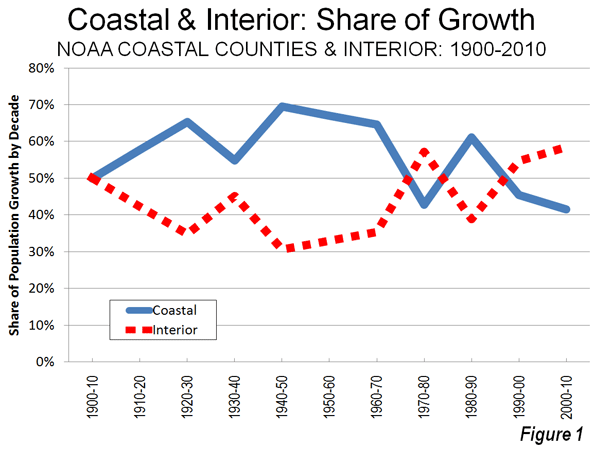
    Population Growth: In fact, coastal counties are not growing faster than the nation as a whole and were not when NOOA issued the 1990s report. For most of the last 40 years, the nation’s interior counties have been adding more population. From 1970 to 2010, interior counties added 55.7 million new residents, compared to 49.7 million new residents in coastal counties. This is a reversal from 1940 to 1970, when two thirds of the nation’s population growth was in the coastal counties.

    The trends today actually have become more favorable for the interior than at any time in a century. From 2000 to 2010, the interior counties captured more of the nation’s growth than in any decade since 1900 (Table). From 2000 to 2010, the interior counties added 16.0 million residents, 59.6 percent of the nation’s growth compared to 11.4 million new residents in the coastal counties.

    Coastal and Interior Population: Counties
    1900-2010
    Coastal Counties Interior Counties United States
    Year Population Share Change Population Share Change Population Change
    1900         30.2 39.7%         46.0 60.3%         76.2
    1910         38.2 41.4%           8.0         54.0 58.6%           8.0         92.2         16.0
    1920         46.2 43.6%           8.0         59.8 56.4%           5.8       106.0         13.8
    1930         57.4 46.6%         11.2         65.8 53.4%           6.0       123.2         17.2
    1940         62.3 47.1%           4.9         69.8 52.9%           4.0       132.2           9.0
    1950         75.2 49.9%         12.9         75.5 50.1%           5.7       150.7         18.5
    1960         94.4 52.6%         19.2         85.0 47.4%           9.5       179.3         28.6
    1970       109.9 54.0%         15.6         93.5 46.0%           8.5       203.4         24.1
    1980       119.8 52.9%           9.9       106.7 47.1%         13.2       226.5         23.2
    1990       133.4 53.6%         13.6       115.3 46.4%           8.6       248.7         22.2
    2000       148.2 52.7%         14.9       133.2 47.3%         17.9       281.4         32.7
    2010       159.6 51.7%         11.4       149.1 48.3%         16.0       308.7         27.3
    Population in Millions
    Calculated from US Census Bureau Data
    Coastal counties designated by NOAA (673 counties)
    Totals may vary due to rounding


    As of 2010, the coastal counties have 51.7 percent of the nation’s population, having dropped from 52.7 percent in 2000 and a peak of 54.0 percent in 1970 (Figure 1). Rather than adding 3600 new people every day, coastal counties added 3100 people per day, while interior counties added 4400 per day during the 2000s. A smaller sample of 559 counties that was examined by economists Jordan Rapaport and Jeffrey Sachs in the early 2000s experienced an even more pronounced movement away from the coasts between 2000 and 2010, with more than 60 percent of the nation’s growth taking place in the interior counties.

    There may also be some concern about density in coastal counties.   Yet Malthusian fears need not grip coastal residents. With a population density of approximately 315 per square mile (120 per square kilometer), the coastal counties of the contiguous United States have only a slightly higher density than the post-enlargement 27-nation European Union. The coastal counties have a density one-half that of Germany. In contrast, the interior counties are far less dense, at 60 persons per square mile.

    There has also been significant change in coastal population trends since the middle 1990s. The largest Pacific Coast metropolitan areas, such as Los Angeles, San Francisco, San Diego, San Jose and Seattle have seen their growth slow considerably. In the 1990s, NOAA was projecting huge population increases for Los Angeles and San Diego counties. It appears likely that these 2015 projections will fall at least 600,000 short in both counties. Even Seattle, arguably the healthiest economically among the west coast metropolitan areas, is now growing more slowly than former laggards Oklahoma City, Indianapolis and Columbus in the interior.

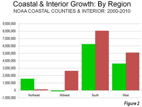
    Regional Population Growth: There was significant variation in growth among the varied regions of the country. In the Northeast, there was much stronger growth on the coast, which added 1.6 million people, compared to a gain of less than 150,000 in the interior. In the Midwest, the coastal counties (along the Great Lakes) lost 120,000 people, while the interior counties gained 2.7 million. In the South, the interior grew more, at 8.1 million, slightly more than 6.3 million in coastal counties.  In the West, interior counties gained 5.1 million people, while the coastal counties gained 3.7 million (Figure 2). This drop in coastal growth was a principal reason why the West grew less quickly than the South, which experienced the most robust coastal growth. For this reason, the West failed to be the nation’s fastest growing region for the first time since 1900.

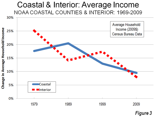
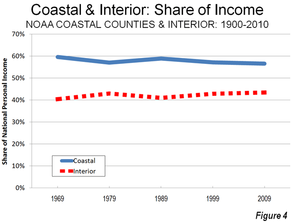
    Personal Income: Rappaport and Sachs noted in their early 2000s work that the density of economic activity was far greater in the coastal counties. Of course this is to be expected, due to their greater population density. However the data with respect to the distribution of personal income is less clear. Since 1969, coastal and interior counties have been alternating leadership in personal income growth per capita. During the 2000s, interior counties experienced average personal income growth slightly less than that of the coastal counties (Figure 3). However, average per capita income since 1970 has risen 81 percent, compared to a lower 75 percent in the coastal counties (adjusted for inflation).  Overall, the share of income in the interior counties has been growing modestly (Figure 4).

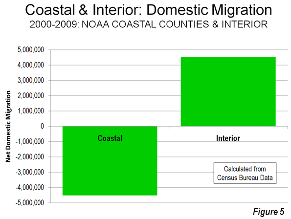
    Domestic Migration: The most important factor in the growth of the interior counties in the 2000s lies with net domestic migration, with more residents moving from the coastal counties to the interior counties. Between 2000 and 2009, 4.5 million people moved to the interior counties, while 4.5 million people moved away from the coastal counties, according to Census Bureau estimates (Figure 5).

    Rappaport and Sachs had theorized that the greater concentration of population and economic activity in the coastal counties could be reflective of a more attractive quality of life. The domestic migration data would suggest that, at least over the last decade, people are opting for the interior, perhaps sensing that the coastal quality of life may not be as affordable and accessible as in the past.  

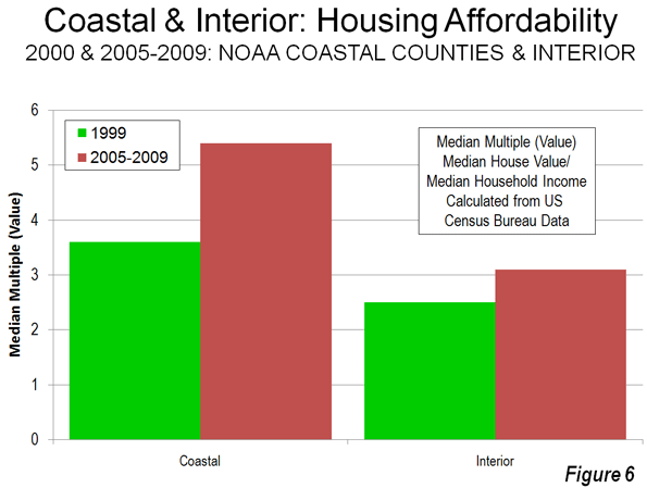
    Cost of Living: The key here lies with the cost of living, which has become far higher on the coasts then in the interior. The most significant cost of living differences for households are in the cost of housing.   

    From 2000 to 2009, housing affordability deteriorated markedly in the coastal counties. Census Bureau data indicates that the Median Multiple (median house founded divided by median household income) rose from 3.6 to 5.4 in the coastal counties (population weighted). By contrast, housing affordability worsened far less in the interior counties, where the Median Multiple rose from 2.5 to 3.1. Thus, the median household saw owned housing increase 22 months worth of income in value in coastal counties, compared to seven months worth of income in interior counties (Figure 6). At the same time, these higher coastal house prices developed as demand for housing was dropping substantially, with 4.5 million people moving away from coastal counties (above).

    Many of the coastal counties have strong land use regulation (smart growth or urban containment regulation), especially in California, Oregon, Washington, Florida and the metropolitan areas of Boston, New York and Washington. A considerable body of research, both econometric and descriptive, has associated more restrictive land use regulation (called smart growth, urban consolidation or urban containment) with higher house price increases, reaching back at least to the seminal 1970s work by Sir Peter Hall and his associates in the United Kingdom. It thus seems likely that the deterioration of housing affordability in coastal counties is materially associated with their less robust growth. The quality of life on the coasts may simply have become too expensive.

    The Future? It is unclear whether the recent higher population growth rates, stronger migration trends and improved economic performance of the interior will continue into the future. The 1940 to 1970 dominance of the coastal counties surged as coastal metropolitan areas, especially in Florida and California, grew much more quickly. Now that pattern has been reversed.  More favorable trends over the past 40 years in the interior counties seem likely continue, unless coastal house prices and the cost of living begin to swing back toward the national norm.

    —-

    Note: Complete county data is at County Coastal Population (also attached to this article)

    Photograph: San Diego, which experienced greater domestic outmigration than Pittsburgh in the 2000s.