Blog

  • Misunderstanding the Geography of Sydney, Paris, Mexico City, Etc.

    Sydney’s Daily Telegraph announced on April 20 that Sydney is more dense than Mexico City, London, Los Angeles and Paris. Of course, anyone who has been to Mexico City or London knows that this is untrue and it may surprise some that Sydney is not even as dense as Los Angeles.

    The article never indicates, quite for sure, what it means by Sydney, the Sydney city council area (the urban area’s core local government authority, or LGA) or the Sydney urban area. Nor does the article provide an overall density, instead only indicating that there are 8,800 persons per square kilometer in "Sydney’s east" and 7,900 per square kilometer in "Sydney City’s west."

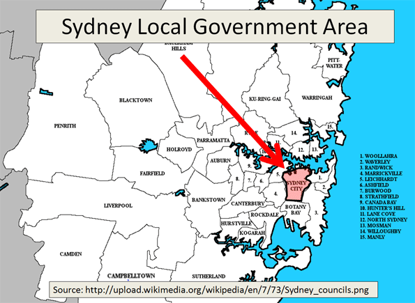
    In fact, the figures are from the latest statistical local area estimates of the Australian Bureau of Statistics (ABS) for 2010, and dated March 31, 2011. A "statistical local area" is a part of an LGA (See map: Sydney Local Government Area). The statistical local areas cited by The Daily Telegraph are Sydney-East and Sydney-West, which have a combined density of 8,300 per square kilometer. The small size of the Sydney-East and Sydney-West statistical local areas is illustrated by the fact that each is about the same size as the Sydney Olympic Park.

    Comparing Urban Area Densities: The Daily Telegraph’s contention results from a profound misunderstanding of urban geography. The result was a comparison of urban geographies that are not comparable.

    The Daily Telegraph compares the density of these two small areas of the Sydney LGA, with the urban area densities of Mexico City (which the Daily Telegraph places at 8,400), London (5,100), Los Angeles (2,750) and Paris (3,250). These figures were taken from an earlier edition of Demographia World Urban Area. (Our latest Demographia World Urban Area data, including estimated population densities for all urban areas in the world of more than 500,000 population is here). Urban areas are areas of continuous urban development.

    The appropriate Sydney geography for comparison to the urban area populations of Mexico City, London, Los Angeles and Paris is the urban area (the international term), which is called the urban centre by ABS (See map: Sydney Urban Area).

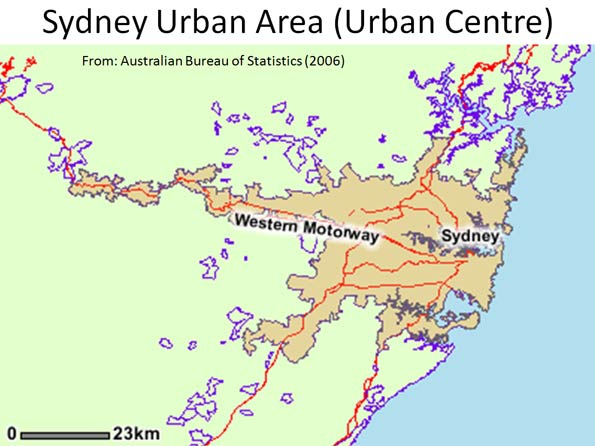
    The Sydney urban centre covers an area extending south to Campbelltown, north to Palm Beach and well into the Blue Mountains on the Great Western Highway. According to the ABS, the Sydney urban area (urban centre) had a population of 3.641 million in 2006 (latest available data), and covered a land area of 1,788 square kilometers. This means that the population density of the Sydney urban area was 2,037 in 2006. Thus, the Sydney urban area has a lower density than all four international urban areas used in The Daily Telegraph comparison (Figure 1).

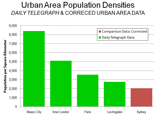
    If the Sydney urban center were as dense as the Los Angeles urban area, the population would be 5 million, instead of 3.6 million. If the Sydney urban centre were as dense as the Mexico City urban area, the population would be 15 million.

    Comparing Core Densities: The small area densities that The Daily Telegraph cites are also smaller than those that exist in the core areas of the cited international urban areas (Figure 2).

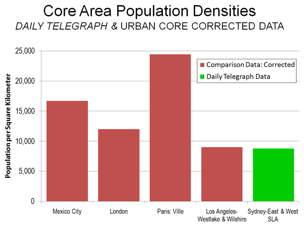
    • In Mexico City, the delegation (district) of Ixtacalco has a population density double that of the Sydney-East and Sydney West statistical local areas (approximately 17,000), in an area nearly twice as large.
    • The 2001 census placed the inner London borough of Kensington and Chelsea at 12,000 persons per square kilometer, in an area approximately the same size as Sydney-East and Sydney-West combined.
    • The ville de Paris has a population density of more than 24,000 per square kilometer, nearly three times that of the combined Sydney-East and Sydney-West statistical local areas. The ville de Paris covers approximately eight times as much land area and smaller area densities are even higher.
    • The 2000 census placed the adjacent Wilshire and Westlake Community Districts of Los Angeles at 9,000 per square kilometer. This is slightly higher than the density of the combined Sydney-East and Sydney-West statistical local areas, in an area nearly four times as large.

    The Sydney urban center and statistical local area data is summarized in the table.

    The Australian Population Debate: An important public policy debate is under way in Australia on the issue of population growth. As Ross Elliot indicated (Malthusian Delusions Grip Australia), some interests believe that the nation is running out of land. In fact, only 0.3 percent of Australia’s land area is urban, a figure one-tenth that of the United States. The starting point for these discussions needs to be valid data and an understanding of the terms involved.

    SYDNEY URBAN CENTER & DENSE STATISTICAL LOCAL AREAS
    Areas Cited by The Daily Telegraph
      2006 Population Land Area (Square Kilometers) Density 2010 Density
    Sydney-East Statistical Local Area         46,738                6.0       7,790          8,799
    Sydney-East Statistical Local Area         38,382                5.7       6,734          7,852
    Combined         85,120               11.7       7,275          8,338
    Share of Sydney Urban Area (Urban Centre) 2.3% 0.7%
    Balance of Urban Area (Urban Centre)     3,556,301          1,776.4       2,002 Not Available
    Total Sydney Urban Area (Urban Centre)     3,641,421          1,788.1       2,036 Not Available
    Notes: 
    Data from Australian Bureau of Statistics
    Urban centre data available only for census years
  • Life and Death in the Labor Market

    The Wall Street Journal recently listed the Top 10 Dying Industries, via research firm IBISWorld. Some industries didn’t just see temporary decline during the recession – some won’t recover and will slowly (or quickly) disappear. IBISWorld’s data format is a little different than ours, and its categories are somewhat obscure, but we thought it would be interesting to pull together a similar table with the associated job data.

    With one major exception, all of these industries have seen some shakeup. But job loss by itself doesn’t tell the full story. Wired telecommunications carriers lost the most jobs, but are tied with newspaper publishing for the second smallest percentage change on the list. This is probably because these are entrenched industries and will take longer to become totally obsolete. Contrast those industries with photofinishing. Photofinishing has been a smaller industry all along, but its percent loss is at 68%. Consider the last time you looked at snapshots that weren’t digital, and then say a little prayer for the photofinishing industry.

    Description 2001 Jobs 2010 Jobs Change % Change
    Wired Telecom. Carriers 1,038,230 709,179 -329,051 -32%
    Mills 487,344 208,526 -278,818 -57%
    Apparel Manufacturing 273,650 127,175 -146,475 -54%
    Newspaper Publishing 428,659 289,997 -138,662 -32%
    DVD, Game & Video Rental 167,526 84,442 -83,084 -50%
    Record Stores 84,884 30,416 -54,468 -64%
    Photofinishing 66,170 20,901 -45,269 -68%
    Manufactured Home Dealers 43,203 19,430 -23,773 -55%
    Formal Wear & Costume Rental 19,889 12,217 -7,672 -39%
    Video Postproduction Services 26,098 26,319 221 1%


    The one industry on this list that is not like the others is video postproduction services. As we mentioned earlier, there’s not an exact relationship between our industry groups and IBISWorld’s, so where it has found overall decline we’ve found slight growth. Here’s a look at our overall fastest-declining industries since 2001:

    Description 2001 Jobs 2010 Jobs 2001-2010 % Change 2001-2010 Change 2009-2010 Change
    Crop and animal production 3,060,000 2,630,246 -14% -429,754 -11,754
    Professional Employer Organizations 798,710 432,936 -46% -365,774 -6,154
    Wired Telecommunications Carriers 1,038,230 709,179 -32% -329,051 -31,331
    New Single-Family Housing Construction (except Operative Builders) 849,104 526,926 -38% -322,178 -57,059
    Department Stores (except Discount Department Stores) 857,007 562,392 -34% -294,615 2,786
    Temporary Help Services 2,349,389 2,125,113 -10% -224,276 284,107
    New Car Dealers 1,118,633 902,006 -19% -216,627 -3,062
    Postal Service 866,747 698,630 -19% -168,117 -8,185
    Nonresidential electrical contractors 767,556 609,549 -21% -158,007 -47,931
    Scheduled Passenger Air Transportation 560,105 409,277 -27% -150,828 -2,988


    This table shows some pretty major decline in several industries. “Crop and animal production” along with “new single family housing construction” stand out. The interesting one on this list is “temporary help services.” That industry shows overall decline of over 224,000 jobs, but this amazing comeback from 2009-2010 where it gains over 284,000 jobs. It ends up with the smallest percentage decline on the list, 10%. However, if we look from 2001-2009, it would top the list here, with a loss of over 508,000 jobs, or 22% decline.

    The industry with the largest percentage loss over that period, “professional employer organizations,” shows 46% decline. That industry, a provider of leased employees typically for human resources management, has shown steady decline since 2003. While that decline looks to have slowed recently, it hasn’t stopped. We’ll have to wait for more data to see what happens.

    Is There Life in Manufacturing?

    Before we get to the better news, let’s look at a quick reminder about what manufacturing has been doing over the past 10 years. From 2001 to 2010 the manufacturing sector lost 4.7 million jobs nationally. Pretty dismal. However, there are industries within the sector that show growth. If we look from 2001-2010 the top 10 fastest-growing manufacturing industries are.

    Description 2001 Jobs 2009 Jobs 2010 Jobs 2001-2010 2009-2010
    Wineries 27,531 47,117 46,850 19,319 -267
    Perishable Prepared Food Manufacturing 24,584 36,785 36,962 12,378 177
    Oil and Gas Field Machinery and Equipment Manufacturing 48,327 61,698 59,673 11,346 -2,025
    Ship Building and Repairing 92,336 103,526 100,841 8,505 -2,685
    Surgical and Medical Instrument Manufacturing 107,547 115,938 115,721 8,174 -217
    Ethyl Alcohol Manufacturing 3,272 9,797 9,708 6,436 -89
    Plastics Packaging Film and Sheet (including Laminated) Manufacturing 5,879 11,782 12,302 6,423 520
    Digital Printing 20,894 27,531 27,308 6,414 -223
    In-Vitro Diagnostic Substance Manufacturing 13,444 19,916 19,458 6,014 -458
    Spice and Extract Manufacturing 16,126 20,708 20,980 4,854 272


    This still isn’t the good news. As the table demonstrates, most of the industries showing high growth from 2001 to 2010 have slackened considerably from 2009 to 2010, and many of them have declined. We would hope to be seeing some hint of recovery in these industries, but instead we’re seeing loss.

    To zero in on industries showing current growth in the manufacturing sector, we’ll look at the top 10 manufacturing industries showing the most growth from 2009 to 2010.

    Description 2001 Jobs 2009 Jobs 2010 Jobs 2001-2010 Change 2009-2010 Change
    All Other Plastics Product Mfg. 400,046 260,516 264,562 -135,484 4,046
    All Other Motor Vehicle Parts Mfg. 167,487 106,257 109,069 -58,418 2,812
    Automobile Mfg. 168,403 94,904 97,424 -70,979 2,520
    Travel Trailer and Camper Mfg. 36,231 23,190 25,347 -10,884 2,157
    Motor Home Mfg. 17,612 9,473 11,525 -6,087 2,052
    Motor Vehicle Metal Stamping 111,209 55,426 57,470 -53,739 2,044
    Wet Corn Milling 9,185 8,127 10,166 981 2,039
    Motor Vehicle Seating and Interior Trim Mfg. 65,601 40,325 42,194 -23,407 1,869
    Iron and Steel Mills 118,583 85,200 86,837 -31,746 1,637
    Motor Vehicle Transmission and Power Train Parts Mfg. 96,132 53,644 55,109 -41,023 1,465


    As you run over this list you’ll probably get the takeaway pretty quickly. The lesson of this table is that the federal auto manufacturing bailout had an immediate positive effect. In an already declining industry sector the bailout has enabled auto manufacturing to recover, very slightly, after a long period of decline.

    Of the three industries on this list not directly related to auto manufacturing (all other plastics mfg., wet corn milling, and iron and steel mills) only wet corn milling showed growth from 2001 to 2009. This means that nine of the top 10 manufacturing industries that have grown from 2009 to 2010 are industries showing a sudden turnaround, without a growth trend in place. Because these correlations are so close, we took a quick look at the relationship between auto manufacturing and iron and steel milling in our input-output model and did not find a strong industry tie. The same was true for auto manufacturing and all other plastics mfg.

    Life vs. Death

    So where do we go from here? First we looked at dying industries. Then we looked at industries within a dying industry sector that are recovering because of massive infusions of money from the government. Is it all really that depressing out there?

    The following table shows high growth industries looking into the future. We applied a filter to get industries growing beyond than the national average, percentage-wise, and then chose the top 10 projected to add the most new jobs from 2008 to 2014.

    Description 2008 Jobs 2014 Jobs Change % Change
    Local government 14,425,000 14,905,114 480,114 3%
    Crude Petroleum and Natural Gas Extraction 556,883 987,818 430,935 77%
    Home Health Care Services 1,294,652 1,697,041 402,389 31%
    Offices of Physicians (except Mental Health Specialists) 2,439,113 2,834,694 395,581 16%
    Investment Advice 855,566 1,220,851 365,285 43%
    Portfolio Management 731,703 1,088,517 356,814 49%
    General Medical and Surgical Hospitals 4,312,784 4,669,173 356,389 8%
    Private Households 1,623,184 1,922,073 298,889 18%
    Services for the Elderly and Persons with Disabilities 663,261 936,620 273,359 41%
    Federal government, civilian, except postal service 2,069,474 2,327,756 258,282 12%


    Local government tops the list, adding nearly a half million jobs. Its percentage growth is the lowest on the list, however. On the other hand, crude petroleum and natural gas extraction is projected to grow by around 430,000 jobs from 2008 to 2014 and projects 77% growth. Health industries make an excellent showing. Between home health care services, offices of physicians, general medical and surgical hospitals, and services for the elderly and person with disabilities, there’s a total projected addition of 1,427,718 jobs. Also notable: two finance industries show up here, investment advice and portfolio management, both of them indicating that after the crash folks are interested in getting some outside advice on their holdings. 

    Much of this growth appears to be driven by demographics: the huge baby boomer generation is reaching senior status, and the U.S. is projected to continue its overall population growth fueling the need for growth in local government and health care to serve growing demand.

    Of course, this isn’t a comprehensive look at industry growth. Everyone knows that the health sector is growing, and we’re starting to spot other reasons for hope. But the truth is that the US economy recently underwent a major shakeup, and hasn’t totally bounced back yet. As far as manufacturing goes, there’s not a ton of good news right now. There is some life out there. But we’ve still got a long way to go.

    Rob Sentz is the marketing director at EMSI, an Idaho-based economics firm that provides data and analysis to workforce boards, economic development agencies, higher education institutions and the private sector. He is the author of a series of green jobs white papers.

    Illustration by Mark Beauchamp

  • Malthusian Delusions Grip Australia

    Entrepreneur Dick Smith wants Australian families to be subject to China-like population doctrine. Families should be limited to just two children, the father of two and grandfather of six says, because our population growth is something like ‘a plague of locusts.’

    Yet in reality, as in many other advanced countries, our population crisis may have more to do with having too few — specifically younger — people than too many.

    The anti-population jihad is nothing new. Thomas Malthus was an 18th century economist and Anglican clergyman, whose ‘Essay on the Principles of Population’ (published 1798) popularised the notion that vice, plague and famine were natural forms of population control. In short, overpopulation would be subject to control by food scarcity.   

    Maulthusians almost 200 years later, in 1968, Paul Ehrlich wrote the blockbuster ‘The Population Bomb’ which warned of imminent mass starvations and famine due to overpopulation.  

    Now joining the fray is our very own Dick Smith, former super-nerd and founder of Dick Smith Electronics stores, aviator, publisher (of Australian Geographic), entrepreneur and 1986 ‘Australian of the Year.’  

    Dick’s a popular figure in Australia, and when he speaks people (and the media) listen. But Dick’s suggestion that Australia is overpopulated, and thus requires we need to limit our growth through a two child policy borders on the hysterical.

    First, let’s start with some global perspective. Overall, world population growth rates are slowing according to the United Nations and the US Census Bureau. Further, based on United Nations forecasts, populations by 2050 will be smaller than they are today in 50 countries – leading economies included. Here’s a useful article from The Economist which explains. And in this article from Bloomberg’s Businessweek, titled ‘Shrinking Societies: the other Population Crisis’, the massive economic and social problems of countries with falling populations are highlighted.

    Australia’s ageing population is not as severe as that looming in Europe and much of east Asia, but this country also faces a demographic implosion that, in the absence of more young people, will place unprecedented demands on a welfare system largely unfunded by the present tax system and those who fund it (namely, workers in the private sector).

    But strangely, discussions about our ageing population and how to fund it and concerns about the overpopulation of Australia take place largely without a logical connection drawn between the two. If we are to avoid a horrendous tax burden on the future generation of workers, in order to maintain our standard of living and support the needs of the boomers, we will need more workers. It’s either that or higher taxes. And the problem with higher taxes, as other countries with similar problems have found, is that they can lead to an exodus of the workforce seeking better opportunities elsewhere. This in turn reduces the tax base. No ‘win-win’ there.

    Doug Saunders is the author of ‘Arrival City,’ a book about the conflicts and change brought on by massive urban migrations. And in this article he explains, “by 2050, most Western countries will have to devote between 27 and 30 per cent of their GDP to spending on retirees and their needs”. This he adds, will produce fiscal deficits in most advanced countries of almost 25 per cent of GDP, making the current crisis seem minuscule by comparison.

    This is not a remote or abstract crisis. Countries like Canada will soon be fighting to attract anyone we can get to work – and squeezing as much as we can from the remaining few.

    Australia has been fond of comparing itself to Canada. We are both western democracies, operating under similar governance systems. We both have relatively small populations given our geographic size (Canada has 34 million people, we have 23 million) and abundant natural resources. The resource we both lack is people. If Saunders is right about Canada fearing the same demographic problems as Japan (population 127 million), Australia might want to take note.

    Dick Smith’s concerns for Australia rely on a second, also false, argument:

    "We are putting our kids into high-rise because we are running out of land, because people want and need to live close to the city. We pay $50 million a year for free range eggs for our bloody chooks to be free range – what about our kids? I was a free range kid. I had a backyard. We are starting to lose that now, and it’s only driven by the huge population increases." (full article here)

    But Dick, we aren’t running out of land. This argument is preposterous, on any valid domestic or global comparison. The reason we are denying future generations a backyard in preference over high density dwelling is not a land shortage brought on by population growth, but a planning philosophy which insists on growth boundaries and high density. This policy is embraced by most planners. Developers and land economists could explain this to Dick, if he were prepared to listen. Plenty of people, given the choice, would happily occupy suburban blocks far from CBDs because their work (which for 9 out of 10 Australians is not in the CBDs) and their lifestyle preferences (typically raising a family) are that way inclined. Those people though are not planners, and neither are they part of the current oligarchy which delivers decisions allegedly in their interests via the confines of inner city coffee shops.

    Even in the United Kingdom (population 62 million, in an area slightly larger than Victoria) there are those proposing the establishment of new urban centres to provide housing choice and to accommodate growth. Ian Abley’s Audacity.org has proposed a ‘250 New Towns’ movement, which seeks to do precisely that.

    If there are those prepared to venture such audacious ideas in a small place like the UK, one wonders why Australia has allowed itself to become preoccupied with the notion that we are somehow running out of land.

    Australia’s growth rate is currently a dizzying 1.6% per annum. It’s fallen from a high of 2%, as international migration was reduced. Neither rates of growth, on a global scale, are remarkable. By 2050, when global population growth is predicted to stop, our total population will reach an estimated 35 million people, of whom 23% – or nearly one in four – will be aged over 65.

    It reads not like a recipe for over population, but one of under population.  Perhaps it’s time the tiny thought bubbles of Dick Smith and his cohorts in this discussion were well and truly pricked by the sharp end of reality?

    Ross Elliott has more than 20 years experience in property and public policy. His past roles have included stints in urban economics, national and state roles with the Property Council, and in destination marketing. He has written extensively on a range of public policy issues centering around urban issues, and continues to maintain his recreational interest in public policy through ongoing contributions such as this or via his monthly blog The Pulse.

  • Getting Married Naked

    One of my girlfriends just invited me to attend her wedding ceremony next month. In our short conversation, I learned that she and her husband have already moved into their brand new, three-bedroom condo (we barely have any detached houses, called villas, in China), purchased a new car, and will have three separate wedding ceremonies: in the groom’s hometown, the bride’s hometown, and the city where they currently live. Based on this description, you are probably picturing a couple in their late 30s who must hold high-paying respectable jobs.

    But that assumption would be wrong. They are an average young Chinese couple in their mid-20s who’ve only just graduated from university a couple of years ago.  However, what they are planning for their wedding is typical in China today.

    So how can they afford all this? Even in go-go China, many in reality can’t afford, and increasingly some are eschewing, the wedding-related expenses.

    But how did we end up in the first place with a situation where pressures force some Chinese couples to disappoint their families, their friends and maybe themselves?  Why have the wedding game become so patently insane even for the relatively affluent.

    To answer this question, we must first become familiar with some Chinese wedding traditions. Primarily when it comes to the cost of a wedding, the groom’s family is expected to provide accommodations for the couple and pay for the wedding ceremony, while the bride’s family provides what could be loosely referred to as a dowry.

    For my parents’ generation (those born between 1955 to 1965), the above mentioned wedding traditions translate into:

    • The newlyweds live with the groom’s parents after getting married. Since housing was provided by the state owned companies in the 1980s, and younger generations were expected to show their filial obedience through living with their parents, no couple would even consider having a place of their own.
    • In respect that China was still going through an extreme resource insufficiency phase in the early 1980s, my mother’s dowry only consisted of two brand new red quilts.  
    • Wedding ceremonies usually took place in the courtyard where people lived. Good friends would come to help cook a “feast” for a relative handful of guests.


    Wedding ceremony in the 1980s


    Now, after the massive economic changes that have happened over the past two decades, these three wedding traditions tend to follow a somewhat different pattern:

    • The new couple absolutely must have their own home. In most cases the groom’s parents pay for this housing. It does not matter whether it is a three-story villa or a 40 square meter (425 square feet) bachelor apartment, whether it’s brand new or 20 years old. The key thing is that the property be ready for the new couple to move into. Depending on the family’s financial status, they either pay the full amount or at least the down payment on a mortgage, with the ownership under the new couple’s name. To pay for this, parents usually start saving as soon as their son is born.
    • The dowry given by the bride’s family is either in the form of a brand new car, a hefty deposit into the newlywed’s bank account, or payment of the cost of interior decoration for their new home (new properties in China are usually delivered as little more than a concrete shell).
    • Wedding ceremonies are commonly held at the best hotels in town, often with about 500 guests in attendance. The guests will be seated at tables of 10, while the new couple spends most of the time standing on a stage in front.  Chinese wedding ceremonies have shifted from pure traditional Chinese style to a kind of bizarre formality. It is neither traditionally Chinese nor Western and typically includes: wedding rings, glamorous wedding pictures taken at a professional studio, multiple dresses worn by the bride, a lavishly decorated dining room and reception area in the hotel, fancy cars to transport the newlyweds and their entourage, hiring a famous host (MC), a huge feast, copious quantities of alcohol, firecrackers, and party favors that include chocolate and cigarettes.


    Modern wedding ceremony

    Don’t feel surprised if you are feeling dizzy just glancing at the list, you are not alone. Newlyweds often start preparing for their wedding ceremony several months in advance. Whether decorating their condo or taking wedding photos, or huddling with the wedding planner about the details of the ceremony, there’s pressure to get everything ready for the big day.  By the time they can go on honeymoon, most couples would rather just stay home and rest.

    The reality is, everybody knows and complains about how tiring it is to organize a wedding, yet most couples still repeat the same motions. Are they sacrificing their efforts for tradition? Not at all. They do it because weddings have become a way for people to show off their social status.

    For the newlyweds it is like a competition with their peers. For the parents however, a fancy wedding ceremony seems to have more symbolic meaning. Due to the fact that they barely had anything when they got married, and most families only have one child, this seems a chance to realize their fantasies in ways virtually impossible for them to achieve 25 years ago. It is also a perfect occasion to show their old friends what a great life they have now.

    Yet, no matter how exciting a Chinese wedding might sound, we all have to face a cold fact: there are many people in China – even among those ensconced in the middle class – who cannot afford these new wedding traditions.

    According to some unofficial calculations, in 2009 the total expenditure directly related to weddings was 600 billion CNY (92 billion USD). In 2010 the average wedding expenditure (excluding housing costs) for a Shanghai couple was 187,000 CNY (28,600 USD).

    For people who do not have the luxury of being able to afford such tremendous costs, it is not uncommon for them to borrow from their friends and relatives in order to have an “unforgettable” ceremony.

    Others see the problem from a different angle. If their daughter were to fall in love with a poor boy, some parents would not grant their permission for them to get married. At the same time, arranged marriages, blind dates and nationwide broadcast dating shows have started to pick up in popularity. The most frequently asked question for the involved parties is: do you have a house under your name?

    Still others are attempting to break free from those so called social norms and traditions, by standing up and saying no to the modern social pressure.

    A new word – “Luohun” (which directly translates as “getting married naked”) – emerged in 2008. It means that two people get married without buying a house, a car, wedding rings, having a fancy wedding ceremony or an exotic honeymoon. Instead, they spend only 9 CNY (1.4 USD) to get registered and obtain their marriage license from the state. Considering two people only get recognized in the community as a couple after their wedding ceremony in the old days, this represents a monumental shift in thinking.

    Over the past 3 years, “Luohun” has won more favour, especially with those born after 1980. According to an online survey regarding marriage trends, 60% of those polled aged 20 to 35 indicated that they can accept this new concept. It’s a matter perhaps of re-adjusting to the realities of an economy that, while growing rapidly, has also become more expensive.

    And there’s certainly some benefit in getting hitched without all the debts and encumbrances that are hard to bear for a young couple. After all, who wouldn’t want to get married naked?

    Lisa Gu is a 26-year old Chinese national. She grew up in Yangzhou (Jiangsu) and lives and works in Nanjing (Jiangsu).

    Photo by sheilaz413

  • Shanghai: Torrid Population Growth

    The population of the provincial level municipality of Shanghai exceeded 22 million at the end of 2010, according to the Shanghai Population and Family Planning Commission. The population of 22.21 million exceeds the 2000 population of 16.41 million by 35 percent. This growth of nearly 6 million is more people than live in all but three Western European urban areas (Paris, London and Essen-Dusseldorf).

    Virtually all of the population gain was among migrant (non-permanent) residents who lack official Shanghai registration (Shanghai Hukou status). The migrant population rose from 5.9 million to 8.1 million, an increase of 153 percent (Estimates place the number of non-permanent urban residents of China as high as 200 million). There were 14.1 million permanent residents (with Shanghai Hukou status), a seven percent increase from the 2000 figure of 13.8 million (Figure).

    Non-permanent residents, who must have lived in Shanghai for six months to be counted, now account for 36.4 percent of the provincial level municipality’s population, nearly double the 19.4 share in 2000.

    Results are expected soon from the China national census, which began in November of 2010. Ding Jinhong, director of East China Normal University’s School of Social Development has suggested that the census may report a population as much as 23 million, with a non-permanent resident population of 9 million.

    It is estimated that the Shanghai urban area, which is wholly contained within the provincial level municipality, will have a mid-year 2011 population of 18.7 million, with a land area of 1,125 square miles (2,900 square kilometers). The Shanghai urban area, the 10th largest in the world, has a population density of 16,500 per square mile or 6,400 per square kilometer.

    This urban density is more than double that of Western European urban areas with more than 500,000, however it is less than one-fourth that of the Mumbai urban area. As in Mumbai, there has been substantial population dispersion from the core to suburban areas, with only 14 percent of growth in the urban core (generally inside the inner-ring expressway) between 1982 and 2000.

    The population density of the provincial municipality, which is analogous to a metropolitan area and includes considerable rural land, is much lower, at 9,100 per square mile (3,500 per square kilometer).

  • The Census’ Fastest-Growing Cities Of The Decade

    Over the past decade urbanists, journalists and politicians have hotly debated where Americans were settling and what places were growing the fastest. With the final results in from the 2010 Census, we can now answer those questions, with at least some clarity.

    Not only does the Census tell us where people are moving, it also gives us clues as to why. It also helps explain where they might continue to go in the years ahead.  This information is invaluable to companies that are considering where to expand, or contract, their operations.

    For Forbes’ evaluation of the Census’ winners and losers, we have focused not on individual cities, but on metropolitan areas, which represent the most accurate designation for measurement. Take Atlanta, No. 10 on our list. While the city’s population grew by 1,000 over the last decade (2010 boundaries), the region, according to the Census grew, by roughly 1 million, the largest numerical increase among the country’s 51 largest metro areas. The city itself represents less than one-tenth the total metro area population.

    Las Vegas continued to be the nation’s fastest-growing major metropolitan area per capita, adding 41.8% to its population between 2000 and 2010. But the Las Vegas margin was very thin. Raleigh, N.C. (which ranked second) also gained 41.8%, and the difference between the two could only be measured at the third decimal point. If Raleigh had added just 10 more people, it would have been the leader.

    Overall, some 15 of the big metros grew at more than twice the 9.7% rate experienced by the entire country. One key reason — for at least some cities — was job growth. Las Vegas, which added 575,000 residents, and Raleigh grew their economies despite the tough recession. Sin City is still a top flight tourist destination, and its business-friendly policies are still attractive to other industries, particularly from highly regulated California.  The Texas metros Austin (No. 3), Houston (No. 8),  San Antonio (No. 9 ) and Dallas-Fort Worth (No. 11) all had strong job growth — as did Nashville, Tenn. (No. 12).

    However, not all the top growing regions in the country share the same economic trajectory. Many of the other leaders grew their job bases rapidly at the beginning of the decade but gave back some of their gains after the collapse of the mortgage market. This happened in places like Las Vegas Riverside-San Bernardino, Calif. (No. 5), Orlando , Fla., (No. 6), Phoenix, Ariz., (No. 7), Jacksonville, Fla. (No.13) and Sacramento, Calif. (No. 14).

    Yet all of the top ten — with the exception of Atlanta — expanded their job base during the decade.

    So if job growth itself is not a single determining indicator, what else has swelled these populations? Two things seem to stand out. One major factor seems to be affordability of housing. Throughout the decade people have moved primarily to those areas with cheaper house price relative to incomes.

    Take the movement of people from expensive coastal California not only to the interior parts of the state but especially to the Texas metropolitan areas, such as Dallas-Fort Worth and Houston. To put this in context, the median house price today as a share of median household income (the “median multiple”) averaged at 2.7 in Dallas-Fort Worth and 2.8 in Houston, compared with 7.2 in the No. 41 ranked Los Angeles or 8.1 in ultra-pricey San Francisco, which ranked No. 37.

    During the bubble, coastal California housing prices were even higher, peaking at a median multiple over 10, while Dallas-Fort Worth and Houston remained at 3.0 or below. There was also strong migration from coastal California to closer metropolitan areas in the West, where house prices were high by national standards, but far more affordable than in coastal California. Examples of this trend were No. 1 Las Vegas (which averaged 4.0 and peaked at 5.9), No. 7 Phoenix (averaged 3.4 and peaked at 4.7) and No. 15 Denver (averaged 4.1 and peaked at 4.5).

    A similar phenomenon can be seen on the east coast. To understand the rapid growth of a place like Raleigh, you have to look to the migration of people from the Northeast, notably the No. 44 New York area and No. 43 Boston. Housing costs seem to be a leading factor here. The ratio of median house price to median household income   in Raleigh averaged 3.6 (peaked at 4.2) — well below that of its primary talent sources like New York, which averaged 6.3, peaking at 7.7, and Boston, which averaged 5.2 and peaked at 6.1.

    Among the 20 fastest-growing regions, No. 16 Washington, D.C. region had relatively expensive housing, with an average median multiple of 4.2, after peaking at 5.7. Washington must be regarded in this sense as the great exception, a place whose steady employment growth has defied all market logic, since it is largely tethered to the ever-expanding scope of the federal government and its similarly growing legions of parasitic private corporations.

    The other major factor determining growth seems to be urban area density and size. Despite all the triumphant celebration of the glories and attraction of dense big city urbanism, almost all the fastest-growing metropolitan areas have low-density core cities and are predominately suburban in form. Indeed not one of the top 15 growing regions has a core city with a density of over 5,000 per square mile and only three, the Dallas-Fort Worth, Houston and Atlanta metropolitan areas, have more than 5 million residents.

    In contrast, the regions with the densest core cities–such as Boston and San Francisco–all grew at about half or less than the national average, despite core densities of 12,000 or above. All three of America’s largest metropolitan areas–New York, Los Angeles and Chicago, with populations nearing or above 10 million–grew far below the national average.  However thrilling and alluring dense large cities might be to pundits, academics and policy wonks, they are proving not so beguiling to Americans who, for the most part, continue to seek out “the American dream” wherever they can best afford it.

    Yet the very bottom of our list does include cities that are neither expensive nor particularly dense. These include the long-standing declinapolises that actually managed to lose population while the rest of the country was gaining. These include No. 47 Buffalo, N.Y., No. 48 Pittsburgh, Pa., No. 49 Cleveland, Ohio and ever-suffering No. 50 Detroit.

    The only non-rust belt core city to lose population this decade was No. 51 – New Orleans-Metarie-Kenner, La.  Of course, the Big Easy’s decline stems in large part from both nature’s depredations and what appears to be only a limited restoration of its basic infrastructure. But amazingly, the job loss in New Orleans was less than that of perennial loser Detroit and former perennial winner San Jose, which ranked 35th.

    So in our minds, NOLA’s last place finish may be a bit unfair, but then again so is life — and  sometimes demographics.

    Population 2000-2010 Employment 2000-2010
    Geography Change Pct Change Change Pct Change
    Las Vegas-Paradise, NV 575,504 41.83% 103,800 14.88%
    Raleigh-Cary, NC 333,419 41.83% 59,500 13.62%
    Austin-Round Rock-San Marcos, TX 466,526 37.33% 93,800 13.94%
    Charlotte-Gastonia-Rock Hill, NC-SC 427,590 32.14% 34,000 4.43%
    Riverside-San Bernardino-Ontario, CA 970,030 29.80% 122,800 12.42%
    Orlando-Kissimmee-Sanford, FL 489,850 29.79% 92,300 10.15%
    Phoenix-Mesa-Glendale, AZ 941,011 28.94% 108,400 6.87%
    Houston-Sugar Land-Baytown, TX 1,231,393 26.11% 278,600 12.38%
    San Antonio-New Braunfels, TX 430,805 25.17% 96,200 12.91%
    Atlanta-Sandy Springs-Marietta, GA 1,020,879 24.03% -30,900 -1.35%
    Dallas-Fort Worth-Arlington, TX 1,210,229 23.45% 101,400 3.67%
    Nashville-Davidson–Murfreesboro–Franklin, TN 278,145 21.20% 34,900 5.00%
    Jacksonville, FL 222,846 19.85% 15,900 2.81%
    Sacramento–Arden-Arcade–Roseville, CA 352,270 19.60% 10,700 1.34%
    Denver-Aurora-Broomfield, CO 364,242 16.71% -20,000 -1.65%
    Washington-Arlington-Alexandria, DC-VA-MD-WV 785,987 16.39% 285,700 10.67%
    Tampa-St. Petersburg-Clearwater, FL 387,246 16.16% -42,000 -3.63%
    Salt Lake City, UT 155,339 16.03% 41,600 7.36%
    Portland-Vancouver-Hillsboro, OR-WA 298,128 15.46% -7,800 -0.80%
    Indianapolis-Carmel, IN 231,137 15.16% 16,600 1.95%
    Richmond, VA 161,294 14.70% 14,000 2.38%
    Oklahoma City, OK 157,566 14.38% 20,500 3.83%
    Columbus, OH 223,842 13.88% -11,400 -1.25%
    Seattle-Tacoma-Bellevue, WA 395,931 13.01% -10,700 -0.65%
    Miami-Fort Lauderdale-Pompano Beach, FL 557,071 11.12% 27,900 1.29%
    Kansas City, MO-KS 199,296 10.85% -16,600 -1.69%
    Minneapolis-St. Paul-Bloomington, MN-WI 311,027 10.48% -59,000 -3.38%
    Louisville/Jefferson County, KY-IN 121,591 10.46% -29,500 -4.75%
    San Diego-Carlsbad-San Marcos, CA 281,480 10.00% 26,400 2.21%
    Memphis, TN-MS-AR 110,896 9.20% -36,700 -5.88%
    Birmingham-Hoover, AL 75,809 7.20% -27,400 -5.30%
    Baltimore-Towson, MD 157,495 6.17% 21,600 1.73%
    Virginia Beach-Norfolk-Newport News, VA-NC 95,313 6.05% 13,100 1.82%
    Cincinnati-Middletown, OH-KY-IN 120,519 6.00% -35,800 -3.52%
    San Jose-Sunnyvale-Santa Clara, CA 101,092 5.82% -191,900 -18.38%
    Hartford-West Hartford-East Hartford, CT 63,763 5.55% -24,400 -4.38%
    San Francisco-Oakland-Fremont, CA 211,651 5.13% -243,100 -11.43%
    Philadelphia-Camden-Wilmington, PA-NJ-DE-MD 278,196 4.89% -47,300 -1.72%
    St. Louis, MO-IL 114,209 4.23% -48,200 -3.60%
    Chicago-Joliet-Naperville, IL-IN-WI 362,789 3.99% -323,300 -7.07%
    Los Angeles-Long Beach-Santa Ana, CA 463,210 3.75% -340,400 -6.23%
    Milwaukee-Waukesha-West Allis, WI 55,167 3.68% -60,000 -6.91%
    Boston-Cambridge-Quincy, MA-NH 161,058 3.67% -112,900 -4.45%
    New York-Northern New Jersey-Long Island, NY-NJ-PA 574,107 3.13% -99,100 -1.18%
    Rochester, NY 16,492 1.59% -27,700 -5.22%
    Providence-New Bedford-Fall River, RI-MA 17,855 1.13% -35,500 -6.16%
    Buffalo-Niagara Falls, NY -34,602 -2.96% -21,300 -3.81%
    Pittsburgh, PA -74,802 -3.08% -23,300 -2.03%
    Cleveland-Elyria-Mentor, OH -70,903 -3.30% -144,700 -12.74%
    Detroit-Warren-Livonia, MI -156,307 -3.51% -470,900 -21.38%
    New Orleans-Metairie-Kenner, LA -148,746 -11.30% -98,300 -15.91%


    Sources: U.S. Census 2000, U.S. Census 2010, U.S. Bureau of Labor Current Employment Survey

    This piece originally appeared in Forbes.

    Joel Kotkin is executive editor of NewGeography.com and is a distinguished presidential fellow in urban futures at Chapman University, and an adjunct fellow of the Legatum Institute in London. He is author of The City: A Global History. His newest book is The Next Hundred Million: America in 2050, released in February, 2010.

    Wendell Cox is a Visiting Professor, Conservatoire National des Arts et Metiers, Paris and the author of “War on the Dream: How Anti-Sprawl Policy Threatens the Quality of Life

    Photo by justin fain

  • A Tough Week for High Speed Rail

    The week ended April 16 was particularly difficult for high speed rail, as the following events illustrate.

    1. High Speed Rail Zeroed Out of US Budget: The US federal budget deal, which cut $38 billion from spending ($76 billion annualized) zeroed out the $2.5 billion 2011 budget allocation for high speed rail and $400 million of prior spending authority from President Obama’s "stimulus" program, that had provided $8 billion for high speed rail in 2009. Approximately $2 billion of that authority remains and applications total $10 billion, mostly for conventional intercity rail services, rather than genuine high speed rail service.

    2.  Missouri Legislators Block High Speed Rail: Members of the Senate Transportation Committee in Missouri refused to place high speed rail in the annual state budget. Governor Jay Nixon is seeking more than $1 billion for intercity out of the remaining $2 billion from the original Obama Administration $8 billion program. Governor Nixon indicates that he will try to get the money placed in the budget should the US Department of Transportation award a grant. Missouri joins Florida, Wisconsin and Ohio in taking actions to block funding for high speed rail projects. This reluctance is principally the result of concerns that high speed rail will incur significant cost overruns and require operating subsidies, all of which would have to be paid for by the states, which generally face serious financial difficulties.

    3. China Slows Down Trains: Safety, energy conservation and fare equity issues led the Ministry of Railways to announce a slow-down of its fastest trains to a maximum speed of 300 kilometers per hour (186 miles per hour). This could add materially to travel times, especially in the longer corridors being developed, which traverse the greatest distance of any in the world (such as Shanghai-Kunming, Shanghai-Beijing and Beijing-Hong Kong).

    4. Opposition to Britain’s HS2 Line Intensifies: Opposition continues to mount against Britain’s HS2 line from London to Manchester and Leeds. Protesters showed up at a Department of Transport event at Northampton Station intended to obtain views on the government’s plans. Lizzy Williams, chair of "Stop HS2" expressed concern that the government’s "consultation" was not objective and told only one side of the story, ignoring the difficulties (A video of Ms. Williams at an anti-HS2 convention is here). Opposition groups also plan a rally on May 8. Finally, it was reported that projected time savings on the line have been exaggerated by the government.

  • China Slowing World’s Fastest High Speed Rail

    The Wall Street Journal reports that China will slow down its world’s fastest high speed rail trains. According to the Journal, Sheng Guangzu, head of China’s Ministry of Railways, told the People’s Daily that the decision will make tickets more affordable and improve energy efficiency on the country’s high-speed railways. The maximum speed will be 300 kilometers per hour (186 miles per hour), which is also the top speed for most high speed rail trains in Japan, France, Korea and Taiwan. The United Press reported that the 300 kph service would be limited to the four north-south (Beijing to Harbin, Beijing to Shanghai, Beijing to Hong Kong and Shanghai to Shenzhen) and east-west lines (Qingdao to Taiyuan, Lanzhou to Xuzhou, Shanghai to Chengdu and Shanghai to Kunming). Both sources were unclear as to whether the new speed limit would apply to the proposed 380 kph Beijing to Shanghai line, however that line is one of the four north-south trunk routes, all of which will operate at the slower speed according to the Ministry of Railways.

    Currently, the world’s fastest high speed rail trains operate on the Guangzhou (South Station) to Wuhan route, which reaches 350 kilometers per hour on its fastest service (which stops in Changsha, the non-stop service having been cancelled), completing the run in 3:16. This lower speed could increase travel time on the route to between 3:30 and 3:45.

    The Journal cited a high-speed rail official (not Chinese) who indicated that there are safety concerns with trains running at above 320 kph. In contrast, the proposed California high speed rail line would operate at top speeds of 355 kph.

    Photo: Nanjing high speed rail train, Shanghai Station (by author)

  • Yuri Gagarin’s Brave, Brilliant Leap into the Dark

    Yuri Gagarin was my hero. For a child just nine years old on 12 April 1961, the day he flew into space, he appeared intrepid, unassuming, and cool. Above all, he appeared in black and white. This was not the glossy, sunlit, bright blue Florida-sky ethic of American efforts in space, all NASA aluminium foil and silver crewcuts in magazines such as Life. No, with Gagarin there was something grittier, more documentary, something altogether scarier than Cape Canaveral. Russia’s success in putting a man into space was, for a child of the West, also a success for grainy monochrome photography and flickering video footage. The mission was dark, seemingly shot at night, and redolent of the air of conspiracy that, in the year of the Berlin Wall going up, surrounded Nikita Khruschev’s Soviet Union.

    Or maybe that’s just a man’s memory playing tricks. In those days, after all, all TV was black and white. But the unmistakable thing about the headlines and the publicity and the genuine celebrations that surrounded this particular celebrity was how strongly they loved both the man and his endeavour. And this was all the more remarkable given the bad light, almost literally, in which the Soviet Union was then regarded.

    The launch of the Soviet satellite Sputnik in 1957 had been a shock to the West. Now, in another surprise gambit, Moscow thumped home its apparent technological superiority over Washington. And yet there was something so smiley, calm, innocent and youthful about Gagarin that people in the West could, with him, forget all about the conflict between capitalism and what was thought to be communism. Gagarin’s achievement was for humanity – to conquer space, gravity, the limitations of this planet. His name was spiky but easily pronounced, and his easy demeanour was not that of an irascible Soviet apparatchik: recognisably Slavic, he was one of us.

    At seven miles a second, he had achieved escape velocity and circumnavigated the Earth in just 108 minutes. Unlike Alan Shepard, who completed a simple up-and-down flight in May 1961, there was nothing ‘sub-orbital’ about Gagarin.

    Obviously, Stalin’s successors milked the occasion, for they had few other heroes they deemed proper for foreign consumption. But even the Soviet bureaucrats couldn’t manage to sour the cream. When Gagarin, who had first trained as a foundry worker, flew to Manchester to receive a medal from the Amalgamated Union of Foundry Workers, thousands mobbed him, and crowds overwhelmed the police. Later, through an interpreter and in a car park, he briefly addressed a large crowd of workers from AEI’s factories at Trafford Park and beyond. ‘There is plenty of room’, he observed, ‘for all in outer space. Plenty of room for the Americans, the Russians, and the British.’

    The daring behind Vostok 1

    Gagarin told the Mancunians that his craft, Vostok 1, had no photographic or military equipment, only scientific gear. Yet although in reality his flight was a Cold War propaganda gesture, there was much about it to applaud – and much that is missing from today’s much less decisive, much more tentative culture.

    First, there was the mission’s willingness to experiment with and explore the unknown in ways that make those who today ‘dare’ to bomb Libya or police a demonstration in central London look like the cowards they are. We forget the scale of scientific ignorance that existed back in 1961. Why was Vostok limited to just one orbit? Because unlike the Americans, who knew how to experiment with minutes of weightlessness flying parabolic arcs in Boeing 707 jets, each of the 20 cosmonauts (out of 2,200 candidates) whom the Russians prepared for space had only experienced a few seconds free of gravity in special ground-based tests. Weightlessness was a great unknown for the Soviet space effort. Result: Sergei Korolev, the Soviet space programme’s legendary chief designer, limited exposure to weightlessness to a journey of just one orbit round the globe (1).

    Second, there was Gagarin’s physical bravery. Sometimes an acrobat, and an excellent high-altitude parachutist, Gagarin, like his colleagues, had to train under a regime little different from Guantanamo Bay. Ghoulish doctors at the aptly named Institute for Medical and Biological Problems in Moscow had, with Korolev and the Soviet military, a commanding influence over the space programme. They therefore took it upon themselves to put cosmonauts in solitary confinement in an isolation chamber for periods of up to 10 days, there to take a battery of mental, physical and psychological tests. Sometimes the doctors starved the cosmonauts of oxygen in the chamber, to see how they got on. They also subjected Gagarin to 12G, or 12 times the force of gravity, aboard a whirling centrifuge.

    One need neither admire this kind of training, nor the tiny primitiveness of the capsule in which Gagarin flew, to note how little of his mettle is around today. Who aspires, in 2011, to handle the exigencies of space? Who would be ready personally to check alignment for re-entry into the Earth’s atmosphere by using Vostok’s ‘Vzor’ porthole, which revealed when the moment was right only by mirrors, lenses and elaborate calibrated markings? Today, people will not even leave the house without a hi-tech mobile phone. When Gagarin came home, the only thing umbilical about his flight was far from reassuring: the ball in which he sat failed to separate completely from the equipment module to his rear, causing the two vehicles, which were connected by electrical and electronic wiring, to tumble headlong round each other. Only burn-up in the atmosphere eventually severed the cabling, setting our hero free.

    The lessons for today

    Gagarin did what he did at the tender age of 27. His subsequent death, in an air accident at the age of 34, was tragic, and long the subject of many conspiracy theories. Yet we know what is important about his feat. The Vostok mission deliberately confronted, and was not fearful of, what today overwhelms the consciousness of the West: the unknown. It was a leap into the dark, but the risks it ran proved surmountable. It wanted to overcome the ignorance of its day.

    Look now at NASA. It has no plans for new manned missions to the Moon, still less for humans to get to Mars. Instead, its leader emphasises that his is a sustainable programme of exploration and innovation. Yes, that’s right – innovation! In truth, the watchwords for NASA, after a series of lethal, Soviet-style mistakes, are our old, familiar, all-too-right-on friends: transparency, accountability, safety, integrity, ‘reaching out’ to foreign partners and stakeholders. There is high-blown bluster about innovation, but the reality is that NASA is more interested in space for its ‘societal benefit’ and putative effect on US competitiveness than for its intrinsic interest or grandeur.

    Is it too much to ask for grandeur, or vaulting ambition, in today’s cautious times? At least the Russians, with their unglamorous rivets and their interchangeable modules, have done well enough over the years to contemplate manned flights to the Moon by 2020 and building a lunar base by 2030. After the events in Japan, fear of Nature, and of the sub-atomic realm, is greater than ever. Meanwhile, outer space is left simply for documentaries designed to inspire awe, or for a handful of astro-billionaires: it is no longer something to which you or I can easily have a human connection, as Gagarin told the people of Manchester that we would.

    Gagarin made everyone sense that connection. For that moment, the human conquest of the planet, rather than man’s subordination to it, was something that everyone could feel proud of.

    This piece originally appeared at Spiked Online.

    James Woudhuysen is author, with Joe Kaplinsky, of Energise! A Future for Energy Innovation, published by Beautiful Books. (Buy this book from Amazon(UK).) He is also a contributor to BIG POTATOES: The London Manifesto for Innovation.

    Photo compilation by Robert Couse-Baker

  • Los Angeles: The MTA’s Bus Stop Strategy

    Those who run the Los Angeles Metropolitan Transportation Authority evidently believe that, since the Consent Decree that forced it to improve service to its bus riders has expired, they are free to rewrite history to justify Metro’s elimination of nine bus lines, its reductions in service on eleven more, and its overall elimination of four percent of its bus service hours by attempting to show that MTA bus service is little utilized and not cost-effective.

    The Consent Decree followed a decade of reductions in bus service and increases in fares while the majority of transit spending by the major LA transit agencies went to rail. As a result of a Federal Title IX (discrimination in utilization of Federal funding) legal action, Labor/Community Strategy Center v MTA, in 1996, Metro agreed to the CD. It was forced to eliminate the effective doubling of fares that it had imposed, to return to offering the monthly passes that had been highly utilized by low-income transit riders, and to commit to a relief of overcrowded bus service. Those of us who fought for the CD, and who fought Metro to make it live up to its commitments, believed the CD to be an incredible success.

    MTA has always felt otherwise.

    To see how MTA characterizes the CD as a failure, and thus justifies bus service reductions, go to the source… literally. The Source is MTA’s blog:

    “After the late 1990’s, Metro increased bus service by more than one million hours. Although overall Metro ridership has increased over time, bus ridership has fallen or been flat in the past two decades.”

    This is a wonderful example of the creative use of statistics.

    The latest National Transit Database data is for 2009, when there were 386 million bus boardings. In 1989, twenty years earlier, there had been 412 million. So, yes, Metro bus ridership fell over this two decade period.

    However, a more relevant way of looking at this is to compare 1996 – the year before the CD went into effect – to 2009. From 1996 to 2009, mostly as a result of the CD, bus vehicle revenue hours were up 20.2%, miles were up 14.6%, and bus boardings were up 14.5%.

    What the CD was intended to correct, more than anything, was Metro’s history of reducing overall ridership, bus and rail, by an average of 12 million a year in the eleven years that followed its start of major rail construction in ’85. The measure of the CD’s success was the turnaround: Once it went into effect, Metro ridership increased 12 million a year for the next eleven years until it expired.

    Metro did increase bus service substantially after the CD, and utilization of this service increased at right about the same level. Again, from The Source:

    “How full are Metro buses today? Overall, Metro buses are running at an average of 42% capacity.”

    The 42% figure is evidently derived by dividing Metro’s FY09 bus average passenger load – passengers-miles/vehicle revenue miles – by the average number of seats on Metro buses. The figure looks low, doesn’t it? Think about all those empty seats.

    However, unlike an airline flight from LAX to JFK, Metro buses make many stops along their routes to pick up and drop off passengers. Bus scheduling is developed around the maximum carrying capacity of a bus at the peak load point of the route during the peak ridership period. This means that, for much of the day, and for most of even the busiest bus trips, there are a lot of empty seats. That’s the nature of the transit business.

    And compare Metro bus service to its 20 largest peers. For 2009, Metro was had the second highest average passenger load of the group, at 17.1, beaten only by MTA-NYCT, at 17.9. The average of the results of the Top 20 was 11.3. That 42% starts looking pretty good . In fact, a ratio this high actually suggests that a lot of Metro bus lines should be examined for overcrowding.

    “At present, Metro subsidizes about 71 percent of the cost of each passenger’s bus ride, an amount higher than most other large transit agencies.”

    More commonly, this ratio is turned around, as in: Metro has a 29% farebox recovery ratio.

    How does Metro bus rank up against its Top 20 peers? Seventh, and the average of the Top 20 is 27%. However,farebox recovery ratio can be a very misleading metric. Direct subsidy ratios are a more significant indicator, particularly taxpayer subsidy per passenger and per passenger-mile. Metro’s subsidy/passenger was $1.74, third in the Top 20, against the average of its peers of $2.49; its subsidy/passenger mile of $.44 was second best, against the average of $.68.

    So, rather than the bus service financial performance being sub-standard, it is actually outstanding, providing good value for the riders and great value for the taxpayers.

    Instead of Metro telling the world what a great job it is doing, and taking pride in what it has accomplished, why is Metro leadership explaining how wasteful it is, and why service must be cut?

    “As to whether [these] will be the final bus service changes, Leahy said that he wasn’t sure. ‘But, if we don’t do these things, the capital program is not sustainable.’”

    For those not familiar with MetroSpeak, “capital program,” when applied to transit, primarily means building more rail.

    This is the central issue: Metro is in the business of construction of transportation infrastructure, and money wasted on actually moving people takes away from what is available to build new guideway transit corridors.

    As of this writing, Metro has Chatsworth Orange Line extension (BRT) and Expo Light Rail Phase I in construction, Expo Phase II approaching construction, and a design/build procurement for Phase 2A of the Pasadena Gold Line is underway.

    Metro is also in various stages of planning and obtaining funding commitments for East San Fernando Valley North-South BRT lines, Sepulveda Pass Transit Corridor, Westside Subway Extension, Downtown Regional Transit Connector, Crenshaw/LAX Transit Corridor, Eastside Transit Corridor, Green Line LAX Extension, South Bay Green Line Extension, and West Santa Ana Transit Corridor. Plus, it’s the majority partner for the seven Metrolink commuter rail lines.

    Clearly, Metro is so short of operating funds that it is cutting service on a bus system that is the best value to the taxpayers and riders in the nation. It cannot afford to operate its current bus system, and it is attempting to get Congress to front-load massive construction funding against the thirty-year half-cent sales tax passed in 2008. Given Metro’s less than stellar record of bringing in capital projects on budget, and considering its failure to provide for the very large capital renewal and replacement costs of the current rail lines as they age, exactly how does it expect to pay the operating costs of the expanded system it is rushing to construct?

    As Will Rogers said, “When you find yourself in a hole, stop digging.”

    Tom Rubin has over 35 years in government surface transportation, including founding the transit industry practice of what is now Deloitte & Touche, LLP, and growing it to the largest of its type. He has served well over 100 transit agencies, MPO’s, State DOT’s, the U.S. DOT, and transit industry suppliers and associations. He was the CFO of the Southern California Rapid Transit District, the third largest transit agency in the U.S. and the predecessor of Los Angeles County Metropolitan Transportation Authority.

    Photo by biofriendly, Metro Bus Campaign, Los Angeles