Blog

  • 2010 Census: South and West Advance (Without California)

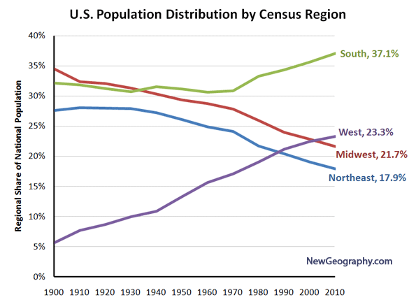
    For a hundred years, Americans have been moving south and west. This, with an occasional hiccup, has continued, according to the 2010 Census.

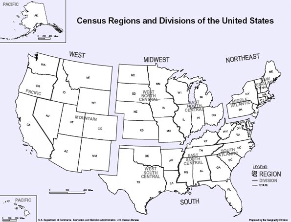
    During the 2000s, 84 percent of the nation’s population growth was in the states of the South and West (see Census region and division map below), while growth has been far slower in the Northeast and Midwest. This follows a pattern now four decades old, in which more than 75 percent of the nation’s population growth has been in the South and West. Indeed in every census period since the 1920s the South and West attracted a majority of the population growth.

    In the first census after World War II, in 1950, the East and the Midwest accounted for 58 percent of the nation’s population, with the South and West making up 42 percent. Since that time, the East and the Midwest have added less than 40 million people, while the South and West added nearly 120 million. Today, the ratios are nearly reversed, with 60 percent of the population living in the South and West and only 40 percent in the East and Midwest.

    The dominance of the South and West was overwhelming. The 24 fastest growing states were all in the South and West. The fastest growing state outside the West and South, surprisingly, was South Dakota, which added a second decade of unprecedented growth, after having gained almost no population between 1930 and 1990.

    Fastest and Slowest Growing States: The fastest growing states were the adjacent Mountain states of Nevada (35.1%), Arizona (24.6%), Utah (23.8%) and Idaho (21.1%). The only large state among the top five growing states was Texas, at 20.1%. These all greatly exceeded the national average growth rate of 9.7%

    Michigan was the only state to lose population (-0.6%) and became the first state in American history to ever exceed 10 million population (earlier in the decade) and then to fall back below that figure. Rhode Island grew only 0.4%. Louisiana grew only 1.4%, which in itself is an accomplishment given the 5 % loss that occurred between 2005 and 2006 after Hurricanes Katrina and Rita. Ohio ranked fourth lowest, gaining only 1.6%. New York continued its laggard performance, gaining only 2.1%. Since the late 1960s, New York (long the largest state) has added little more than one million people, while California added 19 million and has nearly doubled New York’s population.

    California: But all was not well in California. In every 10 year period after the 1920s, California added more people than any other state, until now. Between 2000 and 2010, Texas added 4.1 million people, nearly one million more than California.

    In no decade following the Depression (1930s) has California added so few new residents as in the 2000s. In the 1940s, California’s population rose by 3.7 million, starting from a 1940 base of 6.9 million. During the 2000s, the population increase was 3.4 million, on a 2000 base of 33.8 million.

    California still grew little faster than the national rate (10.0 percent compared to 9.7 percent). Yet this remains the lowest population growth rate for the state since its first Census, in 1850.

    Regional Analysis: The data, both state and regional, that is the basis of the regional analysis below is shown in Tables 1 and 2.

    The South: The South has had the largest share of the nation’s population since the 1940 census and it is now home to nearly 115 million people. The growth has been substantial, with 73 million new residents from 1950 to 2010, expanding 143%, more than twice the national growth rate of 104%. Overall, the South led national growth in the last decade, with a 14.3% rate and adding 14.2 million people. After Texas, the fastest growing states were North Carolina (18.5%), Georgia (18.3%) and Florida (17.6%), which had seen its growth reduced during the housing collapse. South Carolina (15.3%) also grew strongly. Outside of Louisiana, the slowest growth was in West Virginia (2.5%) and Mississippi (4.3%).

    The West: Since 1950, the West has added 58 million people, growing 256%. The West grew the second fastest among the regions, at 13.8% and added 8.7 million residents. As noted above, four of the five fastest growing states were in the Mountain West. In addition, Colorado grew 16.9%.

    The Midwest: Until the emergence of the South in 1940, the Midwest had been the nation’s largest region. Growth has been very slow. Since 1950, the Midwest has added 22.5 million people, but grown only 50 percent, or one-half the national rate of 104 percent. The Midwest had no states that grew above the national rate and had two of the states with the least growth (Michigan and Ohio). Perhaps signaling the rise of the upper Midwest, both North and South Dakota are growing faster than many Eastern or Midwestern states. After decades of population loss, South Dakota experienced unusual growth for the second decade in a row, while North Dakota, grew enough this decade to recover from decades of population loss dating to 1930.

    The Northeast: The nation’s former commercial heartland, the Northeast, has for its third census placed as the nation’s least populated region. A prediction in 1950 that the region housing New York, Philadelphia and Boston would fall so much in relative terms would have been considered absurd. Yet, from 1950 to 2010, the region added 16 million people, for the lowest regional growth rate (40%). The region added less than 2,000,000 population between 2000 and 2010, for a growth rate of 3.2%. The fastest growing state was New Hampshire, at 6.5%, reflecting the growth of its Boston suburbs and exurbs. All other states had growth rates less than one-half of the national rate.

    “Kudos” to the Bureau of the Census: Finally, congratulations are due the Bureau of the Census. In 2000, the Bureau was embarrassed by its under-estimation of the population during the previous decade. At the 1990 to 1999 estimation rate, the 2000 population would have been nearly 7,000,000 below the number of people actually counted in the census. The improvement during the decade of the 2000s was substantial. At the 2000 to 2009 estimate rate, the nation would have had 500,000 more people than were counted in 2010. Missing by less than 0.2 percent is pretty impressive.

    Table 1
    Regional Population: 1950-2010 (Census)
    Division/REGION 1950 1960 1970 1980 1990 2000 2010
    New England 9,314,453 10,509,367 11,841,663 12,348,493 13,206,943 13,922,517 14,444,865
    Middle Atlantic 30,163,533 34,168,452 37,199,040 36,786,790 37,602,286 39,671,861 40,872,375
    NORTHEAST 39,477,986 44,677,819 49,040,703 49,135,283 50,809,229 53,594,378 55,317,240
    East North Central 30,399,368 36,225,024 40,252,476 41,682,217 42,008,942 45,155,037 46,421,564
    West North Central 14,061,394 15,394,115 16,319,187 17,183,453 17,659,690 19,237,739 20,505,437
    MIDWEST 44,460,762 51,619,139 56,571,663 58,865,670 59,668,632 64,392,776 66,927,001
    NORTHEAST & MIDWEST 83,938,748 96,296,958 105,612,366 108,000,953 110,477,861 117,987,154 122,244,241
    Southeast 21,182,335 25,971,732 30,671,337 36,959,123 43,566,853 51,769,160 59,777,037
    East South Central 11,477,181 12,050,126 12,803,470 14,666,423 15,176,284 17,022,810 18,432,505
    West South Central 14,537,572 16,951,255 19,320,560 23,746,816 26,702,793 31,444,850 36,346,202
    SOUTH 47,197,088 54,973,113 62,795,367 75,372,362 85,445,930 100,236,820 114,555,744
    Mountain 5,074,998 6,855,060 8,281,562 11,372,785 13,658,776 18,172,295 22,065,451
    Pacific 15,114,964 21,198,044 26,522,631 31,799,705 39,127,306 45,025,637 49,880,102
    WEST 20,189,962 28,053,104 34,804,193 43,172,490 52,786,082 63,197,932 71,945,553
    SOUTH & WEST 67,387,050 83,026,217 97,599,560 118,544,852 138,232,012 163,434,752 186,501,297
    UNITED STATES 151,325,798 179,323,175 203,211,926 226,545,805 248,709,873 281,421,906 308,745,538


    Table 2              
    States and DC: Population 1950-2010 (Census)  
       
    State 1950 1960 1970 1980 1990 2000 2010
                   
    Alabama 3,061,743 3,266,740 3,444,165 3,893,888 4,040,587 4,447,100 4,779,736
    Alaska 128,643 226,167 300,382 401,851 550,043 626,932 710,231
    Arizona 749,587 1,302,161 1,770,900 2,718,215 3,665,228 5,130,632 6,392,017
    Arkansas 1,909,511 1,786,272 1,923,295 2,286,435 2,350,725 2,673,400 2,915,918
    California 10,586,223 15,717,204 19,953,134 23,667,902 29,760,021 33,871,648 37,253,956
    Colorado 1,325,089 1,753,947 2,207,259 2,889,964 3,294,394 4,301,261 5,029,196
    Connecticut 2,007,280 2,535,234 3,031,709 3,107,576 3,287,116 3,405,565 3,574,097
    Delaware 318,085 446,292 548,104 594,338 666,168 783,600 897,934
    District of Columbia 802,178 763,956 756,510 638,333 606,900 572,059 601,723
    Florida 2,771,305 4,951,560 6,789,443 9,746,324 12,937,926 15,982,378 18,801,310
    Georgia 3,444,578 3,943,116 4,589,575 5,463,105 6,478,216 8,186,453 9,687,653
    Hawaii 499,794 632,772 768,561 964,691 1,108,229 1,211,537 1,360,301
    Idaho 588,637 667,191 712,567 943,935 1,006,749 1,293,953 1,567,582
    Illinois 8,712,176 10,081,158 11,113,976 11,426,518 11,430,602 12,419,293 12,830,632
    Indiana 3,934,224 4,662,498 5,193,669 5,490,224 5,544,159 6,080,485 6,483,802
    Iowa 2,621,073 2,757,537 2,824,376 2,913,808 2,776,755 2,926,324 3,046,355
    Kansas 1,905,299 2,178,611 2,246,578 2,363,679 2,477,574 2,688,418 2,853,118
    Kentucky 2,944,806 3,038,156 3,218,706 3,660,777 3,685,296 4,041,769 4,339,367
    Louisiana 2,683,516 3,257,022 3,641,306 4,205,900 4,219,973 4,468,976 4,533,372
    Maine 913,774 969,265 992,048 1,124,660 1,227,928 1,274,923 1,328,361
    Maryland 2,343,001 3,100,689 3,922,399 4,216,975 4,781,468 5,296,486 5,773,552
    Massachusetts 4,690,514 5,148,578 5,689,170 5,737,037 6,016,425 6,349,097 6,547,629
    Michigan 6,371,766 7,823,194 8,875,083 9,262,078 9,295,297 9,938,444 9,883,640
    Minnesota 2,982,483 3,413,864 3,804,971 4,075,970 4,375,099 4,919,479 5,303,925
    Mississippi 2,178,914 2,178,141 2,216,912 2,520,638 2,573,216 2,844,658 2,967,297
    Missouri 3,954,653 4,319,813 4,676,501 4,916,686 5,117,073 5,595,211 5,988,927
    Montana 591,024 674,767 694,409 786,690 799,065 902,195 989,415
    Nebraska 1,325,510 1,411,330 1,483,493 1,569,825 1,578,385 1,711,263 1,826,341
    Nevada 160,083 285,278 488,738 800,493 1,201,833 1,998,257 2,700,551
    New Hampshire 533,242 606,921 737,681 920,610 1,109,252 1,235,786 1,316,470
    New Jersey 4,835,329 6,066,782 7,168,164 7,364,823 7,730,188 8,414,350 8,791,894
    New Mexico 681,187 951,023 1,016,000 1,302,894 1,515,069 1,819,046 2,059,179
    New York 14,830,192 16,782,304 18,236,967 17,558,072 17,990,455 18,976,457 19,378,102
    North Carolina 4,061,929 4,556,155 5,082,059 5,881,766 6,628,637 8,049,313 9,535,483
    North Dakota 619,636 632,446 617,761 652,717 638,800 642,200 672,591
    Ohio 7,946,627 9,706,397 10,652,017 10,797,630 10,847,115 11,353,140 11,536,504
    Oklahoma 2,233,351 2,328,284 2,559,229 3,025,290 3,145,585 3,450,654 3,751,351
    Oregon 1,521,341 1,768,687 2,091,385 2,633,105 2,842,321 3,421,399 3,831,074
    Pennsylvania 10,498,012 11,319,366 11,793,909 11,863,895 11,881,643 12,281,054 12,702,379
    Rhode Island 791,896 859,488 946,725 947,154 1,003,464 1,048,319 1,052,567
    South Carolina 2,117,027 2,382,594 2,590,516 3,121,820 3,486,703 4,012,012 4,625,364
    South Dakota 652,740 680,514 665,507 690,768 696,004 754,844 814,180
    Tennessee 3,291,718 3,567,089 3,923,687 4,591,120 4,877,185 5,689,283 6,346,105
    Texas 7,711,194 9,579,677 11,196,730 14,229,191 16,986,510 20,851,820 25,145,561
    Utah 688,862 890,627 1,059,273 1,461,037 1,722,850 2,233,169 2,763,885
    Vermont 377,747 389,881 444,330 511,456 562,758 608,827 625,741
    Virginia 3,318,680 3,966,949 4,648,494 5,346,818 6,187,358 7,078,515 8,001,024
    Washington 2,378,963 2,853,214 3,409,169 4,132,156 4,866,692 5,894,121 6,724,540
    West Virginia 2,005,552 1,860,421 1,744,237 1,949,644 1,793,477 1,808,344 1,852,994
    Wisconsin 3,434,575 3,951,777 4,417,731 4,705,767 4,891,769 5,363,675 5,686,986
    Wyoming 290,529 330,066 332,416 469,557 453,588 493,782 563,626
                   
    United States 151,325,798 179,323,175 203,211,926 226,545,805 248,709,873 281,421,906 308,745,538

    Wendell Cox is a Visiting Professor, Conservatoire National des Arts et Metiers, Paris and the author of “War on the Dream: How Anti-Sprawl Policy Threatens the Quality of Life

    Photo by Travelin’ Librarian – Michael Sauers

  • Smart Growth and the Quality of Life

    The idea of “smart growth” should be like mom and apple pie. But take a closer look and you find, for the most part, that smart growth policies often have unintended consequences that are anything but smart.

    If housing is unaffordable, the cost of living is high and people are leaving, it probably means that a state rates higher in smart growth policies. That’s the story from an analysis of the new Smart Growth America state ratings on transportation policies the organization believes would reduce greenhouse gas emissions. The new ratings are based upon strategies recommended in Moving Cooler, a smart growth oriented report authored by Cambridge Systematics in 2009 (Note 1).

    The new Smart Growth America ratings and the Moving Cooler strategies relied, in large measure, on strategies that would force higher population densities, virtually stop development on and beyond the urban fringe, and seek to, in the immortal words of Transportation Secretary Ray Lahood, “coerce” people out of cars.

    Yet when the new ratings are arrayed alongside measures of the quality of life, such as housing affordability and the cost of living, smart growth shows its less attractive side. You can see this, for example, in patterns of domestic migration states with the highest Smart Growth America scores also suffer the highest net domestic out-migration. .

    Quality of Life Indicators: The following analysis compares the Smart Growth America ratings of the states with quality of life indicators, which include lower house prices, a lower cost of living and a greater net domestic migration (Note 2).

    • Housing Affordability: Housing affordability is measured using a median value multiple (Note 3), which is the median house value by the median household income (from the 2009 American Community Survey). Economic research generally indicates that smart growth land use policies lead to higher house prices and lower levels of housing affordability. A lower housing affordability score means that housing is more affordable, and is an indication of a better quality of life. Generally, the median value multiple was 3.0 or below until the housing bubble and remains at that level in some states.
    • Cost of Living: The overall cost of living was examined using regional price parities developed by the Bureau of Economic Analysis (US Department of Commerce) in the form of “regional price parities.” Regional price parities are the domestic equivalent of “purchasing power parities,” which are used to adjust personal income and gross domestic product data between nations. A lower score means that the cost of living is lower and is an indication of a better quality of life.
    • Net Domestic Migration: Net domestic migration rates are for the period of 2000 to 2009 and based upon Bureau of the Census data and is calculated as a percentage of the 2000 population. A higher score means that more people are moving in than moving out. A state with a higher score is more attractive to movers than states with lower scores, which is also an indication of a better quality of life.

    The Top (Mostly Bottom) Ten

    Generally, the states with the highest Smart Growth America ratings perform the worst by these quality of life indicators.

    California is first in Smart Growth America score, at 82 (out of a possible 100). Yet, California ranks 49th in housing affordability, 48th in cost of living and 45th in net domestic migration, having lost 4.4 percent of its population (1.5 million) to other states since 2009. California’s average rank among the quality of life indicators is 47, essentially a mirror image of its Smart Growth America rating. Only New York has a worse average ranking (49th).

    Maryland is second in Smart Growth America score, at 77. However, Maryland ranks 42nd in housing affordability, 41st in the cost of living and 36th in net domestic migration, having lost 1.8 percent of its residents (nearly 100,000) to other states since 2000. Maryland’s average rank is 40th on the quality of life indicators.

    New Jersey ranks third, with a Smart Growth America score of 75. New Jersey ranks 45th in housing affordability, 47th in the cost of living and 47th in domestic migration, having lost 4.5 percent of its population (450,000) to other states during the decade. Among the top ten, only California has a worse average ranking than New Jersey’s, at 46th on the quality of life indicators.

    Connecticut ranks fourth, with a Smart Growth America score of 70. Connecticut ranks 40th in housing affordability, 46th in cost of living and 40th in domestic migration, having lost 2.8 percent (nearly 100,000) of its population. Connecticut’s average rank is 42th in the quality of life indicators.

    Washington is fifth in Smart Growth America score, at 68. Washington ranks 44th in housing affordability and 40th in cost of living. Washington ranked much higher, however, in domestic migration at 14th, with a gain of 4.0 percent (240,000). Washington, like other western states, has been the recipient of strong migration from even more expensive coastal California. Washington’s average rank is 33rd in the quality of life indicators.

    Oregon ranks sixth, with a Smart Growth America score of 65. The state ranks 47th in housing affordability (trailing Hawaii, California and New York), but has a higher average cost of living ranking (31st) and in domestic migration, principally because it, like Washington is a favored destination by people fleeing California.

    Seventh ranked Massachusetts (64) scores much more consistently in the quality of life indicators, at 46th in housing affordability, 45th in the cost of living, 44th in net domestic migration and 45th overall.

    Neighboring Rhode Island (61) ranks eighth and is also a consistent performer, ranking 43rd in housing affordability and net domestic migration, 44th in the cost of living and 43rd overall.

    Delaware and Minnesota share 9th place with a Smart Growth America score of 59. Delaware’s average ranking is 28th, and Minnesota’s average ranking is 29th. Delaware’s ranking, near the top of the bottom 25 is driven by a high net domestic migration rate. Minnesota scores similarly in all quality of life indicators.

    Two states scoring the worst in the quality of life indicators were notably absent in the Top (Mostly Bottom) Ten. New York’s average rank was 49, compared to its Smart Growth America rank of 21. Hawaii’s average quality of life indicator rank was 46 and its Smart Growth America rank was 15. Some of the worst housing affordability and highest costs of living drove their low quality of life scores.

    States with Higher Quality of life Indicators

    The five states with the lowest Smart Growth America scores are Nebraska, North Dakota, West Virginia, Mississippi and Arkansas. These states surely qualify as “flyover” country, being well removed from the more elite coasts. Yet, each of these states scores considerably better than Smart Growth America’s top ten states, with some of the nation’s best housing affordability and lowest costs of living. Slightly more people moved out of these states than moved in. However, bottom ranked Arkansas (Smart Growth America score of 2) attracted 75,000 net domestic residents, almost 1.6 million more than Smart Growth America’s top ranked California and 170,000 more than second ranked Maryland.

    Texas (15th), North Carolina (16th) and Georgia (17th) were among the higher scoring large states in the quality of life indicators. The high Texas ranking resulted from higher rankings in housing affordability and net domestic migration. Georgia and North Carolina had among the highest rankings in net domestic migration.

    Statistical Analyses

    For fun, I did a quick statistical analysis, which indicated that inferior housing affordability and a higher cost of living are associated with a higher Smart Growth America score, at a 99 percent level of confidence (Note 4).

    This relationship is evident in Table 1, which is a summary by Smart Growth America scores. Housing affordability and the cost of living all improve as the Smart Growth America score declines. At this level, a similar relationship is evident in the net domestic migration rate, with the exception of states with a Smart Growth America score of under 20. The states with the highest Smart Growth America ratings (60 and over) lost 2.5 million domestic migrants, while the states with scores from 40 to 60 lost 500,000. States with Smart Growth America ratings under 40 gained 2.5 million domestic migrants, more people than live in all of the nation’s municipalities except for New York, Los Angeles and Chicago. Table 2 provides detailed data for all states.

    Table 1
    Quality of Life Indicator Summary by Smart Growth Score
    Smart Growth America Score
    Housing Affordability
    Cost of Living
    Net Domestic Migration Rate
    Net Domestic Migration
    60 & Over             

    5.1
          

    114.5
    -1.7%
         

    (2,035,132)
    40 to 60             

    4.3
          

    102.2
    1.8%
            

    (501,121)
    20 to 40             

    3.3
            

    87.7
    2.2%
          

    2,576,584
    Under 20             

    2.6
            

    79.2
    -0.5%
                  

    (517)
    Table 2
    Smart Growth America Transportation Ratings & Quality of Life Indicator Summary by State
    Smart Growth America Rating
    Quality of Life Indicators
    State
    Housing Affordability
    Cost of Living
    Net Domestic Migration Rate
    Average Rank
    Value
    Rank
    Value
    Rank
    Value
    Rank
    Value
    Rank
    California
    82
    1
         

    6.5
    49
    129.1
    48
    -4.4%
    45
    47
    Maryland
    77
    2
         

    4.6
    42
    106.5
    41
    -1.8%
    36
    40
    New Jersey
    75
    3
         

    5.1
    45
    125.6
    47
    -5.4%
    47
    46
    Connecticut
    70
    4
         

    4.3
    40
    121.6
    46
    -2.8%
    40
    42
    Washington
    68
    5
         

    5.1
    44
    102.9
    40
    4.0%
    14
    33
    Oregon
    65
    6
         

    5.3
    47
    95.4
    31
    5.2%
    9
    29
    Massachusetts
    64
    7
         

    5.3
    46
    120.8
    45
    -4.3%
    44
    45
    Rhode Island
    61
    8
         

    4.9
    43
    113.7
    44
    -4.3%
    43
    43
    Delaware
    59
    9
         

    4.4
    41
    97.7
    34
    5.8%
    8
    28
    Minnesota
    59
    9
         

    3.6
    26
    92.6
    28
    -0.9%
    32
    29
    Vermont
    57
    11
         

    4.2
    37
    99.5
    36
    -0.2%
    29
    34
    Illinois
    53
    12
         

    3.7
    28
    99.2
    35
    -4.9%
    46
    36
    Virginia
    51
    13
         

    4.3
    38
    102.1
    39
    2.3%
    19
    32
    Wisconsin
    51
    13
         

    3.4
    21
    91.5
    24
    -0.2%
    28
    24
    Hawaii
    50
    15
         

    8.1
    50
    133.4
    50
    -2.4%
    38
    46
    Pennsylvania
    50
    15
         

    3.3
    20
    94.2
    29
    -0.3%
    30
    26
    Arizona
    45
    17
         

    3.9
    30
    94.4
    30
    13.5%
    2
    21
    Florida
    45
    17
         

    4.1
    34
    99.9
    37
    7.2%
    6
    26
    Michigan
    45
    17
         

    2.9
    12
    92.5
    27
    -5.4%
    48
    29
    Nevada
    42
    20
         

    3.9
    32
    100.4
    38
    17.9%
    1
    24
    New York
    41
    21
         

    5.6
    48
    131.8
    49
    -8.7%
    50
    49
    New Mexico
    37
    22
         

    3.7
    27
    83.5
    14
    1.4%
    23
    21
    Colorado
    36
    23
         

    4.3
    39
    97.1
    32
    4.7%
    10
    27
    Utah
    36
    23
         

    4.1
    33
    86.5
    19
    2.4%
    18
    23
    Kentucky
    35
    25
         

    2.9
    13
    80.8
    4
    2.0%
    21
    13
    Tennessee
    35
    25
         

    3.3
    19
    84.7
    18
    4.6%
    12
    16
    Alaska
    34
    27
         

    3.5
    23
    106.7
    42
    -1.2%
    33
    33
    Maine
    33
    28
         

    3.9
    31
    92.2
    26
    2.3%
    20
    26
    South Carolina
    33
    28
         

    3.2
    18
    83.2
    13
    7.6%
    5
    12
    New Hampshire
    32
    30
         

    4.1
    35
    113
    43
    2.6%
    17
    32
    Georgia
    31
    31
         

    3.4
    22
    87.9
    23
    6.7%
    7
    17
    Kansas
    31
    31
         

    2.6
    7
    83.6
    16
    -2.5%
    39
    21
    Idaho
    30
    33
         

    3.8
    29
    82.7
    10
    8.5%
    3
    14
    Iowa
    28
    34
         

    2.5
    3
    82.9
    11
    -1.7%
    35
    16
    Ohio
    28
    34
         

    3.0
    15
    87.2
    21
    -3.2%
    42
    26
    Texas
    27
    36
         

    2.6
    6
    91.7
    25
    4.0%
    15
    15
    North Carolina
    26
    37
         

    3.6
    25
    86.9
    20
    8.2%
    4
    16
    Missouri
    25
    38
         

    3.1
    16
    81.3
    7
    0.7%
    27
    17
    Oklahoma
    24
    39
         

    2.6
    4
    81.6
    8
    1.2%
    24
    12
    Alabama
    23
    40
         

    3.0
    14
    80.8
    4
    2.0%
    22
    13
    Louisiana
    23
    40
         

    3.2
    17
    83.6
    16
    -7.0%
    49
    27
    Montana
    23
    40
         

    4.2
    36
    83.1
    12
    4.4%
    13
    20
    South Dakota
    23
    40
         

    2.8
    11
    82.3
    9
    1.0%
    26
    15
    Wyoming
    21
    44
         

    3.5
    24
    97.4
    33
    4.6%
    11
    23
    Indiana
    20
    45
         

    2.7
    9
    83.5
    14
    -0.4%
    31
    18
    Nebraska
    18
    46
         

    2.6
    5
    87.3
    22
    -2.3%
    37
    21
    North Dakota
    18
    46
         

    2.4
    1
    79.5
    3
    -2.8%
    41
    15
    West Virginia
    13
    48
         

    2.5
    2
    70.3
    1
    1.0%
    25
    9
    Mississippi
    12
    49
         

    2.7
    8
    80.8
    4
    -1.3%
    34
    15
    Arkansas
    2
    50
         

    2.7
    10
    78.2
    2
    2.8%
    16
    9
    Housing Affordability: Median House Value/Median Household Income, 2009
    Cost of Living: Regional Price Parities, 2006
    Net Domestic Migration: 2000-2009 Migration/2000 Population

    ——————-
    Note 1: Moving Cooler has been criticized by Alan Pisarksi (ULI Moving Cooler Report: Exaggerations and Misconceptions) and this author (Reducing Vehicle Miles Traveled Produces Meager Greenhouse Gas Emissions Returns) in previous newgeography.com articles.

    Note 2: There are additional quality of life indicators, such as shorter work trip travel times, less intense traffic congestion, less intense air pollution, more living space, etc.

    Note 3: This measure is based upon median house value, which is the only data available at the state level. The median value multiple is different from the Median Multiple (median house price divided by median household income), which is widely used in metropolitan area analysis (such as in the Demographia International Housing Affordability Survey).

    Note 4: Details of the regression analysis: The dependent variable was the Smart Growth America score. The independent variables were the cost of living indicator and the domestic migration rate. The coefficient of determination (R2) was 0.55. (The positive relationship to the cost of living was strong, with a probability of only 1 in 10,000 that the result could have occurred by chance. The indicated association with the net migration rate was weak; the chance association cannot be ruled out).

    Wendell Cox is a Visiting Professor, Conservatoire National des Arts et Metiers, Paris and the author of “War on the Dream: How Anti-Sprawl Policy Threatens the Quality of Life

  • Toward a Continental Growth Strategy

    North America remains easily the most favored continent both by demography and resources. The political party that harnesses this reality will own the political future.

    America cannot afford a prolonged period of slow economic growth. But neither Democrats nor Republicans are prepared to offer a robust growth agenda. Regardless of what happened in the November midterm elections, the party that can outline an economic expansion strategy suitable to this enormous continental nation will own the political future.

    Economic expansion that barely exceeds the current 2 percent or less is woefully insufficient for the United States. Such meager growth could perhaps work in countries with very low birthrates and limited immigration, such as in much of Europe and Japan, but not in the demographically vibrant United States.

    In the years between 2000 and 2050, Europe’s workforce will decline by 25 percent; Japan’s by 44 percent; China’s by 10 percent. In contrast, America’s workforce is expected to expand by more than 40 percent, adding millions of new entrants from an increasingly diverse population.

    Given the growth in workforce, it is impossible to see how the country succeeds without rapid expansion not only of employment but also a broad-based wealth creation. Despite conservative attempts to dress up the numbers, the vast bulk of all the gains in wealth since 2000 have been achieved by the relatively small number of Americans with incomes significantly above the poverty level. Meantime many middle-tier educated and skilled workers have lost ground while the rate of upward mobility has stagnated.

    The collapse of the housing bubble has eliminated the one way that middle class families took advantage of economic growth during the Bush years. Under Obama, virtually all the gains have been to the stock market (up 30 percent) and corporate profits (42 percent). Meanwhile, weekly earnings, jobs, and home sales price all stagnated or declined. But the biggest price may be paid by young people; even those with degrees have lagged behind in wage growth as they crowd into a labor market potentially far tougher than the one their boomer parents faced.

    All this suggests an emerging “aspiration gap” that could define our politics for much of the next few decades. Today, belief in the achievability of the “American dream,” according to a recent survey by Strategy One, has dropped to the low 40s. Americans may still overwhelmingly believe in the ideal of upward mobility but, as individuals, now only a minority feel they can achieve it themselves.

    The “aspiration gap” fundamentally does not advantage either party at the moment. Democrats are set for large losses in the 2010 election. But party identification and approval for the GOP remain low, particularly among the rising minority and millennial constituencies. Even in suburbia, amid rapidly rising middle class angst, the Republicans, according to a recent Hofstra University poll, have lost more support than the Democrats since 2008. Independents have been the big winner and constitute the largest faction of suburbanites—more than 36 percent, compared to just 30 percent two years ago.

    Our Failing Parties: The Democrats

    Let’s start with the Obamacized Democratic Party. Up through the 1990s, the Democrats still maintained strong links to small businesses, private sector unions, and the old Midwest industrial economy. This gave them reasons to favor growth-inducing policies that could close the “aspiration gap.”

    But today the party has become captured largely by the coastally oriented alliance of public employees, their charges, greens, and the professiorate—what Fred Siegel calls an alliance of the “overeducated and the undereducated.” For the most part, these constituencies are largely detached from the private sector, and thus only tangentially interested in economic growth. Even high unemployment, unsurprisingly, was not the primary concern for an administration dominated by longtime public servants and tenured professors—people who rarely lose their jobs.

    This indifference stems not so much from a traditional socialist agenda, as imagined by some conservatives, but by the nature of the party’s constituencies. It is more a dictatorship of the professoriate than that of the proletariat.

    Further obscuring the growth agenda is the fact that some key advisors consider growth itself inherently evil. Take for instance the president’s science advisor John Holdren. A protégé of the Malthusian Paul Ehrlich, Holdren long has favored the planned “de-development” of Western economies in order to reduce consumption.

    The “de-development” agenda has been bolstered by the growth of the climate change industry. Proposals for “cap and trade” rules or Environmental Protection Agency regulations on greenhouse gases represent profound threats to basic industries like manufacturing, housing, and agriculture. In contrast, they have proven boffo for university research grant-seekers and Silicon Valley venture capitalists, who increasingly focus on “clean” technologies subsidized by government grants and edicts favoring their technologies.

    The climate change agenda also distorts the administration’s approach to infrastructure. Instead of focusing on transportation bottlenecks effecting companies and commuters on a daily basis, the administration has favored massive boondoggles such as high-speed rail or sometimes poorly conceived light-rail systems. These are often too expensive compared to alternatives, and not well-suited to the needs of most American communities or companies.

    Our Failing Parties: The Republicans

    Today, with as many as 25 million Americans unemployed or underemployed, the Democratic Party still seems to be missing a coherent program to put them back to work. Sadly, much the same can be said of the Republicans, who benefit from populist outrage about the stimulus, but also lack an answer to the deepening aspirational gap.

    The fundamental problem is obvious at the level of the Tea Party, the grassroots driving force behind today’s GOP. Tea partiers know what they are against—higher taxes and government spending—but have not developed much in the way of approaches to spur growth.

    This is epitomized by the career of the movement’s patron saint, Sarah Palin. Celebrated by many in the “lower 48,” Palin is widely seen among Alaska’s predominately Republican business community as indifferent to economic growth. As governor, they maintain, she proved more interested in redistribution to the middle class—through larger checks from the state’s energy fund—than in investing in things like new infrastructure.

    “She epitomizes the whole idea of we get a piece and no sense of planning for the future, about thinking about what we need to do,” notes Jim Egan executive director of Commonwealth North, a local think tank.

    Long-term growth, in Alaska and elsewhere, Egan suggests, needs government to play a critical supporting role. The fact that the Obama administration missed its opportunity to focus on basic infrastructure in its bungled, politically driven stimulus does not mean that investing in the future is an inherently bad idea.

    The Republican embrace of austerity represents good policy when it comes to reducing wasteful spending, notably on public employee pensions. But knee-jerk resistance to any government spending could prove detrimental in an increasingly competitive world.

    Needed: A Continental Strategy

    To promote economic growth, the country needs to develop a new national consensus around which I call “a continental strategy.” This would focus on taking advantage of the unique demographic and resource assets of this country as well as its North American neighbors, Mexico and Canada.

    Today the United States faces formidable competitors, notably from China, India, and Brazil. These are proud, vast countries with considerable resources and an expanding middle class population. At least in the short run, they suffer neither the ruinous demography of Japan nor the elaborate welfare burdens of Western Europe.

    Already these countries are investing in their basic infrastructure so that they can tie their vast landmass together and profit from it.

    Hard as it is to imagine amid the wreckage of the stimulus, American history is replete with examples of how government can actually do good things. The public support for canals, railway lines, the New Deal engineering and construction projects, the Interstate Highway, and space programs all greatly benefited the country’s economy. They underpinned first American leadership in the industrial age, and then in the information economy. In recent decades, public investment in basic infrastructure construction and maintenance has declined, even in the face of considerable population growth.

    “One looks back at that map ‘Landscape by Moses,’” writes the sociologist Nathan Glazer, about the legacy of New York City’s “master builder” Robert Moses, “and if one asks what has been added in the 50 years since Moses lost power, one has to say astonishingly: almost nothing.”

    Restoring our priority towards binding together and improving our continental infrastructure remains critical to achieving greater economic growth. Rather than a policy of retrenchment, it would represent a return to an approach that sparked our original ascendency and could gain broad bipartisan support.

    Even today, what makes a continental strategy so compelling lies with this often overlooked reality: North America remains easily the most favored continent both by demography and resources. It possesses the world’s second-largest oil reserves and massive, still largely untapped natural gas supplies.

    North America also constitutes by far the world’s richest agricultural area, with the most arable land. This is a huge advantage as global food demands grow over the next few decades. Critically, the continent also boasts more than four times as much water per capita as either Asia or Europe.

    Most important still, North America retains a unique demographic vitality among all advanced countries. It continues to lure upwardly mobile people from around the world: roughly half of the world’s educated migrants come to America, and a considerable number also head for Canada.

    Ultimately a continental strategy meets the needs of large segments of the country—ranging from immigrants and their children to millennials—who will dominate our emerging job market. These same groups in the coming decades will also shape our political future.

    The party that offers these new voters the greatest opportunities for work, raising a family, and buying a house will be the one that dominates the political future. As generational chroniclers Mike Hais and Morley Winograd, both committed Democrats, have pointed out, millennials are essentially nonideological; they will be attracted to those policies that work, both for society and for their young families.

    Although this year’s political results may please conservative ideologues, they should recognize that this represents only the defeat of poorly executed Obamian statism. The future belongs to whichever party emerges as the true party of growth.

    This article originally appeared at The American.

    Joel Kotkin is executive editor of NewGeography.com and is a distinguished presidential fellow in urban futures at Chapman University. He is author of The City: A Global History. His newest book is The Next Hundred Million: America in 2050, released in February, 2010.

    Photo by IronRodArt – Royce Bair

  • Don’t Touch My Junk – At the Airport OR at the Zoning Office

    Until recently, “Don’t touch my junk” was only a rallying cry for people who liked to accumulate broken down cars in their yards, in defiance of local nuisance ordinances. The internet meme radiating from San Diego International Airport puts an entirely new spin on the phrase.

    Americans have a strong tradition of equality, enshrined in the Equal Protection clause of the 14th Amendment to the United States Constitution: “no state shall … deny to any person within its jurisdiction the equal protection of the laws”. Next to the implied right to privacy—the right to be left alone—we value the fact that the law holds each of us as equals, whether we’re old or young, rich or poor, white, black, brown or purple. We’re Americans, darn it, and we should all be treated the same.

    However, we balance the blind scales of justice with countervailing impulses of forgiveness and righteousness, charity and perseverance. The vaunted Puritan work ethic makes sense—you work hard, you should enjoy the fruits of your labor. On the other hand, our better nature implores us to give a helping hand up, to right wrongs and to make the world a better place. Sometimes we don’t treat people the same because they worked harder or because they need a little extra help. We balance our values, and that’s OK.

    In the wake of 9/11, we have balanced many rights against the greater good of protecting our national security. This week’s dust-up with the TSA’s enhanced security systems is illustrative of that balancing act. Americans will put up with a lot when there is a genuine consensus that the end result benefits the greater good, but eventually government will overreach. Even on—or especially on—issues of grave national concern, we risk going a bridge too far.

    Each day I work with communities and the people who live in them to build better places to live. Like an entrepreneur puts together a business plan evaluating assets and liabilities, revenues and expenses, communities put together comprehensive land use plans to chart their shared course forward. Those plans are implemented through local ordinances and policies, such as zoning regulations or economic development programs.

    The 2005 US Supreme Court case of Kelo v. City of New London (545 US 469) was a case of a bridge too far for local government policy. As you may recall, the city put together a redevelopment plan that promised over 3,000 new jobs and over $1 million a year in new tax revenue. The price to be paid was the Fort Trumbull neighborhood, which was slated to be acquired by eminent domain, demolished and rebuilt by private developers. In this case the Court upheld the existing balance between property rights and community development, ruling that the city’s acquisition of private property for economic development is a permissible “public use” under the takings clause of the Fifth Amendment, applied by the Due Process Clause of the 14th Amendment.

    This was a pyrrhic victory at best, as across the nation people rebelled at the notion, not just of takings—the property owners were due just compensation—but of imposing so great a cost on an individual for the dubious betterment of so many. If they could do this to Susette Kelo in New London, Connecticut, they could take any of our homes if a big enough carrot comes to town. As Ilya Shapiro at Cato Institute noted this summer, in the five years since the Supreme Court decision nine state high courts have limited eminent domain, and almost all state legislatures across the country have passed some type of property rights reform. The consensus comes undone when we reach too far.

    Now I am a planner, by training and craft. I don’t believe, as some say, that “central planning is superior to free-market competition.” Comprehensive planning is a statement of a community’s shared goals and visions for the future. As the Cheshire Cat told Alice, “If you don’t know where you are going, any road will get you there.” The federal government sinks billions of dollars into roads, rail and air networks, so it makes sense to do some transportation planning. Local governments sink untold millions into water, sewer, and road infrastructure, so it makes some sense to spend those scare funds prudently. That said, there is no sense in robbing Peter to pay Paul. Peter needs to pay for Peter’s problems and Paul needs to pay for Paul’s.

    The same questions arise countless times in local government. We write a rule to fix a problem and then the rule creates another problem. For example, local zoning regulations often require special conditional use permits for places of worship. Traditionally churches, synagogues and mosques have been sited in residential neighborhoods, limiting the traffic increase to once-a-week worship services. As a practical matter it wasn’t much of a problem. More recently, many of these buildings have added day care and other week-day services more typical of commercial land uses. So should they be treated the same as commercial uses that attract traffic and impact residential livability? Or following the First Amendment should freedom of religion exempt places of worship from local land use requirements?

    Congress stepped in to this zoning question with the Religious Land Use and Institutionalized Persons Act (RLUIPA) in 2000, prohibiting any “substantial burden” on religious exercise unless a “compelling government interest” can be demonstrated. Religious expression is a constitutionally protected freedom,yet there may be compelling public interest in balancing that expression. In the case of airport security, we all recognize the public interest in security, yet part of the current public outcry stems from the perception that the government may not be consistent in how they treat people based on their religious practices.

    We are still struggling to interpret RLUIPA in cities and counties across the country as well as in our courts. Boulder County, Colorado, recently appealed to the US Supreme Court a decision holding that the county had not treated a proposed church campus expansion similarly to a non-religious use on equal terms. The County’s long-standing commitment to “curbing urban sprawl, maintaining open space to preserve the county’s rural character, and sustaining agriculture”, as expressed in the Comprehensive Plan and implemented in the Land Use Code, was insufficient to balance the protected religious expression. However that case turns out one thing is clear: we have to treat everyone the same, be they a Christian cathedral, a Buddhist temple or a non-denominational retreat center.

    Whether it’s the political correctness of security pat-downs or land use regulations, we inevitably get in trouble when we forget the great American traditions of equality, charity and justice. All men are created equal, at the airport or at the zoning office.

    John C. Shepard, AICP, works in regional development in Southwest Minnesota and is a member of the American Institute of Certified Planners. John has experience in local economic and community development across the Great Plains and Rocky Mountain states. He blogs on life, liberty and the pursuit of Americana at jcshepard.com.

    Photo by phidauex, Sam Ley

  • Belly-Up In The Burbs: Bank-Owned Developments

    In 2009, the number of repossessed autos increased to 1.9 million. The number of homes under foreclosure varies from month to month, but the 2009 total was about 2.8 million. For 2010, it seems that a million new foreclosed homes would be conservative, with a large percentage in California. Miss a few payments on an auto loan and you may wake up to an empty driveway. On the other hand, repossession of your home is a long drawn out process.

    What kinds of communities have been hardest hit with foreclosures? Tom Cusack, a retired federal housing manager in Portland, tracks the issue via his Oregon Housing Blog. This summer, he was quoted in the Portland Tribune, saying “The foreclosure activity that is occurring in suburban markets in Oregon is unprecedented. It’s affecting not just rural areas, not just inner-city neighborhoods, but suburban neighborhoods, probably more substantially than any time in the past.”

    Daniel Ommergluck of Georgia Tech also studied this situation. His findings, he says, contradict “…some suggestions that the crises was primarily centered in suburban or exurban communities.” It concluded, “The intrametropolitan location of a zip code appears to have been a less important factor in REO (real estate owned) growth than the fact that a large amount of development in newer communities was financed during the subprime boom.”

    Decades ago, a young couple would have had to save for many years to accumulate the considerable down-payment to buy their first home, and the prospect of losing that home to foreclosure would have been devastating. With the more recent “easy financing,” though, there has been little to risk. The low effort to move into that new housing development has meant less “emotional” investment. When home prices escalated beyond reason in the years prior to the crash, it left many home buyers over-exposed, specifically because of the easy mortgages.

    The local economy also determines which suburbs suffer the most. Certainly homes in prosperous Houston or San Antonio that did not ride the absurd price increases fared much better than Detroit, with its bleak employment picture, where homes are imploding in value.

    Historically, the U.S. suburban home buying market is somewhere between 70% and 80% higher volume than the urban market. In other words, for every ten homes sold, seven or eight of them are likely to be suburban. So, it would stand to reason that the foreclosure crisis would be focused in the suburbs. Yet suburban vs. urban data on the subject is scarce.

    It’s probably more reasonable to assume that the local employment situation would have a larger effect than whether a community is urban or suburban. For example, when the Ford Plant in urban St. Paul closes, there will be 750 employees out of work and at risk of eventual foreclosure if the job market remains depressed. The residential area abutting the Ford plant is actually very nice, suggesting that many of the workers might live in the nearby city, not in the suburbs. Several miles from the Ford Plant is the suburb of Eagan where Lockeed Martin will close down their operation and put some 400 highly paid people out of work. These newly unemployed workers also may ultimately end up with their homes in foreclosure if they cannot gain highly paid employment elsewhere. Thus suburban vs. urban foreclosures are related to a very localized economy.

    There is, however, a greater menace to the suburbs than home foreclosures. It is when an entire development is foreclosed and becomes bank owned. Since the urban foreclosure is likely on a home that has been sold many times since the development — let’s call it ‘Jones Addition’ — was first built in 1925, the developer going broke is meaningless to the urban dweller.

    However, when ‘Jones Acres’ in Pleasantville was opened just five years ago, and phase one sold out with the beginning of phase two of 12 phases just started at the time of the crash, a very different and dangerous scenario arises. You see, Jones Acres is comprised of 500 lots. Of those, perhaps 40 were purchased by new suburban home buyers trusting that the amenities would be built as planned and promised.

    When President Bush announced that we had a 700 billion dollar problem and needed to bail out the banks, those same financial institutions essentially called the loans, which closed down much (probably most) of the nation’s developers. Land was no longer secure, and the development repossessions began. Without the banks funding, developers could not afford to properly maintain the grounds, associations failed, and eventually the banks were the new owners.

    Here in Minnesota, I know of few suburban developments that have not been foreclosed on. This would seem to be a greater threat to the future of the suburbs than individual homes being lost. Yet very little attention has been paid to the volume of bank owned developments. Much of the suburban land was purchased under contracts to farmers that took the land in phases. If a major builder committed to taking down the 500 lots in Jones Acres, and placed a million dollars in initial money ($2,000 a lot for the land), and after 40 lots decided to walk away, it left the farmer holding the land now likely taxed much higher and in danger of foreclosure. It made sense in many scenarios for the major builder to walk away and lose its lot deposits. Later on, if the development failed and the bank needed to unload the property, another major builder might be able to pick up the lots at 10 cents on the dollar, and just sit on the property for years until the housing market starts to recover.

    Since the recession began, a group of us approached banks with an offer to review the approved plans and re-plan some idle developments more efficiently and sustainably. This state of limbo would have been an excellent time to redesign the land into a much more sustainable (and profitable) product with little outlay from the financial institution. We could not find a single bank that was interested in adding value.

    Often the initial developer imagines the details of a neighborhood: the amenities, the architecture, the landscaping, and the marketing. What happens when a bank takes over? The banker most likely lacks this forward vision, and sells the development later to a buyer who offered 1/10th of the initial land cost for an approved platted development. Bah humbug, this buyer says, who needs a front porch, parks are for drug dealers, and if streets were meant to have trees, then the lord would have planted them there! The result is a highly visible, low value community.

    Cities approve developments based upon relationships. The recession eradicated so many promises that may now never be realized. Foreclosed homes in the cities or in the suburbs are less of a problem than foreclosed developments… and in this case, the suburbs lose – big time!

    Photo by Sean Dreilinger: One of two adjacent bank owned homes.

    Rick Harrison is President of Rick Harrison Site Design Studio and Neighborhood Innovations, LLC. He is author of Prefurbia: Reinventing The Suburbs From Disdainable To Sustainable and creator of Performance Planning System. His websites are rhsdplanning.com and performanceplanningsystem.com.

  • Pittsburgh’s Tunnel of LOV

    Before Pittsburgh’s light-rail “Tunnel to Nowhere” under the Allegheny River came along, my favorite Port Authority boondoggle was the Wabash Tunnel under Mt. Washington.

    Most Pittsburghers know all they need to know about the notorious “Tunnel to Nowhere.”

    Still under construction and still disrupting downtown Pittsburgh after three years, it’s the 1.2-mile, $528 million extension of “The T” (Pittsburgh’s light-rail line to the South Hills suburbs) from Gateway Center under the Allegheny River to the North Shore (where the Steelers’ and Pirates’ subsidized playpens are).

    The “Tunnel to Nowhere’s” humorless fathers and mothers at the Port Authority of Allegheny County, the local Big Transit franchise, prefer to call it “The North Shore Connector.”

    But whatever they call it, their baby is still probably going to cost upwards of $.7 billion by the time it’s done in 2012. That’s when it will begin providing desperately needed cheap public transportation to its key customer base — Steeler and Pirates fans too lazy to walk across one of four bridges that already connect downtown and the ballparks.

    As for the humble Wabash Tunnel, most Pittsburghers have never heard of it and it’s a statistical certainty that most of them have never passed through its innards since it quietly opened in early 2005.

    Originally part of the grandiose “Airport Busway” plan, the tunnel’s rebirth is a textbook case of the confluence of dumb federal regulations, “free” federal transportation money, and criminally stupid local transit officials. As a local historian nicely explains and illustrates in “Pittsburgh’s Money Pit,” the tunnel has a long, sad and bankrupt life.

    To turn it into the Wabash HOV and make it suitable for car traffic, the Port Authority had to pour about $40 million in federal, state and local tax money into it. The ramps from the tunnel portals on each side of the hill to the existing road levels were about $10 million.

    Even if it had connected to an underused $326 million busway as planned, the Wabash would have been a waste of everyone’s money. As a stand-alone tunnel for cars under Mt. Washington, the hill that separates Downtown Pittsburgh from the city’s southern suburbs, it was and still is worthless.

    Paul Skoutelas, in 2005 the Port Authority’s Chief Exaggerating Officer, tried to justify the 3,600-foot tunnel by saying the Wabash HOV would alleviate commuter congestion on the Fort Pitt and Liberty bridges, the two main arteries into downtown from the south.

    That claim was always an absurdity bordering on a lie, since 200,000 vehicles a day used the two bridges in 2005 and the Wabash was projected at its peak – in 2015 — to handle a whopping 4,500 vehicles a day.

    That 4,500-car projection – a typical example of the phony projections Big Transit monopolies make when they justify their future fiascos – will only materialize if an earthquake closes off every other route from the south to downtown.

    Five years after it opened, the Wabash is what everyone knew it would be – a $40 million low-occupancy joke that costs the Port Authority of Allegheny County hundreds of thousands of dollars a year to maintain.

    When I drove through the Wabash LOV Friday, Dec. 3, during rush hour, I found myself riding in the only car in the tunnel. It was so lonely in that yellow tube at 6 p.m. that I decided to stop midway, jump out and take the picture at the top of the page.

    Back in 2007, the number of cars using the Wabash LOV tunnel every day was about 150 – a cost per trip to taxpayers of about $12, according to a local think tank. In the upside-down world of Big Transit accounting, that’s probably a bargain.

    For some strange reason, the Port Authority doesn’t bother to keep track of the number of vehicles using the Wabash each day on its otherwise statistic-filled Web site. I’ve got a couple of calls into my friends who do the PR for the Port Authority.

    They’ll eventually call me back with the official figures. But even if they don’t, it’s safe to assume that the Port Authority’s tunnel of LOV is still a long way from hitting that phony 4,500 projection.

    Bill Steigerwald, a free-lance libertarian writer who recently retired from daily newspaper journalism, loves his native Pittsburgh but hates the political and corporate power brokers who’ve been damaging the city for 60 years. His columns are archived at the Pittsburgh Tribune-Review and his 2000 article for Reason magazine on the city’s abuse of eminent domain powers is here.

    Photo: Evening rush hour in the Wabash LOV Tunnel at 6 p.m. Dec. 3, by author.