Blog

  • How to Make Post-Suburbanism Work

    Are you ready to become a “real” city yet, Southern California? Being “truly livable,” our betters suggest, means being “infatuated” with spending more billions of dollars on outdated streetcars (trolleys) and other rail lines, packing people into ever small spaces and looking toward downtown Los Angeles as our regional center.

    Our cognitive elites dislike the very idea that Los Angeles, as Dorothy Parker once supposedly described, has long been “72 suburbs in search of a city.” Yet, Southern California, as I discuss in a new Chapman University report, has from its early emergence grown around a “post-suburban” model of dynamic, smaller clusters. This urban form has become common in many major metropolitan areas as automobiles have replaced transit as the primary means of getting around.

    This model worked here brilliantly for most of the last half century — until planners, real estate speculators and California bureaucrats decided that we needed to emulate New York City and other older monocentric core cities. Like the provincials they consistently prove themselves to be, our leaders have generally complied.

    So, after nearly 15 years spent in pushing this direction, what have we accomplished? A transit system that barely serves as many people as it did before we started building trains, housing prices among the highest in the nation, super-high poverty rates and a population that continues to seek to go somewhere else, including some 1.6 million net domestic migrants who have left the L.A. and Orange County area since 2000.

    The density mirage

    Some see densification as necessary to meet the demands of an expanding population. Yet, both L.A. and O.C.’s populations are growing slower than both the state and national average. Nor has the pro-density regime relieved any of the pressure on housing and rent. For one thing, high-density housing is far more expensive on a per-square-foot basis, either for townhouses or detached housing. It can only accommodate the poor at the cost of massive subsidies.

    The drive to re-engineer our post-suburban form assumes that downtown Los Angeles can become like the more historic central business districts of New York, Chicago and San Francisco. These CBDs have from nearly double to 10 times the employment levels as downtown L.A. Suffice it to say, downtowns in New York, Chicago and San Francisco have retained regional significance, as others, including Los Angles, have declined in relative influence, with little growth in their share of regional employment. Even the most generous definition of downtown Los Angeles encompasses considerably less than 5 percent of the metropolitan area’s employment, and that share has not grown appreciably since 2000. All the net job growth has been in newer suburbs and exurbs.

    Fundamentally, in “post suburban” regions like southern California, the “sell” is a different one than in places like New York. It is based on a largely suburban quality of life. This does not mean we need to lag economically. Many of the most successful high-tech regions — notably, Silicon Valley; Austin, Texas; Raleigh-Durham, N.C., and the northern reaches of Dallas —– are largely suburban and less dense than the L.A. area. Certainly, densification policies so far have not turned Los Angeles County into a high-tech haven. The county suffers from below-average tech employment, while more suburban Orange County remains 20 percent above average. The fastest increases, albeit from a low base, are occurring in the Inland Empire.

    Read the entire piece at The Orange County Register.

    Joel Kotkin is executive editor of NewGeography.com. He is the Roger Hobbs Distinguished Fellow in Urban Studies at Chapman University and executive director of the Houston-based Center for Opportunity Urbanism. His newest book, The Human City: Urbanism for the rest of us, will be published in April by Agate. He is also author of The New Class ConflictThe City: A Global History, and The Next Hundred Million: America in 2050. He lives in Orange County, CA.

    Photo by Thomas Pintaric (Pintaric) [GFDL or CC-BY-SA-3.0], via Wikimedia Commons

  • A Better Way

    My recent post at Granola Shotgun described how a town in Georgia spent an enormous amount of public money on a new civic center and road expansions, but somehow managed to devalue nearby private property in the process. Here’s an example of a neighborhood in Nashville, Tennessee that took a different approach that cost a lot less and achieved a radically better set of outcomes.


    Screen Shot 2016-08-25 at 6.01.50 PM

    Screen Shot 2016-08-25 at 5.49.18 PM

    The McCabe Park Community Center was designed by a local firm rather than an international starchitect. Municipal funds were recirculated right in town and used to foster native talent and professional employment. And while the facilities are available to everyone in Nashville this center is scaled and programmed primarily to serve the immediate neighborhood.

    Screen Shot 2016-08-25 at 9.25.20 PMGoogle

    Screen Shot 2016-08-25 at 6.41.04 PM

    A conscious decision was made to accommodate pedestrians rather than provide the usual endless automobile infrastructure. There are the required handicap accessible parking spaces close to the entrance at the rear. There are a few dozen off street parking spots along the baseball diamond. But that’s it. It’s absolutely possible to arrive by motor vehicle, but the cars don’t dominate the landscape.

    Screen Shot 2016-08-25 at 11.08.02 PM

    Screen Shot 2016-08-25 at 5.48.42 PM

    Screen Shot 2016-08-25 at 6.01.06 PM

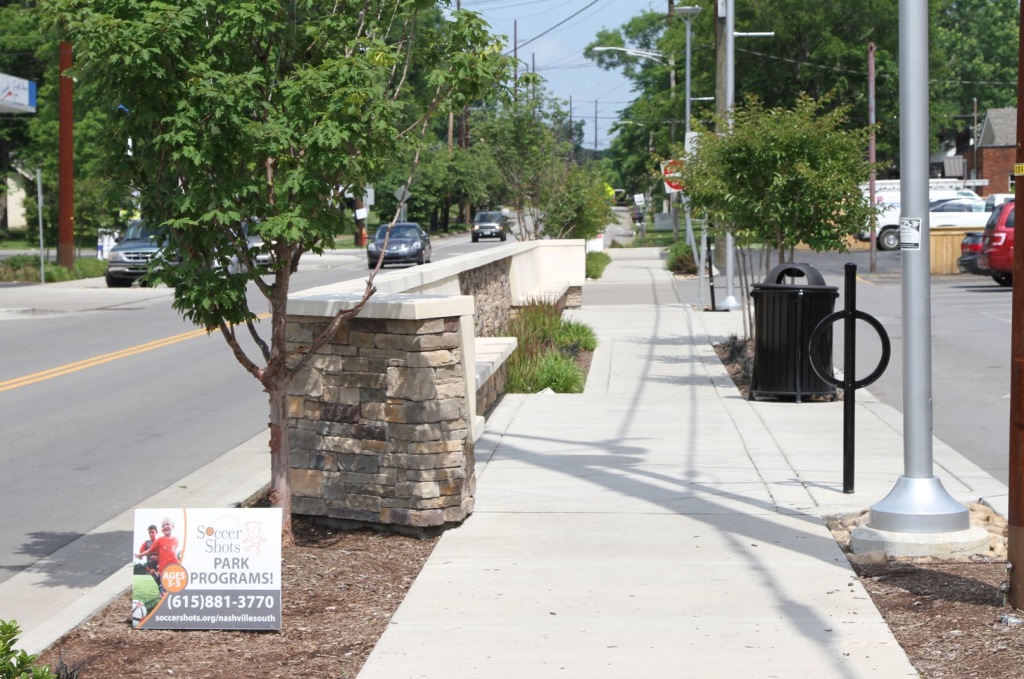
    Bicycle and pedestrian infrastructure make it clear that it’s safe, pleasant, convenient, and dignified to arrive without a car. One of the goals of this community center is to facilitate a more active and healthy lifestyle.

    Screen Shot 2016-08-25 at 11.40.11 PMGoogle from 2009

    Screen Shot 2016-08-26 at 1.07.16 AMGoogle Street View from 2009

    Screen Shot 2016-08-26 at 1.05.07 AMGoogle Street View from 2009

    Screen Shot 2016-08-26 at 1.06.32 AMGoogle Street View form 2009

    Screen Shot 2016-08-26 at 1.48.03 AMGoogle Street View form 2009

    The road out front was a standard suburban affair of wide lanes, fast moving vehicles, no distinction between the road surface and adjacent parking lots, and no sidewalks. This landscape made it very clear that if you weren’t in a car you just weren’t important. It was also brutally ugly and lined with aging low value buildings and struggling businesses.

    Screen Shot 2016-08-26 at 1.29.53 AM


    Screen Shot 2016-08-25 at 5.46.54 PM

    Screen Shot 2016-08-25 at 6.00.19 PM

    Screen Shot 2016-08-25 at 5.49.32 PM

    Screen Shot 2016-08-25 at 5.59.23 PM

    Screen Shot 2016-08-26 at 2.04.37 AM

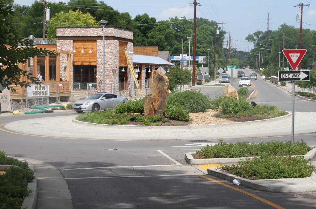
    The new traffic roundabout has transformed the intersection in several crucial ways. First, instead of stopping at a light cars now slow down a bit, but continue on. This means more cars move through the space in less time so traffic congestion has actually been reduced.

    Screen Shot 2016-08-26 at 1.35.08 AM

    Screen Shot 2016-08-26 at 1.35.18 AM

    Screen Shot 2016-08-26 at 1.35.55 AM

    Second, there are significantly fewer accidents because cars are moving at slower speeds and drivers are made to pay more attention to their surroundings as the street narrows. Cars are still welcomed here, but they’ve been disciplined to share the space with humans.

    Screen Shot 2016-08-26 at 1.36.39 AM

    Screen Shot 2016-08-26 at 2.04.12 AM

    Screen Shot 2016-08-26 at 1.39.18 AM

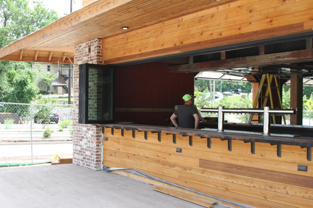
    Third, pedestrians and cyclists can now traverse the area safely so more people are willing to arrive without a car. With more foot traffic shops are able to repurpose some of the asphalt in front for outdoor seating. That translates to more sales, more employment, more profit, and more tax revenue.

    Screen Shot 2016-08-26 at 1.53.49 AM

    Screen Shot 2016-08-26 at 1.52.05 AM

    Screen Shot 2016-08-26 at 2.01.46 AM

    Screen Shot 2016-08-26 at 2.02.54 AM

    Screen Shot 2016-08-26 at 1.52.51 AM

    Screen Shot 2016-08-26 at 1.59.23 AM

    Screen Shot 2016-08-26 at 2.00.44 AM

    Fourth, land values have improved and older buildings are now seeing major improvements that also boost employment and generate new tax revenue. People don’t like paying taxes, but that money is what funds everything people expect the city to provide. The alternative is the slow death of deferred maintenance, budget cuts, and even higher fees and stealth charges on existing low value properties.

    Screen Shot 2016-08-26 at 2.58.33 AM

    Screen Shot 2016-08-25 at 11.07.40 PM

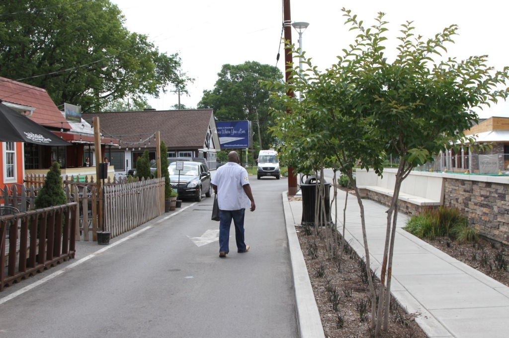
    Parking hasn’t been eliminated as much as redistributed. As sidewalks were installed on-street parking was added. The parked cars create a physical as well as emotional buffer between pedestrians and moving vehicles.

    Screen Shot 2016-08-25 at 5.50.59 PM

    Screen Shot 2016-08-25 at 5.51.14 PM

    Screen Shot 2016-08-25 at 5.52.40 PM

    Screen Shot 2016-08-25 at 5.52.56 PM

    Screen Shot 2016-08-25 at 5.51.36 PM

    The reorganized street supports smaller locally owned shops that keep money circulating in the community. This is the opposite of typical road widening projects that devalue small businesses in older neighborhoods while subsidizing big box corporate chains way out on the edge of town.

    Screen Shot 2016-08-26 at 3.16.43 AM

    Screen Shot 2016-08-26 at 3.17.03 AM

    Screen Shot 2016-08-26 at 3.16.12 AM

    Screen Shot 2016-08-26 at 3.16.26 AM

    Screen Shot 2016-08-26 at 3.15.58 AM

    Here’s something that breaks all the rules of suburban development. It’s supposed to be the kiss of death to have a business situated right next to a fully detached single family home. Yet in this location the shops and the properly designed street actually make these houses more desirable. The usual amenity of residential isolation has been exchanged for the amenity of good walkable urbanism. This kind of arrangement is so incredibly rare in America today that people are willing to pay a premium for such properties.

    Screen Shot 2016-08-25 at 6.02.46 PM

    Screen Shot 2016-08-25 at 6.03.00 PM

    Finally, we have the 1950’s tract homes that could have started the long slide into low rent crappiness as is so often the case when suburban roads are widened in a hopeless attempt to ease traffic congestion. Here, the road diet and nearby improved commercial district  have inspired property owners to invest in substantial renovations and improvements to otherwise outdated homes.

    The future of most suburbs is to change from what they are now to something else. That “something” could be relentless decline or steady incremental rejuvenation. I don’t believe most places understand how to reinvent themselves in a cost effective yet culturally acceptable manner. The politics of inertia, fear, and vested interests are awfully powerful. That means the few places that can successfully pull it off will be miles ahead of the competition. Look around wherever you live. Then think long and hard about how your town will manage in the years ahead.

    John Sanphillippo lives in San Francisco and blogs about urbanism, adaptation, and resilience at granolashotgun.com. He’s a member of the Congress for New Urbanism, films videos for faircompanies.com, and is a regular contributor to Strongtowns.org. He earns his living by buying, renovating, and renting undervalued properties in places that have good long term prospects. He is a graduate of Rutgers University.

  • Honolulu Rail: From $4.6 B to $8.6 B in Eight Years. Now What?

    With its official cost now having risen to $8.6 billion and a funding gap of $1.8 billion, both of which are certain to rise, Honolulu’s rail project will run out of money before construction reaches the downtown area, perhaps even before it reaches Middle Street.

    The Federal Transit Administration says it will demand a return of all federal money if rail does not reach Ala Moana Center, which is possible only if the state Legislature or Honolulu City Council increase taxes dramatically:  An average family of five would have to pay more than $1,000 per year just to complete rail, according to the Tax Foundation of Hawaii. Once completed, the annual cost of operating and maintaining a safe and reliable rail system would require comparable tax payments each year for the lifetime of the rail system.

    State and city lawmakers are reluctant to raise taxes so dramatically, but abandoning the project at this late date would make those who had been supporting it look like idiots.  They must be asking themselves, “How did we get ourselves into this mess?”

    Almost immediately after being elected in 2004, Mayor Mufi Hannemann announced that he wanted a steel-on-steel rail system rather than the bus rapid transit (BRT) that his predecessor had proposed. Hannemann envisioned a 34-mile route that would cost $2.7 billion. By the time it was put to a vote in 2008, the route had shrunk to 20 miles and the projected cost was up to $4.28 billion.

    Some of the 50.6% of voters in that election who authorized the city to build a steel-on-steel system might have been influenced by claims that two-thirds of the $4.28 billion construction budget would be paid by tourists and the federal government; that rail construction would create 10,000 new jobs for local residents; and that traffic congestion would be significantly reduced once rail was operational.

    Though HART’s latest official cost estimate is “only” $8.6 billion, construction costs are expected to skyrocket to upward of $10.8 billion; local residents will end up paying more than two-thirds of total construction costs; the actual number of good jobs for local residents was a tin percentage of the promised number; and that the impact of rail on traffic congestion will be similarly miniscule.

    Had it not been for the media, the public would still be in the dark about the massive cost overruns. According to the Honolulu Authority for Rapid Transportation website, the cost overrun is a myth:

    “It’s important to understand that HART’s existing contracts are on budget and we continue to have a healthy contingency fund of more than $500 million. So far, about 60% of HART’s contracts have been awarded. The construction of the first 10 miles of guideway is underway, the Rail Operations Center is about 70% complete, and HART’s fleet of 80 rail cars is under production and the first cars are expected to arrive here in early 2016.”

    The kindest word we can think of for that explanation is propaganda.

    That so much money has already been spent is reason enough to keep going, according to HART and other rail supporters: If construction stopped now, all that money would have been wasted! 

    They think the funding problem can be solved quickly and easily by the Legislature extending the 0.5% rail surcharge one more time. That would cost island residents a mere “half a penny on each dollar spent,” according to HART.

    This kind of thinking is muddled, at best.

    The Honest Way to Approach Rail

    The rational way to approach the rail question begins with three simple questions:

    • How much more money would local taxpayers have to pay to construct and maintain a safe and reliable rail system?
    • What would be the benefit of having such a system?
    • What alternatives could be pursued if we were to stop rail now, and what would be the benefit of those alternatives?

    Honesty should be presumed only if the factual inquiry and decision-making processes are transparent so the public can see how the answers were reached.

    The $3.5 billion spent thus far is gone under any circumstance. If construction is continued, the total construction cost could reach $10.8 billion, according to the Federal Transit Administration. Although no one knows what the total actual cost would be, there is no rational basis for starting the decision-making process with an optimistic projection.

    If rail is completed, the annual operating cost will exceed $100 million. A comparable amount would also need to be set aside each year to ensure that the system remains safe and reliable. Based on the average life of system components elsewhere, the combined amount would be at least $200 million per year.

    Even if that kind of money were readily available, one wonders exactly what the benefit of rail would be. City and HART officials now acknowledge that traffic congestion would be “worse in the future with rail than what it is today without rail.” That quote comes from the Final Environmental Impact Statement and a letter from the city’s transportation director.

    City and HART officials will quickly add that traffic in the future with rail would be better than traffic in the future without rail, which is necessarily true only if one assumes, as they do, that the alternative to building rail is do nothing (the so-called no-build option). That is a false choice, intended to obfuscate rather than illuminate.

    There are ways to reduce today’s level of traffic congestion, such as by aggressively adding new traffic lanes to existing roads, as has already been done successfully on each side of the central part of H-1 freeway. Installing flyovers and bypasses in chokepoint areas like the Middle Street merge and adding new contra-flow and bus-on-shoulder options would also make a major difference.

    Each of these is a proven strategy that, unlike rail, would directly benefit all commuters.

    Major improvements could also be made to Honolulu’s award-winning bus system. This includes increasing the number of express buses that go where commuters want to go, rather than eliminating most of them, as is part of the rail plan.

    All of these strategies could be accomplished for less than half the money saved by terminating rail now. Rail supporters point out that the above strategies could be pursued along with rail, but that assumes a tax base that never goes dry. The cost of living in Hawaii is already exceptionally high and there’s a limit to how hard island taxpayers can be squeezed.

    Rail Surcharge Burdens Island Residents

    Hawaii’s general excise tax is a tax on sellers of just about everything in this state, including groceries, services, and business-to-business transactions. Consumers are generally aware of only the portion that is shifted to them at the point of sale. A much larger portion is invisible to consumers but is borne by them anyway because it gets up embedded in the price of things consumers have to buy in Hawaii.

    This hidden portion of the excise tax burden is surprisingly large for several reasons, including that taxes paid on business-to-business transactions pyramid. A national expert wrote in the first Price of Paradise book that it would take a sales tax rate of up to 16% to replace the revenue generated by the 4% excise tax at that time.

    Because of subsequent changes in the taxation of business-to-business transactions, the current equivalent rate is roughly 11%. The point is that Hawaii’s general excise tax is quite different from conventional sales tax systems, which is why the above-mentioned expert cautioned that comparing a conventional sales tax to Hawaii’s general excise tax is like comparing a firecracker to a hand grenade.

    The point that needs highlighting is that the burden of Hawaii’s general excise tax is largely hidden from view.  Consumers pay it in the form of higher prices on virtually everything they have to buy in Hawaii.

    The 0.5% rail surcharge currently raises about $250 million each year. According to data from the tourist agency, slightly less than 15% of that amount is being paid directly by tourists. The remaining 85% averages out to $212 per man, woman and child on Oahu, which is slightly more than $1,000 each year from an average family of five.

    HART calls this number a “myth.” It contends that the average cost to each local resident is much less, but does so on the unspoken assumption that consumers bear the burden of the rail surcharge only when it is identified at the point of a purchase, and that the rest of the rail surcharge is never borne by consumers. This approach is intellectually dishonest.

    Any form of rail tax that extracts a quarter-billion dollars from our local community each year (as does the current rail surcharge) creates a quarter-billion-dollar burden. In this case it would be a quarter-billion dollars each year to build the rail, and then nearly that much each year — forever — to operate and maintain a safe and reliable system, including the cost of major rehabilitation every decade.

    In addition to being borne by consumers, the general excise tax is notoriously regressive — that is, disproportionately burdensome to people with relatively low incomes. The concept of regressivity is not simple, but anyone who contends that Hawaii’s general excise tax is not regressive, or that a regressive tax is not disproportionately burdensome to people with relatively low incomes, is either ill-informed or dishonest.

    Pro-rail supporters have argued that a general excise tax surcharge is the best way to fund rail despite being regressive, because a third of it is borne by tourists. Studies differ on the exact percentage of excise taxes ultimately borne by tourists (including by purchasing things made more expensive because of unstated excise taxes), but they generally agree that the share of the burden borne by tourists would be roughly the same, perhaps even greater, if the property tax were used to fund rail, rather than the excise tax. They also show that the property tax is significantly less regressive than is the general excise tax.

    Our elected officials should be honest about this:  General excise taxes rather than property taxes are being used to fund rail simply because they are less noticeable. It would take a 29% increase in everyone’s property taxes to replace the revenue generated by the 0.5% rail surcharge. The political fallout from such an increase would be dramatic.

    We doubt that an average family of five would quietly continue paying $1,000 per year for the rest of their lives for a non-solution to an obvious traffic-congestion problem.

    Members of the state Legislature could stop the madness by repealing the 0.5% rail surcharge, which would put members of the City Council to the test: Do they want rail badly enough to take the political heat for imposing an immediate and permanent 29% increase in property taxes?

    Because candidates for the Legislature and Honolulu City Council are currently seeking political support, now is a perfect time to ask them these questions:

    • Will a particular candidate for the Legislature vote to end the rail surcharge?
    • Will a particular candidate for the City Council vote to replace any such lost revenue by raising property taxes by 29%?

    There’s one additional question for the media: Why not publish every candidate’s position on the funding of rail? After all, rail was by far the largest public works project in the state’s history even before the costs skyrocketed.

    A version of this story originally appeared at Civil Beat.

    About the Authors
    Cliff Slater  Cliff Slater is a businessman who founded Maui Divers. He was a plaintiff in a federal lawsuit challenging the process by which the city selected elevated heavy rail.
    Randall Roth  Randall Roth is a professor at the William S. Richardson School of Law whose areas of expertise include taxation and professional responsibility.  He co-authored Broken Trust and was a plaintiff in above-mentioned lawsuit.
    Panos Prevedouros  Panos Prevedouros is a University of Hawaii professor and chairman of the department of civil and environmental engineering. He has twice run for Honolulu mayor.

    Photo by Musashi1600 (Own work) [CC BY 3.0 us], via Wikimedia Commons

  • California’s Road to Leviathan

    At a time when technology and public opinion should be expanding the boundaries of innovation and self-expression, we appear to be entering a new era of ever greater economic and political centralization, Wendell Cox and I suggest in a new paper.

    The trend to a more centralized economy is particularly evident in the information and media sectors, once hotbeds of entrepreneurial opportunity but now dominated by a handful of leviathan firms who gobble up competitors and often control markets at will. This trend is also evident in Washington, which increasingly regulates all aspects of our life, under an unprecedented welter of presidential and regulatory decrees, often bypassing the legislative process.

    But nowhere is the centralist leviathan being incubated more than in the once fiercely individualist state of California. President Obama’s centralizing can be at least partially justified by the antics of an obstructionist Congress which has shown little desire to work across party lines. But that’s not the case here in California, which functions largely as a one-party dictatorship of crony business oligarchies, an aloof and arrogant bureaucracy, the green lobby and public-sector unions.

    From “Small is beautiful” to “L’état, c’est moi”

    In his quirky first term, Jerry Brown was skeptical of central control and an open adherent of the decentralist, “small is beautiful” philosophy of the late British philosopher E.F. Schumaker. Now he seems to be enamored with creating a “coercive state” that would have fit better during the reign of France’s “Sun King,” Louis XIV.

    California already leads the country in imposing state regulations and laws on everything from gender rights, to cow flatulence, to fair pay, to new licensing requirements for a never-ending panoply of professions. This huge extension of government has already reshaped the cost of such essentials as energy, particularly on the state’s impoverished, heavily Latino interior, and seems likely to escalate already inflated property values to even more absurd levels.

    Read the entire piece at the Orange County Register.

    Joel Kotkin is executive editor of NewGeography.com. He is the Roger Hobbs Distinguished Fellow in Urban Studies at Chapman University and executive director of the Houston-based Center for Opportunity Urbanism. His newest book, The Human City: Urbanism for the rest of us, will be published in April by Agate. He is also author of The New Class ConflictThe City: A Global History, and The Next Hundred Million: America in 2050. He lives in Orange County, CA.

  • Carnegie Deli and Other Bad New York Restaurants

    When you’re a kid, there are certain cartoons you just love. That love remains over time as your warmly think back on childhood memories. It lasts, that is, until you foolishly go back and watch an episode of two of a favorite show, what which point you say, “Holy cow! That show is terrible.”

    I was thinking of this as I read the surprisingly large press that greeted the news that New York’s Carnegie Deli will be closing. It even made the front page of the Financial Times print edition this weekend.

    About 10 or 15 years ago I decided to go check Carnegie Deli out. The food was awful.

    I couldn’t finish my sandwich – not because it was so big, but because it was so bad.

    As all these old line NYC businesses go under one by one, replaced by something suitably gentrified, everybody is bemoaning the loss of places they used to patronize over the years.

    What you don’t get from reading these is just how terrible most of these businesses actually were.

    Carnegie Deli was a case in point. When’s the last time your average New Yorker actually ate there? How much of this sentimental attachment to these places comes from people who used to go them long ago but never patronize them anymore building them up in their minds the way we build up our childhood cartoons? A lot, I suspect.

    Not every genre of old-school NYC business is bad. The hardware stores I’ve been in have been solid. But restaurants in particular are mostly awful.

    Crain’s New York did a big piece on the disappearance of the New York diner. There’s a reason for this. Diners in New York are horrible, at least the ones in Manhattan. I’ve never once been to a good one – and I keep trying new ones. My benchmark dish is the turkey club. In Manhattan the turkey is invariably so dry I can’t finish it, even with a glass or two of water. (The outer boroughs may fare better. I’ve had great diner food on Staten Island, for example).

    I don’t have the sentimental attachment to these places because I’m a newcomer to the city. I would still love to see places like Carnegie Deli survive, but ultimately the quality is just not there.

    These places are failing the marketplace test, not just because of rising rents, but because they are selling a product that might have worked in the 1970s but is no longer up to par in the 21st century.

    Aaron M. Renn is a senior fellow at the Manhattan Institute, a contributing editor of City Journal, and an economic development columnist for Governing magazine. He focuses on ways to help America’s cities thrive in an ever more complex, competitive, globalized, and diverse twenty-first century. During Renn’s 15-year career in management and technology consulting, he was a partner at Accenture and held several technology strategy roles and directed multimillion-dollar global technology implementations. He has contributed to The Guardian, Forbes.com, and numerous other publications. Renn holds a B.S. from Indiana University, where he coauthored an early social-networking platform in 1991.

    Photo Credit: Jtmichcock CC BY-SA 3.0

  • Urban Containment, Endangered Working Families and Beleaguered Minorities

    Working families and the middle class are becoming an increasingly endangered species in   many parts of United States. Median household income remains below its 1999 peak (inflation adjusted). But the problem is not just stagnant incomes. Expenses are also rising, especially the costs of housing in some cities. As a result, it is becoming more and more difficult to make ends meet.
    Much of this has to do, as explained below, with attempts to stop development on the urban periphery which is indispensable to keeping housing affordable. Such prohibitions have been widely advocated by the  planning establishment. Moreover, a new White House Housing Development Toolkit,  rightly identifies housing unaffordability as an important issue but does not mention the important role of greenfield development in keeping costs down.

    Housing Affordability Problem

    Housing costs are generally responsible for the difference in cost of living between US cities (metropolitan areas). The range between cities in the Bureau of Economic Analysis (BEA) cost of living index (Regional Price Parities) in housing cost is far greater than that of its other two elements — 13 times goods and eight times services other than rents. It is no wonder that households are moving to affordable markets.

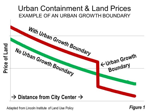
    Excessive land use regulation is a major cause of seriously unaffordable housing. Usually, these regulations include urban containment policy, which restricts or even prohibits building middle income detached housing on the urban fringe. As sure as OPEC cutbacks drive up the price of gasoline, urban planning land cutbacks drive up house prices. There is plenty of evidence that the law of supply and demand operates in urban land markets — that restricting the availability of land for development pushes land (Figure 1) and house prices up (See: A Question of Values: Middle-Income Housing Affordability).

    By definition, housing affordability must be measured in relation to incomes. It should also be compared to trends over time both within the metropolitan area (housing market) and between metropolitan areas (See Canada’s Middle-Income Housing Affordability Crisis).

    The most acute problem is in California, where house prices are up to four times those in liberally regulated US metropolitan areas. Before excessive land use regulations were imposed, housing affordability in California, prices relative to incomes, were similar to the rest of the nation, rarely exceeding 3.0 (measured by the “median multiple,” the median house price divided by the median household income).

    There is little comprehension of the seriousness of the housing affordability problem. With serious concerns being raised about income inequality, housing affordability represents one of the most important threats both to the well-being of middle-income households and poverty reduction. More than anywhere in the country, the price of middle income housing is beyond the reach of most middle income California households, including  those who would easily qualify in liberally regulated markets.

    At the same time, middle-income households in other excessively regulated markets, like Seattle, Portland, Denver, Miami, Boston and New York have seen their house prices double (or more) as regulations have been stiffened.  Finally, all of this increases the demand for subsidized housing. While there is plenty of rhetoric about affordable housing for lower income households, there is not and there is not likely to ever be enough money.

    The key issue is the cost of residential land under the house. Average residential land values are at least 75 percent of the house and land value in San Jose and San Francisco (Note 1), 70 percent in Los Angeles and 65 percent in San Diego. Our analysis of Lincoln Institute of Land Policy data indicates that the average house structure in the four California metropolitan areas had an average value is only 25 percent higher than that of the other major metropolitan areas. By contrast, the land value was more than 650 percent higher. It would be too expensive for middle income households to buy vacant residential lots, even if they intended living in tents.

    With such expensive land, there is virtually no hope to restore housing affordability without tackling the issue of land head on. In the meantime, house prices weigh heavily on all households, and many are leaving California, particularly in their mid-thirties and above.

    Lower Income Minorities: African Americans and Hispanics

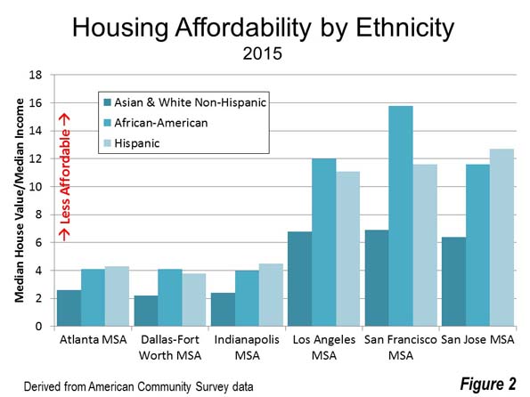
    The situation for housing is far worse for ethnic groups with lower incomes. The maximum housing affordability disadvantage faced by African Americans and Hispanics is illustrated in the following examples. In the San Francisco MSA, the median value house would cost the equivalent of 9 more years of median African-American income than for Asian or White-Non-Hispanics. This has escalated from 1.3 years before regulations were strengthened. An Hispanic household would need six more years of median income to pay for the median valued house in the San Jose MSA. There also large spreads, both for African-American and Hispanic households in other highly regulated metropolitan areas, such as Los Angeles, San Diego, Portland, Boston and New York (See Figure 2 and Table: Housing Affordability: Overall and by Ethnicity).

    Planning’s “Killer App”

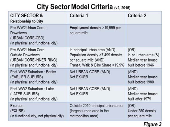
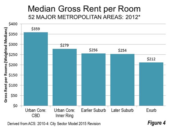
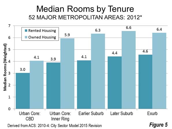
    It is popular to contend that housing affordability can be restored through   building higher densities. There are no examples of restoring metropolitan area housing affordability through intensification. A principal problem is higher prices. A City Sector Model (Figure 3) analysis indicates that the urban core rents per room are well above that of the suburbs (Figure 4). The differences are even greater in cities with the more aggressive intensification programs, such as Portland, Seattle and Los Angeles (Note 3).  Housing units are also smaller (Figure 5). “Granny flats,” basements and apartments are too small for many middle-income households. Forced intensification impairs the quality of life for many people, particularly families (Note 4)

    These policies also have the effect of widening economic divisions. Matthew Rognlie of the Massachusetts Institute of Technology examined French economist Thomas Piketty’s research on rising inequality and concluded that much of the observed inequality stems from housing. He went on to suggest re-examining the land use regulations that create scarcity, toward the end of increasing housing supply. My colleague Hugh Pavletich, co-author of Demographia International Housing Affordability Survey argues that without the “safety valve” of greenfield development, because housing cannot be kept affordable since urban containment destroys the competitive market for land.

    New Zealand consultant Phil Hayward observes: “There might be other policy mixes by which housing supply within a growth boundary could be made the means of keeping housing affordable, but publicly and politically, the debate is nowhere near tackling the complexities involved” (See The Myth of Affordable Intensification).

    Further, large lot or rural zoning is frequently cited as an impediment to housing affordability. This is consistent with economic theory, but its influence is miniscule compared to urban containment (Note 5). The metropolitan areas with substantial large lot zoning had an average price-to-income ratio of 3.0 in 2014, at the upper bound of affordability. This is in contrast with the seriously unaffordable price-to-income ratios (from 5.1 to 9.7) that have urban containment policy . The highest price-to-income ratios are in California’s large metropolitan areas, where there are smaller lot sizes.

    Based on the unparalleled damage they do to housing affordability, urban containment boundaries may be planning’s “killer app.” A principal objective of urban containment policy is to curb the outward expansion of cities (“urban sprawl”). But the “medicine” is far worse than the “cure” — lower standards of living and greater poverty, inflicting particular harm to lower income minorities.

    Necessary Reforms

    Unfortunately, housing affordability has not become an issue in this election year. Yet, policy reforms are appropriate:

    1. Urban containment policy should not be implemented where it has not been adopted.
    2. In urban containment metropolitan areas, improved housing affordability targets should be adopted (price to income ratios), with “event triggered” liberalization of urban fringe land use if the targets are not met. Similar reforms have been proposed in New Zealand and by Paul C. Cheshire, Max Nathan and Henry G. Overman of the London School of Economics.
    Housing Affordability: Overall and By Ethnicity
    Major Metropolitan Areas
    Median Multiple (Years of Median Income Needed to Buy the Median Priced House)
    Additional Years Requried
    All Asians and White Non-Hispanics African Americans Hispanic African Americans Hispanic
    United States 3.5 3.1 5.3 4.3 2.2 1.2
    Atlanta, GA 3.1 2.6 4.1 4.3 1.5 1.8
    Austin, TX 3.6 3.0 4.9 5.0 1.9 2.0
    Baltimore, MD 4.0 3.4 5.7 4.3 2.3 1.0
    Birmingham, AL 3.0 2.6 4.6 3.8 2.0 1.2
    Boston, MA-NH 5.0 4.5 9.3 9.2 4.8 4.7
    Buffalo, NY 2.6 2.3 5.1 5.3 2.8 3.0
    Charlotte, NC-SC 3.2 2.7 4.8 4.3 2.1 1.5
    Chicago, IL-IN-WI 3.6 2.9 6.4 4.5 3.5 1.6
    Cincinnati, OH-KY-IN 2.8 2.6 5.3 3.7 2.8 1.2
    Cleveland, OH 2.8 2.4 4.9 3.9 2.5 1.5
    Columbus, OH 2.9 2.6 4.6 3.7 2.0 1.1
    Dallas-Fort Worth, TX 2.8 2.2 4.1 3.8 1.8 1.5
    Denver, CO 4.5 4.0 7.4 6.3 3.3 2.3
    Detroit,  MI 2.8 2.4 4.7 3.6 2.3 1.2
    Grand Rapids, MI 2.7 2.6 5.2 3.7 2.7 1.1
    Hartford, CT 3.4 3.0 5.4 6.5 2.4 3.6
    Houston, TX 2.7 2.0 4.0 3.6 2.0 1.6
    Indianapolis. IN 2.7 2.4 4.5 4.0 2.1 1.6
    Jacksonville, FL 3.2 2.9 4.8 3.7 2.0 0.9
    Kansas City, MO-KS 2.7 2.5 4.5 3.7 2.0 1.2
    Las Vegas, NV 4.2 3.7 6.0 4.9 2.3 1.2
    Los Angeles, CA 8.6 6.8 12.0 11.1 5.2 4.2
    Louisville, KY-IN 2.9 2.7 4.9 3.4 2.3 0.7
    Memphis, TN-MS-AR 2.9 2.1 4.1 3.5 2.0 1.4
    Miami, FL 4.8 3.8 6.2 5.5 2.4 1.8
    Milwaukee,WI 3.5 3.0 6.9 5.0 3.9 2.0
    Minneapolis-St. Paul, MN-WI 3.3 3.0 7.3 5.1 4.3 2.1
    Nashville, TN 3.3 3.0 5.2 4.2 2.2 1.2
    New Orleans. LA 3.9 3.1 6.0 4.5 3.0 1.5
    New York, NY-NJ-PA 6.0 4.8 8.8 9.2 4.0 4.4
    Oklahoma City, OK 2.8 2.5 4.5 3.4 2.0 0.9
    Orlando, FL 3.4 2.9 4.4 4.3 1.5 1.4
    Philadelphia, PA-NJ-DE-MD 3.7 3.1 6.2 5.8 3.1 2.8
    Phoenix, AZ 3.9 3.5 5.4 5.2 1.9 1.7
    Pittsburgh, PA 2.6 2.5 5.4 3.4 2.9 0.9
    Portland, OR-WA 4.7 4.5 8.7 6.0 4.2 1.5
    Providence, RI-MA 4.3 4.0 6.7 7.6 2.7 3.7
    Raleigh, NC 3.4 2.9 5.1 5.7 2.1 2.7
    Richmond, VA 3.6 3.0 5.4 4.1 2.4 1.1
    Riverside-San Bernardino, CA 5.3 4.7 6.6 6.0 1.8 1.3
    Rochester, NY 2.6 2.3 4.6 4.5 2.3 2.2
    Sacramento, CA 5.4 4.9 8.4 6.8 3.6 1.9
    St. Louis,, MO-IL 2.9 2.6 4.9 3.5 2.3 0.9
    Salt Lake City, UT 3.8 3.6 6.2 5.3 2.6 1.7
    San Antonio, TX 2.7 2.2 3.1 3.3 0.9 1.1
    San Diego, CA 7.2 6.2 9.3 9.5 3.1 3.3
    San Francisco, CA 8.1 6.9 15.8 11.6 8.8 4.7
    San Jose, CA 8.1 6.9 11.6 12.7 4.7 5.8
    Seattle, WA 4.8 4.4 7.8 7.0 3.4 2.6
    Tampa-St. Petersburg, FL 3.4 3.2 4.7 4.0 1.5 0.8
    Tucson, AZ 3.5 3.1 5.0 4.2 1.8 1.1
    Virginia Beach-Norfolk, VA-NC 3.9 3.4 5.7 4.7 2.3 1.3
    Washington, DC-VA-MD-WV 4.3 3.6 5.9 5.8 2.3 2.2
    Data from American Community Survey: 2015
    AFFORDABILITY RATINGS    
    Affordable 3.0 or below
    Moderately Unaffordable 3.1 to 4.0
    Seriously Unaffordable 4.1 to 5.0
    Severely Unaffordable   5.1 and over


    Note 1: Commentators sometimes suggest the high housing prices in the San Francisco Bay Area are the result of land shortages created by topographic constraints, such as bodies of water and mountains. In fact, there is plenty of developable land in the Bay Area, which includes both the San Francisco and San Jose MSAs (See: The Incompatibility of Forced Densification and Housing Affordability).

    Note 2: This is without considering subsidies and tax breaks that can reduce some rents below market levels.

    Note 3: African American 1969 median household is estimated based on the variation in African American median family income from the overall median in that year. Median household income data was not published for ethnicities in the 1970 census. 

    Note 4: The planning establishment sometimes glosses over the reduced quality of life entailed in its efforts to discourage detached housing and force people into higher density housing. This is not their job. The quality of life can only be judged by households themselves.

    Note 5: Boston is an exception, which is the only seriously unaffordable major metropolitan area without urban containment policy. Boston has large lot zoning so expansive that it has created a severe shortage of land for development, with urban containment-like effects on house prices. Boston’s urbanization covers nearly as much land area as the Tokyo urban area, despite having only one-seventh the population. (See: The Evolving Urban Form: Sprawling Boston).

    Photo: Market Street, San Francisco, looking toward the Ferry Building (by author)

    Wendell Cox is principal of Demographia, an international pubilc policy and demographics firm. He is a Senior Fellow of the Center for Opportunity Urbanism (US), Senior Fellow for Housing Affordability and Municipal Policy for the Frontier Centre for Public Policy (Canada), and a member of the Board of Advisors of the Center for Demographics and Policy at Chapman University (California). He is co-author of the “Demographia International Housing Affordability Survey” and author of “Demographia World Urban Areas” and “War on the Dream: How Anti-Sprawl Policy Threatens the Quality of Life.” He was appointed to three terms on the Los Angeles County Transportation Commission, where he served with the leading city and county leadership as the only non-elected member. He served as a visiting professor at the Conservatoire National des Arts et Metiers, a national university in Paris.

  • Solidarity, not Division: Understanding London’s East End

    The East End of London has a long history of working-class community. It has been a place of industry, where the river Thames and the river Lea have provided work for many people. The area attracted many immigrants, including workers from Africa since Tudor times, sailors from China, former slaves from America, French Protestants facing religious persecution in the 1600s and Irish weavers working in the textile industries. There have been Jewish communities in the East End for centuries, too. The twentieth century saw an increase in immigrants from the former British colonies, including South Asia, particularly Bangladesh. Not only has it been a place to seek a livelihood, but it has also been a place of refuge.

    One side of my family hails from the East End and North East London, so I have a strong personal connection to this part of London. My ancestors worked in the local industries and on the river. We might not technically be ‘Cockneys’ (in that we weren’t all born within earshot of Bow Bells), but we are Cockney by nature. Family gatherings would include a raucous ‘knees-up’ (dancing and singing) and traditional local fare of jellied eels. We’re a working-class family who have lived in East London for generations.

    So I was interested when I came across a recent short BBC documentary called Last Whites of the East End. I was disturbed by the title, which suggested that white people in the area are somehow endangered – an odd idea and potentially a racist one. This racism was confirmed when I watched the show. The documentary focused on residents of Newham, one of the poorest working-class boroughs in England. The filmmakers interviewed a number of working-class residents about their experiences of living in the East End and the decisions of some of them to leave the area. The majority of the subjects were white, though they also included one man of Bangladeshi background and one man of white and Afro-Caribbean heritage.

    The narration of the documentary presented a racist agenda, describing the neighbourhood as at ‘tipping point’ with the ‘lowest white population in the UK’. It also noted a ‘dwindling cockney community’ who were in danger of disappearing in the face of increased immigration. Some of those interviewed were moving outside of London, to places like Essex, so they could live in areas with larger white populations. Some described themselves as ‘traditional East Enders’ and lamented the loss of the old community. They spoke of local services being shut down and the closure of the local pub. The film presented the interviewees as embodying white racism and a fear of the other, highlighting their reluctance to build bridges due to perceived differences. As one young white woman explained, they wanted to ‘stay with their own’.

    But there were many contradictions in the documentary, too. It included an elderly white woman, who was preparing to leave her home and move out of London, not due to her fear of her Muslim neighbours (as implied by the narration, despite the fact that she was obviously upset to say goodbye to her Somali neighbour), but because she was elderly and alone and wanted to move closer to her daughter. Like many of her neighbours, she had once been a new arrival to the neighbourhood, moving there from the north of England. The two people of colour in the film both spoke of their connections to the local area and their identification as East Enders. Like their white neighbours, they pointed to the changing environment, but I’d suggest that the changes they were criticising were not tied to the latest influx of new immigrants.

    Instead, they are matters of class. Gentrification and austerity are disrupting the lives of the working-class residents of the East End, not immigration. Housing has become too expensive, and government funding cuts are squeezing local schools and health services. Interviewees complained about the closure of a club which wasn’t just a local pub but also a community centre that elderly residents relied on for social events and to reduce isolation. Some white people are leaving, but, as I’ve seen with some friends and family members, that’s for financial reasons. They can purchase bigger properties if they sell their London homes, or they can pay less rent by moving to areas outside of London with smaller populations and less pressure on local services. And of course, not all of those leaving London are white.

    The documentary downplays this part of the story. It also downplays the working-class solidarity that connects residents despite their differences. Residents of the East End share the experience of hardship and struggle, and this shared struggle has a very long history. The East End has a tradition of political radicalism and collective action. East Enders have looked after each other during tough times and shown a united front against hostile external forces. Famously, in 1936, the local community stood up against a group of anti-Semitic fascists who wanted to march through a Jewish area. The confrontation, known as the Battle of Cable Street, was won because the community put their bodies on the line to keep the fascists out. The same community rallied during the Second World War and looked after each other during the bombing raids of the Blitz. More recently, local people have been supporting each other and engaging in collective action in the face of forced evictions as local public housing is sold and redeveloped for private profit.

    If the ‘traditional East End’ is disappearing, that isn’t because some working-class white are moving out of London. Working-class communities are not made up of just white people, and I’ve certainly never known a London that was mono-cultural. Yes, there are racist white working-class people. But the East End of London is a diverse and dynamic place, and always has been. It has also been a place of solidarity and struggle. The filmmakers chose to emphasize division instead of showing how East Enders act collectively, and it cast immigrants as a threat, when the real threats facing this community are austerity and gentrification.

    This piece first appeared at Working-Class Perspectives.

    Photo Credit: Daryl Hutchison, @daryldactyl

  • OC Model: A Vision for Orange County’s Future

    This is the introduction to a new report on Orange County published by the Chapman University Center for Demographics and Policy titled, "OC Model: A Vision for Orange County’s Future." Read the full report (pdf) here.

    Blessed by a great climate and a highly skilled workforce, Orange County should be at the forefront of creating high wage jobs. The fact that it is not should be a worrying sign to the area’s business, academic, political and media leaders. Despite some signs of recovery in OC, long-term trends, such as a dependence on asset inflation and low wage employment, seem fundamentally incompatible with sustainable and enduring growth in the County.

    To be sure, asset inflation benefits established property owners, and those who work in the real estate sector, but the surge in property prices and an ever increasing number of touristic venues does not provide enough of a viable base for coming generations. Given the area’s high costs — which can at best be mollified — the area’s prosperity depends on building up its cadre of well-paying high value jobs in promising fields as professional business services, technology and design-oriented cultural industries.

    The good news: the county retains some strength in all these fields. But many long-term trends, as we will demonstrate below, are not encouraging. Once one of the nation’s most powerful high-end economies, the county is in danger of losing momentum to other markets.

    Reversing this trend will require a more holistic assessment of current realities. It also requires a strong, coherent strategy targeted to high-wage growth sectors. Instead of the current obsession with real estate and tourism projects, the County needs to focus more on what professional business services, technology, finance and science-based companies need in order to succeed.

    This necessitates a conscious effort, led by the business community, to develop a strategic direction for Orange County. There are a number of models to choose from, ranging from the most successful, Silicon Valley to greater Boston to the North Carolina Research Triangle, and many more. In each case, the growth from established university research centers — Stanford, MIT, Harvard, as well as the University of North Carolina, Duke and North Carolina state — extended from the university’s base to its periphery. This strong cooperation among universities, government and the private sector is critical to the emerging tech and business service corridor developing between the Texas cities of Austin and San Antonio.

    Read the full report (pdf) here.

  • Transit: About Downtown and the Core

    Transit best serves commuting destinations that have high concentrations of employment. For the most part, this means downtowns, or central business districts (CBDs). This is where transit lives up to its “mass transit" name, carrying many people concurrently and efficiently to concentrated destinations. When the same people return home, the “mass” is at the origin, and destinations are dispersed throughout the metropolitan area outside of downtowns, much of transit service is anything but mass, as residents of suburban and other communities frequently note “all the empty buses.”

    According to the City Sector Model, high density downtowns have an average of more than 23,000 jobs per square mile, 30 times the major metropolitan area average. CBD densities rise above 100,000 per square mile in New York and Chicago.  

    This article analyzes transit commuting destinations in the 53 major metropolitan areas (1,000,000 or more residents in 2014). The data is all taken from the 2006-2010, which has been developed by the ASHTO Census Transportation Planning Package from the ACS data and is the latest available for detailed employment locations. We used this data to develop Demographia United States Central Business Districts, which is described in this previous post.

    Summary of Transit Commuting

    CBD’s typically have the most important concentration of tall buildings in metropolitan areas, and typically the tallest buildings. The strongest CBDs were established before the automobile became dominant, and mechanized transport, in the form of transit, was radially oriented toward downtown. To this day, many people, including some in the press and urban planning perceive downtown to be where most of the jobs are.  Yet, the high density CBD’s (over 20,000 jobs per square mile) account for only eight percent of the employment in the 53 major metropolitan areas, and far less in many.

    As an example, the Chicago CBD, including the Chicago Loop (photo at the top of the article) includes some of the tallest buildings in the United States and 500,000 jobs, yet accounts for only 11 percent of the metropolitan area employment. These jobs are concentrated in an area of only 3.4 square miles (8.8 square kilometers). By contrast, the built up urban area is 2,700 square miles (7,000 square miles) and the metropolitan area covers 7,200 square miles (18,500 square kilometers). This concentration of so many jobs in such a small area contributes to some the nation’s worst traffic congestion, even with a high transit market share.

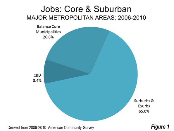
    The suburbs and exurbs dominate metropolitan employment, containing 65 percent of the jobs in the major metropolitan areas. The balance of the jobs (27 percent) are in the historical core municipalities, but outside the CBD (Figure 1)

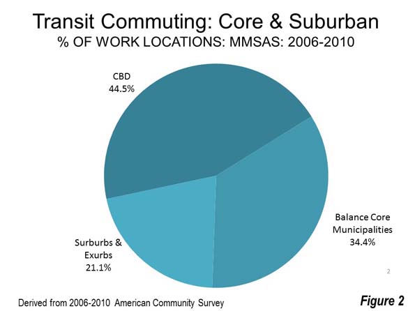
    These highest CBD densities can attract very high levels of transit usage. Despite their small share of metropolitan employment, the CBDs dominate transit commuting. Approximately 45 percent of transit commuters work in the CBDs. Another 34 percent work in the balance of the core municipalities. Finally, only 21 percent were in the suburbs and exurbs, where the 65 percent employment market share is more than triple (Figure 2).

    Six transit legacy cities (historical core municipalities, including New York, Chicago, Philadelphia, San Francisco, Boston and Washington) within metropolitan areas dominate transit commuting, accounting for 72 percent of work trip destinations in the major metropolitan areas and 55 percent in the nation as a whole. These municipalities are also home to the six largest CBDs. New York dominates the legacy cities, with 60 percent of the transit commuting. This is to be expected, since New York is far more dense and has by far the largest CBD.

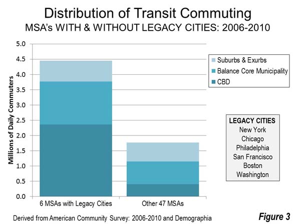
    By contrast the six legacy cities have only about 10 percent of the jobs in the major metropolitan areas, and only six percent of the jobs in the nation. Indeed, downtown commuting in the legacy cities exceeds all commuting in the 47 other metropolitan areas (Figure 3). This is despite the fact that the population of the 47 other metropolitan areas is nearly 2.5 times of the metropolitan areas with legacy cities.

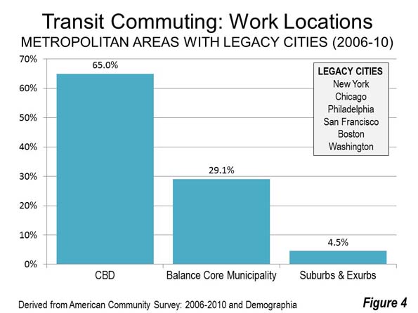
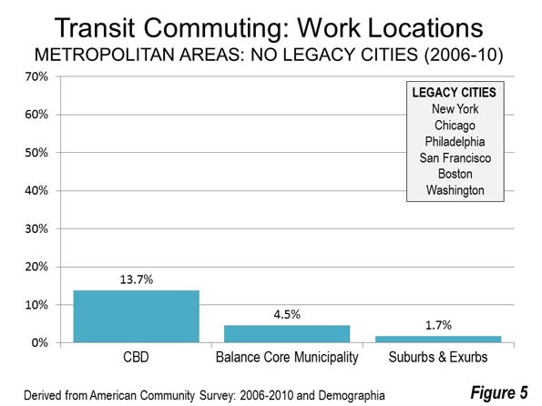
    Transit commuting is heavily skewed toward CBDs in the metropolitan areas with legacy cities, and are also the highest in other metropolitan areas. However, transit market shares to work locations in the suburbs are small, even in legacy cities (Figures 4 and 5).


    Central Business District

    Overall 41.4 percent of major metropolitan CBD commuters accessed work by transit.

    In the legacy cities, 64 percent of work access is by transit and 13 percent in the other 47 metropolitan areas.

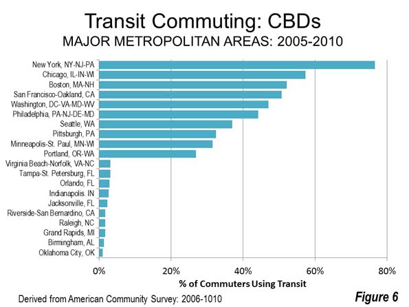
    The nation’s six largest CBDs, not surprisingly, had the largest transit market shares. In New York, south of 59th Street, transit’s market share is approximately 77 percent. In Chicago, transit share to the CBD is 57 percent, in Boston 52 percent, in San Francisco 51 percent and between 40 percent and 50 percent in Philadelphia and Washington. Seattle, Pittsburgh and Minneapolis-St. Paul followed at between 30 percent and 40 percent. Portland ranked 10th at 27 percent.

    At the other end of the scale, the numbers are very modest. The bottom 10 in CBD market share all have three percent or fewer of their commuters using transit. The lowest figures are in Oklahoma City, at 0.9 percent, and Birmingham, at 1.3 percent (Figure 6).

    Outside the CBD in the Core Municipalities

    In the core municipalities and outside the CBDs, the overall transit market share was 10.5 percent. This was a much higher 29.5 percent in the metropolitan areas with legacy cities and a very small 4.5 percent in the other 47 metropolitan areas.

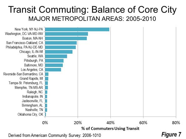
    Some legacy cities have relatively high transit market shares outside the CBDs. As in its CBD transit market share, New York stands well above the others, at 39 percent. New York is joined by the other five legacy city metropolitan areas, with Washington and Boston having 25 to 30 percent transit market shares in the core municipalities outside the CBDs.

    The bottom 10 in the core municipality outside the CBD category all have two percent or smaller transit shares. Again, Oklahoma City ranks last, at 0.6 percent (Figure 7).

    In addition, there are secondary central business districts with large transit market shares in some metropolitan areas. In New York, Brooklyn, which had a transit work trip market share of 60 percent, higher than second ranking Chicago and second only to New York’s principal central business district in Manhattan. Another New York secondary central business district, the Jersey City Waterfront, across the Hudson River from Lower Manhattan, has a 51 percent transit commuting share, while 26 percent of downtown Newark’s commuters used transit. In Washington, Rosslyn attracts 23 percent of its commuters by transit.

    Suburbs and Exurbs

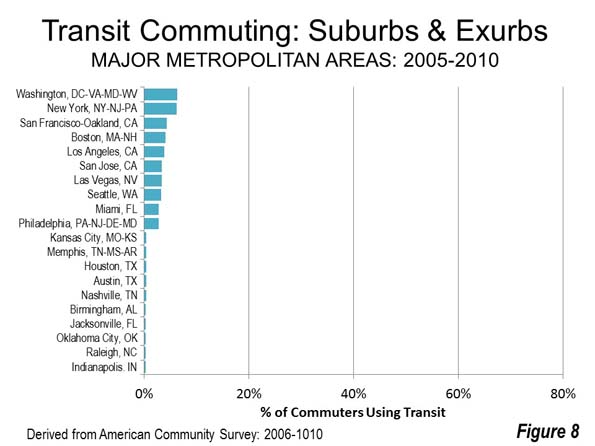
    Perhaps the most surprising finding is the very low transit work location market shares in the suburbs and exurbs (the metropolitan area outside the core municipalities), even in the metropolitan areas with legacy cities. Only 4.5 percent of commuters used transit even in the metropolitan areas with legacy cities. In the other 47 metropolitan areas, the figure was 1.7 percent. Overall the suburban and exurban transit work at market share was 2.5 percent. Employment in the suburbs of even the legacy city metropolitan areas is more similar to the post-World War II automobile urban form than the core cities in the same metropolitan areas.

    The highest suburban and exurban transit market shares were in Washington, at 6.3 percent and New York, in a near statistical tie. Legacy city metropolitan areas San Francisco and Philadelphia ranked third and 10th. Legacy city metropolitan area Chicago did not make the top 10.

    The 10 lowest suburban and exurban market shares were all 0.4 percent or less. Four metropolitan areas congregated at the bottom at near three percent, including Jacksonville, Oklahoma City, Raleigh and last-place Indianapolis (Figure 8).


    The table below contains market share for each of the 53 metropolitan areas, including CBDs, the balance of core municipalities, the suburbs and exurbs and totals.

    Transit is About Downtown and the Core

    The concentration of transit commuting destinations in the legacy cities and in the historical core municipalities that surround them illustrates where transit can play a significant role in mobility and access. At the same time, the small transit share elsewhere shows transit’s very limited potential (both in metropolitan areas outside the legacy cities and the 47 other metropolitan areas). This reality is confirmed by the losses and small gains in transit market share from the nation’s newer rail transit systems, which have largely been constructed outside the legacy cities. Transit is fundamentally about downtown and the core.

    Transit Work Trip Market Share by Work Location
    2006-2010
    Metropolitan Area CBD Balance: Core Municipality Suburbs & Exurbs Total
    Atlanta, GA 14.18% 7.35% 1.76% 3.31%
    Austin, TX 5.12% 3.42% 0.41% 2.56%
    Baltimore, MD 17.72% 10.79% 2.34% 5.26%
    Birmingham, AL 1.32% 1.26% 0.35% 0.69%
    Boston, MA-NH 52.18% 25.52% 4.13% 11.66%
    Buffalo, NY 11.52% 7.13% 1.74% 3.60%
    Charlotte, NC-SC 8.77% 2.22% 0.47% 1.93%
    Chicago, IL-IN-WI 57.40% 16.76% 2.13% 11.32%
    Cincinnati, OH-KY-IN 13.25% 4.76% 0.95% 2.43%
    Cleveland, OH 15.09% 6.20% 1.74% 3.70%
    Columbus, OH 4.89% 2.15% 0.55% 1.59%
    Dallas-Fort Worth, TX 14.04% 3.00% 0.66% 1.54%
    Denver, CO 19.79% 5.22% 2.19% 4.68%
    Detroit,  MI 7.48% 4.79% 0.74% 1.45%
    Grand Rapids, MI 1.72% 1.95% 0.67% 1.06%
    Hartford, CT 8.13% 5.71% 1.61% 2.57%
    Houston, TX 13.15% 3.00% 0.41% 2.56%
    Indianapolis. IN 2.64% 1.29% 0.26% 1.00%
    Jacksonville, FL 2.33% 1.27% 0.30% 1.09%
    Kansas City, MO-KS 7.00% 2.45% 0.44% 1.23%
    Las Vegas, NV 5.61% 3.78% 3.37% 3.56%
    Los Angeles, CA 22.48% 9.74% 3.85% 6.01%
    Louisville, KY-IN 6.47% 2.71% 0.78% 2.19%
    Memphis, TN-MS-AR 3.52% 1.69% 0.43% 1.32%
    Miami, FL 9.35% 7.37% 2.82% 3.59%
    Milwaukee,WI 11.05% 5.97% 1.43% 3.43%
    Minneapolis-St. Paul, MN-WI 31.54% 7.75% 1.35% 4.52%
    Nashville, TN 3.58% 1.20% 0.36% 0.95%
    New Orleans. LA 6.69% 4.93% 0.81% 2.44%
    New York, NY-NJ-PA 76.60% 39.22% 6.25% 30.40%
    Oklahoma City, OK 0.95% 0.57% 0.30% 0.48%
    Orlando, FL 2.91% 3.06% 1.10% 1.65%
    Philadelphia, PA-NJ-DE-MD 44.18% 18.72% 2.76% 9.14%
    Phoenix, AZ 11.82% 2.95% 1.37% 2.19%
    Pittsburgh, PA 32.52% 11.33% 1.37% 5.75%
    Portland, OR-WA 26.96% 7.95% 2.38% 6.12%
    Providence, RI-MA 10.47% 4.00% 1.04% 1.74%
    Raleigh, NC 1.75% 1.42% 0.27% 0.88%
    Richmond, VA 4.93% 4.26% 0.80% 1.77%
    Riverside-San Bernardino, CA 1.75% 2.04% 1.14% 1.19%
    Rochester, NY 6.55% 2.04% 1.22% 2.00%
    Sacramento, CA 12.97% 2.87% 1.34% 2.66%
    St. Louis,, MO-IL 11.24% 6.51% 1.32% 2.53%
    Salt Lake City, UT 12.18% 5.26% 1.67% 3.64%
    San Antonio, TX 6.44% 2.49% 0.66% 2.27%
    San Diego, CA 10.22% 3.44% 2.16% 3.19%
    San Francisco-Oakland, CA 50.68% 19.32% 4.35% 14.22%
    San Jose, CA 8.39% 2.88% 3.38% 3.36%
    Seattle, WA 36.99% 13.46% 3.22% 8.37%
    Tampa-St. Petersburg, FL 3.10% 1.76% 1.18% 1.36%
    Tucson, AZ 6.05% 2.88% 1.30% 2.48%
    Virginia Beach-Norfolk, VA-NC 3.17% 2.34% 1.45% 1.67%
    Washington, DC-VA-MD-WV 47.07% 26.26% 6.30% 13.85%
    Sources: 2006-2010 ACS & Demographia Central Business Districts

    Wendell Cox is principal of Demographia, an international pubilc policy and demographics firm. He is a Senior Fellow of the Center for Opportunity Urbanism (US), Senior Fellow for Housing Affordability and Municipal Policy for the Frontier Centre for Public Policy (Canada), and a member of the Board of Advisors of the Center for Demographics and Policy at Chapman University (California). He is co-author of the “Demographia International Housing Affordability Survey” and author of “Demographia World Urban Areas” and “War on the Dream: How Anti-Sprawl Policy Threatens the Quality of Life.” He was appointed to three terms on the Los Angeles County Transportation Commission, where he served with the leading city and county leadership as the only non-elected member. He served as a visiting professor at the Conservatoire National des Arts et Metiers, a national university in Paris.

    Photo: Chicago CBD, with 11 percent of metropolitan employment, with the balance of the city of Chicago and the expansive suburbs beyond (by author).

  • Why Intensification Will Not Solve the Housing Affordability Crisis

    Analyst Phil Hayward of Wellington, New Zealand provides a provocative perspective on why urban intensification (densification in the urban cores) is incapable of compensating for the huge house price increases attributable to urban containment boundaries. Writing on Making New Zealand for Urban Planning that Works, he notes that “planners and advocates and politicians and even economists, are making an assumption that urban intensification is a potential route to housing affordability.”

    The assumption involves changing zoning so that “X number of housing units” can be constructed in existing urban locations “instead of X number of housing units” on pristine ex-urban land. The latter is assumed to be an evil to be avoided, and that the former is a perfect substitute in terms of “sufficient housing supply to enable affordability.

    Hayward continues:

    Common sense tells us that there are quite a few potential problems with this assumption. For example, NIMBYs will obstruct the intensification and reduce the rate of housing supply so the policy will fail. Therefore, what we need is the removal of NIMBY rights of protest and appeal, and the policy will then work.

    Hayward’s analysis suggests that:

    And generally, the data runs in that direction – not only does intensification within a regulatory boundary "not restore affordability", it seems that the more density you “allow”, the higher your average housing unit price gets. The correlation runs the opposite way to the assumption.

    Indeed, “Paul Cheshire and his colleagues at the London School of Economics believe this is due to the ‘bidding war’ at the margins of each income-level cohort of society, for ‘slightly more space,’" according to Hayward. “But when a market is allowing people to consume "as much space as they want", which has only really occurred in the automobile era, the “bidding war” effect is absent.”

    Boston and Atlanta provide powerful examples.

    …(The) difference is that Boston has de facto growth boundaries / green belts while Atlanta does not. The ironic implication is that fringe growth containment pushes median multiples up less, when there are severe restrictions against density – otherwise Boston should be the most expensive city in the data, not Hong Kong. The evidence suggests that this is because there is a total absence of “bidding war for slightly more space” – everyone has "more than they want" already. The median multiple of 6 rather than 3, represents the effect of demand for "living in Boston", period, and they simply don’t provide enough houses to keep the median multiple down like Atlanta does (in the face of staggering population growth in Atlanta, by the way).

    Perhaps the most important conclusion is that “there is no evidence that any city anywhere in the world has ‘freed up intensification processes’ enough to result in floor space being built faster than site values inflate.

    The bottom line is a mistaken impression that high density housing “will remain available as a substitutable option to suburban family housing even if the latter is forced up in price deliberately by central planner’s policies. The lesson that needs to be learned urgently, is that this is impossible; the two things are inter-related.”    

    But when a market is allowing people to consume "as much space as they want", which has only really occurred in the automobile era, the “bidding war” effect is absent. The evidence supports this, with most median-multiple-3 cities being from 600 to 2500 people per square km. Another interesting case study would be Liverpool; it lost approximately 50% of its population from the 1950’s to the 2000’s (similar to Detroit) – yet its median multiple is over 7. And its density is still 4,400 per square km (presumably it would have been double this, or more, in 1950). This is prima facie evidence that 4,400 people per square km within a growth boundary, are still going to be dissatisfied with their living space, to the extent that they will be engaging in an unwitting bidding war against each other for a little more of it. Of course under these conditions, the lowest socio-economic cohort is denied all options other than crowding tighter and tighter in rented accommodation or even illegal “living space”. In UK cities, rental advertisements include options like a ¼ share in 2 rooms, with communal access to kitchen and bathroom shared by even more tenants in further rooms. In median-multiple-3 housing cities, the same real rent would apply to a whole house of reasonable size and standard. 

    There might be other policy mixes by which housing supply within a growth boundary could be made the means of keeping housing affordable, but publicly and politically, the debate is nowhere near tackling the complexities involved.