A reader forwarded along this video of a bustling recent weekend at La Gran Plaza, a shopping center serving the Latino market in Fort Worth, TX. Just a few years ago, La Gran Plaza was a failing conventional shopping center before developers purchased it and completely redesigned and repurposed the mall to cater to Latinos. Partly because it serves a more insular, cash based clientele and largely because of brilliant design and programming choices, this mall seems to be thriving during a very tough period for retailers.
Blog
-
Proposed Obama Cuts Will Impair Maintenance and Expansion of Nuclear Energy
The days of the nu-cu-ler presidency may be over, but nuclear energy continues to be a hot-button issue, even if pronunciation isn’t the problem.
As it stands, President Obama plans to “slash the budgets of the U.S. Nuclear Regulatory Commission and the national nuclear waste facility at Yucca Mountain, Nevada,” reports eco-watcher Paul Taylor.
The 104 nuclear power plants spread across the United State currently supply around 20% of the nation’s power and have eliminated 8.7 trillion tons of carbon dioxide released into the atmosphere.
Technological improvements in nuclear facilities have also led to a typical power plant operating at 90% annual efficiency – whereas wind and solar power generally operate at 25% efficiency.
The U.S. may operate about a quarter of the 430 nuclear power plants worldwide, but “nuclear energy” continues to be a polarizing subject – safety may have improved, but Chernobyl and Three Mile Island continue to be associated with the energy’s potential hazards.
Despite the memories of Karen Silkwood, Americans appear to be increasing their approval of nuclear power. The number of American citizens in favor of expanding nuclear power is up to 50% in 2007 from a 44% approval rating in 2001.
The energy harvested from one pound of uranium fuel is equivalent to 1.3 millions pounds of coal energy. The decisions Obama will make about the nuclear program will undoubtedly be closely watched by those concerned with stable, domestic energy supplies as well as GHG emissions.
-
Is Obama’s Urban Focus Bad News for the Rest of the Countryside?
To much of the media, Barack Obama is the ultimate dream president, a sophisticated urbanite whose roots lie in top-tier academia and big-city politics. This asset could also become a glaring weakness, blinding him to the fundamental aspirations for smaller places and self-government that have long animated the American experience.
It has been a half-century since have we seen a presidential inner circle so identified with our densest urban centers. The three most recent Democratic presidents — Lyndon Johnson, Jimmy Carter and Bill Clinton — all had substantial roots in small-town America that also helped them understand the aspirations of middle-class suburban and exurban voters.
In contrast, this is an administration steeped in the mystique of big cities. Chief of staff Rahm Emanuel is a tough-guy player from the variously effective and consistently corrupt Chicago city machine. The members of the Cabinet and top-tier apparatus are longtime residents of such large cities as New York, Los Angeles, San Francisco and Boston and, of course, Chicago.
As the continuing Roland Burris saga reveals, the Chicago connection, in particular, seems likely to wreak continued damage. Chicago’s corruption could run like a sore through this administration, much like Arkansas with the Clintons. But rather than deal with almost laughable hillbillies, we may witness the exposure of some of the toughest, and brazen, baddies in American politics.
Yet for the most part, the big media have been too captivated by the president’s urbane mystique to delve too deeply into the Chicago morass. Largely denizens of big cities, the top media generally embrace the notion that dense urban places are inherently better, more efficient, culturally and environmentally sound than less glamorous, more spread-out places.
You can see this worldview almost daily in The New York Times or, more substantially, in the pages of The Atlantic Monthly and The New Republic, where writers often like to envision an American future bright for top-tier cities and pretty bleak for everyone else.
Given the composition of the president’s inner circle, one can imagine such views are widely accepted at the highest levels. Over the coming years, this could precipitate a policy agenda that, though perhaps well intentioned, could work to the disadvantage in the suburbs, exurbs and small towns where most Americans live. Their policies — particularly the new taxes on the so-called $250K-a-year rich — may not even work so much to the advantage of middle-class urbanites; but this may take time to unfold.
More important, Obama’s urban policy also marks a critical shift from the traditional American preference for decentralization of power — including at the city level — to one that embraces ever greater concentration. It could also mark a public embrace of hierarchy every bit as serious — and perhaps less reversible — than has occurred in the relatively unregulated marketplace environment of the past quarter century.
The most recent Pew study confirms that some 77 percent of Americans prefer to live in suburbs, small towns or the countryside. But this prevailing preference for deconcentration disturbs many urban planners and policymakers, including some close to the Obama team. A key transition adviser of urban policy, the Brookings Institution’s Bruce Katz, has been pushing the notion of “regionalism” under which there would be a major shift of power away from individual towns, counties and even urban neighborhoods to mega-regional agencies.
Katz, like many regionalists, seeks to diminish such local interests — which they fear as too parochial and insufficiently enlightened. His views about small-town politics are scathing as evidenced in an anti-Sarah Palin screed, published in The New Republic last October, revealingly titled “Village Idiocy.”
To be sure, regional agencies sometimes are useful, for example, in the management of air and water basins. But almost automatically regionalism favors more powerful entrenched interests over smaller communities and businesses. For example, in Southern California, the vast majority of the population lives in suburban cities, but power at the mega-regional agencies — such as the Southern California Association of Governments — usually reliably reflects the interests of large developers, public employee unions, big architects and planners.
Speaking in Florida recently, the president denounced “sprawl,” saying its days were now “over.” Although hardly a declaration of war on suburbia per se, his comments thrilled those offended by low-density suburbs and who want government to promote ever denser urban development — even if often opposed by grass-roots urbanites.
The emerging centralizing impulse can be seen in the stimulus, with unprecedented funds for light-rail projects and high-speed rail. Although such projects may seem logical in a few concentrated cities like Washington or New York, they seem poorly suited for most American cities and the vast majority of suburbs. In such places, a more practical, market-friendly way to curb greenhouse gases would be to promote decentralization of work, the creation of flexible low-cost transit and providing incentives for home-based business.
Over time, such tendencies could present potential dangers for the president. Despite the preferences of most people around the president, and perhaps he himself, nearly 80 percent of Americans consistently report they favor living in less dense places and overwhelmingly prefer single-family homes. They may also be reluctant to surrender ever more control over their daily lives to either distant regional authorities or the federal apparatus. Ultimately, the administration may be forced to choose between acting on its urban mystique and maintaining its political majority.
This article originally appeared at Politico.
Joel Kotkin is executive editor of NewGeography.com and is a presidential fellow in urban futures at Chapman University. He is author of The City: A Global History
and is finishing a book on the American future.
-
NEW GEOGRAPHY SPECIAL REPORT: America’s Ever Changing Demography
America’s demography tells not one story, but many. People concerned with looking at long-term trends need to familiarize themselves with these realities – and also consider whether these will continue in the coming decades.
Losers and Winners
It’s common to read about rapidly growing places, but what about those that are losing? Perhaps it’s fitting in this time of economic decline first to tell the story of areas of loss of population, of out-migration and of natural decrease, more deaths than births. Such areas are not of course necessarily “losers.” They may be prosperous, with a high quality of life; they are just not “growing.”
The map below shows the 40 percent of counties which lost population, 2000-2007. 216 lost more than 10 percent, and 1139 lost up to 10 percent. These contrast the 33 counties which grew more than 40 percent in these seven years. So overall, well over half the territory of the country lost population. The largest population losses, by far, were in and around New Orleans (Katrina), followed by the metropolitan cores of the Rust Belt axis from Pittsburgh, through Cleveland to Detroit, and extending west into Indiana, and east through Pennsylvania and western New York.
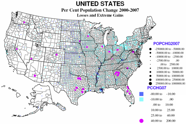
The largest contiguous area of counties with losses remains the same as it was in the 1970s, 1980s and 1990s: the “high plains” from Mexico to Canada (actually continuing in Canada). Probably 90 percent of counties lost population, especially in Kansas, Nebraska and North Dakota, and extending into the Midwest agricultural heartland of Iowa, northern Missouri, southern Minnesota and western Illinois.
Other traditional areas of losses which continue from the 1970s through 1990s include the coal counties of Appalachia (Kentucky, West Virginia), and the “Black Belt” from Arkansas and Louisiana through the Mississippi Delta and on through parts of Alabama, Georgia, South and North Carolina into Virginia.
Again repeating past patterns are losses in some of the large core counties of Megalopolis, as Philadelphia and Baltimore, and elsewhere (St. Louis, Chicago, Minneapolis and even San Francisco). The highest rates of loss were again in and around New Orleans, small counties in Mississippi and Nevada, and Montana, North and South Dakota.
The 33 rapidly growing counties are ALL suburban except for the new metropolitan area of St. George, Utah. Suburban Atlanta dominates, followed by northeastern Florida, and selected suburbs of Columbus, OH, Indianapolis, Charlotte, Chicago, Minneapolis, Washington, DC, Des Moines, Denver, Reno, Houston, Dallas, and Austin. The largest absolute gains (many areas are now hurting economically) were Maricopa (Phoenix), Harris (Houston), Riverside and San Bernardino, Clark (Las Vegas), Los Angeles, and suburbs of Dallas and San Antonio.
Migration
Immigration dominates the news, but there is also emigration, and the difference between these is ‘net’ international migration. Data on immigration and emigration are not very certain or reliable, as people leaving don’t have to tell anyone, and many entering are equally reticent. Yet there is a clear pattern from the map of the 416 counties. Overall the areas of net loss tend to be the same as for losses in overall population.
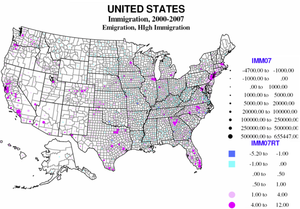
Counties where immigrants greatly exceed emigrants are both the core counties of the largest metropolitan areas and their largest suburban counties, but especially in the west, Texas, Florida, and the Atlantic coast metropolitan cores from Atlanta to Boston, California, Texas, Florida, and metropolitan New York city. Mexican immigration is the largest, but there is significant immigration from the rest of Latin America, from Asia and from Eastern Europe. Most of the immigrant destinations are metropolitan, but include some rural small town areas, typically with food processing, an industry dependent on low wage immigrants (TX, AR, OK, KS, NE, IA).
Largest absolute gains are to Los Angeles, Cook, New York City, Miami, Houston, Dallas, Orange County, Phoenix and Santa Clara, with a bias to the southwest, Florida and New York City. The highest immigration rates are in part the same, Miami, Queens, Hudson NJ, Santa Clara, but high rates also characterize Washington DC suburbs, two Kansas counties (food processing), and a Colorado county (workers for ski resorts).
Significant numbers of non-immigrants also move, and as many as a third probably crossed county lines since 2000. In much of America the balance between in and out migration is close, but for many regions, “net” migration is the most important component of change.
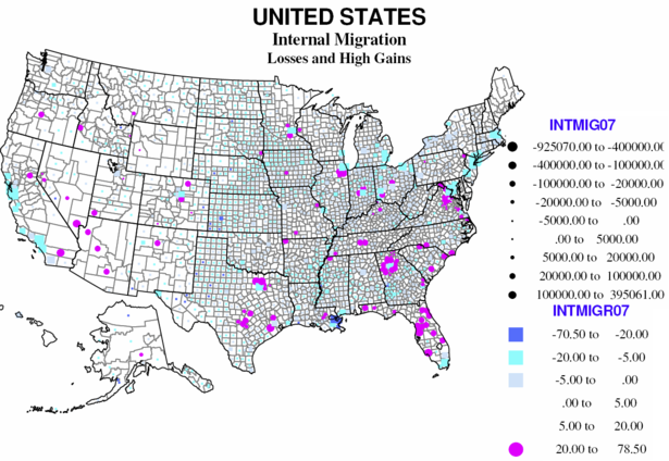
Overall two thirds of American counties reported a net loss from internal migration, 29 at a level more than 20 percent of the base population. Only 118 have high rates of net in-migration (over 20 percent). Large absolute losses characterize most large metropolitan core counties, including coastal California, Dallas, Miami, New Orleans, megalopolis core counties (from Maryland to Massachusetts), and the Great Lakes and Midwest. Smaller absolute net out-migration prevails over most rural small-town America, especially the Great Plains, and agricultural Midwest and Great Lakes, the Black Belt across the south, and includes much of the southwest.
Internal domestic migration represents a distinctive geography. In the west many were inland smaller metropolises, as well as many rural small town environmentally attractive counties that received many of the out-migrants from the large coastal metropolises. In the Midwest and northeast gains were strongly suburban (often local flows from the core counties). In the south rapid gains continued to dominate much of Florida, and metropolitan suburbs, especially around Washington DC, Atlanta, Dallas, and Austin-San Antonio, fueled both by continuing in-region rural to urban flows and by migration from the north to the south.
The losses include the usual suspects, the core counties of the largest metro areas, including Dallas, Miami, and Orange counties, with the native-born displaced to the suburbs and beyond. The largest absolute gains include some central counties, like Maricopa and Clark (but which are also themselves suburban), major suburban counties of Los Angeles, Dallas, Houston, Phoenix, Chicago, and a newcomer, Wake county NC (Raleigh). The highest rates of net in-migration are mostly suburban, Atlanta, Dallas, Washington DC, Denver, Chicago, but also a few smaller counties, as in Pennsylvania and South Dakota.
The Role of Natural Increase
One of the indicators of diversity in America is the remarkable variation in the role of natural increase (or decrease) – that is the difference between births and deaths in an area – in the story of population change.
Almost 30 percent of US counties experience natural decrease, and only a little over 10 percent (337) have high rates of natural increase (6% or more growth in 7 years). Natural decrease is mainly a function of age structure, where the young of child-raising age have left, OR where unusual numbers of the elderly have moved in, dominating the population.
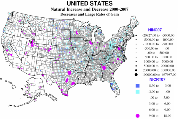
There are four distinct regions of natural decrease. The largest, absolutely and relatively, is Appalachia, from extreme northern Georgia, through smaller parts of Tennessee and North Carolina, western Virginia, most of West Virginia, and both the greater Pittsburgh and the Scranton-Wilkes Barre region of northeastern Pennsylvania. Much is a historic region of coal (and steel) production, and often poor transport links to the rest of country. The region has suffered loss of the young, often for 40 years or more.
The second large region of natural decrease is entirely different in character, namely mid-Florida, centered on Tampa-St, Petersburg and Sarasota, as a result of the aging in place of massive numbers of retirees from the north moving to Florida over the last 50 years.
The third region is much more extensive, covering most of the Great Plains and rural Midwest, from Texas and Arkansas to the Dakotas, Minnesota and Montana, regions again suffering long-term loss of the young population to greater opportunities in the city.
The last smaller region is the Michigan-Wisconsin upper peninsula, where losses can be traced to the result of declining mining and forestry. Counties in New Mexico, Arizona, and northern California are somewhat like Florida with large numbers of retirees, while those in coastal Oregon and Washington are in part like upper Michigan, but with many retirees as well.
The 112 counties where births greatly exceed deaths, not surprisingly, reflect a very different geography. They do represent, as is often pointed out, a shift to metropolitan areas but importantly not to the core cities but the suburban hinterlands. Most prominent areas of high natural increase are primarily suburban areas around metropolitan Houston, Dallas, San Antonio, Atlanta, Washington DC, Chicago, Minneapolis and Raleigh, NC. Many of these areas are also affected by in-migration of Hispanic families.
The other reason for high natural increase is higher fertility – families with above replacement numbers of children, often for reasons of religion or ethnicity, and also reinforced by in-migration of young adults. On the map, Native American Indian reservations stand out, as in North and South Dakota, Wisconsin, Montana, and Alaska, although these numbers are still slow. Mormon Utah and Idaho demonstrate high fertility, family size and shares of births, in rural as well as urban counties. But the dominant area of high natural increase is clearly the extensive southwestern region of Mexican heritage and in-migration over recent decades, in Texas, California, Colorado, New Mexico, Arizona, and eastern Washington, plus selected counties in the high plains, e.g., Kansas and Oklahoma. The final bastions for young families and higher natural increase are military dominated counties, as in Georgia, North Carolina and Kansas.
In absolute losses, parts of Florida and Pennsylvania and the northern Great Plains stand out. Relative gains are highest in Hispanic, Native American Indian and Mormon counties. These are impressive numbers – the surplus of births over deaths as a share of the total population.
Why the Differences?
What makes counties lose or gain people? The US has a diverse and restless population. Counties vary greatly in attractiveness to immigrants from abroad or migrants from other states, broadly because of real or perceived “opportunities,” characteristics of jobs or amenities which may lure migrants from less competitive or attractive areas.
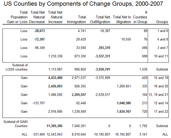
The map divides the counties into nine sets, based on the relative importance of natural increase or decrease, emigration and immigration and in-migration and out-migration. The 1439 counties which lost population include 165 for which the main reason for loss is from natural decrease; of these one subgroup lost overall despite net immigration, the other’s loss was aggravated by net out-migration as well. The larger set of counties with population losses, 1184, are those for which the loss is mainly attributable to net out-migration, with two subgroups, one with loss despite natural increase, the other with loss magnified by natural decrease.
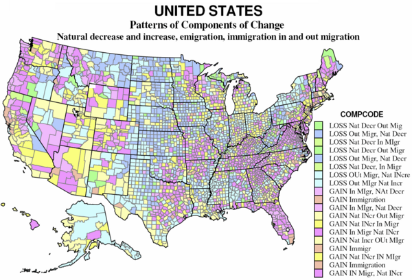
On the map the “darker” green counties (89) had a large natural decrease and a smaller net out-migration; the “lighter” green (76) had natural decrease, exceeding a smaller net in-migration. These counties for which natural decrease dominates are scattered across the Great Plains from Texas to Canada, together with clusters from Appalachia (VA, WV, PA, and NY), northern MI-WI, and a few declining natural resource areas in the west.
The “darker” blue counties (486) are dominated by net out-migration, but also had natural decrease. The “lighter” blue counties (698) had natural increases but these were much exceeded by net out-migration. These counties are often interspersed with the “green” counties, dominated by natural decrease. These 1184 counties – over one-third of counties and of US territory – constitute a large swath of the Plains and Midwest, large parts of New York and Pennsylvania, the coal counties of Kentucky and West Virginia, and the “Black Belt” across the south from Louisiana and Arkansas to southern Virginia. Finally they include sparsely populated resource counties in Alaska and parts of the west. Overall, the counties losing population tend to be non-metropolitan and interior, except for the declining industrial metropolitan counties of the “Rust Belt”.
Gainers
The gaining counties consist of three broad groups — 755 for which natural increase is the main contributor to growth, with subsets of 420 growing despite net out-migration, and 335 with net in-migration as well. The second consists of 104 counties for which immigration is the predominant basis for growth. Finally there are 933 counties for which net in-migration is the main contributor to growth, with subsets with natural decrease with natural increase.
The “yellow” counties (755) gained population mainly because of natural increase; the light yellow counties (420) grew despite often substantial net out-migration; the darker yellow counties (335) also had a smaller net in-migration, and are thus among the more ”successful” more rapidly growing US counties. The former are especially prevalent in cities of the west – e.g. Los Angeles, San Diego, Houston, Dallas – with sizable immigrant populations (see the table) and higher fertility and displacement of the native-born, but yellow counties are also common in non-metropolitan and small metropolitan and suburban areas of the Great Lakes states, the outer Megalopolis, and urban industrializing parts of the south. The “dark” yellow areas are in the same regions, and are very often the areas gaining migrants from the “light” yellow areas, as can be seen in California, Arizona, Utah, Washington and Colorado.
The “orange” counties, only 104, are those where immigration is the main source of growth. These are somewhat scattered, but especially common in New England and Middle Atlantic states, selected counties of the Plains (often with food processing plant growth) and northern Pacific Coast metropolitan regions, as the San Francisco bay region, Portland and Seattle.
The “magenta” counties (933) are those for which net in-migration dominates growth. The lighter magenta for those with natural decrease (213), the darker magenta for those with natural increase as well. All these tend to be the most rapidly growing counties in the country, and tend to occur together. The main difference with counties with natural decrease are those with an older age structure, but which are nevertheless attractive to in-migrants. From the map these occur in two main settings: traditional areas of amenity migration, most obviously covering much of Florida, but also widespread in northern New England, northern Michigan, Wisconsin and Minnesota, the Ozarks, parts of the Tennessee valley, and across much of the west, with particular swaths in western Montana, coastal Oregon and Washington and northern California. The second setting is the exurban environs of major metropolitan areas, where new growth is invading formerly rural areas.
The final, largest set of counties with natural increase as well as high in-migration (720 counties), are the stereotypical winners in the contemporary “growth races” – based on a combination of employment growth and metropolitan or environmental amenities. These tend especially to be southern and western metropolitan areas, small as well as large. The most dominant regions are greater Washington DC, greater Atlanta, Dallas and Houston, Portland, Denver, Phoenix, most of Florida, and – perhaps surprisingly – substantial parts of the north-south borderlands, including Tennessee, Kentucky, Arkansas, Oklahoma, and Missouri.
What about the recession? It’s hard to judge the relative effects of the current severe recession on likely near- or longer-term growth. Clearly, the collapse of housing markets are slowing the growth of such rapidly growing places as Phoenix and Las Vegas, but this does not mean they won’t regain their general attractiveness and economic viability. The particularly severe job losses in the already hurting western Rust Belt will likely aggravate the recent pattern of decline which predated the recession and could get much worse.
Richard Morrill is Professor Emeritus of Geography and Environmental Studies, University of Washington. His research interests include: political geography (voting behavior, redistricting, local governance), population/demography/settlement/migration, urban geography and planning, urban transportation (i.e., old fashioned generalist)
-
Obama Administration to Repeat Protectionist Errors of 1930s?
In a potentially ominous development, Television New Zealand reports that the Obama government has postponed free trade agreement discussions under the proposed Trans-Pacific Strategic Economic Partnership (P4) with New Zealand, Singapore, Brunei and Chile. Along with the United States, Australia, Peru and Vietnam were to have been involved in the expanded free trade area. It is reported that the postponement is related to an assessment of trade policy by the Obama administration. An inward turning US trade policy, favored by President Obama’s organized labor allies even before the economic meltdown, could set the nation on a protectionist course not unlike the measures that prolonged the Great Depression.