Blog

  • De-Industrialization and the Displaced Worker

    Much has been made of working class pain in this election, but the problems go well beyond that.  I don’t like the 1% vs. 99% frame, but it captures something important about our society, namely a sort of bifurcation that has occurred between top and bottom. Roughly the top 20% are doing quite well, and increasingly live in communities surrounded by others like themselves. The bottom 80% does not seem to be faring so well on a variety of social and economic statistics.

    The policies offered by the mainstream of both parties has more or less boiled down to “more of the same stuff we’ve always pitched.” Clearly, the public is looking for something different.

    That’s the subject of my column now out in the May issue of Governing magazine called “De-Industrialization and the Displaced Worker.”  Here’s an excerpt:

    In George O. Smith’s science fiction short story “Pandora’s Millions,” society collapses when the invention of a “matter replicator,” like the ones from Star Trek, instantly renders most of the economy, and money itself, obsolete. Being a short story, this is resolved quickly with the invention of a substance that can’t be duplicated, followed by rebuilding the economy and society around services. Real life doesn’t always recover so quickly from disruptions, as we are finding out.

    Unsurprisingly, this has generated discontent. Back through to the 1980s and ’90s, this was mostly limited to displaced industrial workers. Today that has grown to a much broader spectrum, from young master’s degree holders with piles of student loan debt who are stuck working at Starbucks to corporate middle managers losing their jobs to outsourcing or foreigners working here under H1-B visas.

    This has percolated through to the political system, with the rise of Donald Trump and Bernie Sanders, both questioning many of the premises of the current economic system. America is more receptive to these arguments than many ever would have believed possible. That’s because the current system has lost legitimacy in the minds of many. Not only did it fail to deliver the promised benefits to them, but then government turned around and bailed out the big banks in the financial crash.

    Click through to read the whole thing.

    Aaron M. Renn is a senior fellow at the Manhattan Institute, a contributing editor of City Journal, and an economic development columnist for Governing magazine. He focuses on ways to help America’s cities thrive in an ever more complex, competitive, globalized, and diverse twenty-first century. During Renn’s 15-year career in management and technology consulting, he was a partner at Accenture and held several technology strategy roles and directed multimillion-dollar global technology implementations. He has contributed to The Guardian, Forbes.com, and numerous other publications. Renn holds a B.S. from Indiana University, where he coauthored an early social-networking platform in 1991.

    Image by Flickr/Mirko Tobias Schäfer – CC BY 2.0

  • Scandinavian Women Do Well, Except at the Top

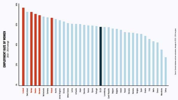
    In which part of the world should we expect most women to reach the top? The answer has to be the Nordic countries. According to The Global Gender Gap report, for example, Iceland is the most gender equal country in the world followed by Norway, Finland and Sweden. Yet as I will discuss below, this has not translated in women making it to “the top”, as one might expect. This a paradox that I will seek to address.

    Around the world, the Nordic countries are often idealized as the most gender equal places in the world. To a large degree, this admiration is warranted. But it is time to realize that the very same system is holding back women’s ability to reach the top.

    To begin with, the Nordics have a unusual gender equal history. The tradition of gender equality has roots in Viking culture. For example, Scandinavian folklore is primarily focused on men who ventured on longboats to trade, explore and pillage. Yet the folklore also includes shiledmaidens, women chosen to fight as warriors. Byzantine historian John Skylitzes records that women were indeed participating in Nordic armies during the 10th century. The fact that women were allowed to bear arms, and train as warriors, suggests that gender segmentation in early Norse societies was considerably more lax – or at least more flexible – than other parts of contemporary Europe. Evidence also suggests that women in early Nordic societies could inherit land and property, that they kept control over their dowry and controlled a third of the property they shared with their spouses. In addition, they could, under some circumstances at least, participate in the public sphere on the same level as men.

    Medieval law, which likely reflects earlier traditions, supports this notion. Medieval inheritance laws in Norway for example followed family relations through both male and female lines. Additionally, women could opt for a divorce. These rights might not seem impressive today, but they were rather unusual in a historical context. In many contemporary European and Asian societies, the view was that women simply belonged to their fathers or husbands, having little right to property, divorce or inclusion in the public sphere.

    Nordic gender egalitarianism continued after the Viking age, particularly in Sweden. In much of the world, women were excluded from participating, at least fully, in the rise of early capitalism during the 18th and 19th centuries. In essence, free markets and property rights were institutions that initially excluded women. Although Sweden and the other Nordic countries were far from completely egalitarian, they challenged contemporary gender norms by opening up early capitalism for women’s participation.

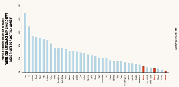
    As shown below, the World Value Survey has asked respondents around the world whether they believe that men should be prioritized over women if jobs are scares. In modern market economies, fewer agree with this notion. In Switzerland for example, 22 per cent believe that men should have more right to a job than women, compared to 16 per cent in the United Kingdom and 14 per cent in Canada and Australia. Sweden has the lowest share agreeing with this view, merely 2 per cent. Norway (6 per cent) and Finland (10 per cent) are also amongst the countries with egalitarian views.

    In addition, the Nordic welfare states have encouraged women to enter the labor market early on. Still today Nordic countries are ahead of most of Europe in this regard. Child care cost and paid maternity, services provided largely by the public sector in the Nordic welfare states, can in part explain the high labor participation amongst both parents. Such systems are much more extensively funded by the public sector in the Nordics compared to other modern economies, and particularly so compared to the Anglo-Saxon nations. Although even here, the United States, still not a full welfare state, does surprisingly well.

    A long history of gender equality, gender equal norms, many women actively participating in the labor market and family friendly welfare policies – surely this should be seen as the recipe for many women reaching the top of the business world? In the new book The Nordic Gender Equality Paradox I show that this is not the case. In Nordic countries surprisingly few women have made to the top echelons.   

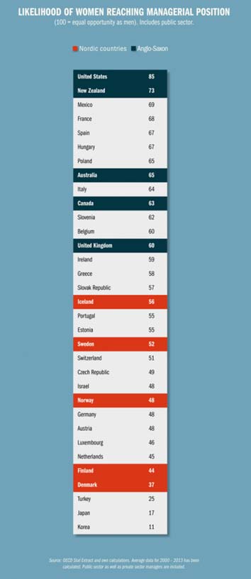
    The OECD gathers information about the proportion of employed persons which have managerial responsibilities in different developed economies. In the table below the share of women managers in different countries is shown as a percentage of the share of male managers. This calculation yields a measure of the likelihood of the average employed women to reach a managerial position compared to the average employed man. The likelihood of a women reaching a managerial position as compared to the same likelihood for a man in the United States is found to be 85 per cent. This is far higher than any other country in the study. As a comparison, the same share is 60 per cent in the United Kingdom and 52 in Sweden. Norway (48 per cent), Finland (44 per cent) and Denmark (37 per cent) score even lower.

    It should be emphasized that this measure includes public sector managers, which inflates the figures for Nordic countries compared to if private sector managers had been studied. The data paints a clear picture: The United States, where welfare state programs do not subsidize women’s parental leave has more women reaching managerial positions than any of the Nordic welfare states.

    Why is it that Nordic countries fail to reach their gender equal potential? Shouldn’t these countries be heads and shoulders above the US when it comes to the share of women climbing to the top? Progressive theorists would naturally assume this. But in reality there is a paradox here; the egalitarianism of the Nordics has clear limits.   At the end of 2014 for example, The Economist ran a story entitled A Nordic mystery

    “Visit a typical Nordic company headquarters and you will notice something striking among the standing desks and modernist furniture: the senior managers are still mostly men, and most of the women are [program administrators]. The egalitarian flame that burns so brightly at the bottom of society splutters at the top of business.”

    As I explain in The Nordic Gender Equality Paradox there is a logical answer to the apparent paradox: policy matters. Numerous studies support the conclusion that the large welfare states in the Nordics, although designed to aid in women’s progress, in fact are hindering the very same progress. Social democratic systems do provide a range of benefits for women, such as generous parental leave systems and publicly financed day care for children. The models however also have features that are detrimental to woman’s careers.

    To give an illustrative example, public sector monopolies in women-dominated areas such as health and education seem to substantially reduce the opportunities for business ownership and career success amongst women. Welfare state safety nets in particular discourage women from self-employment. Overly generous parental leave systems encourage women to stay home rather than work. Substantial tax wedges make it difficult to purchase services that substitute for household work, which reduces the ability of two parents to engage fully in the labor market.

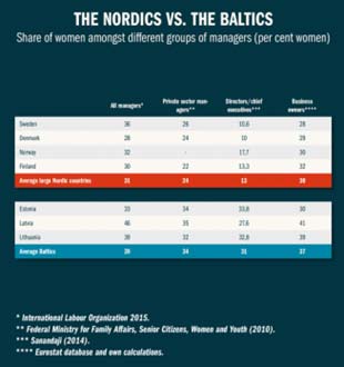
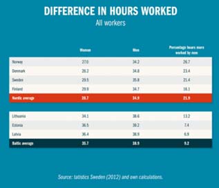
    The Nordic welfare model has, perhaps unintentionally, created a model where many women work but seldom in the private sector and seldom enough hours to be able to reach the top. For example, it might seem as a puzzle why the Baltic countries – which have much more conservative and family oriented cultures – have a higher share of women amongst managers, top executives and business owners than their Nordic neighbors. As shown below, a key factor is difference in working time. In the Nordic societies the average employed man works fully 22 per cent more hours than the average working women. In the Baltic model, where families have greater choice in organizing their lives compared to the Nordic welfare states, the gap is only 9 per cent. On top of this comparison, which looks at working individuals, many Nordic women also take long parental leaves, paid to do so by the welfare state, and thus fall behind in their careers. Of course Baltic mothers are also much concerned for the upbringing of their children. However, many of them solve the equation by getting help from family, perhaps grandmother, to watch the children or buy services to alleviate household work – something easier to do in low-tax countries.

    Thus, for all their gender equal progress, the Nordic countries in fact have relatively few women entrepreneurs, managers and executives. And there is really not a paradox why this situation has developed. It’s all about the policy choices made in the Nordics.

    As is clear, an expansive welfare state may be good for some things, but expanding the ranks of managers for women is not one of them. The feminist heritage that dates back to the age of the Vikings needs to be combined with a more free-market and small government approach if Nordic societies are to fulfill their gender equal potential. Perhaps this is also a lesson to the rest of the world, where progressive policies are often seen as the recipe for promoting women’s careers.

    Nima Sanandaji is the president of the European Centre for Policy Reform and Entrepreneurship (www.ecepr.org) and a research fellow at the Centre for Policy Studies and at the Centre for Market Reform of Education. His latest book, The Nordic Gender Equality Paradox, can be ordered here.

  • Battle of the Imperial Pretenders

    It took the Roman Republic five centuries to devolve into a centralized despotism. It may take ours roughly 240 years to get to the same place, but with decidedly less upside.

    Concern over a crossing of a constitutional Rubicon – the northern Italian river whose passage by Julius Caesar and his legion in 49 B.C. occasioned the death of the Republic – has centered on Donald Trump. The Donald might not have conquered Gaul, or written a brilliant account of his exploits, but his Caesarist attributes – overweening self-regard, contempt for existing institutions and a touch of glamour – are all too obvious.

    No surprise, then, that some on the left, perhaps rehearsing their roles as cheerleaders for Hillary Clinton, see Trump as a “tyrant” – a Caesar in training. Others see a reincarnation of Italy’s fascist dictator Benito Mussolini and link Trump’s success to that of the rising European populist parties, which progressives often label, sometimes accurately, as protofascist.

    Many on the intellectual right also see in The Donald an imperial pretender. New York Times Republican stalwart Ross Douthat has called the likely GOP presidential standard bearer “a protofascist grotesque with zero political experience and poor impulse control.”

    Read the entire piece at The Orange County Register.

    Joel Kotkin is executive editor of NewGeography.com. He is the Roger Hobbs Distinguished Fellow in Urban Studies at Chapman University and executive director of the Houston-based Center for Opportunity Urbanism. His newest book, The Human City: Urbanism for the rest of us, will be published in April by Agate. He is also author of The New Class ConflictThe City: A Global History, and The Next Hundred Million: America in 2050. He lives in Orange County, CA.

    Top image by DonkeyHotey (Hillary Clinton vs. Donald Trump – Caricatures) [CC BY-SA 2.0], via Wikimedia Commons

  • Developing Economies Dominate Per Capita GDP-PPP Growth

    The world’s developing economies have dominated purchasing power economic growth over the last 35 years, according to the most recent gross domestic product (GDP-PPP) per capita data from the International Monetary Fund (IMF). This article summarizes economic growth for three periods, including from the earliest IMF data (1980 to 2015), the intermediate 2000 to 2015 period and the more recent 2010 to 2015 timeframe. The full data is available on the Demographia website, at http://www.demographia.com/db-imf2015.pdf.

    GDP per capita provides a measure of comparative income for individuals in an economy, as opposed to overall GDP data, which is a measure of an economy’s total production. This is an important distinction, because an economy may have a very high overall GDP, while its residents have relatively low income. For example, India has the world’s fourth largest GDP, yet with its population approaching 1.3 billion, ranks 126th in GDP per capita (out of the 190 countries and sub-national geographies included in the database). On the other hand, China’s Macao Special Administrative Region has the third highest GDP per capita in the world, but barely manages to be within the 100 largest economies, due to its much smaller population (approximately less than 600,000).

    Fastest Growing Economies

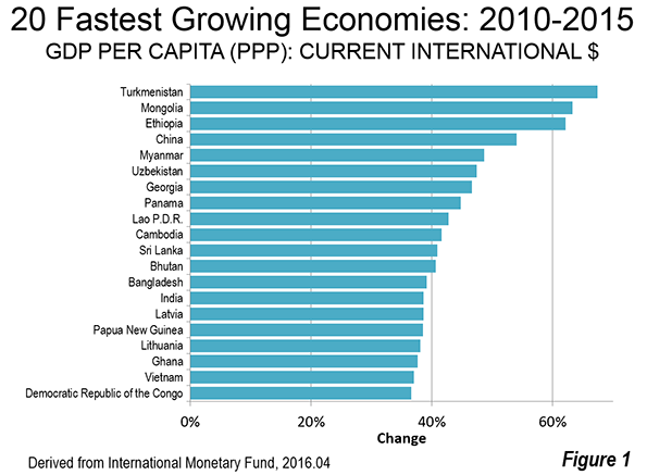
    2010-2015: The most recent period exhibited remarkable geographic diversity among the fastest growing economies. Asia contributed 13 entries out of the top 20, with Africa adding three (Ethiopia, Ghana and the Democratic Republic of the Congo), Europe two (Latvia and Lithuania), Oceana one (Papua New Guinea) and North America one (Panama). The fastest growing economy was Turkmenistan, at 67 percent, closely followed by Mongolia at 63 percent and Ethiopia at 61 percent. China, which has sustained strong growth throughout all of the periods examined, ranked fourth at 54 percent. Myanmar, now emerging from decades of dictatorship,  was the fifth fastest growing economy, at 49 percent (Figure 1).

    The top 20 included two of the world’s poorest economies, third ranked Ethiopia, with a GDP per capita of $1,800 and the Democratic Republic of the Congo (DRC), which ranked 19th, with a GDP per capita of $800 (both figures are after the 2010-2015 increase). The improvement in the DRC is thus very encouraging, but it is  from a severely impoverished base.

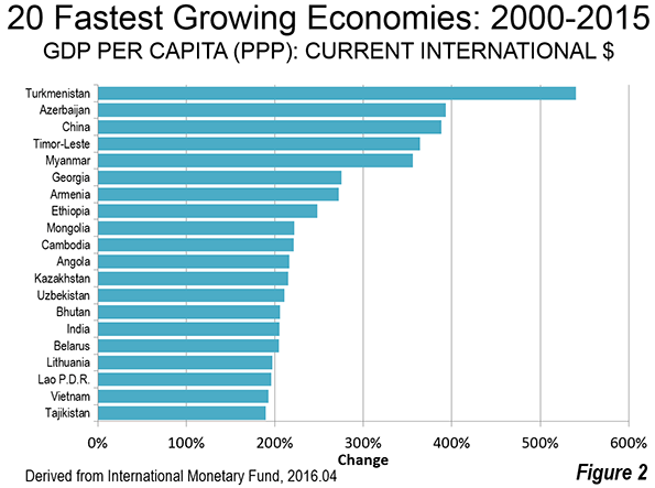
    2000-2015: Perhaps surprisingly, nine of the 20 fastest growing economies over the interim period (2010-2015) are former Soviet republics. Turkmenistan was, as between 2010 and 2015, the fastest growing, at 540 percent. Turkmenistan was joined by fellow former Soviet Azerbaijan , which grew 393 percent. Other former Soviet republics in the top 20 included Georgia, Armenia, Kazakhstan, Uzbekistan, Belarus, Lithuania and Tajikistan.  However, the largest former Soviet republic of all, the Russian Federation, was not among the fastest growing but placed a respectable 45th .

    China ranked third in economic growth, only slightly below Azerbaijian.at 388 percent. Timor-Leste, recovering from its intense ethnic conflict, ranked fourth. Myanmar ranked fifth.

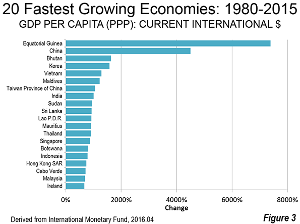
    1980-2015: Over the longer period (1980-2015), Equatorial Guinea grew the fastest, at more than 8,000 percent, driven by its rich oil resources. China ranked second, at 4,500 percent. This huge increase was from a second worst in the world GDP per capita, which was a mere  $300 in 1980. Small Bhutan ranked third, at 1,627 percent, followed by the Republic of Korea (South Korea), which grew 1,572 percent, to become one of the world’s strongest economies. Vietnam ranked fifth, growing 1,283 percent (Figure 3).

    Three of the world’s richest economies, with GDP’s per capita above $50,000, were also among its fastest growing between 1980 and 2015. These included Singapore (14th), Hong Kong (17th) and Ireland (20th).

    Slowest Growing Economies

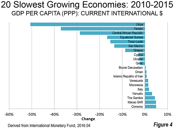
    2010-2015: The slowest growing economies in the last five years have suffered serious civil disorder.  Troubled Libya experienced a more than halving of its GDP per capita between 2010 and 2015. In 2010, Libya had a GDP per capita of $29,600, more than long-time European Union (EU-15) members Greece ($29,000) and Portugal ($26,500). By 2015, Libya had dropped to $14,600, less than Brazil ($15,600) and the Dominican Republic ($15,000).

    Similarly unstable Yemen experienced a loss of 37 percent, from $4,200 to $2,700.

    The Civil war ravaged Central African Republic lost 29 percent in GDP per capita. This is made worse by the fact that the Central African Republic ranked 185th in GDP per capita in 2010 out of the 189 geographies for which there is data. The 2015 data shows the Central African Republic to rank dead last in GDP per capita, 190th out of 190.

    Oil producing Equatorial Guinea experienced a loss of 17 percent in its GDP per capita, which is particularly significant, since Equatorial Guinea had the largest gain of any economy between 1980 and 2015.

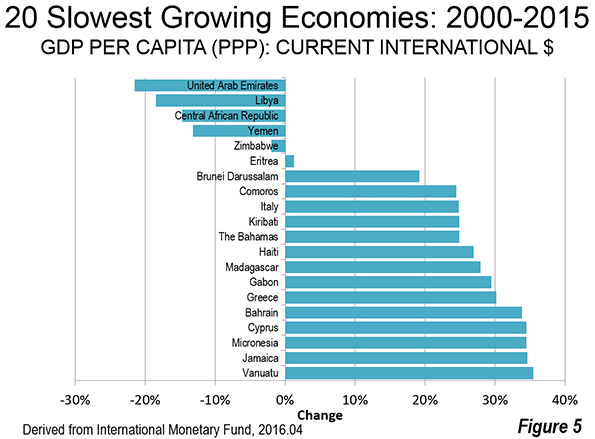
    Three current European Union members were among the slowest growing economies. Greece had the 7th largest loss (-8.8 percent), while Cypress had the 8th largest loss (2.9 percent). Italy was the 16th slowest growing economy, gaining 1.8 percent (Figure 4).

    2000-2015: The largest loss in GDP per capita between 2000 and 2015 was experienced by the oil producing United Arab Emirates. The next three greatest losses were in Libya, the Central African Republic and Yemen, which also sustained the largest losses between 2010 and 2015. The same three European Union members as in 2010-2015 made the 2000-2015 slowest growth list, Italy, Greece and Cypress (Figure 5).

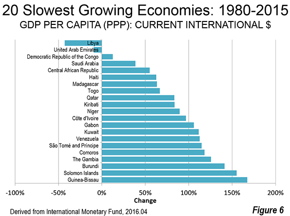
    1980-2015: Libya and the United Arab Emirates were the only geographies to post GDP per capita losses over the past 35 years. Miniscule growth was experienced in the third slowest growing Democratic Republic of the Congo, though as indicated above, the DRC managed to make the top 20 in growth between 2010 and 2015.

    The Future

    While there is much to celebrate about economic growth over the last 35 years and even in the more recent periods, far too much of the world lives in poverty and middle-income standards of living are declining, especially in the high-income world. These factors were the subject of discussions at the 2014 Brisbane G20 conference, when world leaders adopted a communique stressing a commitment to improving standards of living and eradicating poverty.

    Yet, a year and half later, International Monetary Fund Managing Director Christine Lagarde expressed a cautionary note in introducing the organization’s latest World Economic Outlook. The IMF indicated that Director Legarde warned that the recovery remains too slow, too fragile, with the risk that persistent low growth can have damaging effects on the social and political fabric of many countries. It is to be hoped that future reports will show large numbers of people exiting poverty, and a resumption in the rise of middle-income living standards. If these run in tandem, the world economy will be in the best shape in history.

    Wendell Cox is principal of Demographia, an international pubilc policy and demographics firm. He is a Senior Fellow of the Center for Opportunity Urbanism (US), Senior Fellow for Housing Affordability and Municipal Policy for the Frontier Centre for Public Policy (Canada), and a member of the Board of Advisors of the Center for Demographics and Policy at Chapman University (California). He is co-author of the “Demographia International Housing Affordability Survey” and author of “Demographia World Urban Areas” and “War on the Dream: How Anti-Sprawl Policy Threatens the Quality of Life.” He was appointed to three terms on the Los Angeles County Transportation Commission, where he served with the leading city and county leadership as the only non-elected member. He served as a visiting professor at the Conservatoire National des Arts et Metiers, a national university in Paris.

    Photograph: Addis Abeba, capital of Ethiopia (3rd fastest growing economy 2010-2015)

  • Feds Forced to Set Priorities for Washington Subway

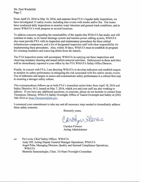
    The Washington Metro passenger safety fiasco (see: America’s Subway: America’s Embarrassment?) has only gotten worse. On May 10 the Washington Post  reported the federal government has twice threatened to close the system if the Washington Area Metropolitan Transportation Authority (WMATA) failed to “take actions to keep passengers safe.” U.S. Secretary Anthony Foxx.

    According to the Post, “The most recent incident to illicit that threat came last Thursday after an arcing insulator exploded near a platform at Federal Center SW. The explosion, a fireball followed by a shower of sparks, was captured by Metro’s security cameras. On Tuesday, at a sit down with reporters, Transportation Secretary Anthony Foxx described his reaction to the video. ‘It was scary.’”

    But Foxx went on to say that “even more worrisome was Metro’s conduct following the incident.” Foxx indicated that Metro’s response had not been sufficient in view of the seriousness of the incident.”

    On the next day (May 11), Federal Transit Administration Acting Administrator Carolyn Flowers took the unusual action of a letter to WMATA General Manager Paul Wiedefeld, itemizing and prioritizing the necessary repairs: “I am therefore directing WMATA to take immediate action to give first priority to these repairs.” The letter is reproduced below.

    On the same day, the Post editorialized (“Metro’s Dangerous Complicity”): “An overhaul in Metro’s culture is what is needed; that begins with accountability.

    Not only is this an embarrassment for America’s Subway (as a previous Washington Post article suggested, see “Metro sank into crisis despite decades of warnings”), but the necessity for the nation’s second most patronized subway, in perhaps the nation’s most sophisticated metropolitan area, having to be directed (appropriately) by a federal agency is even more astounding.

    At the same time, it is important to note the extraordinary nature of this case. There are many Metro (heavy rail) systems in the nation, as well as many light rail and commuter rail systems. Nor should it be assumed that Metro’s burden is anything more than a result of its own failures. Somehow, for example, New York’s subway manages to safety carry more than 10 times as many riders. None of the many systems has ever required such intervention by the federal government on passenger safety, which is perhaps the most basic requirement of transportation systems. This is not “business as usual.”

  • California’s High-Speed Rail Authority Wins Dishonor of the California Golden Fleece Award

    The California High-Speed Rail Authority (CHSRA) has won the Independent Institute’s first California Golden Fleece Award for its lack of transparency and history of misleading the public about key details of the state’s “bullet-train” project, which no longer reflect what voters approved in 2008.

    The agency’s “bait-and-switch” strategy justifies a statewide vote on whether or not to proceed with the train system. Californians should reject this unnecessary and expensive boondoggle.

    Background

    In November 2008, California voters approvedProposition 1A, a $9.95 billion bond measure authorizing construction of a high-speed “bullet train” between downtown San Francisco and the greater Los Angeles area. The vote was 53 percent in favor and 47 percent opposed. The ballot measure contained key details regarding the project’s cost, dedicated tracks, trip time, and financing plan. Many of these details have been changed repeatedly since 2008.

    The Cost: A Moving Target

    Before the 2008 vote on the bond measure, the California High-Speed Rail Authority said: “The total cost to develop and construct the entire high-speed train system would be about $45 billion.” Proposition 1A also promised voters that the train system would operate without taxpayer subsidies: “The planned passenger service by the authority in the corridor or usable segment thereof will not require a local, state, or federal operating subsidy.” Soon after voters approved the project, however, cost projections escalated.

    In its original 2012 Business Plan, the CHSRA set the price tag at a staggering $98 billion. Public and political outcry caused rail officials to quickly backtrack. Just five months later, the revised 2012 Business Planlowered the cost by $30 billion by moving to a “blended” route: one that would share existing rail tracks in urban areas with other train systems, rather than building new dedicated tracks.

    Based on this radical redesign, CHSRA said the entire 520-mile system would be completed in 2029 at a cost of $68 billion, but only by eliminating high-speed service between Los Angeles and Anaheim and between San Jose and San Francisco.

    Then in 2016, the CHSRA Business Plan lowered the cost by roughly $4 billion net, to $64 billion, through a combination of vaguely specified “design refinements,” “system optimization,” “value engineering,” and “lessons learned from bids.”

    At this point, the ever-changing cost estimates defy belief. As noted by Dan Walters, Sacramento Beecolumnist and longtime observer of state government: “Those charged with building California’s north-south bullet train system have been more or less making it up as they go along.” But regardless of whether the final cost is $64 billion, $68 billion, $98 billion, or even higher, the reality should be clear: The cost far exceeds the $45 billion approved by voters in 2008, and now with substantial track redesigns.

    Tracks and Trip Time: From Bullet Train to Choo Choo Train

    Public outrage over the $98 billion price tag prompted train officials to abandon the original plan of building dedicated tracks in urban areas. Instead, officials shifted to blended tracks in urban areas: the bullet train would share tracks with the existing Metrolink commuter network in Southern California and the Caltrain system in Northern California. But the blended approach increases trip time considerably from what was promised to voters.

    Voters in 2008 were told the high-speed train would whisk travelers from San Francisco to Los Angeles in a “maximum nonstop service travel time” that “shall not exceed” 2 hours and 40 minutes. This specific trip time was often mentioned by supporters to sell the bond measure to voters. (See for example, here andhere.) But with the blended approach, the fastest time between these cities is now estimated by the CHSRA to be 3 hours and 8 minutes, with zero nonstop trips planned—another violation of Proposition 1A. But more realistic trip times are expected to be 3 hours and 50 minutes, or more, under real-world travel conditions.

    The original 2:40 trip time assumed that trains would operate at peak speeds of 220 mph, and “sustained revenue operating speeds of at least 200 miles per hour.” But under the blended approach, high-speed trains must share tracks with commuter trains and freight trains, forcing them to slow down at the urban “bookends.” And today’s older urban tracks can typically handle maximum speeds of only 125 mph.

    In February 2016, officials announced that the first operating leg of the high-speed train system would be built for $21 billion from downtown San Jose to an agricultural field in Shafter, north of Bakersfield, which would begin operating by 2025. The previous plan called for trains to operate first from Merced to Burbank by 2022, three years earlier. This change in the initial route might appear innocent, but by moving the first leg of construction further north, officials can delay construction on a tunnel through the Tehachapi and San Gabriel Mountains, which is likely to bust the current $64 billion budget.

    According to a Los Angeles Times special report:

    The monumental task of building California’s bullet train will require punching 36 miles of tunnels through the geologically complex mountains north of Los Angeles.

    Crews will have to cross the tectonic boundary that separates the North American and Pacific plates, boring through a jumble of fractured rock formations and a maze of earthquake faults, some of which are not mapped.

    It will be the most ambitious tunneling project in the nation’s history. . . .

    However, a Times analysis of project documents, as well as interviews with scientists, engineers, and construction experts, indicates that the deadline and budget targets will almost certainly be missed—and that the state has underestimated the challenges ahead, particularly completing the tunneling on time.

    “It doesn’t strike me as realistic,” said James Monsees, one of the world’s top tunneling experts and an author of the federal manual on highway tunneling. “Faults are notorious for causing trouble.”

    Serious questions remain about whether sufficient funding will ever materialize to complete the newly proposed first leg from San Jose to Shafter, and then to eventually extend the line north to San Francisco and south through the mountains to Los Angeles as originally promised.

    The Financing Plan: Smoke and Mirrors

    Supporters of the high-speed rail project envisioned financing coming from multiple partners. Under Proposition 1A, California voters approved a $9.95 billion bond in 2008 to help finance construction of the rail network (interest costs will be an additional $9.5 billion). Voters were told that if they approved the bond, the federal government and the private sector would pay for the rest.

    Supporters were counting on private investors kicking in as much as $36 billion. The federal government was also expected to contribute up to $18 billion. Another source of funding that arose in 2014 consisted of earmarking 25 percent of the proceeds from auctioning credits to emit greenhouse gases under California’s “cap-and-trade” program, which is estimated to yield the rail project about $500 million a year. (Under the plan, the rail authority would use the annual “cap-and-trade” revenues through 2024, and then seek to borrow $5.2 billion against future carbon fees from 2025 to 2050.) To date, much of the promised financing has never materialized and largely amounts to wishful thinking.

    Congress has pledged an initial grant of $3.3 billion, mostly through President Obama’s economic stimulus package. But the state has received only $503 million of that money as of 2015. And Congress has balked at additional funding. “Congress is never going to allocate more money to a project that lacks the ridership numbers, speeds, private funding, and voter support once promised,” said Rep. Jeff Denham (R-Turlock), chairman of the House rail subcommittee.

    The legal authorization to impose the state “cap-and-trade” fees expires in 2020, making the future availability of this money questionable. And a lawsuit seeks to block use of the cap-and-trade fees for the high-speed rail project. According to Jessica Peters, principal fiscal and policy analyst with California’s nonpartisan Legislative Analyst’s Office (LAO): “About half of the [San Jose to Shafter] funds would come from cap-and-trade beyond 2020,” when the fees are set to expire. A LAO review of the CHSRA’s 2016 Business Plan also questioned the logic of choosing a field in Shafter as the initial southern terminus:

    Even with a temporary station or platform, ending the IOS [initial operating segment] in an unpopulated agricultural area does not appear to be an effective approach. This is because this location would not have the types of facilities and nearby businesses, such as transit connections, rental car facilities, and shops necessary to meet the needs of train passengers.

    Finally, the private sector has not invested in the project, which is unlikely to ever be profitable. Summarizing, the LAO said that the CHSRA’s current funding plan is “significantly short of the level needed to complete [the entire San Francisco to Los Angeles system] and does not identify how this shortfall [of $43 billion] would be met.”

    Moreover, the pledge to voters in 2008 that the high-speed train would operate without taxpayer subsidies was based on ridership estimates that are quickly evaporating. In 2008, the CHSRA forecasted a base annual ridership of 65.5 million intercity riders and a high projection of 96.5 million intercity riders by 2030.

    But independent analysis concluded:

    The CHSRA ridership projections are considerably higher than independent figures developed for comparable California systems in Federal Railroad Administration and University of California Transportation Center at Berkeley studies. Using generous assumptions, this Due Diligence Report projects a 2030 base of 23.4 million intercity riders, 64 percent below the CHSRA’s base of 65.5 million intercity riders, and a 2030 high of 31.1 million intercity riders, nearly 60 percent below the CHSRA’s high of 96.5 million. It is likely that the HSR will fall far short of its revenue projections, leading to a need for substantial additional infusions of taxpayer subsidies.

    The blended 2012 redesign will increase trip times substantially, making air travel, driving, Skype, or phone calls more attractive relative to a slower train ride:

    [A]ssuming the optimistic travel time projection of 3:50, the 2035 interregional ridership would be approximately two-thirds (67 percent) below CHSRA projected levels [of 21 million] at 6.9 million annually. Assuming realistic automobile costs and more-plausible outside-the-corridor ridership, the 2035 interregional ridership would be 77 percent below the CHRSA forecast, at 4.8 million annually. Even if the number of automobile drivers switching to rail equals the European experience, ridership would still fall nearly 65 percent short of the CHSRA projection.

    Thus, the CHSRA’s downgraded ridership estimate of 21 million people is still likely to be wildly exaggerated. The promise to operate the high-speed trains without subsidies, therefore, is fantasy using realistic ridership numbers: calculations by Joseph Vranich and Wendell Cox concluded that day-to-day operating losses will generate annual deficits totaling between $124 million and $373 million at the operating-cost midpoint projected by CHSRA for 2035. Subsidies would be needed to backfill these deep deficits.

    The money secured to date is far less than needed to complete the project. With no clear path to obtaining the funds needed for completion, many Californians now decry “the train to nowhere.” And realistic ridership projections show that annual subsidies will likely be needed to keep the trains rolling, if the project is built at all.

    The Pathologies of Government: A Lesson in Perverse Political Incentives

    California’s high-speed rail project highlights that governments do a poor job of assessing the costs and benefits of capital-investment projects since politicians do not personally bear the costs and benefits of the projects or of their calculation errors. In fact, politicians have an incentive to exaggerate the benefits and hide true costs, as was done with the bullet train, to build support for these projects. In contrast, private investors and private operators generally have an incentive to develop accurate projections of capital projects because, if they are wrong, they will typically bear the costs, and, if they are right, they can reap any profits from the wise stewardship of resources.

    Train officials and supporters have repeatedly told the public that the train will cover operating costs, will not require any operating subsidies, and “generate sufficient cash flow to attract private capital” for future construction—even the first leg from San Jose to Shafter will feature “non-subsidized operations,” according to CHSRA officials. If the project is as good of an investment as supporters claim, then taxpayer/government involvement to bankroll the construction and operation is unnecessary. Private investors and private operators can, and should, provide this transportation service.

    But the evidence indicates that the high-speed rail project will not be self-sustaining. As it will waste scare resources, the bullet train qualifies as a boondoggle and should not be undertaken.

    The Recommendation

    The serious discrepancies between the original plan for the high-speed rail project and current promises warrant a statewide ballot referendum on whether to proceed with the project and, if so, how. There is growing opposition to the project now that more information is known about the true cost, slower routes, and financing uncertainties.

    In February 2015, Gavin Newsom (D), California Lieutenant Governor and former mayor of San Francisco,said:

    We’re not even close to the timeline (for the project), we’re not close to the total cost estimates, and the private-sector money and the federal dollars are questionable. . . . I am not the only Democrat that feels this way. I am one of the few that just said it publicly. Most are now saying it privately.

    Following Newsom’s candid remarks, Assemblywoman Patty Lopez (D-San Fernando) said that she now opposes the project, and that five other legislative Democrats are also considering a switch to opposing it. Lopez supports a re-vote on the issue.

    A January 2016 poll found that 53 percent of Californians support killing the high-speed rail project and using the unspent money on water projects; only 31 percent do not. Dan Walters of the Sacramento Beeechoes this sentiment: “We should put at least as much effort into protecting our vital water supply as we are wasting on a bullet train that we neither want nor need.”

    A March 2016 survey found that only 26 percent of likely voters in California consider the high-speed train as “very important” for the future of California. More Californians, 27 percent, view it as “not at all important.” A majority of likely voters, 54 percent, now oppose building the high-speed rail system.

    Californians deserve a re-vote on the high-speed rail project. Voters should use the opportunity to kill this unnecessary and expensive boondoggle sold to the public using tricks and deceit.

    ******

    This piece was originally published by the Independent Institute.

    Written by Lawrence J. McQuillan, PhD, and Hayeon Carol Park, MA.
  • The Best Cities For Jobs 2016

    While speculation is mounting that they’re overheating, the tech boom is still creating jobs at a rapid pace in the Bay Area and Silicon Valley, placing them atop our annual assessment of The Best Cities For Jobs for the third year in a row. A number of secondary tech centers are posting strong growth as well on the back of the boom, as well as spillover from Northern California as high prices push expanding companies and startups to locate elsewhere.

    Tech job growth has been strong, but it’s not been equally distributed across the country. For example, U.S. employment in software publishing is up 5.5% from last year to a weighted total of 343,000 jobs, 26% above the sector’s prior peak amid the dot-com bubble in 2001. The twin capitals of the U.S. tech industry have accounted for much of the growth. Employment in the information sector in the San Francisco-Redwood City-South San Francisco metropolitan statistical area expanded 6.8% last year, capping a torrid growth rate of 62% since 2010. At the same time the metro area’s professional business service sector — which employs almost four times as many as information (270,000) at such firms as Salesforce.com, Uber and Oracle — has grown an impressive 45% since 2010. Overall, the San Francisco metro area clocked 4.6% employment growth last year, and an impressive 23.8% since 2010, placing it first on our list of The Best Cities For Jobs for the second year in a row.

    In the neighboring San Jose-Sunnyvale-Santa Ana MSA, information sector employment has expanded 57% since 2010; its business services sector, smaller than that of San Francisco’s, has posted 36.4% job growth over the same span. Taken together, these two metro areas have been best positioned to take advantage of the growth of social networking and the smartphone economy, which have soared even as many of the older Valley firms — Intel, Hewlett Packard, Yahoo — have faced tough times. Job growth in the San Jose metro area was 4.1% last year,  and 20.8% since 2010, placing it second on our list.

    Yet the success of the Bay Area, particularly its western strip along the San Francisco Peninsula, also has had a spillover impact on other tech hubs. High housing prices, intensified by the force of California’s regulatory regime, has driven many employers to seek other, more affordable locations. A recent study by California’s Legislative Analyst’s Office found that the area’s top tech executives see high housing prices as the biggest barrier to future growth.

    If this is a headache for these tech moguls, it’s manna from heaven for upstart metro areas like Austin-Round, Texas (sixth place on our list of Best Cities For Jobs); Raleigh, N.C. (ninth); Denver-Aurora-Lakewood (seventh) and Portland, Ore. (10th). Although not inexpensive by national standards, these areas are natural catch-basins for tech workers and companies. Employment in Austin’s information sector, for example, has expanded an impressive 34% since 2010, while professional business services jobs have grown 42%. In Raleigh, the tech region with some of the lowest housing costs, information sector employment has increased 18.5% since 2010 and professional business services almost 28%.

    Methodology

    Our rankings are based on short-, medium- and long-term job creation, going back to 2004, and factor in momentum — whether growth is slowing or accelerating. We have compiled separate rankings for America’s 70 largest metropolitan statistical areas (those with nonfarm employment over 450,000), which are our focus this week, as well as medium-size metro areas (between 150,000 and 450,000 nonfarm jobs) and small ones (less than 150,000 nonfarm jobs) in order to make the comparisons more relevant to each category. (For a detailed description of our methodology, click here.)

    The Return Of The Sun Belt

    In the wake of the housing bust, many Sun Belt economies suffered, particularly in the Southeast and Intermountain West. Some believed that the half-century-long era of Sun Belt growth was nearing its end. Yet as the latest Census trends reveal, it is precisely to the Sun Belt where Americans once again are moving, taking their talents, ambitions and hopes with them.

    This resurgence is epitomized by Orlando, which jumped 14 places this year to third, capping a comeback from its dismal 2010 ranking of 36th among the largest MSAs. Job growth last year was 4.6%, equaling that of the San Francisco-Silicon Valley region.

    Orlando’s resurgence has been driven by growth in professional business service jobs (up 26.8% since 2010) , construction-related employment (up 11.5%) and by its largest sector, hospitality, up 22%. The metro area’s population has exploded from 1.2 million in 1990 to 2.3 million today. Much of this recent growth has come from domestic migration, which has accelerated two and half fold since the end of the recession. This has fueled a modest resurgence in construction employment, which expanded 4.6% in the last year in the Florida city.

    The growth of domestic migration has sparked job gains in fields such as construction, retail, education and health, as well as steady growth in business services.  This back to the Sun Belt pattern can be seen in the strong performance of No. 4 Nashville-Davidson-Murfreesboro-Franklin, Tenn., and No. 8 Charlotte-Concord-Gastonia, which are also seeing a payoff from the corporate headquarters and manufacturing jobs they have lured from higher-cost metro areas like Los Angeles. Even cities devastated by the housing bubble like Phoenix, which gained 10 places this year to 17th, and Las Vegas, which gained nine places to 22nd, are clearly on the comeback trail. The death of the Sun Belt has turned out to be more the stuff of coastal dreams than reality.

    Full List: The Best Big Cities For Jobs 2016

    As has been the case for more than a decade, Texas boasts by far the most high-growth hubs of any state. The fifth-ranked Dallas metro area remains a steady fountain of new jobs, attracting many new companies in recent years, most notably Toyota. Besides No. 6 Austin, 12th-ranked San Antonio has also been on a roll, enjoying both strong growth in population (up 11.2% over the past five years and more than 39% since 2000) as well as in jobs.

    Decline In The Tangible Economy

    But not all the news in Texas is good, with the sputtering of years-long growth in hard industries such as energy and manufacturing, which tend to provide high-paying blue collar work. The recent weakness in energy prices has been felt heavily in Houston, a star performer for much of this decade. The energy capital has descended to 24th on this year’s list from sixth last year, the largest drop of any metro area in the country. Economist Bill Gilmer, head of the Institute of Regional Forecasting at the University of Houston, expects somewhere close to 50,000 local energy jobs will disappear before things get better.

    Fortunately, unlike during the early ’80s oil bust, Houston’s economy appears to be diverse enough to weather the storm. Rapid growth in health services (the area is home to the world’s largest medical center), as well as education has kept employment expanding slightly, with 0.7% job growth over the past year, but well off the pace from its five-year increase of 16.4%. Until energy prices rise again, it’s unlikely this dynamic city will get its mojo back entirely.

    With an estimated 250,000 energy jobs gone, other energy centers have also been hard-hit. Ft. Worth-Arlington, home to energy giant Halliburton, dropped 15 places to 28th while Oklahoma City slipped four positions to 37th and New Orleans fell five to 48th. Although not as energy-dominated as Houston, oil and gas has been an important producer of high-wage jobs in these metro areas.

    Perhaps equally worrisome, there are signs that manufacturing-oriented economies are also losing momentum. Unlike Houston, these metro areas rarely have placed among the top 10 Best Large Cities For Jobs, but many had been moving up our rankings in recent years. Not anymore.

    Much of the worst damage has taken place in the Midwest. For example, Grand Rapids dropped three places to 37th, Cincinnati fell nine to 50th, Milwaukee slipped seven to 61st, and Detroit dipped two to 62nd. But the damage also extends to some of the non-Midwestern industrial centers; for example 65th-ranked Birmingham-Hoover, Ala., dropped 10 places, as did Pittsburgh, which had a strong energy sector as well. Our two bottom feeders, 69th-place Buffalo-Cheektowaga–Niagara Falls and last-place Rochester, N.Y., each dropped seven rungs.

    The Big Three

    America’s three largest metropolitan areas — New York, Los Angeles and Chicago– also rarely crack the top 10, but this year clear differences have emerged among them. By far the healthiest economy is New York City, which moved up one place to 16th. Since 2010 the Big Apple has added an impressive 530,000 jobs, paced by a 29.7% expansion in hospitality sector employment and 22% growth in professional business services jobs.

    The story is not so pleasant in Los Angeles-Long Beach-Glendale. As its longtime Bay Area rival has boomed, Los Angeles employment growth has been mediocre, ranking it 42nd this year. Although leisure and hospitality employment has boomed, up 28.1% since 2010, and business and professional services has grown a decent, if unspectacular, 13.8% in the last five years, growth has been slow in information, barely 3.5% over the same period; employment in L.A.’s manufacturing sector declined 3.4% to 356,100 – still a substantial number but a shadow of its former might.

    Full List: The Best Big Cities For Jobs 2016

    Doing even worse is Chicago, which dropped three slots to 47th. The Windy City economy has posted modest growth in professional and business services, and its hospitality industry, while on the upswing, has added jobs at a considerably slower pace than either New York or Los Angeles. And like Los Angeles, its industrial sector continues to shrink, down 1.7% since 2010 to 281,000 jobs. In the most recent Census, the Chicago area led the nation in population decline.

    If you’ve made it this far, there’s one clear takeaway: the health of the American economy looks very different depending on where you live. Right now, growth momentum belongs to the tech centers and the Sun Belt. Don’t expect a major shift in the pecking order until the tech boom or the housing market weaken, or until manufacturing and energy pull themselves out of the current morass.

    This piece first appeared at Forbes.

    Joel Kotkin is executive editor of NewGeography.com. He is the Roger Hobbs Distinguished Fellow in Urban Studies at Chapman University and executive director of the Houston-based Center for Opportunity Urbanism. His newest book, The Human City: Urbanism for the rest of us, will be published in April by Agate. He is also author of The New Class ConflictThe City: A Global History, and The Next Hundred Million: America in 2050. He lives in Orange County, CA.

    Michael Shires, Ph.D. is a professor at Pepperdine University School of Public Policy.

  • Best Cities for Jobs 2016

    best cities for jobs main page

  • 2016 How We Pick the Best Cities for Job Growth

    The methodology for the 2016 rankings largely corresponds to that used in previous years, which emphasizes the robustness of a region’s growth both recently and over time, with a minor addition to mitigate the volatility that the Great Recession has introduced into the time series.  It allows the rankings to include all of the metropolitan statistical areas (MSAs) for which the Bureau of Labor Statistics reports monthly employment data. They are derived from three-month rolling averages of U.S. Bureau of Labor Statistics "state and area" unadjusted employment data reported from November 2004 to January 2016.

    The data reflect the North American Industry Classification System categories, including total nonfarm employment, manufacturing, financial services, business and professional services, educational and health services, information, retail and wholesale trade, transportation and utilities, leisure and hospitality, and government.

    This year’s rankings use five measures of growth to rank all 421 metro areas for which full data sets were available from the past 15 years.  "Large" areas include those with a current nonfarm employment base of at least 450,000 jobs. "Midsize" areas range from 150,000 to 450,000 jobs. "Small" areas have as many as 150,000 jobs.  This year’s rankings reflect the new Office of Management and Budget definitions of MSAs for all series released after March 2016.  In the year-to-year comparisons, four of the MSAs grew enough over the last year to be reclassified from “Small” to “Midsized.” For each of these four, the year-to-year comparisons by comparing their position this year to where they would have ranked last year if they had been included in the “Midsized” category.

    The index is calculated from a normalized, weighted summary of: 1) recent growth trend: the current and prior year’s employment growth rates, with the current year emphasized (two points); 2) mid-term growth: the average annual 2010-2015 growth rate (two points); 3) long-term momentum: the sum of the 2010-2015 and 2004-2009 employment growth rates multiplied by the ratio of the 2004-2009 growth rate over the 2010-2015 growth rate (one point); 4) current year growth (one point); and 5) the average of each year’s growth rate, normalized annually, for the last ten years (two points).  This methodology corresponds to that used in last year’s rankings.  The goal of the rankings methodology is to capture a snapshot of the present and prospective employment outlook in each MSA.

  • Small Cities Rankings – 2016 Best Cities for Job Growth

    Read about how we selected the 2016 Best Cities for Job Growth

    2016 Size Ranking – Small MSAs Area 2016 Weighted INDEX  2015 Nonfarm Emplymt (1000s)  2016 Rank Change
    1 St. George, UT 98.9           59.0 17
    2 Gainesville, GA 97.3           85.6 7
    3 Columbus, IN 95.1           53.1 2
    4 Napa, CA 93.2           71.5 4
    5 Bend-Redmond, OR 92.9           74.7 7
    6 Lake Charles, LA 91.3         103.9 8
    7 The Villages, FL 90.9           26.9 8
    8 Daphne-Fairhope-Foley, AL 86.7           69.2 25
    9 Greeley, CO 86.3         101.0 -7
    10 Wenatchee, WA 85.4           42.8 27
    11 College Station-Bryan, TX 84.9         111.8 65
    12 Haverhill-Newburyport-Amesbury Town, MA-NH NECTA Div 84.7           65.7 60
    13 Jonesboro, AR 83.8           55.3 3
    14 Portsmouth, NH-ME NECTA 82.5           88.8 122
    15 Coeur d’Alene, ID 81.8           59.0 5
    16 Lawrence-Methuen Town-Salem, MA-NH NECTA Div 81.6           83.3 44
    17 Port St. Lucie, FL 81.5         141.1 10
    18 Naples-Immokalee-Marco Island, FL 81.4         139.0 -14
    19 Hilton Head Island-Bluffton-Beaufort, SC 81.3           74.6 9
    20 San Luis Obispo-Paso Robles-Arroyo Grande, CA 80.8         115.1 3
    21 Auburn-Opelika, AL 80.7           61.8 -14
    22 Laredo, TX 80.3         103.1 9
    23 Visalia-Porterville, CA 78.8         120.3 38
    24 Winchester, VA-WV 78.8           62.4 0
    25 Fargo, ND-MN 78.5         140.8 -19
    26 Elkhart-Goshen, IN 78.0         127.8 -9
    27 Logan, UT-ID 77.8           60.2 22
    28 Charlottesville, VA 76.7         114.0 14
    29 Ames, IA 76.2           53.7 -19
    30 Punta Gorda, FL 76.1           46.8 73
    31 Killeen-Temple, TX 75.9         141.0 59
    32 Spartanburg, SC 75.7         145.7 22
    33 Clarksville, TN-KY 75.4           89.6 2
    34 Prescott, AZ 74.9           62.2 14
    35 Idaho Falls, ID 74.8           63.0 57
    36 Manhattan, KS 74.4           45.5 93
    37 Olympia-Tumwater, WA 73.7         110.4 1
    38 Kahului-Wailuku-Lahaina, HI 73.5           74.3 7
    39 Elizabethtown-Fort Knox, KY 71.4           56.5 39
    40 Vallejo-Fairfield, CA 71.0         135.0 37
    41 Lubbock, TX 70.0         142.6 34
    42 Merced, CA 69.6           64.1 -31
    43 Columbia, MO 69.4         100.6 44
    44 Tuscaloosa, AL 68.9         105.9 -19
    45 Bismarck, ND 68.9           74.5 -26
    46 Bowling Green, KY 68.7           73.1 -16
    47 San Rafael, CA Metro Div 68.7         114.9 -15
    48 Kennewick-Richland, WA 67.3         107.9 26
    49 Tyler, TX 67.2         102.4 14
    50 Athens-Clarke County, GA 66.6           93.5 7
    51 Salinas, CA 66.5         135.7 -4
    52 Victoria, TX 66.4           45.1 -39
    53 Billings, MT 65.6           84.7 78
    54 Madera, CA 65.5           36.6 39
    55 Wilmington, NC 64.4         118.9 0
    56 Brockton-Bridgewater-Easton, MA NECTA Div 64.2           82.0 -3
    57 Chambersburg-Waynesboro, PA 63.2           61.0 37
    58 Sebastian-Vero Beach, FL 62.6           49.7 4
    59 Yuba City, CA 62.4           41.6 20
    60 Cleveland, TN 62.4           49.9 10
    61 Brownsville-Harlingen, TX 61.4         140.7 23
    62 Midland, TX 61.3           91.3 -61
    63 Longview, WA 61.2           39.5 -37
    64 Santa Cruz-Watsonville, CA 61.0           98.0 -18
    65 Lafayette-West Lafayette, IN 61.0         103.1 -26
    66 Burlington-South Burlington, VT NECTA 60.9         126.4 7
    67 Yakima, WA 60.7           82.5 65
    68 St. Cloud, MN 60.6         108.5 12
    69 Janesville-Beloit, WI 59.9           67.6 2
    70 Chico, CA 59.7           78.6 -12
    71 San Angelo, TX 59.6           49.5 -42
    72 Pueblo, CO 59.2           61.4 14
    73 Medford, OR 59.0           83.5 -23
    74 Ocean City, NJ 58.8           37.2 31
    75 Monroe, MI 58.7           43.0 33
    76 Manchester, NH NECTA 58.4         110.0 -33
    77 Hanford-Corcoran, CA 57.8           38.6 50
    78 El Centro, CA 57.5           53.3 -37
    79 Hattiesburg, MS 57.1           63.8 31
    80 Iowa City, IA 57.1           99.6 -21
    81 Gainesville, FL 56.6         137.7 38
    82 Grants Pass, OR 56.5           24.9 -42
    83 Bellingham, WA 56.3           87.8 -49
    84 Dubuque, IA 56.3           60.7 -16
    85 Barnstable Town, MA NECTA 56.2           99.3 31
    86 New Bedford, MA NECTA 55.9           67.1 -30
    87 Sherman-Denison, TX 55.9           46.6 37
    88 Morgantown, WV 55.8           72.0 25
    89 Panama City, FL 55.7           80.5 11
    90 Corvallis, OR 55.7           41.4 -7
    91 Mount Vernon-Anacortes, WA 55.6           48.3 -40
    92 Pocatello, ID 55.1           36.0 30
    93 Odessa, TX 54.9           73.8 -90
    94 Missoula, MT 54.6           58.7 66
    95 Flagstaff, AZ 54.4           65.3 16
    96 Bremerton-Silverdale, WA 52.8           89.0 45
    97 Brunswick, GA 52.3           42.4 68
    98 Waco, TX 51.9         116.1 69
    99 Crestview-Fort Walton Beach-Destin, FL 51.8         105.0 -4
    100 Owensboro, KY 50.6           53.5 42
    101 Redding, CA 50.5           64.0 -5
    102 Amarillo, TX 50.5         119.6 53
    103 Lowell-Billerica-Chelmsford, MA-NH NECTA Div 49.8         149.6 6
    104 Florence, SC 49.7           87.1 48
    105 Morristown, TN 49.4           45.5 58
    106 Macon, GA 49.0         103.7 -8
    107 Appleton, WI 48.9         124.0 14
    108 Jackson, TN 48.7           66.9 10
    109 Blacksburg-Christiansburg-Radford, VA 48.4           77.2 -20
    110 Cheyenne, WY 47.9           46.9 -45
    111 Ocala, FL 47.6           98.6 -42
    112 Sioux City, IA-NE-SD 47.0           88.5 16
    113 Rochester, MN 46.8         116.4 53
    114 Kalamazoo-Portage, MI 46.6         145.4 71
    115 South Bend-Mishawaka, IN-MI 46.4         141.5 66
    116 Dover, DE 45.2           69.1 7
    117 Yuma, AZ 44.7           54.8 101
    118 Mankato-North Mankato, MN 44.6           56.5 -19
    119 Lewiston, ID-WA 43.6           27.7 1
    120 Kokomo, IN 41.8           40.7 -16
    121 Sebring, FL 41.7           25.4 -54
    122 Wausau, WI 41.5           72.9 15
    123 Lynn-Saugus-Marblehead, MA NECTA Div 41.3           44.8 -71
    124 Carbondale-Marion, IL 41.2           58.2 122
    125 Albany, OR 40.5           41.7 15
    126 Gadsden, AL 40.3           38.0 20
    127 Dover-Durham, NH-ME NECTA 40.0           52.5 -21
    128 Pittsfield, MA NECTA 39.9           42.3 69
    129 Midland, MI 39.7           37.9 -28
    130 Ithaca, NY 39.6           70.4 -13
    131 Greenville, NC 39.3           78.6 3
    132 Saginaw, MI 39.3           90.0 54
    133 Muncie, IN 39.0           52.2 95
    134 Dalton, GA 38.9           68.0 1
    135 Walla Walla, WA 38.3           27.3 18
    136 Muskegon, MI 38.0           63.7 9
    137 Sumter, SC 37.8           39.2 11
    138 Leominster-Gardner, MA NECTA 37.8           51.3 20
    139 Eau Claire, WI 37.7           85.3 -9
    140 Texarkana, TX-AR 37.7           61.1 97
    141 Battle Creek, MI 37.7           58.9 -16
    142 Lawrence, KS 37.6           53.1 9
    143 Grand Forks, ND-MN 37.2           57.4 -46
    144 California-Lexington Park, MD 37.2           44.8 38
    145 La Crosse-Onalaska, WI-MN 36.6           77.9 30
    146 Grand Junction, CO 36.6           61.8 -39
    147 Niles-Benton Harbor, MI 36.5           61.4 53
    148 Valdosta, GA 36.4           55.6 -4
    149 Danbury, CT NECTA 36.1           78.8 -85
    150 Casper, WY 35.6           40.7 -84
    151 Lewiston-Auburn, ME NECTA 35.4           51.0 3
    152 Oshkosh-Neenah, WI 35.0           95.4 18
    153 New Bern, NC 34.4           44.5 26
    154 Kingsport-Bristol-Bristol, TN-VA 34.0         123.0 18
    155 Kankakee, IL 33.8           45.1 -12
    156 Santa Fe, NM 33.8           62.7 51
    157 Fond du Lac, WI 33.8           48.1 -66
    158 St. Joseph, MO-KS 33.8           62.9 11
    159 Harrisonburg, VA 33.5           65.4 -10
    160 Farmington, NM 33.4           51.1 -116
    161 Johnson City, TN 33.1           79.2 30
    162 Cedar Rapids, IA 32.9         143.5 34
    163 Jacksonville, NC 32.7           49.1 -48
    164 Hagerstown-Martinsburg, MD-WV 32.6         104.0 -17
    165 Springfield, IL 32.6         113.6 48
    166 Rapid City, SD 32.5           64.2 -52
    167 Lake Havasu City-Kingman, AZ 32.4           47.5 25
    168 Lima, OH 32.0           53.5 65
    169 Abilene, TX 31.4           68.8 -31
    170 Peabody-Salem-Beverly, MA NECTA Div 31.0           96.0 -58
    171 Joplin, MO 30.0           81.5 6
    172 Glens Falls, NY 29.9           54.1 37
    173 Rome, GA 29.9           40.6 -17
    174 Longview, TX 29.7         100.4 -138
    175 Burlington, NC 29.6           59.8 -87
    176 Sheboygan, WI 29.3           60.7 -43
    177 Champaign-Urbana, IL 29.2         109.6 27
    178 Houma-Thibodaux, LA 28.8           93.9 -97
    179 Lawton, OK 28.7           46.4 45
    180 Lebanon, PA 28.7           51.3 -16
    181 Bloomsburg-Berwick, PA 28.6           42.5 -19
    182 Watertown-Fort Drum, NY 28.6           42.2 35
    183 Nashua, NH-MA NECTA Div 28.5         126.7 19
    184 State College, PA 28.5           76.9 -8
    185 Hinesville, GA 28.5           19.8 -17
    186 Homosassa Springs, FL 27.9           32.9 49
    187 Taunton-Middleborough-Norton, MA NECTA Div 27.7           59.2 2
    188 Warner Robins, GA 27.7           70.6 11
    189 Hammond, LA 26.9           43.8 -63
    190 Kingston, NY 26.8           61.3 5
    191 Las Cruces, NM 26.6           71.2 -7
    192 Great Falls, MT 26.1           35.9 24
    193 Monroe, LA 25.8           79.1 30
    194 Florence-Muscle Shoals, AL 25.0           56.5 -21
    195 Hot Springs, AR 24.9           37.6 -34
    196 Fayetteville, NC 24.3         128.9 24
    197 Gettysburg, PA 24.0           34.1 -112
    198 Staunton-Waynesboro, VA 23.9           49.2 24
    199 East Stroudsburg, PA 23.5           56.4 51
    200 Goldsboro, NC 23.3           42.6 36
    201 Bangor, ME NECTA 23.2           66.6 0
    202 Altoona, PA 22.8           61.3 9
    203 Alexandria, LA 22.6           64.2 -20
    204 Grand Island, NE 22.4           42.0 -54
    205 Lynchburg, VA 22.4         104.3 14
    206 Danville, IL 21.6           29.3 2
    207 Columbus, GA-AL 21.1         122.2 -29
    208 Cape Girardeau, MO-IL 21.0           44.5 2
    209 Norwich-New London-Westerly, CT-RI NECTA 20.9         128.3 42
    210 Dutchess County-Putnam County, NY Metro Div 20.0         144.2 21
    211 Duluth, MN-WI 19.8         132.7 -31
    212 Waterloo-Cedar Falls, IA 19.6           91.0 -41
    213 Albany, GA 19.6           62.2 21
    214 Topeka, KS 19.4         110.4 -24
    215 Decatur, IL 19.3           51.5 32
    216 Flint, MI 19.1         140.0 -59
    217 Fort Smith, AR-OK 18.7         113.7 -14
    218 Hickory-Lenoir-Morganton, NC 18.7         147.2 -13
    219 Williamsport, PA 18.2           54.6 -117
    220 Racine, WI 17.6           76.3 -6
    221 Erie, PA 17.5         129.8 -33
    222 Terre Haute, IN 16.4           71.2 20
    223 Bloomington, IN 16.4           76.3 -30
    224 Waterbury, CT NECTA 16.3           67.0 -37
    225 Vineland-Bridgeton, NJ 16.3           57.8 33
    226 Wichita Falls, TX 16.1           58.7 12
    227 Utica-Rome, NY 15.7         127.4 14
    228 Jefferson City, MO 15.5           76.0 12
    229 Fairbanks, AK 14.8           37.1 -4
    230 Wheeling, WV-OH 14.8           68.2 -32
    231 Weirton-Steubenville, WV-OH 14.6           43.3 23
    232 Rocky Mount, NC 14.4           58.0 23
    233 Dothan, AL 14.3           57.2 -3
    234 Bay City, MI 14.2           36.7 -19
    235 Jackson, MI 13.2           55.0 -61
    236 Bloomington, IL 13.1           94.6 7
    237 Decatur, AL 12.5           53.8 2
    238 Springfield, OH 12.0           50.7 -79
    239 Huntington-Ashland, WV-KY-OH 11.9         140.7 -13
    240 Mansfield, OH 11.2           52.3 -34
    241 Elmira, NY 10.2           38.7 -14
    242 Carson City, NV 10.1           27.7 -10
    243 Michigan City-La Porte, IN 9.9           41.5 6
    244 Beckley, WV 9.2           46.4 -15
    245 Cumberland, MD-WV 9.1           38.8 -24
    246 Parkersburg-Vienna, WV 9.1           42.2 -34
    247 Anniston-Oxford-Jacksonville, AL 9.0           46.0 6
    248 Charleston, WV 8.0         122.4 -4
    249 Binghamton, NY 7.5         103.5 3
    250 Sierra Vista-Douglas, AZ 6.8           34.1 -2
    251 Atlantic City-Hammonton, NJ 6.6         127.0 6
    252 Pine Bluff, AR 6.1           33.8 4
    253 Johnstown, PA 5.7           56.5 -8