Blog

  • Best and Worst: 2015 International Housing Affordability

    Housing affordability and its impact on   middle income households around the world is emerging as a major concern throughout the developed world. The largest element in household budgets is housing, and house prices have skyrocketed relative to incomes in many metropolitan areas, especially those that have adopted strict land use regulation (particularly urban containment, as described below).

    The 12th Annual Demographia International Housing Affordability Survey reports that, as of the third quarter of 2015, Hong Kong has the least affordable housing among major markets in 9 nations, followed by Sydney, Vancouver, with Auckland, Melbourne, San Jose, San Francisco, London, Los Angeles and San Diego. In each of these markets, housing costs are now triple or more their  levels before restrictive land use regulation (house prices have tripled compared to incomes).

    Ranking Similarities: Demographia and the UBS Real Estate Bubble Index

    The Demographia list of least affordable metropolitan areas is largely echoed by UBS, the international financial services company headquartered in Switzerland. The UBS Global Real Estate Bubble Index ranks London, Hong Kong, Sydney and Vancouver as most vulnerable to risk from a real estate bubble. Demographia rates Hong Kong, Sydney and Vancouver as having the least affordable housing. London is ranked 8th in the Demographia Survey. Overall, the five cities rated by UBS as the most vulnerable are included among the eight least affordable in the Demographia Survey. The three other cities ranked in the least affordable eight by Demographia are not considered in the UBS report.

    Background on Middle-Income Housing Affordability

    In his introduction to the Survey, Senator Bob Day (Australian federal Senate) recalls that: “For more than 100 years the average Australian family was able to buy its first home on one wage. The median house price was around three times the median income allowing young home buyers easy entry into the housing market.”

    Senator Day’s description of the experience in Australia tracks with that of other nations. Following World War II and until the early 1970s, virtually all metropolitan areas in Australia, Canada, Ireland, New Zealand, the United Kingdom and the United States had median multiples around 3.0 or below.

    Since then far more restrictive land use policies have spread beyond the metropolitan areas to many others in other nations. This has often included urban containment policies (called “urban consolidation in Australia”), which severely limit or even prohibit new housing construction on or beyond the urban fringe. The result, as basic economics predicts, is higher land prices and skyrocketing housing costs, (despite expectations to the contrary by planners).

    Rating Housing Affordability

    The Demographia International Housing Affordability Survey uses the "median multiple" price-to-income ratio. The median multiple is calculated by dividing the median house price by the median household income.  Housing affordability ratings are indicated in Table 1.

    Virtually all of the severely unaffordable major markets in this year’s Survey exercise urban containment policy. Meanwhile, no market without strong land use regulation has ever been rated as severely unaffordable in the 12 years of the Survey.

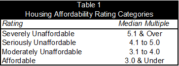
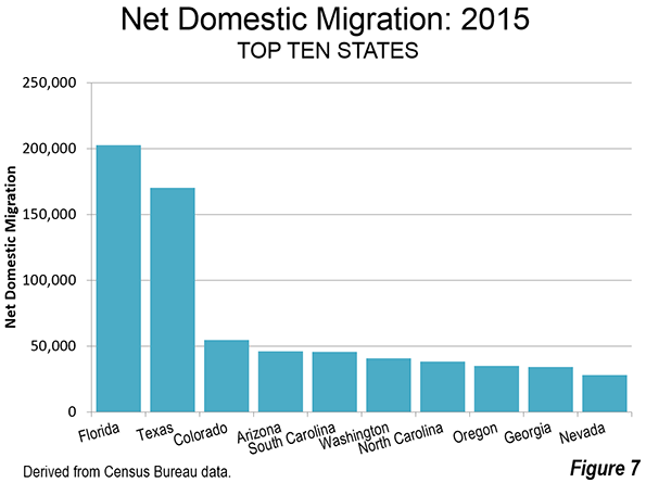
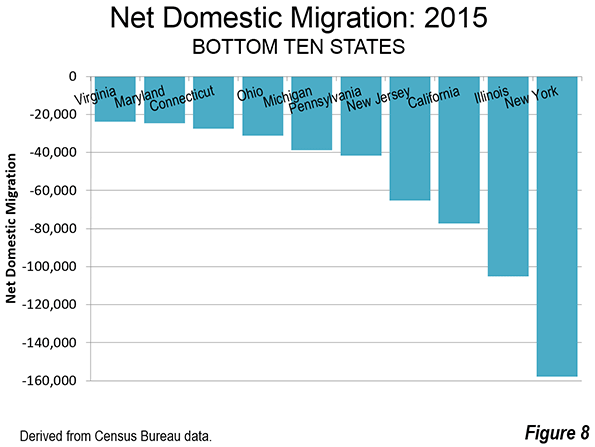
    The Bottom 10: Least Affordable Major Metropolitan Markets

    The kinds of restrictions on development that Senator Day outlines are evident in the most unaffordable metropolitan areas.

    For the fifth straight year, Hong Kong had the least affordable housing.  Its median multiple was 19.0. Sydney became the second least affordable, at 12.2, leaping by 3.2 points, the largest annual increase ever recorded among major markets in the Survey. Sydney displaced Vancouver, which had the third least affordable housing among the major markets, with a median multiple of 10.8. This is up from 10.6 last year. Each of these is the highest median multiple recorded in these markets in the history of the Survey.

    Three metropolitan markets tied in fourth position with a median multiple of 9.7, San Jose, Melbourne and Auckland. San Francisco was the 7th least affordable market, with a median multiple of 9.4, followed by London (8.5). San Diego and Los Angeles, which both had a median multiple of 8.1 (Figure 1).

    Urban containment markets clearly and nearly perennially suffer declines in housing affordability. In 2013, the same ten metropolitan markets were the least affordable and had an average median multiple of 9.1. By 2015, their average median multiple had risen to 10.5. Housing affordability deteriorated in all 10 markets (house prices rose faster than incomes). This loss in housing affordability was at least 14 times the loss in the 10 most affordable markets (below).

    The Top 10: Most Affordable Major Metropolitan Markets

    Again, the United States, with its multiple regulatory variations accounted for all of the top 10 in housing affordability (actually the top 12, because of a four way tie for ninth position). Buffalo, Cincinnati, Cleveland and Rochester had the most affordable housing, with a median multiple of 2.6. Pittsburgh ranked 5th, at 2.7. Detroit, Grand Rapids and St. Louis tied for 6th, at 2.8. The tenth place tie was between Columbus, Indianapolis, Oklahoma City and Kansas City, with a median multiple of 2.9.

    By contrast, the top ten markets experienced relatively little deterioration in housing affordability over the past two years. In 2013, their median multiple averaged 2.6, and rose to 2.7 in 2015 (Figure 1). The housing affordability deterioration in the bottom 10 markets (all urban containment markets) was 14 times as high, as noted above.

    Among the five megacities (over 10 million population) in the Survey, Osaka-Kobe-Kyoto had the best housing affordability, with a moderately unaffordable median multiple of 3.4.
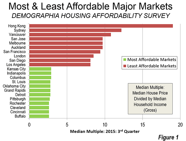
    All Markets

    Overall, the Survey included 368 markets. The most favorable housing affordability was in Ireland, with a median multiple among the markets of 2.8. This was the third year in a row that Ireland had the best housing affordability. In the nine prior years of the Survey, the most affordable housing had always been in either Canada or the United States (Figure 2).

    The United States was the second most affordable in 2015, with a median multiple of 3.5. Canada and Japan tied for third, with median multiples of 3.9. Four geographies with virtually universal urban containment policy were the least affordable, the United Kingdom (5.1), New Zealand (5.2), Australia (5.6) and Hong Kong (19.0).

    Singapore, though seriously unaffordable at 5.0, is far more affordable than its long-time rival,  Hong Kong (19.0). Each has virtually no suburban or rural hinterland and high population density. Yet there is a serious difference in housing policy. In contrast to Hong Kong, Singapore’s e Housing and Development Board, which accounts for approximately 90 percent of housing (which after sale is privately owned) has increased production and reduced new house prices which has led to a lowering of resale house prices as well.

    A Wholly Contrived Crisis

    Senator Day characterizes the housing affordability crisis “wholly contrived,” and “a matter of political choice… the product of restrictions imposed through planning regulation and zoning.” Senator Day calls the economic consequences of present land use policies “devastating.” He argues that governments and central banks have been too hasty to blame unprecedented housing affordability losses on demand factors, while missing the “real culprit,” which is the “refusal of … governments … to provide an adequate and affordable supply of land for new housing stock to meet demand (typically urban containment policy).

    Without reform, prospects for middle income households are grim in the metropolitan areas with urban containment policy. Housing affordability can be expected to deteriorate more, with dire economic and social consequences. According to London School of Economics and Political Science economists Paul C. Cheshire, Max Nathan and Henry G. Overman (see: People Rather than Places, Ends Rather than Means: LSE Economists on Urban Containment).

    "The problem is it is utterly unviable in the long term. With every passing decade the problems would get worse, the wider economic costs would become more penalising, the economy and monetary policy more unmanageable and the outcomes – the divide between the property haves and the property have-nots – more unacceptable."

    Wendell Cox is Chair, Housing Affordability and Municipal Policy for the Frontier Centre for Public Policy (Canada), is a Senior Fellow of the Center for Opportunity Urbanism (US), a member of the Board of Advisors of the Center for Demographics and Policy at Chapman University (California) and principal of Demographia, an international public policy and demographics firm. He is co-author of the “Demographia International Housing Affordability Survey” and author of “Demographia World Urban Areas” and “War on the Dream: How Anti-Sprawl Policy Threatens the Quality of Life.” He was appointed to three terms on the Los Angeles County Transportation Commission, where he served with the leading city and county leadership as the only non-elected member. He served as a visiting professor at the Conservatoire National des Arts et Metiers, a national university in Paris.

    Photo: Sign advertising new house and land packages starting in the $170,000s. Suburban St. Louis, third quarter 2015 (photo by author).

  • Suicide: The New Curse for Boomers?

    We often associate suicide with the crises of youth, or the despair of the old. Yet the group that is now experiencing the biggest surge in suicide is in the Baby Boomer Generation; from about 14 percent in the year 2000 to about 19 percent in 2013. Baby boomers rose to 37.5% of all suicides in 2010. That is now the highest suicide rate of any existing age bracket (shown in figure 1). In order to find a way to reduce this percentage, one must understand why this is happening in the first place.  

    Before tackling the issue of suicide, it is important to understand what it means to be a baby boomer. Baby boomers were those born in the United States between the years 1945 and 1964. Total births per year during that period “grew from 2.3 million to 4.3 million and then fell to 3.2 million.”  This surge in births was largely due to the rapid expansion of the job market created by World War II. The subsequent financial comfort produced an overall positive attitude towards childbearing, causing what is known as the baby boom. These baby boomers would live to see a time where women were joining the work force in large numbers, automobiles were becoming popular, and the U.S. was in a war with Vietnam.

    So why would people born in such an exciting time be committing more suicide today? A study done by Katherine A. Hempstead and Julie A. Phillips tries to decipher whether this sharp increase in Boomer suicide rate is due to personal (e.g. mental and physical health), interpersonal (e.g. divorce), or external circumstances (e.g. economic and political). The data for this study was collected from the National Violent Death Reporting System (NVDRS) and from the CDC. In 2010, suicides from personal circumstances decreased to 79.8%, interpersonal circumstances decreased to 40.4%, and external circumstances increased to 37.5% issue lies in the 4.6% increase in suicides due to external circumstances. This pattern suggests that the large increase in suicides among this generation due to changes in their external circumstances.  


    Figure 1: Suicide rates of different age brackets from 2000 to 2013 (afsp)

    Most reports of suicide due to external circumstances were related to job, financial, or legal distress. A possible explanation of this reporting is the correlation between these suicides and the effects of the Great Recession. The Great Recession, triggered by the bursting of the 8 trillion dollar housing bubble in 2007, caused the U.S. labor market to lose 8.4 million jobs and reduce wages all across the board.

    Although every demographic was hit by the Great Recession, the baby boomer generation was hit the hardest in terms of lost property value, household finances, and lost retirement savings. As one researcher discovered, “27 percent of those aged 50 to 64 experienced reduction in salaries. This was higher than any other age group”   

    This downward trajectory was more difficult for baby boomers to deal with for three known reasons. The first is that Boomers were born at a time of economic optimism, so they tend to have had high expectations for their financial futures. Seeing the wealth that they spent their lives accumulating dwindle away because of an economic downturn may have been a large blow to their prides/egos.

    The second reason is the feelings of losing power that many baby boomers must be going through. The daily spending of boomers decreased from 114 million in 2008 to 55 million in 2009. Even with the recent 15 million dollar spike, boomer daily spending was still down to 105 million per day as of December, 2015. (Fleming).

    The third reason is the current age that baby boomers are currently living through. When hitting the age brackets of 50’s and 60’s, people usually begin considering what they will do to afford retirement. Entering a time of financial instability makes these considerations problematical, especially for those in the middle and lower classes. A study done in 2007 called Money Across Generations shows “51% of boomers reporting being ‘very confident’ of their ability to assure a ‘financially secure life’ for themselves and their children. By 2011, that number had fallen to 33%.”   The combination of financial fear as well as possible mid-life crises makes possible suicide completely understandable.

    Fortunately for the baby boomer generation, the economy is slowly growing back to a relatively normal state. At about 2.2 percent GDP growth per year since 2009, America’s financial future seems optimistic. The hope is that this will be enough to reduce the suicide rate of baby boomers.

    That outcome seems doubtful, however. In fact, suicide rates of baby boomers are expected to go up in the coming years. Figure two shows suicide rates of different age groups in the years 1999 and 2007. Until recently, suicide rates among those in their 40s and 50s seemed to level out or even decrease. The common explanation for this is the level of contentment some often feel in their middle ages. They are less likely to commit suicide because they are often focused on their careers, their children, and even sometimes their grandchildren. Many of the stresses of youth are gone yet they still have the vitality necessary to chase after the things they want. On top of that, they often have a much healthier diet than other age groups, so their risk for chemical depression is much lower.

    This makes the current upsurge in boomer suicides all the more distressing.   At a time when traditionally suicide rates are low, those of boomers are now actually higher than those of any other generation. That includes the 15 to 24, 25 to 44, and the 85 (asfp) and older demographics, all of which traditionally suffer higher suicide rates.   

    Baby boomers are headed into a new stage of their lives, which is usually called the golden years. That name is very misleading however, as suicide rates among the elderly are consistently higher than those of other ages. This is because many elderly people live with undiagnosed cases of depression, which are often worsened by the loss of a spouse or the stress of living with a chronic illness. They also tend to lack adequate social interaction, which is important in fighting the loneliness that often exacerbates depression. Lastly, they are much more likely to carefully plan out suicide attempts. That, combined with their more fragile bodies, makes their suicide attempts much more likely to be successful  

    Figure 2: Suicide Rates Among Ages, 1999 and 2007 (afsp)

    One theory suggests that depression is not decreasing because men are not getting the emotional help that they so desperately need. Figure 3 shows the separated suicide rates of males and females between 1981 and 2013, inclusive (afsp). In that window, the trend stays relatively the same; males are committing suicide more than twice as much as women. Since women are diagnosed with depression twice as much as men, this disparity is surprising. A study by Lisa A. Martin, Harold W. Neighbors, and Derek M. Griffith explores this disparity and finds that men may be equally depressed, but they seem less equipped to handle it.


    Figure 3: Suicide Rates by Sex from 1981 to 2013 (Milburn)

    Some of this comes from today’s social conditions in which boys have been told that they are not supposed to express sadness, as it can be deemed a “unmasculine.” As a result, they feel less willing to see counselors or get help in dealing with their emotional issues. Instead, they turn to other means of consolation such as bouts of anger or substance abuse. That is why they are less often diagnosed with depression.

    One surprising finding is that suicide among boomers is not only a largely male phenomenon, but also largely a white one. Figure 4 shows the suicide rates between 1990 and 2010 by race/ethnicity. According to the data, White people have the highest suicide rate of any ethnicity, followed closely by Native Americans. All minorities, other than Native Americans, have a much lower suicide rate. This trend seems counterintuitive since white people are known to have less financial instability. A theory suggests that white people are less used to adversity, which makes it difficult for them to deal with the difficulties of everyday life. They also may have an unrealistic view of how easy life will be as they grow up, making them more often disappointed with the end result. Other ethnicities may also have a more positive outlook or have stricter religious/moral beliefs on suicide.


    Figure 4: Suicide Rates by Race/Ethnicity from 1990 to 2010 (afsp)

    Though there have been a lot of generalizations throughout this paper, it is important to note that every individual is unique. Although race, gender, generation and other demographics may tell a lot about a person, there is also much more that can only be found by getting to know a person individually. Helping baby boomers to be happier and commit less suicide is going to take personal care and compassion instead of a single standard approach.  An improved economy may help as well in preventing a tsunami of boomer depression and suicide in the years ahead.

    Tyler Hishmeh is a senior business student at Chapman University. When not at school he’s usually training in Muay Thai or hitting balls at the golf range.

  • American Extremism is a Product of American Apathy

    Much research has gone into studying the political polarization that has gripped American politics. Why have the two American parties moved to the extremes? One explanation, championed by MIT Professor Noam Chomsky is that the Republicans have ceased to be a functioning party. Chomsky claims that the GOP has wholly given itself over to the rich, and in order to win elections has been forced to appeal to the radical fringes of American society, who he defines as Evangelicals, nativists, racists and gun fanatics.

    Peter Wehner, Senior Fellow at the Ethics and Public Policy Center, argues that rather than the GOP moving to the right, it’s the Democrats who have moved dramatically to the left. Wehner argues that while Bill Clinton revived the Democrats from nearly twenty years of political defeats by abandoning left-wing politics and embracing centrist policies, Obama ran as an unabashed liberal, and today Hillary Clinton and Bernie Sanders have only followed suit. There may be other, less directly political reasons.

    A Princeton study claims that political polarization has been a frequent occurrence as inequality has increased in the United States, and extremism has been a regular response to economic woes. Another study by UC Berkeley places the blame not on the parties or society, but on the voters themselves, who political scientist David Broockman argues have spontaneously become fanaticized, even more so than their representatives.

    These are all interesting ideas, but most lack hard numbers, and what little numbers are offered come from selective results of specific poll questions asked to a few thousand people at most. If we were to look at the total voting practices of the American people, what insight could we draw? I set about to do just that and have concluded that the driving force of political polarization in America is from profound voter apathy. I am not saying that Chomsky, Wehner, Broockman or any other political theorists are necessarily wrong, but while their arguments seek to explain why the two extremes have become ascendant they fail to address or minimize the shocking disappearance of the moderates in both parties. The disappearance of the center, particularly in the primaries, explains political polarization in America, not the rise of the fringes.

    Pundits and political experts have placed far more emphasis on primaries over the past six years due to the rise of the Tea Party. Despite the evident surge in media attention by elites and massive donations by the super-rich on both sides, the presence of voters in the primaries has been collapsing to all-time lows. In 1972, 30.9% of registered voters participated in the primaries. That number has dropped nearly every year, to 21.7% in 1992 at the beginning of the Clinton era, and 19% in 2000. In 2008, in the heavily-contested race between Clinton and Obama, primary turnout hit 30.3%. But that spike proved to be a one-time oddity, as in 2012 the primary voter rate for both parties declined to an all-time low of 15.9%, or nearly half the rate forty years ago.

    What makes this even more striking is an accompanying decline in total voter registration. In 1972, 72.3% of Americans eligible to vote were registered. In 2012 that number dropped to 65.1% (in 2014 this declined further to 64.6%) for a 7.9 percentage point difference. The drop in voter registration combined with a drop in primary voter participation of eligible voters has resulted in an overall decline of 54% in primary voter participation from the last generation to the current one. More than half of voters have ceased to engage in the ideological formation of our two parties in any meaningful way, leaving the most die-hard 46% to dominate politics. To put that in perspective, let us hypothesize that 7 out of 10 Republicans and a similar 7 out of 10 Democrats have moderate, mostly rational views. Now imagine that the most moderate 5 of 10 left each party; this would leave a distribution of 3 fringe voters for every 2 moderates. Even if the center had previously been the supermajority a drastic decline of the sort we have witnessed between 1972 and 2012 could easily explain the sudden extremism of the party. This demographic collapse in primary voters may explain the rise of extremism far better than the supposition that the majority of people on the right and left have substantially changed their ideologies and adopted extremist positions.

    Any serious conversation on the polarization of American politics cannot ignore the drop in primary voters, though up to this point it mostly has. While the general elections decide whether conservatism or liberalism are dominant at the time, the primaries decide what conservatism and liberalism are. In 1972 when twice as many Republicans participated in the primaries, some of the main points in their platform were nuclear arms reduction, increased government protection for the environment, a 7% tax increase on those making $100,000 or more, and the increase of “trade and cultural exchanges as ways of improving understanding between [the U.S. and China].” In 1972 the DNC supported the Drug War and efforts to maximize coal efficiency. These policies would be unthinkable to GOP and DNC primary voters forty years later. This may have more to do with the fact that the most moderate 60% of voters have disappeared from the political landscape, rather than a change in ideology from the majority of voters.

    What effect does the disappearance of the center have on the structure of American politics? To understand this it is necessary to first outline the general election process. Of the 322 million American citizens only 208,012,000 (64.6%) are registered to vote. 32% of Americans identify as Democrats while 23% identify as Republicans or 67 million and 48 million respectively, with the rest identifying as Independent or belonging to third parties. In 2012, Mitt Romney was only able to win 10 million votes out of 19 million primary votes cast on his way to the nomination. Considering that the Republican Party has 48 million members, hardly a third of Republicans showed up to the polls, perhaps fewer due to Independents voting in the twenty-seven open primaries. The Democratic Party appears to have even lower turnout than the Republicans based on the 2004 race, but even if the Democrats exhibit similar voting patterns, one can expect less than 27 million to vote, in a party comprised of 67 million people.

    Furthermore, one only needs around 50% of the primary vote to win the nomination, and the last two primary competitions were near that figure (53% for Romney 2012, 47% for Obama in 2008). In order to win the GOP nomination Trump, Cruz, Carson or whoever takes 2016’s trophy will only need to win in the range of 10 million votes, or 3% of the total US population. Meanwhile, in order to win the DNC nomination, Clinton or Sanders will only need to win roughly 14 million votes, or 4% of the total US population, meaning that the ideologies of America’s two ruling political parties are decided by a mere 7% of the total population. To put this in perspective, in 1972, 22.3% of Americans who were eligible to vote participated in the formation of their party’s ideology.

    Chomsky and Wehner are not necessarily wrong. Perhaps the GOP has become too dependent on rich donors to connect with the average voter, while the Democrats have moved too far to the left for many who constituted Bill Clinton’s former base. But what is clear is that forty years ago nearly a quarter of eligible Americans voted in the primaries, playing a direct hand in the formation of their party’s ideology, while today that number is closer to one in ten. While the near-universal consensus among pundits and political theorists is that politics has become too polarizing, this extremism has emerged not from fanaticized voters, but from an apathetic middle that has almost completely disappeared from the political landscape. The absence of moderate voters has only had a multiplying effect, as extremist candidates drive out even more centrists from the voting pool.

    Gary Girod is currently pursuing a Ph.D in modern Western European labor history at the University of Houston, and graduate of Chapman University.

  • In Southern California, It Takes an Assortment of Villages

    Among urban historians, Southern California has often had a poor reputation, perennially seen as “anti-cities” or “19 suburbs in search of a metropolis.” The great urban thinker Jane Jacobs wrote off our region as “a vast blind-eyed reservation.”

    The Pavlovian response from many local planners, developers and politicians is to respond to this criticism by trying to repeal our own geography. Los Angeles’ leaders, for example, see themselves as creating the new sunbelt role model, built around huge investments Downtown and in an expensive, albeit underused, subway and light-rail network.

    Yet the notion of turning Southern California into a dense, New York hybrid makes very little sense. Nor has it done much for the regional economy, certainly in Los Angeles. The City of Angels thrived during its period of development into a multipolar region; in the 21st century, as Downtown has gained a few thousand hipsters, the rest of the city has lagged economically while population and job growth – including in tech – has been more robust in the surrounding counties of Orange, Riverside and San Bernardino.

    Building off Strength

    Southern California, even before the advent of the freeways, developed along the lines of an “archipelago of villages.” Even Downtown Los Angeles, the one legitimate urban core in the region, lost its central relevance by the 1930s and, despite all its self-promotion, employs close to the smallest share – well short of 3 percent – of the regional workforce of any large region in the country.

    In contrast, the two fastest-growing areas in Southern California – the Inland Empire and Orange County – are arguably the largest regions in the country without a real downtown. Rather than a negation of urbanity, as some suggest, these areas are nurturing an expansive archipelago of smaller hubs, each serving distinct geographies, populations, tastes and purposes, and constitute the building blocks for Southern California’s urban future.

    Read the entire piece at The Orange County Register.

    Joel Kotkin is executive editor of NewGeography.com and Roger Hobbs Distinguished Fellow in Urban Studies at Chapman University, and a member of the editorial board of the Orange County Register. He is also executive director of the Houston-based Center for Opportunity Urbanism. His newest book, The New Class Conflict is now available at Amazon and Telos Press. He is also author of The City: A Global History and The Next Hundred Million: America in 2050. He lives in Orange County, CA.

  • Why High Taxes Aren’t the Only Reason GE Left Connecticut

    General Electric, unhappy with a recent corporate tax increase in Connecticut, has now announced that it is relocating to Boston’s south waterfront. Indeed Connecticut’s tax climate is bad, ranking 44th according to the Tax Foundation, but GE’s move points to much bigger problems in the state.  I examine this in my new piece over at City Journal. Here’s an excerpt:

    For decades, nearby New York City’s pain was Connecticut’s gain. New York was a grim, dangerous, failing city that almost went bankrupt in the 1970s. More than 100 Fortune 500 companies fled during that era, many heading to suburban New Jersey and Connecticut—including GE, which moved in 1974 from 570 Lexington Avenue to Fairfield, Connecticut. The same story played out in cities across America, with corporations fleeing dying downtowns for the safety of the suburban office campus.

    Today, cities are back. The policing revolution—helped by the waning of the crack epidemic—made cities safe again. Core public services were slowly restored, parks were rebuilt, and transit systems were cleaned up and refurbished. Investment started returning. The structure of the economy changed, too. Starting in the 1990s, technology radically transformed the business world and is now a major industry in its own right. The financial industry was deregulated. Globalization drove demand for new types of business services, reinforcing the need to stay on top of a constantly shifting landscape. People with advanced, specialized knowledge are the ones who help companies innovate now. These employees work in highly interactive ways that benefit from clustering together—disproportionately in urban areas like New York, Chicago, and Boston.

    Click through to read the whole thing.

    Aaron M. Renn is a senior fellow at the Manhattan Institute and a Contributing Editor at City Journal. He writes at The Urbanophile, where this piece originally appeared.

    Photo: The former General Electric/Remington facility in Bridgeport, CT. The buildings have been demolished in recent years.

  • Is California’s Economy Swell?

    Every now and then, something happens to cause California’s comfortable establishment to celebrate the state’s economy.  Recent budget surpluses and jobs data have provided several opportunities, never mind that these are hardly summary statistics.  They don’t tell the complete story.

    The celebrants conveniently ignore California’s nation-leading poverty, huge inequality, persistent negative domestic migration, and the fact that with about 12 percent of the nation’s population, California is home to about 30 percent of the nation’s welfare recipients.

    A recent Next 10 report, prepared by Beacon Economics, has provided another opportunity for celebration.  The Los Angeles Times’ coverage of the report is here.  Their reporter, Chris Kirkham, provides a straight-forward summary, including charts not in the original report and quotes from people who might not be expected to be mindless cheerleaders.  Full disclosure: He tried to interview me, but I was unavailable.

    My favorite coverage was a celebratory piece at The National Memo, by one Froma Harrop, titled High Taxes, Regulations, and a Swell Economy.  Try telling the children of one of the several families living in a single-family home, children with little prospect of ever living a middle-class lifestyle, that California’s economy is swell.  Try telling that to the huge numbers of long-term unemployed in California’s Central Valley, or one of the many people who, like Martin Saldana, have been poorly served by California’s swell economy.  California’s economy might be swell, but only for a portion of the population.

    Harrop, and apparently large numbers of California’s comfortable establishment, don’t appear to care much about their less-fortunate fellow citizens.  She’s channeling Marie Antoinette when she says “OK.  Those who can’t pay the price—or who want bigger spaces—can and often do consider other parts of the country.”

    Right.  What about all the people who provide services to California’s wealthy coastal residents in places like Monterey and Santa Barbara?  What about counties like Napa and Ventura that insist, by law, that land be set aside for agriculture, an industry that employs thousands, but can’t survive and pay wages that would allow a respectable standard of living in these high-cost counties?

    This time the celebration turns out to be about nothing.  The Next 10 report is seriously flawed.  The first hint of weakness is on the first page of the actual report, page 4 of the document, where they say “This analysis is trying to show….”  Serious analysis attempts to answer questions, not support a pre-conceived opinion.

    The next clue is Table 1.  In a report filled with time series, the authors present data on one point in time, say that California has the fourth highest net job growth rate, and conclude all is good.  Why would they do that?  Could it be that the time series doesn’t support the narrative?

    Actually, they used the only recent year where California performed significantly better than the United States.  Here’s the data in time series.  It’s similar to a chart in the Los Angeles Times’ piece.  We compare California’s net job creation rate with that of the United States:

    Doesn’t look so spectacular, does it? 

    Maybe the rankings would look better?  Below is a chart of California’s ranking going back to 1977.  Remember, one is good, 50 is bad:

    The narrative isn’t supported here either.  California has only ranked in the top 20 twice since 2006, and over that time it’s been in the bottom 20 three times.  Indeed, California has been in the top ten only once since 2001.  That was the data point they used in their analysis.

    The report has other weaknesses.

    Consider the charts 4a through 4f.  Combined, they purport to show that for California, firms of all ages were net job creators every year.  There is no year where they show firms of any age group having net job losses.  Given the well-documented massive California job losses in the past few recessions, this is simply unbelievable. 

    Indeed, a close look at the charts yields apparent internal inconsistencies.  Chart 4e is an example.  In 2002, 2009, and 2010 job destruction rates were far greater than job creation rates, but somehow they report that net job creation rates managed to remain positive in each of these years?  For the record, we built a chart using aggregate data that show net job loss rates for all California establishments of -2.2, -5.8, and -3.1 for the years 2002, 2009 and 2010, respectively:

    California’s apologists don’t do themselves any favors by resorting to such shoddy and misleading work.  California has had some good job years recently.  It also has some huge strengths.  These include a world-leading venture capital infrastructure, a world-leading climate, and a fantastic location between Asia and the massive American consumer market.

    California has some huge challenges too, including the poverty, inequality, and limited opportunity for minorities.  Ignoring these challenges and exaggerating the state’s strengths is a guarantee that California will never be the land of opportunity that it was — or could be.

    Bill Watkins is a professor at California Lutheran University and runs the Center for Economic Research and Forecasting, which can be found at clucerf.org.

  • Around The World, The Tide Is Turning Against Megacities

    The massive construction waste collapse last month in Shenzhen reflects a wider phenomenon: the waning of the megacity era. Shenzhen became a megacity (population over 10 million) faster than any other in history, epitomizing the massive movement of Chinese to cities over the past four decades. Now it appears more like a testament to extravagant delusion.

    In 1979, Shenzhen was a small fishing town of roughly 30,000 people when it became a focus of former Chinese leader Deng Xiaoping’s first wave of modernization policies. Now it is a metropolis of 12 million whose population grew 56 percent between 2000 and 2014. For years, it stood as the brash wunderkind of Chinese cities, proud of its gleaming infrastructure that is now increasingly suspect.

    The Shenzhen collapse came four months after a similar deadly public safety disaster in Tianjin, another relatively new megacity, where an explosion at a chemical warehouse killed 173 people. And of course, there is the widespread urban air pollution that is hazardous in Beijing and simply noxious elsewhere. Simply put, the once compelling “economies of scale” offered by increasing the size of cities have broken down in urban agglomerations over 10 million people, where their size has now become encumbrances to further growth, not to mention the happiness and health of their citizens.

    One big problem with megacities, the Chinese are discovering, is their impact on property prices and fertility. Chinese may have been freed last year from the tyranny of the one-child policy, but don’t expect a baby boom in any of the biggest, most glamorous cities. Shanghai has among the lowest fertility rates in the world, one-third of the replacement rate. Beijing and Tianjin suffer a similarly dismal fertility rate.

    This reflects both crowded conditions and insanely high property prices that, on an income-adjusted basis, now are far higher than those in expensive world cities like Vancouver, London, Sydney, San Francisco and New York — two times higher in some cases.

    The population growth rate in Beijing and Shanghai has dropped dramatically since 2010, according to  demographer Wendell Cox. The population of China’s capital expanded 3.9 percent a year from 2000 to 2010; growth slowed to 2.3 percent annually from 2010 to 2014. In Shanghai the population growth rate for the same periods slowed from 3.4 percent annually to 1.3 percent. High degrees of pollution have led at least some affluent urban Chinese to move back toward the countryside, as well as to cleaner, less congested regions in Australia, New Zealand, and North America.

    Nonetheless, the Chinese government remains committed to driving further urbanization to boost economic growth, aiming to turn more rural farmers into city-dwelling, free-spending consumers. In 2014 the government set a goal to increase the ratio of the Chinese population that lives in cities to 60% by 2020 from 53.7% then. But  the urbanization strategy aims to funnel migrants to small and midsize cities with less than 5 million residents, maintaining tight restrictions on legal migration to the megacities.

    To make the smaller cities more attractive Beijing promised to ramp up infrastructure spending, and local governments have rolled out housing subsidies, tax breaks and cheaper mortgages to lure migrants. Whether that will be enough to counteract the pull of the megacities’ bigger job markets is an open question.

    Peak Megacity In Much Of The World

    Until recently the worldwide trend toward megacities — there were 34 in 2014 — has seemed relentless. But in much of the world this trend is slowing down. The populations of Europe and North America are growing slowly, with the exception of London and Moscow. In the last decade the population of New York City grew at roughly one third the relatively low national rate.

    Where megacities can be expected to grow in the future are in the backwaters of the global economy, in Africa and parts of Asia, where the most rapid population growth and urbanization is taking place.

    In an impressive 2011 study, the consultancy McKinsey predicted that through 2025, population growth would shift to 577 “fast-growing middleweight” cities many of them in China and India, while, in contrast, megacities would underperform economically and demographically.

    In India as well, population growth rates have slowed considerably for two of its three largest cities, Mumbai and Kolkata, while New Delhi has become the country’s largest megalopolis. More rapid population growth has taken place in mid-sized cities such as Hyderabad, Pune, Chennai, and Bangalore, as well as in smaller cities like Coimbatore, home to 2.5 million, that have seen much of the industrial and tech growth in the country.

    Urban decentralization has become something of a theme of the government of Prime Minister Narendra Modi, who implemented a program of “rurbanization” as Chief Minister of the state of Gujarat. Villages are still home to the vast majority of Indians and serve as the primary source of new urban migrants. Modi speaks of human settlements with the “heart of a village” and developing “the facilities of the city.”

    Singapore-based scholar Kris Hartley notes a shift of industrial and even service businesses to more rural locales in Southeast Asian countries like Thailand, Vietnam and Indonesia, and parts of China. As megacities become more crowded, congested, and difficult to manage, Hartley suggests, companies in these areas are finding it more convenient, less costly, and better for the families of their employees to locate farther from giant cities.

    Where Megacities Will Grow Fastest

    According to U.N. estimates, 99 percent of all population growth between 2010 and 2100 will take place in developing countries, some 83 percent in Africa alone followed by 13 percent in Asia, particularly the less developed parts.    

    Rather than an indicator of the future, megacity growth in these regions increasingly is something of a lagging indicator of an early phase of urbanization. Growth projections suggest the evolution of two more megacities in Africa: Johannesburg-East Rand (South Africa) and Luanda (Angola).  They will join Lagos in Nigeria, as well as the rapidly growing and poor megacities Cairo and Kinshasa, as well as Karachi in Pakistan

    As is the case in India, these cities will likely be most prolific in producing slums. Worldwide there are now as many as a billion denizens of these depressed areas, threatening the social stability of not only of their countries but also the world, as they tend to generate high levels of both random violence and more organized forms of thuggery, including terrorism.

    One does not have to be a Gandhian idealist to suggest that perhaps dispersion, not concentration, provides a better model for future urban growth in developing countries, offering more space, privacy, and connection to nature, note social scientist Robert Obudho. A focus on large city development, he argues, will exacerbate problems, while shifting toward smaller-scale areas could encourage more “self-reliance, spatial equity, [and] local participation.”

    Ultimately, a shift toward dispersion—both within regions and between them—has been made more feasible in the developing world, as in the West, by new technology. Smaller cities and even villages are no longer as economically isolated and are brought closer to the outside world through the use of cell phones and the Internet. Economic growth in these places could help stem megacity migration by closing the gaps in living standards of rural people relative to their urban counterparts, as has occurred in western countries.

    Such ideas need to be heard more in the discussion about cities in the developing world. We need to confront the urban future with radical new thinking. Rather than foster an urban form that demands heroic survival, we should focus on ways to create cities that offer a more prosperous, healthful and even pleasant life for their citizens.

    Joel Kotkin is executive editor of NewGeography.com and Roger Hobbs Distinguished Fellow in Urban Studies at Chapman University, and a member of the editorial board of the Orange County Register. He is also executive director of the Houston-based Center for Opportunity Urbanism. His newest book, The New Class Conflict is now available at Amazon and Telos Press. He is also author of The City: A Global History and The Next Hundred Million: America in 2050. He lives in Orange County, CA.

    Photo: Shenzhen:  Binhe Avenue from the Shun Hing Tower (by Wendell Cox)

  • China’s Navy: A Maritime Power?

    When China’s navy looks beyond its coastal waters, which it increasingly does, it sees a kind of Great Wall. The Chinese call this the “First Island Chain,” a line of islands, some small, others huge, extending from the Japan archipelago to the north, the Ryuku island chain past Taiwan, and the Philippines to the south. The waters within this arc are considered an integral part of China itself.

    Increasingly, China’s sailors are penetrating this barrier through various choke points to gain access to the broader Western Pacific Ocean. In late November, a large formation of Chinese long-range bombers and support craft passed through the gap between Okinawa and the island of Miyako, the so-called “Miyako Channel”.

    The Miyako Channel is strategically vital for China because it is one of the few international waterways through which the Chinese navy and air can access the Pacific Ocean without violating somebody’s space. It is also located close to the Japanese-controlled Senkaku islands which are also claimed by China.

    The first time a Chinese H-6K bomber passed through the channel was September, 2013; the first multi-plane formation to use this passageway was in May this year, and late this year an unusually large formation of eight bombers and support aircraft passed through the gap, flew around the Pacific, and then returned to home base through the channel.

    The H-6K is a modified and much improved version of an old Soviet Tu-22 bomber, known as a “Badger”. It has been configured to hold cruise missiles under its wings or in its bomb bay. The planes reportedly flew about 620 miles into the Pacific before returning to their home base near Shanghai.

    Both the Chinese navy and the air force are learning to conduct extended maritime operations far from home waters and into the wider Western Pacific. Of course, China has maintained a permanent, rotating flotilla of two destroyers and a supply ship in the waters off the coast of Somalia and the Gulf of Aden since 2009. Unlike Japan, it does not have a permanent base in that region, although it is seeking one.

    In March, 2014, two Chinese warships docked at Abu Dhabi, the first time a Chinese fleet had made a port call on the Arabian Peninsula since the days of the Treasure Ships of Admiral Zheng He. In 2013, the Chinese navy made its first goodwill visit to South America, and it stationed a guided missile frigate in the Mediterranean to help escort ships removing chemical weapons from Syria.

    These missions are not war fighting, but the ships have enhanced capabilities for operating in seas far from home. They have gained experience in coordinating with other naval services on anti-piracy patrol, and exercised with other navies, including those of South Korea and Pakistan.

    In the summer of 2013 a Chinese naval flotilla passed through the Soyu Strait, which separates Hokkaido from the southern tip of Russia’s Kurile islands; they returned to their home base through the Miyako Channel. The People’s Daily trumpeted this maneuver as if it were a major triumph. Never mind that these narrow waters are international passageways or that they could easily be closed off if the Japanese decided to do so.

    China routinely conducts naval and air exercises beyond the First Island Chain as far away as the Philippine Sea, and the number of Chinese naval flotillas passing through the First Island Chain has increased significantly in recent years. There were two in 2008 and 2009, four in 2010, five in 2011, and eleven in 2012. In 2012 surface combatants were deployed seven times to the Philippine Sea; they were deployed nineteen times in 2013. The Maneuver-5 exercise in the Philippine Sea involved units from all three of China’s fleets, its largest open-ocean exercise to date.

    The Chinese navy has now penetrated all of the Western Pacific choke points along the chain, from the Tsuruga Strait separating Hokkaido from Honshu in northern Japan to the Bashi Strait separating Taiwan from the Philippines and the Sunda Strait in Indonesia. In October, 2012 a flotilla exited the East China Sea through the narrow passage way between Taiwan and Japan’s Yonaguna island in the Ryukyu chain (where the Japanese army has constructed a surveillance radar).

    This is thought to have been a signal from Beijing of displeasure over Tokyo’s decision to buy the Senkaku islands a month earlier. Later, two Sovremnny Class destroyers and two frigates exited the chain through the Miyako Strait and returned via the waters separating Yonaguna from Taiwan.

    The navy has steadily progressed from a handful of vessels, to multi-fleet (i.e. elements from all three of China’s fleets), to combined operations with submarines, drones and long-range bombers. Not only does China maintain a permanent anti-piracy force in the Indian Ocean, it now routinely conducts naval exercises and operates beyond the First Island Chain, says the US National Defense University.

    This year China was invited to participate in the Rimpac exercise in waters near Hawaii. It sent a destroyer, but also an intelligence-gathering ship, making it possibly the first time a nation spied on an exercise in which it was a participant.

    When queried as to its purpose and intentions of these missions, Beijing has a standard reply: “The training is in line with the relevant international practices and is not aimed at any one country or target and poses no threat to any country or region.”

    In June, 2015, Beijing issued a white paper on its defense priorities in which it stated what has been obvious to any naval planner paying attention: that China’s naval interests are no longer limited to its coastline, but span the globe. “The traditional mentality [going back to Mao Zedong] that the land outweighs the seas must be abandoned,” the paper states.

    That the Chinese navy will enhance its capabilities for “open seas protection” just puts into words what is actually happening. The white paper leaves little doubt that China is intent on transforming itself into a modern maritime power, capable of challenging Japan or the US in Asia and elsewhere.

    Todd Crowell is the author of The Coming War, published by Amazon as a Kindle Single.

    First Island Chain (perimeter marked in red) map by Suid-Afrikaanse (GFDL) via Wikimedia Commons

  • America’s Next Boom Towns: Regions to Watch in 2016

    Which cities have the best chance to prosper in the coming decade? The question is a complex one, and as the economy changes, so, too, will the best-positioned cities.

    To identify the cities most likely to boom over the next 10 years, we took the 53 largest metropolitan statistical areas in the country (those with populations exceeding 1 million) and ranked them based on eight metrics indicative of past, present and future vitality. We factored in, equally, the percentage of children in the population, the birth rate, net domestic migration, the percentage of the population aged 25-44 with a bachelor’s degree, income growth, the unemployment rate, and population growth.

    The results show two divergent kinds of ascendant cities. One is driven by the tech industry, the in-migration of educated people and sharply rising incomes; the other type is what we describe as “opportunity cities,” which tend to have a diverse range of industries, lower costs and larger numbers of families. We may be one country, but the future is being shaped by two very different urban archetypes.

    The Lone Star Model

    The most vital parts of urban America can be encapsulated largely in one five-letter word: Texas. All four of Texas’ major metro areas made our top 10. Austin, Houston, Dallas-Ft. Worth and San Antonio are very different places, but they all have enjoyed double-digit job growth from 2010 through 2014, well above the national average of 8.1%. They also all have posted income growth well above the national average.

    But the biggest divergence from the pack may be demographics. The Texas cities have become major people magnets, with huge growth in their populations of young, educated millennials and households with children. The clear star of the show is No. 1-ranked Austin, which has become the nation’s superlative economy over the past decade.

    Austin leads the pack in terms of population growth, up 13.2% between 2010 and 2014, in large part driven by the strongest rate of net domestic in-migration of the 53 largest metropolitan areas over the same span: 16.4 per 1,000 residents. The educated proportion of its population between 25 and 44 is 43.7%, well ahead of the national average of 33.6%, although somewhat below the traditional “brain center” cities of the Northeast and the West Coast.

    The other Texas cities also do well across the board, with strong domestic in-migration, low unemployment and a rising population of young families. The biggest question marks going ahead involve No. 6 Houston, which benefited heavily from the energy boom and now is dealing with the consequences of the oil price collapse. Most economists do not see a total meltdown as occurred in the 1980s, but it would not be a surprise to see Houston fall out of our top 10 until energy prices recover. Economist Patrick Jankowski projects some 9,000 layoffs in the energy sector locally in 2016 but enough growth elsewhere — for example 9,000 new jobs in medical services — to keep employment expanding, although far below the pace of the last few years. The other, less energy-dependent Texas metro areas seem likely to continue their stellar performance.

    The Flyover Superstars

    There are several dynamic, fast-growing metro areas elsewhere in the country that seem likely to increase their status in the coming years, mostly in the Southeast and the Intermountain West. Like the Texas cities, these areas enjoy lower costs than the Northeast or California, notably for housing, and tend to be pro-business. All are experiencing significant population growth.

    No. 2 Salt Lake City and No. 4 Denver have been expanding for years, with significant tech-sector growth. Both are logging population increases, with Denver benefiting from strong domestic in-migration while Salt Lake City has the highest birth rate among major metro areas, 16.9 per 1,000 women from 2010-14, largely due to its fecund Mormon population.

    The Southeast has a number of ascendant cities led by No. 5 Raleigh, which, like Austin, has emerged as a tech hot-spot. Some 49% of all Raleigh residents aged 25 to 44 have a four-year degree, higher than any other metro area in the South. The national average is 33.6%.

    The Glorious Gated Community

    Unlike the rest of our rising cities, the Bay Area’s two major metro areas — No. 3 San Jose and No. 9 San Francisco — do not boast rapid population growth, and have low rates of family formation and births. Yet the area’s technology domination has made it so rich that it blows by most regions in terms of positioning for the future.

    The big divergence here is income growth. Since 2010, the two metro areas have enjoyed the strongest expansion in earnings in the nation – 9.2% in the San Jose area between 2010 and 2015 and 7.8% in San Francisco. Silicon Valley and the Bay Area also boast extraordinarily well-educated young workforces. In San Jose 53.5% of workers aged 25 to 44 have a college degree, the third-highest share in the nation, and San Francisco ranks fourth at 52.4%.

    So why are people not flocking to these areas? San Jose is net negative for domestic migration over the time we examined while San Francisco made modest gains only after years of net out-migration. Much of the problem lies in high housing prices, which, notes Dartmouth College economist William Fischel, have turned the Bay Area and the Valley into an “exclusionary region” inaccessible to all but the wealthy and highly gifted.

    Given the growing importance of the technology industry, it seems likely that this gated region will continue to thrive in the years ahead, albeit with a low level of new family formation, relatively few children and a limited middle class. It’s a model that some cites may wish to duplicate but few will be able to. Perhaps the most promising candidate to join this list is No. 15 Seattle, which also has experienced strong job growth, largely from technology and boasts a large population of college graduates.

    The Fading Big Enchiladas

    Perhaps the most glaring omissions at the top of our list are America’s three largest metropolitan areas: New York, Los Angeles and Chicago. Of the three, New York does best, but only well enough for 36th place, hardly what one would expect for America’s, and arguably the world’s, premier city.

    New York has high costs like San Francisco but a far more bifurcated economy and demographics. Wall Street may be approaching the end of an epic run, but overall incomes in New York have fallen 0.5% since 2010. Employment has expanded a respectable 7.3% over the past five years, roughly the national average, but the metro area has the highest rate of domestic out-migration in the country.

    Similar dynamics have lowered future prospects for Los Angeles and Chicago. Ranked 39th, Los Angeles has posted better job growth than New York at 10.2%, but its income losses were also more severe, down 3.8%. As in Gotham, the elites of Southern California in entertainment, real estate and technology may be thriving, but the vast majority are not doing so well, as manufacturing, construction and business services have lagged. Los Angeles’ population — more heavily Latino and African America — is also less well-educated, with only 34.8% of adults 25 to 44 holding bachelor’s degrees, a good 20 points less than their San Francisco-area competitors.

    Chicago, ranked 40th, appears to have worse prospects. For all its problems, Los Angeles still dominates entertainment, has the largest port in the country, close Pacific Rim connection and enjoys the finest weather on the continent. Chicago has none of those advantages, although it boasts a very attractive downtown. The region around the magnificent mile is not doing well, with low job and population growth, stagnant incomes and strong out-migration. Urban analyst Pete Saunders describes Chicago’s economy as “one-third San Francisco and two-thirds Detroit.” That seems more true than many Windy City boosters would like to admit.

    Future Of The Future

    Of course the future is not completely predicable and many things could change in the coming years. In the short run, as mentioned above, the energy boom towns will take a bit of a hit. Energy slowdowns could impact other cities with a concentration in this industry, notably Denver, Salt Lake and even Columbus, near Ohio’s big natural gas and oil reserves.

    But other factors suggest that these lower-cost cities will do well into the future. Columbus, Ohio, for example, may see its  job growth impacted, but the benefits of strong in-migration will linger, particularly the growing numbers of college-educated millennials who have headed to it and other more affordable Rust Belt metro areas in recent years.

    Ultimately we may see the emergence of two distinct urban futures. One will emerge in elite “gated” regions such as San Francisco, San Jose, and, perhaps in the near term, Seattle. These areas will dominate many key tech sectors, and will continue to leverage their well-educated populations. The other will be more along the Texas model, diversified economies driven by lower costs, particularly for housing, diversified economies and increasingly well-educated populations.

    Rather than being fundamentally incompatible, this enormous country should have room for both models. America needs its elite centers, but there also have to be cities for middle-class families. Each can claim a piece of the future.

    2016 Regions to Watch Index
    Rank Region (MSA) Score Children age 5-14, 2014 Job Growth, 2010-2015 Popltn Change, 2010-2014 Earnings growth, 2010-2015 Domestic Mig rate 2010-2014 Birth rate, 2010-2014 Bachelor’s degrees, Age 25-44, 2014 Unemplymt, Nov 15
    1 Austin 75.6 13.7% 19.1% 13.2% 1.5% 16.4 13.8 43.7% 3.3%
    2 Salt Lake City 66.3 16.2% 14.8% 6.0% 2.1% -0.1 16.9 31.2% 2.9%
    3 San Jose 65.6 13.1% 21.3% 6.3% 9.2% -1.8 13.1 53.5% 3.9%
    4 Denver 63.2 13.6% 15.0% 8.3% 0.8% 9.3 13.1 43.9% 3.2%
    5 Raleigh 63.1 14.7% 15.4% 10.0% -1.6% 11.0 12.9 49.0% 4.6%
    6 Houston 63.0 15.2% 15.2% 9.6% 3.8% 7.4 15.0 32.5% 4.9%
    7 Dallas 61.1 15.2% 15.0% 8.2% 0.7% 6.6 14.4 33.4% 4.0%
    8 San Antonio 58.6 14.5% 12.5% 8.7% 1.1% 9.9 14.1 27.6% 3.8%
    9 San Francisco 56.6 11.4% 15.7% 6.0% 7.8% 2.9 11.7 52.4% 3.9%
    10 Oklahoma City 56.2 13.9% 9.3% 6.7% 3.5% 6.8 14.5 30.4% 3.6%
    11 Nashville 56.1 13.3% 14.8% 7.3% 1.7% 8.9 13.1 37.8% 4.3%
    12 Charlotte 54.3 14.1% 15.4% 7.4% 0.9% 8.8 12.8 37.6% 5.1%
    13 Minneapolis 52.1 13.6% 8.7% 4.4% -0.6% 0.1 13.3 44.9% 2.7%
    14 Columbus 51.2 13.5% 10.8% 4.9% 0.7% 2.6 13.7 40.7% 3.9%
    15 Seattle 50.9 12.2% 13.8% 6.7% 4.0% 4.3 12.8 43.1% 4.9%
    16 Atlanta 50.8 14.6% 11.9% 6.2% 0.8% 3.5 13.3 38.2% 5.0%
    17 Orlando 49.1 12.6% 16.6% 8.8% -1.5% 8.2 12.1 31.0% 4.5%
    18 Grand Rapids 48.2 14.0% 20.0% 3.9% -2.2% 1.7 13.5 37.1% 5.2%
    19 Phoenix 48.1 14.2% 12.9% 7.1% -2.1% 6.5 13.7 29.3% 5.0%
    20 Indianapolis 47.9 14.3% 11.0% 4.4% -2.2% 2.1 13.8 36.4% 4.2%
    21 Washington 47.8 12.9% 5.3% 7.0% -3.4% 0.4 13.8 53.2% 4.1%
    22 Portland 47.5 12.7% 12.2% 5.5% 3.1% 5.1 12.1 38.9% 4.8%
    23 Kansas City 45.8 14.2% 6.9% 3.1% -0.3% -0.3 13.6 39.5% 3.9%
    24 San Diego 44.1 12.1% 9.6% 5.4% 1.9% 0.3 14.0 38.7% 4.8%
    25 Boston 43.1 11.4% 8.4% 3.9% 2.2% -0.5 11.2 54.1% 4.1%
    26 Cincinnati 39.4 13.6% 6.4% 1.6% 0.4% -2.1 12.9 37.0% 4.2%
    27 Louisville 39.3 13.0% 10.2% 2.8% -1.2% 1.5 12.5 31.7% 4.2%
    28 Riverside 39.0 15.0% 13.9% 5.1% -2.7% 1.6 14.1 18.8% 6.1%
    29 Jacksonville 39.0 12.7% 9.0% 5.5% -2.4% 5.4 12.7 28.2% 4.7%
    30 Richmond 38.3 12.7% 5.3% 4.3% -2.4% 3.1 12.0 38.1% 4.2%
    31 Detroit 37.5 12.9% 12.0% 0.0% -1.6% -4.6 11.6 33.9% 3.0%
    32 Sacramento 36.7 13.3% 8.3% 4.4% -0.6% 1.7 12.5 32.2% 5.5%
    33 Tampa 35.8 11.5% 10.2% 4.7% -1.6% 6.4 10.9 31.3% 4.6%
    34 Miami 35.0 11.4% 12.6% 6.5% -1.7% 0.9 11.4 31.3% 5.0%
    35 Milwaukee 35.0 13.3% 4.9% 1.0% -1.0% -3.4 12.8 38.3% 4.4%
    36 New York 35.0 12.1% 7.3% 2.7% -0.5% -6.3 12.7 44.8% 4.7%
    37 Baltimore 34.9 12.4% 6.8% 2.8% -1.2% -0.6 12.3 43.9% 5.3%
    38 Las Vegas 33.8 13.5% 13.6% 6.1% -6.5% 4.7 13.2 22.4% 6.3%
    39 Los Angeles 33.7 12.5% 10.2% 3.4% -1.8% -3.6 13.0 34.8% 5.3%
    40 Chicago 32.9 13.3% 6.5% 1.0% -0.1% -6.0 12.7 41.7% 5.4%
    41 Birmingham 31.9 13.1% 5.5% 1.4% -1.1% -0.6 12.9 32.3% 5.2%
    42 St. Louis 31.8 12.8% 4.2% 0.7% -0.4% -3.3 12.2 38.4% 4.6%
    43 Philadelphia 31.6 12.4% 3.8% 1.4% -1.7% -3.0 12.1 41.7% 4.6%
    44 New Orleans 31.2 12.6% 4.5% 5.2% -6.0% 4.7 12.7 33.4% 5.6%
    45 Cleveland 30.1 12.3% 5.2% -0.7% 0.3% -4.3 11.2 34.5% 3.7%
    46 Memphis 29.5 14.2% 3.6% 1.4% -0.8% -4.0 14.2 28.3% 6.1%
    47 Pittsburgh 28.8 10.8% 3.9% 0.0% 2.6% 0.4 10.1 42.2% 4.5%
    48 Virginia Beach 28.8 12.3% 1.0% 2.4% -1.2% -3.5 13.4 30.1% 4.6%
    49 Tucson 25.3 12.3% 3.7% 2.5% -3.9% 0.1 12.1 29.1% 5.3%
    50 Buffalo 25.0 11.6% 3.7% 0.1% 0.3% -2.3 10.6 36.8% 4.9%
    51 Hartford 24.5 11.9% 5.5% 0.2% -1.6% -5.7 10.0 41.9% 4.8%
    52 Rochester 23.9 11.9% 3.3% 0.3% -2.5% -3.9 10.8 36.6% 4.6%
    53 Providence 23.3 11.5% 5.1% 0.5% -0.4% -3.2 10.4 33.2% 4.9%

    Analysis by Mark Schill, Praxis Straetgy Group (mark@praxissg.com). The index incldues eight equally-weighted measures: share of population age 5-14, 5-year job growth, 5-year population change, 5-year real earnings growth, annual average domestic migration rate, annual average birth rate, share of young population with a bachelor’s degree, and current unemployment rate.

    This piece first appeared in Forbes.

    Joel Kotkin is executive editor of NewGeography.com and Roger Hobbs Distinguished Fellow in Urban Studies at Chapman University, and a member of the editorial board of the Orange County Register. He is also executive director of the Houston-based Center for Opportunity Urbanism. His newest book, The New Class Conflict is now available at Amazon and Telos Press. He is also author of The City: A Global History and The Next Hundred Million: America in 2050. He lives in Orange County, CA.

    Mark Schill is a community process consultant, economic strategist, and public policy researcher with Praxis Strategy Group.

    SaltLake City photo by Skyguy414.

  • Migration is Back

    The 2015 state population estimates, recently released by the Census Bureau, indicate that interstate annual migration has begun to surge again. Between July 1, 2014 to June 30, 2015, up to 0.24% of US residents have migrated, returning to levels not experienced since the early 2000s. Interstate migration was just below the 2004 level of 0.25%, but trailed the much higher 2005 and 2006 levels (0.31% and 0.42%). By 2011, after the devastation of the housing bust and the Great Financial Crisis, interstate migration fell to 0.13% (Figure 1). In 2015, 763,000 US residents made interstate moves, the fifth highest figure since 2000. This was well below the peak of 1,251,000 in 2007 and well above the trough of 412,000 in 2011.

    Regional and Divisional Trends

    As opposed to those who claimed the Recession changed migration patterns, it turns out that domestic migrants are moving to just about the same places they did before. They continue to move principally to the South and, to a secondary degree, to the West (2000-2009 and 2010-2015, no data for 2010). The South has gained 5.6 million domestic migrants, followed by 0.8 million in the West. The Northeast has lost 3.7 million domestic migrants, while the Midwest has lost 2.7 million (Figures 2 & 3).

    However, these regional trends mask important differences that have occurred at the division level within the regions (Figure 4). By far the most net domestic migration has been to the South Atlantic division, which stretches along the Atlantic coast from Delaware to Florida and includes West Virginia (Figure 4). The South Atlantic has added 3.8 million net domestic migrants since 2000. This is approximately double the 1.9 million gain of the Mountain division, which includes Western states that do not have a Pacific coast. The West South Central division, which includes Texas, added 1.4 million net domestic migrants, while the East South Central division, stretching from Alabama and Mississippi to Kentucky added 400,000 net domestic migrants. There were net domestic migration losses in the other divisions, including the Middle-Atlantic (New York, Pennsylvania and New Jersey), the East North Central (Ohio to Wisconsin), the Pacific (including California) and the West North Central (the Great Plains).

    With its smaller population, the largest percentage gain in population from net domestic migration occurred in the Mountain division at nearly 15%. There were lesser gains in the three divisions of the South. The largest net domestic migration percentage losses were in the Middle-Atlantic, New England and East North Central divisions. The net domestic migration percentage losses were less in the Pacific division and least in the West North Central division (Figure 5).

    In 2014, Northeast and the Midwest had only one state that added domestic migrants: North Dakota. Of course, with the present difficulties in the oil industry, it would not be surprising for North Dakota to fall back into its more familiar pattern of domestic migration decline in 2016. In every year since 2000, the East and Midwest have lost net domestic migrants in the aggregate. The South has gained in every year and the West in all years but one.

    Out of the four divisions in the North East and Midwest, only the West North Central division has had a (single) positive year in net domestic migration in the 2000s. Similarly, the Pacific division has had only one positive net domestic migration year in the 2000s. The situation is virtually the opposite in the remaining divisions. The South Atlantic division and the Mountain division have both added net domestic migrants every year since 2000. The Texas anchored West South Central division and the East South Central division have both added net domestic migrants in 12 of the 14 years.

    Early and Later Millennium

    Breaking the period in two, the inflation, of the Housing Bubble (2000-2007) and the aftermath (2008-2015, except for 2010), the movement to the South recently has become somewhat stronger, while the movement to the West a bit weaker (Figure 6). The two regions captured 97 percent of net interstate migrants from 2008 to 2015. The Midwest appears to have done better in the later period, with 1.8 percent of the interstate migrants, up from 0.2 percent between 2000 and 2007. However, North Dakota alone accounts for two-thirds of the net interstate migration to the Midwest. Without North Dakota, interstate migration to the Midwest would have made up only 0.6 percent of the total.

    State Highlights: 2014

    The bulk of the 763,000 net interstate migrants — 91 percent (694,000) — moved to the top ten states. Florida regained its lead for the first time since 2005, followed by Texas. All of the other top ten states attracted less than one-third the net domestic migrants that arrived in either Florida or Texas (Figure 7). A large majority of 763,000 net interstate migrants left the bottom ten states — 78 percent (594,000). New York, Illinois, New Jersey and Illinois lost the most domestic migrants. Each of these states has routinely appeared at or near the bottom during since the beginning of the millennium (Figure 8).

    Longer Term State Trends

    Overall, eight states gained net domestic migrants in all 14 of the years since 2000 (Table). Of these, Arizona had the largest percentage gain, at 16.5%. However the greatest percentage gain was in Nevada, at 21.5%. However, Nevada had net domestic migration gains only in 12 years, having experienced declines in the years immediately following the housing bust.  

    Florida had the largest net domestic migration numeric gain at 1,793,000, but like Nevada suffered two years of net domestic migration losses following the housing bust. Overall, 20 states have experienced net domestic migration gains over the period since 2000.

    Two states, Minnesota and Massachusetts, have had 13 years of net domestic migration losses out of the last 14 years. Another nine states have had 14 years of net domestic migration losses out of 14. New York has suffered the largest loss, at 2,278,000 and the largest loss in percentage terms, 12.0%. California, also losing each of 14 years lost 1,739,000 net domestic migrants while Illinois lost 1,027,000 net domestic migrants in 14 years of losses. Others among the largest Northeastern states and Midwestern had 14 years of losses, including Ohio, Michigan and New Jersey. The exception was Pennsylvania, which had four years of net domestic migration gains.

    NET DOMESTIC MIGRATION: 2000-2015
    State/District Years with Net Domestic Migration Gains: (Out of 14) Rank Net Domestic Migration: % of 2000 Population Rank Net Domestic Migration: Number Rank
    Arizona 14 1 16.5% 2       853,000 3
    South Carolina 14 1 11.5% 3       461,000 6
    North Carolina 14 1 10.4% 5       837,000 4
    Delaware 14 1 8.0% 8         63,000 19
    Oregon 14 1 7.8% 9       269,000 11
    Texas 14 1 7.4% 11    1,545,000 2
    Tennessee 14 1 6.3% 13       361,000 9
    Washington 14 1 6.1% 14       360,000 10
    Idaho 13 9 10.0% 6       130,000 13
    Georgia 13 9 7.6% 10       629,000 5
    Montana 13 9 6.9% 12         62,000 20
    Nevada 12 12 21.5% 1       433,000 7
    Florida 12 12 11.2% 4    1,793,000 1
    Colorado 12 12 9.0% 7       388,000 8
    South Dakota 11 15 2.2% 21         17,000 25
    Virginia 11 15 2.0% 23       142,000 12
    Wyoming 10 17 5.3% 16         26,000 23
    Oklahoma 10 17 2.4% 19         84,000 15
    Alabama 10 17 2.0% 24         89,000 14
    West Virginia 10 17 0.5% 26           8,000 26
    Arkansas 9 21 2.7% 18         72,000 16
    Maine 9 21 2.1% 22         26,000 23
    Kentucky 9 21 1.6% 25         65,000 18
    New Mexico 8 24 -1.0% 28        (19,000) 30
    North Dakota 7 25 5.3% 15         34,000 21
    Utah 7 25 3.0% 17         67,000 17
    New Hampshire 7 25 2.3% 20         28,000 22
    Missouri 7 25 -0.2% 27        (10,000) 28
    District of Columbia 6 29 -2.7% 36        (16,000) 29
    Wisconsin 4 30 -1.1% 30        (60,000) 35
    Vermont 4 30 -1.3% 31          (8,000) 27
    Pennsylvania 4 30 -1.3% 32      (164,000) 42
    Iowa 4 30 -1.9% 34        (57,000) 34
    Maryland 4 30 -2.9% 38      (153,000) 41
    Alaska 4 30 -4.9% 42        (31,000) 31
    Louisiana 4 30 -7.3% 48      (326,000) 45
    Indiana 3 37 -1.1% 29        (66,000) 36
    Mississippi 3 37 -2.6% 35        (74,000) 38
    Rhode Island 3 37 -6.6% 46        (70,000) 37
    Hawaii 2 40 -3.9% 39        (47,000) 32
    Minnesota 1 41 -1.6% 33        (79,000) 39
    Massachusetts 1 41 -5.1% 43      (325,000) 44
    Nebraska 0 43 -2.8% 37        (47,000) 32
    Ohio 0 43 -4.5% 40      (507,000) 46
    Kansas 0 43 -4.5% 41      (121,000) 40
    California 0 43 -5.1% 44   (1,739,000) 50
    Connecticut 0 43 -5.8% 45      (199,000) 43
    Michigan 0 43 -7.1% 47      (711,000) 47
    Illinois 0 43 -8.3% 49   (1,027,000) 49
    New Jersey 0 43 -8.4% 50      (712,000) 48
    New York 0 43 -12.0% 51   (2,278,000) 51
    Derived from annual Census Bureau population estimates (No data for 2010)


    Restoration and then Some

    Clearly the migration trends predominant in the years prior to the housing bubble and bust have reasserted themselves. It took more than a decade, and a World War to drag the United States out of the Great Depression and eventually to far greater prosperity. It has taken almost that long to accomplish the same thing following the Great Recession, though thankfully without a world war.  If a mild recovery has sparked a reversion to the historic norm, it would be fascinating to see what would happen under boom conditions.

    Wendell Cox is Chair, Housing Affordability and Municipal Policy for the Frontier Centre for Public Policy (Canada), is a Senior Fellow of the Center for Opportunity Urbanism (US), a member of the Board of Advisors of the Center for Demographics and Policy at Chapman University (California) and principal of Demographia, an international public policy and demographics firm. He is co-author of the “Demographia International Housing Affordability Survey” and author of “Demographia World Urban Areas” and “War on the Dream: How Anti-Sprawl Policy Threatens the Quality of Life.” He was appointed to three terms on the Los Angeles County Transportation Commission, where he served with the leading city and county leadership as the only non-elected member. He served as a visiting professor at the Conservatoire National des Arts et Metiers, a national university in Paris.

    Photo: Florida Oranges by University of Florida IFAS