Blog

  • China Catches Cold: What That Means For The Rest Of Us

    For the last century, one enduring cliché has been that when America sneezes, the world catches a cold. But now the big power with the sniffles is China.

    China’s rise has been the most profound development of the past half century, turning a moribund, rural country into a highly urbanized economic superpower. Hundreds of millions have been lifted out of poverty, and markets around the world reshaped. China alone accounted for a whopping 24.1% of global economic growth from 2003 to 2013. according to the IMF.

    This also means that when China stumbles, as it is now, the impact is widely felt. The current economic slowdown, and the government’s reaction to it, notably currency devaluation and possible controls of capital flight, could impact economies today much as American crises brought on a global depression in the 1930s and ushered in a global recession seven years ago.

    Some claim that China is headed toward a total financial meltdown. But it seems more prudent to assess the impact of China’s economic retreat with the caveat that this may be a short-term phenomenon, as the country showed remarkable resiliency through the recent global recession. However, in the short term, there are several categories of cities which may feel some downdraft from China’s slowdown.

    The Luxury Cities

    Outside of the stock market, probably the biggest impact of China’s swoon will be in real estate. Real estate and hospitality, mostly hotels, accounted for 65% of the $6.4 billion in U.S. investment by Chinese interests in the first half of 2015. Owning property is something of an obsession among Chinese, in part due to an instinctive distrust of the stock market. Despite all the attention paid by Western media to the Chinese stock market crash, only one in 30 Chinese own stock.

    Chinese have been investing heavily in overseas real estate now for a decade, and for the most part those investments are concentrated, not surprisingly, in what I call the “luxury cities,” wealthy global hubs where some Chinese also want to settle but historic returns also have been highest. This has been a major part of the outflow of capital from China, which has been accelerated by the perception of a weakening economy.

    But now there are indications that the Communist Party is ready to impose greater restrictions on private overseas investment, which could start slowing the outflow of funds into real estate, notes Mollie Carmichael, an analyst at John Burns Real Estate Consulting. This could upend economies in many parts of the high-income world.

    Globally the most popular cities for Chinese real estate investors are spread over a wide territory, including such places as Vancouver, Toronto, Australia’s Melbourne and Sydney, Singapore and London. Some experts are already warning of a crash in multi-family apartment across Australia. Each of these cities has a sizable Chinese minority. The huge Chinese investment in Vancouver began before the transfer of Hong Kong back to China from Britain, but the flow of money has continued in recent years.

    These impacts also will be felt in the United States, where Chinese rank second only to Canadians as real estate investors. Buyers from China, Hong Kong and Taiwan spent $22 billion on U.S. homes in the year ending March 2015, up 72% from the same period in 2013 according to the National Association of Realtors. But this surge may be coming to an end, particularly in coastal Southern California, the San Francisco Bay Area, New York and Hawaii, which have been favorites among of Chinese investors. John Burns reports an imminent decline in Chinese investment activity in Orange County, a hotbed for flight capital.

    These areas, not incidentally, have also been hotbeds of real estate inflation in the bubble era and again more recently. A slowdown in Chinese investment could halt, or even reverse, some of the big bets being made there. Of course, this could also be music to the ears of prospective new American investors, and homebuyers, who now do not have to deal with competition from Chinese investors.

    The Commodity Economy

    Some of the biggest impacts of China’s slowdown have been in commodities, notably oil, gas and food. As demand for these products decline, the impact on cities around the world that depend on this sector could be severe. This is most evident in the developing world, from Brazil to Nigeria to South Africa; a drop in Chinese investment, notes Brookings, could be disastrous for African countries that have grown to rely on capital from the Middle Kingdom.

    Also at risk are Canadian cities such as Calgary as well as Australian cities, notably Perth, that also have gotten rich selling raw materials to China. Australia, with an economy and population less than a 10th that of America’s, exports twice to the Middle Kingdom than the United States.

    Any slowdown in China will help undermine oil prices. None of this will be good for such places asHoustonOklahoma City and much of Louisiana, which are already hurting from supply competition with OPEC. Similarly a decline in farm prices, also related to China’s flagging demand, could hit such farm-oriented metropolitan areas as Omaha, Fargo and Minneapolis. The Great Plains, which has thrived from the commodity boom, could take a bit of a hit.

    Yet there’s good news here, particularly for American consumers and those in developing countries, whose food prices have eased. Low energy prices also could help “downstream” producers of oil products, such as refineries, petrochemical facilities and some pharmaceuticals companies. This, notes Houston economist Bill Gilmer, could actually help industrial parts of Houston, particularly along the ship channel, amidst negative impacts on businesses involved in energy exploration and development.

    The Industrial Sector

    China’s ascendency has been powered by its factories. Foreign companies that supply the high-end machinery that they use will be hurt, including many in Germany and Switzerland. Exports are already falling from South Korea, a manufacturing powerhouse increasingly dependent on China trade. This means trouble for Seoul, Munich and the Ruhr urban area. The Port of Hamburg, Germany’s largest, is already seeing a decline in its exports to China.

    Here in the United States, a slowdown could hurt companies like Caterpillar and John Deere, which have sent loads of earth-moving and other equipment to assist China’s massive building boom, as well as to developing countries who buy the equipment needed to meet Beijing’s once seemingly insatiable appetite.

    It would also hurt American centers of precision manufacturing such as Milwaukee and greater Detroit; last year Michigan exported $3.4 billion in machinery to China. The Wolverine States’exports to the Middle Kingdom have surged 1,500% since 2000, far outstripping gains in the rest of the world. Ohio, another bellwether industrial area, has seen the Chinese share  of its exports grow from 2% in 2000 to close to 8% last year. Small industrial towns like Peoria and agricultural equipment firms in places like Fargo could be threatened by a commodity decline. The impacts will be felt heavily on the West Coast as well, particularly around Seattle; some 20% of Washington’s exports go to China, led by aircraft.

    Some might see China’s decline as a harbinger of better times for American, Japanese or European producers, but the impact may be exactly the opposite. It may well be as well that Chinese companies, faced with a slowdown at home and not great prospects elsewhere, will redouble their efforts in the United States. This is already a concern in the U.S. steel industry, which sees Chinese devaluation and the oversupply of steel there leading to ever fiercer price competition.

    Some believe that a weakened China will open itself up to penetration by America’s highly advanced service sector. But this is certainly not the intention of the Chinese. Last year I visited Shenzhen’s Qianhai development, which by 2020, according to local authorities, anticipates attracting some $65 billion in investment, a working population of 650,000 people generating annual gross domestic product of around $25 billion. It is squarely aimed at the global service business and located in one of the world’s newer and most spectacular megacities.

    Rather than cede ground when under attack, the Communist Party seems headed back toward reliance on what they hope are streamlined state-owned companies and a massive new trillion yuan stimulus to spur demand; in other words, back to the future. They will likely continue to intensify their repression of domestic dissent.

    This will outrage those of us who believe in human rights and free markets. But China’s leaders may not be so concerned about the tender sensibilities of investment bankers, civil rights advocates, economists or the Western media. Their priority is maintenance of the regime, which depends on continued improvement of Chinese living standards. Whether we benefit or not is likely a matter of indifference to the leaders of a self-confident people now trying to establish their Asian preeminence, and could from that vantage point seek to become the No. 1 power in the world.

    This piece originally appeared at Forbes.

    Joel Kotkin is executive editor of NewGeography.com and Roger Hobbs Distinguished Fellow in Urban Studies at Chapman University, and a member of the editorial board of the Orange County Register. He is also executive director of the Houston-based Center for Opportunity Urbanism. His newest book, The New Class Conflict is now available at Amazon and Telos Press. He is also author of The City: A Global History and The Next Hundred Million: America in 2050. He lives in Orange County, CA.

    Photo of SEG Plaza electronics market by Bobbie Johnson, licensed under Creative Commons.

  • Race, Ancestry, and Genetic Composition of the U.S.

    Race and ancestry, or countries/peoples of origin, are popular topics, with large amounts of data attempting to help us understand the ethnic nature of the country. In this paper I attempt a summary description of the intersections of race, ancestry, and genome, at the state level, but I hasten to emphasize that the “findings” are tentative, highly uncertain, and based on astoundingly unreliable data. I hope some readers may point the way to better data or safer interpretations.

    Table 1 presents a summary of numbers of people by ”race” by broad ancestral/ethnic or countries of origin together with the main Y-DNA (male) genetic haplogroups associated with the racial and ancestral groups. The haplogroups are male individuals who share a particular mutation or common male ancestor up to 50,000 years ago. All this is uncertain and speculative, for these reasons. The race and ancestral identifications are self-reported, and subject to lying as well as ignorance. But we still can make beautiful detailed maps, down to the county level! The numbers of persons with good DNA analyses are too few to permit highly confident estimates at useful levels of geography. But let’s see what we have.

    Table 1 Race, Ancestry, Haplogroups
    Group Number (millions) Ancestry group Number (millions) Haplogroups
    White
    215
    White,nonihisp
    192
    Eng,Scot,Ire
    87
    R1b
    I
    Germany-Scaand
    50
    R1b
    I
     SCAndin
    10
    I
    R1b
    France Belg
    12
    R1b
    Italy
    16
    R1b
    J
    E Europe
    16
    R1a
    I,J,N
    Balkans,Near east
    2
    J, G
    WhiteHispan
    23
    Mexico
    16
    R1b
    CentAmer,Carib
    7
    R1b
    African
    40
    E
    Asian
    14
    Mod white admix
    O
    NatAmerican
    34
    US, AK
    5
    Q
    R1b
    LatAmericca
    29
    Pacific Islan
    0.4
    Hi white admix
    up to 50%
    Mixed compl
    9
    M


    Race

    Well, some 215 million people are probably mainly white (69%), of which 192 million (61%) are self-identified non-Hispanic white. The difference of 23 million are people who identify as white and Hispanic. About 40 million identify as Black or African-American, although there is probably an admixture of 20 percent or more of “whiteness”.  Up to 14 million identify as of Asian origin, but as many as 1 million may be white in genetics and appearance, e.g. people from Afghanistan, NW India or West Pakistan.  Finally less than 1 million identify as Pacific Islanders.

    This leaves a large number of 34 million who identify as all or partly Native American, including about 5 million Alaskan or US Native American, about half of whom are clearly Native American, but about half of whom appear to be and are probably genetically mostly white. Then 29 million are “Mexican” or Caribbean, etc., not a race, but a perceived or actual combination of Spanish (some Portuguese) and Native Americans, from the US southwest, central America, the Caribbean, and South America. Even though these people legitimately identify as a mix of Native and Spanish, most are genetically “white” (see below).

    Ancestry, country of origin, or ethnicity are even harder categories. The complexity is incredible. Not only have the “countries” changed again and again over the last few centuries, but persons’ stated identities,  which can be multiple, are often bewildering, because of centuries of mixing, often with people who may not know their heritage. For example, some 20 million identify as “American” which is perfectly reasonable, if they are descended from early immigrants (1620 to 1820). People also do reasonably identify with more than one county/people, but these combinations are not tabulated, and it is difficult to claim accuracy from the data on ancestry. Finally, most of our ancestries are European countries, but we know from both history and genetic analysis that people have mingled and moved within “Europe” for thousands of years.

    Given these warnings, what do we almost know? The largest groupings of non-Hispanic whites first the English-Scottish-Irish at some 87 million, 28% of the population, followed by Germans (including Dutch, Austrian, Swiss) at about 50 million, and Scandinavians at 10 million. Others from Western Europe include 16 million from Italy and probably 12 million from France. Eastern Europe is the origin of about 16 million, including 9 million from Poland, 3.5 million from Russia, and 1.5 million from both Hungary and Czechoslovakia, and over 1 million from Greece. About 2 million are from the eastern Balkans and the Middle East.

    As discussed above, self-identified Hispanic whites number some 23 million, people with an African origin perhaps 40 million, of an Asian origin, 13 million, then up to 34 million as from Native American or Native-American-Spanish admixture.

    Genetic composition

    Much has been learned about the genetic evolution of humans and of their complex migration out of Africa, then across the globe. Since the majority of Americans are of European ancestry, the genome story of Europe translates to the genetic structure of the United States.  Table 2 summarizes the numbers of persons by haplogroup estimated for the US population. In Table 1 I added an estimate of the haplogroups associated with the racial-ancestral combinations. These are tentative and will be worked on further.  

    Table 2 Major haplogroups
    Group Population % of population Areas
    R1b
    156
    50
    W Europe
    E
    43
    14
    Africa
    I
    44
    13
    Mid Europe
    R1a
    16
    6
    E Europe
    J
    14
    5
    SE Europe, Near East
    G
    12
    4
    SW Asia
    O
    10
    3
    Asia
    Q
    9
    3
    NatAmerican
    N
    2
    0.7
    Baltic, Siberia
    M
    0.5
    0.2
    Pacific Island


    The relevant haplogroups are:

    • E, over 50,000 years old, still dominant in Africa, and the many descendant groups of equally old
    • F, which developed in south Asia (India-Pakistan), from the earliest migration out of Africa (Europe was still ice-bound). All F subgroups seem to have differentiated in the same hearth area (India to the Caucasus), gradually moving northwest.
    • G occurs in modest numbers in Italy, Turkey and the Balkans,
    • N in the Baltic countries and Siberia,
    • I divided into I1, still strongly Scandinavian and I2 in south Italy and the west Balkans
    • J in Greece and the Middle East (includes most Jews).
    • R1b swept into Europe, dominant from Italy through France, Spain, Portugal, Belgium on through England and Ireland (plus North Africa).
    • R1a is strongest in Eastern Europe (Poland, Czechoslovakia, and Russia)
    • O, Asian
    • Q, Native American

    Evidently groups G, I and J were in Europe by 25,000 years ago, N 20,000 years ago, but the now dominant groups R (R1a, R1b) not until 15 to 20,000 years ago. 

    Sequencing of haplogroups
    Yrs BP
    50-52,000
    E F
    45,000
    G HIJK
    40,000
    IJ K
    30,000
    I J K2
    25,000
    E G I1,I2 J NO K2
    20,000
    N O P
    17,000
    E G I1,I2 j N O Q R
    R1a,R1b


    In the tables and maps I distinguish between the R1B peoples dominantly English, German or French-Italian, and an R1bh population, which is the self-reported American Hispanic population, but which is not genetically different, from the male Y-dana point of view.

    How does this translate to US states (besides with difficulty)? The estimates are based on the self-reported ancestry of people by states and related to the haplogroups of those ancestries. Please see Table 3 and three maps of states the classification is based on the top 2 or 3 relevant haplogroups. HI is unique as the only state with a dominant O, Asian, group, and the District of Columbia as the only area dominated by E (African origin).

    Four states, KS, ME, NH, and WV are most strongly just R1b (West European – English, German and Italian-French). The largest number of states, 12, the historic south, plus MO, are primarily R1b and secondarily E. Six states are also strong in R1b and E, but also in R1a, eastern Europe, IN, MD,MI, OH, NY (also has Hispanic and Jewish), and PA. Somewhat similar are IL and NJ (notice that many of these are contiguous), with R1b, E, and R1bh.

    Estimated Haplogroups for US states
    State Dominant group Share 2nd (share) 3rd (share) 4th (share) Rb1Eng Rb1erm Rb1FRIT
    AL R1b 50 E 25 38 8 4
    AK R1b 56 Q 13 I 7 R1a 6 28 21 7
    AZ R1b 53 R1bh 25 E 7 R1a 6 28 17 8
    AR R1b 70 E 13 38 28 4
    CA R1b 37 R1bh 30 O 14 E 7 R1a5 19 11 7
    CO R1b 68 R1bh 16 R1a 6 I 6 33 25 10
    CT R1b 76 R1a 15 34 13 29
    DE R1b 69 E 14 38 18 13
    DC E 43 R1b 31 17 8 6
    FL R1b 52 R1bh 20 E 15 R1a8 J 5 30 12 10
    GA R1b 50 E 30 37 9 4
    HI O 40 R1b  22 M 16 13 1 8
    ID R1b 70 I 8   41 22 7
    IL R1b 56 E 15 R1bh 12 R1a 6 27 22 9
    IN R1b 69 E 7 R1a 6 37 27 5
    IA R1b 81 I>10 33 43 5
    KS R1b 70 35 32 3
    KY R1b 71 E 7 50 17 4
    LA R1b 55 E 25 24 9 22
    ME R1b 97 56 10 31
    MD R1b 53 E 24 R1a 8 29 16 8
    MA R1b 80 R1a 8 42 8 30
    MI R1b 69 E 14 R1a 11 J 5 30 27 12
    MN R1b 68 I 16 + R1a 8 23 38 7
    MS R1b 44 E 28 32 7 5
    MO R1b 74 E 12 38 29 7
    MT R1b 78 I 11 Q 7 40 30 8
    NE R1b 79 R1a 11 I 9 32 41 6
    NV R1b 51 R1bh 20 27 14 10
    NH R1b 96 50 10 37
    NJ R1b 58 E 17 R1bh 13 R1a >12 J 8 26 13 19
    NM R1b 55 R1bh 35 Q >10 33 17 5
    NY R1b 56 E 15 R1a 10 R1bh 9 J 7 26 13 17
    NC R1b 55 E 20 36 12 7
    ND R1b 72 I>10 R1a 9 19 46 7
    OH R1b 66 E 12 R1a >10 28 29 9
    OK R1b 55 Q 10 E 7 34 17 4
    OR R1b 67 I 9 36 23 8
    PA R1b 77 R1a 11 E 10 34 29 14
    RI R1b 89 R1a 7 38 6 45
    SC R1b 53 E 28 37 11 5
    SD R1b 70 I 20? Q 9 R1a6 25 40 5
    TN R1b 59 E 17 43 12 4
    TX R1b 49 R1bh 30 E 13 22 12 15
    UT R1b 65 I 13 R1bh 12 44 15 6
    VT R1b 93 R1a 5 50 12 31
    VA R1b 56 E 20 37 13 6
    WA R1b 63 I >10 O 7 R1bh 6 33 22 8
    WV R1b 73 45 21 7
    WV R1b 77 I >10 R1a >10 24 45 8
    WY R1b 80 Q 5 I >5 43 29 8

    The second map includes a set with the R1b and I1 combination (high in Scandinavian also), ID, IA, and OR, a related pair with a significant R1bh presence, UT and WA, which also has a sizeable O population.  Also related are MT and SD, with R1b, I but also Q (Native American). States with R1b, I and also R1a (Eastern Europe) include MN, NE, ND and WI. Three states have R1b, then Q or Q and I:  OK<WY and AK (the highest Q share at 13%).  

    The third map shows first four states with R1b and R1a, all in New England: CT, MA, RI and VT. CO and NV have the combination of R1b and R1bh. CA is quite complex, with only a modest R1b share, a very large r1bh share, and also a sizeable O and then E share. AZ and NM also have R1b, R1bh, but also Q (Native American).  FL is also complex, with R1b, R1bh, but also E, R1a and J.

    Ancestry

    I also present a few maps of ancestry combinations (most published maps show the single strongest). The shares of English (plus Scot and Irish), German (plus Austria, Netherlands and Switzerland) and French-Italian (plus Belgium) – all part of the R1b group, are also shown in Table 3.

    English and German (19 states) and German and English (7) are the most common ancestries of Americans (Map 4). English and German by themselves dominate most in KS and WV. Scandinavian is added to English-German for ID, OR and WA (which also adds Asian), and to German-English, for IA, MN, ND, SD, then together with East European for NE and WI. These 11 states are the most “northern European”. Native Americans are added most for MT, OK, WY and especially AK (now 15 states) and then a Hispanic component to CO and UT.

    The English-German and German-English sets include 8 more states with a sizeable Black population, AR, DE, IL, IN, KY, MI and MO, and OH, then PA with a sizeable French-Italian and East European population as well. The full set is also a contiguous bloc across much of the north, and crossing into the south central.

    Not surprising (Map 5) is the English Hispanic (AZ, NV) and Hispanic-English, (NM, plus CA and TX, with additional Asian and German, and Black and French-Italian, respectively), covering the southwest, plus FL, adding a Black population). An English-Black combination coves the rest of the southern portion of the country – LA (Black English, French), then AL. GA, MS, NC, SC, TN and even MD.

    This leaves, (Map 6) besides HI and DC, a northeastern set of 8 states with a distinctive combination of English and French-Italian, CT, ME, NH, RI, VT, plus MA, adding E European) and complex NY, adding Black and East European. The entire mosaic reveals the fascinating stories of immigration and subsequent migration, still ongoing and becoming ever more complex.

    Richard Morrill is Professor Emeritus of Geography and Environmental Studies, University of Washington. His research interests include: political geography (voting behavior, redistricting, local governance), population/demography/settlement/migration, urban geography and planning, urban transportation (i.e., old fashioned generalist).

  • 500 Years of GDP: A Tale of Two Countries

    Last year (2014), China overtook the United States in gross domestic product adjusted for purchasing power (GDP-PPP, see point 4 for explanation), according to both the International Monetary Fund (IMF) and the World Bank (Note 1). It may come as a surprise, but this is really a matter of China simply reasserting its position as the world’s largest economy, which it had lost around 1890 to the United States. This is based on estimates developed by the late legendary economist Angus Maddison of the Organization for Economic Cooperation and Development (OECD).

    Over the 515 years from 1500 to 2015, the available data seems to suggest that the largest economy in the world almost always been either China or the United States. The one exception indicated was in 1700, when India had the highest GDP (for most years there is only incomplete data). This article provides highlights of GDP PPP data in US$2015 (Note 2), beginning less than a decade after Columbus "discovered America" and less than 70 years after the last great pre-Columbian Chinese sailing expedition, led by Admiral Zheng He. Maddison’s data is used and adjusted to 2015$ through 1970, with IMF data used for 1980 to 2015.

    Further, in the earlier years, virtually all nations had very low GDPs per capita. This was to begin changing with the industrial revolution. Thus, the early data can be characterized as being strongly related to population, because there was much less difference in GDP per capita based on level of development.

    1500: In 1500, China was the largest economy in the world, followed closely by India, both with estimated GDP’s of approximately $100 billion. France was a distant third at approximately 18 billion, followed closely by Italy and Germany. What is now the United Kingdom ranked 10th, at barely one quarter the output of France (Figure 1).

    1700: This was the only reported year between 1500 and 2015 that China or the United States did not lead the world. India had the strongest economy in 1700, closely followed by China. Throughout the entire period to the middle of the 20th century, China’s economy was larger than India’s by a relatively small margin. At the same time “the great powers” of the West were still well behind China and India, with France retaining third-place with a GDP less than one fourth that of China and 1/6 that of India. The United Kingdom was yet to break into the top five, ranking eighth (Figure 2).

    1820: By 1820, the next year for which full data is available, China resumed its lead and by a larger margin. India was second, slightly more than one half that of China. The United Kingdom finally appears, in third-place with a GDP one sixth that of China and only slightly ahead of France (Figure 3). The available data shows China to have retained the top position through 1870.

    1890: By 1890, the United States had emerged as the world’s largest economy, opening up an approximately five percent lead over China. India ranked third, followed by the United Kingdom and Japan (Figure 4).

    1930: By 1930, the ascendancy of the United States was clear. China, then reeling from social disorder and civil strife, still remained the second largest economy, but trailed the United States by approximately two thirds. There was little difference between China and the next three largest economies, Germany, the United Kingdom and India (Figure 5).

    1980: Half a century later, in 1980, the United States retained a similar lead, but now over second-ranked Japan. Germany was a close third, followed by Italy and France. India ranked ninth, approximately 30 percent ahead of 10th ranked China. Then the Deng Xiaoping era was getting underway (Figure 6), leading to China’s resurgence back towards the top.

    2010: China’s ascendancy was obvious by 2010, reaching within 20 percent of the United States, which remained number one. This had been a dramatic reversal, since China’s GDP had been little more than one tenth that of the United States only 30 years earlier (1980). India was also restored to a leadership position, ranking third. Japan was fourth and Germany was fifth (Figure 7).

    2015: The 2015 IMF projections show China to have recovered first-place after at least a 125 year hiatus. The United States was second, approximately four percent behind China. India, Japan and Germany remained in third, fourth and fifth place (Figure 8). The BRIIC developing nations are in the top 10, with Russia, Brazil and Indonesia ranking sixth through eighth (in addition to China and India in first and third place). Two other powers of Europe round out the top 10, the United Kingdom and France.

    Observations

    The impact of China’s difficult 19th century is indicated by a 10% GDP decline, despite an increasing population. It seems likely that this is at least partially attributable to the Opium Wars, treaty ports and related extraterritorial jurisdiction by external powers. China’s GDP in 1900 had fallen 10 percent from its 1820 level.

    It is notable that through much of their empire-colonial relationship between the United Kingdom and India, the colony had the larger GDP. This was the case from 1820 through 1900. This is principally due to the larger population of India. For example, in 1870, India’s GDP was one-third larger than that of the United Kingdom. In the same year, however, the UK GDP per capita was six times that of India.

    Similarly, while China’s GDP is larger than that of the United States in GDP, its GDP per capita is about one-fourth that of the US.

    Projections

    GDP projections produced for 2050, by PWC (Price Waterhouse Coopers) indicate that even more significant changes could be ahead. PWC expects China to have GDP of $61 trillion (US$2014). India is projected to be restored to its previous second place, at $42 trillion, just ahead of the United States ($41 trillion). BRIICs members Indonesia and Brazil would be 4th and 5th, while BRIICs Russia would be 8th. Mexico and Japan would follow Brazil, with Nigeria and Germany rounding out the top ten.

    If PWC is right, the dominance of China and the United States might be supplanted by the historically dominant duo of China and India. Of course, no one knows for sure. Forecasting economics is even harder than forecasting population.

    ——————–

    Note: All data is converted into 2015 international dollars using the US GDP implicit price deflator. US
    dollars are the basis of international dollars.

    Photo: Zheng He Park, Nanjing (by author)

    ——————–

    Wendell Cox is Chair, Housing Affordability and Municipal Policy for the Frontier Centre for Public Policy (Canada), is a Senior Fellow of the Center for Opportunity Urbanism (US), a member of the Board of Advisors of the Center for Demographics and Policy at Chapman University (California) and principal of Demographia, an international public policy and demographics firm.

    He is co-author of the "Demographia International Housing Affordability Survey" and author of "Demographia World Urban Areas" and "War on the Dream: How Anti-Sprawl Policy Threatens the Quality of Life." He was appointed to three terms on the Los Angeles County Transportation Commission, where he served with the leading city and county leadership as the only non-elected member. He served as a visiting professor at the Conservatoire National des Arts et Metiers, a national university in Paris.

  • Becoming America the Not-So-Beautiful

    “They don’t know history, but they are making it. But what are they making?”

    – Victor Serge, “The Conquered City,” 1932

    In contrast to the physical sciences, and even other social sciences, the study of history is, by nature, subjective. There is no real mathematical formula to assess the past. It is more an art, or artifice, than a science.

    Yet how we present and think of the past can shape our future as much as the statistics-laden studies of economists and other social scientists. Throughout recorded time, historians have reflected on the past to show the way to the future and suggest those values that we should embrace or, at other times, reject.

    Today we are going through, at both the college and high school levels, a major, largely negative, reassessment of the American past. In some ways, this suggests parallels to the strategy of the Bolsheviks about whom Serge wrote. Under the communists, particularly in the Stalinist epoch, the past was twisted into a tale suited to the needs of the state and socialist ideology. This extended even to Bolshevik history, as Josef Stalin literally airbrushed his most hated rivals – notably Leon Trotsky, founder and people’s commissar of the Red Army – into historical oblivion.

    Progressive Assault

    In the modern reformulation, America – long celebrated as a beacon of enlightenment and justice – now is often presented as just another tyrannical racist and sexist state. The founding fathers, far from being constitutional geniuses, are dismissed as racist thugs and suitable targets of general opprobrium.

    Initially, the progressive assault made some sense. Traditional “civics” education often presented American history in an overly airbrushed manner. Many of the nation’s worst abuses – the near-genocide of American Indians, slavery, discrimination against women, depredations against the working class and the environment – were often whitewashed. These shortcomings now have been substantially corrected in recent decades, from what I can see in my children’s textbooks.

    Read the entire piece at The Orange County Register.

    Joel Kotkin is executive editor of NewGeography.com and Roger Hobbs Distinguished Fellow in Urban Studies at Chapman University, and a member of the editorial board of the Orange County Register. He is also executive director of the Houston-based Center for Opportunity Urbanism. His newest book, The New Class Conflict is now available at Amazon and Telos Press. He is also author of The City: A Global History and The Next Hundred Million: America in 2050. He lives in Orange County, CA.

    Photo by Scott Catron (User:Zaui) (Own work) [GFDL, CC-BY-SA-3.0 or CC BY 2.5], via Wikimedia Commons

  • Low Hanging Fruit

    As a San Franciscan I get a lot of raised eyebrows when I mention that I recently bought property in Cincinnati. “Huh?” Then I walk them through it. Here’s the mom and pop business district along Hamilton Avenue in the Northside neighborhood during a recent Summer Streets event. This is a classic 1890’s Norman Rockwell Main Street with a hardware store, a Carnegie library, barbers, cafes, bars, funky little shops, and seriously good architectural bones.

    Screen Shot 2015-08-27 at 1.05.03 AMTravis Estell UrbanCincy

    Screen Shot 2015-08-27 at 1.04.38 AMTravis Estell UrbanCincy

    Screen Shot 2015-08-27 at 1.04.25 AMTravis Estell UrbanCincy

    It’s the perfect human scaled neighborhood. Kids walk to school. Older people make their way to shops and the farmers market on foot. Riding a bicycle to work is a normal natural activity that doesn’t involve spandex and Tour de France levels of endurance. Bus service to the university and downtown is frequent and convenient. And you can hop on the highway and be anywhere in Cincinnati in minutes.

    Screen Shot 2015-08-28 at 1.39.24 AM

    Screen Shot 2015-08-28 at 1.50.14 AM

    Screen Shot 2015-08-28 at 1.47.48 AM

    Screen Shot 2015-08-28 at 1.49.25 AM

    I tell folks around here that Northside is the kind of neighborhood where you can buy a quality home next door to great neighbors like these and thisand enjoy public events like this for less than the cost of a really good parking space in California. No one builds homes or neighborhoods like these anymore. We no longer have the culture that created these places.

    Screen Shot 2015-08-28 at 4.12.27 AMGoogle

    Screen Shot 2015-09-05 at 4.00.34 AM

    Screen Shot 2015-09-05 at 3.59.17 AM

    Screen Shot 2015-09-05 at 4.00.13 AM

    Screen Shot 2015-09-05 at 3.21.11 AM

    Screen Shot 2015-09-05 at 3.20.05 AM

    Screen Shot 2015-09-05 at 3.20.45 AM

    On the one hand Northside is a compact walkable neighborhood with a distinctive urban feeling at its center. But on the other it’s surrounded by forested hills, a vast historic cemetery, and productive small scale agriculture with farm houses that date back to the 1840’s. It’s a true suburb in the best sense of the word. It offers a good balance of urban convenience and vitality at your front door with the countryside at your back.

    Screen Shot 2015-08-28 at 2.16.43 AMGoogle

    Screen Shot 2015-08-27 at 9.17.59 PM

    Screen Shot 2015-09-05 at 4.55.02 AM

    Screen Shot 2015-09-05 at 4.55.23 AM

    I spend a lot of time talking to people who long for a particular kind of urban living environment. It’s not Manhattan or Hong Kong exactly. It’s smaller and more intimate. It’s more like a friendly small town with ready access to big city opportunity and culture. The old street car suburbs of the 1880’s to 1940’s like Northside are pretty much spot on. But we just haven’t built great urban places like these for three or four generations. As a society we don’t seem able to do it any more.

    Screen Shot 2014-10-27 at 12.16.25 PM

    Screen Shot 2014-10-27 at 11.03.26 AM

    Screen Shot 2014-10-27 at 12.08.29 PM

    Screen Shot 2014-10-27 at 12.17.27 PM

    Screen Shot 2014-10-27 at 11.05.22 AM

    In most places built after about 1950 you can live in a French Provincial tract house on a cul-de-sac near the strip malls and office parks, or… you can live in a Spanish colonial tract house on a cul-de-sac near the strip malls and the office parks. Those are your modern choices. The best you can hope for is an enlightened city planner or civil engineer who stripes a few bike lanes on the sides of the high speed eight lane arterials. Big whoopee.

    New Urbanists and the Smart Growth crowd are up against a massive wall of cultural resistance and institutional barriers. Trying to build new towns in the historical pattern or retrofit post war suburbs is not for the faint of heart. Personally I don’t have the desire to chip away at that mountain. Life’s too short. But there’s so much low hanging fruit out there. Neighborhoods like Northside exist all over the country. They’re already fabulous. They’re already filled with great people. They’re often very reasonably priced. And the best part is that all the obstructionist people who hate walkable urban places and obsess about how to accommodate all the cars have self-selected out. They live an hour away in the distant suburbs and want nothing to do with the city.

    John Sanphillippo lives in San Francisco and blogs about urbanism, adaptation, and resilience at granolashotgun.com. He’s a member of the Congress for New Urbanism, films videos for faircompanies.com, and is a regular contributor to Strongtowns.org. He earns his living by buying, renovating, and renting undervalued properties in places that have good long term prospects. He is a graduate of Rutgers University.

    Lead photo by Travis Estell UrbanCincy

  • Are-You-Better-Off: An Update

    Going into the silly-season of US Presidential campaigning, I want to get a head start on updating the “Are you better off today than you were four years ago?” discussion. In an April 2009 ng article, Rogue Treasury, I compared measures of our economic well-being before and after passage of the Emergency Economic Stabilization Act of 2008. Treasury assured Congress and the people that spending $700 billion would “ensure the economic well-being of Americans.” The Troubled Asset Relief Program (TARP) was going to save the American Dream of homeownership. The numbers showed a very different story. We were, in fact, largely worse off in the first six months after the bill passed. In the table below, I update the figures for May 2015.


    Before TARP

    So Far

    2015 Update

    National Unemployment

    7%

    8%

    5.5%

        Lowest state unemployment

    3.3% (WY)

    3.9% (WY)

    2.6% (NE)

        Highest state unemployment

    9.3% (MI)

    12% (MI)

    7.6% (CO)

    National Foreclosure rate (per 5,000 homes)

    11

    11

    5

        Lowest state foreclosure rate

    < 1 in 7 states

    < 1 in 6 states

    <1 in 4 states

        Highest state foreclosure rate        

    68 (NV)

    71 (NV)

    12 (FL)

    Dow Jones Industrial Average

    10,325

    7,762

    18,126

    “Before TARP” figures are as close to passage of the Bailout Bill (October 3, 2008) as possible; “So Far” figures vary slightly by category from February through April 2009. Unemployment and foreclosure rates by state were available at Stateline.org. The 2015 Update are May 2015 from RealtyTrac.com and BLS.gov.

    “Before TARP” figures are as close to passage of the Bailout Bill (October 3, 2008) as possible; “So Far” figures vary slightly by category from February through April 2009. Unemployment and foreclosure rates by state were available at Stateline.org. The 2015 Update are May 2015 from RealtyTrac.com and BLS.gov.

    Six years later, homeowners appear to be potentially better off even in the worst hit state, Nevada, where they can no longer claim the highest state foreclosure rate. That honor now belongs to Florida. But look at the other end – there are fewer states than ever in the category of having less than 1 foreclosure per 5,000 homes. In December 2006, there were 17 states with less than 1 per 5,000 homes. Nationally, foreclosures in May 2015 were about where they were in December 2006, before things got really bad but after foreclosures were already on the rise nationally – up 35% from the previous year. In December 2006, Florida was at about 6 foreclosures per 5,000 homes; the rate is double that now at 12. Nevada was at 13 in 2006 compared to about 10 now.

    National unemployment before the recession and all the bailouts and stimulus packages (2007 average) was 4.6% – we just are not seeing full recovery yet. Nebraska’s unemployment rate is a little lower now than the 2007 annual average of 3.0%. At the other end of the spectrum, Colorado’s May 2015 unemployment rate is 7.6%, still about double its rate of 3.8% from 2007. Where there is recovery, it is very, very uneven. The battle ground states in the 2012 Presidential election were Colorado (worse), Florida (worse), Michigan (better), and Nevada (better).

    Meanwhile, the rich got richer with TARP. The Dow Jones Industrial Average is up 75% above its pre-TARP level. This as it turns out, seems to be the point of TARP after all. Instead of helping citizens stay in their homes, TARP was used to bailout the banks by purchasing the mortgage-backed securities that weren’t backed by mortgages. After about a month of that, in November 2008, Quantitative Easing (QE) was used to buy the mortgage-related bonds and the TARP money was re-directed so the Fed could take ownership positions in financial institutions.

    By the way, just as we had pointed out in our January 2009 ng article Should We Bailout Geithner Too? a US Court ruled that the New York Fed did not have legal authority to take over a business. On June 15, 2015, Judge Thomas C. Wheeler ruled (in Starr International v. The United States, Case No. 11-779C) wrote: ‘there is nothing in the Federal Reserve Act or in any other federal statute that would permit a Federal Reserve Bank to take over a private corporation and run its business as if the Government were the owner’ the way they did with AIG. Judge Wheeler noted that the Fed’s own lawyers told them they were ‘on thin ice’ going forward with their plans.

    Here’s the bottom line: Legislation that was passed to support homeownership ended up supplying cash to banks both domestic and foreign. Between TARP and QE, the banks were able to sell all of their junk bonds to the government and use the extra cash to pad their reserve funds. More than half of the total money supply in the US is sitting in banks as excess reserves, earning 0.25% interest. That’s about $6.3 billion a year going to the banks on top of all the bailouts, loans, junk bond sales, etc. When the Fed decides to raise interest rates – my guess is February 2016 – the banks will be earning even more by holding on to the money they got from the Fed


    Data Source: http://www.federalreserve.gov/releases/h3/Current/, Table 2. Monthly August 2014 through June 2015, then bi-weekly from July 8 through September 2, 2015.

    Banks are using their excess reserves to run up the value of the stock market through overnight lending and investments. These are short-term investments – overnight is very short term! They are not the kinds of investments that create jobs or make homeowners better off. They are, however, the kinds of investments that make bankers better off. They also add to the wild swings you see in the Dow Jones Industrials Average (volatility).

    Richard Nixon was quoted by a British newspaper in 1987 as saying that if the economy turns down, “a jackass” could be elected on the Democratic ticket.* As the 1988 presidential election approached, the US had just completed 6 years of economic expansion and the unemployment rate was 5.3%. George H.W. Bush (R) won the White House over Michael Dukakis (D) with 426 electoral votes to 111. In November 2008, the banks got the biggest bailouts in history while the nation and the world were entering the Great Recession. Barack Obama (D) beat out John McCain (R) by 365 to 173. If the banks keep going the way they have been, it could be very good news for some jackass running to extend the Obama economy … and bad news for the rest of us.

    *Cited in ‘A New Political Picture’ by Tom Wicker, New York Times, 22 October 1987, p. A35.
    Susanne Trimbath, Ph.D. is CEO and Chief Economist of STP Advisory Services. Dr. Trimbath’s credits include appearances on national television and radio programs and the Emmy® Award nominated Bloomberg report Phantom Shares. She appears in four documentaries on the financial crisis, including Stock Shock: the Rise of Sirius XM and Collapse of Wall Street Ethicsand the newly released Wall Street Conspiracy. Dr. Trimbath was formerly Senior Research Economist at the Milken Institute. She served as Senior Advisor on United States Agency for International Development capital markets projects in Russia, Romania and Ukraine. Dr. Trimbath teaches graduate and undergraduate finance and economics.

    Wall Street photo by flickr user Manu_H.

  • Gas Tax Still a Tax

    Governor Jerry Brown recently released a plan to find funds to fix California’s roads. Infrastructure funding is one of the essential roles of government, so it’s refreshing to hear that our otherwise dysfunctional state government is taking action on this front. But who will be paying for it? Those who use the roads most, that is, California’s drivers, who disproportionately tend to be members of the middle and working classes.

    The Brown plan has two main components: a $65 highway user fee, and a lifting of the gas tax by 6 cents per gallon. The rise of the California state gas tax from 66 cents to 72 cents and the imposition of an additional registration fee are the products of a fairly standard view on infrastructure funding. The underlying thought is that the people who use infrastructure should contribute to its maintenance. After all, this is how private enterprises and public utilities from the Washington State Ferries system to the Los Angeles Department of Water and Power stay afloat. Tolls and fees for road use are nothing new, so why should anybody be concerned with small increases in California’s fees, especially when the funds go to so crucial a cause as infrastructure repair?

    Because although these new costs may seem to be a pittance, for middle and working-class families every rise in the cost of living eats away at social mobility by reducing the amount of cash individuals can invest in homeownership, education, and other middle-class privileges

    The service-fee model of infrastructure maintenance is theoretically sound. But every policy comes with unintended consequences. In California, the cost of living is driving middle and working-class families to cheaper climes like Texas and Florida in droves every year.

    The blue regulate-and-tax model does have its uses. It’s important that there are reasonable regulations addressing every area of economic activity, and for certain public goods like vehicle and firearm registration, slight fees are sensible. But regulations have a way of cropping up frequently and never going away, even once they’ve become irrelevant. One regulation turns to four, four to twelve, and taxes and fees proliferate as well. What was once a fair and reasonable system devolves into a tangled web of incomprehensible rules and restrictions, veritably stifling growth, innovation, and freedom.

    That’s where the regulate-and-tax model of Governor Brown’s infrastructure funding plan is leading us. California drivers already face a plethora of rules and fees, and adding a gas tax and registration fee only complicates the system more. Whatever the benefits are for the state’s coffers, the results are disastrous for those who will be most affected.

    And it’s not as if the proposed new fees revolutionize California’s infrastructure in any way. The funding plan won’t reduce congestion or improve the flow of people, goods or ideas around the state. The American Interest reports on some important trends in transportation which the money-grubbing Brown plan largely ignores, including smarter cars and busses and ultimately autonomous vehicles.

    This funding plan is a short-term fix to repair crumbling infrastructure that was built decades ago. Were it something more visionary and transformative, like a series of test courses for driverless electric vehicles, perhaps the added weight on the middle class could be justified. But, like all blue policies, it is merely an attempt to repair a system that was built in another time, for another world. There’s nothing imaginative in it at all.

    There must be a better way.

    Most sensible political observers would agree that investment in infrastructure funding is one of the state’s most important responsibilities. It pays for itself in time, and the upfront cost is too high for the private sector to take on. The government is the only actor that can adequately plan for and fund infrastructure on a mass scale, and it should do it well.

    But to pay for the repair of infrastructure, we shouldn’t soak the very people whom that repair is meant to help — the masses of middle-class and working-class California drivers. While service fees are justifiable at times, there are some things, like convenient transportation and quality education, that the government should strive to provide as a workable starting point for upward mobility.

    The money has to come from somewhere. In the $168 million 2015 California state budget, only $12 million went to transportation and infrastructure development. And of the funds that went to other areas, especially the $50 million apiece going to K-12 Education and Health and Human Services, not all of the money the state spends is going into teaching children or healing illnesses. Public employee pensions make up an estimated 19% of the state’s budget, and while pensions are important for government workers, they don’t particularly benefit the broader economy or the masses of California’s population. They also tend to drive polities into bankruptcy, as the fates of Stockton, Mammoth Lakes, and San Bernardino demonstrate.

    California’s misaligned spending priorities are as titanic as those of the federal government. Funds ought to be redistributed to investments in infrastructure. More importantly, funding to other areas should be more efficient, with more money going directly to services the government is pledged to provide, so that existing taxation could be better dedicated to crucial public investments without soaking the middle and working classes.

    Budget reform is the most pressing issue California faces today. That’s why the issue of Governor Brown’s gas tax proposal is so important this year. Only under a reformed budget system can the state make investments in infrastructure, education, and innovation, and run them properly, to promote broad-based economic growth and social mobility. Slapping taxes on the lower classes is a cheap, easy way out of making the uncomfortable steps necessary to realign the state budget.

    Flickr photo by Pranav Bhatt of drivers in Los Angeles

    Luke Phillips is a student studying International Relations at the University of Southern California. He has written for the magazine The American Interest and is a research associate at the Center for Opportunity Urbanism.

  • Wave of Migrants Will Give Europe an Extreme Makeover

    The massive, ongoing surge of migrants and refugees into Europe has brought up horrendous scenes of deprivation, along with heartwarming instances of generosity. It has also engendered cruel remembrances of the continent’s darkest hours. But viewed over the long term, this crisis may well be the prelude to changes that could dissipate, and even overturn, some of the world’s most-storied and productive cultures.

    Some may prefer to ignore the long-term impacts of huge migration from the often-chaotic developing world – where 99 percent of the world’s population growth will be taking place – to the more orderly, prosperous and low-fertility richer countries. Separated from the daily drama, the human movement from Syria, the rest of the Middle East and Africa can be seen as potentially changing European society forever by breaking its already-weak Christian foundations and threatening the future of Europe’s elaborate welfare states. In many ways this invokes the vision laid out in the 1973 French novel “Le Camp des Saints,” which envisioned a Europe overwhelmed by a tide of poor refugees.

    These concerns, of course, are not simply European. The flow of generally lower-income people from Central and South America has emerged – largely courtesy of the demagogic Donald Trump – as a key political issue in the Republican presidential race. Claims, based on federal employment data, that immigrants have gained far more jobs in the recovery is the kind of thinking that keeps Trump in business. Concerns about other transfers from the Third World to the First World have also surfaced in a host of other countries, including Canada, Australia and even orderly Singapore.

    Read the entire piece at The Orange County Register.

    Joel Kotkin is executive editor of NewGeography.com and Roger Hobbs Distinguished Fellow in Urban Studies at Chapman University, and a member of the editorial board of the Orange County Register. He is also executive director of the Houston-based Center for Opportunity Urbanism. His newest book, The New Class Conflict is now available at Amazon and Telos Press. He is also author of The City: A Global History and The Next Hundred Million: America in 2050. He lives in Orange County, CA.

  • Behind the Facade in St. Petersburg

    St. Petersburg, Peter the Great’s new European style capital for imperial Russia, is the most visited city for tourists in Russia. It has a ton of great buildings, energetic street life in its smallish central core, and world-renowned cultural institutions like the Hermitage Museum and the Mariinsky Theater.

    As with Moscow, however, I am not going to attempt to replicate what you can find better elsewhere online or in a guidebook. Rather, I want to show a few things that reflect on something a person there told me, namely that “St. Petersburg is like a facade of a city,” similar to the Hollywood western sets in which the “storefronts” have nothing behind them.

    I’m not sure exactly what this guy was trying to communicate about his city, but I did experience a few things that I think relate to it, in which the interior of a space is completely different from what you might expect from the exterior. St. Petersburg would appear to be, like many places, a city where you need a local in the know to really show you around.

    Consider, for example, this long, well-maintained, genteel, colonnaded, and I think somewhat dull facade.

    St. Petersburg - August 2015

    What do you think is behind it? Would you believe this:

    St. Petersburg - August 2015

    It’s a large and high energy street market in a sort of courtyard space. Here’s another passageway with vendor:

    St. Petersburg - August 2015

    And this place, which left me speechless:

    St. Petersburg - August 2015

    Then there’s this building, which the person I was with thought was actually abandoned.

    St. Petersburg - August 2015

    There was somebody sitting out front on a folding chair who looked like a construction worker because his trousers were covered in plaster. We asked to take a peek and it turns out the whole thing was being used as a studio by several artists.

    St. Petersburg - August 2015

    I had a much cooler picture of an amazing sculpture someone was working on, but he didn’t want it photographed.

    Then there are derelict industrial buildings that are more than what they seem, like this one which is in the very center of town, which you can tell from the cathedral sticking up behind it.

    St. Petersburg - August 2015

    In addition to being home to several creative firms and software companies, the interior of this space also has clubs and bars, one of which I enjoyed a craft beer at. It was a very cool space but I sadly neglected to take a picture.

    Here’s another building that at first look doesn’t appear to have much promise.

    St. Petersburg - August 2015

    But follow that path to a metal door on the back left corner, walk up the staircase to the roof, and there’s a great cafe with excellent coffee and amazing rooftop views of the city.

    St. Petersburg - August 2015

    What’s in here, I wonder? Not sure. It’s owned by Roman Abramovich, who did not invite me over for tea.

    St. Petersburg - August 2015

    I’ll wrap up with a couple of urban planning notes. First, a street sign warning of, well, you get it.

    St. Petersburg - August 2015

    Both St. Petersburg and Moscow have Uber, by the way. I’m not sure how useful it is for tourists, since the two times I took it in St. Petersburg, extensive phone conversations with the driver needed to take place to physically connect, and my Russian speaking companion took care of that. St. Petersburg, as you might have gathered, has a lot of canals and other bodies of water, and they have rolled out UberBOAT service there as well.

    I’ll wrap up with a picture of a newish building.

    St. Petersburg - August 2015

    The local person who was showing me around noted that there were often disputes over buildings like this, with some architects demanding better designs. You’ll note the ground floor treatment could be improved, and the upper floors are EIFS or some similar product, which urbanists there seem not to like any more than we do here.

    You can view more of my iPhone pictures of St. Petersburg on Flickr.

    Aaron M. Renn is a senior fellow at the Manhattan Institute and a Contributing Editor at City Journal. He writes at The Urbanophile.

  • Is Owning A Car Too Expensive?

    Many analysts—usually planners—have been regularly offering a wealth of exhortations concerning how uneconomical it is to purchase, operate and maintain a private car. Is this a valid assertion of a household economic burden? And what is the likelihood that the advice will ultimately prove useful? Household economic decision-making varies greatly, depending principally upon income levels, personal circumstances, and preferences. A single mother with children, or a part-time worker, will make transport choices for radically different reasons than a management executive. With their priorities already set, each of these individuals has little use for generic advice; it is either unhelpful or irrelevant to them.

    Such advice often crops up in planning-related journals or web sites. Given that laypeople are unlikely to read these sources, however, the efforts may be largely wasted.

    Underlying the production of advice is the presumption that households need it. In theory, consumers can be unaware of costs in certain cases, for example, if a product is relatively new or not universally used, such as e-cigarettes.

    This could hardly apply to households and the car market. There are 828 cars per 1000 people in the US; 620 in Canada. Even more telling is market participation by households, as shown by the blue bars in Chart 1, below. By 2012, only about 9% of households did not own a vehicle, compared to over 20% in 1960. These figures speak of a large majority of households in the car market. As for households that opted not to own a car, their absence from the market may be due, at least partly, to their knowledge of the costs.

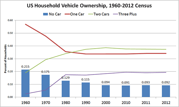
    Chart 1 Source: Oak Ridge National Laboratory; Transportation Energy Data Book. Table 8.5.

    If knowledge is not at issue, the question becomes whether households manage their expenses on this item prudently, or if they could use expert advice to do so.

    Advice on how to manage household transportation expenses is, evidently, also unnecessary. Statistics on household expenditures leave little doubt that households manage their transportation budgets surprisingly well. Consumer surveys show that among all income quintiles, with total household expenditures ranging from about $31,000 to five times that ($155,000), the percentage allocated to transportation is fairly constant – around 15% (Chart 2). The only exception is found among the highest quintile, which may simply be indicative of higher disposable incomes. (We hope readers will be lenient about our use of statistics from multiple countries. The intent is to show trends, rather than report on the specifics of a chosen country.)

    Not only is the mid-teen figure constant across different income groups, it is also constant across countries. The European Union, for example, reports 13.0% and 13.2% all across the EU (excluding its newest members). It is hard to interpret this consistency as anything other than an ability to control transportation costs in a way that meets a household’s needs and budget, particularly when seen in juxtaposition to the expenditure on shelter.

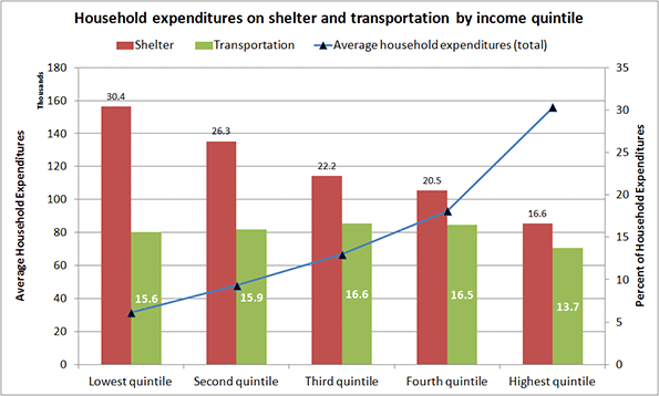
    Chart 2 Source: Statistics Canada, Survey of Household Spending. Table 2: Budget Shares Of Major Spending Categories By Income Quintile, 2012.

    This consistency of the transportation expense at all income levels is intriguing and instructive.Researchers have suggested that it represents a universal constant. Regardless of its universality, it indicates the adaptability people demonstrate in controlling this expense. This adaptability ranges from choosing the means of transport (foot, bike, transit, car or rail), their level of effort, the time they are willing to spend traveling, and their flexibility in reaching destinations.

    For example, public transport lowers costs, but is generally slower than a car (Chart 3). In 2005, 21% of drivers recorded a 90+ minute round trip as opposed to three times that (64%) reported by transit riders. As might be expected, public transport users are predominantly lower quintile households that trade cost for time (Chart 4).

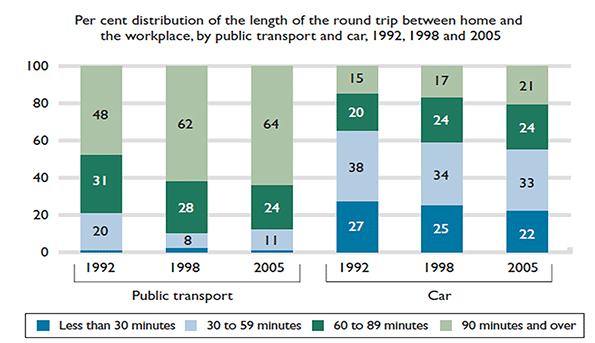
    Chart 3 Source: Statistics Canada, General Social Survey, Trip Duration, 1992, 1998, and 2005.

    Choosing the mode of transport is one path to controlling costs, and certain households are clearly doing so. As the chart below shows, about 75% of bus riders (adding the first three bars) earn up to $50,000 a year, a lower-rank quintile income. Riding the bus is a conscious choice, as percentages of riders of other income brackets suggest, but for the 75% it may also be an economic necessity.

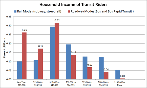
    Chart 4 Source: American Public Transportation Association, A Profile of Public Transportation Passenger Demographics and Travel Characteristics, 2007.

    Other options in controlling transportation costs include walking and bicycling where possible, accessing the second-hand car market, and choosing other motorized transport.

    One good example of ‘other’ motorized transport is motor scooter ownership in developing nations, and in certain industrialized countries. In Taiwan, for example, “….Scooter is the primary mode of transport on this densely populated island – there are about 15 million for 23 million citizens.” Such wide-spread dependence on scooter-based motorized mobility correlates well with its cost and the per capita GDP of its users. Italy, for example, tops the EU in scooter/motorbike ownership. It may not be pure coincidence that it also has one of the lowest GDPs per capita among EU nations.

    The resale market for cars in the US outstrips the new car market by about one to three (Chart 5). Not only is the market large but also, significantly the average cost of a pre-owned car is generally about half its original price.

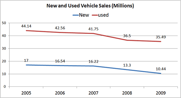
    Chart 5 Source: NIADA’s Used Car Sales Industry Report; Relative Size of Car Markets for New and Used Cars, 2010.

    The size of the resale market demonstrates yet another means by which consumers—particularly the lower quintile households— seek and grasp the opportunity to control car-related costs. As is evident from Chart 6, three of the five quintiles limit their new car purchases extensively; an overwhelming majority of consumers (averaging 77%) buy used cars. That figure reaches about 81% among the lowest quintile households.

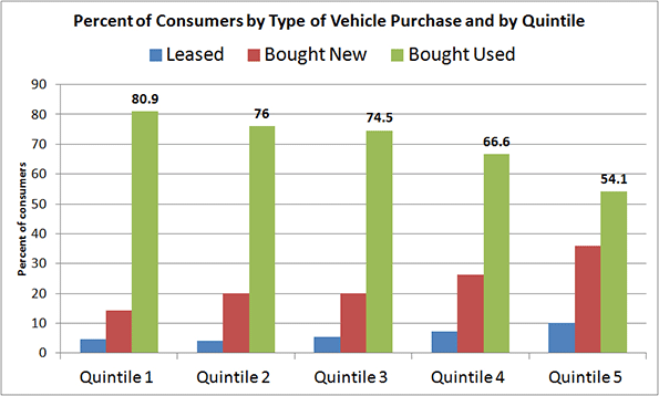
    Chart 6 Source: Laura Paszkiewicz, The Cost and Demographics of Vehicle Acquisition, Consumer Expenditure Survey Anthology, 2003 (61) Division of Consumer Expenditure Surveys, US Bureau of Labor Statistics.

    Not only does the resale market allow for control of a buyer’s initial investment, but segments within the market further enhance that ability. As Chart 7 shows, the price differential between a private sale and that from a franchised dealer can range from double to triple.

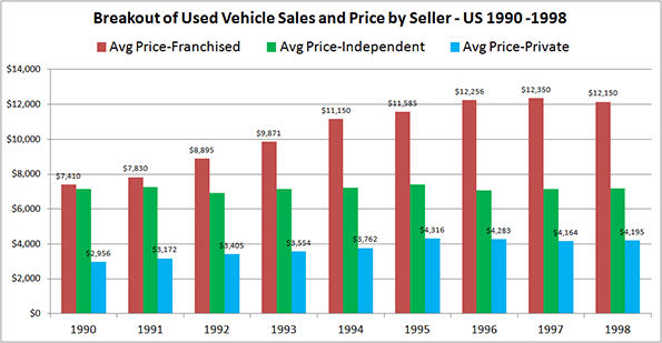
    Chart 7 Source: The Used Vehicle Market in Canada, DesRosiers Automotive Consultants Inc., 2000.

    The twentieth century saw momentous change and variety in the means of transport, both personal and collective. All new entries except bicycles are motorized, and were unimaginable a mere century earlier. The previous means of transportation — horse-dependent — lasted for at least forty centuries, during which collective transport was non-existent. Motorized personal transport is just one instance in a trend of displacing muscle-dependent activities with motor-driven ones (such as climbing stairs being supplanted by using elevators). The change has been astonishing, unusually fast, and, judging by the plethora of articles on the topic, a cause for concern to some.

    Statistics and examples so far allow us to draw at least one indisputable conclusion: Households do know their transportation costs, and adjust their expenditures according to their needs and budget by taking advantage of available opportunities. It would appear that there is little need for guidance on either front.

    Fanis Grammenos heads Urban Pattern Associates (UPA), a planning consultancy. UPA researches and promotes sustainable planning practices including the implementation of the Fused Grid, a new urban network model. He is a regular columnist for the Canadian Home Builder magazine, and author of Remaking the City Street Grid: A model for urban and suburban development. Reach him at fanis.grammenos at gmail.com.

    After twenty-four years at Canada Mortgage and Housing Corporation, Tom Kerwin now leads an active volunteer life, including being the Science and Environment Coordinator for the Calgary Association of Lifelong Learners. He holds a Master’s degree in Environmental Studies from York University.

    Special thanks to Luis Rodriguez for collaborating in shaping this article.

    Flickr photo by promich: Car Town, a used car lot in Chicago.