Blog

  • Small Cities Manufacturing Jobs – 2015 Best Cities Rankings

    Read about how we selected the 2015 Best Cities for Job Growth

    We used five measures of growth to rank MSAs over the past 10 years. “Large” areas include those with a current nonfarm employment base of at least 450,000 jobs. “Midsize” areas range from 150,000 to 450,000 jobs. “Small” areas have as many as 150,000 jobs. This year’s rankings reflect the new Office of Management and Budget definitions of MSAs for all series released after March 2015. As a result, the MSA listed in this year’s rankings do not necessary correspond directly to those listed in prior years. In some instances, MSAs were consolidated with others — for example Pascagoula, MS, was combined with the Gulfport-Biloxi, MS, MSA to form the new Gulfport-Biloxi-Pascagoula, MS, MSA. Others were separated from previously consolidated MSAs and in still other instances individual counties were shifted from one MSA to another. The bottom line is that this year’s rankings are based on good time series for the newly defined MSAs but may not be precisely comparable to those listed in prior years. The total number of MSAs included in this year’s rankings has risen from 398 to 421. This year’s rankings reflect the current size of each MSA’s employment.

    2015  Mfg Rank – Small MSAs Area Weighted INDEX 2014 Mfg Emplmt (1000s) Total Mfg Emplmt Growth Rate 2013-2014 Total Mfg Emplmt Cum Growth
    2009-2014
    2015 Overall Mfg Rank
    1 Madera, CA 74.4 4.6 10.3% 59.8% 1
    2 Naples-Immokalee-Marco Island, FL 74.0 3.5 10.5% 40.0% 2
    3 Sebastian-Vero Beach, FL 71.3 2.1 4.9% 39.1% 3
    4 San Rafael, CA Metro Div 70.5 3.8 17.7% 76.6% 4
    5 Midland, TX 68.9 4.1 8.8% 72.2% 5
    6 Grants Pass, OR 68.6 2.9 19.2% 26.1% 6
    7 Pueblo, CO 68.4 4.8 7.5% 22.2% 7
    8 Merced, CA 68.3 10.7 26.8% 35.3% 8
    9 Lewiston, ID-WA 67.7 4.1 2.5% 40.9% 9
    10 College Station-Bryan, TX 67.2 6.2 10.7% 19.2% 10
    11 Elizabethtown-Fort Knox, KY 66.4 7.3 10.7% 42.5% 11
    12 Columbus, IN 65.5 19.2 7.4% 43.2% 12
    13 Auburn-Opelika, AL 65.1 6.6 5.9% 19.3% 13
    14 Mount Vernon-Anacortes, WA 65.0 6.1 7.6% 26.9% 14
    15 Idaho Falls, ID 64.1 3.9 4.5% 34.9% 15
    16 Kokomo, IN 63.3 11.6 4.8% 42.6% 17
    17 Odessa, TX 63.0 5.8 7.4% 46.2% 18
    18 Bend-Redmond, OR 60.9 4.5 5.4% 24.8% 21
    19 Elkhart-Goshen, IN 60.8 57.8 3.9% 41.9% 22
    20 Santa Cruz-Watsonville, CA 60.5 6.4 6.0% 23.7% 23
    21 Monroe, MI 60.3 5.6 8.4% 28.5% 24
    22 Napa, CA 59.9 12.3 8.5% 17.9% 25
    23 Medford, OR 59.6 7.6 6.1% 24.0% 27
    24 Jackson, MI 59.5 9.6 4.0% 33.8% 28
    25 Vallejo-Fairfield, CA 58.9 11.1 7.4% 16.0% 29
    26 Prescott, AZ 58.7 3.3 1.0% 31.6% 30
    27 Fort Collins, CO 58.5 12.6 7.1% 20.4% 31
    28 Lafayette-West Lafayette, IN 58.5 17.3 4.4% 26.7% 32
    29 Chambersburg-Waynesboro, PA 57.5 10.0 3.1% 31.4% 34
    30 St. George, UT 57.2 2.8 3.7% 25.4% 36
    31 Kennewick-Richland, WA 57.2 7.7 7.5% 15.6% 37
    32 Portsmouth, NH-ME NECTA 57.1 7.6 3.2% 21.2% 38
    33 Tuscaloosa, AL 57.1 15.2 8.9% 12.9% 39
    34 Flint, MI 56.4 12.5 4.5% 31.2% 42
    35 Grand Forks, ND-MN 56.3 4.0 8.1% 11.1% 43
    36 Muskegon, MI 56.2 13.2 3.9% 33.8% 44
    37 Port St. Lucie, FL 55.9 6.0 2.3% 24.3% 45
    38 San Luis Obispo-Paso Robles-Arroyo Grande, CA 55.2 6.9 6.2% 19.7% 47
    39 Niles-Benton Harbor, MI 54.1 13.1 4.3% 17.0% 51
    40 Ocala, FL 53.7 7.4 6.7% 13.8% 53
    41 Morgantown, WV 53.5 4.5 3.1% 21.6% 54
    42 Spartanburg, SC 52.5 28.4 5.3% 16.6% 59
    43 Lima, OH 52.3 8.8 5.6% 11.9% 61
    44 Fond du Lac, WI 52.2 11.1 0.9% 28.2% 62
    45 Kankakee, IL 52.1 5.8 -0.6% 27.7% 63
    46 Appleton, WI 52.1 24.1 4.8% 17.2% 64
    47 Greeley, CO 52.1 12.0 4.6% 17.2% 65
    48 Panama City, FL 51.8 3.7 0.9% 16.7% 67
    49 Florence-Muscle Shoals, AL 51.3 9.3 -3.1% 31.8% 70
    50 Bowling Green, KY 51.1 10.5 3.3% 20.7% 71
    51 Kalamazoo-Portage, MI 50.6 20.4 4.3% 11.9% 74
    52 Gettysburg, PA 50.5 6.9 4.0% 12.4% 75
    53 Kahului-Wailuku-Lahaina, HI 50.4 1.2 0.0% 20.0% 76
    54 Yakima, WA 49.9 8.4 4.1% 16.7% 79
    55 Bellingham, WA 49.6 9.3 2.2% 22.5% 82
    56 Janesville-Beloit, WI 49.0 9.4 2.9% 17.1% 86
    57 Danville, IL 48.6 5.3 12.9% 9.0% 88
    58 Sioux Falls, SD 48.5 13.9 3.0% 17.2% 90
    59 Sheboygan, WI 48.5 20.5 2.7% 11.2% 92
    60 Santa Fe, NM 47.8 0.9 4.0% 8.3% 94
    61 Wenatchee, WA 47.5 2.5 1.4% 17.5% 97
    62 Battle Creek, MI 47.5 11.5 3.0% 12.1% 98
    63 Coeur d’Alene, ID 47.2 4.9 -3.3% 21.7% 99
    64 Ithaca, NY 47.0 3.5 2.0% 16.9% 100
    65 Visalia-Porterville, CA 47.0 12.2 5.2% 8.0% 101
    66 Chico, CA 47.0 3.8 4.5% 15.0% 102
    67 Yuma, AZ 46.8 2.2 1.5% 31.4% 104
    68 Sumter, SC 46.6 6.6 3.1% 8.2% 105
    69 Fargo, ND-MN 45.6 10.3 1.0% 19.8% 109
    70 Longview, WA 45.4 6.5 2.1% 12.0% 110
    71 Olympia-Tumwater, WA 45.4 3.3 4.2% 7.6% 111
    72 Bismarck, ND 45.4 2.0 5.2% -1.6% 112
    73 Dalton, GA 44.8 23.2 7.2% -1.7% 115
    74 Wausau, WI 44.8 15.6 3.1% 7.3% 116
    75 Saginaw, MI 44.8 11.9 -0.8% 27.1% 117
    76 Punta Gorda, FL 44.6 0.7 0.0% 40.0% 119
    77 Myrtle Beach-Conway-North Myrtle Beach, SC-NC 44.5 4.6 3.7% 8.6% 122
    78 Springfield, OH 44.3 6.7 2.0% 10.5% 124
    79 Gadsden, AL 44.0 5.2 4.7% 8.3% 126
    80 Eugene, OR 43.6 13.0 1.8% 8.9% 129
    81 Grand Junction, CO 43.2 2.8 1.2% 12.0% 134
    82 Barnstable Town, MA NECTA 42.6 3.0 1.1% 9.6% 138
    83 Lake Charles, LA 42.1 9.4 2.9% 5.2% 140
    84 Greenville, NC 41.6 6.8 3.0% 13.4% 142
    85 Pittsfield, MA NECTA 41.6 3.9 6.4% 0.0% 143
    86 Redding, CA 41.3 2.3 1.5% 1.5% 148
    87 Racine, WI 41.2 18.8 0.7% 16.0% 149
    88 Huntington-Ashland, WV-KY-OH 40.7 11.5 3.6% 4.9% 152
    89 Bremerton-Silverdale, WA 40.6 2.1 0.0% 10.5% 153
    90 Clarksville, TN-KY 40.4 10.1 3.1% 9.4% 154
    91 South Bend-Mishawaka, IN-MI 40.2 17.1 3.6% 7.6% 157
    92 Watertown-Fort Drum, NY 40.2 2.4 6.0% 0.0% 158
    93 Columbus, GA-AL 40.2 10.8 -0.9% 16.9% 159
    94 Lewiston-Auburn, ME NECTA 40.1 5.2 4.0% 1.3% 161
    95 Charlottesville, VA 40.0 3.8 4.6% 0.0% 162
    96 Haverhill-Newburyport-Amesbury Town, MA-NH NECTA Div 39.9 9.1 0.4% 9.7% 163
    97 Hickory-Lenoir-Morganton, NC 39.8 39.0 2.4% 5.2% 164
    98 Burlington, NC 39.7 8.7 5.2% 4.0% 165
    99 Dover-Durham, NH-ME NECTA 39.4 5.2 1.3% 7.6% 168
    100 Hanford-Corcoran, CA 39.0 4.2 0.8% 5.0% 170
    101 St. Cloud, MN 38.9 15.3 2.0% 7.5% 171
    102 Abilene, TX 38.8 2.9 3.6% -1.1% 173
    103 Walla Walla, WA 38.6 3.6 0.9% 9.2% 174
    104 Albany, OR 38.4 7.0 1.4% 5.0% 176
    105 Rapid City, SD 38.3 2.8 -1.2% 13.5% 177
    106 Logan, UT-ID 38.2 11.3 1.8% 6.9% 178
    107 Longview, TX 38.1 10.5 6.8% -0.6% 180
    108 San Angelo, TX 38.0 3.5 9.4% 2.9% 181
    109 Cleveland, TN 38.0 8.9 -2.9% 18.7% 182
    110 Mansfield, OH 37.9 9.6 1.4% 9.1% 184
    111 Erie, PA 37.8 22.2 1.1% 14.7% 185
    112 Morristown, TN 37.6 10.3 1.0% 0.0% 187
    113 Flagstaff, AZ 37.4 4.2 0.8% 15.5% 189
    114 Owensboro, KY 36.5 8.5 1.2% 7.2% 194
    115 Dover, DE 36.4 4.8 1.4% 3.6% 195
    116 Kingston, NY 36.3 3.5 4.0% -1.9% 197
    117 Casper, WY 36.0 1.8 0.0% 17.0% 201
    118 Taunton-Middleborough-Norton, MA NECTA Div 35.6 6.2 1.1% 1.6% 205
    119 Sioux City, IA-NE-SD 35.5 15.2 1.3% 1.3% 206
    120 Muncie, IN 34.4 4.2 0.8% 9.6% 212
    121 Killeen-Temple, TX 34.0 7.4 0.9% 1.8% 216
    122 Lake Havasu City-Kingman, AZ 33.8 2.8 2.4% 0.0% 219
    123 Sherman-Denison, TX 33.5 5.4 1.9% 5.9% 221
    124 Monroe, LA 33.4 6.8 1.0% 3.0% 222
    125 Waterloo-Cedar Falls, IA 32.9 17.3 -1.7% 12.1% 224
    126 Brownsville-Harlingen, TX 32.9 5.8 3.0% 0.0% 225
    127 Kingsport-Bristol-Bristol, TN-VA 32.9 21.6 1.4% 4.7% 226
    128 Michigan City-La Porte, IN 32.8 7.6 1.8% 5.6% 227
    129 Brockton-Bridgewater-Easton, MA NECTA Div 32.8 5.5 0.0% -0.6% 228
    130 Eau Claire, WI 32.7 10.4 0.0% 6.8% 229
    131 Fort Smith, AR-OK 32.1 18.2 2.4% -8.5% 235
    132 Yuba City, CA 32.0 2.1 0.0% 8.6% 236
    133 Lawton, OK 31.8 3.6 0.0% 0.9% 238
    134 Jackson, TN 31.8 9.7 1.4% -1.0% 239
    135 Anniston-Oxford-Jacksonville, AL 31.6 5.9 1.1% -0.6% 240
    136 Lowell-Billerica-Chelmsford, MA-NH NECTA Div 31.5 22.2 0.3% 1.5% 241
    137 Lubbock, TX 31.0 4.9 2.8% 0.7% 243
    138 La Crosse-Onalaska, WI-MN 30.8 8.5 -1.2% 5.8% 245
    139 Salisbury, MD-DE 30.6 14.2 1.2% -2.1% 248
    140 Johnson City, TN 30.6 7.6 3.2% -3.8% 249
    141 New Bedford, MA NECTA 30.5 7.9 3.5% 0.9% 251
    142 Bloomington, IL 29.8 4.8 -2.0% 7.5% 254
    143 Champaign-Urbana, IL 29.8 8.1 1.3% 2.1% 256
    144 Vineland-Bridgeton, NJ 29.4 8.3 0.4% -0.4% 259
    145 Charleston, WV 29.1 3.4 -1.0% -1.9% 261
    146 Topeka, KS 28.9 7.1 0.9% 2.9% 264
    147 Rome, GA 28.8 5.7 1.8% -7.6% 265
    148 Lawrence-Methuen Town-Salem, MA-NH NECTA Div 27.5 9.4 -0.7% 1.4% 273
    149 Cheyenne, WY 27.3 1.4 -2.4% -6.8% 275
    150 Cedar Rapids, IA 27.3 20.1 0.5% -0.2% 276
    151 Lynchburg, VA 27.2 14.6 0.0% -0.9% 277
    152 Texarkana, TX-AR 27.2 5.3 1.3% -1.3% 278
    153 Norwich-New London-Westerly, CT-RI NECTA 27.1 14.8 -0.2% -2.8% 279
    154 Peabody-Salem-Beverly, MA NECTA Div 26.7 7.7 -0.9% -0.9% 281
    155 Utica-Rome, NY 26.5 11.1 -0.9% -2.1% 282
    156 Tyler, TX 26.5 5.6 1.8% -17.2% 283
    157 Altoona, PA 26.3 7.5 -1.7% 2.3% 284
    158 Joplin, MO 26.3 12.8 1.1% -5.4% 285
    159 Duluth, MN-WI 26.0 7.1 -1.8% 6.5% 286
    160 Decatur, AL 26.0 11.9 -2.2% 0.0% 287
    161 Carson City, NV 25.8 2.6 -3.7% 2.7% 289
    162 Amarillo, TX 25.0 13.1 -1.8% 1.0% 294
    163 State College, PA 24.9 3.9 -1.7% 3.5% 295
    164 Bloomington, IN 24.8 8.6 0.4% 1.6% 296
    165 Victoria, TX 24.8 2.6 0.0% 1.3% 297
    166 Albany, GA 24.3 4.3 0.0% -4.4% 298
    167 Manchester, NH NECTA 23.8 7.7 -0.9% -3.3% 301
    168 Bloomsburg-Berwick, PA 23.8 5.6 -2.9% 0.6% 302
    169 Waco, TX 23.3 14.4 -2.7% 0.9% 304
    170 Terre Haute, IN 23.2 10.9 -4.1% 6.2% 306
    171 Springfield, IL 22.9 3.0 0.0% -8.2% 307
    172 East Stroudsburg, PA 22.8 4.6 0.7% -9.2% 309
    173 Lebanon, PA 22.6 8.7 -3.7% 2.3% 311
    174 Nashua, NH-MA NECTA Div 22.4 19.7 0.3% -6.6% 314
    175 Decatur, IL 22.3 10.1 0.0% 0.3% 315
    176 Leominster-Gardner, MA NECTA 21.8 6.1 -0.5% -10.7% 318
    177 Rochester, MN 21.4 10.7 0.0% -2.7% 321
    178 Rocky Mount, NC 20.0 10.2 -1.6% -7.0% 323
    179 Salinas, CA 19.8 5.0 -3.2% -5.6% 325
    180 Glens Falls, NY 19.1 6.0 -1.1% -4.8% 329
    181 Gainesville, FL 19.0 4.2 -0.8% -3.8% 330
    182 Williamsport, PA 18.6 8.0 -1.2% -9.1% 331
    183 Hagerstown-Martinsburg, MD-WV 18.5 7.5 -3.0% -6.7% 332
    184 Corvallis, OR 18.4 3.0 0.0% -12.7% 333
    185 Atlantic City-Hammonton, NJ 16.9 2.0 0.0% -10.3% 338
    186 Wichita Falls, TX 16.7 5.1 -3.7% -3.7% 339
    187 Waterbury, CT NECTA 16.3 7.3 -6.0% -3.1% 340
    188 Bay City, MI 16.2 3.8 -3.4% -5.0% 342
    189 Sierra Vista-Douglas, AZ 16.1 0.5 -6.3% -11.8% 343
    190 Hattiesburg, MS 15.8 4.0 -2.4% -4.8% 345
    191 Burlington-South Burlington, VT NECTA 15.5 13.4 -3.1% -5.0% 346
    192 Weirton-Steubenville, WV-OH 15.2 5.5 -3.5% -12.8% 348
    193 Johnstown, PA 14.6 3.8 -1.7% -14.3% 350
    194 Oshkosh-Neenah, WI 14.2 22.0 -2.4% -7.4% 352
    195 Elmira, NY 13.8 5.1 0.0% -11.0% 354
    196 Lynn-Saugus-Marblehead, MA NECTA Div 13.4 4.5 -3.6% -7.5% 356
    197 Fairbanks, AK 10.6 0.5 -21.1% -11.8% 358
    198 Wilmington, NC 10.6 5.7 -3.9% -14.9% 359
    199 Parkersburg-Vienna, WV 9.9 3.0 -4.3% -16.0% 360
    200 Wheeling, WV-OH 9.7 3.0 -5.3% -16.7% 363
    201 Laredo, TX 9.2 0.7 -12.5% -12.5% 364
    202 Dutchess County-Putnam County, NY Metro Div 7.8 10.4 -4.3% -19.1% 365
    203 Bangor, ME NECTA 7.1 2.4 -4.1% -25.3% 366
    204 Fayetteville, NC 6.9 7.9 -5.6% -18.5% 367
    205 Dothan, AL 6.9 4.3 -7.9% -23.7% 368
    206 Crestview-Fort Walton Beach-Destin, FL 6.7 3.5 -8.7% -22.8% 369
    207 Las Cruces, NM 6.4 2.5 -7.5% -17.8% 370
    208 Binghamton, NY 5.3 11.6 -2.8% -21.3% 371
    209 Pocatello, ID 0.2 1.5 -16.4% -28.1% 372
    210 El Centro, CA 0.0 1.0 -56.5% -61.5% 373
  • Mid-sized Cities Manufacturing Jobs – 2015 Best Cities Rankings

    Read about how we selected the 2015 Best Cities for Job Growth

    We used five measures of growth to rank MSAs over the past 10 years. “Large” areas include those with a current nonfarm employment base of at least 450,000 jobs. “Midsize” areas range from 150,000 to 450,000 jobs. “Small” areas have as many as 150,000 jobs. This year’s rankings reflect the new Office of Management and Budget definitions of MSAs for all series released after March 2015. As a result, the MSA listed in this year’s rankings do not necessary correspond directly to those listed in prior years. In some instances, MSAs were consolidated with others — for example Pascagoula, MS, was combined with the Gulfport-Biloxi, MS, MSA to form the new Gulfport-Biloxi-Pascagoula, MS, MSA. Others were separated from previously consolidated MSAs and in still other instances individual counties were shifted from one MSA to another. The bottom line is that this year’s rankings are based on good time series for the newly defined MSAs but may not be precisely comparable to those listed in prior years. The total number of MSAs included in this year’s rankings has risen from 398 to 421. This year’s rankings reflect the current size of each MSA’s employment.

    2015  Mfg Rank – Midsized MSAs Area Weighted INDEX 2014 Mfg Emplmt (1000s) Total Mfg Emplmt Growth Rate 2013-2014 Total Mfg Emplmt Cum Growth
    2009-2014
    2015 Overall Mfg Rank
    1 Toledo, OH 62.7 44.0 6.7% 27.4% 19
    2 Savannah, GA 59.8 16.5 6.2% 20.5% 26
    3 Baton Rouge, LA 57.6 29.5 4.5% 20.2% 33
    4 Cape Coral-Fort Myers, FL 57.5 5.1 4.8% 20.3% 35
    5 Bakersfield, CA 56.5 15.0 4.9% 17.8% 41
    6 Springfield, MO 55.2 15.1 5.9% 19.9% 48
    7 Lafayette, LA 55.1 20.2 0.0% 34.3% 49
    8 Columbia, SC 55.0 30.6 7.0% 13.7% 50
    9 Reno, NV 54.0 12.9 2.4% 15.5% 52
    10 Charleston-North Charleston, SC 53.3 25.1 3.7% 21.4% 55
    11 Lansing-East Lansing, MI 53.2 19.7 1.5% 20.1% 56
    12 Madison, WI 52.9 34.1 6.8% 12.0% 57
    13 Deltona-Daytona Beach-Ormond Beach, FL 52.5 10.3 0.7% 22.1% 58
    14 Ogden-Clearfield, UT 52.4 29.8 3.8% 13.6% 60
    15 Stockton-Lodi, CA 51.7 18.8 7.0% 7.2% 69
    16 Provo-Orem, UT 50.8 18.7 2.4% 16.4% 72
    17 North Port-Sarasota-Bradenton, FL 50.6 15.6 3.1% 19.1% 73
    18 Anchorage, AK 50.1 2.3 6.2% 16.9% 77
    19 Pensacola-Ferry Pass-Brent, FL 49.7 6.1 3.4% 14.5% 80
    20 Beaumont-Port Arthur, TX 49.6 22.4 3.7% 16.5% 81
    21 Lakeland-Winter Haven, FL 49.1 16.5 0.8% 15.4% 83
    22 Tulsa, OK 49.1 52.1 3.7% 20.6% 84
    23 Mobile, AL 48.6 18.9 0.7% 32.4% 89
    24 Boulder, CO 48.5 17.7 2.5% 18.8% 91
    25 Trenton, NJ 48.3 9.4 8.5% 1.4% 93
    26 Canton-Massillon, OH 47.7 28.4 2.8% 18.0% 95
    27 Greenville-Anderson-Mauldin, SC 47.6 54.7 2.8% 13.6% 96
    28 Jackson, MS 45.9 18.2 4.8% 9.6% 106
    29 Lincoln, NE 45.8 14.1 3.2% 12.8% 107
    30 Winston-Salem, NC 45.6 31.0 4.6% 4.1% 108
    31 Santa Maria-Santa Barbara, CA 45.3 12.5 4.7% 9.6% 113
    32 Salem, OR 45.1 11.7 3.5% 5.7% 114
    33 Des Moines-West Des Moines, IA 44.7 20.0 1.5% 13.0% 118
    34 Fort Wayne, IN 44.6 34.9 1.4% 14.7% 120
    35 Evansville, IN-KY 44.6 23.0 5.3% 4.7% 121
    36 Harrisburg-Carlisle, PA 44.5 21.0 4.1% 5.5% 123
    37 Rockford, IL 44.3 32.1 2.0% 24.1% 125
    38 Gary, IN Metro Div 43.8 37.2 2.7% 10.1% 127
    39 Youngstown-Warren-Boardman, OH-PA 43.3 30.7 1.7% 17.5% 133
    40 Dayton, OH 43.2 39.6 3.3% 12.4% 136
    41 Montgomery, AL 42.7 18.9 2.9% 11.2% 137
    42 Lake County-Kenosha County, IL-WI Metro Div 42.0 59.1 1.5% 9.1% 141
    43 Boise City, ID 41.4 24.8 1.8% 11.5% 146
    44 Reading, PA 41.1 30.5 2.2% 10.6% 151
    45 Spokane-Spokane Valley, WA 40.1 16.9 1.8% 7.9% 160
    46 Lexington-Fayette, KY 38.9 30.7 2.7% 3.0% 172
    47 Chattanooga, TN-GA 37.8 30.8 1.1% 11.3% 186
    48 Roanoke, VA 37.4 16.7 2.4% 5.7% 188
    49 Green Bay, WI 37.2 29.2 0.8% 8.0% 190
    50 Knoxville, TN 36.2 35.5 1.5% 8.8% 198
    51 Tacoma-Lakewood, WA Metro Div 36.1 17.3 -0.2% 6.6% 199
    52 Asheville, NC 35.8 19.0 1.1% 6.7% 203
    53 Elgin, IL Metro Div 35.8 34.9 1.2% 8.8% 204
    54 Davenport-Moline-Rock Island, IA-IL 34.8 24.3 -0.4% 11.3% 208
    55 Greensboro-High Point, NC 34.7 53.8 0.9% 6.1% 209
    56 Allentown-Bethlehem-Easton, PA-NJ 34.3 35.7 2.2% 1.4% 213
    57 Santa Rosa, CA 34.0 20.2 0.5% 2.9% 214
    58 Little Rock-North Little Rock-Conway, AR 33.9 20.3 3.2% -2.2% 217
    59 Corpus Christi, TX 33.5 9.9 1.7% 5.3% 220
    60 Fresno, CA 33.1 23.2 2.7% -2.2% 223
    61 Akron, OH 32.6 39.9 0.3% 7.3% 231
    62 Colorado Springs, CO 32.1 11.8 -1.4% 5.7% 233
    63 Fayetteville-Springdale-Rogers, AR-MO 31.9 27.5 2.1% -4.5% 237
    64 Ann Arbor, MI 30.0 14.1 0.5% 2.4% 253
    65 Lancaster, PA 29.8 35.9 0.7% -0.5% 255
    66 Durham-Chapel Hill, NC 29.5 30.4 1.4% -3.5% 258
    67 Shreveport-Bossier City, LA 29.0 10.9 1.9% -5.2% 262
    68 Augusta-Richmond County, GA-SC 27.7 20.3 0.0% 0.5% 270
    69 Oxnard-Thousand Oaks-Ventura, CA 27.7 30.2 0.1% -3.3% 271
    70 Scranton–Wilkes-Barre–Hazleton, PA 27.6 27.5 0.0% -2.2% 272
    71 Gulfport-Biloxi-Pascagoula, MS 26.8 19.2 0.5% -10.8% 280
    72 Worcester, MA-CT NECTA 25.7 27.1 0.2% -4.7% 290
    73 Syracuse, NY 25.6 24.5 1.2% -8.8% 291
    74 Huntsville, AL 25.6 23.2 0.7% -7.6% 292
    75 Peoria, IL 25.6 26.6 -1.4% 7.8% 293
    76 Palm Bay-Melbourne-Titusville, FL 23.7 20.1 1.3% -4.6% 303
    77 Wichita, KS 22.9 52.3 -1.3% -1.1% 308
    78 El Paso, TX 22.8 17.1 -2.3% 3.2% 310
    79 McAllen-Edinburg-Mission, TX 22.4 6.3 -1.6% -0.5% 313
    80 Framingham, MA NECTA Div 22.1 25.5 -1.2% -2.3% 316
    81 Portland-South Portland, ME NECTA 21.5 12.1 -0.3% -4.0% 319
    82 York-Hanover, PA 19.7 30.6 -1.1% -6.8% 326
    83 Wilmington, DE-MD-NJ Metro Div 19.2 17.8 -2.0% -4.6% 328
    84 Baltimore City, MD 18.2 11.8 -0.6% -13.0% 335
    85 Tucson, AZ 16.9 22.4 -1.9% -8.3% 337
    86 Modesto, CA 16.2 18.4 -6.6% -4.2% 341
    87 New Haven, CT NECTA 16.0 24.3 -3.1% -8.5% 344
    88 Albuquerque, NM 15.2 16.4 -3.3% -5.6% 347
    89 Bridgeport-Stamford-Norwalk, CT NECTA 15.0 32.0 -3.0% -9.7% 349
    90 Springfield, MA-CT NECTA 14.3 29.1 -3.7% -7.2% 351
    91 Delaware County, PA 14.1 14.6 -3.1% -8.5% 353
    92 Calvert-Charles-Prince George’s, MD 11.7 7.8 -2.1% -27.2% 357
    93 Tallahassee, FL 9.7 2.9 -1.1% -22.1% 362
  • Large Cities Manufacturing Jobs – 2015 Best Cities Rankings

    Read about how we selected the 2015 Best Cities for Job Growth

    We used five measures of growth to rank MSAs over the past 10 years. “Large” areas include those with a current nonfarm employment base of at least 450,000 jobs. “Midsize” areas range from 150,000 to 450,000 jobs. “Small” areas have as many as 150,000 jobs. This year’s rankings reflect the new Office of Management and Budget definitions of MSAs for all series released after March 2015. As a result, the MSA listed in this year’s rankings do not necessary correspond directly to those listed in prior years. In some instances, MSAs were consolidated with others — for example Pascagoula, MS, was combined with the Gulfport-Biloxi, MS, MSA to form the new Gulfport-Biloxi-Pascagoula, MS, MSA. Others were separated from previously consolidated MSAs and in still other instances individual counties were shifted from one MSA to another. The bottom line is that this year’s rankings are based on good time series for the newly defined MSAs but may not be precisely comparable to those listed in prior years. The total number of MSAs included in this year’s rankings has risen from 398 to 421. This year’s rankings reflect the current size of each MSA’s employment.

    2015  Mfg Rank – Large MSAs Area Weighted INDEX 2014 Mfg Emplmt (1000s) Total Mfg Emplmt Growth Rate 2013-2014 Total Mfg Emplmt Cum Growth
    2009-2014
    2015 Overall Mfg Rank
    1 Detroit-Dearborn-Livonia, MI Metro Div 63.6 89.3 9.8% 31.3% 16
    2 Warren-Troy-Farmington Hills, MI Metro Div 61.2 157.9 5.1% 38.8% 20
    3 Grand Rapids-Wyoming, MI 57.0 104.3 3.7% 27.9% 40
    4 Nashville-Davidson–Murfreesboro–Franklin, TN 55.5 79.7 3.4% 23.9% 46
    5 Albany-Schenectady-Troy, NY 52.0 24.5 2.8% 19.9% 66
    6 Oklahoma City, OK 51.7 37.9 2.4% 23.1% 68
    7 Louisville/Jefferson County, KY-IN 50.1 74.9 3.2% 23.1% 78
    8 Kansas City, MO 49.0 41.8 5.1% 8.6% 85
    9 Houston-The Woodlands-Sugar Land, TX 48.8 257.3 2.4% 19.8% 87
    10 Portland-Vancouver-Hillsboro, OR-WA 46.8 119.1 2.8% 12.7% 103
    11 West Palm Beach-Boca Raton-Delray Beach, FL Metro Div 43.8 16.8 3.7% 5.5% 128
    12 Minneapolis-St. Paul-Bloomington, MN-WI 43.4 192.6 2.9% 10.5% 130
    13 Denver-Aurora-Lakewood, CO 43.4 66.4 3.8% 8.4% 131
    14 Fort Lauderdale-Pompano Beach-Deerfield Beach, FL Metro Div 43.3 27.2 2.5% 7.1% 132
    15 San Jose-Sunnyvale-Santa Clara, CA 43.2 161.5 3.4% 8.0% 135
    16 Orlando-Kissimmee-Sanford, FL 42.2 39.8 2.9% 5.8% 139
    17 Fort Worth-Arlington, TX Metro Div 41.5 96.9 2.0% 11.6% 144
    18 Riverside-San Bernardino-Ontario, CA 41.5 90.8 2.5% 6.9% 145
    19 Sacramento–Roseville–Arden-Arcade, CA 41.3 35.0 3.0% 6.4% 147
    20 Indianapolis-Carmel-Anderson, IN 41.1 90.6 3.3% 5.6% 150
    21 Raleigh, NC 40.4 31.9 2.9% 6.0% 155
    22 Miami-Miami Beach-Kendall, FL Metro Div 40.4 37.7 2.0% 5.0% 156
    23 Atlanta-Sandy Springs-Roswell, GA 39.6 153.7 2.2% 8.5% 166
    24 Charlotte-Concord-Gastonia, NC-SC 39.5 100.5 2.4% 9.5% 167
    25 Cincinnati, OH-KY-IN 39.1 109.4 1.8% 5.9% 169
    26 Oakland-Hayward-Berkeley, CA Metro Div 38.5 82.8 2.6% 3.3% 175
    27 St. Louis, MO-IL 38.1 113.1 2.7% 5.2% 179
    28 San Francisco-Redwood City-South San Francisco, CA Metro Div 38.0 36.0 2.1% 2.0% 183
    29 Las Vegas-Henderson-Paradise, NV 37.1 21.2 0.5% 5.8% 191
    30 Providence-Warwick, RI-MA NECTA 37.0 52.2 2.4% 2.8% 192
    31 Austin-Round Rock, TX 36.9 57.7 -0.3% 10.7% 193
    32 Tampa-St. Petersburg-Clearwater, FL 36.4 61.2 0.9% 5.0% 196
    33 Milwaukee-Waukesha-West Allis, WI 36.1 120.9 1.3% 8.1% 200
    34 Seattle-Bellevue-Everett, WA Metro Div 35.9 169.9 0.0% 12.9% 202
    35 Anaheim-Santa Ana-Irvine, CA Metro Div 35.1 160.1 1.1% 7.2% 207
    36 San Diego-Carlsbad, CA 34.7 97.0 1.0% 5.2% 210
    37 Birmingham-Hoover, AL 34.7 38.4 -0.5% 7.3% 211
    38 Buffalo-Cheektowaga-Niagara Falls, NY 34.0 52.2 0.4% 5.1% 215
    39 Columbus, OH 33.8 69.7 0.0% 6.8% 218
    40 Cleveland-Elyria, OH 32.6 124.0 -0.2% 7.6% 230
    41 Urban Honolulu, HI 32.2 11.0 0.6% 2.8% 232
    42 Pittsburgh, PA 32.1 90.2 1.3% 3.5% 234
    43 Montgomery County-Bucks County-Chester County, PA Metro Div 31.5 91.2 1.3% -0.5% 242
    44 Phoenix-Mesa-Scottsdale, AZ 30.9 117.1 -0.2% 5.0% 244
    45 Middlesex-Monmouth-Ocean, NJ 30.8 43.7 1.4% -1.2% 246
    46 Virginia Beach-Norfolk-Newport News, VA-NC 30.7 54.7 0.1% 3.4% 247
    47 Jacksonville, FL 30.5 28.0 1.6% -0.1% 250
    48 Omaha-Council Bluffs, NE-IA 30.1 32.0 -1.4% 2.6% 252
    49 Salt Lake City, UT 29.7 54.0 -0.2% 5.1% 257
    50 Kansas City, KS 29.2 30.1 1.9% -3.3% 260
    51 Northern Virginia, VA 28.9 23.9 0.4% -0.8% 263
    52 San Antonio-New Braunfels, TX 28.6 45.7 -0.9% 5.6% 266
    53 Richmond, VA 28.5 31.0 0.3% -2.8% 267
    54 Silver Spring-Frederick-Rockville, MD Metro Div 28.3 16.4 1.9% -6.5% 268
    55 Dallas-Plano-Irving, TX Metro Div 28.0 166.3 1.1% -0.9% 269
    56 Memphis, TN-MS-AR 27.4 44.4 0.8% -1.1% 274
    57 Boston-Cambridge-Newton, MA NECTA Div 26.0 82.2 -0.3% -0.8% 288
    58 Camden, NJ Metro Div 24.1 35.2 0.3% -7.5% 299
    59 Los Angeles-Long Beach-Glendale, CA Metro Div 24.0 363.9 -1.0% -2.9% 300
    60 Chicago-Naperville-Arlington Heights, IL Metro Div 23.2 278.2 -0.8% -1.5% 305
    61 Rochester, NY 22.6 58.8 -0.6% -4.1% 312
    62 New York City, NY 22.1 74.7 -2.4% -3.3% 317
    63 Newark, NJ-PA Metro Div 21.5 79.8 -1.8% -5.4% 320
    64 Nassau County-Suffolk County, NY Metro Div 20.7 71.5 -2.1% -2.4% 322
    65 Hartford-West Hartford-East Hartford, CT NECTA 19.9 54.9 -1.4% -3.1% 324
    66 Bergen-Hudson-Passaic, NJ 19.2 57.2 -2.6% -5.7% 327
    67 Washington-Arlington-Alexandria, DC-VA-MD-WV Metro Div 18.4 33.3 -1.3% -10.7% 334
    68 Philadelphia City, PA 17.0 21.4 -1.2% -14.2% 336
    69 Orange-Rockland-Westchester, NY 13.5 29.3 -3.4% -9.7% 355
    70 New Orleans-Metairie, LA 9.8 30.1 -5.0% -15.3% 361
  • All Cities Manufacturing Jobs – 2015 Best Cities Rankings

    Read about how we selected the 2015 Best Cities for Job Growth

    We used five measures of growth to rank MSAs over the past 10 years. “Large” areas include those with a current nonfarm employment base of at least 450,000 jobs. “Midsize” areas range from 150,000 to 450,000 jobs. “Small” areas have as many as 150,000 jobs. This year’s rankings reflect the new Office of Management and Budget definitions of MSAs for all series released after March 2015. As a result, the MSA listed in this year’s rankings do not necessary correspond directly to those listed in prior years. In some instances, MSAs were consolidated with others — for example Pascagoula, MS, was combined with the Gulfport-Biloxi, MS, MSA to form the new Gulfport-Biloxi-Pascagoula, MS, MSA. Others were separated from previously consolidated MSAs and in still other instances individual counties were shifted from one MSA to another. The bottom line is that this year’s rankings are based on good time series for the newly defined MSAs but may not be precisely comparable to those listed in prior years. The total number of MSAs included in this year’s rankings has risen from 398 to 421. This year’s rankings reflect the current size of each MSA’s employment.

    2015 Overall Mfg Rank Area Weighted INDEX 2014 Mfg Emplmt (1000s) Total Mfg Emplmt Growth Rate 2013-2014 Total Mfg Emplmt Cum Growth
    2009-2014
    1 Madera, CA 74.4 4.6 10.3% 59.8%
    2 Naples-Immokalee-Marco Island, FL 74.0 3.5 10.5% 40.0%
    3 Sebastian-Vero Beach, FL 71.3 2.1 4.9% 39.1%
    4 San Rafael, CA Metro Div 70.5 3.8 17.7% 76.6%
    5 Midland, TX 68.9 4.1 8.8% 72.2%
    6 Grants Pass, OR 68.6 2.9 19.2% 26.1%
    7 Pueblo, CO 68.4 4.8 7.5% 22.2%
    8 Merced, CA 68.3 10.7 26.8% 35.3%
    9 Lewiston, ID-WA 67.7 4.1 2.5% 40.9%
    10 College Station-Bryan, TX 67.2 6.2 10.7% 19.2%
    11 Elizabethtown-Fort Knox, KY 66.4 7.3 10.7% 42.5%
    12 Columbus, IN 65.5 19.2 7.4% 43.2%
    13 Auburn-Opelika, AL 65.1 6.6 5.9% 19.3%
    14 Mount Vernon-Anacortes, WA 65.0 6.1 7.6% 26.9%
    15 Idaho Falls, ID 64.1 3.9 4.5% 34.9%
    16 Detroit-Dearborn-Livonia, MI Metro Div 63.6 89.3 9.8% 31.3%
    17 Kokomo, IN 63.3 11.6 4.8% 42.6%
    18 Odessa, TX 63.0 5.8 7.4% 46.2%
    19 Toledo, OH 62.7 44.0 6.7% 27.4%
    20 Warren-Troy-Farmington Hills, MI Metro Div 61.2 157.9 5.1% 38.8%
    21 Bend-Redmond, OR 60.9 4.5 5.4% 24.8%
    22 Elkhart-Goshen, IN 60.8 57.8 3.9% 41.9%
    23 Santa Cruz-Watsonville, CA 60.5 6.4 6.0% 23.7%
    24 Monroe, MI 60.3 5.6 8.4% 28.5%
    25 Napa, CA 59.9 12.3 8.5% 17.9%
    26 Savannah, GA 59.8 16.5 6.2% 20.5%
    27 Medford, OR 59.6 7.6 6.1% 24.0%
    28 Jackson, MI 59.5 9.6 4.0% 33.8%
    29 Vallejo-Fairfield, CA 58.9 11.1 7.4% 16.0%
    30 Prescott, AZ 58.7 3.3 1.0% 31.6%
    31 Fort Collins, CO 58.5 12.6 7.1% 20.4%
    32 Lafayette-West Lafayette, IN 58.5 17.3 4.4% 26.7%
    33 Baton Rouge, LA 57.6 29.5 4.5% 20.2%
    34 Chambersburg-Waynesboro, PA 57.5 10.0 3.1% 31.4%
    35 Cape Coral-Fort Myers, FL 57.5 5.1 4.8% 20.3%
    36 St. George, UT 57.2 2.8 3.7% 25.4%
    37 Kennewick-Richland, WA 57.2 7.7 7.5% 15.6%
    38 Portsmouth, NH-ME NECTA 57.1 7.6 3.2% 21.2%
    39 Tuscaloosa, AL 57.1 15.2 8.9% 12.9%
    40 Grand Rapids-Wyoming, MI 57.0 104.3 3.7% 27.9%
    41 Bakersfield, CA 56.5 15.0 4.9% 17.8%
    42 Flint, MI 56.4 12.5 4.5% 31.2%
    43 Grand Forks, ND-MN 56.3 4.0 8.1% 11.1%
    44 Muskegon, MI 56.2 13.2 3.9% 33.8%
    45 Port St. Lucie, FL 55.9 6.0 2.3% 24.3%
    46 Nashville-Davidson–Murfreesboro–Franklin, TN 55.5 79.7 3.4% 23.9%
    47 San Luis Obispo-Paso Robles-Arroyo Grande, CA 55.2 6.9 6.2% 19.7%
    48 Springfield, MO 55.2 15.1 5.9% 19.9%
    49 Lafayette, LA 55.1 20.2 0.0% 34.3%
    50 Columbia, SC 55.0 30.6 7.0% 13.7%
    51 Niles-Benton Harbor, MI 54.1 13.1 4.3% 17.0%
    52 Reno, NV 54.0 12.9 2.4% 15.5%
    53 Ocala, FL 53.7 7.4 6.7% 13.8%
    54 Morgantown, WV 53.5 4.5 3.1% 21.6%
    55 Charleston-North Charleston, SC 53.3 25.1 3.7% 21.4%
    56 Lansing-East Lansing, MI 53.2 19.7 1.5% 20.1%
    57 Madison, WI 52.9 34.1 6.8% 12.0%
    58 Deltona-Daytona Beach-Ormond Beach, FL 52.5 10.3 0.7% 22.1%
    59 Spartanburg, SC 52.5 28.4 5.3% 16.6%
    60 Ogden-Clearfield, UT 52.4 29.8 3.8% 13.6%
    61 Lima, OH 52.3 8.8 5.6% 11.9%
    62 Fond du Lac, WI 52.2 11.1 0.9% 28.2%
    63 Kankakee, IL 52.1 5.8 -0.6% 27.7%
    64 Appleton, WI 52.1 24.1 4.8% 17.2%
    65 Greeley, CO 52.1 12.0 4.6% 17.2%
    66 Albany-Schenectady-Troy, NY 52.0 24.5 2.8% 19.9%
    67 Panama City, FL 51.8 3.7 0.9% 16.7%
    68 Oklahoma City, OK 51.7 37.9 2.4% 23.1%
    69 Stockton-Lodi, CA 51.7 18.8 7.0% 7.2%
    70 Florence-Muscle Shoals, AL 51.3 9.3 -3.1% 31.8%
    71 Bowling Green, KY 51.1 10.5 3.3% 20.7%
    72 Provo-Orem, UT 50.8 18.7 2.4% 16.4%
    73 North Port-Sarasota-Bradenton, FL 50.6 15.6 3.1% 19.1%
    74 Kalamazoo-Portage, MI 50.6 20.4 4.3% 11.9%
    75 Gettysburg, PA 50.5 6.9 4.0% 12.4%
    76 Kahului-Wailuku-Lahaina, HI 50.4 1.2 0.0% 20.0%
    77 Anchorage, AK 50.1 2.3 6.2% 16.9%
    78 Louisville/Jefferson County, KY-IN 50.1 74.9 3.2% 23.1%
    79 Yakima, WA 49.9 8.4 4.1% 16.7%
    80 Pensacola-Ferry Pass-Brent, FL 49.7 6.1 3.4% 14.5%
    81 Beaumont-Port Arthur, TX 49.6 22.4 3.7% 16.5%
    82 Bellingham, WA 49.6 9.3 2.2% 22.5%
    83 Lakeland-Winter Haven, FL 49.1 16.5 0.8% 15.4%
    84 Tulsa, OK 49.1 52.1 3.7% 20.6%
    85 Kansas City, MO 49.0 41.8 5.1% 8.6%
    86 Janesville-Beloit, WI 49.0 9.4 2.9% 17.1%
    87 Houston-The Woodlands-Sugar Land, TX 48.8 257.3 2.4% 19.8%
    88 Danville, IL 48.6 5.3 12.9% 9.0%
    89 Mobile, AL 48.6 18.9 0.7% 32.4%
    90 Sioux Falls, SD 48.5 13.9 3.0% 17.2%
    91 Boulder, CO 48.5 17.7 2.5% 18.8%
    92 Sheboygan, WI 48.5 20.5 2.7% 11.2%
    93 Trenton, NJ 48.3 9.4 8.5% 1.4%
    94 Santa Fe, NM 47.8 0.9 4.0% 8.3%
    95 Canton-Massillon, OH 47.7 28.4 2.8% 18.0%
    96 Greenville-Anderson-Mauldin, SC 47.6 54.7 2.8% 13.6%
    97 Wenatchee, WA 47.5 2.5 1.4% 17.5%
    98 Battle Creek, MI 47.5 11.5 3.0% 12.1%
    99 Coeur d’Alene, ID 47.2 4.9 -3.3% 21.7%
    100 Ithaca, NY 47.0 3.5 2.0% 16.9%
    101 Visalia-Porterville, CA 47.0 12.2 5.2% 8.0%
    102 Chico, CA 47.0 3.8 4.5% 15.0%
    103 Portland-Vancouver-Hillsboro, OR-WA 46.8 119.1 2.8% 12.7%
    104 Yuma, AZ 46.8 2.2 1.5% 31.4%
    105 Sumter, SC 46.6 6.6 3.1% 8.2%
    106 Jackson, MS 45.9 18.2 4.8% 9.6%
    107 Lincoln, NE 45.8 14.1 3.2% 12.8%
    108 Winston-Salem, NC 45.6 31.0 4.6% 4.1%
    109 Fargo, ND-MN 45.6 10.3 1.0% 19.8%
    110 Longview, WA 45.4 6.5 2.1% 12.0%
    111 Olympia-Tumwater, WA 45.4 3.3 4.2% 7.6%
    112 Bismarck, ND 45.4 2.0 5.2% -1.6%
    113 Santa Maria-Santa Barbara, CA 45.3 12.5 4.7% 9.6%
    114 Salem, OR 45.1 11.7 3.5% 5.7%
    115 Dalton, GA 44.8 23.2 7.2% -1.7%
    116 Wausau, WI 44.8 15.6 3.1% 7.3%
    117 Saginaw, MI 44.8 11.9 -0.8% 27.1%
    118 Des Moines-West Des Moines, IA 44.7 20.0 1.5% 13.0%
    119 Punta Gorda, FL 44.6 0.7 0.0% 40.0%
    120 Fort Wayne, IN 44.6 34.9 1.4% 14.7%
    121 Evansville, IN-KY 44.6 23.0 5.3% 4.7%
    122 Myrtle Beach-Conway-North Myrtle Beach, SC-NC 44.5 4.6 3.7% 8.6%
    123 Harrisburg-Carlisle, PA 44.5 21.0 4.1% 5.5%
    124 Springfield, OH 44.3 6.7 2.0% 10.5%
    125 Rockford, IL 44.3 32.1 2.0% 24.1%
    126 Gadsden, AL 44.0 5.2 4.7% 8.3%
    127 Gary, IN Metro Div 43.8 37.2 2.7% 10.1%
    128 West Palm Beach-Boca Raton-Delray Beach, FL Metro Div 43.8 16.8 3.7% 5.5%
    129 Eugene, OR 43.6 13.0 1.8% 8.9%
    130 Minneapolis-St. Paul-Bloomington, MN-WI 43.4 192.6 2.9% 10.5%
    131 Denver-Aurora-Lakewood, CO 43.4 66.4 3.8% 8.4%
    132 Fort Lauderdale-Pompano Beach-Deerfield Beach, FL Metro Div 43.3 27.2 2.5% 7.1%
    133 Youngstown-Warren-Boardman, OH-PA 43.3 30.7 1.7% 17.5%
    134 Grand Junction, CO 43.2 2.8 1.2% 12.0%
    135 San Jose-Sunnyvale-Santa Clara, CA 43.2 161.5 3.4% 8.0%
    136 Dayton, OH 43.2 39.6 3.3% 12.4%
    137 Montgomery, AL 42.7 18.9 2.9% 11.2%
    138 Barnstable Town, MA NECTA 42.6 3.0 1.1% 9.6%
    139 Orlando-Kissimmee-Sanford, FL 42.2 39.8 2.9% 5.8%
    140 Lake Charles, LA 42.1 9.4 2.9% 5.2%
    141 Lake County-Kenosha County, IL-WI Metro Div 42.0 59.1 1.5% 9.1%
    142 Greenville, NC 41.6 6.8 3.0% 13.4%
    143 Pittsfield, MA NECTA 41.6 3.9 6.4% 0.0%
    144 Fort Worth-Arlington, TX Metro Div 41.5 96.9 2.0% 11.6%
    145 Riverside-San Bernardino-Ontario, CA 41.5 90.8 2.5% 6.9%
    146 Boise City, ID 41.4 24.8 1.8% 11.5%
    147 Sacramento–Roseville–Arden-Arcade, CA 41.3 35.0 3.0% 6.4%
    148 Redding, CA 41.3 2.3 1.5% 1.5%
    149 Racine, WI 41.2 18.8 0.7% 16.0%
    150 Indianapolis-Carmel-Anderson, IN 41.1 90.6 3.3% 5.6%
    151 Reading, PA 41.1 30.5 2.2% 10.6%
    152 Huntington-Ashland, WV-KY-OH 40.7 11.5 3.6% 4.9%
    153 Bremerton-Silverdale, WA 40.6 2.1 0.0% 10.5%
    154 Clarksville, TN-KY 40.4 10.1 3.1% 9.4%
    155 Raleigh, NC 40.4 31.9 2.9% 6.0%
    156 Miami-Miami Beach-Kendall, FL Metro Div 40.4 37.7 2.0% 5.0%
    157 South Bend-Mishawaka, IN-MI 40.2 17.1 3.6% 7.6%
    158 Watertown-Fort Drum, NY 40.2 2.4 6.0% 0.0%
    159 Columbus, GA-AL 40.2 10.8 -0.9% 16.9%
    160 Spokane-Spokane Valley, WA 40.1 16.9 1.8% 7.9%
    161 Lewiston-Auburn, ME NECTA 40.1 5.2 4.0% 1.3%
    162 Charlottesville, VA 40.0 3.8 4.6% 0.0%
    163 Haverhill-Newburyport-Amesbury Town, MA-NH NECTA Div 39.9 9.1 0.4% 9.7%
    164 Hickory-Lenoir-Morganton, NC 39.8 39.0 2.4% 5.2%
    165 Burlington, NC 39.7 8.7 5.2% 4.0%
    166 Atlanta-Sandy Springs-Roswell, GA 39.6 153.7 2.2% 8.5%
    167 Charlotte-Concord-Gastonia, NC-SC 39.5 100.5 2.4% 9.5%
    168 Dover-Durham, NH-ME NECTA 39.4 5.2 1.3% 7.6%
    169 Cincinnati, OH-KY-IN 39.1 109.4 1.8% 5.9%
    170 Hanford-Corcoran, CA 39.0 4.2 0.8% 5.0%
    171 St. Cloud, MN 38.9 15.3 2.0% 7.5%
    172 Lexington-Fayette, KY 38.9 30.7 2.7% 3.0%
    173 Abilene, TX 38.8 2.9 3.6% -1.1%
    174 Walla Walla, WA 38.6 3.6 0.9% 9.2%
    175 Oakland-Hayward-Berkeley, CA Metro Div 38.5 82.8 2.6% 3.3%
    176 Albany, OR 38.4 7.0 1.4% 5.0%
    177 Rapid City, SD 38.3 2.8 -1.2% 13.5%
    178 Logan, UT-ID 38.2 11.3 1.8% 6.9%
    179 St. Louis, MO-IL 38.1 113.1 2.7% 5.2%
    180 Longview, TX 38.1 10.5 6.8% -0.6%
    181 San Angelo, TX 38.0 3.5 9.4% 2.9%
    182 Cleveland, TN 38.0 8.9 -2.9% 18.7%
    183 San Francisco-Redwood City-South San Francisco, CA Metro Div 38.0 36.0 2.1% 2.0%
    184 Mansfield, OH 37.9 9.6 1.4% 9.1%
    185 Erie, PA 37.8 22.2 1.1% 14.7%
    186 Chattanooga, TN-GA 37.8 30.8 1.1% 11.3%
    187 Morristown, TN 37.6 10.3 1.0% 0.0%
    188 Roanoke, VA 37.4 16.7 2.4% 5.7%
    189 Flagstaff, AZ 37.4 4.2 0.8% 15.5%
    190 Green Bay, WI 37.2 29.2 0.8% 8.0%
    191 Las Vegas-Henderson-Paradise, NV 37.1 21.2 0.5% 5.8%
    192 Providence-Warwick, RI-MA NECTA 37.0 52.2 2.4% 2.8%
    193 Austin-Round Rock, TX 36.9 57.7 -0.3% 10.7%
    194 Owensboro, KY 36.5 8.5 1.2% 7.2%
    195 Dover, DE 36.4 4.8 1.4% 3.6%
    196 Tampa-St. Petersburg-Clearwater, FL 36.4 61.2 0.9% 5.0%
    197 Kingston, NY 36.3 3.5 4.0% -1.9%
    198 Knoxville, TN 36.2 35.5 1.5% 8.8%
    199 Tacoma-Lakewood, WA Metro Div 36.1 17.3 -0.2% 6.6%
    200 Milwaukee-Waukesha-West Allis, WI 36.1 120.9 1.3% 8.1%
    201 Casper, WY 36.0 1.8 0.0% 17.0%
    202 Seattle-Bellevue-Everett, WA Metro Div 35.9 169.9 0.0% 12.9%
    203 Asheville, NC 35.8 19.0 1.1% 6.7%
    204 Elgin, IL Metro Div 35.8 34.9 1.2% 8.8%
    205 Taunton-Middleborough-Norton, MA NECTA Div 35.6 6.2 1.1% 1.6%
    206 Sioux City, IA-NE-SD 35.5 15.2 1.3% 1.3%
    207 Anaheim-Santa Ana-Irvine, CA Metro Div 35.1 160.1 1.1% 7.2%
    208 Davenport-Moline-Rock Island, IA-IL 34.8 24.3 -0.4% 11.3%
    209 Greensboro-High Point, NC 34.7 53.8 0.9% 6.1%
    210 San Diego-Carlsbad, CA 34.7 97.0 1.0% 5.2%
    211 Birmingham-Hoover, AL 34.7 38.4 -0.5% 7.3%
    212 Muncie, IN 34.4 4.2 0.8% 9.6%
    213 Allentown-Bethlehem-Easton, PA-NJ 34.3 35.7 2.2% 1.4%
    214 Santa Rosa, CA 34.0 20.2 0.5% 2.9%
    215 Buffalo-Cheektowaga-Niagara Falls, NY 34.0 52.2 0.4% 5.1%
    216 Killeen-Temple, TX 34.0 7.4 0.9% 1.8%
    217 Little Rock-North Little Rock-Conway, AR 33.9 20.3 3.2% -2.2%
    218 Columbus, OH 33.8 69.7 0.0% 6.8%
    219 Lake Havasu City-Kingman, AZ 33.8 2.8 2.4% 0.0%
    220 Corpus Christi, TX 33.5 9.9 1.7% 5.3%
    221 Sherman-Denison, TX 33.5 5.4 1.9% 5.9%
    222 Monroe, LA 33.4 6.8 1.0% 3.0%
    223 Fresno, CA 33.1 23.2 2.7% -2.2%
    224 Waterloo-Cedar Falls, IA 32.9 17.3 -1.7% 12.1%
    225 Brownsville-Harlingen, TX 32.9 5.8 3.0% 0.0%
    226 Kingsport-Bristol-Bristol, TN-VA 32.9 21.6 1.4% 4.7%
    227 Michigan City-La Porte, IN 32.8 7.6 1.8% 5.6%
    228 Brockton-Bridgewater-Easton, MA NECTA Div 32.8 5.5 0.0% -0.6%
    229 Eau Claire, WI 32.7 10.4 0.0% 6.8%
    230 Cleveland-Elyria, OH 32.6 124.0 -0.2% 7.6%
    231 Akron, OH 32.6 39.9 0.3% 7.3%
    232 Urban Honolulu, HI 32.2 11.0 0.6% 2.8%
    233 Colorado Springs, CO 32.1 11.8 -1.4% 5.7%
    234 Pittsburgh, PA 32.1 90.2 1.3% 3.5%
    235 Fort Smith, AR-OK 32.1 18.2 2.4% -8.5%
    236 Yuba City, CA 32.0 2.1 0.0% 8.6%
    237 Fayetteville-Springdale-Rogers, AR-MO 31.9 27.5 2.1% -4.5%
    238 Lawton, OK 31.8 3.6 0.0% 0.9%
    239 Jackson, TN 31.8 9.7 1.4% -1.0%
    240 Anniston-Oxford-Jacksonville, AL 31.6 5.9 1.1% -0.6%
    241 Lowell-Billerica-Chelmsford, MA-NH NECTA Div 31.5 22.2 0.3% 1.5%
    242 Montgomery County-Bucks County-Chester County, PA Metro Div 31.5 91.2 1.3% -0.5%
    243 Lubbock, TX 31.0 4.9 2.8% 0.7%
    244 Phoenix-Mesa-Scottsdale, AZ 30.9 117.1 -0.2% 5.0%
    245 La Crosse-Onalaska, WI-MN 30.8 8.5 -1.2% 5.8%
    246 Middlesex-Monmouth-Ocean, NJ 30.8 43.7 1.4% -1.2%
    247 Virginia Beach-Norfolk-Newport News, VA-NC 30.7 54.7 0.1% 3.4%
    248 Salisbury, MD-DE 30.6 14.2 1.2% -2.1%
    249 Johnson City, TN 30.6 7.6 3.2% -3.8%
    250 Jacksonville, FL 30.5 28.0 1.6% -0.1%
    251 New Bedford, MA NECTA 30.5 7.9 3.5% 0.9%
    252 Omaha-Council Bluffs, NE-IA 30.1 32.0 -1.4% 2.6%
    253 Ann Arbor, MI 30.0 14.1 0.5% 2.4%
    254 Bloomington, IL 29.8 4.8 -2.0% 7.5%
    255 Lancaster, PA 29.8 35.9 0.7% -0.5%
    256 Champaign-Urbana, IL 29.8 8.1 1.3% 2.1%
    257 Salt Lake City, UT 29.7 54.0 -0.2% 5.1%
    258 Durham-Chapel Hill, NC 29.5 30.4 1.4% -3.5%
    259 Vineland-Bridgeton, NJ 29.4 8.3 0.4% -0.4%
    260 Kansas City, KS 29.2 30.1 1.9% -3.3%
    261 Charleston, WV 29.1 3.4 -1.0% -1.9%
    262 Shreveport-Bossier City, LA 29.0 10.9 1.9% -5.2%
    263 Northern Virginia, VA 28.9 23.9 0.4% -0.8%
    264 Topeka, KS 28.9 7.1 0.9% 2.9%
    265 Rome, GA 28.8 5.7 1.8% -7.6%
    266 San Antonio-New Braunfels, TX 28.6 45.7 -0.9% 5.6%
    267 Richmond, VA 28.5 31.0 0.3% -2.8%
    268 Silver Spring-Frederick-Rockville, MD Metro Div 28.3 16.4 1.9% -6.5%
    269 Dallas-Plano-Irving, TX Metro Div 28.0 166.3 1.1% -0.9%
    270 Augusta-Richmond County, GA-SC 27.7 20.3 0.0% 0.5%
    271 Oxnard-Thousand Oaks-Ventura, CA 27.7 30.2 0.1% -3.3%
    272 Scranton–Wilkes-Barre–Hazleton, PA 27.6 27.5 0.0% -2.2%
    273 Lawrence-Methuen Town-Salem, MA-NH NECTA Div 27.5 9.4 -0.7% 1.4%
    274 Memphis, TN-MS-AR 27.4 44.4 0.8% -1.1%
    275 Cheyenne, WY 27.3 1.4 -2.4% -6.8%
    276 Cedar Rapids, IA 27.3 20.1 0.5% -0.2%
    277 Lynchburg, VA 27.2 14.6 0.0% -0.9%
    278 Texarkana, TX-AR 27.2 5.3 1.3% -1.3%
    279 Norwich-New London-Westerly, CT-RI NECTA 27.1 14.8 -0.2% -2.8%
    280 Gulfport-Biloxi-Pascagoula, MS 26.8 19.2 0.5% -10.8%
    281 Peabody-Salem-Beverly, MA NECTA Div 26.7 7.7 -0.9% -0.9%
    282 Utica-Rome, NY 26.5 11.1 -0.9% -2.1%
    283 Tyler, TX 26.5 5.6 1.8% -17.2%
    284 Altoona, PA 26.3 7.5 -1.7% 2.3%
    285 Joplin, MO 26.3 12.8 1.1% -5.4%
    286 Duluth, MN-WI 26.0 7.1 -1.8% 6.5%
    287 Decatur, AL 26.0 11.9 -2.2% 0.0%
    288 Boston-Cambridge-Newton, MA NECTA Div 26.0 82.2 -0.3% -0.8%
    289 Carson City, NV 25.8 2.6 -3.7% 2.7%
    290 Worcester, MA-CT NECTA 25.7 27.1 0.2% -4.7%
    291 Syracuse, NY 25.6 24.5 1.2% -8.8%
    292 Huntsville, AL 25.6 23.2 0.7% -7.6%
    293 Peoria, IL 25.6 26.6 -1.4% 7.8%
    294 Amarillo, TX 25.0 13.1 -1.8% 1.0%
    295 State College, PA 24.9 3.9 -1.7% 3.5%
    296 Bloomington, IN 24.8 8.6 0.4% 1.6%
    297 Victoria, TX 24.8 2.6 0.0% 1.3%
    298 Albany, GA 24.3 4.3 0.0% -4.4%
    299 Camden, NJ Metro Div 24.1 35.2 0.3% -7.5%
    300 Los Angeles-Long Beach-Glendale, CA Metro Div 24.0 363.9 -1.0% -2.9%
    301 Manchester, NH NECTA 23.8 7.7 -0.9% -3.3%
    302 Bloomsburg-Berwick, PA 23.8 5.6 -2.9% 0.6%
    303 Palm Bay-Melbourne-Titusville, FL 23.7 20.1 1.3% -4.6%
    304 Waco, TX 23.3 14.4 -2.7% 0.9%
    305 Chicago-Naperville-Arlington Heights, IL Metro Div 23.2 278.2 -0.8% -1.5%
    306 Terre Haute, IN 23.2 10.9 -4.1% 6.2%
    307 Springfield, IL 22.9 3.0 0.0% -8.2%
    308 Wichita, KS 22.9 52.3 -1.3% -1.1%
    309 East Stroudsburg, PA 22.8 4.6 0.7% -9.2%
    310 El Paso, TX 22.8 17.1 -2.3% 3.2%
    311 Lebanon, PA 22.6 8.7 -3.7% 2.3%
    312 Rochester, NY 22.6 58.8 -0.6% -4.1%
    313 McAllen-Edinburg-Mission, TX 22.4 6.3 -1.6% -0.5%
    314 Nashua, NH-MA NECTA Div 22.4 19.7 0.3% -6.6%
    315 Decatur, IL 22.3 10.1 0.0% 0.3%
    316 Framingham, MA NECTA Div 22.1 25.5 -1.2% -2.3%
    317 New York City, NY 22.1 74.7 -2.4% -3.3%
    318 Leominster-Gardner, MA NECTA 21.8 6.1 -0.5% -10.7%
    319 Portland-South Portland, ME NECTA 21.5 12.1 -0.3% -4.0%
    320 Newark, NJ-PA Metro Div 21.5 79.8 -1.8% -5.4%
    321 Rochester, MN 21.4 10.7 0.0% -2.7%
    322 Nassau County-Suffolk County, NY Metro Div 20.7 71.5 -2.1% -2.4%
    323 Rocky Mount, NC 20.0 10.2 -1.6% -7.0%
    324 Hartford-West Hartford-East Hartford, CT NECTA 19.9 54.9 -1.4% -3.1%
    325 Salinas, CA 19.8 5.0 -3.2% -5.6%
    326 York-Hanover, PA 19.7 30.6 -1.1% -6.8%
    327 Bergen-Hudson-Passaic, NJ 19.2 57.2 -2.6% -5.7%
    328 Wilmington, DE-MD-NJ Metro Div 19.2 17.8 -2.0% -4.6%
    329 Glens Falls, NY 19.1 6.0 -1.1% -4.8%
    330 Gainesville, FL 19.0 4.2 -0.8% -3.8%
    331 Williamsport, PA 18.6 8.0 -1.2% -9.1%
    332 Hagerstown-Martinsburg, MD-WV 18.5 7.5 -3.0% -6.7%
    333 Corvallis, OR 18.4 3.0 0.0% -12.7%
    334 Washington-Arlington-Alexandria, DC-VA-MD-WV Metro Div 18.4 33.3 -1.3% -10.7%
    335 Baltimore City, MD 18.2 11.8 -0.6% -13.0%
    336 Philadelphia City, PA 17.0 21.4 -1.2% -14.2%
    337 Tucson, AZ 16.9 22.4 -1.9% -8.3%
    338 Atlantic City-Hammonton, NJ 16.9 2.0 0.0% -10.3%
    339 Wichita Falls, TX 16.7 5.1 -3.7% -3.7%
    340 Waterbury, CT NECTA 16.3 7.3 -6.0% -3.1%
    341 Modesto, CA 16.2 18.4 -6.6% -4.2%
    342 Bay City, MI 16.2 3.8 -3.4% -5.0%
    343 Sierra Vista-Douglas, AZ 16.1 0.5 -6.3% -11.8%
    344 New Haven, CT NECTA 16.0 24.3 -3.1% -8.5%
    345 Hattiesburg, MS 15.8 4.0 -2.4% -4.8%
    346 Burlington-South Burlington, VT NECTA 15.5 13.4 -3.1% -5.0%
    347 Albuquerque, NM 15.2 16.4 -3.3% -5.6%
    348 Weirton-Steubenville, WV-OH 15.2 5.5 -3.5% -12.8%
    349 Bridgeport-Stamford-Norwalk, CT NECTA 15.0 32.0 -3.0% -9.7%
    350 Johnstown, PA 14.6 3.8 -1.7% -14.3%
    351 Springfield, MA-CT NECTA 14.3 29.1 -3.7% -7.2%
    352 Oshkosh-Neenah, WI 14.2 22.0 -2.4% -7.4%
    353 Delaware County, PA 14.1 14.6 -3.1% -8.5%
    354 Elmira, NY 13.8 5.1 0.0% -11.0%
    355 Orange-Rockland-Westchester, NY 13.5 29.3 -3.4% -9.7%
    356 Lynn-Saugus-Marblehead, MA NECTA Div 13.4 4.5 -3.6% -7.5%
    357 Calvert-Charles-Prince George’s, MD 11.7 7.8 -2.1% -27.2%
    358 Fairbanks, AK 10.6 0.5 -21.1% -11.8%
    359 Wilmington, NC 10.6 5.7 -3.9% -14.9%
    360 Parkersburg-Vienna, WV 9.9 3.0 -4.3% -16.0%
    361 New Orleans-Metairie, LA 9.8 30.1 -5.0% -15.3%
    362 Tallahassee, FL 9.7 2.9 -1.1% -22.1%
    363 Wheeling, WV-OH 9.7 3.0 -5.3% -16.7%
    364 Laredo, TX 9.2 0.7 -12.5% -12.5%
    365 Dutchess County-Putnam County, NY Metro Div 7.8 10.4 -4.3% -19.1%
    366 Bangor, ME NECTA 7.1 2.4 -4.1% -25.3%
    367 Fayetteville, NC 6.9 7.9 -5.6% -18.5%
    368 Dothan, AL 6.9 4.3 -7.9% -23.7%
    369 Crestview-Fort Walton Beach-Destin, FL 6.7 3.5 -8.7% -22.8%
    370 Las Cruces, NM 6.4 2.5 -7.5% -17.8%
    371 Binghamton, NY 5.3 11.6 -2.8% -21.3%
    372 Pocatello, ID 0.2 1.5 -16.4% -28.1%
    373 El Centro, CA 0.0 1.0 -56.5% -61.5%
  • Blaming Foreigners for Unaffordable Housing

    In a number of Western world cities, there is rising concern about foreign housing purchases which may be driving up prices for local residents. Much of the attention is aimed at mainland Chinese buyers in metropolitan areas where housing is already pricier than elsewhere. The concern about housing affordability is legitimate. However, blaming foreigners misses the point, which is that the rising prices are to a large degree the result of urban containment policies implemented by governments.

    London and the United Kingdom              

    The Daily Mail reports that London being deluged with foreign house buyers, who are buying not only expensive properties but also "starter homes," driving prices up. The Mail singles out Russian and Chinese buyers, many of whom pay cash for their purchases. Paula Higgins of the Home Owners Alliance lamented the fact that many foreign buyers are paying cash.  She questions the appropriateness of foreign investment in "family homes." David King, of Priced Out, said: "Foreign investment is driving up prices, making it even harder for ordinary people to get a decent place to live."

    Real estate firms headquartered in Russia are steering their clients to less expensive locations, outside London, such as to the north of England and Wales. A London real estate firm said that only 15% of its sales were to buyers from the UK. There is pressure for the government to protect local home buyers

    Certainly these investors are stepping into an already pricey market. The 11th Annual Demographia International Housing Affordability Survey found London house prices to be a severely unaffordable 8.5 times household incomes in 2014. London has the seventh worst housing affordability out of the 86 major markets rated in nine nations. The outside-the-greenbelt exurbs of London have house prices 6.9 times incomes.

    Vancouver

    Vancouver is a city of immigrants. According to data compiled by University of British Columbia (UBC) Geography Professor David Ley, nearly 90 percent of metropolitan Vancouver’s growth over the past two decades has been from foreign immigration (this article contains a graph with the numbers). Yet, there is significant concern about home purchases in the Vancouver area by mainland Chinese. UBC Professor Henry Yu’s history class described the issue in a video (Blaming the Mainlander).

    The Demographia International Housing Affordability Survey found Vancouver house prices to be a severely unaffordable 10.6 times household incomes in 2014. Vancouver has the second worst housing affordability out of the 86 major metropolitan areas rated in nine nations. Hong Kong has the worst housing affordability, with a median multiple of 17.0.

    California and New York

    Ilya Marritz of Public Broadcasting Systems (PBS) radio station WNYC remarked on how foreign investment is driving up prices in the New York and San Francisco bay areas: "There’s this relatively new trend of people buying properties in the city and not actually spending a lot of time living here." The Demographia International Housing Affordability Survey found New York metropolitan area housing to cost 6.1 times incomes, a 65% increase since before the housing bubble.

    The Diplomat, which specializes in Asia-Pacific affairs, commented that “there’s no doubt that China’s presence in the Bay Area market is driving up prices. The Diplomat quoted real estate executive Mark McLaughlin; “it’s added a demographic of buyers who, generally, take a long-term view. They’re not sellers in the next five to seven years.” Chinese buyers are sitting on much of this property as housing in the Bay Area becomes increasingly scarce, causing its value to skyrocket."

    The Demographia International Housing Affordability Survey places both San Francisco and San Jose metropolitan area house prices at 9.2 times incomes, tied for fourth least affordable in the 9 nations.

    The Los Angeles Times reports strong mainland Chinese purchasing activity in the suburbs of Los Angeles, from the San Gabriel Valley to Orange County, particularly Irvine as well as in Riverside-San Bernardino (the Inland Empire).

    The Demographia International Housing Affordability Survey found house prices to be 8.0 times incomes in Los Angeles, the 10th least affordable major metropolitan area in the Survey. Nearby San Diego prices are even higher, at 8.3 times incomes, earning it the 8th least affordable major metropolitan area in the 9 nation Survey.

    New Zealand

    Things have become more heated in New Zealand. The Labour Party opposition housing spokesperson Phil Twyford blamed foreign investors for driving up house prices in Auckland, New Zealand’s only metropolitan area with more than 1,000,000 population.

    "Kiwi families who are struggling to buy their own home want to know the impact offshore speculators are having on skyrocketing Auckland house prices. They are sick and tired of losing homes at auction to higher bidders down the end of a telephone line in another country."

    This evoked considerable criticism for ethnic insensitivity not only among New Zealand’s large Chinese minority, but also ordinary citizens. Radio New Zealand opined: "For a party that has diligently and deliberately courted the ethnic vote, including the Chinese community in Auckland, this was a risky strategy." The Economics Minister accused Labour of playing "the race card." There was predictable reaction in China, which is New Zealand’s largest goods export partner. The Shanghai Daily headlined: "New Zealand housing market debate descends into race row. "Meanwhile, the National Party government continues its difficult task of trying to reverse the consequences of urban containment policy in Auckland.

    The Demographia International Housing Affordability Survey found Auckland house prices to be a severely unaffordable at 8.2 times household incomes in 2014. Auckland has the ninth worst housing affordability out of the 86 major metropolitan areas rated in nine nations.

    Australia

    In Sydney, the Party for Freedom produced a brochure "blaming Chinese property buyers for pushing up home prices, ‘ethnically cleansing’ Australian families from their suburbs and creating a new ‘stolen generation,’" according to The Sydney Morning Herald (" Race hate flyer distributed in Sydney’s north shore and inner city"). The brochure also referred to foreign purchasers as "greedy foreign invaders," and charged them with "pricing locals out of the market." A You-Tube video was posted in which the party chairman burns the flags of China, the Australian ruling Liberal Party, the Labor Party and the Greens and images of Australia’s Prime Minister and the New South Wales Premier.

    Predictably, this brought a sharp reaction from public officials, such as Lane Cove mayor David Brooks-Horn, whose affluent North Shore community was targeted for distribution of the brochures.

    Despite this "vile attack," as New South Wales Multiculturalism Minister characterized it, there remains serious concern in Australia about rising house prices, which many blame on foreign investors aalthough avoiding the extremes indicated above.

    The Demographia International Housing Affordability Survey found Sydney house prices to be a severely unaffordable 9.8 times household incomes in 2014. This is the third most unaffordable market among the 86 major metropolitan areas rated in nine nations.  Today, The Australian Financial Review reported that the median house price in Sydney has reached $1,000,000 for the first time. This is a 23% increase in just one year.

    Melbourne, with prices 8.7 times incomes is sixth least affordable.

    "Supply, Supply, Supply"

    There is a common theme among those who are blaming foreigners for the escalation in their local house prices: foreign buyers have driven up demand, thus increasing prices and driving local purchasers out of the market. That might be a plausible theory if demand by itself raised prices. But, all else equal, demand results in higher prices only when there is a shortage of supply. And a shortage of supply is exactly what has been produced by government policies in each of the metropolitan areas described above.

    The problem lies largely with the blunt policy instrument of urban containment, which makes it virtually impossible to build on wide swaths of suburban greenfield land. Urban containment policy’s most destructive strategies are urban growth boundaries or greenbelts, which often prohibit development on virtually all greenfield sites and other regulations that deny planning permission on the majority of parcels suitable for housing on and beyond the urban fringe. The shortage of supply so important to the price increases has been produced by government policies in each of the metropolitan areas described above (Figure).

    The problem is that urban containment policy "creates its own weather." Investors are disproportionately drawn to markets where there are shortages. Sir Peter Hall and his colleagues pointed out that development plans provide a guide for developers of where to buy within the metropolitan area (in The Containment of Urban England).

    A Canary Wharf buyer in London told The Wall Street Journal: “If I could afford it I’d buy as many as I could”… “Flats [in London] are a great investment. I can’t see that changing." Nor will it so long as the "sure thing" of extraordinary house price increases supported by planning policy continues. San Francisco Bay Area public officials may as well have hung a "Welcome Speculators" banner from the Golden Gate Bridge.

    James Laurenceson, Deputy Director of the Australia-China Relations Institute at the University of Technology in Sydney, told The Sydney Morning Herald.:

    "Housing affordability is a real problem. The real reasons are right in front of our eyes – limited land releases, zoning regulations, development charges, record low interest rates and tax breaks to property investors. There’s not a Chinese buyer amongst them."

    Indeed, most of the cities above became severely unaffordable well before an affluent middle-class was enabled by China’s economic reforms.

    New South Wales Premier Mike Baird characterized the solution as "supply, supply, supply," which he sees as "the principal lever" for improving housing affordability. Housing affordability proposals that do not start with the supply shortage are little more than empty rhetoric. Attempts to blame the prices primarily on foreigners are not only misleading, but also diverts the public from the more important role played by limiting supply.

    Wendell Cox is Chair, Housing Affordability and Municipal Policy for the Frontier Centre for Public Policy (Canada), is a Senior Fellow of the Center for Opportunity Urbanism (US), a member of the Board of Advisors of the Center for Demographics and Policy at Chapman University (California) and principal of Demographia, an international public policy and demographics firm.

    He is co-author of the "Demographia International Housing Affordability Survey" and author of "Demographia World Urban Areas" and "War on the Dream: How Anti-Sprawl Policy Threatens the Quality of Life." He was appointed to three terms on the Los Angeles County Transportation Commission, where he served with the leading city and county leadership as the only non-elected member. He served as a visiting professor at the Conservatoire National des Arts et Metiers, a national university in Paris. 

    Photograph: Opera House, Sydney (by author).

  • Presidential Candidate Jim Webb is an Old-time Democrat

    Will Rogers famously stated, “I am not a member of any organized political party. I am a Democrat.” And he was not so far from the truth. The old Democratic Party was a motley collection of selected plutocrats, labor bosses, Southern segregationists, smaller farmers, urban liberals and, as early as the 1930s, racial minorities. It was no doubt a clunky coalition but delivered big time: winning World War II, pushing back the Soviet Union and making it to the moon while aiding tens of millions of Americans to ascend into the middle class.

    Only one Democratic candidate in the 2016 presidential race, James Webb, represents this old coalition. A decorated combat veteran, onetime Reagan Navy secretary and former U.S. senator from Virginia, Webb, 69, combines patriotism with a call for expansive economic policies to help the middle class. He speaks most directly to white working-class voters, particularly in places like Appalachia, the South and in rural hamlets and exurbs across the country, precisely where Democrats are now regularly thrashed in elections.

    Webb, notes the National Journal, combines “Elizabeth Warren’s passion for economic justice with Rand Paul’s itch to reinvent foreign policy.” After all, the former soldier was one of the harshest critics of George W. Bush’s disastrous Iraq invasion.

    Yet, so far, his candidacy is attracting little to no mention in the media. Part of the problem may lie with the fact that he most identifies with an America – white, rural or suburban – disdained or ignored by the official press. Many current Democrats not only dislike these constituencies, but don’t even want to deal with them, counting, instead, on their coalition of the affluent, minorities and millennials to carry the day.

    Read the entire piece at The Orange County Register.

    Joel Kotkin is executive editor of NewGeography.com and Roger Hobbs Distinguished Fellow in Urban Studies at Chapman University, and a member of the editorial board of the Orange County Register. He is also executive director of the Houston-based Center for Opportunity Urbanism. His newest book, The New Class Conflict is now available at Amazon and Telos Press. He is also author of The City: A Global History and The Next Hundred Million: America in 2050. He lives in Orange County, CA.

    Jim Webb photo by flickr user kalexnova.

  • Special Report: The Laissez Faire New Orleans Rebuilding Strategy Was Exactly That

    Urban risk may be understood as a function of hazard, exposure, and vulnerability.1 In metro New Orleans, Katrina-like storm surges constitute the premier hazard (threat); the exposure variable entails human occupancy of hazard-prone spaces; and vulnerability implies the ability to respond resiliently and adaptively—which itself is a function of education, income, age, social capital, and other factors—after having been exposed to the hazard.

    This essay measures the extent to which, after the catastrophic deluge triggered by Hurricane Katrina in 2005, residents of metro New Orleans have shifted their settlement patterns and how these movements may affect future urban risk.2 What comes to light is that, at least in terms of residential settlement geographies, the laissez faire rebuilding strategy for flooded neighborhoods proved to be exactly that.

    “The Great Footprint Debate” of 2005-2006

    An intense debate arose in late 2005 over whether low-lying subdivisions heavily damaged by Katrina’s floodwaters should be expropriated and converted to greenspace. Most citizens and nearly all elected officials decried that residents had a right to return to all neighborhoods. Planners and experts countered by explaining that a population living in higher density on higher ground and surrounded by a buffer of surge-absorbing wetlands would be less exposed to future storms, and would achieve a new level of long-term sustainability.

    Despite its geophysical rationality, “shrinking the urban footprint” proved to be socially divisive, politically volatile, and ultimately unfunded. Officials thus had little choice but to abrogate the spatial oversight of the rebuilding effort to individual homeowners, who would return and rebuild where they wished based on their judgment of a neighborhood’s viability.

    Federal programs nudged homeowners to return to status quo settlement patterns. Updated flood-zone maps from FEMA’s National Flood Insurance Program, for example, would provide actuarial encouragement to resettle in prediluvial spaces, while the federally funded, state-administered Louisiana Road Home Program’s “Option 1”—to rebuild in place, by far the most popular of the three options—provided grant money to do exactly that.

    “Shrinking the urban footprint” became heresy; “greenspacing” took on sinister connotations; and rebuilding in flooded areas came to be valorized as a heroic civic statement. Actor Brad Pitt’s much-celebrated Make It Right Foundation, for example, pointedly positioned its housing initiative along a surge-prone canal, below sea level and immediately adjacent to the single worst Katrina levee breach, to illustrate that if a nonprofit “could build safe, sustainable homes in the most devastated part of New Orleans, [then it] would prove that high-quality, green housing could be built affordably everywhere.”3 Ignoring topography and hydrology gained currency in the discourse of community sustainability even as it flew in the face of environmental sustainability.

    A Brief History of New Orleans’ Residential Settlement Patterns, 1718-2005

    Topography and hydrology have played fundamental roles in determining where New Orleanians settled since the city’s founding in 1718. The entire region, lying at the heart of the   dynamic deltaic plain of the Mississippi River, originally lay above sea level, ranging from a few inches along the marshy perimeter, to a few feet along an interior ridge system, to 8 to 12 feet along the natural levee abutting the Mississippi River.

    From the 1700s to the early 1900s, the vast majority of New Orleanians lived on the higher ground closer to the Mississippi. Uninhabited low-lying backswamps, while reviled for their (largely apocryphal) association with disease, nonetheless provided a valuable ecological service for city dwellers, by storing excess river or rain water and safeguarding the city from storm surges. Even the worst of the Mississippi River floods, in 1816, 1849, and 1871, mostly accumulated harmlessly in empty swamplands and, in hindsight, bore more benefits than costs. New Orleanians during the 1700s-1900s were less exposed to the hazard of flooding because the limitations of their technology forced them to live on higher ground.4

    Circumstances changed in the 1890s, when engineers began designing and installing a sophisticated municipal drainage system to enable urbanization to finally spread across the backswamp to the Gulf-connected brackish bay known as Lake Pontchartrain. A resounding success from a developmental standpoint, the system came with a largely unforeseen cost. As the pumps removed a major component of the local soil body—water— it  opened up cavities, which in turn allowed organic matter (peat) to oxidize, shrink, and open up more cavities. Into those spaces settled finely textured clay, silt, and sand particles; the soil body thus compacted and dropped below sea level. Over the course of the twentieth century, former swamps and marshes in places like Lakeview, Gentilly, and New Orleans East sunk by 6-10 feet, while interior basins such as Broadmoor dropped to 5 feet below sea level. New levees were built along the lakefront, and later along the lateral flanks, were all that prevented outside water from pouring into the increasingly bowl-shaped metropolis.

    Nevertheless, convinced that the natural factors constraining their residential options had now been neutralized, New Orleanians migrated enthusiastically out of older, higher neighborhoods and into lower, modern subdivisions. Between 1920 and 1930, nearly every lakeside census tract at least doubled in population; low-lying Lakeview increased by 350 percent, while parts of equally low Gentilly grew by 636 percent. Older neighborhoods on higher ground, meanwhile, lost residents: Tremé and Marigny dropped by 10 to 15 percent, and the French Quarter declined by one-quarter. The high-elevation Lee Circle area lost 43 percent of its residents, while low-elevation Gerttown increased by a whopping 1,512 percent.5

    The 1960 census recorded the city’s peak of 627,525 residents, double the population from the beginning of the twentieth century. But while nearly all New Orleanians lived above sea level in 1900, only 48 percent remained there by 1960; fully 321,000 New Orleanians had vertically migrated from higher to lower ground, away from the Mississippi River and northwardly toward the lake as well as into the suburban parishes to the west, east, and south.6

    Subsequent years saw additional tens of thousands of New Orleanians migrate in this pattern, motivated at first by school integration and later by a broader array of social and economic impetuses. By 2000, the Crescent City’s population had dropped by 23 percent since 1960, representing a net loss of 143,000 mostly middle-class white families to adjacent parishes. Of those that remained, only 38 percent lived above sea level.7

    Meanwhile, beyond the metropolis, coastal wetlands eroded at a pace that would reach 10-35 square miles per year, due largely to two main factors: (1) the excavation through delicate marshes of thousands of miles of erosion-prone, salt-water-intruding navigation and oil-and-gas extraction canals, and (2) the leveeing of the Mississippi River, which prevented springtime floods but also starved the delta of new fresh water and vital sediment. Gulf waters crept closer to the metropolis’ floodwalls and levees, while inside that artificial perimeter of protection, land surfaces that once sloped gradually to the level of the sea now formed a series of topographic bowls straddling sea level.

    When those floodwalls and levees breached on August 29, 2005, sea water poured in and became impounded within those topographic bowls, a deadly reminder that topography still mattered. Satellite images of the flood eerily matched the shape of the undeveloped backswamp in nineteenth-century maps, while those higher areas that were home to the historical city, quite naturally, remained dry.

    But the stark geo-topographical history lesson could only go so far in convincing flood victims to move accordingly; after all, they still owned their low-lying properties, and real estate on higher terrain was anything but cheap and abundant. Besides, New Orleanians in general rightfully felt that they had been scandalously wronged by federal engineering failures, and anything short of full metropolitan reconstitution came to be seen as defeatist and unacceptable. Most post-Katrina advocacy thus focused on reinforcing the preexisting technological solutions that kept water out of the lowlands, rather than nudging people toward higher ground. “Shrink the urban footprint” got yelled off the table; “Make Levees, Not War” and “Category-5 Levees Now!” became popular bumper-sticker slogans; and “The Great Footprint Debate” became a bad memory.

    Resettlement in Vertical Space

    The early repopulation of post-Katrina New Orleans defied easy measure. Residents living “between” places as they rebuilt, plus temporarily broken-up families, peripatetic workers, and transient populations all conspired to make the city’s 2006-2009 demographics difficult to estimate, much less map. The 2010 Census finally provided a precise number: 343,829. By 2014, over 384,000 people lived in Orleans Parish, or eighty percent   of the pre-Katrina figure. Of course, not all were here prior; one survey determined roughly 10 percent of the city’s postdiluvian population had not lived here before 2005.8

    How had the new population resettled in terms of topographic elevation? We won’t know precisely until 2020, because only the decennial census provides actual headcounts aggregated at sufficiently high spatial resolution (the block level) for this sort of analysis; annual estimates from the American Community Survey do not suffice. Thus we must make do with the 2010 Census. While much has changed during 2010-2015, the macroscopic settlement geographies under investigation here had largely had fallen into place by 2010.


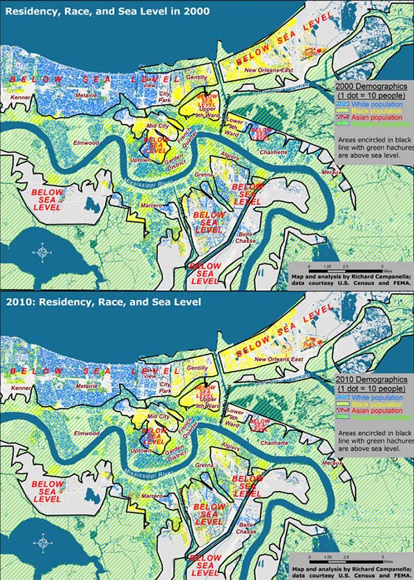
    Figure 1. Residential settlement above and below sea level, 2000 and 2010; analysis and maps by Richard Campanella.

    When intersected with high-resolution LIDAR-based digital elevation models, the 2010 Census data show that residents of metro New Orleans shifted to higher ground by only 1 percent compared to 2000 (Figure 1). Whereas 38 percent of metro-area residents lived above sea level in 2000, 39 percent did so by 2010, and that differentiation generally held true for each racial and ethnic group. Whites shifted from 42 to 44 percent living above sea level; African Americans 33 to 34 percent, Hispanics from 30 to 29 percent, and Asians 20 to 22 percent.

    Clearly, elevation did not exercise much influence in resettlement decisions, and people distributed themselves in vertical space in roughly the same proportions as before the flood. Yet there is one noteworthy angle to the fact that the above-sea-level percentage has risen, albeit barely (38 to 39 percent): it marked the first time in New Orleans history that the percent of people living below sea level has actually dropped.

    What impact did the experience of flooding have on resettlement patterns? Whereas people shifted only slightly out of low-lying areas regardless of flooding, they moved significantly out of areas that actually flooded, regardless of elevation. Inundated areas lost 37 percent of their population between 2000 and 2010, with the vast majority departing after 2005. They lost 37 percent of their white populations, 40 percent of their black populations, and 10 percent of their Asian populations. Only Hispanics increased in the flooded zone, by 10 percent, in part because this population had grown dramatically region-wide, and because members of this population sometimes settled in neighborhoods they themselves helped rebuild.

    The differing figures suggest that while low-lying elevation theoretically exposes residents to the hazard of flooding, the trauma of actually flooding proved to be, sadly, much more convincing.

    Resettlement in Horizontal Space

    Contrasting before-and-after residential patterns in horizontal space may be done through traditional methods such as comparative maps and demographic tables. What this investigation offers is a more singular and synoptical depiction of spatial shifts: by computing and comparing spatial central tendencies, or centroids.  

    A centroid is a theoretical center of balance of a given spatial distribution. A population centroid is that point around which people within a delimited area are evenly distributed.9

    Centroids capture complex shifts of millions of data with a single point. But they do not tell the entire story. A centroid for a high-risk coastal area, for example, may shift inland not because people have moved away from the seashore, but because previous residents decided not to return there. It’s also worth noting it takes a lot to move a centroid, as micro-scale shifts in one area are usually offset by countervailing shifts elsewhere. Thus, apparent minor centroid movements can actually be significant. Following are the centroid shifts for metro New Orleans broken down by racial and ethnic groups (Figures 2 and 3).

    In 2000, five years before the flood, there were 1,006,783 people living within the metro area as delineated for this particular study, of whom 512,696 identified their race as white; 435,353 as black; 25,941 as Asian; and 50,451 as Hispanic in ethnicity. Five years after the flood, these figures had changed to 817,748 total population, of whom 416,232 were white; 327,972 were black; 27,562 were Asian, and 75,397 were Hispanic.10 When their centroids are plotted, they show that metro residents as a whole, and each racial/ethnic sub-group, shifted westward and southward between 2000 and 2010, away from the location of most of the flooding and away from the source of most of the surge, which generally penetrated the eastern and northern (lakeside) flanks of the metropolis.

    Did populations proactively move away from risk? Not quite. What accounts for these shifts is the fact that the eastern half of the metropolis bore the brunt of the Katrina flooding, and the ensuing destruction meant populations here were less likely to reconstitute by 2010, which thus nudged centroids westward. Additionally, flooding from Lake Pontchartrain through ruptures in two of the three outfalls (drainage) canals disproportionally damaged the northern tier of the city, namely Lakeview and Gentilly. Combined with robust return rates in the older, higher historical neighborhoods along the Mississippi, as well as the unflooded West Bank (which sit to the south and west of the worst-damaged areas), they abetted a southwestward shift of the centroids. In a purely empirical sense, this change means more people now live in less-exposed areas. But, as we saw with the vertical shifts, the movements are more a reflection of passive responses to flood damage than active decisions to avoid future flooding.


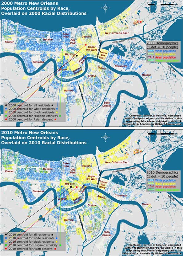
    Figure 2. Population centroids by race and ethnicity for metro New Orleans, 2000-2010; see next figure for detailed view. Analysis and maps by Richard Campanella.


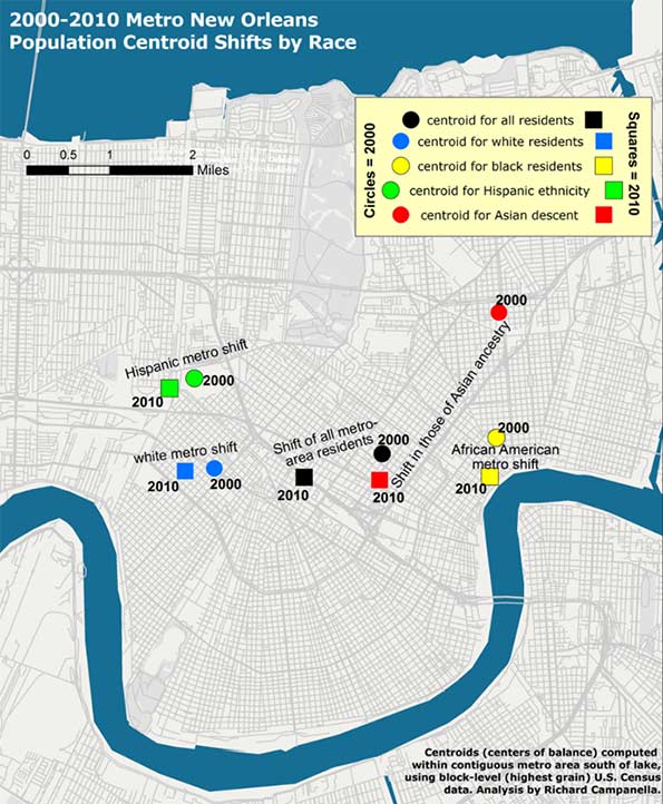
    Figure 3. A closer look at the metro-area population centroid shifts by race and ethnicity, 2000-2010; analysis and map by Richard Campanella.

    Reflections

    Resettlement patterns in metro New Orleans have only marginally reduced residential exposure to the hazard of storm surge. In the vertical dimension, metro-area residents today occupy below-sea-level areas at only a slightly lower rate than before the deluge, 61 percent as opposed to 62 percent, although that change represents the first-ever reverse (decline) of the century-long drift into below-sea-level areas. Likewise, residents’ horizontal shifts, which were in southwestward directions, seemed to suggest a movement away from hazard, but these shifts were more a product of passive than active processes .

    Metro New Orleans, it is important to note, has substantially reduced its overall risk—but mostly thanks to its new and improved federal Hurricane & Storm Damage Risk Reduction System (HSDRRS) rather than shifts in residences. No longer called a “protection” system, the Risk Reduction System is a $14.5 billion integrated network of raised levees, strengthened floodwalls, barriers, gates, and pumps built by the U.S. Army Corps of Engineers and its contractors to protect the metropolis from the surges accompanying storms with a 1-percent chance of occurring in any given year.11 The HSDRRD, which worked well during Hurricane Isaac’s surprisingly strong surge in 2012, has given the metropolis a new lease on life, at least for the next few decades. But all other risk drivers—the condition of the coastal wetlands, subsidence and sea level rise, social vulnerability, and, as evidenced in this paper, exposure—have either slightly worsened, only marginally improved, or generally remained constant.

    The exposure-related patterns reported here reflect who won the “Great Footprint Debate” ten years ago.12 Months after Katrina, when it became clear that no neighborhoods would be closed and the urban footprint would persist, decisions driving resettlement patterns in the flooded region effectively transferred from leaders to homeowners. Rather inevitably, the laissez faire rebuilding strategy proved to be exactly that, and people generally repopulated areas they had previously occupied, though at markedly varied densities.

    Ten years later, the resulting patterns are a veritable Rorschach Test. Some observers look to the 75-90 percent repopulation rates of certain flooded neighborhoods and view them as heroically high, proof of New Orleanians’ resilience and love-of-place. Others point to the 25-50 percent rates of other areas and call them scandalously low, evidence of corruption and ineptitude. Still others might point to the thousands of scattered blighted properties and weedy lots and concede—as St. Bernard Parish President David Peralta admitted on the ninth anniversary of Hurricane Katrina—that “we probably should have shrunk the footprint of the parish at the very beginning.”13

    As for the HSDRRS, continual subsidence and erosion vis-à-vis rising seas, coupled with costly and as-yet undetermined maintenance and certification responsibilities, will gradually diminish the safety dividend provided by this remarkable system. The nation’s willingness to pay for continued upkeep, meanwhile, may grow tenuous; indeed, it’s not even a safe bet locally. Voters in St. Bernard Parish, which suffered near-total inundation from Katrina, defeated not once but twice a tax to pay for drainage and levee maintenance, a move that may well increase flood insurance rates.14

    Residents throughout the metropolis appear to be repeating the same mistakes they made during the twentieth century: of dismissing the importance of natural elevation, of over-relying on engineering solutions, of under-maintaining these structures in a milieu of scarce funds, and of developing a false sense of security about flood “protection.”

    We need to recognize the limits of our ability to neutralize hazards—that is, to presume that levees will completely protect us from storm surges—while appreciating the benefits of reducing our exposure to them. Beyond the metropolis, this means aggressive coastal restoration using every means available as soon as possible, an effort that may well require some expropriations. Within the metropolis, it means living on higher ground or otherwise mitigating risk. In the words of University of New Orleans disaster expert Dr. Shirley Laska, “mitigation, primarily elevating houses, is [one] way to achieve the affordable flood insurance…. It is possible to remain in moderately at-risk areas using engineered mitigation efforts, combined with land use planning that restricts development in high-risk areas.”15

    Planning that restricts development in high-risk areas: this was the same reasoning behind the “shrink the urban footprint” argument of late 2005—and anything but the laissez faire strategy that ensued.

    Bio
    Richard Campanella, a geographer with the Tulane School of Architecture, is the author of “Bienville’s Dilemma,” “Geographies of New Orleans,” “Delta Urbanism,” “Bourbon Street: A History,” and other books. His articles may be read at http://richcampanella.com , and he may be reached at rcampane@tulane.edu or @nolacampanella on Twitter.

    Acknowledgements
    The author wishes to thank Gulf of Mexico Program Officer Kristin Tracz of the Walton Family Foundation, Dr. Shirley Laska, and the Gulf Coast Restoration Fund at New Venture Fund, and Tulane School of Architecture, as well as Garry Cecchine, David Johnson, and Mark Davis for their reviews.

    1 David Crichton, “The Risk Triangle,” in Natural Disaster Management, edited by J. Ingleton (Tudor Rose, London, 1999), pp. 102-103.

    2 In this paper, “metro New Orleans” means the conurbation (contiguous urbanized area shown in the maps) of Orleans, Jefferson, western St. Bernard, and upper Plaquemines on the West Bank (Belle Chasse); it excludes the outlying rural areas of these parishes, such as Lake Catherine, Grand Island, and Hopedale, and does not include the North Shore or the river parishes.

    3 Brad Pitt, as cited in “Make It Right—History,” http://makeitright.org/about/history/, visited February 13, 2015.

    4 Richard Campanella, Bienville’s Dilemma: A Historical Geography of New Orleans and Geographies of New Orleans (University of Louisiana Press, 2006, 2008); R. Campanella, Delta Urbanism: New Orleans (American Planning Association, 2010); R. Campanella, “The Katrina of the 1800s Was Called Sauve’s Crevasse,” Times-Picayune, June 13, 2014, and other prior works by the author.

    5 H. W. Gilmore, Some Basic Census Tract Maps of New Orleans (New Orleans, 1937), map book stored at Tulane University Special Collections, C5-D10-F6.

    6 Richard Campanella, Bienville’s Dilemma: A Historical Geography of New Orleans (University of Louisiana Press, 2008) and other prior works by the author.

    7 Coincidently, 38 percent of all residents of the contiguous metropolis south of Lake Pontchartrain also lived above sea level in 2000. Thus, at both the city and metropolitan level, three out of every eight residents lived above sea level and the other five resided below sea level. All figures calculated by author using highest-grain available historical demographic data, usually from the U.S. Census, and LIDAR-based high-resolution elevation data captured in 1999-2000 by FEMA and the State of Louisiana.

    8 Henry J. Kaiser Family Foundation, “New Orleans Five Years After the Storm: A New Disaster Amid Recovery” (2010), http://kaiserfamilyfoundation.files.wordpress.com/2013/02/8089.pdf

    9 Defining the study area is essential when reporting centroids. New Orleans proper, the contiguous metro area, and the Metropolitan Statistical Area, which includes St. Tammany and other outlying parishes, would all have different population centroids. This study uses the metro area south of the lake shown in the accompanying maps. It is also important to use the finest-grain—that is, highest spatial resolution—demographic data to compute centroids, as coarsely aggregated data carries with it a wider margin of error. This study uses block-level data from the decennial U.S. Census, the finest available.

    10 Figures do not sum to totals because some people chose two or more racial categories while others declined the question, and because Hispanicism is viewed by the Census Bureau as an ethnicity and not a race.

    11 For details on this system, see http://www.mvn.usace.army.mil/Missions/HSDRRS.aspx

    12 Richard Campanella, Bienville’s Dilemma: A Historical Geography of New Orleans (University of Louisiana Press, 2008), pp. 344-355.

    13 David Peralta, as quoted by Benjamin Alexander-Bloch, “Hurricane Katrina +9: Smaller St. Bernard Parish Grappling with Costs of Coming Back,” Times-Picayune/NOLA.COM, August 29, 2014.

    14 Mark Schleifstein, “St. Bernard Tax Defeat Means Higher Flood Risk, Flood Insurance Rates, Levee Leaders Warn,” Times-Picayune/NOLA.COM, May 4, 2015, http://www.nola.com/environment/index.ssf/2015/05/st_bernard_tax_defeat_means_hi.html ; see also Richard Campanella, “The Great Footprint Debate, Updated,” Times-Picayune/NOLA.COM, May 31, 2015.

    15 Shirley Laska, email communication with author, April 12, 2015.

  • LA’s Tale of Two Cities

    It’s the best of times and the worst of times in Los Angeles.

    Los Angeles is now attracting notice as a so-called “global city,” one of the world’s elite metropolises. It is ranked #6 in the world by AT Kearney and tied for 10th in a report by the Singapore Civil Service College that I contributed to.  Yet it also has among the highest big city poverty rates in the nation, and was found to be one of the worst places in America for upward mobility among the poor. Newspaper columns are starting to refer to LA as a “third world city.”

    Though the Bay Area gets the headlines, the LA region likes to boast it’s coming on strong in tech.  With a diverse set of marquee names including Snapchat, Tinder, Oculus, and SpaceX, LA’s startup scene continues to grow. But tech growth overall has been middling, ranking 28th out of the country’s sixty-six largest region in information job growth, according to a recent Forbes survey.

    More disturbing, job growth has also been slow, ranking 35th overall, at a time when it’s long time rivals in the Bay Area occupy the top job and tech rankings. Some of this reflects the loss of a key industry, aerospace, but also the departure of major corporations such as Lockheed,  Northrup Grumman, Occidental Petroleum, and Toyota, which has left LA’s once vaunted corporate community but is a shell of its former self.

    Yet LA’s glitz factor remains potent. The fashion industry has gained considerable recognition.  Tom Ford set up shop and brought his runway show to the city. Locally grown brands like Rodarte have a major following.   LA also is increasingly a global center of gravity in the art world.

    Yet behind the glitz, in the city of Los Angeles, aging water mains regularly erupt and the streets and sidewalks decay, with the city’s own report estimating it has an $8.1 billion infrastructure repair backlog.

    One report chronicles the flight of cash-strapped New York creatives fleeing to sunny, liberating, and less expensive LA.  Another how high prices and the Southern California grind are sending those same creatives packing.

    What’s going on here?

    What we are witnessing is LA changing in the context of the two tier world —divided between rich and poor — that we live in. This has been made worse by a city that has excessively focused on glamour at the expense of broad based opportunity creation.

    Los Angeles may be a creative capital and a great place to live as a creative worker, but it was always much more than that. It was also a great place to build the middle class American Dream or run a business that employed people at scale. For example, it was and still today remains the largest manufacturing center in the United States.  Yet it has lost half of its manufacturing job base since 1990.  That’s over half a million manufacturing jobs lost in the region since then, with over 300,000 of those just since 2000. Unlike Detroit, Houston, Nashville and even Portland, the region has not benefited at all from the resurgence of US manufacturing since 2009.

    Manufacturing decline, of course, is hardly unique to LA, but the city’s problems are particularly acute because region is so huge and diverse, being both the second largest metro area in the country, and the most diverse major region in America.  LA has a higher share of Hispanic population than any major metro apart from San Antonio – one twice as high as the Bay Area.  The LA/Inland Empire’s 8.4 million Hispanics would by themselves be the fourth largest metro area in the country, and are more than the total number of people living in the Bay Area. The area also has over a million black residents.

    With their heavily well-educated populations the Bay Area and Boston can perhaps get away with operating as sort of luxury boutiques for upscale whites and Asians, however dubious a decision that may be. Not so LA.

    The problem is that LA and California more broadly have adopted the luxury boutique mindset.  Policies are made in ways that favor the glamorous industries like Hollywood, high tech, and the arts – industries that don’t employ a lot of aspiring middle class people, particularly Hispanics or blacks.  

    These policies include strongly anti-growth land use and environmental policies designed to produce the kind pristine playgrounds favored by glamour industries and creative elite. But they have rendered the region increasingly unaffordable to all but the highly affluent or those who were lucky enough to buy in long ago. 

    Tech firms and entertainment companies can afford to pay their key workers whatever they need to live in LA.  That’s tougher for more workaday businesses. Ditto for business regulations, where many industries don’t have the margins to spend on things like a phalanx of compliance attorneys.

    Now that high prices are starting to hurt younger hipsters who want to join the creative industries, this is starting to get attention. But if it’s a problem for young, educated Millennials, it’s a disaster for the working class. 

    LA does deserve credit for potentially opportunity expanding investments in transit. But if transit can be seen as a potential winner, most political  leaders seem more concerned with finding ways to simply attempt to politically reallocate some money to those being squeezed by their policies, all at the expense of growth. The $15 minimum wage is Exhibit A. Like rent control, a high minimum wage benefits a few lucky winners while harming others and making it harder to justify business investment that would create more jobs and entry level opportunities onto the ladder of success, while raising consumer prices. The fact that nearly half of LA’s workers might be covered by the new minimum is a damning testament to the erosion of the region’s middle class job base.

    The real measure of success for LA is not how many runway shows, startups, and elite rankings it can achieve, but whether it can recover its role as an engine of opportunity for its large and diverse population to achieve their American Dream. Local leaders would be better served looking for policies that will expand opportunity instead of the ones they are following that actually reduce it.

    Aaron M. Renn is a Senior Fellow at the Manhattan Institute for Policy Research and a Contributing Editor at its magazine City Journal.

  • The Cities Creating The Most White-Collar Jobs

    In our modern economy, the biggest wellspring of new jobs isn’t the information sector, as hype might lead some to think, but the somewhat nebulous category of business services. Over the past decade, business services has emerged as easily the largest high-wage sector in the United States, employing 19.1 million people. These are the white-collar jobs that most people believe offer a ladder into the middle class. Dominated by administrative services and management jobs, the sector also includes critical skilled workers in legal services, design services, scientific research , and even a piece of the tech sector with computer systems and design. Since 2004, while the number of manufacturing and information jobs in the U.S. has fallen, the business services sector has grown 21%, adding 3.4 million positions.

    Given these facts, mapping the geography of business services employment growth is crucial to getting a grip on the emerging shape of regional economies. And because business services cover such a wide spectrum of activities, there is no one kind of area that does best. Business services thrive in a host of often different environments, far more so than the more narrow patterns we see in manufacturing or information. To generate our rankings of the best places for business services jobs, we looked at employment growth in the 366 metropolitan statistical areas for which BLS has complete data going back to 2003, weighting growth over the short-, medium- and long-term in that span, and factoring in momentum — whether growth is slowing or accelerating. (For a detailed description of our methodology, click here.)

    Tech-Service Hubs
    Increasingly much of what we call tech is really about business services. Companies that primarily use technology to sell a product generally require many ancillary services, from accounting and public relations to market research. Apple, Google, and Facebook clearly demand many services, and that’s one reason why San Jose-Sunnyvale-Santa Clara ranks first on our big metro areas list (those with at least 450,000 jobs). Since 2009, business service employment has expanded 34.7% in the area; just last year the sector expanded 7.9%. The Bay Area’s other tech rich region, San Francisco-Redwood City-South San Francisco, ranks second.

    This linkage of tech with business services can be seen in other information-oriented parts of the country. Both third-ranked Raleigh, N.C., and No. 5 Austin, Texas, are also tech hubs, and boast rapidly expanding business service sectors. They are also much less expensive places to do business, which may suggest these areas will be well positioned to capture more service jobs if bubble-licious stock and real estate prices undermine some of the economic logic that has driven business in the Bay Area.

    The key here may also be cultural. Workers in business services tend to be well educated, and younger employees may well share the lifestyle preferences that have led workers to the Bay Area, as well as such moderately hip places as Austin. Their higher wages help defray the spiraling costs of living in these desired locations and millennials’ and, at least until their 30s, keep them closer to the urban core.

    Sun Belt Service Boom Towns
    The balance of our top 10 business service locations are all in the Sun Belt. For the most part, these are lower cost places that have enough amenities and transportation links to attract and nurture business service firms. The strongest example is Nashville, ranked fourth on our list, where business service employment has soared 41.4% over the past five years. Much of this growth is tied to health services, entertainment and staffing services.

    The re-emergence of No. 10 Atlanta-Sandy Springs-Roswell is particularly marked, as we saw in our overall rankings. Business service growth has led economist Marci Rossell to predict a net gain of 140,000 jobs for the metro area this year, which would be the first time it has netted more than 100,000 since 1999.

    The Traditional Big Players
    Business services have long clustered in the largest American cities. But with the exception of the Bay Area, greater Dallas and Atlanta, few of our biggest metro areas did particularly well on our list. Indeed of those areas with over 2 million business service jobs, the next highest ranking belongs to No. 21 Houston, which has seen a healthy 27.8% growth in this sector since 2009.

    Other mega-regions have not done nearly as well. The largest business service economy, that of New York City, with over 4.1 million jobs in this sector, ranks 29th, with good but not spectacular 20.5% growth over the past five years. But New York, as we have seen on our overall list of The Best Cities For Jobs, consistently outpaces its major rivals. Chicago lags on our business services list in 42nd place, with 18.1% growth over the past five years, and Los Angeles, which once saw itself as a serious challenger to New York, ranks 44th, with 17.4% job growth over that span.

    Perhaps the biggest surprise has been the relatively weak record of the capital area. A major beneficiary of the stimulus, it appears now to be slipping in ways no one could have anticipated. The Washington- Arlington- Alexandria MSA, with over 2.5 million business service jobs, ranked 65th out of the 70 largest metro areas; neighboring Silver Spring-Frederick- Rockville won the dubious distinction of coming in dead last, the only large metro area to actually lose business service jobs. Washington’s “beltway bandits” have long thrived during periods of government growth. But after a boom during the early stimulus, Republican controls on spending have filtered into the business service economy. “D.C.,” noted the Washington City Paper, “went from the star of the recession to the runt of the recovery.”

    Potential Rising Stars
    Some might type-cast business service jobs as the domain of large metropolitan regions, clustered particularly in well-developed downtowns. Yet growth also is occurring in small and mid-sized cities, which often enjoy lower costs than their big city cousins. These are clearly some advantages to being in a big urban center in terms of amenities and face-to-face connections, but smaller cities are generally more attractive to middle class families, particularly to middle managers who might not be able to live decently in the hyper-expensive areas.

    One prime example is our fastest growing mid-sized region, Provo-Orem, Utah, where business service employment has surged 46.5% since 2009 to 29,600 jobs. Located south of Salt Lake City, and home to Brigham Young University, the area has long attracted manufacturers and tech firms, who provide a base for business service providers. Indeed small and mid-sized college towns have seen some of the most rapid growth. This includes our No. 1 small and overall metro area, Auburn-Opelika Ala., which has posted 66.7% growth in business services employment since 2009 (albeit off a small base – total employment in the metro area is just 60,700). Just behind is Tuscaloosa, Ala., another small town built around a big university (“Roll Tide”) and some smaller colleges. (For our overall top 10 list, click here.)

    But, as we have seen elsewhere, business service growth also tends to be strongest in areas with expanding other industries. For example, Fayetteville-Springdale-Rogers, Ark., ranked fourth on our mid-sized metro area list, is also home to Walmart, a company that provides opportunities for local business service firms. Overall 11 of the top 12 areas for business service job growth are small and one, Provo-Orem, is midsized.

    These rapidly growing service regions could prove big winners in the years ahead. As telecommunication technology consistently destroys the tyranny of distance, more service firms may find it less expensive, and convenient, to locate their activities elsewhere. Just as manufacturing shifted out of the bigger cities, we could soon see a movement of business service providers as well, which would be a great boom to hundreds of small and medium-size regions.

    Joel Kotkin is executive editor of NewGeography.com and Roger Hobbs Distinguished Fellow in Urban Studies at Chapman University, and a member of the editorial board of the Orange County Register. He is also executive director of the Houston-based Center for Opportunity Urbanism. His newest book, The New Class Conflict is now available at Amazon and Telos Press. He is also author of The City: A Global History and The Next Hundred Million: America in 2050. He lives in Orange County, CA.

    Michael Shires, Ph.D. is a professor at Pepperdine University School of Public Policy.

    Big Tiger Paw” by Josh Hallett – originally posted to Flickr as Big Tiger Paw. Licensed under CC BY 2.0 via Wikimedia Commons.

  • Large Business Services Jobs – 2015 Best Cities Rankings

    Read about how we selected the 2015 Best Cities for Job Growth

    We used five measures of growth to rank MSAs over the past 10 years. “Large” areas include those with a current nonfarm employment base of at least 450,000 jobs. “Midsize” areas range from 150,000 to 450,000 jobs. “Small” areas have as many as 150,000 jobs. This year’s rankings reflect the new Office of Management and Budget definitions of MSAs for all series released after March 2015. As a result, the MSA listed in this year’s rankings do not necessary correspond directly to those listed in prior years. In some instances, MSAs were consolidated with others — for example Pascagoula, MS, was combined with the Gulfport-Biloxi, MS, MSA to form the new Gulfport-Biloxi-Pascagoula, MS, MSA. Others were separated from previously consolidated MSAs and in still other instances individual counties were shifted from one MSA to another. The bottom line is that this year’s rankings are based on good time series for the newly defined MSAs but may not be precisely comparable to those listed in prior years. The total number of MSAs included in this year’s rankings has risen from 398 to 421. This year’s rankings reflect the current size of each MSA’s employment.

    2015 MSA Prof & Bus Svcs Large MSA Ranking Area 2015 Prof & Bus Svcs Weighted INDEX 2014 Prof & Bus Svcs Emplmt (1000s) Total Prof & Bus Svcs Emplmt Growth Rate 2013-2014 Total Prof & Bus Svcs Emplmt Cum Growth
    2009-2014
    2015 MSA Prof & Bus Svcs Overall Ranking
    1 San Jose-Sunnyvale-Santa Clara, CA 65.9   212.7 7.9% 34.7% 13
    2 San Francisco-Redwood City-South San Francisco, CA Metro Div 65.4   256.9 9.0% 42.3% 15
    3 Raleigh, NC 62.6   113.1 8.6% 36.5% 22
    4 Nashville-Davidson–Murfreesboro–Franklin, TN 59.1   136.8 4.3% 41.4% 38
    5 Austin-Round Rock, TX 57.3   150.3 4.3% 37.2% 44
    6 Dallas-Plano-Irving, TX Metro Div 57.2   437.4 6.8% 29.7% 45
    7 West Palm Beach-Boca Raton-Delray Beach, FL Metro Div 54.9   103.9 5.9% 25.0% 51
    8 Riverside-San Bernardino-Ontario, CA 53.8   144.8 8.3% 19.5% 54
    9 Charlotte-Concord-Gastonia, NC-SC 52.5   177.2 4.4% 26.8% 62
    10 Atlanta-Sandy Springs-Roswell, GA 51.6   469.1 5.2% 24.0% 67
    11 Grand Rapids-Wyoming, MI 51.1     79.5 2.7% 31.5% 68
    12 Miami-Miami Beach-Kendall, FL Metro Div 50.3   156.8 5.0% 25.8% 77
    13 Kansas City, KS 50.3     87.9 4.5% 28.0% 78
    14 Memphis, TN-MS-AR 50.1     97.2 3.8% 26.9% 80
    15 Portland-Vancouver-Hillsboro, OR-WA 49.9   164.8 3.8% 25.4% 81
    16 Louisville/Jefferson County, KY-IN 49.2     84.8 6.1% 20.9% 86
    17 Columbus, OH 48.9   179.0 4.0% 24.8% 89
    18 Hartford-West Hartford-East Hartford, CT NECTA 48.8     70.4 4.8% 21.3% 92
    19 Jacksonville, FL 48.7     99.7 3.2% 23.3% 93
    20 Las Vegas-Henderson-Paradise, NV 48.3   119.7 5.4% 20.6% 97
    21 Houston-The Woodlands-Sugar Land, TX 48.0   469.1 3.8% 27.8% 100
    22 Salt Lake City, UT 47.5   115.5 2.3% 26.1% 102
    23 Indianapolis-Carmel-Anderson, IN 47.4   156.5 1.1% 26.2% 103
    24 Oakland-Hayward-Berkeley, CA Metro Div 47.2   184.1 5.1% 23.1% 105
    25 Fort Lauderdale-Pompano Beach-Deerfield Beach, FL Metro Div 46.8   139.2 4.3% 19.9% 109
    26 Providence-Warwick, RI-MA NECTA 45.9     66.7 2.9% 17.2% 112
    27 Sacramento–Roseville–Arden-Arcade, CA 45.0   120.9 4.2% 21.1% 116
    28 San Antonio-New Braunfels, TX 44.9   123.3 5.7% 17.6% 117
    29 New York City, NY 44.5   682.2 4.1% 20.5% 120
    30 Anaheim-Santa Ana-Irvine, CA Metro Div 44.4   281.6 4.3% 17.2% 121
    31 Seattle-Bellevue-Everett, WA Metro Div 43.8   235.2 3.5% 21.9% 125
    32 Fort Worth-Arlington, TX Metro Div 42.9   114.0 3.1% 21.6% 131
    33 Camden, NJ Metro Div 41.6     81.1 2.8% 16.1% 140
    34 Warren-Troy-Farmington Hills, MI Metro Div 41.5   246.5 1.4% 26.6% 141
    35 Orlando-Kissimmee-Sanford, FL 41.4   187.8 4.4% 14.8% 143
    36 Oklahoma City, OK 41.4     81.9 4.7% 16.3% 144
    37 Denver-Aurora-Lakewood, CO 41.4   242.0 2.7% 20.4% 145
    38 Cincinnati, OH-KY-IN 41.0   171.4 3.7% 17.3% 147
    39 Phoenix-Mesa-Scottsdale, AZ 40.1   318.4 2.5% 17.6% 151
    40 Tampa-St. Petersburg-Clearwater, FL 39.8   203.9 1.9% 21.1% 154
    41 San Diego-Carlsbad, CA 39.4   236.1 3.3% 14.8% 160
    42 Chicago-Naperville-Arlington Heights, IL Metro Div 39.1   669.9 1.7% 18.1% 162
    43 Minneapolis-St. Paul-Bloomington, MN-WI 37.9   304.0 3.0% 17.1% 174
    44 Los Angeles-Long Beach-Glendale, CA Metro Div 37.4   613.8 0.5% 17.4% 181
    45 Boston-Cambridge-Newton, MA NECTA Div 36.4   331.8 1.8% 16.5% 190
    46 Urban Honolulu, HI 36.2     66.9 1.4% 16.3% 191
    47 Birmingham-Hoover, AL 36.2     65.5 5.3% 10.6% 192
    48 Detroit-Dearborn-Livonia, MI Metro Div 35.9   123.0 2.2% 19.4% 196
    49 St. Louis, MO-IL 35.6   204.0 2.0% 13.2% 200
    50 Kansas City, MO 35.1     83.3 3.4% 14.4% 204
    51 Cleveland-Elyria, OH 32.8   148.5 1.2% 14.9% 220
    52 Milwaukee-Waukesha-West Allis, WI 31.7   123.2 -0.4% 17.5% 229
    53 Omaha-Council Bluffs, NE-IA 31.2     71.1 -1.1% 14.9% 232
    54 Orange-Rockland-Westchester, NY 31.0     86.6 2.0% 12.1% 234
    55 Philadelphia City, PA 30.5     89.1 1.9% 10.3% 237
    56 New Orleans-Metairie, LA 29.2     74.0 0.4% 9.6% 242
    57 Middlesex-Monmouth-Ocean, NJ 29.1   141.2 1.0% 12.4% 244
    58 Nassau County-Suffolk County, NY Metro Div 27.2   167.6 -0.4% 11.8% 256
    59 Richmond, VA 26.8   100.3 2.4% 10.1% 260
    60 Montgomery County-Bucks County-Chester County, PA Metro Div 26.5   192.8 1.6% 8.8% 262
    61 Virginia Beach-Norfolk-Newport News, VA-NC 26.1   104.3 2.0% 5.8% 264
    62 Pittsburgh, PA 25.8   173.6 0.2% 13.5% 267
    63 Bergen-Hudson-Passaic, NJ 25.1   140.7 -0.5% 11.1% 275
    64 Rochester, NY 23.5     66.3 -0.5% 10.1% 286
    65 Washington-Arlington-Alexandria, DC-VA-MD-WV Metro Div 21.3   584.9 1.3% 5.8% 300
    66 Newark, NJ-PA Metro Div 19.9   212.7 0.0% 4.6% 306
    67 Northern Virginia, VA 17.4   374.6 -0.2% 4.6% 325
    68 Buffalo-Cheektowaga-Niagara Falls, NY 17.0     71.8 -0.2% 2.2% 330
    69 Albany-Schenectady-Troy, NY 16.5     51.4 -0.6% 2.6% 332
    70 Silver Spring-Frederick-Rockville, MD Metro Div 15.9   121.7 -0.1% -0.2% 336