Blog

  • Identifying Black Urbanists

    There are black urbanists.  There are African-Americans who have invested their life’s work toward the betterment of cities.  They haven’t always gotten the exposure and acknowledgement that others have received, but they have nonetheless contributed to an improved understanding of how cities work, especially in an African-American context. 

    Today, I’m putting forth a nomination list of ten individuals whose work may not conventionally fall in the realm of urbanism as it’s known today, but certainly stands out as urban-oriented.  And why is that?  The work of the people listed below doesn’t fall in the fields or disciplines most people associate with today’s urbanists — architects, landscape architects, urban designers, economists, and enlightened public works officials or policymakers.  The ten I’m nominating as leading black urbanists tend to have sociological or activist backgrounds, often rooted in the Chicago School of sociology, which emphasizes the study of human interactions as opposed to the impacts of design, economy or policy on the built environment.  And of course, the human interactions they most frequently observed were those of African-Americans within major cities.

    Here they are, in (roughly) chronological order.

    W. E. B. DuBois.  As a sociologist, historian, civil rights activist and founder of the NAACP who was the first African-American to earn a doctorate (from Harvard, in sociology), DuBois’ work as an activist is well-known.  However, DuBois rose to prominence in 1899 with the publication of The Philadelphia Negro.  The study, which helped to cement the field of sociology as an academic discipline, examined the form and function of Philadelphia’s black community, which operated nearly completely out of the context of other urban communities.  DuBois’ study was among the first to openly say that discrimination was at the heart of problems within isolated black urban communities.

    Horace Cayton, Jr./ St. Clair Drake.  Cayton and Drake followed up the work of DuBois with their own Northern city sociological study, Black Metropolis: A Study of Negro Life in a Northern City.  Using Chicago’s Bronzeville neighborhood as their laboratory, Cayton and Drake provided not only a “generalized analysis of black migration, settlement, community structure, and black-white race relations in the early part of the twentieth century, but also tell us what has changed in the last hundred years and what has not.”  Cayton was the grandchild of America’s first elected African-American senator who later went on to become a sociologist, newspaper columnist and author.  Drake was a sociologist and anthropologist who later founded the African-American Studies program at Stanford University.  The two met at the University of Chicago and produced their famed study.

    John Hope Franklin.  As an historian at several institutions throughout his career, Franklin did not specialize in cities per se.  However, in works such as From Slavery to Freedom, first published in 1947, and his lecture series Racial Equality in America, he more than touches upon the African-American experience in cities, and how discrimination shapes the experience of black residents, and indeed the entire city.

    Gordon Parks.  A photographer, writer and filmmaker, Parks specialized in documenting the everyday lives of African-Americans, especially in cities.  His work often made a statement on the conditions of blacks in cities, and forced viewers to reflect on their condition:


    Parks became known for much more with his later work in fashion photography and film making.  However, his early work brought plenty of attention to race matters in American cities.

    Dorothy Mae Richardson.  Richardson was a community activist who fought against redlining in her neighborhood in Pittsburgh, PA.  Richardson challenged local Pittsburgh banks to issue conventional loans for mortgages and housing rehabs in her Central North Side neighborhood.  That led to the founding of Neighborhood Housing Services in Pittsburgh, and the national group now known as NeighborWorks America, one of the nation’s leading community development institutions.

    Rev. Dr. Calvin Butts.  Rev. Dr. Butts is the pastor of Abyssinian Baptist Church in New York, but in this context is more well-known as the founder and chairman of Abyssinian Development Corporation in New York as well.  Founded in 1989, ADC is one of many community development corporations in New York and across the country that have sought to fill the investment void — for housing, for commercial development, for community services — in distressed communities.  In ADC’s case, the organization is credited with bringing in more than $500 million in housing and commercial development to New York’s Harlem neighborhood since 1989.

    William Julius Wilson.  Following in the earlier sociological tradition of the study of blacks in cities, Wilson is sociology professor at Harvard University.  Wilson is the author of many works, but perhaps his most influential include The Truly Disadvantaged: The Inner City, The Underclass and Public Policy, which once again brought African-American community isolation to the forefront, and When Work Disappears: The World of the New Urban Poor, which examines the impact of job loss on poor communities.  More recently, Wilson published More Than Just Race: Being Black and Poor in the Inner City, which more closely links urban poverty with discriminatory practices whose impacts linger today.

    Geoffrey Canada.  Canada is credited with vastly expanding the role of a traditional family-oriented social service agency to the Harlem Children’s Zone, an organization that tightly tracts the academic success and family support of all families within a 24-block area in Harlem.  The program is resource-intensive, but it is credited with stemming the tide against poverty in Harlem.

    Mary Pattillo.  Pattillo is a professor of sociology and African-American Studies at Northwestern University.  She’s added two important works that illustrate how blacks operate in today’s urban environment.  In 1999 she published Black Picket Fences: Privilege and Peril for the Black Middle Class, which documents how the black middle class has a far more difficult time achieving “escape velocity” from the ills of the inner city, and Black on the Block: The Politics of Race and Class in the City, which illustrates how a uniquely African-American version of gentrification emerged in Chicago’s North Kenwood-Oakland neighborhood on the South Side. 

    So there’s ten black urbanists.  I know there are many more; some who work with lots of notoriety as they address issues like police brutality, housing, public transit, environmental justice, food deserts and the like.  And there are others who toil in anonymity, working in block clubs, CDCs and other organizations, working steadfastly to make their community a better place.

    I made a statement three years ago that takes a shot as to why there are “no prominent black urbanists” today:

    “I believe no nationally prominent black urbanist has emerged in large part because of differing worldviews held by whites and blacks. Very, very, very broadly speaking, with many caveats, I believe whites have a history of believing they can impact cities, while blacks have a history of believing that cities impact them.”

    By that I mean that I see many white urbanists surveying the urban landscape and developing rather abstract solutions that flow downward into actual policy, while many black urbanists assess conditions on the ground and develop solutions that they believe will rise up into actual policy.  I hope at some point the two can meet and work together.

    This post originally appeared at Corner Side Yard on July 7, 2015.

    Pete Saunders is a Detroit native who has worked as a public and private sector urban planner in the Chicago area for more than twenty years.  He is also the author of “The Corner Side Yard,” an urban planning blog that focuses on the redevelopment and revitalization of Rust Belt cities.

    Top photo: Google Earth view of Chicago’s Bronzeville neighborhood, on the South Side lakefront.  Source: Google Earth.

  • Homebuyers Confront China Syndrome

    China has hacked our government, devastated or severely challenged our industries and enjoyed one of the greatest wealth transfers in history – from our households to its. China also benefits from by far the largest trade surplus with the United States and also owns 11 percent of our national debt.

    Sometimes it seems to be increasingly China’s world, and we just happen to live in it. Some, such as columnist Thomas Friedman and Daniel A. Bell, author of the newly published “The China Model,” even suggest we adjust our political system to more closely resemble that of the Chinese.

    Yet, a funny thing has happened on the way to global domination – the Chinese are coming here with their money, and, often, with their families. Rather than seeing China as the land of opportunity, more Chinese have been establishing homes in America, particularly in California, where they account for roughly one-third of foreign homebuyers, with upward of 70 percent paying cash. Overall Chinese investment in U.S. real estate has grown from $50 million in 2000 to $14 billion in 2013, surpassing all other foreign investors.

    Read the entire piece at The Orange County Register.

    Joel Kotkin is executive editor of NewGeography.com and Roger Hobbs Distinguished Fellow in Urban Studies at Chapman University, and a member of the editorial board of the Orange County Register. He is also executive director of the Houston-based Center for Opportunity Urbanism. His newest book, The New Class Conflict is now available at Amazon and Telos Press. He is also author of The City: A Global History and The Next Hundred Million: America in 2050. He lives in Orange County, CA.

  • Comparisons: Commuting in London and New York

    The world’s two leading Global Cities, London and New York are, according to most indicators, remarkably similar in their patterns of regional commuting. This is the conclusion from our recent review of commuting in London and commuting in New York. This analysis contrasts the results between the London Area (Greater London Authority, East and Southeast regions) and the New York combined statistical area, which stretches from New York state, to New Jersey, Connecticut and Pennsylvania. (A unique animated graphic illustrates the London commuting pattern, at "undertheraeder.com." The map is here and illustrates the size of the greenbelt in the London area).

    Population and Area

    The London and New York areas had almost identical populations in 2014. New York had 23.663 million residents and London had 23.431 million residents, just one percent less. London, however, is growing more rapidly, adding 1.1 percent per year since the 2011 census, while New York’s increase has been 0.8 percent annually since the 2010 census (Figure 1).

    The land areas are also similar (Figure 2). The London commute shed covers 15,400 square miles (39,800 square kilometers). The New York area is about 10 percent smaller, covering 13,900 square miles (36,000 square kilometers).

    Broadly, the two cities can be divided into similar sectors. Both have among the largest central business districts (downtowns or CBDs) in the world. The two central municipalities, the Greater London Authority and the city of New York both have somewhat over 8 million population. There is a first ring of counties located outside the Greater London Authority and the city of New York. Finally there are outer counties in both areas. The geographic areas are described in the "Geographical Note" below.

    Distribution of Employment

    In the distribution of employment between the two cities is remarkably similar (Figure 3). In each case, the suburban counties account for 60% of employment. In both London and New York, the outer counties have slightly more employment than the inner counties, though in both cases the inner counties and outer counties have approximately 30% of employment.

    This leaves approximately 40% of the employment for the central cities. In New York, 22% of the employment is in Manhattan, which contains the central business district. In London, a somewhat smaller 16% of the employment is in the five local authority areas that include the central business district (Camden, Lambeth, city of London, Southwark and the city of Westminster). The balance of the city of New York — the outer boroughs of the Bronx, Brooklyn, Queens and Staten Island, has just 18% of the area’s employment, while the balance of the Greater London Authority — outer London and the balance of inner London — has 25% of the area’s employment.

    Where People Live and Work

    The distribution of the jobs are relative to resident workers is also similar between London and New York. In both cities, the inner counties and the outer counties have nearly the same number of jobs as resident workers. In the case of London, there are 99 jobs per 100 resident workers in the inner counties and a somewhat smaller 92 in the outer counties. In New York, there are 97 jobs per resident worker in the inner counties and 87 in the outer counties. The largest imbalances in both areas occur in the core municipalities. There are approximately 330 jobs per 100 resident workers in the local authority areas containing London’s central business district. Manhattan, with New York’s central business district has a somewhat smaller 280 jobs per 100 resident workers. Indicating the draw of the central business district for workers living in the balance of both core municipalities, there are only 83 jobs for each 100 workers in the balance of the Greater London Authority and 68 in the balance of the city of New York (Figure 4).

    In the two cities, most resident workers are employed in their home sector, 68% in New York and 67% in London. This is also the case in each of the sectors of the two cities. In New York, the largest percentage of resident workers (85%) is employed in Manhattan, with the central business district. The number is considerably smaller (64%) in the jurisdictions containing London’s central business district. In London, the largest share of resident workers employed in their own sector is 88% in the outer counties. In both cities, the inner counties also have a relatively strong balance of local residents, with 71% working in their home sector in New York and 75% in London. In both cities, the smallest number of resident workers employed in their home sectors are in the balance of the core municipality, 62% in London and 55% in New York (Figure 5).

    Commuting to the Central Business Districts

    The data indicates a surprisingly limited draw for the two central business districts. Often media articles and even academics presume that cities are monocentric — that most employees work in the central business district. This isn’t even close to being the case. In fact, the analysis of commuting in the New York and London areas shows that only in the sectors containing the central business districts does the central business district attract most of the resident workers. Even in the relatively jobs-poor balance of the two core municipalities, only 36% in New York and 30% in London work in the jurisdictions containing the CBDs. In the inner counties, the numbers are much smaller. Only 14% of New York inner county resident workers have employment in Manhattan, with an even smaller number, 8% of London’s inner county resident workers commuting to CBD jurisdictions. The numbers are even smaller in the outer counties, where only 4.6% of New Yorkers commute to Manhattan and 2.4% of Londoners commute to the CBD jurisdictions (Figure 6). 

    In both cases, approximately 75% of CBD employees are drawn from the core municipality. In New York, approximately 30% of the central business district employees are from Manhattan, while 43% are from the outer boroughs. In London, 19% of the central business district employees are from the five CBD jurisdictions and 57% are from the balance of the Greater London Authority.

    Manhattan is a somewhat stronger draw to the suburban counties, with 18% of employees from the inner counties and 8% from the outer counties. The London CBD draws 17% of its workers from the inner counties and 5% from the outer counties. Despite the comprehensive suburban rail system in New York and both suburban and national rail system in London, comparatively few workers commute from beyond the outer counties — 2.6% in London in 1.5% and New York (Figure 7).

    How Commuters Travel

    There are also similarities between the commuting methods in the London and New York areas. In both cases, cars, vans and other light vehicles carry the majority of commuters, 53% in London and 62% in New York (Figure 8). Mass transit carries virtually the same share of commuters in both cities, at 26%. Many more Londoners walk to work the New Yorkers, at 10%, compared to less than 6%. Approximately 5.8% of London workers report working at home, somewhat more than New York’s 4.1% (Since the two nations use different census survey instruments, the data may not be completely comparable).

    Widely Dispersed Global Cities

    Ultimately the key finding is that the world’s two greatest Global Cities are widely dispersed. Despite the strength of their cores, the overwhelming majority of employment is in the suburbs. Only a small percentage of resident employees in the suburban areas work in the central business districts. A majority of resident workers is attracted to the CBDs only from the jurisdictions containing the CBDs themselves.

    —–

    Geographical Note: The geographical sectors are as follows:

    London (Greater London Authority, Southeast England and East England): The central business district is situated in a wide corridor on both sides of the Thames River. It is contained in local authority areas, including the city of London, the city of Westminster and the boroughs of Camden, Southwark and Lambeth. The inner counties border on the metropolitan greenbelt, which surrounds the Greater London Authority. They are Berkshire Buckinghamshire, Essex, Hertfordshire, Kent and Surrey. The outer counties are Cambridgeshire, East Sussex, Hampshire, Isle of Wight, Norfolk, Oxfordshire, Suffolk and West Sussex.

    New York (New York Combined Statistical Area): The area includes 35 counties, in eight metropolitan areas, including New York (NY-NJ-PA), Allentown-Bethlehem (PA-NJ),  Bridgeport-Stamford (CT), East Stroudsburg (PA), Kingston (NY), New Haven (CT), Torrington (CT) and Trenton (NJ). 

    —–

    Wendell Cox is Chair, Housing Affordability and Municipal Policy for the Frontier Centre for Public Policy (Canada), is a Senior Fellow of the Center for Opportunity Urbanism (US), a member of the Board of Advisors of the Center for Demographics and Policy at Chapman University (California) and principal of Demographia, an international public policy and demographics firm.

    He is co-author of the “Demographia International Housing Affordability Survey” and author of “Demographia World Urban Areas” and “War on the Dream: How Anti-Sprawl Policy Threatens the Quality of Life.” He was appointed to three terms on the Los Angeles County Transportation Commission, where he served with the leading city and county leadership as the only non-elected member. He served as a visiting professor at theConservatoire National des Arts et Metiers,a national university in Paris. 

    Photograph: Traffic in Bergen County, New Jersey (a  New York inner suburban county), by author.

  • Green Pope Goes Medieval on Planet

    Some future historian, searching for the origins of a second Middle Ages, might fix on the summer of 2015 as its starting point. Here occurred the marriage of seemingly irreconcilable world views—that of the Catholic Church and official science—into one new green faith.

    As Pope Francis has embraced the direst notions of climate change, one Canadian commentator compared Francis’s bleak take on the environment, technology, and the market system to that of the Unabomber. “Doomsday predictions,” the Pope wrote in his recent encyclical “Laudato Si,” “can no longer be met with irony or disdain.”

    With Francis’s pontifical blessing , the greens have now found a spiritual hook that goes beyond the familiar bastions of the academy, bureaucracy, and the media and reaches right into the homes and hearts of more than a billion practicing Catholics. No potential coalition of interests threatened by a seeming tsunami of regulation—from suburban homeowners and energy firms to Main Street businesses—can hope to easily resist this alliance of the unlikely.

    Historical U-Turn?

    There are of course historical parallels to this kind of game-changing alliance. In the late Roman Empire and then throughout the first Middle Ages, church ideology melded with aristocratic and kingly power to assure the rise of a feudal system. Issuing indulgences for the well-heeled, the Church fought against the culture of hedonism and unrestrained individualism that Francis has so roundly denounced. The Church also concerned itself with the poor, but seemed not willing to challenge the very economic and social order that often served to keep them that way.

    Historically Medievalism represented a “steady state” approach to human development, seeking stability over change. Coming after the achievements of the classical age—with its magnificent engineering feats as well as an often cruel, highly competitive culture—the Middle Ages ushered in centuries of slow growth, with cities in decline and poverty universal for all but a few.

    To be sure, the Church played an important, if difficult role, in preserving classical culture and, in the Renaissance, often nurtured a resurgence in some classical values of human self-improvement, science and inquiry, and individual enterprise. But ultimately, as Max Weber noted, it could not compete with a Protestantism that fit more easily with the emerging capitalist spirit. Protestant countries—the Netherlands, northern German, Britain, and America—took the lead in the development of the modern world. 

    Capitalism, particularly during the early industrial revolution, often abused human dignity and engendered huge poverty. This still happens today, as the Pope suggests, but this system has also been responsible for lifting hundreds of millions of people—most recently in China and East Asia—out of poverty. Without the resources derived from capitalist enterprise, there would have been insufficient funds to drive the great improvements in sanitation, housing, and education that have created huge pockets of relative affluence across the planet.

    The Coalition for Anti-Growth

    What makes the Pope’s position so important—after all, the world is rejecting his views on such things as gay marriage and abortion—is how it jibes with the world view of some of  the secular world’s best-funded, influential, and powerful forces. In contrast to both Socialist and capitalist thought, both the Pope and the greens are suspicious about economic growth itself, and seem to regard material progress as aggression against the health of the planet.

    The origins of this world view back to the ’40s. An influential group of scientists, planners, and top executives voiced concern about the impact of an exploding population on food stocks, raw materials, and the global political order. In 1948, environmental theorist William Vogt argued that population was outstripping resources and would lead to the mass starvation predicted in the early 19th century by Thomas Malthus.

    The legacy of Malthus, himself a Protestant clergymen, dominates environmental thinking. As historian Edward Barbier notes, Malthusianism presumes that a culture or society lacks all “access to new sources of land and resources or is unable to innovate,” thus is “vulnerable to collapse.” In his seminal 1968 book,The Population Bomb, Paul Ehrlich predicted imminent mass starvation in much of the world and espoused draconian steps to limit fertility, which he saw being imposed by a “relatively small group” of enlightened individuals. He even raised the possibility of placing “sterilants” in the water supply and advocated tax policies that discouraged child-bearing.

    Ehrlich’s dire predictions proved widely off the mark—food production soared, and starvation declined—but this appears not to have dissuaded the Church from embracing Ehrlich’s contemporary acolytes. This is not to say that environmentalism has not achieved much in terms of cleaning the air and water, restoring wildlife and expanding open space. Yet these triumphs are not seen as sources of inspiration by a movement that seems to live off pointing to a doomsday clock. 

    Given their lack of faith in markets or people, the green movement has become ever less adept at adjusting to the demographic, economic, and technological changes that have occurred since the ’70s. Huge increases in agricultural productivity and the recent explosion in fossil fuel energy resources have been largely ignored or downplayed; the writ remains that humanity has entered an irreversible “era of ecological scarcity” that requires strong steps to promote “sustainability.”

    The green movement’s views on population represent the most difficult contradiction in the new alliance. Many environmental organizations and pundits favor strong steps to discourage people from having children. The Church and Francis are now allied to the likes of Peter Kareiva, chief scientist for the U.S.-based Nature Conservancy, who has concluded that not having children is the most effective way for an individual in the developed world to reduce emissions, although he adds that he himself is a father. In the United Kingdom, Jonathan Porritt, an environmental advisor to Prince Charles, has claimed that having even two children is “irresponsible,” and has advocated for the island nation to reduce its population by half in order, in large part, to reduce emissions.

    The Poor will always be with us. But they might not go along with the plan.

    Another flash point between papal concerns and those of their new best friends lies in addressing poverty. The Pope is correct in identifying inequality and poverty as major concerns, but it’s hard to say how green strategies—particularly when they make energy, housing, and industry far more expensive—actually alleviate the plight of the poor or the middle class.

    Ultimately the green platform seeks not to increase living standards as we currently understand them (particularly in high income countries) but to purposely lower them. This can be seen in the calls for “de-development,” a phrase employed by President Obama’s science advisor John Holdren for all “overdeveloped” advanced countries, in part to discourage developing countries from following a similar path. This way of thinking is more mainstream among European activists who seek to promote what is called “de-growth,” which seeks to limit fossil fuels, suburban development, and replace the current capitalist system with a highly regulated economy that would make up for less wealth through redistribution.

    We are not talking here about not socialism, as some right-wingers suggest. Marxism, for all its manifest flaws, justified itself by promising to improve living standards; it was passionate about technology, which is one reason Marx called it “scientific socialism.” Instead, Francis seems closer to Peronism, the dominant state ideology of his native Argentina. Even before his most recentpronunciamento, Francis widely disparaged capitalism, which he equated with the cronyism dominant throughout South America.

    Peron himself may have battled the Church of his day, but Francis’s relations with the current Peronist regime have warmed considerably, particularly since his ascension. As the Guardian reports, when he was named pontiff, posters quickly appeared around Buenos Aires with the image of Francis over the words “Argentine and Peronist.” Peronism embraces the ideal of an economy where justice is mandated through the state’s redistribution of wealth.

    This is not reassuring. Since the last century, Argentina has been one of the world’s greatest economic failures, a country that despite a talented and educated populace and huge natural resources, has tumbled from rich country status to a second or third world country. In essence, replacing the American dream with an Argentinian one sounds less than appealing.

    Trying to sell anti-growth green ideology may prove a tougher in the developing world. Not surprising then that, no matter what the rhetoric that is adopted by the climate conference to be held in Paris this month, critical figures like India’s Prime Minister Narendra Modi will not restrict building new coal plants—the country has tripled coal imports three fold since 2008. In the sweltering cities of the subcontinent, moves to ban air conditioning are simply not good politics. And Chinese President Xi Jinping, the leader of the world’s largest carbon emitter and user of coal, clearly has no real intention of reversing rapid development, based in large part fossil fuels, till 2030, when reasonably priced alternatives may well be generally available.

    In contrast, many greens now seem to embrace ever continuing poverty for emerging countries. Prince Charles, for example, embraces the “intuitive grammar” of ultra-dense slums such as Mumbai’s Dharavi, which, he claims, have perfected more “durable ways of living” than those in the suburbanized west. Similarly, the influential environmental group Friends of the Earth applauds recycling in Dharavi as an “inspiration” for the urban future. California’s Stewart Brand openly endorses the notion “Save the Slums” because they will save the planet.

    Given the reluctance of still poor countries to further impoverish themselves, the burden of the Catholic-green alliance will necessarily fall on the middle and working classes. As we can already see in California (the state with the most draconian environment laws), long-term economic growth has been tepid, despite the occasional tech and property bubbles. At the same time, the state suffers not only among the highest unemployment rates in the country, but the highest level of poverty, when cost of living is addressed, and has become home to one-third of the nation’s welfare recipients.

    Overcoming the “Poverty of Ambition”

    Architect Austin Williams suggests that sustainability, the new prayer word of spiritual greenism, “is an insidiously dangerous concept, masquerading as progress.” It poses an agenda that restricts industry, housing and incomes in a manner that severely undermines social aspiration. Indeed, Williams argues, greens and their allies—now including the world’s most important church—have created “a poverty of ambition.” Williams suggests the common green view is that humanity is “destructive and in need of reduction” rather than “a source of innovation, creativity, imagination and socialization.”

    What matters little to the green movement are the economic ramification of their preferred policies, such as forcing a large percentage of the population into “fuel poverty.” Loss of jobs in trucking and manufacturing would hit blue-collar workers and neighborhoods hardest, according to most studies. How this jibes with meeting the high welfare and retirement costs with an urban population increasingly dominated by immigrants, their offspring, and other poor children, seems problematical at least.

    The new feudal order that is being proposed, like the original, is based as much on powerful self-interest as fulsome good intentions. Tech oligarchs love a regime where they can invest in renewables with the guarantee of public subsidy. The Trustifarians promote subsidies and renewable use through their foundations and feel personally vindicated for their efforts. The media can celebrate the enlightening shift towards sustainable power. Academics receive grants and churn out studies in support. And the lawyers and the upper bureaucracy achieve ever greater job security to administer the entire program. The Church, by embracing the strongest intellectual current, gets a shot at renewed relevance, and even “hipness.”

    This confluence of private interest, public power and the clerical class is suggestive of a new feudal epoch. Bankrolled by inherited money, including from the oil-rich Rockefellers as well as Silicon Valley, the green alliance has already shown remarkable marketing savvy and media power to promote its agenda. Now that their approach is officially also the ideology of the world’s largest and most important church, discussion of climate change has become both secular and religious dogma at the same time. 

    What we seem to have forgotten is the historic ability of our species—and particularly the urbanized portion of it—to adjust to change, and overcome obstacles while improving life for the residents. After all, the earliest cities of Mesopotamia and Egypt arose, in part, from a change in climate that turned marshes into solid land, which could then be used for intensive, irrigated agriculture.  

    Similarly,  pollution and haze that covered most cities in the high income world—St. Louis, Pittsburgh, Dusseldorf, Osaka, Los Angeles—only a few decades ago has greatly improved, mostly through the introduction of new technology and, to some extent, deindustrialization. In recent decades, many waterways, dumping grounds for manufacturers since the onset of the industrial revolution and once considered hopelessly polluted, have come back to life.

    This notion that people can indeed address the most serious environmental issues is critical. We should not take, as Francis does, every claim of the climate lobby, or follow their prescriptions without considerations of impacts on people or alternative ways to address these issues. As we have seen over the past few decades, many of the assertions of environmental lobbyists have turned out to be grossly exaggerated. Similarly, concerns over “sprawl” in the high-income world, for example, have focused on such things as the disappearance of forests, yet, with enlightened policies, both green spaces and forest lands have expanded. Similarly, “sprawl” has not impinged much on farmland or harmed food stocks; indeed both the European Union and the United States continue to produce vast surpluses of food. Rather than suffering from “peak oil,” we are awash in oil and gas.

    At the same time, new technologies like low emission cars, solarizing homes, more efficient monitoring of energy use and some intelligent planning—for example, dispersing work or planting trees—make the draconian steps being proposed by many greens and their allies moot.  There is simply no reason, as a recent McKinsey study has shown, for a shift to denser urban housing, a critical element in contemporary climate change thinking.

    The key issue may be how Catholics embrace his views, and how willing they are to work with environmentalists whose views on family, fecundity, abortion, and gay marriage are polar opposites of church dogma. As one influential lay Catholic explained, many do not look to the Church for scientific and political direction but for spiritual and moral leadership. “The Church speaks with moral authority, at least to me,” this prominent Catholic suggested, “but it does not possess a special scientific authority—a fact well established by its history (see Galileo).”

    Certainly the Church that built so many of the world’s great hospitals, universities, and charities could contribute greatly to grassroots environmental efforts that do not depress the prospects for the poor. In seeking to improve conditions for its flock, the Church needs to make sure that they also don’t get fleeced and driven further into poverty. Social justice may be an important value, but it is dubious that the Church’s credibility will be well served by a neo-feudal alliance dominated by those who abhor the Church’s other core values such as family, the sanctity of human life and some degree of social prudence.

    The Church, as well as those of us outside of it, would do better to develop morehumane, and less hysterical, responses to climate-related issues, and in ways that do not stomp on human aspiration. We should avoid the march full-speed backward in time, to the glorious elitism, mass poverty, and class stagnation of the Medieval era. The world’s people, and Francis’s flock, deserve better than that.

    Joel Kotkin is executive editor of NewGeography.com and Roger Hobbs Distinguished Fellow in Urban Studies at Chapman University, and a member of the editorial board of the Orange County Register. He is also executive director of the Houston-based Center for Opportunity Urbanism. His newest book, The New Class Conflict is now available at Amazon and Telos Press. He is also author of The City: A Global History and The Next Hundred Million: America in 2050. He lives in Orange County, CA.

    Pope Francis photo by presidencia.gov.ar [CC BY-SA 2.0], via Wikimedia Commons

  • Some Kindly Advice From an Old White Guy

    Last month I bought an old fixer-upper for $15,000 in Cincinnati. It was originally offered at $17,000, but I got the sellers down a bit. The place is a complete disaster. All the copper pipes and wires have been stripped out of the building. It hasn’t seen paint for decades. Every window and door needs to be replaced. The roof is shot. There’s no insulation of any kind. The yard is a mess. And there are plenty of similar houses in the neighborhood. So why exactly did I buy it? I’ll get to that in a minute.


    Screen Shot 2015-06-20 at 2.39.06 PMGoogle

    Screen Shot 2015-06-20 at 3.43.32 PMGoogle

    Screen Shot 2015-06-20 at 2.51.09 PMGoogle

    But first I want to relate a conversation I had with a contractor this morning. He’s an older man who lives in the distant suburbs and has very definite opinions about the city. He spoke to me in a kindly grandfather voice. “Do you understand where this house is? Do you know what kind of people live there?” He used some colorful language which I won’t repeat. Let’s just say he’s a white guy of a particular generation from the South… He advised me to take the money I’m about to spend renovating the house and use it to buy a nice big new home on a good sized piece of land across the river in Kentucky instead.

    If this were 1980, or 1990, or 2000 this man’s recommendation would have been entirely valid from an economic perspective. Inner city neighborhoods all over the country were hemorrhaging population, jobs, and revenue for decades. It would have been a disastrous investment. But times have changed. Not everyone has noticed.

    Screen Shot 2015-06-20 at 1.15.34 PMGoogle

    Screen Shot 2015-06-20 at 1.16.17 PMGoogle

    Screen Shot 2015-06-20 at 1.11.49 PMGoogle

    Screen Shot 2015-06-20 at 1.12.31 PMGoogle

    Screen Shot 2015-06-20 at 2.12.12 PMGoogle

    Screen Shot 2015-06-20 at 2.12.43 PMGoogle

    Screen Shot 2015-06-20 at 2.19.56 PMGoogle

    Screen Shot 2015-06-20 at 2.20.21 PMGoogle

    Here are some before and after photos of buildings in the immediate neighborhood curtesy of Google Street View. Since the Google van has driven by a few times in the last decade it’s possible to see the same buildings from the perspective of different years. People have consistently been buying up cheap run down properties, fixing them up, and incrementally improving the neighborhood. This is no longer a place of permanent decline and disinvestment. The area hit bottom a few years back and it’s already on the way back up. It’s not entirely there yet, but it’s well on its way.

    Screen Shot 2015-06-20 at 1.17.02 PMGoogle

    Screen Shot 2015-06-20 at 1.17.35 PMGoogle

    In addition to recently renovated older buildings, vacant lots are sprouting quality new construction. These two homes are LEED certified for energy efficiency.

    Screen Shot 2015-06-20 at 2.30.02 PMGoogle

    GantryUAV21gantrylife.com / bayerbecker.com

    CornerView copy1_0csoinc.net / bayerbecker.com

    A few blocks away a larger vacant parcel is currently being redeveloped into a market rate multi-million dollar mixed use building by an out-of-state firm. I’ve noticed that local companies don’t always appreciate their own assets, but plenty of well funded ventures from other metro areas are taking advantage of the opportunities on offer in Cincinnati.

    Screen Shot 2015-06-20 at 4.57.52 PMGoogle

    Screen Shot 2015-06-20 at 4.56.41 PMGoogle

    unnamed-3

    unnamed-1

    Right next door is the American Can Lofts building which was completely transformed in 2011 after siting empty since 1978. I arrived in Cincinnati for the first time a few years ago just as this building was having its grand reopened. That takes me to how a guy from San Francisco ended up looking at property in Cincinnati in the first place. Which takes me to why I think Cincinnati is such a great investment.

    Screen Shot 2014-12-05 at 1.11.18 AM

    Screen Shot 2014-12-05 at 1.05.23 AM

    Screen Shot 2014-12-05 at 1.11.59 AM

    I have long time friends-of-the-family in Los Angeles. Their daughter graduated from university, got married, and promptly left California. She and her husband explored the country looking for a place to live that they both liked and could afford. (That ruled out nearly every inch of California.) They lived in Baltimore, Maryland for a while and then Portland, Oregon for a year before moving to Cincinnati. They could afford Baltimore and appreciated its gritty charm. But they really loved Portland – give or take the ridiculously high rent and real estate values. What they wanted was Portland at a Baltimore price.

    And then they moved to Cincinnati. Ahhhhhh. They bought a charming century old four bedroom house in perfectly good condition for $50,000. It was the best thing any young couple could have done, both financially and in terms of their quality of life. If they had stayed in Los Angeles or Portland they would still be renting (with room mates) and just scraping by. In Cincinnati they became comfortably middle class home owners at the tender age of twenty five. Their mortgage is $400 a month. And they’ve had no trouble finding good work or like minded friends. They aren’t the only young people making this kind of move. Which is probably why out-of-state developers are investing in the city.

    The odd thing about Cincinnati is that while the existing housing stock is very reasonably priced, good quality space is commanding fairly high rents. Apartments in the America Can building go for $610 for a one bedroom up to $1,480 for a three bedroom – and there’s a waiting lists. My inner capitalist sees a generous spread between affordable property and the potential for solid rent from solvent tenants. If I can provide a high quality building I believe I can find good people to occupy the space at a rent that’s reasonable for them and profitable for me. And I can do it without taking on debt and without being a slumlord. Try that in San Francisco and see how far you get…

    I just hired a young local architect to help with the reconstruction. This is going to be a fun little adventure. And I’m really happy that old guy who was trying to give me advice lives in the distant suburbs. He’d be a terrible neighbor.

    John Sanphillippo lives in San Francisco and blogs about urbanism, adaptation, and resilience at granolashotgun.com. He’s a member of the Congress for New Urbanism, films videos for faircompanies.com, and is a regular contributor to Strongtowns.org. He earns his living by buying, renovating, and renting undervalued properties in places that have good long term prospects. He is a graduate of Rutgers University.

  • Who Should Immigration be Helping?

    Recent revelations about the firing of American tech workers and their replacement by temporary visa holders reveal, in the starkest way, why many Americans are wary of the impact of untrammeled immigration. Workers in American companies have been removed from their jobs not because they could not perform them, but because their replacements, largely from India, are simply cheaper and, likely, more malleable.

    The H-1B temporary visa program was purportedly designed to help tech firms hire specialized talent to fill needs not adequately addressed by the U.S. labor market. But what it has really become is a way to lay off workers for cheaper ones.

    Silicon Valley’s Phony War

    A looming shortage of domestic tech talent has long been a siren song played in Silicon Valley by grandees such as Facebook’s Mark Zuckerberg. It is common to hear them claim the visa program must be expanded for them to compete.

    Immigrant entrepreneurs and technical staff are hugely important, but the notion about “shortages” of IT workers is dicey at best. A 2013 report from the labor-aligned Economic Policy Institute found that the country is producing 50 percent more IT professionals each year than are being employed. EPI estimates “guest workers” now account for one-third to one-half of all new IT job holders, much of them through contracts with Infosys and Tata Consultancy Services, both based in India. These two firms, according to EPI, have cost over 12,000 U.S. workers their jobs this year alone.

    Read the entire piece at The Orange County Register.

    Joel Kotkin is executive editor of NewGeography.com and Roger Hobbs Distinguished Fellow in Urban Studies at Chapman University, and a member of the editorial board of the Orange County Register. He is also executive director of the Houston-based Center for Opportunity Urbanism. His newest book, The New Class Conflict is now available at Amazon and Telos Press. He is also author of The City: A Global History and The Next Hundred Million: America in 2050. He lives in Orange County, CA.

    Photo by telwink

  • Where Do We Still Make Stuff in America?

    The deindustrialization of the United States has been widely considered to be a major force in shaping the economy. It’s one thing to measure where decline has been greatest but where has manufacturing survived or even grown? I use Bureau of Labor Statistics data on manufacturing jobs by county for 1967 and 2014. The results were so surprising that I at first could not believe it.

    In 1967 the US had 19,423,000 manufacturing jobs, 25% of an employed labor force of 76 million, while in 2014 there were 11,900,000 such jobs, constituting only 8.3 % (that is one-third of the 1967 share). Almost 12 million is still a lot of jobs, and higher productivity probably means that the sheer amount of stuff produced may not have fallen, but the role of manufacturing in employment has certainly shrunk and as we shall see, greatly relocated.

    I reproduce a large table, because it is so interesting, indeed so astounding. There are three sections, first counties  with over 25,000 manufacturing jobs in 2014 ( there were far more in 1967), then counties with over 50,000 jobs in 1967, but under 25,000 in 2014,  and third, a few counties with over 4000 manufacturing jobs in 2014, and where these were a high share (over 40%) of the local labor force. These were the some of the winners from geographic relocation.  I also map these changes. The maps include three additional sets of counties: counties with between 10 and 25,000 jobs in 2014, counties with between 25 and 50,000 jobs in 1967, and counties from 33 to 40% in manufacturing in 2014.  These groups are summarized in Table 1.

    Table 1: Manufacturing Change 1967-2014 (Measured in 1,000s)
    Set # of Counties Character 2014 jobs % 1967 jobs % Change % % Change
    1A
    19
    > 25k in 2014, gain 1,102 718 385 54
    1B
    50
    > 25k in 2014 loss 2,616 6,698 -4,082 -61
    2
    26
    > 50k in 1967 435 2,828 -2,403 -85
    3 & 6
    58
    > 33% manuf in 2014 343 232 111 48
    4A
    65
    10 to 25K in 2014, gain 1,164 682 482 71
    4B
    71
    10 to 25k in 2014, loss 1,018 1,909 -841 -44
    5
    26
    25 to 50k, 1967 355 1,029 -674 -66
    Mapped
    315
    7,083 60 13,555 70 -6,472 87 -48
    Unmapped
    2,835
    4,822 40 5,758 30 -976 13 -17
    US
    3,170
    ALL 11,900 19,323 -7,423 -38


    The 315 mapped counties include 60% of the 2014 manufacturing jobs and some 70% of the jobs in 1967. It is evident that the counties with high numbers of manufacturing jobs in 1967 bore the brunt of losses from 1967 to 2014. In contrast,   the smaller, mostly unmapped counties lost only modestly as a set. Many larger counties did gain or hold steady, largely outside the traditional manufacturing belt of the north, or from older core counties into new growing suburbs, as we shall see.  Since the losses in the larger mapped counties are so much higher a share of the total jobs in 1967 than in 2014, we have a yet stronger indication of de-concentration.

    I’ll begin with the biggest losers, who are on table 2.  Now New York City may be thriving in 2014, but it has utterly transformed from an industrial dominance to a minor backwater — the four boroughs dropping their industrial employment from almost 900,000 to a paltry 67,000 jobs, a drop of 92.5%.  In New York County (Manhattan) the fall was even more precipitous: 96%. This is not a misprint. Do not turn off your computer! These are joined by an 84% decline for the New Jersey suburbs: 416,000 to 65,000.  Philadelphia, greater Boston, St. Louis, and, yes, especially Baltimore, city and county, experienced the same kind of precipitous decline. Can we begin to understand the basis for riot and unrest in these core cities, whose manufacturing departed as soon as integration opened manufacturing jobs to black workers! As a set, these counties lost 2.83 million manufacturing jobs, a drop of 85%.

    Table 2
    Set 1:  More than 25,000 Manufacturing Jobs in 1967
    County   Manuf Jobs 1967 Manuf Jobs 2014 Change % Change
    United States 19,323,000 11,900,000 -7,423,000 -38.2
    Snohomish County, Washington 16,000 60,156 44,156 276.0
    Harris County, Texas 123,000 164,479 41,479 33.7
    San Diego County, California 64,000 97,346 33,346 52.1
    Maricopa County, Arizona 59,300 91,348 32,048 54.0
    DuPage County, Illinois 24,500 53,913 29,413 120.1
    Riverside County, California 17,000 41,519 24,519 144.2
    Orange County, California 126,000 150,020 24,020 19.1
    Waukesha County, Wisconsin 20,000 43,232 23,232 116.2
    Elkhart County, Indiana 31,300 53,705 22,405 71.6
    Salt Lake County, Utah 26,000 46,402 20,402 78.5
    San Bernardino County, California 30,000 46,822 16,822 56.1
    Washington County, Oregon 12,000 27,919 15,919 132.7
    Ottawa County, Michigan 16,000 31,831 15,831 98.9
    El Paso County, Texas 19,000 31,000 12,000 63.2
    Pinellas County, Florida 18,000 28,305 10,305 57.3
    Fresno County, California 15,500 25,269 9,769 63.0
    Bexar County, Texas 26,000 30,474 4,474 17.2
    Suffolk County, New York 49,000 51,967 2,967 6.1
    Newport News city, Virginia 25,000 26,503 1,503 6.0
    Sum of gaining counties 717,600 1,102,210 384,610 54.0
    Tulsa County, Oklahoma 39,000 37,197 -1,803 -4.6
    Kent County, Michigan 60,000 57,371 -2,629 -4.4
    Tarrant County, Texas 76,000 70,421 -5,579 -7.3
    Lake County, Illinois 41,000 35,174 -5,826 -14.2
    Kane County, Illinois 39,000 30,327 -8,673 -22.2
    Bucks County, Pennsylvania 40,000 27,061 -12,939 -32.3
    Greenville County, South Carolina 41,000 26,782 -14,218 -34.7
    Hillsborough County, New Hampshire 40,000 25,287 -14,713 -36.8
    Sedgwick County, Kansas 56,000 40,629 -15,371 -27.4
    Alameda County, California 80,000 63,679 -16,321 -20.4
    Multnomah County, Oregon 49,000 32,206 -16,794 -34.3
    Santa Clara County, California 120,000 100,981 -19,019 -15.8
    York County, Pennsylvania 51,000 31,890 -19,110 -37.5
    Lancaster County, Pennsylvania 54,000 33,212 -20,788 -38.5
    Guilford County, North Carolina 54,000 32,428 -21,572 -39.9
    Winnebago County, Illinois 49,000 25,024 -23,976 -48.9
    Berks County, Pennsylvania 56,000 29,439 -26,561 -47.4
    Miami-Dade County, Florida 58,000 30,387 -27,613 -47.6
    Macomb County, Michigan 94,000 59,114 -34,886 -37.1
    Hennepin County, Minnesota 109,000 72,307 -36,693 -33.7
    Dallas County, Texas 138,000 94,078 -43,922 -31.8
    Oakland County, Michigan 94,000 47,243 -46,757 -49.7
    Franklin County, Ohio 76,000 28,991 -47,009 -61.9
    Jefferson County, Kentucky 90,000 40,666 -49,334 -54.8
    Bristol County, Massachusetts 78,000 26,935 -51,065 -65.5
    Middlesex County, New Jersey 82,000 28,277 -53,723 -65.5
    Essex County, Massachusetts 94,000 38,451 -55,549 -59.1
    Jackson County, Missouri 85,000 25,870 -59,130 -69.6
    St. Louis County, Missouri 97,000 35,884 -61,116 -63.0
    Summit County, Ohio 93,000 27,965 -65,035 -69.9
    King County, Washington 146,000 79,631 -66,369 -45.5
    Montgomery County, Pennsylvania 106,000 39,566 -66,434 -62.7
    Hamilton County, Tennessee 95,000 25,092 -69,908 -73.6
    Bergen County, New Jersey 107,000 33,434 -73,566 -68.8
    Marion County, Indiana 120,000 42,808 -77,192 -64.3
    New Haven County, Connecticut 115,000 31,792 -83,208 -72.4
    Montgomery County, Ohio 110,000 26,188 -83,812 -76.2
    Erie County, New York 134,000 42,606 -91,394 -68.2
    Hartford County, Connecticut 151,000 57,332 -93,668 -62.0
    Monroe County, New York 133,000 38,958 -94,042 -70.7
    Fairfield County, Connecticut 130,000 35,507 -94,493 -72.7
    Hamilton County, Ohio 152,000 45,901 -106,099 -69.8
    Middlesex County, Massachusetts 166,000 59,454 -106,546 -64.2
    Worcester County, Massachusetts 165,000 34,677 -130,323 -79.0
    Milwaukee County, Wisconsin 181,000 48,963 -132,037 -72.9
    Allegheny County, Pennsylvania 195,000 36,428 -158,572 -81.3
    Cuyahoga County, Ohio 277,000 69,606 -207,394 -74.9
    Wayne County, Michigan 396,000 71,526 -324,474 -81.9
    Los Angeles County, California 855,000 359,532 -495,468 -57.9
    Cook County, Illinois 831,000 181,315 -649,685 -78.2
    Sum of losing counties 6,698,000 2,615,592 -4,082,408 -61.0
    Table 2, set 2: Over 50,000 in 1967 and Under 25,000 in 2014
        Manuf Jobs 1967 Manuf Jobs 2014 Change % Change
    Bronx NY 59,000 6,000 -53,000 -89.8
    Kings NY 220,000 18,000 -202,000 -91.8
    Onondaga NY 59,000 19,000 -40,000 -67.8
    Queens NY 132,000 22,000 -110,000 -83.3
    Westcheste NY 73,000 12,000 -61,000 -83.6
    New York,  NY NY 482,000 21,000 -461,000 -95.6
    Lucas OH 62,000 16,000 -46,000 -74.2
    Stark OH 63,000 23,000 -40,000 -63.5
    Philadelphia PA 264,000 23,000 -241,000 -91.3
    Providence RI 93,000 22,000 -71,000 -76.3
    Fulton GA 65,000 18,000 -47,000 -72.3
    Nwcastle DE 53,000 13,000 -40,000 -75.5
    Lake IN 98,000 23,000 -75,000 -76.5
    Baltimore MD 68,000 11,000 -57,000 -83.8
    Baltimoecity MD 107,000 12,000 -95,000 -88.8
    Hampden MA 65,000 21,000 -44,000 -67.7
    Norfolk MA 58,000 21,000 -37,000 -63.8
    Suffolkk MA 85,000 8,000 -77,000 -90.6
    Ramsey MN 72,000 23,000 -49,000 -68.1
    Essex NJ 124,000 18,000 -106,000 -85.5
    Hudson NJ 107,000 8,000 -99,000 -92.5
    Passaic NJ 83,000 18,000 -65,000 -78.3
    Union NJ 102,000 21,000 -81,000 -79.4
    StLouis city MO 132,000 17,000 -115,000 -87.1
    San Francisco CA 52,100 7,500 -44,600 -85.6
    Delaware PA 59,600 13,000 -46,600 -78.2
    2,837,700 434,500 -2,403,200 -85
    Table 2, set 3: High Manufacturing Share, Over 4,000 Jobs
    Manuf Jobs 1967 Manuf Jobs 2014 Change % Change
    Jackson County, Alabama 3,200 5,196 1,996 62.4
    Boone County, Illinois 8,300 7,619 -681 -8.2
    DeKalb County, Indiana 4,200 8,128 3,928 93.5
    LaGrange County, Indiana 1,200 5,141 3,941 328.4
    Noble County, Indiana 4,700 8,351 3,651 77.7
    Whitley County, Indiana 2,000 4,541 2,541 127.1
    Marion County, Iowa 1,400 6,128 4,728 337.7
    Ford County, Kansas 1,000 6,272 5,272 527.2
    Pontotoc County, Mississippi 1,100 6,199 5,099 463.5
    Scott County, Mississippi 2,000 4,883 2,883 144.2
    Alexander County, North Carolina 2,600 3,284 684 26.3
    Bladen County, North Carolina 1,000 5,565 4,565 456.5
    Auglaize County, Ohio 5,300 7,339 2,039 38.5
    Shelby County, Ohio 7,900 10,052 2,152 27.2
    Williams County, Ohio 5,900 6,337 437 7.4
    Elk County, Pennsylvania 9,400 6,587 -2,813 -29.9
    Newberry County, South Carolina 3,700 4,831 1,131 30.6
    Titus County, Texas 800 5,865 5,065 633.1
    Box Elder County, Utah 2,300 6,206 3,906 169.8
    Trempealeau County, Wisconsin 1,200 6,418 5,218 434.8
    69,200 124,942 55,742 80.0


    The first set of counties include some winner and more losers.   The winners grew from 718,000 to 1,102,000 jobs, or up 54%, but this is dwarfed by the colossal loss of 4.1 million out of 6.7 million jobs, a loss of 61% in manufacturing jobs.  The losers are somewhat like set 2, just not quite so extreme. Included are the two counties which lost the most—Cook (Chicago) and Los Angeles-  650,000 and 500,000!  Other big losses include Wayne (Detroit), 324,000, Cuyahoga (Cleveland), 207,000, Milwaukee, 132,000, Hamilton (Cincinnati), 106,000, Allegheny (Pittsburgh), 159,000, and Worcester, MA, 136,000.  

    The gaining larger counties are the beneficiaries of two forms of de-concentration – from the north to the south and west, and from older core counties to their suburbs.  Growing industrial centers in the south and west include Harris (Houston), San Diego, Maricopa (Phoenix), Fresno, Bexar (San Antonio),  Salt Lake, and Pinellas, FL (St. Petersburg), but as or more important is the growth of suburbs, notably Orange, CA, Suffolk, NY (way out there), San Bernardino-Riverside, Waukesha, WI, Washington, OR, and the biggest winner of all, Snohomish, WA, where Boeing builds big jets, and the home of the late Senator Henry Jackson. This leaves two growing smaller metro areas of the north: Ottawa, MI, and Elkhart, IN, one of the fastest growing and most successful examples of manufacturing and income growth.

    Sets 1 and 2 represent the larger manufacturing cores of 1967, 2014 or both. But in 1967 they held 57% of all manufacturing jobs, while in 2014, their share dropped to 35% (10.3 million versus 4.2 million), again illustrating the basic geography of de-concentration.

    Sets 3 and set 6 counties, with high manufacturing shares in 2014, include many successful micropolitan or suburban counties in all regions. A few counties with high manufacturing shares in 2014 are suburban, often to smaller metropolitan areas, e.g. Scott, KY, (Lexington). Many more are exurban to medium sized metro areas, as to Springfield, MO, Raleigh, NC, Des Moines, IA or Jackson, MS, and especially 3 counties in northeastern IN, in exurban territory beyond Ft. Wayne and Elkhart.

    Some success stories are in more remote small town areas, as AL, AR, TN, MO, OH, SD, NC, SD, TX, and KS, for example, Ford County (Dodge City) and McPherson (Hutchinson Space Center).   

    Set 4 counties, with 10,000 to 25,000 manufacturing jobs in 2014, again include both losers (71 counties, losing 841,000 jobs, or 44%) and winners, gaining 682,000 jobs, or 71%.  Losses are not so severe as for the sets 1, 2, and 5 counties, but are still significant, as in PA, 6 more counties, OH, 3 more, NJ, 3 more, MI, 3 more, and 1 each in MN, CT, IN, KS, CO (Denver), and also several in the south, as in AL (Jefferson-Birmingham), TN, (Shelby-Memphis) and Knox, and NC, 2 counties.

    Counties gaining the most include 6 TX counties, Travis (Austin), 2 Houston suburbs, 2 Dallas suburbs, and Potter (Amarillo), 5 CA counties, Kern and Merced in the central valley, and suburban Sonoma, Ventura and Napa, 3 Atlanta suburban counties, 3 UT counties, suburban or exurban to Salt Lake, 2 in CO, Weld (Greeley) and Larimer (Ft. Collins), 2 in LA, and in OH (exurban and small town in the west of the  state). Thus almost all are large metro suburbs or smaller independent metro counties. From the list it is clear that these counties well represent the twin trends of suburban-exurban spillover or relocation, as well as the broader de-concentration from the north to the south and west.        

    Several set 5 counties, 25,000 to 50,000 jobs in 1967, are also in the set 4 list (10,000 to 25,000 job in 2014), often with significant losses. Some with even higher losses, to under 10,000 manufacturing jobs in 2014, include counties in IL, IN, LA (Orleans), MI, NJ, NY (4 more), and PA (4 more).

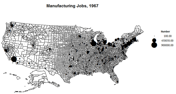
    What do the maps tell us?

    The preceding discussion has probably induced the curious reader to peruse the maps to find places of decline versus growth. The maps show data for only 10 percent of US counties, 315 of 3170.  Yet these contained 70% of manufacturing jobs in 1967, and 60% in 2014.

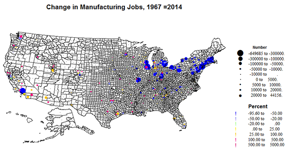
    The 1967 and 2014 maps of jobs in manufacturing depict the broad distribution of loss. Although the sheer density and size of places in the traditional industrial belt of the north stand out, a few big losses in the west, notably Los Angeles and San Francisco, appear. But the rests of the south, the plains and the west suggest a widespread if modest expansion, often in proximity to larger declining counties.

    The pattern of change from 1967 to 2014 displays the patterns of change in numbers and rates of growth versus decline.  Losses are largest and almost continuous from Detroit east to Boston, while in the south, the Midwest and west, the big losers are in older, long standing large centers, Like, LA, SF, New Orleans, St. Louis, Minneapolis, Chicago, Cincinnati, and Indianapolis. These are interspersed with growing centers of manufacturing in TX, across the west, but also quite prominent in suburban and exurban and new industrial places in the south and Midwest, e.g. MS, AL, GA, TN, LA and AR,  but in substantial numbers in different areas of OH, IN, MI, WI, IL and MN, KS and MO. While the growth in the burgeoning west and TX might be an expected product of sheer population, and located both in suburbs, as around LA, SF, Portland and Seattle, much was in new independent place such as Boise, Phoenix, Tucson, Salt Lake, Greeley and Ft. Collins, Reno and Las Vegas. In contrast, a pattern of core decline but impressive suburban-exurban growth occurred in parts of the Midwest, in MI, IN, OH, WI, MN, and MO.

    Conclusion

    Yes, the decline of manufacturing as a dominant part of the labor force is large and rea. But America still makes a lot of stuff, much in quite different places, so that there is no longer a distinctive industrial belt, but in a more dispersed pattern. Many of the older centers of manufacturing, like NY, Boston, Philadelphia, and Chicago and Los Angeles, have long since transformed into world centers of services, while others, like Pittsburgh, Detroit and Cleveland appear to be in a process of transformation.

    Some may view this transformation and the huge decline in manufacturing jobs as a benign market effect in which the US specializes in services while much of making things is out-sourced to lower cost countries. But in much of the real America far too few equivalent middle class jobs have replaced the lost jobs.  Perhaps what the US needs now is serious innovation in making new kinds of things, and bring manufacturing up to 19 million and beyond! Instead I suspect the ever-wise market will innovate with robots, presaging a time when the country will complete its transformation to an owner and servant society.

    Richard Morrill is Professor Emeritus of Geography and Environmental Studies, University of Washington. His research interests include: political geography (voting behavior, redistricting, local governance), population/demography/settlement/migration, urban geography and planning, urban transportation (i.e., old fashioned generalist).

  • Commuting in London

    According to the 2011 census, the London commuter shed — defined here as the of London (the Greater London Authority, or GLA) and the East and Southeast regions of England — had a 2013 population of 23.2 million, spread over an area of 15,400 square miles (39,800 square kilometers).

    For this analysis, the area is divided into five parts, including the central business district (CBD), the balance of Inner London, Outer London, the inner counties, which are largely adjacent to London and the outer counties. Counties are largely only ceremonial at this point and used for geographical convenience. In many counties, unitary local authorities have been established that replace part or all of the previous county geographic authority.

    The central business district is situated in a wide corridor on both sides of the Thames River. It is contained in five local authority areas, including the city of London, the city of Westminster and the boroughs of Camden, Southwark and Lambeth. All of central London’s eight largest rail stations are in these five areas, and central business district commuters rely to a substantial degree on its suburban rail system.

    Inner London roughly corresponds to the London County Council area as it existed before creation of the Greater London Council (GLC) in 1965. Outer London includes the boroughs that were added in the establishment of the GLC which was abolished in 1986. A new, London authority (the GLC) was created  in 2000, with a considerably scaled back portfolio of responsibilities, principally transport, police, fire, emergency services and planning. GLA has 33 local authorities, 32 of which are popularly referred to as boroughs, plus the City of London (the one square mile historic core). The local authorities which are responsible for a many local public services, and constituted London’s only local government between 1986 and 2000.

    The inner counties border on the metropolitan greenbelt, which surrounds London (Note). They are Berkshire Buckinghamshire, Essex, Hertfordshire, Kent and Surrey. The outer counties are Cambridgeshire, East Sussex, Hampshire, Isle of Wight, Norfolk, Oxfordshire, Suffolk and West Sussex.

    Distribution of Employment

    As of the 2011 census, the local authority areas containing the central business district had approximately 1.4 million jobs, or approximately 15 percent of the jobs in the London area. The rest of GLA, including the balance of inner London and Outer London has 25 percent of the employment. The outer counties have the largest number of jobs, at 2.7 million, comprising 30 percent of London area employment. The inner counties have nearly as many jobs, at 2.6 million, or 29 percent of employment. Thus, the suburban areas outside the Greenbelt have nearly 60 percent of the London area employment (Figure 1).

    Where People Live and Work

    The local authority areas containing the CBD have the greatest imbalance between resident workers and jobs. There are 3.35 jobs for each resident worker in these areas. The ratio of jobs to resident workers is much closer in the balance of Inner London, with a ratio of 1.04 jobs per employee. The least balanced is Outer London, with only 0.73 jobs per employee. The inner counties have the second highest ratio, at 0.93 jobs per employee. Surprisingly, the outer counties have the ratio closest to 1.00, at 0.99 jobs per employee (Figure 2). This parallels our findings of America’s only city with anything like London’s pedigree, New York.

    Most employees work in the sector of their residence. About 65 percent of CBD local authority area residents work in the CBD area (Figure 3). Outside-the-greenbelt commuters work in their own sector to a greater degree. In the outer counties 88 percent work in their home sectors, while 75 percent of inner counties commuters work in their own sectors. The balance of Inner London has the lowest percentage of employees working in their own sectors (41 percent), while Outer London is somewhat higher, at 50 percent.

    Commuting to Central London

    Despite its strong CBD, the London area is anything but monocentric. Approximately 85 percent of London area jobs are outside the central business district. Yet London comparative data from nearly two decades ago placed London’s CBD at fourth largest in the world, trailing Tokyo, New York and slightly behind Osaka. With London’s strong economic growth since that time, London has probably passed Osaka, which has faced more difficult economic times.

    The overwhelming majority of jobs in the London CBD are filled by GLA residents, with more than 75 percent of commuters living in the balance of Inner London or Outer London (Figure 4). This leaves only a quarter living in the exurban areas beyond the greenbelt. Approximately 17 percent of CBD commuters travel from the inner counties, adjacent to the Greenbelt. Only 5 percent travel from the outer counties. Less than three percent of CBD commuters travel from beyond the London area, which may be surprising given the plentiful higher speed (as opposed to genuine high speed) rail services.

    How Commuters Travel

    More than half of Londoners commute to work by car or other light vehicles (including car pools). Transit accounts for about a quarter of commuting, while about 10 percent of commuters walk to work. Approximately six percent usually labor mainly at or from home (Figure 5).

    Among mass transit commuters, suburban rail systems account for the largest share, at 37 percent, underground (metro) and light rail 33 percent and buses 30 percent. Over the past three decades there has been a substantial increase in bus ridership, principally from expanded services financed with savings from competitive tendering (also called competitive contracting) and additional services added later in conjunction with London’s inner congestion pricing zone. Competitive contracting involves use of competitively selected private companies to operate services. London’s "red bus" system — which is fully integrated in its fare, route structure and vehicle livery with its many double deck buses is virtually all operated by the private sector through competitive tendering.

    Minicentric London?

    In some ways, London is one of the world’s most dispersed cities, largely due to the discontinuous development encouraged by the greenbelt. The greenbelt imposes a substantial distance penalty for commuters from the inner and outer counties to the CBD, whether by car or train. This is in considerable contrast to Western Europe’s other megacity, Paris, which is far more compact in its metropolitan development, despite having a considerably weaker CBD. London also demonstrates that the age of the monocentric metropolitan area is largely a thing of the past in high income world cities. With less than one-sixth of metropolitan employment in the CBD, "minicentric" might be a more accurate characterization.

    Note: Housing development is prohibited on the metropolitan greenbelt, which surrounds London (GLA). The metropolitan greenbelt covers three times the land area of the GLA. Virtually all population growth over the past 85 years in the London area has occurred outside the greenbelt. The inner and outer counties have added more than 7 million residents over the since the 1931 census, while London itself has added approximately 500,000 residents.

    The metropolitan is a cornerstone of London’s urban containment policy, which also applies throughout the United Kingdom. Housing development is banned on the greenbelt and the U.K.’s urban containment policy has been associated with a substantial rise in house prices relative to incomes (see: The Barker Review of Housing Supply, the Barker Review of Land Use Planning and The Costs of Smart Growth: A 40 Year Perspective).

    Wendell Cox is Chair, Housing Affordability and Municipal Policy for the Frontier Centre for Public Policy (Canada), is a Senior Fellow of the Center for Opportunity Urbanism (US), a member of the Board of Advisors of the Center for Demographics and Policy at Chapman University (California) and principal of Demographia, an international public policy and demographics firm.

    He is co-author of the "Demographia International Housing Affordability Survey" and author of "Demographia World Urban Areas" and "War on the Dream: How Anti-Sprawl Policy Threatens the Quality of Life." He was appointed to three terms on the Los Angeles County Transportation Commission, where he served with the leading city and county leadership as the only non-elected member. He served as a visiting professor at the Conservatoire National des Arts et Metiers, a national university in Paris. 

    Photo: Traffic in London (by author)

  • Australia’s Recipe for Urban Decay

    Across federal, state, and local levels, Australian urban planning authorities have emphasized the need for policies that seek to limit urban fringe development and create densely-populated urban centers. This process is called ‘urban consolidation’ and has been a goal of Australian authorities for more than three decades. More specifically, urban consolidation is defined by efforts to concentrate housing, jobs, and amenities around “activity centers” such as a traditional downtown, satellite urban centers, and elongated strategic corridors. These high-density areas are to be separated by green belts of undeveloped land and connected by public transport links such as trains and light rail systems.

    Australian planners’ efforts to establish a high-density urban form have been effective, at least from their point of view. From 1981 to 2011, housing stock in Sydney, Melbourne, and Brisbane saw a large shift towards high-density units. A net total of 640,000 new multi-unit dwellings were built during this time, representing an increase of over 115%. This surge forced the proportion of multi-unit housing to increase to nearly one-third of the total housing supply in cities that have historically been dominated by single-family dwellings.1

    As Australia moves toward higher-density cities, what will be the result? Urban planners assert that their policy decisions are thoroughly researched and provide the “best” outcomes, but evidence from Australia’s largest cities tends to refute that claim. Among the numerous issues that arise due to consolidation ideology, perhaps the most disturbing are the severe impacts on housing affordability, poverty, and housing quality.

    Urban consolidation policies, by definition, are aimed at choking the supply of new single-family detached housing by limiting urban fringe growth as a means of minimizing the urban footprint. This is intended to drive more and more of the urban population into compact living situations. Thus, by limiting the supply of single-family detached housing and pushing more households into the market for multi-family housing, urban consolidation causes home prices to rise in both markets. As Figures 1 through 5 show, this is exactly what has happened in cities that adopt consolidation ideology. The Australian Bureau of Statistics reports that “the price of established houses in the capital cities rose by almost half (46%) between 2002-03 and 2008-09, with prices increasing at an average of 6.5% per year.”2 From 2001 to 2011, the number of dwellings in Sydney costing less than AUD $275 in rent per week decreased by 52% while the number of dwellings costing more than $275 in weekly rent surged by 269%; in Melbourne, the number of dwellings that cost at least $650 per week in rent more than tripled. Homeowners in Sydney and Melbourne have also seen tremendous increases in mortgage payments. In the same ten-year period, there was a seven-fold increase in the number of households in Sydney and Melbourne paying more than $4,000 per month in mortgage payments, while the number of households paying less than $1,000 per month was cut in half.3  At a time when wages and income have been stagnant, this means a severe decrease in housing affordability, meaning fewer Australians are able to afford the highly sought-after stability of homeownership.

    Given the profile of buyers and sellers, the market for dense multi-family housing is predominantly driven by investors, landlords, and institutional property owners.4 Thus the large majority of occupants are renters, not owner-occupiers, and there is no reason to infer that this ownership pattern will change.  As Australian cities continue to densify, ownership demand – that is, the market for the purchase and sale of housing units – will be driven less by owner-occupiers and more by investors and landlords, who have historically been the dominant players in multi-unit dwelling markets. This latter group of owners responds to market conditions in a different way than the owner-occupier group, and the shift is likely to have a profound impact on economic and socio-political outcomes in the long-term.

    In housing markets, there are two groups of consumers: investors, who intend to lease the units after buying, and owner-occupiers, who intend to live in the residences themselves. Owner-occupiers purchase homes for personal consumption; their decision about which home to buy is driven by the quality of the housing, access to transportation and employment, amenities in the surrounding area, and the sense of financial stability provided by owning one’s own home. Investors, on the other hand, are quite different. By definition, investors are driven by profit. They are seeking rental income from tenants as well as appreciation in the value of both the property and the underlying land. They evaluate properties based on the potential cash flows from renting and the price they can receive when they sell the property sometime in the future.

    But investors’ motives may become distorted in Australia due to a policy known as ‘negative gearing.’ Negative gearing, in terms of real estate investment, allows any negative cash flow from a single property to be deducted from the investor’s total taxable income.5 This gives investors   an incentive to purchase properties where the mortgage payments exceed rental income, especially if value of the property is appreciating. This pushes up the after-tax returns to investors which inflates housing prices even further. It also provides investors with greater incentive to make speculative purchases, which increases home price volatility and instability.

    What happens when you throw urban consolidation policies into the mix? As urban planners continue to choke the supply of new land, the price of existing land continues to accelerate upward. When investor profits are increasingly driven by speculating on the land value rather than income from the tenants, investors are more inclined to purchase lower-value properties which require less maintenance and fewer capital expenditures yet enjoy the same increases in underlying land value. By this logic, we could expect that low-income housing would increase in value at a faster pace than higher-quality housing as investors bid up the prices, which is exactly what happened in Sydney’s last real estate boom.6 Low-value properties are also more likely to provide investors with the support of negative gearing since they typically provide the lowest rental revenues. But investors, looking primarily at tax advantages, are less likely to improve the properties or even maintain existing structures. Thus, we can see how more and more investors not only have the incentive to compete for low-value housing units, where there is already insufficient supply, but also neglect those units in the long-term. Such market pressures are already noticeable in Sydney and Melbourne, where urban consolidation has been occurring for a longer time, and will certainly arise in Brisbane, in the state of Queensland, as planners establish growth boundaries for its booming population.7

    But it doesn’t stop there. This problem is exacerbated by the nature of Strata title plans, which have come to dominate the market for higher density housing in Australia. Essentially, strata titling comes from legislation passed in the 1960s whereby each apartment unit or flat on a parcel of land can be owned individually, and thus a mortgage could be taken out in order to purchase individual high-density housing units. This is similar to a condominium ownership structure in the United States, but with a few key shortcomings. Although strata titling allows a few individuals living in high-density areas to enjoy homeownership, it primarily benefits investors who now only have to purchase single units instead of entire multi-family buildings. Even worse, strata titling’s lack of consideration for common areas poses a serious issue in the long run for the maintenance of high-rise buildings and their surrounding neighborhoods, especially in areas of lower income. According to Bill Randolph, Director of the City Futures Research Center at the University of New South Wales, “the strata system may come badly unstuck in lower value areas where investor landlords have little incentive to reinvest in their property and home owners do not have the wherewithal to afford major repair costs.”8

    Putting it all together, what can we expect to be the future for Australia? Urban consolidation policies continue to push more Australians out of suburban homes and into cramped apartments, where housing markets are dominated by investor-landlords instead of owner-occupiers. The consolidation policies will squeeze the supply of land and force dwelling prices to rise regardless of rental revenue, promoting speculative behavior among investors. Negative gearing and strata titling programs incentivize these investors to neglect their properties, causing high-density areas (especially low-income neighborhoods) to deteriorate. The end result is slum-like conditions, social tension, and perpetual poverty for the neighborhood’s inhabitants. Even in higher-value neighborhoods, a lack of necessary upkeep will erode housing quality, even as prices continue to inflate. This is the reality of urban consolidation; it takes ownership out of the hands of Australians and puts it in the hands of speculative and neglectful investor-landlords. It is nothing short of a recipe for urban decay.

    Clinton Stiles-Schmidt graduated magna cum laude from Chapman University where he earned a Bachelor of Science in Business Administration (emphasis in Real Estate and Finance) and a Bachelor of Arts in Economics. His experience includes several internships in real estate investment and development as well as studying abroad in both Spain and Australia. Clinton recently joined Cushman & Wakefield as an Analyst in their Corporate Finance & Investment Banking Group.


    Figure 1: Ratio of Housing Debt to Disposable Income in Australia9

    Figure 2: Weekly Rent Payments in Sydney10

    Figure 3: Monthly Mortgage Payments in Sydney11

    Figure 4: Weekly Rent Payments in Melbourne12

    Figure 5: Monthly Mortgage Payments in Melbourne13


    1 "Community Profiles." ABS Census 1986-2011. Australian Bureau of Statistics, 1 Oct. 2014. http://www.abs.gov.au/websitedbs/censushome.nsf/home/communityprofiles.

    2 "Measures of Australia’s Progress, 2010." Australian Bureau of Statistics, 15 Sept. 2010. http://www.abs.gov.au/ausstats/abs@.nsf/Lookup/by%20Subject/1370.0~2010~Chapter~House%20prices%20(5.4.4.1)

    3 "Community Profiles." ABS Census 1986-2011. Australian Bureau of Statistics, 1 Oct. 2014. http://www.abs.gov.au/websitedbs/censushome.nsf/home/communityprofiles.

    4 Randolph, Bill. "Delivering the Compact City in Australia: Current Trends and Future Implications." City Future Research Centre, University of New South Wales, 1 June 2006.

    5 Koulizos, Peter. "How Negative Gearing Works." The Realestate.com.au Blog. Realestate.com.au, 21 Oct. 2013. http://www.realestate.com.au/blog/how-negative-gearing-works/.; "Real Estate." Australian Tax Office. Australian Government, 22 Jan. 2013. https://www.ato.gov.au/General/Capital-gains-tax/In-detail/Real-estate/

    6 Hill, Robert J., Daniel Melser, and Iqbal Syed. "Measuring a Boom and Bust: The Sydney Housing Market 2001–2006." Journal of Housing Economics 18.3 (2009): 193-205. ScienceDirect. Web. http://www.sciencedirect.com/science/article/pii/S1051137709000321

    7 Yu, Xiaojiang. "‘The Great Australian Dream’ Busted on a Brick Wall: Housing Issues in Sydney." Cities 22.6 (2005): 436-45. ScienceDirect. Web. http://www.sciencedirect.com/science/article/pii/S0264275105000879 ; Stimson, Robert J., and Shane P. Taylor. "City Profile: Brisbane." Cities 16.4 (1999): 285-95.ScienceDirect. Web. http://www.sciencedirect.com/science/article/pii/S0264275199000104

    8 Randolph, Bill. "Delivering the Compact City in Australia: Current Trends and Future Implications." Urban Policy and Research 24.4 (2006): 473-90. City Futures, June 2006. Web. https://www.be.unsw.edu.au/sites/default/files/upload/researchpaper6.pdf

    9 "RBA: Statistical Tables." Reserve Bank of Australia, 26 Sept. 2014. http://www.rba.gov.au/statistics/tables/.

    10 "Community Profiles." ABS Census 1986-2011. Australian Bureau of Statistics, 1 Oct. 2014. http://www.abs.gov.au/websitedbs/censushome.nsf/home/communityprofiles.

    11 Ibid.

    12 Ibid.

    13 Ibid.

    Sydney suburb photo by BigStockPhoto.com.

  • Hooray For the High Bridge

    My latest article is online in City Journal and is a look at the restoration and reopening of the High Bridge in New York City. Part of the original Croton Aqueduct system that first brought plentiful clean water to New York, portions of the High Bridge are the oldest standing bridge in the city. Here’s an excerpt:

    It’s worth asking whether, with its $61 million price tag, the High Bridge project was really needed. Strictly speaking, the answer is: No. The structure was in no danger of falling down. And, just a half mile to the north, the Washington Bridge provides a functional, if unpleasant, pedestrian crossing over the Harlem River. Yet, the High Bridge is an important part of New York history and deserves its loving restoration. Spending serious money on outlying neighborhoods that are mostly minority and heavily poor to give their residents a humane environment instead of a minimalistic one shows that New York does care about all its citizens. Great cities don’t just do great things in a sanitized downtown Green Zone for visitors. They create greatness in their workaday neighborhoods, too, with projects that speak not merely to the pragmatic, but to the human spirit. The High Bridge restoration again shows what great commercial success allows a city to do for its citizens.

    Click through to read the whole thing.

    Here are some additional pictures I took. First, the High Bridge peeking through the trees from the Manhattan heights. You can see both the original stone arch spans and the longer steel arch span.


    Looking south:


    Embedded seal in the bridge pavement with historical info. There are quite a few of these discussing various aspects of the project.


    The neighbors are fans:

    Aaron M. Renn is a senior fellow at the Manhattan Institute and a Contributing Editor at City Journal. He writes at The Urbanophile, where this piece first appeared.