Blog

  • Mid Sized Cities Information Jobs – 2015 Best Cities Rankings

    Read about how we selected the 2015 Best Cities for Job Growth

    We used five measures of growth to rank MSAs over the past 10 years. “Large” areas include those with a current nonfarm employment base of at least 450,000 jobs. “Midsize” areas range from 150,000 to 450,000 jobs. “Small” areas have as many as 150,000 jobs. This year’s rankings reflect the new Office of Management and Budget definitions of MSAs for all series released after March 2015. As a result, the MSA listed in this year’s rankings do not necessary correspond directly to those listed in prior years. In some instances, MSAs were consolidated with others — for example Pascagoula, MS, was combined with the Gulfport-Biloxi, MS, MSA to form the new Gulfport-Biloxi-Pascagoula, MS, MSA. Others were separated from previously consolidated MSAs and in still other instances individual counties were shifted from one MSA to another. The bottom line is that this year’s rankings are based on good time series for the newly defined MSAs but may not be precisely comparable to those listed in prior years. The total number of MSAs included in this year’s rankings has risen from 398 to 421. This year’s rankings reflect the current size of each MSA’s employment.

    2014 MSA Info  Ranking – Midsized MSAs Area 2015 Weighted INDEX 2014 Nonfarm Emplymt (1000s) 2014 Info Emplymt Total Information Emplymt Cum Growth 2009-2014 2015  Change from 2014 – Midsized MSAs
    1 Savannah, GA 96.6       168.1      2.0 28.3% 63
    2 Tallahassee, FL 93.5       176.3      3.9 23.2% 14
    3 Baton Rouge, LA 93.5       399.8      6.0 28.6% 3
    4 Provo-Orem, UT 92.1       219.7   10.2 30.1% (3)
    5 Durham-Chapel Hill, NC 89.6       294.2      4.2 17.8% 3
    6 Madison, WI 89.5       386.9   14.8 36.1% (3)
    7 Ann Arbor, MI 89.4       211.3      5.0 26.1% 14
    8 Jackson, MS 85.1       273.3      5.3 19.4% 14
    9 Santa Maria-Santa Barbara, CA 80.3       180.0      4.5 32.4% (5)
    10 Springfield, MO 79.4       204.8      4.3 7.6% 24
    11 Lincoln, NE 77.1       185.7      2.6 13.0% 2
    12 McAllen-Edinburg-Mission, TX 76.1       247.9      2.3 9.5% 8
    13 El Paso, TX 75.9       296.7      5.9 16.4% (2)
    14 Huntsville, AL 75.6       217.9      2.7 14.1% (7)
    15 Charleston-North Charleston, SC 75.2       324.3      5.3 2.6% (6)
    16 Bridgeport-Stamford-Norwalk, CT NECTA 74.0       409.4   11.4 10.0% (11)
    17 Augusta-Richmond County, GA-SC 70.1       228.2      3.2 6.7% (7)
    18 Oxnard-Thousand Oaks-Ventura, CA 70.0       295.6      5.5 5.1% 23
    19 Winston-Salem, NC 69.8       255.2      2.3 0.0% 14
    20 Green Bay, WI 69.6       173.6      2.1 1.6% 40
    21 Tacoma-Lakewood, WA Met Div 66.4       293.5      2.9 0.0% (3)
    22 Spokane-Spokane Valley, WA 65.2       235.4      3.1 8.1% (5)
    23 Knoxville, TN 64.3       382.8      5.8 3.0% (4)
    24 Fresno, CA 63.5       319.2      3.9 1.7% 22
    25 Asheville, NC 62.9       181.4      1.9 -4.9% 13
    26 Boise City, ID 62.6       284.2      4.4 -0.8% (14)
    27 North Port-Sarasota-Bradenton, FL 62.3       276.7      3.4 0.0% 18
    28 Greenville-Anderson-Mauldin, SC 61.1       394.4      7.1 3.4% (1)
    29 Allentown-Bethlehem-Easton, PA-NJ 61.0       354.0      6.2 6.3% (5)
    30 Anchorage, AK 60.3       177.7      4.5 -3.6% 5
    31 Lexington-Fayette, KY 59.5       268.3      5.8 7.5% 23
    32 Santa Rosa, CA 58.7       193.7      2.7 3.8% (3)
    33 Columbia, SC 57.4       375.8      5.5 -3.0% (2)
    34 Akron, OH 56.9       332.2      3.9 -5.6% (6)
    35 Cape Coral-Fort Myers, FL 55.8       239.1      3.1 6.9% (10)
    36 Mobile, AL 55.6       174.8      2.0 -11.6% 0
    37 Omaha-Council Bluffs, NE-IA 55.4       486.6   11.1 -2.9% (2)
    38 Lansing-East Lansing, MI 53.9       225.6      2.8 7.7% (36)
    39 Elgin, IL Met Div 52.6       249.9      3.7 -11.9% not ranked
    40 Chattanooga, TN-GA 52.6       242.1      2.9 -23.0% 17
    41 Montgomery, AL 51.1       170.3      2.2 1.6% (11)
    42 Boulder, CO 51.0       178.3      8.2 -6.5% (2)
    43 Corpus Christi, TX 49.0       196.6      2.1 -8.7% (1)
    44 Gary, IN Met Div 48.6       276.5      2.1 -10.1% (18)
    45 Canton-Massillon, OH 47.8       172.2      1.7 -15.0% 8
    46 Fayetteville-Springdale-Rogers, AR-MO 47.6       227.8      1.9 -12.3% 13
    47 Stockton-Lodi, CA 47.6       212.1      2.1 -3.1% 33
    48 Worcester, MA-CT NECTA 47.3       277.1      3.4 0.0% (34)
    49 Beaumont-Port Arthur, TX 47.2       168.8      1.5 -6.3% 22
    50 Framingham, MA NECTA Div 47.1       171.0      5.3 -5.9% 1
    51 Kansas City, KS 47.0       458.8   15.1 -8.3% 1
    52 Lakeland-Winter Haven, FL 46.7       205.5      1.6 -10.9% 22
    53 Palm Bay-Melbourne-Titusville, FL 45.8       199.8      1.9 -25.3% 34
    54 Urban Honolulu, HI 45.6       467.2      7.2 -0.9% (18)
    55 Delaware County, PA 44.6       232.4      2.6 -12.4% not ranked
    56 Colorado Springs, CO 43.8       263.9      6.8 -3.3% 0
    57 Greensboro-High Point, NC 43.6       354.7      5.0 -10.2% 19
    58 Springfield, MA-CT NECTA 43.3       324.0      3.7 -7.5% (43)
    59 Ogden-Clearfield, UT 43.0       234.7      2.1 -4.5% (20)
    60 Wichita, KS 42.6       294.5      4.5 -18.2% 18
    61 Lancaster, PA 41.6       240.5      3.1 -13.1% 0
    62 Toledo, OH 41.6       298.3      3.1 -1.1% (25)
    63 Lafayette, LA 40.7       221.8      2.9 -9.4% 0
    64 Reno, NV 40.4       204.2      2.0 -16.7% 25
    65 Albany-Schenectady-Troy, NY 40.4       457.2      8.3 -10.1% (10)
    66 Reading, PA 39.3       176.7      1.3 -4.9% 4
    67 Albuquerque, NM 39.3       380.3      7.8 -15.9% 2
    68 Bakersfield, CA 39.2       261.7      2.3 -13.6% (21)
    69 Fort Wayne, IN 37.6       212.9      3.0 -8.2% (26)
    70 Portland-South Portland, ME NECTA 37.2       193.8      3.1 -16.2% 11
    71 Trenton, NJ 37.0       252.9      5.0 -18.0% (27)
    72 Davenport-Moline-Rock Island, IA-IL 36.3       183.0      2.4 -18.2% (24)
    73 Tulsa, OK 35.5       445.6      7.5 -11.4% (6)
    74 Gulfport-Biloxi-Pascagoula, MS 35.1       152.0      1.5 -6.3% not ranked
    75 Syracuse, NY 33.4       318.1      4.5 -12.4% (9)
    76 Peoria, IL 32.9       178.0      2.2 -10.8% (11)
    77 Tucson, AZ 31.6       370.8      4.1 -8.9% (27)
    78 Calvert-Charles-Prince George’s, MD 31.6       387.7      4.9 -2.0% (16)
    79 Youngstown-Warren-Boardman, OH-PA 31.4       226.2      1.9 -20.8% 9
    80 Modesto, CA 31.0       163.0      0.9 -25.0% 11
    81 York-Hanover, PA 29.4       180.1      1.7 -17.7% (49)
    82 Harrisburg-Carlisle, PA 28.4       330.1      4.5 -22.0% (24)
    83 Dayton, OH 28.0       374.5      8.4 -21.5% 3
    84 Baltimore City, MD 26.9       365.1      3.6 -12.1% 0
    85 Roanoke, VA 26.9       161.4      1.7 -15.0% (8)
    86 Little Rock-North Little Rock-Conway, AR 26.6       347.8      6.7 -14.9% (18)
    87 Deltona-Daytona Beach-Ormond Beach, FL 26.2       184.6      2.6 -21.2% (8)
    88 Salem, OR 25.9       151.5      1.0 -23.1% 49
    89 Lake County-Kenosha County, IL-WI Met Div 24.3       399.2      3.6 -18.2% (14)
    90 Rockford, IL 23.0       150.9      1.4 -22.2% 68
    91 Scranton–Wilkes-Barre–Hazleton, PA 22.5       262.5      3.7 -29.9% (1)
    92 Evansville, IN-KY 21.7       157.9      1.8 -24.3% (10)
    93 Des Moines-West Des Moines, IA 20.2       345.7      6.6 -20.9% (10)
    94 Pensacola-Ferry Pass-Brent, FL 20.2       166.6      2.2 -27.5% (22)
    95 Wilmington, DE-MD-NJ Met Div 16.6       352.1      4.1 -23.3% (10)
    96 Shreveport-Bossier City, LA 15.9       183.5      2.0 -52.0% (47)
    97 New Haven, CT NECTA 13.3       282.4      4.0 -32.2% (5)
  • Small Cities Information Jobs – 2015 Best Cities Rankings

    Read about how we selected the 2015 Best Cities for Job Growth

    We used five measures of growth to rank MSAs over the past 10 years. “Large” areas include those with a current nonfarm employment base of at least 450,000 jobs. “Midsize” areas range from 150,000 to 450,000 jobs. “Small” areas have as many as 150,000 jobs. This year’s rankings reflect the new Office of Management and Budget definitions of MSAs for all series released after March 2015. As a result, the MSA listed in this year’s rankings do not necessary correspond directly to those listed in prior years. In some instances, MSAs were consolidated with others — for example Pascagoula, MS, was combined with the Gulfport-Biloxi, MS, MSA to form the new Gulfport-Biloxi-Pascagoula, MS, MSA. Others were separated from previously consolidated MSAs and in still other instances individual counties were shifted from one MSA to another. The bottom line is that this year’s rankings are based on good time series for the newly defined MSAs but may not be precisely comparable to those listed in prior years. The total number of MSAs included in this year’s rankings has risen from 398 to 421. This year’s rankings reflect the current size of each MSA’s employment.

    2014 MSA Info  Ranking – SMALL MSAs Area 2015 Weighted INDEX 2014 Nonfarm Emplymt (1000s) 2014 Info Emplymt Total Information Emplymt Cum Growth 2009-2014 2014 Info Rank Within Size
    1 Janesville-Beloit, WI 99.3        66.8     1.8 63.6% 1
    2 Rochester, MN 94.3     114.9     2.0 27.1% 7
    3 Logan, UT-ID 88.8        58.3     0.9 28.6% 3
    4 College Station-Bryan, TX 87.5     106.1     1.4 27.3% 9
    5 Laredo, TX 85.6     100.2     0.7 16.7% 5
    6 Cheyenne, WY 84.7        47.1     1.2 9.1% 15
    7 Fond du Lac, WI 84.6        48.3     1.0 11.1% 8
    8 Wilmington, NC 82.6     117.1     2.8 0.0% 33
    9 Victoria, TX 78.9        45.5     0.5 0.0% 49
    10 Oshkosh-Neenah, WI 78.6        95.1     1.7 13.3% 18
    11 Portsmouth, NH-ME NECTA 78.3        83.6     2.4 5.9% 10
    12 Bloomington, IN 78.3        77.0     1.4 0.0% 38
    13 Bend-Redmond, OR 77.9        70.3     1.5 7.1% 20
    14 Flint, MI 77.8     142.3     4.1 32.6% 2
    15 Sheboygan, WI 77.3        60.9     0.3 0.0% 129
    16 Abilene, TX 75.5        69.2     1.2 9.1% 4
    17 Rapid City, SD 75.3        65.0     1.0 0.0% 123
    18 Lawrence-Methuen Town-Salem, MA-NH NECTA Div 75.1        79.2     1.6 33.3%  
    19 Haverhill-Newburyport-Amesbury Town, MA-NH NECTA Div 74.6        62.8     0.4 0.0% 43
    20 Clarksville, TN-KY 73.7        88.2     1.2 20.7% 31
    21 Columbus, IN 73.7        51.8     0.5 25.0% 32
    22 San Luis Obispo-Paso Robles-Arroyo Grande, CA 73.4     111.1     1.4 16.7% 6
    23 Tyler, TX 71.8     100.2     2.3 11.1% 12
    24 Napa, CA 71.6        69.5     0.6 5.6% 100
    25 Bay City, MI 71.0        37.4     0.5 0.0% 27
    26 Champaign-Urbana, IL 70.3     108.7     2.6 -7.2% 13
    27 Pocatello, ID 69.8        35.2     0.4 0.0% 90
    28 Peabody-Salem-Beverly, MA NECTA Div 67.7        96.2     1.3 30.0% 79
    29 Port St. Lucie, FL 67.2     135.3     1.4 0.0% 74
    30 Fort Collins, CO 67.0     148.9     2.5 -2.6% 56
    31 Jackson, MI 66.7        55.9     0.4 0.0% 160
    32 Spartanburg, SC 66.6     140.6     1.1 0.0%  
    33 Cleveland, TN 66.1        46.0     0.3 0.0% 26
    34 Burlington, NC 65.8        60.9     0.5 0.0% 36
    35 Fargo, ND-MN 65.4     140.2     3.3 -5.7% 34
    36 Auburn-Opelika, AL 65.1        60.7     0.5 0.0% 23
    37 Flagstaff, AZ 65.1        64.3     0.4 0.0% 24
    38 Taunton-Middleborough-Norton, MA NECTA Div 64.8        58.7     1.3 0.0%  
    39 Walla Walla, WA 64.5        27.1     0.4 0.0%  
    40 Gainesville, FL 64.2     135.2     1.6 0.0% 94
    41 Lewiston, ID-WA 64.1        27.4     0.4 0.0% 25
    42 Redding, CA 63.4        63.1     0.7 10.5% 65
    43 Muskegon, MI 63.3        63.0     0.8 0.0% 30
    44 Kokomo, IN 63.0        40.7     0.4 0.0% 47
    45 Eugene, OR 62.9     149.7     3.4 -1.9% 28
    46 Myrtle Beach-Conway-North Myrtle Beach, SC-NC 62.7     148.3     2.3 0.0%  
    47 Grants Pass, OR 62.4        24.5     0.3 0.0%  
    48 Bismarck, ND 61.4        74.0     1.0 3.6% 98
    49 Santa Fe, NM 61.1        61.8     0.9 -12.9% 58
    50 Watertown-Fort Drum, NY 60.8        41.6     0.7 0.0%  
    51 Prescott, AZ 60.5        60.9     0.6 0.0% 35
    52 Dover-Durham, NH-ME NECTA 60.4        52.7     1.1 0.0%  
    53 Brownsville-Harlingen, TX 60.2     138.1     1.2 -42.9% 122
    54 Chico, CA 60.1        76.9     1.1 6.7% 113
    55 Las Cruces, NM 58.7        71.1     0.9 8.0% 22
    56 Decatur, AL 58.6        53.8     0.3 0.0% 50
    57 Binghamton, NY 58.6     105.7     1.9 -3.4% 16
    58 Sioux Falls, SD 58.4     146.5     2.7 -10.0% 46
    59 Bangor, ME NECTA 57.3        66.4     1.1 0.0% 119
    60 Lowell-Billerica-Chelmsford, MA-NH NECTA Div 56.9     147.6     6.4 3.2% 143
    61 Albany, OR 56.9        41.1     0.4 0.0%  
    62 Hanford-Corcoran, CA 56.6        37.6     0.2 0.0% 110
    63 Fairbanks, AK 55.8        37.5     0.5 0.0% 104
    64 Terre Haute, IN 55.3        70.8     0.7 0.0% 66
    65 St. George, UT 54.8        54.6     0.7 0.0% 53
    66 Yuba City, CA 53.4        40.5     0.4 -14.3% 62
    67 Wichita Falls, TX 53.2        58.5     1.1 -8.3% 76
    68 South Bend-Mishawaka, IN-MI 53.0     137.6     1.8 0.0% 67
    69 San Rafael, CA Met. Div 52.5     113.0     2.6 36.8%  
    70 Texarkana, TX-AR 52.4        59.1     0.5 -16.7% 71
    71 Madera, CA 51.5        36.5     0.4 -14.3% 42
    72 Charlottesville, VA 51.5     112.2     2.1 0.0%  
    73 Lawton, OK 51.4        45.4     0.5 -16.7% 64
    74 Sebastian-Vero Beach, FL 51.2        48.4     0.6 0.0% 17
    75 Pueblo, CO 51.2        60.6     0.7 -12.5% 44
    76 Naples-Immokalee-Marco Island, FL 51.0     136.2     1.5 -6.3% 48
    77 Altoona, PA 50.4        61.1     0.8 -7.4% 52
    78 Burlington-South Burlington, VT NECTA 50.0     124.2     2.3 -11.5% 91
    79 Jackson, TN 49.9        65.6     0.6 -10.0% 124
    80 Greenville, NC 49.0        78.4     0.9 -10.0% 19
    81 Corvallis, OR 48.7        40.3     0.7 -22.2% 149
    82 La Crosse-Onalaska, WI-MN 48.7        77.2     1.1 0.0% 68
    83 Visalia-Porterville, CA 48.2     116.6     0.9 -18.2% 141
    84 Grand Forks, ND-MN 48.1        58.0     0.6 -10.0% 72
    85 Saginaw, MI 47.4        88.7     1.3 0.0% 21
    86 Charleston, WV 47.3     123.3     1.7 -15.0% 99
    87 Dothan, AL 47.3        57.3     0.7 -12.5% 87
    88 Kankakee, IL 47.3        45.2     0.5 -17.6% 73
    89 Olympia-Tumwater, WA 46.5     108.9     0.9 -6.9%  
    90 Utica-Rome, NY 46.4     127.8     1.8 -19.7% 159
    91 Nashua, NH-MA NECTA Div 46.3     125.4     1.9 -6.7% 105
    92 Kingsport-Bristol-Bristol, TN-VA 45.6     122.2     2.0 -10.4% 29
    93 Cedar Rapids, IA 45.4     140.5     4.7 -4.1% 69
    94 Racine, WI 45.3        76.0     0.4 -7.7% 88
    95 Hickory-Lenoir-Morganton, NC 44.5     147.2     0.9 0.0% 14
    96 Hagerstown-Martinsburg, MD-WV 43.9     103.4     2.2 -4.3% 82
    97 Kennewick-Richland, WA 43.8     104.6     0.8 -11.1%  
    98 Johnson City, TN 43.7        78.6     1.5 -22.0% 132
    99 Columbus, GA-AL 43.6     123.2     1.6 -11.3% 116
    100 Odessa, TX 42.7        81.7     0.5 -16.7% 109
    101 Eau Claire, WI 42.3        85.3     0.9 -10.0% 103
    102 Longview, TX 42.2     105.4     1.4 -10.9% 61
    103 Manchester, NH NECTA 42.0     108.6     3.0 -9.1% 57
    104 Amarillo, TX 41.9     117.4     1.4 -12.5% 97
    105 Tuscaloosa, AL 41.7     104.4     0.8 -17.2% 115
    106 Waterbury, CT NECTA 41.4        68.4     0.7 -8.7% 95
    107 Huntington-Ashland, WV-KY-OH 41.3     141.5     1.3 -13.3%  
    108 Elmira, NY 40.0        39.6     0.4 -20.0% 89
    109 Pittsfield, MA NECTA 39.8        41.4     0.6 -5.6% 107
    110 Punta Gorda, FL 39.3        44.6     0.4 -14.3% 112
    111 Yuma, AZ 39.2        52.7     0.5 -6.3% 45
    112 Dutchess County-Putnam County, NY Met. Div 38.7     142.4     1.9 -14.9%  
    113 Topeka, KS 38.6     111.6     1.5 -25.0% 144
    114 Niles-Benton Harbor, MI 38.6        60.2     0.5 -11.8% 133
    115 Leominster-Gardner, MA NECTA 37.8        50.4     0.4 -20.0% 152
    116 Lynn-Saugus-Marblehead, MA NECTA Div 37.8        45.2     1.0 -12.1%  
    117 Muncie, IN 37.5        51.0     0.3 -25.0% 86
    118 Barnstable Town, MA NECTA 37.3        97.6     1.5 -11.8% 54
    119 Fort Smith, AR-OK 36.7     113.4     1.2 0.0% 63
    120 Lafayette-West Lafayette, IN 35.9     102.3     0.9 -10.0% 11
    121 Santa Cruz-Watsonville, CA 35.8        95.7     0.8 -14.3% 128
    122 Lynchburg, VA 35.6     103.7     0.9 -18.2%  
    123 Anniston-Oxford-Jacksonville, AL 35.2        46.3     0.6 -25.0% 135
    124 Vallejo-Fairfield, CA 35.1     130.4     1.1 -21.4% 108
    125 Fayetteville, NC 34.7     128.6     1.4 -8.7% 70
    126 St. Cloud, MN 34.6     107.0     1.6 -9.4% 40
    127 Glens Falls, NY 34.3        53.6     0.9 -10.0% 41
    128 Brockton-Bridgewater-Easton, MA NECTA Div 33.4        80.8     0.6 -14.3% 140
    129 Springfield, IL 32.8     111.4     1.7 -19.0% 142
    130 Kahului-Wailuku-Lahaina, HI 32.5        72.4     0.6 -25.0%  
    131 Johnstown, PA 30.3        57.8     0.7 -12.5% 114
    132 Casper, WY 30.2        43.2     0.4 -20.0% 83
    133 Duluth, MN-WI 29.6     134.0     1.4 -20.4% 84
    134 Salisbury, MD-DE 28.3     142.3     1.2 -21.7%  
    135 Gadsden, AL 28.3        37.6     0.3 -40.0% 55
    136 Decatur, IL 27.9        50.8     0.6 -21.7% 138
    137 Idaho Falls, ID 27.3        60.2     0.9 -30.8% 120
    138 Kingston, NY 26.6        60.9     0.9 -10.0% 81
    139 Danville, IL 26.4        29.3     0.2 -33.3% 150
    140 Merced, CA 26.1        64.5     0.4 -33.3% 117
    141 Wausau, WI 26.0        71.6     0.4 -29.4% 145
    142 Lubbock, TX 25.1     138.6     3.8 -16.8% 111
    143 Ocala, FL 24.4        98.3     0.8 -25.0% 139
    144 El Centro, CA 24.3        54.9     0.3 -25.0% 77
    145 Ithaca, NY 23.8        70.6     0.4 -20.0% 51
    146 Waco, TX 23.5     112.4     1.2 -16.3% 92
    147 Owensboro, KY 23.5        52.6     0.4 -20.0% 125
    148 Sherman-Denison, TX 23.0        45.6     0.4 -20.0% 37
    149 Appleton, WI 22.6     122.1     1.5 -27.4% 130
    150 Salinas, CA 22.5     132.8     1.4 -17.6% 118
    151 Killeen-Temple, TX 22.4     136.2     1.8 -23.6% 59
    152 Grand Junction, CO 22.1        61.9     0.7 -22.2% 60
    153 Sierra Vista-Douglas, AZ 21.9        34.7     0.3 -50.0%  
    154 Florence-Muscle Shoals, AL 20.8        56.4     0.4 -29.4% 134
    155 Midland, TX 19.7        98.6     0.9 -25.0% 154
    156 Panama City, FL 18.6        78.4     1.1 -31.3% 136
    157 Kalamazoo-Portage, MI 18.1     141.0     0.9 -34.1% 147
    158 Coeur d’Alene, ID 18.1        58.3     0.6 -29.2% 78
    159 Greeley, CO 17.7     101.5     0.7 -28.6% 131
    160 Medford, OR 16.7        82.0     1.3 -23.5% 121
    161 Bloomington, IL 15.8        94.4     0.7 -22.2% 146
    162 Elkhart-Goshen, IN 15.3     124.5     0.5 -21.1% 85
    163 Vineland-Bridgeton, NJ 12.5        56.6     0.5 -42.3% 96
    164 Lake Havasu City-Kingman, AZ 10.7        46.6     0.6 -30.8% 155
    165 Atlantic City-Hammonton, NJ 10.3     130.6     0.7 -30.0% 102
    166 Erie, PA 10.1     130.6     1.2 -29.4% 153
    167 San Angelo, TX 8.2        49.3     0.8 -34.2% 156
    168 Dover, DE 7.3        68.0     0.4 -33.3% 93
    169 Norwich-New London-Westerly, CT-RI NECTA 7.2     127.5     1.1 -32.7% 127
    170 Lewiston-Auburn, ME NECTA 6.6        50.6     0.5 -34.8% 148
    171 Crestview-Fort Walton Beach-Destin, FL 5.1     103.4     0.9 -32.5% 151
    172 New Bedford, MA NECTA 4.2        66.3     0.4 -42.9% 106
    173 Morristown, TN 3.9        44.2     0.3 -40.0% 126
  • Small Regions Rising

    In the last 25 years there has been a huge change in the level of competitiveness of smaller urban areas – by which I mean the small end of the major urban scale, or metro areas of about one to three million people – that has put them in the game for people in residents in way they never were before.

    I recently gave the morning keynote at the Mayor’s Development Roundtable in Oklahoma City and talked a bit about this phenomenon, as well as how these generally younger and sprawling areas ought to be thinking about their future.

    If the video doesn’t display for you, click over to watch on You Tube (my segment starts at 4:36).


    Aaron M. Renn is a senior fellow at the Manhattan Institute and a Contributing Editor at City Journal. He writes at The Urbanophile, where this piece first appeared.

  • Democrats Now the Party of Plutocracy

    There’s more than a bit of cognitive dissonance in the merger of Democrats with plutocracy – rule by the wealthy. After all, the party’s brand is supposed to be “party of the people.” For Democrats, the allure of corporate cash – in campaign contributions and, later on, in of corporate patronage – may be overwhelming, but it does pose a threat to the party’s positioning.

    To be sure, the Republicans are not exactly a primary vehicle for social democracy, but at least they generally don’t generally sell themselves this way. This differs from the almost comic attempt of Hillary Clinton to run as the candidate of the abandoned middle class. After all, this seems strange coming from a woman who gets six-figure fees for speeches to corporate groups, and whose family foundation may turn out to be one of the most egregious examples of quid pro quo fundraising since the money-grubbing days of the Nixon regime.

    Yet the progressive establishment seems ready to accept Clinton’s recent transformation from corporate shill to class warrior; as the increasingly obsequious progressive mouthpiece the New Republic suggested “Clinton’s movement to the left is unalloyed good news for liberals.” Rolling Stone, a noted stranger to credibility, as its now-discredited campus rape story suggests, also sees in her a kindred spirit in duplicity. Her “fake populism,” they declared, “is a hit.”

    Read the entire piece at The Orange County Register.

    Joel Kotkin is executive editor of NewGeography.com and Roger Hobbs Distinguished Fellow in Urban Studies at Chapman University, and a member of the editorial board of the Orange County Register. He is also executive director of the Houston-based Center for Opportunity Urbanism. His newest book, The New Class Conflict is now available at Amazon and Telos Press. He is also author of The City: A Global History and The Next Hundred Million: America in 2050.  He lives in Los Angeles, CA.

    Photo: “US Secretary of State Hillary Rodham Clinton Meets Japanese Foreign Minister Seiji Maehara in Hawaii 101027-F-LX971-088” by Master Sgt. Cohen Young – https://www.dvidshub.net/image/1317097. Licensed under Public Domain via Wikimedia Commons.

  • The California Dream has Moved Away

    Southern California faces a serious middle income housing affordability crisis. I refer to middle income housing, because this nation has become so successful in democratizing property ownership that the overwhelming majority of middle income households own their own homes in most of the country.

    Recently I had the privilege of participating in a forum on this subject sponsored by the Urban Land Institute, Los Angeles Housing Chapter in Century City. The forum also included a presentation from USC Professor Dowell Myers and was chaired by Ehud Mouchly, who chairs the Housing Chapter. This article is adapted from my presentation.

    I am a native Angeleno, having been born near Temple and Alvarado, less than two miles from City Hall. I was appointed to three terms on the Los Angeles County Transportation Commission (LACTC) by Mayor Tom Bradley, where I played a pivotal role in the establishment of the Los Angeles rail system. LACTC and SCRTD were the two predecessors to the current Los Angeles County Metropolitan Transportation Authority (MTA).

    In addition, for 11 years, Hugh Pavletich of Christchurch, New Zealand and I have published the Demographia International Housing Affordability Survey. The latest edition was released in January and included median multiple data for 86 major metropolitan areas and nearly 300 smaller metropolitan areas in nine nations. Finally, I publish the most comprehensive annual review of world urbanization, providing population, land area and density for world urban areas with over 500,000 population (See World’s 1,000 Largest Cities: World Urban Areas 2015 Edition).

    All of this makes housing in Southern California and urban development particularly interesting to me.

    The Imperative: A Rising Standard of Living and Less Poverty

    The title of the forum was "The Changing Demographics of Southern California and Their Impact on Housing," however I think that the reverse is more significant — the impact housing is likely to have on Southern California.

    My perspective is neither ideological nor tied to any political party. It is a fundamentally pragmatic view that domestic policy should principally seek to better people’s lives, by facilitating a rising standard of living and reducing poverty. These objectives were also referenced in the G20 nations communiqué in Brisbane and adopted a announcing a dedication to improving standards of living and eradicating poverty.

    The issue is particularly ripe in California, where public policies relating to housing are having virtually the opposite effect. Housing costs have already increased poverty and reduced the discretionary income of middle-income households.

    This is not an issue of suburbs versus the urban core. I could not be more pleased by the long overdue resurgence of downtown areas as residential locations, something made possible by the huge crime reductions that began with Mayor Rudy Giuliani’s policies in New York City and similar efforts in cities like Los Angeles. It is important to recognize that a vibrant core no more needs dying suburbs then vibrant suburbs need a dying core. Both urban cores and suburbs can prosper, creating a stronger urban area.

    The Housing Crisis

    Southern California’s biggest crisis relates to housing. Housing is important to the standard of living and alleviating poverty. It is the largest element of household budgets. When housing more expensive, it leaves households with less discretionary income to purchase other goods and services. This will, other things being equal, reduce economic output from levels that would be otherwise attained.

    This has been developing for more than four decades as house price to income ratios (such as the median multiple, the median house price divided by the median household income) have doubled and tripled above historical levels and well above those of other metropolitan areas. Attention is often focused on lower income affordable housing, a problem virtually everywhere, but most parts of the country do not suffer so severe a middle-income housing affordability problem. Low-income housing affordability is important and one of the best ways to minimize it is to ensure that there is middle-income housing affordability.

    A bit of historical perspective is appropriate. For centuries nations had little or no property-owning middle class. Huge progress has been made in the last century and particularly since World War II. Following the war, housing development innovation, combined with transportation advances, led to the development of owned middle income housing in the suburbs. It started with Levittown on Long Island and spread across the nation. The most fabled Southern California example is Lakewood (see D. J. Waldie’s Holy Land: A Suburban Memoir on this). The result was a massive increase in home ownership, rising from percentages from the low 40s to 65% in the final decades of the 20th century.

    Similar progress was made in other countries, especially in Canada, Australia and New Zealand, where middle-income households purchased homes with sufficient space. In each of these nations, the median multiples were around or below 3.0 as late as 1995.

    All of this represented progress toward what the late and renown British urbanist Peter Hall called the "ideal of a property owning democracy" (See: The Costs of Smart Growth Revisited: A 40 Year Perspective).

    Sadly, affordability has diminished greatly in many metropolitan areas around the world.  House prices relative to incomes have doubled or tripled in virtually all of the metropolitan areas of Australia and New Zealand, some metropolitan areas in Canada as well as in some key metropolitan areas in the United States, with the worst in California. In each of these places, this house price escalation occurred after implementation of urban containment policies (also called smart growth or growth management), which seriously reduce the amount of land that can be used for new housing.

    The Roots of Urban Containment Policy

    Urban containment has its roots in the British 1947 Town and Country Planning Act. This act created green belts around British cities and is a proximate cause of the present housing shortage and crisis. The general philosophy of the 1947 Act is evident throughout urban planning in the United States and has been implemented in Oregon, part of Washington and California. Urban containment policy was also enacted in Florida. There, house prices had escalated at rates — if not the price levels — to near that of California during the housing bubble. However, legislators took the opportunity to repeal Florida’s urban containment policies when housing prices dropped to historical median multiple levels.

    A recent California Legislative Analyst’s report indicated that much of the problem is California’s strict land-use laws and regulations (See:  How the California Dream Became a Nightmare). A dense mesh of "urban containment" and "smart growth"  regulations have severely limited the land available for new housing, especially on the periphery, where cities grow organically. This destroys the competitive market for land, driving up its cost. This makes house prices escalate in relation to incomes.

    California: 50% More Poverty Than Mississippi

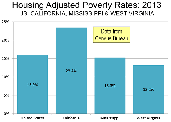
    Today, California house prices are far higher than in the rest of the nation. This is taking a toll on the standard of living and increasing poverty. The Census Bureau’s supplemental poverty measure, which adjusts for housing costs shows California’s poverty rate to be the highest in the nation. It should be of concern that California’s poverty rate is 50% above that of perennial poverty leader Mississippi (Figure).

    Because so much poverty is concentrated among minority ethnic populations, California’s urban containment policy is particularly disadvantaging Hispanics and African-Americans. The Thomas Rivera Institute at USC published a detailed examination of California’s land-use regulations and found that "Far from helping, they are making it particularly difficult for Latino and African American households to own a home."

    The Need for Reform

    The bad news is that things are likely to get much worse. Under the Sustainable Communities Strategies required under Senate Bill 375 (2008), it is likely to become nearly impossible to build traditional suburban single-family housing in California’s metropolitan areas (See: California Declares War on Suburbia). Already, median multiples in San Francisco, San Jose, Los Angeles and San Diego are approaching the highs reached at the peak of the housing bubble. House prices are likely to continue rising relative to incomes, other things being equal.

    Allowing Supply to Meet Demand

    It is often asserted that diminishing land supply in California reflects not so much regulation, but physical limits. The state is sometimes seen as ‘built out’. Yet, in fact, there is plenty of land available for development. Despite its reputation for urban sprawl, the Los Angeles urban area is the most densely populated in the United States. It covers a bit more than one half the land area of the New York urban area. Like any urban area, the greenfield land that is available for development is on the periphery, which  includes areas like the northern Antelope Valley, the Victor Valley, and Southwestern California (Temecula to Hemet) and in some closer areas. Each of these areas is closer to the urban core than some parts of the New York commuter shed.

    These areas could easily accommodate the additional population expected in the area by 2060, including the single family housing generally preferred among middle-income households. Households are not likely to raise children on high rise balconies.

    Even so, the urban footprint would continue to be much smaller than that of New York. If sufficient land were opened to development, the city would expand geographically, but people would also have better access to middle class standards of living, and there would likely be a lot less poverty. The obvious choice would be to let the city expand, while improving real incomes and reducing poverty.

    The California Dream is Now in Denver?

    During the discussion period after my talk, perhaps the most prescient comment was made by an unidentified audience member said that the California dream is now in Denver. California’s unjustifiably and artificially high housing prices are the cause. Between 1993 and 2010, there was net out-migration from California to 42 of the 50 states and the District of Columbia. Immigration to Los Angeles and Orange from abroad has also declined, as immigrants too look for more affordable alternatives. People seeking sun, glamour or a good time will continue to flourish in southern California, but it seems likely that more families, and middle class households, will continue to ebb out, seeking somewhere else the dream that was once so closely identified with Southern California.

    Wendell Cox is principal of Demographia, an international public policy and demographics firm. He is co-author of the "Demographia International Housing Affordability Survey" and author of "Demographia World Urban Areas" and "War on the Dream: How Anti-Sprawl Policy Threatens the Quality of Life." He was appointed to three terms on the Los Angeles County Transportation Commission, where he served with the leading city and county leadership as the only non-elected member. He served as a visiting professor at the Conservatoire National des Arts et Metiers, a national university in Paris. Wendell Cox is Chair, Housing Affordability and Municipal Policy for the Frontier Centre for Public Policy (Canada), is a Senior Fellow of the Center for Opportunity Urbanism and is a member of the Board of Advisors of the Center for Demographics and Policy at Chapman University.

    Photo: Central Los Angeles and the San Fernando Valley (by author)

  • Why We Should Nourish Strong Families

    Every social, economic, and public policy issue can be seen, at its base, as a family issue. The data and evidence are overwhelming, and have been for decades: family structure is the principal variable in the entire list of economic and social indicators. Voluminous academic research confirms that strong family environments correlate highly with positive educational, economic and social outcomes, and inversely with negative outcomes: incidence of crime and imprisonment; inability to obtain and retain employment; the incidence and persistence of poverty; out-of-wedlock births; entitlement dependence; substance abuse and dependence; domestic violence; and others. Even income and wealth inequality — inequality of life’s outcomes — correlates closely with family structure.

    Strong family structure is the single most powerful explanatory correlate in social science; stronger, even, than race. Two-parent black American families, for example, outscore single-parent white families by all measures of well-being. That’s why it is distressing that less than half of US kids live in a traditional family.

    Where does inequality start? – Much has been made of income inequality in the US; it might even be one of the biggest issues in next year’s presidential election. But the biggest reason for income inequality is single parenthood. Research by Harvard economist Raj Chetty and his colleagues concludes that the single strongest correlate of upward economic mobility across geographic regions of America is the fraction of children that do not live in single-parent families.

    Earlier this year, Our Kids: The American Dream in Crisis by Robert Putnam, attracted much attention. Putnam argues that access to the core institutions that foster the development of children – strong families, strong schools, strong communities – is increasingly separate and unequal. How did this happen? Putnam points to the usual suspects (the first being loss of manufacturing jobs), but his descriptions of life paths actually tell the American story of the past 50 years: great rewards go to those with human capital (skills, education, and determination), but not to those without. As it happens, those traits correlate closely with strong family structure. Hence, as family cohesion deteriorates, outcomes diminish for kids in those households.

    When looking at social, cultural, and economic phenomena it is difficult to separate cause from effect. The retreat from marriage and the decline in men’s labor force participation rates have occurred simultaneously. But numerous studies have found that employment and participation rates have remained consistently higher for married fathers than for married men with no children and unmarried men with no children. Sadly, these effects persist across generations.

    Family Fragmentation – Family fragmentation is the biggest domestic problem facing this country. So writes Mitch Pearlstein, head of the Center of the American Experiment and author of Broken Bonds: What Family Fragmentation Means for America’s Future.

    According to Pearlstein, about 40 percent of babies born in America these days are born outside of marriage. That’s true of about 30 percent of non-Hispanic whites, more than 50 percent of Hispanics, and more than 70 percent of blacks. Why does it matter? Because data show that children raised by their two biological (or adoptive) parents do substantially better in every respect in life than those who are not. They do better in school and in higher education; they do better at jobs and economically; and they develop more stable and lasting relationships personally. In other words, they are more likely to earn success, personal satisfaction and happiness.

    According to Brookings Institution scholar Isabel Sawhill, family fragmentation is propelling a bifurcated society. Among the wealthiest 20 percent of whites, divorce rates and single parenthood have declined to 1950s levels. But among the poorest 30 percent of whites – and among much larger percentages of Hispanics and blacks – divorce and single parenthood have become a way of life.

    What to do? – Strong, healthy families are conducive to a rich, safe, healthy, productive society, one with wide opportunities, social and geographic mobility, and cultural, moral and civic strength. Families lead to and are supported by an independent, self-reliant population. Do we not all agree these are worthwhile goals? And does that not suggest we should be promoting strong, healthy families?

    The promotion of family is a cultural cause. What can we do? For one, those of us who see empirical evidence of the importance of family can disseminate the facts. For another, those of us who, through personal experience, are aware of the social and economic benefits of strong families, could preach what we practice, as suggested by Charles Murray in his book, Coming Apart.

    Does this view devalue or stigmatize non-traditional families — single, same-sex, unrelated households, for example? No, the modern conception of family now includes those formations. And to those who say “check your privilege,” I say, share and spread the privilege.

    Dr. Roger Selbert is a trend analyst, researcher, writer and speaker. Growth Strategies is his newsletter on economic, social and demographic trends. Roger is economic analyst, North American representative and Principal for the US Consumer Demand Index, a monthly survey of American households’ buying intentions.

    Flickr photo by Sarah R: Moroccan-inspired vegetable soup

  • Australian Treasurer Given Primer on Housing Economics

    Wodonga (Victoria) mother of two Mel Wilson has made headlines across Australia with an open letter to Federal Treasurer Joe Hockey on housing affordability. In commenting on Australia’s housing affordability crisis, the Treasurer has told a press conference "The starting point for a first home buyer is to get a good job that pays good money."

    Australia has a severe housing affordability problem. As the Demographia International Housing Affordability Survey showed in January, Sydney median house prices had reached 9.8 times median household incomes of by the third quarter of 2014. In the intervening months house prices have escalated so much that some say the median price will soon pass $1 million.

    It was not that long ago that house prices were far more reasonable in Australia. Nationally, in the early 1990s, house prices averaged around three times incomes. Since that time, house prices have more than doubled relative to incomes. This is placed a considerable burden on purchasing households, especially first home buyers.

    Ms. Wilson incredulously took Treasurer Hockey through the economics of buying a first house in Sydney. She reminded him that it would take all of the average wage earner’s take home pay for four years to save the down-payment on the median house, now priced at A$915,000 (approximately US$700,000.  The entire letter is published below.

    In a later statement, the Treasurer, to his credit, indicated the need for strong lobbying of the states to make more land available to increase supply. The problem in Sydney and Australia is not unique. Similar house cost crises have developed from London to Toronto and San Francisco, where governments have severely limited the land that can be used for new residences, with the wholly predictable result that prices escalate out of control.

    Ms. Wilson, and other concerned (or baffled, as Ms. Wilson puts it) Australians should hope that Treasurer Hockey’s "strong lobbying" is successful. The economic reality is that until there is liberalization of the land use restrictions responsible for much of the housing cost escalation, there will be no relief, other things being equal. Indeed, house prices are likely to just keep going skyward. This requires a mid-course correction toward policies that place improving the standards of living and reducing poverty at a higher priority than urban design.

    Letter from Ms. Mel Wilson to Treasurer Joe Hockey:

    Dear Joe,

    I just wanted to touch base with you regarding your comment that young people are able to enter the property market if they just “get a good job that pays good money.”

    I just wanted to ask you how one might go about this?

    Are you going to be reviewing all the current Awards that are in place to ensure that most jobs pay “good money”?

    Are you going to be creating hundreds of thousands of new jobs that, under your Awards, pay over $100,000 per year?

    Apologies if I have missed this fantastic news, but as someone working in 2 senior HR roles, I believe I would have known about this so that I could pass the message on to some very tired, over qualified employees who currently fall under various Federal and State awards and are being paid between $18 to $25 per hour.

    Are you aware of what the average Australian wage is?

    Are you aware of what the average Australian mortgage in Sydney is?

    Are you aware of the first-home buying process?

    Just in case these facts and figures aren’t available to you, I thought you might be interested.
    The average weekly wage according to the Australian Bureau of Statistics on 1st January 2015 was $1,128.70, or $58,692.40 before tax. This means a take home amount of about $904.00 per week.
    The median house price in Sydney, according to the Domain Group Housing Price Report, as of March 2015, was $914,056.

    Not sure if you know how first home buying works at the moment, but you normally need a deposit of about 20%. This is to pay for the Stamp Duty (which is a State Tax you must pay every time you buy a property), and also to assist in the approval process so that you don’t need to pay Lenders Mortgage Insurance.

    So in this instance, the first home buyer would need about $182,811.00 saved to purchase a house that is the average price in Sydney.

    So to go out and get one of these “good jobs that pay good money” I assume these young people you speak of would need to go to university first.

    On average, it takes about 3 -4 years to get a degree, so if a young person goes to University straight out of school, they can expect to finish their course and be ready for the workforce at about 21, with a HECS-HELP debt of over $20,000. To make this a bit easier for you to understand, let’s say there is a young person named Joe Junior who has done just this.

    If Joe Junior is extremely lucky, and is up there with the best of the graduates from that course and that year, he will get a job straight out of University paying usually under the average wage.
    However, lets just be extremely generous here and say that Joe Junior got a job and was on the national weekly take home wage of $904 per week.

    Joe Junior needs to only save every single dollar worked for about 4 years to save his $182,811 deposit for their first home. Thank you, Mr Hockey, for throwing in that $7,000 first home owner grant too – that meant Joe Junior could get into his first home 8 weeks earlier!

    Just a quick side note, this example does not take into consideration the rising house prices, or Joe Junior’s HECS-HELP debt that he obtained from getting his degree to get one of your so-called “good jobs”.

    Joe Junior is now 25 (not so junior anymore), has been living at home with his parents this entire time and has not been able to spend a single dollar on any bills, board or holidays or public transportation. He also can’t afford a car or petrol for a car but then again “poor people don’t drive cars”. Oh wait, Joe Junior isn’t a poor person – he has a “good job that pays good money.”

    Luckily Joe Junior’s parents have been happy to drive their little Joe Junior to and from work every day and provide free housing, clothing, medical expenses and also provide the food for his breakfast, lunch and dinner each day.

    So finally Joe Junior has saved his $182,811 deposit (of which only about half will go towards his mortgage due to the stamp duty cost), and can now purchase his first home, with a mortgage of about $822,650.00.

    According to the Commonwealth Bank’s online mortgage estimator, the repayments for a mortgage of this amount are $1,073.00 per week over 30 years.

    So hopefully Joe Junior’s average weekly wage of $904.00 has gone up enough to cover the cost of the mortgage.

    Joe Junior has been applying for these “good jobs hat pay good money" that you speak of (I assume by "good money" you mean more than the average wage as you have just seen it is not even enough to cover the cost of the average house prices’ mortgage in Sydney), but hasn’t had any luck as yet. He needed to stay in the same job post university to demonstrate to the bank job stability so that he could purchase his first home. So he only has a degree, and experience in the one job, one industry, and there are just not that many jobs out there paying “good money.”

    Joe Junior now also can’t wash his clothes, eat food, or get to and from work as he no longer lives with his parents, so getting one of these “good jobs” is even more difficult.

    So Joe Senior, are you really aware of all the facts and figures when you says things like buying your first home is “readily affordable” to young people?

    Just slightly confused as to what you were thinking when you said these words at the media conference in Sydney.

    Looking forward to another one of your politically correct, direct and well thought out responses.

    Regards,
    Another baffled Australian

  • Smaller Stars: The Best Small And Medium-Size Cities For Jobs 2015

    A look at job growth in America’s small and medium-size cities provides a very different, perhaps more intimate portrait of the ground-level economy across a wider swathe of the country than our survey last week of The Best Big Cities For Jobs. It takes us to many states that lack large cities, particularly in the Midwest and South. In contrast to our big city list, information technology is a driving factor in only a handful of smaller metro areas – grittier sectors like energy and manufacturing are the livelihood of a good many, as well as tourism for a surprisingly large number of thriving places that have become vacation meccas for the increasing number of affluent residents of major urban areas.

    The 421 metropolitan statistical areas we evaluated in our rankings, ranging from large to small, account for 87.6% of all U.S. nonfarm employment.  Of them, the country’s small MSAs (those with less than 150,000 nonfarm jobs) and medium-sized ones (between 150,000 and 450,000 nonfarm jobs) account for just over a third of U.S. urban employment.  Job creation in these communities since 2000 has been roughly comparable to the nation’s larger metro areas — total nonfarm employment has increased 7.5% in small and medium-size MSAs compared to 7.8% for large ones.

    Our rankings are based on employment growth over the short-, medium- and long-term, going back to 2003, and factor in momentum — whether growth is slowing or accelerating. (For a detailed description of our methodology, click here.)

    The Slipstream Economies

    A good number of our top-ranked smaller cities are posting strong job growth in the slipstream of larger economies. This is clearly the case with our top-ranked medium-size metro area, Provo-Orem, and its northern Utah neighbor, No. 7 Ogden-Clearfield. Both are located along the Wasatch Front not far from the somewhat bright lights of Salt Lake City (and more importantly its airport) and are heavily Mormon. Provo is home to Brigham Young University, the academic center of the Mormon universe with over 29,000 students. That group’s social cohesion, which translates into a high percentage of families with children, as well as emphasis on education and enterprise, underlay the success of these areas.

    But what is most striking about these two metro areas is the diversity of their economic growth. Since 2009, for example, employment in the Provo-Orem area is up 23.5%, with gains in virtually every sector, paced by increases in construction and natural resources (60%), information (30.1%), business services (46.5%) and even manufacturing (16.4%). With the exception of information jobs, Ogden has showed a similar, albeit less spectacular pattern of widespread economic growth over the same time period.

    Other slipstream economies that are thriving include our second-ranked small city. Greeley, Colo., slightly over an hour’s drive from the Denver airport. Greeley rose seven places from last year, powered largely by 114% employment growth since 2009 in construction and natural resources (oil and gas mostly) as well as solid expansions in business services (up 29.8%) and manufacturing (up 17.2%). As in the case of Provo and Ogden, Greeley benefits from being close to a dynamic large metro area, but can couple that with prized small town attributes like less traffic, good schools, relatively low housing prices and safe streets.

    Energy Hot Spots: Not All Cold Yet

    Until the recent tumble in energy prices, big oil towns reliably dominated our list. For all sorts of reasons, including fierce local opposition, big metro areas don’t tend to produce oil and natural gas, though the technical and business aspects are dominated by a few, notably Houston. The price plunge had not yet translated into heavy job losses in many energy towns by January 2015, which is as far as our data goes, although some clearly were already hurting.

    Take our top-ranked small city, Midland, and nearby No. 3-ranked Odessa, which are in the oil-rich Permian Basin of West Texas. Employment grew 9.1% in Midland last year, the fastest pace of any metro area in the country. Since 2009 the west Texas town has logged almost insane 45.8% expansion in its job base, with a large boost not only in natural resources and construction (108.4% growth), but also manufacturing (up 72.2%), wholesale trade (80.6%) , professional business services (up 40%) as well as leisure and hospitality (likely rooms for the roughnecks). Odessa boasts similar, albeit somewhat less gaudy numbers.

    But you don’t have to be in Texas to be an energy boomtown. Bakersfield, Calif., No. 6 on the medium-size list, has managed to retain a strong energy economy in a state that has all but declared war on fossil fuels. Bakersfield has been described as “little Texas,” and it has enjoyed strong, very un-Californian employment growth in such areas as manufacturing, up 17.8% since 2009, trade (19.8%) and natural resources and construction (40.8%). Blue collar employment may be suffering in much of California, but not down in this metro area, best known for country stars like Merle Haggard and highly resistant to the San Francisco-style economic post-industrial model that dominates the state.

    Yet there’s no question that there are problems in the oil patch. Some of the biggest decliners on our list from last year are big energy towns, such as Lafayette, La., which slid 43 places to 48th on the mid-size cities list, and Anchorage, Alaska, down 25 places to 63rd. On our small city list, Bismarck, N.D., a major hub for that state’s shale boom, dropped from second last year to 19th this year, and Houma-Thibodaux, La., tumbled 61 places to 81st.

    Playground Towns

    Looking across the country, however, many of the small cities doing the best are not those that produce anything tangible like energy or cars. There’s been a strong resurgence in what may be considered playgrounds for the expanding ranks of the affluent residents of major urban areas, particularly on the West Coast, where Silicon Valley is minting many millionaires along with its famous billionaires, as well as along the East Coast, where second home and retirement-oriented communities are booming. Last year, vacation home sales broke the national record.

    Among the playground areas that are prospering on our small cities are No. 4 Naples-Immokalee-Marco Island, Fla., where employment expanded 5.4% last year to 136,200 jobs, Napa, Calif. (eighth, with 15.6% job growth since 2009), and Redmond-Bend, Ore. (12th). On our mid-size list, Santa Rosa, Calif., (Sonoma County) ranks 12th and Santa Barbara- Santa Maria, Calif., 17th.

    In some of these places, not surprisingly, leisure and hospitality are the largest industry — 19.6% of the workforce in Naples is employed in this sector. Economist Bill Watkins, who has studied these trends in California and Oregon, suggests that the growth of the playground cities reflects the emergence of America’s haute bourgeoisie. “The well-to-do go to these places,” he notes, fueling both their growth and, in hard times, their sometimes sharp declines. “They have second homes and can spend a lot of money.” Watkins’ analysis of Bend, Ore.’s economy, for example, shows that upwards of 80% of the volatility in its economy can be traced to what is occurring in California, notably the Bay Area.

    Industrial Cities:Some Up, Some Down

    For generations manufacturing in the U.S. has been moving to smaller cities, largely in the South, while Midwestern and northeastern industrial cities have been taking it on the chin. With a modest growth in manufacturing, some small and mid-size cities have done surprisingly well, although many continue to lag, and even fall further in the rankings.

    Columbus, Ind., a manufacturing hub that is home to diesel engine maker Cummins, epitomizes the up and down nature of industrial economies. Right now Columbus, riding a new wave of investment from Cummins and other manufacturers, has risen to fifth on our small city list, and is at record high employment. Since 2009 the Indiana metro area’s job count has expanded 23.4% to 51,800, paced by an impressive 43.2% jump in manufacturing.

    Sadly, this is not the case for many manufacturing towns. As with the large city list, many of the bottom dwellers are old industrial centers. On the mid-size list, take  91st place Youngstown-Warren-Boardman, Ohio-Pa., where employment is down 6.6% from 2003, or No. 85 Toledo, Ohio, off 5.4% from 2003. Among small cities furniture manufacturing center Rocky Mount, N.C., fell to 255th, down 4.4% since 2009, while old steel center Weirton-Steubenville, W.V.-Ohio, dropped to 254th place, with employment down 12.7% since 2003.

    College Towns And The Future For Small Cities

    The future of small city America depends heavily on how these areas adjust to changing economic times. Given that manufacturing and agriculture are becoming less labor intensive, to stay competitive, smaller cities will need to move more aggressively into knowledge-based fields like software, medical services and higher-end business services. Mid-sized college towns like No. 1 Provo, Boulder, Colo. (14th), Lexington, Ky. (19th), and Madison, Wisc. (20th), have experienced steady growth.

    Diversification of the economy may be the best guide to future smaller city growth. Madison, for example, has a strong government and education employment base but also is home to growing number of technology firms, with information employment up an impressive 36.1% since 2009. Medical software maker Epic employs 6,800 at its sprawling campus in nearby Verona.

    But perhaps the best example of successful small city growth may be Fargo, N.D., a long time butt of sophisto jokes, which ranks sixth on our small metro area list. Fargo, which is also home to North Dakota State University, may not have the cool factor of San Francisco or even Madison, but its economy is extraordinarily balanced, and not nearly as energy-dependent as other North Dakotan cities like Bismarck or Williston. It has posted double-digit employment growth since 2009 in everything from construction and manufacturing to business services and hospitality.

    As many of America’s most prosperous metro areas become ever more expensive and highly regulated, notably in California and the Northeast, small-city America could enjoy a renaissance in coming years. But it will take determination on the part of local leaders and residents to begin expanding their economic strategy beyond any one niche, and instead develop a growth economy that can insulate themselves from the downturns that affect any single industry over time.

    Joel Kotkin is executive editor of NewGeography.com and Roger Hobbs Distinguished Fellow in Urban Studies at Chapman University, and a member of the editorial board of the Orange County Register. He is also executive director of the Houston-based Center for Opportunity Urbanism. His newest book, The New Class Conflict is now available at Amazon and Telos Press. He is also author of The City: A Global History and The Next Hundred Million: America in 2050.  He lives in Los Angeles, CA.

    Michael Shires, Ph.D. is a professor at Pepperdine University School of Public Policy.

    Photo: “Provo Downtown Historic District” by Tricia SimpsonOwn work. Licensed under CC BY-SA 3.0 via Wikimedia Commons.

  • Are Suburbs Causing Crime?

    Reihan Salam, often an insightful critic, argues in Salon that poverty has come to the suburbs at a higher rate than it has grown in big cities because poorer service workers have followed the service jobs required in the suburbs. This has caused problems. Salam sees more civil strife in suburbs like Ferguson, Missouri today partly because the different kinds of family structures that have become so predominant, particularly those exhibited by the poor, cannot be accommodated in single-family, detached housing.

    There’s clearly some truth here but overall the policies he suggests do not hold water. Households led by singles are up to over 20 percent of all households in the most highly populated metropolitan areas, two-parent families with the manpower to take care of suburban homes and lawns has fallen, and single parent households have grown. His solution:  to build smaller, high-density attached housing units, not so much because they are more affordable for the poor; many of the suburban poor already live in rental housing units, and overall high density is generally more expensive than lower density. Salam sees density and its concomitant higher property assessments as  generating more  tax revenue, thus reducing local government aggressiveness in  levying traffic and loitering fines (administered mostly through an often distrusted police force), which have grown to become an enormous burden for the poor in the suburbs.  

    But Salam doesn’t seem to appreciate that much of the desperation for local tax dollars is driven by increases in the number of residents — all kinds of residents but including the poor — and especially the young and poor, who generate the demand for  expensive services like schools, special education, and law enforcement.  Salam is under the impression that higher density buildings produce more property tax revenue, but he doesn’t acknowledge that if these buildings are filled with more people per acre than a single family home, they will also require more services, and generate the need for more taxes.   One of the enduring political features of high-density urban areas is the lack of a tax base (or political willingness) to adequately fund big city school systems. By court order, New York State had to revamp its school aid formula in the early 2000s to channel billions in more funds to the New York City public school system, which State Supreme Court Justice Leland DeGrasse  ruled had for years neglected its constitutional obligation to ensure "the availability of a sound basic education to all children of the state."

    In fairness, one of the most perplexing issues in urban planning over the decades has been whether or not certain types of housing pay more or less in property taxes than their inhabitants require in government services. This question has not been answered to anyone’s satisfaction.

    There are broader questions raised by this article. If the poor (the majority of whom are single mothers) are poor at least in some respect to there being only one or no working adults in a household, wouldn’t a poor, single mother of three still be poor living in an attached apartment (as opposed to a basement of a single-family home)? If at least one social objective to alleviate poverty is to create two-income households, it is not clear how building smaller housing units would encourage this. As the University of Washington’s Richard Morrill  and others have repeatedly shown, our most densely populated areas (i.e. those with smaller housing units) exhibit the most severe forms of economic stratification.

    Nor is it clear how Salam’s recommendation would address the aspirations of the poor, most of whom still seek one day to acquire a piece of property and a single-family home. A recent Redfin study found that 92 percent of “Millenials” (those born during the early 1980s and now in their late 20s and 30s) who don’t own a home want to buy one in the future. And according to figures from the 2008 Current Population Survey, as reported by Thomas Tseng in Newgeography.com, 44 percent of Millenials belong to some racial or ethnic category other than "non-Hispanic white." It’s an unfortunate reality of American life that even into the second decade of the 21st century a disproportionate number of the poor are racial minorities. One must assume that a goodly portion of these young aspirants to homeownership must be poor racial minorities.

    How would forcibly filling the landscape with apartment buildings and crowding out single-family, detached homes (making them, therefore, more expensive) help the poor achieve that dream?

    Salam’s remedy of building smaller living units might even exacerbate another problem that some suburbs (and the nation as a whole) face: the “birth dearth”, or the decline, especially in older suburbs, of family formation and birth rates. As opposed to the “nursery” for America’s next generation that many of America’s sprawl suburbs still remain, urban centers today are among the most “child free” ‑ whether in Manhattan, San Francisco, Chicago, or Boston. But even in the old-line suburbs, since the 2008 recession, the number of new children has plummeted. The largest declines in the 5 to 14 cohort since 2000 have almost all occurred in the large coastal metropolitan regions, including their suburbs, led by Los Angeles where the child population has dropped by 303,000, or 15.3%, since 2000. In the New York metro area, the number of 5- to 14-year-olds has fallen by 238,000. This includes the Nassau-Suffolk region, America’s “oldest suburb,” which has experienced a decline of 71,834 residents in the 0-14 population group between 2000 and 2013.

    Today the number of households with children is 38 million, about the same as a decade ago, even as the total number of households has shot up by nearly 10 million. There are now more houses with dogs than houses with children.

    The decline in the numbers of potential young suburban residents suggests not some great urban revival, but a drain in the population of future taxpayers and workers. As demographer Wendell Cox and others have shown, localities with higher densities have considerably lower birth rates than areas with lower densities. With the push for higher density, are the suburbs slated next to become “child free zones”?

    Few would dispute that many suburban areas across the country lack sufficient housing options. But the seemingly ubiquitous assumption that high density housing will eradicate problems such as high taxes, increasing inequality, civil unrest, and lower birth rates may be invested with an unjustified sense of certainty.   

    Seth Forman, Ph.D, AICP, is author of American Obsession: Race and Conflict in the Age of Obama and Blacks in the Jewish Mind: A Crisis of Liberalism, among other books. His work has appeared in publications that include National Review, Frontpagemag.com, The Weekly Standard, and The American. He is currently Research Associate Professor at Stony Brook University, and the Chief Planner for the Long Island Regional Planning Council. His opinions are not associated with any of these institutions. He blogs at www.mrformansplanet.com.

  • Not so Unequal America?

    The extreme and rising inequality of income and wealth in the United States has been exhaustively reported and analyzed, including by me. Incomes are strikingly unequal just about everywhere, but not to the same degree. To discover a more egalitarian America, I used US Census American Community Survey data (2007-2011) estimates of the Gini coefficients of all US counties and equivalents. The Gini coefficient is a measure of the percent departure of a line of accumulated population versus accumulated income, from the lowest to the highest and the straight line if everyone had the same equal income. 

    The index would be 0 if all were equal, 1.0 if only 1 person had all the income. The median US counties, dozens of them, have a Gini of .43, which is in fact pretty extreme, far higher than in 1974, when it was .37. But the overall US figure is .47 (.41 in 1975), because larger counties tend to be more unequal than smaller, skewing the average. Examples of a median .43 county are Winnebago, WI (Oshkosh!), Klamath, OR, and Arlington, VA, and a good example of the average US county is Jackson, MO (Kansas City!). The lowest Gini for the US is .33 (Yakutat, AK and Power, ID) and the highest is no surprise at .59, New York county (Manhattan). It is revealing and horrific that our lowest value of .33 is that of Sweden (and most of Scandinavia), Germany is only .35 and the lowest in the world is evidently Switzerland, despite those rich bankers, at .31.  

    Is this a Great Country or What?

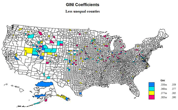
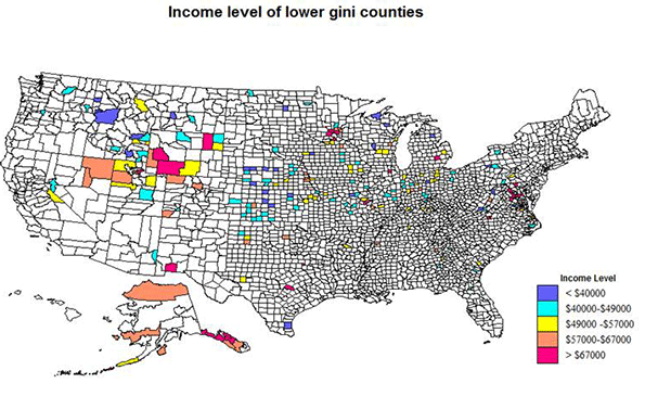
    I mapped only the 208 counties with the lowest Gini indices, those under .39, in two ways, first by the Gini values and then by groups of these counties sorted by median incomes.  Only 10 have values below .35. In 1975, 11 counties had Ginis bellow .27.  States with the highest number or share of less unequal counties include Alaska, 10, Idaho, 11, Indiana, 15, Iowa, 10, Kansas, 18, Minnesota, 11, Nebraska, 17, Utah, 7, Virginia, 13 and Wyoming, 8. Except for Alaska, there is an evident north central bias: band of less unequal counties from Virginia to Idaho-Nevada, with epicenter at the junctions of Utah, Idaho and Wyoming. 

    States without any qualifying as less unequal counties (with Ginis under .39)  are Alabama, Connecticut, Delaware, Hawaii, Louisiana, Maine, Massachusetts, New Hampshire, New Jersey, Rhode Island  and South Carolina. Large California has only one, as does New York, and large Texas only 7.    

    Size of Counties

    A problem with the data is that small population size of many of the counties render the ACS estimates somewhat uncertain.  Thirteen have fewer than 500 households, 25 have fewer than 1000. It is reasonable that smaller rural counties, e.g., in the Plains states, might have less inequality because of the homestead settlement history and the absence of slavery, but there is still uncertainty due to small sample size. Of the counties with under 1000 households, 8 are in NE, 5 in AK, 3 in KS, 2 in CO, MT and TX, and 1 in ID, N and WA.  

    At the other end, 28 counties have more than 25,000 households, and 5 have over 100,000. The largest are an interesting set. All are suburban, or even exurban, and most are fairly high income, essentially homogeneously middle class. The six largest are Williamson, TX, King William, VA, St. Charles, MO, Anoka, MN, Loudoun, VA and Davis, UT. These are also among the richest counties on the list. 

    It might be meaningful that some of these counties, as around Washington, DC, Baltimore and Austin, TX, have high levels of government employees, while their minority levels are quite low.

    Lower inequality, but High in Minorities

    This unlikely combination does occur, although only 7 of the 208 counties have minority shares (percentages) above .5: TX, 3, Kenedy, Moore and Reagan;  KS, 2, Ford and Seward; AZ 1, Greenlee, and AK, Aleutians 1. The TX, KS and AZ counties are all Hispanic, and high in energy development for TX and KS.  The AK county is Asian. No county has a black population majority. Surry county, VA, at 47% black, is highest share of black population, located and exurban between Richmond and Norfolk.  

    The Lowest Ginis, Under .36

    Thirty-one counties have Gini levels under .36 (Still high of course!) Only 10 are under .35. These vary in size from tiny Kenedy, TX (147 households) to Loudon, VA  with 105,000. The distribution by state is
    VA 7:  King William, Prince George, Surry, Craig, Greene, Loudon, King and Queen
    KS 4:   Meade, Wabaunsee, Wichita, Kearny
    AK 3:  Yakutat, Bristol Bay, North Slope
    UT 3: Morgan, Emery, Juab
    NE 3:   Blaine, Stanton, Grant
    TX 2: Kenedy and Carson.
    Several states with one county: CA, Mono,  GA, Chattahoochee,  ID, Power,  IL, Kendall,  IN, Jasper,  IA,  Cedar, KY, Spencer, OH, Putnam, and WY, Lincoln.

    These are distributed in a similar way to the 208 lower Gini counties, with the exception of the much larger number in VA, and not just in the WDC area!  UT and AK stand out, as do neighbor states of KS and NE.  The AK set is high in minorities (Native Americans, Asians), as is Kenedy, TX (Hispanic).  The VA set includes suburban Richmond and Washington DC counties, exurban to rural Chesapeake Bay counties, a tiny Allegheny mountain county and suburban Charlottesville. ID, UT, KY, KS, IL, IN and GA have suburban counties, KS and TX energy growth counties, and NE, WY, UT and CA fairly remote rural counties, the latter three recreational.

    Less unequal counties by income level

    Lower income counties: 27 counties have median household incomes below $40,000. By state these are
    NE 5: Garfield, Hooker, Blaine, Grant. Hayes
    ID 5: Idaho, Lewis, Power, Benewah, Clark
    KS 4: Cloud, Norton, Trego, Rush
    MI 2: Oscoda, Ontonagon        
    WV 2: Grant, Monroe
    WI 2: Adams, Florence
    Several states with one county, including PA, Forest: TX, Kenedy: MT, Golden Valley:  IN, Jay;
    IA, Osceola,;  ND, Griggs; and MO, Monroe,

    The dominance of neighboring KS and NE is noteworthy, as is the large number and share in Idaho. Eight of the counties are small, with under 1000 households, and only 4 have over 40,000. Thus most of the counties are rural and small town, resource oriented, and often with small manufactures. The counties in upper Michigan and Wisconsin are similar in character.

    Higher income counties at the other end comprise 28, with median household incomes above $67,000. By state these are:
    VA 7: Loudoun, Stafford, Prince William, Spotsylvania, Manassas Park, New Kent, King George
    AK 4: Juneau, Denali, Skagway, North Slope
    MN 4: Scott, Sherburne, Anoka, Wright
    MD 3: Calvert, Charles, Carroll 
    WY 3; Campbell, Sublette, Sweetwater
    TX 2; Rockwall,  Williamson
    Several with one county: NM, Los Alamos: UT, Morgan; MO, St Charles; MI, Livingston; IL, Kendall

    The 9 richest counties include 6 suburban or exurban around Washington DC and Baltimore, suggesting the importance of federal employment, and federal oriented Los Alamos, NM, Rockwall is suburban Dallas, Scott suburban Minneapolis.   Other suburban and exurban counties are in UT, MO, and MN (3 more!), VA (4 more), MI, IL, and TX. Higher income rural small town areas are in AK (4) and WY (3).

    Middle Income Less Unequal Counties

    The middle group of 52 counties with median household incomes between $49,000 and $57,000 are more varied and complex.  By state
    IN 6: Jasper, Ohio, Putnam, Spencer, Tipton and Whitley
    IA 5: Iowa, Lyon, Cedar, Mills, Benton                    
    KS 3: Jackson, Wabaunsee, Jefferson
    UT 3: Juab, Duchesne, Box Elder    
    OH 4: Mercer, Henry, Auglaize, Putnam
    WI 2: Kewaunee, Dodge, Columbia     
    MN 2: Le Sueur, Nicollet
    ID 2: Jefferson, Teton
    MO, 2, Clinton, Lincoln
    WY 2: Weston, Carbon,
    KY, 2, Anderson, Bullitt
    TX,  Reagan
    GA 2: Pike, Effingham
    VA 2: Surry, Greene  
    NE 2: Hamilton, Kearny
    AK, Aleutians, AR, Saline, CA, Mono, IL, Washington, MI, Lapeer
    MT Lewis and Clark. OR, Hood River, PA, Perry, TN, Cheatham, NC Currituck
    None have under 1000 households, and 21 have 10,000 or more. The largest, Saline, AR, has 41,000 (suburban Little Rock).

    These tend to prevail across the north central states from OH west to UT, and include many small town and small city regional centers. Several are free-standing small town counties, a few are suburban to larger cities, such as Nashville and Little Rock, but the most are far suburban or exurban to smaller metro areas. 

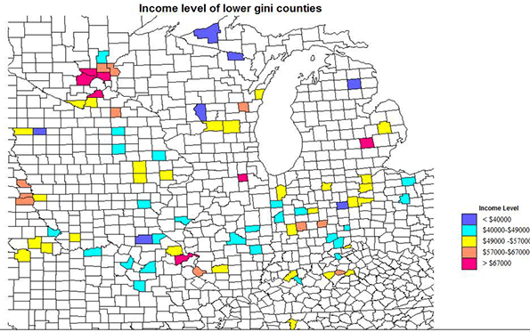
    The small map inset centered on Indiana illustrates these patterns.

    Conclusions                 

    The geography of these less unequal counties is unusual. Not one is a metropolitan core county, large or small. Not one is a majority black county. While there are many suburban counties, almost all are in a few clusters, VA-MD, ID-UT, or in the upper Midwest, especially MN. A large number are exurban, just beyond the official metro areas, mostly across the north, but with a few in the  south. And, most old-fashioned and reassuring, quite a number are freestanding small city and small town, micropolitan or smaller counties, most notably in the Northern Plains and Rocky Mountain states, and apparently doing well with a resource and small industrial economy.   

    Contrasting the  Most Unequal Counties

    OK, how different is the geography of the most unequal counties?  The US has 30 counties with Gini indices over .53, culminating in New York (Manhattan) at almost .6. These are indeed quite different, as race plays a dominant role, but not a universal one.

    23 of the 30 are in the south, and 17 of these have high black population shares, including core metropolitan counties, the District of Columbia, Fulton (Atlanta). Orleans (New Orleans), and Richmond, VA. Outside the south, 6 of the 8 counties also have a high minority share, New York (Manhattan), Westchester, Essex, NJ (Newark), Sioux, SD (reservation), and Harding, NM (Latino), leaving only tiny Mineral CO (recreation), and  Fairfield CT (super rich suburban-exurban NY).

    Six counties in the south do not have high minority shares,  Decatur, TN (west central on the Tennessee river), Baylor, TX , exurban Wichita Falls, Llano, TX , exurban Austin and tiny Borden, TX, Galax city, VA, far southwest, and Watauga, NC, home of Appalachian State University.

    Race clearly is the most common basis for extreme inequality, but exurban counties close to rich metropolitan centers may also have high class differentials, as do some recreation dependent areas.    

    Richard Morrill is Professor Emeritus of Geography and Environmental Studies, University of Washington. His research interests include: political geography (voting behavior, redistricting, local governance), population/demography/settlement/migration, urban geography and planning, urban transportation (i.e., old fashioned generalist).