Blog

  • California in 2060?

    The California Department of Finance (DOF) has issued population projections for the state’s counties to 2060.  Forecasts are provided for every decade, from a 2010 base. The DOF projects that the the state will grow from 37.3 million residents in 2010 to 51.7 million in 2060. This is a 0.7 percent annual growth rate over the next 50 years. By contrast, California’s growth rate was 1.7 percent annually over the last 50 years (1960-2010), and a much higher 3.0 percent in the growth heyday of 1940 to 1990. However, even with this slower rate, California is expected to grow slightly more quickly than the nation (0.6 percent annually).

    The current projections are considerably more conservative than those made by DOF less than a decade ago. In 2007, DOF forecast that California would have 60 million residents in 2050. The current population project for 2050 is substantially smaller, at 49.8 million.

    Metropolitan Complexes

    To understand where this growth is projected to take place — and not — we look at CSA’s (consolidated statistical areas).  CSA’s are economically connected, adjacent metropolitan areas. CSA’s require a 15 percent employment interchange between the metropolitan areas. Metropolitan areas themselves are defined by a 25 percent commuting interchange between outlying counties and central counties, each of which must have at least one-half of its population in the core urban area.

    As Michael Barone pointed out in his analysis of the 2014 population estimates, sometimes it is not obvious when one metropolitan area changes into another, as in the cases of San Francisco/San Jose and Los Angeles/Riverside-San Bernardino, which are CSA’s. Another example is New York and the southwestern Connecticut suburbs in Fairfield and New Haven counties. This is because there is no break in the continuous urbanization.

    Metropolitan Complexes in 2060

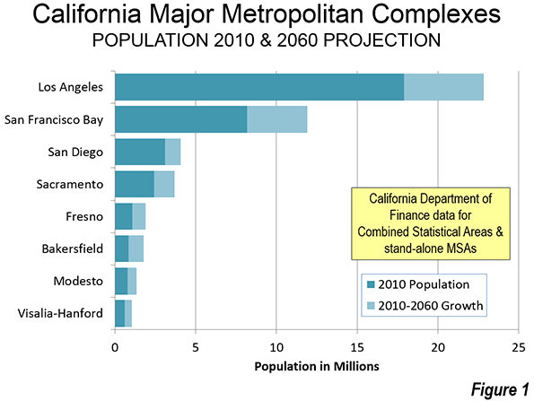
    If the DOF has it right, in a half century, California will be home to eight major metropolitan complexes. which I am defining as combined statistical areas (CSA’s) or  "stand alone" metropolitan areas with more than 1,000,000 population (Figure 1).

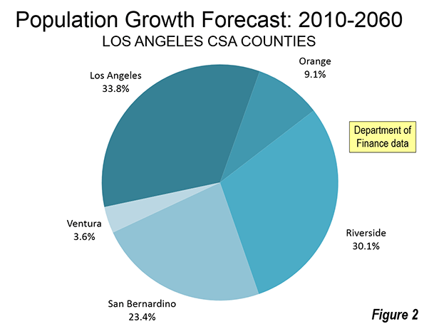
    The Los Angeles metropolitan complex (Los Angeles-Riverside, including Los Angeles, Orange, Riverside, San Bernardino and Ventura counties) would remain by far the largest, growing from 17.9 million to 22.8 million. One-third of the growth would be in Los Angeles County, and two-thirds outside. Riverside and San Bernardino counties would receive most of the growth (53 percent). Riverside County would grow the fastest, adding 68 percent to its population (Figure 2). Overall, the Los Angeles metropolitan complex would grow 27.3 percent, well below the projected state rate of 38.4 percent. This is quite a turnaround for a metropolitan complex that was once among the fastest growing in human history.

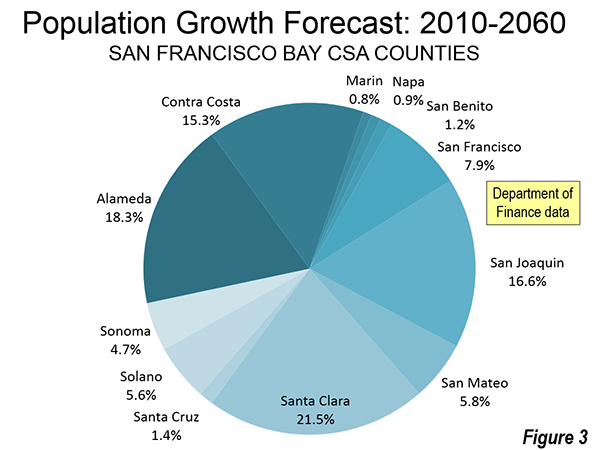
    The San Francisco Bay metropolitan complex, including the San Francisco, San Jose, Santa Cruz, Vallejo, Santa Rosa and Stockton metropolitan areas would grow a much faster 45.6 percent, from 8.1 million in 2010 to 11.9 million in 2060. The core city of San Francisco would add nearly 300,000, growing 36.3 percent to 1.1 million, (nearly the state rate). However, only 8 percent of the Bay Area growth would be in San Francisco, and 92 percent outside (Figure 3).  Four counties would add more than 500,000 residents, including Santa Clara (800,000), Alameda (680,000), Contra Costa (519,000), and newly added San Joaquin county, which is defined as the Stockton metropolitan area (620,000). San Joaquin County would also grow the fastest, at 90 percent, reaching 1.3 million. This growth is to be expected, since San Joaquin is one of the more peripheral counties, and where the metropolitan fringe (which includes the commuting shed) has been expanding the most.

    The San Diego metropolitan complex, a "stand alone" metropolitan area, would grow nearly as slowly as Los Angeles. San Diego’s population of 3.1 million in 2010 would rise to 4.1 million in 2060, an increase of 30.8 percent.

    Sacramento’s metropolitan complex includes the Sacramento, Truckee-Grass Valley and Yuba City metropolitan areas. Sacramento is projected to grow 52.8 percent, from 2.4 million in 2010 to 3.7 million in 2060.

    Four additional metropolitan complexes with more than 1 million population are projected, all in the San Joaquin Valley.

    Fresno, which includes Fresno County and Madera County, would grow from 1.1 million to 1.9 million, for a nearly 75 percent growth rate.

    Bakersfield (Kern County) would be the fastest growing among major metropolitan complexes. Bakersfield would grow from 840,000 in 2010 to 1.8 million in 2060, for a growth rate of 111 percent.

    Modesto (Stanislaus and Merced counties) would be the seventh largest metropolitan complex. From a 2010 population of 770,000, Modesto would grow 74 percent to 1,340,000. However, it is possible that by 2060 the commuting shed will reach the San Francisco Bay metropolitan complex, causing it to consume Modesto, as it already has Stockton.

    In 2060, California would get its eighth major metropolitan area, with Visalia-Hanford reaching 1,040,000, up 74 percent from 2010 (Tulare and Kings Counties).

    Outside of these areas, the largest metropolitan complex would be Salinas, which is projected to have 530,000 residents by 2060. However, Salinas is close enough to the San Francisco Bay Area that it could be added to that area’s commuting shed by 2040. The next largest metropolitan area would be El Centro (Imperial County), with a population projected to reach 340,000 by 2060. El Centro, however, could be included in the San Diego commuter shed by that time, making it a part of the San Diego metropolitan complex. The next largest metropolitan complexes would be in the northern Sacramento Valley, Redding and Chico, both approximately 300,000.

    Only 2.4 million Californians lived outside the 8 major metropolitan complexes, or 7 percent of the population. Growth in these areas is expected to be slow, with only a 27 percent increase to 2060.

    The Difficulty of Projections

    Of course, it is virtually impossible to accurately predict demographic trends 50 years into the future. California’s slower than expected growth in recent decades reflected general economic weakness since 1990, and the impact of ultra-high housing prices, particularly on the coast. However, the 2060 California projections provide an interesting view of the future from today’s perspective.

    Photo: Bakersfield: Fastest Growth Projected 2010 to 2060. “Bakersfield CA – sign” by nickchapman – originally posted to Flickr as P1000493. Licensed under CC BY 2.0 via Wikimedia Commons.

    Wendell Cox is principal of Demographia, an international public policy and demographics firm. He is co-author of the "Demographia International Housing Affordability Survey" and author of "Demographia World Urban Areas" and "War on the Dream: How Anti-Sprawl Policy Threatens the Quality of Life." He was appointed to three terms on the Los Angeles County Transportation Commission, where he served with the leading city and county leadership as the only non-elected member. He served as a visiting professor at the Conservatoire National des Arts et Metiers, a national university in Paris. Wendell Cox is Chair, Housing Affordability and Municipal Policy for the Frontier Centre for Public Policy (Canada), is a Senior Fellow of the Center for Opportunity Urbanism and is a member of the Board of Advisors of the Center for Demographics and Policy at Chapman University.

  • The Uncelebrated Places Where America’s Farm Economy Is Thriving

    We consume their products every day but economists give them little attention, and perhaps not enough respect. Yet America’s agriculture sector is not only the country’s oldest economic pillar but still a vital one, accounting for some 3.75 million jobs — not only in the fields, but in factories, laboratories and distribution. That compares to about 4.3 million jobs in the tech sector (which we analyzed last month here). Net farm income totaled $108 billion in 2014, according to preliminary figures from the USDA, up 24% from 2004.

    This growth may not be impressive by Silicon Valley standards, but most farms and agribusinesses are likely to be with us longer than the latest social media darlings. Online crazes like FarmVille may come and go, but people always have to eat, and in the rest of world, many of them are eating more, and, as the old saying goes, “higher on the hog.” As the world’s leading exporter of agricultural products, the U.S. farm sector is capitalizing on that. The dollar value of U.S. agricultural exports rose to a record $152.5 billion in 2014, making up about 9% of total U.S. goods exports for the year. It’s one of a short list of sectors in which the United States has continued to consistently post a trade surplus — $42 billion last year.

    For 2013, the USDA estimated that agricultural exports supported about 1.1 million full-time private-sector jobs, which included 793,900 off the farm (in the food processing industry, the trade and transportation sector and in other supporting industries).

    There are many communities in America where agriculture is still a primary industry — even the dominant one. Working with Mark Schill, head of research at the Grand Forks, N.D.-based Praxis Strategy Group, we analyzed the performance of the nation’s largest 124 agriculture economies and put together a list of the strongest ones. We ranked the 124 metropolitan statistical areas based on short- and long-term job growth (2004-14 and 2012-14) in 68 agriculture-related industries (including food processing and manufacturing, wholesaling and farm equipment), average earnings in these communities, earnings growth, and the share of agribusiness in the local workforce.

    Short On Water, But Still In The Lead

    California may be struggling with a terrible drought, but its agricultural economy still thrives in the domestic and international markets. Six of our top 10 U.S. agricultural economies are in California, including No. 1 Madera, No. 3 Merced and No. 6 Bakersfield. These California regions have a similar profile: an outsized concentration in agribusiness, roughly 10 times the national average, reasonable growth, and low but rising wages.

    All these areas did poorly during the recession, and some, notably Merced, have served as exemplars of what The New York Times described as the “ruins of the American dream.” Many California farm communities, particularly those closer to the ultra-pricey Bay Area, hoped that lower land prices would bring skilled workers, and maybe jobs, to their towns from places like Silicon Valley.

    But if this aspiration to become a high-tech exurb has floundered in many places, the traditional agricultural economy has continued to roll along. Since 2004, agribusiness employment in our top-ranked agricultural economy, Madera, has surged 36.6%, which is impressive given that nationwide over the same time span, agribusiness employment has remained pretty much unchanged. Although pay for local agriculture-related jobs remains relatively low, wages have risen 15.7% over the past decade to $26,557 for the 14,700 people in this sector. (Note that farm owners on the whole are doing quite well. In 2013, the average farm household income was $118,373, according to the Congressional Research Service, 63% higher than the average U.S. household income of $72,641.)

    The key to California farming is dominance in specialized, high-value sectors. California accounts for a remarkable 80% of the world’s almonds, and that lucrative cash crop has been key to Madera’s prosperity — the county produced $623 million worth of almonds in 2013. The area is a big producer of milk and grapes as well, and has a thriving organic farm sector.

    Most of the other California leaders share a similar profile, but with sometimes different specializations. Grapes dominate No. 3 Bakersfield’s agricultural production, while Salinas (eighth), where we have both worked as consultants, describes itself as “the salad bowl of the world,” growing 70% of the nation’s lettuce. The area’s specialization in “fresh” has also made it a center of agricultural research and marketing, which provide higher-income opportunities than more traditional farm-based activities. The Salinas area  has also developed a thriving winery scene along the nearby Santa Lucia Mountains as well as a burgeoning number of organic farms production sector in recent years.

    Heartland Hotspots

    The other hot spot for the agriculture economy is the nation’s breadbasket. Our second-ranked agriculture hub, Decatur, Ill., grows the cash crops that built Middle America — corn and soybeans cover 80% of the area’s land. Due largely to the more mechanized nature of the area’s wet corn milling industry, and the large related industries, notably Archer Daniels Midland, the average local agribusiness worker makes $85,900 a year, almost three times the wages in Madera and other California farm areas.

    In fourth place is St. Joseph, a metropolitan statistical area that straddles the Missouri and Kansas border. The area has become a major center for food processing companies – particularly meat — as well as animal pharmaceuticals. It’s a major hub along the Kansas City Animal Health Corridor, where nearly a third of the $19 billion global animal health industry is concentrated.

    Other heartland growth areas include No. 11 Grand Island, Neb., No. 12 Evansville, Ind., and No. 14 Waterloo-Cedar Falls, Iowa. All these areas specialize in the agribusinesses that have long defined agriculture in the Midwest: cattle, grains and corn.

    Just two areas in our top 10 are outside California and the heartland. Yakima, Wash., markets itself as the “fruit bowl of the nation,” and accounts for roughly 60% of the nation’s apple production, as well as a major share of cherries and pears. About 30% of the local workforce is employed in agriculture or related businesses. Perhaps the most surprising entrant on our list is the only large metro area in the top 10: ninth place Atlanta-Sandy Springs-Roswell. While agribusiness is not dominant in Atlanta, it makes the list due to high rankings in agribusiness wages ($74,932, 2nd) and wage growth (up 24.5% since 2004). This is driven by high-value sectors such as flavoring syrups and concentrates for the beverage industry (Coca-Cola is based in the city), farm machinery manufacturing, coffee and tea, and breweries. Its high ranking also reflects the vast sprawl of the area, which still also includes many large poultry producers, as well growers of rye, peanuts and pecans.

    The Agricultural Future

    Even as population growth slows in the United States and other developed nations, higher birth rates in emerging markets mean the world will require a 70% increase in food production by 2050. The shift of China alone from self-sufficiency in grains such as wheat, corn and soybeans to import dependence all but guarantees growth opportunities for American producers.

    To be sure, agricultural producers and the areas they are concentrated in face many challenges. Climate change is expected to impact the growing of certain crops. Severe water shortages, like the one California is experiencing, could threaten many agricultural areas throughout the traditionally arid West.

    These challenges will force food producers and processors to adapt. But what kind of farms will meet the challenge? It seems likely that most of the demand will be filled by large, often family-controlled concerns, as has been the trend for decades. As of 2012, some 66% of U.S. farm production by dollar value was accounted for by just 4% of the country’s farms. The century-long process of mechanization that has steadily reduced the numbers of farm workers has moderated in recent decades. The farms of the future are increasingly high-tech and run by highly skilled professionals and technicians.

    Simply put, large producers tend to be better suited to adapt to change, and particularly at marketing abroad. But at the same time, we can expect growth in more specialized fields, such as organic fruits, vegetables and meat as well as wine and specialty products, like olive oil. In fact two California areas known for artisanal production have logged considerable growth in recent years and placed highly on our list: Napa (13th) and Santa Maria-Santa Barbara (16th). In future years, we can expect that many other areas, even in the heartland, may look to these niches for profits.

    The notion of a stable peasantry, so important in a country like France, and the romantic attachment to farming among many urbanities, does not apply to most of rural America.

    As de Tocqueville noted in the first half of the 19th century, agriculture in America is a business. “Almost all farmers of the United States,” he observed,” combine industry with agriculture; most of them make agriculture a trade.”

    The idea of living on the land may impress old hippies, urban exiles and hipsters, but for most U.S. agricultural communities, the attachment comes from producing jobs, incomes and opportunities for local residents. This may not be as utopian an approach as some might like, but it has brought more food to more tables than any farming economy in the world.

    Rank Region (MSA) Score 2004 – 2014 %  Job Change 2012 – 2014 % Job Change 2014 Wages, Salaries, & Proprietor Earnings 2004-2014 Earnings Change 2014 Location Quotient 2014 Sector Jobs
    1 Madera, CA 63.3 36.6% 9.2%  $ 26,557 15.7% 11.5   14,730
    2 Decatur, IL 59.7 7.7% 1.8%  $ 85,907 13.8% 4.4     5,768
    3 Merced, CA 58.8 14.9% 10.2%  $ 33,383 3.9% 11.2   22,770
    4 St. Joseph, MO-KS 58.4 159.9% -0.1%  $ 44,800 11.9% 3.5     5,333
    5 Yakima, WA 56.9 27.9% 2.3%  $ 27,075 14.2% 12.0   34,537
    6 Bakersfield, CA 55.2 44.6% 10.7%  $ 26,594 3.2% 8.3   70,559
    7 Visalia-Porterville, CA 54.7 14.2% 2.9%  $ 30,536 12.0% 11.1   44,799
    8 Salinas, CA 53.8 17.2% 5.8%  $ 32,509 -0.9% 11.7   57,221
    9 Atlanta-Sandy Springs-Roswell, GA 53.0 2.8% 1.0%  $ 74,932 24.5% 0.5   30,758
    10 Hanford-Corcoran, CA 52.3 0.7% 1.3%  $ 38,676 14.1% 9.3   11,559
    11 Grand Island, NE 51.4 32.3% -0.2%  $ 41,632 14.5% 7.0     8,158
    12 Evansville, IN-KY 50.6 21.2% 10.3%  $ 46,548 12.5% 1.3     5,041
    13 Napa, CA 50.0 15.5% 4.2%  $ 51,483 -4.8% 7.7   15,008
    14 Waterloo-Cedar Falls, IA 47.0 6.9% -0.9%  $ 62,298 5.1% 4.7   11,155
    15 Modesto, CA 46.6 -2.9% 1.7%  $ 42,215 10.3% 6.2   28,978
    16 Santa Maria-Santa Barbara, CA 46.1 23.2% 8.0%  $ 29,722 5.3% 4.5   24,148
    17 Chico, CA 46.0 19.6% 8.0%  $ 37,430 7.6% 2.6     5,485
    18 Yuma, AZ 45.6 -18.7% -1.6%  $ 27,921 22.7% 7.9   14,062
    19 Santa Rosa, CA 45.3 7.9% 7.6%  $ 41,952 3.5% 3.3   17,864
    20 Kennewick-Richland, WA 44.9 29.8% 1.2%  $ 29,603 8.2% 6.3   19,308
    21 Wenatchee, WA 44.4 10.2% 0.0%  $ 21,851 4.8% 10.1   14,404
    22 Gettysburg, PA 44.4 16.9% 2.2%  $ 37,146 2.9% 6.1     6,032
    23 Davenport-Moline-Rock Island, IA-IL 44.4 10.4% 0.8%  $ 61,311 3.5% 2.6   12,469
    24 Walla Walla, WA 43.9 2.5% -1.4%  $ 32,919 6.3% 8.6     6,907
    25 Boston-Cambridge-Newton, MA-NH 43.6 27.1% 8.2%  $ 46,168 2.2% 0.4   27,025
    26 Grand Rapids-Wyoming, MI 43.3 16.8% 6.7%  $ 37,050 9.5% 1.6   20,959
    27 Sioux Falls, SD 43.2 0.4% 4.2%  $ 43,743 11.9% 1.9     7,326
    28 Louisville/Jefferson County, KY-IN 43.0 -15.2% -1.1%  $ 53,691 24.1% 0.7   11,775
    29 New Orleans-Metairie, LA 42.8 -8.0% 1.4%  $ 59,275 13.3% 0.5     6,968
    30 Omaha-Council Bluffs, NE-IA 42.0 5.4% 3.9%  $ 46,590 7.3% 1.6   20,208
    31 Santa Cruz-Watsonville, CA 41.9 2.0% 2.9%  $ 33,401 10.8% 3.9   11,167
    32 Canton-Massillon, OH 41.7 25.1% 8.6%  $ 40,484 -2.6% 1.4     6,009
    33 Fresno, CA 41.5 4.0% -0.3%  $ 29,168 7.6% 6.8   66,982
    34 Amarillo, TX 41.5 14.7% 4.2%  $ 38,692 6.1% 2.4     7,411
    35 Des Moines-West Des Moines, IA 41.4 5.4% 0.1%  $ 59,584 4.8% 1.5   13,798
    36 Cincinnati, OH-KY-IN 41.3 3.6% 7.8%  $ 49,291 -0.2% 0.6   16,821
    37 Kalamazoo-Portage, MI 41.1 6.4% 5.0%  $ 32,065 12.5% 1.9     7,031
    38 Minneapolis-St. Paul-Bloomington, MN-WI 40.9 -1.5% 3.3%  $ 49,930 8.6% 0.8   39,300
    39 Houston-The Woodlands-Sugar Land, TX 40.8 -7.3% 6.5%  $ 51,866 3.5% 0.3   21,060
    40 Birmingham-Hoover, AL 40.5 1.3% 10.9%  $ 38,714 0.3% 0.5     6,401
    41 San Diego-Carlsbad, CA 39.9 4.6% 10.1%  $ 33,886 3.3% 0.5   19,359
    42 Bellingham, WA 39.7 19.8% 4.5%  $ 30,171 6.5% 2.3     5,441
    43 Oxnard-Thousand Oaks-Ventura, CA 39.4 26.2% 0.2%  $ 31,156 7.8% 3.5   30,982
    44 Appleton, WI 39.3 7.6% 0.5%  $ 43,222 5.0% 2.9     9,032
    45 Cedar Rapids, IA 39.1 7.1% 1.2%  $ 60,098 -4.5% 1.6     5,922
    46 Gainesville, GA 39.1 19.7% 4.2%  $ 34,848 -9.1% 5.1   10,420
    47 Columbus, OH 39.1 -15.7% 0.0%  $ 60,747 7.4% 0.6   14,524
    48 Peoria, IL 39.0 -5.6% -4.0%  $ 48,075 20.9% 1.1     5,132
    49 San Jose-Sunnyvale-Santa Clara, CA 39.0 -5.0% 9.2%  $ 38,179 2.5% 0.4   11,750
    50 Grand Forks, ND-MN 38.9 -10.8% -4.2%  $ 39,268 19.3% 3.5     5,303
    51 Phoenix-Mesa-Scottsdale, AZ 38.8 -2.2% 6.5%  $ 37,495 7.5% 0.4   22,154
    52 San Luis Obispo-Paso Robles-Arroyo Grande, CA 38.6 26.0% -0.7%  $ 32,695 11.1% 2.5     7,682
    53 Portland-Vancouver-Hillsboro, OR-WA 38.6 2.6% 7.1%  $ 34,455 4.8% 1.0   29,146
    54 Sioux City, IA-NE-SD 38.5 -4.7% -1.0%  $ 42,084 -1.9% 5.8   13,565
    55 Greeley, CO 37.6 11.8% 2.1%  $ 32,324 -3.4% 4.8   12,935
    56 Reading, PA 37.5 5.0% 5.8%  $ 38,675 -2.7% 1.9     8,553
    57 Fargo, ND-MN 37.5 3.9% -3.3%  $ 53,253 6.0% 1.9     6,805
    58 Joplin, MO 37.4 -21.2% -1.4%  $ 40,138 15.9% 2.4     5,003
    59 Yuba City, CA 37.2 -14.0% -3.1%  $ 32,690 13.9% 4.6     6,050
    60 Green Bay, WI 37.1 20.6% 3.3%  $ 36,437 -4.0% 2.8   12,150
    61 Stockton-Lodi, CA 37.1 -2.4% -2.4%  $ 35,861 8.1% 4.3   25,296
    62 Salem, OR 36.7 3.2% 3.2%  $ 26,949 1.6% 4.0   17,217
    63 Chicago-Naperville-Elgin, IL-IN-WI 36.7 -7.5% 2.2%  $ 51,126 2.0% 0.6   67,224
    64 Seattle-Tacoma-Bellevue, WA 36.7 0.6% 5.6%  $ 39,415 2.7% 0.3   16,642
    65 Wichita, KS 36.5 7.1% 3.1%  $ 51,114 -5.5% 0.9     7,260
    66 St. Cloud, MN 36.3 13.1% 3.6%  $ 34,545 -0.8% 2.2     5,877
    67 Richmond, VA 36.2 -5.2% 8.2%  $ 38,672 -2.3% 0.4     5,900
    68 Hartford-West Hartford-East Hartford, CT 35.7 12.0% 4.8%  $ 37,100 0.6% 0.4     6,376
    69 Rochester, NY 35.3 5.7% 5.6%  $ 36,398 -3.1% 1.1   14,768
    70 Charlotte-Concord-Gastonia, NC-SC 35.2 -0.2% 3.3%  $ 40,743 2.3% 0.5   15,328
    71 Baltimore-Columbia-Towson, MD 35.1 13.4% 2.8%  $ 46,016 -3.7% 0.4   13,801
    72 Vineland-Bridgeton, NJ 34.8 34.2% -2.9%  $ 36,070 -4.2% 3.9     6,008
    73 El Centro, CA 34.6 -5.7% -9.0%  $ 27,952 10.9% 7.3   12,420
    74 Ogden-Clearfield, UT 34.5 33.6% 2.7%  $ 33,771 -2.4% 0.8     5,185
    75 Jackson, MS 34.4 -14.0% -1.2%  $ 36,223 16.1% 0.8     5,237
    76 Kansas City, MO-KS 33.8 -9.3% -0.9%  $ 50,538 2.8% 0.5   14,001
    77 Harrisonburg, VA 33.6 -10.4% 0.0%  $ 34,844 -4.3% 4.6     7,585
    78 Indianapolis-Carmel-Anderson, IN 33.5 12.4% -0.9%  $ 51,997 -4.9% 0.6   16,132
    79 Memphis, TN-MS-AR 33.5 -17.5% -2.3%  $ 55,272 3.0% 0.6     9,734
    80 Boise City, ID 33.3 -5.1% -1.8%  $ 36,627 8.3% 1.7   12,560
    81 San Francisco-Oakland-Hayward, CA 32.9 -2.1% 2.8%  $ 44,038 -3.7% 0.4   21,369
    82 Fort Smith, AR-OK 32.6 -22.2% -2.3%  $ 34,447 8.0% 3.0     8,706
    83 Rochester, MN 32.5 9.2% -0.4%  $ 36,864 -1.1% 1.8     5,470
    84 San Antonio-New Braunfels, TX 32.5 10.4% -4.9%  $ 39,201 12.2% 0.5   11,860
    85 Las Cruces, NM 32.4 -12.9% -1.1%  $ 23,719 12.3% 2.7     5,506
    86 Salt Lake City, UT 32.3 -1.1% -0.1%  $ 39,698 4.4% 0.3     6,090
    87 Harrisburg-Carlisle, PA 32.2 -19.9% -2.2%  $ 47,083 5.2% 0.9     7,431
    88 Denver-Aurora-Lakewood, CO 31.8 -2.2% 2.6%  $ 48,162 -9.4% 0.4   14,651
    89 Sacramento–Roseville–Arden-Arcade, CA 31.6 9.9% 1.0%  $ 38,510 -3.0% 0.7   16,298
    90 Lancaster, PA 31.2 -18.0% -2.3%  $ 45,489 -2.5% 2.4   15,195
    91 Goldsboro, NC 30.9 -6.0% -0.2%  $ 31,551 -6.1% 3.9     5,053
    92 Knoxville, TN 30.8 1.2% -0.9%  $ 36,956 2.9% 0.6     5,745
    93 Fayetteville-Springdale-Rogers, AR-MO 30.7 -14.2% -2.8%  $ 33,593 3.0% 3.0   17,130
    94 Milwaukee-Waukesha-West Allis, WI 30.7 -13.6% 3.3%  $ 43,829 -8.4% 0.6   14,113
    95 Detroit-Warren-Dearborn, MI 30.0 -7.5% 4.3%  $ 33,166 -3.8% 0.2   10,978
    96 Providence-Warwick, RI-MA 30.0 -5.5% 0.7%  $ 33,580 2.7% 0.3     6,187
    97 Columbia, SC 29.5 0.0% 0.8%  $ 32,795 -1.6% 0.9     8,184
    98 Urban Honolulu, HI 29.5 -6.3% 2.8%  $ 29,767 -1.1% 0.6     7,576
    99 York-Hanover, PA 29.5 -1.9% -2.3%  $ 43,359 -4.7% 1.4     6,338
    100 St. Louis, MO-IL 29.3 -19.6% -7.4%  $ 55,033 4.5% 0.6   20,054
    101 New York-Newark-Jersey City, NY-NJ-PA 29.3 0.9% 2.0%  $ 42,074 -9.8% 0.3   63,059
    102 Miami-Fort Lauderdale-West Palm Beach, FL 29.1 -0.7% 1.0%  $ 32,275 -1.1% 0.5   31,740
    103 Virginia Beach-Norfolk-Newport News, VA-NC 29.0 -26.5% -4.2%  $ 45,284 6.8% 0.4     8,457
    104 Cleveland-Elyria, OH 28.7 -7.1% 2.1%  $ 35,946 -5.8% 0.5   13,914
    105 Nashville-Davidson–Murfreesboro–Franklin, TN 27.4 3.0% -3.8%  $ 39,609 -1.3% 0.5   10,847
    106 Lexington-Fayette, KY 27.3 -15.2% -6.2%  $ 32,557 9.7% 1.4     9,763
    107 Riverside-San Bernardino-Ontario, CA 27.3 -15.0% -0.8%  $ 32,745 0.5% 0.7   26,357
    108 Philadelphia-Camden-Wilmington, PA-NJ-DE-MD 26.9 -6.9% 0.2%  $ 40,376 -9.6% 0.5   38,965
    109 Pittsburgh, PA 26.7 -20.2% 0.1%  $ 34,121 -0.5% 0.3     7,765
    110 Raleigh, NC 26.4 -17.6% 1.0%  $ 40,219 -9.4% 0.4     6,022
    111 Oklahoma City, OK 26.3 -12.3% -5.2%  $ 37,948 4.6% 0.4     6,099
    112 Lakeland-Winter Haven, FL 25.6 -14.9% -8.7%  $ 43,105 -0.4% 2.2   11,733
    113 Orlando-Kissimmee-Sanford, FL 25.2 -4.8% -0.2%  $ 33,141 -7.5% 0.4   12,851
    114 Buffalo-Cheektowaga-Niagara Falls, NY 25.1 -21.6% -1.4%  $ 41,848 -8.4% 0.6     7,851
    115 Naples-Immokalee-Marco Island, FL 24.9 -22.9% -8.2%  $ 25,014 13.7% 1.9     6,572
    116 Dallas-Fort Worth-Arlington, TX 24.7 -9.1% 0.0%  $ 47,118 -18.2% 0.3   28,697
    117 Los Angeles-Long Beach-Anaheim, CA 24.6 -19.1% -3.7%  $ 43,853 -5.8% 0.4   59,217
    118 Tampa-St. Petersburg-Clearwater, FL 23.6 -14.5% 1.3%  $ 26,027 -7.7% 0.6   20,043
    119 Chattanooga, TN-GA 22.8 -18.2% -8.1%  $ 42,812 -2.2% 0.9     5,466
    120 Salisbury, MD-DE 22.3 -13.6% -9.3%  $ 32,913 -2.2% 2.7   10,914
    121 McAllen-Edinburg-Mission, TX 22.0 -38.2% -11.7%  $ 26,476 20.1% 1.1     7,330
    122 North Port-Sarasota-Bradenton, FL 20.7 -5.3% -4.6%  $ 32,039 -11.5% 1.3     9,269
    123 Washington-Arlington-Alexandria, DC-VA-MD-WV 18.9 -19.7% -3.8%  $ 31,162 -8.9% 0.1   10,945
    124 Allentown-Bethlehem-Easton, PA-NJ 13.2 -16.4% -10.8%  $ 49,598 -24.4% 0.6     5,176


    To determine the top regions for agribusiness, Mark Schill of Praxis Strategy Group, mark@praxissg.com, examined employment data in 68 ag- and food production-related industries, including crop and animal production. Only metropolitan areas with at least 5,000 total jobs in the 68 industries are included in the analysis. The five measures are equally-weighted. Location quotient is the local share of jobs in agribusiness divided by the national share in the same industry group. Data is from Economic Modeling Specialists, Intl (EMSI).

    Joel Kotkin is executive editor of NewGeography.com and Roger Hobbs Distinguished Fellow in Urban Studies at Chapman University, and a member of the editorial board of the Orange County Register. He is also executive director of the Houston-based Center for Opportunity Urbanism. His newest book, The New Class Conflict is now available at Amazon and Telos Press. He is also author of The City: A Global History and The Next Hundred Million: America in 2050.  He lives in Los Angeles, CA.

    Mark Schill is a community process consultant, economic strategist, and public policy researcher with Praxis Strategy Group.
  • 21st Century California Careers

    California is undergoing profound change.  Most strikingly, people are leaving the Golden State, which was once the preferred destination of migrants worldwide.  California’s domestic migration has been net negative for over 20 years.  That is, for 20 years, more people have been leaving California for other states than have been arriving from other states.  The state’s population is only growing because of a relatively high birthrate, mostly among immigrants.

    Domestic migration is not a one-way street.  It may be net negative, but lots of people are coming to the state.  It’s just that more are leaving. Generally speaking, low and middle-income people are leaving.  Those coming tend to be wealthier and older than those leaving.  They are people who can afford California’s higher costs and limited opportunity.  These migratory trends are increasing income-inequality in America’s most unequal state.

    Businesses are leaving the state too, but not all businesses.  Tradable goods producers are leaving California, because the state has for ten years maintained the single worst business climate in America.  Tradable goods are goods that can be produced in one place and consumed in another.  Manufacturing is the classic example, but technology is changing what is a tradable good.

    Today, many jobs that used to be considered non-tradable services are now tradable services.  Back-office accounting functions can be done anywhere, as can legal research or title research.  Just about any job that is done at a computer is now a tradable service.

    Unless they have a monopoly, tradable goods and tradable service providers face relentless price competition.  California’s high-cost environment is forcing them to relocate to lower-cost communities to survive.  Tradable producers won’t be providing 21st Century California jobs.

    California, with its beaches, deserts, mountains, cosmopolitan cities and other attractions, is a major tourism destination.  These amenities also make California a wonderful place to live for those who can afford it.  So, wealthy people come to or stay in California, and then try to close the gate behind them.  Our cities become ever more divided between the older haves and the younger have-nots, between opulent consumption and not-so-much consumption.

    So who will provide jobs for 21st Century Californians?  In a single word the rich and upper middle class affluents. When they come as tourists, they spark demand for leisure and hospitality jobs.  Consequently, this sector has been California’s second most rapidly growing sector with over 15 percent (239,400 jobs) growth since the beginning of the recession in October 2007.  Only healthcare grew faster or created more California jobs.  Since it is hard to guide tourists or change bed sheets remotely, these are non-tradable services jobs. 

    The resident rich will also create jobs.  We see this already in places like Santa Barbara, where there are types of jobs that were unimaginable until recently.  People will come to your house to cook your gourmet meal, clean your house, bathe your dog, trim your toenails, and supervise your exercise. They’ll even bring an athletic gym in the back of a truck.  There are doggy day care centers, with web cams to watch your puppy while you’re separated.  There is a pet cremation center.  There is a dog bakery.  Some people make a living walking other people’s dogs, while some people make a living taking older, apparently poorly-motivated, people for exercise walks.   

    Huge amounts of money are spent on homes, and not just on the purchase.  Remodels are almost perpetual for some, and they are happy to pay huge sums for quality craftsmanship.  So it is with cars.  Car collectors used to be hands-on.  Today, many hire someone to restore their cars.

    The list of services that wealthy people are willing to pay for is unlimited.  Rich people, indeed all of us if we could afford it, enjoy paying someone else to do even mildly unpleasant chores. 

    This has resulted in rapid-for-California growth in non-tradable services jobs.  According to the California Employment Development Department, non-tradable services jobs grew 14 percent since 2000, while tradable-goods jobs declined by 24 percent.

    We’ve seen this before.  Domestic service was a large sector in Victorian England, peaking about 1891 when internal combustion engines and automobiles brought renewed economic growth.  This provided new opportunities for workers and raised the cost of service workers.

    California won’t see a new burst of economic or job growth in tradable sectors, particularly when the current tech boom evaporates. This is because California’s coastal elites will more successfully restrain growth than did their Victorian predecessors, perpetuating and increasing the state’s income inequality. 

    While the Irish Potato Famine and popular pressure forced the Corn Laws’ repeal, California’s elite face no such pressure.  In California’s one-party system, environmental purity easily trumps economic opportunity, and since California is only a state, it has a relief valve for disaffected citizens.  They can easily leave, and everyone that leaves increases the sustainability of the Coastal Elite’s no-growth, consumption based economy.

    California’s bureaucracy will provide plenty of jobs too.  When the bureaucracy decides everything, as it does in California, it’s a unique source of middle class jobs.  Working for California’s bureaucracy pays well, but other options can be more profitable.  Lobbying and fighting the bureaucracy can be big business.  As it is, every California community has people whose only job is to help businesses and people navigate the local bureaucracy.

    California’s formidable tech sector will diminish as a source of jobs and economic growth.  Venture capital’s changing economics and California’s ever-increasing costs will drive new growth to up-and-coming centers of innovation, places like Austin.  As it is, Austin, with 73.9 percent growth in tech-sector jobs between 2004 and 2014, saw more rapid growth in tech-sector jobs than San Jose, with 70.2 percent growth in tech-sector jobs over the same period.

    We’ll be left with a bunch of rich people and a big bureaucracy and the people who serve them.  California will still be a beautiful place, but it’ll hide an increasingly ugly social reality.

    Bill Watkins is a professor at California Lutheran University and runs the Center for Economic Research and Forecasting, which can be found at clucerf.org.

  • Suburban Migration In Baltimore

    One unique aspect of Baltimore is that it is a so-called “independent city” that is not part of any county. Because of this, migration data from the IRS allows us to look specifically at the city of Baltimore. So I wanted to take a quick look at migration between Baltimore and its suburbs.

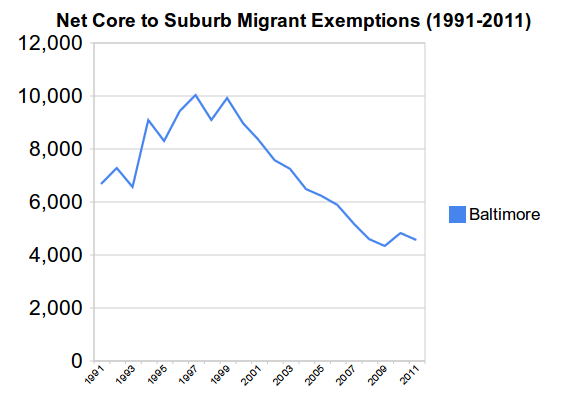
    As you might expect, there’s been a net outflow of people from the city for quite some time. From 1990 to 2011 (the most recent year the IRS has released), Baltimore lost almost 151,000 people on a net basis to its suburbs. Here’s the chart:


    You see here that Baltimore had an accelerating net loss of people, but then showed a steep drop in net loss through the 2000s. This is consistent with county level migration I’ve seen in other regions.

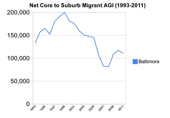
    When people leave, they take their money with them. Baltimore’s cumulative net loss of annual income to its own suburbs from departing residents is about $2.75 billion from 1992 to 2011. (Income data isn’t available for 90-91 and 91-92 movers). That’s annual income, so this loss in effect recurs every single year. That’s a lot of money. Here’s the chart on adjusted gross income loss (in thousands of dollars):


    What was a small post-recession bump in the people numbers is a more sizable one in the money figures.

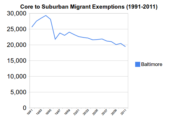
    Since we can, let’s also look at the individual flows of people leaving and people coming in. Here are people moving from Baltimore to the suburbs:


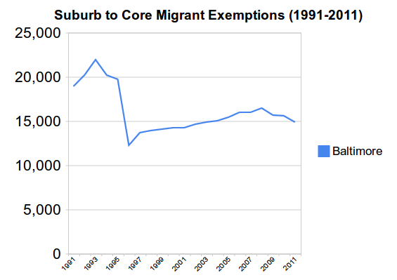
    And here are people moving from the suburbs to the city of Balitmore – and yes, lots of people do that:


    Here we see that the decline in Baltimore’s net loss was driven both by a decline in the number of people leaving and by an increase in the number of people coming in. This is similar to what I’ve seen in other similar places. The uptick in the recession is due to a drop off in the number of in movers.

    There are some pretty dramatic movements in the early 90s, which were an interesting time in urban America to put it mildly. I’m not familiar with the specifics of Baltimore in that era. Some other regions I looked at – including St. Louis, which is also an independent city – show higher early 90’s migration, but nothing like the swing in Baltimore.

    We will have to see what happens in post-2011 years. The IRS is delayed in issuing data, and has been trying to kill off this data program entirely, so who knows when more data will be available. 2012 data should in theory be out right about now, but we are some years away at best from finding out what impact this year’s riots might have had.

    I should caveat this data by noting that it is based on tax returns that can be matched from year to year, so there are some movers who aren’t captured. As you can see, this is a pretty large data set, however.

    Aaron M. Renn is a senior fellow at the Manhattan Institute and a Contributing Editor at City Journal. He writes at The Urbanophile, where this piece first appeared.

  • California Environmental Quality Act, Greenhouse Gas Regulation and Climate Change

    This is the introduction to a new report, California’s Social Priorties, from Chapman University’s Center for Demographics and Policy. The report is authored by David Friedman and Jennifer Hernandez. Read the full report (pdf).

    California has adopted the most significant climate change policies in the United States, including landmark legislation (AB 32)2 to lower state green- house gas (GHG) emissions to 1990 levels by 2020. Proposed new laws, and recent judicial decisions concerning the analysis of GHG impacts under the California Environmental Quality Act (CEQA), may soon increase the state’s legally mandat- ed GHG reduction target to 80% below 1990 levels by 2050.3 The purpose of California’s GHG policies is to reduce the concentration of human-generated GHGs in the atmosphere. The United Nations Intergovernmental Panel on Climate Change (IPCC) and many other scient.c organizations have predicted that higher GHG atmospheric concentra- tions generated by human activity could cause catastrophic climate changes.

    This paper demonstrates that even the complete elimination of state GHG emissions will have no measurable effect on climate change risks unless Cali- fornia-style policies are widely adopted throughout the United States, and particularly in other countries that now generate much larger GHG emissions. As California Governor Jerry Brown, a staunch proponent of climate change policies, recently observed, “We can do things in California, but if others don’t follow, it will be futile.”4 Similarly, the California legislature recognized at the time that AB 32 was enacted that at- mospheric GHG concentrations could only be stabilized through national and international actions, and that the state’s “far-reaching effects” would result from “encouraging other states, the federal government, and other countries to act.”5 Nevertheless, the extent to which California’s GHG policies have and may be likely to inspire similar measures in
    other locations, is rarely, if ever seri- ously evaluated by state lawmakers or the California judiciary. Absent such considerations, imposing much more substantial GHG mandates may not only fail to inspire complementary actions in other locations, but could even result in a net increase in GHG emissions should population and economic activity move to locations with much higher GHG emission rates than California.

    Key findings include the following:

    1. Most scientists agree that climate change risks are associated with the atmospheric accumulation of gases with high global warming potential includ- ing carbon dioxide and other gases attributed to human activity (collectively “carbon dioxide equivalent” or “CO2e” emissions). In 2011 California accounted for less than 1% of global CO2e emissions, and less than 0.065% of the worldwide annual CO2e emissions increase that occurred during 1990-2011. The state’s per capita CO2e emissions are much lower than in the rest of the United States, and comparable with relatively efficient advanced industrial countries like Germany and Japan.

    2. Despite its sizable population and economy, California generates a relatively minute, and falling, share of global CO2e emissions. The amount of global CO2e emissions and atmospheric concentrations would have been virtually unchanged, even if California’s GHG emissions were zero from 1990-2011, and remained at that level and assuming cur- rent emission trends in other locations continued through 2050.

    3. As recognized in AB 32 and by other state leaders, California’s ability to reduce climate change risks is not primarily a function of reducing state emissions. To have any measurable effect on global CO2e levels, the state must show that CO2e emissions can be reduced in a manner that also allows societies, such  as China and India, to improve the prospects for the vast majority of the population now living in or near poverty conditions. Over the last several decades, and especially since the mid-2000s, when climate change emerged as the state’s dominant environmental policy focus, California has failed to demonstrate that it can sustain a thriving middle and working class in addition to its most affluent  population.

    4. As sharply illustrated by Tesla’s recent decision to locate a $5 billion electric car facility, and 6,500 green jobs, in Nevada, California continues to suffer from a relatively poor global economic reputation as a place to do businesses outside high-end services and technology development. This drives even green energy manufacturing, let alone more traditional industries, from the state. State policies also reduce middle and working class employment opportunities, and increase housing and other key living expenses, such as energy costs.

    5. Ironically this has resulted in a mas- sive displacement of former state businesses and residents to other locations with higher per-capita CO2e emission levels. Since 1990, 3.8 million former residents, approximately the population of Oregon or Oklahoma, relocated to other states. Billions of dollars of  economic activity which might have remained in California have now been relocated to states and foreign countries with much higher emissions and weaker regulations. The cumulative net CO2e emission increases generated by the unprecedented movement of the state’s former residents and continuing loss of economic activity to higher GHG generating locations nearly offsets the GHG reductions that would  be achieved in California under AB 32.

    Section I of this paper provides background information about historical CO2e atmospheric concentrations, the extent of global CO2e emissions over time, climate change risks associated with these trends, and California’s relative contribution to worldwide CO2e emissions. This section demonstrates that California accounts for a minute and falling share of global GHG emissions.

    Section II discusses the development of California’s current climate change policies and shows that, in the past, California consistently recognized that CO2e emission reduction goals must be adopted in a measured, balanced man- ner to facilitate the concurrent need for economic growth and other important social objectives. Despite recent increases in corporate earnings by Silicon Valley corporations, increased home prices to pre-recession levels, and a decrease in reported unemployment rates, California also includes the nation’s largest number and highest percentage of people living in poverty. Nearly 24% of the state’s population is impoverished according to recently released U.S. Census Bureau statistics and faces enormous economic and social challenges.

    The state’s ability to meet its pressing social and economic challenges could be worsened by proposed legislation and judicial interpretations of CEQA mandating much more substantial GHG reductions than even sympathetic scientific assessments have found to be unachievable using any current technology.

    Sections III and IV show that, even assuming that California had zero CO2e emissions during 1990-2011, and for an additional four decades projected to 2050, global CO2e emission levels and atmospheric CO2e concentration would be virtually unaffected. In fact, unrealistic unilateral GHG reduction mandates can actually increase global CO2e levels and associated climate change risks by discouraging states and countries from adopting similar policies, and by displacing people and industries to locations with higher emissions.

    The achievement of significant, but more realistic GHG objectives and broad-based economic and social growth would have an immeasurably greater effect on atmospheric CO2e concentration levels if the state’s economic vitality proved a workable model that also allows for the achievement of critical social aims, such as reducing poverty and improving the standard of living for the middle class and those aspiring to join the middle class.

    Read the full report (pdf).

  • Dispersion and Concentration in Metropolitan Employment

    The just released County Business Patterns indicates a general trend of continued employment dispersion to the newer suburbs (principally the outer suburbs) and exurbs but also greater concentration in the central business districts of the 52 major metropolitan areas in the United States (over 1 million population in 2013). County Business Patterns is a Census Bureau program that provides largely private-sector employment data by geography throughout the nation.

    This article examines the most recent data, for 2013, with comparisons to 2007, which was the peak employment year and preceded the Great Recession, the most substantial economic decline in the United States since the Great Depression. There are also comparisons to 2010, the year in which national employment reached its lowest level (trough) before beginning what is, so far, a long and fairly arduous recovery. The analysis uses the City Sector Model (Note)

    2007-2013 Trend

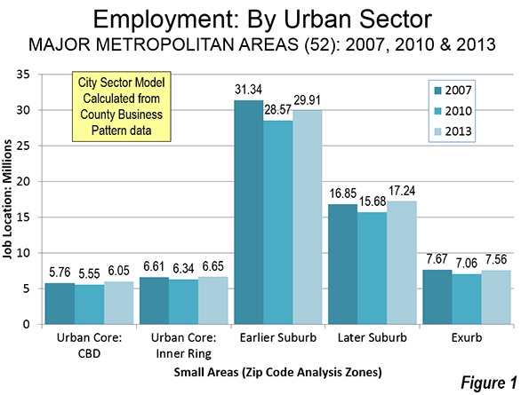
    Job losses were registered in each of the five urban sectors between the employment peak of 2007 and the trough of 2010. Three of the urban sectors have recovered to above their 2007 employment levels. However, overall major metropolitan area employment remains lower by approximately 800,000. Since the 2010 trough, the largest numeric gains have been in the newer suburbs. The Central Business Districts (CBDs) of the Urban Core have recovered more than double their 2007 to 2010 numeric loss. In contrast, the balance of the Urban Core, the Inner Ring experienced a modest increase over its 2007 employment peak. The exurbs have not yet fully recovered. By far the largest losses between 2007 and 2010 were in the earlier suburbs (principally inner suburbs), where employment dropped 2.8 million and has recovered less than one half of that loss (Figure 1).

    Dispersion and Concentration

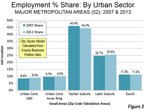
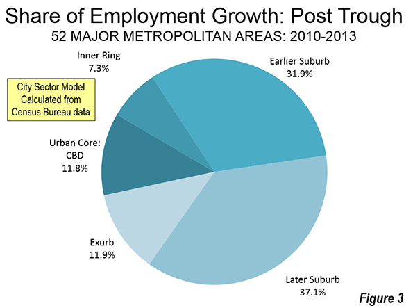
    The dispersion and concentration is most evident in the shares of employment by urban sector (Figure 3). Three of the urban sectors increased their share of metropolitan employment between 2007 and 2013. The largest increase was in the newer suburban areas, which rose from 24.7 percent to 25.6 percent of metropolitan employment. The central business districts also increased their share of employment, from 8.4 percent in 2007 to 9.0 percent in 2013. This trend is similar to the City Observatory (Joe Courtright) findings that urban cores outperformed suburbs in job growth between 2007 and 2011. The Courtright findings were for areas within three miles of the largest city center, while the findings here relate to the generally smaller CBDs (Figure 2).The gains in other sectors were at the expense of the earlier suburbs, which experienced a loss from 45.9 percent to 44.4 percent of metropolitan employment between 2007 and 2013.


    From the 2010 Trough to 2013

    Since the trough of 2010, there were numeric gains in all of the urban sectors. The gains were concentrated in the suburbs and exurbs, which accounted for 80.9 percent of the employment growth from 2010 to 2013. This nearly equals the 81.9 percent share of employment in these areas in 2007. The urban core, including the CBD and inner ring, captured 19.1 percent of the 2010 to 2013 employment growth, better than their combined 18.1 percent share in 2007 (Figure 3).

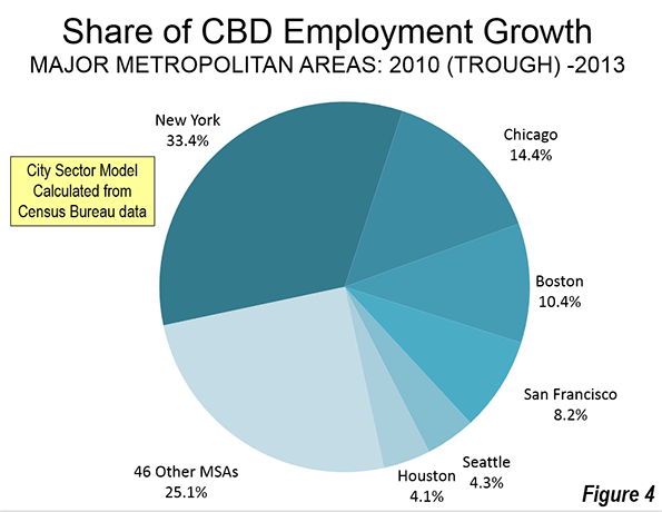
    There was also geographic concentration in the CBD gains between the 2010 trough and 2013. Approximately two-thirds of the CBD employment gain between 2007 and 2013 was in four metropolitan areas: New York, Chicago, Boston and San Francisco. Along with Seattle and Houston, these metropolitan areas account for 75 percent of the CBD growth. All of the 46 other major metropolitan areas contributed 25 percent of the gain (Figure 4).

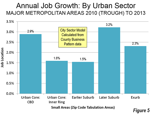
    Between 2010 and 2013, the largest annual percentage employment gain was in the later suburbs, at 3.2 percent. The CBDs, experienced the second strongest growth at 2.9 percent. However, numeric gain in the later suburbs was more than three times that of the CBDs, due to their already much larger employment base (Figure 5).

    Returning to Normalcy?

    For decades, most employment growth has been outside the urban cores of the major metropolitan areas, as had been the case with residential population gains. The Great Recession interfered with these patterns, but normalcy may be returning. Brookings Institution Demographer William Frey recently commented on later population trends (through 2014), suggesting "renewed growth in suburban and exurban counties." The new data indicates renewed employment growth in suburban and exurban areas. At the same time, it would not be surprising for the revival in the CBDs to continue, even if the numbers are relatively small in the metropolitan area context, where the dominance of suburban and exurban job growth seems likely to continue.

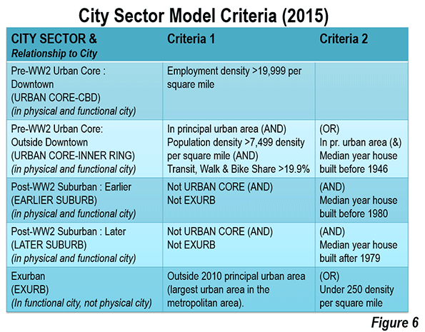
    Note: The analysis is based on the City Sector Model (Figure 6), which classifies small areas (ZIP codes, more formally, ZIP Code Tabulation Areas, or ZCTAs) in metropolitan area in the nation based upon their behavioral functions as urban cores, suburbs or exurbs. The criteria used are generally employment and population densities and modes of work trip travel. The purpose of the urban core sectors is to replicate, to the best extent possible, the urban form as it existed before World War II, when urban densities were much higher and when a far larger percentage of urban travel was on transit or by walking. The suburban and exurban sectors replicate automobile oriented suburbanization that began in the 1920s and escalated strongly following World War II.

    Photo: New York: Columbus Circle (by author)

    Wendell Cox is principal of Demographia, an international public policy and demographics firm. He is co-author of the "Demographia International Housing Affordability Survey" and author of "Demographia World Urban Areas" and "War on the Dream: How Anti-Sprawl Policy Threatens the Quality of Life." He was appointed to three terms on the Los Angeles County Transportation Commission, where he served with the leading city and county leadership as the only non-elected member. He served as a visiting professor at the Conservatoire National des Arts et Metiers, a national university in Paris. Wendell Cox is Chair, Housing Affordability and Municipal Policy for the Frontier Centre for Public Policy (Canada), is a Senior Fellow of the Center for Opportunity Urbanism and is a member of the Board of Advisors of the Center for Demographics and Policy at Chapman University.

  • How Cities Can Show Resilience

    Resilient: Strong. Healthy. Successful again. But how does a city become resilient? Here are five ways that city leaders can help:

    Designing for resilience requires systems thinking: Cities are complex, interconnected systems. Think of a city as being like a human body – a harmonious balance of cardiovascular, skeletal, respiratory, and cognitive functions. Each system is dependent on the next, and is easily stressed when unbalanced or shocked after trauma. An obvious example is PTSD, once known as “shell shock,” affecting so many military veterans today.

    Health experts have known the value of systems thinking in global health efforts for years. The same logic has grown popular in urban planning. Dr. Timon McPhearson, an Assistant Professor of Urban Ecology at The New School in New York City puts it this way:

    “Systems thinking is crucial to problem solving including for urban planning and policy, because no problem exists in isolation, all are part of a larger system of interacting networks; social networks, bio geophysical networks, political networks, and economic networks. Interestingly, it turns out that you can’t understand the behavior of a system by studying its parts; you need to study the whole thing.”

    California is an example. It may be easy to understand how the state’s drought is impacting its ability to produce food. However, you may be unaware that the drought is also having tremendous impacts on energy production. Energy and water are inextricably linked, with energy required to pump, treat, transport and cool water. Conversely, the force of falling water turns turbines that generate hydroelectricity, and most thermal power plants depend on H2O for cooling.

    The smartest cities create resilience from shocks and stresses: When your body has a weakened immune system, it will often lose the fight against viruses and disease. Cities also bounce back much more quickly from earthquakes, hurricanes, and floods if the core components of their social fabric are strong – things like education, health, general prosperity and community cohesion.

    There is also a strong connection between resilience and social networks. Disconnected communities have weak resilience. Transportation systems, entertainment venues and open spaces that bring communities together can have extraordinarily positive effects on their bounce-back capabilities.

    Only diverse teams can create epic resilience ideas: The strongest resilience solutions generally come from large, multi-disciplinary teams of engineers, architects, designers, social scientists, and economists. Masterfully crafted city projects are both beautiful and functional. They stimulate the economy and improve quality of life for the community.

    They also require diverse teams. Recent research reported by NPR found that diverse teams generally perform better, especially in idea rich fields like research, urban planning, and science. In the world of research, paper citations are a metric of effectiveness. Diverse teams lead to more citations. According to Harvard economist Richard Freeman, “People who are more alike are likely to think more alike and one of the things that gives a kick to science is that you get people with somewhat different views.”

    Creating resilience solutions requires input from many, and an open mind to diverse perspectives.
    Resilience solutions can have dual benefits: When Superstorm Sandy’s 14-foot storm tide nailed Hoboken on October 29, 2012, the streets, according to Mayor Dawn Zimmer, filled with water “like a bathtub.” The storm caused more than $250 million in damage.

    The initial reaction was to erect giant sea walls around Hoboken, but citizens cringed at the thought of giving up their magnificent views of New York harbor and Manhattan skyline. Perspectives changed when the city began working with a winning team from Rebuild By Design, a competition created in the wake of the storm to pioneer ways of designing, funding and implementing a resilient future. Instead of erecting big, ugly sea walls, the team created a system of parks, buildings and greenways as barriers against flooding, as well as a park around the city to serve as a rainwater storage site.

    The Hoboken example shows how resilience projects following a disaster don’t have to be a drag. They can protect cities and their citizens, and improve quality of life.

    Cooler heads design the best resilience strategies: Mayor Lianne Dalziel, of Christchurch, New Zealand, knows something about resilience. Christchurch was hit by a magnitude 7.1 earthquake in September, 2010. It devastated the city and aftershocks that followed were equally grim, including a 6.3 aftershock the following February that killed 185 people. A thousand buildings were damaged or destroyed in the city center alone, and rebuilding continues to this day. The financial impacts have been estimated to be $40 billion. Some economists have projected that it will take New Zealand’s economy 50 to 100 years to completely recover.

    As I listened to Mayor Danziel speak to an audience of experts and city officials last year, I was deeply moved by her warnings to communities about rushed decisions following a disaster – decisions that could ultimately do more harm than good. She even suggested that a “national cooling-off period” should be observed to prevent communities from major policy decisions fueled by emotion and sadness. It was a joke, but she might just be on to something. How do you avoid making rush decisions? Plan ahead.

    Most of the best resilience ideas are borrowed. Salvador Dali once said, “Those who do not want to imitate anything, produce nothing.” Every city in the world is different, but the problems they face are often similar. Good solutions should be shared.

    According to the World Bank, almost half a billion of the world’s urban residents live in coastal areas prone to storm surges and rising sea levels. This includes New York City, Miami, New Orleans, Mumbai, Ho Chi Minh City and Shenzhen, China; those are six of the ten cities projected to have the highest annual flood costs by 2050, according to Tim McDonnell of Climate Desk.

    The United States, Colombia, Pakistan, Somalia, Australia, Guatemala, China, and Kenya are all also losing billions to drought. The World Economic Forum reports that since 1900, global droughts have affected two billion people, leading to more than 11 million deaths. Organizations like Rockefeller’s 100 Resilient Cities Challenge (100RC) recognize commonalities between urban areas, and are working hard to facilitate information sharing. In the networked age of information, sharing ideas is easier than ever.

    Hire resilience experts: Are you leading a community development or critical infrastructure improvement project? Hire advisors, engineers, and urban designers that understand how to design for resilience. The community is where resilience starts and ends. It is the grass roots where the best-laid plans are hatched, and it’s also where the suffering begins when things go bad.

    City leaders must engage with all levels of the socio-economic ladder, particularly the lower rungs. That’s where the people who are hit the hardest when disaster strikes are, and where to find those who are usually the most receptive to new ideas, especially if they can see how it will help them in the short run. The key is connecting with them in meaningful ways. And giving them real, open pathways to you.

    Charles Rath is President & CEO of Resilient Solutions 21, or RS21. RS21 pulls from a wide array of disciplines to create solutions for cities, countries, agencies and businesses challenged by the physical, social and economic forces that will drive our world in the 21st century. For more information, contact charles@resilientsolutions21.com.

    Flickr photo by superkimbo: Viewpoint from Hoboken… a new perspective on rebuilding after disaster.

  • How California Became a Blue-State Role Model

    California, once disdained as zany, insubstantial and politically unreliable, has now become a favorite of the blue state crew. From culture and technology to politics, the Golden State is getting all sorts of kudos from an establishment media traditionally critical of our state.

    For example, the New York Times recently ran two pieces, one political and the other cultural, that praised this state for its innovation and cool – even in the midst of a horrendous drought.

    And to be sure, it’s nice to be a pet – at least I hope that’s what our dog Roxie feels. But we may want to understand why those who traditionally lambasted California now grant us their favors. Although some praise is deserved – both the economy and the cultural scene in California have improved somewhat – much of this shift reflects changes in the political and media culture itself.

    How a writer looks at California can be increasingly predicted by the writer’s political orientation. For liberals, the nasty California that produced both Richard Nixon and Ronald Reagan has been supplanted by a cooler, greener and more socially progressive state. If you are on the Right, California is beloved for reasons of nostalgia; for the Left, California is where the future once again is being shaped. Those of us more in the middle are simply unsure of what to think.

    Read the whole thing at the Orange County Register.

    Joel Kotkin is executive editor of NewGeography.com and Roger Hobbs Distinguished Fellow in Urban Studies at Chapman University, and a member of the editorial board of the Orange County Register. He is also executive director of the Houston-based Center for Opportunity Urbanism. His newest book, The New Class Conflict is now available at Amazon and Telos Press. He is also author of The City: A Global History and The Next Hundred Million: America in 2050.  He lives in Los Angeles, CA.

    Photo courtesy of the National Archives.

  • Land Use Regulations and “Social Engineering”

    All forms of land use regulation are explicitly “social engineering”. Full stop. Let’s acknowledge that reality as we move forward. The question is never whether we’ll be engaging in manipulating society through land use regulations, but how and why.

     Screen Shot 2015-03-30 at 1.59.06 AM


    The typical pejorative reference to “social engineering” includes things like government built subsidized low income housing or rent control imposed on private property. There are large numbers of people who find this sort of thing distasteful. I understand the objections, particularly since so much public housing has been so bad and rent control distorts the rental market. Then again, lots of for-profit housing is really bad and all sorts of other things distort rental markets.

    Screen Shot 2015-04-26 at 3.22.22 AM
    Screen Shot 2015-04-26 at 3.20.47 AM

    How about a municipality that dictates all new construction must be single family detached homes with a minimum 2,800 square feet on a lot that’s at least a quarter acre? What exactly is the logic behind that kind of land use control? Well… a particular town might want to “socially engineer” a middle class demographic in and a lower class demographic out. If only large expensive homes are available then the “wrong” kinds of people can’t live there. And their “undesirable” children can’t attend the local schools, etc.

    It’s also possible to “socially engineer” a private community so that it only includes people of a certain age… say, 55 and over. Municipal governments love retirement communities because they pay property tax, but don’t burden the town’s budget with school aged children. And most of the social services for retirement age folks are paid for by federal and state programs rather than local government. This sort of thing certainly distorts the local property market as well. So let’s be honest and say that some people like certain kinds of “social engineering” but not others.

    Screen Shot 2015-04-26 at 2.23.01 AM screen-shot-2014-10-08-at-11-12-33-am

    Screen Shot 2015-04-26 at 3.39.35 PM

    Voters in some areas value the rural agricultural quality of the landscape and don’t want to see the place paved over with new subdivisions, gas stations, and strip malls. Land use regulations are put in place with restrictions like zoning that requires new homes to be built on no less than forty acres. In addition, there are procedures that restrict new construction based on water availability, flood hazards, soil percolation, and so on. These policies work together to keep most of the land unavailable for development. These policies do in fact preserve the beauty of the open landscape, but they also restrict the supply of buildings and drive up the cost of property in the area. “Social engineering.”

    Screen Shot 2015-03-28 at 4.28.34 PM

    Screen Shot 2015-03-28 at 6.14.03 PM

    Screen Shot 2015-03-28 at 8.22.21 PM

    Screen Shot 2015-03-28 at 4.26.34 PM

    Screen Shot 2015-03-28 at 4.25.28 PM

    Other areas have pro growth policies that encourage development. Each new shopping mall, housing tract, and car dealership represents tax revenue and progress. There are a host of professional organizations that relentlessly lobby for new growth in order to promote full employment, affordable middle class homes, and a continuation of the suburban lifestyle. As property taxes rise the cost of having land sit idle becomes prohibitive just as potential profits rise. Owners are pressured into selling or developing whether they necessarily want to or not. Individual buildings sell well and bring many immediate benefits, but the long term consequences often destroy the landscape and reduce the quality of life. “Social engineering.”

    Screen Shot 2015-04-28 at 2.52.11 AM

    Screen Shot 2015-04-28 at 2.54.35 AM

    Screen Shot 2015-04-14 at 6.50.45 PM

    Screen Shot 2015-04-15 at 12.12.45 AM

    These photos show a form of development that is illegal almost everywhere in North America. The buildings all touch. That’s illegal. Some buildings have both commercial and residential uses. That’s illegal. All of these buildings have little or no parking. That’s illegal. Even at just three or four stories there’s still far too much density. That’s illegal. There’s a long list of handicap accessibility inadequacies in these buildings. That’s illegal. The streets between these buildings are much too narrow. That’s illegal. And yet these are highly desirable places to live and command premium prices on the open market in large part because they are so rare. So much so, in fact, that voters introduced rent control and other measures to help keep at least some working class people in the neighborhood. “Social engineering.”

    “Social engineering.” Use the term if you wish. But apply it evenly across the physical and political landscape.

    John Sanphillippo lives in San Francisco and blogs about urbanism, adaptation, and resilience at granolashotgun.com. He’s a member of the Congress for New Urbanism, films videos for faircompanies.com, and is a regular contributor to Strongtowns.org. He earns his living by buying, renovating, and renting undervalued properties in places that have good long term prospects. He is a graduate of Rutgers University

  • More Privatization Pain For the Public in North Carolina

    Privatization done right can be a great boon. Done poorly, it can harm the public for decades. We see another example of the latter ongoing in North Carolina (h/t @mihirpshah). The Charlotte Observer reports:

    The N.C. Department of Transportation’s contract with a private developer to build toll lanes on Interstate 77 includes a controversial noncompete clause that could hinder plans to build new free lanes on the highway for 50 years.

    The clause has long been part of the proposed contract. But it was changed in late 2013 or early 2014 to also include two new free lanes around Lake Norman – an important $431 million project supported by local transportation planners.

    Some area officials were surprised that under the contract with I-77 Mobility Partners, the developer would likely collect damages if the state added two new general-purpose lanes from Exit 28 to Exit 36 at the lake.

    Many of these long term privatization contracts are loaded with “submarine” clauses like non-competes that lurk underwater ready to rise up torpedo the public without warning. Did the people of North Carolina know that they were signing away their right to make public policy for the next 50 years when they did this deal?

    What raises serious a red flag is that the clause that incorporated the I-77 added lanes project was added late in the game, which suggests that the current impact were not an accident:

    Bill Coxe, a transportation planner with Huntersville, said he doesn’t know who lobbied for the revision. The new language wasn’t part of the draft contract from 2013, but it was added before the final deal was signed in June. “We saw that late in the game,” he said. “We aren’t sure who modified that.”

    Mooresville’s representative on an advisory committee that helps make transportation recommendations said she didn’t know about the change to the contract with the developer. Neither did Andrew Grant, a Cornelius assistant town manager who helps shape regional transportation policy.

    So many of these deals have less to do with bringing in private capital to finance infrastructure improvements than they do contractually creating a decades long stream of monopoly rents for the contractor.

    Chicago got burned when an arbitrator ruled it owed $58 million to the group that leased the city’s lakefront parking garages. The city had promised it would not allow anyone else to build a garage open to the public to compete with the lessee. But it did anyway and they had to pay damages.

    Contra the claim in the article that these clauses are necessary to attract investment, simply look around and see that businesses take huge investment risks every single day in markets with no barriers to entry for competitors. You don’t see Walgreens going to city governments and telling them they won’t open a store unless the city promises not to approve a CVS within a two mile radius, for example. We often see retail competitors right across the street from each other

    But why invest in the actual marketplace when you can sign a sweetheart deal that grants you a five decade monopoly?

    In this case, it appears to be free lanes and toll lanes side by side on the same facility. So there’s some justification for some sort of agreement on the state’s plans for the free lanes. But given that the free lane expansion was already on the books and supported by transportation planners, to have the project de facto killed through a clause slipped into a private contract in a way that does not appear to have been vetted by the public is dubious. If the residents of the area had known the free lane project they were banking on would be basically taken off the table for 50 years, it might have created protests that could potentially derail the contract. So by simply adding a non-compete clause, the state and contractor could do the same thing without stirring up the public until it was too late. It’s all the more reason why there needs to be much, much more scrutiny on the terms of these deals.

    Aaron M. Renn is a senior fellow at theManhattan Instituteand a Contributing Editor atCity Journal. He writes at The Urbanophile, where this piece first appeared.

    Interstate 77 map by Nick Nolte (Own work) [Public domain], via Wikimedia Commons