Blog

  • Prairie Metropolitan Areas Drive Canada’s Growth

    In Canada, growth is moving west, but not all the way. The big growth now is in the Prairies between central Canada and British Columbia, the Canadian part of the Great Plains.

    Yet you can’t talk about metropolitan Canada without first mentioning the Toronto region.

    The Greater Golden Horseshoe continues to dominate Canada’s population, according to the latest census metropolitan area estimates from Statistics Canada. Anchored by Toronto, the metropolitan areas of the Greater Golden Horseshoe (Hamilton, Kitchener, Oshawa, Brantford, Barrie, Peterborough St. Catherine’s – Niagara and Guelph) now have a population of 8.7 million residents, 23.4% of the national total of 35.5 million.

    The Major Metropolitan Areas

    Canada has six major metropolitan areas (populations over 1 million) and a total of 33 (Table 1).

    Table 1
    Canada: Census Metropolitan Areas
    Population: 2001-2011-2014
            Annual Change
    Metropolitan Area 2001 2011 2014 2001-2011 2011-2014
    Toronto                       4,883     5,770     6,056 1.68% 1.63%
    Montréal                      3,533     3,886     4,027 0.96% 1.20%
    Vancouver                     2,075     2,373     2,470 1.35% 1.35%
    Calgary                          978     1,264     1,407 2.60% 3.62%
    Edmonton                         962     1,206     1,328 2.28% 3.27%
    Ottawa           1,110     1,270     1,318 1.35% 1.24%
    Québec                           704        777        800 0.99% 0.97%
    Winnipeg                         696        746        783 0.70% 1.61%
    Hamilton                         689        742        765 0.75% 1.01%
    Kitchener-Waterloo        432        493        507 1.34% 0.93%
    London                           453        489        502 0.78% 0.87%
    Halifax                          369        402        414 0.86% 0.98%
    St. Catharines-Niagara        392        403        406 0.27% 0.28%
    Oshawa                           309        367        384 1.76% 1.51%
    Victoria                         326        352        359 0.78% 0.62%
    Windsor                          321        328        334 0.23% 0.57%
    Saskatoon                        231        270        301 1.58% 3.62%
    Regina                           197        218        238 1.00% 2.98%
    Sherbrooke                       184        205        212 1.07% 1.18%
    St. John’s                       176        203        212 1.39% 1.49%
    Barrie                           155        193        200 2.18% 1.30%
    Kelowna                          154        184        191 1.76% 1.38%
    Abbotsford        154        174        179 1.25% 0.88%
    Kingston                         153        164        168 0.74% 0.78%
    Sudbury                  161        165        166 0.23% 0.09%
    Saguenay                         162        159        160 -0.18% 0.16%
    Trois-Rivières                   143        153        156 0.67% 0.56%
    Guelph                           129        146        151 1.20% 1.20%
    Moncton                          122        140        146 1.38% 1.37%
    Brantford                        129        139        143 0.82% 0.87%
    Saint John                       126        129        127 0.20% -0.34%
    Thunder Bay                      127        125        125 -0.14% 0.04%
    Peterborough                     115        122        123 0.58% 0.29%
    Metropolitan Areas   20,851   23,759   24,859 1.31% 1.52%
    Outside Metropolitan Areas   10,172   10,586   10,684 0.40% 0.31%
    Canada   31,023   34,345   35,542 1.02% 1.15%
    In thousands
    Source: Statistics Canada


    Toronto remains the largest metropolitan area in the nation, at 6.1 million residents. The population has increased nearly 1.2 million since 2001, 300,000 of it in since the census year of 2011. In the past half-century, Toronto has steadily increased its share of Canada’s population. In 1961, 11 percent of the nation’s residents were in the Toronto metropolitan area. By 2014, 17 percent of the population was in Toronto. Toronto’s has built a margin of 2.0 million over second-ranked Montréal, an expansion of more than one half just since 2001. Montréal had been the largest metropolitan area in Canada until 1976.

    Montréal continues to be Canada’s second largest metropolitan area, at 4.1 million. Montréal’s annual growth rate was higher between 2011 and 2014 than in the previous 10 years, though is still growing at less than the national average. 

    Vancouver is Canada’s third largest metropolitan area. In the second half of the 20th century, Vancouver grew at a rate considerably greater than that of the nation as a whole. However over the last three years, Vancouver’s has grown at a rate less than that of Canada as a whole. Vancouver is nearing a population of 2.5 million, which it should achieve in 2015.

    Among Canada’s major metropolitan areas (over 1 million residents), Calgary is the fastest-growing. Calgary has reached a population of 1.4 million and is growing at 2.5 times the national rate (3.62 percent annually).Since 2001, Calgary has added more than 400,000 residents. Calgary’s growth rate has been spectacular. In 1951, Calgary had fewer than 150,000 residents, but has since grown into a major center specializing in energy. Calgary has the distinction of having built by far the largest post-World War II downtown area in either Canada or the United States (see photograph at the top of the article).

    Edmonton has grown almost as quickly. From a population of under 200,000 in 1951, Edmonton has grown to more than 1.3 million. Edmonton’s annual growth rate since 2011 has been 3.27% and has added more than 360,000 residents since 2001.

    Ottawa, the national capital (see photo below), stretches across the Ontario-Québec border, with Gatineau the largest municipality on the Quebec side. In 2011, Ottawa had been the fourth largest metropolitan area since 1941, but has been passed by both Calgary and Edmonton since 2011.


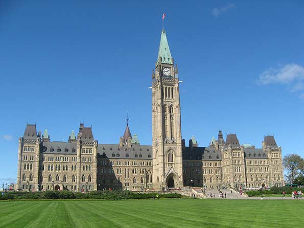
    Photo: Centre Block, Parliament Hill, Ottawa

    Moving to the Prairies?

    The population estimates of the last three years indicate considerable growth in the Prairie metropolitan areas relative to the rest of the nation. The Prairies provinces are include Alberta, Manitoba and Saskatchewan (Table 2).

    Table 2
    Canada: Census Metropolitan Areas by Region
    Population: 2001-2011-2014
            Annual Change
    Region 2001 2011 2014 2001-2011 2011-2014
    Atlantic Provinces        794        874        900 0.96% 0.97%
    Québec                        4,997     5,498     5,683 0.96% 1.11%
    Ontario     8,587     9,830   10,231 1.36% 1.34%
    Prairie Provinces     3,765     4,474     4,846 1.74% 2.70%
    British Columbia     2,708     3,083     3,199 1.30% 1.24%
    Metropolitan Areas   20,851   23,759   24,859 1.31% 1.52%
    In thousands
    Source: Statistics Canada


    Calgary and Edmonton have experienced strong growth for decades. The same was not true of Saskatchewan’s two largest cities, Saskatoon and Regina. After years of near population stagnation, both metropolitan areas, and the province added population at an accelerated rate. Saskatchewan’s growth pattern has paralleled that of North Dakota, which has shared the energy boom and experienced unprecedented growth after decades of stagnation.

    Saskatoon’s annual growth rate tied with that of Calgary, at 3.62%. This is more than double the 2001 to 2011 growth rate. Regina nearly tripled its annual growth rate from 1.00% between 2001 and 2011 to 2.98% between 2011 and 2014.

    But perhaps the biggest surprise was Winnipeg. Winnipeg was for many years Canada’s fourth largest metropolitan area, a title it relinquished to Ottawa in the 1960s. By 2001, Winnipeg had fallen to eighth place, its population exceeded by not only Calgary and Edmonton, but also Quebec City. However, in a major turnaround, Winnipeg’s annual growth rate has more than doubled since 2011.

    The strength of the Prairies is evident in the regional data (Table 2). The metropolitan areas in the Prairie Provinces grew at more than double the rate achieved by the metropolitan areas in the other regions of Canada between 2011 and 2014.

    The metropolitan areas in all of the four other regions of Canada grew at rates below that of the nation as a whole between 2011 and 2014. The slowest growth was in the Atlantic Provinces (New Brunswick, Newfoundland, Nova Scotia and Prince Edward Island). The annual growth rate of Québec’s metropolitan areas was the second lowest. However growth edged up in Québec’s metropolitan areas. Ontario and British Columbia had grown an approximately the national metropolitan area rate between 2001 and 2011. However, both provinces saw their metropolitan growth fall below the national rate in the last three years.

    The Prairies are likely to experience a reduction in their population growth rate as a result of lower oil and commodity prices. It is an open question how long the lower prices will prevail. The proximate cause of the lower prices is OPEC’s relaxed rationing of its supply to the world. That could change by political whim at virtually any time, or due to disruptions in the Middle East or West Africa, sending prices higher.

    Meanwhile, non-metropolitan Canada continues its very slow growth, which now stands at one-third that of the nation and one-fifth that of the metropolitan areas.

    Wendell Cox is principal of Demographia, an international public policy and demographics firm. He is co-author of the "Demographia International Housing Affordability Survey" and author of "Demographia World Urban Areas" and "War on the Dream: How Anti-Sprawl Policy Threatens the Quality of Life." He was appointed to three terms on the Los Angeles County Transportation Commission, where he served with the leading city and county leadership as the only non-elected member. He was appointed to the Amtrak Reform Council to fill the unexpired term of Governor Christine Todd Whitman and has served as a visiting professor at the Conservatoire National des Arts et Metiers, a national university in Paris.

    Top Photo: Downtown Calgary (by author)

  • The Three Faces of Populism

    More than at any other time in recent memory, American politics now are centered on class and the declining prospects of the middle class. This is no longer just an issue for longtime leftists or Democratic or right-wing propagandists. It’s a reality so large that even the most detached and self-satisfied Republicans must acknowledge it.

    The Left’s new superstar, New York City Mayor Bill de Blasio, identifies inequality as “the dominant issue in our public discourse” but similar assessments have recently been coming from such unlikely sources as GOP Senate Majority Leader Mitch McConnell, Jeb Bush and even Mitt Romney.

    So, if populism will become a dominant theme in the next election, what form will it take? Populism itself is more a sentiment than a program; it reflects people’s deep-seated fears about the future and a festering resentment of the seemingly unassailable power of financial and other corporate elites.

    Read the entire piece at The Orange County Register.

    Joel Kotkin is executive editor of NewGeography.com and Roger Hobbs Distinguished Fellow in Urban Studies at Chapman University, and a member of the editorial board of the Orange County Register. He is also executive director of the Houston-based Center for Opportunity Urbanism. His newest book, The New Class Conflict is now available at Amazon and Telos Press. He is also author of The City: A Global History and The Next Hundred Million: America in 2050.  He lives in Los Angeles, CA.

  • Europe Is Still a Second-Rate Power

    In the years after the Cold War, much was written about Europe’s emergence as the third great force in the global political economy, alongside Asia and the United States. Some, such as former French President Francois Mitterand’s eminence grise Jacques Attali, went even further: in his 1991 book Millenium Attali predicted that in the 21st century, “Japan and Europe may supplant the United States as the chief superpowers.”

    This notion of a fading America has been embraced among some here as well, by authors such as Jeremy Rifkin who has written extensively about a “European dream” supplanting the American one on a global scale. In 2008, CNN anchor Fareed Zakaria predicted the rise of what he called “the post-American world,” with the U.S. still preeminent but losing ground, particularly to emerging countries in Asia. This view is widely held in American elite circles, including many people in or close to the Obama administration.

    Yet something funny happened on the road to a post-American era: it didn’t happen. Even under two of the most incompetent administrations in our country’s long history, we are headed not to a “post-American” world, but more likely a “post-European” one.

    The Fading of the “European Dream”

    Fifty years ago, when Europe’s economy was growing faster than America’s on a consistent basis, and Asia was just emerging, the case for the continent’s ascendency seemed much stronger. But for the past 30 years Europe’s economy has been generally performing worse than that of the U.S. , not to mention rising Asian powers, including China and India.

    The Great Recession hit all economies, but recently American growth rates have consistently outperformed those on the continent. By 2013 Europe was still experiencing 12 percent unemployment—a rate that exceeds ours at the height of the U.S. recession. European household debt, notes analyst Morgan Housel, has been increasing while that of American households has dropped.

    The roots of Europe’s poor economy lies in large part in the very welfare state so admired by some progressives. To be sure, generous benefits have helped make Europe somewhat less unequal than the United States. But in the process Europe has become a very expensive place to do business. High taxes and welfare costs, tolerable in an efficient economy like Germany’s, have caught up with weaker, less productive countries such as Italy, Greece, and even France.

    This weakness is most evident in two critical sectors—energy and technology—critical to modern economies. Europe’s much ballyhooed attempt to go “green” has raised energy costs throughout the continent. Ultimately, the effects of high energy prices tend to fall on the middle and working classes, as well as on manufacturing industries, which are are now scouring the world, including the southern United States, for lower cost alternatives.

    Europe is also vastly underrepresented among the rising players in the tech world . The continent still possesses some influential industrial companies—Siemens, BMW, Volkswagen, Bayer, Royal Dutch Shell, Daimler—but it has created no European equivalent to Google, Facebook, Apple, Amazon, Microsoft, Intel, or even IBM. Not one of the world’s 14 largest tech companies by revenue is based in Europe. Five are in Asia, nine in the United States. European officials have tried to curb these often intrusive and arrogant companies, but the problem lies not in overstrong American competition but Europe’s inability to grow and nurture successful young companies.

    The Barrel of the Gun

    It’s understandable that a continent that almost destroyed itself twice with wars in the 20th century would shy away from the use of military force. This was reinforced by decades of reliance on U.S. military might for security. This situation in turn nurtured a strong anti-military, pacifistic streak that resulted in a region with a large economy but with little to offer on the battlefield. England is the only European country to possess one of the world’s top five military budgets. Besides the U.S., by far the largest military power, the top four include China, Russia, and Saudi Arabia. The three largest economies using the Euro—France, Germany, and Italy—spend one third less on defense combined than the U.S. Increasingly the only counterweight to U.S. power will be the emerging Sino-Russian alliance, which matches Russia’s still prodigious arms production with China’s almost limitless bankroll.

    Demilitarization has its perils. As Chairman Mao once noted, “political power grows out of the barrel of a gun.” Sure we should all prefer, like President Obama, to employ “soft power” rather than going in with guns blazing a la George Bush. Yet the world is still full of well-armed people who don’t play by such civilized rules. A hard-baller like Vladimir Putin knows a bluffer when he sees one and knows he can do what he wants, in the Ukraine or elsewhere, without fear of European intervention or even fear that the E.U. might help arm Kiev’s forces. Similarly, Jihadis have learned that you can do what you want to Europeans, knowing that some countries—notably France, Germany, Spain and Italy—will willingly pay ransoms to free their citizens. Kidnap a German and get rich; do it to an American, Brit or, god forbid, an Israeli, and there’s eventually hell to pay.

    The Demographic Disaster

    Europe’s biggest problem, however, happens inside the boudoir. Along with Japan, Europe has pioneered low fertility. European countries average a fertility rate of 1.5, well below the 2.1 children per family needed to replace their population.

    The problem is most acute in Italy, Spain, and, most important, Germany. The number of German babies born annually has dropped below the levels at the turn of the last century. Not surprisingly the U.N. expects Germany’s population to drop 9 percent by 2050. Germany may have fewer children than it did in 1900, but Spain’s total number of births has dropped well below the rates of 1858, and may match those of the 18th century.

    This reflects something of a hangover from the disasters inflicted by Europeans on themselves in the last century. After decades of war and conflict, notes historian Tony Judt, Europeans simply wanted peace and quiet. In post-war Europe, every subsequent generation has been a “me generation,” focusing less on family and religion and more on material goods and financial security. Today Europe is one of the most irreligious places on the planet; there are more atheists in Germany, by some counts, than in the entire United States, a country with nearly four times as many people.

    To maintain their workforces and create new consumers, European countries have by necessity made a priority of bringing in more immigrants. By 2025 Germany’s economy will need six million additional workers; this means 200,000 new migrants every year to keep its economic engine humming, according to government estimates . The situation gets worse from there, and by 2050 Germany’s overall workforce (PDF) is expected to drop 30 percent below 2010 levels, reducing it from 54 to 38 million. In the same time period the American workforce is expected grow by an additional 35 million workers.

    For years, Germany and other western European countries have depended on newcomers from Turkey and other Islamic countries to drive their economy. But Islamic migration is widely believed to have failed to deliver workers with enough skills, not to mention creating ever more dire cultural and social divisions. Concerned about Islamic immigration, Germans are now relying , as they did back in the ’60s, on the diminishing pool of skilled workers from rapidly aging states such as Spain and Italy, as well as from eastern Europe. These economically beleaguered countries have become a major source of new migrants to Germany, numbering roughly one million in 2011, a 20 percent increase from the previous year.

    In the process, much of southern and eastern Europe is gradually depopulating. By 2050, Bulgaria is expected to lose 27 percent of its population, while Latvia, Lithuania, and Romania are expected to lose more than 10 percent of theirs. By 2050 the populations of almost the all of Eastern Europe will fall, according to recent projections.

    Then there is Europe’s rapidly aging population, a natural product of low birth rates, which also imposes enormous burdens on the region’s economy. A proposal by German Chancellor Angela Merkel would impose a one percent income tax as a “demographic reserve” to make up for rising pension costs. “We have to consider the time after 2030, when the baby boomers of the ’50s and ’60s are retired and costing us more in health and care costs,” explained Gunter Krings, who drafted the new proposal for Germany’s ruling Christian Democrats.

    Ultimately the next generation will be the biggest losers in Europe’s decline. Even though birthrates are very low, those young people now entering the workforce face extraordinarily high levels of unemployment ranging 20 percent and higher in countries such as Spain, Greece and France. No surprise that Europe’s young are widely described as “the lost generation.”

    Political Chaos

    Europe’s current political crisis has spawned a new level of political uncertainty most clearly seen in the rise of radical new parties—such as Greece’s Syriza—on both right and left. Two forces driving this shift in political balance have been immigration and a growing grassroots rebellion, such as has emerged in Greece, over EU budget and regulatory policies. In Spain, for example, the fastest rising party, Podemos, borrows directly from Syriza’s brand of quasi-Marxist radicalism.

    But most of the thunder in other parts of Europe comes from the right. Many Europeans have come to see the EU not as a great unified superstate but instead as an oppressive, unelected, despotic power. The “common European home” dreamed of by Soviet President Mikhail Gorbachev is becoming a ramshackle collection of apartments, with neighbors who increasingly don’t get along and look elsewhere for succor.

    Another key driver of opposition from the right is the EU’s generally lenient view about immigration. Despite their growing dependence on immigrants, Europeans are increasingly resentful of the newcomers, particularly those from Africa and the Middle East. Some two thirds of Spaniards, Italians, and British citizens, according to an Ipsos poll, believe there are already “too many immigrants,” while majorities in Germany, Russia, and Turkey also hold negative views about newcomers in their midst.

    In France the long-standing fear of losing control of national destiny has combined with growing fear over immigration, stoked by the recent terrorist incidents there. This has allowed the far right National Front’s Marine Le Pen to emerge as an unlikely front runner in the next race for president. The rise of the United Kingdom’s Independence Party stems from a similar concern about threats to Britain’s sovereignty as well as angst over immigration, particularly among working and middle class voters. Even countries such as Denmark and the Netherlands, once considered paragons of liberalism, have seen the rise of similarly minded rightist movements.

    Back to Bipolarity

    Buffeted by a weak economy and a welter of social ills, the aforementioned visions of Jacques Attali and American Europhiles now seem like wishful thinking, if not delusional. In reality in everything from culture and high tech to military prowess, the continent is rapidly becoming a peripheral global power at best. Only Russia, the most powerful military power and the continent’s primary source of energy, seems to have seen the light. President Putin has made this clear as he develops closer ties to China, with whom he shares an authoritarian philosophy.

    Other countries on the fringe of the continent, such as Greece and Serbia, also are looking increasingly at Russia, and its emergent Chinese alliance, rather than the E.U. Chinese plans for new bullet trains to Central Asia and eastern Europe could further enhance the Middle Kingdom’s linkage to Eurasia and central Asia.

    “So what about us?” Anglo-Americans (culturally if not ethnically) may ask. In a globalized world that speaks and writes in English, the Anglosphere—comprising both the U.K. and its various colonial offspring, including the United States—retains some natural advantages. This is where the most elite colleges and universities are located, and where the top financial, technology, and key business service firms are concentrated. Equally important, the Anglosphere also controls much of what the developing countries will most need in the future—food—through the unsurpassed fecundity of the United States, Canada, Australia, and New Zealand.

    Demographics and a unique ability to absorb a wide range of immigrants make the Anglosphere economically and demographically more vibrant than Europe. By 2050, the Anglosphere will be home to upwards of 550 million people, the largest population grouping outside China and India. English-speakers may not straddle the world like the 19th century empire-makers, but they are likely to remain first among equals well into the current century.

    Ultimately, the various countries of the world will have to choose between the Anglosphere and the Chinese-led authoritarian alliance. This will become something of a new version of the Cold War (but with China not Russia in the lead position), with each bloc seeking to win influence across the world. Anglophone India and Japan, for example, may choose the Anglosphere due to democratic traditions and a feeling of foreboding about a future forged by Chinese economic and, increasingly, military power.

    On the other hand, Latin American nations like Brazil and Argentina may consider “yankee imperialism” a greater threat to their autonomy and choose instead to embrace the Middle Kingdom and its Russian ally. This may also hold true for much of Africa, where China is making deep inroads. The Chinese-led New Development Bank and its $40 billion “Marshall Plan” for infrastructure in developing countries represents a bold move to secure ever more influence in the emerging world order.

    In this bipolar world forged in the context of U.S. vs China competition, Europe will likely be a bit player, wooed by both but essential to neither. In the 21st century, the road to power will not run through Paris or Berlin but through Beijing and Washington. Like the great leaders of the post-war era, American politicians and statesmen need to acknowledge the new reality of the post-European world and begin to address its implications.

    This piece first appeared at The Daily Beast.

    Joel Kotkin is executive editor of NewGeography.com and Roger Hobbs Distinguished Fellow in Urban Studies at Chapman University, and a member of the editorial board of the Orange County Register. He is also executive director of the Houston-based Center for Opportunity Urbanism. His newest book, The New Class Conflict is now available at Amazon and Telos Press. He is also author of The City: A Global History and The Next Hundred Million: America in 2050.  He lives in Los Angeles, CA.

  • 10 Most Affluent Cities in the World: Macau and Hartford Top the List

    The United States and Europe continue to dominate the list of strongest metropolitan areas (city) economies in the world, according to the Brookings Institution’s recently released Global Metro Monitor 2014. This is measured by gross domestic product per capita, adjusted for purchasing power parity (GDP-PPP). Brookings points out that this does not indicate personal income, but "proxies the average standard of living in an area."

    The Global Metro Monitor 2014 provides detailed ratings for the 300 largest metropolitan economies in the world, measured by gross domestic product adjusted for purchasing power parity. The list is defined by total size of the economy, with some cities with very high GDP-PPPs per capita, but small populations are excluded. For example, Midland, Texas, with the highest GDP-PPP per capita metropolitan area according to the United States by the Department of Commerce Bureau of Economic Analysis, is excluded.  Other cities, with large populations and low GDP-PPP s per capita were included, such as megacity Kolkata, with a GDP-PPP of $4,000, a fraction of the top 10 average of $77,000. Megacities such as Lagos, Dhaka and Kinshasa were excluded from the top 300, owing to their low GDP-PPPs per capita

    According to data in the Global Metro Monitor website and report, 90 of the top 100 cities were in the United States or Europe in 2014, 68 in the United States and 20 in Europe. The US figure matches that of the previous Global Metro Monitor (2012), while Europe has fallen from 22 to 20 cities.

    Macau: The Most Affluent City

    Last year’s most affluent city, Hartford, was replaced by Macau, which, with Hong Kong is one of China’s two special economic regions. Brookings estimates Macau’s GDP-PPP per capita at $93,849, opening a substantial lead on Hartford of more than $10,000.

    Macau’s economy has expanded rapidly the last decade, principally due to legalized gaming industry and related tourism. Macau displaced Las Vegas as the largest gaming center in 2006. According to the Las Vegas Review Journal, Macau’s gaming revenues had exploded to nearly seven times that of the Las Vegas Strip ($44.1 billion compared to $6.4 billion). Revenue declined, however, in 2014, partly due to China’s anti-corruption drive and competition from other growing East Asian centers, such as Singapore and the Philippines.

    Macau is the one of the smallest cities in the Brookings 300, with a population of only 575,000. Only three other richest cities have populations less than 600,000 including Durham, North Carolina the smallest, ranked 12th, Pennsylvania’s capital, Harrisburg (with a core city that filed for bankruptcy), ranked 25th and Scotland’s capital, Edinburgh, at ranked 37th.

    Balance of the Top 10 Cities

    As was the case last year, nine of the 10 largest GDP-PPP’s per capita were in the United States (Figure). Like Macau, the second and third ranking cities were also smaller than the average, a population of 4.7 million. Second ranked Hartford, with a GDP-PPP per capita of $83,100 has 1.1 million residents. Hartford’s economy strong in finance, especially insurance and benefits and is an important government center, as the capital of Connecticut.

    San Jose, with 1.9 million residents, ranked third, with a GDP-PPP per capita of $82,400. San Jose is home to the larger part of the world’s leading technology center, suburban Silicon Valley. Tech and University hub Boston ranked fourth.

    Leading energy hub Houston ranked as the fifth most affluent city, with a GDP-PPP per capita of nearly $75,000 (Note 1). With 6.4 million residents, Houston is the largest city among the top five. Among the top ten, only New York is larger.

    Bridgeport, Connecticut, a metropolitan area adjacent to New York that includes suburban business centers such as Stamford, Westport and Greenwich is ranked 6th.

    The balance of the top 10 also includes cities specializing in technology, finance and government. Number seven Washington has probably the world’s largest government complex   and has nurtured a huge technology center centered in the Virginia and Maryland suburbs. Seattle ranks eighth, continuing its historic leadership in the technology driven aerospace industry besides its emergence as one of leading information technology centers in the world.

    San Francisco which includes part of the Silicon Valley in its suburbs (sharing with San Jose) and has a strong social media industry in its urban core, ranks 9th. The top 10 was rounded out by New York, perennially ranked as one of the two top global cities, along with London (see: Size is not the Answer: The Changing Face of the Global City, referred to as the Global Cities Report, described further in Note 2)

    Additional Highlights

    Europe:Unlike the United States, which placed 37 of its most affluent cities in the top 50 and 31 in the second 50, Europe’s 20 most affluent economies were concentrated in the second 50, with only six in the top 50. Comparatively small Edinburgh, cited above, was the most affluent, at 37th. Paris was ranked 40th most affluent by Brookings and 3rd in the Global Cites report, just ahead of London at 42nd, the perennial global city co-leader (which was ranked number one in the Global Cities Report).

    Hong Kong:Along with Macau, China’s other special economic region, Hong Kong continued to be among the world’s most affluent, at 39th. The Global Cities Report ranked Hong Kong as the sixth Global City, with a GDP-PPP PPP higher than that of former its former imperial capital   London.

    China: Perhaps most significantly, mainland China has begun to enter the top 100. Suzhou, partly exurban to Shanghai (Kunshan), now ranks 68th. Suzhou has been the recipient of considerable business park investment, including cooperative ventures with Singapore. China’s economic prosperity may be shifting toward the Yangtze Delta (which extends from Ningbo and Hangzhou, through Shanghai to Nanjing). Along with Suzhou, Wuxi, Changzhou and Nanjing now have GDP-PPP’s per capita exceeding $30,000. By contrast, among the large manufacturing centers of the Pearl River Delta, only Shenzhen exceeds a GDP-PPP of $30,000, while Guangzhou, Dongguan and Foshan are below that level (Note 2). According to a new Economist Intelligence Unit report, Jiangsu (which includes the urban corridor from Suzhou to Nanjing) now accounts for more manufacturing employment than any other province.

    Surprisingly Low Rankings: Some cities that might have been expected to be among the world’s most affluent, ranked comparatively low. For example Tokyo, the world’s largest city, ranked fourth in the Global Cities Report, made it only to the third 50 in affluence. Seoul-Incheon, a burgeoning corporate and tech center, remained outside the top 100.

    Canada’s largest city, Toronto managed only a ranking of 100, well below the Prairie behemoths of Calgary (11th) and Edmonton (23rd). Australia’s largest city, Sydney also barely made the top 100, at 95th, far below energy and commodities capital Perth (17th).

    European cities with reputations for unusual prosperity also ranked lower than expected. Financial center Zurich was ranked 45th. Scandinavia’s most affluent city  was Stockholm (48th), followed by energy leader Oslo (62nd), Helsinki (87th) and Copenhagen, which failed to make the top 100 and ranked in the third 50. Singapore,which the Global Cities Report ranks fourth, is ranked 14th most affluent.  

    Evaluating City Performance

    Cities grow as migrants are attracted by hope for better lives. This is as true in Africa and India as it is in Europe or the United States. Cities achieve their primary purpose when they produce a higher standard of living for their residents. Some cities do very well at this, as the Brookings data indicates, and some do less well. The Global Metro Monitor provides crucial information that can be used by national, regional and local officials to measure how well their policies are performing in improving living conditions in relation to both their own past and other cities.

    Note 1: Purchasing power can vary greatly even within nations. Because of this, the United States Department of Commerce, Bureau of Economic Analysis has developed a regional price parities (RPP) program to adjust for metropolitan area costs of living. For example, in 2012, the unadjusted per capita income in San Jose was 30 percent above that of Houston. In the same year, the per capita income-RPP (or in international terms, the per capita income-PPP) in San Jose was just six percent above that of Houston, indicating cost of living at least 20 percent higher in San Jose. 

    Note 2:  Joel Kotkin was principal author of Size is not the Answer: The Changing Face of the Global City, which included contributing authors Ali Modarres, Aaron M. Renn and me. The report was jointly published by the Civil Service College of Singapore and Chapman University. The report is available here.

    Note 3: The 2012 Global Metro Monitor ranked some cities of China higher, though Note 19 expressed concerns about population data for some cities, which might have excluded migrant populations (the "floating population"). There are no such difficulties in the 2014 Global Metro Monitor.

    Wendell Cox is principal of Demographia, an international public policy and demographics firm. He is co-author of the "Demographia International Housing Affordability Survey" and author of "Demographia World Urban Areas" and "War on the Dream: How Anti-Sprawl Policy Threatens the Quality of Life." He was appointed to three terms on the Los Angeles County Transportation Commission, where he served with the leading city and county leadership as the only non-elected member. He was appointed to the Amtrak Reform Council to fill the unexpired term of Governor Christine Todd Whitman and has served as a visiting professor at the Conservatoire National des Arts et Metiers, a national university in Paris.

    Photo: St. Paul’s Church (Facade), Macau, photo by authors

  • 50 Years of US Poverty: 1960 to 2010

    Although inequality is the current focus of concern with income, it is in the end a story of the rich, the middle and the poor, who of course have not gone away.  It is valuable to remind ourselves, particularly the young, about how pervasive poverty was 50 years ago, how poverty declined markedly between 1960 and 1980, after which it has risen again. Most important is to understand what led to the poverty reduction between 1960 and 1980, in order to further understand the power and lure of forces which would return us to the good old days of 1960, or before!. This piece is inspired by the pioneering book from 1970 on the Geography of Poverty, with Ernest Wohlenberg, based on 1960 data.  The data updates come mainly from US Census Bureau. 

    I start with the basic data, the numbers of the poor and the percent below the poverty level for 1960, for 1980 and for 2010, plus a summary table.  These are supplemented by some maps of the poverty rates for whites and for blacks (or non-whites), and for the elderly (only available for 1980).

    Overall for the nation the poverty rate fell from 22% in 1960 steeply down to 12% in 1980 then moved up moderately to 15% during the current era of rising inequality.  I look first at broad patterns of relative poverty for the three times, and then turn to the more interesting or surprising story of the differences in the reduction of poverty across the states, and then the story for whites, blacks and the elderly.

    Broad Patterns 

    The United States was so different in 1960, with a poor rural south and southwest, and a fairly poor Great Plains. (Figure 1). While the west coast was better off and metropolitan, the main area of lower poverty was the historic urban-industrial core from IL and WI to southern New England, where unionized industry prevailed. CT was richest with less than 10 percent poverty; this compared to MS with a poverty rate of 55! The deep south was amazingly poor and not just for Blacks. 

    Changes by 1979 were indeed revolutionary (Figure 2).  Areas of lower poverty extended from the old industrial core to the rest of New England and down Megalapolis to Virginia, and to the “old northwest”, MN, WI, IA, and to most of the US West. Most improved were the corners of the south, TX, OK, and FL, NC, due to energy development, new industries moving to the south and poor blacks escaping to the north.  Only a small lower Mississippi region (AR, LA, MS, and AL) remained fairly poor.

    2010 saw a rather general resurgence of poverty – related certainly to globalization and industrial off shoring, deindustrialization in the old northeastern core, and greater poverty across the southern tier from CA to FL, in part related to heavy immigration from Latin America.  Some of this shift could, in my opinion, be pegged as well to the shift to more conservative Republican Party rule.


    Numbers of States
    White Black Over 65
    Rate 1960 1980 2010   1980 1980 1980
    <12% 2 27 14 41 0 11
    12-18% 19 19 30 10 7 21
    18-24% 11 5 7 8 8
    24-40% 14 36 11
    >40% 5

    Poverty rates fell broadly between 1960 and 1980, especially for the half of states with 1960 rates above the 22% average level, while the number of states with rates below the 1980 average of 12% rose from 2 to 27 states. Rates increased modestly in the ensuing years in the then states with the lowest rates.

    The Relative Fates of States    

    Several states fared relatively best, with poverty rates falling at least in half or more in 2010 than in 1980. These are in two disparate sets: first southern states with very high poverty in 1960: AL, AR, KY, MS, NC, and VA, and another northern set  in ME, NE, NH, ND, SD, UT, and VT.  Other states in which poverty rates fell at least in half, but were lower in 1980 than in 2010 include GA, IA, SC, and TN. FL and TX poverty rates fell to less than half the 1960 rates in 1980, but poverty growth by 2010 showed some back-tracking. At the other extreme three states actually had higher rates of poverty in 2010 than way back in 1960: CA, NV, and NY.

    The particular gains for the south reflect two dominant forces, the out-migration of large numbers of black people to the north and west, slowing the reduction in poverty rates for the north and west, as well as the successful shift of industry from the north to the south, both forces including millions of families and of jobs.  TX and FL stand out because of high migration from Latin America. The exceptional story of CA and NY is similarly one of massive migration of minorities from the rest of the country but of even larger immigration from Latin America. The opposite story of very low poverty in NH, VT, and ME is one of overflow of opportunities and wealth from Massachusetts. The reason for ND, SD, NE, and UT is pre-oil development, and reflects broader forces for poverty reduction.

    Poverty in White and Black

    White poverty rates fell from 17 to 9.4 in 1979 but then edged up to 10% in 2010. At the same time, black poverty rates fell from a horrendous 55% in 1959 to just under 30% in 1979 and appears to have remained at 30 in 2010. Note that black poverty rates remain three times that of whites, and are comparatively as high as they were in 1959.  The gap remains worse (Figure 6) in the south and extreme generally across the north, but much lower in places like the Dakotas and upper New England in 1979 in part because of small numbers, and also due to the fact that the 1959 rates included Native Americans while the 1979 numbers did not.  The only good estimates for white poverty were for 1979, and reveal a remarkable uniformity across much of the country, lagging slightly in Appalachia-Ozarkia. (Figure 5) 

    Meanwhile, rates for blacks fell more in the parts of the South SC,  VA, NC, FL, and TX, but even more so  in the historic ”black belt” of AL, LA, MS, AR, and SC where the poverty rate dropped from 77 to 33 %. Less improvement is evident for early northern destinations of blacks from the south: NY, IL, MI, OH, and NJ, or in CA and OR.

    Please refer back to the table. While whites had rates below 12% in 46 states, for blacks the number is 0.   While 0 states had white rates above 18%, 44 states had black rates above 18%. This is shameful.  I am unable to find any positive spin for this story. The racial gap remains deeply entrenched.

    I close with a variant of the 2010 poverty map, showing the absolute numbers as well as the rates (Figure 8). Poverty remains serious across the southern tier, especially on CA, TX and GA, but also in the north, especially in NY and the eastern Great Lakes states.  While direct causality is unlikely, one can understand the worry of the increased numbers and shares of the poor clear across the southern tier of the country- CA to FL.     

    Poverty of the Elderly

    Compared to the generally poor picture of black poverty, the story  for the elderly is much  more positive. If anyone won the “war on poverty”, it was the elderly. Is this because of their political clout? Not just that, but it obviously matters. The data for 1959 and 2010 are not fully comparable, so the only map is for 1979.  But the elderly poverty rate in 1959 was a striking 46 percent, not that much below the outcast blacks, so the fall in the rate to under 15% in 1979 is quite astonishing. The reasons for this are discussed below. Here we can compare the pattern for elderly with that for all persons.
    Actually the correlation between age and poverty is quite high; elderly rates average about 5% above those for all people.  CA, AZ, FL, and NY achieved lower senior poverty rates in 1979 than for all persons, probably a result of selective migration, perhaps a role of political influence in AZ and FL.

    Why did poverty fall so much from 1960 to 1980, and then increase again? This is no big mystery! The two powerful and complementary forces reducing poverty were America’s robust economic expansion, in the 1960s especially, combined with social programs, starting with the New Deal (especially Social Security and the minimum wage), and the era of union growth, followed by the 60s Civil Rights revolution, including women’s rights, and the Great Society’s War on Poverty, above all Medicare and Medicaid. Of course these programs had to be paid for, but this was accomplished by vast economic investment and gains in productivity of the economy.

    The elderly were a huge part of poverty in 1960 but a relatively low part by 1980.  And despite the nation’s ongoing inability to overcome racial discrimination and unrest, the social programs have greatly helped the emergence  of a black middle class, as much in the south as in the north.

    Factoring in the Cost of Living

    But wait! Isn’t the cost of living higher in New York and San Francisco than in West Virginia and Nebraska?  Should this affect the estimates of poverty across the state?  The answer is yes, and fortunately, the Census Bureau has just completed a new series of poverty estimates for 2010-2012 adjusting for variations in the cost of living, and compared these to their official figures.  The effects are not trivial.

    Essentially, the cost of living is significantly higher in the biggest, densest and richest metropolitan cores, and correspondingly lower is most of the rest of the country. The higher costs in these few giant but populous places is sufficient to raise the number in poverty nationally, by 2.6 million, raising the US rate from 15.1 to 16 percent.

    The critical states for underestimating poverty are actually few: CA, 2,750,000 more, up 7.3%: NJ, 415,000 more, up 4.8%; FL, 771,000 more, 4.1%; MD, up 195,000, up 3.3%; NV, 102,000, 3.8%; and NY, up 308,000, 1.6%. California dominates the rise in poverty, by itself adding more poor than the country as a whole.  But some other states with big metropolitan areas do not suffer this cost of living adjustment: TX, -338,000. -1.3%; OH, -252,000, -2.2%; MI, -130,000, -1.3%; IN -106,000, -1.7%; and NC, -249,000, 2.6%. I do not know that these states have in common, perhaps less stringent growth management and lower tax rates.  

    There are seven states with a drop in the number of poor of 3% or more after adjusting for cost of living,  including MS, -136,000, -4.6%; NM, -86,000, -4.2%; WV, -75,000, -4.3%; and KY, -165,000, -3.8%.  As a consequence, we end up with a US pattern that is counter-intuitive, and contrary to conventional long-term wisdom about poverty. Big, rich mega-urban California earns the nation’s highest poverty rate as well as in total numbers (24%), followed by DC with 22.7; NV, 19.8; and FL, 19.5.  Long maligned poor states like MS has the same rate as the country, at 16%, AR, 16.5; SC, 15.8; and especially extreme, WV, 12.9 and KY, 13.6. Rather than having the lowest poverty rate at 9.6, CT moves up to 12.5, while IA, 8.6; ND, 9.2; WY, 9.2; and MN, 9.7, fall below 10% poor.  Counter-argument can be made that the story is not so different as first appears, if the richest states with higher cost of living also tend to  have higher levels of services to those in poverty. But this has not been measured. 

    Perusing the  two new maps of the percent poor in 2010,cost of living  adjusted, and the change in rates and numbers, highlights the key role of California-Nevada and of Megalapolis-Florida, historic cores of urban wealth, are also incubators of higher poverty. This also supports the idea that that immigration from Latin America must play a role in the heightened poverty along most of the southern border, and especially California.  The curse of poverty remains everywhere, but it’s clearly become more severe in some places, and less so in others.

    Richard Morrill is Professor Emeritus of Geography and Environmental Studies, University of Washington. His research interests include: political geography (voting behavior, redistricting, local governance), population/demography/settlement/migration, urban geography and planning, urban transportation (i.e., old fashioned generalist).

  • The Jewish World is Contracting Toward U.S., Israel

    Recent anti-Semitic events – from France and Belgium to Argentina – are accelerating the relentless shrinking of the Jewish Diaspora. Once spread virtually throughout the world, the Diaspora – the scattering of Jews after the fall of ancient Israel – is retreating from many of its global redoubts as Jews increasingly cluster in two places: Israel and the United States.

    Seventy years after the liberation of Auschwitz, Jewish communities throughout Europe are again on the decline. This time, the pressure mainly comes not from the traditional anti-Semitic Right but from Islamic fundamentalists, which include many European citizens.

    Not all this decline is attributable to attacks from Islamic militants. Demographic factors – intermarriage and low birth rates – afflict almost all Diaspora communities.

    Read the full article at The Orange County Register.

    Joel Kotkin is executive editor of NewGeography.com and Roger Hobbs Distinguished Fellow in Urban Studies at Chapman University, and a member of the editorial board of the Orange County Register. He is also executive director of the Houston-based Center for Opportunity Urbanism. His newest book, The New Class Conflict is now available at Amazon and Telos Press. He is also author of The City: A Global History and The Next Hundred Million: America in 2050.  He lives in Los Angeles, CA.

    Photo by Chamber of Fear (originally posted to Flickr as Jewish Family Night) [CC BY-SA 2.0], via Wikimedia Commons

  • The New New Thing: Suburban Bunker Buildings

    I have a theory about where the next culturally dynamic neighborhoods are likely to emerge and which building types will be the engine of that transformation. It may not be exactly what most people expect.

    As American industry receded in the later half of the Twentieth Century it left behind an alluvial delta of redundant buildings that sat vacant for years, no longer useful or productive. All effort was focused on building the new suburbs. These abandoned inner city warehouse districts became so cheap and run down that they were eventually colonized by artists, immigrants, and bohemians seeking cheap rent and an environment where landlords and municipal authorities looked the other way. They weren’t necessarily safe, or clean, or attractive, but they provided a kind of freedom for the people who lived there.

     Screen Shot 2015-02-10 at 8.38.05 PM  Screen Shot 2015-02-10 at 8.39.46 PM Screen Shot 2015-02-10 at 8.40.07 PM  unnamed-2 unnamed
     unnamed-3 unnamed-1 

    The photos above are of friends in their 8,000 square foot live/work space in Philadelphia. The general dismissive attitude of many suburbanites is that such people exist outside the mainstream and are irrelevant to the lives of “real” people. Contrary to this common misconception all the creative types I know are highly skilled and hold down jobs as welders, carpenters, accountants, and technicians of various kinds. I know a couple who spend half the year in video production making car commercials and then pursue their art during the long hiatus. I know another guy who worked like a dog for a few years after college at a prototype lab for the pharmaceutical industry in order to pay off all his student loans and other debts. Now he’s free to do what he really wants without the burden of debt. These folks simply choose not to spend their money on a mortgage on a suburban home with multiple car payments, but their lives and economic productivity are very real.

    Technically, living in an old warehouse involves breaking a hundred different rules and regulations, but they’ve been there for years and no one cares. It’s that kind of space and that kind of neighborhood. Unfortunately, the area is rapidly gentrifying and they may be priced out of the space soon as nearby warehouses are being converted to luxury lofts. That begs the question – where are the cheap funky emerging neighborhoods these days? You can’t live and work this way in a suburban tract home. Neither the physical space nor the local culture will allow it.

    unnamed-1 unnamed

    A couple of years ago I was in Salt Lake City having lunch with a prominent well-connected real estate agent. She’s the kind of charming knowledgable person I always seek out so it was a pleasure to see her again. I had explored various parts of Salt Lake from the downtown core all the way out to Daybreak in the distant suburbs. She spoke of the urban renaissance, the new streetcar system, and the many new developments in previously blighted areas. But I explained that the part of town that really interested me was the neglected and undervalued areas in the lackluster middle distance just beyond downtown that were neither sophisticated and urbane nor verdant and domestic. These semi-commercial, vaguely industrial, half-assed residential zones were neither fish, nor flesh, nor fowl. But they had the two qualities that fascinate me: they’re relatively inexpensive and generally ignored by the Upright Citizens Brigade. They’re close enough to downtown and the university that you could still ride a bicycle to access culture and employment, but just a short drive to suburban conveniences farther out. It’s the wrong combination for people with conventional tastes, but the perfect sweet spot for a certain kind of subculture that needs to be left alone in order to thrive. They need wiggle room that doesn’t exist in the highly supervised downtown or manicured suburbs. And many of these brick and concrete buildings are little bunkers where you could do just about anything within the raw space. They offer the one thing that’s in terribly short supply. Slack. 

    unnamed-2 unnamed-3 unnamed-1

    I sent these photos over to her and explained that these nondescript aging suburban bunker buildings were the next great building type. She was gracious and polite, but she obviously thought I was insane. Now granted, she isn’t the only person to come into contact with me to come to this conclusion – and not just because of my irregular taste in property.

    Screen Shot 2015-02-09 at 5.01.50 PM  Screen Shot 2015-02-09 at 5.05.02 PM Screen Shot 2015-02-09 at 5.04.39 PM

    This conversation came back to me this afternoon as I walked past a building that used to house a discount bakery outlet. As a much younger and poorer person twenty years ago I used to frequent this establishment myself to buy day old bread and not-quite-expired donuts. This month the bunker building was transformed into an upscale furniture store with in-house designer services. I poked around and explored the shop. I had no particular interest in the furniture itself and don’t think this kind of business could succeed anyplace other than a prosperous part of town. But it was the bones of the building itself that fascinated me.

    Screen Shot 2015-02-09 at 5.01.18 PM Screen Shot 2015-02-09 at 5.01.02 PM Screen Shot 2015-02-09 at 4.54.42 PM Screen Shot 2015-02-09 at 5.02.40 PM Screen Shot 2015-02-09 at 4.55.46 PM

    It’s a big flexible durable space like the old inner city industrial buildings. The walls and floor are concrete and the ceilings are exposed wood and steel. The former loading docks make perfectly segmented rooms with high ceilings and the ability to adapt to many uses including indoor/outdoor applications. Paint and some inexpensive drywall partitions transform the space very quickly. The front room was mostly glass and open to the parking lot, but the vast majority of the building was entirely private. This is a perfect example of the new new thing. This is where the starving bohemians will end up if they want to continue doing their work in a big, affordable, mostly unregulated spot. In an expensive real estate market people will colonize any vacant building and make their luxury furniture showroom work. But in depressed suburban markets these buildings are ripe for economically displaced artists. Gather enough interesting and entrepreneurial types in one such neighborhood and it could be the social and cultural engine that pulls up an entire dying suburban strip.

    John Sanphillippo lives in San Francisco and blogs about urbanism, adaptation, and resilience at granolashotgun.com. He’s a member of the Congress for New Urbanism, films videos for faircompanies.com, and is a regular contributor to Strongtowns.org. He earns his living by buying, renovating, and renting undervalued properties in places that have good long term prospects. He is a graduate of Rutgers University.

  • Is Jakarta the World’s Most Congested City?

    The world’s second-largest city, Jakarta, is its most congested according to the Castrol Magnatec Stop-Start Index. The Start-Stop Index estimates the average number of starts and stops per vehicle in 78 cities around the world. Jakarta drivers had 33,240 starts and stops annually according to the survey. A higher number of starts and stops is associated with more intense traffic congestion and more intense greenhouse gas emissions per mile traveled. This is an indication of a roadway system that provides insufficient capacity for the travel demand (including commercial truck traffic). The Start-Stop Index did not include the world’s largest city, Tokyo–Yokohama.

    Measuring Traffic Congestion

    The Castrol Magnatic is one of three international traffic congestion measures that provide information over broad geographical areas. The other two indexes, the Tom Tom Traffic Congestion Index and the INRIX Traffic Scorecard provide measures of traffic congestion by travel time losses. These indexes generally follow the method pioneered by the Texas A&M Transportation Institute, the results of which are reported annually in its Urban Mobility Report.

    The Castrol Magnatic Start-Stop Index measures congestion by the number of starts and stops experienced by drivers. The three traffic congestion indexes also measure different geographies. The Tom Tom Traffic Congestion Index provides scores for cities in the United States, Canada, China, Australia, New Zealand, Europe, South Africa and Latin America. The INRIX Traffic Scorecard provides information on cities in the United States, Canada and Europe. The Castrol Magnatic Start-Stop Index provides by far the greatest geographical coverage, with data from the United States, Canada, China, Australia, New Zealand, Europe, South Africa, Latin America and Southeast Asia. However, over its larger geography, fewer cities are evaluated in this survey than in the Tom Tom and INRIX indexes.

    The state of traffic congestion reporting is has improved and it seems likely that the remaining portions of the world not yet reported upon will soon be added.

    Rating Starts and Stops

    The Castrol Magnatic Start-Stop Index relies on data automatically collected from its subscribers by traffic index publisher and vehicle navigation company, Tom Tom. Castrol Magnatic rates each city on a "three color" matrix. Cities with an average of more than 18,000 starts and stops annually are rated "red." This indicates a "severe" level of start-stop driving. The second level is "amber," with annual starts and stops between 8000 and 18,000. This is considered "heavy" level of start-stop driving. The least critical level is "green," which indicates a "moderate" level of start-stop driving.

    Megacities and Start-Stop Driving

    Fourteen of the worlds 34 megacities were included in the Start-Stop Index. The Start-Stop Index provides the first information for Jakarta, which has often been cited anecdotally for the worst traffic congestion, a title is now bestowed by Castrol Magntic. Some, but not all of the megacities have been previously rated with high levels of traffic congestion in the other indexes.

    Istanbul ranked second among the megacities with 32,520 starts and stops annually. This Istanbul was also second worst in the Tom Tom Congestion Index in 2013. Mexico City had 30,840 starts and stops annually. Mexico City was also among the most congested cities in the 2013 Tom Tom Congestion Index, ranking fifth.

    Moscow was the fourth most congested megacity in the Start-Stop Index, with nearly 29,000. Last year, Tom Tom ranked Moscow as having the worst traffic congestion.

    Like Jakarta, Bangkok has often been anecdotally cited for having the worst traffic congestion in the world. Traffic is bad in Bangkok, but ranks only fourth worst in the world in according to the Start-Stop Index, with approximately 27,500 stops and starts annually.

    Buenos Aires had the six the worst traffic congestion at nearly 24,000 stops and starts annually. Shanghai was rated seventh among the megacities with approximately 23,000 starts and stops, but did not make Tom Tom’s most congested 10.

    São Paulo was the eighth ranked megacity in nearly a tie with Shanghai. Sao Paulo was ranked seventh by Tom Tom.

    Beijing, London and Paris rounded out the 11 cities with severe start-stop driving levels ("red"), with at least 18,000. Beijing ranked as the ninth most congested megacity, the same as its Tom Tom ranking. London’s was ranked 10th among the megacities, compared to its the current "London Commute Zone" ranking of third worst in the INRIX Traffic Scorecard. Paris was not ranked in the worst 10 by either INRIX or Tom Tom.

    Three of the megacities had heavy start-stop driving levels ("amber"). Megacity Rio de Janeiro ranked 12th, compared to its third worst ranking by Tom Tom.

    It may come as a surprise to harried commuters, but the two American megacities were ranked least congested. New York ranked 13th. By far the lowest number of annual starts and stops registered for a megacity were in Los Angeles, at approximately 9,400. This is more than 40% better than for New York and is less than one third of the annual starts and stops in Jakarta (Figure 1). Los Angeles is currently rated as having the fourth worst congestion by INRIX, following Honolulu, Milan and the London Commute Zone, though is not ranked in the worst 10 by Tom Tom. The least congested ranking among the megacities for Los Angeles is at considerable odds with the near domination worst rankings for the three decades of the Texas A&M Transportation Center Urban Mobility Report  (which includes only US cities).

    The Developing World and the New World

    The developing world dominated the most congested rankings among all cities. Among the 10 most congested cities, only one high income city was included, Rome.

    Most of the other cities of the New World (Canada, Australia and New Zealand) had fewer than 10,000 starts and stops per year. This included Toronto, Melbourne, Sydney, Auckland and Wellington. The exceptions were Vancouver and Sydney, both with approximately 13,000 starts and stops per year. A number of smaller cities (below 500,000 population) also had fewer than 10,000 starts and stops per year, such as Tampere, Finland and Brno in the Czech Republic.

    Environmental and Economic Costs of High Density

    Generally, the worst start-stop congestion ratings are associated with cities that have higher urban population densities (Figure 2). This is consistent with the association of greater traffic congestion analysis with higher urban population densities,   also found in the Tom Tom Traffic Congestion Index and the INRIX Traffic Scorecard.

    More starts and stops impairs fuel economy, which also materially increases greenhouse gas emissions. Moreover, greater traffic congestion lengthens travel times. Economic growth is greater in where there is rapid mobility throughout the entire metropolitan area (labor market). Yet, urban plans often seek higher densities in their quest for reduced greenhouse gas emissions. The Castrol Magnatic Start-Stop Index results underscore the need for rational urban planning that takes into full account both the economic and environmental consequences of strategies that lead to greater traffic congestion.

    Wendell Cox is principal of Demographia, an international public policy and demographics firm. He is co-author of the “Demographia International Housing Affordability Survey” and author of “Demographia World Urban Areas” and “War on the Dream: How Anti-Sprawl Policy Threatens the Quality of Life.” He was appointed to three terms on the Los Angeles County Transportation Commission, where he served with the leading city and county leadership as the only non-elected member. He was appointed to the Amtrak Reform Council to fill the unexpired term of Governor Christine Todd Whitman and has served as a visiting professor at the Conservatoire National des Arts et Metiers, a national university in Paris.

    Photo: Jakarta: low capacity main artery from busway station (by author)

  • America Needs The Texas Economy To Keep On Rolling

    In the last decade, Texas emerged as America’s new land of opportunity — if you will, America’s America. Since the start of the recession, the Lone Star State has been responsible for the majority of employment growth in the country. Between November  2007 and November 2014, the United States gained  a net 2.1 million jobs, with 1.2 million alone in Texas.

    Yet with the recent steep drop in oil prices, the Texas economy faces extreme headwinds that could even spark something of a downturn. A repeat of the 1980s oil bust isn’t likely, says Comerica Bank economist Robert Dye, but he expects much slower growth, particularly for formerly red-hot Houston, an easing of home prices and, likely, a slowdown of in-migration.

    Some blue state commentators might view Texas’ prospective decline as good news. Some, like Paul Krugman, have spent years arguing that the state’s success has little to do with its much-touted business-friendly climate of light regulation and low taxes, but rather, simply mass in-migration by people seeking cheaper housingSchadenfreude is palpable in the writings of progressive journalists like the Los Angeles Times’ Michael Hiltzik, who recently crowed that falling energy prices may finally “snuff out” the detested “Texas miracle.”

    Such attitudes are short-sighted. It is unlikely that the American economy can sustain a healthy rate of growth without the kind of production-based strength that has powered Texas, as well as Ohio, North Dakota and Louisiana. De-industrializing states like California or New York may enjoy asset bubbles that benefit the wealthy and generate “knowledge workers” jobs for the well-educated (nationwide, professional and business services employment rose by 196,000 from October 2007 through October 2014), but they cannot do much to provide opportunities for the majority of the population.

    By their nature, industries like manufacturing, energy, and housing have been primary creators of opportunities for the middle and working classes. Up until now, energy  has been a consistent job-gainer since the recession, adding  199,000 positions from October 2007 through October 2014, says Dan Hamilton, an economist at California Lutheran University. Manufacturing has not recovered all the jobs lost in the recession, but last year it added 170,000 new positions through October. Construction, another sector that was hard-hit in the recession, grew by 213,000 jobs last year through October. The recovery of these industries has been critical to reducing unemployment and bringing the first glimmer of hope to many, particularly in the long suffering Great Lakes.

    Reducing the price of gas will not change the structure of the long-stagnant economies of the coastal states; job growth rates in these places have been meager for decades. Lower oil prices may help many families pay their bills in the short run. But there’s also pain in low prices for a country that was rapidly becoming an energy superpower, largely due to the efforts of Texans.

    Already the decline in the energy economy, which supports almost 1.3 million manufacturing jobs, is hurting manufacturers of steel, construction materials and drilling equipment, such as Caterpillar. Separately, the strengthening of the dollar promises harder times ahead for exporters  in the industrial sector, and greater price competition from abroad, amid weakening overseas demand. Factory activity is slowing, though key indicators like the ISM PMI are still signaling that output is expanding.

    Right now in Texas, of course, the pain is mounting in the energy sector. Growth seems certain to slow in places such as Houston, which Comerica’s Dye says is “ground zero in the down-draft.” Also vulnerable will be San Antonio, the major beneficiary of the nearby Eagle Ford shale. The impacts may be worst in West Texas oil patch towns like Midland, where energy is essentially the economy.

    Yet there remain reasons for optimism. Cheaper energy prices will be a boon for the petrochemical and refining industries, which are thick on the ground around Houston and other parts of the Gulf Coast. The Houston area is not seeing anything like the madcap office and housing construction that occurred during the oil boom of the 1980s. Between 1982 and 1986 the metro area added 71 million square feet of office space; including what is now being built, the area has added just 28 million square feet since 2010. Compared to the 1980s, the residential market is also relatively tight, with relatively little speculative building.

    The local and state economies have also become far more diversified. Houston is now the nation’s largest export hub. The city also is home to the Texas Medical Center, often described as the world’s largest. Dallas has become a major corporate hub and Austin is developing into a serious rival to Northern California’s tech sector.

    Texas needs to increase this diversification given that oil prices could remain low for quite a while, and even drop further after their recent recovery.

    This is not to deny that the state is facing hard times. Energy accounts for 411,372 jobs in Texas, about 3.2% of the statewide total, according to figures from Austin economist Brian Kelsey quoted in the Austin American-Statesman. If oil and gas industry earnings in Texas fall 20%, Kelsey estimates the state could lose half of those jobs and $13.5 billion in total earnings.

    Low prices also could also devastate the state budget, which is heavily reliant on energy industry revenues. A reduction in state spending could have damaging consequences in a place that has tended to prefer low taxes to investing in critical infrastructure, and is already struggling to accommodate break-neck growth. The only good news here is that slower population growth might mitigate some of the turndown in spending, if it indeed occurs.

    But in my mind, the biggest asset of Texas is Texans. Having spent a great deal a time there, the contrasts with my adopted home state of California are remarkable. No businessperson I spoke to in Houston or Dallas is even remotely contemplating a move elsewhere; Houstonians often brag about how they survived the ‘80s bust, wearing those hard times as a badge of honor.

    To be sure, Texans can be obnoxiously arrogant about their state, and have a peculiar talent for a kind of braggadocio that drives other Americans a bit crazy. But they are also our greatest regional asset, the one big state where America remains America, if only more so.

    This piece first appeared at Forbes.

    Joel Kotkin is executive editor of NewGeography.com and Roger Hobbs Distinguished Fellow in Urban Studies at Chapman University, and a member of the editorial board of the Orange County Register. He is also executive director of the Houston-based Center for Opportunity Urbanism. His newest book, The New Class Conflict is now available at Amazon and Telos Press. He is also author of The City: A Global History and The Next Hundred Million: America in 2050.  He lives in Los Angeles, CA.

    Photo:
    West Texas Pumpjack” by Eric Kounce TexasRaiser – Located south of Midland, Texas. Licensed under Public Domain via Wikimedia Commons.

  • Recent Population Change in US States, 2012-2014

    How are states faring in these two years of modest recovery? Change is never simple. States vary in their rates of births and deaths, “natural increase” (or decrease, possibly), rates of immigration from abroad, and especially in domestic, internal migration. I present four maps, for population change, natural increase, immigration, and domestic migration.

    Population change

    In sheer numbers Texas beats out California, followed by Florida. Well, these are the 3 most populous states. These are followed by North Carolina, Georgia, Arizona, and Washington.  But for the highest rate of growth, the winner is oil boom region North Dakota which easily wins at 5.4%, followed by Washington DC, Texas, Colorado, Utah, and Nevada, all  gaining over 3%. Florida is close at 2.8 and Arizona at 2.7. Growth tends to be high in the west, except Alaska and New Mexico, in the South Atlantic states, plus Tennessee, and in the far northern Plains states.

    States with the lowest absolute change are paced by the only state to lose population, West Virginia, followed by five New England states, plus New Mexico.  States with the lowest rates of growth are broadly similar, West Virginia, New Mexico, and some in New England, but also joined by larger Illinois, Pennsylvania, Michigan, and Ohio. Broadly, the swath of slow growth extends from the Gulf, Lousiana, Mississippi, Alabama, through Arkansas and Missouri, then north and east across the Great Lakes states, Kentucky and West Virginia to much of the northeast, with Massachusetts an outlier of modest growth. What components account for these patterns?

    Natural increase

    Starting this time with fertility rates, Mormon Utah and wild Alaska win, but non-Mormon Texas is third, then strongly Mormon Idaho, Washington DC, North Dakota (all those young workers), and California. The west stands out with higher rates, along with Georgia and DC. The entire east, from Oklahoma to Florida and Maine, suffer low rates, again except for Georgia and DC. Minnesota joins the northern Plains with higher rates of births than was typical from the immediate past decades. 

    In numbers, giant California and Texas and New York dominate, followed by Georgia, Illinois, and Virginia. Natural decrease beset West Virginia and Maine, and numbers are low in much of New England and among the smallest states, e.g., Vermont, Delaware, Montana and Wyoming. Note that natural increase is the major component of growth for the most states (25) as expected: AL, AK, AR, CA, DE, GA, ID, IN, IA, KS, KY, LA, MN, Mo, MS, NE, OH, OK, SD, TN,  UT, VA, WA, WI, WY. 

    Immigration

    Immigration remains a major component of US population change, but its geography is changing.  The highest rate is for Hawaii, but essentially the list is dominated by east coast Megalapolis plus Florida, with amazing rates for New York, New Jersey, Massachusetts, Washington DC, Maryland, and Connecticut. California and Texas, traditional winners, are far down the list as immigration from overseas has boomed while flows from Mexico have been markedly reduced.  Washington is moderately high in rate and numbers (migrants, especially Asians, to high tech jobs). In absolute numbers California is still number 1, but New York is second, Florida third, and Texas down to fourth. Overall rates and numbers are low in the inner portions of the east, except for Minnesota and low in most of the interior west. Note that immigration is the main component of growth for HI, ME, MD, MA, NC, RI, NJ- mostly states located in the eastern megalopolis.

    Domestic migration

    Internal migration is the major force for redistribution of population across states. In numbers, the big gaining states are to Texas and Florida, as has been the case for quite a while, but there are strong gains in Colorado and Arizona as well. In terms of migration gains, increasingly prominent are North and South Carolina and Tennessee, and even Washington.  The biggest losing states are again as they have been for some time:  New York, Illinois, New Jersey, California (to other states in the west), Pennsylvania, and Michigan.

    Highest rates of gain from domestic migration are, not surprisingly, North Dakota, then popular Colorado, South Carolina, Nevada, Florida and Washington, DC, while the higher rates of net out-migration are for Alaska, New York, Illinois, Connecticut, New Mexico and New Jersey. Basically the west wins, except for California, Alaska, and New Mexico, the far southeast gains, while virtually all of the huge quadrant from Kansas to Massachusetts loses. Domestic migration is the main component of growth for CO, DC, FL, MT, NC, ND, NV, OR, SC, and TN  (AZ is about equally high in natural increase and in-migration),  and is the dominant negative component of change for CT, IL, MI, NM, NY, PA, WV and WI.

    Immigration offsets internal out-migration in many states: CA, HI, KY, LA, MA, MD, ME, MN, MO, NE, NH, NJ, NY, PA, RI and VA.  The states most balanced in all 3 components of  growth – immigration, domestic migration and natural increase – are DE, DC, NC, and WA.

    Summary: what does this all tell us?   

    From studying US population for over 50 years, the essential conclusion is that the story is complex and changeable. Therefore, one shouldn’t make long term forecasts based on two years of experience. It is true that broadly the West and the South Atlantic states have experienced vigorous growth for some time, and that the states from Louisiana and Mississippi to Missouri and then extending east to the Middle Atlantic states grew more slowly, without any obvious signs of a turnaround. But there have   been surprises along the edges, perhaps of longer duration, as with ND, SD, and MT developments, while other areas of improved growth, as in MN, MA, and TN, are less sure, as is slower growth in the rest of New England or Alaska. But see below!

    Natural increase is normally the least volatile, but even so, note the change from longer term slow-to-greater natural increase for the northern Plains and Minnesota, Georgia stands out in the East.

    Immigration is probably the most changeable, as is evident from recent experience, the higher rates of immigrants into Megalapolis, and lower rates in the southwest: TX, NM, AZ. Immigration responds to demand for more technical and professional jobs, as well as for agriculture and construction. But these sectors can be volatile and the effects temporary.   

    While internal migration has slowed somewhat in the recession, it remains a potent force. Except for the ND, SD, MT phenomenon, the shift from the northeast and lower Mississippi to the west and the southeast, plus redistribution out of California, seems perhaps surprising, rather stable. Nevertheless, the second lesson is that the patterns for the next two years, 2014-2016 could be different! Already in 2015 are news reports of a marked slowdown in North Dakota, due to the plunging price of oil! Sic transit Gloria! 

    Richard Morrill is Professor Emeritus of Geography and Environmental Studies, University of Washington. His research interests include: political geography (voting behavior, redistricting, local governance), population/demography/settlement/migration, urban geography and planning, urban transportation (i.e., old fashioned generalist).