Tag: Atlanta

  • Density is Not the Issue: The Urban Scaling Research

    The "urban scaling" research of Geoffrey West, Luis Bettencourt, Jose Lobo, Deborah Strumsky, Dirk Helbing and Christian Kuhnert on cities has attracted considerable attention (references below). They have provided strong quantitative evidence, based upon voluminous econometric analysis that cities tend to become more efficient as they grow in population.

    Specifically, West, a theoretical physicist, and his team show that measures such as gross domestic product per capita and income per capita rise, on average, 15 percent with each doubling of city population. They draw parallels with the animal kingdom, noting that larger animals tend to be more efficient than smaller ones, and comparing elephants, efficient because of their size, to cities.

    This is all very attractive, especially the elephant analogy, which appropriately suggests that cities are organisms.

    The Urban Organism

    Yet the research has been widely reported to suggest that density as opposed to size is the key to urban productivity. West et al look at cities as "integrated economic and social units," at the "level of metropolitan statistical areas (MSAs); in the European Union, larger urban zones (LUZs); and in China, urban administrative units." This is the economic, or functional manifestation of the urban organism (the urban area, the area of continuous urbanization, is the physical manifestation). In so doing, West, et al demonstrate a familiarity with urban geography that is all too rare, even among analysts who have studied cities for far longer.

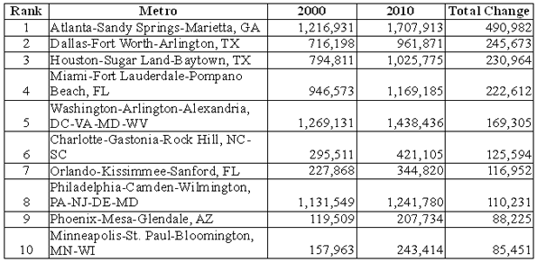
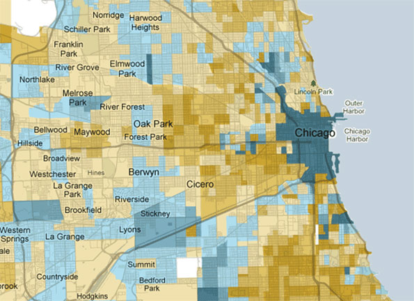
    The key issue here is what constitutes a “city”.  New York is a good, example, as headquarters to the national media, a world class city and as urban as it gets in the United States. But the New York metropolitan area, the "integrated economic and social unit" is not Manhattan or even five boroughs. It stretches from a bit west of Blooming Grove Township, in Pike County 25 miles west of Port Jervis, a city 90 miles from Manhattan located in western Orange County, NY, to Montauk Point in Suffolk County and from north of West Point, in Putnam County to Egg Harbor Township, in Ocean County, New Jersey (that’s nearly 30 miles south of Toms River). Suffice it to say most of this vast region is not dense at all.

    Divining Density

    Yet, some analysts have characterized the West, et al research as being about higher densities, Richard Florida wrote in The Wall Street Journal:

    Researchers at the Santa Fe Institute have been able to demonstrate that bigger, denser cities literally speed up the metabolism of daily life.

    That’s only half right. The research was about city size, not density, as the authors indicate (below).

    All too typical of the way that suburbanized America is disparaged by the media, Jonah Lehrer, of The New York Times sputtered that:

    In recent decades, though, many of the fastest-growing cities in America, like Phoenix and Riverside, Calif., have given us a very different urban model. These places have traded away public spaces for affordable single-family homes, attracting working-class families who want their own white picket fences.

    In reality, the kind of suburbs found in Phoenix and Riverside-San Bernardino will be found surrounding every one of the nation’s core cities, including New York, an urban area that covers  more land area than any urban area in the world at 3,450 square miles (8,935 square kilometers), according to the Census Bureau. That’s twice the expanse of the Los Angeles urban area. Granted, New York’s Hudson Valley suburbs are greener and more affluent than most in Phoenix, but their population density is nearly the same. Moreover, neither Phoenix nor New York (think Staten Island or much of Long Island) should be ashamed of attracting "working class families who want their own white picket fences." Why demean aspiration?

    Urban blogger James Withow refers to their "remarkable findings" that "raise interesting policy issues on density." Another analyst wrote "West offers data that shows cities create economies of scale that suburbs and small towns cannot match." This is patently absurd since, as noted above, West did not study any part of the urban organism below the metropolitan area. There was no attempt to make a distinction between the productivity of say, Manhattan or Brooklyn, to White Plains or even Blooming Spring Township. No core city or suburb is an "integrated economic and social unit."

    West et al on Density

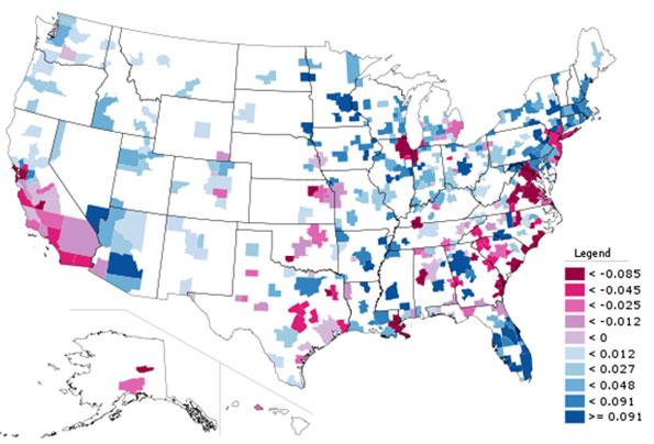
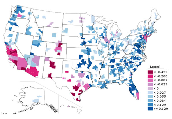
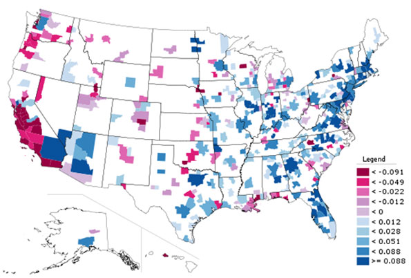
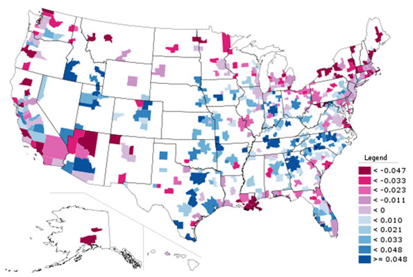
    Indeed, West et al make it very clear that their findings have nothing to do with urban population density. They tested for correlations population growth and income, patents and violent crimes, and found "no significant trend exists between residuals for income, patents and violent crime and population growth or density." They further note their equations showed an "R2 consistent with zero" (in every day English, that means they found no relationship between density and the other variables).

    This conclusion was correct, though comparing metropolitan area densities is less than ideal. Just to check, we reran the equations with urban density data and found that this approach too produced an "R2 consistent with zero," not only for income, patents and violent crimes, but also gross metropolitan product.

    West et al pointed out that:

    The shape of the city in space, including for example its residential density, matter much less than (and are mostly accounted for by) population size in predicting indicators of urban performance. Said more explicitly, whether a city looks more like New York or Boston or instead like Los Angeles or Atlanta has a vanishing effect in predicting its socio-economic performance. (emphasis by author)

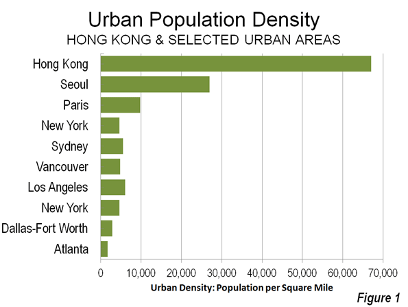
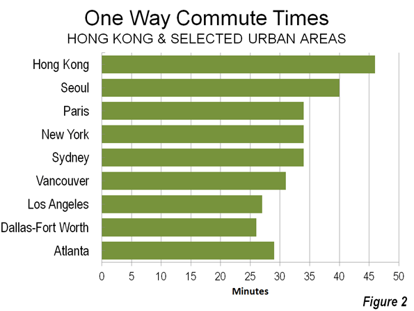
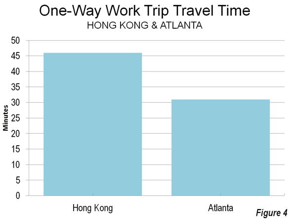
    In other words, the same improvement in urban performance would be predicted from doubling the population of Atlanta, with an urban density of 1,700 per square mile (700 per square kilometer) as in New York, with more than three times Atlanta’s density or Los Angeles’ with more than four (Los Angeles is highest density large urban area in the United States).

     It turns out – counter the misunderstandings of some urbanists – that higher or lower density simply does not matter according to the West, et al research.

    It’s About Density Thresholds and Efficient Labor Markets

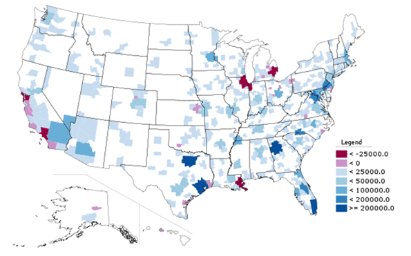
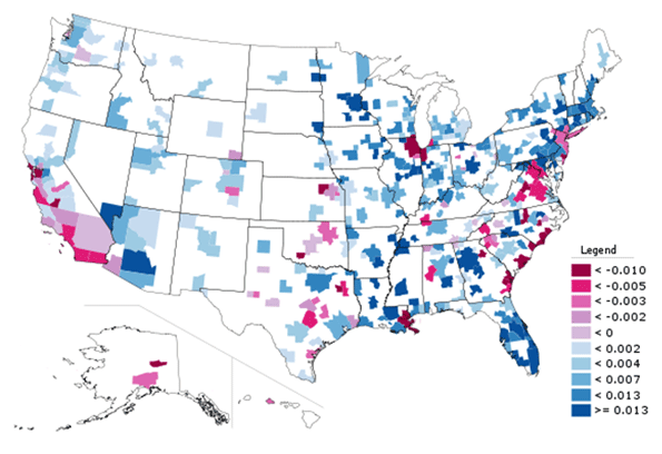
    Cities (integrated economic and social units) are created by reaching urban density thresholds. They tend to become more productive as they grow, so long as they are not too large to function as a labor market. Density doesn’t matter particularly. Indeed, the general tendency is for cities to become more dispersed (less dense) as they grow, as indicated by longer term data in the US, Canada and around the world.

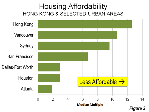
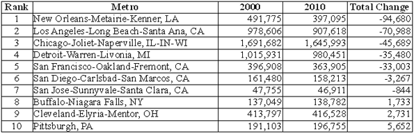
    For example, the Seattle and Houston urban areas have population densities much lower than those of Paris, London, Hong Kong and even Los Angeles – yet they still rank higher among the most productive metropolitan areas in the world, according to the Brookings Institution Global Metropolitan Monitor 2011. Brookings rates Hartford as the most productive metropolitan area in the world, yet its urban population density is nearly as low as Atlanta’s.

    Finally, the Brookings list excludes the world’s most dense major city, Dhaka. That’s because the economic output of its 15 million people is insufficient to make a list that includes cities one-tenth its size. Dhaka combines the highest population density in the world with perhaps the lowest per capita economic output of any megacity in the world.

    Allowing Organisms to Grow

    As West et al suggests, cities, like elephants, are organisms. Both expand (dare we say "sprawl") as they grow. This should be cause for concern, given planning dictates that would restrain urban organism, such as urban growth boundaries. These restraints are akin to depriving a large mammal of sufficient space to roam and feed. That’s no way to treat a productive organism, or a great city.

    ——-

    Reference Materials:
    Growth, innovation, scaling, and the pace of life in cities
    Urban Scaling and Its Deviations: Revealing the Structure of Wealth, Innovation and Crime across Cities
    2010 US Urban Area Data

    ——-

    African Bush Elephant photo by flickr user nickandmel2006.

    Wendell Cox is a Visiting Professor, Conservatoire National des Arts et Metiers, Paris and the author of “War on the Dream: How Anti-Sprawl Policy Threatens the Quality of Life.”

  • Housing Affordability Protests Occurring in “Livable” Hong Kong, Not “Sprawling” Atlanta

    The Economist has published another in its city rating series, under the headline "The Best city in the World." This one was the result of a contest examining ways to elaborate on its rating system. The winner, Filippo Lovato, added a spatial dimension to the ratings, which included a 5 point rating of "sprawl," a pejorative term for the natural expansion of cities (which in this article means urban areas, areas of continuous urban development). Much of the urban planning literature is pre-occupied with combating urban sprawl, though urban expansion continues virtually everywhere around the world, as cities add population and become more affluent.

    Livability for Whom?

    As Jon Copestake, the Editor of the Economist Intelligence Unit’s Cost of Living and Livability surveys and I discussed in front of a Property Institute of Western Australia meeting, The Economist livability ratings are not aimed at average resident households, but rather at an international audience, such as corporate executives and corporate relocation services. This distinction can be important.

    Hong Kong was top ranked for livability in the new Economist list. Doubtless this is accurate for well paid executives posted temporarily, who are granted substantial housing allowances by their employers and who can live in luxury condominiums within a short walk or taxi ride to their jobs in Central (the core of the Hong Kong central business district).

    For local residents, livability is measured differently than for jet-setters or corporate executives.

    Hong Kong: Smart Growth Model

    With the developed world’s highest urban area density and lowest automobile market share, Hong Kong beguiles anti-sprawl "smart growth" crusaders, for whom these two characteristics are the "two great commandments."

    The entire  Hong Kong urban form (urban area) is as dense as Manhattan at 67,000 per square mile (25,900 per square kilometer), but is more than twelve times the density of the New York urban area: the city and its “sprawling” surrounding suburbs (5,300 per square or 2,100 per square kilometer). Similarly, Hong Kong is somewhat more dense than the ville de Paris, but seven times the density of the Paris urban area (9,800 per square mile or 3,800 per square kilometer). This hyper-density combined with one of the world’s strongest central business districts give Hong Kong a nearly 80% mass transit share of motorized travel, nearly 10 times that of the New York urban area and more than three times that of the Paris urban area (Figure 1).

    "Livable" Hong Kong?

    To its permanent and unsubsidized residents, though, Hong Kong’s spatial Nirvana does not provide much in terms of livability.

    Excessively Long Commutes Hong Kong’s high density indicates that jobs and houses are relatively close to one another, which should indicate that commute times would be short. Not so. Commutes are among the longest in the developed world – only Tokyo residents take more time to get to work. (Figure 2)

    The average one way commute is 46 minutes in Hong Kong, well above the developed world average of 33 minutes for urban areas over 5,000,000 population. By comparison, commuters in similarly sized Dallas-Fort Worth (26 minutes) and "gridlocked" Los Angeles (27 minutes) get to work much faster. Commuting also takes longer in Hong Kong than in Paris (34 minutes) and London (37 minutes).  Lengthy commutes impose an economic price and make Hong Kong less livable.

    Exorbitant House Prices: Hong Kong’s housing, the largest household budget item, is profoundly unaffordable. The 8th Annual Demographia International Housing Affordability Survey rates Hong Kong as the most costly out of 325 metropolitan areas. The median house price in Hong Kong’s is 12.6 times the median annual gross household income (the "median multiple"), which leaves little more than a pittance in discretionary income for many households. Perhaps this is why Hong Kong’s fertility rate has fallen to rock bottom levels near the lowest on the planet – people cannot afford kids.

    Even during the housing bubble, coastal California never became so unaffordable. Hong Kong housing is nearly twice as costly as San Francisco (6.7 median multiple) and more than four times as costly as Dallas-Fort Worth (2.9), Houston (2.9) or Atlanta (Figure 3).

    Concern about housing affordability has become so intense that it is an issue in public protests, which The Economist reports to have drawn up to 400,000 people earlier this month (link to photo). Exorbitant house prices make Hong Kong less livable.

    "Sprawling" Atlanta

    Things are much different in "sprawling" Atlanta, which The Economist’s spatial list ranks as the worst among the US entries. Atlanta is at the opposite end of the density spectrum from Hong Kong, with the lowest urban population density of any major developed world urban area.

    Short Commutes: Atlanta’s low density would suggest that jobs and houses must be so far apart that commute times are very long. Again, not so. Atlanta commuters have among the shortest travel times (29 minutes) in the world among urban areas of similar size (see Note: Jobs-Housing Balance). Shorter travel times make Atlanta more livable (Figure 4).

    Other similarly sized US urban areas do even better, such as Dallas-Fort Worth (26 minutes) and Atlanta’s leaders know that traffic congestion need to be eased to improve Atlanta’s competitiveness. But the political process politics has offered a dysfunctional plan that would spend more than half of a new tax on mass transit, which is used by only the one percent. Less than one half of the money would be spent on the roads that the 99 percent use (Figure 5). Any strong growth will overwhelm the stingy highway improvements, and if the voters approve the July 31 referendum, Atlanta’s travel time advantage over Hong Kong could narrow.

    Affordable House Prices: Despite being the bane of planning orthodoxy, Atlanta’s has far better housing affordability than Hong Kong. The median multiple is 1.9, compared to Hong Kong’s 12.6. Hong Kongers pay six times as much of their income for their houses (which are also two-thirds smaller than in Atlanta). So far, there have been no protests against Atlanta’s low house prices. Better housing affordability makes Atlanta area more livable.  

    The Hong Kong Model

    Hong Kong’s high density (more than double that of any other large developed world urban area) is an accident of history, the result of geo-politics, not urban planning. Further, China’s impressive new cities are being built at a small fraction of Hong Kong densities. Yet, Hong Kong has given much to the world. Not least is the fact that its market oriented economy served as the model for economic reform which has radically improved livability for hundreds of millions of people in China.

    Further, Hong Kong is attractive as one of the world’s premier tourist destinations. For aficionados of cities, like me, Hong Kong is intensely interesting. It is the ultimate in urbanization. It is a wonderful place to visit and to live – if someone else is paying the bills.

    However, the interplay between Hong Kong’s hyper-dense urban form and its transportation system burdens Hong Kong residents dearly, both in time and money. For them, Hong Kong is hardly a model of livability.

    ——————-

    Note: Commuting in Dallas-Fort Worth: Larger Dallas-Fort Worth has faster average work trip travel times than Atlanta, at 26 minutes, which are principally are aided by its much superior freeway (motorway) systems and arterial street (non-freeway boulevard) systems. Transit carries about one-half the share (0.6%) of travel in Dallas-Fort Worth as in Atlanta.

    Note: Jobs-Housing Balance: One of urban planning’s principal goals is to achieve a jobs-housing balance, wherein jobs and housing are so close that people can walk to work or use transit, minimizing travel times and distances. Hong Kong is best in this, with its small urban footprint. Yet, despite having achieved the ultimate, it takes Hong Kongers much longer to get to work than Atlantans. The comparison of Hong Kong and Atlanta shows this theoretical measure to be of little importance. A better indicator of the jobs-housing balance is practical – how long it takes to get to work.

    Note: Travel Times by Car and Transit: Mass transit has substantially longer average work trip travel times than cars in nearly all of the world metropolitan areas for which data is available. In Atlanta, the average work trip by car (single-occupancy) was 29 minutes in 2007, compared to 54 minutes for mass transit.

    ———-

    Wendell Cox is a Visiting Professor, Conservatoire National des Arts et Metiers, Paris and the author of “War on the Dream: How Anti-Sprawl Policy Threatens the Quality of Life.”

    Photograph: Kowloon, Hong Kong (by author)

  • The Atlanta Transportation Tax: Too Much for Too Little

    On July 31, voters in a 10 counties of the 28 county Atlanta metropolitan area will vote on whether to raise the sales tax by one cent for $8 billion in transit and highway projects over 10 years. The measure is highly tilted towards transit spending. Sadly, this would do virtually nothing to reduce Atlanta’s traffic or its travel times.

    In a metropolitan area in which barely one percent of travel (Figure 1) and less than five percent of work trip travel is by transit, the tax measure devotes more than 50 percent of the funding to transit (Figure 2).   Yet in reality, the focus of any transportation revenue issue should be on reducing travel times, whether by transit or highways. This is how transportation improves an urban economy. The reality is that with nearly all travel by highways and transit’s inherently slower travel times, much of the tax money would have virtually no impact on reducing travel times or traffic congestion.


    Atlanta’s Traffic Congestion: Promoters of the tax claim that the highway projects will reduce traffic congestion. Atlanta is well known for its serious traffic congestion. There are two reasons for this:

    1. Atlanta’s sparse freeway system is limited to little more than a belt route (I-275) and three radial freeways (I-20, I-75 and I-85) that converge into two in the one place more capacity is needed, the core. Trucks are not permitted on freeways inside the beltway, which concentrates the considerable interstate traffic on a single roadway, I-275. If Atlanta had the higher freeway density (freeway mileage per square mile) of Los Angeles or Minneapolis-St. Paul, traffic congestion would be far less of a problem.
    2. Atlanta’s regional arterial (high capacity streets) system is virtually non-existent. For this reason, I proposed (in 2000) development of a one-mile terrain constrained grid of arterials. The Atlanta Regional Council (ARC), the local metropolitan planning organization, has included a somewhat more modest (but useful) arterial grid in is regional plan.

    Yet despite its reputation, Atlanta’s traffic congestion could be worse. The latest INRIX National Scorecard rates the Atlanta metropolitan area as having the 15th worst traffic congestion in the nation, behind Portland, which is nearly 60 percent smaller and twice as dense, with its compact city policies. Among high-income world metropolitan areas with more than 5 million population, only Nagoya outside the United States may have a shorter work trip travel time (Note 1). Atlanta’s world-competitive work trip travel time of 29 minutes is faster than that of far more transit-dependent Toronto (33 minutes), smaller Sydney (34 minutes) and much smaller Vancouver (31 minutes), despite their compact city policies.

    The Transit Projects: So Much for So Little: The proposed transit projects have virtually no potential to reduce work trip travel times and traffic congestion. Approximately one-fifth of the transit funding would be used to rehabilitate and upgrade the MARTA subway system, a need that should have been legitimately funded from the existing MARTA sales tax. Another nearly 20 percent of the transit funding would be spent on the "Belt-Line" streetcar project in central Atlanta. The role of the Belt-Line is more "city building" (read "real estate speculation") than it is transportation. It will do nothing to reduce work trip travel times. Further, it is exceedingly costly. The extravagance of this project is illustrated by an annualized capital cost alone (principally construction) high enough to pay the lease on a new mid-sized car for each new regular passenger (Note 2). Moreover, that is before the likely capital cost escalation and the substantial operating subsidies (Note 3).

    Transit’s problem in Atlanta (and elsewhere) lies outside its core downtown job market (Note 4). Most destinations in a metropolitan area cannot be reached by transit in a way remotely competitive with the car. The transit tax would only modestly increase transit ridership. ARC projects the transit projects will boost daily transit ridership less than 10 percent. If all of the forecast new passengers were to be taken from cars (which is not likely), the net reduction in traffic volumes over ten years would be equal to less than three months of traffic growth. Put another way, at the best, the transit proposals would mean that the traffic congestion expected on January 1, 2025 would not occur until March of 2025. That’s less than 90 days of traffic relief for 10 years of taxation.

    The Road Projects: In a metropolitan area in which personal mobility predominates, roadway improvements, such as expansions, an arterial grid in Atlanta’s case and completion of the GA-DOT HOT (high occupancy toll) system provide far greater  potential for reducing travel times. There is another significant benefit to highway investments. As traffic speeds increase fuel efficiency improves and both air pollution and greenhouse gas emissions are reduced.

    Under the tax referendum, a significant opportunity to improve mobility would be missed, to the detriment of the vast majority of Atlantans; over 88 percent of all commuters in Atlanta travel by car, but the figure is only slightly less (83 percent) among low income commuters (Figure 3).

    What’s Right About Atlanta: For all its problems, Atlanta has much to be proud of. Former World Bank principal planner Alain Bertaud said of Atlanta in a 2002 study:

    While income and population were rising very fast, Atlanta managed to keep a very low cost of living. A worldwide cost of living survey conducted by the Economist Intelligence Unit in 2002 found that Atlanta had the lowest cost of living among major US cities and ranked 63rd among major cities around the world. This achievement is remarkable in view of the rapid rate of growth of the metropolitan area over the last 20 years. It shows that while demographic and economic growth has certainly contributed to generate pollution and congestion, the various actors responsible for the management of metropolitan Atlanta must have done a lot of things right. High income growth and high demographic growth combined with a low cost of living suggests that labor markets are functioning well and that housing does not encounter important supply bottlenecks (Note 5).

    As successful as local land use policies have been in making Atlanta livable by making it affordable (the first principle of livability is affordability), local leaders need to start over with a proposal primarily designed to reduce traffic congestion, reduce travel times and grow the economy.

    Politics Trumps Reducing Traffic Congestion: Traffic congestion is most effectively addressed by projects that reduce work trip travel times, since it is the concentration of work trips at peak hours that   causes the worst congestion. The long-suffering commuters of Atlanta would have been far better served by a program that selected projects based upon their effectiveness in reducing travel times. A simple cost per hour of delay measure would have been appropriate. Atlanta deserves a much better deal.

    Wendell Cox is a Visiting Professor, Conservatoire National des Arts et Metiers, Paris and the author of “War on the Dream: How Anti-Sprawl Policy Threatens the Quality of Life.”

    —————–

    Note 1: Based upon 109 metropolitan areas for which data is available. Japanese data is reported as median work trip travel time. Nagoya’s median work trip travel time (27 minutes) is less than Atlanta’s (29 minutes). The excessively long rail commute times of many Japanese commuters could make Nagoya’s average work trip travel time as great or greater than Atlanta’s. Dallas-Fort Worth has the shortest work trip travel time of any metropolitan area over 5 million population (and the lowest transit work trip market share)

    Note 2: A team led by Oxford University professor Bengt Flyvbjerg found that passenger rail systems typically have cost overruns of 45 percent. If the average increase is experienced, the Belt-Line cost could escalate to $1 billion.

    Note 3: The capital cost is discounted at 4 percent over 35 years, which equals more than $5,500 annually. A new Ford Fusion, Toyota Camry, Honda Accord or Nissan Altima could be leased for less than $5,000 annually, with no down payment, according to internet sources (such as http://www.leasecompare.com/)

    Note 4: More than 93 percent of metropolitan Atlanta’s employment is outside downtown (and Mid-Town). Downtown’s share of employment declined from 2000 to 2009 (latest data available from the US Census Bureau, County Business Patterns).

    Note 5: Atlanta was most affordable major metropolitan area in the US, UK, Canada, Australia, Ireland, New Zealand and Hong Kong in the 8th Annual Demographia International Housing Affordability Survey.

    ——

    Photo: Atlanta Freeway (by author)

  • The Shifting Landscape of Diversity in Metro America

    Census 2010 gave the detail behind what we’ve known for some time: America is becoming an increasingly diverse place.  Not only has the number of minorities simply grown nationally, but the distribution of them among America’s cities has changed. Not all of the growth was evenly spread or did it occur only in traditional ethnic hubs or large, historically diverse cities.

    To illustrate this, I created maps of U.S. metro areas showing their change in location quotient. Location quotient (LQ) measures the concentration of something in a local area relative to its concentration nationally. This is commonly used for identifying economic clusters, such as by comparing the percentage of employment in a particular industry locally vs. its overall national percentage. In a location quotient, a value of 1.0 indicates a concentration exactly equal to the US average, a value greater than 1.0 indicates a concentration greater than the US average, and a value less than 1.0 indicates a concentration less than the US average.

    While commonly used for economic analysis, the math works for many other things. It can be useful to measure how the concentration of particular values changes over time relative to the national average.  In this case, we will examine the change in LQ for various ethnic groups between the 2000 and 2010 censuses for metro areas. Those metro areas with a positive change in LQ grew more concentrated in that ethnic group compared to the US average over the last decade. Those with a negative change in LQ grew less concentrated compared to the nation as a whole, even if they grew total population in that ethnic group.

    To increase concentration level requires growing at a faster percentage than the US as a whole. This is obviously easier for places that start from a low base than those with a high base. In this light, places that have traditionally been ethnic hubs – such as west coast metros for Asians – can grow less concentrated relative to the nation as a whole even if they continue to add a particular ethnic group. Asian population, for example, can grow strongly in California, but at a slower rate than the rest of the country. This is indeed the case as groups like Hispanics and Asians have been de-concentrating from the west coast, and now are showing up in material numbers even in the Heartland.

    Black Population


    Black Only Population, Change in Location Quotient 2000-2010

    The change in Black concentration is particularly revealing. Much has been written about the so-called reversing of the Great Migration. But contrary to media reports, there is no clear monolithic move from North to South. Instead, we see that the outflow has been disproportionately from America’s large tier one metros like New York, Chicago, and Los Angeles. In contrast, Northern cities like Indianapolis, Columbus, and even Minneapolis-St. Paul (home to a large African immigrant community) grew Black population strongly, and actually increased their Black concentrations. Similarly, there were clearly preferred metro destinations in South for Blacks, like Atlanta and Charlotte. Many other Southern metros , particularly those along the Atlantic coast of Georgia and the Carolinas continued to lose their appeal to Blacks, relatively speaking.

    Hispanic Population


    Hispanic Population (of any race), Change in Location Quotient 2000-2010

    Here we see de-concentration clearly in action. The Mexican border regions retained high Hispanic population counts, but they are no longer as dominant as in the past. Places like Nashville, Oklahoma City, and Charlotte particularly stand out for increasing Hispanic population percentage. Again, large traditionally diverse tier one cities like New York and Chicago show declines on this measure as smaller cities are now more in on the diversity game.

    Asian Population


    Asian Only Population, Change in Location Quotient 2000-2010

    Again, we see here that America’s Asian population spread well beyond traditional west coast bastions. There were big increases in Asian population counts, with resulting LQ changes, in places like Atlanta, Indianapolis, Philadelphia, and Boston. Even New York (which now has over one million Asian residents within the city limits alone) and Chicago showed gains among Asians.

    Children (Population Under Age 18)

    As a bonus, here is a look at LQ change for metro areas for people under the age of 18.


    Children (Population Under Age 18), Change in Location Quotient 2000-2010

    Here we see that metros along America’s northern tier now have relatively fewer children than a decade ago, while metros like Denver, Dallas, and Nashville had more. Clearly, some places are increasingly seen as better – and perhaps also more affordable – locations for child rearing than others.  Perhaps unsurprisingly many of the out of favor locales are either expensive, have poor economic prospects, and/or are excessively cold. Not surprisingly, for example, Atlanta, Houston and Florida’s west coast have gained in this demographic while much of the Northeast, particularly upstate New York, have lost out.

    The overall key is while there are certain broad themes that emerge from the recent Census, such as America’s increasing diversity or signs of a reversing of the Great Migration, we need to take a more fine grained view to see which places are in fact benefitting and being hurt by these trends.  What we see here is that traditional large urban bastions of black population and ethnic diversity are no longer the only game in town. Smaller places in the interior and the South are now emerging as diversity magnets in their own right, as well as magnets for families with children. This is the collection of places to watch to look for the next set of great American cities to emerge.

    Aaron M. Renn is an independent writer on urban affairs based in the Midwest. His writings appear at The Urbanophile. Telestrian was used to analyze data and to create maps for this piece.

    Note: The original version of this piece included incorrect charts for the Asian, Hispanic, and child measures.

  • Major Metropolitan Commuting Trends: 2000-2010

    As we indicated in the last article, solo automobile commuting reached an all time record in the United States in 2010, increasing by 7.8 million commuters. At the same time, huge losses were sustained by carpooling, while the largest gain was in working at home, which includes telecommuting. Transit and bicycling also added commuters.  This continues many of the basic trends toward more personalized employment access that we have seen since 1960.

    Solo Automobile Commuting: Among the nation’s 51 metropolitan areas with more than 1 million population, 38 experienced increases in solo automobile commuting between 2000 and 2010. More than 80% of commuting is by solo automobile in 25 of the 51 largest metropolitan areas, with the highest rates being in Birmingham, Detroit, Cincinnati, Indianapolis and Kansas City. Another 28 metropolitan areas have single automobile commute shares of between 70% and 80%, with Boston, Washington and San Francisco between 60% and 70%. As would be expected, the lowest solo automobile commute share was in New York at 51%.

    Car Pools: The national data also showed a nearly 2.4 million loss in carpool use. The losses were pervasive, occurring in all 51 metropolitan areas. Riverside-San Bernardino had the highest carpool market share at just under 15%, while all other major metropolitan areas were below 12%. Car pools have been losing market share for decades.

    Work at Home (Includes Telecommuting): In what we have previously labeled as The Decade of the Telecommute, the nation experienced a 1.7 million increase in working at home over the past decade. The market share gains in working at home were as pervasive as the losses in carpooling, with all 51 metropolitan areas registering increases. Austin had the strongest work-at-home market share, at 7.3%, followed by Portland at 6.5%, San Francisco and Denver at 6.2%, Phoenix at 6.0%, with San Diego, Raleigh and Atlanta above 5.5%. Overall, working at home exceeded transit commuting in 37 major metropolitan areas out of 51 in 2010, up from 27 in 2000. Three metropolitan areas had work at home market shares of less than 3%, including Memphis, New Orleans and last place Buffalo.

    Transit: As noted before, transit enjoyed its first 10 year gain since journey to work data was first collected by the Census Bureau 50 years ago. Overall, transit added 900,000 daily commuters, roughly half that for telecommuters. Transit’s market share increased in 25 of the top 51 metropolitan areas. It is also notable that in a number of the metropolitan areas with the largest expenditures for new rail systems, there were either losses or commuting gains were concentrated in the more flexible bus services.

    New York: As so often has been the case, transit was largely a "New York story." More than one half of the new transit commuters were in the New York metropolitan area, more than 450,000 of the 900,000 increase. New York boasts by far the most extensive transit system in the nation, which serves the second largest central business district in the world and by far the nation’s most important. In 2000, New York had a transit work trip market share of 27.4%. By 2010, New York’s transit work trip market share had risen to 30.7%, more than double that of any other metropolitan area. More than 70% of the new transit commuters in the New York area were on its subway (Metro), suburban rail and light rail systems.

    San Francisco: San Francisco retained its position as the second strongest transit metropolitan area, with a 14.6% work trip market share in 2010. This is up from 13.8% in 2000.

    Washington: Washington was the third strongest transit commuting market, with a 14.0% work trip market share in 2010. This modest increase from 13.4% nonetheless produced the second largest ridership increase in the nation, at more than 130,000. This reflects the strength of Washington’s job market over the decade. Rail ridership accounted for 53% of this increase, while buses accounted for the other 47%.

    Boston and Chicago: Boston passed Chicago to become the fourth strongest transit market, at 11.8% in 2010. This is an increase from 11.2% in 2000. Chicago ranked fifth at 11.2%, a small reduction from the 11.3% in 2000.

    Los Angeles: Los Angeles had the third largest increase in transit commuting, adding 60,000 daily transit commuters. Approximately 75% of these new commuters were attracted by the region’s extensive bus system as opposed to its very expensive but limited rail system. This increase placed Los Angeles in a virtual tie with Portland, with a work trip market share of 6.2%.

    Portland: Portland continued to experience its now 30 year transit market share erosion, despite having added three new light rail lines between 2000 and 2010. Portland’s transit work trip market share fell to 6.2% from 6.3% and now trails the work at home and telecommute market share of 6.5%.

    Seattle:Seattle added 29,000 new transit commuters for the fourth strongest growth in the nation. Approximately 75% of the new commuters were on the metropolitan area’s bus system.

    Atlanta: Atlanta, which is home to the third largest postwar Metro system in the nation (MARTA) gained nearly 9000 new transit commuters, all of them on the bus, while losing more than 3000 rail commuters.

    Miami:Miami added 16,000 new transit commuters, though more than 90% were attracted to the bus system, rather than the rail services.

    Rail and Bus in Texas: Other metropolitan areas with new and expanded rail systems did not fare as well. In Dallas-Fort Worth, the light rail system was more than doubled in length, yet there was a reduction of more than 3000 daily transit commuters. The transit work trip market share in Dallas-Fort Worth dropped from 1.8% to 1.4%, approximately one quarter lower than that of any other major metropolitan area with a new light rail or Metro system. Houston, which built its first light rail line during the period, lost nearly 3000 daily transit commuters, with its transit work trip market share dropping by nearly one-third, from 3.2% to 2.3%. By contrast, the third largest metropolitan area in Texas, San Antonio, lost no commuters from its bus only transit system.

    Other New Rail Metropolitan Areas: Other metropolitan areas with new rail systems experienced modest ridership increases, with 60 to 70 percent of the increase on the bus systems in Charlotte, Minneapolis-St. Paul and Phoenix. Salt Lake City experienced a small decline in transit commuting.

    Below 1 Percent: Four metropolitan areas had transit work trip market shares of less than 1%, including Indianapolis, Raleigh, Birmingham and last place Oklahoma City, with a market share of 0.4%.

    Bicycles: It was also a good decade for bicycle commuting, with the national increase of nearly 250,000. The bicycle commuting market share rose in 45 of the 51 largest metropolitan areas. Portland had the highest bicycle market share at 2.2%, with three other metropolitan areas at 1.5% or above, Sacramento, San Francisco and San Jose. The lowest bicycle commuting market shares were in San Antonio, Cincinnati, Birmingham and Memphis, all at 0.1 percent.

    Walking: There was little change in walking among the nations major metropolitan areas. The largest shares were in New York (5.9%) and Boston (5.4%), with the smallest shares in Raleigh (1.1%), Orlando (1.1%) and Birmingham (1.0%).

    Drifting Away from Shared Commuting: In some ways, the 2000s were different than previous decades, especially with the reversals in bicycle commuting and transit. However, overall, shared ride commuting (transit and car pools) lost share due to the precipitous decline in car pooling. Longer term share increase trends also continued in single-occupant automobile commuting and working at home. The bottom line: personal employment access (personal mobility plus working at home) continues to carve away at the smallish share still held by shared commuting.

    ————-

    Data: The 2000 and 2010 commuting market shares by mode are shown in Tables 1 and 2 (2010 metropolitan area boundaries).

    ————

    Table 1
    Work Trip Market Share: 2000
    Metropolitan Areas Over 1,000,000 Population in 2010
    Metropolitan Area Car, Truck or Van: Alone Car/Van Pool Transit Bicycle Walk Other Work at Home (Includes Telecommute)
    Atlanta 77.0% 13.7% 3.4% 0.1% 1.3% 1.1% 3.5%
    Austin 76.5% 13.7% 2.5% 0.6% 2.1% 1.1% 3.6%
    Baltimore 75.5% 11.5% 5.9% 0.2% 2.9% 0.9% 3.2%
    Birmingham 83.3% 12.0% 0.7% 0.1% 1.2% 0.7% 2.1%
    Boston 71.1% 8.6% 11.2% 0.5% 4.6% 0.8% 3.3%
    Buffalo 81.7% 9.4% 3.3% 0.2% 2.7% 0.5% 2.1%
    Charlotte 80.7% 12.8% 1.4% 0.1% 1.2% 0.8% 2.9%
    Chicago 70.4% 11.0% 11.3% 0.3% 3.1% 1.0% 2.9%
    Cincinnati 81.3% 10.1% 2.8% 0.1% 2.3% 0.6% 2.7%
    Cleveland 81.3% 8.8% 4.1% 0.2% 2.2% 0.6% 2.7%
    Columbus 82.1% 9.7% 2.1% 0.2% 2.3% 0.6% 3.0%
    Dallas-Fort Worth 78.7% 13.9% 1.8% 0.1% 1.5% 1.0% 3.0%
    Denver 76.0% 11.7% 4.4% 0.4% 2.1% 0.8% 4.6%
    Detroit 84.7% 9.2% 1.7% 0.1% 1.4% 0.6% 2.2%
    Hartford 82.6% 8.7% 2.8% 0.2% 2.5% 0.6% 2.6%
    Houston 77.0% 14.3% 3.2% 0.3% 1.6% 1.1% 2.5%
    Indianapolis 82.8% 10.4% 1.3% 0.2% 1.7% 0.7% 3.0%
    Jacksonville 80.3% 12.6% 1.3% 0.5% 1.7% 1.4% 2.3%
    Kansas City 82.6% 10.6% 1.2% 0.1% 1.4% 0.7% 3.5%
    Las Vegas 74.6% 14.7% 4.4% 0.5% 2.3% 1.3% 2.3%
    Los Angeles 71.9% 14.6% 5.6% 0.7% 2.7% 1.0% 3.5%
    Louisville 81.8% 11.2% 2.0% 0.2% 1.7% 0.7% 2.5%
    Memphis 80.7% 13.3% 1.6% 0.1% 1.3% 0.9% 2.2%
    Miami-West Palm Beach 77.3% 13.1% 3.2% 0.5% 1.7% 1.2% 3.1%
    Milwaukee 79.7% 9.9% 4.2% 0.2% 2.9% 0.6% 2.6%
    Minneapolis-St. Paul 78.3% 10.0% 4.4% 0.4% 2.4% 0.6% 3.8%
    Nashville 80.5% 13.1% 0.8% 0.1% 1.5% 0.8% 3.2%
    New Orleans 72.9% 14.6% 5.4% 0.6% 2.7% 1.3% 2.4%
    New York 52.7% 9.3% 27.4% 0.3% 6.0% 1.5% 2.9%
    Oklahoma City 81.6% 12.1% 0.5% 0.2% 1.7% 1.0% 2.9%
    Orlando 80.6% 12.1% 1.6% 0.4% 1.3% 1.1% 2.9%
    Philadelphia 73.1% 10.2% 8.9% 0.3% 3.9% 0.7% 2.9%
    Phoenix 74.6% 15.3% 1.9% 0.9% 2.1% 1.4% 3.7%
    Pittsburgh 77.5% 9.8% 5.9% 0.1% 3.6% 0.6% 2.5%
    Portland 73.1% 11.5% 6.3% 0.8% 2.9% 0.8% 4.6%
    Providence 80.7% 10.5% 2.4% 0.2% 3.3% 0.8% 2.2%
    Raleigh 80.8% 12.1% 0.9% 0.2% 1.6% 1.0% 3.5%
    Richmond 81.7% 10.9% 1.9% 0.2% 1.8% 0.8% 2.7%
    Riverside-San Bernardino 73.5% 17.6% 1.6% 0.5% 2.2% 1.2% 3.5%
    Rochester 81.7% 9.1% 2.0% 0.2% 3.5% 0.6% 2.9%
    Sacramento 75.3% 13.5% 2.7% 1.4% 2.2% 0.9% 4.0%
    Salt Lake City 76.0% 13.4% 3.3% 0.5% 2.1% 0.7% 4.0%
    San Antonio 76.2% 14.9% 2.7% 0.1% 2.4% 1.2% 2.6%
    San Diego 73.9% 13.0% 3.3% 0.6% 3.4% 1.4% 4.4%
    San Francisco-Oakland 62.8% 12.7% 13.8% 1.1% 3.9% 1.3% 4.3%
    San Jose 77.2% 12.4% 3.4% 1.2% 1.8% 0.9% 3.1%
    Seattle 71.6% 12.7% 7.0% 0.6% 3.1% 0.8% 4.2%
    St. Louis 82.5% 10.0% 2.2% 0.1% 1.7% 0.6% 2.9%
    Tampa-St. Petersburg 79.7% 12.4% 1.3% 0.6% 1.7% 1.2% 3.1%
    Virginia Beach-Norfolk 78.8% 12.1% 1.7% 0.3% 2.7% 1.6% 2.7%
    Washington 67.5% 13.4% 11.2% 0.3% 3.0% 0.9% 3.7%
    Top 51 Metropolitan Areas 73.2% 11.8% 7.5% 0.4% 2.9% 1.0% 3.2%
    Calculated from Census Bureau data
    Metropolitan areas as defined in 2010
    Table 2
    Work Trip Market Share: 2010
    Metropolitan Areas Over 1,000,000 Population in 2010
    Car, Truck or Van: Alone Car/Van Pool Transit Bicycle Walk Other Work at Home (Includes Telecommute)
    Atlanta 77.6% 10.3% 3.4% 0.2% 1.3% 1.5% 5.8%
    Austin 75.6% 10.5% 2.3% 0.6% 1.9% 1.8% 7.3%
    Baltimore 76.5% 9.6% 6.0% 0.2% 2.6% 1.0% 4.1%
    Birmingham 84.8% 10.0% 0.6% 0.1% 1.0% 0.5% 3.1%
    Boston 69.5% 7.5% 11.8% 0.7% 5.4% 0.8% 4.4%
    Buffalo 82.0% 7.5% 3.8% 0.3% 3.0% 1.1% 2.3%
    Charlotte 80.6% 10.0% 2.0% 0.2% 1.5% 0.6% 5.1%
    Chicago 71.0% 8.5% 11.2% 0.6% 3.1% 1.0% 4.5%
    Cincinnati 84.1% 7.9% 2.1% 0.1% 2.0% 0.4% 3.4%
    Cleveland 82.3% 7.2% 3.6% 0.3% 2.2% 0.7% 3.7%
    Columbus 82.4% 8.0% 1.7% 0.5% 2.3% 0.6% 4.6%
    Dallas-Fort Worth 81.3% 10.1% 1.4% 0.2% 1.2% 1.4% 4.6%
    Denver 76.3% 9.6% 4.1% 0.8% 1.9% 1.1% 6.2%
    Detroit 84.6% 8.5% 1.5% 0.2% 1.4% 0.8% 3.0%
    Hartford 81.5% 7.9% 3.1% 0.3% 3.0% 1.0% 3.2%
    Houston 79.4% 11.5% 2.3% 0.3% 1.4% 1.7% 3.4%
    Indianapolis 83.9% 8.2% 0.9% 0.3% 1.5% 0.8% 4.3%
    Jacksonville 82.5% 8.9% 1.0% 0.5% 1.4% 1.2% 4.5%
    Kansas City 83.7% 8.5% 1.2% 0.2% 1.4% 0.9% 4.1%
    Las Vegas 78.9% 10.5% 3.8% 0.6% 1.6% 1.3% 3.3%
    Los Angeles 73.5% 10.7% 6.2% 0.9% 2.6% 1.2% 5.0%
    Louisville 83.5% 9.2% 1.9% 0.2% 1.3% 0.9% 3.1%
    Memphis 83.6% 10.3% 1.0% 0.1% 1.5% 0.9% 2.7%
    Miami-West Palm Beach 78.8% 9.4% 3.5% 0.6% 2.0% 1.4% 4.4%
    Milwaukee 80.1% 9.3% 3.4% 0.5% 2.6% 0.7% 3.4%
    Minneapolis-St. Paul 78.3% 7.9% 4.8% 0.7% 2.4% 0.9% 4.9%
    Nashville 81.3% 10.7% 1.0% 0.2% 1.2% 1.0% 4.6%
    New Orleans 78.1% 11.0% 3.2% 0.7% 2.6% 1.9% 2.5%
    New York 50.5% 6.8% 30.7% 0.5% 5.9% 1.6% 3.9%
    Oklahoma City 82.7% 10.6% 0.5% 0.3% 1.6% 1.0% 3.4%
    Orlando 82.1% 9.2% 1.6% 0.3% 1.1% 1.4% 4.4%
    Philadelphia 73.9% 8.0% 9.6% 0.5% 3.5% 0.8% 3.8%
    Phoenix 76.7% 11.8% 2.0% 0.6% 1.5% 1.5% 6.0%
    Pittsburgh 77.0% 8.9% 5.6% 0.3% 3.7% 0.9% 3.5%
    Portland 72.1% 8.8% 6.2% 2.2% 3.3% 0.9% 6.5%
    Providence 81.3% 8.3% 2.6% 0.5% 3.2% 0.9% 3.2%
    Raleigh 82.0% 8.7% 0.9% 0.3% 1.1% 1.1% 5.9%
    Richmond 81.2% 10.1% 1.8% 0.4% 1.2% 0.7% 4.6%
    Riverside-San Bernardino 76.1% 14.8% 1.7% 0.4% 1.8% 1.4% 3.8%
    Rochester 82.6% 7.1% 1.8% 0.4% 3.9% 0.7% 3.6%
    Sacramento 75.6% 11.2% 2.9% 1.7% 1.9% 1.1% 5.5%
    Salt Lake City 77.7% 11.3% 2.9% 0.8% 2.3% 1.0% 4.0%
    San Antonio 79.5% 11.5% 2.1% 0.1% 2.0% 1.4% 3.3%
    San Diego 76.2% 10.1% 3.3% 0.8% 2.8% 1.0% 5.9%
    San Francisco-Oakland 61.5% 10.6% 14.6% 1.7% 4.2% 1.2% 6.2%
    San Jose 77.5% 10.3% 2.9% 1.6% 1.8% 0.9% 5.1%
    Seattle 70.5% 10.2% 8.2% 1.1% 3.5% 1.0% 5.5%
    St. Louis 83.0% 7.7% 2.6% 0.2% 1.9% 0.8% 3.7%
    Tampa-St. Petersburg 80.3% 9.5% 1.6% 0.8% 1.4% 1.4% 5.0%
    Virginia Beach-Norfolk 80.9% 9.4% 1.8% 0.5% 3.3% 0.9% 3.1%
    Washington 65.6% 10.6% 14.0% 0.5% 3.5% 1.0% 4.9%
    Top 51 Metropolitan Areas 73.7% 9.4% 7.9% 0.6% 2.8% 1.2% 4.4%
    Calculated from Census Bureau data
    Metropolitan areas as defined in 2010

    Wendell Cox is a Visiting Professor, Conservatoire National des Arts et Metiers, Paris and the author of “War on the Dream: How Anti-Sprawl Policy Threatens the Quality of Life

    Photo: Manhattan (New York), with the Woolworth Building in the distance (by author)

  • The Shifting Geography of Black America

    Black population changes in various cities have been one of the few pieces of the latest Census to receive significant media coverage.  The New York Times, for example, noted that many blacks have returned to the South nationally and particularly from New York City.  The overall narrative has been one of a “reverse Great Migration.”  But while many northern cities did see anemic growth or even losses in black population, and many southern cities saw their black population surge, the real story actually extends well beyond the notion of a monolithic return to the South.

    The map below, showing total growth in Black Only population from 2000 to 2010, indeed shows that northern and west coast cities had low or even negative growth while various southern cities boomed.


    Here is a list of the top ten metro areas (among those with more than a million total people) for black population growth:


    And here are the bottom ten (among those with more than one million people):


    Of course, looking at total population numbers can mislead. Some cities grew slowly or lost people as a whole while others boomed. With Houston, Dallas, and Atlanta all adding over a million people each, it’s no surprise these regions added lots of blacks. Working and middle class African-Americans likely shared many of the same motivations to move to these cities – such as lower housing prices – as Americans of other ethnicities. In that light, a look at change in black population share (the percentage of the population that is black) provides additional perspective:


    Here we see not a single-minded return to the South, but a complex mixture of shrinking and growing regions in various parts of the country.  This includes some surprising places, like Minneapolis-St. Paul, which was one of the top ten metros in the country for total black population growth, and also saw its black population share grow strongly.  Now the Twin Cities, along with Columbus, Ohio, another strong performer, are two of the top destination for African immigrants from Somalia and elsewhere, which doubtless accounts for part of that strong growth. But anecdotal reports indicate that they are also benefitting from Chicago’s expanding black diaspora, along with places like Indianapolis and various Downstate metros.

    Atlanta, well known as America’s premier metro area for blacks, continued to dominate the charts. Not only far and away the leader in adding raw numbers of blacks, the African-American share also grew share strongly too. Charlotte is also clearly emerging as another key black population hub, ranking #6 in America for total black population growth, which is impressive for a smaller city, and adding nearly two percentage points in black population share.  It grew its black population much faster than other fast growing small cities like Raleigh or Nashville, and added share at more than three times as fast.

    By contrast, Houston, which grew total black population significantly, had a much lower share gain. Austin, one of America’s fastest growing metros, added only 28,000 blacks and actually lost black population share. And Washington, DC, despite being a traditional black population and cultural hub, also lost black population share regionally as gentrification in the District resulted in its loss of its black majority for the first time in decades, according to the Brookings Institution. 

    So even among rapidly growing metro areas in the South, the appeal to black population is selective, favoring places like Atlanta, Charlotte, Florida cities, and even slower growing cities along the length of the Mississippi River like Memphis.  Even some cities in the North are retaining their allure to blacks as well. Less favored or even out of favor are metros like DC, Dallas, and Houston as well as cities such as Charleston and Savannah along the southeast coast.

    Slow or negative black population growth is particularly concentrated in traditional tier one “global cities”, as well as those facing economic or other hardship like Detroit, Cleveland, and immediate post-Katrina New Orleans.

    The latter may be understandable – whites have been leaving these regions as well – but the former is quite troubling.  The global city model, focused on high end and creative services, is supposedly the bright and shining savior of American urbanism. Indeed, it’s hard to find a city that doesn’t have some aspect of that as a core plank in its civic strategy. Yet the cities that have been most focused at promoting this notion – such as New York, San Francisco, and Chicago – are generally those  disproportionately driving blacks away. The reasons for this aren’t clear, but the high and increasing cost of living in those places seems like one logical explanation.

    Here’s a more detailed look at the percentage growth in Black Only population in some tier one global type metros:


    New York barely broke even on black population, while Chicago, LA, and the Bay Area all actually lost black residents, a stunning reversal from their past as black magnets. However, Boston, not a traditional black population hub, grew its black population strongly on a percentage basis, as did Miami and DC, though as noted before, the share change in DC was negative.  Here is that metric for the same metros:


    With the notable exceptions of Boston and Miami – and Philadelphia, seldom ranked highly as a global city but still a traditional large northern metropolis – most global city regions appear to be increasingly inhospitable to Blacks.  Thus their model of success, whatever its appeal to some, at a basic level simply lacks inclusiveness. This shows its clear limits as an overall model for America’s urban centers as a whole.

    Aaron M. Renn is an independent writer on urban affairs based in the Midwest. His writings appear at The Urbanophile. Data analysis, maps, and charts in this piece were prepared with Telestrian.

  • The Next Boom Towns In The U.S.

    What cities are best positioned to grow and prosper in the coming decade?

    To determine the next boom towns in the U.S., with the help of Mark Schill at the Praxis Strategy Group, we took the 52 largest metro areas in the country (those with populations exceeding 1 million) and ranked them based on various data indicating past, present and future vitality.

    We started with job growth, not only looking at performance over the past decade but also focusing on growth in the past two years, to account for the possible long-term effects of the Great Recession. That accounted for roughly one-third of the score.  The other two-thirds were made up of a a broad range of demographic factors, all weighted equally. These included rates of family formation (percentage growth in children 5-17), growth in educated migration, population growth and, finally, a broad measurement of attractiveness to immigrants — as places to settle, make money and start businesses.

    We focused on these demographic factors because college-educated migrants (who also tend to be under 30), new families and immigrants will be critical in shaping the future.  Areas that are rapidly losing young families and low rates of migration among educated migrants are the American equivalents of rapidly aging countries like Japan; those with more sprightly demographics are akin to up and coming countries such as Vietnam.

    Many of our top performers are not surprising. No. 1 Austin, Texas, and No. 2 Raleigh, N.C., have it all demographically: high rates of immigration and migration of educated workers and healthy increases in population and number of children. They are also economic superstars, with job-creation records among the best in the nation.

    Perhaps less expected is the No. 3 ranking for Nashville, Tenn. The country music capital, with its low housing prices and pro-business environment, has experienced rapid growth in educated migrants, where it ranks an impressive fourth in terms of percentage growth. New ethnic groups, such as Latinos and Asians, have doubled in size over the past decade.

    Two advantages Nashville and other rising Southern cities like No. 8 Charlotte, N.C., possess are a mild climate and smaller scale. Even with population growth, they do not suffer the persistent transportation bottlenecks that strangle the older growth hubs. At the same time, these cities are building the infrastructure — roads, cultural institutions and airports — critical to future growth. Charlotte’s bustling airport may never be as big as Atlanta’s Hartsfield, but it serves both major national and international routes.

    Of course, Texas metropolitan areas feature prominently on our list of future boom towns, including No. 4 San Antonio, No. 5 Houston and No. 7 Dallas, which over the past years boasted the biggest jump in new jobs, over 83,000. Aided by relatively low housing prices and buoyant economies, these Lone Star cities have become major hubs for jobs and families.

    And there’s more growth to come. With its strategically located airport, Dallas is emerging as the ideal place for corporate relocations. And Houston, with its burgeoning port and dominance of the world energy business, seems destined to become ever more influential in the coming decade. Both cities have emerged as major immigrant hubs, attracting on newcomers at a rate far higher than old immigrant hubs like Chicago, Boston and Seattle.

    The three other regions in our top 10 represent radically different kinds of places. The Washington, D.C., area (No. 6) sprawls from the District of Columbia through parts of Virginia, Maryland and West Virginia. Its great competitive advantage lies in proximity to the federal government, which has helped it enjoy an almost shockingly   ”good recession,” with continuing job growth, including in high-wage science- and technology-related fields, and an improving real estate market.

    Our other two top ten, No. 9 Phoenix, Ariz., and No. 10 Orlando, Fla., have not done well in the recession, but both still have more jobs now than in 2000. Their demographics remain surprisingly robust. Despite some anti-immigrant agitation by local politicians, immigrants still seem to be flocking to both of these states. Known better s as retirement havens, their ranks of children and families have surged over the past decade. Warm weather, pro-business environments and, most critically, a large supply of affordable housing should allow these regions to grow, if not in the overheated fashion of the past, at rates both steadier and more sustainable.

    Sadly, several of the nation’s premier economic regions sit toward the bottom of the list, notably former boom town Los Angeles (No. 47). Los Angeles’ once huge and vibrant industrial sector has shrunk rapidly, in large part the consequence of ever-tightening regulatory burdens. Its once magnetic appeal to educated migrants faded and families are fleeing from persistently high housing prices, poor educational choices and weak employment opportunities. Los Angeles lost over 180,000 children 5 to 17, the largest such drop in the nation.

    Many of L.A.’s traditional rivals — such as Chicago (with which is tied at No. 47), New York City (No. 35) and San Francisco (No. 42) — also did poorly on our prospective list.  To be sure,  they will continue to reap the benefits of existing resources — financial institutions, universities and the presence of leading companies — but their future prospects will be limited by their generally sluggish job creation and aging demographics.

    Of course, even the most exhaustive research cannot fully predict the future. A significant downsizing of the federal government, for example, would slow the D.C. region’s growth. A big fall in energy prices, or tough restrictions of carbon emissions, could hit the Texas cities, particularly Houston, hard. If housing prices stabilize in the Northeast or West Coast, less people will flock to places like Phoenix, Orlando or even Indianapolis (No.11) , Salt Lake City (No. 12) and Columbus (No. 13). One or more of our now lower ranked locales, like Los Angeles, San Francisco and New York, might also decide to reform in order to become more attractive to small businesses and middle class families.

    What is clear is that well-established patterns of job creation and vital demographics will drive future regional growth, not only in the next year, but over the coming decade.  People create economies and they tend to vote with their feet when they choose to locate their families as well as their businesses.  This will prove   more decisive in shaping future growth   than the hip imagery and big city-oriented PR flackery that dominate media coverage of America’s changing regions.

    Cities of the Future Rankings
    Rank Metropolitan Area
    1 Austin, TX
    2 Raleigh, NC
    3 Nashville, TN
    4 San Antonio, TX
    5 Houston, TX
    6 Washington, DC-VA-MD-WV
    7 Dallas-Fort Worth, TX
    8 Charlotte, NC-SC
    8 Phoenix, AZ
    10 Orlando, FL
    11 Indianapolis, IN
    12 Salt Lake City, UT
    13 Columbus, OH
    14 Jacksonville, FL
    15 Atlanta, GA
    16 Las Vegas, NV
    16 Riverside, CA
    18 Portland, OR-WA
    19 Denver, CO
    20 Oklahoma City, OK
    21 Baltimore, MD
    22 Louisville, KY-IN
    22 Richmond, VA
    24 Seattle, WA
    25 Kansas City, MO-KS
    26 San Diego, CA
    27 Miami, FL
    28 Tampa, FL
    29 Sacramento, CA
    30 Birmingham, AL
    31 New Orleans, LA
    32 Philadelphia, PA-NJ-DE-MD
    33 Minneapolis, MN-WI
    34 St. Louis, MO-IL
    35 Cincinnati, OH-KY-IN
    35 New York, NY-NJ-PA
    37 Boston, MA-NH
    38 Memphis, TN-MS-AR
    39 Pittsburgh, PA
    40 Virginia Beach, VA-NC
    41 Rochester, NY
    42 Buffalo, NY
    42 San Francisco, CA
    44 Hartford, CT
    45 Milwaukee, WI
    45 San Jose, CA
    47 Chicago, IL-IN-WI
    47 Los Angeles, CA
    49 Providence, RI-MA
    50 Detroit, MI
    51 Cleveland, OH

    This piece originally appeared at Forbes.com.

    Joel Kotkin is executive editor of NewGeography.com and is a distinguished presidential fellow in urban futures at Chapman University, and an adjunct fellow of the Legatum Institute in London. He is author of The City: A Global History. His newest book is The Next Hundred Million: America in 2050, released in February, 2010.

    Photo by Exothermic Photography

  • Rethinking Urban Dynamics: Lessons from the Census

    Much has been made of the vaunted “back to the city” movement by “the young and restless,” young professionals, the creative class, empty nesters and others were voting with their feet in favor of cities over suburbs.  Although there were bright spots, the Census 2010 results show that the trend was very overblown, affecting mostly downtown and near downtown areas, while outlying ones bled population.  One culprit for this discrepancy seems to be that the intra-census estimates supplied by the Census Bureau were inflated – in some cases very inflated.

    Looking at selected core cities for major US metropolitan areas, many of them were materially over-estimated:


    One particularly egregious case relates to Atlanta. Its huge projected population increase in the 2000s led me to describe it as “one of America’s top urban success stories.”  The reality proved to be quite different. Rather than strong population growth in the city, the population growth turned out to be basically flat, quite a different story.  Other declines might be more predictable, such as Detroit, or those who had previously challenged estimates like Cincinnati and St. Louis.  Still, even urban cores in rapidly growing regions like Dallas and Houston were not immune from this trend.

    There were some exceptions. Cities like Indianapolis, Columbus, and Oklahoma City came in slightly ahead of expectations, but the number of cities with misses and the sizes of the positive and negative misses tilted towards the down direction.

    It seems clear now that the justification for much of the “back to the city” story reflected bad estimates. People can’t be faulted for relying on the official government numbers – I did. But the reality of the 2010 Census, as demonstrated by Wendell Cox and others, is that the 1990s were actually better for urban population growth in America than the 2000s in many respects.

    One legitimate bright spot for cities lay in the growth of downtown and near downtown areas.  Though often starting from low bases, these areas often showed impressive increases.  For example, St. Louis showed good growth downtown despite a very disappointing decline in total city population:

    The poster child for this phenomenon was Chicago, where a fairly expansive area in the greater core showed large population growth.  Areas that were formerly almost all commercial, such as the Loop, added significant residential population, while areas that were nearly derelict like the near South Side have blossomed into thriving upscale neighborhoods.


    The problem, from places ranging from Chicago to Cleveland, is that the gains in the “core of the core” have been more than offset by losses elsewhere, especially the flight of blacks and other minorities – many of them immigrants – to the increasingly diverse suburbs.

    Cities across America have invested enormous sums into downtown redevelopment and major projects in selected districts.  The good news: these investments have shown some ability to move the needle in terms of attracting young professionals downtown.  The bad news lies with the fact that these developments have been extremely costly, and have not transformed the overall demographic or economic climates of the cities that tried them.  This demonstrates the limits of the policies.  Those who aren’t in the young professional, empty nester, or creative class demographic have rightly figured out that they are no longer the target market of city leadership. No surprise then that many of them    have decided to vote with their feet.

    Given the resulting overall negative swings, cities may want to revisit their strategy of putting all their chips in the downtown redevelopment basket in favor of less glamorous improvements in basic neighborhood safety, services, schools and other critical elements.  A handful of elite enclaves and talent hubs may be able to thrive on a “favored demographic quarter” strategy, but for most places there just aren’t enough young professionals and artists to go around.

    Aaron M. Renn is an independent writer on urban affairs based in the Midwest. His writings appear at The Urbanophile.

    * Actual population minus projected population as of 4/1/2010 using a run rate projection based on the 2008-2009 estimated population growth.
    ** Base is the projected 4/1/2010 population above.

    Photo by Ian Freimuth

  • The Best Cities For Minority Entrepreneurs

    As the American economy struggles to recover, its greatest advantage lies with its diverse population. The U.S.’ major European competitors — Germany, Scandinavia, France, Italy, the Netherlands and Italy — have admittedly failed at integrating racial outsiders. Its primary Asian rivals, with the exception of Singapore, are almost genetically resistant to permanent migration from those outside the dominant ethnic strain.

    In contrast, America’s destiny is tied to minorities, who already constitute a third of the nation’s population and who will account for roughly half of the population by 2050. Younger and more heavily represented in the labor force, minorities are poised to become the primary source of entrepreneurial growth.

    The clear advantage with minorities, particularly immigrant minorities, lies in their own self-selection. Risk-takers by the very act of emigration, they are more likely to start small firms than other Americans. In fact, a recent Kauffman Foundation study found that immigrants  were unique in boosting their  entrepreneurial activities since the onset of the recession.  Overall the share of immigrants among new entrepreneurs has expanded from 13.4% in 1996 to nearly 30% this year.

    Forbes asked demographer Wendell Cox (www.demographia.com), researcher Erika Ozuna and me to examine the immigrant entrepreneurial phenomena among the nation’s 52 largest metropolitan areas. The results (below) turned out to be in many ways surprising, and almost counter-intuitive.

    Usually we think of immigrant entrepreneurs as clustering in crowded city communities or high-tech  places like Silicon Valley. But based on rates of self-employment, housing affordability, income growth and migration, immigrant entrepreneurs tend to prefer sprawling, heavily suburbanized regions, many of them clustered in the South and Southwest.

    The best U.S. city for minority entrepreneurs on our list, Atlanta, has long been a haven for black entrepreneurs. But, recently, its Latino and Asian populations have exploded, with exceptionally high rates of self-employment.  In the past decade, the Atlanta region’s Asian population surged 74%, while its Latino population grew by 101%. The overall foreign-born population rose by roughly 300,000.

    Similar surges took place in almost all the top cities on list. They include Baltimore (No. 2), Nashville (No. 3), Houston, Miami, Oklahoma City, Riverside San Bernardino, Calif., the Washington D.C. metro area,  Orlando, Fla.. and Phoenix, Ariz.

    Latino shopping center developer Jose Legaspi traces much of the entrepreneurial success in these areas to this rise in population. This is particularly true in places like Miami, which has the nation’s highest rate of foreign immigration, and has long boasted of its role as “the capital of the Americas.” Less renowned are cities like Houston, which now enjoys a higher per capita rate of immigration than Boston, Seattle or Chicago. All these cities have engendered dense pockets of diverse and often dispersed ethnic populations; in some locales, ethnic groups share neighborhoods and economic space. It’s increasingly common to see stores owned by ethnic groups serving both their own tribe as well as others.

    “The entrepreneurial class will follow the immigrant population,” notes the Montebello, Calif.-based entrepreneur, who has developed retail centers in such diverse locations as Los Angeles, Las Vegas, Atlanta, Phoenix and Fort Worth, Texas. “You get small retailers following their needs as well as a growing professional class.”

    Legaspi notes that an increasingly critical factor for the growth of many of these fastest-growing minority areas is cost of living. With the exception of Baltimore and Washington — whose growth is tied to the expansion of the federal government — the cities on our list enjoy relatively low housing costs. Minorities “American dream” generally does not revolve around an  apartment in dense, expensive urban areas, Legaspi n says, but want an affordable single-family house.

    This also applies to middle- and working-class African-Americans, whose shift away from cities to suburbs has been among the most remarked upon phenomena identified by the Census. In Atlanta, for example, the ratio of median income to median house value is 4.6 for African-Americans, 3.1 for Asians and 5.2 for Hispanics. In 35th-ranked San Francisco it’s 14.3 for African Americans, 7.1 for Asians and 10.6 for Hispanics. No surprise that per-capita minority growth is far more rapid in Atlanta than in the avowedly “multi-cultural” Bay Area.

    Land use and other regulations also play a role here, not only for housing prices but for entrepreneur opportunities. Again, with exception of the Washington and Baltimore areas,  the fast-growing minority regions, and rapidly growing self-employed populations, are regions with diffuse, multi-polar and heavily suburbanized land patterns.

    The strip mall, much detested among urban aesthetes and planners often serves as “the immigrants’ friend,” says Houston architect Tim Cisneros. In places like Houston, Cisneros points out, Columbians, Nigerians, Mexicans , Indian and Vietnamese businesses usually cluster not in downtown centers or fancy high-end malls, but in makeshift auto-oriented strip  centers, where prices are low, parking ample and the location within easy driving distance of various ethnic populations. You want a good Indian meal in Houston, you don’t need to head downtown, but to the outer suburbs of Fort Bend County.

    In contrast, many of the more expensive, denser regions — many with storied high-tech sectors — did poorly in our survey. Besides San Francisco, Minneapolis ranked  No. 49, San Diego No. 48, San Jose No. 46 and Boston No. 45. Chicago clocked in at a dismal No. 50.New York, the legendary home of minority entrepreneurship, ranked a meager No. 39.

    Jonathan Bowles, president of the New York-based Center for an Urban Future, traced this poor performance to a myriad of factors, including sky-high business rents, which stymie would-be entrepreneurs in minority communities. “[Entrepreneurs] face incredible burdens here when they start and try to grow a business,” Bowles suggested. “Many go out of business quickly due to the cost of real estate and things like high electricity costs. It’s an expensive city to do business without a lot of cash.”

    Yet not every region at the bottom of our list came from the array of high-end “luxury” cities. The bottom of the list also included a host of rustbelt cities, including Detroit (No. 47), Cleveland (No. 51) and Milwaukee (last place at No. 52). Clearly cheap rents and affordable space are not enough when weighed against slow job growth, weak immigration and general economic stagnation.

    And often, notes Richard Herman, an immigrant attorney in Cleveland, a cultural pre-disposition against immigrants plays a destructive role in many of these cities. “The rust belt cities don’t tend to welcome newcomers,” Herman says. “The infrastructure, the sentiment is not there. But you can’t get around it. We have to change our culture if want to change our situation.”

    Here is the full ranking of the top 52 metros for minority entrepreneurs, compiled by researchers Wendell Cox and Erika Ozuna:

    1. Atlanta-Sandy Springs-Marietta, GA
    2. Baltimore-Towson, MD
    3. Nashville-Davidson-Murfreesboro-Franklin, TN
    4. Houston-Sugar Land-Baytown, TX
    5. Miami-Fort Lauderdale-Pompano Beach, FL
    6. Oklahoma City, OK
    7. Riverside-San Bernardino-Ontario, CA
    8. Washington-Arlington-Alexandria, DC-VA-MD-WV
    9. Orlando-Kissimmee, FL
    10. Phoenix-Mesa-Scottsdale, AZ
    11. Memphis, TN-MS-AR
    12. Dallas-Fort Worth-Arlington, TX
    13. San Antonio, TX
    14. Tampa-St. Petersburg-Clearwater, FL
    15. Austin-Round Rock, TX
    16. Charlotte-Gastonia-Concord, NC-SC
    17. Indianapolis-Carmel, IN
    18. Los Angeles-Long Beach-Santa Ana, CA
    19. Richmond, VA
    20. New Orleans-Metairie-Kenner, LA
    21. Jacksonville, FL
    22. Tucson, AZ
    23. Portland-Vancouver-Beaverton, OR-WA
    24. Raleigh-Cary, NC
    25. Louisville-Jefferson County, KY-IN
    26. Birmingham-Hoover, AL
    27. Seattle-Tacoma-Bellevue, WA
    28. Cincinnati-Middletown, OH-KY-IN
    29. Sacramento-Arden-Arcade-Roseville, CA
    30. Pittsburgh, PA
    31. Kansas City, MO-KS
    32. Columbus, OH
    33. Las Vegas-Paradise, NV
    34. Virginia Beach-Norfolk-Newport News, VA-NC
    35. San Francisco-Oakland-Fremont, CA
    36. Denver-Aurora-Broomfield, CO
    37. St. Louis, MO-IL
    38. Buffalo-Niagara Falls, NY
    39. New York-Northern New Jersey-Long Island, NY-NJ-PA
    40. Rochester, NY
    41. Hartford-West Hartford-East Hartford, CT
    42. Salt Lake City, UT
    43. Providence-New Bedford-Fall River, RI-MA
    44. Philadelphia-Camden-Wilmington, PA-NJ-DE-MD
    45. Boston-Cambridge-Quincy, MA-NH
    46. San Jose-Sunnyvale-Santa Clara, CA
    47. Detroit-Warren-Livonia, MI
    48. San Diego-Carlsbad-San Marcos, CA
    49. Minneapolis-St. Paul-Bloomington, MS-WI
    50. Chicago-Naperville, Joliet-IL-IN-WI
    51. Cleveland-Elyria-Mentor, OH
    52. Milwaukee-Waukesha-West Allis, WI

    This piece originally appeared in Forbes.com

    Joel Kotkin is executive editor of NewGeography.com and is a distinguished presidential fellow in urban futures at Chapman University, and an adjunct fellow of the Legatum Institute in London. He is author of The City: A Global History. His newest book is The Next Hundred Million: America in 2050, released in February, 2010.

    Photo by LHOON

  • Why Affordable Housing Matters

    Economists, planners and the media often focus on the extremes of real estate — the high-end properties or the foreclosed deserts, particularly in the suburban fringe. Yet to a large extent, they ignore what is arguably the most critical issue: affordability.

    This problem is the focus of an important new study by Demographia. The study, which focuses largely on English-speaking countries, looks at the price of housing relative to household income. It essentially benchmarks the number of years of a region’s household income required to purchase a median-priced house.

    Overall, the results are rather dismal in terms of affordability, particularly in what Wharton’s Joe Gyourko dubs “superstar cities.” These places — such as London, New York, Sydney, Toronto and Los Angeles — generally tend to be more expensive than second-tier regions commonly found in the American South and heartland.

    Even with their usually higher incomes, these regions, for the most part, still have a ratio of five years median income to median house price; this is far higher than the historical ratio of three. In some areas the ratios are even more stratospheric. Sydney and Melbourne, for example, have ratios over nine; London, New York, San Jose and Los Angeles approach six or more.

    Urbanists often assume that these high prices — unprecedented in a tepid economy — reflect the greater attractiveness of these regions. This is somewhat true, particularly for parts of London and New York, which can survive high ratios because their markets are less national and middle-income and more tied to the global upper classes.

    In places like Mayfair or New York’s Upper East Side, the buying “public” extends beyond the local market to high-income markets in places like the United Arab Emirates, Moscow, Shanghai, Singapore or Tokyo. Many owners are not full-time residents and consider a home in such places as just another expression of their wealth and privilege.

    Yet such markets are exceptional. In most regions, the vast preponderance of homebuyers are either natives or long-term migrants. Their less glamorous tastes — notably access to affordable single-family dwellings — drives migration  from one region to another. Over the past decade, and even since the crash, this has meant a general trend of migration from high-end, unaffordable markets to less expensive regions. In the U.S., for example, people have been flocking to the South, particularly the large metropolitan areas of Texas.

    One factor driving this migration, the Demographia study reveals, is differing levels of regulation of land use between regions. In many markets advocacy for “smart growth,” with tight restrictions on development on the urban fringe, has tended to drive up prices even in places like Australia, despite the relatively plentiful supply of land near its major cities.

    More recently, “smart growth” has been bolstered by claims, not always well founded, that high-density development is better for the environment, particularly in terms of limiting greenhouse gases. Fighting climate change (aka global warming) has given planning advocates, politicians and their developer allies a new rationale for “cramming” people into more dense housing, even though most surveys show an overwhelming preference for less dense, single-family houses in most major markets across the English-speaking world.

    Limits on the kind of residential living most people prefer inevitably raises prices. As the Demographia study shows, the highest rise in prices relative to incomes generally has taken place in wherever strong growth controls have been imposed by local authorities.

    Perhaps the poster child for “smart growth” has been the U.K. Long before the climate change debate, both of England’s major parties embraced the notion of strict constraints on suburban development — not only in London, but across the country. As a result, even places with weak economies are not as affordable as they should be. Liverpool, Newcastle and the Midlands have affordability rates higher than Toronto, Boston, Miami and Portland — and not much lower than those of New York or Los Angeles.

    But the most remarkable impact of “smart growth” policies has been in Australia, which once had among the most affordable housing prices in the English-speaking world. Houses in Sydney and Melbourne, for example, are now less affordable than in London or San Francisco.  Even secondary markets like Adelaide and Perth are more expensive than Toronto, New York, Los Angeles or Chicago. Most recently these policies have even caught the attention of the OECD, which linked overly regulated housing markets not only to the Great Recession, but to a continued slow economic recovery.

    Compared with the U.K. and Australia, the U.S. housing market is more hopeful, with a host of regions — notably Houston, Dallas, Austin, San Antonio, Phoenix and Kansas City — with affordability rates around three and under. Low prices by themselves, of course, are no guarantor of success; in economically challenged places like Detroit and Cleveland, out-migration and high unemployment have driven prices down.

    But in many, if not most, cases affordability has promoted economic and demographic growth.  Generally speaking, affordable markets tend to draw migrants from overpriced ones, for example to Houston or Austin from Los Angeles or New York.

    Nor is this necessarily a case of “smart” people heading to dense, expensive cities while the less cognitively gifted head to the low-cost regions — as news outlets like The Atlantic have claimed. In fact, the American Community Survey reveals that between 2007 and 2009 college graduates generally gravitated toward lower-cost, less dense markets — such as Austin, Houston and Nashville — than to the highly constrained, denser ones. Overall  growth in affordable markets — with a ratio of three or four — among college graduates was roughly 5%; in the more expensive places , it was barely 3%.

    How could this be, if everyone with an above-a-room-temperature IQ supposedly favors hip, cool, dense cities? Perhaps it’s because of factors often too small or mundane for urban pundits to acknowledge. Most people, particularly as they enter their 30s, aspire to a middle-class lifestyle — and being able to afford a house constitutes a large part of that.

    So what does this tell us about future growth? Clearly affordability matters. Areas that combine strong income and job growth, along with affordable housing, are poised to do best. This will be particularly true once the economy recovers and a new generation of millennial buyers, entering their 30s in huge numbers over the next decade, start their search for a place where they can settle down and start raising families.

    This piece originally appeared in Forbes.

    Joel Kotkin is executive editor of NewGeography.com and is a distinguished presidential fellow in urban futures at Chapman University, and an adjunct fellow of the Legatum Institute in London. He is author of The City: A Global History. His newest book is The Next Hundred Million: America in 2050, released in February, 2010.

    Photo by Je Kemp