Tag: census

  • US Population Estimate Accuracy: 2010

    Intercensal population estimates, while generally reliable, are prone to substantial variation in some cases. This is especially so with municipal population estimates.

    Between 2000 and 2010, the average discrepancy between the US Census Bureau 2010 estimates and the 2010 census counts at the county level was 3.1% (absolute value). By comparison, among the 50 largest municipalities and census designated places, the average discrepancy was more than one-half higher, at 4.7 using the 2000 to 2009 estimates (there were no 2010 sub-county population estimates). The variations, however, can be substantial in sub-county population estimates. Between 2000 and 2010, the Census Bureau estimated that New York had added more than 410,000 residents. However, the 2010 census count showed a much smaller gain, at approximately 165,000 (2010 estimates are available for New York because it is composed of whole counties).

    There were even more substantial variations. The 2009 population estimates for Atlanta and Detroit were more than 25% higher than the 2010 census count. In the case of Atlanta, the 2000 to 2009 population growth estimate was more than 120,000, more than 100 times the actual increase of approximately 1,000. The discrepancies in Atlanta and Detroit were greater than in all but a three of the nation’s more than 3,000 counties and each of the counties with larger discrepancies had populations of less than 1,000 in 2010.

  • Business Insider: “Americans are Still Moving to the Suburbs”

    Andy Kiersz’s article in the Business Insider  (see Americans are Still Moving to the Suburbs) summarizes data from the US Census Bureau’s American Community Survey (ACS) to conclude that "Americans still love the suburbs, and are still moving there from big cities."

    This has long been and continues to be indicated in the data, even as major media rely on anecdotes are to suggest that large numbers of people are leaving the suburbs to "return" to the core cities (from which, by the way, most never moved). There is no doubt that the core cities are doing much better than before, and that is a good thing. Much of this is because the cities are safer than in the 1970s and 1980s. The historic urban core has been restored as an integral part of the modern urban area. However, promoting the health of core cities does not require demeaning or dismissing the suburbs, which are just as integral to modern urbanism as core cities.

    Kiersz refers to a list of the 25 largest met migration movements between counties as reported by the ACS for 2007 to 2011. In every case, the 25 largest net domestic migration movements are from more highly urban core environments to more suburban environments (domestic migration is measured only at the county level).

    The list shows that even within the nation’s largest core city, New York, people are moving to more dispersed areas. This includes net migration from Manhattan to the Bronx and Brooklyn to Queens. Then there is the suburban movement, with a stream of migrants from Queens, in the city to adjacent, suburban Nassau County. Migration from Nassau County even further out, to Suffolk County also made the top 25.

    The outward movement is not limited to New York. A net 50,000 people left the Los Angeles metropolitan area than arrived, just among the 25 largest county migration pairs. Most went to the Riverside-San Bernardino area (which depending on the definition can be called "exurban") and a large number to the Bakersfield metropolitan area. Within the metropolitan area, 10,000 moved from Los Angeles County to Orange County.

    The city (also a county) of San Francisco, which has had the strongest growth of any fully developed major US municipality that has not annexed since 1950, lost 5,000 people to nearby suburban San Mateo County.

    The top 25 also includes nearly 20,000 people moving from Chicago’s core Cook County to three suburban counties.

    It will probably be quite a long time, if ever, before the top 25 migration list has meaningful representation showing movement from suburban counties to core counties. Yet, today’s more healthy cities will do better if they genuinely tackle their remaining challenges. Most important are their education systems that send a disproportionate share of young families to the suburbs. However, from the United States to Europe, Japan, and China, the natural order is that cities (metropolitan areas with their core cities, suburbs, and exurbs) tend to disperse as they add population. That reality is again confirmed by the new data.

  • North Dakota Leads Population Growth Again

    New US Census Bureau state level estimates have just been released. Repeating the pattern similar to that developing since 2010, North Dakota, the District of Columbia, Texas, Utah and Colorado have posted the strongest percentage gains.  North Dakota added 3.1 percent to its population between 2012 and 2013 and 7.6 percent since the 2010 Census. Close behind was the District of Columbia, which added 7.4 percent since 2010, though its growth over the past year has been at a lower 2.1 percent rate.

    Texas added the most residents of any other state over the last three years (1.3 million), a fifth more than 22nd ranked California, which is nearly 50 percent larger. Texas has added 5.2 percent to its population since 2010, while California has added 2.9 percent.

    Utah grew 5.0 percent, followed closely by Colorado, at 4.8 percent.

    Former perennial growth leader Florida continues to recover, placing 6th, with a three year growth rate of 4.0 percent. At its present growth rate, Florida should pass New York by 2014, to become the fourth largest state. South Dakota, Washington, Arizona and Alaska rounded out the top ten.

    The slowest growing states were Rhode Island (the only state to lose population since 2010), Maine, West Virginia, Michigan and Vermont. A table is attached with the data.

    States Ranked by 2010-2013 Population Change
    Rank   2010 Census 2012 2013 Pop. Change 2010-2013 % Change 2012-2013 % Change 2010-2013
    1  North Dakota           672,591        701,345        723,393         50,802 3.1% 7.6%
    2  District of Columbia           601,723        633,427        646,449         44,726 2.1% 7.4%
    3  Texas      25,145,561   26,060,796   26,448,193    1,302,632 1.5% 5.2%
    4  Utah        2,763,885     2,854,871     2,900,872       136,987 1.6% 5.0%
    5  Colorado        5,029,196     5,189,458     5,268,367       239,171 1.5% 4.8%
    6  Florida      18,801,310   19,320,749   19,552,860       751,550 1.2% 4.0%
    7  South Dakota           814,180        834,047        844,877         30,697 1.3% 3.8%
    8  Washington        6,724,540     6,895,318     6,971,406       246,866 1.1% 3.7%
    9  Arizona        6,392,017     6,551,149     6,626,624       234,607 1.2% 3.7%
    10  Alaska           710,231        730,307        735,132         24,901 0.7% 3.5%
    11  Wyoming           563,626        576,626        582,658         19,032 1.0% 3.4%
    12  Nevada        2,700,551     2,754,354     2,790,136         89,585 1.3% 3.3%
    13  North Carolina        9,535,483     9,748,364     9,848,060       312,577 1.0% 3.3%
    14  Virginia        8,001,024     8,186,628     8,260,405       259,381 0.9% 3.2%
    15  South Carolina        4,625,364     4,723,417     4,774,839       149,475 1.1% 3.2%
    16  Hawaii        1,360,301     1,390,090     1,404,054         43,753 1.0% 3.2%
    17  Georgia        9,687,653     9,915,646     9,992,167       304,514 0.8% 3.1%
    18  Delaware           897,934        917,053        925,749         27,815 0.9% 3.1%
    19  California      37,253,956   37,999,878   38,332,521    1,078,565 0.9% 2.9%
    20  Idaho        1,567,582     1,595,590     1,612,136         44,554 1.0% 2.8%
    21  Maryland        5,773,552     5,884,868     5,928,814       155,262 0.7% 2.7%
    22  Oklahoma        3,751,351     3,815,780     3,850,568         99,217 0.9% 2.6%
    23  Montana           989,415     1,005,494     1,015,165         25,750 1.0% 2.6%
    24  Oregon        3,831,074     3,899,801     3,930,065         98,991 0.8% 2.6%
    25  Tennessee        6,346,105     6,454,914     6,495,978       149,873 0.6% 2.4%
    26  Nebraska        1,826,341     1,855,350     1,868,516         42,175 0.7% 2.3%
    27  Massachusetts        6,547,629     6,645,303     6,692,824       145,195 0.7% 2.2%
    28  Minnesota        5,303,925     5,379,646     5,420,380       116,455 0.8% 2.2%
    29  Louisiana        4,533,372     4,602,134     4,625,470         92,098 0.5% 2.0%
    30  Arkansas        2,915,918     2,949,828     2,959,373         43,455 0.3% 1.5%
    31  Iowa        3,046,355     3,075,039     3,090,416         44,061 0.5% 1.4%
    32  Kansas        2,853,118     2,885,398     2,893,957         40,839 0.3% 1.4%
    33  New York      19,378,102   19,576,125   19,651,127       273,025 0.4% 1.4%
    34  Indiana        6,483,802     6,537,782     6,570,902         87,100 0.5% 1.3%
    35  Kentucky        4,339,367     4,379,730     4,395,295         55,928 0.4% 1.3%
    36  New Mexico        2,059,179     2,083,540     2,085,287         26,108 0.1% 1.3%
    37  New Jersey        8,791,894     8,867,749     8,899,339       107,445 0.4% 1.2%
    38  Alabama        4,779,736     4,817,528     4,833,722         53,986 0.3% 1.1%
    39  Wisconsin        5,686,986     5,724,554     5,742,713         55,727 0.3% 1.0%
    40  Missouri        5,988,927     6,024,522     6,044,171         55,244 0.3% 0.9%
    41  Mississippi        2,967,297     2,986,450     2,991,207         23,910 0.2% 0.8%
    42  Connecticut        3,574,097     3,591,765     3,596,080         21,983 0.1% 0.6%
    43  Pennsylvania      12,702,379   12,764,475   12,773,801         71,422 0.1% 0.6%
    44  New Hampshire        1,316,470     1,321,617     1,323,459           6,989 0.1% 0.5%
    45  Illinois      12,830,632   12,868,192   12,882,135         51,503 0.1% 0.4%
    46  Ohio      11,536,504   11,553,031   11,570,808         34,304 0.2% 0.3%
    47  Vermont           625,741        625,953        626,630              889 0.1% 0.1%
    48  Michigan        9,883,640     9,882,519     9,895,622         11,982 0.1% 0.1%
    49  West Virginia        1,852,994     1,856,680     1,854,304           1,310 -0.1% 0.1%
    50  Maine        1,328,361     1,328,501     1,328,302              (59) 0.0% 0.0%
    51  Rhode Island        1,052,567     1,050,304     1,051,511         (1,056) 0.1% -0.1%
     United States  308,745,538 313,873,685 316,128,839    7,383,301 0.7% 2.4%


  • Little Housing Boom on the Prairie

    The great North Dakota boom, driven by oil development and strong agricultural markets, has continued to put the state at the top of economic growth rankings. The state can now add “housing growth” to the list.

    As the region’s oil industry expands and matures, the market for more permanent housing solutions has heated up. According to recently released Census data, North Dakota led the nation in housing growth in 2012, increasing its supply of housing by 2.3% in just one year. Overall national growth was 0.3%.

    While much of this growth has been focused on the oil patch, the entire state has seen strong economic growth, job creation, and accompanying strength in the housing market. Cities located hours outside the oilfield are reporting shortages of housing and tight markets for existing housing. Shortages of housing have also been reported in small towns throughout the state, as job-seekers move to the region looking to find work in the state’s growing oil and ag industries. A review of the new Census data bears out such reports. North Dakota is home to 8 of the top 100 counties nationwide for housing growth, including 4 of the top 10. Williams and McKenzie County, in the heart of the Bakken development, placed number one and two nationally, respectively, but counties far outside the oil patch also showed strong rates of growth.

    The new shift towards more permanent housing construction will probably come as a relief to communities and officials throughout the state, who have been scrambling to find solutions to shortages. While temporary housing for oil workers has boomed throughout the oilfield, local officials have begun to explore limits on such “man camps”, citing their negative effects on local communities, impact on permanent development, strain on infrastructure, and safety concerns. The state has also seen rising rates of homelessness, and faced challenges finding enough workers to fill job openings- often due to lack of places for those interested in moving to the region to work. As estimates of the amount of recoverable oil in the Bakken continue to climb, larger, out of state developers have begun to enter the region, looking to take advantage of what may be a longer, more sustained expansion. With 21,000 job openings currently unfilled statewide and the potential for tens of thousands of wells remaining to be drilled over the next three decades, the pressure for more housing growth to meet the needs of expanding businesses is likely to continue.

  • Moving to North Dakota: The New Census Estimates

    The new state (and DC) population estimates indicate a substantial slowdown in growth, from an annual rate of 0.93 percent during the 2000s to 0.75% between 2011 and 2012. This 20 percent slowdown in growth was driven by a reduction in the crude birth rate to the lowest point ever recorded in the United States (12.6 live births per 1000 population).

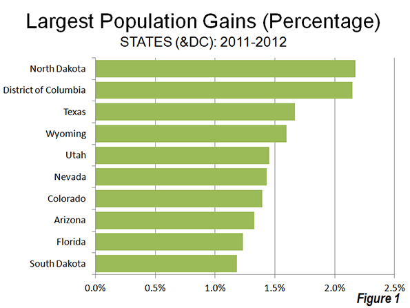
    The big surprise was the population growth leader, North Dakota, which has experienced a strong boom in natural resource extraction. Between 1930 and 2010, North Dakota had lost population. However in the first two years of the new decade, North Dakota has experienced strong growth, and reached its population peak, according to the new estimates, in 2012. North Dakota’s population growth rate between 2011 and 2012 was 2.17%. Nearby South Dakota also grew rapidly, ranking 10th in population growth. The other fastest-growing states were all in the South or the West. The District of Columbia, located in the strongly growing Washington, DC Metropolitan area ranked second in growth rate behind North Dakota (Figure 1).

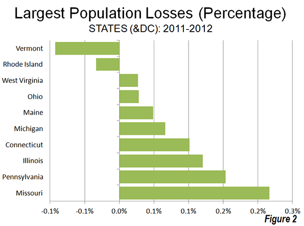
    Two states lost population, Vermont and Rhode Island, as the Northeast and Midwest represented all but one of the 10 slowest growing states. West Virginia, in the South, was also included among the slowest growing states (Figure 2).

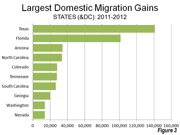
    The domestic migration trends continue to favor the South and West. Texas continues to attract the largest number of domestic migrants (141,000), followed by Florida (101,000). These two states have been the domestic migration leaders in the nation every year since 2000 (Figure 3). Four states gained from 25,000 to 35,000 domestic migrants (Arizona, North Carolina, Tennessee and South Carolina).

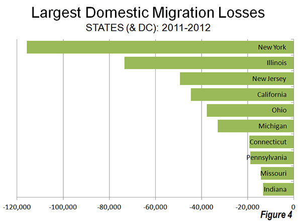
    Generally, the same states continued to dominate domestic migration losses, with New York losing the most migrants, Illinois ranking second, followed by California, Ohio and Michigan. With the exception of California, all of the 10 states losing the largest number of domestic migrants were in the Northeast or the Midwest (Figure 4).

    Overall, domestic migration continues to be dominated by the South, which attracted 354,000 residents from other states. The West added 52,000 domestic migrants, however virtually all of this gain occurred in the Intermountain West. Gains in Oregon and Washington were far more than offset by the large losses in California, as well as losses in Hawaii and Alaska. The Intermountain West gained more than 70,000 domestic migrants. The Northeast lost 221,000 domestic migrants, while the Midwest lost 185,000.

  • Exodus to Suburbs Continues Through 2012

    The latest US Census Bureau migration data shows that people continue to move from principal cities (which include core cities) in metropolitan areas to what the Census Bureau characterizes as "suburbs" (Note). Between 2011 and 2012, a net 1.5 million people moved from principal cities to suburbs (principal cities lost 1.5 million people to the suburbs). The movement to the suburbs was pervasive. In each of the age categories, there was a net migration from the principal cities to the suburbs. There was also net migration to the "suburbs" in all categories of educational attainment.

    These data are in contrast to claims that people are moving from a suburbs to central cities. Virtually none of the migration data has shown any such movement. Moreover, the city population estimates produced for 2011 by the Census Bureau, which indicated stronger central city growth have been shown to be simply allocations of growth within counties, rather than genuine estimates of population increase.

    —-

    Note on Census Bureau "Suburbs:"

    The movement to the suburbs is undoubtedly understated in the Census Bureau estimates, because many jurisdictions included in the "principal city" classification are in fact suburbs. The Real State of Metropolitan America showed that virtually all population growth in principal cities was either in suburban jurisdictions classified as principal cities, or in cities with substantial expenses of post-World War II automobile oriented (or suburban) land-use patterns. The remaining core cities that are largely only urban core in land use accounted for only 2% of principal city growth from 2000 to 2008.

    For a decade, the Census Bureau has used a "principal city" designation instead of the former "central city" term. All former "central cities" are "principal cities." The Census Bureau characterizes all other areas of metropolitan areas as "suburbs." In fact, many of the principal cities are functionally suburbs, having barely existed or not existed at all at the beginning of the great automobile oriented suburban exodus following World War II.

    Examples of such suburban principal cities, with their metropolitan areas in parentheses, are Hoffman Estates (Chicago), Arlington (Dallas-Fort Worth), Aurora (Denver), Fountain Valley (Los Angeles), Eden Prairie (Minneapolis-St. Paul), Mesa (Phoenix), Hillsboro (Portland), San Marcos (San Diego), Pleasanton (San Francisco), Kent (Seattle), Virginia Beach (Virginia Beach-Norfolk) and many others.

  • Census Bureau Finds 3.2 Million More People in Salt Lake City?

    Today the US Bureau of the Census released a fascinating report on metropolitan area population growth by radius from the corresponding city halls. The report provides summary tables indicating the metropolitan areas that had the greatest and least growth, for example, near the downtown areas.  I was surprised to find that Salt Lake City had done so well, having seen is population rise from 336,000 to 355,000 within a two mile radius of city hall (Table 3-7). That struck me as odd. A two mile radius encompasses an area of only 12.6 square miles, for a density of about 28,000 per square mile. Only the city San Francisco has densities that high over such a large area in the West. Moreover, all of the municipality of Salt Lake City is within two miles of city hall, and the 2010 census counted only 186,000 people in the entire  city of more nearly 110 square miles.

    In reviewing the backup file, Worksheets “Pop2000″, Pop2010”, “Density2000” and “Density 2010”), I discovered that Salt Lake City’s data was actually that of San Francisco and that metropolitan Salt Lake City was credited with 3.2 more people than it had Another surprise was that the San Francisco metropolitan area was reported with 260,000 people, less than one-third the population reported for the core city of San Francisco in 2010. Santa Fe had a reported population 3.4 million people, about 1.4 million people more than live in the entire state of which it is the capital. Further, in at least 35 cases, the populations for metropolitan areas did not correspond to those reported in the 2010 census.

    Obviously this is the kind of automated (computer) error that can happen to anyone or any agency. Nonetheless, an immediate correction would be appropriate.

    With considerable effort, we were able to get through to the public information office at the Bureau of the Census to notify them of the error.

    Until a corrected report is issued, any analysis of the report will need to be very cautious indeed. We look forward to the revision.

  • A Summary of 2011 Commuting Data Released Today

    The Census Bureau’s American Community Survey released its annual one-year snapshot of demographic data in the United States. As usual, this included journey to work (commuting data), which is summarized in the table below.

    American Community Survey Commuting Data
    2011, 2010 & 2000
    ESTIMATES of Total Commuters 2000 2010 2011
    Drive Alone 97.10 104.86 105.64
    Car/Van Pool 15.63 13.27 13.39
    Transit 5.87 6.77 6.96
    Bicycle 0.49 0.73 0.78
    Walk 3.76 3.80 3.89
    Motorcyle, Taxi & Other 1.24 1.60 1.63
    Work at Home 4.18 5.92 5.99
    Total 128.28 136.94 138.27
    In Millions
    MARKET SHARE
    Drive Alone 75.70% 76.57% 76.40%
    Car/Van Pool 12.19% 9.69% 9.68%
    Transit 4.57% 4.94% 5.03%
    Bicycle 0.38% 0.53% 0.56%
    Walk 2.93% 2.77% 2.81%
    Motorcyle, Taxi & Other 0.97% 1.17% 1.18%
    Work at Home 3.26% 4.33% 4.34%
    Total 100.00% 100.00% 100.00%
    Sources: 2000, 2010 Census &  2011 American Community Survey


    Trends Since 2010

    As estimated employment improved from 137.9 million in 2010 to 138.3 from 2010 to 2011, there was an increase of 800,000 in the number of commuters driving alone, which, as usual, represented the vast majority of commuting (105.6 million daily one way trips), at 76.40 percent. This was not enough, however, to avoid a small (0.17 percentage point) decline in market share.

    Car pooling experienced a rare increase of 120,000 commuters, which translated into a 0.1 percentage point loss in market share, to 9.68 percent. Transit increased 190,000 commuters, and had a 0.09 percentage point increase in market share, to 5.03 percent. This brought transit’s market share to above its 2008 share of 5.01 percent and near its 1990 market share of 5.11 percent.

    Working at home increased by 70,000, with a modest 0.1 percentage point increase from 2010.

    Trends Since 2000

    Even with declining falling household incomes and rising gasoline prices, single-occupant commuting continued to rise between 2000 and 2011. Solo drivers increased nearly 8 million, more than the total transit commuting in 2011. Car pooling continued its long-term decline, falling 2.2 million. Transit did well (as would be expected with unfavorable economic conditions and unprecedented gasoline price increases), as we noted last year, having added 1.1 million commuters. This was spread thinly around the country, though with a 70 percent concentration in New York and Washington, DC. Over the period, working at home experienced an increase of 1.8 million, the largest increase outside solo driving.

    Media Attention

    For the most part the commuting data was ignored by the media — and for good reason. The one year changes were predictably modest. However, the exception was USA Today, with a top of the webpage "Fewer Americans Driving Solo" headline. In fact, as noted above, the short term and long term trends reflected an increase in solo driving. Moreover, reading the story it would be easy to get the impression that a sea change had occurred in how people get to work. To its credit, however, USA Today appropriately labeled the likely reasons for the mountains it made into molehills — the economy and gasoline prices.

  • Observations on Exurban Trends

    Getting the Migration Story Straight: Analysts continue to misunderstand the recent metropolitan area census estimates. Much of the misunderstanding arises from a misinterpretation of a chart produced by the Brookings Institution, which indicates that the rate of population growth has fallen in exurban counties and was, last year, less than the rate of growth in what Brookings calls emerging suburbs and "city/high density suburbs." However, the Brookings chart characterizes  only total population growth, which is the combination of the natural growth rate, net international migration and net domestic migration. In other words, the Brookings Institution chart includes both people who move between areas of the United States and the net of those who move from outside the United States, are born or died.

    Perhaps the most befuddled was the Arch Daily, which says that "people are leaving the suburbs and once again flocking to the cities…"  In fact exurban and suburban areas continue to grow, though their growth rates have fallen. The highly touted decline in exurban growth rates is for one year only (2010-2011) and represents only the first year in the last 20 that the exurban has trailed that of the "city/high density suburbs." It is also the first year out of the last 20 that the "city/high density suburbs" did not trail both the suburbs and exurbs.

    However, aggregate growth rates say nothing about moving to or from cities. Only one of the components of population change, domestic migration, can possibility indicate movement from the suburbs and exurbs to the cities. People who migrate from outside the nation, for example, are not moving from suburbs to the city (the suburbs of Paris don’t count). People who are born or die are not migrating from the suburbs to the cities (where they might come from or are going has been the source of endless debate through history). The only people who can possibly be moving from suburbs and exurbs to the city are domestic migrants —people who move within the United states.

    Figure 1 indicates the components of population change in the core counties of the nation’s 51 metropolitan areas with more than 1,000,000 population (there are no city level migration data).

    • There was a net gain in natural growth of 556,000 (births minus deaths)
    • There was a net gain in international migration of 295,000 (people who moved from outside the nation to the core counties.
    • There was a net loss in domestic migrants of 67,000. These US residents moved  away from the core counties.
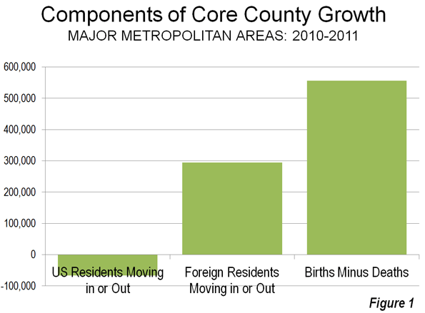
    As we indicated in Still Moving to the Suburbs and Exurbs: The 2011 Census Estimates, there was net domestic migration to the suburbs and exurbs between 2010 and 2011. There was net domestic migration out of the central counties (there is no "city" migration data). This is illustrated in Figure 2, which has been annotated to make the actual moving of people clear.
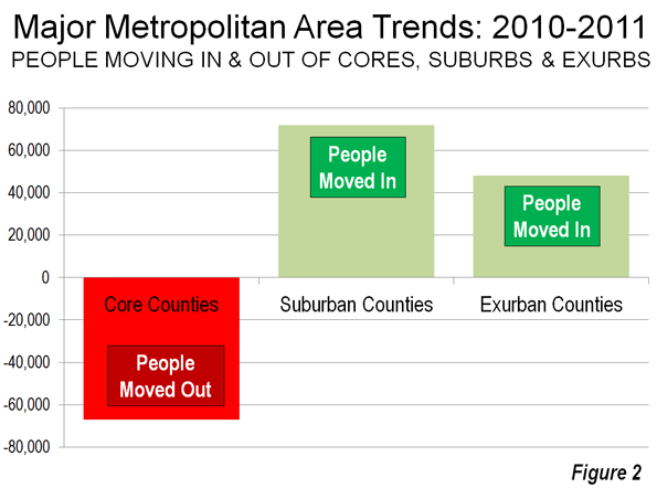
    If it should ever occur, it will be very clear when people are moving to the cores from the suburbs and exurbs. There will be PLUS domestic migration numbers to the core counties and MINUS domestic migration numbers from the suburbs and exurbs. Until that time any flocking (though that is too strong a word for current trends) will be away from the cores and to the suburbs and exurbs.

    Of course, in the greatest economic downturn in more than 75 years, domestic migration has slowed considerably. It is not surprising, therefore that population growth rates in the exurbs and suburbs have fallen, since far fewer people are moving.

    All Domestic Migration was to the Suburbs: Finally, all of the net domestic migration in the nation was to the suburbs and exurbs of the nation’s major metropolitan areas (Also see Figure 2).

    On the Health of Exurban Housing Markets

    On a related subject, University of South Florida Professor Steven Polzin offered an interesting comment on the Planetizen site:

    While I have not explicitly researched the distribution of home foreclosures as a function of the transportation costs of residents, I would caution analysts to more fully explore the nature of the housing foreclosure trend before jumping to the assumption that transportation costs were a significant contributor to geographically differential rates of foreclosure. Foreclosures were more prominent in homes purchased more recently relative to the housing crash. These new home purchasers were more often highly leveraged, had little equity in their home, and in many cases younger workers with less job seniority and more susceptible to layoffs. In addition, in fringe areas that had been growing there was a high concentration of homes all purchased recently. Thus, new growth areas were more susceptible to both foreclosures and the cascading effect of home depreciation spreading based on nearby foreclosed properties.

    In a new suburb a young financially extended family may lose their job, have no equity in the house and quickly lose their house. Its depreciated value is soon reflected in adjacent appraisals cascading the stress throughout relatively fragile neighborhoods. On the other hand in established neighborhoods only a relatively small share of the homes changed hands near the peak of the building bubble. Thus, many of those homeowners had far more equity in their home and perhaps more job seniority and security enabling them to whether a housing downturn. In addition, the diversity of home ages and types and the less frequent occurrence of foreclosed properties will control the pace at which home value depreciation will cascade through the neighborhood.

    If commuting cost was as big a contributor to suburban fringe foreclosure rates then one would have expected downtown condominiums to weather the housing bubble. In many locations like Florida large clusters of new downtown residential properties suffered the same rapid depreciation as did suburban fringe areas. The concentration of new units seemed to be more critical than the location.

    Similar sentiments have been posted on these pages from time to time, such as here and here.
  • Census Bureau Releases Latest Take on America’s Urban Areas

    We are used to dealing with jurisdictional boundaries when assessing and comparing cities. These are often either municipal areas or metropolitan statistical areas (which are based on entire counties). But these can have little relevance to the amount of area in a given city-region that is actually urban in nature. This makes apples to apples across regions difficult.

    Once a decade though the Census Bureau gives us a more detailed look. They release definitions of so-called “urbanized areas” that attempt to look at just the amount of land that is actually urban in form. In theory this would allow for better apples to apples comparisons between regions. Unfortunately, most data is not sliced this way, so we only get this glimpse. Here’s the map of the new 2010 urbanized area definitions:

    Wendell Cox has a breakdown of the largest urbanized areas that includes density. He also published a historical review that tracks urbanized area population and density since 1950 for the largest city regions. For more thoughts on urbanized areas, see Nate Berg’s take over at Atlantic Cities.

    I don’t want to try to offer a complete analysis of this right now, but one thing that really jumped out at me was the very low densities of some southern boomtowns like Atlanta (1,707/sq. mi) and Charlotte (1,685/sq. mi.). Contrast with even Houston (2,979/sq. mi.) and Dallas (2,879/sq. mi) and see the difference. Atlanta is already showing serious signs of weakness vs. the Texas mega-metros and I wonder if this is part of the reason why. It also makes me wonder if Charlotte might someday suffer in a similar manner if its growth ever flames out.