Tag: Census 2010

  • A Tale of 273 Cities

    It was the best of times, it was the worst of times; it was the age of wisdom, it was the age of foolishness; it was the epoch of belief, it was the epoch of incredulity; it was the season of light, it was the season of darkness; it was the spring of hope, it was the winter of despair. 

    Charles Dickens, A Tale of Two Cities

    Since 1790, 273 cities have made an appearance on the list of the nation’s 100 largest places.

    Cities of all shapes and sizes have made the list at one time or another – ranging from New York, which has held the top spot in every single census from the very beginning; to little Chillicothe, Ohio, which appeared once in 1830, at #87, and never made the list again.

    Examining this list decade-by-decade is instructive, for it largely tracks the entire history of the nation’s settlement patterns – from the initial cultural hearths of Yankee New England and Tidewater Virginia; through the river and canal era; the railroad era; the industrial era; the interstate highway and suburban era; to the decline of the Rust Belt, and the triumph (for the time being) of the Sunbelt – and beyond.

    The list tells the story of the relative decline of many cities – places like Providence (1790-1980); Dayton (1830-1990); and Des Moines (1880-2000), which were ranked in the top 100 for decades, have shrunk to one degree or another, and eventually fell off the list, but remain significant-sized urban centers today.

    It also tells the story of the absolute decline of many cities – places like St. Louis, Detroit, Buffalo, Pittsburgh, and Cleveland – formerly huge cities that all once ranked in the top 10, which have now lost over half of their population.  All five of these cities remain in the top 100, but they are all suffering from the seemingly intractable problems that come with massive abandonment and disinvestment – fiscal instability, poverty, inequality, and a frayed civic and social fabric.  Here in 2014, their collective future, especially in their current form, is increasingly uncertain.

    And that – looking toward the future – is why this topic is truly important. Examining this information is about far more than a trivial jaunt down memory lane.  What does it tell us about the future of our cities?

    For one, there is this question: Does any of this even matter?

    Is the size of our central cities even important? Aren’t city boundaries arbitrary and meaningless?  Isn’t it the surrounding metropolitan region that really counts?

    Well, it’s a complicated story.  For years, pundits, prognosticators, and policy wonks have been telling us that the age of the central city is over; that it is the region that is important.  Economies are based on regional job markets, they say, and improvements in transportation and communications are making local places (even large ones) increasingly irrelevant.

    The fact that economies are regional is true – as far as it goes.  But like anything viewed through one lens only, it does not tell the whole story.

    Are regions important? Of course. But so are places.  Like so many other things in the realm of urban public policy, this is not a binary, either/or, choice.

    Indeed, at the same time that we are being told by one set of pundits about the irrelevance of our cities, we have another set of pundits telling us that this is, in fact, a new golden age for our cities.

    Cities entered a long cyclical downturn following World War II, they tell us, but they are now on the rebound, and are experiencing an unparalleled renaissance. Property values are increasing, Millennials are moving to our downtowns, and previously declining neighborhoods are coming back to life, replete with upscale shops, bistros, and pubs. 

    But this doesn’t tell the whole story, either. For every gentrifying formerly shrinking city like New York, Washington, and San Francisco, and for every sprawling boom town like San Jose, Charlotte, or Columbus; there is a St. Louis, a Cleveland, and a Detroit; and there is a Gary, a Flint, and a Youngstown.

    What does the future hold for these cities?  What about the giant places full of the mind-boggling, post-apocalyptic decay and dysfunction that comes with literally losing one million residents, like Detroit?  

    And what about the mid-sized places, like Flint, that may not have the assets or the resources to ever turn the corner.  Will they continue to die a slow, agonizing death, and literally disappear?  Or will they continue on in a shadow-form, serving as a cautionary tale, and inhabiting some type of uniquely American, urban equivalent of purgatory?  

    Or can they be restored – if not, perhaps, to their former glory, to at least something that is stable, equitable, and workable for those that remain?

    This post is full of more questions than answers.  It is an inherently complicated topic.

    Big Questions for the Rust Belt

    While it is true that cities have grown and declined (and sometimes grown again) throughout American history, it is also true that we have never before experienced the unprecedented population decline that some of our largest cities have experienced over the past 60 years, especially those in the Rust Belt.

    Rust Belt cities have experienced the triple whammy of structural economic decline (the outsourcing of manufacturing); continued regional outmigration (to the Sunbelt); and continued suburbanization (in a region with a strong tradition of local government and a deep antipathy toward consolidation).  All three of these things make the shrinkage of its cities unique, from a historic standpoint.

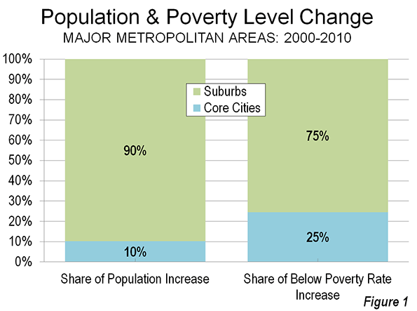
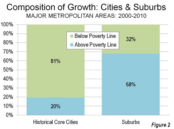
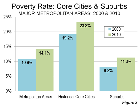
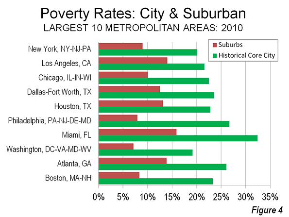
    When a large city loses over half of its population, whether that equates to one million people (Detroit); 500,000 people (Cleveland); or 100,000 people (Youngstown), there are very real consequences for the very real residents that remain.  Even if these particular cities were experiencing widespread regional prosperity and economic growth (they are not), it would not fundamentally change the social and economic reality for city residents living with the consequences of widespread abandonment in these places.

    Regardless of what some advocates of regionalism might say, city boundaries are not arbitrary and meaningless.  Although some may claim that shrinking cities are no big deal as long as the metropolitan region overall is growing, central cities will continue to profoundly matter, especially to the people (often disproportionately poor) that remain.

    Municipal boundaries are not irrelevant, whatever the regionalists may tell you.  Economies may be regional, but in most of the nation’s fastest declining cities, government is not.  Municipal boundaries affect taxation, land use policy, public safety, education, public infrastructure, and the delivery of social services. 

    When a city’s population declines precipitously, the proportional demand for the public services that it provides shrinks less than its population, with the end result that its residents end up paying more in taxes, for less in services.  Even if this were not the case, it is expensive and (politically speaking) exceedingly difficult to scale-back and shrink long-term capital investments in public infrastructure – as “shrinking cities” like Detroit and Youngstown have discovered.  

    What goes on within a given city’s actual municipal boundaries has incredibly important ramifications for its tax base; its employment base; the performance of its schools; the distribution of everyday amenities like grocery stores, shops, and restaurants; the delivery of public services; and less tangible, but equally important things like its sense of place and its sense of itself.  As cities are abandoned, decline, and become hollowed out, access to social and economic opportunities diminishes along with the population:  the jobs disappear, the doctor’s offices disappear, the grocery stores disappear – relocated, often, to a distant and increasingly inaccessible locale.  To pretend as though the economic and social well being of city residents is not directly impacted by population decline is to turn a blind eye to reality itself.

    But it is not just city residents that are affected by decline.  The health of the entire region suffers as a result.  The shrinking tax and resource base of City “A”, is not simply counteracted by economic growth in nearby cities “B” and “C”.  In a region anchored by a declining central city surrounded by dozens of separate municipalities, the redundant duplication and proliferation of local government services (education, public safety, public utilities, transportation infrastructure, social services) ends up costing all taxpayers more. 

    The worst-case scenario is a shrinking central city and a shrinking region with an overall population decline, coupled with continued central city abandonment and continued outward expansion.  In a region like this, there is not only more costly “stuff” (redundant public services and physical infrastructure) than there needs to be, but there is more “stuff” with ever fewer taxpayers to pay for it.

    And while the conventional wisdom may be that regional, not local, economies are what matter, it is important to understand that regions comprised of dozens of separate local jurisdictions do not typically behave very effectively as “regions”.  It is not impossible for them to do so, but it is exceedingly difficult. 

    So why don’t we just go ahead and combine everything?  Problem solved, right?

    Not so fast. 

    It has always been interesting to me that the Sunbelt is the region of the country that tends to have the fewest number of local governments, the most liberal annexation laws, and is home to most of the cities that have undergone major city/county consolidations (such as Jacksonville, Nashville, Augusta, Lexington, and Louisville). 

    This wasn’t always the case.  Philadelphia consolidated with its neighboring suburbs (some of the largest cities in the country at the time) in 1854, and New York City did the same thing (merging with Brooklyn – then the nation’s 4th largest city, and the other three boroughs) in 1898.

    From a public policy standpoint, most of the South and the West is typically regarded as “conservative”; while much of the Northeast and Midwest is viewed as “liberal”.  In this stereotypical telling of the tale, conservatives are supposed to belaissez-faire in terms of urban planning and public policy and are supposed to reflexively favor the local over the regional.

    Yet it is precisely in the “conservative” South and West where the people have been most willing to change the model of government and public service delivery to align with modern social and economic realities.  Effective government and accountability is still viewed as extremely important, but voters have recognized the benefits of having less duplication and more efficient delivery of services, as well as the regional cohesion and political power that annexation and consolidation can bring with them.

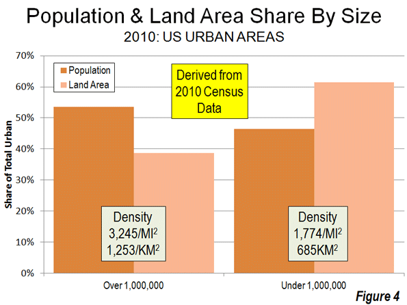
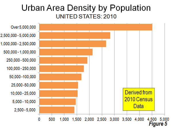
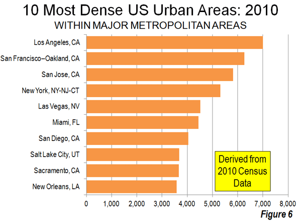
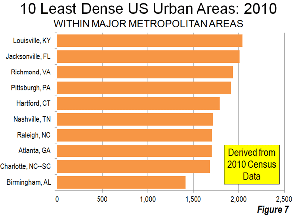
    Urban development patterns and public policy decisions on infrastructure are often different in the Sunbelt as well – especially in the West.  New development tends to be denser and more compact than it does in the Rust Belt.  Not many people know that “car crazy” Los Angeles is actually the most densely populated urban area in the United States, or that “sprawling” Las Vegas ranks 10th.  The Los Angeles “suburb” of Santa Ana is twice as densely populated as the “city”of Cleveland.

    Some of this has to do with the fact that scarce water supplies don’t allow for scattershot suburban development, and some of it has to do with an increasingly urban ethos that has evolved, especially in California, over the past 50 years.  Cities and urban residents are not viewed with the same degree of mistrust, suspicion, and disdain that they are viewed with in the Rust Belt.

    So, the Sunbelt is usually posited as an economic success story, especially in comparison with the Rust Belt.

    But the questions remain:  Was it due to less duplication of local government?  Was it in spite of it?  Or did it have nothing to do with it one way or the other?

    No one really knows for sure.

    There is little doubt in my mind that some of the reason for the growth and economic prosperity of Sunbelt cities, and for the corresponding decline of Rust Belt cities, is the failure of most Rust Belt cities to adjust their local government paradigms to reflect modern economic realities. 

    One only need contrast Cleveland with Columbus, or Detroit with Indianapolis to at least get a general sense of the divergent paths that several pairs of Rust Belt cities have taken, and to make some general comparisons between their regional economic outcomes.

    But, these comparisons are not “apples to apples”, either, and it is extremely problematic to claim that the key to Columbus’ economic success (in comparison with, say, Cleveland) has solely been due to its aggressive annexation of nearby communities.

    But, with Columbus sitting as the 15th largest city in the U.S. today, and continuing to attract new residents, and with Cleveland dropping from 5th to 45th, and continuing to lose population, it is probably fair to say that it had something to do with it.

    If Rust Belt cities had annexed or consolidated with surrounding communities earlier, they would be larger and more cohesive today, and it is probably fair to say that they would have more political clout at the state and national level.  They also could have been better positioned to shape how their surrounding regions grew – into something denser, more compact, more cohesive, and less duplicative of public services and infrastructure.

    Could have, would have, should have. That horse has largely left the barn.

    Today, it is a fair question to wonder how effective (never mind politically feasible) it would actually be to retroactively superimpose the Sunbelt model upon Rust Belt cities.  Making Buffalo look and function like Charlotte, on paper, would be very different from making it look or function like Charlotte, in reality. 

    In most Rust Belt cities today, the fact of the matter is that the incoherent and incohesive development patterns have already occurred, the infrastructure has already been duplicated, and the social and economic mismatches and inequities already exist. 

    These problems need to be addressed, but clumsily imposing a model that has appeared to work throughout much of the Sunbelt, without taking the time to understand how it would work here, might not be the answer for our region.  It might just be trying to force a very ineffective square peg into a very politically infeasible round hole.

    So, what will the future hold for our cities?  How can we knit them and their surrounding regions together to create an effective, politically feasible, governing framework that works for all of our residents, rich and poor, black and white, urban and suburban? 

    I don’t know, but I know that it has to do with starting small, working on fundamentals, building trust, inspiring hope, and building authentic relationships between real people. 

    It is the urban policy question of the 21st Century in the Rust Belt, and it is something that urban advocates, political leaders, policy wonks, and everyday citizens will need to grapple with for the rest of my lifetime.

    Now, for the Maps…

    The maps below tell the story of how the 100 largest U.S. cities have changed decade-by-decade since the first census in 1790. Please note that only cities over 2,500 are included, so several of the maps from the earliest census years show less than 100 cities.  The 10 largest cities in each census year are labeled.  

    Due to the scale of these maps, Alaska and Hawaii are not shown (Honolulu and Anchorage both rank in the top 100 today).

    Below each map you will find a short description of some of the historic, demographic, economic, and transportation trends that were in play at the time of each census. I have also included a breakdown of how many cities in each region of the country ranked in the top 100.

    For more detailed information on the 100 largest cities, census-by-census, please click here

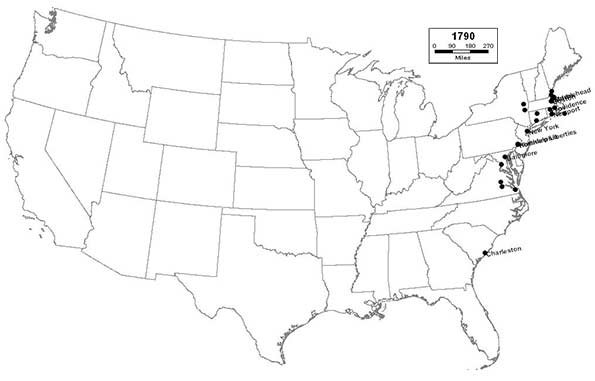
    1790 – Northeast (18); Midwest (0); South (6); West (0)

    In the immediate aftermath of the American Revolution, all of the the largest cities are concentrated along the eastern seaboard.  At the time of the first census, New York City ranked as the nation’s largest – a title that it will go on to hold for the next 220 years; and likely – in perpetuity.  Philadelphia, Boston, Charleston, and Baltimore round out the top five.

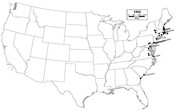
    1800 – Northeast (24); Midwest (0); South (9); West (0)

    As the 19th Century dawns, the largest cities continue to be clustered along the eastern seaboard as the brand-new nation begins to expand slowly inland. The nation’s new capital, Washington, D.C., joins the list, ranking 31st.  

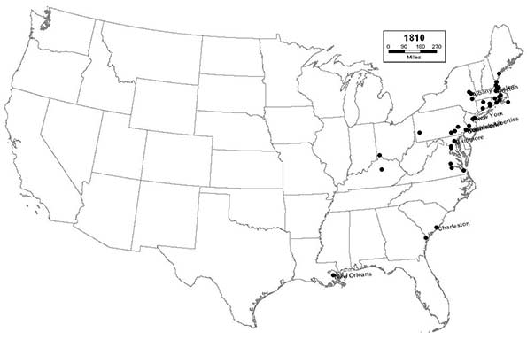
    1810 – Northeast (34); Midwest (1); South (11); West (0)

    This census marks the beginning of the era of ascendance for the great inland river cities, such as New Orleans, Pittsburgh, and Cincinnati.  These cities will serve as key centers of trade and commerce as the interior frontier of the new nation begins to be settled.

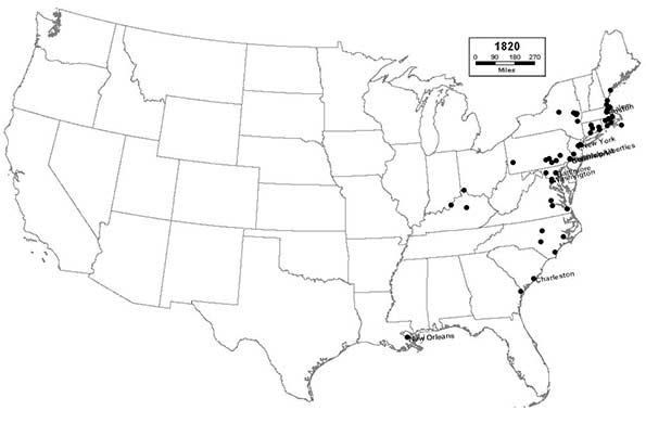
    1820 – Northeast (43); Midwest (1); South (17); West (0)

    The inland river cities, like Louisville, continue to grow and expand.  The importance of waterways increases further as the canal era dawns, literally putting places like Utica on the map.

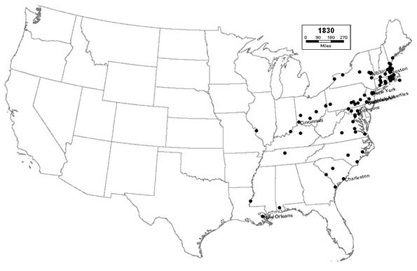
    1830 – Northeast (59); Midwest (6); South (25); West (0)

    Places throughout the industrial northeast, especially in New England, now firmly dominate the list of the nation’s largest cities. The canals throughout New York, Pennsylvania, and Ohio begin to spur new settlement and industry in places like Buffalo, Rochester, and other smaller cities immediately west and east of the Appalachians. The river cities continue to grow rapidly, as Cincinnati enters the top 10, and St. Louis joins the list.

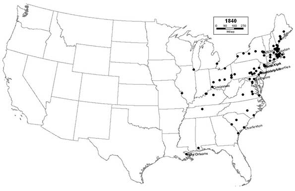
    1840 – Northeast (67); Midwest (10); South (23); West (0)

    The Great Lakes region begins to develop, thanks to the canals, as Detroit, Cleveland, and Chicago join the list. This region will begin to serve as a staging area for the people and goods needed to develop the areas west of the Mississippi.  The Northeast, bolstered by new immigrants from Ireland, remains the urban heart of the nation. 

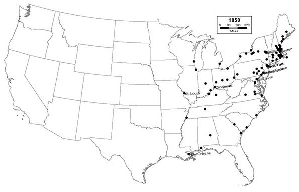
    1850 – Northeast (64); Midwest (12); South (24); West (0)

    The canal system reaches its mature peak, as strategic locations on the Great Lakes and inland rivers and canals, such as Milwaukee, Memphis, and Syracuse flourish. St. Louis enters the top 10.  The relative importance of the eastern seaboard begins to diminish, especially in the South, as the Ohio and Mississippi rivers begin to rival it in importance. Charleston drops out of the top 10 for the first time since 1790.

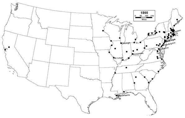
    1860 – Northeast (60); Midwest (17); South (21); West (2)

    As the Civil War dawns, railroads begin to surpass the canals in importance, as new cities like San Francisco, St. Paul, and Atlanta join the list.  The nation’s largest cities will become increasingly dependent upon the railroads for the next 100 years.  For the first time, Midwestern cities begin to rival eastern seaboard cities in importance, as Chicago enters the top 10, joining Cincinnati and St. Louis.  But the Northeast remains the nation’s urban powerhouse, as Philadelphia consolidates with its neighboring suburban towns to become the nation’s second largest city and New York’s closest, but still distant, rival. 

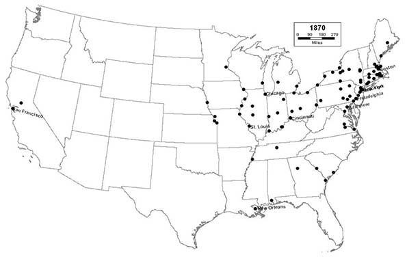
    1870 – Northeast (54); Midwest (26); South (18); West (2)

    New Midwestern cities like Kansas City, St. Joseph, and Omaha flourish as important gateway railroad terminals from which the Great Plains and the remainder of the West will eventually be settled. The South begins a long period of urban and economic decline following its defeat in the Civil War. The cities of the West Coast begin a period of rapid settlement, as San Francisco enters the top 10.

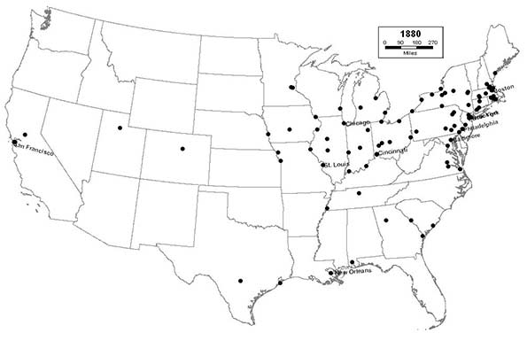
    1880 – Northeast (48); Midwest (27); South (20); West (5)

    Westward settlement spreads rapidly via railroad across the Great Plains, the West, and Texas, as new cities like Minneapolis, Des Moines, Denver, Salt Lake City, and San Antonio join the list.

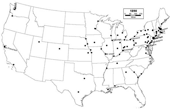
    1890 – Northeast (45); Midwest (29); South (18); West (8)

    The nation’s manufacturing heartland and industrial base begins to shift from New England to the Great Lakes, as Youngstown join the list, Cleveland enters the top 10, and Chicago surpasses Philadelphia as the nation’s second largest city. The West Coast begins to grow rapidly, as Los Angeles, Seattle, and Portland all join the list, along with Dallas; setting the stage for the eventual domination of the nation’s urban landscape by California and Texas.

    1900 – Northeast (46); Midwest (26); South (21); West (7)

    As the 20th Century dawns, after nearly four decades of economic decline, the South turns the corner and begins its economic recovery as new industrial cities like Birmingham and Houston join the list.  Mid-sized cities in the Great Lakes region, like Akron, begin to grow rapidly, as a new wave of immigrants from southern and eastern Europe settles throughout this rapidly industrializing part of the country. With railroads now linking the nation from coast-to-coast in several different corridors, the American settlement frontier officially disappears. New York City consolidates with nearby towns and with cross-river rival, Brooklyn, the nation’s 4th largest city, to reach a population of 3.5 million, and achieves unparalleled domination of the nation’s urban hierarchy.

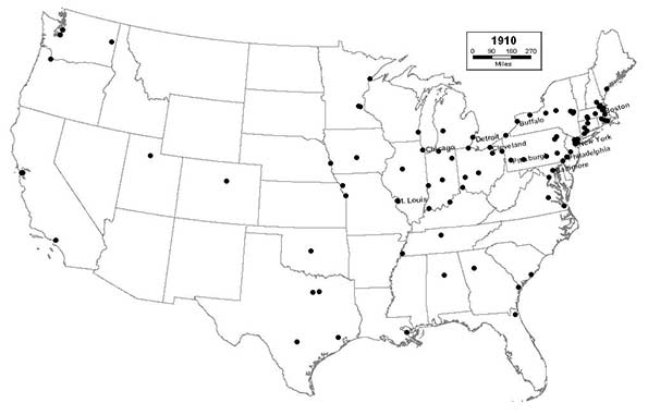
    1910 – Northeast (45); Midwest (27); South (19); West (9)

    The Great Lakes region continues to thrive as its cities grow larger and more prosperous, and Pittsburgh enters the top 10. Cincinnati drops out of the top 10, but remains a vibrant and expanding urban center. Southern cities, like Fort Worth, Oklahoma City, and Jacksonville join the list, giving Florida a top 100 city for the first time.

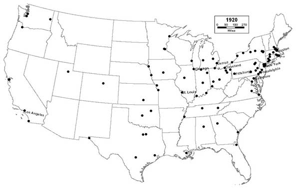
    1920 – Northeast (40); Midwest (29); South (21); West (10)

    Smaller industrial cities in the Great Lakes region, like Canton and Flint, thrive as the steel and automotive industries explode, and Detroit, “The Motor City”, enters the top 10. Charleston drops out of the top 100 for the first time since 1790. Southern California, poised to eventually become the nation’s prototypical urban region, begins its period of automobile-age ascendance as San Diego joins the list, and Los Angeles enters the top 10. 

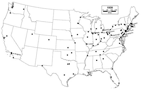
    1930 – Northeast (36); Midwest (29); South (23); West (12)

    Industrialization in the Great Lakes region reaches its apex in overnight boom towns like Gary, as the region becomes the manufacturing center not only of North America, but of the entire world. The Sunbelt’s period of growth begins in earnest, as cities in California and Florida, like Long Beach, Miami, and Tampa expand rapidly.  In contrast, a period of long, steady decline ensues in smaller industrial cities throughout the Northeast, in general, and New England, in particular.

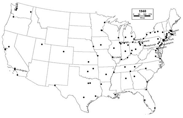
    1940 – Northeast (33); Midwest (28); South (27); West (12)

    The preceding decade is a difficult one for the nation’s cities.  Very few cities grow in the immediate aftermath of the Great Depression. Northern industrial cities are hit particularly hard, but some southern cities, like Charlotte, begin to flourish.

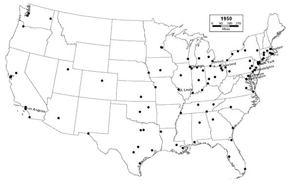
    1950 – Northeast (28); Midwest (27); South (31): West (14)

    For the first time, the South surpasses the Northeast as the region with the most cities in the top 100, as Austin and Baton Rouge join the list. Pittsburgh drops out of the top 10, as industrial decline in the Northeast accelerates after a brief uptick during the war. Washington, D.C. enters the top 10, due in large part to the expansion of the federal government during the Great Depression and World War II.  Phoenix joins the list at #99, presaging the rapid development of the desert Southwest in the coming decades; a small desert crossroads at the beginning of the 20th Century, it will end the century as the nation’s sixth largest city.

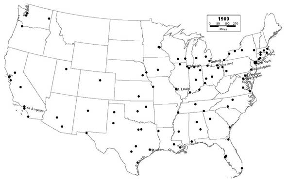
    1960 – Northeast (19); Midwest (28); South (35); West (18)

    Both suburbanization and deindustrialization become major factors in central city decline, especially in the North, where major cities are hemmed in by adjacent cities and towns, and are therefore unable to expand via annexation. The long tradition of town, borough, and township government throughout the entire North stymies efforts to consolidate governments into units that better reflect modern realities. Boston drops out of the top 10 for the first time since 1790. The expansion of the Interstate Highway System takes its toll, especially on mature Northern cities, by opening up outlying areas for suburban development, and by displacing business and residents in the urban core.  Most cities throughout the Midwest have now reached both the peak of their population and their industrial development.  In the coming years, they will increasingly follow the pattern established in the Northeast 30 years earlier, as the region begins to transition from the “Great American Manufacturing Belt” to the “Rust Belt”.  In contrast, the Sunbelt continues to enjoy explosive growth, as Houston enters the top 10, and San Jose, Tucson, Albuquerque, and Honolulu join the list. 

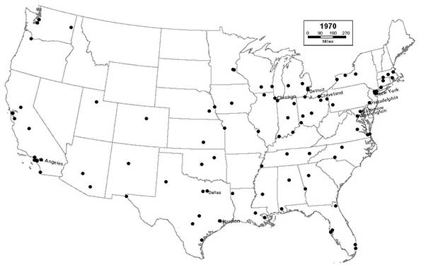
    1970 – Northeast (16); Midwest (28); South (35); West (21)

    Anaheim, Santa Ana, and Riverside join the list, as Southern California continues to attract new immigrants, both foreign and domestic, in record numbers.  The largest Southern and Western cities continue to grow even larger, as Dallas joins the top 10. The industrial Midwest begins to experience a period of rapid decline, as St. Louis drops out of the top 10. 

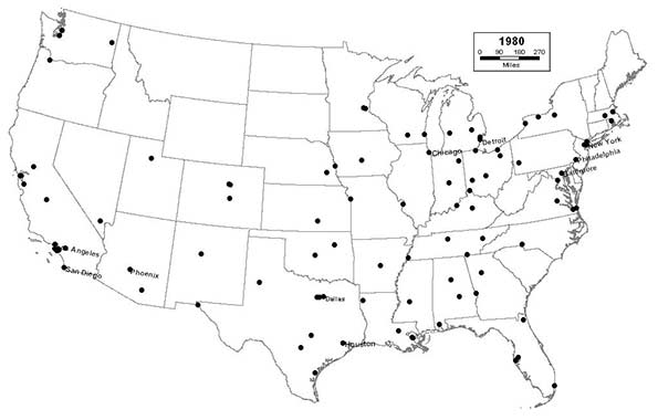
    1980 – Northeast (12); Midwest (24); South (38); West (26)

    Colorado Springs and Las Vegas join the list, as the interior West continues to grow rapidly.  The growth of the West extends to Alaska, as Anchorage makes the list for the first time.  Even the suburbs of sunbelt cities, like Arlington, Texas, and Aurora, Colorado begin to surpass established Northeastern and Midwestern central cities in population. San Diego and Phoenix join the top 10. Midwestern cities continue to deindustrialize rapidly, and begin losing population at a truly alarming rate. Suburbanization, white flight, and the inability to annex or consolidate with outlying areas make the problem of industrial decline even worse, as Cleveland drops out of the top 10. 

    1990 – Northeast (9); Midwest (21); South (40); West (30)

    Cities throughout the Sunbelt continue to grow in size, prominence, and influence, as Los Angeles surpasses Chicago as the nation’s second largest city.  Three of the nation’s 10 largest cities are now located in Texas, as San Antonio joins the top 10.  Sunbelt “boomburbs” continue to explode as cities like Mesa, Arizona; Garland, Texas; and Fremont, California join the list, displacing older eastern cities like Syracuse, Worcester, and Providence, which drops out the top 100 for the first time since 1790.

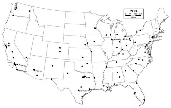
    2000 – Northeast (9); Midwest (20); South (40); West (31)

    The previously established patterns of Rust Belt decline and Sunbelt expansion begin to stabilize, although many Rust Belt cities continue to lose population at an alarming rate.  Dayton drops out of the top 100 for the first time since 1830. Sunbelt boomburbs continue to grow rapidly, as Plano, Texas; Glendale, Arizona; Scottsdale, Arizona; and Irving, Texas all reach the top 100.  

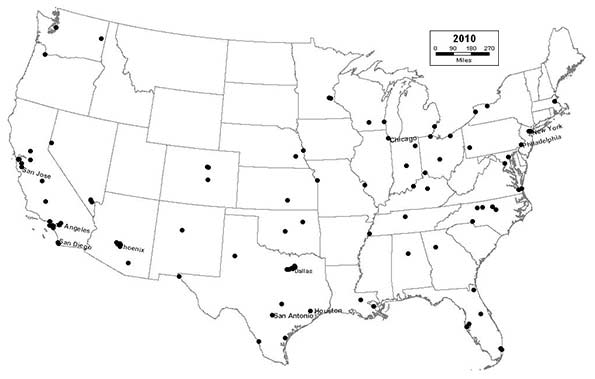
    2010 – Northeast (8); Midwest (17); South (39); West (36)

    The Sunbelt achieves complete dominance of America’s urban landscape, as 6 of the nation’s 10 largest cities are now located in California and Texas. Rust Belt cities like Cleveland, which experienced a slight respite from decline throughout the 1990s, begin a new period of free-fall, as the housing market collapses in the late 2000s.  Detroit drops out of the top 10.  Akron drops out of the top 100.  Sunbelt cities continue to eclipse their Rust Belt counterparts, as Reno, Orlando, Winston-Salem; Henderson, Nevada; Chula Vista, California; and Irvine, California all reach the top 100.

    This post originally appeared in Jason Segedy’s Notes From the Underground on April 14,, 2014.

    Segedy is the Director of the Akron Metropolitan Area Transportation Study, the Metropolitan Planning Organization serving Akron, Ohio.  As a native of Akron, and as an urban planner, he has a strong interest in the future of places throughout the Great Lakes region, and in the people that inhabit them.

  • Is the Census Bureau On Track For Another Estimating Fiasco?

    When the 2010 Census results were released, a number of big cities had populations that were very off from what would have been expected based on the Census Bureau’s previous annual estimates of the population – sometimes grossly so.  Some of these were related to cities that had challenged the estimates and had adjustments made in their favor, such as Cincinnati and St. Louis. Given that the Census Bureau seems to have approved every challenge, bogus challenges were all but encouraged.  Still, there were significant variances in cities that didn’t challenge the Census, such as Chicago and Phoenix. 

    Had the estimates been correct, Atlanta would have gained over 125,000 people in the last decade – a stunning gain of 30%. But Atlanta’s actual population was nearly flat, growing less than 1%. Other cities experiencing huge swings due to misestimates were places like New York City (projected to gain 417,000, actually gained less than half that at 167,000) and Chicago (projected to lose 29,000 people, actually lost over 200,000).  I myself ended up with some egg on my face for drawing unwarranted inferences from what appear to be badly botched estimates.

    Urban advocates were quick to cry foul, alleging undercounts (though taking the strong growth counted for downtowns as gospel).  Given the much more rigorous Census standards for challenges to decennial counts, it was virtually impossible for these to succeed, but some have continued to maintain systematic undercounting in the decennial census as a matter of course.

    When the first round of new post-2010 Census estimates were released for cities, the media started crowing again about a supposed resurgence in city populations. However, this wasn’t real growth. Instead, the Census Bureau had created a new, temporary methodology to get the estimates out the door. Rather than producing real numbers, they simply took the estimates for growth at the county level and assumed every municipality in the country grew at the exact same percentage as the county as a whole.  The media missed the story because they relied on the headline data, and were attracted to the “back to the city” meme. They would have had to dig into the methodology document – something ordinarily no one would need to do for this sort of routine release – to figure this out.  This release was embarrassment number two for the municipal estimates program.

    You would think that after these two fiascos, the Census Bureau would be highly attuned to getting the municipal estimates right. Indeed, for the recently released 2012 vintage municipal estimates, they went back to using a real estimating methodology instead of the simple allocation approach from 2011. However, as with the 2000s, these are showing strong municipal population growth in places where that would represent a major discontinuity with the actual decennial Census results from the 2000-2010, and from economic conditions.

    How is it that cities, after a disappointing 2000s where some places actually underperformed versus the 1990s, in an economy that has been recessionary to sluggish the entire post-2010 person and in which the housing market that triggered the crash has also yet to recover, that these growth rates are possible? It’s certainly eyebrow-raising at a minimum.

    Consider Chicago. After losing over 200,000 people in the 2000s, Chicago supposedly gained 17,000 people between 2010 and 2012. With a highly publicized murder problem in many of the neighborhoods that saw the severest depopulation in the previous decade, where housing was whacked leaving any number of uncompleted building shells, and with a budget crunch that is squeezing service provision, this would certainly represent a remarkable accomplishment.

    Or look at Indianapolis. In its urban core area, Center Township (township data is reported in a similar manner to municipal estimates in some areas), the population declined by almost 25,000 people during the 2000s, a steep 14.5% loss that was worse than Buffalo and St. Louis and nearly as bad as Cleveland.  Center Township has lost population every decade since 1950. Yet the Census Bureau has estimated that it gained 2,300 people since the census. Though a lower total percentage due to the base, this is more physical people than was estimated to be added by all but three of Indy’s suburbs, many of which posted huge gains in the 2000s (such as Westfield, which added 20,800 during the 2000s but was only estimated to have added 1,800 since the census despite building permit issuances at all time record highs).  This sort of radical turnaround in fortunes would certainly be nearly miraculous if true.

    Amazingly, the Census Bureau actually even went back to the estimating status quo ante in Atlanta by claiming very high population growth, despite missing by a country mile last time around. Atlanta is projected to have gained almost 24,000 people since the census, even though it was nearly flat the previous decade. This is a rate very close to what the Census Bureau estimated it had in the last decade.

    You can go right down the line and find similar effects at work in other places. It raises serious questions about these estimates. Places like San Francisco, DC, and even Pittsburgh have had economic growth that might seem to underpin more robust core population growth, it’s hard to credit many of these other places with such turnaround.  Some of the analysts focused on an inability of people to move outwards because of the economy, but it’s hard to believe this alone grew the population of Atlanta by 24,000 people.

    There are red flags all over these numbers. Perhaps the urban advocates claiming dramatic undercounting in the census were right – or maybe not. Regardless, something very odd appears to have been going on with the Census Bureau’s municipal estimates and counts over the last decade or so. Until there’s reason to believe they’ve finally started getting it right, I would treat any number that comes out before the decennial census with extreme skepticism. After having fooled us not once, but twice before, smart money should apply a steep discount to any annual municipal estimates coming out of the Census Bureau.

    Aaron M. Renn is an independent writer on urban affairs and the founder of Telestrian, a data analysis and mapping tool. He writes at The Urbanophile.

    Photo: Travelin’ Librarian

  • Aging America: The Cities That Are Graying The Fastest

    Notwithstanding plastic surgery, health improvements and other modern biological enhancements, we are all getting older, and the country is too. Today roughly 18.5% of the U.S. population is over 60, compared to 16.3% a decade ago; by 2020 that percentage is expected to rise to 22.2%, and by 2050 to a full 25%.

    Yet the graying of America is not uniform across the country — some places are considerably older than others. The oldest metropolitan areas, according to an analysis of the 2010 census by demographer Wendell Cox, have twice as high a concentration of residents over the age of 60 as the youngest. In these areas, it’s already 2020, and some may get to 2050 aging levels decades early.

    For the most part, the oldest metropolitan areas — with the exception of longtime Florida retirement havens Tampa-St. Petersburg and Miami — tend to be clustered in the old industrial regions of the country. These are regions that have suffered mightily from deindustrialization and the movement of people toward the South and West. These metro areas now make up eight of the 10 oldest among the nation’s 51 largest metropolitan statistical areas.

    The oldest city in America is Pittsburgh, where 23.6% of the metro area’s population is over 60 (see the full list in the table below). The old steel capital is followed by such former robust manufacturing hubs as Buffalo (No. 3 on our list), Cleveland (fifth), and Detroit (ninth).

    How did these places get so old? The biggest factor: migration deficits. More Americans have been leaving these cities than moving there, and people who move tend to be younger. Meanwhile these graying cities attract relatively few immigrants from abroad. Pittsburgh, for example, ranks 34th among the 51 biggest metro areas in net domestic migration, losing some 2% of its population to other places over the past decade. It also stands 50th in foreign immigration over the same period. Buffalo has fared even worse: it’s 40th in domestic migration and 49th in new foreign-born residents.

    Another factor is low birth rates. An aging population, not surprisingly, does not produce many children. In 2000 only three U.S. metro areas had more elderly than children under the age of 15 (Pittsburgh, Miami and Tampa-St. Petersburg, Fla.). The 2010 Census showed we now have 10, with the addition of Buffalo, Boston, Cleveland, Hartford, Providence, Rochester and San Francisco to the first three. Thus the elderly population is overtaking the younger population not only in Florida’s retirement havens, but in a number of Rust Belt and Northeastern cities — and the West Coast may not be far behind.

    The graying trend, like aging itself, is pervasive. The number of children relative to elderly declined over the past decade in every one of the 51 largest major metropolitan areas.

    But not all of America’s most rapidly aging cities are in Florida and the Rust Belt. Even the New York metro area, usually associated with the “young and restless,” is also getting senescent, with an elderly population nearly equal to that of the young. It ranks 15th on our list of the grayest cities. This is surprising, since like more-old-than-young San Francisco (17th place), immigration from abroad has been strong.

    Other metropolitan areas widely celebrated as magnets for the young and hip are also aging rapidly. For example, while Portland remains younger than average, it rose from 36th oldest in 2000 to 29th oldest in 2010. Even Seattle got older, rising from 39th place in 2000 to 34th in 2010.

    This pattern is surprisingly prevalent even in the urban cores that are at the heart of these regions. In New York County, better known as Manhattan, roughly 19% of the population is over 60, well above the national average. In San Francisco the percentage of elderly is a tad higher at 19.2%. These choice places are expensive to move into, so getting there some decades ago is a big plus. As the entrenched populations age, these places may become far more geriatric than commonly assumed.

    But it’s not just the core cities that are getting older. In fact, in terms of rate of aging, some of the places going gray the fastest include suburbs of these cities that used to be the primary destinations of young families. Among the most rapidly aging places within the country’s largest metro areas are New York City’s bedroom communities of Nassau County, N.Y., and Bergen County, N.J.; Middlesex outside of Boston; and suburban St. Louis County.

    What does this mean to employers, investors, and, most importantly, residents of these regions? In some cases there are positives in the near-term economic picture. Some aging metro areas like Pittsburgh and Boston have done relatively well over the course of the recent long recession. This may be in part because older homeowners were less impacted by the housing bubble than younger ones, who tend to cluster in Sun Belt cities such as Atlanta.

    In some cases, inertia from a large employed base of older skilled workers may have also insulated local economies. Older workers have tended to weather the recession better than younger ones and a surprising number have managed to stay in the workforce. Indeed, senior employment has jumped 27% in the last five years while that of younger and middle aged workers has fallen notably.

    Seniors may also become something of an entrepreneurial engine for local economies, notes one recent Kauffman Foundation Study. In fact, the share of new entrepreneurs who are 55 to 64 year old has risen from 14.3% in 1996 to 20.9% in 2011.

    Yet there are also long-term problems implicit in too rapid graying, chiefly in the prospect of a deficient future workforce. In Massachusetts, known among some demographers as “the granny state,” the population under 18 fell 5% over the past decade and there was a slightly larger drop in the 18 to 44 demographic. As the population of those 45 and older grows, there may not be sufficient new income to cover the rising costs for elder care.

    More troublesome may be the labor force impacts of rapid aging, as there is a shortage of some skilled workers, both in the Rust Belt and tech centers, particularly younger ones. This reality is already causing problems in Europe, particularly in the economically devastated south, and also more prosperous East Asia, particularly Japan.

    An older population, and fewer families, tend to depress economic growth, consumer demand and entrepreneurial creativity. Japan today is not only much older, but also more financially hard-pressed than in its ’80s heyday, heavily in debt and losing its once dominant position in several critical industries.

    It is conceivable that some now rapidly aging metropolitan areas will be able to shrug off these effects, by attracting immigrants and newcomers from other parts of the country. But to do so, they will have to become more attractive to families, by creating more affordable, lower density housing and growing the local economy.

    This, however, may prove difficult to achieve, especially in cities that seeking to severely limit or even outlaw “family friendly” detached housing (such as in California and the Northwest). Economic growth could also be hampered as the electorate ages and political pressure builds to increase support for the elderly (a dynamic already evident in Europe and Japan), even at the expense of future generations.

    Major Metropolitan Areas Ranked by 60 & Over Share of Population
    Metropolitan Area 2000 Rank 2010 Change
    1 Pittsburgh, PA 22.1% 2 23.6% 6.8%
    2 Tampa-St. Petersburg, FL 23.8% 1 23.5% -0.9%
    3 Buffalo, NY 19.9% 4 21.6% 8.6%
    4 Miami, FL 20.6% 3 21.3% 3.5%
    5 Cleveland, OH 18.6% 5 21.2% 14.0%
    6 Hartford, CT 17.9% 7 20.0% 11.7%
    7 Providence, RI-MA 18.1% 6 19.9% 9.8%
    8 Rochester, NY 16.5% 12 19.8% 20.0%
    9 Detroit,  MI 15.6% 18 18.9% 21.5%
    10 St. Louis,, MO-IL 16.8% 9 18.9% 12.2%
    11 Birmingham, AL 16.8% 10 18.8% 11.8%
    12 Philadelphia, PA-NJ-DE-MD 17.2% 8 18.7% 8.7%
    13 Louisville, KY-IN 16.2% 14 18.7% 14.9%
    14 Boston, MA-NH 16.3% 13 18.6% 13.9%
    15 New York, NY-NJ-PA 16.6% 11 18.4% 11.1%
    16 Baltimore, MD 15.9% 17 18.2% 14.9%
    17 San Francisco-Oakland, CA 15.4% 20 18.1% 17.6%
    18 New Orleans. LA 15.0% 25 18.0% 19.4%
    19 Jacksonville, FL 14.7% 28 17.9% 21.6%
    20 Richmond, VA 15.1% 23 17.9% 18.2%
    21 Milwaukee,WI 16.1% 16 17.8% 10.4%
    22 Cincinnati, OH-KY-IN 15.4% 21 17.7% 15.0%
    23 Orlando, FL 16.2% 15 17.6% 8.8%
    24 Phoenix, AZ 15.5% 19 17.5% 12.6%
    25 Sacramento, CA 14.9% 27 17.3% 16.2%
    26 Kansas City, MO-KS 15.2% 22 17.2% 13.8%
    27 Oklahoma City, OK 15.1% 24 17.0% 12.7%
    28 Las Vegas, NV 14.9% 26 16.9% 13.1%
    29 Portland, OR-WA 13.6% 36 16.8% 22.9%
    30 Virginia Beach-Norfolk, VA-NC 13.8% 34 16.7% 21.2%
    31 Chicago, IL-IN-WI 14.4% 29 16.4% 14.0%
    32 San Diego, CA 14.3% 30 16.1% 12.7%
    33 San Antonio, TX 14.3% 31 16.0% 12.4%
    34 Seattle, WA 13.4% 39 15.9% 18.6%
    35 Nashville, TN 13.9% 33 15.9% 14.4%
    36 Indianapolis. IN 14.1% 32 15.8% 12.0%
    37 Memphis, TN-MS-AR 13.5% 38 15.8% 17.4%
    38 Los Angeles, CA 13.0% 41 15.7% 21.0%
    39 Columbus, OH 13.5% 37 15.7% 16.3%
    40 San Jose, CA 12.9% 42 15.7% 21.6%
    41 Minneapolis-St. Paul, MN-WI 12.8% 43 15.6% 22.1%
    42 Denver, CO 12.1% 45 15.2% 25.6%
    43 Washington, DC-VA-MD-WV 12.4% 44 15.0% 21.2%
    44 Charlotte, NC-SC 13.2% 40 15.0% 13.6%
    45 Riverside-San Bernardino, CA 13.7% 35 15.0% 9.5%
    46 Atlanta, GA 10.8% 48 13.8% 28.2%
    47 Raleigh, NC 11.0% 46 13.6% 23.7%
    48 Dallas-Fort Worth, TX 10.8% 47 13.3% 23.2%
    49 Houston, TX 10.8% 49 13.2% 23.0%
    50 Salt Lake City, UT 10.7% 50 12.7% 19.3%
    51 Austin, TX 9.8% 51 12.4% 26.4%
    Data from US Census


    Joel Kotkin is executive editor of NewGeography.com and is a distinguished presidential fellow in urban futures at Chapman University, and contributing editor to the City Journal in New York. He is author of The City: A Global History. His newest book is The Next Hundred Million: America in 2050, released in February, 2010.

    This piece originally appeared at Forbes.com.

    “Senior Citizens Crossing” photo by Flickr user auntjojo.

  • Core City Growth Mainly Below Poverty Line

    Over the toughest economic decade since Great Depression, the nation’s core cities continued to gain more than their share the below poverty line population in the 51 metropolitan areas with more than 1,000,000 population. Between 2000 and 2010, core cities (Note 1) attracted approximately 10 percent of the increase in population (Note 2) while adding 25 percent of the increase in people under the poverty line (Figure 1).

    Most New Core City Residents in Poverty: The core city poverty trend was overwhelming. In the core cities of the 51 metropolitan areas with more than 1,000,000 population (2010), 81 percent of the aggregate population increase was under the poverty line. This compares to the 32 percent of the suburban population increase that was below the poverty line. This may be a much lower figure than the concentration in the core cities, but even that also is far too high (Figure 2).

    The trend in core city poverty concentration was also pervasive. In 39 of the 51 metropolitan areas, core cities accounted for a greater share of poverty level population growth than overall population growth. One of the exceptions was Louisville, where the core city expanded to nearly six times its 2000 land area and more than doubled its population (Note 3). The result was to convert Louisville into a largely suburban city, which masks the high poverty rate in genuine urban core of the former city.

    Poverty in the Suburbs: At the same time, as core city population growth has stalled, much of the numeric increase in the below poverty line population has been in the suburbs. In 2010, the Brookings Institution reported that a majority of the metropolitan population below poverty was in the suburbs (Note 3). This is to be expected, since suburban areas account for nearly 75 percent of major metropolitan area population.

    Partially in response to the Brookings Institution finding, there has been some misinterpretation as to the relative economic fortunes of the core cities and the suburbs. This is consistent with the continuing "drumbeat" of the "return to the cities," which results of the last definitive ten year census only briefly quieted. The "great inversion" cited by Aaron Ehrenhalt and others, wherein the affluent "flock" (the recurring term) to the cities, as the suburbs are ghettoized, remains far from an actual reality.  

    Overall the average major metropolitan area poverty rate rose from 10.9 percent in 2000 to 14.1 percent in 2010. Rather than gentrify, the core city rate rose from 19.2 percent to 23.3 percent, while the suburban rate rose from 8.2 percent to 11.3 percent (Figure 3).

    Core City Poverty Rates Double the Suburbs: In 2010, core city poverty rates were higher in every major metropolitan area than in the suburbs. Overall, average core city poverty rates were more than double that of the suburbs in most metropolitan areas (27 of 51). Among the 10 largest metropolitan areas, the core cities of New York, Chicago, Houston, Philadelphia, Miami, Washington and Boston (Figure 4) suffered poverty rates more than double  those of their suburbs. The cities of Milwaukee and Hartford had the highest poverty rates relative to their suburbs, at four or more times.

    Shares of Poverty Level Population in the Core Cities: On average, 41 percent of metropolitan area populations living below the poverty rate resided in the core cities. The city of San Antonio had the highest share of its metropolitan below poverty population, at 73 percent, followed closely by the city of Milwaukee, at 72 percent. New York City accounted for 63 percent of its metropolitan below poverty line population and the city of San Jose 61 percent. Even after incorporating suburbs, the city of Louisville contained 57 percent of its metropolitan below poverty level population (Figure 5).

    Highlights of the 2010 Data: The 2010 poverty rates for metropolitan areas, core cities and suburbs are shown in the table below. Highlights of the data are described below:

    Metropolitan Areas: The highest metropolitan area poverty rates were in Memphis (19.1 percent), New Orleans (17.4 percent) and Riverside-San Bernardino (17.1 percent). The lowest metropolitan area poverty rates were in Washington (8.4 percent), Hartford (10.1 percent) and Boston (10.3 percent).

    Core Cities: The city of Detroit had the highest poverty rate, at 37.6 percent, The city of San Bernardino, whose city council voted to file for bankrupcty on July 10, had the second highest poverty rate at 34.6 percent, and Cleveland ranked third highest, at 34.0 percent.  The lowest core city poverty rates were in high-tech centers, the city of San Jose (12.6 percent), the city of Seattle (14.7 percent and in the two core cities of San Francisco-Oakland (15.7 percent). Despite the strong metropolitan area showing (#1) and high suburban ranking (#3), the city of Washington had only the 15th lowest poverty rate among core cities.

    Suburbs: The highest suburban poverty rates were in Riverside-San Bernardino (16.2 percent), Miami (15.9 percent) and Oklahoma City (15.2 percent). The lowest suburban poverty rates were in Baltimore (6.7 percent), Milwaukee (6.9 percent) and Washington (7.1 percent), with Baltimore and Washington profiting from strong federal government employment and contracting.

    The data reflects the continuation of longer term trends as wealth losses continue to afflict many core cities and as domestic migrants continue to move away (As was previously reported core counties, the lowest level at which there is migration data, have predominantly lost domestic migrants, both between 2000 and 2009 and in the latest estimates, between 2010 and 2011.) The problem, however is much larger. Both the core cities and the suburbs are are challenged by heightened poverty rates. The entire urban form, from the exurbs and the suburbs to the core cities   need  a substantial reduction in poverty, although  present economic trends are working against this   result.

    2010 Poverty Rates: Major Metropolitan Areas, Core Cities & Suburbs
    Poverty Rates
    Metropolitan Area (MSA) Historical Core City (HCM) MSA City Suburbs City/  Suburbs
    Atlanta, GA Atlanta 14.8% 26.1% 13.9% 1.88
    Austin, TX Austin 15.9% 20.8% 11.7% 1.78
    Baltimore, MD Baltimore 11.0% 25.6% 6.7% 3.80
    Birmingham, AL Birmingham 17.0% 29.5% 14.2% 2.08
    Boston, MA-NH Boston 10.3% 23.3% 8.3% 2.80
    Buffalo, NY Buffalo 14.4% 30.2% 9.7% 3.13
    Charlotte, NC-SC Charlotte 14.5% 17.2% 12.6% 1.36
    Chicago, IL-IN-WI Chicago 13.6% 22.5% 10.0% 2.24
    Cincinnati, OH-KY-IN Cincinnati 14.0% 30.6% 11.4% 2.69
    Cleveland, OH Cleveland 15.1% 34.0% 10.7% 3.19
    Columbus, OH Columbus 15.7% 22.6% 10.5% 2.16
    Dallas-Fort Worth, TX Dallas 14.6% 23.6% 12.5% 1.88
    Denver, CO Denver 12.5% 21.6% 9.7% 2.21
    Detroit,  MI Detroit 16.6% 37.6% 12.4% 3.02
    Hartford, CT Hartford 10.1% 31.2% 7.8% 3.99
    Houston, TX Houston 16.5% 22.8% 13.1% 1.74
    Indianapolis. IN Indianapolis 14.8% 21.1% 9.1% 2.31
    Jacksonville, FL Jacksonville 15.3% 16.7% 13.1% 1.28
    Kansas City, MO-KS Kansas City 12.4% 20.4% 10.0% 2.05
    Las Vegas, NV Las Vegas 15.1% 16.0% 14.7% 1.09
    Los Angeles, CA Los Angeles 16.3% 21.6% 14.0% 1.54
    Louisville, KY-IN Louisville 15.3% 18.9% 12.2% 1.55
    Memphis, TN-MS-AR Memphis 19.1% 26.5% 12.0% 2.20
    Miami, FL Miami 17.1% 32.4% 15.9% 2.04
    Milwaukee,WI Milwaukee 15.5% 29.5% 6.9% 4.30
    Minneapolis-St. Paul, MN-WI Minneapolis & St. Paul 10.9% 23.7% 7.6% 3.10
    Nashville, TN Nashville 15.4% 20.8% 12.2% 1.71
    New Orleans. LA New Orleans 17.4% 27.2% 13.4% 2.02
    New York, NY-NJ-PA New York 13.8% 20.1% 9.0% 2.24
    Oklahoma City, OK Oklahoma City 15.9% 16.8% 15.2% 1.11
    Orlando, FL Orlando 14.7% 18.5% 14.2% 1.30
    Philadelphia, PA-NJ-DE-MD Philadelphia 12.7% 26.7% 7.9% 3.36
    Phoenix, AZ Phoenix 16.3% 22.5% 13.0% 1.73
    Pittsburgh, PA Pittsburgh 12.2% 22.3% 10.7% 2.08
    Portland, OR-WA Portland 13.4% 18.5% 11.7% 1.59
    Providence, RI-MA Providence 13.7% 30.5% 11.7% 2.60
    Raleigh, NC Raleigh 12.9% 18.4% 10.0% 1.84
    Richmond, VA Richmond 11.6% 25.8% 8.9% 2.91
    Riverside-San Bernardino, CA San Bernardino 17.1% 34.6% 16.2% 2.13
    Rochester, NY Rochester 14.2% 33.8% 9.3% 3.62
    Sacramento, CA Sacramento 15.1% 21.5% 13.3% 1.62
    St. Louis,, MO-IL St. Louis 13.3% 27.8% 11.5% 2.42
    Salt Lake City, UT Salt Lake City 13.1% 22.3% 11.3% 1.98
    San Antonio, TX San Antonio 16.3% 19.1% 11.7% 1.64
    San Diego, CA San Diego 14.8% 17.4% 13.0% 1.34
    San Francisco-Oakland, CA San Francisco & Oakland 10.9% 15.7% 9.0% 1.74
    San Jose, CA San Jose 10.6% 12.6% 8.4% 1.49
    Seattle, WA Seattle 11.7% 14.7% 11.1% 1.33
    Tampa-St. Petersburg, FL Tampa 15.4% 21.3% 14.6% 1.46
    Virginia Beach-Norfolk, VA-NC Norfolk 10.6% 16.4% 9.7% 1.69
    Washington, DC-VA-MD-WV Washington 8.4% 19.2% 7.1% 2.69
    Average (Unweighted) 14.1% 23.3% 11.3% 2.18
    Data from American Community Survey, 2010


    Wendell Cox is a Visiting Professor, Conservatoire National des Arts et Metiers, Paris and the author of “War on the Dream: How Anti-Sprawl Policy Threatens the Quality of Life.”

    Photograph: Downtown Detroit (by author)

    ———————-

    Note 1: "Historical core municipalities," which are defined here. One such city is designated in each metropolitan area, except in Minneapolis-St. Paul and San Francisco-Oakland. In each of the metropolitan areas, these are the core cities of the metropolitan area at the beginning of the great automobile-oriented suburban expansion. These cities represent at least the urban core. However, in most cases, these cities  include considerable post-war suburban development is not genuinely urban core, largely due to post-1950 annexations.

    Note 2: The data in this analysis is extracted from the American Community Survey for 2010 and the United States Census of 2000. The metropolitan areas for both years are as geographically defined in 2010. The total population figures are the population for which poverty status has was determined by the Bureau of the Census (in each year this was approximately 98 percent of the total population).

    Note 3: The city of Louisville reached its population peak of 390,000 in 1960. Its highest density was nearly 9,300 per square mile (3,600 per square kilometer) in 1950, when it had a population of 370,000 in 40 square miles (100 square kilometers). The suburban incorporating consolidation of 2000 left the city with under 600,000 population in 340 square miles and a population density of 1,700 per square mile (700 per square kilometer), one of the lowest core city population densities in the nation.

    Note 4: The Brookings Institution report compared its "primary cities" to suburbs for 95 metropolitan areas. The primary cities included some that were little more than small towns at the beginning of the great automobile oriented suburban expansion, such as Aurora (Denver), Mesa (Phoenix), Santa Ana (Los Angeles), Fremont (San Francisco-Oakland) and Arlington (Dallas-Fort Worth), which is not served by mass transit. Each of these municipalities is classified as suburban in this analysis.

  • Misreferencing Misoverestimated Population

    I know the media confusion story of the past week is all about the momentary misreporting that got the story of the Supreme Court ruling backwards. Yet there was some real misoverestimating across the nation over the latest census numbers that were released recently on municipal population estimates for 2011.

    Here are some recent headlines:

    LATimes: U.S. population in cities growing faster than in suburbs

    Chicago Tribune: Census sees Chicago’s population inching up

    Boston Herald: U.S. population in cities growing faster than in suburbs, figures show

    AP: Big US cities boom as young adults shun suburbs, census estimates show

    Lots more just like those. Guess what… Pretty much all of those stories are wrong, or at the very least baseless when you really look at the data.

    The census data reported was the 2011 population estimates for incorporated places across the US. So basically cities, towns, boroughs, and townships. We went through this yesterday, but if one read the actual census methodology for this particular data they were quite clear. The subcounty (i.e. municipal) population estimates are mostly based on an estimate of the change in housing units at the municipal level. The census changed their methodology on how they computed housing unit change for this particular data and as they explain:

    “To produce subcounty housing unit estimates, we distributed the extrapolated county estimates down to each subcounty area within a county based on 2010 Census proportions.” (emphasis added)

    Which means basically that there was very little 2011 data that went into these numbers. Without using new information it begs the question of how much the results should be interpreted. They basically took the estimated county level population data and allocated it to smaller municipalities based on the 2010 Census. They also just assumed that all the growth was even within counties. That assumption, that center cities grew the same as their immediate suburbs, produced the results being reported on everywhere. There appears to be no other supporting analysis for the assumption, it is just an assumption. Other than that, there is no new information here to lead to the conclusions making their way into the headlines. It may have even tripped up the experts out there because the Census folks explain they changed their methodology just for this particular data release, and are likely to change it again before next year’s update. But you have to read into their methodology notes to realize the changes for just this year. This is all probably an example of why some of us have the bad habit of reading footnotes first.

    Was there any new growth in cities? Not at all. Or at least there is no data in any of this to tell us one way or another. The Census basically took the growth that likely continued to be mostly in the suburbs and just assumed it was spread evenly between center cities and suburbs within counties across the nation. The result was that it all of a sudden appeared cities were growing faster (or in some cases shrinking less) than they have been in other data. In reality, the new patterns were no more than an artifact of the temporary change in the Census Bureau’s methodology for this data. If they had ever used the same methodology in the past, namely taking county-wide population changes and distributed growth evenly across municipalities the results would have come out the same. If these municipal estimates had been calculated this way over the last decade, they would have wound up being very much different from the eventual decennial census enumeration.

    So the headlines may be ok if there is data on ‘cities’ that are in themselves counties, but those areas are few; or in the case of New York City, multiple counties. For most cities are only parts of larger counties. Other than Allegheny County I looked at Cook County which includes Chicago and indeed both the city of Chicago and most all of its Cook County suburbs are being reported as having nearly identical growth rates since 2010. I bet that is no more true there than it isn’t here.

    The only caveat to any of that is that the data reported does seem to have some new 2011 data on group quarters population incorporated into it, as their methodology says it should. So where there was a recent change in the population of college dorms, military barracks, prisoners are related types of institutions then you are seeing population changes different from the county-wide averages. That appears to me the main source of the disproportionate growth the 2011 data is showing for the City of Pittsburgh. So real growth for sure, but I would be careful in explaining its causes.

    So this all may not be as egregious an error as the news cycle we once had in 2000 when population ‘growth’ Downtown was attributed to a big new influx of young people living in the Golden Triangle in the 1990’s. The truth was that the Allegheny County Jail was rebuilt and expanded in the 1990’s and that expansion more than accounted for a nominal reported increase in Downtown’s residential population. The eventual increase in Downtown’s population would come mostly a decade and several hundred million dollars in subsidies later. Nonetheless, this misuse of Census data is certainly more widespread and likely be misreferenced for years to come.

    Chris Briem works at the Program in Urban and Regional Analysis at the University of Pittsburgh’s University Center for Social and Urban Research. This article originally appeared at Nullspace on June 29, 2012 and The Urbanophile on June 30, 2012.

    Photo by Flickr user quinn.anya, accessible online.

  • Staying the Same: Urbanization in America

    The recent release of the 2010 US census data on urban areas (Note 1) shows that Americans continue to prefer their lower density lifestyles, with both suburbs and exurbs (Note 2) growing more rapidly than the historic core municipalities.  This may appear to be at odds with the recent Census Bureau 2011 metropolitan area population estimates, which were widely mischaracterized as indicating exurban (and suburban) losses and historical core municipality gains. In fact, core counties lost domestic migrants, while suburban and exurban counties gained domestic migrants. The better performance of the core counties was caused by higher rates of international migration, more births in relation to deaths and an economic malaise that has people staying in (counties are the lowest level at which migration data is reported). Nonetheless, the improving environment of core cities in recent decades has been heartening.

    The urban area data permits analysis of metropolitan area population growth by sector at nearly the smallest census geography (census blocks, which are smaller than census tracts). Overall, the new data indicates that an average urban population density stands at 2,343 per square mile (904 per square kilometer). This is little different from urban density in 1980 and nearly 10 percent above the lowest urban density of 2,141 per square mile (827) recorded in the 1990 census. Thus, in recent decades, formerly falling US urban densities have stabilized .

    Urban density in 2010, however, remains approximately 27 percent below that of 1950, as many core municipalities lost population while suburban and suburban populations expanded. This resulted in the substantial expansion of urban land area reflecting the preference for low-density lifestyles among Americans and most people in other high-income areas of the world.   Between the 1960s and 2000, nearly all of the growth in the major metropolitan regions of Western Europe and Canada has taken place in suburban areas, as these nations’ urban areas have dispersed in a manner similar to that of the United States. The trend continued through 2011 in Canada and domestic migration data in Western Europe shows a continuing movement of people from the historical cores to the suburbs and exurbs.

    This dispersion, pejoratively called "urban sprawl" has been routinely linked with everything from obesity and global warming to "bowling alone." In fact, while population densities have fallen, households densities have remained steady, barely droppping at all. Average household size has fallen dramatically, as fewer children have been born and divorce rates have soared. New households have been formed at more than 1.5 times the rate of population growth. The result is that a 27 percent decline in urban density since 1950 translated into a much more modest 4 percent decline in household density. A more genuine target for anti-suburban crusaders would be household sprawl rather than urban sprawl (Figure 1).

    Smaller Urban Areas Growing Faster

    Even as urban densities have reached a floor, Americans still continue to move to areas of lower density and smaller populations. For example, the urban areas of more than 1 million population in 1990 attracted 48 percent of the nation’s urban growth between 1990 and 2000. Between 2000 and 2010, these areas attracted a smaller 38 percent of urban growth (Figure 2).

    The Exurbs: A Two-Way Exodus

    For much of the last decade (and even before), the media has been heralding an epochal “return” to core cities. This idea is fundamentally misleading since most suburbanites actually came not from core cities but smaller towns and rural areas. The census results have made it clear that the urban focus of population growth was largely anecdotal, although  small inner city areas of some core cities (such as small sections of  St. Louis, Chicago, Dallas, Seattle, San Diego and Portland)  have experienced uncharacteristic growth. But overall, most growth continued to be in the suburbs and exurbs.  Measured at the census block level, exurbs are constantly at risk of being converted into suburbs as they become a part of the continuously developed area. Even so, as of 2010, exurban areas accounted for 16.1 percent of the population in the 51 major metropolitan areas. The historical core municipalities accounted for 26.3 percent of the population, while suburban areas housed 57.6 percent of the population (Figure 3).

    It should be considered, however, that in many urban areas — such as Houston, Los Angeles, Phoenix, Portland, Seattle and Orlando — many historic city neighborhoods were developed as and remain suburban in their form, being dominated detached homes and automobiles. It is unlikely that exurban areas (measured at the census block level) will exceed the historical core cities in population, since they are at constant risk of being merged with suburbs (as the urban area expands).

    Smaller Urban Areas: Where the Sprawl Is

    The principal urban areas of the major metropolitan areas are nearly twice as dense as the rest of America’s urban areas. These urban areas have 53 percent of the urban population, but occupy only 39 percent of the urban land area. By contrast, the smaller urban areas have 47 percent of the urban population, while occupying 61 percent of the urban land area (Figure 4). It seems odd  that the fury of urban planners is directed at the larger, more dense urban areas rather than the smaller, much less dense urban areas, that sprawl to a far greater degree (Figure 5).

    Most and Least Dense Major Urban Areas

    Among the major metropolitan areas, the most dense urban area is Los Angeles, at a density of 6,999 per square mile (2,702 per square kilometer). This is a 32 percent denser than fourth ranked New York whose  hyper-dense core is offset by its low density suburbs. In fact, San Jose, which is virtually all suburban in its urban form and was a small urban area in 1950 (link to 1950-2010 data), ranks third and also is more dense than the New York urban area. Second ranked San Francisco is also more dense than New York (Figure 6). New Orleans ranked 10th most dense, however experienced a reduction in density of more approximately 30 percent due to the devastation of Hurricanes Katrina

    It may be surprising that Portland, with by far the most radical densification policies in the nation, does not even rank among the 10 most dense urban areas. Portland ranked 13th, behind urban areas like Las Vegas, Salt Lake City, San Diego, Sacramento, Denver and exclusively suburban Riverside-San Bernardino (and even the much smaller urban areas of Fresno, Bakersfield, Turlock and Los Banos in California’s San Joaquin Valley). However Portland did densify, reaching one-half the density of Los Angeles.  Portland will catch Los Angeles in density by 2120 at the current rate.   

    The least dense urban area is Birmingham, with a population density of 1,414 per square mile (546 per square kilometer). Atlanta, the least dense urban area of more than 3 million population in the world right is the third least dense at 1,707 per square mile (659 per square kilometer). The second least dense urban area, Charlotte, had a density of 1,685 per square mile (651 per square kilometer), while increasing its land area over the decade at twice the rate of Atlanta (Figure 7).

    Staying the Same

    Urbanization in the United States over the last decade can be characterized by the old French proverb that "the more things change the more they stay the same."

    As in Europe and elsewhere (see the Evolving Urban Form series), when they move, Americans go to less dense areas such as to suburban and exurban areas within the larger metropolitan areas as well as smaller, lower density urban regions. The extent to which they move, however, will depend more upon economic improvement than the lure of core areas that, in reality, continue to lose younger people in their thirties while continuing not attracting their boomer parents as they get older.

    Wendell Cox is a Visiting Professor, Conservatoire National des Arts et Metiers, Paris and the author of “War on the Dream: How Anti-Sprawl Policy Threatens the Quality of Life

    —-

    Note 1: Urban Areas and Metropolitan Areas: An urban area is the area of continuous development and as Sir Peter Hall put it, is thus the "physical" urban form. The urban area is a similar, but fundamentally different concept than a metropolitan area and analysts routinely confuse the terms. The United States Census Bureau calls urban areas over 50,000 population "urbanized areas." The metropolitan area is larger, and includes one or more urban areas as well as economically connected rural areas. . The metropolitan area is the "functional" urban form. There is no rural territory within urban areas, but there can be substantial rural territory in a metropolitan area (For example, the US defines metropolitan areas by counties. This can lead to artificially large metropolitan areas. For example, the Riverside San Bernardino metropolitan area, in the West where counties tend to be larger, covers 27,300 square miles (a land area larger than Ireland). The Cleveland metropolitan area, with a principal urban area similar in population to Riverside-San Bernardino, covers only 2,000 square miles, because it is located in Ohio, where counties are smaller. At the same, the far lower population density of the Riverside-San Bernardino metropolitan area is despite the fact that the urban area is approximately 50 percent more dense than the Cleveland urban area

    Note 2: Historical Core Municipalities, Suburbs and Exurbs: For the purposes of this article, an area outside a historical core municipality is considered a suburb if it is in the urban area and an exurb if it is in the corresponding metropolitan area, but outside the principal urban area. Urban areas are delineated at a small census geographical area (the census block), which makes more precise analysis possible than is available at the county level, the lowest level at which domestic migration data is available.

    Note 3: Principal Urban Areas: The principal urban area is the urban area within a metropolitan area that has the largest population. For example, in the Riverside-San Bernardino metropolitan area, the Riverside-San Bernardino urban area is the principal urban area. Other urban areas, such as Murrietta, Hemet and Indio (Palm Springs) would be secondary urban areas.

    —-

    Photograph: Exurban St. Louis (photo by author)

  • Population Change 2010-2011: Interesting Differences

    The recently released estimates of population change and the natural increase and migration components of that change for 2010-2011 contain a few surprises, as well as much what has come to be expected.  What we population freaks have been awaiting are estimates of the components of change for the whole 2000-2010 decade, but these are still being adjusted, in part because of the tremendous complexity of migration and immigration and, yes, estimating  just who is in the country!

    I provide four simple maps, one of population change, 2010-2011,  one for the portion f that change due to natural increase (births less deaths), one for immigration and one for domestic or internal migration between the states.  Overall the big news is a slowdown of growth, to only .92 %, the lowest since the 1940s. This was due to a fewer  births, and thus of natural increase, because of folks not marrying or marrying later, and or postponing births because of the recession. It also has to do with  a reduction in immigration, again because of the recession, and possibly because of anti-immigrant sentiment and policies.

    The second big news is the somewhat surprising shift of some rapid growth to areas beyond the sunbelt and towards the northern tier.  Still impressive absolutely, the pace of growth has slowed in states such as Florida and Georgia, more so in Arizona and even more in Nevada, from the housing collapse and lower immigration. The South Atlantic region remained strong, but the new locus of faster growth is the “northern tier” from Minnesota through the Dakotas to Oregon and Washington. The Dakotas’ growth, also affecting Montana and Wyoming, is energy related, while that of Washington, now the 6th fastest growing state, is a reflection of a young population, continuing immigration, both high tech and agricultural growth, and a relatively robust economy.

    Natural increase. Natural increase is low in the states with the highest shares of the elderly, most obviously Florida, Pennsylvania, West Virginia and northern New England, in general regions and states from which young people have moved, e.g., MI, OH, KY, MO, AR, LA, MS, AL and IA, across the eastern heartland. But natural increase may have picked up a little in economically stronger states like NY, NJ, IL, IN and WI. Natural increase rates are higher, as might be expected, across the southwest and in Mormon states like Utah and Idaho. The bigger surprise once again is in the the upper Plains, including MN, ND, SD, and NE. Again Washington surprises, behaving like a sunbelt state, due more to an influx of a young population, than high fertility. 

    Immigration. Immigration overall has slowed, but was a relatively significant part of growth for much of the northeast, especially NY, NJ, MA, CT, RI, MD and DE, and remained important in FL, CA, NV, AZ, and WA (and yes Texas, but at a lower rate). The pace of immigration fell most in Nevada and Arizona.

    Domestic migration. This map is the one that most closely reflects the perceived and/or actual attractiveness of the states in the recent past. The states with the highest rates of net out-migration are mainly in the old urban-industrial core, including IL, MI, OH, NY, NJ and even CT, KS in the Plains and now Nevada. Even Alaska, Hawaii and especially California lost through domestic migration. The biggest change is the shift from net out-migration to net gains for the District of Columbia, Louisiana (after years of loss), and especially North Dakota, which made strong gains for the first time in decades. Missouri, New Hampshire, Utah and especially Nevada shifted from net gain to net loss.

    The gains of Texas and Florida, and at a lower rate, North and South Carolina and Tennessee, continue a pattern seen throughout the 2000-2010 decade. But Arizona, Georgia and Virginia have slowed down, and Nevada went from big gains to a loss. The biggest winners are South and especially North Dakota and Montana, in a dramatic turnaround, Colorado, now with the 4th highest rate, and Washington, with the 5th highest. Colorado appears especially popular with retiree migrants, particularly from California. DC and ND, losers for 2000-2009 had the two highest rates of gain for 2010-2011!

    Warning: These trends are fascinating, but we should remember that economic conditions – and even perceived attractiveness of states for cultural or environmental reasons – are volatile and can change again and again.

    Richard Morrill is Professor Emeritus of Geography and Environmental Studies, University of Washington. His research interests include: political geography (voting behavior, redistricting, local governance), population/demography/settlement/migration, urban geography and planning, urban transportation (i.e., old fashioned generalist).

  • The Shifting Landscape of Diversity in Metro America

    Census 2010 gave the detail behind what we’ve known for some time: America is becoming an increasingly diverse place.  Not only has the number of minorities simply grown nationally, but the distribution of them among America’s cities has changed. Not all of the growth was evenly spread or did it occur only in traditional ethnic hubs or large, historically diverse cities.

    To illustrate this, I created maps of U.S. metro areas showing their change in location quotient. Location quotient (LQ) measures the concentration of something in a local area relative to its concentration nationally. This is commonly used for identifying economic clusters, such as by comparing the percentage of employment in a particular industry locally vs. its overall national percentage. In a location quotient, a value of 1.0 indicates a concentration exactly equal to the US average, a value greater than 1.0 indicates a concentration greater than the US average, and a value less than 1.0 indicates a concentration less than the US average.

    While commonly used for economic analysis, the math works for many other things. It can be useful to measure how the concentration of particular values changes over time relative to the national average.  In this case, we will examine the change in LQ for various ethnic groups between the 2000 and 2010 censuses for metro areas. Those metro areas with a positive change in LQ grew more concentrated in that ethnic group compared to the US average over the last decade. Those with a negative change in LQ grew less concentrated compared to the nation as a whole, even if they grew total population in that ethnic group.

    To increase concentration level requires growing at a faster percentage than the US as a whole. This is obviously easier for places that start from a low base than those with a high base. In this light, places that have traditionally been ethnic hubs – such as west coast metros for Asians – can grow less concentrated relative to the nation as a whole even if they continue to add a particular ethnic group. Asian population, for example, can grow strongly in California, but at a slower rate than the rest of the country. This is indeed the case as groups like Hispanics and Asians have been de-concentrating from the west coast, and now are showing up in material numbers even in the Heartland.

    Black Population


    Black Only Population, Change in Location Quotient 2000-2010

    The change in Black concentration is particularly revealing. Much has been written about the so-called reversing of the Great Migration. But contrary to media reports, there is no clear monolithic move from North to South. Instead, we see that the outflow has been disproportionately from America’s large tier one metros like New York, Chicago, and Los Angeles. In contrast, Northern cities like Indianapolis, Columbus, and even Minneapolis-St. Paul (home to a large African immigrant community) grew Black population strongly, and actually increased their Black concentrations. Similarly, there were clearly preferred metro destinations in South for Blacks, like Atlanta and Charlotte. Many other Southern metros , particularly those along the Atlantic coast of Georgia and the Carolinas continued to lose their appeal to Blacks, relatively speaking.

    Hispanic Population


    Hispanic Population (of any race), Change in Location Quotient 2000-2010

    Here we see de-concentration clearly in action. The Mexican border regions retained high Hispanic population counts, but they are no longer as dominant as in the past. Places like Nashville, Oklahoma City, and Charlotte particularly stand out for increasing Hispanic population percentage. Again, large traditionally diverse tier one cities like New York and Chicago show declines on this measure as smaller cities are now more in on the diversity game.

    Asian Population


    Asian Only Population, Change in Location Quotient 2000-2010

    Again, we see here that America’s Asian population spread well beyond traditional west coast bastions. There were big increases in Asian population counts, with resulting LQ changes, in places like Atlanta, Indianapolis, Philadelphia, and Boston. Even New York (which now has over one million Asian residents within the city limits alone) and Chicago showed gains among Asians.

    Children (Population Under Age 18)

    As a bonus, here is a look at LQ change for metro areas for people under the age of 18.


    Children (Population Under Age 18), Change in Location Quotient 2000-2010

    Here we see that metros along America’s northern tier now have relatively fewer children than a decade ago, while metros like Denver, Dallas, and Nashville had more. Clearly, some places are increasingly seen as better – and perhaps also more affordable – locations for child rearing than others.  Perhaps unsurprisingly many of the out of favor locales are either expensive, have poor economic prospects, and/or are excessively cold. Not surprisingly, for example, Atlanta, Houston and Florida’s west coast have gained in this demographic while much of the Northeast, particularly upstate New York, have lost out.

    The overall key is while there are certain broad themes that emerge from the recent Census, such as America’s increasing diversity or signs of a reversing of the Great Migration, we need to take a more fine grained view to see which places are in fact benefitting and being hurt by these trends.  What we see here is that traditional large urban bastions of black population and ethnic diversity are no longer the only game in town. Smaller places in the interior and the South are now emerging as diversity magnets in their own right, as well as magnets for families with children. This is the collection of places to watch to look for the next set of great American cities to emerge.

    Aaron M. Renn is an independent writer on urban affairs based in the Midwest. His writings appear at The Urbanophile. Telestrian was used to analyze data and to create maps for this piece.

    Note: The original version of this piece included incorrect charts for the Asian, Hispanic, and child measures.

  • New Geography’s Most Popular Stories of 2011

    As our third full calendar year at New Geography comes to a close, here’s a look at the ten most popular stories in 2011. It’s been another year of steady growth in readership and reach for the site.  Thanks for reading and happy new year.

    10.  The Other China: Life on the Streets, A Photo Essay Argentinean architect and photographer Nicolas Marino offers a set of stunning photographs from the streets of Chengdu and Shanghai.

    9.  Six Adults and One Child in China Emma Chen and Wendell Cox outline the rising numbers of elderly and increasing age dependency ratios in China and across the globe.  Chen and Cox outline a number of solutions, including “extending work and careers into the 70s; means tested benefits; greater incentives for having children; and measures to keep housing more affordable and family friendly,” but conclude “the ultimate issue will be maintaining economic growth.”

    8.  The Texas Story is Real Aaron Renn takes a look at a number of broad-based economic measures of Texas over the past decade. He finds that “While every statistic isn’t a winner for Texas, most of them are, notably on the jobs front. And if nothing else, it does not appear that Texas purchased job growth at the expense of job quality, at least not at the aggregate level.”

    7.  Let’s Face it High Speed Rail is Dead and Obama’s High Speed Rail Obsession Aaron Renn and Joel Kotkin look at high speed rail in America from two angles, Renn from the practical and Kotkin from the political.  According to Renn: “In short, it’s time to stop pretending we are going to get a massive nationwide HSR rail network any time soon.  Advocates should instead focus on building a serious system in a demonstration corridor that can built credibility for American high speed rail, then built incrementally from there.” Kotkin’s piece also appeared at Forbes.com.

    6.  America’s Biggest Brain Magnets Joel Kotkin and Wendell Cox use American Community Survey data to estimate the biggest gainers of bachelor’s degree holders in U.S. regions.  The big winners:  New Orleans, Raleigh, Austin, Nashville, and Kansas City. This piece also appeared at Forbes.com.

    5.  The Next Boom Towns in the U.S. Joel Kotkin examines the U.S. regions most primed for future growth, based on my analysis of six forward-looking metrics.  “People create economies and they tend to vote with their feet when they choose to locate their families as well as their businesses.  This will prove   more decisive in shaping future growth than the hip imagery and big city-oriented PR flackery that dominate media coverage of America’s changing regions.” The piece also appeared at Forbes.com.

    4.  The Decline and Fall of the French Language Gary Girod wonders if the French language is declining in worldwide significance.

    3.  Census 2010 Offers a Portrait of America in Transition Aaron Renn’s summary of this spring’s new Census 2010 results includes eight county and metropolitan area level maps showing population change and shifts in racial group concentrations.

    2.  The Golden State is Crumbling In this piece, also appearing at The Daily Beast, Joel Kotkin blames California’s stagnancy on self-imposed policy decisions.  While the state has many assets and is rich in promise “the state will never return until the success of the current crop of puerile billionaires can be extended to enrich the wider citizenry. Until the current regime is toppled, California’s decline—in moral as well as economic terms—will continue, to the consternation of those of us who embraced it as our home for so many years.”

    1.  Best Cities for Jobs 2011 Our best cities rankings measure one thing: job growth.  This purposefully simple approach leaves out other less tangible measures of such as quality of life or other amenity indicators, leaving you with a tool to use creating policy for your region.

  • Is Suburbia Doomed? Not So Fast.

    This past weekend the New York Times devoted two big op-eds to the decline of the suburb. In one, new urban theorist Chris Leinberger said that Americans were increasingly abandoning “fringe suburbs” for dense, transit-oriented urban areas. In the other, UC Berkeley professor Louise Mozingo called for the demise of the “suburban office building” and the adoption of policies that will drive jobs away from the fringe and back to the urban core.

    Perhaps no theology more grips the nation’s mainstream media — and the planning community — more than the notion of inevitable suburban decline. The Obama administration’s housing secretary, Shaun Donavan, recently claimed, “We’ve reached the limits of suburban development: People are beginning to vote with their feet and come back to the central cities.”

    Yet repeating a mantra incessantly does not make it true. Indeed, any analysis of the 2010 U.S. Census would make perfectly clear that rather than heading for density, Americans are voting with their feet in the opposite direction: toward the outer sections of the metropolis and to smaller, less dense cities. During the 2000s, the Census shows, just 8.6% of the population growth in metropolitan areas with more than 1 million people took place in the core cities; the rest took place in the suburbs. That 8.6% represents a decline from the 1990s, when the figure was 15.4%.

    Nor are Americans abandoning their basic attraction for single-family dwellings or automobile commuting. Over the past decade, single-family houses grew far more than either multifamily or attached homes, accounting for nearly 80% of all the new households in the 51 largest cities. And — contrary to the image of suburban desolation — detached housing retains a significantly lower vacancy rate than the multi-unit sector, which has also suffered a higher growth in vacancies even the crash.

    Similarly, notes demographer Wendell Cox, despite a 45% boost in gas prices, the country gained almost 8 million lone auto commuters in the past 10 years. Transit ridership, while up slightly, is still stuck at the 1990 figure of 5%, while the number of home commuters grew roughly six times as quickly.

    In the past decade, suburbia extended its reach, even around the greatest, densest and most celebrated cities. New York grew faster than most older cities, with 29% of its growth taking place in five boroughs, but that’s still a lot lower than the 46% of growth they accounted for in the 1990s. In Chicago, the suburban trend was even greater. The outer suburbs and exurbs gained over a half million people while the inner suburbs stagnated and the urban core, the Windy City, lost some 200, 000 people.

    Rather than flee to density, the Census showed a population shift from more dense to less dense places. The top ten population gainers among metropolitan areas — growing by 20%, twice the national average, or more — are the low-density Las Vegas, Raleigh, Austin, Charlotte, Riverside–San Bernardino, Orlando, Phoenix, Houston, San Antonio and Atlanta. By contrast, many of the densest metropolitan areas — including San Francisco, Los Angeles, Philadelphia, Boston and New York — grew at rates half the national average or less.

    It turns out that while urban land owners, planners and pundits love density, people for the most part continue to prefer space, if they can afford it. No amount of spinmeistering can change that basic fact, at least according to trends of past decade.

    But what about the future? Some more reasoned new urbanists, like Leinberger, hope that the market will change the dynamic and spur the long-awaited shift into dense, more urban cores.

    Density fans point to the very real high foreclosure rates in some peripheral communities such as those that surround Los Angeles or Las Vegas. Yet these areas also have been hard-hit by recession — in large part they consist of aspiring, working class people who bought late in the cycle. Yet, after every recession in the past, often after being written off for dead, areas like Riverside-San Bernardino, Calif., have tended to recover with the economy.

    Less friendly to the meme of density’s manifest destiny has been a simultaneous meltdown in the urban condo market. Massive reductions in condo prices of as much as 50% or more have particularly hurt the areas around Miami, Portland, Chicago and Atlanta. There are open holes, empty storefronts, and abandoned projects in downtowns across the country that, if laid flat, would appear as desperate as the foreclosure ravaged fringe areas.

    In many other cases, the prices never dropped because the owners gave up selling condos and started renting them, often to a far lower demographic (such as students) than the much anticipated “down-shifting” boomers. Contrary to one of the most oft-cited urban legends by Leinberger and his cohorts, demographics do not necessarily favor density. Most empty-nesters and retirees, notes former Del Webb Vice President of Development Peter Verdoon, prefer not just outer suburbs but increasingly “small towns and rural areas” Dense cities, he notes, are a relatively rare choice for those seeking a new locale for their golden years.

    Verdoon’s assertion is borne out by our own analysis of the 2010 Census. Generally speaking, aging boomers tended to move out of dense urban cores, and to a lesser extent, even the suburbs. If they moved anywhere, they were headed further out in metropolis towards the more rural area. Among cities the biggest beneficiaries have been low-density cities in the Southwest and southern locales such as Charlotte, Raleigh and Austin.

    What about the other big demographic, the millennials? Like previous generations of urbanists, the current crop mistake a totally understandable interest in cities among post-adolescents. Yet when the research firm Frank Magid asked millennials what made up their “ideal” locale, a strong plurality opted for suburbs — far more than was the case in earlier generations.

    Generational analysts Morley Winograd and Mike Hais note that older millennials — those now entering their 30s — are as interested in homeownership as previous generations. This works strongly in favor of suburbs since they tend to be more affordable and, for the most part, offer safer streets, better parks and schools.

    In the short run, suburbia’s future, like that of much of real estate market, depends on the economy. But even here trends may be different than the density lobby suggests. As housing prices fall, the much ballyhooed trend toward a “rentership” society may weaken. Already in many markets such as Atlanta, Las Vegas and Minneapolis and Phoenix it is cheaper to own than rent, something that favors lower-density suburban neighborhoods.

    Longer term, of course, suburbs, even on the fringe, will change as growth restarts. Cities here and around the world tend to expand outward, and over time the definition of the fringe changes. To be sure, some fringe communities, particularly in highly regulated and economically regressive areas, could indeed disappear; but many others, particularly in the faster growing parts of the country, will reboot themselves.

    They will become, as the inner suburbs already have, more diverse with many working at home or taking shorter trips to their place of work They will become less bedrooms of the core city but more self-contained and “village like,” with shopping streets and cultural amenities near what will still be a landscape dominated primarily by single-family houses.

    In fact the media reports about the “death” of fringe suburbs seem to be more a matter of wishful thinking than fact. If the new urbanists want to do something useful, they might apply themselves by helping these peripheral places of aspiration evolve successfully. That’s far more constructive than endlessly insisting on — or trying to legislate — their inevitable demise.

    This piece first appeared at Forbes.com.

    Joel Kotkin is executive editor of NewGeography.com and is a distinguished presidential fellow in urban futures at Chapman University, and an adjunct fellow of the Legatum Institute in London. He is author of The City: A Global History. His newest book is The Next Hundred Million: America in 2050, released in February, 2010.

    Photo courtesy of BigStockPhoto.com.