Tag: Census 2010

  • More Americans Move to Detached Houses

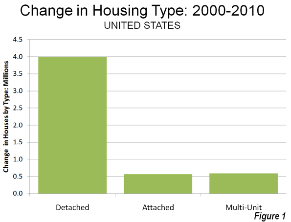
    In defiance of the conventional wisdom in the national media and among most planning professionals, Americans continue not only to prefer, but to move into single family detached houses. Data from the 2010 American Community Survey indicates that such housing attracted 79.2% of the new households in the 51 major metropolitan areas (over 1,000,000 population) over the past decade.

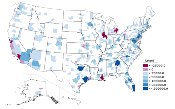
    In contrast households in multi-unit buildings (apartments and condominiums) represented 11.8% of the new housing, while two-unit attached housing represented 11.3% of the increase. There was a 2.3% decline in the "other" category of new housing, which includes mobile homes and boats. A total of 4 million net new occupied detached houses were added in the largest metropolitan areas, while there were 590,000 additional apartments and condominiums and 570,000 attached houses (Figure 1).

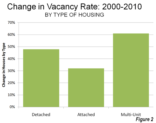
    Detached Vacancy Rate Rises Less than Multi-Unit: Another conventional assumption is that single family homes have been disproportionately abandoned by their occupants, particularly since the collapse of the housing bubble. This is also not true. In 2010 detached housing enjoyed a 92.4% occupancy rate in 2010 which is higher than the 89.4% occupancy rate in attached housing and 84.2% occupancy rate in multi-unit buildings. Because a more of the multi-unit housing is rental, it is to be expected that the vacancies would be the highest in this category. However, at the national level, overall vacancy rates rose the most in multi-unit housing, with an increase of 61%, from 10.7% in 2000 to 17.1% in 2010. The vacancy rate in detached housing rose at a slower rate, from 7.3% in 2000 to 10.7% in 2010, an increase of 48%. Attached housing – such as townshouses – have the slowest rise in vacancy rate, from 8.4% in 2000 to 11.0% in 2010, an increase of 32% (Figure 2).

    Detached and Attached Up in Most Markets, Apartments and Condominiums Down in Most: The move to detached housing was pervasive at the major metropolitan area level. Among the 51 largest metropolitan areas, the share of detached housing rose in 44 and declined in seven. The share of attached housing rose in 32 of the metropolitan areas, while declining in 19. Multi-unit housing experienced an increase in its market share in only three markets, while declining in 48.

    Largest Metropolitan Areas: Detached housing also increased more than attached housing and multi-unit housing in each of the nation’s five largest metropolitan areas.

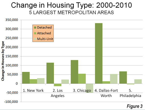
    • In the largest metropolitan area, New York, 51.9% of the new housing was detached. This is considerably more than the 36.9% detached market share in 2000. Multi-unit housing accounted for 24.1% of the increase in the market. This is a far smaller share than the 55.7% that multi-unit housing represented in 2000. Attached housing was 19.9% of the increase, nearly 3 times its 2000 share of 6.7%. This movement of New Yorkers to less dense housing forms is particularly significant, in view of the fact that New York has historically had the lowest share of lower density housing (detached and attached) and the highest share of multi-unit houses.
    • In the second largest metropolitan area, Los Angeles, 96.0% of the new housing was detached. This is nearly double the 49.7% that detached housing represented of the market in 2000. The balance of the new housing was split between a share of 18.6% for multi-unit housing and a loss of 11.8% in the attached housing. The share of new units represented by multi-unit houses was less one-half than its percentage of the market in 2000 (39.0%).
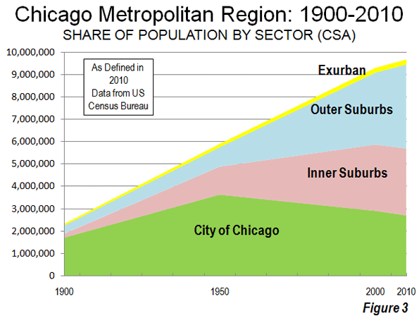
    • In the third largest metropolitan area, Chicago, 95.9% of the new housing was detached, well above the 52.5% share in 2000. There was a huge loss in apartment and condominium share, at 31% of the market, while attached housing captured 40.4% of the market.
    • In the fourth largest metropolitan area, Dallas Fort Worth, 84.3% of the new housing was detached, well above the 62.0% share in 2000. Multi-unit housing accounted for 13.5% of the increase, approximately one-half the 2000 market share. Attached housing represented 3.2% of the increase.
    • In the fifth largest metropolitan area, Philadelphia, 77.6% of new housing was detached, well above the 45.3% market share for detached housing in 2000. Apartments and condominiums accounted for 27.7% of the increase between 2000 and 2010, slightly more than the 2000 market share 23.7%. Attached housing represented a minus 4.3% of the new housing.

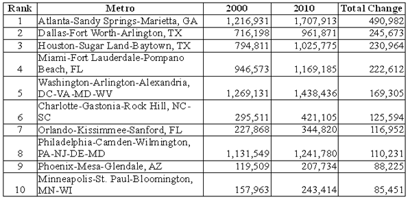
    Despite being only the fourth largest metropolitan area, Dallas-Fort Worth accounted for 46% of the new housing in the five largest metropolitan areas (Figure 3).

    The three largest metropolitan markets where there was an increase in multi-unit housing share were San Jose, New Orleans and Denver. In San Jose, 55.5% of new housing was multi-unit, while only 10.3 percent was detached. New Orleans had a similar 10.5% detached new housing share, while 65.8% of the new housing was multi unit. In Denver, 31.3% of the new housing was multi-unit, while 60.2% was detached.

    The share of detached housing also declined between 2000 and 2010 in Boston, Kansas City, Minneapolis-St. Paul and Portland. In each of these metropolitan areas, the share of attached housing increased, while the share of multi-unit housing decreased. Nonetheless, detached housing continued to attract a majority of new housing in Kansas City (70.8 percent) and Portland (56.6 percent). Despite Portland’s strong planning emphasis on high density housing, its share of multi-unit housing, and 26.8% between 2000 and 2010 was less than its 2000 market share of 27.5%, with a strong 20.6 percent share in attached housing. Attached housing also accounted for a comparatively large share of new housing in Boston (45.7 percent), Minneapolis-St. Paul (39.7 percent) and Kansas City (25.8 percent). The stronger densification policies that existed in Minneapolis-St. Paul until the middle of the decade may have artificially raised the share of attached new housing.

    Share by housing type data is provided for the major metropolitan areas in Tables 1 and 2.

    Table 1
    Occupied Housing by Major Metropolitan Area: 2000
    Metropolitan Area Detached Attached Multi-Unit Other
    Atlanta, GA 66.6% 3.5% 25.5% 4.4%
    Austin, TX 57.7% 3.7% 32.1% 6.6%
    Baltimore, MD 46.0% 28.5% 24.2% 1.3%
    Birmingham, AL 68.3% 2.6% 17.9% 11.2%
    Boston, MA-NH 48.9% 4.4% 45.4% 1.3%
    Buffalo, NY 60.0% 2.8% 35.1% 2.1%
    Charlotte, NC-SC 67.5% 3.4% 21.8% 7.3%
    Chicago, IL-IN-WI 52.5% 6.3% 40.1% 1.1%
    Cincinnati, OH-KY-IN 64.7% 3.6% 27.8% 3.9%
    Cleveland, OH 65.7% 5.5% 27.7% 1.2%
    Columbus, OH 62.8% 5.5% 29.1% 2.6%
    Dallas-Fort Worth, TX 62.0% 3.1% 30.3% 4.6%
    Denver, CO 60.9% 7.8% 29.0% 2.3%
    Detroit,  MI 70.5% 5.5% 20.7% 3.3%
    Hartford, CT 60.0% 5.2% 34.1% 0.8%
    Houston, TX 61.4% 3.6% 29.1% 6.0%
    Indianapolis. IN 68.4% 5.2% 23.2% 3.3%
    Jacksonville, FL 63.5% 3.9% 22.3% 10.3%
    Kansas City, MO-KS 71.3% 4.6% 21.4% 2.6%
    Las Vegas, NV 53.4% 6.0% 34.7% 5.9%
    Los Angeles, CA 49.7% 8.6% 39.6% 2.0%
    Louisville, KY-IN 70.7% 2.1% 22.2% 5.0%
    Memphis, TN-MS-AR 69.1% 3.8% 22.8% 4.2%
    Miami, FL 45.4% 9.9% 42.1% 2.6%
    Milwaukee,WI 55.7% 5.3% 38.3% 0.7%
    Minneapolis-St. Paul, MN-WI 62.8% 7.7% 27.4% 2.0%
    Nashville, TN 64.9% 4.4% 24.4% 6.2%
    New Orleans. LA 59.9% 7.7% 28.5% 3.9%
    New York, NY-NJ-PA 36.9% 6.5% 56.3% 0.4%
    Oklahoma City, OK 71.6% 3.1% 19.2% 6.0%
    Orlando, FL 61.5% 4.5% 25.1% 8.9%
    Philadelphia, PA-NJ-DE-MD 45.3% 29.8% 23.5% 1.4%
    Phoenix, AZ 61.6% 6.1% 24.9% 7.4%
    Pittsburgh, PA 68.8% 6.5% 20.4% 4.4%
    Portland, OR-WA 63.8% 3.3% 27.5% 5.5%
    Providence, RI-MA 54.3% 2.9% 41.6% 1.2%
    Raleigh, NC 63.6% 5.2% 21.5% 9.8%
    Richmond, VA 71.3% 4.9% 20.4% 3.4%
    Riverside-San Bernardino, CA 67.0% 5.1% 18.6% 9.3%
    Rochester, NY 65.7% 4.3% 26.5% 3.5%
    Sacramento, CA 66.1% 6.0% 24.0% 3.9%
    Salt Lake City, UT 67.0% 4.8% 25.4% 2.8%
    San Antonio, TX 67.4% 2.9% 22.2% 7.5%
    San Diego, CA 51.7% 9.4% 34.5% 4.4%
    San Francisco-Oakland, CA 50.3% 9.3% 39.1% 1.3%
    San Jose, CA 57.0% 9.1% 30.5% 3.4%
    Seattle, WA 60.2% 3.5% 31.6% 4.8%
    St. Louis,, MO-IL 70.2% 3.1% 21.9% 4.8%
    Tampa-St. Petersburg, FL 58.4% 4.6% 25.7% 11.4%
    Virginia Beach-Norfolk, VA-NC 61.4% 10.4% 25.2% 3.0%
    Washington, DC-VA-MD-WV 47.6% 19.4% 32.1% 0.8%
    Average (Weighted) 55.9% 7.5% 33.3% 3.3%
    Data from 2000 Census
    Metropolitan areas over 1,000,000 population as defined in 2010


    Table 2
    Occupied Housing by Major Metropolitan Area: 2010
    Metropolitan Area Detached Attached Multi-Unit Other
    Atlanta, GA 69.2% 5.3% 22.7% 2.7%
    Austin, TX 60.4% 2.6% 31.8% 5.1%
    Baltimore, MD 47.4% 27.3% 24.2% 1.1%
    Birmingham, AL 70.8% 2.4% 16.8% 10.0%
    Boston, MA-NH 48.7% 5.9% 44.2% 1.2%
    Buffalo, NY 62.3% 2.9% 33.0% 1.8%
    Charlotte, NC-SC 68.9% 5.1% 20.4% 5.6%
    Chicago, IL-IN-WI 54.2% 7.6% 37.1% 1.1%
    Cincinnati, OH-KY-IN 68.9% 4.8% 23.2% 3.1%
    Cleveland, OH 68.7% 5.1% 25.1% 1.1%
    Columbus, OH 64.1% 7.3% 26.6% 2.1%
    Dallas-Fort Worth, TX 65.9% 3.1% 27.4% 3.6%
    Denver, CO 60.8% 7.9% 29.4% 1.9%
    Detroit,  MI 71.6% 6.3% 19.1% 2.9%
    Hartford, CT 60.9% 5.3% 33.1% 0.7%
    Houston, TX 65.1% 3.5% 26.0% 5.3%
    Indianapolis. IN 71.3% 5.0% 21.1% 2.6%
    Jacksonville, FL 66.3% 4.8% 21.3% 7.6%
    Kansas City, MO-KS 71.3% 6.4% 20.1% 2.2%
    Las Vegas, NV 60.9% 5.4% 29.9% 3.8%
    Los Angeles, CA 51.0% 8.0% 39.0% 1.9%
    Louisville, KY-IN 71.6% 3.6% 20.9% 4.0%
    Memphis, TN-MS-AR 72.5% 3.3% 20.4% 3.7%
    Miami, FL 47.0% 10.8% 40.0% 2.1%
    Milwaukee,WI 56.2% 6.5% 36.5% 0.8%
    Minneapolis-St. Paul, MN-WI 61.5% 11.0% 25.9% 1.6%
    Nashville, TN 67.2% 5.6% 22.3% 4.9%
    New Orleans. LA 65.1% 6.1% 24.6% 4.2%
    New York, NY-NJ-PA 37.2% 6.7% 55.7% 0.4%
    Oklahoma City, OK 74.3% 3.0% 17.1% 5.6%
    Orlando, FL 64.1% 5.5% 23.4% 6.9%
    Philadelphia, PA-NJ-DE-MD 46.6% 28.5% 23.7% 1.3%
    Phoenix, AZ 67.2% 4.8% 22.2% 5.8%
    Pittsburgh, PA 69.4% 7.5% 19.1% 4.0%
    Portland, OR-WA 62.8% 5.5% 27.4% 4.3%
    Providence, RI-MA 55.7% 3.7% 39.6% 1.0%
    Raleigh, NC 65.4% 8.0% 20.5% 6.2%
    Richmond, VA 73.2% 4.9% 19.0% 3.0%
    Riverside-San Bernardino, CA 70.7% 4.3% 17.1% 7.9%
    Rochester, NY 66.9% 4.8% 25.3% 2.9%
    Sacramento, CA 68.8% 5.6% 22.6% 3.0%
    Salt Lake City, UT 67.8% 6.1% 23.9% 2.2%
    San Antonio, TX 70.8% 2.2% 21.1% 5.9%
    San Diego, CA 53.0% 9.0% 34.5% 3.5%
    San Francisco-Oakland, CA 50.7% 9.4% 38.8% 1.1%
    San Jose, CA 54.3% 10.7% 32.0% 3.0%
    Seattle, WA 60.5% 4.2% 31.5% 3.8%
    St. Louis,, MO-IL 70.8% 4.2% 21.1% 3.9%
    Tampa-St. Petersburg, FL 59.6% 5.6% 24.7% 10.1%
    Virginia Beach-Norfolk, VA-NC 62.5% 11.1% 24.0% 2.5%
    Washington, DC-VA-MD-WV 48.1% 19.6% 31.7% 0.7%
    Average (Weighted) 57.8% 7.9% 31.5% 2.8%
    Data from 2010 American Community Survey
    Metropolitan areas over 1,000,000 population as defined in 2010


    In Housing, Preference Trumps Policy: The trend of the last decade is evidence of a continued preference of American households for detached housing. The results are remarkable for at least two reasons:

    • The first is that there have been unprecedented policy initiatives to discourage, if not to prohibit the building of new detached houses. It seems likely that the miniscule new detached housing share in San Jose, for example, is a direct result of that metropolitan area’s virtual prohibition of new detached housing, rather than any evidence that households have begun to prefer higher density housing. A small detached housing share in the face of a strong public policy bias toward higher density housing says nothing about preferences.
    • Second; the media and wishful advocates of denser settlement patterns have continuously referred to detached housing as having been severely overbuilt during the housing bubble, while suggesting an imperative for households to move into multiunit, often rented housing. The new data, with the larger increase in multi-unit vacancy rates, indicates that there was at least as much overbuilding in more dense housing types as there was in detached housing.

    Despite the expressed preferences of planners, academics and even many builders, American households continue to make their own decisions about housing.

    Wendell Cox is a Visiting Professor, Conservatoire National des Arts et Metiers, Paris and the author of “War on the Dream: How Anti-Sprawl Policy Threatens the Quality of Life

    Lead photo: Houses in Los Angeles. Photograph by author.

  • Major Metropolitan Commuting Trends: 2000-2010

    As we indicated in the last article, solo automobile commuting reached an all time record in the United States in 2010, increasing by 7.8 million commuters. At the same time, huge losses were sustained by carpooling, while the largest gain was in working at home, which includes telecommuting. Transit and bicycling also added commuters.  This continues many of the basic trends toward more personalized employment access that we have seen since 1960.

    Solo Automobile Commuting: Among the nation’s 51 metropolitan areas with more than 1 million population, 38 experienced increases in solo automobile commuting between 2000 and 2010. More than 80% of commuting is by solo automobile in 25 of the 51 largest metropolitan areas, with the highest rates being in Birmingham, Detroit, Cincinnati, Indianapolis and Kansas City. Another 28 metropolitan areas have single automobile commute shares of between 70% and 80%, with Boston, Washington and San Francisco between 60% and 70%. As would be expected, the lowest solo automobile commute share was in New York at 51%.

    Car Pools: The national data also showed a nearly 2.4 million loss in carpool use. The losses were pervasive, occurring in all 51 metropolitan areas. Riverside-San Bernardino had the highest carpool market share at just under 15%, while all other major metropolitan areas were below 12%. Car pools have been losing market share for decades.

    Work at Home (Includes Telecommuting): In what we have previously labeled as The Decade of the Telecommute, the nation experienced a 1.7 million increase in working at home over the past decade. The market share gains in working at home were as pervasive as the losses in carpooling, with all 51 metropolitan areas registering increases. Austin had the strongest work-at-home market share, at 7.3%, followed by Portland at 6.5%, San Francisco and Denver at 6.2%, Phoenix at 6.0%, with San Diego, Raleigh and Atlanta above 5.5%. Overall, working at home exceeded transit commuting in 37 major metropolitan areas out of 51 in 2010, up from 27 in 2000. Three metropolitan areas had work at home market shares of less than 3%, including Memphis, New Orleans and last place Buffalo.

    Transit: As noted before, transit enjoyed its first 10 year gain since journey to work data was first collected by the Census Bureau 50 years ago. Overall, transit added 900,000 daily commuters, roughly half that for telecommuters. Transit’s market share increased in 25 of the top 51 metropolitan areas. It is also notable that in a number of the metropolitan areas with the largest expenditures for new rail systems, there were either losses or commuting gains were concentrated in the more flexible bus services.

    New York: As so often has been the case, transit was largely a "New York story." More than one half of the new transit commuters were in the New York metropolitan area, more than 450,000 of the 900,000 increase. New York boasts by far the most extensive transit system in the nation, which serves the second largest central business district in the world and by far the nation’s most important. In 2000, New York had a transit work trip market share of 27.4%. By 2010, New York’s transit work trip market share had risen to 30.7%, more than double that of any other metropolitan area. More than 70% of the new transit commuters in the New York area were on its subway (Metro), suburban rail and light rail systems.

    San Francisco: San Francisco retained its position as the second strongest transit metropolitan area, with a 14.6% work trip market share in 2010. This is up from 13.8% in 2000.

    Washington: Washington was the third strongest transit commuting market, with a 14.0% work trip market share in 2010. This modest increase from 13.4% nonetheless produced the second largest ridership increase in the nation, at more than 130,000. This reflects the strength of Washington’s job market over the decade. Rail ridership accounted for 53% of this increase, while buses accounted for the other 47%.

    Boston and Chicago: Boston passed Chicago to become the fourth strongest transit market, at 11.8% in 2010. This is an increase from 11.2% in 2000. Chicago ranked fifth at 11.2%, a small reduction from the 11.3% in 2000.

    Los Angeles: Los Angeles had the third largest increase in transit commuting, adding 60,000 daily transit commuters. Approximately 75% of these new commuters were attracted by the region’s extensive bus system as opposed to its very expensive but limited rail system. This increase placed Los Angeles in a virtual tie with Portland, with a work trip market share of 6.2%.

    Portland: Portland continued to experience its now 30 year transit market share erosion, despite having added three new light rail lines between 2000 and 2010. Portland’s transit work trip market share fell to 6.2% from 6.3% and now trails the work at home and telecommute market share of 6.5%.

    Seattle:Seattle added 29,000 new transit commuters for the fourth strongest growth in the nation. Approximately 75% of the new commuters were on the metropolitan area’s bus system.

    Atlanta: Atlanta, which is home to the third largest postwar Metro system in the nation (MARTA) gained nearly 9000 new transit commuters, all of them on the bus, while losing more than 3000 rail commuters.

    Miami:Miami added 16,000 new transit commuters, though more than 90% were attracted to the bus system, rather than the rail services.

    Rail and Bus in Texas: Other metropolitan areas with new and expanded rail systems did not fare as well. In Dallas-Fort Worth, the light rail system was more than doubled in length, yet there was a reduction of more than 3000 daily transit commuters. The transit work trip market share in Dallas-Fort Worth dropped from 1.8% to 1.4%, approximately one quarter lower than that of any other major metropolitan area with a new light rail or Metro system. Houston, which built its first light rail line during the period, lost nearly 3000 daily transit commuters, with its transit work trip market share dropping by nearly one-third, from 3.2% to 2.3%. By contrast, the third largest metropolitan area in Texas, San Antonio, lost no commuters from its bus only transit system.

    Other New Rail Metropolitan Areas: Other metropolitan areas with new rail systems experienced modest ridership increases, with 60 to 70 percent of the increase on the bus systems in Charlotte, Minneapolis-St. Paul and Phoenix. Salt Lake City experienced a small decline in transit commuting.

    Below 1 Percent: Four metropolitan areas had transit work trip market shares of less than 1%, including Indianapolis, Raleigh, Birmingham and last place Oklahoma City, with a market share of 0.4%.

    Bicycles: It was also a good decade for bicycle commuting, with the national increase of nearly 250,000. The bicycle commuting market share rose in 45 of the 51 largest metropolitan areas. Portland had the highest bicycle market share at 2.2%, with three other metropolitan areas at 1.5% or above, Sacramento, San Francisco and San Jose. The lowest bicycle commuting market shares were in San Antonio, Cincinnati, Birmingham and Memphis, all at 0.1 percent.

    Walking: There was little change in walking among the nations major metropolitan areas. The largest shares were in New York (5.9%) and Boston (5.4%), with the smallest shares in Raleigh (1.1%), Orlando (1.1%) and Birmingham (1.0%).

    Drifting Away from Shared Commuting: In some ways, the 2000s were different than previous decades, especially with the reversals in bicycle commuting and transit. However, overall, shared ride commuting (transit and car pools) lost share due to the precipitous decline in car pooling. Longer term share increase trends also continued in single-occupant automobile commuting and working at home. The bottom line: personal employment access (personal mobility plus working at home) continues to carve away at the smallish share still held by shared commuting.

    ————-

    Data: The 2000 and 2010 commuting market shares by mode are shown in Tables 1 and 2 (2010 metropolitan area boundaries).

    ————

    Table 1
    Work Trip Market Share: 2000
    Metropolitan Areas Over 1,000,000 Population in 2010
    Metropolitan Area Car, Truck or Van: Alone Car/Van Pool Transit Bicycle Walk Other Work at Home (Includes Telecommute)
    Atlanta 77.0% 13.7% 3.4% 0.1% 1.3% 1.1% 3.5%
    Austin 76.5% 13.7% 2.5% 0.6% 2.1% 1.1% 3.6%
    Baltimore 75.5% 11.5% 5.9% 0.2% 2.9% 0.9% 3.2%
    Birmingham 83.3% 12.0% 0.7% 0.1% 1.2% 0.7% 2.1%
    Boston 71.1% 8.6% 11.2% 0.5% 4.6% 0.8% 3.3%
    Buffalo 81.7% 9.4% 3.3% 0.2% 2.7% 0.5% 2.1%
    Charlotte 80.7% 12.8% 1.4% 0.1% 1.2% 0.8% 2.9%
    Chicago 70.4% 11.0% 11.3% 0.3% 3.1% 1.0% 2.9%
    Cincinnati 81.3% 10.1% 2.8% 0.1% 2.3% 0.6% 2.7%
    Cleveland 81.3% 8.8% 4.1% 0.2% 2.2% 0.6% 2.7%
    Columbus 82.1% 9.7% 2.1% 0.2% 2.3% 0.6% 3.0%
    Dallas-Fort Worth 78.7% 13.9% 1.8% 0.1% 1.5% 1.0% 3.0%
    Denver 76.0% 11.7% 4.4% 0.4% 2.1% 0.8% 4.6%
    Detroit 84.7% 9.2% 1.7% 0.1% 1.4% 0.6% 2.2%
    Hartford 82.6% 8.7% 2.8% 0.2% 2.5% 0.6% 2.6%
    Houston 77.0% 14.3% 3.2% 0.3% 1.6% 1.1% 2.5%
    Indianapolis 82.8% 10.4% 1.3% 0.2% 1.7% 0.7% 3.0%
    Jacksonville 80.3% 12.6% 1.3% 0.5% 1.7% 1.4% 2.3%
    Kansas City 82.6% 10.6% 1.2% 0.1% 1.4% 0.7% 3.5%
    Las Vegas 74.6% 14.7% 4.4% 0.5% 2.3% 1.3% 2.3%
    Los Angeles 71.9% 14.6% 5.6% 0.7% 2.7% 1.0% 3.5%
    Louisville 81.8% 11.2% 2.0% 0.2% 1.7% 0.7% 2.5%
    Memphis 80.7% 13.3% 1.6% 0.1% 1.3% 0.9% 2.2%
    Miami-West Palm Beach 77.3% 13.1% 3.2% 0.5% 1.7% 1.2% 3.1%
    Milwaukee 79.7% 9.9% 4.2% 0.2% 2.9% 0.6% 2.6%
    Minneapolis-St. Paul 78.3% 10.0% 4.4% 0.4% 2.4% 0.6% 3.8%
    Nashville 80.5% 13.1% 0.8% 0.1% 1.5% 0.8% 3.2%
    New Orleans 72.9% 14.6% 5.4% 0.6% 2.7% 1.3% 2.4%
    New York 52.7% 9.3% 27.4% 0.3% 6.0% 1.5% 2.9%
    Oklahoma City 81.6% 12.1% 0.5% 0.2% 1.7% 1.0% 2.9%
    Orlando 80.6% 12.1% 1.6% 0.4% 1.3% 1.1% 2.9%
    Philadelphia 73.1% 10.2% 8.9% 0.3% 3.9% 0.7% 2.9%
    Phoenix 74.6% 15.3% 1.9% 0.9% 2.1% 1.4% 3.7%
    Pittsburgh 77.5% 9.8% 5.9% 0.1% 3.6% 0.6% 2.5%
    Portland 73.1% 11.5% 6.3% 0.8% 2.9% 0.8% 4.6%
    Providence 80.7% 10.5% 2.4% 0.2% 3.3% 0.8% 2.2%
    Raleigh 80.8% 12.1% 0.9% 0.2% 1.6% 1.0% 3.5%
    Richmond 81.7% 10.9% 1.9% 0.2% 1.8% 0.8% 2.7%
    Riverside-San Bernardino 73.5% 17.6% 1.6% 0.5% 2.2% 1.2% 3.5%
    Rochester 81.7% 9.1% 2.0% 0.2% 3.5% 0.6% 2.9%
    Sacramento 75.3% 13.5% 2.7% 1.4% 2.2% 0.9% 4.0%
    Salt Lake City 76.0% 13.4% 3.3% 0.5% 2.1% 0.7% 4.0%
    San Antonio 76.2% 14.9% 2.7% 0.1% 2.4% 1.2% 2.6%
    San Diego 73.9% 13.0% 3.3% 0.6% 3.4% 1.4% 4.4%
    San Francisco-Oakland 62.8% 12.7% 13.8% 1.1% 3.9% 1.3% 4.3%
    San Jose 77.2% 12.4% 3.4% 1.2% 1.8% 0.9% 3.1%
    Seattle 71.6% 12.7% 7.0% 0.6% 3.1% 0.8% 4.2%
    St. Louis 82.5% 10.0% 2.2% 0.1% 1.7% 0.6% 2.9%
    Tampa-St. Petersburg 79.7% 12.4% 1.3% 0.6% 1.7% 1.2% 3.1%
    Virginia Beach-Norfolk 78.8% 12.1% 1.7% 0.3% 2.7% 1.6% 2.7%
    Washington 67.5% 13.4% 11.2% 0.3% 3.0% 0.9% 3.7%
    Top 51 Metropolitan Areas 73.2% 11.8% 7.5% 0.4% 2.9% 1.0% 3.2%
    Calculated from Census Bureau data
    Metropolitan areas as defined in 2010
    Table 2
    Work Trip Market Share: 2010
    Metropolitan Areas Over 1,000,000 Population in 2010
    Car, Truck or Van: Alone Car/Van Pool Transit Bicycle Walk Other Work at Home (Includes Telecommute)
    Atlanta 77.6% 10.3% 3.4% 0.2% 1.3% 1.5% 5.8%
    Austin 75.6% 10.5% 2.3% 0.6% 1.9% 1.8% 7.3%
    Baltimore 76.5% 9.6% 6.0% 0.2% 2.6% 1.0% 4.1%
    Birmingham 84.8% 10.0% 0.6% 0.1% 1.0% 0.5% 3.1%
    Boston 69.5% 7.5% 11.8% 0.7% 5.4% 0.8% 4.4%
    Buffalo 82.0% 7.5% 3.8% 0.3% 3.0% 1.1% 2.3%
    Charlotte 80.6% 10.0% 2.0% 0.2% 1.5% 0.6% 5.1%
    Chicago 71.0% 8.5% 11.2% 0.6% 3.1% 1.0% 4.5%
    Cincinnati 84.1% 7.9% 2.1% 0.1% 2.0% 0.4% 3.4%
    Cleveland 82.3% 7.2% 3.6% 0.3% 2.2% 0.7% 3.7%
    Columbus 82.4% 8.0% 1.7% 0.5% 2.3% 0.6% 4.6%
    Dallas-Fort Worth 81.3% 10.1% 1.4% 0.2% 1.2% 1.4% 4.6%
    Denver 76.3% 9.6% 4.1% 0.8% 1.9% 1.1% 6.2%
    Detroit 84.6% 8.5% 1.5% 0.2% 1.4% 0.8% 3.0%
    Hartford 81.5% 7.9% 3.1% 0.3% 3.0% 1.0% 3.2%
    Houston 79.4% 11.5% 2.3% 0.3% 1.4% 1.7% 3.4%
    Indianapolis 83.9% 8.2% 0.9% 0.3% 1.5% 0.8% 4.3%
    Jacksonville 82.5% 8.9% 1.0% 0.5% 1.4% 1.2% 4.5%
    Kansas City 83.7% 8.5% 1.2% 0.2% 1.4% 0.9% 4.1%
    Las Vegas 78.9% 10.5% 3.8% 0.6% 1.6% 1.3% 3.3%
    Los Angeles 73.5% 10.7% 6.2% 0.9% 2.6% 1.2% 5.0%
    Louisville 83.5% 9.2% 1.9% 0.2% 1.3% 0.9% 3.1%
    Memphis 83.6% 10.3% 1.0% 0.1% 1.5% 0.9% 2.7%
    Miami-West Palm Beach 78.8% 9.4% 3.5% 0.6% 2.0% 1.4% 4.4%
    Milwaukee 80.1% 9.3% 3.4% 0.5% 2.6% 0.7% 3.4%
    Minneapolis-St. Paul 78.3% 7.9% 4.8% 0.7% 2.4% 0.9% 4.9%
    Nashville 81.3% 10.7% 1.0% 0.2% 1.2% 1.0% 4.6%
    New Orleans 78.1% 11.0% 3.2% 0.7% 2.6% 1.9% 2.5%
    New York 50.5% 6.8% 30.7% 0.5% 5.9% 1.6% 3.9%
    Oklahoma City 82.7% 10.6% 0.5% 0.3% 1.6% 1.0% 3.4%
    Orlando 82.1% 9.2% 1.6% 0.3% 1.1% 1.4% 4.4%
    Philadelphia 73.9% 8.0% 9.6% 0.5% 3.5% 0.8% 3.8%
    Phoenix 76.7% 11.8% 2.0% 0.6% 1.5% 1.5% 6.0%
    Pittsburgh 77.0% 8.9% 5.6% 0.3% 3.7% 0.9% 3.5%
    Portland 72.1% 8.8% 6.2% 2.2% 3.3% 0.9% 6.5%
    Providence 81.3% 8.3% 2.6% 0.5% 3.2% 0.9% 3.2%
    Raleigh 82.0% 8.7% 0.9% 0.3% 1.1% 1.1% 5.9%
    Richmond 81.2% 10.1% 1.8% 0.4% 1.2% 0.7% 4.6%
    Riverside-San Bernardino 76.1% 14.8% 1.7% 0.4% 1.8% 1.4% 3.8%
    Rochester 82.6% 7.1% 1.8% 0.4% 3.9% 0.7% 3.6%
    Sacramento 75.6% 11.2% 2.9% 1.7% 1.9% 1.1% 5.5%
    Salt Lake City 77.7% 11.3% 2.9% 0.8% 2.3% 1.0% 4.0%
    San Antonio 79.5% 11.5% 2.1% 0.1% 2.0% 1.4% 3.3%
    San Diego 76.2% 10.1% 3.3% 0.8% 2.8% 1.0% 5.9%
    San Francisco-Oakland 61.5% 10.6% 14.6% 1.7% 4.2% 1.2% 6.2%
    San Jose 77.5% 10.3% 2.9% 1.6% 1.8% 0.9% 5.1%
    Seattle 70.5% 10.2% 8.2% 1.1% 3.5% 1.0% 5.5%
    St. Louis 83.0% 7.7% 2.6% 0.2% 1.9% 0.8% 3.7%
    Tampa-St. Petersburg 80.3% 9.5% 1.6% 0.8% 1.4% 1.4% 5.0%
    Virginia Beach-Norfolk 80.9% 9.4% 1.8% 0.5% 3.3% 0.9% 3.1%
    Washington 65.6% 10.6% 14.0% 0.5% 3.5% 1.0% 4.9%
    Top 51 Metropolitan Areas 73.7% 9.4% 7.9% 0.6% 2.8% 1.2% 4.4%
    Calculated from Census Bureau data
    Metropolitan areas as defined in 2010

    Wendell Cox is a Visiting Professor, Conservatoire National des Arts et Metiers, Paris and the author of “War on the Dream: How Anti-Sprawl Policy Threatens the Quality of Life

    Photo: Manhattan (New York), with the Woolworth Building in the distance (by author)

  • A Century of Change in the US Black Population, 1910 to 2010

    2010 was the 100th anniversary of the start of the “Great Migration” of the “Negro” population to northern cities from the mainly rural South. The midway point occurred in 1960 when black urban population was beginning to peak.   

    Since then redistribution had taken several forms. First, we see some return migration to the South, but to metropolitan, but not to the rural small town “Black Belt” of the past but to the sprawling metropolitan regions. Second, there is a decline of black population in metropolitan core cities and counties because of suburbanization. Third, we see a more dispersed growth of the Black population to a wider set of large metropolitan areas across the country.

    In this essay I map and discuss first state level change in the Black population for 1910, 1960 and 2010, then concentrate on US counties which were majority Black in 1910, 1960 or 2010 or housed over 100,000 Black population in 2010, whatever the share. Special note is made of counties which were majority in combinations of the three times, 1910, 1960 and 2010.

    For states I map and discuss change for two critical 50 year periods, 1910 through 1960 and 1960 through 2010. The first encloses both the Great Migration from World War One and the equally large migration from south to north and west in World War II still firmly within the unreconstructed Jim Crow segregation era.  The past 50 years coincides with the rise of the South economically and demographically. Changes wrought by the Civil Rights Revolution brought the at least formal achievement of greater equality—culminated symbolically by the election of a Black President.

    In 1910 the South had 8.75 million of nation’s 9.83 million “Negroes”, an 89 percent share. By 1960 the southern share had fallen to under 60%  with 11.31 of 18.97 million Black population. By 2010 the South had 22 of 39 million Blacks, for 56 percent, still a sizeable majority.

    For 1910 to 1960 absolute and relative changes are depicted in Figure 1. In absolute numbers New York gained the most, 1.3 million, but California and especially Michigan  had the highest rates of growth, with 40 times their 1910 population in 1960. The largest   absolute gains, after New York, were in Illinois (Chicago), California, Michigan, Ohio and Pennsylvania.  Note that the highest growth was in industrial belt states.  In the South, Texas, Louisiana, North Carolina and Virginia – growing and industrializing – experience growth but at modest rates as Black people moved to the growing cities. The Deep South states, with the highest Black shares in 1910, Arkansas, Mississippi, South Carolina, Georgia and even Kentucky experienced absolute losses of Black people over the 50 years.

    For 1960 to 2010, changes are depicted in Figure 2, The highest rates of growth were in states historically very low in Black shares, as Minnesota, Utah, Arizona, New Hampshire and Vermont, with fairly large numbers for Minnesota, Arizona, the Dakotas and Nevada. Remarkably high rates and amounts of growth ocurred in Florida and Maryland (suburbanization from Washington, DC) and substantial growth occurred in the metropolitan dynamos of the South, Georgia (Atlanta) and Texas (especially Houston).

    Growth slowed in mostof the northern industrial belt. Only West Virginia experienced a decline in the Black population (Washington DC lost via gentrification and Black suburbanization). The percent Black fell in AL, AR, DC, MS, NC, SC, VA and WV, most of the South, and even in FL and TX, despite large absolute gains. The highest increase in the Black population (number of times higher) were in mainly white NV, MN, VT and ND.

    Over the full century, among the 27 states with the largest total Black population, the highest rates of change were for Wisconsin, California, Michigan, Connecticut and New York, and the highest absolute growth were in New York, Florida, Texas and California. The lowest   rate was for Arkansas, barely above the 1910 level, followed by Kentucky and Mississippi.

    I do offer two maps at the county level for Black population change 1960 to 2010, but only for a select set of 359 counties, those with a majority Black in 1910, 1960 or 2010, or with at least 100,000 Black persons in 2010.

    As can be seen from the map, all counties (288) with a majority Black at one or more of the three times (1910, 1960 or 2010) are located in the South, including 18 which also had over 100,000 Black persons in 2010  Of the 71 counties that were never a majority Black but had over 100,000 Black population in 2010, 30 more are in the South. Those outside the South (42) are basically the rest of the country’s largest metropolitan counties.

    The majority Black counties define the traditional “Black Belt” of slavery and plantation agriculture across the US South from east Texas to Maryland. The micro-geography of Black majority counties is amazingly unchanged. The dominant areas: the Mississippi Delta and the states Alabama, Georgia, South Carolina, North Carolina and Virginia show cores of 177 counties that have had a Black majority in all three censuses, surrounded by a set of 66 with a Black majority in two of the three census counts, and at the fringe the 128 counties which had a Black majority only in 1910.

    The only area with over 100,000 Black persons and with a Black majority in 1960 and 2010 was Washington, DC, the only one in 1910 and 2010 was Hinds county (Jackson, Mississippi), and the only in all three censuses was Montgomery, Alabama, all government-centered  cities in the South,

    But although the South is still dominant, most of the largest absolute totals are outside the South. New York City alone has over 2 million Black persons, Cook county (Chicago) 1.3 million, Los Angeles, 857,000. Southern metropolises are increasingly important. Harris County Texas (Houston), for example, has more African-Americans (775,000) than Detroit or Philadelphia. Suburban Prince George, MD, 557,000, Dallas, 528,000 and Miami-Dade, 473,000 and Fulton (Atlanta, 466,000, plus 376,000 in De Kalb) all contain large black populations. Only in the South are there high Black populations in rural, small town to small city counties typically in the traditional areas. In the North, Black persons are highly concentrated in the largest core metropolitan counties. Metropolitan Black populations have grown greatly in the South as well, including more suburbanization than in the North.

    Conclusion
    The overall story of the American Black population is one of great change and of continuity—a dramatic spread from the rural South to the large metropolitan North, followed more recently by a partial return to the South’s expanding metropolitan areas. It also reflects growing suburbanization in both the North and the South, and a moderate spread to metropolitan areas in less traditionally Black parts of the country.

    Richard Morrill is Professor Emeritus of Geography and Environmental Studies, University of Washington. His research interests include: political geography (voting behavior, redistricting, local governance), population/demography/settlement/migration, urban geography and planning, urban transportation (i.e., old fashioned generalist).

  • Suburbanized Core Cities

    The suburbs of major metropolitan areas captured the overwhelming majority of population growth between 2000 and 2010, actually increasing their share of growth, as has been previously reported. However, it is often not understood that much of the recent central city (Note 1) growth has actually been suburban in nature, rather than core densification. In fact, historical core cities (Note 2) vary substantially. In some cases, core cities are largely pre-war and transit oriented, such as New York, Chicago and San Francisco. In other cases, much of historical core city is automobile oriented suburban in character. This article provides a classification of historical core cities based upon the extent of their pre-automobile cores as well as population and land area data.

    Central Cities before World War II: Auto-oriented suburbanization began before the Great Depression.  In 1940, transit’s urban market share in the United States appears to have been higher than that of Western Europe today (Note 3). Each of the nation’s largest metropolitan areas (then called "metropolitan districts") boasted a strong, dense core, and could be generally delineated by the city limits of the largest municipality.

    In the years after the Second World War, many cities annexed considerable territory. At the same time, a number of new major metropolitan areas emerged which effectively lacked a dense core. For the purposes of analysis, the historical core cities of the 51 major metropolitan areas (those with more than 1,000,000 population) have been divided into three categories, based upon the extent of the suburban development within their borders. The categories are defined in Table 1 and data is provided in Tables 2 and 3 in the attached PDF document.

    Table 1
    Classification of Historical Core Municipalities

    Nature of Historical Core Municipality:
    Classification based upon 2010 City Limits

    Large Urban Core in 1940?

    2010
    City Limits

      Pre-War & Non-Suburban

    Yes

     Is pre-war core; nearly all included land area was developed by 1940. Little development that is post-war suburban in character. Little or no change in boundaries since 1940.

      Pre-War  & Suburban

    Yes

    Includes pre-war core, however contains substantial development that is post-war suburban in character (2010 boundaries contain substantial areas that were greenfield in 1940)

      Post War & Suburban

    No

    Has smaller pre-war core: less than 100,000 population in 1940 and nearly all development is post-war suburban in character.

    The historical core municipality is the municipality with the largest 1940 population in the present metropolitan area (metropolitan statistical area).
    There can be more than one historical core municipality in a metropolitan area, with the exception below.
    There can be a second historical core municipality if (1) it is adjacent to a historical core municipality classified as "Pre-War  & Non-Suburban," (2) had a 1940 population at least 25 percent of the first historical core municipality and (3) a population density of at least 5,000 per square mile.
    Multiple municipality names listed in some other metropolitan areas for reference purposes.

    Pre-War & Non Suburban: The first category is the "Pre-War & Non Suburban" historical core cities. Each of these 19 cities is itself a pre-automobile core. City boundaries have changed little since before World War II and nearly all land was developed at that time (Note 3).

    Overall, these cities had a population density of 11,900 per square mile in 2010 (Figure 1). However, 16 of the cities have lost population since 1940, with only New York, San Francisco and Oakland having gained population, albeit very modestly. (Oakland lost population over the past decade.) Between 2000 and 2010 the "Pre-War & Non Suburban" historical core cities lost 424,000 people, or 2.2 percent of their population (Figures 2 and 3). Seven gained population, though in five of these cases (Boston, Hartford, Philadelphia, Providence and Washington) the 2010 population remained well below mid-century levels.

    Pre-War & Suburban: The second category is the "Pre-War & Suburban" historical core cities. These 27 cities had pre-automobile cores, usually quite small, in 1940, but also include (in their 2010 borders) substantial land that was undeveloped in 1940. Substantial automobile-oriented suburban development has occurred in these areas. The strong automobile oriented suburban influence is indicated by the average population density of 2900 people per square mile of land area, approximately one-fourth the density in the "Pre-War & Non Suburban" category.

    On average, the 2010 land area of the "Pre-War & Suburban" historical core cities is 3.2 times the land area of the corresponding urban areas in 1950 (areas of continuous development or the "urban footprint"). These urban areas included both the historical core city and the suburbs (Note 4).   The city of Jacksonville covers the most land area relative to its 1950 urban area, at 14.7 times. The city of Portland, the recipient of frequent praise by advocates of densification, covered more area in 2010 than its entire urban area in 1950 and its population density today is less than that of the entire urban area in 1950.

    The "Pre-War & Suburban" historical core cities added 1,520,000 people between 2000 and 2010. This translates into an average growth of 7.8 percent relative to the 2000 population. Three cities grew more than 100,000. Louisville added 341,000 people principally through a city – county merger, after its previous annexations had failed to stop its population decline. Between 1950 and 2000, Louisville has lost nearly one-third of its population while adding more than 50 percent to its land area.

    Charlotte added 191,000 people, principally due to a continuing annexation program. San Antonio and Houston took advantage of considerable undeveloped land within their city limits to add 183,000 and 146,000 people respectively.

    Post-War & Suburban:  The third category is the "Post-War & Suburban" historical core cities. None of these seven cities had more than 100,000 population in 1940 or a large pre-automobile core; these are essentially suburbanized cities.  In each case, the cities have undertaken huge annexations. On average, the 2010 city limits include nearly 6 times as much land as the corresponding urban areas in 1950. The city of San Jose, known for its densification policies, covers nearly 3 times as much land as its entire urban area in 1950, which included the city and all of the suburbs (Figure 4).

    The "Post-War & Suburban" historical core cities added 619,000 people between 2000 and 2010, for an increase rate of 15.5 percent, the largest percentage growth of the three categories.

    Perhaps surprisingly the population density of the "Post-War & Suburban" historical core cities was one-quarter above that of the "Pre-War & Suburban" category, at 3700 per square mile. This may be at least partially driven cities like San Jose, Las Vegas and Riverside-San Bernardino, which have generally avoided planning that required larger lots and below market densities.

    The cities of Philadelphia and Phoenix reflect these differing patterns.   In 2010 Philadelphia had a population density of more than 11,300 people per square mile and covered an area of 135 square miles. The city of Phoenix had a population density of under 3000 people per square mile and covered more than 500 square miles. Not even one square mile of the 2010 city of Phoenix equals the average density of Philadelphia. In 1940, Philadelphia had a population of 1.9 million, 30 times that of the 65,000 in Phoenix.

    As would be expected in a dense historic core city, Philadelphia has a substantial transit work trip market share, at 25 percent. This is five times that of the surrounding suburbs (5 percent). In contrast, the city of Phoenix has s a transit work trip market share of only three percent, below that of the Philadelphia suburbs. 

    Suburban Development Makes Cities Grow: As the data above indicates, virtually all net core city population growth over the past decade has been suburban in nature. Core cities characterized by substantial automobile-oriented suburbanization added more than 2.1 million residents, while the cities with little   automobile-oriented suburbanization lost more than 400,000. It turns out that even most “core” cites are more suburban than many imagine.

    ——————–

    Note 1: "City" has multiple meanings and analysts have not always provided  sufficient clarity when using the term. For example, "city" can mean a metropolitan area, and urban area, a municipality (incorporated jurisdiction) or as in China, a region either at the provincial or sub-provincial level. As used in this article, the term "city" means a municipality unless otherwise indicated.

    Note 2: The historical core city is the city in the present metropolitan area that had the largest population in 1940. Usually, this is the first named city in the official Census Bureau title. However, in two cases (Virginia Beach-Norfolk and Riverside-San Bernardino), the second named city is the historical core city because it was the largest in 1940.

    Note 3: There are no comparable data on overall transit market shares between Europe and the United States. However, Eurostat data for nearly 150 European metropolitan areas indicates that transit’s work trip market share averages approximately 17 percent. The same population range (over 100,000) of US metropolitan areas has a transit work trip market share of six percent. In 1940, the overall US transit market share was approximately 14 percent. Because transit work trip market shares are generally substantially higher than overall shares, it is suggested that the 1940 US transit market share was greater than the current share in Europe.

    Note 4: The city of Chicago made a substantial annexation largely to incorporate the land for O’Hare International Airport. This annexation did not materially increase post-war suburban development in Chicago and the city is thus classified as "Pre-War & Non-Suburban."

    Note 5: 1950 used because urban areas were not designated before that time.

    Wendell Cox is a Visiting Professor, Conservatoire National des Arts et Metiers, Paris and the author of “War on the Dream: How Anti-Sprawl Policy Threatens the Quality of Life

    Photo: City of San Antonio annexation map from the San Antonio Planning and Development Department. The red rectangle is the land area of the city in 1940. 

  • Despite Exhortations, San Antonio Suburbanizes

    "Despite years of effort by city leaders to revitalize San Antonio’s downtown neighborhoods, thousands of residents flocked to sprawling subdivisions on the far North and West sides in the past decade, while the inner city lost residents."

    That is how John Tedesco, Elaine Ayala and Brian Chasnoff of the San Antonio Express-News described the continuing dispersion of the San Antonio metropolitan area’s core Bexar County in an analysis of census tract population trends between 2000 and 2010 (we had reported more generally on the continuing dispersion of San Antonio a few months ago).

    Referring to the "siren song of the outlying suburbs," the authors note that the strongest growth in Bexar County occurred in suburban areas outside the outer beltway (the "Anderson Loop" or state route 1604). The growth, largely on the north and west sides of the county was nearly one-half of total county growth. At the same time, the inner city lost population.

    The Express-News analysis indicates that the population increased 233 percent in the northern and western areas outside the Anderson Loop. Inside the inner loop (Interstate 410), the population increased 7 percent. This includes the inner city area, where the population declined three percent. In the rest of the county (between the inner and outer loops and the outer suburbs of the east and south), the population increase was 24 percent.

    Outside core Bexar County, the metropolitan area added 34 percent to its population, more than any of the three major sectors of Bexar County.

    The reporters noted that "Every San Antonio mayor who served in the past decade preached the virtues of life in the inner city. For many people, it’s an appealing message — in theory. “Most people agree,” former Mayor Phil Hardberger said. “And then they drive out beyond 1604 to their houses.”

    Norman Dugas, a residential subdivision developer and past president of the Real Estate Council of San Antonio told the Express-News “The reality is, market forces are much more important than any planning emphasis or desire to shape development.” Put another way, "preaching" is not enough. People will likely follow their preferences unless forbidden to do so, which is regrettably a policy direction in some places.
    Subsidies to the core areas (often plentiful) and exhortations by public officials (few, if any of whom have themselves moved permanently to the inner city from the suburbs) are unlikely to change how people prefer to live.

  • Biggest Boomer Towns

    The boomer generation, spawned (literally) in the aftermath of the Second World War, will continue to shape the American landscape well into the 21st Century. They may be getting older, but these folks are still maintaining their power. Those born in the first ten years of the boomer generation  — between 1945 and 1955 — number 36 million, and they will continue to influence communities and real estate markets across the country, especially as they contemplate life after kids and retirement.

    Much has been written about where “empty nesters” might move as their children move off on their own. One longstanding favorite is the notion that, having jettisoned their children, the boomers will also desert their suburban communities for the bright city lights.

    Unfortunately for developers — some of whom have invested heavily in high-end housing for urbanizing “empty nesters” — the actual data do not support this thesis. Indeed, our analysis of migration by this cohort in the past 10 years shows a 10.3% decline among core city dwellers, a loss of some 1.3 million people over the past decade. For this analysis, Forbes, with the help of demographer Wendell Cox, looked at population numbers from the Census for boomers aged 45 to 54 in 2000 and compared them with the numbers for those ages 55 to 64 in 2010.

    These population changes include reductions due principally to deaths. Census data do not include mortality information. This cohort lost 3.2% of its population over the 10 years. This would only marginally reduce the changes between 2000 and 2010, while the scale of differences between the metropolitan areas would be identical.

    So where are these surviving boomers settling as they enter their likely extended golden years?  The results may surprise urban boosters who have confidently expected them to flock downtown.

    To be sure, a few of the highly affluent — the ones mentioned in the mainstream media — may purchase homes, or pied-à-terres, in places like Manhattan, Chicago’s Gold Coast or San Francisco. But these areas actually have suffered an exodus of boomers over the past decade. In our ranking of the 51 largest metros in the U.S., the urban cores of San Jose, San Francisco, Los Angeles and Chicago scored near the bottom, suffering double-digit percentage losses of boomers. According to the last Census, New York’s urban core, which the Daily News suggested is packed with aspiring seniors, lost 12% of boomers in their mid-50s to mid-60s  — or about 274,000 people.

    Over the past three years  you could blame this loss on the economy, which has postponed retirements brought home many of the boomers’ young, largely unemployed or underemployed children back to the suburban homestead. Or you can credit it to more active lifestyles among boomers who appear to working later than ever. According to a Careerbuilder.com survey, over 60% of workers over 60 indicated they are postponing retirement.

    Yet perhaps something more profound is at work here. An analysis of those who were 55 to 65 in 2000 and 65 to 75 in 2010 reveals an even stronger anti-urban bias, with an over 12% drop in city dwellers. Since these folks are far less likely to have kids at home and more properly retired, this cohort’s behavior suggests that aging boomers are if anything less likely to move to the cities in the next decade.

    Indeed, if boomers do move, notes Sandi Rosenbloom, a noted expert on retirement trends and professor of Planning and Civil Engineering at the University of Arizona, they tend to move to less dense and more affordable regions. The top cities for aging boomers largely parallel those that appealed to the “young and restless” in our earlier survey. The top ten on our list are all affordable, generally low-density Sun Belt metros:

    1. Las Vegas, Nev.
    2. Phoenix, Ariz.
    3. Tampa-St. Petersburg, Fla.
    4. Orlando, Fla.
    5. Riverside-San Bernardino, Calif.
    6. Raleigh, N.C.
    7. Austin, Texas
    8. San Antonio, Texas
    9. Jacksonville, Fla.
    10. Charlotte, N.C.-S.C.

    But according Sandi Rosenbloom, a noted expert on retirement trends and a professor of planning and civil engineering at the University of Arizona, most boomers are staying put, largely in the suburbs they settled in decades ago.  The propensity to move, she points out, starts to drop precipitously as people leave their early 30s. Roughly 1 in 3 people in their 20s move in a given year; by the time they enter their 40s, that figure slides to about 1 in 10. As people age into their 50s and beyond, the percentage drops to roughly 5%, or 1 in 20.

    “The boomers are staying put more than anyone thought,” Rosenbloom says. “People of that generation tend to own their own homes and stay there. The idea that they are moving to the city really comes from the wishful thinking school of planning.”

    The recession has exacerbated this stay-at-home trend. The number of people moving is at its lowest level since the early 1960s. When boomers do decide to move, Rosenbloom notes, they do so largely for prosaic reasons, such as being closer to children or, more important, grandchildren.

    Others succumb to the temptation to cash out expensive housing in metros like New York, Los Angeles, the Bay Area or Boston for less costly residences in Sun Belt locales. Housing in and around these core cities, particularly in attractive neighborhoods, Rosenbloom adds, are simply too expensive for the vast majority of budget-conscious seniors.

    Much of this also has to do with the lifestyle preferences of both boomers and seniors, which appear far different than those put forth by urban pundits. People over 55 that Rosenbloom has interviewed usually express a preference to stay or relocate in places that are less crowded and congested. Furthermore, most are reluctant to give up their cars, and many are less able to walk than drive. This may explain why most retirement communities end up on the urban fringe or farther.

    This trend — which Rosenbloom has also encountered in the U.K., Australia, Canada and New Zealand — is also reflected by the growing shift to smaller towns and cities among both aging boomers and seniors. The “young and restless” may head to suburbs, particularly in the lower-cost Sun Belt cities, but some older Americans appear headed to even less densely populated regions. Over the past decade over 1 million aging boomers and seniors moved to more smaller cities and rural locations from suburban or urban locations.

    What do these trends suggest for the future of our communities and real estate? For one, the big opportunities for selling to aging boomers will remain primarily in the suburbs and some select more rural locations. We also can expect the new senior citizens to move to more affordable places close to their children.

    These findings do provide some long-term hope for the housing market, particularly in suburbs. Leading demographers have been busy predicting a massive drop-off in single-family homes as boomers retire and their children leave. Yet our analysis on the Census reveals that most boomers — as well as those older than them — are staying in the suburbs a lot longer than expected. Many will likely to stay in their homes and old neighborhoods well into their 70s or even 80s, leaving either their home either in an ambulance or to an assisted living facility.

    Developers and planners anxious to service aging boomers should, instead of building downtown towers, address the needs of this generation precisely where they now live and are likely to stay. This could include adding to new residential options in the suburbs to enlivening local shopping districts while boosting senior services in everything from recreation and public safety to health care. As the rock and roll generation heads toward its dotage, both business and communities need to adjust their strategies based not on fantasies but on the realities so clearly evidenced by the Census.

    This piece originally appeared at Forbes.com.

    Joel Kotkin is executive editor of NewGeography.com and is a distinguished presidential fellow in urban futures at Chapman University, and an adjunct fellow of the Legatum Institute in London. He is author of The City: A Global History. His newest book is The Next Hundred Million: America in 2050, released in February, 2010.

  • The Evolving Urban Form: Los Angeles

    Los Angeles has grown more than any major metropolitan region in the high income world except for Tokyo since the beginning of the twentieth century, and also since 1950.  In 1900, the city (municipality, see Note) of Los Angeles had little over 100,000 people and ranked 36th in population in the nation behind Allegheny, Pennsylvania (which has since merged with Pittsburgh) and St. Joseph Missouri (which has since lost more than one quarter of its population).

    As people moved West in the intervening decades and especially after World War II, the Los Angeles area exploded in population. By 1960, the Los Angeles metropolitan area, which was then and is now composed of Los Angeles and Orange counties, had passed Chicago to become second in population only to the New York metropolitan area. It was to take considerably longer for the city of Los Angeles to pass the city of Chicago as the nation’s second largest municipality, though this occurred by the 1990 census.

    The Los Angeles combined statistical area (analogous to the former consolidated metropolitan statistical area) is made up of three metropolitan areas, Los Angeles, Riverside – San Bernardino and Oxnard (Ventura County). This combined area covers 35,000 square miles or more than 90,000 square kilometers. This is a land area nearly as large as that of Hungary and larger than Austria. The overwhelming share of the CSA is rural, with less than 10 percent of the land area developed.

    Growth from 1900: The CSA had only 250,000 people in 1900, though grew to nearly 5,000,000 in 1950. By 2010, the population was nearing 18 million, a figure not much less than that of Australia, at 22 million (Table 1). Indeed until 1990 the Los Angeles CSA population was closing in on Australia. However, since that time population growth in the Los Angeles area has slowed considerably and Australia should remain larger.

    Table 1
    Los Angeles Combined Statistical Area: Population (CSA): 1900-2010
    Year City of Los Angeles Balance: LA County  Los Angeles County   Orange County   Riverside County   San Bernardino County   Ventura County   Total 
    1900        102,479                   67,819         170,298           19,696         17,897            27,929         14,367         250,187
    1910        319,198                 184,933         504,131           34,436         34,696            56,706         18,347         648,316
    1920        576,673                 359,782         936,455           61,375         50,297            73,401         28,724     1,150,252
    1930    1,238,048                 970,444      2,208,492         118,674         81,024         133,900         54,976     2,597,066
    1940    1,504,277              1,281,366      2,785,643         130,760       105,524         161,108         69,685     3,252,720
    1950    1,970,358              2,181,329      4,151,687         216,224       170,046         281,642       114,647     4,934,246
    1960    2,479,015              3,559,756      6,038,771         703,925       306,191         503,591       199,138     7,751,616
    1970    2,816,061              4,216,014      7,032,075     1,420,386       459,074         684,072       376,430     9,972,037
    1980    2,966,850              4,510,653      7,477,503     1,932,709       663,166         895,016       529,174   11,497,568
    1990    3,485,398              5,377,766      8,863,164     2,410,556    1,170,413      1,418,380       669,016   14,531,529
    2000    3,694,820              5,824,518      9,519,338     2,846,289    1,545,387      1,709,434       753,197   16,373,645
    2010    3,792,621              6,025,984      9,818,605     3,010,232    2,189,641      2,035,210       823,318   17,877,006
    Consolidated statistical area as defined by OMB as of 2010

    The city of Los Angeles had grown 88 percent from 1950 to 2000, but over the past decade added only three percent to its population. Even more spectacular declines in growth occurred in the rest of the CSA. For example, Orange County had grown 1200 percent between 1950 and 2000 yet grew only six percent in the last decade.

    Growth: 2000 to 2010: The population growth in the Los Angeles CSA was widely dispersed and away from the core. The central area (urban core) of the city Los Angeles extends from the Santa Monica Mountains to South Los Angeles and from the boundaries of Beverly Hills, West Hollywood and Culver City to East Los Angeles grew only 0.7 percent. Uniquely, the central area densified strongly between 1960 and 2000, while other urban cores nearly all declined in population, whether in the United States or Western Europe. Much of this was due to strong immigration from Mexico, other parts of Latin America, as well as Asia.

    The inner suburban ring, which includes the balance of Los Angeles County south of the Santa Susana and San Gabriel Mountains as well as the older northwestern Orange County suburbs grew by 1.5 percent. Within this area, 32 inner suburbs (all in Los Angeles County) grew from 1.766 million to 1.767 million (0.1 percent) from 2000 to 2010 (Note 2).

    The outer suburbs, which include the balance of Orange County (including the Mission Viejo urban area) and the western portions of Riverside and San Bernardino counties (including the Riverside – San Bernardino urban area) grew 19 percent.

    The exurban areas, which include areas outside the core urban areas of Los Angeles, Riverside-San Bernardino and Mission Viejo grew 30 percent. The hot spots included Ventura County, the Santa Clarita Valley, the Antelope Valley, the Victorville-Hesperia area, the Coachella Valley (Indio-Palm Springs), the Hemet area and the Temecula-Murrieta area. An argument could be made that Temecula-Murrieta would be in the San Diego metropolitan area if metropolitan areas were defined by smaller area units, such as municipalities (as in Canada) or census tracts. The exurban areas are more attractive to residents at least in part because of considerably less expensive housing and their greater availability of detached houses than in the three core urban areas.

    More remote areas of the desert extending to the Nevada and Arizona borders added 42 percent to their population (Table 2, Figure 1 and 2).

    Table 2
    Los Angeles CSA: Population by Sector: 2000-2010
    Sector 2000 2010 Change % Change
    Central Los Angeles          1,752,024              1,763,967         11,943 0.7%
    Inner Ring          9,093,756              9,231,513       137,757 1.5%
    Outer Suburbs          3,053,615              3,630,273       576,658 18.9%
    Exurbs          2,173,459              2,822,884       649,425 29.9%
    Remote             301,331                 428,369       127,038 42.2%
    Total       16,374,185            17,877,006    1,502,821 9.2%

    City of Los Angeles: The dispersion of population was also evident in the city of Los Angeles. For decades, the city of Los Angeles has grown strongly. Approximately one-quarter of this growth since 1960 has been the densifying central area, as noted above.

    However, little noted is the fact that most of the city’s growth was greenfield suburban in nature, built at low and moderate densities and largely car-oriented. For most of the past fifty years the growth has been “over the hill” in the San Fernando Valley, a formerly rural area which was annexed by the city before 1930. Between 1950 and 2010, the population of the San Fernando Valley grew from 300,000 to 1,400,000. Thus, the Valley grew like virtually every fast-growing historical core city in the nation that has grown since 1950, by filling up empty land (Figure 3).

    Much has been written about the “Manhattanization” of the Los Angeles core. However, with only 13 towers more than 550 feet, downtown Los Angeles is no threat to Manhattan, with more than 125, or even Chicago with more than 70. Further, job growth is stagnant, with virtually no change in private sector employment over the last decade, despite substantial government subsidies.

    Between 2000 and 2010, the central area grew at its slowest rate since the 1950s, growing by only 0.7 percent to its population, growing only 12,000 (to 1,764,000) or barely 12 percent of the city’s growth. Nonetheless, and contrary to the reputation of Los Angeles, the central area is very densely populated, at approximately 14,000 people per square mile, with the highest density census tracts having more than 90,000 residents per square mile. Among the nation’s largest municipalities, only New York and San Francisco are denser than central Los Angeles.

    The big story in growth was on periphery. The San Fernando Valley captured 70 percent of the city’s growth in the 2000s, with considerable greenfield expansion in the hills north of Chatsworth and Northridge. Even so, the Valley’s growth was only five percent. The western portion of the city, which extends from the Santa Monica Mountains to Los Angeles International Airport, grew three percent and accounted for 13 percent of the city’s growth. The Harbor area added two percent to its population and accounted for five percent of the city’s growth (Figure 4).

    The Future: Growth or Stagnation? After more than a century of spectacular growth, Los Angeles demographic juggernaut is stagnating and could conceivably go in reverse due to declining immigration, an exodus of middle class and working class families.  Indeed Even the strong growth in the outer suburbs and exurbs was not sufficient to drag the regional population increase (9 percent) up to the national rate of 10 percent between 2000 and 2010.

    The immediate prognosis should be for even slower growth. The financial, regulatory and cost of living disadvantages of California are widely recognized by households and businesses alike. With stronger regulations in the offing, such as the stronger land use restrictions likely to occur as a result of Senate Bill 375, any future growth on the periphery could be dampened. Even with multi-billion support in terms of tax breaks and public investment, the central core seems unlikely to come close to making much of a real difference, at least beyond the media.  Los Angeles may not be on the road to Rust Belt stagnation, but the dynamism of the last century is no more.

    ——

    Note 1: In this article, the term "city" means municipality.

    Note 2: This includes municipalities and census designated places nearest the central area of the city of Los Angeles, from Glendale and Pasadena through Monterey Park to South Gate, Compton and Gardena and to the west of the central area.

    Note 3: Biographical Note: The author was born in the Echo Park district, near downtown Los Angeles.

    Photograph: Downtown Los Angeles from Echo Park (by author)

    Wendell Cox is a Visiting Professor, Conservatoire National des Arts et Metiers, Paris and the author of “War on the Dream: How Anti-Sprawl Policy Threatens the Quality of Life

  • The Shifting Geography of Black America

    Black population changes in various cities have been one of the few pieces of the latest Census to receive significant media coverage.  The New York Times, for example, noted that many blacks have returned to the South nationally and particularly from New York City.  The overall narrative has been one of a “reverse Great Migration.”  But while many northern cities did see anemic growth or even losses in black population, and many southern cities saw their black population surge, the real story actually extends well beyond the notion of a monolithic return to the South.

    The map below, showing total growth in Black Only population from 2000 to 2010, indeed shows that northern and west coast cities had low or even negative growth while various southern cities boomed.


    Here is a list of the top ten metro areas (among those with more than a million total people) for black population growth:


    And here are the bottom ten (among those with more than one million people):


    Of course, looking at total population numbers can mislead. Some cities grew slowly or lost people as a whole while others boomed. With Houston, Dallas, and Atlanta all adding over a million people each, it’s no surprise these regions added lots of blacks. Working and middle class African-Americans likely shared many of the same motivations to move to these cities – such as lower housing prices – as Americans of other ethnicities. In that light, a look at change in black population share (the percentage of the population that is black) provides additional perspective:


    Here we see not a single-minded return to the South, but a complex mixture of shrinking and growing regions in various parts of the country.  This includes some surprising places, like Minneapolis-St. Paul, which was one of the top ten metros in the country for total black population growth, and also saw its black population share grow strongly.  Now the Twin Cities, along with Columbus, Ohio, another strong performer, are two of the top destination for African immigrants from Somalia and elsewhere, which doubtless accounts for part of that strong growth. But anecdotal reports indicate that they are also benefitting from Chicago’s expanding black diaspora, along with places like Indianapolis and various Downstate metros.

    Atlanta, well known as America’s premier metro area for blacks, continued to dominate the charts. Not only far and away the leader in adding raw numbers of blacks, the African-American share also grew share strongly too. Charlotte is also clearly emerging as another key black population hub, ranking #6 in America for total black population growth, which is impressive for a smaller city, and adding nearly two percentage points in black population share.  It grew its black population much faster than other fast growing small cities like Raleigh or Nashville, and added share at more than three times as fast.

    By contrast, Houston, which grew total black population significantly, had a much lower share gain. Austin, one of America’s fastest growing metros, added only 28,000 blacks and actually lost black population share. And Washington, DC, despite being a traditional black population and cultural hub, also lost black population share regionally as gentrification in the District resulted in its loss of its black majority for the first time in decades, according to the Brookings Institution. 

    So even among rapidly growing metro areas in the South, the appeal to black population is selective, favoring places like Atlanta, Charlotte, Florida cities, and even slower growing cities along the length of the Mississippi River like Memphis.  Even some cities in the North are retaining their allure to blacks as well. Less favored or even out of favor are metros like DC, Dallas, and Houston as well as cities such as Charleston and Savannah along the southeast coast.

    Slow or negative black population growth is particularly concentrated in traditional tier one “global cities”, as well as those facing economic or other hardship like Detroit, Cleveland, and immediate post-Katrina New Orleans.

    The latter may be understandable – whites have been leaving these regions as well – but the former is quite troubling.  The global city model, focused on high end and creative services, is supposedly the bright and shining savior of American urbanism. Indeed, it’s hard to find a city that doesn’t have some aspect of that as a core plank in its civic strategy. Yet the cities that have been most focused at promoting this notion – such as New York, San Francisco, and Chicago – are generally those  disproportionately driving blacks away. The reasons for this aren’t clear, but the high and increasing cost of living in those places seems like one logical explanation.

    Here’s a more detailed look at the percentage growth in Black Only population in some tier one global type metros:


    New York barely broke even on black population, while Chicago, LA, and the Bay Area all actually lost black residents, a stunning reversal from their past as black magnets. However, Boston, not a traditional black population hub, grew its black population strongly on a percentage basis, as did Miami and DC, though as noted before, the share change in DC was negative.  Here is that metric for the same metros:


    With the notable exceptions of Boston and Miami – and Philadelphia, seldom ranked highly as a global city but still a traditional large northern metropolis – most global city regions appear to be increasingly inhospitable to Blacks.  Thus their model of success, whatever its appeal to some, at a basic level simply lacks inclusiveness. This shows its clear limits as an overall model for America’s urban centers as a whole.

    Aaron M. Renn is an independent writer on urban affairs based in the Midwest. His writings appear at The Urbanophile. Data analysis, maps, and charts in this piece were prepared with Telestrian.

  • Why America’s Young And Restless Will Abandon Cities For Suburbs

    For well over a decade urban boosters have heralded the shift among young Americans from suburban living and toward dense cities. As one Wall Street Journal report suggests, young people will abandon their parents’ McMansions for urban settings, bringing about the high-density city revival so fervently prayed for by urban developers, architects and planners.

    Some demographers claim that “white flight” from the city is declining, replaced by a “bright flight” to the urban core from the suburbs. “Suburbs lose young whites to cities,” crowed one Associated Press headline last year.

    Yet evidence from the last Census show the opposite: a marked acceleration of movement not into cities but toward suburban and exurban locations. The simple, usually inexorable effects of maturation may be one reason for this surprising result. Simply put, when 20-somethings get older, they do things like marry, start businesses, settle down and maybe start having kids.

    An analysis of the past decade’s Census data by demographer Wendell Cox shows this. Cox looked at where 25- to 34-year-olds were living in 2000 and compared this to where they were living by 2010, now aged 35 to 44. The results were surprising: In the past 10 years, this cohort’s presence grew 12% in suburban areas while dropping 22.7% in the core cities. Overall, this demographic expanded by roughly 1.8 million in the suburbs while losing 1.3 million in the core cities.

    In many ways this group may be more influential than the much ballyhooed 20-something. Unlike younger adults, who are often footloose and unattached, people between the ages of 35 and 44 tend to be putting down roots. As a result, they constitute the essential social ballast for any community, city or suburb.

    Losing this population represents a great, if rarely perceived, threat to many regions, particular older core cities. Rust Belt centers such as Cleveland and Detroit have lost over 30% of this age group over the decade.

    More intriguing, and perhaps counter-intuitive, “hip and cool” core cities like San Francisco, New York and Boston have also suffered double-digit percent losses among this generation. New York City, for example, saw its 25 to 34 population of 2000 drop by over 15% — a net loss of over 200,000 people — a decade later. San Francisco and Oakland, the core cities of the Bay Area, lost more than 20% of this cohort over the decade, and the city of Boston lost nearly 40%.

    In contrast, the largest growth among this peer group took place in metropolitan areas largely suburban in form, with a strong domination by automobiles and single-family houses. The most popular cities among this group — with increases of over 10% — were Las Vegas; Raleigh, N.C.; Riverside-San Bernardino, Calif.; Charlotte, N.C.; Orlando, Fla.; San Antonio, Houston and Dallas-Fort Worth, in Texas; and Sacramento, Calif..

    Furthermore, most of the growth took place not in the urban centers of these regions but in the outlying suburbs. This cohort expanded by more than 40% Raleigh’s suburbs — 37,000 people — over the decade. Houston’s suburbs gained the most of any region of the country, adding 174,000 members of this particular generation.

    These findings should inform the actions of those who run cities. Cities may still appeal to the “young and restless,” but they can’t hold millennials captive forever. Even relatively successful cities have turned into giant college towns and “post-graduate” havens — temporary way stations before people migrate somewhere else. This process redefines cities from enduring places to temporary resorts.

    Rather than place all their bets on attracting 20-somethings cities must focus on why early middle-age couples are leaving. Some good candidates include weak job creation, poor schools, high taxes and suffocating regulatory environments. Addressing these issues won’t keep all young adults in urban settings, but it might improve the chances of keeping a larger number.

    Our findings may also give pause to those developers who often buy at face value the urbanist narrative about an city-centric real estate future. In the last decade, many developers have anticipated  a continuing tsunami of wealthy young professionals, as well as legions of “empty-nesters,” flowing into the urban cores. This led to a rash of high-end condominium developments. Yet in the end, the condo market turned out far less appealing than advertised, crashing virtually everywhere from Chicago and Las Vegas to Atlanta, Portland and Kansas City. This has left many investors with empty units, distress auctions or far less profitable rentals.

    One hopes the development community might still learn something from that failure. But the Urban Land Institute among others increasingly maintain that vast new frontiers for new high-density growth will develop in the inner-ring suburbs. Yet in many areas with strong central cores, such as New York, Seattle and Chicago, inner suburbs usually grew slowly, particularly in comparison with the further out peripheral expanses.

    Critically, the notion of mass suburban densification is likely to meet strong resistance from local residents. This will be particularly marked in attractive, affluent “progressive” areas like the Bay Area’s Marin County, Chicago’s North Shore suburbs and New York’s Hudson Valley. People who move to these places are attracted by their leafy, single-family-home-dominated neighborhoods and village-like shopping streets. Nothing short of economic catastrophe or government diktat would make them accept any intense program of densification.

    Of course, some urbanists claim that the new millennial generation, born after 1983,  will prove “different” from all their predecessors. Yet research to date finds older millennials may prove more attracted to suburban living than many density advocates suggest. According to a survey  by Frank Magid and Associates, more millennials consider suburbs as their “ideal place” to settle than do  older groups.

    As generational chroniclers Morley Winograd and Mike Hais have noted, the fact that most millennials plan to get married and have children only reinforces this trend over time. Another problem may prove that millennials may be running out of ideal urban options.  Back in the 1990s it was far easier to buy a home in one of the nation’s handful of really attractive cosmopolitan urban settings — for example,  brownstone Brooklyn, Northside Chicago, LA’s beach communities or San Francisco. Today these areas suffer some of the highest housing prices relative to incomes of any places in the country.

    Rather than blindly accept the vision of a mass movement back to the urban centers, developers might focus instead on what kind of housing, and community, addresses the needs and affordability concerns of millennials as they move into full adulthood. Over the next ten years, the number of millennials entering their mid-30s will expand by over 40 million   – a population larger than those of elderly residents who will be old enough to give up their homes.

    This large group is also most likely to continue moving to the lower-density, more affordable South and  West. These areas already boast disproportionate percentages of millennials, Hais and Winograd report.

    It’s time for developers and planners to look more closely at how young adults as they enter their 30s vote with their feet. Unless there has been a mind-numbing change in attitude or an unexpected return to good governance in cities, young adults entering middle age will continue their shift toward suburban and lower-density areas in the decade ahead, upending the predictions of most pundits, planners and development experts.

    This piece originally appeared at Forbes.com.

    Joel Kotkin is executive editor of NewGeography.com and is a distinguished presidential fellow in urban futures at Chapman University, and an adjunct fellow of the Legatum Institute in London. He is author of The City: A Global History. His newest book is The Next Hundred Million: America in 2050, released in February, 2010.

    Photo by mamamusings, Liz Lawley, Upstairs Window – Encroaching fog

  • The Evolving Urban Form: Chicago

    Looks can be deceiving. No downtown area in the western world outside Manhattan is more visually impressive than Chicago. Both the historic Loop and the newer development north of the Chicago River, especially along North Michigan Avenue have some of the most iconic structures outside of emerging Asia. Yet these vertical monuments mask a less celebrated reality: that of dispersing, low density urban area.

    Chicago Combined Statistical Area: Let’s take a close look at the 2010 census data. Overall, the combined statistical area, which includes the metropolitan area (Note 1) and two exurban counties added nearly 365,000 people, for a growth rate of 3.9 percent. This is well below the national growth rate of approximately 10 percent (Map, Figure 1). Chicago followed the general trend of with growth being greatest in the outer suburbs while declines took place both in the inner suburbs and the historical core municipality (Figure 2).

    Massive Core City Loss: The historical core city of Chicago lost but 200,000 people, and fell to a population of 2.7 million, the lowest count since the 1910 census. The population is down 925,000 from 1950 and at the current rate would drop at least 1 million from the 1950 peak by the 2020 census.  Chicago is at risk of joining London and Detroit as the only two historical core municipalities in modern times that have lost more than 1 million people.

    Inner Suburbs: As in New York and Seattle, Chicago’s inner suburbs grew slowly. The inner suburbs include the part of Cook County that is outside the city of Chicago as well as Lake County, Indiana (home of Gary), which shares the city of Chicago’s eastern border. The inner suburbs added fewer than 30,000 residents and grew only one percent.

    This suggests some limitations to the newly developing mantra that has inner suburbs will be the locus of future growth although there are scattered inner suburbs in other cities (such as Hoboken, New Jersey) that did see growth. Perhaps the old mantra, about people returning to the city from which they had never come was finally quashed by the realities of the 2010 census.   

    Outer Suburbs: The outer suburbs, which include the remaining counties of the metropolitan area, grew at a rate of 16.5 percent, actually grew faster than the national average of approximately 10 percent. The outer suburbs added more than 500,000 people. The largest growth, 175,000 was in Will County, to the south, one of the five “collar counties” that used to define the boundaries of the metropolitan area. McHenry County, the most distant of the collar counties added 100,000. The fastest growth was in far suburban and also southern Kendall County, which more than doubled in population.

    Chicago Metropolitan Area: Overall, the Chicago metropolitan area added approximately 360,000 people and grew 4.0 percent from 2000. This is well below the national average population growth rate, however was above that of the Los Angeles metropolitan area, once among the  nation’s of leading growth areas until the last decade.

    Historical Trends: The city of Chicago, like other historical core cities, had previously been dominant in its metropolitan area. The earliest Census Bureau metropolitan area (“metropolitan district”) estimates from 1900 indicated that more than 90 percent of the region’s population was contained in the city of Chicago. By 1950, the city of Chicago had fallen to 66 percent of the metropolitan area as defined in that year.  The city of Chicago now has only 28 percent of the combined statistical area population of 9.7 million (Figure 3, Table and Note 2).

    CHICAGO METROPOLITAN AREA
    POPULATION TREND BY COUNTY: 2000 TO 2010
    1900 1950 2000 2010 Change: 2000-2010 % Change: 2000-2010
    HISTORIC CORE MUNICIPALITY
    Chicago   1,698,575   3,620,962   2,895,671 2,695,598 -200,073 -6.9%
    INNER SUBURBAN      178,052   1,255,982   2,965,634 2,995,082 29,448 1.0%
    Cook County, IL      140,160      887,830   2,481,070 2,499,077 18,007 0.7%
    Lake County, IN        37,892      368,152      484,564 496,005 11,441 2.4%
    OUTER SUBURBAN      378,896      884,980   3,237,011 3,770,425 533,414 16.5%
    DeKalb County, IL        31,756        40,781        88,969 105,160 16,191 18.2%
    DuPage County, IL        28,196      154,999      904,161 916,924 12,763 1.4%
    Grundy County, IL        24,136        19,217        37,535 50,063 12,528 33.4%
    Jasper County, IN        14,292        17,031        30,043 33,478 3,435 11.4%
    Kane County, IL        78,792      150,388      404,119 515,269 111,150 27.5%
    Kendall County, IL        11,467        12,155        54,544 114,736 60,192 110.4%
    Kenosha County, WI        21,707        75,238      149,577 166,426 16,849 11.3%
    Lake County, IL        34,504      179,097      644,356 703,462 59,106 9.2%
    McHenry County, IL        29,659        50,656      260,077 308,760 48,683 18.7%
    Newton County, IN        10,448        11,006        14,566 14,244 -322 -2.2%
    Porter County, IN        19,175        40,076      146,798 164,343 17,545 12.0%
    Will County, IL        74,764      134,336      502,266 677,560 175,294 34.9%
    CHICAGO METROPOLITAN AREA   2,255,523   5,761,924   9,098,316 9,461,105 362,789 4.0%
    EXURBAN METROPOLITAN COUNTIES        75,540      150,332      213,939 224,916 10,977 5.1%
    Kankakee Coiunty, IL        37,154        73,524      103,833 113,449 9,616 9.3%
    La Porte County, IN        38,386        76,808      110,106 111,467 1,361 1.2%
    CHICAGO COMBINED STATISTICAL AREA 2,331,063 5,912,256 9,312,255 9,686,021 364,150 3.9%
    Data from the US Census Bureau


    Since 1950 (Note 3), all of the growth in the Chicago area has been in the suburbs. By 2000, both inner suburbs and the outer suburbs each had more people than the city of Chicago. Today the outer suburbs, with forty percent of the region’s population, represent the largest demographic force in Chicago (Figure 4).

    We do not usually associate Chicago with the dreaded term “sprawl” but Chicago now stands as the third largest urban agglomeration in the world in land area, trailing only New York and Tokyo. The Chicago urban area covers more land than Los Angeles, which has a far higher urban density.

    Dispersing Employment: Chicago’s dispersion extends to employment. Despite having the second strongest central business district in the nation (after Manhattan), jobs are rapidly decentralizing. Last year the Downtown Loop Alliance reported that private sector employment in the Loop fell 20 percent during the last decade. Overall, the downtown area of Chicago now represents approximately 10 percent of regional employment, barely half the percentage of Manhattan or Washington, DC.

    American community survey data from 2009 indicates the total employment in the North West corridor along Interstate 90 has at least as much employment as downtown Chicago. This corridor, anchored by the edge city (Note 4) of Schaumburg, is typical of emerging suburban centers around the nation. Only two percent of workers in this corridor use transit for commuting.

    Another corridor, along Interstate 88 (anchored by Lisle and Aurora) has at least two thirds the employment of downtown, with only one percent commuting by transit. The North Shore corridor encompassing parts of northern Cook County and Lake County is of similar size to the Interstate 88 corridor and has a larger transit work trip market share of five percent.

    Downtown, on the other hand, has the third largest transit work trip market share in the nation, following Manhattan and Brooklyn. In 2000, 55 percent of people working downtown (the larger downtown including the Loop, north of the River and adjacent areas to the west and south) commuted by transit. This illustrates the strength of transit for providing access to the largest, most dense downtown areas in contrast to dispersed suburban areas.

    Perhaps more telling, the number of jobs and resident workers (the “jobs-housing” balance) in the city of Chicago are converging toward equality. According to American community survey data, there are 1.1 jobs in the city of Chicago for each working resident. This is substantially less, for example, than Washington (2.6), Atlanta (2.0), Boston (1.7), San Francisco (1.4) and Baltimore (1.4).

    On the other hand, two of the three large suburban corridors have higher ratios of jobs to workers than the city of Chicago. The Interstate 88 corridor has 1.3 jobs per worker, while the North Shore has approximately 1.5 jobs per worker. The Interstate 90 corridor has slightly more jobs than workers. These data indicate that Chicago is well on the way to a more evenly distributed employment pattern that has become more common around the nation.

    Middle America’s Leviathan: The Chicago area has been very resilient through the years. After nearly a century as the nation’s “second city,” Aaron Renn points out the area could fall from its much cherished “global city” status. Still, Chicago remains the dominant urban area between the coasts. Virtually all of its Midwestern competition has fallen away (such as Detroit, St. Louis and Cleveland). However, in the longer run Chicago could be displaced by Dallas-Fort Worth and Houston. Nonetheless, the urban area’s visually arresting business district will retain its iconic status even if, overall, the region looks more and more like the rest of highly dispersed Middle America.

    ——

    Note 1: This article uses metropolitan area and combined statistical areas as defined by the authoritative US Office of Management and the Budget.

    Note 2: The 1950 references provided because the closest to the Post-War democratization of homeownership and car ownership and expansion of car oriented suburbanization. Before World War II, most US historical core cities were comparatively dense, while a far smaller share of the population lived in the suburbs.

    Note 3: Figure 3 and the Table show data for the 2010 geographical definition of the combined statistical area. Earlier metropolitan area definitions are also referred to in the text.

    Note 4: An “edge city” is a major employment center outside the central business district (downtown).  “Edge city” became a part of the language as a result of Joel Garreau’s 1991 book, Edge City: Life on the Urban Frontier.

    Photograph: Downtown Chicago from the Air (by author)