Tag: Census 2010

  • The Next Boom Towns In The U.S.

    What cities are best positioned to grow and prosper in the coming decade?

    To determine the next boom towns in the U.S., with the help of Mark Schill at the Praxis Strategy Group, we took the 52 largest metro areas in the country (those with populations exceeding 1 million) and ranked them based on various data indicating past, present and future vitality.

    We started with job growth, not only looking at performance over the past decade but also focusing on growth in the past two years, to account for the possible long-term effects of the Great Recession. That accounted for roughly one-third of the score.  The other two-thirds were made up of a a broad range of demographic factors, all weighted equally. These included rates of family formation (percentage growth in children 5-17), growth in educated migration, population growth and, finally, a broad measurement of attractiveness to immigrants — as places to settle, make money and start businesses.

    We focused on these demographic factors because college-educated migrants (who also tend to be under 30), new families and immigrants will be critical in shaping the future.  Areas that are rapidly losing young families and low rates of migration among educated migrants are the American equivalents of rapidly aging countries like Japan; those with more sprightly demographics are akin to up and coming countries such as Vietnam.

    Many of our top performers are not surprising. No. 1 Austin, Texas, and No. 2 Raleigh, N.C., have it all demographically: high rates of immigration and migration of educated workers and healthy increases in population and number of children. They are also economic superstars, with job-creation records among the best in the nation.

    Perhaps less expected is the No. 3 ranking for Nashville, Tenn. The country music capital, with its low housing prices and pro-business environment, has experienced rapid growth in educated migrants, where it ranks an impressive fourth in terms of percentage growth. New ethnic groups, such as Latinos and Asians, have doubled in size over the past decade.

    Two advantages Nashville and other rising Southern cities like No. 8 Charlotte, N.C., possess are a mild climate and smaller scale. Even with population growth, they do not suffer the persistent transportation bottlenecks that strangle the older growth hubs. At the same time, these cities are building the infrastructure — roads, cultural institutions and airports — critical to future growth. Charlotte’s bustling airport may never be as big as Atlanta’s Hartsfield, but it serves both major national and international routes.

    Of course, Texas metropolitan areas feature prominently on our list of future boom towns, including No. 4 San Antonio, No. 5 Houston and No. 7 Dallas, which over the past years boasted the biggest jump in new jobs, over 83,000. Aided by relatively low housing prices and buoyant economies, these Lone Star cities have become major hubs for jobs and families.

    And there’s more growth to come. With its strategically located airport, Dallas is emerging as the ideal place for corporate relocations. And Houston, with its burgeoning port and dominance of the world energy business, seems destined to become ever more influential in the coming decade. Both cities have emerged as major immigrant hubs, attracting on newcomers at a rate far higher than old immigrant hubs like Chicago, Boston and Seattle.

    The three other regions in our top 10 represent radically different kinds of places. The Washington, D.C., area (No. 6) sprawls from the District of Columbia through parts of Virginia, Maryland and West Virginia. Its great competitive advantage lies in proximity to the federal government, which has helped it enjoy an almost shockingly   ”good recession,” with continuing job growth, including in high-wage science- and technology-related fields, and an improving real estate market.

    Our other two top ten, No. 9 Phoenix, Ariz., and No. 10 Orlando, Fla., have not done well in the recession, but both still have more jobs now than in 2000. Their demographics remain surprisingly robust. Despite some anti-immigrant agitation by local politicians, immigrants still seem to be flocking to both of these states. Known better s as retirement havens, their ranks of children and families have surged over the past decade. Warm weather, pro-business environments and, most critically, a large supply of affordable housing should allow these regions to grow, if not in the overheated fashion of the past, at rates both steadier and more sustainable.

    Sadly, several of the nation’s premier economic regions sit toward the bottom of the list, notably former boom town Los Angeles (No. 47). Los Angeles’ once huge and vibrant industrial sector has shrunk rapidly, in large part the consequence of ever-tightening regulatory burdens. Its once magnetic appeal to educated migrants faded and families are fleeing from persistently high housing prices, poor educational choices and weak employment opportunities. Los Angeles lost over 180,000 children 5 to 17, the largest such drop in the nation.

    Many of L.A.’s traditional rivals — such as Chicago (with which is tied at No. 47), New York City (No. 35) and San Francisco (No. 42) — also did poorly on our prospective list.  To be sure,  they will continue to reap the benefits of existing resources — financial institutions, universities and the presence of leading companies — but their future prospects will be limited by their generally sluggish job creation and aging demographics.

    Of course, even the most exhaustive research cannot fully predict the future. A significant downsizing of the federal government, for example, would slow the D.C. region’s growth. A big fall in energy prices, or tough restrictions of carbon emissions, could hit the Texas cities, particularly Houston, hard. If housing prices stabilize in the Northeast or West Coast, less people will flock to places like Phoenix, Orlando or even Indianapolis (No.11) , Salt Lake City (No. 12) and Columbus (No. 13). One or more of our now lower ranked locales, like Los Angeles, San Francisco and New York, might also decide to reform in order to become more attractive to small businesses and middle class families.

    What is clear is that well-established patterns of job creation and vital demographics will drive future regional growth, not only in the next year, but over the coming decade.  People create economies and they tend to vote with their feet when they choose to locate their families as well as their businesses.  This will prove   more decisive in shaping future growth   than the hip imagery and big city-oriented PR flackery that dominate media coverage of America’s changing regions.

    Cities of the Future Rankings
    Rank Metropolitan Area
    1 Austin, TX
    2 Raleigh, NC
    3 Nashville, TN
    4 San Antonio, TX
    5 Houston, TX
    6 Washington, DC-VA-MD-WV
    7 Dallas-Fort Worth, TX
    8 Charlotte, NC-SC
    8 Phoenix, AZ
    10 Orlando, FL
    11 Indianapolis, IN
    12 Salt Lake City, UT
    13 Columbus, OH
    14 Jacksonville, FL
    15 Atlanta, GA
    16 Las Vegas, NV
    16 Riverside, CA
    18 Portland, OR-WA
    19 Denver, CO
    20 Oklahoma City, OK
    21 Baltimore, MD
    22 Louisville, KY-IN
    22 Richmond, VA
    24 Seattle, WA
    25 Kansas City, MO-KS
    26 San Diego, CA
    27 Miami, FL
    28 Tampa, FL
    29 Sacramento, CA
    30 Birmingham, AL
    31 New Orleans, LA
    32 Philadelphia, PA-NJ-DE-MD
    33 Minneapolis, MN-WI
    34 St. Louis, MO-IL
    35 Cincinnati, OH-KY-IN
    35 New York, NY-NJ-PA
    37 Boston, MA-NH
    38 Memphis, TN-MS-AR
    39 Pittsburgh, PA
    40 Virginia Beach, VA-NC
    41 Rochester, NY
    42 Buffalo, NY
    42 San Francisco, CA
    44 Hartford, CT
    45 Milwaukee, WI
    45 San Jose, CA
    47 Chicago, IL-IN-WI
    47 Los Angeles, CA
    49 Providence, RI-MA
    50 Detroit, MI
    51 Cleveland, OH

    This piece originally appeared at Forbes.com.

    Joel Kotkin is executive editor of NewGeography.com and is a distinguished presidential fellow in urban futures at Chapman University, and an adjunct fellow of the Legatum Institute in London. He is author of The City: A Global History. His newest book is The Next Hundred Million: America in 2050, released in February, 2010.

    Photo by Exothermic Photography

  • The Evolving Urban Area: Seattle

    Lunching at Seattle’s Space Needle, the casual observer might imagine that one of the nation’s most dense urban areas is spread out below. To the immediate south of the Space Needle is one of the nation’s premier downtown areas. In 2000 downtown Seattle had the seventh largest employment base in the country and was one of the most dense. Its impressive, closely packed buildings witness a storied past. For more than 60 years, between 1914 and 1990, downtown Seattle has had the tallest building on the West Coast, Smith Tower, and was the fourth tallest building in the world when built. It held the title for an impressive 55 years, from 1914 to 1969, when another Seattle building briefly took the title (1001 4th Avenue). Later (1985), Seattle’s Columbia Center became the first building on the West Coast to exceed 75 floors, but by 1990 had been passed by the U.S. Bank Tower in Los Angeles (see Elliot Bay photograph and Note 1).

    However, looks can be deceiving.  In 2000, Seattle ranked last in urban population density out of the 11 urban areas in the 13 western states with more than 1 million population (just behind Portland, which ranked next-to-last).  The Seattle urban area’s density was approximately 60 percent below that of Los Angeles, the US’s  densest urban area. Even the Houston and Dallas-Fort Worth urban areas, famous for their great expanse, were denser than Seattle. Updated urban area density data from the 2010 census will not be available for at least a year.

    Nor is the historical core municipality of Seattle particularly closely packed. With a population density of 7,200 per square mile, the city of Seattle is considerably less dense than a number of Los Angeles suburbs such as Santa Ana (12,000) and Garden Grove (9,500). Even so, the city of Seattle is nearly two-thirds more dense than the city of Portland (4,400), despite the latter’s densification claims.

    The 2010 Census: The 2010 census indicates a continuing dispersion of population in the Seattle metropolitan region (Figure 1). The Seattle metropolitan region, formally the Seattle combined statistical area (Note 2) is composed of the core Seattle metropolitan area (King, Pierce and Snohomish counties) and five exurban statistical areas, Bremerton (Kitsap County), Olympia (Thurston County), Mount Vernon (Skagit County), Oak Harbor (Island County) and Shelton (Mason County).

    Seattle Combined Statistical Area: Population 2000-2010
    Area 2000 2010 Change % Share of Growth Share of Population
    City of Seattle        563,374        608,660           45,286 8.0% 9.2% 14.5%
    Balance: King County     1,173,660     1,322,589        148,929 12.7% 30.3% 31.5%
    Pierce & Snohomish Counties     1,306,844     1,508,560        201,716 15.4% 41.0% 35.9%
    Metropolitan Area Outside Seattle    2,480,504    2,831,149        350,645 14.1% 71.2% 67.4%
    Metropolitan Area     3,043,878    3,439,809        395,931 13.0% 80.4% 81.9%
    Exurban Metropolitan Areas        663,260        759,503           96,243 14.5% 19.6% 18.1%
    Combined Statistical Area    3,707,138    4,199,312        492,174 13.3% 100.0% 100.0%
    Calculated from US Census data


    City of Seattle (Historical Core Municipality): Overall, the historical core city of Seattle grew 8.0 percent, from 564,000 to 609,000 between 2000 and 2010, which was one of the healthiest increases among major cities. In adding 45,000, the city still only accounted for 9.2 percent of the Seattle metropolitan region population growth.  The city of Seattle now constitutes less than 15 percent of the metropolitan region population, down from 36 percent 1950 (same geographic area). In 1950, the city of Seattle had nearly two thirds of the population of King County. By 2010, the city of Seattle was less than one third of King County’s population, despite annexations. As the city has continued to decline in its share of the metropolitan region’s population, the impressive downtown area has also lost its dominance and by 2009 had fallen to 8 percent of the metropolitan region’s employment.

    Inner Suburbs: Areas outside the city of Seattle accounted for more than 90 percent of growth in the metropolitan region. The inner suburbs, which include the residential development to the south, north and east of Seattle in King County grew more than 50 percent faster than the city of Seattle, at 12.7 percent between 2000 and 2010. The inner suburbs grew from 1,170,000 to 1,320,000, adding nearly 150,000 new residents, more than three times the city of Seattle increase. King County outside Seattle also captured 30 percent of the metropolitan region’s growth and now has 32 percent of the metropolitan region’s population. The eastern suburbs of King County are home to one of the nation’s largest, most diverse and successful edge cities, Bellevue, as well as the Microsoft campus in neighboring Redmond.

    Outer Suburbs: The outer suburbs, which include Pierce County (Tacoma is the county seat) and Snohomish County grew 15.4 percent, nearly double the growth rate of the city of Seattle. The outer suburbs grew from 1.3 million to 1.5 million, adding 200,000 new residents, more than four times the city of Seattle’s increase. Pierce and Snohomish counties captured 41 percent of the metropolitan region’s growth and now account for 36 percent of the metropolitan region’s population.

    Exurban Areas:  The exurban statistical areas grew nearly as quickly as the outer suburbs. Between 2000 and 2010, the exurban areas increased their population by 14.5 percent.  The exurban statistical areas accounted for 20 percent of the metropolitan region’s population growth. These more distant areas grew from 660,000 to 760,000 people, adding nearly 100,000 new residents. This is more than double the increase in the city of Seattle population. Approximately 18 percent of the population in the metropolitan region lives in the exurban statistical areas, a larger number than residing in the city of Seattle.

    The Dispersion Continues: The dispersion of Seattle, like that of metropolitan regions around the nation and the world, has been going on for decades. The city of Seattle has accounted for only 5 percent of the metropolitan region’s population since 1950 (Figure 2) with suburbs and exurbs accounting for the vast majority of the nearly 3,000,000 increase.

    Despite the pre-2010 census media and academic drumbeat to the effect that metropolitan areas were no longer dispersing, the census revealed a totally different and even inconvenient truth. This does not mean that both residents of the entire metropolitan region, suburbs and core city, should not be proud of an attractive urban area in an incomparable natural setting. Yet, the vast majority of the region’s population and employment growth is taking place outside the core. Seattle is following the national and international pattern to ever greater dispersion.

    _________

    Note 1: Downtown Seattle is on a hill and the newer buildings are generally on higher ground than Smith Tower, which makes the difference in height look greater.

    Note 2: "Combined statistical areas" were formerly "consolidated metropolitan statistical areas."

    Top Photograph: Downtown Seattle from the Space Needle (by author)

    Wendell Cox is a Visiting Professor, Conservatoire National des Arts et Metiers, Paris and the author of “War on the Dream: How Anti-Sprawl Policy Threatens the Quality of Life

  • Hey, Dad: Family Still Matters!

    America is getting older. Those over the age of 65, which currently account for 12% of the population, are expected to make up 20% of the population by 2030. People are marrying later, and a growing group, though still a distinct minority, is choosing not to have children. So if there are proportionately fewer traditional households, do families still matter in determining how places and regions grow?

    The answer is yes. Using Census data, with the help of demographer Wendell Cox, we determined the regions in the U.S. with the biggest increases in children ages 5 to 17 (See table below). These family hot spots, which include Raleigh, N.C. (No. 1), Austin, Texas (No. 3) and Charlotte, S.C. (No. 4), are also some of the country’s biggest job generators. Many rank highly in the fastest-growing cities in the U.S. And seven of the ten leading regions for kids also have the fastest-growing foreign-born populations.

    Take the region with the biggest increase in children, Raleigh. The North Carolina powerhouse experienced a nearly 50% jump in residents between ages 5 to 17 over the past decade. There are 70,000 more kids in the Triangle now than a decade ago. The region also experienced the second-highest overall population increase, the second-biggest surge in educated migrants and the third-highest job growth over the past two decades. It also ranked among those regions seeing the biggest jump in new immigrants.

    Texas boasts many of the strongest economies in the country, which helps make it home to many of the leading metros for kids, including Austin (No. 3), Dallas (No. 7),  Houston (No. 9) and San Antonio (No. 10). These areas have emerged as major magnets for migrants from both within the country and abroad. Dallas and Houston, for example, now get more immigrants per capita than Washington, Chicago or Boston.

    The rest of our top ten areas for kids were superstars in employment and population growth during the early years of this decade. Despite tougher times, Las Vegas (No. 2), Charlotte, S.C. (No. 4), Phoenix, Ariz. (No. 5), Atlanta (No. 6) and Orlando, Fla. (No. 8)” were all among leaders in overall population and also saw large increases in their numbers of immigrants.

    One thing these regions share is affordable housing. Throughout the real estate bubble, housing prices in Raleigh, the Texas cities and Atlanta remained low. Today, prices have also plummeted in virtually all the other markets in our top ten, reinforcing their relative affordability.

    A look at the bottom of the list also tells two stories. Some 28 of the 50 largest regions — we took out New Orleans due to the unusual circumstance of Hurricane Katrina — actually experienced an absolute decrease in the number of kids. Buffalo’s youth population dropped by almost 30,000 — a 13.6% decline. Many of the other cities at the bottom of the list came from the familiar ranks of slow- or negative-growth Rust Belt cities, including   Pittsburgh (No. 49), Rochester, N.Y. (No. 48) Cleveland (No. 47) and Detroit (No. 46).

    Other areas losing youngsters included the nation’s three legitimate megacities — Los Angeles (No. 44), New York (No. 38) and Chicago (No. 35) — as well as areas long associated with the migration of the “young and restless,” including Boston (No. 37) and San Francisco (No. 36). Unlike young adults who move to Austin and Raleigh, the “young and restless” in these “hip and cool” centers may not hang around long enough to have children.

    Jobs certainly are a big factor. Like the Rust Belt towns, most of these areas have experienced stagnant job growth or even lost employment over the decade. Another reason young families aren’t staying could be housing costs; all these cities rank among the most unaffordable in the nation. Even if you’re a family with a job, or two, it’s hard to raise the capital to make a down payment unless you have loads of stock in Google, or more likely, well-to-do parents.

    Overall, the places with the absolute fewest kids ages 5 to 17 tend to be dense core cities. Children constitute barely 1 in 10 residents in the city of Seattle.  The urban cores of San Francisco, Washington and Boston show similar low rates.

    The few kids in these regions are mostly in the suburbs.  The Seattle suburbs, for example, have 75% more kids than the city. This difference is driven both by growth in immigrants to more affordable, less dense suburban areas as well as the movements of people of child-bearing age out of the city.

    So what do the numbers suggest about the link between families and regional dynamism? Some demographers and urbanists see the shrinking percentage of families as a sign of their increasing irrelevance to regional growth. One prominent demographer even called traditional families a kind of “endangered species,” although an awfully large one given that they still number one in five households and constitute, with their kids, roughly 90 million people, or almost 30% of the population.

    In reality families are unlikely to go the way of the Dodo. As the large millennial generation, born between 1982 and 2003, enters their late 20s and early 30s, they will naturally begin to spawn. Generational researchers Morley Winograd and Mike Hais have studied millennial attitudes and have found that these young adults are much more family-oriented than Gen Xers and even their own baby boomer parents. Some 85% plan on getting married, and some 77% are inclined toward having children of their own.

    It’s also critical to expand our definition of families. Once children leave their home, parents do not suddenly become footloose, fancy-free singles; they remain parents. Often they end up moving closer to their children, or sometimes the children make a “U-turn” to be close to Mom and Dad: Grandparents, after all, make excellent, and cheap, babysitters.

    Of course, many of the more affluent and educated young adults will initially head to urban centers like New York, San Francisco or Boston as they seek potential spouses and begin their careers. But as they age, Winograd and Hais note, many of the older millennials want to establish roots in more affordable suburbs that are often closer to their work, especially ones with good schools. According to a survey by Frank Magid and Associates, a large plurality of millennials name suburbs as their “ideal” place to settle, more so than earlier generations.

    The surprising uptick in the percentage of multigenerational households also suggests a growing role for extended families. Rather than shrinking, household size is beginning to grow again for the first time in decades.

    According to the Pew Foundation, multi-generational households now make up 15% of households, up from 12% in 1980. If hard times continue this trend likely will accelerate. The percentage of single households has also started to flatten and has actually dropped among the elderly.

    So what’s the lesson here? Ignore the claims of pundits on right and left who long have predicted the demise of the family. The family will prove more important than ever in determining where people live, work and, especially, settle.

    None of this suggests a reprise of the Ozzie and Harriet 1950s. As social historian Stephanie Coontz points out, that era was an outlier created by peculiar circumstances including the Depression and the Second World War, which suppressed child-bearing, followed by a huge and sustained economic boom. For most of our history, Coontz notes, family relations in America have been far less orthodox, with grandparents, aunts, uncles, divorced parents and even siblings raising kids.

    Margaret Mead once wrote, “No matter how many communes anybody invents, the family always comes back.” Those who have children, not those who do not, define and create the future. It’s a lesson companies and economic developers would do well to learn.

    Fastest Growing Areas for 5-17 Year Olds
    Rank
    2000
    2010
    Change
    % Change
    1
    Raleigh 143,369 214,124 70,755 49.4%
    2
    Las Vegas 248,469 349,636 101,167 40.7%
    3
    Austin 223,958 307,256 83,298 37.2%
    4
    Charlotte 243,784 329,495 85,711 35.2%
    5
    Phoenix 619,044 794,609 175,565 28.4%
    6
    Atlanta 813,107 1,016,643 203,536 25.0%
    7
    Dallas-Fort Worth 1,035,311 1,276,916 241,605 23.3%
    8
    Orlando 300,729 367,908 67,179 22.3%
    9
    Houston 988,463 1,190,078 201,615 20.4%
    10
    San Antonio 353,599 418,439 64,840 18.3%
    11
    Riverside-San Bernardino 756,033 893,468 137,435 18.2%
    12
    Nashville 235,779 278,122 42,343 18.0%
    13
    Indianapolis 293,728 332,189 38,461 13.1%
    14
    Denver 402,259 453,645 51,386 12.8%
    15
    Tampa-St. Petersburg 387,074 432,851 45,777 11.8%
    16
    Salt Lake City 210,272 232,331 22,059 10.5%
    17
    Columbus 297,323 327,153 29,830 10.0%
    18
    Washington 878,018 957,157 79,139 9.0%
    19
    Sacramento 361,875 390,940 29,065 8.0%
    20
    Oklahoma City 205,122 221,354 16,232 7.9%
    21
    Jacksonville 216,124 233,109 16,985 7.9%
    22
    Portland 356,220 381,928 25,708 7.2%
    23
    Louisville 212,078 224,638 12,560 5.9%
    24
    Kansas City 356,234 376,038 19,804 5.6%
    25
    Richmond 204,359 215,599 11,240 5.5%
    26
    Memphis 249,261 255,755 6,494 2.6%
    27
    Seattle 548,711 562,461 13,750 2.5%
    28
    San Jose 309,422 317,055 7,633 2.5%
    29
    Minneapolis-St. Paul 580,592 593,309 12,717 2.2%
    30
    Miami 870,894 881,916 11,022 1.3%
    31
    Birmingham 192,830 195,263 2,433 1.3%
    32
    San Diego 525,040 520,745 -4,295 -0.8%
    33
    Hartford 205,814 204,130 -1,684 -0.8%
    34
    Cincinnati 390,704 387,109 -3,595 -0.9%
    35
    Chicago 1,772,051 1,745,047 -27,004 -1.5%
    36
    San Francisco-Oakland 676,544 660,471 -16,073 -2.4%
    37
    Boston 751,049 726,366 -24,683 -3.3%
    38
    New York 3,269,939 3,144,025 -125,914 -3.9%
    39
    Milwaukee 292,713 279,371 -13,342 -4.6%
    40
    Philadelphia 1,074,283 1,023,024 -51,259 -4.8%
    41
    Baltimore 479,250 455,157 -24,093 -5.0%
    42
    St. Louis 528,319 493,153 -35,166 -6.7%
    43
    Virginia Beach 306,209 284,872 -21,337 -7.0%
    44
    Los Angeles 2,482,750 2,301,383 -181,367 -7.3%
    45
    Providence 281,358 257,614 -23,744 -8.4%
    46
    Detroit 869,661 784,176 -85,485 -9.8%
    47
    Cleveland 403,465 360,365 -43,100 -10.7%
    48
    Rochester 200,620 177,981 -22,639 -11.3%
    49
    Pittsburgh 406,762 353,740 -53,022 -13.0%
    50
    Buffalo 213,785 184,816 -28,969 -13.6%
    51
    New Orleans 261,362 195,664 -65,698 -25.1%
    Total 28,485,719 29,560,594 1,074,875 3.8%
    Source:  U.S. Census 2000, U.S. Census 2010.   Analysis by Wendell Cox.

    This piece originally appeared at Forbes.com.

    Joel Kotkin is executive editor of NewGeography.com and is a distinguished presidential fellow in urban futures at Chapman University, and an adjunct fellow of the Legatum Institute in London. He is author of The City: A Global History. His newest book is The Next Hundred Million: America in 2050, released in February, 2010.

    Photo by shutterBRI

  • Will the Last Family Leaving Seattle Please Turn out the Lights?

    New Census data for the Seattle area’s population changes, 2000-2010, permit a preliminary look at age and at types of households in the region. Let’s look at patterns of geographic variation in selected age groups and household types for places in greater Seattle. It provides more evidence for how rapidly Seattle in particular is changing in fundamental ways.

    The data show show a fairly similar geographic pattern — a dramatic gradient from Seattle (and to a degree also the older core cities of Tacoma and Everett) through the older suburbs and out to the urban and exurban fringe. These gradients trace the shares of singles (high in Seattle, low in the far suburbs), those under 18 (low in Seattle, high farther out), husband and wife families with children (low in Seattle, high in the far suburbs), and home ownership (lower in Seattle).

    This pattern is not new. But because of growth management and the concentration of higher-density redevelopment in the core cities, the gradient is perhaps more marked than earlier. Seattle really is exceptional — amazingly high in singles, but low in husband-wife couples with children, proportions under 18, and in home ownership. Conversely, some of the far suburbs are exceptionally low in singles, and high in traditional families, persons under 18, and home ownership.

    Two related variables are young adults, those 20-35, and the share of unmarried partners, but there are some differences from each other and from the preceding variables. The share of persons 20-35 is again exceptionally high in Seattle and Everett but also on military bases, and along the 520 corridor (Kirkland and Redmond). It is unusually low in retirement communities and on islands (e.g., Vashon, Bainbridge). The share of unmarried partner households is also very high in Seattle, but also in less affluent areas, places with high minority shares, and in a few rural communities.

    The shares of population over 65 and of single-parent households also have distinct patterns. The highest shares of the elderly are naturally in retirement communities, followed by island places (Vashon and Bainbridge and Mercer Island) and some older suburbs. Low shares of older folks characterize military bases, areas with many ethnic minorities, and some younger suburbs such as Sammamish and Mill Creek, and (in contrast to many large cities) in Seattle, Tacoma, and Everett.

    High shares of single-parent families occur on Indian reservations, on military bases, and in minority ethnic areas, most notably in south King Ccounty and parts of Pierce County. Low shares of single-parent households occur, as expected, in affluent suburbs, but are surprisingly low in Seattle. These variables, in particular, attest to the continuing gentrification of Seattle, and its changing patterns of ethnicity related to gentrification and high housing costs.

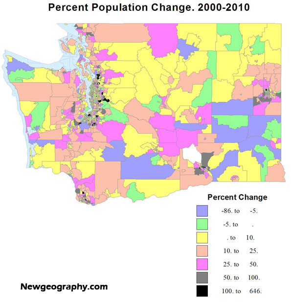
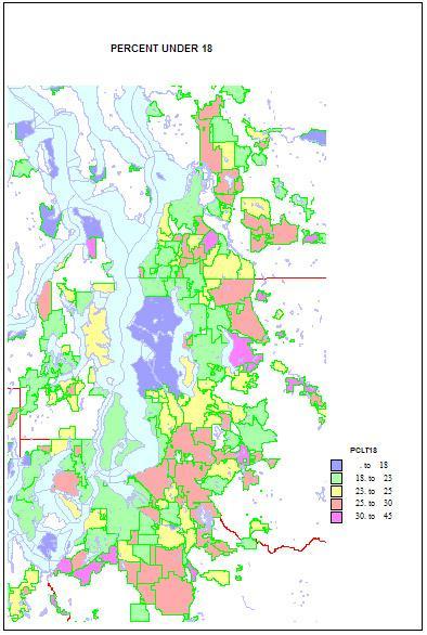
    Higher shares of persons under 5 reveal areas of young families. The highest shares are in military bases and Latino towns in eastern Washington, but are quite high, over 12 percent, in the farthest suburban and exurban places around Seattle such as Duvall and Snoqualmie. They are lowest in retirement towns, on islands such as Vashon and Bainbridge, and in some college towns such as Pullman.

    Shares of persons under 18 show a similar but not identical pattern. Again they are highest in military and Latino places, and in suburban and exurban places in the metropolitan area, and lowest in university towns and in Seattle itself. This implies that while still low Seattle is not as deficient in the very youngest as it is in older children.

    The story is very different for young adults. Not surprisingly, shares 20-25 are very high in university towns, on military bases, and Seattle, and quite low in suburban, mainly residential communities, especially more affluent areas, and on islands. Middle-aged adults, aged 45-64 (the baby boomers and thus the largest age group) are high in some older residential suburbs where younger adults are less common, and low in college towns, Latino areas, and in some areas of very recent growth, as in Snoqualmie and Monroe.

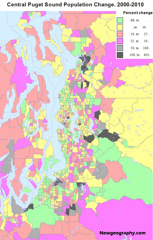
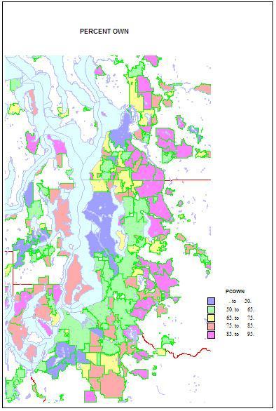
    Home ownership is related to both age and household types. Rates of home ownership are extremely high, in the 90s in newer and more affluent suburbs, with mainly single family homes; the rates are lowest on military bases, college towns, and in a few less affluent suburbs, such as Tukwila. As for the city of Seattle — which has indeed changed its character in a fundamental way — home ownership has dropped to a low of 48 percent. This shift helps us understand the cleavages in Seattle’s body politic, as a formerly very middle class city adjusts to an influx of singles, renters, and young people.

    Finally, as to types of households. Married couple families with children are the historic norm. They remain traditionally high on military bases, and in the farther newer suburbs, such as Snoqualmie, Sammamish, and Maple Valley; they are low as expected in college towns, in retirement communities, and (no surprise) in Seattle—13 percent, which is really low.

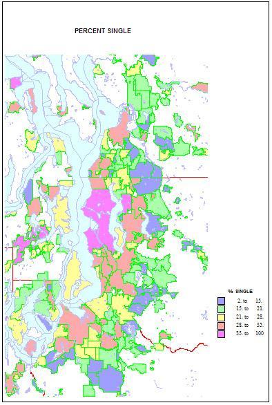
    Conversely, singles are highest in two island towns, Friday Harbor and Langley, but Seattle is an extremely high 41 percent. Shares are lowest in the same new suburbs rich in families, as in Sammamish, at 11 percent. Shares of unmarried partners are a high 10 percent of households in Seattle, but are higher on Indian reservations and the cities of Hoquiam and Aberdeen. The share of single-parent households is also high on Indian reservations, in less affluent and more ethnic suburbs like Parkland and Bryn Mawr and Tukwila. It is lowest in the newer, family-filled far suburbs.

    This piece originally ran at Crosscut.com and was edited by David Brewster.

    Richard Morrill is Professor Emeritus of Geography and Environmental Studies, University of Washington. His research interests include: political geography (voting behavior, redistricting, local governance), population/demography/settlement/migration, urban geography and planning, urban transportation (i.e., old fashioned generalist).

  • Fifty Years of Population Change in the US: 1960-2010

    A new census leads us to ask how population has changed, but usually discussion is focused on changes since the last census. But even more interesting is to appreciate the vaster changes over a greater sweep of time, for example: the fifty years since 1960, when the United States had 179 million people, toward the end of the post-war Baby Boom.

    Over this fifty year period, the country experienced a tremendous economic expansion and metropolitan growth. The attatched maps and charts display these changes, both in the greatest absolute and relative (percentage) losses and gains. We can then assess areas and regions that changed the most – or the least – and how this pattern differs from the most recent decade.

    Looking at both the maps and the tables, high absolute losses are in large northeastern metropolitan counties, plus, because of Katrina, Orleans (New Orleans).  Next most prominent in terms of losses are mining and small industrial counties in Appalachia as well as the largely rural Black majority counties in the Mississippi delta (Arkansas and Mississippi). Far more widespread in terms of space are small absolutely but often high percentage losses across the Great Plains, the rural small town heartland of the country. Losses do extend to the west, in a few mining and farming counties, as in MT, ID, OR and WA, as well as a few Native American reservation areas. 

    From Table 1 (below), 12 counties lost more than 100,000 people since 1960, most in the northeastern historic urban industrial core, including two New York City boroughs. The bigger loser by far, however, was Wayne (Detroit) . Next were Philadelphia, which lost 477,000 and St. Louis, falling 57 percent from 750,000 to 319,000.   Among non-metropolitan counties, the largest absolute losses were in West Virginia, Kentucky and Pennsylvania (mining), and Arkansas and Mississippi (high Black population).

    High relative losses (table 2) of over 50 percent beset 69 counties, all non-metropolitan   except one: St Louis. States with the greatest number of declining counties included North Dakota, 19; Texas, 16; South Dakota, 6, Kansas, Montana and Nebraska, 4; Arkansas, 3; and Missouri, 2. Most were in the Plains states. It is also clear that a high proportion of counties – both metropolitan and non metropolitan – with high Black populations have experienced losses, a sad commentary on disinvestment in areas with high African-American shares.

    In contrast, the pattern of gains is more complex.  Overwhelmingly, the highest absolute amounts (table 3) – and often percentage gains (table 4) – are in mostly larger metropolitan complexes. For the largest areas, the core counties often had lesser rates of growth, even if the absolute amounts were very large (e.g., Los Angeles, Cook, Dallas-Fort Worth, Houston). In contrast the highest rates of growth, often over 400 percent, took place in their satellite or suburban counties. Most obvious are greater Los Angeles and San Francisco, Denver, the large Texas metropolitan areas, Minneapolis, Chicago-Milwaukee, Atlanta, Indianapolis, Seattle, Portland and Washington, DC.  More recent, less suburban (at least in terms of jurisdiction) dominated areas, often in the Sunbelt, include especially Maricopa (Phoenix), Las Vegas, Salt Lake, Nashville, Charlotte, Raleigh, and Richmond.

    This leaves perhaps the two most spectacular (along with California, obviously: the northeastern Megalopolis and Florida. Florida clearly has the highest overall rate of change over this period. The northeastern Megalopolis is highly varied, but overall now spreading from Richmond, Virginia to Portland, Maine. It has developed into an astounding agglomeration of growth, with the locus of fastest absolute as well as percentage growth in its suburban and exurban portions.

    Growth was also often substantial in non-metropolitan or now small metropolitan areas in many parts of the country. An especially remarkable belt of growth – including small towns – extends from Memphis across Tennessee and North Carolina. Another span of significant growth – despite decline or slower growth in the recent past – lies in the Midwest (Indiana, Ohio, Michigan, Wisconsin and Minnesota). Belts of growth follow the I-5 corridor from California to Canada, the corridor from Tulsa through Fayetteville and Springfield to St Louis, and the I95 coastal south Atlantic strip.

    Sixteen counties gained a million or more: Los Angeles, Orange, San Diego, Riverside and San Bernardino, a southwestern megalopolis; Santa Clara (San Jose); Harris (Houston); Dallas and Fort Worth (Tarrant) and Bexar (San Antonio) in Texas; Miami, Ft. Lauderdale (Broward) and Palm Beach, Florida; Clark (Las Vegas); King (Seattle); and Maricopa (Phoenix).

    Finally the counties which grew at the fastest rate over the 50 years include some 118 that grew by 400 percent or more, and 27 that expanded more than ten-fold. States with the most such counties (400 to 1000 % ) include Florida, 15; Georgia, 11; Colorado, 8; Texas, 6; Virginia 6; California, 4; AZ,MN, MO, NC, and NV, 3 each; MD, NM, OR, TN, WY, 2 each; with 1 each in AL, AR, AK, IL, IN, KY, LA, MS, NE, OK, PA,  SC, UT and WA. Among the over 1000 percent growth, AK and AZ, 1; CO, 3; FL, 8; GA, 4; NV, 2; TX, 6; UT, 1; and VA, 1. 

    Types of counties with over 400 percent growth include 3 core metropolitan, 69 suburban, 44 environmental, and 2 others, often resource development. The fastest growth county was Douglas in suburban Denver, followed by environmentally attractive Mohave, AZ, and Flagler and Collier, FL, followed by Dallas suburb, Collin, and Atlanta suburb Gwinnett.

    Conclusion
    People continue to come to the US in large numbers, and people move from place to place in remarkable numbers.  Don’t count on the current pattern of population to remain very stable, just as the last fifty years have not been.  For example, while the northeastern “Rustbelt” seems in trouble, it is a region of vast plant capacity, superior universities, and a high quality labor force. A reaction to the high cost of excessive outsourcing, and even  some shifts from the “new South” could bring about a surprising restoration.

    Table 1: Largest Absolute Losses, 1960-2010
    Name
    1900
    1960
    2000
    2010
    Change 1960-2010
    Percent Change, 1960-2010
    MI Wayne County 348,793 2,666,297 2,061,162 1,820,584 -845,713 -31.7%
    PA Philadelphia County 1,293,697 2,002,512 1,517,550 1,526,006 -476,506 -23.8%
    MO St. Louis city 575,238 750,026 348,189 319,294 -430,732 -57.4%
    PA Allegheny County 775,058 1,628,587 1,281,666 1,223,348 -405,239 -24.9%
    OH Cuyahoga County 439,120 1,647,895 1,393,978 1,280,122 -367,773 -22.3%
    MD Baltimore city 508,957 939,024 651,154 620,961 -318,063 -33.9%
    LA Orleans Parish 287,104 627,525 484,674 343,829 -283,696 -45.2%
    DC District of Columbia 278,718 763,956 572,059 601,723 -162,233 -21.2%
    NY Erie County 433,686 1,064,688 950,265 919,040 -145,648 -13.7%
    NJ Essex County 359,053 923,545 793,633 783,969 -139,576 -15.1%
    NY Kings County 1,166,582 2,627,319 2,465,326 2,504,700 -122,619 -4.7%
    NY New York County 2,050,600 1,698,281 1,537,195 1,585,873 -112,408 -6.6%
    WI Milwaukee County 330,017 1,036,041 940,164 947,735 -88,306 -8.5%
    MA Suffolk County 611,417 791,329 689,807 722,023 -69,306 -8.8%
    VA Norfolk city 46,624 305,872 234,403 242,803 -63,069 -20.6%
    OH Hamilton County 409,479 864,121 845,303 802,374 -61,747 -7.1%
    OH Mahoning County 70,134 300,480 257,555 238,823 -61,657 -20.5%
    WV Kanawha County 54,696 252,925 200,073 193,063 -59,862 -23.7%
    PA Cambria County 104,837 203,283 152,598 143,679 -59,604 -29.3%
    Table 2: Greatest Relative Losses 1960-2010
    Name
    1900
    1960
    2000
    2010
    Change 1960-2010
    Percent Change, 1960-2010
    ND Sheridan County 4,350 1,710 1,321 -3,029 -69.6%
    WV McDowell County 18,747 71,359 27,329 22,113 -49,246 -69.0%
    HI Kalawao County 1,177 279 147 90 -189 -67.7%
    ND Burke County 5,886 2,242 1,968 -3,918 -66.6%
    TX Cottle County 1,002 4,207 1,904 1,505 -2,702 -64.2%
    TX Loving County 33 226 67 82 -144 -63.7%
    ND Logan County 1,625 5,369 2,308 1,990 -3,379 -62.9%
    NM Harding County 1,874 810 695 -1,179 -62.9%
    ND Divide County 5,566 2,283 2,071 -3,495 -62.8%
    TX Terrell County 2,600 1,081 984 -1,616 -62.2%
    CO La Plata County 7,016 19,225 43,941 7,310 -11,915 -62.0%
    ND Grant County 6,248 2,841 2,394 -3,854 -61.7%
    ND Slope County 1,893 767 727 -1,166 -61.6%
    MS Quitman County 5,435 21,019 10,117 8,223 -12,796 -60.9%
    ND Hettinger County 6,317 2,715 2,477 -3,840 -60.8%
    MS Issaquena County 10,400 3,576 2,274 1,406 -2,170 -60.7%
    ND Cavalier County 12,580 10,064 4,831 3,993 -6,071 -60.3%
    ND Towner County 6,491 5,624 2,876 2,246 -3,378 -60.1%
    SD Campbell County 4,527 3,531 1,782 1,466 -2,065 -58.5%
    ND Steele County 5,888 4,719 2,258 1,975 -2,744 -58.1%
    ND McIntosh County 4,818 6,702 3,390 2,809 -3,893 -58.1%
    ND Emmons County 4,349 8,462 4,331 3,550 -4,912 -58.0%
    TX Motley County 1,257 2,870 1,426 1,210 -1,660 -57.8%
    SD McPherson County 6,327 5,821 2,904 2,459 -3,362 -57.8%
    MO St. Louis city 575,238 750,026 348,189 319,294 -430,732 -57.4%
    Table 3: Largest Absolute Gains, 1960-2010
    Name
    1900
    1960
    2000
    2010
    Change 1960-2010
    Percent Change, 1960-2010
    CA Los Angeles County 170,298 6,038,771 9,519,338 9,818,605 3,779,834 63%
    AZ Maricopa County 20,457 663,510 3,072,149 3,817,117 3,153,607 475%
    TX Harris County 63,786 1,243,158 3,400,578 4,092,459 2,849,301 229%
    CA Orange County 19,696 703,925 2,846,289 3,010,232 2,306,307 328%
    CA San Diego County 35,090 1,033,011 2,813,833 3,095,313 2,062,302 200%
    CA Riverside County 17,897 306,191 1,545,387 2,189,641 1,883,450 615%
    NV Clark County 127,016 1,375,765 1,951,269 1,824,253 1436%
    FL Dade County 4,955 935,047 2,253,362 2,496,435 1,561,388 167%
    CA San Bernardino County 27,929 503,591 1,709,434 2,035,210 1,531,619 304%
    TX Dallas County 82,726 951,527 2,218,899 2,368,139 1,416,612 149%
    FL Broward County 333,946 1,623,018 1,748,066 1,414,120 423%
    TX Tarrant County 52,376 538,495 1,446,219 1,809,034 1,270,539 236%
    CA Santa Clara County 60,216 642,315 1,682,585 1,781,642 1,139,327 177%
    FL Palm Beach County 228,106 1,131,184 1,320,134 1,092,028 479%
    TX Bexar County 69,422 687,151 1,392,931 1,714,773 1,027,622 150%
    WA King County 110,053 935,014 1,737,034 1,931,249 996,235 107%
    CA Sacramento County 45,915 502,778 1,223,499 1,418,788 916,010 182%
    FL Orange County 11,374 263,540 896,344 1,145,956 882,416 335%
    FL Hillsborough County 36,013 397,788 998,948 1,229,226 831,438 209%
    NY Suffolk County 77,582 666,784 1,419,369 1,493,350 826,566 124%
    TX Travis County 47,386 212,136 812,280 1,024,266 812,130 383%
    VA Fairfax County 18,580 275,002 969,749 1,081,726 806,724 293%
    GA Gwinnett County 25,585 43,541 588,448 805,321 761,780 1750%
    TX Collin County 50,087 41,247 491,675 782,341 741,094 1797%
    NC Wake County 54,626 169,082 627,846 900,993 731,911 433%
    AZ Pima County 14,689 265,660 843,746 980,263 714,603 269%
    NC Mecklenburg County 55,268 272,111 695,454 919,628 647,517 238%
    UT Salt Lake County 77,725 383,035 898,387 1,029,655 646,620 169%
    Table 4: Largest Relative Gains, 1960-2010
    Name
    1900
    1960
    2000
    2010
    Change 1960-2010
    Percent Change, 1960-2010
    CO Douglas County 3,120 4,816 175,766 285,465 280,649 5827%
    AZ Mohave County 3,426 7,736 155,032 200,186 192,450 2488%
    FL Flagler County 4,566 49,832 95,696 91,130 1996%
    FL Collier County 15,753 251,377 321,520 305,767 1941%
    TX Collin County 50,087 41,247 491,675 782,341 741,094 1797%
    GA Gwinnett County 25,585 43,541 588,448 805,321 761,780 1750%
    AK Matanuska-Susitna Borough 5,188 59,322 88,995 83,807 1615%
    TX Montgomery County 17,067 26,839 293,768 455,746 428,907 1598%
    FL Hernando County 3,638 11,205 130,802 172,778 161,573 1442%
    NV Clark County 127,016 1,375,765 1,951,269 1,824,253 1436%
    FL Citrus County 5,391 9,268 118,085 141,236 131,968 1424%
    TX Fort Bend County 16,538 40,527 354,452 585,375 544,848 1344%
    GA Forsyth County 11,550 12,170 98,407 175,511 163,341 1342%
    FL Osceola County 3,444 19,029 172,493 268,685 249,656 1312%
    TX Denton County 28,318 47,432 432,976 662,614 615,182 1297%
    CO Summit County 2,744 2,073 23,548 27,994 25,921 1250%
    NV Douglas County 1,534 3,481 41,259 46,997 43,516 1250%
    UT Washington County 4,612 10,271 90,354 138,115 127,844 1245%
    TX Rockwall County 8,531 5,878 43,080 78,337 72,459 1233%
    GA Fayette County 10,114 8,199 91,263 106,567 98,368 1200%
    VA Loudoun County 21,948 24,549 169,599 312,311 287,762 1172%
    FL Charlotte County 12,594 141,627 159,978 147,384 1170%
    FL Pasco County 6,054 36,785 344,765 464,697 427,912 1163%
    TX Williamson County 38,072 35,044 249,967 422,679 387,635 1106%
    GA Henry County 18,602 17,619 119,341 203,922 186,303 1057%
    FL Lee County 3,071 54,539 440,888 618,754 564,215 1035%

    Richard Morrill is Professor Emeritus of Geography and Environmental Studies, University of Washington. His research interests include: political geography (voting behavior, redistricting, local governance), population/demography/settlement/migration, urban geography and planning, urban transportation (i.e., old fashioned generalist).

  • The New Geography of Population Loss and Gain

    Dramatic shifts in population growth across the United States in the last decade should surprise no one. Some patterns are continuing trends of earlier decades, but other patterns show substantial change.  I show these changes in three ways, first a conventional choropleth map coloring counties by broad classes from high losses to moderate and high percent gain, second a map in which absolute gains and losses are depicted by proportional symbols, with colors showing the rate of change, and third, a look a counties that experienced either extreme loss and gain. 

    There are four major regions that experienced population loss. The largest covers the rural high plains from Texas to Canada, and most marked in Kansas, Nebraska, Iowa, North and South Dakota, and eastern Montana in a continuation of at least 60 years, and no surprise, as farms get larger and more mechanized, small towns decline. Yet these losses are less pervasive than earlier, especially due to energy development in Wyoming, North and South Dakota and Montana, and energy and agricultural change in Oklahoma and Texas. 


    The second area of decline, also continuing a long historic trend, can be seen in the heavily African-American dominated areas in the Mississippi Delta, in Arkansas, Louisiana and Mississippi, and across the Black belt, Alabama, Georgia, and South Carolina, where significant development investment simply did not occur—race matters.

    Third, we see continued population reductions  across Appalachia from eastern Kentucky, through West Virginia, but this loss has now taken gotten more severe in western Pennsylvania and New York, largely due reductions in  mining and manufacturing as well as a dearth  of new investment.

    Fourth is decline across many urban as well as rural counties in the upper Midwest, in Illinois, Indiana, Ohio and Michigan, due to a complex mix of deindustrialization and related forces.

    Looking at losses from the map emphasizing absolute number of population change reduces the significance of the losses in the Plains, as most were small, reveals somewhat larger absolute losses in the Mississippi delta, and the specific Katrina-led losses in greater New Orleans. It highlights the concentration of larger losses in core metropolitan counties, not only in northern Appalachia and the upper Midwest, particularly in Ohio, Pennsylvania and Michigan, but also in other large cities, as St. Louis and Chicago.


    At least eight regions of significant growth can be described. Territorially, the most obvious can be seen in the Mountain stares, from Arizona, through Utah and much of Colorado, Wyoming into parts of Idaho and Montana. The reasons vary, from energy in Wyoming, to more amenity based growth in western Colorado and Montana, to broader, across the board expansions in Arizona, Utah and Idaho. The high fertility in the Mormon realm also played a role. Nevada is, well, Nevada.

    A second area of continuing growth is across the Pacific coast, but especially the entire I-5 corridor, the spillover counties surrounding Los Angeles, California’s Central valley, largely due to high Latino growth (which was a major factor way to the north in Washington state).

    Third is the continuing and large scale boom in and around the largest Texas cities, Dallas, Houston, Austin and San Antonio. All have enjoyed a combination of population and economic growth.

    Fourth is a pickup in growth from Oklahoma across the Ozarks, through northwestern Arkansas and across southern Missouri, from a mixture of industrial development and amenity migration.

    Fifth is a less expected belt of growth from the Chicago suburbs, across western Wisconsin, and Minnesota (especially northern), to Fargo, ND.

    Sixth is the never ending growth of Florida. Seventh is the continuing significant urban and industrial based growth in the middle South, from Tennessee and Kentucky, northern Georgia, through South and North Carolina, into Virginia. Then, eighth, is the high level of growth over what we might call the outer, exurban edges of Megalopolis, from Richmond, Virginia, to southern Maine.

    Looking at absolute gains from the second map shows a quite widespread geography of growth, many micropolitan and small metropolitan counties across the west registered  the highest rates of gain. Similarly across the Plains, while the greatest growth is in suburban counties around the Texas giants, growth was robust in many smaller metropolitan areas and cities, from the Mexican border up to Canada.  Likewise, in the upper Midwest, despite problem in the declining big city cores, growth was stronger in exurban and small metropolitan areas. Across the southeast, despite the stupendous growth around Atlanta, Nashville, Raleigh and Washington DC, the significant pattern is how widespread growth was across much of the region. Florida, too, perhaps grew less fast in its long time biggest cities, but is now filling up the remaining space!

    Finally Megalapolis is far from dormant. The old cores of Baltimore, Philadelphia, New York and Boston may be slow growing or even declining a little,but  the satellite and exurban belt show remarkable gains, especially in Maryland, Delaware and eastern Pennsylvania, in a kind of spillover of investment and residence to its outer limits.

    The Biggest Losers and Gainers

    Absolute losses: The largest loss numbers are in core counties of de-industrializing metropolitan areas in the north. Among just the 21 counties losing more than 10,000, Michigan has 3 for a loss of 260,000, Ohio, 6, for a loss of 228,000, and Pennsylvania 3, for a loss of 81,000. Others include Cook county (Chicago), St Louis city and county, Erie (Buffalo), and Baltimore. Greater New Orleans includes three counties, with a loss of 195,000. The one non-metropolitan county is highly African-American Washington County, MS (Greenville). Indeed, high Black concentration is a common denominator among all these areas.  Race continues to rule demography in much of the south.

    Relative losses:  Most of the counties with the highest loss rate (48 counties with over a 17 percent loss) are rural or small town. The only exceptions are Orleans and St. Bernard (New Orleans). States with high rate loss counties include Texas (7), Mississippi and North Dakota (6), Louisiana (5) Arkansas and Kansas (4), South Dakota, Nebraska, Montana and Alaska (2), and one each in Colorado, Minnesota, Nevada, New Mexico, Oklahoma and West Virginia.  The AR, LA and MS counties are heavily African American.

    Absolute Gains

    51 counties gained more than 100,000 residents. The top 11 are
    Wake, NC :: 273,000
    San Diego :: 281,000
    Collin, TX (Dallas suburb) :: 291,000
    Los Angeles :: 299,000
    Bexar (San Antonio :: 322,000
    San Bernardino :: 326,000
    Tarrant (Ft. Worth) :: 363,000
    Clark, NV (Las Vegas) :: 576,000
    Riverside :: 644,000
    Harris (Houston) :: 692,000
    Maricopa (Phoenix) :: 745,000

    Of the 51 big gainers, ALL are metropolitan, as the 12 in Texas gained 3,171,000, the 12 in California 2,640,000, 7 in Florida 1,335,000, two in North Carolina 497,000, three in Virginia 384,000, and two in Georgia 332000. Many of these counties are Sunbelt core counties, or satellite or spillover counties. Many are suburbs of large metropolitan centers. Of the 51, only 8 are in the “north” of the country (Illinois, Utah, Washington and northern California).

    Relative Gains

    The eight counties gaining more than 75% are
    Sumter, FL :: 75%
    Forsyth GA  ::  78
    Rockwall, TX :: 82
    Loudon, VA :: 84
    Lincoln, WY  :: 86
    Flagler, FL :: 92
    Pinal, AZ :: 109
    Kendall, IL :: 110

    Of the top 35 counties, gaining over 50 percent, Texas had seven, Georgia, six, Florida four, Utah 2, with one each in AK, AZ, CO,ID, IL, IN, IA, MS, NV,NC, OH, PA, SD, VA, WA and WY. Twenty-eight are metropolitan suburbs, three are new small metropolitan areas (FL UT), two are energy development areas (SD, WY) and two more environmental (PA, ID). Finally of the 35, 11 are in the North, 24 in the South.  Eight counties are in both the highest absolute and highest relative lists—Pinal, AZ, Douglas, CO, Loudon, VA, and five in Texas, Collin, Denton, Montgomery, Ft. Bend, and Williamson. Overall, in terms of growth, Texas wins.

    Conclusion

    I know a lot about population in the US, but still I’m glad I didn’t venture predictions ten years ago, as population change is more than a little unpredictable. Yes, Sunbelt growth was expected, but the details were sometimes as expected but there were unusual gains and losses. The data reviewed here are just the totals for redistricting, so no attempt was made to relate population change to economic change. Still, while some of the redistribution to the Sunbelt, or to the Mountain states was amenity or retirement driven, much more seems to be a consequence of massive shifts of industry and services from the higher cost north to the lower cost south. But there is a vast amount of talent and physical plant in these areas so I would not dare to predict that 2020 would be a simple continuation of the last decade.

    Richard Morrill is Professor Emeritus of Geography and Environmental Studies, University of Washington. His research interests include: political geography (voting behavior, redistricting, local governance), population/demography/settlement/migration, urban geography and planning, urban transportation (i.e., old fashioned generalist).

  • Stories from the 2010 Census: Race and Ethnic Change in Washington State

    The city of Seattle is an exceptional place. The 2010 census figures on race, ethnicity and age confirm this reputation. The main story from the census findings is the continued gentrification of Seattle, with displacement of minorities and the less affluent out of the center of the city, especially to south King county and Pierce county. The city core is becoming whiter, while the edges and suburbs, north and east as well as south are becoming far more diverse.

    A second part of the story is the overall increase in the minority population, both statewide and in central Puget Sound. I present six maps, the first four showing the census tracts with the highest shares of Black, Asian, Native American, Latino, and those with two or more races. The last two show change in the share of all minorities (or of whites, looking at it from that point of view) for the state and for the greater Seattle area, a remarkable summary of the new face of the metropolis.

    The Black share of the population, which did grow substantially in the decade, grew mainly in the very south end  of Seattle, south to Tukwila, a smaller area in south Tacoma, with belts over 10 percent Black covering much of central and south Seattle, south King county and much of Tacoma and Lakewood. Unlike the 1960s through 1980s, there is NO tract over half Black (the highest is 41 percent). Shares in most of the region remain well below 5 percent, rural small town areas below one percent.  Blacks and Asians are not well represented outside greater Seattle.

    The Asian population is much larger than the Black total, and higher shares are far more widespread. Unlike the concentration that has long existed on south Seattle’s Beacon Hill , the 2010 map shows equally high shares in many parts of the eastside, especially Bellevue and Redmond and Sammamish, and smaller areas in south King county and south Everett. The newer areas are also areas of high foreign born and immigration of professionals from Asia.

    Unlike the Black and Asian populations, the Native American and Latino populations are more prevalent outside the metropolitan Seattle core.  The Native American population resides mainly on official reservations, often dominating their census tracts. The largest area and population is associated with the Yakama nation in central Washington. The Latino population of the state increased 71 percent to 756,000 in 2010.  From the map, it’s clear that the Latino population follows the irrigated agriculture of the Columbia basin, including the small metropolitan areas of the Tri Cities (Kennewick-Richland-Pasco) and Yakima.

    The highest Latino shares in the metropolis are in south King county and Pierce county, rather similar to the pattern for African-Americans, but with a more westerly orientation in south Seattle  and Renton.  Native American populations remain quite concentrated in the recognized reservations, quite urban in Tacoma (Puyallup), suburban in Snohomish and King counties, and exurban in Kitsap county. About five percent of Washingtonians identify as of two or more races, a remarkable 47 percent increase. The main areas are most associated with the major military reservation , Ft. Lewis-Mc Chord in Pierce county, with lesser shares in highly diverse south Seattle and south King county.


    A map of all minorities would attest to the diversification of two parts of the state, the Columbia basin in eastern Washington, and the greater Seattle area, with up to half the urban footprint showing shares over 35 percent non-white, and with much of south King county and south Tacoma, and parts of Bellevue-Redmond now over 50 percent. This is a remarkable shift from an overwhelmingly white suburbia of 20 years earlier.

    Perhaps even more revealing has been the low share of minorities in professional, affluent, highly educated parts of Seattle— what analyst Aaron Renn has dubbed “the white city”.  Homogeneity also prevailed in far suburban, exurban and rural areas but these areas rarely lay much claim to be “multicultural.”

    The change in greater Seattle’s Black population reveals its continuing exodus/displacement from Seattle, and its continuing suburbanization.  Asians too experienced tremendous growth in the suburbs, especially in eastern King county and suburban Snohomish county. Change in the Latino population, like that of the Black population, is greatest in south King county, into south Tacoma, but also in the SR99 corridor in Snohomish county. Growth in both the Black and Latino populations follows that of less affluent housing markets than is evident in the areas with expanding Asian populations.

    The map of minority population change for the Seattle region highlights the exceptionalism of the city of Seattle.  Most observers would probably be drawn to the dramatic and obvious diversification of suburbia, in all directions, north, east and south of Seattle. But as a 55 year resident of Seattle, the most dramatic feature is that much of Seattle has become whiter or only slightly more diverse. In contrast  the bulk of the region has become more ethnically and racially complex . 

    The reasons for this redistribution are complex, but we know that the popularity of living in Seattle on the part of younger, less familial and more professional households, together with shifts in the housing stock away from family housing, was critical in making the central city less diverse and the rest of the region, and much of the state, more so.

    Diversity

    How can we measure diversity?. Usually it is  measured as the degree to which the shares of major racial and ethnic groups are equal. So maximum diversity for six groups (Blacks, Native Americans, Asians, Latinos, Whites, and those of two or more races, would be .167, if each group were one sixth. An area 100 percent of one race would have zero diversity or an index of 1.


    Viewed this way, the  2010 census may surprise the reader. Seattle has long been the most or among the few most diverse places in the state and many people probably believe it still is. But according to the 2010 census Seattle has been displaced by dozens of places in its own region! It has become slightly more diverse, as suburban cities, mainly but not only to the south have become markedly more diverse.  Many might also think eastern Washington, with its increasing Latino population, must be highly diverse. But no, the hotbed of diversity is from the southern part of Seattle, through south King County, to and beyond Tacoma.  Table 1 lists the most diverse places. The top six most diverse places are  just beyond the city of Seattle, and their diversity is amazingly high.  In Pierce County a belt of high diversity extends from Fife and the Puyallup reservation across south Tacoma to Lakewood, Parkland, Spanaway and Ft.Lewis-McChord.  This is truly a remarkable transformation.

    Most Diverse Urban Places in Washington
    Rank Place Diversity
    1 Tukwila 0.241
    2 Sea Tac 0.247
    3 BrynMawr-Skyway 0.249
    4 Boulevard Park 0.259
    5 White Center 0.264
    6 Riverton 0.273
    7 Fife 0.295
    8 Kent 0.312
    9 Renton 0.319
    10 Federal Way 0.324
    22 Tacoma 0.401
    40 Seattle 0.471

    Washington state and even greater Seattle are still much “whiter” than most other larger states. The exception has been a relatively high share of Asian people, due to our port of entry position from Asia.  But the last decade has been one of increasing diversity, especially in metropolitan suburbs and in eastern Washington.


    Richard Morrill is Professor Emeritus of Geography and Environmental Studies, University of Washington. His research interests include: political geography (voting behavior, redistricting, local governance), population/demography/settlement/migration, urban geography and planning, urban transportation (i.e., old fashioned generalist).

  • Rethinking Urban Dynamics: Lessons from the Census

    Much has been made of the vaunted “back to the city” movement by “the young and restless,” young professionals, the creative class, empty nesters and others were voting with their feet in favor of cities over suburbs.  Although there were bright spots, the Census 2010 results show that the trend was very overblown, affecting mostly downtown and near downtown areas, while outlying ones bled population.  One culprit for this discrepancy seems to be that the intra-census estimates supplied by the Census Bureau were inflated – in some cases very inflated.

    Looking at selected core cities for major US metropolitan areas, many of them were materially over-estimated:


    One particularly egregious case relates to Atlanta. Its huge projected population increase in the 2000s led me to describe it as “one of America’s top urban success stories.”  The reality proved to be quite different. Rather than strong population growth in the city, the population growth turned out to be basically flat, quite a different story.  Other declines might be more predictable, such as Detroit, or those who had previously challenged estimates like Cincinnati and St. Louis.  Still, even urban cores in rapidly growing regions like Dallas and Houston were not immune from this trend.

    There were some exceptions. Cities like Indianapolis, Columbus, and Oklahoma City came in slightly ahead of expectations, but the number of cities with misses and the sizes of the positive and negative misses tilted towards the down direction.

    It seems clear now that the justification for much of the “back to the city” story reflected bad estimates. People can’t be faulted for relying on the official government numbers – I did. But the reality of the 2010 Census, as demonstrated by Wendell Cox and others, is that the 1990s were actually better for urban population growth in America than the 2000s in many respects.

    One legitimate bright spot for cities lay in the growth of downtown and near downtown areas.  Though often starting from low bases, these areas often showed impressive increases.  For example, St. Louis showed good growth downtown despite a very disappointing decline in total city population:

    The poster child for this phenomenon was Chicago, where a fairly expansive area in the greater core showed large population growth.  Areas that were formerly almost all commercial, such as the Loop, added significant residential population, while areas that were nearly derelict like the near South Side have blossomed into thriving upscale neighborhoods.


    The problem, from places ranging from Chicago to Cleveland, is that the gains in the “core of the core” have been more than offset by losses elsewhere, especially the flight of blacks and other minorities – many of them immigrants – to the increasingly diverse suburbs.

    Cities across America have invested enormous sums into downtown redevelopment and major projects in selected districts.  The good news: these investments have shown some ability to move the needle in terms of attracting young professionals downtown.  The bad news lies with the fact that these developments have been extremely costly, and have not transformed the overall demographic or economic climates of the cities that tried them.  This demonstrates the limits of the policies.  Those who aren’t in the young professional, empty nester, or creative class demographic have rightly figured out that they are no longer the target market of city leadership. No surprise then that many of them    have decided to vote with their feet.

    Given the resulting overall negative swings, cities may want to revisit their strategy of putting all their chips in the downtown redevelopment basket in favor of less glamorous improvements in basic neighborhood safety, services, schools and other critical elements.  A handful of elite enclaves and talent hubs may be able to thrive on a “favored demographic quarter” strategy, but for most places there just aren’t enough young professionals and artists to go around.

    Aaron M. Renn is an independent writer on urban affairs based in the Midwest. His writings appear at The Urbanophile.

    * Actual population minus projected population as of 4/1/2010 using a run rate projection based on the 2008-2009 estimated population growth.
    ** Base is the projected 4/1/2010 population above.

    Photo by Ian Freimuth

  • Washington State’s Evolving Demography

    Population change in the state of Washington has relevance to the nation and to other states because it tells us something about market preferences of households versus the orientation of planners (e.g., “smart growth”). It tells us much about gentrification and America’s changing racial and ethnic diversity.

    The summary will be in two parts. This piece will look at population growth and redistribution. A second article will review the growth of the minority population and its (surprising to some) redistribution and its relation to the gentrification of the city of Seattle, plus a look at the implications of ethnic change to Washington’s new 10th congressional district.

    Washington state and the greater Seattle region grew fairly vigorously 14% (838,000 new residents) in the decade, as they have most decades for over a century. This growth is unusually high for a “non Sunbelt” state. This growth is due not just the engine of Seattle, as eastern and western Washington also experienced substantial growth.

    Most smaller metropolitan areas across the state grew faster than the Seattle metropolitan core. Fast-growing counties are found in the east (Franklin 50%, the easy winner, Benton 23; Kittitas, 22; and Grant 20); all associated with Latino in-migration, as well as in the west (Clark, 23 %; suburban Portland, Mason, 23 percent; suburban Olympia, Thurston (Olympia) 22; Whatcom (Bellingham), 20; and Snohomish, finally, suburban Seattle, 18.

    There are two Washingtons: greater Seattle and the rest of the state, marked by a love and hate relationship. But the balance of power – and demography – is clearly changing in both. There were a few areas of slow growth or decline, as in the heart of the wheat country, but significant growth took place in other metropolitan areas, most notably the Tri-Cities, Vancouver (suburban Portland), Bellingham, Olympia (the state capitol) as well as Spokane, Yakima, and Wenatchee.

    There has been considerable population growth associated with the Columbia Basin project, fueled by heavy Latino in-migration and high birth rates. At the same time there has been population expansion in selected environmental amenity areas – often with retiree in-migration – in many counties across the state. Amenity fueled growth was dramatic in all directions beyond the metropolitan central Puget Sound core, but was also impressive in several areas in eastern Washington, as in Okanogan, Pend Oreille, and Stevens, the far north and northeast, and in Kittitas. Some of this growth comes from migration east from Seattle. Fourth, despite a growth management plan, metropolitan exurbs continue to expand, especially around Vancouver, Spokane, Bellingham and the Tri-Cities (black on the map, over 100% growth).

    Turning to central Puget Sound, the most dramatic growth (often over 100 percent), occurred at the far edge of the urban growth areas, and just beyond as exurban growth. This is true in absolute numbers as well as rates. Growth management and upzoning have been unable to stem this tide, for two main reasons rarely acknowledged by planners: the preference of families with children for single family houses and greater housing affordability, at least in some areas (for example, King county south and east of Seattle, and south into Pierce county). Growth was also impressive in most rural and exurban areas, especially in Pierce, Snohomish and Kitsap counties, but far less in King county, which has by far the strictest growth controls

    At the same time, there was concentrated growth in already urban areas, city and suburban, as higher density apartment sprang up across much of Seattle, Tacoma, south King county, in some Eastside cities, and in the SR 99 corridor of Snohomish county north from Seattle.

    In Pierce, Snohomish and south King, some single family and small apartment growth occurred in less affluent areas, attracting many people, including young families who cannot afford to live closer to Seattle. Areas of slower growth tended to be military areas, some urban non-residential tracts, and some more affluent, older settled single family home areas, with an aging population. Growth in downtown Seattle and Bellevue, even Tacoma, was substantial, if not quite as great as planners envisioned. The current shift from home ownership to renting is leading some to project a projected apartment boom in or near downtown Seattle.

    It’s also interesting to look at density as a measure of “urban-ness”. The third map for density is at a finer block group level. Moderate urban densities from 1000 to 5000 per square mile are dominated by single family homes, areas between 5000 and 7000, by a mix of single family homes and apartments, and over 7000 by apartments, essentially the density goal of urbanist smart growth planning. Seattle really has achieved a substantial degree of such urbanness, dominating central Seattle, but spreading to all corners of the city. Other areas of higher density include the SR99 corridor in Snohomish county, especially south Everett, high tech suburbs to the east, and in south King county the SR 99 corridor again, in some less affluent suburbs, and in Pierce county, downtown Tacoma, and some of South Tacoma toward Ft. Lewis.

    But still more than half the urban footprint resists the officially preferred urban densities. Even with densification, redevelopment and the opening of the first light rail line, these higher density areas housed only 34 percent of the population of King county (up from 32 % in 2000), and only 10 % of the population of the people of the three suburban counties. The city of Seattle is exceptional, containing 52 percent of the high density tracts on the metropolitan area, although it has only one-sixth of the population.

    As the late great UW economist Charlie Tiebout told a seminar 50 years ago, “People vote with their feet” This is certainly true about residential choices. While perhaps twenty percent at most of Americans may prefer higher density living, for reasons of age, family status or ideology, the large majority does not and likely will not.

    To a leftist like me, the tragedy is how smart growth transfers wealth and the vaunted “quality of life” to the rich and the professionals, at the expense of the poor and of minorities. Sadly the Democratic party seems totally blind to the fact that the fixation on new urbanism contributes to the rightward backlash. Folks do not want to be told how to live, especially, dare I assert, when those hectoring them have already cornered the nicest parts of the region for themselves. Middle and working class families are not likely to embrace policies – beloved by affluent professionals – that would deny them a chance to own their preferred kind of residence at a reasonable price.

    Richard Morrill is Professor Emeritus of Geography and Environmental Studies, University of Washington. His research interests include: political geography (voting behavior, redistricting, local governance), population/demography/settlement/migration, urban geography and planning, urban transportation (i.e., old fashioned generalist).

  • The Census’ Fastest-Growing Cities Of The Decade

    Over the past decade urbanists, journalists and politicians have hotly debated where Americans were settling and what places were growing the fastest. With the final results in from the 2010 Census, we can now answer those questions, with at least some clarity.

    Not only does the Census tell us where people are moving, it also gives us clues as to why. It also helps explain where they might continue to go in the years ahead.  This information is invaluable to companies that are considering where to expand, or contract, their operations.

    For Forbes’ evaluation of the Census’ winners and losers, we have focused not on individual cities, but on metropolitan areas, which represent the most accurate designation for measurement. Take Atlanta, No. 10 on our list. While the city’s population grew by 1,000 over the last decade (2010 boundaries), the region, according to the Census grew, by roughly 1 million, the largest numerical increase among the country’s 51 largest metro areas. The city itself represents less than one-tenth the total metro area population.

    Las Vegas continued to be the nation’s fastest-growing major metropolitan area per capita, adding 41.8% to its population between 2000 and 2010. But the Las Vegas margin was very thin. Raleigh, N.C. (which ranked second) also gained 41.8%, and the difference between the two could only be measured at the third decimal point. If Raleigh had added just 10 more people, it would have been the leader.

    Overall, some 15 of the big metros grew at more than twice the 9.7% rate experienced by the entire country. One key reason — for at least some cities — was job growth. Las Vegas, which added 575,000 residents, and Raleigh grew their economies despite the tough recession. Sin City is still a top flight tourist destination, and its business-friendly policies are still attractive to other industries, particularly from highly regulated California.  The Texas metros Austin (No. 3), Houston (No. 8),  San Antonio (No. 9 ) and Dallas-Fort Worth (No. 11) all had strong job growth — as did Nashville, Tenn. (No. 12).

    However, not all the top growing regions in the country share the same economic trajectory. Many of the other leaders grew their job bases rapidly at the beginning of the decade but gave back some of their gains after the collapse of the mortgage market. This happened in places like Las Vegas Riverside-San Bernardino, Calif. (No. 5), Orlando , Fla., (No. 6), Phoenix, Ariz., (No. 7), Jacksonville, Fla. (No.13) and Sacramento, Calif. (No. 14).

    Yet all of the top ten — with the exception of Atlanta — expanded their job base during the decade.

    So if job growth itself is not a single determining indicator, what else has swelled these populations? Two things seem to stand out. One major factor seems to be affordability of housing. Throughout the decade people have moved primarily to those areas with cheaper house price relative to incomes.

    Take the movement of people from expensive coastal California not only to the interior parts of the state but especially to the Texas metropolitan areas, such as Dallas-Fort Worth and Houston. To put this in context, the median house price today as a share of median household income (the “median multiple”) averaged at 2.7 in Dallas-Fort Worth and 2.8 in Houston, compared with 7.2 in the No. 41 ranked Los Angeles or 8.1 in ultra-pricey San Francisco, which ranked No. 37.

    During the bubble, coastal California housing prices were even higher, peaking at a median multiple over 10, while Dallas-Fort Worth and Houston remained at 3.0 or below. There was also strong migration from coastal California to closer metropolitan areas in the West, where house prices were high by national standards, but far more affordable than in coastal California. Examples of this trend were No. 1 Las Vegas (which averaged 4.0 and peaked at 5.9), No. 7 Phoenix (averaged 3.4 and peaked at 4.7) and No. 15 Denver (averaged 4.1 and peaked at 4.5).

    A similar phenomenon can be seen on the east coast. To understand the rapid growth of a place like Raleigh, you have to look to the migration of people from the Northeast, notably the No. 44 New York area and No. 43 Boston. Housing costs seem to be a leading factor here. The ratio of median house price to median household income   in Raleigh averaged 3.6 (peaked at 4.2) — well below that of its primary talent sources like New York, which averaged 6.3, peaking at 7.7, and Boston, which averaged 5.2 and peaked at 6.1.

    Among the 20 fastest-growing regions, No. 16 Washington, D.C. region had relatively expensive housing, with an average median multiple of 4.2, after peaking at 5.7. Washington must be regarded in this sense as the great exception, a place whose steady employment growth has defied all market logic, since it is largely tethered to the ever-expanding scope of the federal government and its similarly growing legions of parasitic private corporations.

    The other major factor determining growth seems to be urban area density and size. Despite all the triumphant celebration of the glories and attraction of dense big city urbanism, almost all the fastest-growing metropolitan areas have low-density core cities and are predominately suburban in form. Indeed not one of the top 15 growing regions has a core city with a density of over 5,000 per square mile and only three, the Dallas-Fort Worth, Houston and Atlanta metropolitan areas, have more than 5 million residents.

    In contrast, the regions with the densest core cities–such as Boston and San Francisco–all grew at about half or less than the national average, despite core densities of 12,000 or above. All three of America’s largest metropolitan areas–New York, Los Angeles and Chicago, with populations nearing or above 10 million–grew far below the national average.  However thrilling and alluring dense large cities might be to pundits, academics and policy wonks, they are proving not so beguiling to Americans who, for the most part, continue to seek out “the American dream” wherever they can best afford it.

    Yet the very bottom of our list does include cities that are neither expensive nor particularly dense. These include the long-standing declinapolises that actually managed to lose population while the rest of the country was gaining. These include No. 47 Buffalo, N.Y., No. 48 Pittsburgh, Pa., No. 49 Cleveland, Ohio and ever-suffering No. 50 Detroit.

    The only non-rust belt core city to lose population this decade was No. 51 – New Orleans-Metarie-Kenner, La.  Of course, the Big Easy’s decline stems in large part from both nature’s depredations and what appears to be only a limited restoration of its basic infrastructure. But amazingly, the job loss in New Orleans was less than that of perennial loser Detroit and former perennial winner San Jose, which ranked 35th.

    So in our minds, NOLA’s last place finish may be a bit unfair, but then again so is life — and  sometimes demographics.

    Population 2000-2010 Employment 2000-2010
    Geography Change Pct Change Change Pct Change
    Las Vegas-Paradise, NV 575,504 41.83% 103,800 14.88%
    Raleigh-Cary, NC 333,419 41.83% 59,500 13.62%
    Austin-Round Rock-San Marcos, TX 466,526 37.33% 93,800 13.94%
    Charlotte-Gastonia-Rock Hill, NC-SC 427,590 32.14% 34,000 4.43%
    Riverside-San Bernardino-Ontario, CA 970,030 29.80% 122,800 12.42%
    Orlando-Kissimmee-Sanford, FL 489,850 29.79% 92,300 10.15%
    Phoenix-Mesa-Glendale, AZ 941,011 28.94% 108,400 6.87%
    Houston-Sugar Land-Baytown, TX 1,231,393 26.11% 278,600 12.38%
    San Antonio-New Braunfels, TX 430,805 25.17% 96,200 12.91%
    Atlanta-Sandy Springs-Marietta, GA 1,020,879 24.03% -30,900 -1.35%
    Dallas-Fort Worth-Arlington, TX 1,210,229 23.45% 101,400 3.67%
    Nashville-Davidson–Murfreesboro–Franklin, TN 278,145 21.20% 34,900 5.00%
    Jacksonville, FL 222,846 19.85% 15,900 2.81%
    Sacramento–Arden-Arcade–Roseville, CA 352,270 19.60% 10,700 1.34%
    Denver-Aurora-Broomfield, CO 364,242 16.71% -20,000 -1.65%
    Washington-Arlington-Alexandria, DC-VA-MD-WV 785,987 16.39% 285,700 10.67%
    Tampa-St. Petersburg-Clearwater, FL 387,246 16.16% -42,000 -3.63%
    Salt Lake City, UT 155,339 16.03% 41,600 7.36%
    Portland-Vancouver-Hillsboro, OR-WA 298,128 15.46% -7,800 -0.80%
    Indianapolis-Carmel, IN 231,137 15.16% 16,600 1.95%
    Richmond, VA 161,294 14.70% 14,000 2.38%
    Oklahoma City, OK 157,566 14.38% 20,500 3.83%
    Columbus, OH 223,842 13.88% -11,400 -1.25%
    Seattle-Tacoma-Bellevue, WA 395,931 13.01% -10,700 -0.65%
    Miami-Fort Lauderdale-Pompano Beach, FL 557,071 11.12% 27,900 1.29%
    Kansas City, MO-KS 199,296 10.85% -16,600 -1.69%
    Minneapolis-St. Paul-Bloomington, MN-WI 311,027 10.48% -59,000 -3.38%
    Louisville/Jefferson County, KY-IN 121,591 10.46% -29,500 -4.75%
    San Diego-Carlsbad-San Marcos, CA 281,480 10.00% 26,400 2.21%
    Memphis, TN-MS-AR 110,896 9.20% -36,700 -5.88%
    Birmingham-Hoover, AL 75,809 7.20% -27,400 -5.30%
    Baltimore-Towson, MD 157,495 6.17% 21,600 1.73%
    Virginia Beach-Norfolk-Newport News, VA-NC 95,313 6.05% 13,100 1.82%
    Cincinnati-Middletown, OH-KY-IN 120,519 6.00% -35,800 -3.52%
    San Jose-Sunnyvale-Santa Clara, CA 101,092 5.82% -191,900 -18.38%
    Hartford-West Hartford-East Hartford, CT 63,763 5.55% -24,400 -4.38%
    San Francisco-Oakland-Fremont, CA 211,651 5.13% -243,100 -11.43%
    Philadelphia-Camden-Wilmington, PA-NJ-DE-MD 278,196 4.89% -47,300 -1.72%
    St. Louis, MO-IL 114,209 4.23% -48,200 -3.60%
    Chicago-Joliet-Naperville, IL-IN-WI 362,789 3.99% -323,300 -7.07%
    Los Angeles-Long Beach-Santa Ana, CA 463,210 3.75% -340,400 -6.23%
    Milwaukee-Waukesha-West Allis, WI 55,167 3.68% -60,000 -6.91%
    Boston-Cambridge-Quincy, MA-NH 161,058 3.67% -112,900 -4.45%
    New York-Northern New Jersey-Long Island, NY-NJ-PA 574,107 3.13% -99,100 -1.18%
    Rochester, NY 16,492 1.59% -27,700 -5.22%
    Providence-New Bedford-Fall River, RI-MA 17,855 1.13% -35,500 -6.16%
    Buffalo-Niagara Falls, NY -34,602 -2.96% -21,300 -3.81%
    Pittsburgh, PA -74,802 -3.08% -23,300 -2.03%
    Cleveland-Elyria-Mentor, OH -70,903 -3.30% -144,700 -12.74%
    Detroit-Warren-Livonia, MI -156,307 -3.51% -470,900 -21.38%
    New Orleans-Metairie-Kenner, LA -148,746 -11.30% -98,300 -15.91%


    Sources: U.S. Census 2000, U.S. Census 2010, U.S. Bureau of Labor Current Employment Survey

    This piece originally appeared in Forbes.

    Joel Kotkin is executive editor of NewGeography.com and is a distinguished presidential fellow in urban futures at Chapman University, and an adjunct fellow of the Legatum Institute in London. He is author of The City: A Global History. His newest book is The Next Hundred Million: America in 2050, released in February, 2010.

    Wendell Cox is a Visiting Professor, Conservatoire National des Arts et Metiers, Paris and the author of “War on the Dream: How Anti-Sprawl Policy Threatens the Quality of Life

    Photo by justin fain