Tag: Chicago

  • SPECIAL REPORT: Metropolitan Area Migration Mirrors Housing Affordability

    On schedule, the annual ritual occurred last week in which the Census Bureau releases population and migration estimates and the press announces that people are no longer moving to the Sun Belt. The coverage by The Wall Street Journal was typical of the media bias, with a headline “Sun Belt Loses its Shine.” In fact, the story is more complicated – and more revealing about future trends.

    Domestic Migration Tracks Housing Affordability: There have been changes in domestic migration (people moving from one part of the country to another) trends in the last few years, but the principal association is with housing affordability.

    Severe and Not-Severe Bubble Markets: Overall, the major metropolitan markets with severe housing bubbles (a Median Multiple rising to at least 4.5, see note) lost nearly 3.2 million domestic migrants (all of these markets have restrictive land use regulation, such as smart growth or growth management) from 2000 to 2009. However, not all markets with severe housing bubbles lost domestic migrants. “Safety valve” bubble markets drew migration from the extreme bubble markets of coastal California, Miami and the Northeast. These “safety valve” markets (including Phoenix, Las Vegas, Portland, Seattle, Riverside-San Bernardino, Orlando, Tucson and Tampa-St. Petersburg), gained a net 2.2 million from 2000 to 2009, while the other bubble markets lost 5.3 million domestic migrants from 2000 to 2009 (See Table below, metropolitan area details in Demographia US Metropolitan Areas Table 8). At the same time, the markets that did not experience a severe housing bubble (those in which the Median Multiple did not reach 4.5) gained a net 1.5 million domestic migrants.

    The burst of the housing bubble explains the changes in domestic migration trends. Housing affordability has improved markedly in the extreme bubble markets, so that there was less incentive to move. Then there was the housing bust-induced Great Recession, which also slowed migration since people had more trouble selling their homes or finding anew job. As a result, the migration to the “safety valve” markets and to the smaller markets dropped substantially.

    • During 2009, the “safety valve” markets gained only 51,000 net domestic migrants, one-fifth of the annual average from 2000 to 2008.
    • At the same time, the other severe housing bubble markets lost 236,000 domestic migrants in 2009, compared to the average loss of 638,000 from 2000 to 2008.
    • Areas outside the major metropolitan areas also experienced a significant drop in domestic migration, dropping from an annual average of 203,000 between 2000 and 2008 to 23,000 in 2009.
    • The major metropolitan markets that did not experience a severe housing bubble gained 161,000 domestic migrants in 2009, little changed from the 169,000 average from 2000 to 2008. These markets are concentrated in the South and Midwest. Indianapolis, Kansas City, Nashville, Louisville and Columbus as well as the Texas metropolitan areas continued their positive migration trends.
    Domestic Migration by Severity of the Housing Bubble
    Metropolitan Areas over 1,000,000 Population
    2000-2008
    Metropolitan Areas 2000-2009 2009 2000-2008 Average
    Withouth Severe Housing Bubbles     1,509,870         160,514      168,670
    With Severe Housing Bubbles    (3,161,514)        (184,486)     (372,129)
       Not "Safety Valve" Markets    (5,347,211)        (235,838)     (638,922)
       "Safety Valve" Markets     2,185,697           51,352      266,793
    Outside Largest Metropolitan Areas     1,651,644           23,972      203,459
    Severe housing bubbles: Housing costs rose to a Median Multiple of 4.5 or more (50% above the historic norm of 3.0). 
    Median Multiple: Median House Price/Median Household Income
    "Safety Valve" refers to markets with severe housing bubbles that received substantial migration from more expensive markets (coastal California, Miami and the Northeast). These markets include Las Vegas, Phoenix, Riverside-San Bernardino, Sacramento, Portland, Seattle, Orlando, Tucson and Tampa-St. Petersburg.

    Moreover, the Census Bureau revised its previous domestic migration figures for 2000 to 2008 to add more than 110,000 from the markets without severe housing bubbles, while taking away more than 150,000 domestic migrants from the markets with severe housing bubbles. This adjustment alone rivals the 2009 domestic migration loss of 183,000 in these markets

    Population Growth: The Top 10 Metropolitan Areas: Sun Belt metropolitan areas continued to experience the greatest population growth. Between 2000 and 2009, the fastest growing metropolitan areas were Atlanta, Dallas-Fort Worth and Houston, In 2009, Washington, DC was added to the list (Details in Demographia US Metropolitan Areas, Table 2).

    New York: The New York metropolitan area remains the nation’s largest, now reaching a population of over 19 million. More than 700,000 new residents have been added since 2000. However, New York’s population growth has been the second slowest of the 10 largest metropolitan areas since 2000 (Figure 1). Moreover, New York’s net domestic out-migration has been huge. New York has lost 1,960,000 domestic migrants, which is more people than live in the boroughs of The Bronx and Richmond combined. Overall, 10.7% of the New York metropolitan area’s 2000 population left the metropolitan area between 2000 and 2009. More than 1,200,000 of this domestic migration was from the city of New York. Between 2008 and 2009, New York’s net domestic out-migration slowed from the minus 1.32% 2000-2008 annual rate to minus 0.58%., reflecting the smaller migration figures that have been typical of the Great Recession.

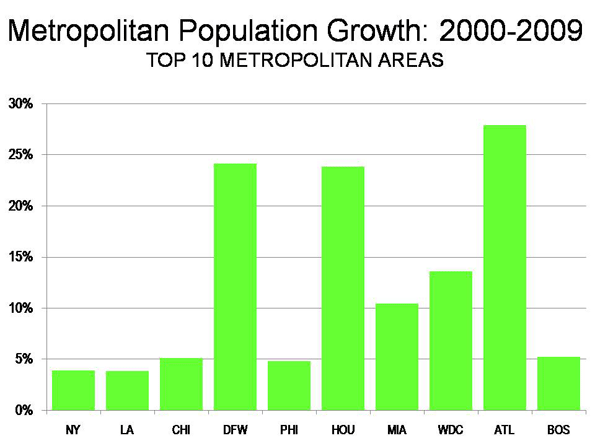
    Los Angeles: For decades, Los Angeles has been one of the world’s fastest growing metropolitan areas. Growth had ebbed somewhat by the 1990s, when Los Angeles added 1.1 million people. The California Department of Finance had projected that Los Angeles would add another 1.35 million people between 2000 and 2010. Yet, the Los Angeles growth rate fell drastically. From 2000 to 2009, Los Angeles added barely one-third the projected amount (476,000) and grew only 3.8%. Unbelievably, fast growing Los Angeles became the slowest growing metropolitan area among the 10 largest. In 2009, Los Angeles had 12.9 million people. Los Angeles lost 1.365 million domestic migrants, which is of 11.0% of its 2000 population, and the most severe outmigration among the top 10 metropolitan areas (Figure 2).

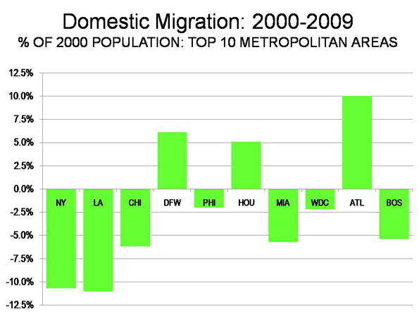
    Chicago: Chicago continues to be the nation’s third largest metropolitan area, at 9.6 million population, a position it has held since being displaced by Los Angeles in 1960. Chicago has experienced decades of slow growth and continues to grow less than the national average, at 5.1% between 2000 and 2009 (the national average was 8.8%). Yet, Chicago grew faster than both New York and Los Angeles. Chicago also lost a large number of domestic migrants (561,000), though at a much lower rate than New York and Chicago (6.2%). Even so, Chicago is growing fast enough that it could exceed 10 million population in little more than a decade, by the 2020 census.

    Dallas-Fort Worth: Dallas-Fort Worth has emerged as the nation’s fourth largest metropolitan area, at 6.4 million, having added 1,250,000 since 2000. In 2000, Dallas-Fort Worth ranked fifth, with 500,000 fewer people than Philadelphia, which it now leads by nearly 500,000. Dallas-Fort Worth added more population than any metropolitan area in the nation between 2008 and 2009 and has been the fastest growing of the 10 top metropolitan areas since 2006. As a result, Dallas-Fort Worth has replaced Atlanta as the high-income world’s fastest growing metropolitan area with more than 5,000,000 population. Dallas-Fort Worth added a net 317,000 domestic migrants between 2000 and 2009.

    Philadelphia: Philadelphia is the nation’s fifth largest metropolitan area, at just below 6,000,000 population. Like Chicago, Philadelphia has had decades of slow growth, yet has grown faster in this decade than both New York and Los Angeles (4.8%). Philadelphia has lost a net 115,000 domestic migrants since 2000, for a loss rate of 2.2%, well below that of New York, Los Angeles and Chicago.

    Houston: Houston ranks sixth, with 5.9 million people and is giving Dallas-Fort Worth a “run for its money.” Like Dallas-Fort Worth, Houston has added more than 1,000,000 people since 2000. Over the same period, Houston has passed Miami and Washington (DC) in population. Houston has added a net 244,000 domestic migrants since 2000, and added 50,000 in 2008-2009, the largest number in the country. Like Dallas-Fort Worth, Houston accelerated its annual domestic migration growth rate in 2008-2009. At the current growth rate, Houston seems likely to pass Philadelphia in population shortly after the 2010 census.

    Miami: Miami (stretching from Miami through Fort Lauderdale to West Palm Beach) is the seventh largest metropolitan area, with 5.6 million people. Miami has added more than 500,000 people, for a growth rate of 10.4%. However, Miami has suffered substantial domestic migration losses, at 287,000, a loss rate of, 5.7% relative to its 2000 population.

    Washington (DC): Washington recaptured 8th place, moving ahead of Atlanta, which had temporarily replaced it. Washington’s population is 5.5 million and added 655,000 between 2000 and 2009, for a growth rate of 13.6%. However, Washington lost a net 110,000 domestic migrants, 2.2% of its 2000 population. That trend was reversed in 2008-2009, when a net 18,000 domestic migrants moved to Washington, perhaps reflecting the increased concentration of economic power in the nation’s capital.

    Atlanta: Atlanta is the real surprise this year. For more than 30 years, Atlanta has had strong growth, however, this year it slowed. Atlanta is the 9th largest metropolitan area in the nation, at 5.5 million. Since 2000, Atlanta has added 1.2 million people, though added only 90,000 last year. Atlanta has added a net 429,000 domestic migrants since 2000, though the rate slowed to only 17,000 in 2008-2009.

    Boston: Boston is the nation’s 10th largest metropolitan area, with 4.6 million people. During the 2000s, Boston has added nearly 200,000, growing by 4.2%. Yet, Boston has also experienced a net domestic migration loss of 236,000, or 5.4% of its 2000 population. In 2008-2009, Boston, like Washington, reversed its domestic migration losses, adding 7,000.

    Trends by Size of Metropolitan Area: As throughout the decade, the slowest growing areas of the nation have been metropolitan areas over 10,000,000 population (New York and Los Angeles), which grew 3.9% and non-metropolitan areas, which grew 2.6% during the decade Metropolitan areas that had between 2.5 and 5.0 million population in 2000 boasted the biggest jump (these include fast growing Houston and Atlanta, which are now more than 5 million), at 13.4% for the decade. All of the other size classifications grew between 8.9% and 11.3% over the decade (see Demographia US Metropolitan Areas, Table 1). Metropolitan areas that began the decade with between 5,000,000 and 10,000,000 population gained 10.0%. Those with 250,000 to 500,000 grew 10.4%, those with 500,000 to 1,000,000 grew 10.2% and the smallest metropolitan areas, those from 50,000 to 250,000 grew 8.9%

    Metropolitan areas over 1,000,000 population lost 2.19 million domestic migrants during the decade, but smaller metropolitan areas added 2.24 million domestic migrants. Non-metropolitan areas lost 50,000 domestic migrants. In 2009, the smaller metropolitan areas gained 125,000 domestic migrants, while the larger metropolitan areas lost 30,000. Non-metropolitan areas lost more than 90,000 domestic migrants. As noted above, these smaller figures for 2009 reflect the more stable housing market and the extent to which the Great Recession has reduced geographic mobility (See Demographia US Metropolitan Areas, Tables 1 and 3).


    Note: The Median Multiple is the median house price divided by the median household income. The historic standard has been 3.0.

    Photograph: Dallas

    Wendell Cox is a Visiting Professor, Conservatoire National des Arts et Metiers, Paris. He was born in Los Angeles and was appointed to three terms on the Los Angeles County Transportation Commission by Mayor Tom Bradley. He is the author of “War on the Dream: How Anti-Sprawl Policy Threatens the Quality of Life.

  • Mayor Daley’s Report Card

    In December of 2010 Mayor Daley will become Chicago’s longest serving Mayor. In office since 1989, he will surpass the record held by his father. In the March issue of The New Yorker magazine, journalist Evan Osnos has a long article on Mayor Daley. The front cover of the magazine calls Daley, “America’s most successful mayor”.

    By longevity standards Mayor Daley is a success, but then again so was the late Coleman Young who was Detroit’s Mayor for over 20 years.

    The tone of Osnos’ piece is mostly positive, providing some history:

    He took office at a moment when Chicago was paralyzed by infighting and mismanagement. In 1987, William Bennett, the Secretary of Education, said that Chicago had the worst school system in the country—“ an education meltdown.” The center of the city was a desiccating museum of masterpieces by Mies van der Rohe and Louis Sullivan. Infant mortality in remote neighborhoods was comparable to levels in the Third World.

    In the years that followed, Detroit, Cleveland, and former industrial powers continued to wither, but Chicago did not. It has grown in population, income, and diversity; it has added more jobs than Los Angeles and Boston combined.

    The problem with Osnos’ history is it’s not entirely accurate. First of all, by the time Mayor Daley was elected in 1989 the City Council infighting had mostly stopped. Eugene Sawyer, Chicago’s second African American Mayor, was supported by the white elements of the Chicago Democratic Machine.

    Some of the mistakes are hard to fathom. Osnos cites no source on his rather incredible job numbers. Chicago has roughly the same population as it did in 1989, unlike Los Angeles which has climbed past the 4 million mark. Chicago is stuck under 3 million people with the long term population trend in decline. It’s difficult to have population growth without decent job growth.

    Osnos’ article has provoked a heated reaction from Chicago Reader ace columnist Ben Joravsky. The Chicago Reader and Joravsky, over the years, have covered Daley’s shady tenure as Mayor. Jorasky reminds us in attacking the New Yorker article:

    And why is it that Daley’s boosters always compare Chicago to poor, unfortunate Detroit—a one-industry town battered by the collapse of its one industry? Chicago has always been a larger, healthier, more diverse town than Detroit. If you want to see how Chicago really ranks, compare it to New York City, whose population and wealth are rising faster than Chicago’s with a fraction of the attendant corruption. In fact, Chicago’s population has fallen in the last few years.

    Joravsky could hardly keep from mentioning Chicago’s murder problem:

    Did I mention that in recent years Chicago has been the murder capital of the country? In fact, the murder tally has been much higher under Daley than it ever was under Byrne or Washington—it’s even higher than, yes, Detroit, which Osnos points out was known as the nation’s murder capital in the 1970s. And now we’re so broke we can’t hire police officers to replace the hundreds of veterans who are retiring—even though our taxes keep going up and up. My property taxes were $2,700 in 1997; this year I expect I’ll pay close to $8,000.

    This isn’t Chicago’s only problem. Its convention business is evaporating. Chicago’s union run McCormick Place is headed towards financial ruin. Major trade shows have left Chicago for better places to do business. Part of McCormick Place’s problem has been the pervasive influence of the Chicago Mob, also known as the outfit. Mayor Daley is quite sensitive to the subject because it has affected so many aspects of Chicago. Recently, the Chicago Tribune quoted former senior FBI agent James Wagner explaining the situation:

    The Outfit has long been entrenched at McCormick Place and in many of the unions and contractors that do business there.
    “It’s been a rehabilitate-the-felon location in terms of being a place to get people jobs when they get out of prison,” said James Wagner, a former longtime organized-crime supervisor for the FBI in Chicago and now top investigator at the Illinois Tollway. “It’s had these kinds of problems for about as long as it’s been there. And it’s had someone associated with the Outfit in just about every job there.”
    Among the factors that make McCormick Place a haven for the mob are its sheer size and the number of contracts and trade shows there, Wagner said.
    Four years ago, the riggers union, whose members set up exhibits at McCormick Place, was under federal investigation after its boss, Fred Schreier, who was once married to the niece of the late mob boss Tony Accardo, pleaded guilty to taking a bribe.

    Near the end of Osnos’ New Yorker article Mayor Daley’s scandals get a mention without too much detail. Daley fails to answer questions on the massive Hired Truck scandal which has been closely linked to the Chicago Mob. Daley also refuses to remain silent on why a major campaign contributor and close friend bombed a restaurant with the Chicago Mob, according to federal testimony. Recently, Daley admitted that he’s been questioned by the FBI concerning a major bribery and zoning case which just concluded.
    Chicago’s immediate economic situation has been nicely summarized by blogger Gary Lucido:

    How much worse can it get?

    I just picked up the January employment numbers for the greater Chicago metropolitan area and the picture is getting more grim than I thought – we have hit a new 14 year low. The Chicago area has lost 162,000 jobs in just the last 12 months and a total of 459,000 jobs have been lost since employment peaked in July 2007. The unemployment rate for the Chicago area is now at 11.7%, which is up from a low of 4.6% in November 2007 and that is higher than any rate that I have access to (going back to 1990).

    The New Yorker article mentions Mayor Daley polling numbers dropping into the 30s. In Chicago’s one party state, Daley can run next time, even with low polling numbers, and win — unless a credible wealth financed candidate materializes. No candidate has. But, one sign that Mayor Daley feels he’s got a bad report card coming: he opened up a Twitter page.

    Steve Bartin is a resident of Cook County and native who blogs regularly about urban affairs at http://nalert.blogspot.com. He works in Internet sales.

    Photo by kate.gardiner

  • The Myth of the Strong Center

    At the height of the foreclosure crisis the problems experienced by some so-called “sprawl” markets, like Phoenix and San-Bernardino-Riverside, led some observers to see the largest price declines as largely confined to outer ring suburbs. Some analysts who had long been predicting (even hoping for) the demise of the suburbs skipped right over analysis to concoct theories not supported by the data. The mythology was further enhanced by the notion – never proved – that high gas prices were forcing home buyers closer to the urban core.

    Yet a summary of the trends over the past 18 months show only minor disparities between geographies within leading urban regions. Overall house prices escalated similarly in virtually all areas within the same metropolitan areas and the price drops appear to have also been similar. This is in contrast to a theory that suggests that huge price drops occurred in the outer suburbs while central city prices held up well.

    Summary of 18 Month Subarea Price Declines: This is indicated by a review of 8 metropolitan areas: Los Angeles, the San Francisco Bay Area, San Diego, Sacramento, Atlanta, Chicago, Portland and Seattle (see end note), for which subarea data is readily available (see table). On average, central area median house prices (all houses, including condominiums), fell 3% in relation to the overall metropolitan area average. Inner suburban areas experienced a 3% gain relative to metropolitan area prices, while outer suburban areas changed at the metropolitan area average. In actual price reduction terms, core areas declined 28.8%, inner suburban areas declined 25.7%, and outer suburban areas declined 27.1%. The overall average metropolitan area decline was 27.2%. There was, however, considerable variation in the figures by metropolitan area (see figure below).

    MEDIAN HOUSE PRICE CHANGES BY GEOGRAPHICAL SECTOR
    8 Metroplitan Areas
    CALIFORNIA MARKETS Central Inner Suburbs Outer Suburbs Overall
    Los Angeles -45.3% -30.0% -41.5% -37.1%
    San Francisco Bay -38.0% -39.1% -38.6% -38.6%
    San Diego -36.5% -37.4% -37.0% -36.9%
    Sacramento -53.6% -36.3% -37.5% -44.0%
    OTHER MARKETS
    Atlanta -11.6% -17.0% -15.8% -15.8%
    Chicago -21.0% -16.3% -17.5% -17.8%
    Portland -10.0% -14.5% -15.7% -13.5%
    Seattle -14.2% -14.7% -13.2% -13.7%
    AVERAGE -28.8% -25.7% -27.1% -27.2%
    Estimated from Data Quick information
    California Markets: July 2008 to January 2010
    Other Markets: 2008-2nd Quarter to 2009-4th Quarter

    Where Central Area Losses were Greatest: Over the past 18 months, central areas posted the largest losses in three of the areas. Further, in each of these areas, the smallest price drops were experienced in the inner suburbs.

    • Sacramento had the steepest central area relative price decline. Central area prices declined 37% relative to inner suburban prices, where the smallest losses occurred. The central area price loss averaged 53.6%, compared to the overall metropolitan area loss of 44.0%. The inner suburbs experienced the smallest loss, at 36.3%.
    • Los Angeles also had a steep central area relative price decline. Central area prices declined 45.3%, compared to the overall metropolitan area loss of 37.1%. The inner suburbs experienced the smallest loss, at 30.0% while outer suburbs lost 41.5%.
    • Chicago’s greatest losses also occurred in the central area, but were of a much smaller magnitude. Central area prices declined 21.0%, compared to the overall metropolitan area loss of 17.8%. The inner suburbs experienced the smallest loss, at 16.3%. The outer suburbs lost 17.5%.

    Where Suburban Losses were the Greatest: In two areas, the central area price losses were the least, Atlanta and Portland. Yet, the magnitude of these losses was modest. It is interesting to note that the metropolitan areas with the smallest relative losses in the central areas pursued radically different policies with respect to development. Portland’s “smart growth” policies favor central development at the expense of suburban development, while Atlanta’s more liberal policies do not attempt to steer development to the core.

    • Atlanta’s greatest price declines occurred in the inner suburbs, which experienced a loss of 17.0%, slightly more than that of the outer suburbs (15.8%). In comparison, the central area price drop was the least, at 11.6%, The metropolitan area loss was 15.8%.
    • Portland’s greatest price declines occurred in the outer suburbs which experienced a 15.7% loss, compared to the inner suburbs, at 14.5. The lowest decline was in the central area at 10.0%. The metropolitan area loss was 13.5%.

    Little Difference in Some Markets: There was little difference in the price declines among geographic sectors in three of the metropolitan areas. In the San Francisco Bay area, San Diego and Seattle, the differences between central, inner suburban and outer suburban price declines were all within a 2% range.

    Core Condominium Market Crisis

    However, core area markets where condominiums predominate indicate substantial difficulties in some of the metropolitan areas. These markets are generally only a small part of central cities, principally around downtown areas or major centers. For example, in the Portland area, the core condominium areas ring the downtown area and include the Pearl District and the South Waterfront District. The central area, which encompasses the entire city of Portland, however, is much larger and has a much larger share of detached housing.

    Demand has been so weak in the core condominium markets that substantial price reductions have occurred and a number of buildings have been forced to sell units at auction. Other buildings have given up altogether on selling and have rented condominiums. Some of the price drops, especially in Atlanta, Portland and Seattle are far greater than occurred overall in the respective metropolitan markets. The condominium implosion has not received nearly the level of attention in the national or local media that was accorded the housing bubble and collapse itself.

    Portland: A local television station video indicates that Portland’s condominium market is in crisis. A report in The Oregonian indicates that the downtown area has a “glut” of condominiums and that February sales prices averaged 30% below list. A luxury new 15-story building in the Pearl District (The Wyatt) is now being leased instead. Units at The Atwater in the South Waterfront district were auctioned, with minimum bid prices more than 50% lower than list. The John Ross, also in the South Waterfront District, is Portland’s largest condominium project and will be auctioning its units. Minimum bid prices average 70% below the previous top list prices. The smallest units have a minimum bid price of $110,000. By comparison, over the past year, the median house price in the Portland metropolitan area has dropped approximately 10%.

    Atlanta: Atlanta has a “vast oversupply” of condominiums. The uptown (including Atlantic Station) and Buckhead markets of Atlanta appear to be experiencing some of the worst market conditions in the nation. The prestigious Mansion on Peachtree, a combination hotel and condominium development, was unable to sell 75% of its residences and was recently sold in foreclosure at approximately $0.30 on the dollar. The winning auction bids at The Aqua condominium in Uptown averaged 50% below the last asking price. In Atlantic Station, units at The Element were auctioned at substantial discounts. Among conventional sales, condominium price reductions of up to 40% have been reported. One building has offered discounts of $100,000 per bedroom. Some new buildings have been converted to rentals, while planned projects have been placed upon hold.

    Seattle: Things are little better in Seattle. The overbuilt downtown area condominium market has experienced a median price decline of 35% over the past year. Units at The Gallery in tony Belltown were auctioned off at minimum prices 50% below the last list prices (which had already been discounted). Units at The Brix, on Capitol Hill, attracted bids at auction averaging 30% below previous list prices. Later this month, unsold units at 5th & Madison will be auctioned, at minimum prices below 50% of previous list. For comparison, median house prices in the Seattle metropolitan area declined 6% over the past year.

    Chicago: The downtown area of Chicago has been among the most vibrant condominium markets for more than a decade. However, in 2009, condominium sales fell to the lowest level since 1997. At current sales rates, the downtown area has a supply of more than five years, with annual sales of less than 600 and more than 3,000 units available or under construction.

    Los Angeles: Few markets have seen as many condominium buildings planned as downtown Los Angeles, and few have seen so many put on hold. A recent issue of the Los Angeles Downtown News lists approximately 50 downtown condominium projects. More than three-quarters of the projects have been scaled back, have had construction slowed or are on “hold.” The market has been so weak that a number of developers have taken losses by auctioning condominium units that they have not been able to sell conventionally.

    San Diego: The downtown San Diego condominium is substantially overbuilt. Developers have leased units that were to have been sold and there is virtually no construction of new units.

    Rental Conversions: Even these grim reports, however, may mask an even bigger problem. It is estimated that more than 20,000 condominiums units are completed or nearly completed, but are not listed for sale in Miami. In what is by far the nation’s strongest condominium market, Manhattan, more than 6,000 condominium units are completed or nearly completed, but not listed for sale.

    In core cities, few issues have been as divisive as the conversion of rental units to condominiums. But, now the opposite is now occurring – condominiums are being converted into apartments for rent: This is trend that undermines markets in a way that cannot be measured by median prices, since it replaces generally high-paying condo owners for generally less flush renters. This puts those who bought at higher prices in these markets at a particular disadvantage.

    Conclusion: Overall, contrary to the mythology developed early in the bubble, suburbs and even exurbs have generally performed about as well as closer in markets. The big imponderable will be the future of the core condominium market, which is experiencing significant financial reverses largely ignored by the national media.


    Note: As used in this article, the Los Angeles metropolitan area is the Los Angeles-Riverside Combined Statistical Area, the San Francisco area is the San Francisco-San Jose Combined Statistical Area and all other metropolitan areas are the corresponding metropolitan statistical areas. http://demographia.com/db-prdistr2010.pdf>Subareas defined.

    Photograph: Condominium construction, Atlanta, weekend of the Lehman Brothers collapse.

    Wendell Cox is a Visiting Professor, Conservatoire National des Arts et Metiers, Paris. He was born in Los Angeles and was appointed to three terms on the Los Angeles County Transportation Commission by Mayor Tom Bradley. He is the author of “War on the Dream: How Anti-Sprawl Policy Threatens the Quality of Life.

  • The Limits Of Politics

    Reversing the general course of history, economics or demography is never easy, despite even the most dogged efforts of the best-connected political operatives working today.

    Since the 2006 elections – and even more so after 2008 – blue-state politicians have enjoyed a monopoly of power unprecedented in recent history. Hardcore blue staters control virtually every major Congressional committee, as well as the House Speakership and the White House. Yet they still have proved incapable of reversing the demographic and economic decline in the nation’s most “progressive” cities and states.

    Obama and his congressional allies have worked overtime in favor of urban blue-state constituencies in everything from transportation funding and energy policies to the Wall Street bailouts and massive transfers of private wealth to powerful public-employee unions. Yet these areas continue suffering from net outmigration and stubbornly high job losses – as well as from some of the most severe fiscal imbalances in the nation.

    Nowhere is this more evident than in the president’s hometown of Chicago. The Windy City has suffered a very bad recession and may have fallen to its worst relative position since the Daley reconquista in 1989. As Chicago blogger Steve Bartin points out, even the presence of a Daley operative in the White House has failed to prevent the city from falling “in a funk.” He writes that even a reliable booster, columnist Mary Schmich of the Chicago Tribune, has lately described the city “as edgy, a little sullen and scared, verging on depressed.”

    There’s plenty reason for feeling low, well beyond the humiliating loss of the Obama-backed Olympics bid last year. For example, Oprah Winfrey, the city’s one bona fide A-list celebrity, is retiring her talk show in 2011. She is also reportedly shifting much of her media empire to Southern California, which, for all its admitted problems, has gads of celebrities and much better weather.

    Chicago’s most serious concern, however, revolves around the economy. In June, its unemployment rate peaked at 11.3%, far outpacing the national unemployment rate of 10%. Since 2007, the region has lost more jobs than Detroit, and more than twice as many as New York. Chicago’s total loss over the entire decade is greater than any region outside Detroit: about 250,000 positions, which is about the amount its emerging mid-American rival Houston has gained. In hard times businesses tend to look for places with a friendly environment for their enterprise. They avoid high taxes, political payoffs and inflated public employee salaries – all well-known Chicago specialties. These costs are undermining the city’s competitive position in, for example, the convention business, among others.

    Other key sectors are also flailing. Political influence in Washington will not stem the flow of high-wage trading jobs away from the Mercantile Exchange to decentralized electronic exchanges. Nor can it reverse the deteriorating state fiscal crisis caused by weak economies and exacerbated by insanely high pensions and out of control spending policies. Late last month Moody’s and S&P downgraded the debt ranking for the State of Illinois. Of course, such fiscal malaise is not limited to Chicago or Illinois. True blue California has an even worse debt rating. New York, another blue bastion, is also just about out of cash.

    To be sure, the recession has not hurt New York as much as Chicago, but the Big Apple has lost heavily , including 50,000 financial sector jobs since 2007. The outrageous bonuses to a few well-placed financial types will cushion but not deflect the influence of declining high-wage jobs. This can be seen in the striking weakness in the once seemingly unstoppable high-end condominium market. Particularly hard hit have been recent gentrified neighborhoods like Williamsburg in Brooklyn, N.Y., much like the hard-hit, newly developed areas along the Chicago lakefront.

    Other blue bastions have been shedding jobs as well, both during the recession and over the whole decade. Beyond Chicago and Detroit, the biggest losses among the mega-regions have taken place in the San Francisco Bay Area, Los Angeles-Long Beach and Boston. Big money can still be made in Silicon Valley, Hollywood or around the academic economy of Boston, but in terms of overall jobs, the past decade has been dismal for these regions. Meanwhile, the consistent big gainers have been – besides Houston – Dallas and Washington, D.C., the one place money really does seem to grow on trees. Even Miami, Phoenix and San Bernardino-Riverside, in California, boast more jobs today than in 2000, despite significant setbacks in the recent recession.

    These trends coincide with continuing shifts in demographics. The recession may have slowed the pace of net migration, but the essential pattern has remained in place. People continue to leave places like New York, Chicago, San Francisco and Los Angeles for more affordable, economically viable regions like Houston, Dallas, Austin and San Antonio. Overall, the big winners in net migration have been predominately conservative states like Texas – with over 800,000 net new migrants – notes demographer Wendell Cox. In what Cox calls “the decade of the South,” 90% of all net migration went to southern states.

    Utah, Colorado and the Pacific Northwest have also experienced positive flows – but perhaps most striking have been the migration gains, albeit modest, in Great Plains states such as Oklahoma and South Dakota as well as Appalachian Kentucky and West Virginia. Historically these places shipped many of their people to cities of the industrial Midwest, the eastern seaboard and California; that is no longer the case.

    Ultimately these shifts could undermine the true blue political strategy, perhaps as early as the 2010 congressional and state elections, and certainly after reapportionment. By 2012, the census will likely take seats from New York, Michigan, Pennsylvania and Ohio, handing them over to Texas, North Carolina, Georgia and Utah. Perhaps nothing will epitomize the new reality more than the fact that California, now among the most extreme blue states in terms of governance, will not gain a Congressional seat for the first time since the 1860s.

    These trends suggest that the current administration and the majority party in Congress must adjust their strategy. Further attempts to push a radical “progressive” agenda – expansive public employee bailouts, higher taxes and radical measures to combat “climate change” and suburban development – might please their current core constituencies, but they have the perverse effect of driving even more people and jobs out of these regions.

    All these underlying trends appear a boon to Republicans. But Democrats could counter the emerging GOP edge by appealing to the needs of these ascendant regions. By their very nature, growth states have the most urgent need for government investments in basic infrastructure, something traditional Democrats long have espoused. Moreover, such areas tend to become more tolerant as they welcome outsiders, and could be turned off to excessive Republican social conservatism.

    For any of this to work, however, Democrats must first abandon their current narrow, urban-centric blue-state strategy. They must learn to adjust their appeal to regions on the upswing, or things could turn out very badly for them very soon.

    This article originally appeared at Forbes.com.

    Joel Kotkin is executive editor of NewGeography.com and is a distinguished presidential fellow in urban futures at Chapman University. He is author of The City: A Global History. His next book, The Next Hundred Million: America in 2050, will be published by Penguin Press early next year.

  • The Economic Fallout of the Chicago Way

    Many large American cities are hurting from the recent recession. Unrealistic revenue assumptions based on ever higher real estate prices and sales tax receipts have left cities unable to pay their basic bills. As asset and consumer prices deflate, from a lack of demand, those cities with “sticky” costs – the result of overly powerful unions and excessive business regulations – are stuck in an economic quagmire.

    Chicago has become a leading poster child for recent urban economic malaise. With the election of Barack Obama, 2009 was supposed to be a year in which the Windy City basked in glory. The world was supposed to see the benefits of an administration run by Chicago Machine operatives such as David Axelrod, Rahm Emanuel, Valeria Jarret and Desiree Rogers.

    Yet despite the new power in Washington, the Chicago Way has not turned out well back home. A series of events has put Chicago in a funk, along with structural economic problems. In June, Chicago’s unemployment rate peaked at 11.3%, far outpacing the national unemployment rate.

    Since 2007 the region has lost more jobs than Detroit, and more than twice as many as New York. Over the decade that is about to end Chicagoland’s total loss was greater than any region outside Detroit. It has lost about as many jobs – 250,000 – as up and comer Houston has gained.

    Columnist Mary Schmich of the Chicago Tribune, usually a reliable booster, has described the situation:

    Chicago has a mood problem.

    It seems edgy lately, a little sullen and scared, verging on depressed. Some days, it feels more like the angry, confused place I moved to in 1985 than the exuberant city that has swaggered through the past two decades.

    One can question Schmich’s past description of Chicago as “exuberant”. But recently there’s been many Chicago problems.

    Chicago’s bid for the 2016 Olympics failed. Even with Chicago’s most prominent citizens, President Obama and Oprah Winfrey, making a pitch to the International Olympic Committee, the Windy City came up short, behind all the finalists.

    Oprah’s recent announcement that she’s ending her long run talk show will end Chicago’s most visible export. It appears much of the Oprah’s empire is moving to California to be closer to America’s entertainment capital, more celebrities and, of course, better weather.

    On a more serious note, Chicago also has had to deal with two high profile political suicides. Chicago Board of Education President Michael Scott committed suicide in November. Scott was subpoenaed before a federal grand jury that was investigating the sale of admissions to magnet schools.

    In September, a prolific Chicago fundraiser, Chris Kelley, committed suicide after pleading guilty to felony charges concerning the Blagojevich federal case. Kelly’s death was another reminder of the fallout of Chicago corruption.

    But it’s just the top of the social heap that’s hurting. The national recession also has been particularly harsh for union-dominated Chicago. The loss of employment has put pressure on Chicago’s politicians to allow Wal-Mart to expand their number of stores in the city. With only one Wal-Mart store in the city, the thousands of potential new jobs could be just what Chicago needs right now. Mayor Daley wants to let Wal-Mart open several more stores but faces stiff opposition in City Council. Alderman Burke, the Chairman of the Finance Committee, is the key decision maker concerning Wal-Mart, whose local expansion is anathema to the unions. Mayor Daley said this concerning when Alderman Burke is going to hold hearings on Wal-Mart:

    “That’s up to him. He could have had it six months ago or two months ago.”

    The other big union problem can be found in Chicago’s fast-eroding convention business. The union run McCormick Place has been making big news lately because of its loss of three major conventions. In November when two major conventions announced they were leaving Chicago, Crain’s Chicago Business made this stunning indictment:

    The chief executive officer won his post after raising campaign cash for disgraced Gov. Rod Blagojevich. The just-departed human resources director owed her job to a powerful state senator. Other top executives have long ties to Mayor Richard M. Daley’s political machine.

    That’s what clout looks like at the Metropolitan Pier and Exposition Authority, known as McPier, a little-understood government entity that operates the city’s primary convention venue, the vast McCormick Place complex; the adjacent McCormick Hyatt Regency Hotel, and the lakefront tourist center Navy Pier.

    The loss of two major trade shows this month and a deepening financial crisis raise questions of how the Chicago Way can compete with more efficient, warm-weather convention centers such as Orlando, Fla., and Las Vegas.

    With labor costs much cheaper in other venues, competing becomes very difficult, particularly in tough times.

    Fiscal incompetence has made the problems worse. To help with Chicago’s downturn a “rainy day” fund was set up by leasing major city assets. Chicago leased its parking meters to a private company. This controversial move was supposed to yield generous revenue up front. When Chicago recently passed the new city budget, the Chicago Sun-Times reported:

    Chicago’s 75-year, $1.15 billion parking meter windfall would be nearly drained in just one year to provide token property tax relief and stave off tax increases, thanks to a $6.1 billion 2010 budget approved Wednesday.

    Despite complaints that Chicago’s future was being mortgaged, the City Council voted 38-to-12 to approve Mayor Daley’s plan to drain reserves generated by asset sales to solve the city’s worst budget crisis in modern history.

    Chicago’s recent economic decline is also affecting the state of Illinois’ budget. It may be unfair to blame the Chicago Machine for Illinois’ budget situation, but they certainly have played their role. Just days ago Moody’s and S&P downgraded the state of Illinois debt. Only California now has a lower debt rating.

    Worse may be in the offing. Chicago’s recent economic malaise has been revealed in the stunning new documentary on the coming elimination of futures floor trading:

    The exchange, a critical element of Chicago’s economy, may be on the way to downsizing if not oblivion. That’s more bad news for a city that seems to be falling apart even as its operatives try to run the country.

    Steve Bartin is a resident of Cook County and native who blogs regularly about urban affairs at http://nalert.blogspot.com. He works in Internet sales.

  • Migration: Geographies In Conflict

    It’s an interesting puzzle. The “cool cities”, the ones that are supposedly doing the best, the ones with the hottest downtowns, the biggest buzz, leading-edge new companies, smart shops, swank restaurants and hip hotels – the ones that are supposed to be magnets for talent – are often among those with the highest levels of net domestic outmigration. New York City, Los Angeles, San Francisco, Boston, Miami and Chicago – all were big losers in the 2000s. Seattle, Denver, and Minneapolis more or less broke even. Portland is the only proverbially cool city with a regional population over two million that gained any significant number of migrants.

    Those who find this an occasion for a schadenfreude moment attribute it to tax and regulatory climates. Clearly, things like cost of doing business are clearly very important. And indeed this is often under-rated by cool city proponents. And other things equal, people do prefer low tax jurisdictions. Still, is this the only answer, or is there another explanation? Could it be that rather than high costs driving migration, both costs and migration are being driven by other underlying factors?

    Perhaps the root problem is structural change in the economy in the age of globalization. As business became more globalized and more virtualized, this created demand for new types of financial products and producer services – notably in the law, accounting, consultancy, and marketing areas – to help businesses service and control their far flung networks. Unlike many activities, financial and producer services are subject to clustering economics, and have ended up concentrated in a relatively small number of cities around the world.

    These so-called “global cities” serve as control nodes for various global networks and key production sites for these services, along with other specialized niches they long had. In effect, more distributed economic activities requires increasing centralization of select functions, particularly the most highly value-added functions. Yet these activities are not set in stone; for example, areas that were once centers for global business, like Cleveland or Detroit, are fading; others like Houston and Dallas are rising.

    Yet unlike the Texas cities, which retain a strong middle-class and middle-echelon economy, many of the more elite, established urban centers – for example New York and London – increasingly create parallel economies and labor markets in those cities. These cities now generally contain two kinds of people and firms: those who are part of the global city functions and those who are not. Those who are engaged in global city functions operate in a world of very high value-added activities; specialized, niche skill markets; and rising demand conditions. Those skills are not readily acquired outside of global cities. Often, they are sub-specialized to particular places as different global cities specialize in different niches.

    In many cases, these functions have not yet migrated to India or China or often even another global city. This tends to inflate salaries significantly for these specialized, niche skill jobs.

    On the other hand, many people who once thrived in these cities have not benefited from these economic forces. They often are in occupations where labor arbitrage is feasible, and their jobs can either be off-shored, or readily transferred to lower cost locales in the US. This includes manufacturing work, but also important but less specialized white collar occupations like basic accounting, loan officers, corporate IT, and HR. In short, the routine side of the traditional monolithic corporate headquarters and services firm.

    In effect, in these global cities, two economic geographies share the same physical geography – and those economic geographies are in conflict. One set requires catering to high skill, highly paid workers and firms where cost is a secondary concern. The other involves occupations and industries where cost is very much a concern. The occupants of these two geographies have very different public policy priorities. Which of them will win out?

    In a global city, particularly a mature and expensive one, the elite geography wins. It is generating the most money, and with money comes power and influence. Additionally, the high wage workers in these industries are simply able to pay more for real estate and other items. Their mere paychecks are driving up costs in the city they live in. They are re-ordering the city in their own high income image, aided and abetted by a speculative financial fueled housing bubble.

    The prestige of these industries burnishes the civic brand, making them attractive to civic boosters. What’s more, leaders in global cities feel that these are their businesses of their future. For them the attractiveness of concentrating in areas where you think you can create a “wide moat” advantage makes sense.

    This is why cities like Portland, Minneapolis, Denver, and Seattle haven’t fared nearly so badly – they aren’t really full metal global cities and thus, while not always cheap, have remained relatively affordable versus places like San Francisco and New York.

    At the same time it is not easy for these more expensive cities to adopt a low tax, low cost approach. For many reasons, places like San Francisco, New York, and London will never, no matter what they do, be able to match Atlanta, Houston, or Dallas, or even Chicago in a war on costs. That would be a suicide mission. Their logical strategy is to follow the law of comparative advantage, and specialize where you have the best competitive position in the market, and that’s global city functions.

    Many other cities have followed this strategy, but with differing success. Fearing to end up like the next Michigan and Detroit pair, many states and cities have invested heavily to build up urban amenities to cater to the global city firms and their workers: transit systems, showplace public buildings, art and culture events, bike lanes, and beautification. Cost fell by the wayside as a concern, as did investments in priorities of the traditional middle class.

    This explains why, for example, not only have taxes gone up, but things like schools and other basic services have declined so badly in places like California. Traditional primary and secondary education is not important to industries where California is betting its future. Silicon Valley, Hollywood, and biotech draw their workers from the best and brightest of the world. They source globally, not locally. Their labor force is largely educated elsewhere. Basic education and investments in poorer neighborhoods has no ROI for those industries. With the decline of high tech manufacturing in Silicon Valley, even previously critical institutions such as community colleges are no longer as needed.

    The same goes for growth and sprawl. They are playing a game of quality over quantity. They specialize in elite urban areas and elite suburbs or exurbs. For example, San Francisco also has Marin, Palo Alto and Los Altos Hills. New York has, in addition to Manhattan, Greenwich and northern Westchester. The only thing they need size for is sheer scale in certain urban functions, and they already have it. Growth is unnecessary for them and only brings problems.

    It also explains the highly pro-immigration stance of these cities, as a large service class is needed for globalization’s new aristocrats. Immigrants are needed as low cost labor in the burgeoning restaurant and hotel business. In America’s global cities immigrant housekeepers, landscapers, and nannies are common. They may not dress like His Lordship’s butler, but that doesn’t make them any less servants.

    Lastly, it explains why we have seen the same polarizing class pattern so consistently despite broad geographic and socio-political differences between places like Los Angeles, Boston, and Chicago, to say nothing of overseas locales like London. A common global phenomenon probably has a common underlying cause.

    The traditional middle class, feeling the squeeze, is simply moving to where its own kind is king and its own priorities are catered to. In a battle of conflicting economic geographies, the one with higher value added wins, displacing others in what Jane Jacobs termed the “self-destruction of diversity”. First, an attractive environment draws diverse uses, then one becomes economically dominant and, through superior purchasing power, displaces other uses over time. The story ends when that dominant economic activity exhausts itself – the true danger facing global cities, though fortunately they are generally not dependent on just one small niche. It’s basic comparative advantage.

    If you are just an average middle class guy, why live in one of those global cities anyway? Unless you have roots there that you value, take advantage of something you can’t get anywhere else such as by having a passion for world class opera, or are one of globalization’s courtiers – a hanger on like a high end chef, artist, or indie rocker, perhaps – why put up with the high cost and hassles? It makes no sense. You’re better off living in suburban Cincinnati than suburban Chicago.

    And frankly, the folks on the global city side prefer it if you leave anyway. Immigrants are unlikely to start trouble, but a middle class facing an economic squeeze and threat to its way of life might raise a ruckus. That won’t happen if enough of them move to Dallas and rob the rest of critical mass and resulting political clout.

    Many of those leaving are college educated, especially, when they get older, get married, and start having families. A relatively large number of these people could be replaced by a smaller number of elite bankers, biotech PhDs, and celebrity chefs. In that case, both “narratives” could hold simultaneously. One type of talent moves in, while a greater number of a different kind moves out. As with trade generally, this could even be viewed as a win-win in some regard.

    Again, it is easy to blame the costs and public policy. Clearly there is room for improvement in governance such as reigning in out of control civil service pay and pensions in places like California and New York. But what is more pernicious is the rising income gap in America, and the likely outcomes it drives when a city acquires a small elite economic class with incomes that far outstrip the average, and lacks strong economic linkages to the rest of the city other than for personal services. It sets in motion economic logic that undermines the traditional middle class, which then starts leaving, exacerbating the gap.

    For years we worried that a large, stable middle class with a permanent, largely minority underclass constituted an unjust order. As it turns out, the alternatives are sometimes worse. Ultimately some American cities have come to take on the cast of their third world brethren, a perhaps somewhat less extreme version of Mexico City or São Paulo, where vast wealth and glitter exist side by side with the favelas.

    This explains why America’s global cities often feel more kinship with their international peers than with many of the places in their own country. The global cities, which now enjoy something of a political ascendency, are also sundering the American commonwealth. Taking steps to prevent a further widening of the income gap may be the only way to save these cities’ middle class – and maintain the solidarity of the country.

    Aaron M. Renn is an independent writer on urban affairs based in the Midwest. His writings appear at The Urbanophile.

  • The Week New Urbanism Died?

    It has been a bad media week for New Urbanism.

    The day that New Urbanism Died?” was the headline of the St. Louis Urban Workshop blog that detailed the Chapter 11 bankruptcy of Whittaker Builders, developer of the “New Town at St. Charles,” a premier New Urbanist community located in the St. Louis exurbs (beyond the suburbs).

    The author notes that “New Town will not disappear, plenty of people are happy to live there, but its promise is gone. It’s become just another suburban enclave and will face the same challenges as other suburban developments; lack of retail, long commutes, etc.” The blog’s headline is a play on a characterization by postmodern architect Charles Jenks, who referred to the demolition of the infamous Pruitt-Igoe public housing project as “The Day Modern Architecture Died.”

    The Northwest Indiana Times detailed the failure of a new urbanist community (Coffee Creek) in an October 23 article. The article noted that the planned 2,000 home mixed use development, located in the exurbs 45 miles from Chicago’s Loop had attracted only 12 homes and an apartment building. Much of the empty land has been purchased by another developer, who indicated an affection for the new urbanism concept, noting however that it probably would not work here. The article notes that a more modest New Urbanist development is doing better, in nearby Burns Harbor, with 75 homes occupied out of a planned 300.

    Perhaps the unkindest cut of all was a survey, reported by the Oregonian, to the effect that residents of Orenco Station travel by car to work nearly as much as people who live in the unremarkably conventional and sprawling suburbs of Portland.

    Despite these unhappy stories, the death of New Urbanism is not imminent. True, to the extent that New Urbanism requires subsidies it is likely to prove unsustainable in the longer term, like its Pruitt-Igoe type predecessors. On the other hand, to the extent that New Urbanism represents a genuine response of architects, builders and developers to actual, rather than imagined demand, New Urbanism could be with us for some time to come.

  • The Limits of Transit: Costly Dead-End

    The proposed Chicago Transit Authority (CTA) fare increase and service cuts for next year are indicative of transit’s recurring budgetary problems, and not only in Chicago but nationwide. But in the Windy City, these moves have elicited an understandably negative public reaction since the city of Chicago depends on transit about as much as any city besides New York.

    CTA, like other transit agencies around the nation routinely, claim that fare increases and service cuts are necessary due to under-funding. Transit budget crises seem to come as often as Presidents day in many places and more often than February 29 (every four years) virtually everywhere.

    If under-funding were the primary problem, then an examination of historic trends would indicate that the money available to transit had declined (after adjusting for inflation) relative to ridership. But in nearly all cases, including both the CTA and the national data, this is far from the truth.

    Cost Escalation at CTA: Despite its storied history as one of the nation’s premier transit agencies, CTA has suffered heavy ridership losses since its modern peak in 1979. A principal reason for this decline was a series of devastating fare increases that would not have been necessary if costs had been maintained within inflation. In 2007, CTA spent 13% more (inflation adjusted) to run its buses and trains than in 1979. That would be fine if ridership had risen 13% (or more), since then both riders and taxpayers could feel that they had obtained value for money. However, ridership dropped by more than 2 percent. If CTA had kept its costs per passenger within inflation, it would have at least $400 million more each year, and would have no need to consider fare increases or service reductions.

    National Transit Cost Escalation: Between 1982 (the last year before the federal gas dedicated gas tax for transit) and 2007, national transit ridership (passenger miles) rose 44% percent. At the same time, transit expenditures, adjusted for inflation, rose 100%. This means that each new inflation adjusted $1.00 for transit delivered $0.44 in new value (additional ridership). If transit had kept expenditures growth within inflation, there would have been in excess of $13 billion in 2007 (See Note).

    In contrast, the price (or cost) of most products and services rise about with the rate of inflation or slightly more or less. Over the same period of time, automobile and airline costs per passenger mile have declined, producing more than $1.00 in value for each new inflation adjusted dollar. Food costs have declined 3 percent relative to inflation, energy costs have declined 2 percent relative to inflation and housing costs have risen 1 percent relative to inflation.

    Transit’s Intractable Fiscal Problem: Transit is incapable of producing ridership increases that coincide with its funding increases because of its structure. Transit is a monopoly, and an unregulated monopoly incapable of managing itself effectively. Private monopolies, such as electric utilities, are routinely regulated. Economic theory generally holds that monopolies are to be avoided, because of their power to violate the interests of consumers by passing on higher than necessary prices and substandard service. No responsible government would think of granting a monopoly to a private company without exercising regulatory control to ensure that the company does abuse its position of power.

    Before the wide availability of subsidies to transit, there were private companies, which could not raise fares or cut service without regulatory review and approval. It was not the best possible system, but it was designed to principally serve consumers. But government is different. There are no commissions set up to regulate government monopolies, like transit.

    Competitive Incentives: The antidote to monopoly is competition, and transit costs cannot be controlled without it. There is a successful model. Transit agencies can competitively bid and competitively contract bus routes for limited periods of time, requiring firms to supply services they specify. The public agency continues to draw the routes, establish the timetables and set the fares. In a number of cases, competitive contracting has lowered costs and reduced the rate of cost increase.

    In Los Angeles, our efforts led to carving a new transit district (Foothill Transit) out of the old public monopoly (the Southern California Rapid Transit District). Other services were transferred from the public monopoly to be administered by the city of Los Angeles. In each case, the transferred services were competitively contracted, and evaluation reports put the savings at more than 40%. Similar results have been achieved in Denver and San Diego, where approximately 50% of bus services are now competitively contracted. In Denver, the competitive contracting program was established by state legislation, while in San Diego, local officials introduced the program to gain control of rapidly escalating costs. More than a decade ago, my report for the Metropolitan Transit Association showed that substantial savings could be achieved at CTA through competitive contracting without requiring employee layoffs or give-backs.

    Competitive contracting has even spread to commuter rail systems, such as in San Diego, Dallas-Fort Worth, Miami, Boston and Los Angeles. However, for all of these savings, competitive contracting accounts for only a small share of transit services in the United States.

    The Antithesis of Cost Effectiveness: There remains strong resistance by the special interests that control transit, from the managers to the employees to vendors. Within a couple of years, the California legislature caved to lobbying from transit interests, including the transit unions, and outlawed the kinds of cost reducing reforms that had created Foothill Transit. This is despite the fact that not a single penny in wages or benefits had been taken away from a single transit worker.

    Perhaps the most brazen case was when the Denver transit agency approached the state legislature in the early 1990s seeking repeal of the competitive contracting bill, claiming that it was costing the agency more than if the services were provided by its own employees. It later was revealed that the analysis had compared the internal costs of operations with the competitively contracted costs of operations and capital (buses and facilities). It was even worse than that. The cost of the competitively contracted buses was amortized at a rate more than double the normal accounting standard. After this misleading initiative, the legislature expanded the competitive contracting requirement.

    The resistance of monopoly transit interests to competitive contracting is understandable. People and organizations generally tend to look out for their own interests first and unregulated monopolies can do so with a vengeance. Without the countervailing force of competition (or, less effectively, regulation) their financial demands prevail over the interests of the riders and taxpayers, without whom there would be no reason for transit to exist.

    One result is that when major transit expansions are chosen, the approaches that cost the most per passenger are often selected. The classic case is the selection of rail technologies over bus technologies, which are usually far more cost-effective given the modest transit volumes in the United States. Instead we often choose rail systems that cost more on an annual basis than it would cost to lease each new transit customer a car in perpetuity. Sometimes the cost equals that of an economy car, other times it could be a Lexus.

    Another contributing factor has been transit wages and benefits, both for managers and operating employees. These have risen far faster than in competitive markets, whether unionized or not. Other costs have risen as well, from capital costs to the costs of administration. The present monopoly situation effectively establishes a public policy objective of maximizing transit costs per passenger. The focus should be on maximizing ridership by minimizing expenditures per passenger.

    Internal Reforms Do Not Survive: There is always the potential for internal reform. One of the most sweeping of such programs was implemented by Chicago’s Mayor Jane Byrne in the early 1980s. She forced major cost reductions at CTA. However, after she left, costs resumed their upward trend. It is difficult, if not impossible, to sustain the political will to control transit costs without the incentives of competition.

    Overseas: Perhaps surprisingly, the conversion to competition has been widespread overseas. Virtually all of the world’s largest public bus systems take this approach. Transport for London (formerly London Transport) is competitively bid. Between 1985 and 2000, the costs per mile of service declined more than one-half, adjusted for inflation. Much the same has occurred in Socialist Scandinavia. All Copenhagen bus service is competitively bid. Stockholm not only bid its bus service, but also saved money by competitively bidding its metro (subway) system. Commuter rail lines are being competitively bid in Germany, as are entire bus systems in Adelaide and Perth in Australia. In all of these cases, the public has gained by lower costs, expanded services and generally lower fares than would have otherwise been the case. In the United States, however, the surviving public monopoly structure skims more than half of the new money off the top, leaving less than half for the riders and taxpayers.

    Why This is Important: All of this is relevant because there is a sense that transit will play a much larger role in the future. Virtually none of the analysis exhibits any understanding of the dynamics that rule transit expenditures. For example, the contentious Moving Cooler presumes that transit expenditures will rise within the inflation rate and, as a result, expects romantically unachievable increases in ridership.

    This is wishful thinking of the worst kind. Congress, the state and the nation’s transit agencies have studiously avoided any sort of analysis that would compare transit costs to inflation. They cannot be relied upon to set things right since they will not confront the special interests that control transit.

    Instead, American transit agencies spend more without a corresponding increase in ridership. New money made available to transit loses value like the depreciating currency of a hyper-inflating economy. Washington, state governments and local governments can throw a lot more money at transit. They seem incapable however of producing a corresponding increase in ridership.


    Note: National expenditures calculated from the governments database of the United States Bureau of the Census. Ridership from the American Public Transportation Association. Chicago ridership and operating cost data from the American Public Transportation Association and the US Department of Transportation Federal Transit Administration National Transit Database. Financial data adjusted to 2007$ using the Consumer Price Index.


    Wendell Cox was appointed to three terms by Mayor Tom Bradley to represent the city of Los Angeles on the Los Angeles County Transportation Commission (LACTC), which was the principal transit and highway policy body in the nation’s largest county. As the only LACTC member who was not an elected official, he chaired the Service Coordination Committee, which established the procedures that led to the establishment of Foothill Transit. He also chaired two American Public Transit Association national committees (Governing Boards and Policy & Planning).

  • Eros Triumphs…At Least in Some Places, Mapping Natural Population Increases

    As with other advanced capitalist societies, the US population is aging. About 30 percent of US counties experienced natural decrease – more deaths than births – in the 2000-2007 period.

    Nevertheless, the most exceptional feature of the United States remains its unusually high level of natural increase, and significant degree of population growth. This is often attributed to the high level of immigration, especially from Mexico, illegal as well as legal, and their high fertility. This process is indeed critical, even though most of the migration is in fact legal, and the share from Mexico is not as high as commonly perceived. Also most of the Hispanic population in the United States is native, not immigrant.

    Perhaps a more important feature of US society contributing to a smaller decline in fertility than in most other advanced countries is the extraordinary cultural traditionalism of perhaps half the American population. This is reflected in the so-called “culture wars”: a more educated modernism, pejoratively dubbed as “secular humanist,” versus a more traditional, religion-observing “moral majority.”

    Conservatives campaign against abortion and even contraception, and maintain an amazingly high level of religiosity and skepticism of science, creating a climate favorable to a level of fertility above replacement levels (2.1 per female). The super pro-child Mormon Church alone claims millions of members, and evangelical groups boast even more. This creates a fascinating, future-influencing tension between a younger-growing, more educated population choosing lower fertility on average, and a more traditional population more successful at reproducing themselves!

    Natural increase, then, can be expected in the following kinds of areas. One is heavily Hispanic areas. Those with more recent immigrant stock have higher fertility, but above replacement fertility seems to persist for several generations. Another lies in Native American Indian areas. The explanation here is controversial, but there is perhaps a sense of the need for more children as a reaction to a perceived threat of loss of identity.

    For areas with more vibrant economic growth, attracting and maintaining young workers constitute another focal point for natural increase. These are overwhelmingly urban, even metropolitan. Note that these areas may not have above replacement fertility, but will have natural increase, simply because of the younger age structure of the population.

    Other strong candidates for natural increase include military base areas, because of the prevalence of young families. Likewise Mormon areas, and fundamentalist religion areas, at least where there remain sufficiently young populations.

    Seventy percent of counties had natural increase, differing from counties with natural decrease by higher immigration, much higher levels of urban population, a much younger population, and far higher levels of racial and ethnic minorities, especially Hispanics.

    A little more than half (1193) of counties with natural increase had net domestic out-migration – more people leaving than moving into the county, and of these the majority (702) lost population, while in the other 492 natural increase was greater than the out-migration loss, resulting in population gains. Out migration counties differ from in-migration counties ONLY because of the markedly higher ethnic and racial minority shares, obviously reflecting much weaker economic performances. The population losing counties had especially high African American population shares and were more rural.

    The net in-migration counties (1093) are usefully separated into those in which natural increase exceeded the net in-migration (only 272 counties) and those in which net in-migration was dominant (821). The former had slightly higher minority shares, and were somewhat more urban.

    Geography of Natural Increase

    Figure 1 maps natural increase by five levels, with cooler colors having a small natural increase (here in the simple sense of the excess of births over deaths as a share of the base population), and warm colors indicated high levels of natural increase. Rates of over 10 percent are really startlingly high.

    Natural increase prevails over much of the country, with the exception of much of the Great Plains, from Texas to Canada, and northern Appalachia. High levels of natural increase, over 6 percent (orange and magenta on Map 1) occur in five kinds of areas that are really highly predictable.

    • First, areas of high Hispanic population, mainly from Texas to southern and central California, but also in parts of eastern Washington and southwestern Kansas.
    • Second, Native American Indian reservation areas, most obviously in Alaska, New Mexico, South Dakota, Arizona but also Montana and North Dakota.
    • Third, the Mormon “culture belt,” spreading from the “Zion” of Utah to Idaho, Nevada and Wyoming.
    • Fourth, rapidly growing suburban and exurban counties, most notably around Houston, Dallas, San Antonio, Austin, Atlanta, Washington DC, Chicago, Minneapolis, Charlotte and Denver, and
    • fifth, in counties with military bases, for example, in North Carolina, Georgia, Kansas, Oklahoma and several other states.

    Above average natural increase, from 4 to 6 percent, is typical of many modestly growing metropolitan areas, both central and suburban and exurban counties, and in a scattering of rural-small town counties, especially in the west (western Colorado is notable). Low natural increase, under 2 percent, is very widespread across both urban and rural areas, and is often indicative of slow-growing economies with out-migration (please see Map 2), and in areas moderately attractive to older migrants, thus depressing births, but not enough to cause natural decrease.

    Map 2 sorts counties according to in or out migration, population gain or loss, and the role of natural increase versus net in-migration. Four basic types are mapped, but then divided into high or low natural increase. Rapidly growing counties with net in-migration even greater than high natural increase (dark pink) are especially typical of suburban and exurban counties of large metropolises, and of fast-growing smaller metropolitan areas. Lower natural increase is more common for rural and small town amenity areas, as well as far exurban counties. Natural increase greater than in-migration (yellow) is not very common, and tends to occur in rural-small town counties, including several counties with high Mormon shares. Counties with out-migration but enough natural increase to permit overall population growth (green) are common in three kinds of areas. First are large central metropolitan counties – such as those containing Los Angeles, Houston, Dallas, and Miami – with high non-Hispanic white out-migration, but high Hispanic in-migration. The second type are border region counties with high Mexican in-migration, and the third are Native American Indian areas. Those counties experiencing population loss (purple) are much more like counties with natural decrease: dominantly rural or declining rust belt metropolitan areas.

    Finally, what areas have the highest rates of natural increase? These see increases of 16 to 19 percent from the base population. They are Wade-Hampton, Alaska (west of Bethel); Webb, Texas (Laredo); Utah (Provo); Hidalgo, Texas (McAllen); Loudoun, Virginia (Leesburg, northwest of Washington DC); Starr, Texas (Rio Grande City); and Madison, Idaho (Rexburg). Three are Hispanic, two Mormon, one Alaska native, and one fast growing suburban.

    Natural increase has remained higher than forecast 40 years ago due to far higher immigration, above replacement fertility even among the affluent and educated, and high teenage pregnancy in connection with constraints on abortion – i.e., America’s very high religious traditionalism. The unknowns ahead include the rate of future immigration, whether 2nd and 3rd generation Hispanics will reduce fertility markedly and whether education and modernism will reduce the power of tradition.

    See Richard’s similar piece on natural decreases in US population.

    Richard Morrill is Professor Emeritus of Geography and Environmental Studies, University of Washington. His research interests include: political geography (voting behavior, redistricting, local governance), population/demography/settlement/migration, urban geography and planning, urban transportation (i.e., old fashioned generalist)

  • Go to Middle America, Young Men & Women

    A few weeks ago, Eamon Moynihan reviewed economic research on cost of living by state in a newgeography.com article. The results may seem surprising, given that some of the states with the highest median incomes rated far lower once prices were taken into consideration. The dynamic extends to the nation’s 51 metropolitan areas with more than 1,000,000 population (See Table).

    There is a general perception that the most affluent metropolitan areas are on the east coast and the west coast. Indeed, 8 of the 10 metropolitan areas with the highest nominal per capita income in 2006 were on the two coasts. These included San Francisco, San Jose and Seattle on the west coast and Washington, Boston, New York, Hartford and Philadelphia on the east coast. Middle-America is represented by Denver and Minneapolis-St. Paul. However, as anyone who has lived on the coasts and Middle America knows, a dollar in New York or San Francisco does not buy nearly as much as a dollar in Dallas-Fort Worth or Cincinnati.

    Per Capita Income: Purchasing Power Parity
    US Metropolitan Areas over 1,000,000 Population
        2006 Per Capita Income  
    Rank Metroplitan Area Purchasing Power Adjusted Nominal Nominal Rank
    1 San Francisco $46,287 $57,747 1
    2 Washington $45,178 $51,868 3
    3 Denver $44,798 $44,691 8
    4 Minneapolis-St. Paul $44,326 $44,237 9
    5 Houston $42,815 $43,174 11
    6 Boston $42,571 $50,542 4
    7 Pittsburgh $41,716 $38,550 20
    8 St. Louis $41,613 $37,652 27
    9 Milwaukee $41,572 $39,536 19
    10 Baltimore $41,451 $43,026 12
    11 Seattle $41,448 $45,369 6
    12 Kansas City $41,329 $37,566 28
    13 Hartford $41,104 $44,835 7
    14 New Orleans $40,935 $40,211 16
    15 Philadelphia $40,725 $43,364 10
    16 Dallas-Fort Worth $40,643 $39,924 17
    17 Cleveland $39,997 $37,406 30
    18 Indianapolis $39,843 $37,735 26
    19 Chicago $39,752 $41,591 14
    20 Richmond $39,282 $38,233 22
    21 New York $39,201 $49,789 5
    22 Birmingham $39,057 $37,331 31
    23 Cincinnati $38,691 $36,650 36
    24 Nashville $38,680 $37,758 25
    25 Detroit $38,670 $38,119 24
    26 Charlotte $38,632 $38,164 23
    27 Miami $38,555 $40,737 15
    28 San Jose $38,505 $55,020 2
    29 Jacksonville $38,413 $37,519 29
    30 Louisville $38,262 $36,000 41
    31 Oklahoma City $38,156 $35,637 42
    32 Las Vegas $37,691 $38,281 21
    33 Salt Lake City $37,381 $35,145 45
    34 San Diego $37,358 $42,801 13
    35 Rochester $37,066 $36,179 38
    36 Columbus $37,058 $36,110 39
    37 Atlanta $36,691 $36,060 40
    38 Memphis $36,501 $35,470 44
    39 Tampa-St. Petersburg $36,260 $35,541 43
    40 Portland $36,131 $36,845 35
    41 Buffalo $36,091 $33,803 48
    42 Norfolk (Virginia Beach metropolitan area) $35,418 $34,858 46
    43 Raleigh $35,087 $37,221 32
    44 San Antonio $34,913 $32,810 50
    45 Providence $34,690 $37,040 34
    46 Austin $33,832 $36,328 37
    47 Phoenix $33,809 $34,215 47
    48 Sacramento $32,750 $37,078 33
    49 Los Angeles $32,544 $39,880 18
    50 Orlando $32,095 $33,092 49
    51 Riverside-San Bernardino $25,840 $27,936 51
    Source:        
    http://www.bea.gov/scb/pdf/2008/11%20November/1108_spotlight_parities.pdf

    Purchasing Power Parity: Things change rather dramatically when purchasing power is factored in. Some years ago, international economic organizations, such as the Organization for Economic Cooperation and Development, the World Bank and the International Monetary Fund began using costs of living by nation to compare national economic performance, rather than currency exchange rate. This practice, called “purchasing power parity” is based upon the recognition that there may be substantial differences in the cost of living between nations.

    This can be illustrated by comparing Switzerland and the United States. For years, Switzerland has had a higher per capita GDP than the United States on an exchange rate basis. Switzerland’s gross domestic product per capita was $53,300 in 2006, nearly 30% above that of the United States ($42,000). However price levels in Switzerland are so high that incomes do not go nearly as far as the exchange rate would suggest. Once adjusted for purchasing power parity, the Swiss GDP per capita in 2006 drops to $39,000, well below that of the United States. Much of the difference has to do with regulation. The more liberal economy of the United States produces a lower cost economy than in Switzerland, or for that matter most of Western Europe. The US economic advantage would be even greater measured on a household basis, since US households include nearly 10% more members (generally children) than those in Western Europe.

    The same concept was applied by the Department of Commerce Bureau of Economic Analysis researchers in their review of purchasing power parities between US metropolitan areas in 2006. When purchasing power is factored in, five of the top metropolitan areas in nominal per capita income (not adjusted for purchasing power) drop out and are replaced by other metropolitan areas rarely thought of as among the nation’s most affluent.

    Among the three west coast nominal leaders, San Francisco remains as #1, in both nominal and purchasing power adjusted per capita income. Seattle dropped from 6th to 11th position. However, the real surprise is San Jose, which dropped from 2nd position to 28th.

    The east coast regions ranked among the top 10 metropolitan areas in nominal income also were decimated by their high costs, with only Washington (which rose from 3rd to 2nd) and Boston (which fell from 4th to 6th) remaining. New York fell from 5th to 21st, Hartford from 7th to 13th and Philadelphia from 10th to 16th.

    The two non-coastal metropolitan areas in the nominal top 10 remain, with Denver rising from to 3rd and Minneapolis-St. Paul rising from 9th to 4th.

    It can be argued that Middle-America replaced the five metropolitan areas dropping out of the top ten. Houston, long one of the most disparaged metropolitan areas among urbanists, occupies the 5th position (compared to its 11th ranking in the nominal list). Three of the new entrants are confirmed members of the Rust Belt: Pittsburgh (7th), St. Louis (8th) and Milwaukee (9th). Finally, there is a new east coast entrant, blue-collar Baltimore (10th).

    The Impact of Taxes: But that is just the beginning. Taxes also diminish the purchasing power of households. Unfortunately, there is virtually no readily available information on state and local taxation by metropolitan area. There is, however state and local government taxation data at the state level. If it is assumed that this data is representative of metropolitan differences (weighted proportionately by state in multi-state metropolitan areas), there would be changes in rank among the top 10. Denver would displace Washington in the number two position, closing more than one-half the gap with San Francisco. Even more surprisingly, St. Louis would move ahead of both Boston and Pittsburgh to rank 6th. Kansas City would leap over #11 Seattle, Baltimore, Milwaukee and Pittsburgh to rank 8th, trailing #7 Boston by $25, not much more than the price of a Red Sox standing room ticket. Pittsburgh would occupy the #9 position and Milwaukee #10 (See Figure).

    More than Housing: The largest differences in purchasing power stem from housing, with east coast and west coast metropolitan areas having generally higher housing costs. As a result of the housing bust and the larger house price drops in those areas, purchasing power adjusted incomes could recover relative to those of Middle America. However, the high cost of living on the east and west coasts extend to more than housing prices. Generally, according to proprietary (and for sale) ACCRA cost of living data, the west coast and east coast metropolitan areas have higher costs of living even without housing. These differences are largely in grocery costs, which probably reflects the anti-big box store planning regulations and politics that exist in many of these areas. Grocery costs in the more affluent middle-American metropolitan areas tend to be lower.

    Other Surprises: Outside the top 10 most affluent metropolitan areas, there are other surprises. Urban planning favorite Portland ranks 40th, just above Buffalo. Rust Belt Cleveland ranks 17th, a few positions above New York. Kansas City, with its highly decentralized civic architecture, ranks 12th, just behind Seattle. Indianapolis (17th) is more affluent than Chicago (18th) and both are more affluent than New York.

    Five of the bottom 10 metropolitan areas are in the south, including Virginia Beach, Raleigh, Austin, San Antonio and Orlando. But perhaps the biggest surprise of all is that four of the five lowest ranking metropolitan areas are in the southwest: Phoenix (47th), Sacramento (48th), Los Angeles (49th) and Riverside-San Bernardino (51st).

    The Dominance of Middle America: But among the 10 most affluent metropolitan areas in the nation, six or seven may be counted as Middle-America (depending on how Baltimore is classified). Only three are from the original group that supplies 8 of the top metropolitan areas when purchasing power is not considered.


    Related articles:
    Gross Domestic Product per Capita, PPP: World Metropolitan Regions
    Gross Domestic Product per Capita, PPP: China Metropolitan Regions

    Photograph: Pittsburgh

    Wendell Cox is a Visiting Professor, Conservatoire National des Arts et Metiers, Paris. He was born in Los Angeles and was appointed to three terms on the Los Angeles County Transportation Commission by Mayor Tom Bradley. He is the author of “War on the Dream: How Anti-Sprawl Policy Threatens the Quality of Life.