Tag: Chicago

  • Welcome to Chicagoland

    As part of his plan to boost sagging ratings at the network, CNN chief Jeff Zucker commissioned an eight part reality series about Chicago and its mayor called Chicagoland that premiers tonight at 10pm ET. The show is produced by the same people who did the Brick City series about Newark Mayor Cory Booker, with support from mega-star executive producer Robert Redford.

    Rahm and the Media

    Given that Brick City seems to have only helped Booker’s reputation, cynics in Chicago have already noted the fact that show’s producers are represented by the William Morris Endeavor Agency, which just so happens to be the home of Chicago Mayor Rahm Emanuel’s brother Ari. This is as much because of as in spite of a well-publicized move by directors Marc Levin and Mark Benjamin to ask the agency to recuse themselves from representing them when it comes to the show.


    Trailer for CNN series “Chicagoland” – click here if the video does not display.

    One need not believe in such a conspiracy to see this show as yet another example of Rahm’s media power – and his fearlessness in pursuing high profile opportunities to get his message out even in venues where he’s not in complete control. Rahm has had significant success in getting high profile national and global attention – for example, a glowing profile from NYT columnist Thomas Friedman – since taking office. He didn’t shy away from getting out there even when a spike in murders made global headlines Chicago of the type Chicago didn’t want – a time when many mayors would have crawled into their bunkers. And although he’s been in office a while now, Rahm fatigue seems not to have set in. Sun-Times columnist Neil Steinberg has a lengthy piece on him in the March issue of Esquire with the colorful title of “And Now For the Further Adventures of Rahm the Imapler.” The Financial Times recently ran a mostly positive piece called “Rahm Emanuel: Mayor America.” It even includes a high production quality six and a half minute video that will give you a flavor of it (if the video doesn’t display, click here):


    With his ambition for Chicago as a global city, Rahm clearly sees global media as the ones that really count. Chicago’s status as a media center afterthought means few out of town reporters actually know that much about the city, hence Rahm has a huge opportunity to shape the message. This must infuriate the local media, which to a great extent Rahm is free to ignore because of his ability to go direct at the national and global level. Chicagoland should thus be seen as part of Rahm’s global media push, both for Chicago and for himself.

    Reality TV vs. Journalism

    The series is probably as good for Rahm and the city as it could possible get. Certainly the problems – high crime, poor schools, and labor troubles – are not glossed over. But given that they’ve been well publicized globally, it’s hard to imagine how they could be without sacrificing all credibility. Within the context of realism, this is a big win for the city.

    Whether it’s a big win for journalism is another story. Like most modern documentaries or reality TV shows, Chicagoland is non-fiction in a sense, but also heavily scripted and edited to provide a compelling narrative. This makes for great TV drama and characterizations, but whether it represents truth as a reporter would tell it is much more doubtful.

    Just as one example, the producers clearly had extensive access to Rahm and he’s frequently shown as concerned about crime, battling with unions, boosting the local economy, talking to school kids and even mentoring an inner city kid he brought on as an intern. But is that a fair representation of how Rahm Emanuel spends his time? The Chicago Reader did a two part series analyzing Rahm Emanuel’s schedule and published a two part series about it called “The Mayor’s Millionaire Club” (see part one and part two). They show that access to Rahm is heavily dependent on your wealth, influence, and donations. Yet that doesn’t come through in Chicagoland at all. Instead when the occasional powerful people are shown, they are always doing a good turn for the city, such as a group of tech executives donating products to schools.

    I’m not suggesting this series should have been a bulldog investigative piece. However, I strongly suspect that CNN’s actual journalists will be seething at seeing their network and its relatively strong reputation being used for what is clearly not the type of work they themselves would undertake. Right or wrong, the CNN brand carries an expectation of a certain type of journalistic standard that the Sundance Channel (where Brick City originally ran) doesn’t. Right now on CNN’s Chicagoland page there’s an ad for Anderson Cooper 360. Something tells me that were Anderson Cooper in charge of Chicagoland, it would look quite different.

    Compelling Drama and Characters

    However, taken on the terms of a Sundance series, Chicagoland succeeds, and my guess is that Rahm will be overall pleased. The show sets up the drama by structuring the series as battles between opposing forces. In the first couple episodes, this is the battle between Rahm and Chicago Public Schools leadership on the one hand, and the teachers union and some affected parent groups on the other over plans by CPS to shutter 50 schools. Frankly, I thought it overly portrayed Chicago as if it were Newark. The segments were introduced by short positive vignettes of some aspect of Chicago (like the Stanley Cup playoffs), followed by more extensive coverage of the school closing dispute, and educational and crime problems in Chicago’s impoverished South Side. It would be like doing a flyby of Times Square before doing a deep dive on some of the worst blocks in Newark. While I myself have written on the two Chicagos theme, I was feeling that Chicago was being unfairly stigmatized.

    I need not have worried. After the initial focus on the school closing dispute, the focus shifts. The drama is now between the good guys (basically every single person featured in the show) and the bad guys (gangsters and such who exist almost entirely offscreen, or so we’re led to believe). Almost without exception, the good guy characters are shown as 100% white knight types. Instead of positive vignettes followed by something Newarkesque, there’s a more balanced take in time allocation and the threads start merging across the two Chicagos. The show also starts laying the Chicago sales job on with a trowel. In Chicagoland’s coverage of things like the food scene, the music scene, the comedy clubs, or even footage of Rahm protesting a neo-Nazi march back in the 70s as a teenager, it’s hard to see how this could have been any more positive in its portrayal of the city if it had been produced directly by the Chicago Convention and Tourism Bureau. This is a huge win for the city.

    The show also manages to create several compelling characters. One of them is the surgeon who leads the trauma unit at Cook County Hospital, a job I certainly would not want. How that guy manages to balance family life in Roscoe Village (my old neighborhood) with the reality of what he deals with every night at his job is beyond me.

    But the star of the show is clearly Elizabeth Dozier, principal at Fenger High School in the South Side neighborhood at Roseland. She’s shown fighting not only to only educate her students, but keep them safe over the summer, and even invest in their lives after graduation when they get in trouble. (Dozier trying to help a former student who’s in jail for robbery realistically shows the need for “retail” 1:1 or N:1 investment in the lives of specific troubled people, not just programs, to make a real difference in a troubled person’s life – and even so the difficulty in seeing life change happen). Her obvious passion and dedication in the face of tough odds clearly come through. Yet even here there’s a sense of manufacture. Dozier is a young, attractive, stylish black professional who not only runs a South Side High School, but also gets personal face time with Rahm, knows Grant Achutz of Alinea, and hangs out with Billy Dec on his boat. How much of this A-list hob-nobbing was happening prior to Chicagoland coming to town I wonder? Regardless, it makes for compelling TV.

    While I have my quibbles, I think on the whole Chicagoland is an enjoyable watch that will end up being good for the city and the mayor. Just don’t go in expecting journalism. This is first and foremost reality TV style drama. With that caveat in mind, I recommend watching it.

    Takeaways From the Chicagoland

    Watching Chicagoland made me think again two bigger picture issues.

    First, in watching gangs take revenge on each other in an endless cycle of retaliation that literally stretches on for years and in which no one can actually recall the original offense, I was reminded of Hannah Arendt writing on the role of forgiveness:

    Forgiveness is the exact opposite of vengeance, which acts in the form of re-acting against an original trespassing, whereby far from putting an end to the consequences of the first misdeed, everybody remains bound to the process, permitting the chain reaction contained in every action to take its unhindered course. In contrast to revenge, which is a natural, automatic reaction to transgression and which because of the irreversibility of the action process can be expected and even calculated, the act of forgiving can never be predicted; it is the only reaction that acts in an unexpected way and thus retains, though being a reaction, something of the original character of action. Forgiving, in other words, is the only reaction which does not merely re-act but acts anew and unexpectedly, unconditioned by the act which provoked it and therefore freeing from its consequences both the one who forgives and the one who is forgiven. The freedom contained in Jesus’ teachings of forgiveness is the freedom from vengeance, which incloses both doer and sufferer in the relentless automatism of the action process, which by itself need never come to an end.

    Forgiveness is not the only way to put a stop to a cycle of revenge. Arendt posits official punishment as another. But forgiveness is clearly the fastest and surest route. Until either the police are able to impose order and mete out genuine justice, or the grieving family and aggrieved gang compatriots of these murder victims are able to forgive and forswear vengeance, the cycle is unlikely to ever end.

    I don’t want to judge too harshly teenagers in a ghetto living out the only life script they’ve ever known. But what’s our excuse? We too often live out in miniature the same process ourselves. How often do most of us forgive genuine wrong done against us, even of a much less consequential nature? Tune into the internet any day of the week and see untold amounts of shrieking over some offense or another, real or imagined. I suspect the vast majority of us would be behave no differently from those gangbangers in similar circumstances. We are blessed not to be there, however. But will we use that privileged position to end or perpetuate cycles of wrong in our own lives?

    Secondly, Chicagoland made me think about the bigger picture of leadership in our cities and the major problems they face. I voted for Rahm as mayor, for three reasons. 1) I saw him as like his mentor Bill Clinton, namely someone to whom getting elected and staying in power is more important than pushing any ideological agenda. In short, I saw him as a pragmatist, not an ideologue with a policy ax to grind like Bill de Blasio. 2) Rahm spent a lot of time outside of Chicago. He’s got a global perspective and a global network that’s critical in this era. He’s also got the gravitas to interact at the highest levels of power in America, which is something few mayors can say. 3) Rahm has no natural constituency in Chicago. So if he wants to be re-elected, he needs to perform. He clearly has future political ambitions, and flaming out as mayor wouldn’t be helpful in pursuing them.

    Looking back, while I’ve criticized Rahm for an excessive focus on the elite, I believe my judgment then was correct and on the whole I think he’s done a decent job in a very difficult situation. Apropos of point #3, if Chicago thinks differently, the popular and competent Cook County Board President Toni Preckwinkle is waiting in the wings. Whatever you think of his neoliberal policies, it’s clear Rahm is an actual leader, one with a ton of intelligence, drive, power, and the will to get things done.

    Yet watching Chicagoland, it’s evident that even leadership ability of Rahm’s caliber struggles mightily with the city’s huge challenges. Chicago has a massive fiscal hole, and a very serious problem with a two tier society that has left vast tracts of the city behind. It’s by no means certain that Rahm will be able to make Chicago soar in the way that Daley did in the 90s, or even get re-elected if a there’s any stumble and a credible candidate like Preckwinkle gets into the race.

    When I think about the difficulties in solving the problems in Chicago, which has not only Rahm’s leadership but a massively successful global city economy in the Loop and hundreds of thousands of well-heeled residents, it makes me pause. If Chicago struggles with its problems, how much more so other cities facing similar or worse problems but with much weaker leadership and no global city money and firepower? It really makes me wonder if a lot of places are simply going to die a slow death barring some lucky break from a change in the marketplace.

    This ultimately is what I’d challenge the residents of other cities to think about when watching this show. Look at Chicago and what it is dealing with. Think about your own problems and your resources for combating them vis-a-vis Chicago. If that doesn’t make you sober up, I’m not sure what will.

    Aaron M. Renn is an independent writer on urban affairs and the founder of Telestrian, a data analysis and mapping tool. He writes at The Urbanophile, where this piece originally appeared.
  • Are Special Service Districts a Boon or a Bane?

    America’s cities have been under fiscal pressure for an extended period of time. To cope with this, and better manage assets, they’ve increasingly turned to various forms of special purpose districts or entities for service delivery. Traditional independent service districts such as sewer districts or transit districts were often designed to circumvent bonding limits or to deliver services regionally, so were larger in scale. These newer service districts are much smaller in scope. They consist of two basic components:

    1. A private sector, usually non-profit management agency that operates a public asset or delivers services under contract to the city in a form of public-private partnership.
    2. Special purpose funding sources to finance this entity’s activities. These funds can include private donations, proceeds raised from Tax Increment Financing (usually for capital purposes), and taxes raised from so-called Business Improvement Districts (or BIDs, with special property taxes collected from businesses in a given area on a semi-voluntary basis, generally after a super-majority of property owners vote to agree to impose the tax).

    Examples of these special service districts abound. One of the most famous is the Central Park Conservancy, which manages Central Park in New York under contract to the city.  The conservancy was founded in 1980 to raise funds to restore Central Park.  It received funds from the city budget, but also does significant private fundraising as well, for both capital and operating purposes.

    Another well-known example in New York is the Bryant Park Corporation, which runs Bryant Park in Manhattan.  Once known as “Needle Park” because it was taken over by drug users and deals, today Bryant Park is a lavish showplace right down to fresh cut flowers in its marble restrooms.  Bryant Park is only 9.6 acres, but has an annual budget of $7 million. As Bryant Park Corporation CEO Dan Biederman once noted, that is more than the entire $4.3 million parks budget of the city of Pittsburgh.  This cash is raised from a BID, sponsorships, and commercial concessions in the district.

    A different type of entity is the Chicago Loop Alliance.  As with similar groups in many cities, Chicago uses the Alliance as a downtown management agency, responsible for marketing, beautification, public art, events, etc. in downtown Chicago. It’s backed by local businesses, especially retailers, but also receives funding from a BID (known as a Special Service Area (SSA) in Chicago).

    As a final example, when the city of Indianapolis built the eight mile downtown Indy Cultural Trail, a non-profit called Indianapolis Cultural Trail, Inc. was created maintain and promote it. The trail was the brainchild of Central Indiana Community Foundation President Brian Payne. To ensure that the trail would be well maintained over the long term in an era of tight budgets, he included a maintenance endowment in the original private fundraising to build it.  Additionally, ICT, Inc. raises private funding to supplement this.

    These four examples are different in various ways, but something they obviously all have in common is that they serve prosperous areas or are focused on showplace type amenities. While not all such districts around the country are quite so upscale, in general they tend to be most prominent and effective in central business districts or wealthier neighborhoods.

    These special service districts are part of a trend towards privatized government in America. Given the state of Central and Bryant Parks when their respective organizations where formed, obviously those two have been a success. Many of these districts are very well run because they depend at least in part on private sector cash raising and because as private entities they are free from many cumbersome government rules.

    On the other hand, it’s not hard to see these as perpetuating the move towards two-tier municipal services, in which wealthier areas receive higher services levels than elsewhere. In effect, techniques like BIDs enable relatively thriving areas to purchase better levels of service for themselves without having to help finance similar services elsewhere.  That’s not necessarily a good thing.  For example, New York City has been criticized in some quarters for a lack of investment in outer borough parks.  State Senator Daniel Squadron of Brooklyn said in AM New York, “Large conservancies get millions every year from private donors. But the parks that find it hardest to get that support are the ones that need it the most.” He wants to force the Central Park Conservancy to pass long 20% of its donations to smaller parks.

    However, it isn’t always bad if a central business district, clearly a unique area in a city, has different services delivered there. Its dense concentration of employment and visitors almost necessitates it.  The same is true for special regional attractions. Central Park truly is unique.

    In fact, the move towards privatized services in wealthier areas could be a good thing for the rest of the city if it is used to free up funds for use where there isn’t as much private capital available.  In this case a city could look to move parks, street cleaning, and other items “off the books” via special service districts in areas that can afford to fund such services largely by themselves. The city would then concentrate public funds in poorer or middle class areas. The tradeoff would be that the wealthier areas might be allowed to purchase higher quality services for themselves, but that would be structured in a way that let service quality be raised for others.

    On the other hand, it’s not hard to see how this could evolve as a mechanism for “strategic abandonment” as well.  In this case the city would cut general service levels then allowing wealthier areas to buy them back.  Critics have charged that special service districts are exactly the legal mechanism that will be used to implement planned shrinkage in Detroit.

    In short, how this plays out will depend greatly on the strategic intent (or neglect) of city leaders. But regardless, in an era of financial extremis for cities, the trend towards more privatized government and special service districts is sure to continue.  The key is for the public to demand that these deals be structured as win-wins that don’t just benefit the already thriving areas of the city, but enable investments in struggling areas that are often overlooked.

    Aaron M. Renn is an independent writer on urban affairs and the founder of Telestrian, a data analysis and mapping tool. He writes at The Urbanophile.

    Bryant Park photo by Jean-Christophe BENOIST

  • To Rebuild, the Midwest Must Face Its Real and Severe Problems

    Despite well-publicized problems that earned it the nickname of the “Rust Belt”, on paper the Midwest possesses some formidable strengths. These include the largest concentration of engineers in America, world class educational institutions, a plethora of headquarters of global champions ranging from Proctor and Gamble to Caterpillar to the Chicago Mercantile Exchange, the world’s greatest reserves of fresh water, and an expanding immigrant population.

    Yet with limited exceptions, these have been around for a while, but haven’t produced much growth across the region. Instead, outside of an archipelago of successful outliers (mostly select parts of major metros or college towns), the region has seen its population, job, and income growth badly trail the nation.  During the 2000s US population grew by 9.7%, the Midwest* 3.8%. For jobs, the US lost 1.5% but the Midwest 7.8%.

    Reversing this requires not just leveraging strengths and building on assets, but facing the very real and severe structural challenges that plague the region. However, most of the strategies out there remain outside the region’s essential DNA:

    • Economic clusters like high tech startups or water industries are in effect attempts to build new success enclaves outside the system.
    • Rebuilding downtowns into urban playgrounds for the upscale often takes place against a backdrop of vacant lots, abandoned structures, and depopulation – in other words, empty space.
    • The Rust Belt Chic movement suggests that many of the problems are actually the solution.  But while there are intriguing and important elements to this, it bypasses core issues.

    These are all good as far as they go, but they require little broad-based reform (as opposed to district or enclave based solutions) to structural problems and thus are limited in what they can achieve.

    What are these structural problems? Among the key ones are:

    1. Racism. The modern history of Midwest cities is enmeshed in the history of race relations, particularly between black and white. Places like Chicago and Milwaukee remain among the absolutely most segregated in America. Race riots have been defining feature of cities ranging from Detroit to Cincinnati (which had a race-influenced riot as recently as 2001). In all of these places, a large population of black residents live in segregated neighborhoods plagued with problems ranging from poor schools to low quality housing to a lack of jobs.  Significant social distress has resulted. 

    There are signs the Great Migration that brought blacks north in search of factory work is reversing, with black residents actually seeing more welcoming environments and better economic opportunities in Southern metro areas like Atlanta, Houston, and Charlotte. As well, historically it’s been the more ambitious who leave, not such a good thing for the people and places left behind.

    2. Corruption.  Midwest cities ranging from Chicago to Detroit to Cleveland are famous as cesspools of corruption and cronyism. Systems like Chicago’s “aldermanic privilege” tradition that gives city council members almost dictatorial control over their districts produce environments of almost required tacit corruption even if no laws are violated. In other cities, it’s well known that your approvals will go much faster if you hire the right wired-up subcontractors, lawyers, or lobbyists. While this type of environment exists at some level everywhere, it’s very bad in many Midwest cities and badly degrades an already challenged business climate.

    3. Closed Societies. Contrary to the assertions of Robert Putnam and Bowling Alone, a lot of Midwest places suffer from an excess of social capital. As Sean Safford noted in Why the Garden Club Couldn’t Save Youngstown, excessively dense social networks can create a hermetically sealed environment into which new ideas can’t penetrate or get a hearing.  There are many reports of newcomers to Midwest cities saying that they have difficult making friends and penetrating the social networks in places as diverse as Minneapolis and Cleveland. In Cincinnati and St. Louis expect that the first question you’ll be asked is “Where did you go to high school?” which tells you everything you need to know about those cities.  Immigration has ticked up in recent years, but overall the Midwest has done a poor job of attracting outsiders.

    4. Two-Tier Environment and Resulting Paralysis.  Despite the plethora of high end companies, educated workers, and top quality universities, the Midwest economy was traditionally based on moderately skilled labor in agriculture and industry. This forged a work force that places too low value on education and which can even be suspicious of people with too much of it. Today’s agriculture and manufacturing concerns, at least the ones with jobs that pay more than subsistence wages, require much higher levels of skills and education than in the past. What’s more, with the global macro-economy favorable to larger cities and talent based industries, larger metros have comparatively done well while most smaller towns have struggled. As a result, their quality of life and services have so badly degraded they are no longer attractive to “discretionary residents” (those with the means and opportunity to leave), which perpetuates a downward spiral as the educated flock to bigger cities. That’s why manufacturers complain they can’t find workers with skills, even if those skills are just passing and drug test and showing up to work everyday. This produces massive inequities, resentment, and policy confusion. What’s more, realistically many very poorly performing communities may never recover.

    Beyond these core issues, many places have aging infrastructure, massive blight issues, a regulatory environment not suited to the 21st century, and severe fiscal problems. All of these are extremely difficult problems to resolve, but that does not mean they don’t need to be faced, and overcome.

    Unsurprisingly, the Midwest has not been a particularly competitive region.  There will continue to be bright spots ranging Des Moines to Madison to the greater Chicago Loop to the fracking fields of western Pennsylvania, but until the region faces up to its problems don’t expect a major turnaround anytime soon.

    Aaron M. Renn is an independent writer on urban affairs and the founder of Telestrian, a data analysis and mapping tool. He writes at The Urbanophile.

  • Well-Heeled in the Windy City

    A couple weeks ago, noting the apparently immunity of global city Chicago to problems elsewhere in the city, I asked the question: What happens when global city Chicago realizes there’s a good chance it can simply let the rest of the city fail and get on with its business?

    I’d argue we’re seeing the results right before our eyes.

    At the same time murders in significant parts of the city are even higher than during the peak of the crack epidemic, when the city says its too poor to hire more cops, when 54 schools are closed and a 1000 teachers laid off, half the mental health clinics closed, libraries cut back, etc., Chicago has found a nearly limitless stream of money for elite amenities, most recently – and appallingly – $50+ million in TIF subsidies for a new DePaul arena. There’s also been hundreds of millions of dollars more in corporate welfare under Daley and Rahm.

    Investing in success is a great idea – if you plan to harvest a return on that investment to fund city services and your safety net. It’s clear there’s no intention of doing this in Chicago. I discuss this in my most recent City Journal piece, “Well-Heeled in the Windy City.” Here’s an excerpt:

    Clearly, cities like Chicago must retain a substantial portion of upscale residents and businesses. Detroit and other cities show the results of failure on this front. Yet the moral case for elite amenities has always rested on the assumption of a broader public good: what benefited the wealthy would also make life better for the rest of the city….Under Emanuel’s leadership, though, Chicago has made peace with a two-tier society and broken the social contract. Rather than trying to expand opportunity, Chicago has bet its future on its already successful residents—leading some on the left to call Emanuel Mayor 1 Percent. The Windy City isn’t alone in following this strategy. Detroit has gone bankrupt, but that hasn’t stopped city government from lavishing $450 million in subsidies on a new Red Wings arena.

    Since I critique bike infrastructure as part of Chicago’s splurge for the elite, I want to clarify that point here where there are lots of bike advocates. I strongly support bike infrastructure. In fact, I once gave a presentation where I said protected bike lanes and bike share should be Rahm’s top two transport priorities on taking office because they are cost-effective and can leverage outside funds. However, even the most passionate advocates must admit that the optics are bad on making a full court press on bike lanes when cutting core services elsewhere. More importantly, Rahm’s explicit rationale on bike infrastructure has been luring talent for the tech economy, thus it is an elite focused venture. For example, the Sun-Times reported:

    Emanuel called protected bike lanes central to the city’s sustainability plan and his efforts to make Chicago the high-tech hub of the Midwest. Chicago “moved up dramatically” in the list of major cities whose employees bike to work, he said.

    “It’s part of my effort to recruit entrepreneurs and start-up businesses because a lot of those employees like to bike to work,” he said.

    “It is not an accident that, where we put our first protected bike lane is also where we have the most concentration of digital companies and digital employees. Every time you speak to entrepreneurs and people in the start-up economy and high-tech industry, one of the key things they talk about in recruiting workers is, can they have more bike lanes.”

    I’m simply taking the mayor at his word. (See also here and here).

    This piece originally appeared at The Urbanophile.

  • Rahm Emanuel’s Chicago More Violent than Al Capone’s Chicago and the Old West

    Since Rahm Emanuel entered the political scene years ago, he’s been a master at manipulating the press to his benefit. A pliant media has largely gone along with whatever talking point Emanuel desired. Lately, some of the media has begun to put the spotlight on violent Chicago with its rather high murder rate. Banning or restricting handguns has not been very successful in combatting violence in Chicago.  The website Big Government reports the bloody details:

    After Chicago recorded a terrible homicide total of 53 in August, September wasn’t much better for Rahm’s "world class" city. The city suffered 41 homicides, 30 of which resulted from 184 total shootings

    September brings more bad news for Chicago residents. While Mayor Rahm Emanuel, Police Superintendent Garry McCarthy, and the Chicago media have continued to hammer the point that the "crime rate is down," and "murder is down," as of September 22, the homicide total for 2013 now exceeds the rate up to the same date in 2011 by two percent at 350, according to the Chicago Police Crime Data Portal.

    How does today’s Chicago hold up at the violent memory of Al Capone’s Chicago of the 1920s? Not very well.  WLS-TV investigated the data and the evidence is rather stunning report in February:

    Let’s compare two months: January 1929, leading up to the St. Valentine’s Day Massacre, and last month, January 2013. Forty-two people were killed in Chicago last month, the most in January since 2002, and far worse than the city’s most notorious crime era at the end of the Roaring Twenties.

    Even though the image of Chicago, perpetuated by Hollywood over the years, was that mobsters routinely mowed down people on the streets, the crime stats tell us that we were safer under Capone than Emmanuel. In January 1929 there were 26 killings. Forty-two people were killed in Chicago last month, the most in January since 2002.

    Even though the image of Chicago, perpetuated by Hollywood over the years, was that mobsters routinely mowed down people on the streets, the crime stats tell a different story. The figures from January 2013 are significantly higher than the January of Al Capone’s most famous year.

    It’s not just the Capone era violence that doesn’t hold up to scrutiny. Constantly we hear from the media and advocates of gun control that we don’t want things to become “the Wild West”. In the last several years, historians have begun to look at this long time legend that was promoted by Hollywood movies.  As Ryan McMaken explains:

    Historian Richard Shenkman largely attributes this to the legacy of those reliably-violent Western films. "Many more people have died in Hollywood Westerns than ever died on the real Frontier…[i]n the real Dodge City, for example, there were just five killings in 1878, the most homicidal year in the little town’s Frontier history: scarcely enough to sustain a typical two-hour movie."

    The old West with its minimal government and armed populace has never been too popular with progressives. But, the reality is it was never really violent according to Terry Anderson and Peter Hill. So, the murder rate of the Capone era and Dodge city of 1878 would be a major improvement for Mayor Rahm Emanuel.

    Note: This post was originally incorrectly attributed to Wendell Cox.

  • Driving Alone Dominates 2007-2012 Commuting Trend

    New data from the American Community Survey makes it possible to review the trend in mode of access to employment in the United States over the past five years. This year, 2012, represents the fifth annual installment of complete American Community Survey data. This is also a significant period, because the 2007 was a year before the Lehman Brothers collapse that triggered the Great Financial crisis, while gasoline prices increased about a third between 2007 and 2012.

    National Trends

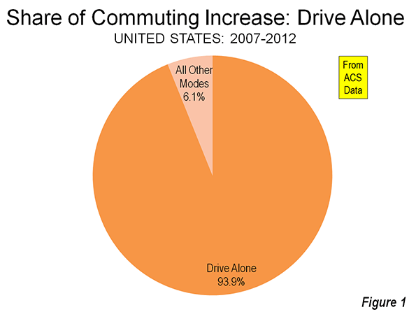
    The work trip access data is shown in Tables 1 and 2. Driving alone continued to dominate commuting, as it has since data was first reported in the 1960 census. In 2007, 76.1 percent of employment access was by driving alone, a figure that rose to 76.3 percent in 2012. Between 2007 and 2012, driving alone accounted for 94 percent of the employment access increase, capturing 1.55 million out of the additional 1.60 million daily one-way trips (Figure 1). The other 50,000 new transit commutes were the final result of increases in working at home, transit and bicycles, minus losses in car pooling and other modes.

    Carpools continued to their long decline, losing share in 43 of the 52 major metropolitan areas. Approximately 810,000 fewer people travel to work by carpools in 2012, which reduced its share from 10.7 percent to 9.7 percent.

    Transit did better, rising from 4.9 percent of work access in 2007 to 5.0 percent in 2012. There was an overall increase of approximately 250,000 transit riders. This increase, however, may be less than might have anticipated in view of the much higher gasoline prices and the imperative for commuters to save money in a more difficult economy.

    Bicycling also did well, rising from a 0.5 percent share in 2007 to a 0.6 percent share in 2012. Approximately 200,000 more people commuted by bicycle by 2012.

    Walking retained its 2.8 percent share, with only a modest 15,000 increase over the period. The largest increase in employment access outside single occupant driving was working at home, which rose from 4.1 percent to 4.4 percent. This translated into an increase of approximately 470,000.

    Metropolitan Area Highlights

    Among the 52 metropolitan areas with more than 1 million population (major metropolitan areas), 47 had drive alone market shares of 70 percent or more. Birmingham was the highest, at 85.6 percent. Surprisingly, this grouping included metropolitan areas with reputations for strong transit ridership, such as Chicago, Philadelphia, and Portland. Four metropolitan areas had drive alone shares of between 60 percent and 70 percent: Seattle, Washington, Boston, and San Francisco, which had the second lowest in the nation at 60.8 percent. As would be expected, New York had by far the lowest drive alone market share at 50.0 percent.

    Consistent with its low drive alone market share, New York led by a large margin the other metropolitan areas in its transit work trip market share. Transit carried 31.1 percent of New York commuters, up nearly a full percentage point from the 30.2 percent in 2007. New York alone accounted for nearly one-half of the growth in transit commuting over the period.

    San Francisco continued to hold onto second place, with a 15.1 percent transit market share, up a full percentage point from 2007. Washington rose to 14.0 percent, up from 13.2 percent in 2007. Boston (11.9 percent) and Chicago (11.0 percent) were the only other major metropolitan areas to achieve a transit work trip market share of more than 10 percent, and were little changed from 2007.

    Working at home continued to increase at a larger percentage rate than any other mode of work access. Four metropolitan areas were tied for the top position in 2012, at 6.4 percent. These included Raleigh, Austin, San Diego, and Portland, all metropolitan areas with a strong high-tech orientation. In San Diego and Portland, where large light rail systems have been developed, working at home is now more popular as a mode of access to work than transit.

    According to 2012 US Census Bureau estimates, the major metropolitan areas comprised 55.2 percent of the national population. These metropolitan areas represented a slightly larger share of total employment, at 57.3 percent. The combined major metropolitan areas also had similar shares to their national population share in each of the employment access modes, ranging from a low of 55.3 percent of communters driving alone to 59.9 percent of walkers. The one exception was transit, where the major metropolitan areas constituted nearly all of commuters, at 90.7 percent, well above their 55.2 percent share of US population (Table 1).

    Table 1
    Distribution of Employment Access (Commuting) by Employment Location: 2012
    SHARE OF WORK ACCESS BY MODE (2012)
      All Employment Drive Alone Car Pool Transit Bike Walk Other Work at Home
    MAJOR METROPOLITAN AREAS 57.3% 55.3% 55.4% 90.7% 59.9% 56.0% 55.6% 59.3%
    Metropolitan Areas with Legacy Cities 17.1% 13.8% 14.4% 65.4% 21.5% 27.8% 18.3% 17.1%
      6 Legacy Cities (see below) 6.0% 2.7% 4.1% 55.1% 12.7% 16.3% 7.8% 4.6%
      Suburban 11.1% 11.1% 10.3% 10.3% 8.8% 11.5% 10.5% 12.6%
      New York Metropolitan Area 6.4% 4.2% 4.5% 39.6% 5.8% 13.6% 8.5% 5.9%
        Legacy City: New York 3.1% 1.0% 1.5% 35.4% 4.2% 9.5% 4.2% 2.5%
        Suburban 3.3% 3.2% 3.0% 4.2% 1.7% 4.1% 4.3% 3.5%
      5 Other Metropolitan Areas with Legacy Cities 10.7% 9.6% 9.9% 25.8% 15.7% 14.2% 9.8% 11.2%
        5 Legacy Cities (CHI, PHI, SF, BOS, WDC) 2.9% 1.7% 2.6% 19.7% 8.5% 6.8% 3.6% 2.1%
        Suburban 7.8% 7.9% 7.3% 6.1% 7.1% 7.5% 6.2% 9.1%
    46 Other Major Metropolitan Areas 40.2% 41.5% 41.0% 25.3% 38.4% 28.2% 37.3% 42.2%
    OUTSIDE MAJOR METROPOLITAN AREAS 42.7% 44.7% 44.6% 9.3% 40.1% 44.0% 44.4% 40.7%
    United States 100% 100% 100% 100% 100% 100% 100% 100%
    Calculated from American Community Survey: 2012 (one year)

    Follow this link to a table containing data for the nation’s major metropolitan areas.

    Commuting Becomes More Concentrated in Legacy Cities

    This concentration of transit commuting was most evident to the six large "transit legacy cities," (the core cities of New York, Chicago, Philadelphia, San Francisco, Boston, and Washington), which still exhibit sufficient remnants of their pre-automobile urban cores that support extraordinarily high transit market shares. The transit legacy cities accounted for 55 percent of all transit commuting destinations in the United States, yet have only six percent of the nation’s jobs. Between 2007 and 2012, the concentration increased, with transit legacy cities accounting 68 percent of the additional transit commutes were between 2007 and 2012. Outside the legacy cities, there was relatively little difference in the share of transit commutes within metropolitan areas with legacy cities and in the other major metropolitan areas (Figure 2)

    The key to the intensive use of transit in the legacy cities is the small pockets of development that are particularly amenable to high transit market shares – the six largest downtown areas (central business districts) in the United States. Most of the commuting to transit legacy cities is to these downtown areas, Yet, the geographical areas of these downtowns is very small. Combined, the six downtown areas are only one-half larger than the land area of Chicago’s O’Hare International Airport. This yields employment per square mile densities of from 40 to 150 times densities of employee residences throughout their respective urban areas.  

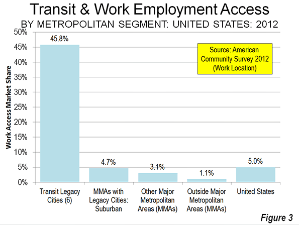
    Not surprisingly, transit has very strong market shares to work locations in the transit legacy cities, at 45.8 percent. At the same time, transit commuting to locations outside the transit legacy cities is generally well below the national average. The exception is New York, where transit commuting to suburban locations is 6.4 percent, above the overall national average of 5.0 percent. In the five other metropolitan areas with transit legacy cities, transit commuting to suburban locations is 3.9 percent. This drops to 3.1 percent, overall, in the 46 other major metropolitan areas and 1.1 percent in the rest of the nation (Table 2 and Figure).

    Table 2
    Employment Access (Commuting) by Employment Location: 2012
      Drive Alone Car Pool Transit Bike Walk Other Work at Home
    MAJOR METROPOLITAN AREAS 73.6% 9.4% 7.9% 0.6% 2.8% 1.2% 4.5%
    Metropolitan Areas with Legacy Cities 61.7% 8.2% 19.2% 0.8% 4.6% 1.3% 4.4%
      6 Legacy Cities (see below) 33.9% 6.5% 45.8% 1.3% 7.6% 1.6% 3.3%
      Suburban 76.8% 9.1% 4.7% 0.5% 2.9% 1.1% 5.0%
      New York Metropolitan Area 50.0% 6.8% 31.1% 0.6% 6.0% 1.6% 4.1%
        Legacy City: New York 23.7% 4.6% 57.1% 0.8% 8.6% 1.6% 3.5%
        Suburban 74.8% 8.9% 6.4% 0.3% 3.5% 1.6% 4.6%
      5 Other Metropolitan Areas with Legacy Cities 68.6% 9.0% 12.1% 0.9% 3.7% 1.1% 4.6%
        5 Legacy Cities (CHI, PHI, SF, BOS, WDC) 44.8% 8.6% 33.7% 1.8% 6.5% 1.5% 3.1%
        Suburban 77.6% 9.1% 3.9% 0.6% 2.7% 1.0% 5.1%
    46 Other Major Metropolitan Areas 78.7% 9.9% 3.1% 0.6% 2.0% 1.1% 4.6%
    OUTSIDE MAJOR METROPOLITAN AREAS 79.9% 10.1% 1.1% 0.6% 2.9% 1.3% 4.2%
    United States 76.3% 9.7% 5.0% 0.6% 2.8% 1.2% 4.4%
    Transit legacy cities include the municipalities of New York, Chicago, Philadelphia, San Francisco, Boston & Washington

    Staying the Same

    The big news in the last five years of commuting data is that virtually nothing has changed. This is remarkable, given the greatest economic reversal in 75 years and continuing gasoline price increases that might have been expected to discourage driving alone. Yet, driving alone continues to increase, while the most cost effective mode of car pooling continued to suffer huge losses, while working at home continued to increase strongly.

    Wendell Cox is a Visiting Professor, Conservatoire National des Arts et Metiers, Paris and the author of “War on the Dream: How Anti-Sprawl Policy Threatens the Quality of Life.

    Photograph: DART light rail train in downtown Dallas (by author)

  • The Growing Public Safety Inequality Gap in Chicago

    Take a look at the two maps below. Like the captions say, the one on the left shows homicide rates in Chicago by police district in the early 90s, when crime was at its peak, and the one on the right shows the same thing, but about two decades later.* The areas in dark green are the safest; the ones in dark pink are the most dangerous. The colors are calibrated so that green areas are safer than average for the early 90s, and pink ones are more dangerous than average for the early 90s. The 2008-2011 map keeps the same calibration: green is safe compared to the early 90s, so that you can see change in the levels of violence over time.

    And, indeed, the first thing that jumps out from these maps is that there’s way more green nowadays, and it tends to be darker. The city is way safer! Some areas we might consider a bit dicey today – like, say, the Lawndale/Little Village area – actually register as light green, meaning that by early 90s standards, they would be considered relatively safe.

    HOMICIDE RATE BY POLICE DISTRICT

    Hom90 hom20

    1990-1993 2008-2011

    [For those of you craving numbers, the murder rate averaged 30 per 100k during the first period, and 17 per 100k during the second, a decline of nearly 50%.]

    Of course, the other thing we notice is that there are some very distinct patterns to safety. These maps are breaking exactly no news by indicating that the more dangerous parts of the city are on the West and South Sides, but it is striking, I think, to see that nowadays, basically the entire North Side is the darkest green, which translates to a homicide rate of less than 6 per 100k. In fact, the dark-green part of the city has a murder rate of 3.3 per 100k.

    Three point three. In New York City, which is constantly (and mostly correctly) being held up as proof that urban safety miracles can happen in America, it’s 6.3. Toronto, which as far as North American big cities go occupies a fairy tale land where no one hurts anybody, had a homicide rate of 3.3 per 100k as recently as 2007. The North Side is unbelievably safe, at least as far as murder goes.

    But there are none of the darkest green on the West or South Sides. There’s actually a fair amount of pink, meaning places that are relatively dangerous even by the terrifying standards of the early 90s.

    This raises a question: Has the great Crime Decline benefited the whole city equally? Are the South and West Sides still relatively dangerous because they started from such a bad place, or because they haven’t seen nearly as much of a decline as the North Side has?

    Here is the answer in another map:

    CHANGE IN HOMICIDE RATE, EARLY 90s – LATE 2000s

    Murderchange

    The areas in darkest green saw the greatest decline; red means the murder rate actually increased.

    So: Yes, the great Crime Decline is a fickle thing. The North Side saw huge decreases (in Rogers Park, it was over 80%) pretty much everywhere; the few areas that are lighter green were the safest in the city to begin with. The parts of the South and West Sides closest to downtown – Bronzeville, the West Loop, Pilsen, etc. – got a lot safer. But most of the rest actually got worse, including some neighborhoods that were already among the most dangerous in the city, like Englewood and Garfield Park.

    This is a complicated state of affairs, and probably goes at least part of the way to explaining why, in the face of a 50% decrease in homicides citywide over the last two decades, many people persist in believing that the opposite is true: because in their neighborhoods, it is. It’s a dynamic that defies an easy narrative, and makes me slightly less angry (though only slightly) at all those journalists who have written in the last year or two about murder in Chicago without mentioning that the city is, in fact, safer on the whole than it has been in fifty years.

    Here is one final pair of maps:

    RATIO OF POLICE DISTRICT HOMICIDE RATE TO CITY AVERAGE

    Homicideratios90s homicideratio2

    1990-1993 2008-2011

    This is slightly less intuitive. These maps show the how the homicide rate in any given police district compares to the citywide average, using ratios; for example, if the homicide rate in West Town is 10 per 100k, and citywide it’s 5 per 100k, West Town’s ratio is 2 to 1. If West Town were 2.5 per 100k, its ratio would be 0.5 to 1. (Obviously the numbers in these examples are made up.) Blue areas have ratios below 1, and so are relatively safe; red ones above 1, and are relatively dangerous.

    With the help of these maps, I’m going to ignore what I said about all this defying an easy narrative, and try to supply one: Over the last twenty years, at the same time as overall crime has declined, the inequality of violence in Chicago has skyrocketed. The pattern of what’s blue and what’s red in each map is mostly the same; I count only three out of twenty-five districts that switched from one color to another. But the colors are much darker in the 2000s than they were in the 1990s. There have always been safer and more dangerous areas here, as there are everywhere; but the gap between them is way, way bigger now than it used to be.

    Numbers will help this case. Imagine that for each of these two time periods, we cut the city into equal thirds: one contains the most dangerous neighborhoods; another, the safest; and the last, everything else. In the early 90s, the most dangerous third of the city had about six times as many murders as the safest third. By the late 2000s, the most dangerous part of the city had nearly fifteen times more homicides than the safest third.

    In addition, here are two charts (click to enlarge):

    HomRatio90

    Homratio20

    The divergence is self-evident. The early 90s look very roughly like a normal curve: most neighborhoods are in the middle, and there’s a clear, if slightly bumpy, slope down towards the extremes.

    Today, any semblance of a normal curve has been annihilated. Or, actually, that’s not quite right. Now it looks like there might be two completely separate normal curves, one with a peak at 0.2-0.4, and the other peaking at 3.1-4. Plus a few guys who got lost in the middle.

    I suppose there are many, many things that one might say about what this means, but here’s the bottom line: The disadvantages and tragedies that people in “dangerous” neighborhoods experience are both absolute and relative. The death of an innocent person** is an indescribable loss no matter what. And, on that count, things are somewhat better for Chicago’s most violent areas: the homicide rate for the most dangerous third of the city declined from 51 to 39 per 100k in the time period we’ve looked at here. That is a real accomplishment, and hundreds, if not thousands, of people are still with their families and friends because of it.

    But in other ways, it does matter if other parts of the city are getting safer much, much faster. When people weigh safety in their decisions about where to live, they do so by comparing: How much safety am I gaining by living in one neighborhood versus another? The same is true of entrepreneurs considering where to open their next business. The same is true of tourists looking to explore the city. The same is true of locals looking to travel to another neighborhood to eat out or go shopping.

    On every one of those counts, the disadvantages that are accruing to already-disadvantaged neighborhoods in terms of lost population, investment, and connections to the rest of the city are now much more severe. The hurdles are that much higher.

    That’s bad for those physical neighborhoods. It’s also terrible for the people who have good reasons to live there, like social networks, nearby family, or the affordability of real estate.

    Because I don’t have the data in front of me, but who would doubt that over these same twenty years, there has also been a growing gap between how much it costs to live on the safe North Side compared to the more dangerous parts of the South and West Sides? Who would doubt that, as the North Side reaches Toronto-level peacefulness, the cost of rent has greatly diminished the number of apartments there affordable to the poor and working class?

    In other words, just as the stakes have been tripled as to whether you live in Relatively Safe Chicago or Relatively Dangerous Chicago, it has become much, much harder to establish yourself on the winning side.

    So: Next time you hear someone talking about “record violence” in the city, tell them that actually, murders are down almost 50% from twenty years ago. And then tell them that what’sreally alarming is murder inequality.

    * Why does this data end in 2011? Because I made these maps using data from the Chicago Police Department annual reports, which are available online, and which only broke down crimes by police district in the 1990s. In 2012, the police district boundaries changed, making it not quite an apples-to-apples comparison to prior years. Maybe somewhere data exists by Community Area for the early 90s, and then I could redo all of this.

    ** And I think reporting like that done by This American Life at Harper High in Englewood ought to challenge conventional middle-class ideas about “innocence” in the ghetto. It is very easy for those who don’t live in the neighborhood to talk about “thugs” and “gangsters” getting what they deserve. It is also very cruel, and very naive about what exactly “gangs” are, and what kind of people join one, and how, and why.

    This post originally appeared in City Notes on August 5, 2013. Daniel Hertz is a masters student at the Harris School of Public Policy at the University of Chicago.

    Chicago photo by Bigstock.

  • 125 Years of Skyscrapers

    Skyscrapers have always intrigued me. Perhaps it began with selling almanacs to subscribers on my Oregon Journalpaper route in Corvallis. I have continued to purchase almanacs each year and until recently, the first thing I would do is look in the index for "Buildings, tall” in the old Pulitzer The World Almanac, the best source until the Internet.

    My 1940 edition is the first in which “Buildings, tall” appears. The world of skyscrapers has changed radically through the years. This article provides a historical perspective on the world’s tallest buildings, using information from almanacs and the Internet (See Table Below). Extensive hyperlinking is also used, principally to articles on particular buildings.

    The Rise of Commercial and Residential Buildings

    Throughout most of history, the tallest habitable buildings have been religious edifices, or mausoleums, such as the great pyramids of Egypt. But in the middle to late 19th century, taller commercial and residential buildings were erected in the United States. For four years, from 1890 to 1894, the New York World Building, itself was the tallest in the world, at 309 feet (95 meters) and 20 floors. But it was not until the turn of the 20th century that a commercial or residential building exceeded the tallest religious building, Ulm Cathedral in Germany. This was Philadelphia’s City Hall. In its wisdom, however, Philadelphia outlawed any building higher than William Penn’s head at the top of City Hall. It was not until the late 1980s that a taller building appeared in Philadelphia (One Liberty Place).

    Tallest Buildings in 1940

    Despite Chicago’s claim as birthplace of the skyscraper, by 1940, nine of the 10 tallest buildings in the world were in New York. Manhattan was so dominant that the World Almanac listed the city at the top of the list, out of alphabetical order. The five tallest buildings, the Empire State Building, the Chrysler Building, 60 Wall Tower (now 70 Pine), 40 Wall Tower (now the Trump Building) and the RCA Building (now the GE Building) all  opened in the 1930s and represent Art Deco at its zenith. The sixth tallest, the Woolworth Building, had been the world’s tallest from 1913 to 1930 and is neo-Gothic.

    Cleveland’s Terminal Tower was 7th tallest, and the tallest building in the world outside New York. Cleveland’s Union Terminal was in the building and served the legendary New York Central Railroad’spremier New York to Chicago 20th Century Limited.

    Tallest Buildings in 1962

    Things changed little by 1962. The five Art Deco skyscrapers that where the tallest in 1940 remained so in 1962. There were two newcomers to the top 10 list, both modernist monoliths, the Chase Manhattan Bank Building in lower Manhattan and the Pan Am Building (later the Met-Life Building). The Pan Am Building is despised by many New Yorkers as Parisians despise the Tour Montparnasse. This led to banning similar behemoths in the ville de Paris (most of the skyscrapers in the Paris urban area are in La Defense, a nearby suburban “edge city”). But all of the 10 tallest buildings in the world were in the United States.

    Tallest Buildings in 1981

    Just two decades later, New York’s dominance eroded. By now, The World Almanac listed New York in alphabetical order, between New Orleans and Oakland. For the first time since before 1908 when the Singer Building opened, New York was not the home of the world’s tallest building. That title had gone to Chicago’s, Sears Tower (later Willis Tower), which opened in 1974. Chicago gained even more respect with two other buildings appearing in the top 10, the Standard Oil Building (nowAon Center) and the John Hancock Center, which was the tallest mixed use (residential and commercial) building in the world. The twin towers of the former New York World Trade Center were tied for second tallest in the world.

    For the first time, a non-American skyscraper was in the top 10. Toronto’s First Canadian Place was the eighth tallest in the world. Only three of the former five New York Art Deco buildings remained in the top 10, with 40 Wall Tower and the RCA Building no longer on the list.

    Tallest Building in 2000

    By 2000,   Kuala Lumpur, which is not among the largest cities in the world, emerged with both of the tallest buildings, in the Petronas Towers. The Petronas Towers ended America’s long history of having the tallest building. These distinctive postmodern towers were just two of six Asian entries in the top 10, including another postmodern structure, the Jin Mao Tower in Shanghai’s Pudong, which is probably the world’s largest edge city.

    I recall my surprise at exiting the Guangzhou East Railway station in 1999 to see the CITIC Tower, the 7th tallest building in the world. There could have been no better indication of that nation’s modernization. The Pearl River Delta had two other of the tallest buildings, one in Shenzhen (Shun Hing Square), the special economic zone that became the economic model for the rest of China, and the second in Hong Kong (Central Plaza).

    Tallest Building in 2013

    By 2013, the world of skyscrapers had nearly completely overturned. Dubai, with a population little more than Minneapolis-St. Paul, is now home to the world’s tallest building, the Burj Khalifa. The Burj Khalifa is not just another building. Never in history has a new tallest building exceeded the height of the previous tallest building by so much. Even the long dominant Empire State Building had exceeded the Chrysler building by only 200 feet (64 meters). The Burj Khalifa was nearly 1050 feet higher (320 meters) than the then tallest building, Taipei 101, and reaches to more than 1/2 mile (0.8 kilometers) into the sky. The world’s second tallest building (the Mecca Royal Hotel Clock Tower) is also on the Arabian Peninsula.

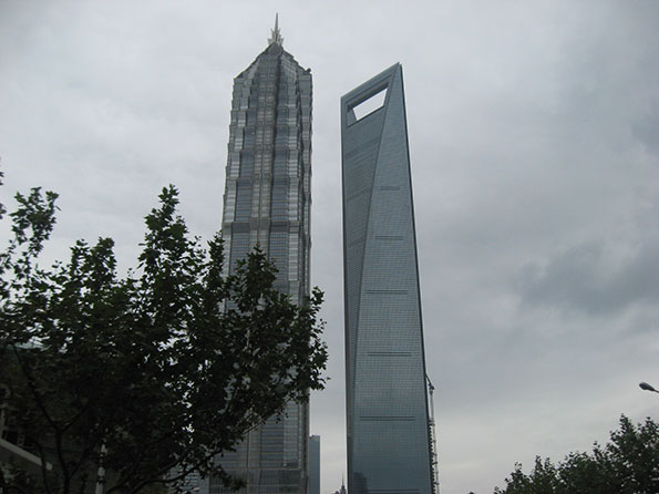
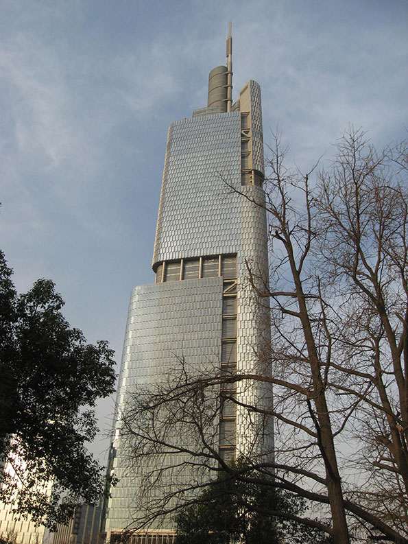
    The Shanghai World Financial Center is now the fourth tallest in the world, and when it opened had the highest habitable floor and the highest observation deck in the world. Its unusual design has earned it the nickname "bottle opener" among residents (Photo 1). Hong Kong has a new entry in the list, the International Commerce Center, across the harbor in Kowloon. Nanjing’s Greenland Financial Complex (Photo 2) ranks 8th, and Shenzhen’s Kinkey 100 ranks 10th.


    Nine of the 10 tallest buildings in the world are now in Asia. The last American entry is the Sears Tower (Willis Tower), in Chicago, which ranks 9th. Skyscraperpage.com maintains a graphic of the world’s tallest buildings (Note 1).

    Under Construction: A number of super-tall buildings (Note 2) will soon open. Earlier this month, the Shanghai Tower was “topped out.” This structure is across the street from the Jin Mao Tower and the Shanghai World Financial Center, forming by far the greatest concentration of super-tall skyscrapers in the world (Photo 1). The Ping An Finance Center in Shenzhen and the Wuhan Greenland Center in Wuhan are also under construction, and will rank, at least temporarily, second and third tallest in the world when completed. The Goldin Finance Building in Tianjin and the Lotte World Tower in Seoul will be somewhat shorter. One World Trade Center in New York will be completed before most of these, which will allow it brief entry into the top ten.

    Another entry, Sky City in Changsha (Hunan) could be on the list, slightly taller than the Burj Khalifa. This building is to be constructed in 210 days, following site preparation and work began last month. It was, however, halted by municipal officials and there are conflicting reports as to the building’s status.

    Skyscraperpage.com also maintains a graphic of the world’s tallest under-construction buildings.

    Tallest Buildings in 2020?

    None of the tallest buildings in the world are predicted to be in the United States by 2020, according to a graphic of current plans posted on the Council on Tall Buildings and Urban Habitat website. The Burj Khalifa is expected to be replaced as tallest by another Arabian Peninsula entry, the Kingdom Tower in Jeddah, which will be 0.6 miles high (3.3 kilometers). The torch has been passed to Asia.

    WORLD’S TALLEST COMPLETED BUILDINGS: 1940-2013
    1940 Building City Feet Meters Stories
    1 Empire State New York 1,250 381 102
    2 Chrysler New York 1,046 319 77
    3 60 Wall Tower (70 Pine Street) New York 950 290 66
    4 40 Wall Tower (Trump) New York 927 283 90
    5 RCA New York 850 259 70
    6 Woolworth New York 792 241 60
    7 Terminal Tower Cleveland 708 216 52
    8 Metropolitan Life New York 700 213 50
    9 500 5th Avenue New York 697 212 60
    10 20 Exchange Place New York 685 209 54
    1962 Building City Feet Meters Stories
    1 Empire State New York 1,250 381 102
    2 Chrysler New York 1,046 319 77
    3 60 Wall Tower (70 Pine Street) New York 950 290 66
    4 40 Wall Tower (Trump) New York 927 283 71
    5 RCA New York 850 259 70
    6 Pan Am (Met-Life) New York 830 253 59
    7 Chase Manhattan New York 813 248 60
    8 Woolworth New York 792 241 60
    9 20 Exchange Place New York 741 226 57
    10 Terminal Tower Cleveland 708 216 52
    1981 Building City Feet Meters Stories
    1 Sears Tower (Willis Tower) Chicago 1,454 443 110
    2 World Trade Center-North Tower New York 1,350 411 110
    2 World Trade Center-South Tower New York 1,350 411 110
    4 Empire State New York 1,250 381 102
    5 Standard Oil (Amoco) Chicago 1,136 346 80
    6 John Hancock Center Chicago 1,127 344 100
    7 Chrysler New York 1,046 319 77
    8 Texas Commerce Tower Houston 1,002 305 75
    9 First Canadian Place Toronto 952 290 72
    10 60 Wall Tower (70 Pine Street) New York 950 290 66
    2000 Building City Feet Meters Stories
    1 Petronas Tower 1 Kuala Lumpur 1,483 452 88
    1 Petronas Tower 2 Kuala Lumpur 1,483 452 88
    3 Sears Tower (Willis Tower) Chicago 1,454 443 110
    4 Jin Mao Tower Shanghai 1,381 421 88
    5 World Trade Center-North Tower New York 1,350 411 110
    5 World Trade Center-South Tower New York 1,350 411 110
    7 Citic Plaza Guangzhou 1,283 391 80
    8 Shun Hing Center Shenzhen 1,260 384 69
    9 Empire State New York 1,250 381 102
    10 Central Plaza Hong Kong 1,227 374 78
    2013 Building City Feet Meters Stories
    1 Burj Khalifa Dubai 2,717 828 163
    1 Mecca Royal Hotel Clock Tower Mecca 1,971 601 120
    3 Taipei Taipei 101 1,670 508 101
    4 Shanghai World Financial Center Shanghai 1,614 592 101
    5 International Commerce Center Hong Kong 1,588 484 118
    6 Petronas Tower 1 Kuala Lumpur 1,483 452 88
    6 Petronas Tower 2 Kuala Lumpur 1,483 452 88
    8 Greenland Financial Complex Nanjing 1,476 450 89
    9 Sears Tower (Willis Tower) Chicago 1,454 443 110
    10 Kinkey 100 Shenzhen 1,450 442 100
      Outside United States
      United States, Outside New York
      New York


    Wendell Cox is a Visiting Professor, Conservatoire National des Arts et Metiers, Paris and the author of “War on the Dream: How Anti-Sprawl Policy Threatens the Quality of Life.

    ———————

    Note 1: There are a number of sources for information on tall buildings, such as the Council on Tall Buildings and Urban Habitat, Skyscraperpage.com, Emporis.comand Wikipedia.com. Of course, my favorite will always be The World Almanac, even if the Internet provides faster access. Wikipedia also has fascinating articles on individual buildings (Wikipedia’sutility is limited to recreational research for identifying original sources, and should never be used in serious research, or God forbid, used in a footnote).

    Note 2: The Council on Tall Buildings and Urban Habitats defines a super-tall building as being over 980 feet (300 meters) high.

    ——————————

    Photo 1: Jin Mao Tower (left) and Shanghai World Financial Center (right), Shanghai. Construction began later on the recently topped out Shanghai Tower to the right of the Shanghai World Financial Center.

    Photo 2: Greenland Financial Center, Nanjing

    —————————-

    Photograph: The New York World Building (1890-1955).

  • Is the Census Bureau On Track For Another Estimating Fiasco?

    When the 2010 Census results were released, a number of big cities had populations that were very off from what would have been expected based on the Census Bureau’s previous annual estimates of the population – sometimes grossly so.  Some of these were related to cities that had challenged the estimates and had adjustments made in their favor, such as Cincinnati and St. Louis. Given that the Census Bureau seems to have approved every challenge, bogus challenges were all but encouraged.  Still, there were significant variances in cities that didn’t challenge the Census, such as Chicago and Phoenix. 

    Had the estimates been correct, Atlanta would have gained over 125,000 people in the last decade – a stunning gain of 30%. But Atlanta’s actual population was nearly flat, growing less than 1%. Other cities experiencing huge swings due to misestimates were places like New York City (projected to gain 417,000, actually gained less than half that at 167,000) and Chicago (projected to lose 29,000 people, actually lost over 200,000).  I myself ended up with some egg on my face for drawing unwarranted inferences from what appear to be badly botched estimates.

    Urban advocates were quick to cry foul, alleging undercounts (though taking the strong growth counted for downtowns as gospel).  Given the much more rigorous Census standards for challenges to decennial counts, it was virtually impossible for these to succeed, but some have continued to maintain systematic undercounting in the decennial census as a matter of course.

    When the first round of new post-2010 Census estimates were released for cities, the media started crowing again about a supposed resurgence in city populations. However, this wasn’t real growth. Instead, the Census Bureau had created a new, temporary methodology to get the estimates out the door. Rather than producing real numbers, they simply took the estimates for growth at the county level and assumed every municipality in the country grew at the exact same percentage as the county as a whole.  The media missed the story because they relied on the headline data, and were attracted to the “back to the city” meme. They would have had to dig into the methodology document – something ordinarily no one would need to do for this sort of routine release – to figure this out.  This release was embarrassment number two for the municipal estimates program.

    You would think that after these two fiascos, the Census Bureau would be highly attuned to getting the municipal estimates right. Indeed, for the recently released 2012 vintage municipal estimates, they went back to using a real estimating methodology instead of the simple allocation approach from 2011. However, as with the 2000s, these are showing strong municipal population growth in places where that would represent a major discontinuity with the actual decennial Census results from the 2000-2010, and from economic conditions.

    How is it that cities, after a disappointing 2000s where some places actually underperformed versus the 1990s, in an economy that has been recessionary to sluggish the entire post-2010 person and in which the housing market that triggered the crash has also yet to recover, that these growth rates are possible? It’s certainly eyebrow-raising at a minimum.

    Consider Chicago. After losing over 200,000 people in the 2000s, Chicago supposedly gained 17,000 people between 2010 and 2012. With a highly publicized murder problem in many of the neighborhoods that saw the severest depopulation in the previous decade, where housing was whacked leaving any number of uncompleted building shells, and with a budget crunch that is squeezing service provision, this would certainly represent a remarkable accomplishment.

    Or look at Indianapolis. In its urban core area, Center Township (township data is reported in a similar manner to municipal estimates in some areas), the population declined by almost 25,000 people during the 2000s, a steep 14.5% loss that was worse than Buffalo and St. Louis and nearly as bad as Cleveland.  Center Township has lost population every decade since 1950. Yet the Census Bureau has estimated that it gained 2,300 people since the census. Though a lower total percentage due to the base, this is more physical people than was estimated to be added by all but three of Indy’s suburbs, many of which posted huge gains in the 2000s (such as Westfield, which added 20,800 during the 2000s but was only estimated to have added 1,800 since the census despite building permit issuances at all time record highs).  This sort of radical turnaround in fortunes would certainly be nearly miraculous if true.

    Amazingly, the Census Bureau actually even went back to the estimating status quo ante in Atlanta by claiming very high population growth, despite missing by a country mile last time around. Atlanta is projected to have gained almost 24,000 people since the census, even though it was nearly flat the previous decade. This is a rate very close to what the Census Bureau estimated it had in the last decade.

    You can go right down the line and find similar effects at work in other places. It raises serious questions about these estimates. Places like San Francisco, DC, and even Pittsburgh have had economic growth that might seem to underpin more robust core population growth, it’s hard to credit many of these other places with such turnaround.  Some of the analysts focused on an inability of people to move outwards because of the economy, but it’s hard to believe this alone grew the population of Atlanta by 24,000 people.

    There are red flags all over these numbers. Perhaps the urban advocates claiming dramatic undercounting in the census were right – or maybe not. Regardless, something very odd appears to have been going on with the Census Bureau’s municipal estimates and counts over the last decade or so. Until there’s reason to believe they’ve finally started getting it right, I would treat any number that comes out before the decennial census with extreme skepticism. After having fooled us not once, but twice before, smart money should apply a steep discount to any annual municipal estimates coming out of the Census Bureau.

    Aaron M. Renn is an independent writer on urban affairs and the founder of Telestrian, a data analysis and mapping tool. He writes at The Urbanophile.

    Photo: Travelin’ Librarian

  • Did the Midwest Ever Have Strong Coastal Connections?

    Pete Saunders recently described how, after being built in part with eastern money, West Coast outposts like San Francisco and Los Angeles never relinquished their East Coast connections. This created bi-coastal connectivity that continues to play dividends for both coast at the expense of relatively disconnected “flyover country.”

    But I wonder: did most places in the Midwest ever have great connections to the East Coast (especially New York City) to begin with? It brought to mind William Cronon’s tour de force book “Nature’s Metropolis: Chicago and the Great West” in which he documented the rise of Chicago and the rest of the Midwest together as an integrated system. One of the things he did was try to trace financial flows. This wasn’t easy, but he looked at things like bankruptcy and probate records, as well as other people’s research into correspondent banking relationships.

    What Cronon found is that Chicago served as the the gateway that connected the rest of the Midwest to eastern markets. This was true physically via the industrial works in Chicago that converted raw materials into finished goods, railroads, etc. But it was also true financially. Cronon notes:

    By choosing Chicago to be the greatest concentration of railroad capital on the continent, and by giving Chicago merchants special access to credit and discounts that made wholesaling possible, New Yorkers and other eastern capitalists place it atop the western system at the very moment that settlement in the region began its most explosive growth
    ….
    Canadian geographer A. F. Burghardt has used less grandiloquent language to describe this same process. In his phrase, Chicago became a “gateway city” by serving as the chief intermediary between newly occupied farms and town in the West and the maturing capitalist economy of the Northeast and Europe.

    Writing specifically about finance, Cronon notes:

    In 1884 a Chicago guidebook author could report, “Our banks are now depended on to a great extent to furnish Eastern exchange for other cities, and Chicago has become the recognized financial center of the West – bearing the same relation to the West that New York does to the entire country.”

    If one moves further down the urban hierarchy, the implications of these banking linkages for Chicago’s regional hinterland become clearer still. By looking at medium-sized cities that used Chicago banks for their principal correspondent relations, one discovers that Chicago’s financial hinterland extended from Cleveland in the east to Denver in the west. Three decades later, in 1910, it extended all the way west to Seattle, San Francisco, and Los Angeles.

    What this suggests to me, though I didn’t see Cronon explicitly state it, is that much of the Midwest may never have had much in the way of independent East Coast connections. Rather, their connections were with Chicago, relationships that definitely continue to the modern day. Thus it may be less a matter of Midwestern cities giving up East Coast ties as never having had much of them in the first place.

    Chicago, by contrast, had not only its original East Coast connections, but also developed networks to the West. The persistence of these networks is one of the many factors that enabled Chicago to more readily adapt to the global era than other Rust Belt locales. Chicago may be the only Midwest city with reasonably strong coastal connections.

    It would be interesting to study the development of financial relationships in cities over time. Saunders posited that New York money originally financed San Francisco, but Cronon notes the dominance of Chicago connections by 1910. San Francisco ultimately became the major west coast financial center in its own right and retains a significant finance center function through its venture capital concentrations.

    Cleveland as the easternmost extent of Chicago’s hinterland is something we see today. Indeed, I’ve been told the west side of the Cleveland region tilts towards Chicago and the east side towards New York even today.

    In any case, I’m not making definitive claims, just looking for potential explanations for the paucity of Midwest networks. Cronon basically makes the argument that Chicago and the Midwest were the original “megaregion” and as a result, perhaps Midwestern cities developed networks that were excessively Chicago-centric. Given the historic status of Chicago as a gateway city to national and global markets, my idea that Chicago should see itself as the Midwest’s global gateway seems directionally correct.

    Aaron M. Renn is an independent writer on urban affairs and the founder of Telestrian, a data analysis and mapping tool. He writes at The Urbanophile where this piece originally appeared.
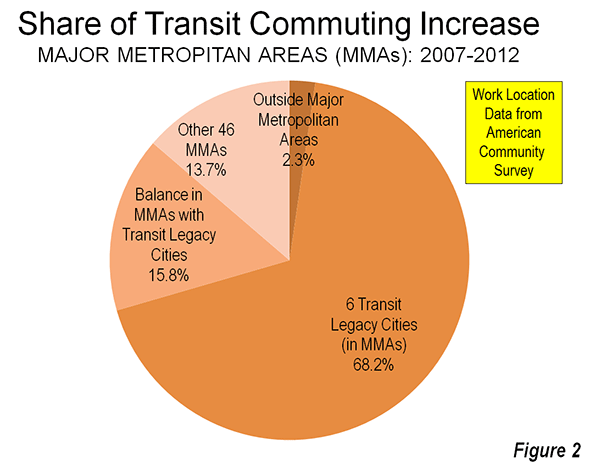
    Photo by Doug Siefken