Tag: Chicago

  • No G-8 Summit for Chicago

    Veteran Chicago journalist Ben Joravsky explains why Chicago’s better off without the G-8 summit:

    One, we’re not equipped to handle it. Two, we can’t afford it. And, three, it has the potential to give the Republicans great campaign material for the coming election.

    President Obama has done Mayor Emanuel a great favor, because there’s no real upside to the summit for Chicago. Banks on La Salle Street were planning to close. Many major corporations located downtown were telling their employees to stay home. The fear of violence from the demonstrators was bound to dampen economic activity. There’s no real need to showcase Chicago, international travelers are well aware of the town.

    Some may view as an embarrassment to Emanuel. The Chicago Sun-Times reported to President Obama only gave Emanuel “an hour’s advance notice.”  But Emanuel is the lucky one. Violent demonstrations or not, the G-8 would have put the spotlight on Chicago. Do we want to shine a light on the recent loss of  200,000 people? The high retail sales tax? The bad public schools? The relentless legacy of public corruption?

    President Obama helped his former Chief of Staff dodge a major bullet.

  • Academics Find Chicago Most Corrupt Big City

    One of the great failures in studying the politics of American cities has been the assumptions political scientists have used. Many academics assume that politicians work toward serving the public interest. In this naïve or dishonest world, an informed public (aided by a vigilant press) votes for candidates that rise above petty self interest to promote the common good. Recently, The University of Illinois-Chicago Political Science department released an impressive empirical study on corruption. Chicago is number one in public corruption. The facts are rather disturbing, “Since 1973, 31 more aldermen have been convicted of corruption. Approximately 100 aldermen have served since then, which is a conviction rate of about one-third.”

    The study shows that Chicago city council isn’t the only place in Illinois racking up felony convictions. Illinois Governors have an “ethics problem”:

    Since 1970, four Illinois governors have been convicted of corruption. Yet only seven men have held this office in this time, meaning more than half of the state’s governors have been convicted in the past forty-two years. Otto Kerner, who served from 1961 until his resignation in 1968 to accept a federal judgeship, was convicted in 1973 of mail fraud, bribery, perjury, and income tax evasion while governor. Dan Walker, who served from 1973 – 1977, was convicted in 1987 of obtaining fraudulent loans for the business he operated after he left office.

    George Ryan, who served from 1999 – 2003, was found guilty in 2006 of racketeering, conspiracy and numerous other charges. Many of the charges were part of a huge scandal, later called “Licenses for Bribes,” which resulted in the conviction of more than 40 state workers and private citizens. The scandal involved unqualified truck drivers receiving licenses in exchange for bribes that would ultimately end up in Ryan’s campaign fund. The scandal came to light when a recipient of one of these licenses crashed in to a van and killed six children. But perhaps the most famous of all Illinois corrupt officials is Rod Blagojevich, who served from 2003 until his impeachment in 2009. Blagojevich was ultimately convicted in 2011 of trying to sell the U.S. Senate seat vacated by Barack Obama. Other charges included his attempting to shake down Children’s Memorial Hospital for a campaign contribution in return for funding and his trying to extort a racetrack owner.

    When Rod Blagojevich reports in March  to Littleton, Colorado, American history will be made. Illinois will have to back-to- back Governors in jail at the same time. What is it about Chicago and Illinois voters that gets them to vote for crooks? The data in the study is based on Justice Department numbers going back to 1976.

    As we move closer to the next Presidential election, Barack Obama’s association with Chicago’s political culture is bound to be an issue once again. How could a Chicago politician rise so far, so fast, without questioning the corrupt part of the country he comes from? It’s something to keep in mind when you read this study.

  • The Shifting Landscape of Diversity in Metro America

    Census 2010 gave the detail behind what we’ve known for some time: America is becoming an increasingly diverse place.  Not only has the number of minorities simply grown nationally, but the distribution of them among America’s cities has changed. Not all of the growth was evenly spread or did it occur only in traditional ethnic hubs or large, historically diverse cities.

    To illustrate this, I created maps of U.S. metro areas showing their change in location quotient. Location quotient (LQ) measures the concentration of something in a local area relative to its concentration nationally. This is commonly used for identifying economic clusters, such as by comparing the percentage of employment in a particular industry locally vs. its overall national percentage. In a location quotient, a value of 1.0 indicates a concentration exactly equal to the US average, a value greater than 1.0 indicates a concentration greater than the US average, and a value less than 1.0 indicates a concentration less than the US average.

    While commonly used for economic analysis, the math works for many other things. It can be useful to measure how the concentration of particular values changes over time relative to the national average.  In this case, we will examine the change in LQ for various ethnic groups between the 2000 and 2010 censuses for metro areas. Those metro areas with a positive change in LQ grew more concentrated in that ethnic group compared to the US average over the last decade. Those with a negative change in LQ grew less concentrated compared to the nation as a whole, even if they grew total population in that ethnic group.

    To increase concentration level requires growing at a faster percentage than the US as a whole. This is obviously easier for places that start from a low base than those with a high base. In this light, places that have traditionally been ethnic hubs – such as west coast metros for Asians – can grow less concentrated relative to the nation as a whole even if they continue to add a particular ethnic group. Asian population, for example, can grow strongly in California, but at a slower rate than the rest of the country. This is indeed the case as groups like Hispanics and Asians have been de-concentrating from the west coast, and now are showing up in material numbers even in the Heartland.

    Black Population


    Black Only Population, Change in Location Quotient 2000-2010

    The change in Black concentration is particularly revealing. Much has been written about the so-called reversing of the Great Migration. But contrary to media reports, there is no clear monolithic move from North to South. Instead, we see that the outflow has been disproportionately from America’s large tier one metros like New York, Chicago, and Los Angeles. In contrast, Northern cities like Indianapolis, Columbus, and even Minneapolis-St. Paul (home to a large African immigrant community) grew Black population strongly, and actually increased their Black concentrations. Similarly, there were clearly preferred metro destinations in South for Blacks, like Atlanta and Charlotte. Many other Southern metros , particularly those along the Atlantic coast of Georgia and the Carolinas continued to lose their appeal to Blacks, relatively speaking.

    Hispanic Population


    Hispanic Population (of any race), Change in Location Quotient 2000-2010

    Here we see de-concentration clearly in action. The Mexican border regions retained high Hispanic population counts, but they are no longer as dominant as in the past. Places like Nashville, Oklahoma City, and Charlotte particularly stand out for increasing Hispanic population percentage. Again, large traditionally diverse tier one cities like New York and Chicago show declines on this measure as smaller cities are now more in on the diversity game.

    Asian Population


    Asian Only Population, Change in Location Quotient 2000-2010

    Again, we see here that America’s Asian population spread well beyond traditional west coast bastions. There were big increases in Asian population counts, with resulting LQ changes, in places like Atlanta, Indianapolis, Philadelphia, and Boston. Even New York (which now has over one million Asian residents within the city limits alone) and Chicago showed gains among Asians.

    Children (Population Under Age 18)

    As a bonus, here is a look at LQ change for metro areas for people under the age of 18.


    Children (Population Under Age 18), Change in Location Quotient 2000-2010

    Here we see that metros along America’s northern tier now have relatively fewer children than a decade ago, while metros like Denver, Dallas, and Nashville had more. Clearly, some places are increasingly seen as better – and perhaps also more affordable – locations for child rearing than others.  Perhaps unsurprisingly many of the out of favor locales are either expensive, have poor economic prospects, and/or are excessively cold. Not surprisingly, for example, Atlanta, Houston and Florida’s west coast have gained in this demographic while much of the Northeast, particularly upstate New York, have lost out.

    The overall key is while there are certain broad themes that emerge from the recent Census, such as America’s increasing diversity or signs of a reversing of the Great Migration, we need to take a more fine grained view to see which places are in fact benefitting and being hurt by these trends.  What we see here is that traditional large urban bastions of black population and ethnic diversity are no longer the only game in town. Smaller places in the interior and the South are now emerging as diversity magnets in their own right, as well as magnets for families with children. This is the collection of places to watch to look for the next set of great American cities to emerge.

    Aaron M. Renn is an independent writer on urban affairs based in the Midwest. His writings appear at The Urbanophile. Telestrian was used to analyze data and to create maps for this piece.

    Note: The original version of this piece included incorrect charts for the Asian, Hispanic, and child measures.

  • Blago’s Historic Sentencing: Organized Crime in Illinois

    Former Illinois Governor Rod Blagojevich was sentenced today to 14 years in prison. Illinois will now have the dubious distinction of having two back-to-back Governors in jail at the same time. Could a more vigilant press have stopped the amazing political career of Rod Blagojevich? When you look into the background of the former Governor the tentacles of organized crime can’t be ignored.

    Rod Blagojevich has been identified as a former associate of the Elmwood Park street crew of the Chicago Mob by Justice Department informant Robert Cooley. The allegations concern Blagojevich paying street tax to the Chicago Mob to operate a bookmaking operation. Former senior FBI agent James Wagner confirmed that Cooley told the FBI about Blagojevich in the 1980s. The Chicago Sun-Times and Chicago Tribune still haven’t reported on the Cooley allegations concerning Blagojevich. WLS-TV reporter Chuck Goudie has been most vocal in reporting on Blagojevich’s background.

    Blagojevich was tried in room 2525 of the Dirkson Federal Building, the same room used for the massive Family Secrets Chicago Mob trial. It’s odd that Judge James Zagel was the federal judge in both cases. But, there’s more in common than the media has emphasized.

    Blagojevich can’t help but be a little bitter. Former friend Eric Holder was supposed to help Blagojevich land a valuable casino in Rosemont, Il. Congressman Jesse Jackson Jr. is under an ethics cloud but is not going to be indicted for the Obama Senate seat deal. While Barack Obama claims to know nothing about Chicago corruption, as Joel Kotkin said recently: Illinois is a state of embarrassment.

  • Illinois: State Of Embarrassment

    Most critics of Barack Obama’s desultory performance the past three years trace it to his supposedly leftist ideology, lack of experience and even his personality quirks. But it would perhaps be more useful to look at the geography — of Chicago and the state of Illinois — that nurtured his career and shaped his approach to politics. Like with George W. Bush and Texas, this is a case where you can’t separate the man from the place.

    The Chicago imprint on Obama is unmistakable. His closest advisors are almost all products of the Windy City’s machine politic: ConsigliereValerie Jarrett; his first chief of staff, now Chicago Mayor, Rahm Emanuel; and his current chief of staff, longtime Chicago hackster William Daley, scion of the Windy City’s longtime ruling family.

    All these figures arose from a Chicago where corruption is so commonplace that it elicits winks, nods and even a kind of admiration. Since 1973, for example, 27 Chicago Aldermen have been convicted by U.S. Attorney of the Northern District of Illinois.

    That culture of corruption affects the rest of the state as well. Both Gov. George Ryan (who served from 1999 to 2003 and  and his successor Ron Blagojevich have been convicted a major crimes. So have four of the state’s last eight governors. Blagojevich’s felonies are part and parcel of a political climate that also includes the also newly convicted  Antonin “Tony” Rezko, a real estate speculator and early key Obama backer, sentenced late last month to a ten-year prison sentence.

    Crony capitalism constitutes the essential element of what the legendary columnist John Kass of the Chicago Tribune has labeled both the “Chicago way” and the “Illinois Combine”, not primarily an ideology-driven movement. The political system, he notes, “knows no party, only appetites.”

    Just look at the special favors granted to vested interests while the state has imposed a 65% boost in income taxes for middle class citizens. Companies like Boeing and United, which have head offices in Chicago, get tax breaks and incentives, while everyone else pays the full fare. This game is still afoot.  Even as the state deficit persists, other big players such as the CME group, which operates the Chicago Mercantile Exchange, the Chicago Board of Options and Sears are threatening to leave unless their taxes are also lowered.

    Thus it’s not surprising then that cronyism has become a hallmark of the Obama administration. Wall Street grandees, a key source of Obama campaign funders in 2008 and again now, have been treated to bailouts as well as monetary policies that have assured massive profits to the “too big to fail” crowed while devastating consumers and smaller banks.

    The evolving scandal over “green jobs” — with huge loans handed out to faithful campaign contributors — epitomizes the special dealing that has become an art form in the system of Chicago and Illinois politics.  Beneficiaries include longtime Obama backers such as Goldman Sachs, Morgan Stanley and Google. Another scandal is building up around the telecom company LightSquared. This company, financed largely by key Obama donors, appears to have gained a leg up for a huge Pentagon contract due to White House pressure.

    If the Chicago system had proven an economic success, perhaps we could excuse Obama for bringing it to the rest of us. Most of us would put up with a bit of corruption and special dealing if the results were strong economic and employment growth.

    But the bare demographic and economic facts for both Chicago and Illinois reveal a stunning legacy of failure. Over the past decade, Illinois suffered the third highest loss of STEM (science, technology, engineering and math-related) jobs in the nation, barely beating out Delaware and Michigan. The rest of the job picture is also dismal: Over the past ten years, Illinois suffered the third largest loss of jobs of any state, losing over six percent of its employment.

    The state’s demographic picture also is dismal. In the last decade, Illinois lost population not only to sunbelt states such as Texas and Florida but actually managed to have negative migration even with places like California and New York, net losers to virtually everywhere else. In fact, Illinois had a positive net migration with only one major state, Michigan.

    Chicago and its Daley dictatorship has been much celebrated in the media – particularly after Obama’s election in everything from the liberal New Yorker to Fast Company, which named Chicago “city of the year” in 2008. The following year, the Windy City was deemed the best city for men by Askmen.com, for offering what it claimed was “the perfect balance between cosmopolitan and comfortable, combining all of the culture, entertainment and sophistication of an internationally renowned destination with an affordable lifestyle and down-to-earth work hard/play hard character.”

    Well, you can make that case, unless you happen to be searching for a job. Over the past decade, “the Chicago way” has proven more adept at getting good coverage than creating employment for its residents. In NewGeography’s last cities rankings greater Chicago ranked 41st out of the 51 largest metropolitan areas. Between 2001 and 2011 it actually lost jobs. Since 2007 the region has lost more jobs than Detroit, and more than twice as many as New York. It has lost about as many jobs – 250,000 – as up and comer Houston has gained.  In NewGeography’s recent survey of high-tech growth, the Chicago region stood at a dismal 47th among the nation’s 51 largest metropolitan areas.

    Overall, Chicago Loop Alliance reports that private sector employment in the Loop, the core of the Chicago downtown area, fell from 338,000 to 275,000 between 2000 and 2010. Chicago’s core has fallen further behind, in capturing high end employment than its traditional rival, New York.

    This weak hand is also evident in the region’s strongly negative migration. According to the last Census, Chicago lost more than 200,000 people during the last decade. People are leaving the Chicago area not only for Sun Belt havens but to rising Midwest competitors like Indianapolis and Minneapolis, which offer better business climates, lower housing prices and cleaner governments, says local urban analyst Aaron Renn. Even perennial losers like Los Angeles and New York are net gainers with Chicago.

    Given this economic and demographic track record, it’s no big surprise that the City of Chicago and the State of Illinois face enormous fiscal pressures. The city is facing a deficit of about $650 million and the state’s unfunded future liabilities are upwards of $160 billion. The  new taxes are on tap for state residents, according to Illinois Public Policy Institute, will cost the average Illinoisan a whole week’s earnings.

    One might hope this disastrous record might make President Obama consider taking a different path to governing our country.  Yet sadly it appears that acknowledgement of failure is not part of the “Chicago way” — a denial that may cost us dearly in the years ahead.

    This piece first appeared at Forbes.com.

    Joel Kotkin is executive editor of NewGeography.com and is a distinguished presidential fellow in urban futures at Chapman University, and an adjunct fellow of the Legatum Institute in London. He is author of The City: A Global History. His newest book is The Next Hundred Million: America in 2050, released in February, 2010.

    Official White House Photo by Pete Souza.

  • Major Metropolitan Commuting Trends: 2000-2010

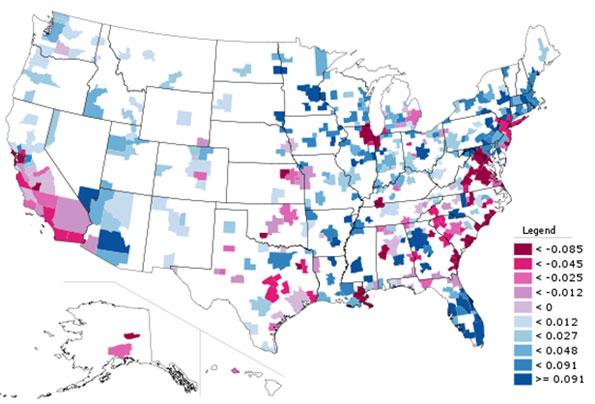
    As we indicated in the last article, solo automobile commuting reached an all time record in the United States in 2010, increasing by 7.8 million commuters. At the same time, huge losses were sustained by carpooling, while the largest gain was in working at home, which includes telecommuting. Transit and bicycling also added commuters.  This continues many of the basic trends toward more personalized employment access that we have seen since 1960.

    Solo Automobile Commuting: Among the nation’s 51 metropolitan areas with more than 1 million population, 38 experienced increases in solo automobile commuting between 2000 and 2010. More than 80% of commuting is by solo automobile in 25 of the 51 largest metropolitan areas, with the highest rates being in Birmingham, Detroit, Cincinnati, Indianapolis and Kansas City. Another 28 metropolitan areas have single automobile commute shares of between 70% and 80%, with Boston, Washington and San Francisco between 60% and 70%. As would be expected, the lowest solo automobile commute share was in New York at 51%.

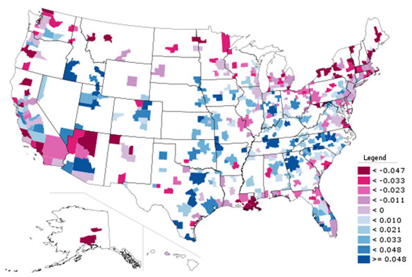
    Car Pools: The national data also showed a nearly 2.4 million loss in carpool use. The losses were pervasive, occurring in all 51 metropolitan areas. Riverside-San Bernardino had the highest carpool market share at just under 15%, while all other major metropolitan areas were below 12%. Car pools have been losing market share for decades.

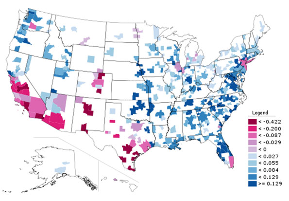
    Work at Home (Includes Telecommuting): In what we have previously labeled as The Decade of the Telecommute, the nation experienced a 1.7 million increase in working at home over the past decade. The market share gains in working at home were as pervasive as the losses in carpooling, with all 51 metropolitan areas registering increases. Austin had the strongest work-at-home market share, at 7.3%, followed by Portland at 6.5%, San Francisco and Denver at 6.2%, Phoenix at 6.0%, with San Diego, Raleigh and Atlanta above 5.5%. Overall, working at home exceeded transit commuting in 37 major metropolitan areas out of 51 in 2010, up from 27 in 2000. Three metropolitan areas had work at home market shares of less than 3%, including Memphis, New Orleans and last place Buffalo.

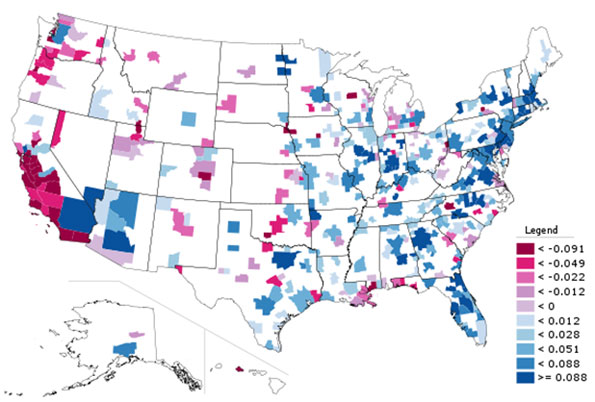
    Transit: As noted before, transit enjoyed its first 10 year gain since journey to work data was first collected by the Census Bureau 50 years ago. Overall, transit added 900,000 daily commuters, roughly half that for telecommuters. Transit’s market share increased in 25 of the top 51 metropolitan areas. It is also notable that in a number of the metropolitan areas with the largest expenditures for new rail systems, there were either losses or commuting gains were concentrated in the more flexible bus services.

    New York: As so often has been the case, transit was largely a "New York story." More than one half of the new transit commuters were in the New York metropolitan area, more than 450,000 of the 900,000 increase. New York boasts by far the most extensive transit system in the nation, which serves the second largest central business district in the world and by far the nation’s most important. In 2000, New York had a transit work trip market share of 27.4%. By 2010, New York’s transit work trip market share had risen to 30.7%, more than double that of any other metropolitan area. More than 70% of the new transit commuters in the New York area were on its subway (Metro), suburban rail and light rail systems.

    San Francisco: San Francisco retained its position as the second strongest transit metropolitan area, with a 14.6% work trip market share in 2010. This is up from 13.8% in 2000.

    Washington: Washington was the third strongest transit commuting market, with a 14.0% work trip market share in 2010. This modest increase from 13.4% nonetheless produced the second largest ridership increase in the nation, at more than 130,000. This reflects the strength of Washington’s job market over the decade. Rail ridership accounted for 53% of this increase, while buses accounted for the other 47%.

    Boston and Chicago: Boston passed Chicago to become the fourth strongest transit market, at 11.8% in 2010. This is an increase from 11.2% in 2000. Chicago ranked fifth at 11.2%, a small reduction from the 11.3% in 2000.

    Los Angeles: Los Angeles had the third largest increase in transit commuting, adding 60,000 daily transit commuters. Approximately 75% of these new commuters were attracted by the region’s extensive bus system as opposed to its very expensive but limited rail system. This increase placed Los Angeles in a virtual tie with Portland, with a work trip market share of 6.2%.

    Portland: Portland continued to experience its now 30 year transit market share erosion, despite having added three new light rail lines between 2000 and 2010. Portland’s transit work trip market share fell to 6.2% from 6.3% and now trails the work at home and telecommute market share of 6.5%.

    Seattle:Seattle added 29,000 new transit commuters for the fourth strongest growth in the nation. Approximately 75% of the new commuters were on the metropolitan area’s bus system.

    Atlanta: Atlanta, which is home to the third largest postwar Metro system in the nation (MARTA) gained nearly 9000 new transit commuters, all of them on the bus, while losing more than 3000 rail commuters.

    Miami:Miami added 16,000 new transit commuters, though more than 90% were attracted to the bus system, rather than the rail services.

    Rail and Bus in Texas: Other metropolitan areas with new and expanded rail systems did not fare as well. In Dallas-Fort Worth, the light rail system was more than doubled in length, yet there was a reduction of more than 3000 daily transit commuters. The transit work trip market share in Dallas-Fort Worth dropped from 1.8% to 1.4%, approximately one quarter lower than that of any other major metropolitan area with a new light rail or Metro system. Houston, which built its first light rail line during the period, lost nearly 3000 daily transit commuters, with its transit work trip market share dropping by nearly one-third, from 3.2% to 2.3%. By contrast, the third largest metropolitan area in Texas, San Antonio, lost no commuters from its bus only transit system.

    Other New Rail Metropolitan Areas: Other metropolitan areas with new rail systems experienced modest ridership increases, with 60 to 70 percent of the increase on the bus systems in Charlotte, Minneapolis-St. Paul and Phoenix. Salt Lake City experienced a small decline in transit commuting.

    Below 1 Percent: Four metropolitan areas had transit work trip market shares of less than 1%, including Indianapolis, Raleigh, Birmingham and last place Oklahoma City, with a market share of 0.4%.

    Bicycles: It was also a good decade for bicycle commuting, with the national increase of nearly 250,000. The bicycle commuting market share rose in 45 of the 51 largest metropolitan areas. Portland had the highest bicycle market share at 2.2%, with three other metropolitan areas at 1.5% or above, Sacramento, San Francisco and San Jose. The lowest bicycle commuting market shares were in San Antonio, Cincinnati, Birmingham and Memphis, all at 0.1 percent.

    Walking: There was little change in walking among the nations major metropolitan areas. The largest shares were in New York (5.9%) and Boston (5.4%), with the smallest shares in Raleigh (1.1%), Orlando (1.1%) and Birmingham (1.0%).

    Drifting Away from Shared Commuting: In some ways, the 2000s were different than previous decades, especially with the reversals in bicycle commuting and transit. However, overall, shared ride commuting (transit and car pools) lost share due to the precipitous decline in car pooling. Longer term share increase trends also continued in single-occupant automobile commuting and working at home. The bottom line: personal employment access (personal mobility plus working at home) continues to carve away at the smallish share still held by shared commuting.

    ————-

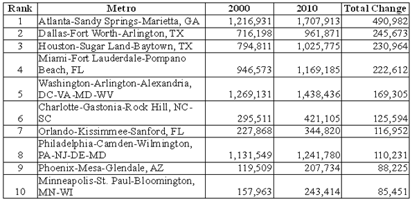
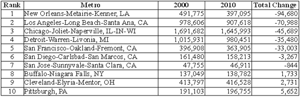
    Data: The 2000 and 2010 commuting market shares by mode are shown in Tables 1 and 2 (2010 metropolitan area boundaries).

    ————

    Table 1
    Work Trip Market Share: 2000
    Metropolitan Areas Over 1,000,000 Population in 2010
    Metropolitan Area Car, Truck or Van: Alone Car/Van Pool Transit Bicycle Walk Other Work at Home (Includes Telecommute)
    Atlanta 77.0% 13.7% 3.4% 0.1% 1.3% 1.1% 3.5%
    Austin 76.5% 13.7% 2.5% 0.6% 2.1% 1.1% 3.6%
    Baltimore 75.5% 11.5% 5.9% 0.2% 2.9% 0.9% 3.2%
    Birmingham 83.3% 12.0% 0.7% 0.1% 1.2% 0.7% 2.1%
    Boston 71.1% 8.6% 11.2% 0.5% 4.6% 0.8% 3.3%
    Buffalo 81.7% 9.4% 3.3% 0.2% 2.7% 0.5% 2.1%
    Charlotte 80.7% 12.8% 1.4% 0.1% 1.2% 0.8% 2.9%
    Chicago 70.4% 11.0% 11.3% 0.3% 3.1% 1.0% 2.9%
    Cincinnati 81.3% 10.1% 2.8% 0.1% 2.3% 0.6% 2.7%
    Cleveland 81.3% 8.8% 4.1% 0.2% 2.2% 0.6% 2.7%
    Columbus 82.1% 9.7% 2.1% 0.2% 2.3% 0.6% 3.0%
    Dallas-Fort Worth 78.7% 13.9% 1.8% 0.1% 1.5% 1.0% 3.0%
    Denver 76.0% 11.7% 4.4% 0.4% 2.1% 0.8% 4.6%
    Detroit 84.7% 9.2% 1.7% 0.1% 1.4% 0.6% 2.2%
    Hartford 82.6% 8.7% 2.8% 0.2% 2.5% 0.6% 2.6%
    Houston 77.0% 14.3% 3.2% 0.3% 1.6% 1.1% 2.5%
    Indianapolis 82.8% 10.4% 1.3% 0.2% 1.7% 0.7% 3.0%
    Jacksonville 80.3% 12.6% 1.3% 0.5% 1.7% 1.4% 2.3%
    Kansas City 82.6% 10.6% 1.2% 0.1% 1.4% 0.7% 3.5%
    Las Vegas 74.6% 14.7% 4.4% 0.5% 2.3% 1.3% 2.3%
    Los Angeles 71.9% 14.6% 5.6% 0.7% 2.7% 1.0% 3.5%
    Louisville 81.8% 11.2% 2.0% 0.2% 1.7% 0.7% 2.5%
    Memphis 80.7% 13.3% 1.6% 0.1% 1.3% 0.9% 2.2%
    Miami-West Palm Beach 77.3% 13.1% 3.2% 0.5% 1.7% 1.2% 3.1%
    Milwaukee 79.7% 9.9% 4.2% 0.2% 2.9% 0.6% 2.6%
    Minneapolis-St. Paul 78.3% 10.0% 4.4% 0.4% 2.4% 0.6% 3.8%
    Nashville 80.5% 13.1% 0.8% 0.1% 1.5% 0.8% 3.2%
    New Orleans 72.9% 14.6% 5.4% 0.6% 2.7% 1.3% 2.4%
    New York 52.7% 9.3% 27.4% 0.3% 6.0% 1.5% 2.9%
    Oklahoma City 81.6% 12.1% 0.5% 0.2% 1.7% 1.0% 2.9%
    Orlando 80.6% 12.1% 1.6% 0.4% 1.3% 1.1% 2.9%
    Philadelphia 73.1% 10.2% 8.9% 0.3% 3.9% 0.7% 2.9%
    Phoenix 74.6% 15.3% 1.9% 0.9% 2.1% 1.4% 3.7%
    Pittsburgh 77.5% 9.8% 5.9% 0.1% 3.6% 0.6% 2.5%
    Portland 73.1% 11.5% 6.3% 0.8% 2.9% 0.8% 4.6%
    Providence 80.7% 10.5% 2.4% 0.2% 3.3% 0.8% 2.2%
    Raleigh 80.8% 12.1% 0.9% 0.2% 1.6% 1.0% 3.5%
    Richmond 81.7% 10.9% 1.9% 0.2% 1.8% 0.8% 2.7%
    Riverside-San Bernardino 73.5% 17.6% 1.6% 0.5% 2.2% 1.2% 3.5%
    Rochester 81.7% 9.1% 2.0% 0.2% 3.5% 0.6% 2.9%
    Sacramento 75.3% 13.5% 2.7% 1.4% 2.2% 0.9% 4.0%
    Salt Lake City 76.0% 13.4% 3.3% 0.5% 2.1% 0.7% 4.0%
    San Antonio 76.2% 14.9% 2.7% 0.1% 2.4% 1.2% 2.6%
    San Diego 73.9% 13.0% 3.3% 0.6% 3.4% 1.4% 4.4%
    San Francisco-Oakland 62.8% 12.7% 13.8% 1.1% 3.9% 1.3% 4.3%
    San Jose 77.2% 12.4% 3.4% 1.2% 1.8% 0.9% 3.1%
    Seattle 71.6% 12.7% 7.0% 0.6% 3.1% 0.8% 4.2%
    St. Louis 82.5% 10.0% 2.2% 0.1% 1.7% 0.6% 2.9%
    Tampa-St. Petersburg 79.7% 12.4% 1.3% 0.6% 1.7% 1.2% 3.1%
    Virginia Beach-Norfolk 78.8% 12.1% 1.7% 0.3% 2.7% 1.6% 2.7%
    Washington 67.5% 13.4% 11.2% 0.3% 3.0% 0.9% 3.7%
    Top 51 Metropolitan Areas 73.2% 11.8% 7.5% 0.4% 2.9% 1.0% 3.2%
    Calculated from Census Bureau data
    Metropolitan areas as defined in 2010
    Table 2
    Work Trip Market Share: 2010
    Metropolitan Areas Over 1,000,000 Population in 2010
    Car, Truck or Van: Alone Car/Van Pool Transit Bicycle Walk Other Work at Home (Includes Telecommute)
    Atlanta 77.6% 10.3% 3.4% 0.2% 1.3% 1.5% 5.8%
    Austin 75.6% 10.5% 2.3% 0.6% 1.9% 1.8% 7.3%
    Baltimore 76.5% 9.6% 6.0% 0.2% 2.6% 1.0% 4.1%
    Birmingham 84.8% 10.0% 0.6% 0.1% 1.0% 0.5% 3.1%
    Boston 69.5% 7.5% 11.8% 0.7% 5.4% 0.8% 4.4%
    Buffalo 82.0% 7.5% 3.8% 0.3% 3.0% 1.1% 2.3%
    Charlotte 80.6% 10.0% 2.0% 0.2% 1.5% 0.6% 5.1%
    Chicago 71.0% 8.5% 11.2% 0.6% 3.1% 1.0% 4.5%
    Cincinnati 84.1% 7.9% 2.1% 0.1% 2.0% 0.4% 3.4%
    Cleveland 82.3% 7.2% 3.6% 0.3% 2.2% 0.7% 3.7%
    Columbus 82.4% 8.0% 1.7% 0.5% 2.3% 0.6% 4.6%
    Dallas-Fort Worth 81.3% 10.1% 1.4% 0.2% 1.2% 1.4% 4.6%
    Denver 76.3% 9.6% 4.1% 0.8% 1.9% 1.1% 6.2%
    Detroit 84.6% 8.5% 1.5% 0.2% 1.4% 0.8% 3.0%
    Hartford 81.5% 7.9% 3.1% 0.3% 3.0% 1.0% 3.2%
    Houston 79.4% 11.5% 2.3% 0.3% 1.4% 1.7% 3.4%
    Indianapolis 83.9% 8.2% 0.9% 0.3% 1.5% 0.8% 4.3%
    Jacksonville 82.5% 8.9% 1.0% 0.5% 1.4% 1.2% 4.5%
    Kansas City 83.7% 8.5% 1.2% 0.2% 1.4% 0.9% 4.1%
    Las Vegas 78.9% 10.5% 3.8% 0.6% 1.6% 1.3% 3.3%
    Los Angeles 73.5% 10.7% 6.2% 0.9% 2.6% 1.2% 5.0%
    Louisville 83.5% 9.2% 1.9% 0.2% 1.3% 0.9% 3.1%
    Memphis 83.6% 10.3% 1.0% 0.1% 1.5% 0.9% 2.7%
    Miami-West Palm Beach 78.8% 9.4% 3.5% 0.6% 2.0% 1.4% 4.4%
    Milwaukee 80.1% 9.3% 3.4% 0.5% 2.6% 0.7% 3.4%
    Minneapolis-St. Paul 78.3% 7.9% 4.8% 0.7% 2.4% 0.9% 4.9%
    Nashville 81.3% 10.7% 1.0% 0.2% 1.2% 1.0% 4.6%
    New Orleans 78.1% 11.0% 3.2% 0.7% 2.6% 1.9% 2.5%
    New York 50.5% 6.8% 30.7% 0.5% 5.9% 1.6% 3.9%
    Oklahoma City 82.7% 10.6% 0.5% 0.3% 1.6% 1.0% 3.4%
    Orlando 82.1% 9.2% 1.6% 0.3% 1.1% 1.4% 4.4%
    Philadelphia 73.9% 8.0% 9.6% 0.5% 3.5% 0.8% 3.8%
    Phoenix 76.7% 11.8% 2.0% 0.6% 1.5% 1.5% 6.0%
    Pittsburgh 77.0% 8.9% 5.6% 0.3% 3.7% 0.9% 3.5%
    Portland 72.1% 8.8% 6.2% 2.2% 3.3% 0.9% 6.5%
    Providence 81.3% 8.3% 2.6% 0.5% 3.2% 0.9% 3.2%
    Raleigh 82.0% 8.7% 0.9% 0.3% 1.1% 1.1% 5.9%
    Richmond 81.2% 10.1% 1.8% 0.4% 1.2% 0.7% 4.6%
    Riverside-San Bernardino 76.1% 14.8% 1.7% 0.4% 1.8% 1.4% 3.8%
    Rochester 82.6% 7.1% 1.8% 0.4% 3.9% 0.7% 3.6%
    Sacramento 75.6% 11.2% 2.9% 1.7% 1.9% 1.1% 5.5%
    Salt Lake City 77.7% 11.3% 2.9% 0.8% 2.3% 1.0% 4.0%
    San Antonio 79.5% 11.5% 2.1% 0.1% 2.0% 1.4% 3.3%
    San Diego 76.2% 10.1% 3.3% 0.8% 2.8% 1.0% 5.9%
    San Francisco-Oakland 61.5% 10.6% 14.6% 1.7% 4.2% 1.2% 6.2%
    San Jose 77.5% 10.3% 2.9% 1.6% 1.8% 0.9% 5.1%
    Seattle 70.5% 10.2% 8.2% 1.1% 3.5% 1.0% 5.5%
    St. Louis 83.0% 7.7% 2.6% 0.2% 1.9% 0.8% 3.7%
    Tampa-St. Petersburg 80.3% 9.5% 1.6% 0.8% 1.4% 1.4% 5.0%
    Virginia Beach-Norfolk 80.9% 9.4% 1.8% 0.5% 3.3% 0.9% 3.1%
    Washington 65.6% 10.6% 14.0% 0.5% 3.5% 1.0% 4.9%
    Top 51 Metropolitan Areas 73.7% 9.4% 7.9% 0.6% 2.8% 1.2% 4.4%
    Calculated from Census Bureau data
    Metropolitan areas as defined in 2010

    Wendell Cox is a Visiting Professor, Conservatoire National des Arts et Metiers, Paris and the author of “War on the Dream: How Anti-Sprawl Policy Threatens the Quality of Life

    Photo: Manhattan (New York), with the Woolworth Building in the distance (by author)

  • The Chicago Machine’s Favorite After School Charity

    One of the great scams of modern political life is the charitable contributions of tax-exempt foundations associated with politicians.  A perfect illustration is one charity associated with former Chicago Mayor Daley which has received some attention.

    The charity, After School Matters, set up by Maggie Daley (former Chicago Mayor Daley’s wife and sister-in-law of White House Chief of Staff William Daley) has received more than $54 million from the financially troubled city.   The Chicago Tribune explains that

    “days before Emanuel took office, the Daley administration awarded the nonprofit a one-year, nearly $6.5 million contract to oversee summer jobs efforts and after-school programs.

    The group is housed in city offices near the Cultural Center, where it pays no rent and uses city computers and phones."

    The Tribune article provides some rather unusual facts. Three full time city of Chicago workers labor full time for the private charity.  It also benefits from corporate contributions, as The Chicago Sun-Times’ ace investigative reporter Tim Novak explains:

    "After School Matters – founded and run by Maggie Daley – raised more money in a single year than 97 percent of the 12,757 charities in Illinois filing reports with the IRS"

    How this corporate support “materialized” is now coming into question. Long time Chicago media critic Steve Rhodes points out that this appears to be a shakedown racket of those who do business with the city of Chicago.

    In 2008, After School Matters became prominent news because of its donor list. Prominent corporations like J.P Morgan Chase and Motorola gave significant contributions to Daley’s charity, and all received City of Chicago contracts.  

    This isn’t just a story about a local charity with conflicts of interest. Federal taxpayers are giving federal stimulus dollars to the Daley charity. Even Mayor Rahm Emanuel, the Chicago Sun-Times reports, admits “the city should not be dictating which charities recipients of city subsidies should donate to.”

    Former Mayor Daley is upset that anyone would think that his wife’s charity isn’t fully dedicated to helping children. The Chicago Sun-Times reports:

    Former Mayor Richard M. Daley on Monday denounced as “disgraceful” and a “personal insult to my wife” an internal audit concluding that recipients of city subsidies were told to donate to Maggie Daley’s After School Matters program.

    The former mayor insisted that no arms were ever twisted to produce donations to the charity that his wife founded to occupy and educate Chicago teenagers.

    Daley’s response is textbook Chicago media spin. When confronted with facts, claim outrage and avoid the specifics.   

  • How to Save Chicago

    The title raises the obvious question: Does Chicago need saving?

    I guess the answer is clear. Aaron Renn published a reviewofthe 2010 census, and for Chicago it was not pretty. Since 2000 the city lost over 200,000 people: nearly 7.5% of its Black residents, and almost 6% on non-Hispanic Whites. Only the Hispanic population grew, but at an anemic 3.4%. Even the metro area writ large isn’t doing all that well, growing by only 3.9% (against the nation’s 10%).

    Los Angeles, described as “a city in secular decline" appealed to the schadenfreude in my heart. As a Chicago booster, the decline of an arch-rival is emotionally (if irrationally) satisfying. But sadly, many of LA’s problems are Chicago’s issues as well: a decline of the central business district, an exodus of major businesses, the disproportionate influence of real estate on local politics, and ethnic politics. Add to that a still vibrant Outfit (mob), a lousy climate, and apart from Lake Michigan, little in the way of natural distinction, and you don’t have a pretty picture.

    Even some gentrification seems to be wearing thin. Walking along Clark St. there are plenty of empty store fronts. It’s beginning to look a little dreary (though still far from a slum).

    That all sounds pretty desperate. But there is some good news as well.

    • My wife and I inadvertently got off the Skyway one exit too soon and wound up driving down 87th St. to Stony Island. This is a thriving, middle-class Black neighborhood. Every storefront was occupied, and there was no graffiti! (Unlike graffiti-scarred Rome, which we also recently visited.)
    • Public transport is alive and well in Chicago. Trains and buses are clean, graffiti-free, and the passengers are civilized.
    • There is lots of affordable housing. Plenty of “luxury apartments” are for rent along Clark St. One can buy a perfectly nice condo for $100K or less. Many neighborhoods have been redeveloped and are really nice; Logan Square is a good example. This is the good side of the real estate bust, and gives the city a huge advantage over, say, New York or San Francisco.
    • Lakeshore Drive, Michigan Avenue, Wacker Drive, and even State Street are as fabulous as ever, especially in nice weather.

    So there is hope, but the patient is sick, and if things don’t change then Chicago could go the way of St. Louis or Detroit.

    So how can Chicago be saved? Here is my advice to Rahm Emanuel, the new Mayor.

    • Forget about the old business model – the world has changed. The days of small-time manufacturing or major banking centers are over. The notion that The Loop is going to be the home of large corporations is past. So concentrate on the new world: what can Chicago do well? I count three things: Residential, Retail, and Tourism. And Chicago has (quite inadvertently) done the residential part right. It’s the other stuff that needs attention.
    • Remember why Sears Roebuck started in Chicago: it was the center of the country. The Windy City is still is the center of the country. It should have the World’s Busiest Airport. It still is the railroad capital of America. It could be the retail capital of America. Chicago – The Loop, Michigan Avenue, Woodfield Mall, all of it – can be where America comes to shop. If relative pipsqueak Minneapolis can make a success of the Mall of America, just think what Chicago can do.
    • So – first step – lower sales taxes! We paid over 10% tax at a restaurant on Rush St. That’s crazy! Reduce sales taxes to 4% (or eliminate them entirely). Perhaps this will mean a decline in government revenue, but so what? It will create thousands of jobs and billions in business. (If politicians were really interested in their constituents rather than their own perks, this would be a no-brainer.)
    • Maintain the neighborhoods. I know the stockyards are long gone, but where is that really good steakhouse in Bridgeport? Likewise, I’m happy to drive to 87th and Stony Island for dinner and good music, but you need to ensure my safety. The city doesn’t need more real estate – it needs more cops, public transit, art, advertising, and street lights.
    • Free parking on Sundays. I know the city has taken a lot of flak for parking, but in principle it works. I parked within a couple of blocks of a fancy restaurant on Rush St. on a Friday night ($6). I parked within a block of Clark & Diversey so my wife could go shopping ($2). Before the new meters I would have had to drive around for an hour to find a place to park, and then it’d be many blocks away. Now it’s easy, and (compared to wasting time and gas) not expensive.

    But free parking on Sundays would bring them in from the suburbs in droves! New York does that, and that’s the only day we drive down to the City. Cut folks a break – it’s good business.

    • Improve public transit. That doesn’t mean new trains, but it does mean more safety. Let me take the train to Chinatown at night and have it be an enjoyable experience. Where is the convenient bus to Hyde Park? Why can’t I buy a tourist day-pass or a weekend pass for the CTA at my local station? And why do the ticket vending machines not accept credit cards? Oh, and if you do have an extra train or two, why not run A and B express trains on the Red Line? They did that 25 years ago.
    • Keep the cows. I don’t mean the stockyards, I mean the art. Of course the actual street-corner cows are passe, but Marilyn Monroe isn’t – she works. Use your architecture, your waterfront, your grand vistas. Use your imagination.

    Here is the key:  for Mayor Emanuel and for all politicians. The citizens have to earn money before you can tax it. Exorbitant sales taxes just spoil it for everybody. Yes, I know you need to spend money on schools and welfare and public-employee pensions. But you can’t do that if the money isn’t there in the first place.

    So get Chicago open for business. Lower sales taxes. Ensure public safety downtown and in the neighborhoods. Invest a little in mass transit. Give up just a bit of the parking revenue. Chicago is a great tourist and shopping destination, better than Rome in every way except ruins. Allow your citizens to cash in before Chicago itself becomes a ruin.

    Daniel Jelski is Dean of Science & Engineering State University of New York at New Paltz.

    Photo by smik67.

  • The Shifting Geography of Black America

    Black population changes in various cities have been one of the few pieces of the latest Census to receive significant media coverage.  The New York Times, for example, noted that many blacks have returned to the South nationally and particularly from New York City.  The overall narrative has been one of a “reverse Great Migration.”  But while many northern cities did see anemic growth or even losses in black population, and many southern cities saw their black population surge, the real story actually extends well beyond the notion of a monolithic return to the South.

    The map below, showing total growth in Black Only population from 2000 to 2010, indeed shows that northern and west coast cities had low or even negative growth while various southern cities boomed.


    Here is a list of the top ten metro areas (among those with more than a million total people) for black population growth:


    And here are the bottom ten (among those with more than one million people):


    Of course, looking at total population numbers can mislead. Some cities grew slowly or lost people as a whole while others boomed. With Houston, Dallas, and Atlanta all adding over a million people each, it’s no surprise these regions added lots of blacks. Working and middle class African-Americans likely shared many of the same motivations to move to these cities – such as lower housing prices – as Americans of other ethnicities. In that light, a look at change in black population share (the percentage of the population that is black) provides additional perspective:


    Here we see not a single-minded return to the South, but a complex mixture of shrinking and growing regions in various parts of the country.  This includes some surprising places, like Minneapolis-St. Paul, which was one of the top ten metros in the country for total black population growth, and also saw its black population share grow strongly.  Now the Twin Cities, along with Columbus, Ohio, another strong performer, are two of the top destination for African immigrants from Somalia and elsewhere, which doubtless accounts for part of that strong growth. But anecdotal reports indicate that they are also benefitting from Chicago’s expanding black diaspora, along with places like Indianapolis and various Downstate metros.

    Atlanta, well known as America’s premier metro area for blacks, continued to dominate the charts. Not only far and away the leader in adding raw numbers of blacks, the African-American share also grew share strongly too. Charlotte is also clearly emerging as another key black population hub, ranking #6 in America for total black population growth, which is impressive for a smaller city, and adding nearly two percentage points in black population share.  It grew its black population much faster than other fast growing small cities like Raleigh or Nashville, and added share at more than three times as fast.

    By contrast, Houston, which grew total black population significantly, had a much lower share gain. Austin, one of America’s fastest growing metros, added only 28,000 blacks and actually lost black population share. And Washington, DC, despite being a traditional black population and cultural hub, also lost black population share regionally as gentrification in the District resulted in its loss of its black majority for the first time in decades, according to the Brookings Institution. 

    So even among rapidly growing metro areas in the South, the appeal to black population is selective, favoring places like Atlanta, Charlotte, Florida cities, and even slower growing cities along the length of the Mississippi River like Memphis.  Even some cities in the North are retaining their allure to blacks as well. Less favored or even out of favor are metros like DC, Dallas, and Houston as well as cities such as Charleston and Savannah along the southeast coast.

    Slow or negative black population growth is particularly concentrated in traditional tier one “global cities”, as well as those facing economic or other hardship like Detroit, Cleveland, and immediate post-Katrina New Orleans.

    The latter may be understandable – whites have been leaving these regions as well – but the former is quite troubling.  The global city model, focused on high end and creative services, is supposedly the bright and shining savior of American urbanism. Indeed, it’s hard to find a city that doesn’t have some aspect of that as a core plank in its civic strategy. Yet the cities that have been most focused at promoting this notion – such as New York, San Francisco, and Chicago – are generally those  disproportionately driving blacks away. The reasons for this aren’t clear, but the high and increasing cost of living in those places seems like one logical explanation.

    Here’s a more detailed look at the percentage growth in Black Only population in some tier one global type metros:


    New York barely broke even on black population, while Chicago, LA, and the Bay Area all actually lost black residents, a stunning reversal from their past as black magnets. However, Boston, not a traditional black population hub, grew its black population strongly on a percentage basis, as did Miami and DC, though as noted before, the share change in DC was negative.  Here is that metric for the same metros:


    With the notable exceptions of Boston and Miami – and Philadelphia, seldom ranked highly as a global city but still a traditional large northern metropolis – most global city regions appear to be increasingly inhospitable to Blacks.  Thus their model of success, whatever its appeal to some, at a basic level simply lacks inclusiveness. This shows its clear limits as an overall model for America’s urban centers as a whole.

    Aaron M. Renn is an independent writer on urban affairs based in the Midwest. His writings appear at The Urbanophile. Data analysis, maps, and charts in this piece were prepared with Telestrian.

  • The Evolving Urban Form: Chicago

    Looks can be deceiving. No downtown area in the western world outside Manhattan is more visually impressive than Chicago. Both the historic Loop and the newer development north of the Chicago River, especially along North Michigan Avenue have some of the most iconic structures outside of emerging Asia. Yet these vertical monuments mask a less celebrated reality: that of dispersing, low density urban area.

    Chicago Combined Statistical Area: Let’s take a close look at the 2010 census data. Overall, the combined statistical area, which includes the metropolitan area (Note 1) and two exurban counties added nearly 365,000 people, for a growth rate of 3.9 percent. This is well below the national growth rate of approximately 10 percent (Map, Figure 1). Chicago followed the general trend of with growth being greatest in the outer suburbs while declines took place both in the inner suburbs and the historical core municipality (Figure 2).

    Massive Core City Loss: The historical core city of Chicago lost but 200,000 people, and fell to a population of 2.7 million, the lowest count since the 1910 census. The population is down 925,000 from 1950 and at the current rate would drop at least 1 million from the 1950 peak by the 2020 census.  Chicago is at risk of joining London and Detroit as the only two historical core municipalities in modern times that have lost more than 1 million people.

    Inner Suburbs: As in New York and Seattle, Chicago’s inner suburbs grew slowly. The inner suburbs include the part of Cook County that is outside the city of Chicago as well as Lake County, Indiana (home of Gary), which shares the city of Chicago’s eastern border. The inner suburbs added fewer than 30,000 residents and grew only one percent.

    This suggests some limitations to the newly developing mantra that has inner suburbs will be the locus of future growth although there are scattered inner suburbs in other cities (such as Hoboken, New Jersey) that did see growth. Perhaps the old mantra, about people returning to the city from which they had never come was finally quashed by the realities of the 2010 census.   

    Outer Suburbs: The outer suburbs, which include the remaining counties of the metropolitan area, grew at a rate of 16.5 percent, actually grew faster than the national average of approximately 10 percent. The outer suburbs added more than 500,000 people. The largest growth, 175,000 was in Will County, to the south, one of the five “collar counties” that used to define the boundaries of the metropolitan area. McHenry County, the most distant of the collar counties added 100,000. The fastest growth was in far suburban and also southern Kendall County, which more than doubled in population.

    Chicago Metropolitan Area: Overall, the Chicago metropolitan area added approximately 360,000 people and grew 4.0 percent from 2000. This is well below the national average population growth rate, however was above that of the Los Angeles metropolitan area, once among the  nation’s of leading growth areas until the last decade.

    Historical Trends: The city of Chicago, like other historical core cities, had previously been dominant in its metropolitan area. The earliest Census Bureau metropolitan area (“metropolitan district”) estimates from 1900 indicated that more than 90 percent of the region’s population was contained in the city of Chicago. By 1950, the city of Chicago had fallen to 66 percent of the metropolitan area as defined in that year.  The city of Chicago now has only 28 percent of the combined statistical area population of 9.7 million (Figure 3, Table and Note 2).

    CHICAGO METROPOLITAN AREA
    POPULATION TREND BY COUNTY: 2000 TO 2010
    1900 1950 2000 2010 Change: 2000-2010 % Change: 2000-2010
    HISTORIC CORE MUNICIPALITY
    Chicago   1,698,575   3,620,962   2,895,671 2,695,598 -200,073 -6.9%
    INNER SUBURBAN      178,052   1,255,982   2,965,634 2,995,082 29,448 1.0%
    Cook County, IL      140,160      887,830   2,481,070 2,499,077 18,007 0.7%
    Lake County, IN        37,892      368,152      484,564 496,005 11,441 2.4%
    OUTER SUBURBAN      378,896      884,980   3,237,011 3,770,425 533,414 16.5%
    DeKalb County, IL        31,756        40,781        88,969 105,160 16,191 18.2%
    DuPage County, IL        28,196      154,999      904,161 916,924 12,763 1.4%
    Grundy County, IL        24,136        19,217        37,535 50,063 12,528 33.4%
    Jasper County, IN        14,292        17,031        30,043 33,478 3,435 11.4%
    Kane County, IL        78,792      150,388      404,119 515,269 111,150 27.5%
    Kendall County, IL        11,467        12,155        54,544 114,736 60,192 110.4%
    Kenosha County, WI        21,707        75,238      149,577 166,426 16,849 11.3%
    Lake County, IL        34,504      179,097      644,356 703,462 59,106 9.2%
    McHenry County, IL        29,659        50,656      260,077 308,760 48,683 18.7%
    Newton County, IN        10,448        11,006        14,566 14,244 -322 -2.2%
    Porter County, IN        19,175        40,076      146,798 164,343 17,545 12.0%
    Will County, IL        74,764      134,336      502,266 677,560 175,294 34.9%
    CHICAGO METROPOLITAN AREA   2,255,523   5,761,924   9,098,316 9,461,105 362,789 4.0%
    EXURBAN METROPOLITAN COUNTIES        75,540      150,332      213,939 224,916 10,977 5.1%
    Kankakee Coiunty, IL        37,154        73,524      103,833 113,449 9,616 9.3%
    La Porte County, IN        38,386        76,808      110,106 111,467 1,361 1.2%
    CHICAGO COMBINED STATISTICAL AREA 2,331,063 5,912,256 9,312,255 9,686,021 364,150 3.9%
    Data from the US Census Bureau


    Since 1950 (Note 3), all of the growth in the Chicago area has been in the suburbs. By 2000, both inner suburbs and the outer suburbs each had more people than the city of Chicago. Today the outer suburbs, with forty percent of the region’s population, represent the largest demographic force in Chicago (Figure 4).

    We do not usually associate Chicago with the dreaded term “sprawl” but Chicago now stands as the third largest urban agglomeration in the world in land area, trailing only New York and Tokyo. The Chicago urban area covers more land than Los Angeles, which has a far higher urban density.

    Dispersing Employment: Chicago’s dispersion extends to employment. Despite having the second strongest central business district in the nation (after Manhattan), jobs are rapidly decentralizing. Last year the Downtown Loop Alliance reported that private sector employment in the Loop fell 20 percent during the last decade. Overall, the downtown area of Chicago now represents approximately 10 percent of regional employment, barely half the percentage of Manhattan or Washington, DC.

    American community survey data from 2009 indicates the total employment in the North West corridor along Interstate 90 has at least as much employment as downtown Chicago. This corridor, anchored by the edge city (Note 4) of Schaumburg, is typical of emerging suburban centers around the nation. Only two percent of workers in this corridor use transit for commuting.

    Another corridor, along Interstate 88 (anchored by Lisle and Aurora) has at least two thirds the employment of downtown, with only one percent commuting by transit. The North Shore corridor encompassing parts of northern Cook County and Lake County is of similar size to the Interstate 88 corridor and has a larger transit work trip market share of five percent.

    Downtown, on the other hand, has the third largest transit work trip market share in the nation, following Manhattan and Brooklyn. In 2000, 55 percent of people working downtown (the larger downtown including the Loop, north of the River and adjacent areas to the west and south) commuted by transit. This illustrates the strength of transit for providing access to the largest, most dense downtown areas in contrast to dispersed suburban areas.

    Perhaps more telling, the number of jobs and resident workers (the “jobs-housing” balance) in the city of Chicago are converging toward equality. According to American community survey data, there are 1.1 jobs in the city of Chicago for each working resident. This is substantially less, for example, than Washington (2.6), Atlanta (2.0), Boston (1.7), San Francisco (1.4) and Baltimore (1.4).

    On the other hand, two of the three large suburban corridors have higher ratios of jobs to workers than the city of Chicago. The Interstate 88 corridor has 1.3 jobs per worker, while the North Shore has approximately 1.5 jobs per worker. The Interstate 90 corridor has slightly more jobs than workers. These data indicate that Chicago is well on the way to a more evenly distributed employment pattern that has become more common around the nation.

    Middle America’s Leviathan: The Chicago area has been very resilient through the years. After nearly a century as the nation’s “second city,” Aaron Renn points out the area could fall from its much cherished “global city” status. Still, Chicago remains the dominant urban area between the coasts. Virtually all of its Midwestern competition has fallen away (such as Detroit, St. Louis and Cleveland). However, in the longer run Chicago could be displaced by Dallas-Fort Worth and Houston. Nonetheless, the urban area’s visually arresting business district will retain its iconic status even if, overall, the region looks more and more like the rest of highly dispersed Middle America.

    ——

    Note 1: This article uses metropolitan area and combined statistical areas as defined by the authoritative US Office of Management and the Budget.

    Note 2: The 1950 references provided because the closest to the Post-War democratization of homeownership and car ownership and expansion of car oriented suburbanization. Before World War II, most US historical core cities were comparatively dense, while a far smaller share of the population lived in the suburbs.

    Note 3: Figure 3 and the Table show data for the 2010 geographical definition of the combined statistical area. Earlier metropolitan area definitions are also referred to in the text.

    Note 4: An “edge city” is a major employment center outside the central business district (downtown).  “Edge city” became a part of the language as a result of Joel Garreau’s 1991 book, Edge City: Life on the Urban Frontier.

    Photograph: Downtown Chicago from the Air (by author)