Tag: Dallas

  • Forget What the Pundits Tell You, Coastal Cities are Old News – it’s the Sunbelt that’s Booming

    Ever since the Great Recession ripped through the economies of the Sunbelt, America’s coastal pundit class has been giddily predicting its demise. Strangled by high-energy prices, cooked by global warming, rejected by a new generation of urban-centric millennials, this vast southern region was doomed to become, in the words of the Atlantic, where the “American dream” has gone to die. If the doomsayers are right, Americans must be the ultimate masochists. After a brief hiatus, people seem to, once again, be streaming towards the expanse of warm-weather states extending from the southeastern seaboard to Phoenix.

    Since 2010, according to an American Community Survey by demographer Wendell Cox, over one million people have moved to the Sunbelt, mostly from the Northeast and Midwest.

    Any guesses for the states that have gained the most domestic migrants since 2010? The Sunbelt dominates the top three: Texas, Florida and Arizona. And who’s losing the most people? Generally the states dearest to the current ruling class: New York, Illinois, California and New Jersey.  Some assert this reflects the loss of poorer, working class folks to these areas while the “smart” types continue to move to the big cities of Northeast and California. Yet, according to American Community Survey Data for 2007 to 2011, the biggest gainers of college graduates, according to Cox, have been Texas, Arizona and Floria; the biggest losers are in the Northeast  (New York), the Midwest (Illinois and Michigan).

    For the most part, notes demographer Cox, this is not a movement to Tombstone or Mayberry, although many small towns in the south are doing well, this is a movement to Sunbelt cities. Indeed, of the ten fastest growing big metros areas in America in 2012, nine were in the Sunbelt. These included not only the big four Texas cities—Austin, Houston, Dallas-Ft. Worth, San Antonio—but also Orlando, Raleigh, Phoenix, and Charlotte.

    Perhaps the biggest sign of a Sunbelt turnaround is the resurgence of Phoenix, a region devastated by the housing bust and widely regarded by contemporary urbanists as the “least sustainable” of American cities. The recovery of Phoenix, appropriately named the Valley of the Sun, is strong evidence that even the most impacted Sunbelt regions are on the way back. 

    A look at the numbers on domestic migration undermines the claim that most Americans prefer, like the pundit class, to live in and near the dense Northeastern urban cores. People simply continue to vote with their feet. Since 2000, more than 300,000 people have moved to Atlanta, Dallas, Houston, and Charlotte; in contrast a net over two million left New York and 1.4 million have deserted the LA area while over 600,000 net departed Chicago and almost as many left the San Francisco Bay region. These trends were slowed, but not reversed, by the Great Recession.

    The Sunbelt’s recovery seems likely to continue in the future. Immigrants, who account for a rising proportion of our population growth, are increasingly heading there. New York remains the immigrant leader, with the foreign-born population increasing by 600,000 since 2000 but second place Houston, a relative newcomer for immigrants, gained 400,000, more than Chicago and the Bay Area combined. The regions experiencing the highest rate of newcomers were largely in the south; Charlotte and Nashville saw their foreign-born populations double as immigrants increasingly beat a path to the Sunbelt cities.

    The final demographic coup for the Sunbelt lies in its attraction for families. Eight of the eleven top fastest growing populations under 14, notes Cox, are found in the Sunbelt with New Orleans leading the pack. Generally speaking, roughly twenty percent or more of the population of Sunbelt metros are under 14, far above the levels seen in the rustbelt, the Left Coast, or in the Northeast.

    This all suggests that the Sunbelt is cementing, not losing, its grip on America’s demographic future. By 2012 and 2017, according to a survey by the manufacturing company Pitney Bowes nine of the ten leading regions in terms of household growth will be in the Sunbelt.

    If the population growth rates predicted by the US Conference of Mayors continue, Dallas-Ft. Worth will push Chicago out of third place among American metropolitan areas in 2043, with Houston passing the Windy City eight years later. Now seventh place Atlanta would move up to sixth place and Phoenix to 8th. Of America’s largest cities then, five would be located in the Sunbelt, and all are expected to grow much faster than New York, Los Angeles or the San Francisco area. Overall, the South would account for over half the growth in our major metropolitan areas in 2042, compared to barely 3.6 percent for the Northeast and 8.7 percent in the Midwest.

    What drives the change? Not just the sun, but the economy, stupidos!

    From the beginning of the Sunbelt ascendency, sunshine and warm weather have been important lures and this may even be more true in the near future. But the key forces driving people to the Sunbelt are largely economic—notably job creation, lower housing prices and lower costs relative to incomes.

    Until the housing bust, states like Arizona, Nevada and Florida were typically among the leaders in creating new jobs but their performance fell off with the decline of construction. But other Sunbelt locales, notably Texas, Louisiana and Oklahoma have picked up much of the slack. This resurgence has been centered in Texas, which created nearly a million new jobs between 2007 and 2013. In contrast, arch-rival California has lost a half a million.

    Many other Sunbelt states have yet to recover jobs lost from the recession, but most of their big metros have shown strong signs of recovery. Since 2007 five of the seven fastest growing jobs markets among the twenty largest cities were in Sunbelt states. Looking forward, recent estimates of job growth between 2013 and 2017, according to Forbes and Moody’s project employment to grow fastest in Arizona, followed by Texas. Also among the top ten are several states hit hard by the Recession, notably Florida, Georgia and Nevada. No Northeastern state appeared anywhere on the list; nor did California.

    For all its shortcomings, including what some may consider the overuse of tax breaks and incentives, the much-dissed Sunbelt development model continues to reap some significant gains. The area’s history of lagging economically has long spurred Sunbelt economic developers to utilize a policy of light regulation, low taxes and lack of unions to lure businesses to their area. Sunbelt states—Texas, Florida, the Carolinas, Tennessee, Arizona—dominate the ranks of the most business friendly states in the union, notes Chief Executive magazine, findings they often cite when courting footloose businesses.

    The clear economic capital of the Sunbelt is now Houston, with some stiff competition from Dallas-Ft. Worth. Houston, the energy capital, now ranks second only to New York in new office construction and is the overall number one for corporate expansions. There are fifty new office buildings going up in the city, including Exxon Mobil’s campus, the country’s second largest office complex under construction (after New York’s Freedom Tower). Chevron, once Standard Oil of California, has announced plans to construct a second tower for its downtown Houston campus while Occidental Petroleum, founded more than fifty years ago in Los Angeles, is moving its headquarters to Houston.

    Houston’s ascendance epitomizes the shift in the geographic and economic center of the Sunbelt. The “original in the Xerox machine” for Sunbelt style growth, Los Angeles’ rise was powered by new industries like entertainment and aerospace and oil, ever expanding sprawl and a strong, tightly knit business elite. Pleasant weather and Hollywood glitz still inform the image of Los Angeles, but under a regime dominated by government employee unions, greens and developers of dense housing, it suffers unemployment almost four points higher than Houston . Nine million square feet of space is currently being built in Houston, compared to just over one million in Los Angeles-Orange which has more than twice the population. It is not in the rising Sunbelt but in places like Southern California, where jobs lag amidst high costs, that the American dream now seems most likely to die.

    Movin’ on Up

    In Houston particularly but throughout the Sunbelt, job growth critically is not tied to cheap labor, but to  industries like energy which pay roughly $20,000 more than those in the information sector. According to EMSI, a company that models labor market data, energy has  generated some 200,000 new jobs in Texas alone over the past decade. Although Houston is the primary beneficiary, the American energy boom is also sparking strong growth in other cities, notably Dallas-Ft. Worth, San Antonio, and Oklahoma City.

    Once dependent on low-wage industries such as textiles and furniture, the energy boom is pacing a  Sunbelt move towards generally better paying heavy manufacturing. Texas and Louisiana already lead the nation in large new projects, many of them in petrochemicals and other oil-related production. Of the biggest non-energy investments, three of the top four, according to the Ernst and Young Investment Monitor, are in Tennessee, Alabama and South Carolina, which are becoming the new heartland of American heavy manufacturing, notably in automobiles and steel. Since 2010, Birmingham, Houston, Nashville and Oklahoma city all have enjoyed double digit growth in high paying industrial jobs that used to be the near exclusive province of the Great Lakes, California and the Northeast.

    The Sunbelt resurgence is important in part because it offers some hope to millions of Americans who may not have gone to Harvard or Stanford, but have work skills and ambition. The region’s growth in what might be called “middle skilled jobs” that pay $60,000 or above has been impressive.

    It may come as a surprise to some, but the Sunbelt is also pulling ahead in high tech jobs. In a recent analysis of STEM (science, technology, engineering and mathematics) job growth for Forbes we found that out of out of the 52 largest regions, the four most rapid growers over the past decade were Austin, Raleigh, Houston and Nashville, with Jacksonville, Phoenix and Dallas also in the top fifteen. In contrast New York ranked #36th out of 52 and Los Angeles, a long-time tech superpower, now a mediocre #38.

    In another example of how much things are changing, when college students in the South now graduate, noted a recent University of Alabama study, they do go to the “big city” but their top four choices outside the state are in the Sunbelt—Atlanta, Houston,  Nashville, Tenn., and Dallas—and followed then by New York. The biggest net gains in people with BAs and higher are primarily in the sunbelt, led by Phoenix,   Houston, Dallas-Ft. Worth, Austin, Houston and San Antonio; the biggest losers, according to Cox’s calculations, have been New York, Los Angeles, Chicago and, surprisingly given its reputation, Boston.

    These trends may become more pronounced as the current millennial generation starts settling down into family life. Housing costs could prove a decisive factor. In terms of the median multiple, median housing cost as share of median household income, Sunbelt cities tend to be about half as expensive as New York, Boston or Los Angeles, and one third of the Bay Area.  

    To be sure, many of the “best and brightest” will continue to flock to New York, the Bay Area or Los Angeles, but many more—particularly those without Ivy degrees or wealthy parents—may migrate to those places where their paycheck stretches the furthest. The Sunbelt, with its job growth, strong middle class wages and lows housing costs, is a good bet for the future.  

    What will the future bring?

    Prosperity, Herodotus reminded us, “never abides long in one place.” Certainly the Sunbelt economy could lose its current momentum but fortunately, having been schooled by the housing bust, many Sunbelt communities are increasingly focused on improving their basic economy—jobs, income growth, and skills-based education. Tennessee and Louisiana, for example, have led the way on expanding working training, and some of most ambitious education reform is taking place in New Orleans and Houston.

    Yet, there are many threats to continued growth, both internal and external. Given his penchant for executive orders and his close ties to wealthy green donors, President Obama could take steps—for example clamping down on fossil fuel development—that could reverse the steady growth along the Gulf Coast. Any draconian shift on climate change policies would be most detrimental to the energy sector Sunbelt states.

    But President Obama will not be in office forever. In the long run, the biggest threat to the Sunbelt ascendency is internal. Some fear that as more easterners and Californians flock to the area, they will bring with them a taste for the very regulatory and tax policies that have stifled growth in the states they left behind . Most worryingly, so called “smart growth” regulations could drive housing costs up, as occurred in Florida and several other states in the last decade, and erode some of the Sunbelt’s competitive advantage.

    Perhaps the most immediate threat comes from the angry, reactionary elements on the right, who tend to be more powerful in the sunbelt than elsewhere. These groups, sometimes including the Tea Party, have taken   positions on issues like immigration and gay rights that local business leaders fear could deprive their regions of energetic and often entrepreneurial newcomers. Equally important, the right’s anti-tax orthodoxy, although perhaps not as devastating as the huge burdens placed on middle class individuals in the North and California, could delay critical outlays in transportation, parks and other essential infrastructure in regions that are growing rapidly. This is particularly true of education, a field in which most Sunbelt cities, while gaining ground, remain below the national average.

    Whatever one thinks of the motivations of the green clerisy, there are clearly environmental measures, particularly in the Sunbelt’s western regions, that these cities need to enact to protect future growth. This includes reducing the amount of concrete that creates “heat islands,” expanding parks, and shifting to more drought resistant plants.

    Fortunately, many leaders throughout the Sunbelt, particularly in its cities, are aware of these challenges, and are looking for ways to tackle them. This is driven not by the doomsday environmentalism common in California and Northeast, but grows instead out of a practical concern with stewarding critical resources and creating the right amenities to foster continued growth.

    Combined with basics like lower housing costs and taxes, it’s a common optimism about the future that really underlies the resurgence now occurring from Phoenix to Tampa. The long-term shifts in American power and influence that have been underway since the 1950s have not been halted by the housing bust. Disdained by urban aesthetes, hated by much of the punditry, and largely ignored except for their failings in the media, the Sunbelt seems likely to enjoy the last laugh when it comes to shaping the American future.

    This story originally appeared at The Daily Beast.

    Joel Kotkin is executive editor of NewGeography.com and Distinguished Presidential Fellow in Urban Futures at Chapman University, and a member of the editorial board of the Orange County Register. He is author of The City: A Global History and The Next Hundred Million: America in 2050. His most recent study, The Rise of Postfamilialism, has been widely discussed and distributed internationally. He lives in Los Angeles, CA.

    Houston skyline photo by Bigstock.
  • Where Americans Are Moving

    The red states may have lost the presidential election, but they are winning new residents, largely at the expense of their politically successful blue counterparts. For all the talk of how the Great Recession has driven people — particularly the “footloose young” — toward dense urban centers, Census data reveal that Americans are still drawn to the same sprawling Sun Belt regions as before.

    An analysis of domestic migration for the nation’s 51 largest metropolitan statistical areas by demographer Wendell Cox shows that the 10 metropolises with the largest net gains from 2000 through 2009 are in the Sun Belt, led by Phoenix, and followed by Riverside-San Bernardino, Calif.; Atlanta; Dallas-Ft. Worth; and Las Vegas.

    Migration has slowed from a high of nearly 2 million annually in 2006 to less than 800,000 last year, but the most recent numbers show that the Sun Belt states, though chastened by the recession, are far from dead, as often alleged. This part of America, widely consigned to what the Bolshevik firebrand Leon Trotsky called the “dustbin of history” by Eastern pundits, somehow manages to continue to draw Americans seeking opportunities, in particular from the large coastal metropolitan regions.

    Migration data for the most recent one-year period available, July 2010 t0 July 2011, show the Great Recession has shaken the rankings up quite a bit within the circle of fast-growth regions. The biggest winner has been Texas. The Lone Star state boasts four of the 10 metro areas with the largest net migration gains for the past two years.  Dallas ranks first, followed by Austin in third place, Houston in fifth and San Antonio in eighth. In contrast, some of the growth leaders over the 2000-09 period, notably Las Vegas, and to a lesser extent Phoenix, have tumbled considerably in the rankings. The lesson here: a strong economy has to be based on something more than gaming, tourism and home construction. Energy, technology, manufacturing and trade are far preferable as an economic base.

    Also posting strong net migration gains for 2010-11 were Miami (second place), Washington, D.C. (sixth), and Seattle (ninth). In each of these areas, economic conditions appear to have improved. The once disastrous condo glut in the Miami area, which includes Dade, Broward and Palm Beach counties, has begun to clear up as foreign buyers pour into the region. Taxpayer-funded Washington is surging with new jobs and the highest incomes in the land. Seattle continues a long-term evolution toward the healthiest of the blue-state private economies. San Francisco, a consistent big loser for the last decade, jumped to 19th, presumably as a result of the current dot.com bubble.

    Another huge turnaround can be seen in New Orleans, which ranked a dismal 43rd for 2000-09 as residents fled not only Katrina but a stagnant, low-wage, corruption-plagued economy. But in our 2010-11 ranking, the Crescent City surged to a respectable 16th, one of the biggest migration turnarounds in the country.

    How about the biggest losers? From 2000-09, the metropolitan areas that suffered the biggest net domestic migration losses resemble something of an urbanist dream team: New York, which saw a net outflow of a whopping 1.9 million citizens, followed by the Los Angeles metro area (-1,337,522), Chicago, Detroit, and, despite recent improvements, San Francisco-Oakland. The raw numbers make it clear that California has lost its appeal for migrants from other parts of the U.S., and has become an exporter of people and talent (and income).

    And despite the cheap money Bernanke-Geithner policies of the past few years that have benefited giant banks centered in the bluest big cities, people continue to leave these areas.  The 2010-11 numbers show the deck chairs on the migratory titanic have stayed remarkably similar, with New York still ranking first among the 51 biggest metro areas for net migration losses, followed by Chicago, Los Angeles, Detroit and Philadelphia. In most of these cases only immigration from abroad, and children of immigrants, have prevented a wholesale demographic decline.

    What can we expect now? It seems clear that the urban-centric policies of the Obama administration have not changed Americans’ migration patterns. The weak recovery has slowed migration, but expensive, overregulated and dense metropolitan areas continue to lose population to lower-cost, less regulated and generally less dense regions. This may speed up as recent tax hikes squeeze the hard-pressed middle class and if, as appears likely, the social media bubble continues to deflate.

    If the economy somehow gains strength, it may only serve to further accelerate these trends. The incipient recovery in housing prices seems likely, at least in places like California and the Northeast, to create yet another bubble. This will give people more incentive to move to less expensive areas, particularly those who can cash in by selling a house in a pricier city and moving to a less expensive one. The differential in housing costs between New York and Tampa-St. Petersburg now stands at historic highs, and near peak bubble highs between Los Angeles and Phoenix; the traditional growth states are looking more attractive all the time for people looking to make quick money in an economy with shrinking opportunities elsewhere. This includes the massive wave of aging boomers, many of whom may see selling a house in California or the Northeast as a way to make up for less than adequate IRAs. The combination of low prices and warmer weather in the past has proven an irresistible one for those retiring or simply down-shifting their careers. This appeal is likely to grow as the senior population expands.

    Other demographic factors could further drive this trend. As the millennial generation ages and starts looking for places to buy homes and raise families, many will seek out places that are both affordable and offer better economic opportunities. These will tend to be in the South and Southwest, particularly Texas, and Plains States metro areas such as Oklahoma City.

    Finally we can expect immigrants, particularly from Asia, to continue to seek out housing bargains and new opportunities primarily in the Sun Belt states, as our recent study of changing Asian settlement patterns revealed. More will be shifting from the high-priced, low-growth big metros for opportunity cities such as Houston, Dallas-Fort Worth, Raleigh and Charlotte.

    Overall we can  expect domestic migration to pick up, and to follow the well-trodden path from the great cities of the Northeast and California to the Sun Belt’s  resurgent boom towns. This may be bad news to many urban pundits and big city speculators, but it also should create new opportunities for more perceptive, and less jaded, investors.

    2010-2011 Net Domestic Migration for the Nation’s 51 Largest Regions
    Rank by Net Flow Metropolitan Area Net Flow Rate Per 1,000 Residents Rank by Rate
    1 Dallas-Fort Worth-Arlington, TX 39,021 6.04 10
    2 Miami-Fort Lauderdale-Pompano Beach, FL 36,191 6.43 9
    3 Austin-Round Rock-San Marcos, TX 30,669 17.47 1
    4 Tampa-St. Petersburg-Clearwater, FL 27,157 9.68 3
    5 Houston-Sugar Land-Baytown, TX 21,580 3.58 16
    6 Washington-Arlington-Alexandria, DC-VA-MD-WV 21,517 3.80 15
    7 Denver-Aurora-Broomfield, CO 19,565 7.59 7
    8 San Antonio-New Braunfels, TX 19,515 8.97 4
    9 Seattle-Tacoma-Bellevue, WA 17,598 5.07 13
    10 Riverside-San Bernardino-Ontario, CA 15,131 3.54 17
    11 Charlotte-Gastonia-Rock Hill, NC-SC 13,778 7.74 6
    12 Raleigh-Cary, NC 13,262 11.53 2
    13 Atlanta-Sandy Springs-Marietta, GA 12,419 2.33 18
    14 Portland-Vancouver-Hillsboro, OR-WA 11,388 5.07 12
    15 Orlando-Kissimmee-Sanford, FL 10,394 4.82 14
    16 New Orleans-Metairie-Kenner, LA 10,153 8.59 5
    17 Nashville-Davidson–Murfreesboro–Franklin, TN 9,323 5.81 11
    18 Oklahoma City, OK 8,746 6.90 8
    19 San Francisco-Oakland-Fremont, CA 5,880 1.35 22
    20 Phoenix-Mesa-Glendale, AZ 5,585 1.32 24
    21 Pittsburgh, PA 3,740 1.59 20
    22 Jacksonville, FL 2,911 2.15 19
    23 Sacramento–Arden-Arcade–Roseville, CA 2,856 1.32 23
    24 Columbus, OH 2,219 1.20 26
    25 Indianapolis-Carmel, IN 1,940 1.10 27
    26 Louisville/Jefferson County, KY-IN 1,886 1.46 21
    27 Richmond, VA 1,546 1.22 25
    28 Salt Lake City, UT 915 0.80 28
    29 San Diego-Carlsbad-San Marcos, CA 816 0.26 29
    30 Minneapolis-St. Paul-Bloomington, MN-WI 536 0.16 30
    31 Baltimore-Towson, MD -1,341 -0.49 32
    32 Boston-Cambridge-Quincy, MA-NH -1,627 -0.36 31
    33 Birmingham-Hoover, AL -2,452 -2.17 35
    34 Buffalo-Niagara Falls, NY -2,558 -2.25 38
    35 San Jose-Sunnyvale-Santa Clara, CA -2,704 -1.46 34
    36 Kansas City, MO-KS -2,820 -1.38 33
    37 Memphis, TN-MS-AR -2,933 -2.22 37
    38 Rochester, NY -3,320 -3.15 40
    39 Hartford-West Hartford-East Hartford, CT -4,749 -3.92 45
    40 Milwaukee-Waukesha-West Allis, WI -4,862 -3.12 39
    41 Providence-New Bedford-Fall River, RI-MA -6,254 -3.91 44
    42 Las Vegas-Paradise, NV -6,353 -3.24 41
    43 Virginia Beach-Norfolk-Newport News, VA-NC -7,086 -4.22 47
    44 Cincinnati-Middletown, OH-KY-IN -7,149 -3.35 42
    45 St. Louis, MO-IL -10,260 -3.64 43
    46 Cleveland-Elyria-Mentor, OH -12,521 -6.04 51
    47 Philadelphia-Camden-Wilmington, PA-NJ-DE-MD -13,133 -2.20 36
    48 Detroit-Warren-Livonia, MI -24,170 -5.64 49
    49 Los Angeles-Long Beach-Santa Ana, CA -50,549 -3.92 46
    50 Chicago-Joliet-Naperville, IL-IN-WI -53,908 -5.68 50
    51 New York-Northern New Jersey-Long Island, NY-NJ-PA -98,975 -5.22 48


    Joel Kotkin is executive editor of NewGeography.com and is a distinguished presidential fellow in urban futures at Chapman University, and contributing editor to the City Journal in New York. He is author of The City: A Global History. His newest book is The Next Hundred Million: America in 2050, released in February, 2010.

    This piece originally appeared at Forbes.

    Dallas photo by Bigstock.

  • The Rise of the Great Plains: Regional Opportunity in the 21st Century

    This is the introduction to a new report on the future of the American Great Plains released today by Texas Tech University (TTU). The report was authored by Joel Kotkin; Delore Zimmerman, Mark Schill, and Matthew Leiphon of Praxis Strategy Group; and Kevin Mulligan of TTU. Visit TTU’s page to download the full report, read the online version, or to check out the interactive online atlas of the region containing economic, demographic, and geographic data.

    For much of the past century, the vast expanse known as the Great Plains has been largely written off as a bit player on the American stage. As the nation has urbanized, and turned increasingly into a service and technology-based economy, the semi-arid area between the Mississippi Valley and the Rockies has been described as little more than a mistaken misadventure best left undone.

    Much of the media portray the Great Plains as a desiccated, lost world of emptying towns, meth labs, and Native Americans about to reclaim a place best left to the forces of nature. “Much of North Dakota has a ghostly feel to it," wrote Tim Egan in the New York Times in 2006. This picture of the region has been a consistent theme in media coverage for much of the past few decades.

    In a call for a reversal of national policy that had for two centuries promoted growth, two New Jersey academics, Frank J. Popper and Deborah Popper, proposed that Washington accelerate the depopulation of the Plains and create “the ultimate national park.” They suggested the government return the land and communities to a “buffalo commons,” claiming that development of The Plains constitutes, “the largest, longest-running agricultural and environmental miscalculation in American history.” They predicted the region will “become almost totally depopulated.”

    Our research shows that the Great Plains, far from dying, is in the midst of a historic recovery. While the area we have studied encompasses portions of thirteen states, our focus here is on ten core locations: North Dakota, South Dakota, Nebraska, Kansas, Oklahoma, Texas, New Mexico, Colorado, Wyoming, and Montana.

    Rather than decline, over the past decade the area has surpassed the national norms in everything from population increase to income and job growth. After generations of net out-migration, the entire region now enjoys a net in-migration from other states, as well as increased immigration from around the world. Remarkably, for an area long suffering from aging, the bulk of this new migration consists largely of younger families and their offspring.

    No less striking has been a rapid improvement in the region’s economy. Paced by strong growth in agriculture, manufacturing and energy — as well as a growing tech sector — the Great Plains now boasts the lowest unemployment rate of any region. North Dakota, South Dakota and Nebraska are the only states with a jobless rate of around 4 percent; Kansas, Montana, Oklahoma and Texas all have unemployment rates below the national average.

    A map of areas with the most rapid job growth over the past decade and through the Great Recession would show a swath of prosperity extending across the high plains of Texas to the Canada/North Dakota border. Rises in wage income during the past ten years follow a similar pattern. The Plains now boasts some of the healthiest economies in terms of job growth and unemployment on the North American continent.

    Of course, this tide of prosperity has not lifted all boats. Large areas have been left behind — rural small towns, deserted mining settlements, Native American reservations — and continue to suffer widespread poverty, low wages and, in many cases, demographic decline.

    In addition, the region faces formidable environmental and infrastructural challenges. Most prominent is the continuing issue of adequate water supplies, particularly in the southern plains. The large-scale increase in both farming and fossil fuel production, particularly the use of hydraulic fracking, could, if not approached carefully, exacerbate this situation in the not so distant future.

    Inadequate infrastructure, particularly air connections, still leaves much of the area distressingly cut off from the larger urban economy. The area’s industrial economy and rich resources are subject to a lack of sufficient road, rail and port connections to markets around the world. Yet despite these challenges, we believe that three critical factors will propel the region’s future.

    First, with its vast resources, the Great Plains is in an excellent position to take advantage of worldwide increases in demand for food, fiber and fuel. This growth is driven primarily by markets overseas, particularly in the developing countries of east and south Asia, and Latin America.

    As these countries have added hundreds of millions of middle class consumers, the price and value of commodities has continued to rise and seem likely to remain strong, with some short-term market corrections, over time.

    Second, the rapid evolution and adoption of new technologies has enhanced the development of resources, notably oil and gas previously considered impractical to tap. At the same time, the internet and advanced communications have reduced many of the traditional barriers — economic, cultural and social — that have cut off rural regions from the rest of country and the world.

    Third, and perhaps most important, are demographic changes. The late Soichiro Honda once noted that “more important than gold or diamonds are people.” The reversal of outmigration in the region suggests that it is once again becoming attractive to people with ambition and talent. This is particularly true of the region’s leading cities — Omaha, Oklahoma City, Tulsa, Kansas City, Sioux Falls, Greeley, Wichita, Lubbock, and Dallas-Fort Worth — many of which now enjoy positive net migration not only from their own hinterlands, but from leading metropolitan areas such as Los Angeles, the San Francisco Bay Area, New York and Chicago. Of the 40 metropolitan areas in the region, 32 show positive average net domestic migration since 2008.

    Together these factors — resources, information technology and changing demographics — augur well for the future of the Great Plains. Once forlorn and seemingly soon-to-be abandoned, the Great Plains enters the 21st century with a prairie wind at its back.

    Visit TTU’s page to download the full report, read the online version, or to check out the interactive online atlas of the region containing economic, demographic, and geographic data.

    Praxis Strategy Group is an economic research, analysis, and strategic planning firm. Joel Kotkin is executive editor of NewGeography.com and author of The Next Hundred Million: America in 2050. Kevin Mulligan is Associate Professor of Geography at Texas Tech University and Director of TTU’s Center for Geospatial Technology.

  • Flocking Elsewhere: The Downtown Growth Story

    The United States Census Bureau has released a report (Patterns of Metropolitan and Micropolitan Population Change: 2000 to 2010.) on metropolitan area growth between 2000 and 2010. The Census Bureau’s the news release highlighted population growth in downtown areas, which it defines as within two miles of the city hall of the largest municipality in each metropolitan area. Predictably, media sources that interpret any improvement in core city fortunes as evidence of people returning to the cities (from which they never came), referred to people "flocking" back to the "city" (See here and here, for example).

    Downtown Population Trends: Make no mistake about it, the central cores of the nation’s largest cities are doing better than at any time in recent history. Much of the credit has to go to successful efforts to make crime infested urban cores suitable for habitation, which started with the strong law enforcement policies of former New York Mayor Rudy Giuliani.

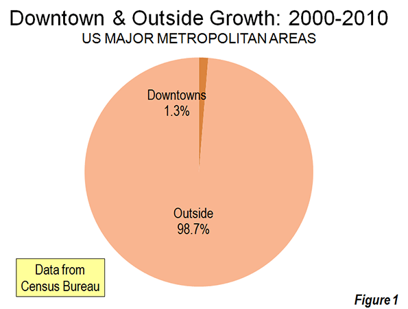
    However, to characterize the trend since 2000 as reflective of any "flocking" to the cities is to exaggerate the trend of downtown improvement beyond recognition. Among the 51 major metropolitan areas (those with more than 1 million population), nearly 99 percent of all population growth between 2000 and 2010 was outside the downtown areas (Figure 1).

    There was population growth in 33 downtown areas out of the 51 major metropolitan areas. As is typical for core urban measures, nearly 80 percent of this population growth was concentrated in the six most vibrant downtown areas, New York, Chicago, Philadelphia, Washington, Boston and San Francisco.

    If the next six fastest-growing downtown areas are added to the list (Dallas-Fort Worth, Houston, Los Angeles, Portland, San Diego and Seattle), downtown growth exceeds the national total of 205,000 people, because the other 39 downtown areas had a net population loss. Overall, the average downtown area in the major metropolitan areas grew by 4000 people between 2000 and 2010. That may be a lot of people for a college lacrosse game, but not for a city. While in some cases these increases were substantial in percentage terms, the population base was generally small, which was the result of huge population losses in previous decades as well as the conversion of old disused office buildings, warehouses and factories into residential units.

    Trends in the Larger Urban Cores: The downtown population gains, however, were not sufficient to stem the continuing decline in urban core populations. Among the 51 major metropolitan areas, the aggregate data indicates a loss of population within six miles of city hall. In essence, the oasis of modest downtown growth was more than negated by losses surrounding the downtown areas. Virtually all the population growth in the major metropolitan areas lay outside the six mile radius core, as areas within the historical urban core, including downtown, lost 0.4 percent.

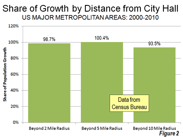
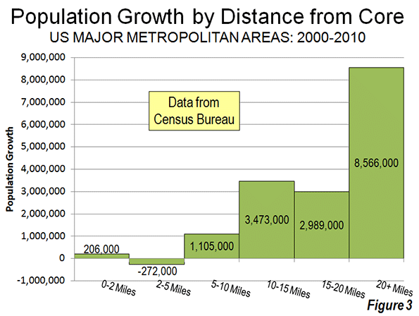
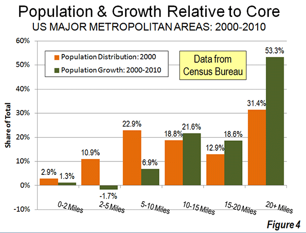
    Even when the radius is expanded to 10 miles, the overwhelming majority of growth remains outside. Approximately 94 percent of the aggregate population growth of the major metropolitan areas occurred more than 10 miles from downtown (Figure 2). Figure 3 shows that more than one-half of the growth occurred 20 miles and further from city hall. Further, the population growth beyond 10 miles (10-15 mile radius, 15-20 miles radius and 20 mile and greater radius) from the core exceeded the (2000) share of population, showing the continuing dispersal of American metropolitan areas (Figure 4).

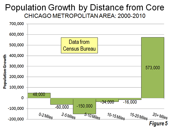
    Chicago: The Champion? The Census Bureau press release highlights the fact that downtown Chicago experienced the largest gain in the nation. Downtown Chicago accounted for 13 percent of the metropolitan area’s growth with an impressive 48,000 new residents. However, while downtown Chicago was prospering, people were flocking away from the rest of the city. Within a five mile radius of the Loop, there was a net population loss of 12,000 and a net loss of more than 200,000 within 20 miles (Figure 5). Only within the 36th mile radius from city hall is there a net population gain.

    Cleveland: Comeback City and Always Will Be? In view of Cleveland’s demographic decline (down from 915,000 in 1950 to 397,000 in 2010), any progress in downtown Cleveland is welcome. But despite the frequently recurring reports, downtown Cleveland’s population growth was barely 3,000. Despite this gain, the loss within a 6 mile radius was 70,000 and 125,000 within a 12 mile radius. Beyond the 12- mile radius, there was a population increase of nearly 55,000, which insufficient to avoid a metropolitan area population loss.

    Other Metropolitan Areas: A total of 30 major metropolitan areas suffered core population losses, despite the fact that many had downtown population increases.

    • Five major metropolitan areas suffered overall population losses (Buffalo, Cleveland, Detroit, Pittsburgh and Katrina ravaged New Orleans).
    • St. Louis, with a core city that holds the modern international record for population loss (from 857,000 in 1950 to 319,000 in 2010), experienced a population decline within a 27 mile radius of city hall. Approximately 150 percent of the growth in the St. Louis metropolitan area was outside the 27 mile radius. Even so, there was an increase of nearly 6,000 in the population of downtown St. Louis.
    • There were population losses all the way out to a considerable distance from city halls in Memphis (16 mile radius), Cincinnati (15 mile radius) and Birmingham (14 mile radius). The three corresponding downtown areas also lost population.
    • Despite having one of the strongest downtown population increases (12,000), population declined within a 10 mile radius of the Dallas city hall. This contrasts with nearby Houston, which also experienced a strong downtown increase (10,000) but no losses at any radius of the urban core.
    • Milwaukee experienced a small downtown population increase (2,000), but had a population loss within an11 mile radius.

    The other 21 major metropolitan areas experienced population gains throughout. Even so, most of the growth (77 percent) was outside the 10 mile radius. San Jose had the most concentrated growth, with only 24 percent outside a 10 miles radius from city hall. All of the other metropolitan areas had 60 percent or more of their growth outside a 10 mile radius from city hall.

    As we have observed before, 2000 to 2010 was, unlike the 1970s and other decades, more friendly to the nation’s core cities, although less so than the previous decade. Due to the repurposing of old offices and other structures, sometimes aided by subsidies, small downtown slivers may have done better than at any time since before World War II. But the data is clear. Suburban growth was stronger in the 2000s than in the 1990s. The one percent flocked to downtown and the 99 percent flocked to outside downtown.

    Population Loss Radius: Major Metropolitan Areas
    Miles from City Hall of Historical Core Municipality*
    Major Metropolitan Areas (Over 1,000,000 Population Share of Metropolitan Growth Population Loss Radius (Miles)
    "Outside Downtown" (2- Mile Radius) Outside 5-Mile Radius Outside 10-Mile Radius
    MAJOR METROPOLITAN AREAS: TOTAL 98.7% 100.4% 93.5% 6
    Atlanta, GA 99.6% 101.1% 99.9% 9
    Austin, TX 98.1% 96.7% 81.9% 0
    Baltimore, MD 106.5% 118.7% 99.5% 9
    Birmingham, AL 104.2% 132.5% 124.9% 14
    Boston, MA-NH 90.8% 76.9% 67.3% 0
    Buffalo, NY Entire Metropolitan Area Loss
    Charlotte, NC-SC 99.1% 97.4% 75.0% 3
    Chicago, IL-IN-WI 86.7% 103.3% 144.6% 35
    Cincinnati, OH-KY-IN 105.1% 126.8% 135.2% 15
    Cleveland, OH Entire Metropolitan Area Loss
    Columbus, OH 100.5% 104.3% 86.9% 7
    Dallas-Fort Worth, TX 99.0% 101.0% 100.7% 10
    Denver, CO 98.0% 100.3% 89.8% 5
    Detroit,  MI Entire Metropolitan Area Loss
    Hartford, CT 99.2% 92.7% 67.2% 0
    Houston, TX 99.2% 99.5% 98.0% 0
    Indianapolis. IN 102.1% 112.1% 89.6% 8
    Jacksonville, FL 100.2% 106.3% 85.3% 8
    Kansas City, MO-KS 99.5% 109.0% 113.3% 12
    Las Vegas, NV 101.4% 98.0% 63.6% 4
    Los Angeles, CA 97.3% 102.2% 97.6% 8
    Louisville, KY-IN 102.5% 108.5% 90.9% 8
    Memphis, TN-MS-AR 101.2% 118.5% 143.5% 16
    Miami, FL 99.4% 93.0% 91.3% 0
    Milwaukee,WI 95.9% 109.0% 107.5% 11
    Minneapolis-St. Paul, MN-WI 97.4% 99.2% 100.1% 7
    Nashville, TN 100.0% 101.4% 92.4% 7
    New Orleans. LA Entire Metropolitan Area Loss
    New York, NY-NJ-PA 93.5% 81.7% 68.9% 0
    Oklahoma City, OK 100.1% 96.8% 83.5% 2
    Orlando, FL 99.7% 99.4% 84.2% 0
    Philadelphia, PA-NJ-DE-MD 92.6% 98.8% 96.3% 7
    Phoenix, AZ 100.7% 101.8% 93.6% 6
    Pittsburgh, PA Entire Metropolitan Area Loss
    Portland, OR-WA 95.0% 91.5% 62.7% 0
    Providence, RI-MA 96.2% 91.7% 70.1% 0
    Raleigh, NC 99.6% 93.0% 67.7% 0
    Richmond, VA 95.7% 91.7% 70.2% 0
    Riverside-San Bernardino, CA 99.5% 97.2% 85.8% 0
    Rochester, NY 146.9% 149.3% 82.5% 9
    Sacramento, CA 99.9% 94.4% 79.5% 0
    Salt Lake City, UT 98.9% 95.1% 84.1% 0
    San Antonio, TX 101.1% 102.5% 86.7% 7
    San Diego, CA 96.3% 94.1% 90.1% 0
    San Francisco-Oakland, CA 90.7% 87.6% 82.2% 0
    San Jose, CA 95.1% 79.1% 24.3% 0
    Seattle, WA 96.5% 91.9% 81.4% 0
    St. Louis,, MO-IL 94.8% 119.7% 148.9% 27
    Tampa-St. Petersburg, FL 98.6% 97.8% 83.7% 0
    Virginia Beach-Norfolk, VA-NC 93.1% 90.1% 82.3% 0
    Washington, DC-VA-MD-WV 97.5% 94.5% 87.9% 0
    Calculated from Census Bureau data
    *Except in Virginia Beach-Norfolk, Where Virginia Beach is used


    ——-

    Notes:

    Population Weighted Density: In its report, the Census Bureau uses "population-weighted density," rather than average population density to compare metropolitan areas. The Census Bureau justified this use as follows:

    "Overall densities of CBSAs can be heavily affected by the size of the geographic units for which they are calculated. Metropolitan and micropolitan statistical areas are delimited using counties as their basic building blocks, and counties vary greatly across the country in terms of their geographic size. With this in mind, one way of measuring actual residential density is to examine the ratio of population to land area at the scale of the census tract, which—of all the geographic units for which decennial census data are tabulated—is typi­cally the closest in scale to urban and subur­ban neighborhoods".

    The Census Bureau rightly points out the problem with comparing metropolitan area density. However, it is a problem of the federal government’s making, by virtue of using metropolitan area building blocks (counties) that are sometimes too large for designation of genuine metropolitan areas. These difficulties have been overcome by the national census authorities in Japan in Canada, for example, where smaller building blocks are used (such as municipalities or local government authorities).

    Further, the Census Bureau already has a means for measuring population density at the census tract level, which is "the closest in scale to urban and suburban neighborhoods." This is the urban area.

    "Population-weighted density" is an interesting concept that can provide an impression of the density that is perceived by the average resident of the metropolitan area. Unfortunately, in its report, the Census Bureau is less than precise with its terminology and repeatedly fails to modify the term density with the important "population-weighted" qualification. This could lead to considerable misunderstanding.

    The Census Bureau did not provide average population densities based for the mileage radii. Because of large bodies of water (such as Lake Michigan in Chicago can reduce land areas, it was not possible to estimate population densities by radius.

    Census Bureau Revision of Incorrect Report: We notified the Census Bureau of errors in its press release and report on September 27. The problems included substitution of San Francisco population data for Salt Lake City as well as metropolitan population in the supporting spreadsheet file. On September 28, the Census Bureau issued a revised press release and report to rectify the errors. Later the erroneous spreadsheet was withdrawn and had not been re-posted as of October 1. We have made corrections to the spreadsheet for this analysis.

    Note: Larger "Downtown" Populations in Smaller Metropolitan Areas: Because of the broad 2-mile radius measure used by the Census Bureau, most of the population increase characterized as relating to downtown occurred outside the major metropolitan areas. This is simply because in smaller metropolitan areas, such an area (12.6 square miles) will necessarily contain a larger share of the metropolitan area. Further, many smaller metropolitan areas are virtually all suburban and had experienced little or no core population losses over the decades that have been so devastating to many large core municipalities. On average, 2.7 percent of the population of major metropolitan areas was within a two-mile radius of city hall in 2010. By comparison, in smaller metropolitan areas, approximately 12.7 percent of the population was within a two mile radius.

    Photograph: Chicago Suburbs: (where nearly all the growth occurred), by author

  • Thunder On The Great Plains: A Written-Off Region Enjoys Revival

    They may not win their first championship against Miami’s evil empire, but the Oklahoma City Thunder have helped to put a spotlight on what may well be the most surprising success story of 21st century America: the revival of the Great Plains. Once widely dismissed as the ultimate in flyover country, the Plains states have outperformed the national average for the past decade by virtually every key measure of vitality — from population, income and GDP growth to unemployment — and show no sign of slowing down.

    It’s a historic turnaround. For decades, the East Coast media has portrayed the vast region between Texas and the Dakotas as a desiccated landscape of emptying towns, meth labs and right-wing “clingers.” Just five years ago, The New York Times described the Plains as “not far from forsaken.”

    Many in the media and academia embraced Deborah and Frank Popper’s notion that the whole region should be abandoned for “a Buffalo commons.” The Great Plains, the East Coast academics concluded, represents “the largest, longest-running agricultural and environmental miscalculation in American history” and boldly predicted the area would “become almost totally depopulated.”

    Yet a funny thing happened on the way to oblivion. Rising commodity prices, the tapping of shale gas and oil formations and an unheralded shift of industry and people into the interior has propelled the Plains economy through the Great Recession.

    Since 2000, the Plains’ population has grown 14%, well above the national rate of 9%. This has been driven by migration from the coasts, particularly Southern California, to the region’s cities and towns. Contrary to perceptions of the area as a wind-swept old-age home, demographer Ali Modarres has found that the vast majority of the newcomers are between 20 and 35.

    Oklahoma City epitomizes these trends. Over the last decade, the city’s population expanded 14%, roughly three times as fast as the San Francisco area and more than four times the rate of growth of New York or Los Angeles. Between 2010 and 2011 OKC ranked 10th out of the nation’s 51 largest metropolitan areas in terms of rate of net growth.

    Nothing more reflects the changing fortunes of Oklahoma City than the strong net migration from many coastal communities, notably Los Angeles and Riverside, a historic reversal of the great “Okie” migration of the 1920s and 1930s. In the past decade, over 20,000 more Californians have migrated to Oklahoma than the other way around. OKC has even experienced a small net migration from the Heat’s South Florida stomping grounds.

    The city’s transformation from a cow town into an attractive, modern metropolis has been fueled by some $2 billion in public investment and over $5 billion in private investment, says Roy Williams, president of the Oklahoma City Chamber of Commerce. Besides the arena for the Thunder, the city has engineered a successful riverfront development known as Bricktown, fostered a growing arts scene and become more ethnically diverse, largely as a result of immigration from Mexico.

    This pattern of revived urbanization can be seen in other Plains cities. World-class art museums grace Ft. Worth’s Cultural District, and downtown in Omaha, Neb., has become a lively venue bristling with revelers on weekends. Even downtown Fargo, N.D., now boasts a boutique hotel, youth-oriented bars, interesting restaurants and a small, but vibrant arts scene.

    Great Plains cities are doing well, however, predominantly due to their strong record of economic growth. Over a decade in which most large metropolitan areas lost jobs, Ft. Worth, Dallas, Oklahoma City and Omaha have created employment. Unlike many Bush-era boom towns, such as Las Vegas, Riverside-San Bernardino, Calif., or the major Florida cities, the Plains did not hemorrhage jobs during the Great Recession.

    The Plains states enjoy some of the lowest unemployment rates in the country. There were seven states with unemployment of 5% or less in April; four are on the Plains: North Dakota, with the nation’s lowest jobless rate at 3%, South Dakota, Nebraska, Iowa and Oklahoma.

    This is partly due to a booming energy industry. As U.S. oil and gas production has surged over the past decade, the Plains’ share has grown from roughly a third to nearly 45%. The biggest two gainers, Texas and Oklahoma, together boosted their energy employment by 220,000.

    But the Great Plains’ economic dynamism extends well beyond energy. The region’s farms and ranches cover an area exceeding 500 million acres,or over 790,000 square miles — larger than Mexico — and account for roughly a quarter of the nation’s agricultural production. These farms have benefited from the long-term increase in food commodity prices — notably wheat, corn, soybeans — and record exports. Since 2007 the Plains share of food shipments abroad has surged from 20% to nearly 25%.

    At the same time, the region’s industrial sector, notes research by Praxis Strategy Group’s Mark Schill, has withstood the recession better than the rest of the nation. Never a center of unionized mass manufacturing, the region has become a location of choice for expanding industries, in part due to low costs, cheap energy and a favorable regulatory environment.

    They know all about this in Oklahoma . Last year the Sooner State led the nation in industrial growth. One major coup: a large Boeing facility moved last year from California to OKC. The Dakotas and Nebraska also sit in the top ranks of producers of new industrial jobs. Since 2007, the Plains states have boosted their share of U.S. manufactured good from 19% to 21%.

    More surprising still has been the region’s surge in employment in jobs related to science, technology, engineering and math. This has been spearheaded, of course, by Texas, but most other Plains states — North Dakota, South Dakota, Oklahoma — also have enjoyed well above average tech job growth. North Dakota, remarkably, now boasts the second-highest percentage of people 25 to 44 with a post-secondary education, behind only Massachusetts; it also has one of the highest rates of high-tech startups in the nation.

    Given their generally strong state budgets, the Plains states have continued to pour more resources per capita into university-related research than their counterparts elsewhere. North Dakota ranks number one here, but South Dakota, Oklahoma, Kansas, Montana and Texas all rank in the top 10.

    None of this suggests that the Plains are ready to bid for primacy as high-tech centers with California or Massachusetts, or Ohio and Michigan as the country’s industrial bastions. For all their improved amenities, Omaha, Ft. Worth or Oklahoma City seem unlikely to surpass New York City as the nation’s cultural, restaurant or financial capital in our lifetimes.

    Yet it seems clear that the region, long dismissed as irrelevant, will play a much larger role in the nation’s economic future. Like the young Thunder, the people of the Plains now have a prairie wind at their back.

    Joel Kotkin is executive editor of NewGeography.com and is a distinguished presidential fellow in urban futures at Chapman University, and contributing editor to the City Journal in New York. He is author of The City: A Global History. His newest book is The Next Hundred Million: America in 2050, released in February, 2010.

    This piece originally appeared in Forbes.

    Oklahoma City photo by BigStockPhoto.com.

  • Heavy Metal Is Back: The Best Cities For Industrial Manufacturing

    For a generation American manufacturing has been widely seen as a “declining sport.” Yet its demise has been largely overplayed.  Despite the many jobs this sector has lost in the past generation, manufacturing remains remarkably resilient, with a global market share similar to that of the 1970s.

    More recently, the U.S. industrial base has been on a powerful upswing, with employment climbing steadily since 2009. Boosted by productivity gains and higher costs in competitors, including China, U.S. manufacturing exports have grown at their fastest rate since the late 1980s. In 2011 American manufacturing continued to expand, while Germany, Japan and Brazil all weakened in this vital sector.

    To determine the best cities for manufacturing my colleague Mark Schill at Praxis Strategy Group measured the 51 largest regions in the country in terms of how they expanded their “heavy metal” sector — think automobiles, farm and energy equipment, aircraft, metal work and machine shops. We averaged absolute growth rate and momentum in 148 heavy metal manufacturing industries over ten-, five-, two-, and one-year time frames.

    Our top ranked area, Houston, is one of only four regions that enjoyed net job growth in manufacturing in the past 10 years. This year its heavy manufacturing sector expanded by almost 5%. Houston’s industrial growth is no fluke; over the past year its overall job growth has been about the best among  all the nation’s major metros.

    Houston’s industrial success owes much to the city’s massive port and booming energy sector, says Bill Gilmer, senior economist at the Federal Reserve office of Dallas. “Houston is about energy — it’s about fabricated metals and machinery,” he says. “It’s oil service supply and petrochemicals. It’s all paced by a high price of oil and new technology that makes it more accessible.”

    This shift towards domestic energy augurs well for a huge and economically beneficial  shift in America’s  longer term economic prospects, he points out. Cheap natural gas, for example, makes petrochemical production in America more competitive than anyone could have imagined a decade ago. Linkages with Mexico in terms of energy as well as autos has made Texas — which is also home to No. 4 ranked San Antonio and No. 15 ranked Dallas — the nation’s primary export super-power, with current shipment 15% to 20% above pre-crisis levels.

    The energy and industry connection also can be seen in No. 10 Oklahoma City, where heavy industry has been booming through much of the recession due to its strong fossil fuel industry. This synergy between energy and manufacturing could also spread to other regions, including many not associated with large fossil fuel deposits  New finds in the Utica shale in Ohio, for example, could be worth as much as  $500 billion; one energy executive called it “the biggest thing to hit Ohio since the plow.”

    These gas finds may help ignite the heavy metal revival. As coal-fired plants become more expensive to operate due to concerns over greenhouse gas emissions, the region will have a new, cleaner and potentially less expensive power source.

    Already the  boom in natural gas has sparked a considerable industrial rebound in parts of eastern Ohio including the building of a new $650 million steel plant for gas pipes in the Youngstown area.  Karen Wright, whose Ariel Corporation sells compressors used in gas plants, has added more than 300 positions in the past two years. “There’s a huge amount of drilling throughout the Midwest,” Wright says. “This is a game changer.”

    But the industrial rebound is not only about energy. Another critical factor is rising  wages in East Asia, including China. Increasingly, American-based manufacturing is in a favored position as a lower-cost producer. Concerns over “knock offs” and lack of patent protection in China may also spark a growing “Made in the USA” trend.

    The shift back to U.S. production may be a great sign for many regions. Our No. 3 ranked area, Seattle-Tacoma-Bellevue, is picking up heavy metal jobs associated with the aerospace industry. A growing focus on domestic production for Boeing’s new aircraft could bring even more prosperity to the high-flying region, which also ranked No. 1 on our recent technology industry growth ranking.

    If new industrial growth is just another piece of good news in the Pacific Northwest, it’s manna from heaven to the long suffering industrial heartland heavily concentrated in the Great Lakes region, which includes much of Ohio, Michigan, Indiana, Illinois , Wisconsin and Minnesota.  Long reviled as the “rust belt” this area now leads in the industrial rebound with over 100,000 new manufacturing jobs in just the past year.

    Particularly well positioned is No. 2 ranked Milwaukee, which is home to a wide array of specialized manufacturing firms ranging from machine tools to energy. Over the past year alone the region added almost 3900 heavy metal jobs and has consistently led other Great Lakes communities in job creation.

    But Milwaukee is not the only rust belt rebound town. The greater Detroit area, No. 6 on our list, actually added the most heavy metal jobs — more than 12,000 — than any region of the country. The area’s ranking, however, was dragged down by its legacy; greater Detroit still has lost almost 130,000 positions in the past decade.

    The heavy metal revival has a long way to go. And we cannot expect it to produce the same kinds of jobs produced in the last century. For example, the new jobs will be more highly skilled; even as the share of the workforce employed in manufacturing has dropped from 20% to roughly half that, high skilled jobs in industry have soared 37%, according to a New York fed study.

    Regions seeking strong industrial growth will have to focus more and more on training more skilled workers. Even after years of declining employment and surplus numbers of graduates in the arts and law, manufacturers in heavy industry are running short on skilled workers. Industry expert David Cole predicts there could be demand for 100,000 new workers by 2013. According to Deloitte Touche, 83% of all manufacturers suffer a moderate or severe shortage of skilled production workers.

    The resurgence of heavy metal should lead regions, and the federal government, to consider shifting their emphasis toward productive, skilled based training and away from a single-minded focus on the BA or graduate degree. Few regions suffer a shortage of art history or English graduates.   This more practical emphasis is particularly critical for the Midwest, which is home to four of the ten highest-ranked industrial engineering schools in the nation.

    Even more important: training workers for the assembly lines of tomorrow. These jobs, notes Ariel’s Karen Wright, will require not BA degrees but high degrees of math and mechanical skills that can be apply to expanding companies like hers.

    As we enter a new economic era, regions should look beyond the current obsession with “creative” and “information” industries. Instead, they should focus on a resurgent industrial economy — which then can provide a customer base for advertising, graphics and software companies — as a primary driver of economic growth.  Turn down those soulful   Adele tracks: Heavy metal is back.

    The Top Regions for Heavy Metal
    Manufacturing Job Growth


    Score consists of 10, 5, 2, and 1 year job growth rate and job momentum and 2011 industry concentration. 

    Rank MSA Name Score
    1 Houston-Sugar Land-Baytown, TX 68.5
    2 Milwaukee-Waukesha-West Allis, WI 65.6
    3 Seattle-Tacoma-Bellevue, WA 64.7
    4 San Antonio-New Braunfels, TX 60.7
    5 Virginia Beach-Norfolk-Newport News, VA-NC 60.4
    6 Detroit-Warren-Livonia, MI 58.2
    7 Kansas City, MO-KS 56.3
    8 Hartford-West Hartford-East Hartford, CT 56.1
    9 Sacramento–Arden-Arcade–Roseville, CA 54.4
    10 Oklahoma City, OK 53.3
    11 Pittsburgh, PA 53.2
    12 Salt Lake City, UT 52.6
    13 Richmond, VA 52.0
    14 Portland-Vancouver-Hillsboro, OR-WA 51.8
    15 Dallas-Fort Worth-Arlington, TX 51.5
    16 Cincinnati-Middletown, OH-KY-IN 51.3
    17 Cleveland-Elyria-Mentor, OH 51.3
    18 San Diego-Carlsbad-San Marcos, CA 50.5
    19 Raleigh-Cary, NC 50.1
    20 San Jose-Sunnyvale-Santa Clara, CA 48.7
    21 Birmingham-Hoover, AL 48.0
    22 Minneapolis-St. Paul-Bloomington, MN-WI 47.9
    23 Atlanta-Sandy Springs-Marietta, GA 47.6
    24 Louisville/Jefferson County, KY-IN 47.3
    25 Austin-Round Rock-San Marcos, TX 47.2
    26 St. Louis, MO-IL 46.8
    27 Orlando-Kissimmee-Sanford, FL 46.7
    28 Charlotte-Gastonia-Rock Hill, NC-SC 46.2
    29 Denver-Aurora-Broomfield, CO 45.7
    30 Boston-Cambridge-Quincy, MA-NH 44.9
    31 Chicago-Joliet-Naperville, IL-IN-WI 44.6
    32 Washington-Arlington-Alexandria, DC-VA-MD-WV 44.0
    33 Memphis, TN-MS-AR 43.9
    34 Tampa-St. Petersburg-Clearwater, FL 42.9
    35 Indianapolis-Carmel, IN 42.9
    36 Providence-New Bedford-Fall River, RI-MA 42.9
    37 Rochester, NY 42.3
    38 Columbus, OH 42.2
    39 Phoenix-Mesa-Glendale, AZ 41.9
    40 Jacksonville, FL 41.1
    41 Los Angeles-Long Beach-Santa Ana, CA 40.2
    42 Miami-Fort Lauderdale-Pompano Beach, FL 40.1
    43 Nashville-Davidson–Murfreesboro–Franklin, TN 39.8
    44 Philadelphia-Camden-Wilmington, PA-NJ-DE-MD 39.1
    45 Buffalo-Niagara Falls, NY 38.7
    46 Riverside-San Bernardino-Ontario, CA 37.9
    47 New Orleans-Metairie-Kenner, LA 35.7
    48 Baltimore-Towson, MD 34.3
    49 Las Vegas-Paradise, NV 31.0
    50 New York-Northern New Jersey-Long Island, NY-NJ-PA 30.1
    51 San Francisco-Oakland-Fremont, CA 24.5
    Analysis includes job data from 148 six-digit NAICS industry sectors covering Primary Metal Manufacturing (NAICS 331), Fabricated Metal Manufacturing (332), Machinery Manufacturing (333) and Transportation Equipment Manufacturing (336).
    Data Source: EMSI Complete Employment, 2011.4 


    This piece first appeared at Forbes.com.

    Joel Kotkin is executive editor of NewGeography.com and is a distinguished presidential fellow in urban futures at Chapman University, and contributing editor to the City Journal in New York. He is author of The City: A Global History. His newest book is The Next Hundred Million: America in 2050, released in February, 2010.

    Mark Schill of Praxis Strategy Group perfomed the economic analysis for this piece.

    Photo courtesy of BigStockPhoto.com.


  • More Americans Move to Detached Houses

    In defiance of the conventional wisdom in the national media and among most planning professionals, Americans continue not only to prefer, but to move into single family detached houses. Data from the 2010 American Community Survey indicates that such housing attracted 79.2% of the new households in the 51 major metropolitan areas (over 1,000,000 population) over the past decade.

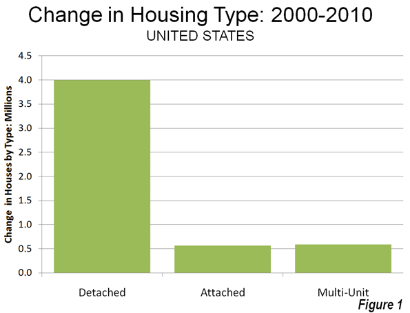
    In contrast households in multi-unit buildings (apartments and condominiums) represented 11.8% of the new housing, while two-unit attached housing represented 11.3% of the increase. There was a 2.3% decline in the "other" category of new housing, which includes mobile homes and boats. A total of 4 million net new occupied detached houses were added in the largest metropolitan areas, while there were 590,000 additional apartments and condominiums and 570,000 attached houses (Figure 1).

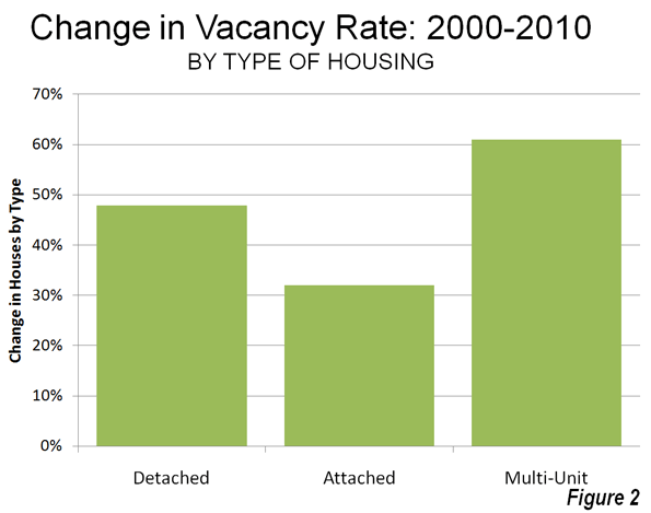
    Detached Vacancy Rate Rises Less than Multi-Unit: Another conventional assumption is that single family homes have been disproportionately abandoned by their occupants, particularly since the collapse of the housing bubble. This is also not true. In 2010 detached housing enjoyed a 92.4% occupancy rate in 2010 which is higher than the 89.4% occupancy rate in attached housing and 84.2% occupancy rate in multi-unit buildings. Because a more of the multi-unit housing is rental, it is to be expected that the vacancies would be the highest in this category. However, at the national level, overall vacancy rates rose the most in multi-unit housing, with an increase of 61%, from 10.7% in 2000 to 17.1% in 2010. The vacancy rate in detached housing rose at a slower rate, from 7.3% in 2000 to 10.7% in 2010, an increase of 48%. Attached housing – such as townshouses – have the slowest rise in vacancy rate, from 8.4% in 2000 to 11.0% in 2010, an increase of 32% (Figure 2).

    Detached and Attached Up in Most Markets, Apartments and Condominiums Down in Most: The move to detached housing was pervasive at the major metropolitan area level. Among the 51 largest metropolitan areas, the share of detached housing rose in 44 and declined in seven. The share of attached housing rose in 32 of the metropolitan areas, while declining in 19. Multi-unit housing experienced an increase in its market share in only three markets, while declining in 48.

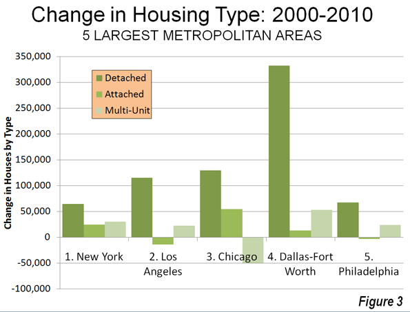
    Largest Metropolitan Areas: Detached housing also increased more than attached housing and multi-unit housing in each of the nation’s five largest metropolitan areas.

    • In the largest metropolitan area, New York, 51.9% of the new housing was detached. This is considerably more than the 36.9% detached market share in 2000. Multi-unit housing accounted for 24.1% of the increase in the market. This is a far smaller share than the 55.7% that multi-unit housing represented in 2000. Attached housing was 19.9% of the increase, nearly 3 times its 2000 share of 6.7%. This movement of New Yorkers to less dense housing forms is particularly significant, in view of the fact that New York has historically had the lowest share of lower density housing (detached and attached) and the highest share of multi-unit houses.
    • In the second largest metropolitan area, Los Angeles, 96.0% of the new housing was detached. This is nearly double the 49.7% that detached housing represented of the market in 2000. The balance of the new housing was split between a share of 18.6% for multi-unit housing and a loss of 11.8% in the attached housing. The share of new units represented by multi-unit houses was less one-half than its percentage of the market in 2000 (39.0%).
    • In the third largest metropolitan area, Chicago, 95.9% of the new housing was detached, well above the 52.5% share in 2000. There was a huge loss in apartment and condominium share, at 31% of the market, while attached housing captured 40.4% of the market.
    • In the fourth largest metropolitan area, Dallas Fort Worth, 84.3% of the new housing was detached, well above the 62.0% share in 2000. Multi-unit housing accounted for 13.5% of the increase, approximately one-half the 2000 market share. Attached housing represented 3.2% of the increase.
    • In the fifth largest metropolitan area, Philadelphia, 77.6% of new housing was detached, well above the 45.3% market share for detached housing in 2000. Apartments and condominiums accounted for 27.7% of the increase between 2000 and 2010, slightly more than the 2000 market share 23.7%. Attached housing represented a minus 4.3% of the new housing.

    Despite being only the fourth largest metropolitan area, Dallas-Fort Worth accounted for 46% of the new housing in the five largest metropolitan areas (Figure 3).

    The three largest metropolitan markets where there was an increase in multi-unit housing share were San Jose, New Orleans and Denver. In San Jose, 55.5% of new housing was multi-unit, while only 10.3 percent was detached. New Orleans had a similar 10.5% detached new housing share, while 65.8% of the new housing was multi unit. In Denver, 31.3% of the new housing was multi-unit, while 60.2% was detached.

    The share of detached housing also declined between 2000 and 2010 in Boston, Kansas City, Minneapolis-St. Paul and Portland. In each of these metropolitan areas, the share of attached housing increased, while the share of multi-unit housing decreased. Nonetheless, detached housing continued to attract a majority of new housing in Kansas City (70.8 percent) and Portland (56.6 percent). Despite Portland’s strong planning emphasis on high density housing, its share of multi-unit housing, and 26.8% between 2000 and 2010 was less than its 2000 market share of 27.5%, with a strong 20.6 percent share in attached housing. Attached housing also accounted for a comparatively large share of new housing in Boston (45.7 percent), Minneapolis-St. Paul (39.7 percent) and Kansas City (25.8 percent). The stronger densification policies that existed in Minneapolis-St. Paul until the middle of the decade may have artificially raised the share of attached new housing.

    Share by housing type data is provided for the major metropolitan areas in Tables 1 and 2.

    Table 1
    Occupied Housing by Major Metropolitan Area: 2000
    Metropolitan Area Detached Attached Multi-Unit Other
    Atlanta, GA 66.6% 3.5% 25.5% 4.4%
    Austin, TX 57.7% 3.7% 32.1% 6.6%
    Baltimore, MD 46.0% 28.5% 24.2% 1.3%
    Birmingham, AL 68.3% 2.6% 17.9% 11.2%
    Boston, MA-NH 48.9% 4.4% 45.4% 1.3%
    Buffalo, NY 60.0% 2.8% 35.1% 2.1%
    Charlotte, NC-SC 67.5% 3.4% 21.8% 7.3%
    Chicago, IL-IN-WI 52.5% 6.3% 40.1% 1.1%
    Cincinnati, OH-KY-IN 64.7% 3.6% 27.8% 3.9%
    Cleveland, OH 65.7% 5.5% 27.7% 1.2%
    Columbus, OH 62.8% 5.5% 29.1% 2.6%
    Dallas-Fort Worth, TX 62.0% 3.1% 30.3% 4.6%
    Denver, CO 60.9% 7.8% 29.0% 2.3%
    Detroit,  MI 70.5% 5.5% 20.7% 3.3%
    Hartford, CT 60.0% 5.2% 34.1% 0.8%
    Houston, TX 61.4% 3.6% 29.1% 6.0%
    Indianapolis. IN 68.4% 5.2% 23.2% 3.3%
    Jacksonville, FL 63.5% 3.9% 22.3% 10.3%
    Kansas City, MO-KS 71.3% 4.6% 21.4% 2.6%
    Las Vegas, NV 53.4% 6.0% 34.7% 5.9%
    Los Angeles, CA 49.7% 8.6% 39.6% 2.0%
    Louisville, KY-IN 70.7% 2.1% 22.2% 5.0%
    Memphis, TN-MS-AR 69.1% 3.8% 22.8% 4.2%
    Miami, FL 45.4% 9.9% 42.1% 2.6%
    Milwaukee,WI 55.7% 5.3% 38.3% 0.7%
    Minneapolis-St. Paul, MN-WI 62.8% 7.7% 27.4% 2.0%
    Nashville, TN 64.9% 4.4% 24.4% 6.2%
    New Orleans. LA 59.9% 7.7% 28.5% 3.9%
    New York, NY-NJ-PA 36.9% 6.5% 56.3% 0.4%
    Oklahoma City, OK 71.6% 3.1% 19.2% 6.0%
    Orlando, FL 61.5% 4.5% 25.1% 8.9%
    Philadelphia, PA-NJ-DE-MD 45.3% 29.8% 23.5% 1.4%
    Phoenix, AZ 61.6% 6.1% 24.9% 7.4%
    Pittsburgh, PA 68.8% 6.5% 20.4% 4.4%
    Portland, OR-WA 63.8% 3.3% 27.5% 5.5%
    Providence, RI-MA 54.3% 2.9% 41.6% 1.2%
    Raleigh, NC 63.6% 5.2% 21.5% 9.8%
    Richmond, VA 71.3% 4.9% 20.4% 3.4%
    Riverside-San Bernardino, CA 67.0% 5.1% 18.6% 9.3%
    Rochester, NY 65.7% 4.3% 26.5% 3.5%
    Sacramento, CA 66.1% 6.0% 24.0% 3.9%
    Salt Lake City, UT 67.0% 4.8% 25.4% 2.8%
    San Antonio, TX 67.4% 2.9% 22.2% 7.5%
    San Diego, CA 51.7% 9.4% 34.5% 4.4%
    San Francisco-Oakland, CA 50.3% 9.3% 39.1% 1.3%
    San Jose, CA 57.0% 9.1% 30.5% 3.4%
    Seattle, WA 60.2% 3.5% 31.6% 4.8%
    St. Louis,, MO-IL 70.2% 3.1% 21.9% 4.8%
    Tampa-St. Petersburg, FL 58.4% 4.6% 25.7% 11.4%
    Virginia Beach-Norfolk, VA-NC 61.4% 10.4% 25.2% 3.0%
    Washington, DC-VA-MD-WV 47.6% 19.4% 32.1% 0.8%
    Average (Weighted) 55.9% 7.5% 33.3% 3.3%
    Data from 2000 Census
    Metropolitan areas over 1,000,000 population as defined in 2010


    Table 2
    Occupied Housing by Major Metropolitan Area: 2010
    Metropolitan Area Detached Attached Multi-Unit Other
    Atlanta, GA 69.2% 5.3% 22.7% 2.7%
    Austin, TX 60.4% 2.6% 31.8% 5.1%
    Baltimore, MD 47.4% 27.3% 24.2% 1.1%
    Birmingham, AL 70.8% 2.4% 16.8% 10.0%
    Boston, MA-NH 48.7% 5.9% 44.2% 1.2%
    Buffalo, NY 62.3% 2.9% 33.0% 1.8%
    Charlotte, NC-SC 68.9% 5.1% 20.4% 5.6%
    Chicago, IL-IN-WI 54.2% 7.6% 37.1% 1.1%
    Cincinnati, OH-KY-IN 68.9% 4.8% 23.2% 3.1%
    Cleveland, OH 68.7% 5.1% 25.1% 1.1%
    Columbus, OH 64.1% 7.3% 26.6% 2.1%
    Dallas-Fort Worth, TX 65.9% 3.1% 27.4% 3.6%
    Denver, CO 60.8% 7.9% 29.4% 1.9%
    Detroit,  MI 71.6% 6.3% 19.1% 2.9%
    Hartford, CT 60.9% 5.3% 33.1% 0.7%
    Houston, TX 65.1% 3.5% 26.0% 5.3%
    Indianapolis. IN 71.3% 5.0% 21.1% 2.6%
    Jacksonville, FL 66.3% 4.8% 21.3% 7.6%
    Kansas City, MO-KS 71.3% 6.4% 20.1% 2.2%
    Las Vegas, NV 60.9% 5.4% 29.9% 3.8%
    Los Angeles, CA 51.0% 8.0% 39.0% 1.9%
    Louisville, KY-IN 71.6% 3.6% 20.9% 4.0%
    Memphis, TN-MS-AR 72.5% 3.3% 20.4% 3.7%
    Miami, FL 47.0% 10.8% 40.0% 2.1%
    Milwaukee,WI 56.2% 6.5% 36.5% 0.8%
    Minneapolis-St. Paul, MN-WI 61.5% 11.0% 25.9% 1.6%
    Nashville, TN 67.2% 5.6% 22.3% 4.9%
    New Orleans. LA 65.1% 6.1% 24.6% 4.2%
    New York, NY-NJ-PA 37.2% 6.7% 55.7% 0.4%
    Oklahoma City, OK 74.3% 3.0% 17.1% 5.6%
    Orlando, FL 64.1% 5.5% 23.4% 6.9%
    Philadelphia, PA-NJ-DE-MD 46.6% 28.5% 23.7% 1.3%
    Phoenix, AZ 67.2% 4.8% 22.2% 5.8%
    Pittsburgh, PA 69.4% 7.5% 19.1% 4.0%
    Portland, OR-WA 62.8% 5.5% 27.4% 4.3%
    Providence, RI-MA 55.7% 3.7% 39.6% 1.0%
    Raleigh, NC 65.4% 8.0% 20.5% 6.2%
    Richmond, VA 73.2% 4.9% 19.0% 3.0%
    Riverside-San Bernardino, CA 70.7% 4.3% 17.1% 7.9%
    Rochester, NY 66.9% 4.8% 25.3% 2.9%
    Sacramento, CA 68.8% 5.6% 22.6% 3.0%
    Salt Lake City, UT 67.8% 6.1% 23.9% 2.2%
    San Antonio, TX 70.8% 2.2% 21.1% 5.9%
    San Diego, CA 53.0% 9.0% 34.5% 3.5%
    San Francisco-Oakland, CA 50.7% 9.4% 38.8% 1.1%
    San Jose, CA 54.3% 10.7% 32.0% 3.0%
    Seattle, WA 60.5% 4.2% 31.5% 3.8%
    St. Louis,, MO-IL 70.8% 4.2% 21.1% 3.9%
    Tampa-St. Petersburg, FL 59.6% 5.6% 24.7% 10.1%
    Virginia Beach-Norfolk, VA-NC 62.5% 11.1% 24.0% 2.5%
    Washington, DC-VA-MD-WV 48.1% 19.6% 31.7% 0.7%
    Average (Weighted) 57.8% 7.9% 31.5% 2.8%
    Data from 2010 American Community Survey
    Metropolitan areas over 1,000,000 population as defined in 2010


    In Housing, Preference Trumps Policy: The trend of the last decade is evidence of a continued preference of American households for detached housing. The results are remarkable for at least two reasons:

    • The first is that there have been unprecedented policy initiatives to discourage, if not to prohibit the building of new detached houses. It seems likely that the miniscule new detached housing share in San Jose, for example, is a direct result of that metropolitan area’s virtual prohibition of new detached housing, rather than any evidence that households have begun to prefer higher density housing. A small detached housing share in the face of a strong public policy bias toward higher density housing says nothing about preferences.
    • Second; the media and wishful advocates of denser settlement patterns have continuously referred to detached housing as having been severely overbuilt during the housing bubble, while suggesting an imperative for households to move into multiunit, often rented housing. The new data, with the larger increase in multi-unit vacancy rates, indicates that there was at least as much overbuilding in more dense housing types as there was in detached housing.

    Despite the expressed preferences of planners, academics and even many builders, American households continue to make their own decisions about housing.

    Wendell Cox is a Visiting Professor, Conservatoire National des Arts et Metiers, Paris and the author of “War on the Dream: How Anti-Sprawl Policy Threatens the Quality of Life

    Lead photo: Houses in Los Angeles. Photograph by author.

  • Major Metropolitan Commuting Trends: 2000-2010

    As we indicated in the last article, solo automobile commuting reached an all time record in the United States in 2010, increasing by 7.8 million commuters. At the same time, huge losses were sustained by carpooling, while the largest gain was in working at home, which includes telecommuting. Transit and bicycling also added commuters.  This continues many of the basic trends toward more personalized employment access that we have seen since 1960.

    Solo Automobile Commuting: Among the nation’s 51 metropolitan areas with more than 1 million population, 38 experienced increases in solo automobile commuting between 2000 and 2010. More than 80% of commuting is by solo automobile in 25 of the 51 largest metropolitan areas, with the highest rates being in Birmingham, Detroit, Cincinnati, Indianapolis and Kansas City. Another 28 metropolitan areas have single automobile commute shares of between 70% and 80%, with Boston, Washington and San Francisco between 60% and 70%. As would be expected, the lowest solo automobile commute share was in New York at 51%.

    Car Pools: The national data also showed a nearly 2.4 million loss in carpool use. The losses were pervasive, occurring in all 51 metropolitan areas. Riverside-San Bernardino had the highest carpool market share at just under 15%, while all other major metropolitan areas were below 12%. Car pools have been losing market share for decades.

    Work at Home (Includes Telecommuting): In what we have previously labeled as The Decade of the Telecommute, the nation experienced a 1.7 million increase in working at home over the past decade. The market share gains in working at home were as pervasive as the losses in carpooling, with all 51 metropolitan areas registering increases. Austin had the strongest work-at-home market share, at 7.3%, followed by Portland at 6.5%, San Francisco and Denver at 6.2%, Phoenix at 6.0%, with San Diego, Raleigh and Atlanta above 5.5%. Overall, working at home exceeded transit commuting in 37 major metropolitan areas out of 51 in 2010, up from 27 in 2000. Three metropolitan areas had work at home market shares of less than 3%, including Memphis, New Orleans and last place Buffalo.

    Transit: As noted before, transit enjoyed its first 10 year gain since journey to work data was first collected by the Census Bureau 50 years ago. Overall, transit added 900,000 daily commuters, roughly half that for telecommuters. Transit’s market share increased in 25 of the top 51 metropolitan areas. It is also notable that in a number of the metropolitan areas with the largest expenditures for new rail systems, there were either losses or commuting gains were concentrated in the more flexible bus services.

    New York: As so often has been the case, transit was largely a "New York story." More than one half of the new transit commuters were in the New York metropolitan area, more than 450,000 of the 900,000 increase. New York boasts by far the most extensive transit system in the nation, which serves the second largest central business district in the world and by far the nation’s most important. In 2000, New York had a transit work trip market share of 27.4%. By 2010, New York’s transit work trip market share had risen to 30.7%, more than double that of any other metropolitan area. More than 70% of the new transit commuters in the New York area were on its subway (Metro), suburban rail and light rail systems.

    San Francisco: San Francisco retained its position as the second strongest transit metropolitan area, with a 14.6% work trip market share in 2010. This is up from 13.8% in 2000.

    Washington: Washington was the third strongest transit commuting market, with a 14.0% work trip market share in 2010. This modest increase from 13.4% nonetheless produced the second largest ridership increase in the nation, at more than 130,000. This reflects the strength of Washington’s job market over the decade. Rail ridership accounted for 53% of this increase, while buses accounted for the other 47%.

    Boston and Chicago: Boston passed Chicago to become the fourth strongest transit market, at 11.8% in 2010. This is an increase from 11.2% in 2000. Chicago ranked fifth at 11.2%, a small reduction from the 11.3% in 2000.

    Los Angeles: Los Angeles had the third largest increase in transit commuting, adding 60,000 daily transit commuters. Approximately 75% of these new commuters were attracted by the region’s extensive bus system as opposed to its very expensive but limited rail system. This increase placed Los Angeles in a virtual tie with Portland, with a work trip market share of 6.2%.

    Portland: Portland continued to experience its now 30 year transit market share erosion, despite having added three new light rail lines between 2000 and 2010. Portland’s transit work trip market share fell to 6.2% from 6.3% and now trails the work at home and telecommute market share of 6.5%.

    Seattle:Seattle added 29,000 new transit commuters for the fourth strongest growth in the nation. Approximately 75% of the new commuters were on the metropolitan area’s bus system.

    Atlanta: Atlanta, which is home to the third largest postwar Metro system in the nation (MARTA) gained nearly 9000 new transit commuters, all of them on the bus, while losing more than 3000 rail commuters.

    Miami:Miami added 16,000 new transit commuters, though more than 90% were attracted to the bus system, rather than the rail services.

    Rail and Bus in Texas: Other metropolitan areas with new and expanded rail systems did not fare as well. In Dallas-Fort Worth, the light rail system was more than doubled in length, yet there was a reduction of more than 3000 daily transit commuters. The transit work trip market share in Dallas-Fort Worth dropped from 1.8% to 1.4%, approximately one quarter lower than that of any other major metropolitan area with a new light rail or Metro system. Houston, which built its first light rail line during the period, lost nearly 3000 daily transit commuters, with its transit work trip market share dropping by nearly one-third, from 3.2% to 2.3%. By contrast, the third largest metropolitan area in Texas, San Antonio, lost no commuters from its bus only transit system.

    Other New Rail Metropolitan Areas: Other metropolitan areas with new rail systems experienced modest ridership increases, with 60 to 70 percent of the increase on the bus systems in Charlotte, Minneapolis-St. Paul and Phoenix. Salt Lake City experienced a small decline in transit commuting.

    Below 1 Percent: Four metropolitan areas had transit work trip market shares of less than 1%, including Indianapolis, Raleigh, Birmingham and last place Oklahoma City, with a market share of 0.4%.

    Bicycles: It was also a good decade for bicycle commuting, with the national increase of nearly 250,000. The bicycle commuting market share rose in 45 of the 51 largest metropolitan areas. Portland had the highest bicycle market share at 2.2%, with three other metropolitan areas at 1.5% or above, Sacramento, San Francisco and San Jose. The lowest bicycle commuting market shares were in San Antonio, Cincinnati, Birmingham and Memphis, all at 0.1 percent.

    Walking: There was little change in walking among the nations major metropolitan areas. The largest shares were in New York (5.9%) and Boston (5.4%), with the smallest shares in Raleigh (1.1%), Orlando (1.1%) and Birmingham (1.0%).

    Drifting Away from Shared Commuting: In some ways, the 2000s were different than previous decades, especially with the reversals in bicycle commuting and transit. However, overall, shared ride commuting (transit and car pools) lost share due to the precipitous decline in car pooling. Longer term share increase trends also continued in single-occupant automobile commuting and working at home. The bottom line: personal employment access (personal mobility plus working at home) continues to carve away at the smallish share still held by shared commuting.

    ————-

    Data: The 2000 and 2010 commuting market shares by mode are shown in Tables 1 and 2 (2010 metropolitan area boundaries).

    ————

    Table 1
    Work Trip Market Share: 2000
    Metropolitan Areas Over 1,000,000 Population in 2010
    Metropolitan Area Car, Truck or Van: Alone Car/Van Pool Transit Bicycle Walk Other Work at Home (Includes Telecommute)
    Atlanta 77.0% 13.7% 3.4% 0.1% 1.3% 1.1% 3.5%
    Austin 76.5% 13.7% 2.5% 0.6% 2.1% 1.1% 3.6%
    Baltimore 75.5% 11.5% 5.9% 0.2% 2.9% 0.9% 3.2%
    Birmingham 83.3% 12.0% 0.7% 0.1% 1.2% 0.7% 2.1%
    Boston 71.1% 8.6% 11.2% 0.5% 4.6% 0.8% 3.3%
    Buffalo 81.7% 9.4% 3.3% 0.2% 2.7% 0.5% 2.1%
    Charlotte 80.7% 12.8% 1.4% 0.1% 1.2% 0.8% 2.9%
    Chicago 70.4% 11.0% 11.3% 0.3% 3.1% 1.0% 2.9%
    Cincinnati 81.3% 10.1% 2.8% 0.1% 2.3% 0.6% 2.7%
    Cleveland 81.3% 8.8% 4.1% 0.2% 2.2% 0.6% 2.7%
    Columbus 82.1% 9.7% 2.1% 0.2% 2.3% 0.6% 3.0%
    Dallas-Fort Worth 78.7% 13.9% 1.8% 0.1% 1.5% 1.0% 3.0%
    Denver 76.0% 11.7% 4.4% 0.4% 2.1% 0.8% 4.6%
    Detroit 84.7% 9.2% 1.7% 0.1% 1.4% 0.6% 2.2%
    Hartford 82.6% 8.7% 2.8% 0.2% 2.5% 0.6% 2.6%
    Houston 77.0% 14.3% 3.2% 0.3% 1.6% 1.1% 2.5%
    Indianapolis 82.8% 10.4% 1.3% 0.2% 1.7% 0.7% 3.0%
    Jacksonville 80.3% 12.6% 1.3% 0.5% 1.7% 1.4% 2.3%
    Kansas City 82.6% 10.6% 1.2% 0.1% 1.4% 0.7% 3.5%
    Las Vegas 74.6% 14.7% 4.4% 0.5% 2.3% 1.3% 2.3%
    Los Angeles 71.9% 14.6% 5.6% 0.7% 2.7% 1.0% 3.5%
    Louisville 81.8% 11.2% 2.0% 0.2% 1.7% 0.7% 2.5%
    Memphis 80.7% 13.3% 1.6% 0.1% 1.3% 0.9% 2.2%
    Miami-West Palm Beach 77.3% 13.1% 3.2% 0.5% 1.7% 1.2% 3.1%
    Milwaukee 79.7% 9.9% 4.2% 0.2% 2.9% 0.6% 2.6%
    Minneapolis-St. Paul 78.3% 10.0% 4.4% 0.4% 2.4% 0.6% 3.8%
    Nashville 80.5% 13.1% 0.8% 0.1% 1.5% 0.8% 3.2%
    New Orleans 72.9% 14.6% 5.4% 0.6% 2.7% 1.3% 2.4%
    New York 52.7% 9.3% 27.4% 0.3% 6.0% 1.5% 2.9%
    Oklahoma City 81.6% 12.1% 0.5% 0.2% 1.7% 1.0% 2.9%
    Orlando 80.6% 12.1% 1.6% 0.4% 1.3% 1.1% 2.9%
    Philadelphia 73.1% 10.2% 8.9% 0.3% 3.9% 0.7% 2.9%
    Phoenix 74.6% 15.3% 1.9% 0.9% 2.1% 1.4% 3.7%
    Pittsburgh 77.5% 9.8% 5.9% 0.1% 3.6% 0.6% 2.5%
    Portland 73.1% 11.5% 6.3% 0.8% 2.9% 0.8% 4.6%
    Providence 80.7% 10.5% 2.4% 0.2% 3.3% 0.8% 2.2%
    Raleigh 80.8% 12.1% 0.9% 0.2% 1.6% 1.0% 3.5%
    Richmond 81.7% 10.9% 1.9% 0.2% 1.8% 0.8% 2.7%
    Riverside-San Bernardino 73.5% 17.6% 1.6% 0.5% 2.2% 1.2% 3.5%
    Rochester 81.7% 9.1% 2.0% 0.2% 3.5% 0.6% 2.9%
    Sacramento 75.3% 13.5% 2.7% 1.4% 2.2% 0.9% 4.0%
    Salt Lake City 76.0% 13.4% 3.3% 0.5% 2.1% 0.7% 4.0%
    San Antonio 76.2% 14.9% 2.7% 0.1% 2.4% 1.2% 2.6%
    San Diego 73.9% 13.0% 3.3% 0.6% 3.4% 1.4% 4.4%
    San Francisco-Oakland 62.8% 12.7% 13.8% 1.1% 3.9% 1.3% 4.3%
    San Jose 77.2% 12.4% 3.4% 1.2% 1.8% 0.9% 3.1%
    Seattle 71.6% 12.7% 7.0% 0.6% 3.1% 0.8% 4.2%
    St. Louis 82.5% 10.0% 2.2% 0.1% 1.7% 0.6% 2.9%
    Tampa-St. Petersburg 79.7% 12.4% 1.3% 0.6% 1.7% 1.2% 3.1%
    Virginia Beach-Norfolk 78.8% 12.1% 1.7% 0.3% 2.7% 1.6% 2.7%
    Washington 67.5% 13.4% 11.2% 0.3% 3.0% 0.9% 3.7%
    Top 51 Metropolitan Areas 73.2% 11.8% 7.5% 0.4% 2.9% 1.0% 3.2%
    Calculated from Census Bureau data
    Metropolitan areas as defined in 2010
    Table 2
    Work Trip Market Share: 2010
    Metropolitan Areas Over 1,000,000 Population in 2010
    Car, Truck or Van: Alone Car/Van Pool Transit Bicycle Walk Other Work at Home (Includes Telecommute)
    Atlanta 77.6% 10.3% 3.4% 0.2% 1.3% 1.5% 5.8%
    Austin 75.6% 10.5% 2.3% 0.6% 1.9% 1.8% 7.3%
    Baltimore 76.5% 9.6% 6.0% 0.2% 2.6% 1.0% 4.1%
    Birmingham 84.8% 10.0% 0.6% 0.1% 1.0% 0.5% 3.1%
    Boston 69.5% 7.5% 11.8% 0.7% 5.4% 0.8% 4.4%
    Buffalo 82.0% 7.5% 3.8% 0.3% 3.0% 1.1% 2.3%
    Charlotte 80.6% 10.0% 2.0% 0.2% 1.5% 0.6% 5.1%
    Chicago 71.0% 8.5% 11.2% 0.6% 3.1% 1.0% 4.5%
    Cincinnati 84.1% 7.9% 2.1% 0.1% 2.0% 0.4% 3.4%
    Cleveland 82.3% 7.2% 3.6% 0.3% 2.2% 0.7% 3.7%
    Columbus 82.4% 8.0% 1.7% 0.5% 2.3% 0.6% 4.6%
    Dallas-Fort Worth 81.3% 10.1% 1.4% 0.2% 1.2% 1.4% 4.6%
    Denver 76.3% 9.6% 4.1% 0.8% 1.9% 1.1% 6.2%
    Detroit 84.6% 8.5% 1.5% 0.2% 1.4% 0.8% 3.0%
    Hartford 81.5% 7.9% 3.1% 0.3% 3.0% 1.0% 3.2%
    Houston 79.4% 11.5% 2.3% 0.3% 1.4% 1.7% 3.4%
    Indianapolis 83.9% 8.2% 0.9% 0.3% 1.5% 0.8% 4.3%
    Jacksonville 82.5% 8.9% 1.0% 0.5% 1.4% 1.2% 4.5%
    Kansas City 83.7% 8.5% 1.2% 0.2% 1.4% 0.9% 4.1%
    Las Vegas 78.9% 10.5% 3.8% 0.6% 1.6% 1.3% 3.3%
    Los Angeles 73.5% 10.7% 6.2% 0.9% 2.6% 1.2% 5.0%
    Louisville 83.5% 9.2% 1.9% 0.2% 1.3% 0.9% 3.1%
    Memphis 83.6% 10.3% 1.0% 0.1% 1.5% 0.9% 2.7%
    Miami-West Palm Beach 78.8% 9.4% 3.5% 0.6% 2.0% 1.4% 4.4%
    Milwaukee 80.1% 9.3% 3.4% 0.5% 2.6% 0.7% 3.4%
    Minneapolis-St. Paul 78.3% 7.9% 4.8% 0.7% 2.4% 0.9% 4.9%
    Nashville 81.3% 10.7% 1.0% 0.2% 1.2% 1.0% 4.6%
    New Orleans 78.1% 11.0% 3.2% 0.7% 2.6% 1.9% 2.5%
    New York 50.5% 6.8% 30.7% 0.5% 5.9% 1.6% 3.9%
    Oklahoma City 82.7% 10.6% 0.5% 0.3% 1.6% 1.0% 3.4%
    Orlando 82.1% 9.2% 1.6% 0.3% 1.1% 1.4% 4.4%
    Philadelphia 73.9% 8.0% 9.6% 0.5% 3.5% 0.8% 3.8%
    Phoenix 76.7% 11.8% 2.0% 0.6% 1.5% 1.5% 6.0%
    Pittsburgh 77.0% 8.9% 5.6% 0.3% 3.7% 0.9% 3.5%
    Portland 72.1% 8.8% 6.2% 2.2% 3.3% 0.9% 6.5%
    Providence 81.3% 8.3% 2.6% 0.5% 3.2% 0.9% 3.2%
    Raleigh 82.0% 8.7% 0.9% 0.3% 1.1% 1.1% 5.9%
    Richmond 81.2% 10.1% 1.8% 0.4% 1.2% 0.7% 4.6%
    Riverside-San Bernardino 76.1% 14.8% 1.7% 0.4% 1.8% 1.4% 3.8%
    Rochester 82.6% 7.1% 1.8% 0.4% 3.9% 0.7% 3.6%
    Sacramento 75.6% 11.2% 2.9% 1.7% 1.9% 1.1% 5.5%
    Salt Lake City 77.7% 11.3% 2.9% 0.8% 2.3% 1.0% 4.0%
    San Antonio 79.5% 11.5% 2.1% 0.1% 2.0% 1.4% 3.3%
    San Diego 76.2% 10.1% 3.3% 0.8% 2.8% 1.0% 5.9%
    San Francisco-Oakland 61.5% 10.6% 14.6% 1.7% 4.2% 1.2% 6.2%
    San Jose 77.5% 10.3% 2.9% 1.6% 1.8% 0.9% 5.1%
    Seattle 70.5% 10.2% 8.2% 1.1% 3.5% 1.0% 5.5%
    St. Louis 83.0% 7.7% 2.6% 0.2% 1.9% 0.8% 3.7%
    Tampa-St. Petersburg 80.3% 9.5% 1.6% 0.8% 1.4% 1.4% 5.0%
    Virginia Beach-Norfolk 80.9% 9.4% 1.8% 0.5% 3.3% 0.9% 3.1%
    Washington 65.6% 10.6% 14.0% 0.5% 3.5% 1.0% 4.9%
    Top 51 Metropolitan Areas 73.7% 9.4% 7.9% 0.6% 2.8% 1.2% 4.4%
    Calculated from Census Bureau data
    Metropolitan areas as defined in 2010

    Wendell Cox is a Visiting Professor, Conservatoire National des Arts et Metiers, Paris and the author of “War on the Dream: How Anti-Sprawl Policy Threatens the Quality of Life

    Photo: Manhattan (New York), with the Woolworth Building in the distance (by author)

  • Comparing Perry’s Texas to Romney’s Massachusetts

    Republican primary front-runners Rick Perry and Mitt Romney are each basing a large part of their campaigns on their economic track records. So who is better when it comes to jobs and the economy — Romney or Perry?

    Let’s put each of their states under the microscope to see what the data says. In this exercise we will use Analyst, EMSI’s web-based labor market analysis tool, to help us see the ins and outs of the Massachusetts and Texas economies.

    Notes:
    1. All data, graphs, and tables are from Analyst’s 2011.3 dataset, which is based on BLS, Census, BEA, and nearly 80 other sources.

    2. As an economics firm we want to stress this point — businesses and economic activity create jobs, not politicians.

    3. Gov. Perry (2000-current) and Romney (Massachusetts Governor from 2003-2007) do not have perfectly overlapping times in office, so we are going to consider the 10-year time frame and then look at how the states have performed during the recession, which would tend to reflect the legacy of each politician (e.g., politicians always inherit the blessings or curses of the previous administration).

    4. Performance during the recession is the key point of data we want to look at. Which state is strong when tough times arise?

    TEN-YEAR TRENDS
    Right off the bat we see that the Texas economy is the clear leader. The state grew by 18%, or about 2.2 million jobs, in the last 10 years. Over that same time period Massachusetts grew by 2%, or less than 100,000 jobs.

    (click images to enlarge)


    Almost every industry sector in Texas grew from 2001 to 2011. Agriculture, information, and manufacturing were the only ones to actually decline. The big leaders were health care (43% growth, 421,000 jobs), government (17% growth, 282,000 jobs), oil and gas (111% growth, 257,000 jobs), finance and insurance (38% growth, 216,000 jobs), and professional and technical services (29% growth, 210,000 jobs).

    NAICS Code Description 2001 Jobs 2011 Jobs Change % Change 2011 Earnings
    62 Health Care and Social Assistance 985,667 1,407,160 421,493 43% $49,118
    90 Government 1,679,431 1,961,341 281,910 17% $59,455
    21 Mining, Quarrying, and Oil and Gas Extraction 231,809 488,494 256,685 111% $136,302
    52 Finance and Insurance 575,109 791,054 215,945 38% $69,091
    54 Professional, Scientific, and Technical Services 713,722 923,621 209,899 29% $74,784
    72 Accommodation and Food Services 789,913 987,746 197,833 25% $19,814
    56 Administrative and Support and Waste Management and Remediation Services 744,446 932,960 188,514 25% $33,979
    53 Real Estate and Rental and Leasing 410,363 559,112 148,749 36% $31,946
    81 Other Services (except Public Administration) 592,116 708,981 116,865 20% $28,597
    23 Construction 849,097 950,903 101,806 12% $54,438
    61 Educational Services 148,927 214,526 65,599 44% $36,378
    55 Management of Companies and Enterprises 41,840 105,073 63,233 151% $102,137
    71 Arts, Entertainment, and Recreation 171,298 230,177 58,879 34% $24,422
    44-45 Retail Trade 1,350,407 1,400,681 50,274 4% $30,803
    48-49 Transportation and Warehousing 506,512 553,486 46,974 9% $60,395
    42 Wholesale Trade 508,024 552,876 44,852 9% $80,704
    22 Utilities 52,813 55,870 3,057 6% $118,804
    11 Agriculture, Forestry, Fishing and Hunting 345,303 319,410 (25,893) (7%) $20,912
    51 Information 299,481 227,513 (71,968) (24%) $73,610
    31-33 Manufacturing 1,066,622 871,533 (195,089) (18%) $79,460
    Total 12,062,901 14,242,517 2,179,616 18% $53,493
    Source: EMSI Complete Employment – 2011.3

    Massachusetts’ growth sprung primarily from health care (24% growth, 111,000 jobs), professional and technical services (10% growth, 37,000 jobs), educational services  (19% growth, 35,000 jobs), and real estate (27% growth, 34,000 jobs). A big thing to note is that nine industry sectors — utilities, government, transportation, retail trade, management of companies, wholesale trade, information, construction, and manufacturing — lost jobs from 2001-2011.

    NAICS Code Description 2001 Jobs 2011 Jobs Change % Change 2011 Earnings
    62 Health Care and Social Assistance 468,668 579,523 110,855 24% $60,616
    54 Professional, Scientific, and Technical Services 363,592 400,919 37,327 10% $96,534
    61 Educational Services 184,644 220,002 35,358 19% $56,621
    53 Real Estate and Rental and Leasing 125,313 159,096 33,783 27% $32,018
    72 Accommodation and Food Services 249,024 277,782 28,758 12% $22,995
    81 Other Services (except Public Administration) 179,165 203,904 24,739 14% $33,199
    71 Arts, Entertainment, and Recreation 84,064 105,900 21,836 26% $28,814
    52 Finance and Insurance 232,356 253,578 21,222 9% $115,262
    56 Administrative and Support and Waste Management and Remediation Services 212,872 213,893 1,021 0% $39,572
    21 Mining, Quarrying, and Oil and Gas Extraction 2,604 3,398 794 30% $148,741
    11 Agriculture, Forestry, Fishing and Hunting 20,552 20,373 (179) (1%) $33,359
    22 Utilities 12,332 11,383 (949) (8%) $135,669
    90 Government 432,156 426,859 (5,297) (1%) $66,827
    48-49 Transportation and Warehousing 124,887 111,495 (13,392) (11%) $52,693
    44-45 Retail Trade 406,859 393,365 (13,494) (3%) $32,842
    55 Management of Companies and Enterprises 72,884 58,796 (14,088) (19%) $125,760
    42 Wholesale Trade 150,660 134,602 (16,058) (11%) $91,749
    51 Information 122,543 100,471 (22,072) (18%) $100,676
    23 Construction 219,882 195,324 (24,558) (11%) $66,726
    31-33 Manufacturing 398,839 264,887 (133,952) (34%) $94,358
    Total 4,063,896 4,135,549 71,653 2% $63,647
    Source: EMSI Complete Employment – 2011.3

    Since much of the discussion in the Republican primary has to do with the nation’s more recent economic turmoil, let’s refocus our analysis to 2007 – 2011.

    MASSACHUSETTS FACTS
    The current population of Massachusetts is 6.6 million with 4.1 million jobs. The unemployment rate is 7.6%, and average earnings in the state are more than $63,000 per year. The gross regional product (GRP), which is the value of all goods and services produced in a region by all industries, is $378 billion per year.

    In Massachusetts, nearly 80% of the population is White, Non-Hispanic. The age demographics tell us the state is pretty balanced, and educational attainment is high.


    Massachusetts ’07-11

    From 2007-2011, jobs declined by 1% (overall loss of 34,000). All things considered — not bad. The biggest losses were felt in construction and manufacturing (total losses of 82,000 jobs). The biggest gains were in health care (45,000 jobs), educational services (11,000 jobs), professional and technical (11,000 jobs), and accommodation and food services (10,000 jobs).

    NAICS Code Description 2007 Jobs 2011 Jobs Change % Change 2011 Earnings
    62 Health Care and Social Assistance 534,634 579,523 44,889 8% $60,616
    61 Educational Services 209,184 220,002 10,818 5% $56,621
    54 Professional, Scientific, and Technical Services 390,170 400,919 10,749 3% $96,534
    72 Accommodation and Food Services 267,731 277,782 10,051 4% $22,995
    52 Finance and Insurance 245,717 253,578 7,861 3% $115,262
    81 Other Services (except Public Administration) 196,358 203,904 7,546 4% $33,199
    71 Arts, Entertainment, and Recreation 98,450 105,900 7,450 8% $28,814
    22 Utilities 10,653 11,383 730 7% $135,669
    21 Mining, Quarrying, and Oil and Gas Extraction 2,854 3,398 544 19% $148,741
    11 Agriculture, Forestry, Fishing and Hunting 19,934 20,373 439 2% $33,359
    51 Information 100,643 100,471 (172) 0% $100,676
    90 Government 427,688 426,859 (829) 0% $66,827
    53 Real Estate and Rental and Leasing 162,635 159,096 (3,539) (2%) $32,018
    55 Management of Companies and Enterprises 62,367 58,796 (3,571) (6%) $125,760
    48-49 Transportation and Warehousing 116,671 111,495 (5,176) (4%) $52,693
    44-45 Retail Trade 404,423 393,365 (11,058) (3%) $32,842
    42 Wholesale Trade 148,614 134,602 (14,012) (9%) $91,749
    56 Administrative and Support and Waste Management and Remediation Services 227,964 213,893 (14,071) (6%) $39,572
    23 Construction 236,308 195,324 (40,984) (17%) $66,726
    31-33 Manufacturing 306,523 264,887 (41,636) (14%) $94,358
    Total 4,169,521 4,135,549 (33,972) (1%) $63,647
    Source: EMSI Complete Employment – 2011.3

    Also, here is a view of 6-digit (NAICS) industries that grew and declined from 2007-11. In the table above we looked only at 2-digit NAICS. When we use the 6-digit sectors we can see much more specific industry detail. Portfolio management was the highest growing industry from 2007-11 in Massachusetts.


    Here is a list of occupations that grew and declined from ’07-11. These are 5-digit occupations (SOC codes). Consistent with the industry data, the fastest-growing occupation is personal financial advisors.


    TEXAS FACTS

    Texas has a total population of 25.6 million with 14.2 million jobs. The average earnings is $53.5K per year, and the unemployment is 972,000. The unemployment rate is 8.4%, which is a tad higher than Massachusetts’. The state’s GRP is $1.2 trillion per year.


    In terms of demographics, Texas is 46% White, Non-Hispanic, 36% Hispanic, and 11% Black or African American. Educational attainment is lower than Massachusetts. Texas also appears to have a slightly younger population when compared to Massachusetts.


    Texas ’07-11

    From 2007-2011, the Texas economy grew by 3% (391,000 jobs gained overall). The state had huge job gains in oil and gas extraction (56% growth and 175,000 jobs), health care (14% growth and 171,000 jobs), and government (7% growth and 125,000 jobs). Other sectors like finance and insurance, accommodation and food, professional and technical, and educational services all had decent gains. Losses occurred in construction and manufacturing (about 192,000 jobs), retail trade (41,000 jobs or -3%), information (35,000 jobs or -13%), transportation (24,000 jobs or – 4%) and wholesale trade (13,000 jobs or -2%).

    NAICS Code Description 2007 Jobs 2011 Jobs Change % Change 2011 Earnings
    21 Mining, Quarrying, and Oil and Gas Extraction 313,502 488,494 174,992 56% $136,302
    62 Health Care and Social Assistance 1,235,840 1,407,160 171,320 14% $49,118
    90 Government 1,836,081 1,961,341 125,260 7% $59,455
    52 Finance and Insurance 717,799 791,054 73,255 10% $69,091
    72 Accommodation and Food Services 943,336 987,746 44,410 5% $19,814
    54 Professional, Scientific, and Technical Services 892,977 923,621 30,644 3% $74,784
    61 Educational Services 192,643 214,526 21,883 11% $36,378
    55 Management of Companies and Enterprises 83,783 105,073 21,290 25% $102,137
    81 Other Services (except Public Administration) 689,944 708,981 19,037 3% $28,597
    71 Arts, Entertainment, and Recreation 215,084 230,177 15,093 7% $24,422
    22 Utilities 50,935 55,870 4,935 10% $118,804
    11 Agriculture, Forestry, Fishing and Hunting 317,762 319,410 1,648 1% $20,912
    56 Administrative and Support and Waste Management and Remediation Services 934,474 932,960 (1,514) 0% $33,979
    53 Real Estate and Rental and Leasing 564,471 559,112 (5,359) (1%) $31,946
    42 Wholesale Trade 565,616 552,876 (12,740) (2%) $80,704
    48-49 Transportation and Warehousing 577,467 553,486 (23,981) (4%) $60,395
    51 Information 262,342 227,513 (34,829) (13%) $73,610
    44-45 Retail Trade 1,441,632 1,400,681 (40,951) (3%) $30,803
    23 Construction 1,025,977 950,903 (75,074) (7%) $54,438
    31-33 Manufacturing 989,430 871,533 (117,897) (12%) $79,460
    Total 13,851,095 14,242,517 391,422 3% $53,493
    Source: EMSI Complete Employment – 2011.3

    Here is a look at 6-digit industries and 5-digit occupations that grew and declined at the largest clip in Texas from ’07-11. As you can see, oil and natural gas extraction is a very big driver for the state. Under Perry, the state also picked up quite a few local government jobs during the recession.


    CONCLUSION

    Based on job numbers, both candidates do have legitimate claims that their states have done well through the recession. In this comparison — Texas really benefits from the huge grow within oil and natural gas. See this recent interactive display to better visualize this trend.

    When looking at data like this, it is important to keep in mind that the economies of states (and these two states in particular) are quite different in terms of total population, demographics, and industry composition. Both states have some strong qualities, but based on raw numbers, Texas is the obvious choice.

    Rob Sentz is the marketing director at EMSI, an Idaho-based economics firm that provides data and analysis to workforce boards, economic development agencies, higher education institutions and the private sector. He is the author of a series of green jobs white papers. Email Rob with questions at rob@economicmodeling.com.

    Lead illustration by Mark Beauchamp

  • Major Texas Metro Areas Are Confirming Failures in Rail Transit

    Despite the success of the Main St. line, I’ve been concerned for a long time now that the next set of rail lines will essentially bankrupt Metro while providing minimal benefit (except for possibly the Universities line, which has moderate benefits, but may not get built anytime soon because of the money drain of the other lines being built first).  Now the Coalition On Sustainable Transportation (COST) has come out with the numbers from other cities (especially Dallas) that don’t bode well for Houston at all.  Some key excerpts (I know it’s a lot, but there are some really good points in here):

    —————

    For example: Dallas will pay increasing debt service for many years and has 30 plus year bonds and commercial paper for its almost $4 billion of debt. Their debt service is considered annual operating costs in the chart below, because: By the time current bonds are paid, the rail system will be at the end of its service life and will need replacement through the creation of a new round of bonds, continuing this high bond expense for as long as the system operates. While other Texas cities have not yet reached this Dallas level of bond debt and expense, Houston is rapidly moving in the same direction and Austin’s planning is pointing in this direction. Currently Dallas’s debt service is about 3 times Houston’s and almost 40 times Austin’s.

    One may look at the data in the table above in many ways, but, none of the conclusions seem to be positive for rail transit. Dallas, Houston, San Antonio and Austin are all among the top 20 fastest growing major cities in the nation. However, the three cities with various levels of rail transit, Dallas, Houston and Austin, all have declining transit ridership trends and have fewer absolute transit riders today than they had a dozen years ago. They have spent billions to implement and promote transit with a heavy focus on rail transit.

    These data highlight a number of broader Texas Metro Area negative transit trends:

    1. Metro areas with more rail transit have significantly higher costs and higher taxpayer subsidies per ride.
    2. Metro areas with more rail transit have fewer total transit boardings per capita.
    3. Metro areas with higher densities have fewer transit riders (boardings) per capita.
    4. Dallas has the largest population and greatest population density but the least cost effective transit system: Higher cost per ride (boarding) and fewer boardings per capita.
    5. Increasing the proportion of a region’s transit funds being spent on rail transit leads to less cost effective overall transit and degraded transit for the majority of transit riders who still ride busses.

    Some Major Texas City Metro Areas comparisons/observations regarding transit data:

    1. Dallas-Ft. Worth Metro’s population is more than 3 times San Antonio’s and Dallas’ annual transit operating expense is 4.4 times San Antonio’s but Dallas has only 1.6 times the transit ridership of San Antonio.
    2. Dallas-Ft. Worth Metro’s population is 3.8 times that of Austin and Dallas’ annual transit operating expense is 3.7 times the transit expense of Austin but Dallas-Ft. Worth has only 1.9 times Austin’s ridership.
    3. Dallas has the most invested, more than $4 billion, in light rail and it has the highest cost per transit ride at 2.8 times San Antonio’s costs and almost 2 times Austin’s. Dallas has the least boardings per capita, about one-half of San Antonio and Austin.
    4. San Antonio’s bus only transit system has 1.2 times Austin’s ridership but only 82% of Austin’s annual operating expense.
    5. San Antonio’s ‘cost per transit rider’ is about one-third of Dallas-Ft. Worth’s and San Antonio has 2 times as many transit riders per capita as Dallas-Ft Worth.
    6. Dallas’ 2011 net debt service (principal and interest) budget of $153 million is greater than San Antonio’s total 2011 budgeted operating costs of $141.3 million and almost as much as Austin’s $168.2 million.


    It is no surprise that Dallas has hit a transit financial wall causing it to pause and curtail, at least temporarily, further light rail expansion. It seems, the more light rail Dallas implements, the more inefficient and expensive its transit becomes. This is an often occurring trend when regions implement rail transit and is a serious problem trend now developing in Houston and Austin. The result is overall degradation of transit service as exorbitantly expensive rail transit and resulting debt absorb increasingly higher percentages of transit funds. This, in turn, results in increasing transit fares and reductions in bus service which have disproportionately negative quality-of-life impacts on lower income citizens. Almost everyone forgets that the majority of transit riders still ride busses even after such massive investments in rail transit such as in Dallas or in Portland, the Mecca of train transit, where well over one-half of the transit rides are on busses. More importantly, this wasteful spending on ineffective trains ‘bleeds dry’ taxpayer funds which could be used to make positive contributions in serving communities’ many, higher priority needs for all citizens. (like express commuter bus services from all neighborhoods to all job centers, as I’ve been advocating)

    Much experience has shown that once a cycle of high cost rail transit is implemented, the agency becomes heavily burdened with debt for a very long time. It is highly probable that the very high debt service (principle and interest) will become a permanent and major part of the transit agency’s annual operating costs. When one issue of bonds is paid down, it becomes time for another round of debt to replace aging equipment. This, in turn results in very poor cost effectiveness and degradation of the overall transit system as it serves fewer riders at higher costs. This high debt can never be paid-off without major increases in local taxes. Transit agencies cannot responsibly project and achieve enough ridership to make rail transit cost-effective. This has even less credibility in light of the national declining trend in the use of transit and the fact that the use of transit in Texas’ major metro areas has a declining trend over the past dozen years. As Dallas and other major cities have experienced, this results in a spiraling decline in transit performance and effectiveness, degradation of mobility for low income citizens and, often, cutbacks in other higher priority city services. This results in reducing overall quality-of-life.

    —————-

    Is this the future we really want for Houston?  Because it’s not too late to stop it now, but it will be too late very, very soon, and then we will be stuck with the same harsh reality as Dallas for decades to come…

    This post first appeared at Houston Strategies