Tag: Dallas

  • Personal Income in the 2000s: Top and Bottom Ten Metropolitan Areas

    The first decade of the new millennium was particularly hard on the US economy. First, there was the recession that followed the attacks of 9/11. That was followed by the housing bust and the resulting Great Financial Crisis, which was the most severe economic decline since the Great Depression.

    Per capita personal incomes in America’s major metropolitan areas vary widely. Moreover, the changes in per capita incomes from 2000 to 2009 have also varied. The differences are particularly obvious when average incomes are adjusted for metropolitan area Consumer Price Indexes. The US Bureau of Labor statistics produces a Consumer Price Index for nearly 30 metropolitan areas. Among these, 28 metropolitan areas are covered by these local Consumer Price Indexes.

    While overall national inflation was approximately 25 percent between 2000 and 2009, the metropolitan area inflation indexes ranged from 16 percent in Phoenix to more than 32 percent in San Diego. Five additional metropolitan areas had 2000 to 2009 inflation of more than 30 percent, including Los Angeles, Riverside-San Bernardino, Miami, Tampa-St. Petersburg and San Diego. Four metropolitan areas experienced inflation of less than 20 percent, including Atlanta, Detroit and Cleveland and Phoenix.

    Overall, the 28 metropolitan areas covered by metropolitan inflation indexes averaged a per capita income decrease of 0.1 percent, after adjustment for inflation. Increases were achieved in 18 metropolitan areas, while decreases occurred in 10. The overall average declines occurred because the steepest loss (19 percent in San Jose), was far outside the plus 10 percent to minus 8 percent range of the other 27 metropolitan areas (Table).

    Metropolitan Area: Per Capita Income
    Metropolitan Areas Covered by Metropolitan Consumer Price Indexes
    Inflation Adjusted
    Rank Metropolitan Area
    2000 in 2009$
    2009
    Change
    1 Baltimore
    $    43,729
    $    47,962
    9.7%
    2 Pittsburgh
    $    39,024
    $    42,216
    8.2%
    3 Washington
    $    53,753
    $    56,442
    5.0%
    4 Philadelphia
    $    43,572
    $    45,565
    4.6%
    5 St. Louis
    $    38,636
    $    40,342
    4.4%
    6 Milwaukee
    $    40,028
    $    41,696
    4.2%
    7 Los Angeles
    $    41,382
    $    42,818
    3.5%
    8 Houston
    $    42,232
    $    43,568
    3.2%
    9 Cleveland
    $    38,396
    $    39,348
    2.5%
    10 Chicago
    $    42,761
    $    43,727
    2.3%
    11 Phoenix
    $    33,594
    $    34,282
    2.0%
    12 San Diego
    $    44,812
    $    45,630
    1.8%
    13 Kansas City
    $    39,020
    $    39,619
    1.5%
    14 New York
    $    51,638
    $    52,375
    1.4%
    15 Cincinnati
    $    37,852
    $    38,168
    0.8%
    16 Seattle
    $    48,651
    $    48,976
    0.7%
    17 Boston
    $    53,396
    $    53,713
    0.6%
    18 Minneapolis-St. Paul
    $    45,690
    $    45,750
    0.1%
    19 Denver
    $    46,205
    $    45,982
    -0.5%
    20 Miami-West Pallm Beach
    $    41,937
    $    41,352
    -1.4%
    21 Riverside-San Bernardino
    $    30,600
    $    29,930
    -2.2%
    22 Portland
    $    39,703
    $    38,728
    -2.5%
    23 Tampa-St. Petersburg
    $    38,048
    $    36,780
    -3.3%
    24 San Francico
    $    61,831
    $    59,696
    -3.5%
    25 Dallas-Fort Worth
    $    41,575
    $    39,514
    -5.0%
    26 Detroit
    $    40,412
    $    37,541
    -7.1%
    27 Atlanta
    $    39,775
    $    36,482
    -8.3%
    28 San Jose
    $    68,185
    $    55,404
    -18.7%
    Unweighted Average
    $    43,801
    $    43,700
    -0.2%

    The Top Ten: The strongest per capita personal income growth between 2000 and 2009 was in Baltimore, which had an inflation adjusted increase of 9.7 percent. This strong performance is not surprising due to Baltimore’s proximity to Washington and the federal government’s high paying jobs. It also receives spillover lucrative employment from federal contracts to health, defense and security companies. In fact, Baltimore did better than Washington. Washington, which extends from the District of Columbia and into Maryland, Virginia and West Virginia. Not that DC did badly; it boasted the third highest income growth, and 5.0 percent.

    However, perhaps the biggest surprise is the metropolitan area that slipped into the number two position between Baltimore and Washington. The Pittsburgh metropolitan area, which may have faced the most severe economic challenges of any major metropolitan area over the past 40 years, achieved per capita personal income growth of 8.2 percent. The Pittsburgh gain is all the more significant in view of the local financing difficulties which placed the city of Pittsburgh in the near equivalent of bankruptcy under Pennsylvania’s Act 47. However, as is the case in on number of metropolitan areas, the central city has become much less dominant and no longer seals the fate of the larger metropolitan area. Today, the city of Pittsburgh accounts for only 15 percent of the metropolitan area population.

    Philadelphia, the other long troubled region across the state, constitutes another surprise. Philadelphia placed fourth in per capita income growth at 4.6 percent only slightly behind Washington. The Philadelphia metropolitan area borders on that of Baltimore, stretching from Pennsylvania into New Jersey, Delaware and Maryland. Together with Washington and Baltimore, Philadelphia anchors the northern end of a corridor of comparative prosperity.

    Four of the next six positions are occupied by Midwest metropolitan areas. This may be unexpected because of the significant job losses sustained in this area since 2000. St. Louis, which stretches from Missouri into Illinois, ranked fifth in per capita income growth, at 4.4 percent. Milwaukee ranked sixth in its per capita income growth at 4.2 percent. Cleveland ranked ninth with per capita income growth of 2.5 percent, while Chicago placed 10th, with a gain of 2.3 percent in per capita personal income.

    Los Angeles was the only metropolitan area in the West to place in the top 10 in per capita income growth. Los Angeles ranked seventh growth of 3.5 percent. Houston replaced eighth with personal income growth of 3.2 percent.

    Overall, the East and Midwest captured six of the top ten income positions, while the South and West occupied four of the top ten positions.

    The Bottom 10: If the top 10 contained surprises, the bottom 10 could be even more surprising. Last place (28th) was occupied by San Jose, which experienced a stunning 18.7 percent decline in per capita inflation adjusted income between 2000 and 2009. This income loss is more than double that of the second-worst performing metropolitan area and more than triples that of all but two other metropolitan areas.

    The second worst position (27th) also contained a surprise, in Atlanta, which has enjoyed decades of unbridled growth. Yet, Atlanta experienced a per capita income loss of 8.3 percent. There was no surprise in the third to the last ranking (26th) of Detroit, with its automobile industry employment losses and the physical deterioration of its central city, which may be unprecedented in modern peace-time. Per capita incomes declined 7.1 percent in Detroit.

    Dallas-Fort Worth, which has also experienced strong growth in the past, posted a surprising fourth worst, with a per capita income decline of 5.0 percent. San Francisco, which has now replaced San Jose as the metropolitan area with the highest per capita income, ranked fifth worst and experienced a decline of 3.5 percent.

    All of the remaining bottom 10 positions were occupied by metropolitan areas that have developed a reputation for strong growth. Tampa St. Petersburg ranked 6th worst, with a per capita income loss of 3.3 percent. Portland (Oregon) ranked 7th worst with a personal income loss of 2.5 percent. Riverside San Bernardino, with the lowest per capita income ranking out of the 28 metropolitan areas, ranked 8th worst with a per capita income drop of 2.2 percent.

    The Miami (to West Palm Beach) metropolitan area ranked 9th in personal income growth with a loss of 1.4 percent from 2000 to 2009, while Denver topped out the bottom 10, ranking, with a per capita income loss of 0.5 percent

    Overall, the South and the West captured nine of the bottom ten positions, while only one Midwestern metropolitan area, Detroit, broke into the bottom ten.

    Of course, the 2000s certainly were an unusual time. But it does suggest that the dogma about the geography of regional prosperity needs to be challenged and perhaps thoroughly revised.

    Photo: Pittsburgh: Second Fastest Growing Income per Capita 2000-2009 (photo by author)

    Wendell Cox is a Visiting Professor, Conservatoire National des Arts et Metiers, Paris and the author of “War on the Dream: How Anti-Sprawl Policy Threatens the Quality of Life

  • Dallas: Building America’s Largest Urban Park on the Trinity Riverside

    A flood protection site in Dallas is being transformed into America’s largest urban park. The economic and ecological benefits of conserving this slice of North Texas are destined to reverberate well beyond the city limits. Blackland Prairie is the most endangered large ecosystem in North America. The development that is underway —thankfully — to preserve this remnant of our past will also shore up our natural assets for the future.

    The Trinity River Corridor Project aims to restore or develop a total of 10,000 acres, including 6,000 acres of forest, 2,000 acres along the river’s Elm Fork, and a 2,000-acre floodway extension, which alone will be three times the size of Central Park. Over eighty percent of it will comprise natural landscape, much of it Blackland Prairie ecology. In 1998, a $246 million bond was passed to establish the ambitious public works project, which will also preserve the Great Trinity Forest, the largest urban bottomland hardwood forest in North America.

    What It Means For Dallas
    After plans to turn the 715-mile Trinity River into a shipping channel were scrapped, the value of the Trinity River and its surrounding environs was re-evaluated. At the 21st Century City conference, Ignacio Bunster-Ossa, a principal with Philadelphia-based Wallace, Roberts & Todd, calculated benefits that included 19,000 new trees to absorb approximately 380 tons of CO2 – the equivalent of 750,000 miles traveled by automobile; 300 acres of wetlands to sequester 3,000-4,000 tons of CO2; and $8.8 billon in development value to boost the local economy.

    Estimated at around $2.2 billion, the Trinity River Corridor Project also allocates a portion of the land use for recreational amenities including an equestrian center, sports fields, trails, and a “nature interpretative center.” International regattas, fireworks, concerts…these are promises for the future, although at present, the nature interpretive center is the only part of the plan that has been completed.

    Trinity River Audubon Center: A Glimpse
    Trinity River Audubon Center is a 21,000 square foot LEED-certified nature education facility . The view from the window of TRAC Executive Director Chris Culak’s office is vintage Old West: fertile soil, coneflowers, Lemon Beebalm, Black-bellied Whistling Ducks, and a vast many other flora and fauna that have sprung up in this nexus of Cross Timbers, grasslands, and wetlands.

    “The property started out as a quarry in the 1940s,” explains Chris. “Since the mid-60s it has been a dump. The guy who ran it was fined repeatedly. The dump caught fire twice— in 1988 at 1997— and the second time it burned for two months, primarily due to the construction debris. Bulldozers had to roll in to make room for the fire trucks.” Ultimately, stakeholders organized and sued the City.

    The City of Dallas estimated it would cost $107-110 million to clean it up, and would take at least 10 years. In 2000, it resolved the matter by doing a $25 million landfill instead, which was completed in record time. Its partnership with the National Audubon Society to develop a nature center within this property demonstrates how a municipal liability can be transformed into a major asset.

    Today, the Trinity River Audubon Center is the gateway to remarkable biodiversity that blossoms across 120 acres, including four miles of meandering trails. Since opening in October 2008, more than 85,000 people have come through the Center, 30,000 of whom are students. Reflecting the National Audubon Society’s mission to connect people to the outdoors, TRAC is fostering a conservation ethos in children who may not get it elsewhere.

    Getting Down to Brass Tax
    The Trinity River Audubon Center presents a great example of the economic development potential in public-private partnerships. The $15 million TRAC building was jointly paid for by the City of Dallas, which contributed $13.5 million and the National Audubon Society, which covered the rest. Additional funds are appropriations from the federal government for flood control, and from state, county, city, and private funds.

    The City’s return on its initial investment is a restoration project that totals $37 million in capital improvements. As with other public-private partnerships for cultural centers such as the Dallas Museum of Art and the Nasher Sculpture Garden, the City maintains ownership, but only pays a small stipend. Beyond that, these entities must raise their own money.

    “People sometimes say that if it’s worth so much, then private interests will develop it,” says TRAC’s Culak, “but without the vision for implementation and municipal support, you can’t get that kind of development in here.” He added, “The economic benefit will be tenfold, but we’re going to have to put something into it to get as much out of it.”

    Fortunately, Dallas has tremendous resources within its philanthropic community. A core group of visionaries have been keepers of the dream, including Gail Thomas, Ph.D., the president of The Trinity Trust. “The average citizen in Dallas doesn’t have a clue about the marvelous, dramatic changes that will take place in their lives,” says Gail.

    Renewal Takes Awhile
    “In the 20th century we created our cities to move as quickly as we could from one place to another,” explains Gail. “We built these cities in the fast lane, for connectivity. In the midst of building airports, railroads, and highways we forgot the importance of walking, of having our human senses activated by our environment. Consequently, our 20th century cities have been rather cruel to human sensibilities. We seek a more humane city, one that allows for the complexities of diverse lifestyles while offering serene and quiet places that feed the soul.”

    To get to this vision will require a significant amount of development, over the next decade and beyond. Says Culak, “This is on the same order as building DFW Airport was over 50 years ago. Any resistance we have to it is just like it was then.” He continues, “People want things instantly. They are still asking, ‘What’s in it for me?’ Unless you go on vacation to Indianapolis, Pittsburgh or Vancouver, you don’t necessarily know what other cities are doing. For Dallas, this is it. It’s a city built on a prairie next to a river. The Trinity River is the only natural resource we have. You’ve got to use what you have.”

    Dallasites are in for a surprise when they discover that what we do have is a river made for kayaking. The standing wave, a practice whitewater feature, will open this spring, the horse park will open its first barns this coming year, and the first of two Calatrava bridges will open in October 2011.

    Such events represent a great thrust forward for a project that is still a mystery to many in this community. “There have been a lot of naysayers,” says Gail, “but we think we’ll have the last laugh.”

    Photo of Trinity River near Dallas by gurdonark — Robert Nunnally

    Anna Clark is the author of Green, American Style and the president of EarthPeople. She lives in one of Dallas’ first residences to earn a Platinum-LEED certification from the U.S. Green Building Council.

  • Could the Dallas Way be the Right Way?

    Dallas was George W. Bush’s first choice for a retirement destination but it gets low approval ratings elsewhere. A recent poll of readers of American Style magazine rated Dallas only 24th out of 25 large American cities as an arts destination. It came in immediately behind those well-known cultural magnets Milwaukee and Las Vegas, and ahead of only Jacksonville FL, even though it dwarfs all three places in terms of population, arts institutions and urban amenities. An apparently typical assessment residing in the blogosphere states flatly “God I hate Dallas. Everything about it. Especially the airport. Which is the only part of Dallas I’ve ever been in.”

    There has always been urban rivalry, going back at least to the days of the Greek city-states. When Phoenix overtook Philadelphia in the census rankings some years ago, the local newspapers delighted in printing unflattering pieces about the other and extolling their own virtues.

    Increasingly, this rivalry goes beyond traditional boosterism. Cities used to be places where one lived, but they have become metaphors about lifestyle and identity, and the personal has become increasingly highly political.

    In the last presidential election, the former mayor of Wasilla, Alaska seemed to argue that small towns were the keepers of the true American flame, which upset quite a few urbanites. But not all cities are created equal. The creative class thesis suggests that, like high school, there is cool and there is un-cool. This gets complicated when the nerds decide the cool places are. Cities that are designated as cool, like Portland, also tend to be among the least ethnically diverse.

    In short, we are now quarrelling about which cities are the coolest, based upon the extent to which they serve as extensions of our personalities and manifestations of our identities. This has always existed in terms of local rivalries—New York and New Jersey, Minneapolis and St. Paul—but now it is taking on the characteristics of cultural civil war.

    In this scheme of things, Dallas ranks among the totally uncool, which is probably one of the reasons George Bush chose it. But reputation is not necessarily its reality, as visitors to the city can find out for themselves. On a recent Friday afternoon downtown, I saw a line of school buses jostling to drop off and pick up their passengers ranging from young children to strapping adolescents. Every ethnicity seemed to be represented. They were not going to a sports event represented but regular traffic to the Dallas Arts District, a contiguous area amid the high rises that covers 68 acres and contains a broad array of theatres, museums and the city’s Arts Magnet school.

    Texas is hardly short of arts destinations: San Antonio ranked high in the American Style poll, as did Austin, which is known for its South by Southwest and Austin City Limits music festivals. Although Dallas does not automatically come to mind when thinking about highbrow culture, its Arts District is not just a vanity project, but is part of a restructuring of the city’s image taking shape for over three decades. The Arts District was anchored by the opening of the Dallas Museum of Art in 1984; this was followed by the Myerson Symphony Center [designed by I.M. Pei], the Crow Collection of Asian Art, the Nasher Sculpture Center, and the renovation of the Booker T. Washington High School for the Performing and Visual Arts [Norah Jones is an alumna]. Most recent to open is the AT&T Performing Arts Center, the fourth of the cultural buildings to be designed by a prize-winning architect.

    Most metro areas would delight in this kind of enhancement. Yet Harvey Graff, in his book “The Dallas Myth” suggests the city has grown by “brash boosterism”. He argues the ‘Dallas Way’ of getting things done involves an existential denial of the past [especially negative events, notably the Kennedy Assassination] and an equally strong denial of any limits to the future.

    Graff believes that the Dallas Way fails its residents. He argues little, if anything, has been done for poorer neighborhoods. There is substance to this of course: all American cities reflect the inequalities of our society

    Yet what Dallas is doing is still remarkable. In addition to the Arts District, it is pursuing costly projects such as the DART light rail network, which is connecting formerly neglected neighborhoods [now reviving to create a new Uptown] and reaching out to middle suburbia, where whole plazas are sprouting Asian stores and restaurants. No-one is going to be confusing it with New York any time soon, but it does seem that the Dallas Way also has things to recommend it. House prices have not cratered; the Metroplex is not in the fifth circuit of foreclosure hell like Phoenix or Las Vegas.

    Of course, this comes at a literal price, and a figurative one. Reviving some neighborhoods means gentrification. Spending on light rail tends to support young adults rather than children needing kindergartens. Stable house prices in some Dallas neighborhoods can mean modest homes costing more than a half million dollars, the antithesis of affordability.

    Yet the growth machine worked in the past and helped Dallas become a leading producer of higher end jobs and a high degree of home ownership. In many ways Dallas works better for its diverse residents than many urban aesthetes might suggest.

    This leaves unanswered the question of the aspirations of a city like Dallas to be taken seriously by the urban tastemakers. In the current climate, that seems unlikely. Cool is going to beat out the rest—except in the contexts of jobs and incomes, which is the world in which most people operate. Economic growth in Dallas and Houston gets little attention in the chat rooms where the defenders of Portland and its counterparts congregate. But as for me, I’m thinking that for the very first time, George Bush might actually be right.

    Andrew Kirby has been associated with the journal *Cities* for nearly thirty years. He is based in Arizona.

    Photo by purpletwinkie

  • Greetings From Recoveryland: Ten Places to Watch Coming Out of the Recession

    Like a massive tornado, the Great Recession up-ended the topography of America. But even as vast parts of the country were laid low, some cities withstood the storm and could emerge even stronger and shinier than before. So, where exactly are these Oz-like destinations along the road to recovery? If you said Kansas, you’re not far off. Try Oklahoma. Or Texas. Or Iowa. Not only did the economic twister of the last two years largely spare Tornado Alley, it actually may have helped improve the landscape.

    We have compiled a list of the 10 American cities best situated for the recovery. These are places where the jobs are plentiful, and the pay, given the lower cost of living, buys more than in bigger cities. In other words, places unlike much of the rest of the country. The cities, most of which lie in the red-state territory of America’s heartland, fall into three basic groups. There’s the Texaplex—Austin, Dallas, San Antonio, and Houston—which has become the No. 1 destination for job-seeking Americans, thanks to a hearty energy sector and a strong spirit of entrepreneurism. There are the New Silicon Valleys—Raleigh-Durham, N.C.; Salt Lake City; and urban northern Virginia—which offer high-paying high-tech jobs and housing prices well below those in coastal California. And then there are the Heartland Honeys—Oklahoma City, Indianapolis, and Des Moines, Iowa—which are enjoying a revival thanks to rising agricultural prices and a shift toward high-end industrial jobs.

    Unlike the Sun Belt states and cities along the East and West coasts, these locales not only grew during the boom of the mid-2000s, they suffered least in the Great Recession. The fact that they are mostly in red states should give the newly ascendant GOP comfort as it tries to deliver on its election-year promise to right the economy. That isn’t to say all the blue states will remain weather-beaten. Wall Street, heady with cheap money, has sparked a return to opulence. And the strong demand for high-tech products and services will likely keep places like Boston, San Francisco, and San Diego from devolving into fancy versions of Detroit. Yet given the results of last week’s election and the increasing odds against another bailout of state governments, the near-broke and highly regulated blue states will be hard-pressed to generate much new employment.

    Of course, not everyone living in our Top 10 cities has avoided the heartache. And the continued slow pace of the economic recovery could hamper expansion even in the most-favored cities. If energy tanks as a result of a renewed global slowdown, it could hurt Texas and Oklahoma; dropping agricultural prices would hit some of the Heartland Honeys hard. But relatively—and that is the operative word in this tough economy—our 10 cities should fare better than most anywhere in America. And they could offer us a road map for what the nation’s economy will look like once the dust settles.

    THE TEXAPLEX

    For sheer economic promise, no place beats Texas. Though the Lone Star State’s growth slowed during the recession, it didn’t suffer nearly as dramatically as the rest of the country. Businesses have been flocking to Texas for a generation, and that trend is unlikely to slow soon. Texas now has more Fortune 500 companies—58—than any other state, including longtime corporate powerhouse New York.

    Austin boasted the strongest job growth in our Top 10, both last year and over the decade. Home to the state capital and the ever-expanding University of Texas, the city is arguably the best-positioned of the nation’s emerging tech centers. It enjoys good private-sector growth, both from an expanding roster of homegrown firms and outside companies, including an increasing array of multinationals such as Samsung, Nokia, Siemens, and Fujitsu.

    Yet Austin’s newfound prosperity isn’t simply a product of its university culture or its synergetic collection of technology firms. Its success owes a great deal to simply being in Texas—a state itching to eclipse its historic archrival, the increasingly troubled California. Indeed, Texas is becoming to the Golden State what Arizona, Nevada, and Oregon were in the last decade: a refuge for workers and companies fed up with California’s high unemployment, cost of living, and dysfunctional state government.

    The Texas economy has benefited from widening diversification. Houston has a robust energy business and medical-services industry, and thriving international trade—all long-term growth areas. Dallas enjoys an expanding tech sector and well-developed business-service industries tied to a powerful corporate base. San Antonio has a strong military connection and an expanding manufacturing capacity, and it is a key locale for the growing Latino marketplace. What’s more, Texas offers pro-business policies and relatively low taxes, and the physical infrastructure in the cities is generally as good or better than in many East and West coast metropolitan areas.

    People are voting with their feet. All four Texas cities are enjoying strong immigration from the rest of the country and abroad. Houston and Dallas have higher rates of immigration than Chicago, and if the job picture stays the same, those cities could someday rival New York and Los Angeles in terms of ethnic diversity.

    THE NEW SILICON VALLEYS

    Although Massachusetts and California are lauded as the places “where the brains are,” neither ranked high in the growth of tech jobs over the past decade. More important is where the brains are headed.

    A lot of them are going to North Carolina, Virginia, and Utah. The population of Raleigh-Durham grew faster than any major U.S. metropolitan area during the recession, and the city ranked third on our list in terms of job growth over the last decade. To the north, in Virginia, lies another Silicon Valley wannabe, stretching across Alexandria, Arlington, and Fairfax counties. And then there’s Salt Lake City and its environs, buoyed by the arrival of such big names as Adobe, Twitter, and Electronic Arts. The Greater Salt Lake region, which follows the Wasatch Mountains from Provo to Ogden, has much to attract tech companies: short commutes, decent public schools, spectacular nearby recreation, and, perhaps most important, affordable housing. Roughly 75 percent of households in Salt Lake can afford a median-priced house, as compared with 45 percent in Silicon Valley and roughly half that in New York City and San Francisco. The cost advantages of cities like Salt Lake and the other high-tech hubs are expected to prove especially attractive to millennials—the generation born after 1982—as they begin forming families and buying homes en masse.

    None of these Silicon Valleys may ever reach the critical mass of the real thing in California, but they will become increasingly more effective competitors and take an expanding market share of the nation’s technology business.

    THE HEARTLAND HONEYS

    The oft-ignored center of the country boasts a thriving economy that seems poised for further expansion. The region is well positioned to take advantage of growing markets for agricultural commodities and farm machinery in fast-growing countries such as India and China. The Great Plains and parts of the southern Midwest have also attracted new investments in manufacturing, both from domestic and foreign firms.

    Having largely missed out on the housing bubble, the region also avoided the hangover. As a result, after watching generation after generation move away, several heartland cities are enjoying a noticeable uptick in domestic migration as well as immigration. During the Great Depression, it was Oklahomans who moved to California to escape the Dust Bowl. Now there are considerably more people moving from California to Oklahoma than the other way around.

    Indianapolis, once written off as “Indiana no-place,” is one emerging hotspot. The area’s housing affordability now stands at a remarkable 90-plus percent. Although the recession has hit some of Indiana’s manufacturing-oriented northwest corner, over the past decade Indianapolis’s population grew at a rate 50 percent greater than the national average, notes urban analyst Aaron Renn. Much of this success is due to an aggressively pro-business attitude that promotes growing clusters such as life sciences, motor sports, and Internet marketing.

    Oklahoma City and Des Moines have also enjoyed steady growth in both jobs and net migrants over the past decade. Des Moines was recently rated the No. 1 spot in the country for business and careers by Forbes magazine, thanks to a surging agricultural sector and strength in the business-services segment. And Oklahoma City—which enjoys low unemployment as a result of its steadily growing energy and aerospace sectors—has been ranked among the best job markets for young people, ahead of Dallas, Seattle, and even New York (having Kevin Durant lead the NBA’s Oklahoma City Thunder for the foreseeable future can only improve the buzz).

    Of course, none of the cities in our list competes right now with New York, Chicago, or L.A. in terms of art, culture, and urban amenities, which tend to get noticed by journalists and casual travelers. But once upon a time, all those great cities were also seen as cultural backwaters. And in the coming decades, as more people move in and open restaurants, museums, and sports arenas, who’s to say Oklahoma City can’t be Oz?

    Job Growth
    Net Domestic Migration
    Total 2010
    2009
     
    10yr
    7yr
    2yr
    1yr
    9yr
    6yr
    2yr
    1yr
    Emplymt
    Population
    Northern Virginia 13.8% 11.5% -1.0% 1.2% 12.3 3.2 10.1 8.3 1,309,675 2,558,256
    Raleigh 13.5% 13.7% -4.9% -0.4% 236.7 186.6 47.2 18.4 496,900 1,125,827
    Salt Lake City, Ogden, Provo 7.7% 8.5% -6.7% -1.4% 9.2 15.9 7.4 2.4 961,900 2,227,413
    Austin 14.1% 17.8% -0.9% 1.7% 177.2 136.5 37.3 15.5 768,500 1,705,075
    Dallas-Fort Worth 3.7% 8.1% -3.6% 0.8% 59.3 44.8 14.3 7.2 2,876,925 6,447,615
    Houston 11.7% 10.9% -3.6% -0.5% 51.2 42.9 15.5 8.7 2,518,675 5,867,489
    San Antonio 11.4% 10.8% -2.7% -0.2% 102.1 86.4 21.3 9.3 833,325 2,072,128
    Oklahoma City 4.9% 6.7% -2.2% 1.0% 37.8 32.7 11.6 7.3 561,125 1,227,278
    Des Moines 7.8% 7.4% -3.5% -0.9% 63.6 56.2 14.0 6.1 316,975 562,906
    Indianapolis 1.6% 0.3% -5.5% -0.3% 45.9 34.6 8.0 4.1 870,850 1,743,658
    New York -1.5% 0.3% -4.1% -0.5% -104.7 -82.6 -13.8 -5.8 8,288,300 19,069,796
    Los Angeles -6.2% -5.2% -8.0% -1.0% -107.9 -89.0 -15.7 -6.3 5,118,950 12,874,797
    San Francisco -13.1% -6.0% -8.9% -2.6% -83.1 -57.6 3.4 1.9 1,853,350 4,317,853
    Chicago -8.0% -4.8% -7.4% -1.7% -60.0 -45.8 -8.8 -4.2 4,235,175 9,580,567
    Nation -1.2% 0.4% -4.9% -0.1%   130,690,750  
    Areas are Metroplitan Statistical Areas
    Northern Virginia, Va. includes Arlington, Clarke, Fairfax, Fauquier, Loudoun, Prince William, Spotsylvania, Stafford, and Warren Counties and Alexandria, Fairfax, Falls Church, Fredericksburg, Manassas, and Manassas Park Cities in Virginia.
    Salt Lake City region includes Ogden and Provo Metroplitan Statistical Areas
    Job growth uses May-August average for each year.
    Job data:  U.S. Bureau of Labor Statistics, Current Employment Survey
    Migration data:  U.S. Census Population Estimates.  Migration is cumulative over 10, 7, 2, or 1 yr period.  Number is rate per 1,000 residents in base year.

    —————-

    This article originally appeared in Newsweek.

    Praxis Strategy Group and Zina Klapper provided research for this article.

    Joel Kotkin is executive editor of NewGeography.com and is a distinguished presidential fellow in urban futures at Chapman University and an adjunct fellow with the Legatum Institute in London. He is author of The City: A Global History. His newest book is The Next Hundred Million: America in 2050, released in February, 2010.

    Photo: Jeanette Runyon

  • Decade of the Telecommute

    The rise in telecommuting is the unmistakable message of the just released 2009 American Community Survey data. The technical term is working at home, however the strong growth in this market is likely driven by telecommuting, as people use information technology and communications technology to perform jobs that used to require being in the office.

    In 2009, 1.7 million more employees worked at home than in 2000. This represents a 31% increases in market share, from 3.3 percent to 4.3 percent of all employment. Transit also rose, from 4.6% to 5.0%, an increase of 9% (Note). Even so, single occupant automobile commuting also rose, from 75.7% to 76.1%, despite the huge increase in gasoline prices. The one means of transport that continued to decline was car pooling, which saw its share decline from 12.1% in 2000 to 10.0% in 2009.

    The increase in working at home was pervasive in scope. The share of employees working at home rose in every major metropolitan area (over 1,000,000 population), with an average increase of 38%. The largest increase was in Charlotte – ironically a metropolitan area with large scale office development in its urban core – with an 88% increase in the work at home market share. In five metropolitan areas, the increase was between 70% and 80% (Richmond, Tampa-St. Petersburg, Raleigh, Jacksonville and Orlando). Only five metropolitan areas experienced market share increases less than 20% (New Orleans, Salt Lake City, Rochester, Buffalo and Oklahoma City). Nonetheless, the rate of increase in the work at home market share exceeded that of transit in 49 of the 52 major metropolitan areas. Transit’s increase was greater only in Washington, Seattle and Nashville (where the transit market share is miniscule).

    The working at home market share increase was also strong outside the major metropolitan areas, rising 23%.

    Working at home is fast closing the gap with transit. In part driven by the surge in energy prices since earlier in the decade, transit experienced its first increase since data was first collected by the Bureau of the Census in 1960. Yet working at home is growing more rapidly, and closing the gap, from 1.7 million fewer workers than transit in 2000 to only 1.0 million fewer in 2009. At the current rate, more people could be working at home than riding transit by 2017. This is already the case in much of the country outside the New York metropolitan area, which represents a remarkable 39 percent of the nation’s transit commuters. Taking New York out of the picture, 31% more people (1.35 million) worked at home than traveled by transit, more than 4 times the 7% difference in 2000 (Table 1, click for additional information).

    Table 1
    Transit & Work at Home Share of Commuting
    Major Metropolitan Areas: 2000 & 2009
      Transit Work at Home
    Metropolitan Area 2000 2009 2000-2009 2000 2009 2000-2009
    New York 27.4% 30.5% 11.4% 2.9% 3.9% 32.6%
    Los Angeles 5.6% 6.2% 11.6% 3.5% 4.8% 35.3%
    Chicago 11.3% 11.5% 2.0% 2.9% 4.0% 37.1%
    Dallas-Fort Worth 1.8% 1.5% -13.3% 3.0% 4.1% 37.0%
    Philadelphia 8.9% 9.3% 3.7% 2.9% 3.9% 35.0%
    Houston 3.2% 2.2% -29.2% 2.5% 3.4% 37.4%
    Miami-West Palm Beach 3.2% 3.5% 9.7% 3.1% 4.5% 48.0%
    Atlanta 3.4% 3.7% 8.7% 3.5% 5.6% 59.9%
    Washington 11.2% 14.1% 26.6% 3.7% 4.5% 22.7%
    Boston 11.2% 12.2% 9.8% 3.3% 4.3% 31.9%
    Detroit 1.7% 1.6% -4.7% 2.2% 3.1% 40.1%
    Phoenix 1.9% 2.3% 17.5% 3.7% 5.3% 44.3%
    San Francisco-Oakland 13.8% 14.6% 6.0% 4.3% 6.0% 40.5%
    Riverside 1.6% 1.8% 9.0% 3.5% 4.6% 32.6%
    Seattle 7.0% 8.7% 25.0% 4.2% 5.1% 23.6%
    Minneapolis-St. Paul 4.4% 4.7% 6.4% 3.8% 4.6% 20.6%
    San Diego 3.3% 3.1% -7.0% 4.4% 6.6% 50.2%
    St. Louis 2.2% 2.5% 14.2% 2.9% 3.5% 22.5%
    Tampa-St. Petersburg 1.3% 1.4% 11.0% 3.1% 5.5% 75.7%
    Baltimore 5.9% 6.2% 5.8% 3.2% 3.9% 23.2%
    Denver 4.4% 4.6% 4.3% 4.6% 6.2% 36.4%
    Pittsburgh 5.9% 5.8% -2.9% 2.5% 3.2% 28.5%
    Portland 6.3% 6.1% -3.0% 4.6% 6.1% 32.9%
    Cincinnati 2.8% 2.4% -13.4% 2.7% 3.8% 40.3%
    Sacramento 2.7% 2.7% 0.8% 4.0% 5.4% 33.1%
    Cleveland 4.1% 3.8% -8.1% 2.7% 3.4% 25.0%
    Orlando 1.6% 1.8% 15.4% 2.9% 4.9% 71.4%
    San Antonio 2.7% 2.3% -12.5% 2.6% 3.4% 29.0%
    Kansas City 1.2% 1.2% 4.6% 3.5% 4.3% 24.7%
    Las Vegas 4.4% 3.2% -26.8% 2.3% 3.3% 45.1%
    San Jose 3.4% 3.1% -9.6% 3.1% 4.5% 44.4%
    Columbus 2.1% 1.4% -35.0% 3.0% 4.1% 36.7%
    Charlotte 1.4% 1.9% 32.2% 2.9% 5.4% 88.1%
    Indianapolis 1.3% 1.0% -22.2% 3.0% 3.7% 24.7%
    Austin 2.5% 2.8% 11.7% 3.6% 5.9% 64.6%
    Norfolk 1.7% 1.4% -17.7% 2.7% 3.4% 27.9%
    Providence 2.4% 2.7% 12.8% 2.2% 3.6% 64.5%
    Nashville 0.8% 1.2% 38.5% 3.2% 4.3% 34.6%
    Milwaukee 4.2% 3.7% -12.5% 2.6% 3.2% 25.3%
    Jacksonville 1.3% 1.2% -9.1% 2.3% 4.0% 73.8%
    Memphis 1.6% 1.5% -8.1% 2.2% 3.1% 41.3%
    Louisville 2.0% 2.4% 20.2% 2.5% 3.1% 22.9%
    Richmond 1.9% 2.0% 6.5% 2.7% 4.7% 76.8%
    Oklahoma City 0.5% 0.4% -13.0% 2.9% 3.1% 4.7%
    Hartford 2.8% 2.8% -1.3% 2.6% 4.0% 53.6%
    New Orleans 5.4% 2.7% -50.3% 2.4% 2.9% 19.2%
    Birmingham 0.7% 0.7% -2.3% 2.1% 2.7% 29.5%
    Salt Lake City 3.3% 3.0% -10.1% 4.0% 4.7% 17.8%
    Raleigh 0.9% 1.0% 10.7% 3.5% 6.0% 74.4%
    Buffalo 3.3% 3.6% 7.9% 2.1% 2.3% 8.3%
    Rochester 2.0% 1.9% -4.3% 2.9% 3.3% 13.7%
    Tucson 2.5% 2.5% 1.8% 3.6% 5.0% 36.3%
    Total 7.5% 8.0% 6.4% 3.2% 4.4% 37.7%
    Other 1.0% 1.2% 12.3% 3.4% 4.2% 23.0%
    National Total 4.6% 5.0% 9.2% 3.3% 4.3% 30.9%
    Major metropolitan areas: Over 1,000,000 population in 2009
    Metropolitan Area definitions as of 2009
    Data from 2000 Census and 2009 American Community Survey

    The rise of working at home is illustrated by the number of major metropolitan areas in which it now leads transit in market share. In 2000, working at home had a larger market share than transit in 28 of the present 52 major metropolitan areas. By 2009, working at home led transit in 38 major metropolitan areas, up 10 from 2000. Between 2000 and 2009, the working at home market share increased nearly 6 times as much as the transit share in the major metropolitan areas (38.4% compared to 6.4%).

    Working at Home Leaps Above Transit In Portland and Elsewhere: Perhaps most surprising is the fact that Portland now has more people working at home than riding transit to work. This is a significant development. Portland is a model “smart growth” having spent at least $5 billion additional on light rail and bus expansions over the last 25 years. Portland was joined by other metropolitan areas Houston, Miami-West Palm Beach, New Orleans and San Jose, all of which have spent heavily on urban rail systems. Working at home also passed transit in Cincinnati, Hartford, Las Vegas, Raleigh and San Antonio (Table 2).

    Table 2
    Work at Home Share Greater than Transit
    Major Metropolitan Areas
    Atlanta Houston Norfolk Sacramento
    Austin Indianapolis Oklahoma City Salt Lake City
    Birmingham Jacksonville Orlando San Antonio
    Charlotte Kansas City Phoenix San Digo
    Cincinnati Las Vegas Portland San Jose
    Columbus Louisville Providence St. Louis
    Dallas-Fort Worth Memphis Raleigh Tampa-St. Petersburg
    Denver Miami-West Palm Beach Richmond Tucson
    Detroit Nashville Riverside
    Hartford New Orleans Rochester
    Indicates working at home passed transit between 2000 and 2009

    Further, the shares are close enough at this point that working at home could surpass n transit in Milwaukee, Cleveland and Minneapolis-St. Paul in the next few years.

    Transit: About New York and Downtown

    As noted above, transit also has gained during this decade. However, the gains have not been pervasive. Out of the 52 major metropolitan areas, transit gained market share in 29 and lost in 23. As usual, transit was a New York story, as the New York metropolitan area saw its transit work trip market share rise from 27.4% to 30.5%. New York accounted for 47% of the increase in transit use, despite representing only 37% in 2000. New York added nearly 500,000 new transit commuters. This is nearly five times the increase in working at home (106,000). Washington also did well, adding 125,000 transit commuters, followed by Los Angeles at 73,000 and Seattle at 41,000.

    Transit’s downtown orientation was evident again. This is illustrated by the fact that more than 90% of the increased use in the major metropolitan areas occurred in those metropolitan areas with the 10 largest downtown areas (New York, Los Angeles, Chicago, Philadelphia, Houston, Atlanta, Washington, Boston, San Francisco and Seattle). Among these, only Houston experienced a decline in transit commuting.

    Implications

    Working at home has been the fastest growing component of commuting for nearly three decades. In 1980, working at home accounted for just 2.3% of commuting, a figure that has nearly doubled to 4.3% in 2009. This has been accomplished with virtually no public investment. Moreover, this seems to have happened without any loss of productivity. Companies like IBM, Jet Blue and many others have switched large numbers of their employees to working at home. These firms, which necessarily seek to provide the best return on their investment for stockholders and owners would not have made these changes if it had interfered with their productivity.

    Over the same period, and despite the recent increases, transit’s market share has fallen from 6.4% of commuting in 1980 to 5.0% in 2009. At the same time, gross spending over the period rose more than $325 billion (inflation and ridership adjusted) from 1980 levels. Inflation adjusted expenditures per passenger mile have more than doubled since that time.

    Given the remarkable rise of telecommuting, its low cost and effectiveness as a means to reduce energy use, perhaps it’s time to apply at least some of our public policy attention to working in cyberspace. It presents a great opportunity, perhaps far greater and far more cost-effective than the current emphasis on new rail transit systems.

    ———-

    Note: Work trip market share reflects transit in its strongest market, trips to and from work. Transit’s overall impact, measured by total roadway and transit travel (passenger miles) is approximately 1%, compared to the national work trip market share of 5%.

    Wendell Cox is a Visiting Professor, Conservatoire National des Arts et Metiers, Paris and the author of “War on the Dream: How Anti-Sprawl Policy Threatens the Quality of Life

    Photograph: DDFic

  • How Texas Avoided the Great Recession

    Lately, Texas has been noted frequently for its superior economic performance. The most recent example is the CNBC ratings, which designated the Lone Star state as the top state for business in the nation. Moreover, Texas performed far better than its principal competitor states during the Great Recession as is indicated in our How Texas Averted the Great Recession report, authored for Houstonians for Responsible Growth.

    Introduction: How Texas averted the Great Recession:

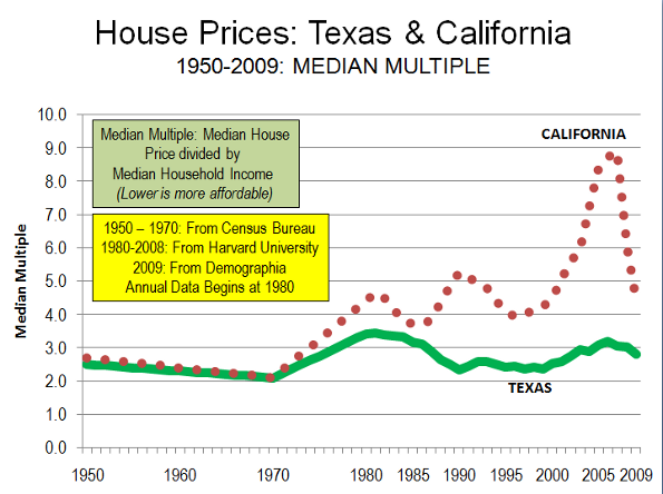
    One reason that Texas did so well is that it fully escaped the “housing bubble” that did so much damage in California, Florida, Arizona, Nevada and other states. One key factor was the state’s liberal, market oriented land use policies. This served to help keep the price of land low while profligate lending increased demand. More importantly, still sufficient new housing was built, and affordably. By contrast, places with highly restrictive land use policies (California, Florida and other places, saw prices rise to unprecedented heights), making it impossible for builders to supply sufficient new housing at affordable prices (overall, median house prices have been 3.0 times or less median household incomes where there are liberal land use policies).

    The Great Recession: The world-wide Great Recession was the deepest economic decline since the Great Depression: This downturn hit average households very hard. According to Federal Reserve Board “flow of funds” data, gross housing values declined 9 quarters in a row through the first quarter of 2009. The previous modern record is a single quarter. From the peak to the trough, household net worth was reduced a quarter, which is more than 1.5 times the previous record decline.

    Texas Largely Avoided the Great Recession. Texas has largely escaped the economic distress experienced around the nation, and especially that of its principal competitors, California and Florida. By virtually all measures, Texas has performed better in growth of gross domestic product, employment, unemployment, personal income, state tax collections, and consumer spending This is in part due to much less mortgage distress in Texas. At the bottom of the economic trough, the Brookings Institution Metropolitan Monitor ranked the performance of the 6 largest Texas metropolitan areas among the top 10 in the nation. The latest Metropolitan Monitor ranked each of the 6 metropolitan areas in the highest performance category.

    Throughout the past decade, Texas has experienced far smaller house price increases than in California, Florida and many other states. During the bubble, California house prices increased at a rate 16 times those of Texas, while Florida house prices increased 7 times those of Texas. As a result, after the bubble burst, subsequent house price declines were far less severe or even non-existent in Texas. Texas had experienced its own housing bubble in the 1980s, however even then overall prices did not exceed the Median Multiple of 3.0 (The Median Multiple is the median house price divided by the median household income).

    Unlike Texas, all of the markets with steep house price escalation had more restrictive land use regulations. This association between more restrictive use regulation and higher house prices has been noted by a wide range economists, from left-leaning Nobel Laureate Paul Krugman to the conservative Hoover Institution’s Thomas Sowell. It is even conceded in The Costs of Sprawl —2000, the leading academic advocacy piece on more restrictive land use controls, which indicates the potential for higher house or land prices in 7 of its 10 recommended strategies.

    Comparing Texas and California: Unlike California, housing remained affordable in Texas. California’s housing affordability – in relation to income – largely tracked that of Texas (and the nation) until the early 1970s (Figure). After more restrictive land use regulations were adopted prices started to escalate. This relationship has been well demonstrated by William Fischel of Dartmouth University. Other factors have had little impact. Construction cost increases have been near the national average in California. Other factors, like underlying demand as measured by domestic migration, have been lower in California than in Texas..

    Comparing Texas and Florida: The contrast with Florida is similar. Housing affordability in Florida was comparable to that of Texas as late as the 1990s. However, with strict planning control of land for development in Florida, land prices rose substantially when profligate lending increased demand.

    Comparing Texas and Portland: Further, the Texas housing market avoided the huge price increases that have occurred in Portland (Oregon), which relies on extensive restrictive land use regulation. In 1990, Portland house prices relative to incomes were similar to those of the large Texas metropolitan areas. At the recent peak, the median Portland house price soared to approximately 80% above Texas prices. Portland did not experience the price collapses of California, but due to the greater price volatility associated with smart growth price declines in relation to incomes that were five times those of Texas.

    How the Speculators Missed Texas: Speculation is often blamed as having contributed to the higher house prices that developed in California and Florida. This is correct. Moreover, with some of the strongest demand in the United States, Texas would seem to have been a candidate for rampant speculation. After all, it happened back in the 1970s when a huge oversupply of housing, industrial, retail and office space collapsed in the face of falling energy prices.

    But it did not happen this time, despite solid population growth. During the housing bubble, Dallas-Fort Worth and Houston ranked second and third to Atlanta in population increases among metropolitan areas with more than 5 million population. Austin is the nation’s second fastest growing metropolitan area with more than 1 million population. Each of these metropolitan areas had strong underlying demand, as indicated by domestic migration data.

    Yet the speculators were not drawn to the metropolitan areas of Texas. This is because speculators or “flippers” are not drawn by plenty, but by perceived scarcity. In housing, a sure road to scarcity is to limit the supply of buildable land by outlawing development on much that might otherwise be available.

    However, the speculators did not miss California and Florida. Nor did they miss Las Vegas or Phoenix, where the price of land for new housing rose between five and 10 times as the housing bubble developed. Despite their near limitless expanse of land, much of it was off limits to building, and the exorbitant price increases were thus to be expected.

    The Threat: Yet, despite the success of the less restrictive land use policies in Texas, there are strong efforts there to impose more smart growth policies. The impact could be devastating, especially from strategies that ration land that would raise land and house prices, as has occurred in California and Florida. In 2009, Governor Perry vetoed a bill that would have required the state to promote smart growth. Federal initiatives, under proposed climate change and transportation acts could do much to destroy not only the affordability of Texas metropolitan markets, but could also make Texas less competitive in the decades ahead.

    Photograph: Suburban San Antonio (by the author)

    Wendell Cox is a Visiting Professor, Conservatoire National des Arts et Metiers, Paris. He was born in Los Angeles and was appointed to three terms on the Los Angeles County Transportation Commission by Mayor Tom Bradley. He is the author of “War on the Dream: How Anti-Sprawl Policy Threatens the Quality of Life.

  • Time to Dismantle the American Dream?

    For some time, theorists have been suggesting that it is time to redefine the American Dream of home ownership. Households, we are told, should live in smaller houses, in more crowded neighborhoods and more should rent. This thinking has been heightened by the mortgage crisis in some parts of the country, particularly in areas where prices rose most extravagantly in the past decade. And to be sure, many of the irrational attempts – many of them government sponsored – to expand ownership to those not financially prepared to bear the costs need to curbed.

    But now the anti-homeowner interests have expanded beyond reigning in dodgy practices and expanded into an argument essentially against the very idea of widespread dispersion of property ownership. Social theorist Richard Florida recently took on this argument, in a Wall Street Journal article entitled “Home Ownership is Overvalued.”

    In particular, he notes that:

    The cities and regions with the lowest levels of homeownership—in the range of 55% to 60% like L.A., N.Y., San Francisco and Boulder—had healthier economies and higher incomes. They also had more highly skilled and professional work forces, more high-tech industry, and according to Gallup surveys, higher levels of happiness and well-being. (Note)

    Florida expresses concern that today’s economy requires a more mobile work force and is worried that people may be unable to sell their houses to move to where jobs can be found. Those who would reduce home ownership to ensure mobility need lose little sleep.

    The Relationship Between Household Incomes and House Prices

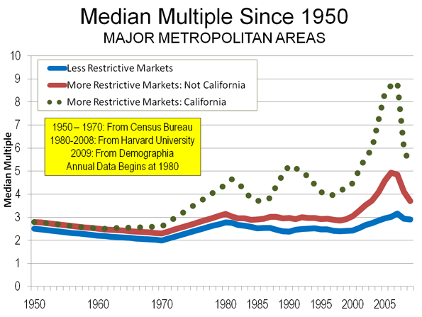
    It is true, as Florida indicates, that house prices are generally higher where household incomes are higher. But, all things being equal, there are limits to that relationship, as a comparison of median house prices to median house prices (the Median Multiple) indicates. From 1950 to 1970 the Median Multiple averaged three times median household incomes in the nation’s largest metropolitan areas. In the 1950, 1960 and 1970 censuses, the most unaffordable major metropolitan areas reached no higher than a multiple of 3.6 (Figure).

    This changed, however, in some areas after 1970, spurred by higher Median Multiples occuring in California.

    William Fischel of Dartmouth has shown how the implementation of land use controls in California metropolitan areas coincided with the rise of house prices beyond historic national levels. The more restrictive land use regulations rationed land for development, placed substantial fees on new housing, lengthened the time required for project approval and made the approval process more expensive. At the same time, smaller developers and house builders were forced out of the market. All of these factors (generally associated with “smart growth”) propelled housing costs higher in California and in the areas that subsequently adopted more restrictive regulations (see summary of economic research).

    During the bubble years, house prices rose far more strongly in the more highly regulated metropolitan areas than in those with more traditional land use regulation. Ironically many of the more regulated regions experienced both slower job and income growth compared to more liberally regulated areas, notably in the Midwest, the southeast, and Texas.

    Home Ownership and Metropolitan Economies

    The major metropolitan areas Florida uses to demonstrate a relationship between higher house prices and “healthier economies” are, in fact, reflective of the opposite. Between August 2001 and August 2008 (chosen as the last month before 911 and the last month before the Lehman Brothers collapse), Bureau of Labor Statistics data indicates that in the New York and Los Angeles metropolitan areas, the net job creation rate trailed the national average by one percent. The San Francisco area did even worse, trailing the national net job creation rate by 6 percent, and losing jobs faster than Rust Belt Pittsburgh, St. Louis, and Milwaukee.

    Further, pre-housing bubble Bureau of Economic Analysis data from the 1990s suggests little or no relationship between stronger economies and housing affordability as measured by net job creation. The bottom 10 out of the 50 largest metropolitan areas had slightly less than average home ownership (this bottom 10 included “healthy” New York and Los Angeles). The highest growth 10 had slightly above average home ownership (measured by net job creation). Incidentally, “healthy” San Francisco also experienced below average net job creation, ranking in the fourth 10.

    Moreover, housing affordability varied little across the categories of economic growth (Table).

    Net Job Creation, Housing Affordability & Home Ownership
    Pre-Housing Bubble Decade: Top 50 Metropolitan Areas (2000)
    Net Job Creation: 1990-2000 Housing Affordability: Median Multiple (2000) Home Ownership: Rate 2000
    Lowest Growth 10  7.4%                                2.8 62%
    Lower Growth 10 14.9%                                3.1 63%
    Middle 10 22.8%                                3.2 64%
    Higher Growth 10 30.9%                                2.6 61%
    Highest Growth 10 46.9%                                2.9 63%
    Average 24.7%                                2.9 62%
    Calculated from Bureau of the Census, Bureau of Economic Analysis and Harvard Joint Housing Center data.
    Metropolitan areas as defined in 2003
    Home ownership from urbanized areas within the metropolitan areas.

    Home Ownership and Happiness

    If Gallup Polls on happiness were reliable, it would be expected that the metropolitan areas with happier people would be attracting people from elsewhere. In fact, people are fleeing with a vengeance. During this decade alone, approximately one in every 10 residents have left for other areas.

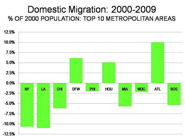
    • The New York metropolitan area lost nearly 2,000,000 domestic migrants (people who moved out of the metropolitan area to other parts of the nation). This is nearly as many people as live in the city of Paris.
    • The Los Angeles metropolitan area has lost a net 1.35 million domestic migrants. This is more people than live in the city of Dallas.
    • The San Francisco metropolitan area lost 350,000 domestic migrants. Overall, the Bay Area (including San Jose) lost 650,000, more people than live in the cities of Portland or Seattle.

    Why have all of these happy people left these “healthy economies?” One reason may be that so many middle income people find home ownership unattainable is due to the house prices that rose so much during the bubble and still remain well above the historic Median Multiple. People have been moving away from the more costly metropolitan areas. Between 2000 and 2007:

    • 2.6 million net domestic migrants left the major metropolitan areas (over 1,000,000 population) with higher housing costs (Median Multiple over 4.0).
    • 1.1 net domestic migrants moved to the major metropolitan areas with lower house prices (Median Multiple of 4.0 or below).
    • 1.6 million domestic migrants moved to small metropolitan areas and non-metropolitan areas (where house prices are generally lower).

    An Immobile Society?

    Florida’s perceived immobility of metropolitan residents is curious. Home ownership was not a material barrier to moving when tens of millions of households moved from the Frost Belt to the Sun Belt in the last half of the 20th century. During the 2000s, as shown above, millions of people moved to more affordable areas, at least in part to afford their own homes.

    Under normal circumstances (which will return), virtually any well-kept house can be sold in a reasonable period of time. More than 750,000 realtors stand ready to assist in that regard.

    Of course, one of the enduring legacies of the bubble is that many households owe more on their houses than they are worth (“under water”). This situation, fully the result of “drunken sailor” lending policies, is most severe in the overly regulated housing markets in which prices were driven up the most. Federal Reserve Bank of New York research indicates that the extent of home owners “under water” is far greater in the metropolitan markets that are more highly restricted (such as San Diego and Miami) and is generally modest where there is more traditional regulation, such as Charlotte and Dallas (the exception is Detroit, caught up in a virtual local recession, and where housing prices never rose above historic norms, even in the height of the housing bubble). Doubtless many of these home owners will find it difficult to move to other areas and buy homes, especially where excessive land use regulations drove prices to astronomical levels.

    Restoring the Dream

    There is no need to convince people that they should settle for less in the future, or that the American Dream should be redefined downward. Housing affordability has remained generally within historic norms in places that still welcome growth and foster aspiration, like Atlanta, Dallas-Fort Worth, Houston, Indianapolis, Kansas City, Columbus and elsewhere for the last 60 years, including every year of the housing bubble. Rather than taking away the dream, it would be more appropriate to roll back the regulations that are diluting the purchasing power and which promise a less livable and less affluent future for altogether too many households.

    Note. Among these examples, New York is the largest metropolitan area in the nation. Los Angeles ranks number 2 and San Francisco ranks number 13. The inclusion of Boulder, ranked 151st in 2009 seems a bit curious, not only because of its small size, but also because its advantage of being home to the main campus of the University of Colorado. Smaller metropolitan areas that host their principal state university campuses (such as Boulder, Eugene, Madison or Champaign-Urbana) will generally do well economically.

    Photograph: New house currently priced at $138,990 in suburban Indianapolis (4 bedroom, 2,760 square feet). From http://www.newhomesource.com/homedetail/market-112/planid-823343

    Wendell Cox is a Visiting Professor, Conservatoire National des Arts et Metiers, Paris. He was born in Los Angeles and was appointed to three terms on the Los Angeles County Transportation Commission by Mayor Tom Bradley. He is the author of “War on the Dream: How Anti-Sprawl Policy Threatens the Quality of Life.

  • The Muddled CNT Housing and Transportation Index

    The Center for Neighborhood Technology (CNT) has produced a housing and transportation index (the “H&T Index”), something that has been advocated by Secretary of Housing and Urban Development (HUD) Shaun Donovan and Secretary of Transportation Ray LaHood. The concept is certainly worth support. Affordable housing and mobility are crucial to the well-being of everyone, which translates into a better quality of life, more jobs and economic growth. Surely, much of the internationally comparatively high standard of living enjoyed by so many middle and lower income households in the United States has resulted from inexpensive housing (often on the urban fringe) and the ability to access virtually all of the urban area by quick and affordable personal transportation.

    CNT has developed an impressive website, with “tons” of data and maps that are both impressive and attractive. Maps can be adjusted to look at approximately 40 demographic indictors for “block groups” in the nation’s metropolitan areas. Block groups are neighborhoods (smaller than census tracts) defined by the Bureau of the Census and have an average population of approximately 1,500.

    CNT uses the HUD “housing burden” at 30% of household income as a maximum for affordability and further says that housing and transportation should not exceed 45%. The maps show neighborhoods that CNT finds to be affordable and not affordable by these criteria.

    But for all of its superficial impressiveness, the H&T Index is subject to serious misinterpretation and suffers from methodological flaws that neutralize the usefulness of its affordability indices.

    The H&T Index: Potential for Misinterpretation

    The H&T Index: Not a Neighborhood Index: The H&T Index is particularly susceptible to misinterpretation by ideological interests contemptuous of America’s suburban lifestyle, who would use public policy to force people to live in higher densities. While the H&T Index reports data at the neighborhood level, it is not a neighborhood index. However, the H&T Index does not compare neighborhood housing and transportation costs with neighborhood incomes. Rather, the H&T Index uses the metropolitan median household income.

    As a result, low income neighborhoods appear to be affordable, because their less costly housing is compared to the higher metropolitan area median income. Higher income neighborhoods appear unaffordable, because their higher housing costs are compared to the lower metropolitan area median income.

    Press reports, such as in the Washington Post have failed to clearly describe this issue. Without clear reporting, the H&T Index is could play into the popular fiction that suburbs are filled with households unable to cannot afford their housing and transportation. In fact, the vast majority of suburban homeowners can afford their transportation and housing and an appropriate portrayal of neighborhood data (with the corrections noted below) would illustrate this. The high level of recent foreclosures that have occurred in some suburbs are simply a reflection of the fact that “easy money” enticed some people to take on obligations that were beyond their means (just as central city developers built condominium towers that have been foreclosed upon or offered as rentals, with unit prices discounted 50% and more).

    The potential for misinterpretation is illustrated by examining three neighborhoods in Dallas County (Table 1), one low income, one middle income and one high income (2000 data).

    • The H&T Index indicates that housing costs are 8% of incomes in the low-income West Dallas neighborhood when compared to median metropolitan income. However, when the neighborhood income is used, the share of income required for housing is 57%, nearly twice the HUD maximum standard.

    It might be thought that people should move to West Dallas from the suburbs to take advantage of the low housing prices. However, any such migration would quickly escalate land prices up to eliminate any advantage (and to force the low income residents to move, as happens in “gentrifying” neighborhoods).

    • In the middle income (Garland) neighborhood, housing costs as a share of income are 24%, whether measured by the metropolitan or neighborhood income, both within the HUD 30% maximum
    • In the high income (University Park) neighborhood, CNT finds housing costs to be 102% of median metropolitan incomes. When neighborhood income is used instead, housing costs drop to 25% of incomes, well within the HUD 30% maximum.
    Metropolitan & Neighborhood Housing & Transportation Indices: 2000
    Factor Low Income Neighborhood: West Dallas Middle Income Neighborhood: Garland High Income Neighborhood: University Park
    Median Household Income: Metropolitan (PMSA) $48,364 $48,364 $48,364
    Housing Cost Share 8% 24% 102%
    Median Household Income: Neighborhood $6,989 $48,594 $200,001
    Housing Cost Share 57% 24% 25%
    Base data from H&T Index

    The H&T Index: Criticisms of the Methodology

    (1) Missing the Housing Bubble? CNT places more emphasis on transportation costs than on housing costs. This is evident in the H&T Index attention to rising transportation costs from 2000 to 2008. The housing bubble and its impact on household costs appears nowhere among the 40 indicators (Note).

    Yet, there is every indication that housing costs have risen substantially more than transportation costs since 2000. For example, in Kansas City’s core Jackson County, the Census Bureau’s American Community Survey data indicates that the increase in average housing costs was nearly 60% greater than CNT’s transportation cost increase. In Portland’s core Multnomah County, the increase in average housing costs was more 125% greater than CNT’s estimated increase in transportation costs (Figure).

    (2) Exaggerating by Mixing Averages and Medians: The H&T Index compares average housing and transportation costs with the median household income. Averages and means are not the same things. Median income data is “middle” score, with one half of households having incomes above the median and one-half having incomes below the median. On the other hand, “average” housing costs and transportation costs are the total housing and transportation costs divided by the total number of households. High incomes and high priced housing skews averages up. Mixing medians and averages is inherently invalid. For example, in 2008, average housing costs were 19% higher than median housing costs. This means that, on average, where the H&T Index reports a 30% housing affordability figure, it is really substantially lower, at 25% (30% reduced by 19%).

    Thus, the net effect of comparing average housing costs to median incomes makes the housing element of the H&T Index worse than it really is.

    (3) Exaggerating by Leaving Some Households Out: The H&T Index excludes home owning households without a mortgage. The average housing expenditures of households without mortgages are smaller than those of households with mortgages. However, this is a material omission, since housing costs include utility payments. In Multnomah County, excluding households without mortgages raises average housing expenditures by nearly 10% (in 2008). Households without mortgages are households too. The net effect of excluding households without mortgages is to increase housing costs, making the housing portion of the index higher than it would otherwise be.

    (4) Exaggerating by Mixing Data from Different Years: The H&T Index provides 2008 estimates for neighborhood transportation costs, using modeled data. Transportation costs have surely increased since 2000, reaching their peak in 2008 due to the highest ever gasoline prices. CNT again compares these average costs to median household income, but not for 2008. CNT uses 2000 income data. In Jackson County and Multnomah counties, the use of 2000 instead of 2008 data exaggerates transportation’s share of household income between 20% and 25%.

    Each of the above methodological issues is sufficient to render H&T Index outputs to be unreliable.

    Housing’s Role in Housing & Transportation Affordability

    While both transportation and housing costs are important, housing costs have dented household budgets far more than the increase in transportation costs. Even after the house price declines of the last few years, house prices remain well above their historic ratio to household incomes. This will only get worse, if, as many expect, mortgage interest rates rise from their present lows and as rents rise to follow higher house prices.

    In contrast, transportation costs are more susceptible to reduction than housing costs. Once the mortgage is signed, the cost of the house will not be reduced. Once the lease is signed, there is little chance that the rent will be lowered. But transportation costs will be reduced in the future by the far more fuel efficient vehicles being required by Washington. Some people can work at home part of the time. People also change cars more frequently than they change houses. If costs become an issue, perhaps the next car is a compact rather than an SUV.

    CNT’s focus on trends in transportation costs rather than housing costs is consistent with its related study, Penny Wise Pound Fuelish, which advocates expansion of prescriptive land use (smart growth) policies to encourage core urban development and make much suburban development illegal. Yet, these very policies played a dominant role in driving house prices up three times as fast relative to incomes as in metropolitan areas that did not adopt them.

    Genuine advocacy for affordability requires addressing both transportation and housing costs. It also requires recognition of the significant damage done to affordability by prescriptive land use policies. An extra dollar that a household must pay for housing is just as valuable as one spent on transportation.

    All of which leaves us where we started. The nation could still use a reliable housing and transportation index.


    Note: CNT provides no 2008 data for housing costs. Such costs will not be available at the neighborhood level from the American Community Survey until 2012 or 2013. However, it would likely have been no more difficult for CNT to model updated housing data by neighborhood than it was to model 2008 data for transportation costs at the neighborhood level.

    Wendell Cox is a Visiting Professor, Conservatoire National des Arts et Metiers, Paris. He was born in Los Angeles and was appointed to three terms on the Los Angeles County Transportation Commission by Mayor Tom Bradley. He is the author of “War on the Dream: How Anti-Sprawl Policy Threatens the Quality of Life.

    Photograph: Hartford Suburbs

  • Don’t Mess With Texas

    One of the most ironic aspects of our putative “Age of Obama” is how little impact it has had on the nation’s urban geography. Although the administration remains dominated by boosters from traditional blue state cities–particularly the president’s political base of Chicago–the nation’s metropolitan growth continues to shift mostly toward a handful of Sunbelt red state metropolitan areas.

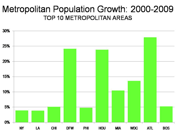
    Our Urbanist in Chief may sit in the Oval Office, but Americans continue to vote with their feet for the adopted hometown of widely disdained former President George W. Bush. According to the most recent Census estimates, the Dallas and Ft. Worth, Texas, region added 146,000 people between 2008 and 2009–the most of any region in the country–a healthy 2.3% increase.

    Other Texas cities also did well. Longtime rival Houston sat in second, with an additional 140,000 residents. Smaller Austin added 50,000–representing a remarkable 3% growth–while San Antonio grew by some 41,000 people.

    In contrast, most blue state mega cities–with the exception of Washington, D.C.–grew much more slowly. The New York City region’s rate of growth was just one-fifth that of Dallas or Houston, while Los Angeles barely reached one-third the level of the Texas cities.

    These trends should continue: According to Moody’s Economy.com, Texas’ big cities are entering economic recovery mode well ahead of almost all the major centers along the East or West Coasts. This represents a continuation of longer-term trends, both before and after the economic crisis. Between 2000 and 2009 New York gained 95,000 jobs while Chicago lost 257,000, Los Angeles over 167,000 and San Francisco some 216,000. Meanwhile, Dallas added nearly 150,000 positions and Houston a hefty 250,000.

    This leads me to believe that the most dynamic future for America urbanism–and I believe there is one–lies in Texas’ growing urban centers. To reshape a city in a sustainable way, you need to have a growing population, a solid and expanding job base and a relatively efficient city administration.

    None of these characteristics apply to places like President Obama’s hometown of Chicago, which continues to suffer from the downturn–but you would never know it based on media coverage of the Windy City.

    The New Yorker, for example, recently published a lavish tribute to the city and its mayor, Richard Daley. But as long-time Chicago observer Steve Bartin points out, the story missed–or simply ignored–many critical facts. Mistaking Daley’s multi-term tenure as proof of effectiveness, it failed to recognize the region’s continued loss of jobs, decaying infrastructure, rampant corruption and continued out-migration of the area’s beleaguered middle class.

    Generally speaking, as Urbanophile blogger Aaron Renn points out, the repeated reports of an urban renaissance in older northern cities should be viewed with skepticism. In the Midwest region over the past year the share of population growth enjoyed in core counties–an area usually much larger than the city boundary–actually declined in most major Midwestern metros, including Chicago.

    Yet urbanists generally have not embraced the remarkable growth in the major Texas metropolitan areas. Only Austin gets some recognition, since, with its hip music scene and more liberal leanings, it’s the kind of place high-end journalists might actually find tolerable. The three other big Texas cities have become the Rodney Dangerfields of urban America–largely disdained despite their prodigious growth and increasingly vibrant urban cores.

    Part of the problem stems from the fact that all Texas cities are sprawling, multi-polar regions, with many thriving employment centers. This seems to offend the tender sensibilities of urbanists who crave for the downtown-centric cities of yesteryear and reject the more dispersed model that has emerged in the past few decades.

    Yet despite planners’ prejudices, places like Houston and Dallas are more than collections of pesky suburban infestations. They are expanding their footprints to the periphery and densifying at the same time.

    Of course, like virtually all other regions, Houston and Dallas suffer excess capacity in both office buildings and urban lofts. But the real estate slowdown has not depressed Texans’ passion for inner city development. Indeed, over the past decade the central core of Houston–inside the boundaries of the 610 freeway loop–has experienced arguably the widest and most sustained densification in the country.

    An analysis of building permit trends by Houston blogger Tory Gattis, for example, found that before the real estate crash, the Texas city was producing more high-density projects on a per-capita basis than the urbanist mecca of Portland. Significantly, as Gattis points out, the impetus for this growth has largely resulted not from planning but from infrastructure investment, job growth and entrepreneurial venturing.

    This process is also evident in the Dallas area, which has experienced a surge in condo construction near its urban core and some very intriguing “town center” developments, such as the Legacy project in suburban Plano. In Big D, developers generally view densification not as an alternative to suburbia but another critical option needed in a growing region.

    It’s widely understood there that many people move to places like Dallas, whether in closer areas or exurbs, largely to purchase affordable single-family homes. But as the population grows, there remains a strong and growing niche for an intensifying urban core as well.

    Dallas and other Texas cities substitute the narrow notion of “or”–that is cities can grow only if the suburbs are sufficiently strangled–with a more inclusive notion of “and.” A bigger, wealthier, more important region will have room for all sorts of grand projects that will provide more density and urban amenities.

    This approach can be seen in remarkable plans for developing “an urban forest” along the Trinity River, which runs through much of Dallas. The extent of the project–which includes reforestation, white water rafting and restorations of large natural areas–would provide the Dallas region with 10,000 acres of parkland right in the heart of the region. In comparison, New York City’s Central Park, arguably the country’s most iconic urban reserve, covers some 800 acres.

    If it is completed within 10 years, as now planned, the Trinity River project will not only spawn a great recreational asset, but could revitalize many parts of the city that have languished over the past few decades. It could become a signature landmark in the urban development of 21st-century America.

    As we look at the coming decades, this Texan vision may help define a new urban future for a nation that will grow by roughly 100 million people by 2050. To get a glimpse of that future, urbanists and planners need to get beyond their nostalgic quest to recreate the highly centralized 19th-century city. Instead they should hop a plane down to Dallas or Houston, where the outlines of the 21st-century American city are already being created and exuberantly imagined.

    This article originally appeared at Forbes.com.

    Joel Kotkin is executive editor of NewGeography.com and is a distinguished presidential fellow in urban futures at Chapman University. He is author of The City: A Global History. His newest book is The Next Hundred Million: America in 2050, released in Febuary, 2010.

    Photo by Stuck in Customs

  • SPECIAL REPORT: Metropolitan Area Migration Mirrors Housing Affordability

    On schedule, the annual ritual occurred last week in which the Census Bureau releases population and migration estimates and the press announces that people are no longer moving to the Sun Belt. The coverage by The Wall Street Journal was typical of the media bias, with a headline “Sun Belt Loses its Shine.” In fact, the story is more complicated – and more revealing about future trends.

    Domestic Migration Tracks Housing Affordability: There have been changes in domestic migration (people moving from one part of the country to another) trends in the last few years, but the principal association is with housing affordability.

    Severe and Not-Severe Bubble Markets: Overall, the major metropolitan markets with severe housing bubbles (a Median Multiple rising to at least 4.5, see note) lost nearly 3.2 million domestic migrants (all of these markets have restrictive land use regulation, such as smart growth or growth management) from 2000 to 2009. However, not all markets with severe housing bubbles lost domestic migrants. “Safety valve” bubble markets drew migration from the extreme bubble markets of coastal California, Miami and the Northeast. These “safety valve” markets (including Phoenix, Las Vegas, Portland, Seattle, Riverside-San Bernardino, Orlando, Tucson and Tampa-St. Petersburg), gained a net 2.2 million from 2000 to 2009, while the other bubble markets lost 5.3 million domestic migrants from 2000 to 2009 (See Table below, metropolitan area details in Demographia US Metropolitan Areas Table 8). At the same time, the markets that did not experience a severe housing bubble (those in which the Median Multiple did not reach 4.5) gained a net 1.5 million domestic migrants.

    The burst of the housing bubble explains the changes in domestic migration trends. Housing affordability has improved markedly in the extreme bubble markets, so that there was less incentive to move. Then there was the housing bust-induced Great Recession, which also slowed migration since people had more trouble selling their homes or finding anew job. As a result, the migration to the “safety valve” markets and to the smaller markets dropped substantially.

    • During 2009, the “safety valve” markets gained only 51,000 net domestic migrants, one-fifth of the annual average from 2000 to 2008.
    • At the same time, the other severe housing bubble markets lost 236,000 domestic migrants in 2009, compared to the average loss of 638,000 from 2000 to 2008.
    • Areas outside the major metropolitan areas also experienced a significant drop in domestic migration, dropping from an annual average of 203,000 between 2000 and 2008 to 23,000 in 2009.
    • The major metropolitan markets that did not experience a severe housing bubble gained 161,000 domestic migrants in 2009, little changed from the 169,000 average from 2000 to 2008. These markets are concentrated in the South and Midwest. Indianapolis, Kansas City, Nashville, Louisville and Columbus as well as the Texas metropolitan areas continued their positive migration trends.
    Domestic Migration by Severity of the Housing Bubble
    Metropolitan Areas over 1,000,000 Population
    2000-2008
    Metropolitan Areas 2000-2009 2009 2000-2008 Average
    Withouth Severe Housing Bubbles     1,509,870         160,514      168,670
    With Severe Housing Bubbles    (3,161,514)        (184,486)     (372,129)
       Not "Safety Valve" Markets    (5,347,211)        (235,838)     (638,922)
       "Safety Valve" Markets     2,185,697           51,352      266,793
    Outside Largest Metropolitan Areas     1,651,644           23,972      203,459
    Severe housing bubbles: Housing costs rose to a Median Multiple of 4.5 or more (50% above the historic norm of 3.0). 
    Median Multiple: Median House Price/Median Household Income
    "Safety Valve" refers to markets with severe housing bubbles that received substantial migration from more expensive markets (coastal California, Miami and the Northeast). These markets include Las Vegas, Phoenix, Riverside-San Bernardino, Sacramento, Portland, Seattle, Orlando, Tucson and Tampa-St. Petersburg.

    Moreover, the Census Bureau revised its previous domestic migration figures for 2000 to 2008 to add more than 110,000 from the markets without severe housing bubbles, while taking away more than 150,000 domestic migrants from the markets with severe housing bubbles. This adjustment alone rivals the 2009 domestic migration loss of 183,000 in these markets

    Population Growth: The Top 10 Metropolitan Areas: Sun Belt metropolitan areas continued to experience the greatest population growth. Between 2000 and 2009, the fastest growing metropolitan areas were Atlanta, Dallas-Fort Worth and Houston, In 2009, Washington, DC was added to the list (Details in Demographia US Metropolitan Areas, Table 2).

    New York: The New York metropolitan area remains the nation’s largest, now reaching a population of over 19 million. More than 700,000 new residents have been added since 2000. However, New York’s population growth has been the second slowest of the 10 largest metropolitan areas since 2000 (Figure 1). Moreover, New York’s net domestic out-migration has been huge. New York has lost 1,960,000 domestic migrants, which is more people than live in the boroughs of The Bronx and Richmond combined. Overall, 10.7% of the New York metropolitan area’s 2000 population left the metropolitan area between 2000 and 2009. More than 1,200,000 of this domestic migration was from the city of New York. Between 2008 and 2009, New York’s net domestic out-migration slowed from the minus 1.32% 2000-2008 annual rate to minus 0.58%., reflecting the smaller migration figures that have been typical of the Great Recession.

    Los Angeles: For decades, Los Angeles has been one of the world’s fastest growing metropolitan areas. Growth had ebbed somewhat by the 1990s, when Los Angeles added 1.1 million people. The California Department of Finance had projected that Los Angeles would add another 1.35 million people between 2000 and 2010. Yet, the Los Angeles growth rate fell drastically. From 2000 to 2009, Los Angeles added barely one-third the projected amount (476,000) and grew only 3.8%. Unbelievably, fast growing Los Angeles became the slowest growing metropolitan area among the 10 largest. In 2009, Los Angeles had 12.9 million people. Los Angeles lost 1.365 million domestic migrants, which is of 11.0% of its 2000 population, and the most severe outmigration among the top 10 metropolitan areas (Figure 2).

    Chicago: Chicago continues to be the nation’s third largest metropolitan area, at 9.6 million population, a position it has held since being displaced by Los Angeles in 1960. Chicago has experienced decades of slow growth and continues to grow less than the national average, at 5.1% between 2000 and 2009 (the national average was 8.8%). Yet, Chicago grew faster than both New York and Los Angeles. Chicago also lost a large number of domestic migrants (561,000), though at a much lower rate than New York and Chicago (6.2%). Even so, Chicago is growing fast enough that it could exceed 10 million population in little more than a decade, by the 2020 census.

    Dallas-Fort Worth: Dallas-Fort Worth has emerged as the nation’s fourth largest metropolitan area, at 6.4 million, having added 1,250,000 since 2000. In 2000, Dallas-Fort Worth ranked fifth, with 500,000 fewer people than Philadelphia, which it now leads by nearly 500,000. Dallas-Fort Worth added more population than any metropolitan area in the nation between 2008 and 2009 and has been the fastest growing of the 10 top metropolitan areas since 2006. As a result, Dallas-Fort Worth has replaced Atlanta as the high-income world’s fastest growing metropolitan area with more than 5,000,000 population. Dallas-Fort Worth added a net 317,000 domestic migrants between 2000 and 2009.

    Philadelphia: Philadelphia is the nation’s fifth largest metropolitan area, at just below 6,000,000 population. Like Chicago, Philadelphia has had decades of slow growth, yet has grown faster in this decade than both New York and Los Angeles (4.8%). Philadelphia has lost a net 115,000 domestic migrants since 2000, for a loss rate of 2.2%, well below that of New York, Los Angeles and Chicago.

    Houston: Houston ranks sixth, with 5.9 million people and is giving Dallas-Fort Worth a “run for its money.” Like Dallas-Fort Worth, Houston has added more than 1,000,000 people since 2000. Over the same period, Houston has passed Miami and Washington (DC) in population. Houston has added a net 244,000 domestic migrants since 2000, and added 50,000 in 2008-2009, the largest number in the country. Like Dallas-Fort Worth, Houston accelerated its annual domestic migration growth rate in 2008-2009. At the current growth rate, Houston seems likely to pass Philadelphia in population shortly after the 2010 census.

    Miami: Miami (stretching from Miami through Fort Lauderdale to West Palm Beach) is the seventh largest metropolitan area, with 5.6 million people. Miami has added more than 500,000 people, for a growth rate of 10.4%. However, Miami has suffered substantial domestic migration losses, at 287,000, a loss rate of, 5.7% relative to its 2000 population.

    Washington (DC): Washington recaptured 8th place, moving ahead of Atlanta, which had temporarily replaced it. Washington’s population is 5.5 million and added 655,000 between 2000 and 2009, for a growth rate of 13.6%. However, Washington lost a net 110,000 domestic migrants, 2.2% of its 2000 population. That trend was reversed in 2008-2009, when a net 18,000 domestic migrants moved to Washington, perhaps reflecting the increased concentration of economic power in the nation’s capital.

    Atlanta: Atlanta is the real surprise this year. For more than 30 years, Atlanta has had strong growth, however, this year it slowed. Atlanta is the 9th largest metropolitan area in the nation, at 5.5 million. Since 2000, Atlanta has added 1.2 million people, though added only 90,000 last year. Atlanta has added a net 429,000 domestic migrants since 2000, though the rate slowed to only 17,000 in 2008-2009.

    Boston: Boston is the nation’s 10th largest metropolitan area, with 4.6 million people. During the 2000s, Boston has added nearly 200,000, growing by 4.2%. Yet, Boston has also experienced a net domestic migration loss of 236,000, or 5.4% of its 2000 population. In 2008-2009, Boston, like Washington, reversed its domestic migration losses, adding 7,000.

    Trends by Size of Metropolitan Area: As throughout the decade, the slowest growing areas of the nation have been metropolitan areas over 10,000,000 population (New York and Los Angeles), which grew 3.9% and non-metropolitan areas, which grew 2.6% during the decade Metropolitan areas that had between 2.5 and 5.0 million population in 2000 boasted the biggest jump (these include fast growing Houston and Atlanta, which are now more than 5 million), at 13.4% for the decade. All of the other size classifications grew between 8.9% and 11.3% over the decade (see Demographia US Metropolitan Areas, Table 1). Metropolitan areas that began the decade with between 5,000,000 and 10,000,000 population gained 10.0%. Those with 250,000 to 500,000 grew 10.4%, those with 500,000 to 1,000,000 grew 10.2% and the smallest metropolitan areas, those from 50,000 to 250,000 grew 8.9%

    Metropolitan areas over 1,000,000 population lost 2.19 million domestic migrants during the decade, but smaller metropolitan areas added 2.24 million domestic migrants. Non-metropolitan areas lost 50,000 domestic migrants. In 2009, the smaller metropolitan areas gained 125,000 domestic migrants, while the larger metropolitan areas lost 30,000. Non-metropolitan areas lost more than 90,000 domestic migrants. As noted above, these smaller figures for 2009 reflect the more stable housing market and the extent to which the Great Recession has reduced geographic mobility (See Demographia US Metropolitan Areas, Tables 1 and 3).


    Note: The Median Multiple is the median house price divided by the median household income. The historic standard has been 3.0.

    Photograph: Dallas

    Wendell Cox is a Visiting Professor, Conservatoire National des Arts et Metiers, Paris. He was born in Los Angeles and was appointed to three terms on the Los Angeles County Transportation Commission by Mayor Tom Bradley. He is the author of “War on the Dream: How Anti-Sprawl Policy Threatens the Quality of Life.