Tag: data

  • Nerdwallet.com Mixes Apples and Oranges on “Worst Cities for Drivers”

    The website nerdwallet.com mixes apples and oranges in producing a list of the 10 worst "cities" for car drivers in the United States. The ratings hardly matter, since the nerdwallet.com score is based on a mixture of urban area and municipality data.

    The Apples: Nerdrwallet.com uses the Texas Transportation Institute traveled the may delay measures for urban areas. These are areas of continuous urban development that always include far more population than is in the central city or municipality. There is no data for the traffic congestion measures at the central city level. These traffic congestion scores are nerdwallet.com’s "apples."

    The Oranges: The oranges of the population densities for the core municipalities. For example, the density shown for New York is that of the city, at 27,000 per square mile. The urban area has a density of approximately 5000 per square mile.

    The Comparison: The net effect is that nerdwallet.com uses the city of New York, with its 8 million people in approximately 300 square miles to the New York urban area with approximately 18 million people in 3,400 square miles. These are not the same things and any score derived from the mixing of these two definitions is inherently invalid.

    This is one of all too many examples of comparisons that are made in the press between "cities," with editors and fact checkers taking insufficient care to ensure that they are using comparable data.

  • IRS to Continue Migration Data

    " The IRS should be applauded" — it is hard to imagine a public statement to this effect, other than from a government insider. But this was the Tax Foundation, improbably and correctly complimenting the Internal Revenue Service in announcing that its annual income tax migration data would continue to be produced. This apparently reverses a decision to discontinue the data. The Tax Foundation noted that there was:

    … outrage when the IRS announced that they were canceling the program. An IRS economist, informed of the decision by higher-ups, told the Daily Caller: "We were just told this morning that the program is indeed going to be discontinued.  It is not our decision at all and we are very disappointed." Jim Pettit, of the activist group Change Maryland, penned a National Review piece noting that the decision came soon after the data put Maryland Governor Martin O’Malley on the defensive (O’Malley has routinely asserted that Maryland has a great tax system and business climate, despite strong evidence to the contrary), and the Washington Examiner followed up with an editorial saying that the data is vital for ascertaining which "model" of states (high-tax, high-service vs. low-tax, low-service) Americans were preferring. Members of Congress also started calling, demanding an explanation.

    We join in the chorus. This data has been valuable for many uses and many will continue to use it in the years to come.

  • Infographic: Growth of All Occupations by Industry & Education, 2001-2011

    We recently partnered with Catherine Mulbrandon at VisualizingEconomics.com to create a series of treemaps that illustrate important aspects of the labor market. In this post we provide a sneak peek at two of the graphics she created. The remainder will be posted in An Illustrated Guide to Income in the United States, a booklet from Catherine set to be released this summer.

    These two graphics are based on EMSI’s labor market database, which is a combination of over 80 public and private data sources. More specifically, the first table shows job change for all occupations by industry (based on 2-digit supersectors, as defined by the North America Industry Classification System) and the second shows occupation change by education level. The data is from 2001-2011.

    Red indicates decline and blue indicates growth.

    Each square on the graphic indicates a specific 5-digit occupation classified by the Standard Occupational Classification system. There are over 800 unique squares present on the charts. Large squares, like the ones on the upper right and in the retail trade sector, indicate a lot of jobs for the specific occupation code. Smaller squares indicate occupations with less jobs.

    In the graphic above we have pulled together occupation data related to all 20 NAICS supersectors. Government, health care, and retail trade have the largest employment. Utilities, mining, and management of companies have the fewest jobs. Also note the size of the squares within each industry sector. Here are a few observations:

    • Broad momentum. It is interesting to note how each broad industry sector tended to either be dominated by growth or decline. For instance, with very few exceptions, almost every occupation within the manufacturing sector declined from 2001-2011. The same holds true for construction, information, agriculture, and, to a certain extent, retail trade. Conversely, sectors like health care, educational services, professional/scientific/technical services, accommodation and even arts tended to show occupational growth.
    • Mixed sectors. Other industry sectors like finance, administrative, real estate, wholesale trade, and government were much more mixed.

    The graphic above shows the distribution of jobs across all levels of educational attainment. We use the same 5-digit SOC codes and group them according to what their typical educational attainment is. Where possible, occupation titles are included so you can get a sense of where certain jobs fall. Here are a few quick observations:

    • The OJT sectors (on-the-job training) are huge. This includes short-term OJT (lower right), moderate-term OJT (upper left), long-term OJT (middle right), and work experience in a related field (center). Also notice how the occupations in these sectors are less stable than the others. This is consistent with what was observed in the latest recession — jobs with higher education levels tend to perform better in tough economic times.
    • Advanced degrees showed growth. Over the past 10 years, every occupation associated with a more advanced degree (master’s, doctoral, professional) showed some sort of growth.
    • The other sectors have mixed results. Bachelor’s degrees showed more stability over the past 10 years, but there are a handful of occupations that declined since 2001. The same holds true for associate’s, postsecondary vocational awards, and degrees plus work experience.
  • Interactive Graphic: Job Growth by Sector for all Counties in the Nation

    The fully interactive map below indicates job growth and decline for all US counties from 2006 to 2011. These show up as hot or cold spots; red for growth, blue for decline. You can select a state to zoom in on and find a county that way, or simply click on a county to drill in. Once you’ve chosen a county, the table under the map will show you job numbers by industry category.

    The data for this graphic comes from EMSI’s Complete 2011.3 dataset, based on data from the Bureau of Labor Statistics and many other sources. Many thanks to Tableau for putting this together. If you have questions or comments about the graphic or the data behind it, please email EMSI’s Josh Stevenson.

  • Infographic: Which Industries Are Growing in Your State?

    EMSI teamed up with Tableau Software to create this industry data display. You can visualize every broad-level (2-digit NAICS) industry by state over the last decade. Also, click on the dot for each state to see the trends for each sector. The bigger the dot, the more jobs that state has in the selected industry. It may take a few seconds to load.

    A few observations:

    1. Right off the bat, you can see the explosive growth of the mining sector nationally over the past few years. If you scroll to mining and oil exploration in the dropdown or isolate it by clicking on the chart, you can see Texas has by far the largest number of jobs among all states. We covered this sector and specific oil and gas extraction occupations in depth recently.

    2. One of the cool things to do is scroll through each year to see the changing complexion of employment. There’s widespread growth projected for most states in 2011, with a few exceptions, but clicking back through the past few years shows a much different picture.

    3. Another intriguing sector is manufacturing. In the last decade, it hasn’t fared well. That much is clear. But notice the tide start to shift in 2010, with Indiana and Michigan showing slight growth. And in 2011, nearly three-quarters of the US is expected to see job expansion.

  • The Commonwealth Bank of Australia/UBS-Demographia Data Dispute

    The Age (Melbourne) headlined a story “CBA Accused of Choosing its Facts.” CBA is the Commonwealth Bank of Australia, while UBS is the Swiss investment house. Commonwealth produced a report comparing housing affordability in Australian metropolitan areas to international metropolitan areas (Australian Housing and Mortgages: CBA Mortgage Book Secure). According to The Age:

    Investment forums and housing blogs were alive with talk yesterday that an 18-page presentation used by the bank had replaced unfavourable housing affordability figures with data showing housing costs were not out of step with other cities in the world.

    One slide compared Australian housing affordability to several cities, citing figures from a combination of the US urban planning research house Demographia and the investment bank UBS.
    The slide showed housing in Sydney and Melbourne was more affordable than cities such as San Francisco, New York and Vancouver. But it used UBS data exclusively for the Australian cities, and Demographia data for the overseas cities.

    The data were not comparable. Commonwealth relied upon Median Multiple data (median house price divided by median household income) from the 6th Annual Demographia Housing Affordability Survey for international metropolitan areas. However, Commonwealth used a median/average multiple (median house price divided by average household income) calculated by UBS, the Swiss investment house, for Australian metropolitan areas. These are very different indicators.

    There would have been nothing wrong with having used the median/average multiple, had it been shown for all metropolitan areas, Australian and international. However, comparing the median/average multiple to the Median Multiple is invalid. Average household incomes are routinely higher than median household incomes and the use of an average income figure inappropriately biases Australian housing affordability relative to international metropolitan areas.

    For example, the UBS median/average multiple for Sydney is reported by Commonwealth to be 6.2. Commonwealth finds Sydney to be more affordable than San Francisco’s, which it indicates at 7.0. However, the San Francisco figure is the Median Multiple and the comparable figure for Sydney is 9.1, making Sydney less affordable than San Francisco

    In fact, had the UBS median/average multiple been used for all metropolitan areas, including the international metropolitan areas, it is likely that the gap between Australian metropolitan areas and international metropolitan areas would be of similar magnitude to that shown in the Demographia International Housing Affordability Survey.

    From time to time, various interests have suggested alternate measures of housing affordability for Australia and then compared or suggested comparison to our Median Multiple data. Of course, that is invalid.

    The Age article by Eric Johnston was carried in other Fairfax Media outlets such asThe Sydney Morning Herald and the Brisbane Times, and the subject has been covered by financial blogs.

    Note: Author Wendell Cox of Demographia.com and Hugh Pavletich of PerformanceUrbanPlanning.com are co-authors of the Demographia International Housing Affordability Survey.

  • How Much of the World is Covered by Cities?

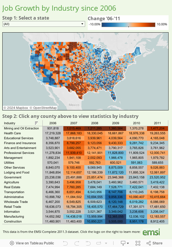
    For years, planners and others have raised concerns about the amount of land that urbanization occupies, especially in the United States and other developed nations. My attention was recently drawn to an estimate that 2.7% of the world’s land (excluding Antarctica) is occupied by urban development. This estimate, which is perhaps the first of its kind in the world, is the product of the Columbia University Socioeconomic Data and Applications Center Gridded Population of the World and the Global Rural-Urban Mapping Project (GRUMP) and would amount to 3.5 million square kilometers.

    While the scholars of Columbia are to be complimented for their ground breaking work, their estimate seems very high, especially in light of the fact that in the United States, with the world’s lowest density urban areas, only 2.6% of land is urbanized. Further, the data developed for our Demographia World Urban Areas and Population Projections would seem to suggest a significant overstatement of urbanization’s extent. Demographia World Urban Areas and Population Projections data are generally from national census authorities and examination of satellite photography.

    The GRUMP overestimation is illustrated by the following.

    GRUMP places the total of all urban extents in the United States at 754,000 square kilometers, more than three times the 240,000 square kilometers reported by the Bureau of the Census in 2000. This is despite the fact that GRUMP uses the same urbanization criteria as the Bureau of the Census. At the average GRUMP population density, most US urban areas would not even qualify as urban under the national standards used in countries such as the US, Canada, the UK and France.

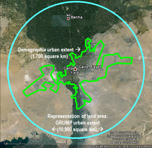
    The overestimation can be illustrated by Cairo, which surrounded by desert land virtually devoid of urbanization. GRUMP places Cairo’s urban land area (“urban extent”) at 10,900 square kilometers. Cairo is well known among demographers as one of the world’s most dense urban areas. Yet the GRUMP urban density, at 1,550 per square kilometer would make Cairo no more dense than Fresno, though somewhat more dense than Portland. The Demographia Cairo urban area is estimated at 1,700 square kilometers, more than 80% smaller. The contrast between the GRUMP and Demographia land area estimates is illustrated in the figure. There are a numerous additional discrepancies of similar scope.


    One problem with the GRUMP estimates is their reliance on lights at night as observed from satellites. The problem is that lights illuminate large areas and any estimates based upon them would be likely to be inflated. Documentation associated with GRUMP acknowledges this effect, which it refers to as “blooming.”

    But “blooming” is not the only problem. The poorest urban areas tend to have fewer lights and are thus illuminated to a larger degree than more affluent areas. The result, in the GRUMP data is that some of the project’s most dense urban areas are in fact not the world’s most dense. For example, low income Kinshasa (former Leopoldville), in the Democratic Republic of the Congo is indicated by GRUMP to be 40% more dense than Hong Kong. The reality is that Hong Kong is twice the density of Kinshasa, the difference being the effect of “blooming,” combined with more sparse electricity consumption in the African urban area.

    Demographia World Urban Areas and Population Projections accounts for more than 50% of world urbanization and includes all identified urban areas with 500,000 population or more. These urban areas cover only 0.3% of the world’s land area. There is only the most limited data for smaller urban areas. However, it is generally known that smaller urban areas tend to be less dense than larger urban areas (which makes one wonder why the anti-sprawl interests have targeted larger urban areas). In the United States, the urban areas with less than 500,000 population average about one-half the density of larger urban areas. University of Avignon data indicates that the smaller urban areas of western Europe are about 60% less dense than the larger ones.

    If it the US 50% less factor is assumed, then urbanization would cover approximately 0.85% of the world’s land (1.1 million square kilometers).

    If the European 60% less factor is assumed, then urbanization would cover 1% of the world’s land (1.3 million square kilometers).

    By these estimates, the GRUMP urbanization estimates would be more than 200% high.

    GRUMP has contributed a useful term to the parlance of urban geography — the “urban extent.” An urban extent is simply continuous urbanization, without regard to labor markets or economic ties. For example,

    The Tokyo urban extent might be considered to run from the southern Kobe suburbs, through the balance of the Osaka-Kobe-Kyoto urban area, Otsu, Nagoya, Hamamatsu, Shizuoka and through the Tokyo urban area to the northern suburbs, a distance of 425 miles (GRUMP calls the Tokyo urban extent the world’s largest).

    China’s Pearl River Delta, with its physically connected but relatively economically disconnected, urban areas (including at least Hong Kong, Shenzhen, Dongguan, Guanzhou-Foshan, Zhongshan, Jiangmen, Zhuhai and Macao) is another example.

    Despite its difficulties, the GRUMP project is an important advance and it is to be hoped will produce more accurate estimates in the future.


    Note: The Demographia Cairo urban area is also the urban extent (the extent of continuous urban development). It includes the 6th of October new town and New Cairo, but excludes the 10th of Ramadan new town, which is physically disconnected from the Cairo urban extent.

    Photograph: In the GRUMP Cairo Urban Area (by the author)

  • The Fog of Stimulus

    The news is full of stories about the the impact of the ARRA on job creation, including this one from the The Wall Street Journal about a shoe store owner who created or saved nine jobs with less than $900.

    In the story, the Army Corps of Engineers spent $889.60 buying boots from shoe store owner Buddy Moore of Kentucky. Because the boots were purchased with ARRA funds, the Corps asked Buddy to report how many jobs the boot order had “created or saved.” He and his daughter struggled with paperwork, online forms, and a “helpline,” only to make a wild guess 15 minutes before the reporting deadline that they had created nine jobs.

    Though not completely spelled out in the article, the impression is that Buddy and his daughter reasoned that they had created or saved nine jobs, because their boots had “helped nine members of the Corps to work.”

    This sort of misreporting is now fodder for ARRA opponents, and is the last thing that the White House wanted on its hands. In July the Office of Management and Budget (OMB) issued this memorandum and created a series of PowerPoints and PDFs intended to assist ARRA recipients with their reporting.

    These documents do not appear to be currently available on the White House website, but you can find the Google doc here. This list (also not directly available) shows that the Army Corps of Engineers is and was considered a primary recipient. Given its status, it is the one required in the initial PowerPoint to report the “job creation narrative and number.”

    As a prime recipient, the Corps should have been briefed on the fact that the key data issue to avoid was: “Significant Reporting Errors: (which are) instances where required data is not reported accurately and such erroneous reporting results in significant risk that the public will be misled or confused by the recipient report in question.”

    They also would have had to listen in to this presentation on data quality, which stresses that prime recipients are fully responsible for the quality of the data. The Corps could have caught the reporting mistake by running a simple math equation, which would have indicated that the shoe store had created a full-time job for every $98.84.

    If this were true, only $2 billion (administered by Buddy Moore) would have reemployed every single unemployed person in the US, a savings of $785 billion to the American taxpayer.

    In the end, it turns out that because the payment made by the Corps was less than $25,000, the Corps (while responsible for reporting the total number and amount of small sub-awards less than $25,000) was not required to have Buddy Moore report anything.

    Prime recipients are still responsible to report a total jobs creation estimate based off what sub-recipients and vendors do with the funds they disperse. To do that, the Corps could have called up Buddy and asked him to estimate the extra hours he worked for that specific order, and calculated Full Time Equivalents using those hour(s) by “… adding the total hours worked by all employees in the quarter, and dividing by the total hours in a full-time schedule.”

    In this case, let’s assume he worked an extra hour filling the boot order. A quarter-year full-time job would take 520 hours to complete, so he would report that the Corps funds created 1/520 of a quarterly FTE (.001923 FTE), or just about 2/1000th’s of a full-time job for a quarter of the year. The shoe store’s estimate of job creation, therefore, was 4,680 times too big.

    The OMB’s method of job reporting is, by our estimation, a good way of quantifying job creation. The problem, highlighted by the WSJ article, is that average businesses and recipients have had a hard time understanding what data was needed in the first place, and then what they were supposed to do with it.

    Mark Beauchamp is a customer service representative at Economic Modeling Specialists Inc., an Idaho-based data and economic analysis firm.

    Illustration by Mark Beauchamp.

  • Recession Job Losses and Recovery in Midwest Cities

    The Windy Citizen pointed me at coverage of metro area job losses in the recession. Here is how the 12 cities I principally cover in this blog stacked up, sorted in descending order of percentage losses:

    1. Detroit; 139,600 jobs; -7.5%
    2. Milwaukee; 44,800; -5.2%
    3. Cleveland; 54,100; -5.1%
    4. Chicago; 206,200; -4.5%
    5. Indianapolis; 40,200; -4.4%
    6. Cincinnati; 42,200; -4.0%
    7. Louisville; 22,900; -3.7%
    8. Minneapolis-St. Paul; 63,100; -3.5%
    9. St. Louis; 43,900; -3.3%
    10. Pittsburgh; 32,800 – 2.8%
    11. Kansas City; 21,900; -2.1%
    12. Columbus, Ohio; 19,600; -2.1%

    A couple things that jump out of me from this are that Chicago and Indianapolis are doing far worse than conventional wisdom views of their overall economic health. Both regions are getting clobbered. The Pittsburgh story gets some additional ammunition, as does my view that Columbus is the next Midwestern star.

    Recession Job Recovery

    So when will the jobs come back? Nobody knows for sure, but an organization called IHS Global Insight has predicted the year in which employment will match its pre-recession peak in various major US cities (via IBJ News Talk):

    • Kansas City: 2011
    • Columbus: 2012
    • Indianapolis: 2012
    • Louisville: 2013
    • Minneapolis-St. Paul: 2013
    • Pittsburgh: 2013
    • Chicago: 2014
    • Cincinnati: 2014
    • St. Louis: 2014
    • Cleveland: After 2015
    • Detroit: After 2015
    • Milwaukee: After 2015

    Visit Aaron’s blog at The Urbanophile.

  • New Job Market Report from Jobbait Adds New Data

    Mark Hovind over at Jobbait.com released his monthly job market report, and this month he’s expanded it significantly with sector-level data by state and metropolitan area.

    Mark offers the numbers in an easily digestible format organized by state in color coded tables. It’s a great way to get a feel for what’s happening in your region or nationally.

    Mark hopes this will help identify sectors with job prospects, even in regions where overall employment is declining.

    Looking at total job growth, North Dakota is still the only state showing year-over-year employment growth, followed by Washington, DC.

    Fastest declining states by growth rate are Arizona, Michigan, Nevada and Oregon.

    Fastest declining states by sheer numbers are California, Florida, Illinois, Michigan, Ohio and Texas.

    See Jobbait.com for the full report.