Tag: economic geography

  • Book Review: “The Fate of the States: The New Geography of American Prosperity” by Meredith Whitney

    In December 2010, Meredith Whitney, the financial analyst, appeared on 60 Minutes, where she predicted that the United States would see between 50 and 100 defaults of municipal bonds. Since she was one of the earliest analysts to predict the financial meltdown, publishing a research report in October 2007 that said that because of mortgage losses Citigroup might have to cut its dividend, it was not surprising that her statement attracted a great deal of attention, but also significant pushback from industry representatives, who insisted that municipal bonds were safe.  This book, "Fate of the States: The New Geography of American Prosperity" is her effort to elaborate on that call.    

    Whitney begins her analysis with a review of the housing bubble and banking crisis, which by now is well trod ground, but she does so in a highly informed and balanced way.  Where some commentators want to place most of the blame on government, others on Wall Street, and yet others on the Federal Reserve Bank for keeping interest rates too low for too long, she argues that everyone behaved badly.  The self-destructive behavior that she witnessed on the part of many banks and financial institutions during this period remains an enduring and puzzling part of the story.   

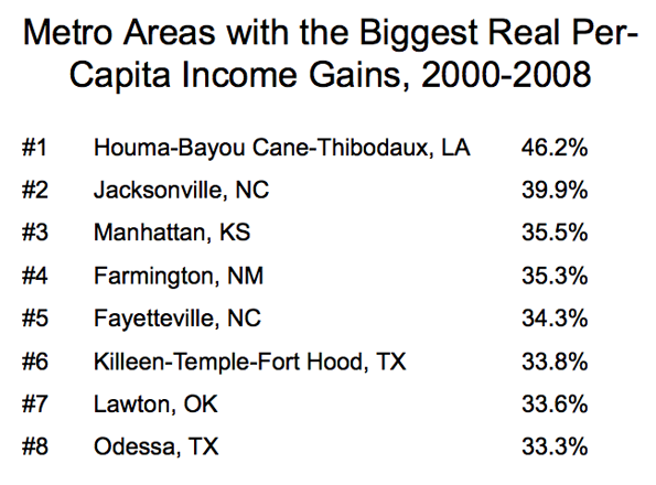
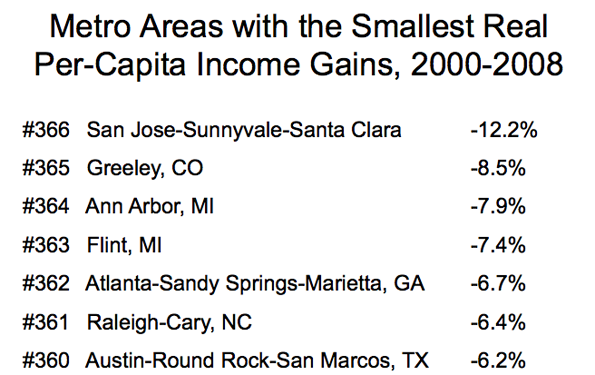
    Readers of New Geography will be familiar with two of the themes that she articulates.  One is the rise of a zone of prosperity from the Gulf Coast through the heartland and up to North Dakota that has been built on pro-active energy policy and strong global demand for agricultural commodities.  A second theme she articulates is the striking disparity in the cost of living between states like California and New Jersey compared with far more affordable states like Texas.  Low cost states, she says, will continue to attract new investment and jobs.

    In arguably the core section of the book, she explains how the housing bubble interacted with banking and government to create what she calls “The Negative Feedback Loop from Hell.”  By way of background, it should be noted that the underlying economics of banking are unusual.   As economist Joseph Stiglitz demonstrated in the 1980s, the price of money does not necessarily clear markets.  Instead, banks often employ credit rationing in order to control risk.  As she argues, this is exactly what happened in the states where the housing bubble inflated the most. These are the states where the subsequent economic decline was the greatest.    

    As Whitney shows, it was also these states, where government officials handed out the most generous pay packages, including large back loaded pensions. On top of that, these states often piled on the most government debt, which nearly doubled between 2000 and 2010.  The result has been significant retrenchment on core government services, from police and fire protection to public education. In her view, this is the negative feedback loop from hell, and the reason that she believes that fiscal stress will continue for a long period of time.

    As the fight for limited resources works itself out, she believes that besides government there will be three parties at the negotiating table. Two are straightforward enough: the bondholders, who expect to be paid back the money they lent, and the public sector employees, who expect to receive the pensions they were promised. But she also sees a third party. Writing shortly before the bankruptcy in Detroit, she presciently recognized that citizens will also have a claim on resources, arguing that they need and deserve the services that government is supposed to provide.

    Although the sub title of the book mentions geography, Whitney largely dismisses what a contemporary textbook on economics and geography calls the “who, why, and where of the location of economic activity.” This is not surprising. There are probably few people who are aware that this branch of economics even exists.  (Among professional economists, more attention has been paid in recent years with the advent of New Economic Geography as championed by Paul Krugman, although, ironically, empirical research indicates that key elements of  of Krugman’s theoretical work are almost certainly wrong.)

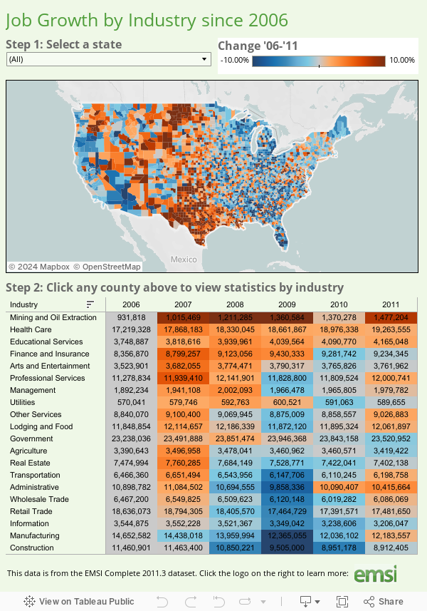
    While Whitney rightly focuses on the economic growth that distinguishes many of the states in the central corridor of the country, she cites data that shows that most economic activity continues to occur elsewhere.  She observes, “These so-called flyover states contributed 25 percent of U.S. GDP in 2011, up from 23 percent in 1999.” That is nearly a 10 percent increase, but obviously from a lower base. A current and highly visible example of the importance of geography is the huge growth in the number of warehouses along the New Jersey Turnpike, as engineering projects deepen New York harbor and expand the Panama Canal. Access to water will always be important.    

    Additionally, I would argue that the issues that Whitney addresses cannot be fully understood without taking into account the challenges that continue to face older industrial cities. All economies must constantly re-invent themselves. In the case of cities with a large industrial legacy, however, intrinsic market failures caused by asymmetric and imperfect information have made redevelopment significantly more difficult.  Theoretical and empirical work in recent years has also shown that joint and several liability under U.S. environmental law undermines efficient price discovery for properties that once had an industrial use.      

    These issues aside, Whitney has written a book that is both provocative and necessary. Clearly, certain states have instituted policies that are far more effective at attracting business and new residents. At the same time, other states appear unable to reform. Perhaps her central insight is that problems associated with debt can take on a life of their own. Therefore, her message is clear. States that properly manage their debt and pension obligations will enjoy a prosperous future. States that do not will encounter severe problems.  Investors and public sector employees take note.

    Eamon Moynihan is the Managing Director for Public Policy at EcoMax Holdings, a specialty finance company that focuses on the redevelopment of previously used properties.

  • Metro Job Recovery in 2011

    The latest BLS release for metro area unemployment has full year averages for 2011 available, so we can see which cities added the most jobs last year. On the whole, it was a much better year for metros than we’ve seen in the recent past. The national economy added jobs, and all but two large metros did as well. New York City added the most jobs of any region, but given that it is far and away the biggest city in America, it should do so. NYC ranked only the middle of the pack on a percentage growth basis. On that measure, Austin, Texas was number one.

    The top percentage gainer in the Midwest region? Detroit, Michigan. Perhaps this shouldn’t be surprising either, as manufacturing is pro-cyclical.

    Here is the performance of the metro areas in the United States with more than one million people, ranked by percentage change. The data is also available in spreadsheet form.

    Rank Metro Area 2010 2011 Total Change Pct Change
    1 Austin-Round Rock-San Marcos, TX 769.5 791.4 21.9 2.85%
    2 San Jose-Sunnyvale-Santa Clara, CA 855.2 878.2 23.0 2.69%
    3 Houston-Sugar Land-Baytown, TX 2528.1 2593.1 65.0 2.57%
    4 Charlotte-Gastonia-Rock Hill, NC-SC 807.5 826.7 19.2 2.38%
    5 Nashville-Davidson–Murfreesboro–Franklin, TN 734.3 751.7 17.4 2.37%
    6 Salt Lake City, UT 608.1 622.0 13.9 2.29%
    7 Detroit-Warren-Livonia, MI 1737.1 1775.3 38.2 2.20%
    8 Dallas-Fort Worth-Arlington, TX 2860.9 2921.7 60.8 2.13%
    9 Raleigh-Cary, NC 498.1 508.6 10.5 2.11%
    10 Pittsburgh, PA 1125.3 1148.6 23.3 2.07%
    11 Oklahoma City, OK 558.5 569.6 11.1 1.99%
    12 Tampa-St. Petersburg-Clearwater, FL 1112.0 1132.3 20.3 1.83%
    13 Portland-Vancouver-Hillsboro, OR-WA 968.8 986.1 17.3 1.79%
    14 Minneapolis-St. Paul-Bloomington, MN-WI 1697.1 1727.1 30.0 1.77%
    15 Baltimore-Towson, MD 1274.0 1293.5 19.5 1.53%
    16 Seattle-Tacoma-Bellevue, WA 1641.2 1666.1 24.9 1.52%
    17 Denver-Aurora-Broomfield, CO 1193.5 1211.6 18.1 1.52%
    18 Columbus, OH 903.3 916.9 13.6 1.51%
    19 Miami-Fort Lauderdale-Pompano Beach, FL 2185.6 2218.3 32.7 1.50%
    20 Phoenix-Mesa-Glendale, AZ 1688.9 1712.8 23.9 1.42%
    21 Atlanta-Sandy Springs-Marietta, GA 2272.6 2302.9 30.3 1.33%
    22 New Orleans-Metairie-Kenner, LA 519.1 526.0 6.9 1.33%
    23 San Antonio-New Braunfels, TX 843.0 853.2 10.2 1.21%
    24 Richmond, VA 602.4 609.5 7.1 1.18%
    25 New York-Northern New Jersey-Long Island, NY-NJ-PA 8306.8 8403.9 97.1 1.17%
    26 Indianapolis-Carmel, IN 871.1 881.2 10.1 1.16%
    27 Jacksonville, FL 583.1 589.6 6.5 1.11%
    28 Rochester, NY 503.1 508.7 5.6 1.11%
    29 Washington-Arlington-Alexandria, DC-VA-MD-WV 2962.9 2995.5 32.6 1.10%
    30 Hartford-West Hartford-East Hartford, CT – Metro 533.2 538.9 5.7 1.07%
    31 Chicago-Joliet-Naperville, IL-IN-WI 4246.6 4291.4 44.8 1.05%
    32 Milwaukee-Waukesha-West Allis, WI 805.8 814.1 8.3 1.03%
    33 Louisville/Jefferson County, KY-IN 592.9 599.0 6.1 1.03%
    34 Kansas City, MO-KS 971.6 981.4 9.8 1.01%
    35 Orlando-Kissimmee-Sanford, FL 1001.1 1011.0 9.9 0.99%
    36 Memphis, TN-MS-AR 589.8 595.4 5.6 0.95%
    37 Cincinnati-Middletown, OH-KY-IN 980.8 989.4 8.6 0.88%
    38 Buffalo-Niagara Falls, NY 538.2 542.7 4.5 0.84%
    39 San Francisco-Oakland-Fremont, CA 1880.2 1894.3 14.1 0.75%
    40 Boston-Cambridge-Quincy, MA-NH – Metro 2426.5 2443.3 16.8 0.69%
    41 Los Angeles-Long Beach-Santa Ana, CA 5126.8 5162.2 35.4 0.69%
    42 San Diego-Carlsbad-San Marcos, CA 1222.8 1231.2 8.4 0.69%
    43 St. Louis, MO-IL 1286.9 1295.4 8.5 0.66%
    44 Las Vegas-Paradise, NV 803.6 808.3 4.7 0.58%
    45 Riverside-San Bernardino-Ontario, CA 1125.9 1129.7 3.8 0.34%
    46 Philadelphia-Camden-Wilmington, PA-NJ-DE-MD 2697.0 2705.9 8.9 0.33%
    47 Providence-Fall River-Warwick, RI-MA – Metro 541.3 542.8 1.5 0.28%
    48 Virginia Beach-Norfolk-Newport News, VA-NC 735.2 736.8 1.6 0.22%
    49 Cleveland-Elyria-Mentor, OH 991.1 992.7 1.6 0.16%
    50 Birmingham-Hoover, AL 489.5 488.6 -0.9 -0.18%
    51 Sacramento–Arden-Arcade–Roseville, CA 809.9 802.0 -7.9 -0.98%

    This first appeared at Aaron’s blog, Urbanophile.com.

  • Interactive Graphic: Ranking States By Competitiveness

    In a previous post we looked at which states have been most competitive in terms of job creation since the recession.

    In this post we teamed up with our friends at Tableau Software to produce the following interactive graphic, which details individual industries that are driving states to be more (or less) competitive. The graphic breaks down the performance of the 20 major sectors in every state in the contiguous US (plus Hawaii and Alaska) in terms of expected and actual job change from 2007-2011. Further explanation of the analysis is below.

    Rundown on the data

    We used shift share, a standard economic analysis method that reveals if overall job growth is explained primarily by national economic trends and industry growth or unique regional factors. Shift share analysis, which can also be referred to as “regional competitiveness analysis,” helps us distinguish between growth that is primarily based on big national forces (the proverbial “rising tide lifts all boats” analogy) vs. local competitive advantages.

    To generate our ranking, we summed the overall competitive effect for each broad 2-digit industry sector by state (e.g., agriculture, manufacturing, health care, construction, etc.) and added them together to yield a single statewide number that indicates the overall competitiveness of the economy as compared to total economy. We calculate the competitive effect by subtracting the expected jobs (the number of jobs expected for each state based on national economic trends) from the total jobs. The difference between the total and expected is the competitive effect. If the competitive effect is positive, then the industries within the state have exceeded expectations and created more jobs than national trends would have suggested. Those industries are therefore gaining a greater share of the total jobs being created. If the competitive effect is negative, then the industries are not gaining jobs as fast as what we would expect given national trends. In this case the state is losing a greater share of the total jobs being created.

    Observations On Most Competitive

    The big thing that stands out is that most of the competitive states tend to be in the middle of the country. This is tied to the growth in the oil and gas sector, yes, but in most cases better-than-expected performance in construction, government, and other miscellany sectors. In Alaska, North Dakota, and Nebraska, smaller states in terms of population and jobs, manufacturing, transportation, and construction are some of the most competitive industries. Louisiana also fares quite well in healthcare and accommodation & food services.

    Observations On Least Competitive

    For states that rank toward the bottom, the housing bust and subsequent construction downturn is the biggest culprit. For instance, in Nevada, which is last on the list, construction is nearly 50,000 jobs below what would be expected given national and industry trends. Florida, a much more populous state, is more than 130,000 jobs below what would be expected. For states like Michigan, Ohio, and Indiana, the poor performance in manufacturing and government weighed heavily in our ranking.

    Here is the original graphic that show the comparison between states.

    Please check out the graphic and let us know if you have any questions. Email Rob Sentz (rob@economicmodeling.com) or hit us via Twitter @DesktopEcon. Data and analysis comes from Analyst, EMSI’s web-based labor market analysis tool.

  • Reset Your Life in Flyover Country

    Bert Sperling just released a new list of  “The Best Places to Hit Refresh” and perhaps surprisingly many are located in the much-ignored flyover states. According to the list, five cities throughout the Midwest and Great Plains perfect for those looking to start over. Their methodologies included looking at the city’s overall population, unemployment rates, rates of singles living in the city, and the types of economies that the city can call their own—from oil in the upper Great Plains to education in the eastern Midwest.

    What cities grace the list and why? In fifth place, Sioux Falls, SD, with its location in a state with some of the country’s most business-friendly laws (no corporate income tax, for example), low unemployment rate (5.5%), and a singles rate that rivals some of the larger U.S. metros (19th in the nation) allows for a perfect opportunity for those looking to start over. An economy that includes a number of banks and other financial firms and excellent health care has attracted a huge growth rate in recent years.

    Next on the list is a tie between two more southwestern cities: Lawton, OK and Logan, UT. Both of these locales offer low unemployment rates (5.6% and 5.7%, respectively) and a high singles rate (15.9% and 16.4%). Lawton’s economy consists mostly of the Fort Sill U.S. military base, while Logan’s boasts Utah State University as its major economic provider.

    Next up is the city of Lincoln, NE whose residents enjoy the lowest unemployment rate in the country at 4.1%. The city’s economy is composed of several financial and insurance firms, a Goodyear tire factory, and the University of Nebraska at Lincoln which helps to give the city a high rate of singles at 15.1%.

    The second best city to start over is the northern city of Fargo, ND. Home to Microsoft Business Solutions, Fargo began its growth even before the explosion of the oil and gas industry in western North Dakota. The populace enjoys the nation’s third-lowest unemployment rate at 4.5%, while the presence of North Dakota State University and Minnesota State University at Moorhead contribute a high rate of singles (15.9%) as well as a young feel to the isolated city.

    Finally, the best city to start over according to Sperling is the Midwestern college town of Iowa City, IA. The city boasts a very low unemployment rate (4.7%), a high singles rate (16.1%), and a well-educated workforce thanks to the presence of the University of Iowa. The city’s culture is positively affected by Chicago’s proximity and the university’s label as a Big Ten college, as well as a diverse student population. Iowa City is a flourishing Midwestern city with deep cultural roots that make for a great place to not only start over, but to live as well.

    All of this comes at a perfect time after a University of Iowa journalism professor, Stephen Bloom, openly marginalized the state of Iowa’s populace as the “elderly waiting to die”. Sperling’s list helps to solidify Iowa (and the rest of the Midwest and Great Plains) as a hopeful place with opportunity as fertile as the soil itself.

  • Interactive Graphic: Job Growth by Sector for all Counties in the Nation

    The fully interactive map below indicates job growth and decline for all US counties from 2006 to 2011. These show up as hot or cold spots; red for growth, blue for decline. You can select a state to zoom in on and find a county that way, or simply click on a county to drill in. Once you’ve chosen a county, the table under the map will show you job numbers by industry category.

    The data for this graphic comes from EMSI’s Complete 2011.3 dataset, based on data from the Bureau of Labor Statistics and many other sources. Many thanks to Tableau for putting this together. If you have questions or comments about the graphic or the data behind it, please email EMSI’s Josh Stevenson.

  • The Spread of Proprietors/Independent Contractors In the US

    A few weeks ago EMSI looked at the states with the largest share of 1099 workers — that is, proprietors/independent contractors, farm workers, and others not covered by unemployment insurance. We found that since 2006 every state (as well as D.C.) has seen growth in noncovered workers.

    Simply put, the number of workers outside traditional employment rolls is on the rise.

    We have since mapped out job growth among 1099 workers in every U.S. county from 2006-2011 to see where this increase in nontraditional employment is most evident. And the data makes the trend even clearer: The majority of counties across the nation have seen at least a small increase in noncovered workers, and some have seen huge increases. This is especially the case in the western and southwestern portions of the U.S.

    It should be emphasized that not all 1099 workers captured in the EMSI Complete dataset are proprietors/independent contractors. However, if we use growth in the 1099 economy as a loose proxy for entrepreneurial behavior (i.e., a backbone for economic growth and business development), it’s very apparent which areas are progressing in that arena and which areas are falling behind.

    The counties with the most 1099 job growth are mostly in fairly isolated areas:

    1, Loving County, Texas, 114% (the least populous county in the US)
    2, Todd County, South Dakota, 81%
    3, Calhoun County, West Virginia, 63%
    4 (tie), Roane County, West Virginia, 57%
    4 (tie), Reagan County, Texas, 57%
    4 (tie), Union County, Florida, 57%
    7 (tie), Wayne County, Utah, 54%
    7 (tie), Shackleford County, Texas, 54%
    9, Ochiltree County, Texas, 53%
    10, Kenedy County, Texas, 52%

    Seven of the top 12 counties, in fact, are in Texas, including Midland County. Oil and gas extraction, the fastest-rising sector for 1099 workers in the US, is driving most of this growth in workers outside the unemployment insurance (UI) system.

    In contrast, the counties showing the biggest job loss in 1099 employment have a more diverse population base:

    1, Ziebach County, South Dakota, -23%
    2 (tie), St. Louis City, Missouri, -15%
    2 (tie), Roanoke County, Virginia, -15%
    4, Ohio County, West Virginia, -14%
    5, Sully County, West Virginia, -13%
    6, Oliver County, North Dakota, -12%
    7 (tie), Marshall County, South Dakota, -11%
    7 (tie), Forsyth County, Georgia, -11%
    9, Pennington County, South Dakota, -10%
    10, Decatur County, Iowa, -9%

  • Infographic: Which Industries Are Growing in Your State?

    EMSI teamed up with Tableau Software to create this industry data display. You can visualize every broad-level (2-digit NAICS) industry by state over the last decade. Also, click on the dot for each state to see the trends for each sector. The bigger the dot, the more jobs that state has in the selected industry. It may take a few seconds to load.

    A few observations:

    1. Right off the bat, you can see the explosive growth of the mining sector nationally over the past few years. If you scroll to mining and oil exploration in the dropdown or isolate it by clicking on the chart, you can see Texas has by far the largest number of jobs among all states. We covered this sector and specific oil and gas extraction occupations in depth recently.

    2. One of the cool things to do is scroll through each year to see the changing complexion of employment. There’s widespread growth projected for most states in 2011, with a few exceptions, but clicking back through the past few years shows a much different picture.

    3. Another intriguing sector is manufacturing. In the last decade, it hasn’t fared well. That much is clear. But notice the tide start to shift in 2010, with Indiana and Michigan showing slight growth. And in 2011, nearly three-quarters of the US is expected to see job expansion.

  • State GDP Performance

    Gross Domestic Product is the basic measure of economic output. The government released 2009 GDP data for US states recently, so it’s worth taking a look. Here’s a map of percent change in total real GDP from 2000 to 2009, with increases in blue, decreases in red:

    As you can see, Michigan actually experienced a decline in its total real output over the last decade. Given the restructuring of the auto industry, that’s not surprising.

    Here’s another view, this one a similar percent change view of real per capita GDP:

    Here you can see that Michigan is not alone. Some of the fast growing Sun Belt states added people at a faster rate than they grew economic output. Georgia in particular is worth noting, because even metro Atlanta has been showing declining real per capita GDP. In fact, Georgia actually declined by more than Michigan did on this metric, so obviously all is not well down there. Texas, despite its vaunted jobs engine, is expanding almost totally horizontally. It is 9th lowest in the US on real per capita GDP growth, with a nearly flat 2% performance over the last decade.

    North Dakota is also interesting. They are leading the charts, I presume driven by energy and high tech. (Thanks to Great Plains software, I believe Fargo is now Microsoft’s biggest software development center in the US outside Redmond).

    This post originally appeared at The Ubanophile.

  • A Bad Business Cycle for the Creative Economy

    Here’s a simple question for you…which metro areas did prospered the most during the past business cycle? (2000-2008)  Were the winners the highly-educated communities that make up the Creative Economy?  Or did someone else zoom ahead?

    I asked myself these questions when I was preparing for a talk that I was giving at the Rochester Institute of Technology on innovation and economic development.  Being a man of numbers,  I calculated the gains in real-per capita income for all metro areas. Who do  you think was #1, and who do you think was #366 (out of 366)?

    A bit surprising, isn’t it?  The common themes are guns and oil. The big gains in the #1-ranked Houma region are mainly connected with the increase in oil drilling, since BLS data shows that wages in the mining/oil industry in Terrebonne Parish, where Houma is located, soared from $58K a year to $78K from 2005 to 2008.  #2 Jacksonville (NC) is the location of Camp Lejeune. Fayetteville (NC). #5 Fayettville (NC) is home to Fort Bragg, one of the larget military bases in the world. #6 Killeen is obviously home to Fort Hood.  #8 Odessa, Texas, is  riding the oil boom.

    Now let’s look at the metro areas which were the biggest losers in real per-capita income, 2000-2008.

    Uh, oh.  This is not the list you might have expected, in a world where brains and innovation are supposed to be important. There’s Silicon Valley at the top (or the bottom) of the list, where incomes didn’t recover from the popping of the tech bubble that peaked in 2000.  But other tech-type metro areas, such as Raleigh and Austin were hit hard as well.

    Brains and education did not seem to count too much in success in the last business cycle. Overall, the top ten cities, measured by growth in per capita income, had an average college graduate rate of 17.7% The bottom ten cities had a college graduate rate of 31.8%.

    Is this inverse relationship between growth and education going to persist into the future? Impossible to say. My personal view is that the lack of rewards for education–which show up in the individual income statistics as well–is correlated to the lack of commercially-successful breakthrough innovations, which would immediate sop up all the excess college graduates.

    To put it another way, innovative industries tend to locate where they can get a lot of college graduates. That means high education areas attract new companies, boosting growth.

    But without innovation,  the whole economic development dynamic changes. You can’t attract growing innovative companies because they are few and far between. For their part,   companies are more likely to view cost as a main consideration in deciding where to locate.  Goodbye San Jose and Austin, hello China and India.

    Mike Mandel is Editor-in-Chief of Visible Economy. This post originally appeared on his blog “Mandel on Innovation and Growth.”

  • Texas Dominates Milken’s New Best Performing Cities Index

    Texas metropolitan regions hold down four of the top five and nine of the top 16 places in Milken’s new Best Performing Cities Index, released this morning. The rankings were authored by previous New Geography Contributor Ross DeVol, director of Regional Economics at Milken.

    It’s refreshing to see a set of rankings attempting to take an objective, hard data-based look at comparative analysis. The Milken Rankings are a combination of job growth, wage and salary growth, high-tech GDP growth, and high-tech location quotients (see page 8 of the report).

    A region’s industry mix plays a big role in its ranking; you can see energy-centric regions scoring well. But remember that these rankings also explicitly factor in high tech growth and high tech concentration.

    Regions that avoided real estate inflation and those maintaining what they have or simply avoiding rapid decline tend to score better.

    “‘Best performing’ sometimes means retaining what you have,” said DeVol. “In a period of recession, the index highlights metros that have adapted to weather the storm. As we move forward in a recovery that still lacks jobs, metros will be further tested in their ability to sustain themselves.”

    The rankings include 324 regions, breaking them into two groups based on region size.

    You can view the full lists at Milken’s interactive rankings website, and the full report includes analyses of the top large and small places.

    Here’s the top and bottom 25 Large places:

    Top 25 Large Regions Bottom 25 Large Regions
    2009 rank 2008 rank Metropolitan area 2009 rank 2008 rank Metropolitan area
    1 4 Austin-Round Rock, TX MSA 176 97 Bradenton-Sarasota-Venice, FL MSA
    2 13 Killeen-Temple-Fort Hood, TX MSA 177 150 Birmingham-Hoover, AL MSA
    3 3 Salt Lake City, UT MSA 178 144 Memphis, TN-MS-AR MSA
    4 7 McAllen-Edinburg-Mission, TX MSA 179 117 Miami-Miami Beach-Kendall, FL MD
    5 16 Houston-Sugar Land-Baytown, TX MSA 180 120 Cape Coral-Fort Myers, FL MSA
    6 21 Durham, NC MSA 181 183 Spartanburg, SC MSA
    7 9 Olympia, WA MSA 182 178 Wilmington, DE-MD-NJ MD
    8 5 Huntsville, AL MSA 183 189 Dayton, OH MSA
    9 14 Lafayette, LA MSA 184 73 Merced, CA MSA
    10 2 Raleigh-Cary, NC MSA 185 191 Hickory-Lenoir-Morganton, NC MSA
    11 15 San Antonio, TX MSA 186 193 Cleveland-Elyria-Mentor, OH MSA
    12 29 Fort Worth-Arlington, TX MD 187 170 Providence-New Bed.-Fall Riv., RI-MA MSA
    13 23 Dallas-Plano-Irving, TX MD 188 186 South Bend-Mishawaka, IN-MI MSA
    14 37 El Paso, TX MSA 189 185 Kalamazoo-Portage, MI MSA
    15 45 Wichita, KS MSA 190 197 Canton-Massillon, OH MSA
    16 88 Corpus Christi, TX MSA 191 192 Ann Arbor, MI MSA
    17 17 Seattle-Bellevue-Everett, WA MD 192 187 Atlantic City, NJ MSA
    18 40 Baton Rouge, LA MSA 193 188 Youngstown-Warren-Board., OH-PA MSA
    19 72 Tulsa, OK MSA 194 190 Grand Rapids-Wyoming, MI MSA
    20 20 Greeley, CO MSA 195 196 Lansing-East Lansing, MI MSA
    21 8 Tacoma, WA MD 196 199 Holland-Grand Haven, MI MSA
    22 48 Fort Collins-Loveland, CO MSA 197 198 Warren-Troy-Farmington Hills, MI MD
    23 54 Little Rock-N. Little Rock-Conway, AR MSA 198 194 Toledo, OH MSA
    24 67 Shreveport-Bossier City, LA MSA 199 200 Detroit-Livonia-Dearborn, MI MD
    25 41 Wash.-Arl.-Alex., DC-VA-MD-WV MD 200 195 Flint, MI MSA

    And the top and bottom 25 Small regions:

    Top 25 Small Regions Bottom 25 Small Regions
    2009 rank 2008 rank Metropolitan area 2009 rank 2008 rank Metropolitan area
    1 1 Midland, TX MSA 100 110 Vineland-Millville-Bridgeton, NJ MSA
    2 7 Longview, TX MSA 101 94 Parkersburg-Marietta-Vienna, WV-OH MSA
    3 5 Grand Junction, CO MSA 102 114 Williamsport, PA MSA
    4 26 Tyler, TX MSA 103 117 Mansfield, OH MSA
    5 10 Odessa, TX MSA 104 85 Jackson, TN MSA
    6 29 Kennewick-Pasco-Richland, WA MSA 105 115 Muncie, IN MSA
    7 15 Bismarck, ND MSA 106 63 Flagstaff, AZ MSA
    8 6 Warner Robins, GA MSA 107 112 Racine, WI MSA
    9 11 Las Cruces, NM MSA 108 70 Dothan, AL MSA
    10 17 Fargo, ND-MN MSA 109 105 Sheboygan, WI MSA
    11 45 Pascagoula, MS MSA 110 97 Niles-Benton Harbor, MI MSA
    12 23 Sioux Falls, SD MSA 111 100 Altoona, PA MSA
    13 8 Bellingham, WA MSA 112 95 Terre Haute, IN MSA
    14 38 College Station-Bryan, TX MSA 113 59 Redding, CA MSA
    15 2 Coeur d’Alene, ID MSA 114 122 Lima, OH MSA
    16 12 Cheyenne, WY MSA 115 75 Janesville, WI MSA
    17 81 Texarkana, TX-Texarkana, AR MSA 116 96 Elkhart-Goshen, IN MSA
    18 27 Waco, TX MSA 117 119 Anderson, SC MSA
    19 16 Houma-Bayou Cane-Thibodaux, LA MSA 118 113 Dalton, GA MSA
    20 44 Laredo, TX MSA 119 120 Springfield, OH MSA
    21 40 Abilene, TX MSA 120 84 Lewiston-Auburn, ME MSA
    22 25 Iowa City, IA MSA 121 116 Muskegon-Norton Shores, MI MSA
    23 72 Glens Falls, NY MSA 122 121 Saginaw-Saginaw Township North, MI MSA
    24 24 Billings, MT MSA 123 123 Battle Creek, MI MSA
    25 64 Ithaca, NY MSA 124 124 Jackson, MI MSA