Tag: economic geography

  • Riding Out the Recession in the Forty Strongest Metropolitan Economies

    A few days ago BusinessWeek released a list of the top 40 metropolitan economies based on data compiled at the Brookings Institution’s Metromonitor project. But, as many old media sites tend to do, they’ve locked the list behind a slow-loading slide show in a cheap attempt to drum up page views. Many of the commenters to the original article couldn’t even find the list.

    So, in the interest of usability, here’s the top 40 in boring list format:

    1 San Antonio, TX
    2 Austin-Round Rock, TX
    3 Oklahoma City, OK
    4 Little Rock-North Little Rock-Conway, AR
    5 Dallas-Fort Worth-Arlington, TX
    6 Baton Rouge, LA
    7 Tulsa, OK
    8 Omaha-Council Bluffs, NE-IA
    9 Houston-Sugar Land-Baytown, TX
    10 El Paso, TX
    11 Jackson, MS
    12 McAllen-Edinburg-Mission, TX
    13 Washington-Arlington-Alexandria, DC-VA-MD-WV
    14 Columbia, SC
    15 Pittsburgh, PA
    16 Harrisburg-Carlisle, PA
    17 Des Moines-West Des Moines, IA
    18 Virginia Beach-Norfolk-Newport News, VA-NC
    19 Honolulu, HI
    20 Rochester, NY
    21 Buffalo-Niagara Falls, NY
    22 Scranton-Wilkes-Barre, PA
    23 Augusta-Richmond County, GA-SC
    24 Colorado Springs, CO
    25 Madison, WI
    26 Albuquerque, NM
    27 Syracuse, NY
    28 Albany-Schenectady-Troy, NY
    29 Kansas City, MO-KS
    30 Raleigh-Cary, NC
    31 Ogden-Clearfield, UT
    32 Boston-Cambridge-Quincy, MA-NH (tied)
    32 New Haven-Milford, CT (tied)
    33 Bridgeport-Stamford-Norwalk, CT
    34 Denver-Aurora-Broomfield, CO (tied)
    34 Baltimore-Towson, MD (tied)
    35 Poughkeepsie-Newburgh-Middletown, NY
    36 Hartford-West Hartford-East Hartford, CT
    37 Indianapolis-Carmel, IN
    38 Memphis, TN-MS-AR

    Trends? Looks like energy economies, state capitals, university-heavy towns, generally affordable regions that avoided the housing boom, and a few old industrial centers that suffered the brunt of decline 25 years ago and now may be positioned for an up-swing.

    Here’s an explanation of the list methodology:

    The Brookings Institution ranked the 100 largest metros by averaging the ranks for four key indicators: employment change, unemployment change, gross metropolitan product, and home price change. Employment was measured by the change from the peak quarter for each metro to the second quarter of 2009. The peak was the quarter in which the metro had the most jobs during the past five years. Unemployment was ranked by measuring the percentage-point change from the first quarter of 2009 to the second quarter of 2009. Gross metropolitan product was measured from the peak quarter to the second quarter of 2009. And the ranking of home prices compared the second quarter of 2009 to the previous quarter. The employment data were provided by Moody’s Economy.com, the unemployment data were collected from the U.S. Bureau of Labor Statistics, and the home price index came from the Federal Housing Finance Agency.

    Source: The Brookings Institution’s MetroMonitor

  • Mapping US Metropolitan Unemployment Rates, May 2009

    Here’s a quick map of the newly released May 2009 metropolitan area unemployment numbers. On this map, color signifies the rate in May 2009 and size of bubble indicates the rate point change since May of last year. Green dots are below the national unemployment level of 9.1 in May, and red dots are above the national number.

    We can see that highest unemployment is concentrated on the west coast and California, manufacturing dependend Michigan, Indiana, and Ohio, parts of Appalachia, the Carolinas, and Florida.

    Unemployment is increasing the fastest in Kokomo and Elkhart-Goshen, IN; Bend, Eugene, Medford, and Portland, OR; Hickory-Lenoir-Morganton, NC; and Muskegon and Monroe, MI.

    While every metropolitan area of the country saw increased unemployment over May 2008, the Great Plains from Texas to North Dakota, the Mountain West, and parts of New England are still holding employment better than the rest of the nation.

  • The Best Places to Avoid a Recession

    Would you like to avoid recessions altogether?

    You can come close if you live in the right place.

    This report looks at the period January 1991 through April 2009 – a period of 220 months that includes three recessions. Since employment rises and falls monthly because of seasonal trends (school year, holiday retail and more), this report uses 12-month employment growth rates as the measurement criteria – the employment in a given month compared to the employment 12 months earlier. This eliminates seasonality and allows us to compare, if you will, apples with apples.

    The metric in this analysis is the percent of months where the 12-month employment growth rate is positive.

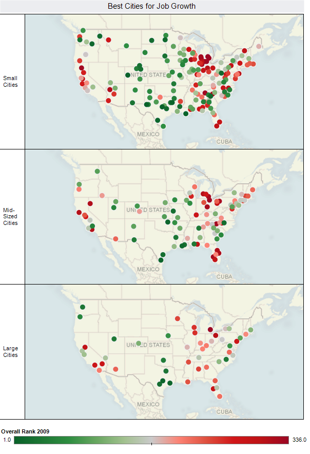
    Using employment growth rates as the measurement criteria:

    Alaska is 99.1% recession-proof since employment was growing for 218 months out of 220.

    Michigan is 51.8% recession-proof since employment was growing for 114 months out of 220.

      All the states are shown in the graphic, color-coded as follows:

    • Green is 90% or more
    • Grey is 80% to 90%
    • Red is 70% to 80%
    • Black is less than 70%

    Some metropolitan areas are also relatively recession-proof:

    Area
    Share of months where 12-month job growth rate is positive
    Grand Junction, CO
    100.00%
    McAllen-Edinburg-Mission, TX
    99.50%
    Olympia, WA
    99.10%
    Bismarck, ND
    98.60%
    Anchorage, AK
    97.70%
    Fargo, ND-MN
    97.70%
    Tyler, TX
    97.30%
    Greeley, CO
    96.80%
    Iowa City, IA
    96.40%
    Sioux Falls, SD
    96.40%
    Cheyenne, WY
    95.90%
    Columbia, MO
    95.90%
    Coeur d’Alene, ID
    95.50%
    College Station-Bryan, TX
    95.50%
    Billings, MT
    95.00%
    Fayetteville-Springdale-Rogers, AR-MO
    94.50%
    Laredo, TX
    94.50%
    Las Cruces, NM
    94.50%
    Valdosta, GA
    94.50%
    Killeen-Temple-Fort Hood, TX
    94.10%
    Rapid City, SD
    94.10%
    Bellingham, WA
    93.60%
    Ogden-Clearfield, UT
    93.60%
    Knoxville, TN
    93.20%
    St. George, UT
    93.20%

    And, unfortunately, some metropolitan areas are not very recession proof:

    Area
    Share of months where 12-month job growth rate is positive
    Baltimore City, MD
    17.70%
    Flint, MI
    28.60%
    Detroit-Livonia-Dearborn, MI Metro
    34.10%
    Philadelphia City, PA
    35.50%
    Dayton, OH
    37.30%
    Mansfield, OH
    38.20%
    Youngstown-Warren-Boardman, OH-PA
    41.80%
    Muncie, IN
    42.70%
    Kingston, NY
    43.60%
    Waterbury, CT NECTA
    45.50%
    Binghamton, NY
    47.30%
    Lima, OH
    47.30%
    Springfield, OH
    48.20%
    Detroit-Warren-Livonia, MI
    49.10%
    Lansing-East Lansing, MI
    50.00%
    Saginaw-Saginaw Township North, MI
    50.50%
    Ann Arbor, MI
    51.40%
    Cleveland-Elyria-Mentor, OH
    52.70%
    Decatur, IL
    52.70%
    Terre Haute, IN
    53.60%
    Canton-Massillon, OH
    54.10%
    Battle Creek, MI
    54.50%
    Jackson, MI
    55.00%
    Niles-Benton Harbor, MI
    55.00%

    You can’t necessarily judge a metropolitan area by its State’s employment growth rates. For example, Georgia is only 73.6% recession-proof yet Valdosta is 94.5%. Indiana is 74.5% yet Indianapolis is 90.0%. Missouri is 72.3% yet Columbia is 95.9%.

    A complete list of states and metropolitan areas is available at http://jobbait.com/a/rpa.htm.

    The data in this report present only part of a recession-proof picture of states and metropolitan areas. Think of them as a long-term picture from 1990 through April 2009. They do not necessarily represent what’s happening today. For example, Olympia WA which is the second-most recession-proof metropolitan area long term has declines in the last two months, March and April 2009. And, this will change next month and the month after.

    This report was written by Mark Hovind, President of JobBait. Mark helps six and seven figure executives find jobs by going directly to the decision-makers most likely to hire them. Mark can be reached through www.JobBait.com or by email at Mark@JobBait.com.

  • Visualizing our 2009 Best Cities for Job Growth Rankings

    Here’s some great maps of our annual Best Cities Rankings created by Robert Morton at Tableau Software. Robert used their software tool to plot a color coded point for each city in the rankings by size group, and immediate geographic patterns emerge:

    Check out Robert’s post for a map of the biggest gainers and losers from last year, and a rank change by size scatter plot of each place.

  • Jobs Continue to Decentralize Within America’s Metropolitan Regions

    Since 1998, most major American metropolitan areas have seen a decline in employment located close to the city center as jobs have moved farther into the suburbs.

    A recent report by the Brookings Institution determined that this “job sprawl” threatens to undermine the long-term regional and national prosperity.

    The report analyzes the spatial distribution of jobs in large metropolitan regions and how these trends differ across major industries, in addition to ranking cities according to their amount of job sprawl.

    The report found that only 21 percent of employees work within three miles of downtown. Using the period before the current recession, the report found that while the number of jobs has increased, 95 of 98 metro areas analyzed saw a shift of jobs away from the central core.

    The Brookings Institute argues that “allowing jobs to shift away from city centers hurts economic productivity, creates unsustainable and energy inefficient development and limits access to underemployed workers.” Yet this may be more a matter of Brookings ideology than a likely far more complex reality.

    Job sprawl is greatest both in areas that have clearly declined – such as Detroit – as well as growing regions like Dallas-Fort Worth. Nor does concentration guarantee success, as can be seen by the mediocore performance of the more concentrated New York region. Yet virtually everywhere jobs continue to sprawl, in many cases faster than even population. Maybe it’s time to learn how to adjust to the emerging future rather than yearn for a return to the economic and geographic structure of the last century.

  • Which are the places dominant in finance?

    The financial services sector (finance, insurance, real estate, management) lies at the heart of the economic crisis and recession. This is the sector that doubled in its share of the labor force over the last 30 years, creating vast but uneven wealth. It is instructive to see which American cities are most culpable in these excesses.

    New York dominates, as it has for centuries, especially if we include neighboring Fairfield county, CT (Bridgeport, Stamford, Greenwich), based on its very high share (20 %) of resident employees in finance. This does not include the very high share of incomes that financial services represents in the New York area, as discussed in our recent report on the city’s middle class.

    But Washington, DC has by far the highest share; there are also high shares in neighboring Baltimore and Richmond. These figures illustrate the rising relative power of center of government in the contemporary political economy. Los Angeles is roughly equivalent, but with a slightly lower share than New York. Chicago, the economic capital of the interior, tops off the big four centers of control.

    The next tier of five major regional capitals, all also Federal Reserve cities, are Dallas, Atlanta, Philadelphia, Boston and San Francisco, with Boston and San Francisco among places with the highest shares in finance. They are followed by four regional capitals on the path to financial stardom – if you can use that term today – including Miami, Houston and Seattle and Phoenix, as well as another federal reserve city, Minneapolis.

    Several major metropolitan areas are far less important in finance than in earlier times. These include the Rust Belt cities of Detroit, Cleveland, St. Louis, Pittsburgh and Cincinnati. These, in turn, are being challenged by the growing smaller metro areas and regional capitals of Denver, Portland, San Diego, Sacramento and Tampa-St. Petersburg.

    Finally smaller, often growing metropolises with high shares in finance include, most obviously Charlotte, but also Austin, Columbus, Madison, Raleigh, Des Moines and Olympia, WA, all state capitals and/or university towns. But the highest shares, after Bridgeport are located smaller areas in Florida, Palm Coast and Fort Walton Beach.

    Place
    Total Population (millions)
    Total labor force (millions)
    Number in Finance (thousands)
    % finance
    New York 18.8 9.9 1535 15.5
    Los Angeles 12.9 6.6 970 14.7
    Chicago 9.5 4.9 750 15.3
    Dallas 6.1 3.1 502 16.2
    Philadelphia 5.8 2.95 457 15.5
    Houston 5.6 2.7 383 14.2
    Miami 5.4 2.8 409 14.6
    Washington 5.3 3 645 21.5
    Atlanta 5.3 2.7 464 17.2
    Boston 4.5 2.5 440 17.6
    Detroit 4.5 2.15 299 13.9
    San Francisco 4.2 2.2 411 18.7
    Phoenix 4.2 2.1 305 14.5
    Riverside-SB 4.1 1.8 205 11.4
    Seattle 3.3 1.8 310 17.2
    Minneapolis 3.2 1.8 313 17.4
    San Diego 3 1.5 245 16.3
    St.Louis 2.8 1.4 202 14.4
    Tampa St. Pete 2.7 1.3 203 15.6
    Baltimore 2.7 1.4 235 16.8
    Denver 2.5 1.4 232 16.6
    Pittsburgh 2.4 1.2 158 13.2
    Portland 2.2 1.15 177 15.4
    Cincinnati 2.1 1.1 158 14.4
    Cleveland 2.1 1.06 139 13.1
    Sacramento 2.1 1 161 16.1
    Orlando 2 1.1 171 15.5
    Bridgeport 0.9 0.47 94 20
    Palm Coast 0.06 0.031 6 20
    Ft Walton 0.15 0.09 17 19
    San Jose 1.8 0.9 171 19
    Boulder 0.29 0.175 33 19
    Olympia 0.24 0.1 18 18
    Raleigh 1.05 0.55 96 17.4
    Des Moines 0.55 0.31 53 17
    Oxnard 0.8 0.43 73 17
    Manchester-Nash 0.4 0.2 34 17
    Charlotte 1.65 0.85 145 17
    Austin 1.6 0.86 142 16.5
    Tallahassee 0.35 0.19 32 16.6
    Columbus OH 1.75 0.95 152 16
    Richmond VA 1.21 0.68 110 16.2
    Anchorage 0.36 0.195 31 16
    Madison  WI 0.56 0.34 54 16