Tag: Economy

  • Metro Job Recovery in 2011

    The latest BLS release for metro area unemployment has full year averages for 2011 available, so we can see which cities added the most jobs last year. On the whole, it was a much better year for metros than we’ve seen in the recent past. The national economy added jobs, and all but two large metros did as well. New York City added the most jobs of any region, but given that it is far and away the biggest city in America, it should do so. NYC ranked only the middle of the pack on a percentage growth basis. On that measure, Austin, Texas was number one.

    The top percentage gainer in the Midwest region? Detroit, Michigan. Perhaps this shouldn’t be surprising either, as manufacturing is pro-cyclical.

    Here is the performance of the metro areas in the United States with more than one million people, ranked by percentage change. The data is also available in spreadsheet form.

    Rank Metro Area 2010 2011 Total Change Pct Change
    1 Austin-Round Rock-San Marcos, TX 769.5 791.4 21.9 2.85%
    2 San Jose-Sunnyvale-Santa Clara, CA 855.2 878.2 23.0 2.69%
    3 Houston-Sugar Land-Baytown, TX 2528.1 2593.1 65.0 2.57%
    4 Charlotte-Gastonia-Rock Hill, NC-SC 807.5 826.7 19.2 2.38%
    5 Nashville-Davidson–Murfreesboro–Franklin, TN 734.3 751.7 17.4 2.37%
    6 Salt Lake City, UT 608.1 622.0 13.9 2.29%
    7 Detroit-Warren-Livonia, MI 1737.1 1775.3 38.2 2.20%
    8 Dallas-Fort Worth-Arlington, TX 2860.9 2921.7 60.8 2.13%
    9 Raleigh-Cary, NC 498.1 508.6 10.5 2.11%
    10 Pittsburgh, PA 1125.3 1148.6 23.3 2.07%
    11 Oklahoma City, OK 558.5 569.6 11.1 1.99%
    12 Tampa-St. Petersburg-Clearwater, FL 1112.0 1132.3 20.3 1.83%
    13 Portland-Vancouver-Hillsboro, OR-WA 968.8 986.1 17.3 1.79%
    14 Minneapolis-St. Paul-Bloomington, MN-WI 1697.1 1727.1 30.0 1.77%
    15 Baltimore-Towson, MD 1274.0 1293.5 19.5 1.53%
    16 Seattle-Tacoma-Bellevue, WA 1641.2 1666.1 24.9 1.52%
    17 Denver-Aurora-Broomfield, CO 1193.5 1211.6 18.1 1.52%
    18 Columbus, OH 903.3 916.9 13.6 1.51%
    19 Miami-Fort Lauderdale-Pompano Beach, FL 2185.6 2218.3 32.7 1.50%
    20 Phoenix-Mesa-Glendale, AZ 1688.9 1712.8 23.9 1.42%
    21 Atlanta-Sandy Springs-Marietta, GA 2272.6 2302.9 30.3 1.33%
    22 New Orleans-Metairie-Kenner, LA 519.1 526.0 6.9 1.33%
    23 San Antonio-New Braunfels, TX 843.0 853.2 10.2 1.21%
    24 Richmond, VA 602.4 609.5 7.1 1.18%
    25 New York-Northern New Jersey-Long Island, NY-NJ-PA 8306.8 8403.9 97.1 1.17%
    26 Indianapolis-Carmel, IN 871.1 881.2 10.1 1.16%
    27 Jacksonville, FL 583.1 589.6 6.5 1.11%
    28 Rochester, NY 503.1 508.7 5.6 1.11%
    29 Washington-Arlington-Alexandria, DC-VA-MD-WV 2962.9 2995.5 32.6 1.10%
    30 Hartford-West Hartford-East Hartford, CT – Metro 533.2 538.9 5.7 1.07%
    31 Chicago-Joliet-Naperville, IL-IN-WI 4246.6 4291.4 44.8 1.05%
    32 Milwaukee-Waukesha-West Allis, WI 805.8 814.1 8.3 1.03%
    33 Louisville/Jefferson County, KY-IN 592.9 599.0 6.1 1.03%
    34 Kansas City, MO-KS 971.6 981.4 9.8 1.01%
    35 Orlando-Kissimmee-Sanford, FL 1001.1 1011.0 9.9 0.99%
    36 Memphis, TN-MS-AR 589.8 595.4 5.6 0.95%
    37 Cincinnati-Middletown, OH-KY-IN 980.8 989.4 8.6 0.88%
    38 Buffalo-Niagara Falls, NY 538.2 542.7 4.5 0.84%
    39 San Francisco-Oakland-Fremont, CA 1880.2 1894.3 14.1 0.75%
    40 Boston-Cambridge-Quincy, MA-NH – Metro 2426.5 2443.3 16.8 0.69%
    41 Los Angeles-Long Beach-Santa Ana, CA 5126.8 5162.2 35.4 0.69%
    42 San Diego-Carlsbad-San Marcos, CA 1222.8 1231.2 8.4 0.69%
    43 St. Louis, MO-IL 1286.9 1295.4 8.5 0.66%
    44 Las Vegas-Paradise, NV 803.6 808.3 4.7 0.58%
    45 Riverside-San Bernardino-Ontario, CA 1125.9 1129.7 3.8 0.34%
    46 Philadelphia-Camden-Wilmington, PA-NJ-DE-MD 2697.0 2705.9 8.9 0.33%
    47 Providence-Fall River-Warwick, RI-MA – Metro 541.3 542.8 1.5 0.28%
    48 Virginia Beach-Norfolk-Newport News, VA-NC 735.2 736.8 1.6 0.22%
    49 Cleveland-Elyria-Mentor, OH 991.1 992.7 1.6 0.16%
    50 Birmingham-Hoover, AL 489.5 488.6 -0.9 -0.18%
    51 Sacramento–Arden-Arcade–Roseville, CA 809.9 802.0 -7.9 -0.98%

    This first appeared at Aaron’s blog, Urbanophile.com.

  • On The Move

    Overall migration rates in America appear to be down in the wake of the Great Recession, reaching the lowest levels recorded since the 1940’s. While some statisticians argue that changes in data collection over time have led to an overstatement of such changes, there seems little doubt that “interstate migration has been trending downward for many years,” regardless of recent recessionary effects. That said, Americans remain a mobile people. Each year, millions of Americans make an interstate move. While overall migration rates may be down, “the commonly held belief that Americans are more mobile than their European counterparts still appears to hold true.” In good times and bad, the draw of opportunity in a new state still remains a siren call for many Americans.

    Adding a bit of information on current American migration patterns, Atlas Van Lines, a major American moving company, recently released it’s annual data on interstate moves. A plurality of states (24) had a balance between inbound and outbound moves. Magnet states included the upper south (TN and NC), the capital region (DC, VA, and MD), and hubs of energy production, including North Dakota, Texas, and Alaska. Many Midwest and Great Lakes states had more outbound movers than inbound. While the Atlas numbers don’t mesh completely with Census migration estimates, they may lend some support to Wendell Cox’s argument that domestic migration may be returning to some sort of normalcy. Simply put, people continue to go where they can find work, economic opportunity, reasonable costs of living, and good weather.

  • In Keystone XL Rejection, We See Two Americas At War With Each Other

    America has two basic economies, and the division increasingly defines its politics. One, concentrated on the coasts and in college towns, focuses on the business of images, digits and transactions. The other, located largely in the southeast, Texas and the Heartland, makes its living in more traditional industries, from agriculture and manufacturing to fossil fuel development.

    Traditionally these two economies coexisted without interfering with the progress of the other. Wealthier gentry-dominated regions generally eschewed getting their hands dirty so that they could maintain the amenities that draw the so-called creative class and affluent trustifarians. The more traditionally based regions focused, largely uninhibited, on their core businesses, and often used the income to diversify their economies into higher-value added fields.

    The Obama administration has altered this tolerant regime, generating intensifying conflict between the NIMBY America and its more blue-collar counterpart. The administration’s move to block the Keystone XL oil pipeline from Canada to the Gulf of Mexico represents a classic expression of this conflict. To appease largely urban environmentalists, the Obama team has squandered the potential for thousands of blue-collar jobs in the Heartland and the Gulf of Mexico.

    In this way, Obama differs from Bill Clinton, who after all recognized the need for basic industries as governor of poor and rural Arkansas. But the academic and urbanista-dominated Obama administration has little appreciation for those who do the nation’s economic dirty work.

    NIMBY America’s quasi-religious devotion to the cause of global warming is the current main reason for their hostility to the basic economy. But it is all a part of a concerted, decades-long jihad to limit the dreaded “human footprint,” particularly of those living outside the carefully protected littoral urban areas.

    Oddly, in their self-righteous narcissism, the urbanistas seem to forget that driving production from more regulated areas like California or New York to far less controlled areas like Texas or China, may in the end actually increase net greenhouse gas emissions. The hip, cool urbanistas won’t stop consuming iPads, but simply prefer that the pollution making them is generated far from home, and preferably outside the country.

    The perspective in the Heartland areas and Texas, of course, is quite different. They regard basic industries as central to their current prosperity. Oil and gas, along with agriculture and manufacturing, have made these areas the fastest growing in terms of jobs and income over the past decade.

    Of course, the apologists for the NIMBY regions can claim that they, too, create economic value. And to be sure, Silicon Valley — now in a midst of one of its periodic boom periods — Wall Street and Hollywood constitute some of the country’s prime economic assets. Similarly, highly regulated cities such as New York, San Francisco, Seattle, Boston and Chicago offer a quality of life, at least for the well-heeled, that draws talent and capital from the rest of the world.

    But the NIMBY model suffers severe limitations. For one thing, these high cost areas generally lag in creating middle-skilled jobs; New York and San Francisco, for example, have suffered the largest percentage declines in manufacturing employment of the nation’s 51 largest metropolitan areas. Indeed with the exception of Seattle, the NIMBY regions have all underperformed the national average in job creation for well over a decade.

    These areas are becoming increasingly toxic to the middle class, especially families who are now fleeing to places like Texas, Tennessee, North Carolina and even Oklahoma. NIMBY land use regulations — designed to limit single-family houses — usually end up creating housing costs that range up to six times annual income; in more basic regions, the ratio is around three or lower.

    Ironically, America’s most ardently “progressive” areas turn out to be the most socially regressive, with the largest gaps between rich and poor. Even the current tech bubble has not been of much help to heavily Latino working-class areas like San Jose, where unemployment ranges around 10%, nor across the Bay in devastated Oakland, where the jobless rate surpasses 15%.

    To succeed, America needs both of its economies to accommodate the aspirations not only of its current population but the roughly 100 million more Americans who will be here by 2050. If the regions that want to maintain NIMBY values want to do so, that should be their prerogative. But stomping on the potential of other, less fashionable areas seems neither morally nor socially justifiable.

  • The Hardest Job To Fill In 2012? A Look At The Supply of Web Developers

    Keith Cline at Inc.com has a fresh look at one of the enduring, and perplexing, stories of 2011 — the skills shortage. Even with 13.3 million Americans unemployed, and millions more underemployed, there are industries severely lacking in skilled talent.

    Cline provided five loose job titles/duties that employers will have a hard time filling as 2012 starts. Chief among them: software engineers and web developers.

    Writes Cline, “The demand for top-tier engineering talent sharply outweighs the supply in almost every market especially in San Francisco, New York, and Boston.  This is a major, major pain point and problem that almost every company is facing, regardless of the technology ‘stack’ their engineers are working on.”

    Exacerbating the apparent problem is that the four other job areas that Cline mentions are often related to high-tech industries and web development — creative design/user experience, product management (particularly of the consumer web/e-commerce/mobile variety), web-savvy marketing, and analytics.

    But is there really a skill shortage in these areas across the US, or is it a matter of firms not wanting to budge on wages? As Brian Kelsey recently pointed out, “A talent shortage, and a talent shortage at the wages you are willing to pay, are usually two separate issues.”

    Let’s focus on web developers, and see what job and wage trends show. Working with EMSI’s occupation data, which is based on classifications from the Bureau of Labor Statistics, there are three primary job codes for developers: 1) computer programmers; 2) software developers, applications; and 3) software developers, systems software.

    According to EMSI’s most recent figures, software developers have performed better in the job market than computer programmers. Software developer jobs have been steadily growing nationally in recent years — after a dip in 2008 — while computer programmer jobs (the blue line in the chart below) have been stagnant or in decline since the economic downturn.

    On average nationally, these jobs pay between $33 per hour (for programmers) and $44 per hour (for systems software developers). The top 10 percent of workers in these fields make on average $51 to $64 per hour. Among the largest 100 metro areas in the US, San Jose ($55.48), Bridgeport, Conn. ($49.48), and Boston ($46.58) pay the highest median earnings for developers.

    These are solid baseline figures. But what about the supply issue?

    One way to determine labor shortages is by analyzing historic wages, coupled with employment trends, for an occupation; if wages are increasing over time, that’s a good sign of unmet demand in the market and hence, a shortage. The reason: demand from employers for additional workers would be so great that it would push up wages.

    We looked at median earnings for programmers and computer software engineers from 2000-2010 using the BLS’ Current Population Survey (CPS) dataset, a monthly survey of US households. Adjusted for inflation, CPS data* shows programmers’ wages have essentially been flat (2% growth) since 2000. It’s a different story for software engineers; their wages increased 13% from 2000 to 2010.

    But for both programmers and software engineers, real wages have declined since 2004. This make sense given the stagnant employment picture for programmers. Yet for software engineers, employment has increased more than 6% since 2009 while wages have held steady in recent years.

    If there is indeed the major undersupply that Cline and others have argued, wages would not be stagnant but continuing to rise (and probably rising sharply). That appeared to happen in the early 2000s — but not recently.

    * Note: Current Population Survey wage estimates are different than the above-mentioned hourly earnings that EMSI reports in its complete employment dataset. EMSI’s figures, which include proprietors, come from the BLS’ Occupational Employment Statistics dataset and the Census’ American Community Survey.

  • Manufacturing Executives Predict Jobs will Return to the U.S.

    A recent poll of 3,000 C-level manufacturing company executives found that 85% see certain manufacturing functions returning to the U.S., citing increasing costs overseas (37%), logistics/delivery demands (20%), quality issues (7%) and other reasons (37%).

    From the Cook Associates Survey:

    85 percent of manufacturing executives see the possibility of certain manufacturing operations returning to the U.S., with 37 percent citing overseas costs as the major factor. Nineteen percent cited logistics and 36 percent stipulated other reasons, including economic/political issues, quality and safety concerns, patriotism and overseas skills shortages for highly technical manufacturing processes.

    Cook Associates Executive Search polled nearly 3,000 manufacturing executives primarily in small- to mid-sized U.S. companies from October 13 through November 18, 2011. Participants consisted of C-level executives (CEO, CFO, COO) and key functional Vice Presidents (Operations, Manufacturing, Supply Chain).The survey data was supplemented by written comments submitted by individual executives.

    The survey identified low-volume, high-precision, high-mix operations, automated manufacturing and engineered products requiring technology improvements or innovation as the primary forms of manufacturing returning to the States.

  • Interactive Data Visualization: The Connection Between Manufacturing Jobs and Exports

    By Hank Robison and Rob Sentz

    We recently observed that there are only about 50 manufacturing sectors out of 472 (6-digit NAICS) that actually gained jobs over the past 10 years. This made us wonder because we keep hearing that manufacturing output is actually improving. Politicians and policymakers tend to assume that an uptick in output would naturally result in an uptick in employment. So we investigated.

    What we found

    We placed national export data on top of job totals for each of the 472 manufacturing sectors, and found that manufacturing exports (inflation-adjusted) actually grew by 56% from 02-10 while manufacturing jobs contracted by 23%. Growth in exports have clearly not resulted in more domestic jobs. See the interactive graphic at the bottom of this post for a visualization.

    Across the manufacturing sectors we are actually seeing a predominantly inverse relationship between jobs and exports. To explore this further, we placed each of the 472 industries into one of four categories (again see the graphic):
    1) Those that gained both exports and jobs,
    2) Those that gained exports but lost jobs,
    3) Those that lost exports but gained jobs, and
    4) Those that lost both exports and jobs.

    Some observations

    Those advocating for increased exports as a way of resuscitating jobs in manufacturing need to look at this data. Only 11% of all manufacturing sectors showed gains in jobs and exports, which is not a huge surprise given manufacturing decline. 19% lost jobs AND exports at the same time. Now here is the stat really worth noting — 71% of all manufacturing sectors increased their exports while decreasing their domestic workforce.

    There are some political ramifications here. The Obama Administration has proposed exports as a key to kick-starting the U.S. labor market (see this post from Brookings). Economists and policy experts as well as all of us here at EMSI are huge fans of improving exports. Exports are a principal source of foreign exchange and an important driver for U.S. goods. Export industries also tend to pay higher wages and connect with the rest of the economy through greater multiplier effects, which mean they are key for income and job formation.

    However, as the data suggests things are not that simple. Domestic manufacturers appear to be outsourcing large parts of their work to foreign suppliers. In the process, they employ fewer domestic workers but become more competitive in foreign markets. As a result, exports go up while employment goes down. This is something that policymakers need to consider before pinning too much hope on exports as a way of reviving manufacturing sector employment.

    Conclusion

    There may be a conflict of goals here. On one hand we want high-wage, high-benefit jobs; on the other, “full employment.” But in manufacturing can we have both? If wages, and benefits are pushing producers to outsource then either wages go down (an unattractive prospect), or we adopt policies that spawn productivity growth needed to support high-wages. Are there any other choices?

    Data Graphic

    In this interactive graphic, you can explore EMSI’s data on manufacturing jobs and exports. The data is based on 4-digit NAICS manufacturing sectors. NOTE: 6-digit data was used in the previous analyis.

    Click on the chart to highlight an industry or use the drop-down box. Data in the top half of the graphic shows percentage change in jobs (on the y-axis) and exports (on the x-axis). The bottom line graph simply compares manufacturing jobs and exports over time.

    As we highlighted above, 71% of all manufacturing sectors increased their exports while decreasing their domestic workforce from 2002 to 2010.

    For more information, email Rob Sentz.

  • Avent on Cities: Understanding Part of the Equation

    Ryan Avent hits a home run, strikes out and earns a "yes, but," all in the same article ("One Path to Better Jobs: More Density in Cities") in The New York Times.

    A Home Run on Housing Regulation: Avent rightly notes that the land-use and housing regulations of metropolitan areas like San Francisco have not only driven housing prices higher, but also negatively impacted economic growth. Studies in the UK, the US and the Netherlands have demonstrated that significant restrictions on land use (called smart growth or urban containment) lead to reduced employment and economic growth in metropolitan areas. His comparison to OPEC is "right on" – that metropolitan areas like San Francisco have squeezed the supply of housing, which, of course, drives up house prices, just as restricting the supply of any good or service in demand will tend to do. Avent is also right in noting that high housing prices have driven huge numbers of people out of the San Francisco Bay Area to places like Phoenix. According to the Census Bureau, nearly 2,100,000 people moved from Los Angeles, San Francisco, San Diego and San Jose between 2000 and 2009 to other parts of the country.

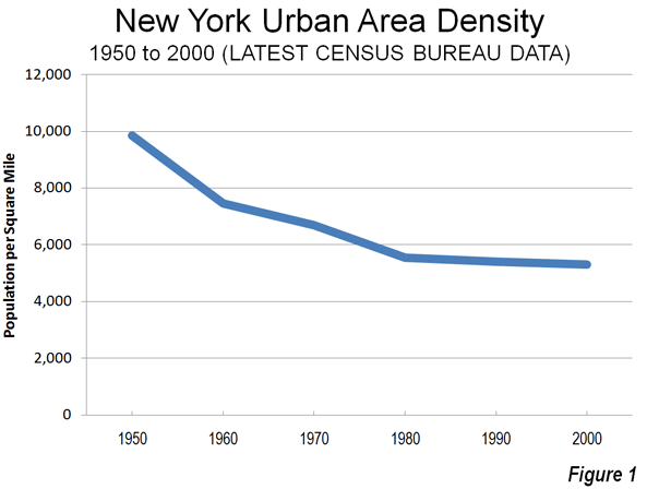
    Striking Out on Density: The strikeout results from assumptions that are patently wrong. Cities (urban areas) do not get more dense as they add population. They actually become less dense. For example, the New York urban area has added 50 percent to its population since 1950, yet its population density has dropped by 45 percent (Figure 1). Between 2000 and 2010, most metropolitan population growth, whether in San Francisco, New York, Phoenix, Portland or Houston, was in the lower density suburbs (see: http://www.city-journal.org/2011/eon0406jkwc.html ). The same dispersion is occurring virtually around the world (see: http://www.demographia.com/db-evolveix.htm), from Seoul, to Shanghai, Manila and Mumbai. Rapid urban growth would mean even further dispersion and lower densities, not the higher density neighborhoods Avent imagines. Nonetheless, allowing the more affordable detached housing that people prefer would likely lead to stronger economic growth and more affluent residents in the San Francisco and other over-regulated metropolitan areas.

    A "Yes, But" on Productivity: Any comparison of incomes between metropolitan areas needs to take into consideration the cost of living. For example, the San Francisco Bay Area (San Francisco/San Jose) is one of the most expensive places to live in the country. The median house price is more than 2.5 times that of Phoenix, after accounting for income differentials. Avent does not control for the difference in the cost of living, which is largely driven by the higher cost of housing. The lower cost of living neutralizes much of the impact of lower incomes (such as in Houston) in metropolitan areas like Houston, Dallas-Fort Worth, Indianapolis, etc., where the OPEC model has not been applied to land use regulation.

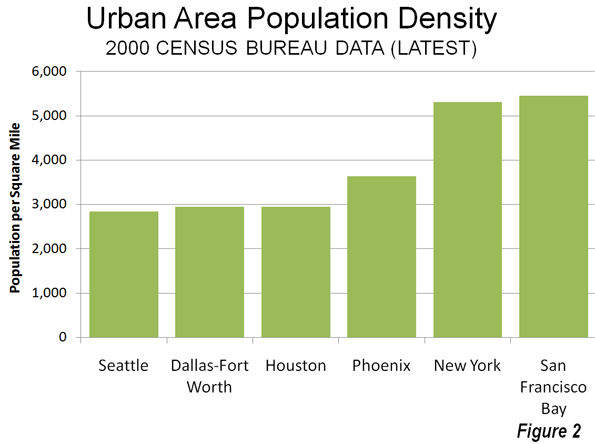
    Finally, even controlling for the cost of living, there are substantial exceptions to any density-productivity thesis. For example, some of the greatest productivity gains information technology have come out of the Seattle area, which is the least dense major urban area in the 13 Western states, less dense than Houston, Dallas-Fort Worth and Phoenix. Even more impressively, Seattle’s urban density is barely one-half that of New York or San Francisco (Figure 2), yet its gross domestic product per capita is higher than New York and within 2 percent of San Francisco/San Jose. Seattle’s substantial contribution to the nation’s productivity has occurred while its population density was declining nearly 15 percent (since 1980).  

    Avent, like many analysts before appears to presume that population growth means higher densities. In fact, urban areas grow by dispersing, not densifying.

  • Interactive Graphic: Job Growth by Sector for all Counties in the Nation

    The fully interactive map below indicates job growth and decline for all US counties from 2006 to 2011. These show up as hot or cold spots; red for growth, blue for decline. You can select a state to zoom in on and find a county that way, or simply click on a county to drill in. Once you’ve chosen a county, the table under the map will show you job numbers by industry category.

    The data for this graphic comes from EMSI’s Complete 2011.3 dataset, based on data from the Bureau of Labor Statistics and many other sources. Many thanks to Tableau for putting this together. If you have questions or comments about the graphic or the data behind it, please email EMSI’s Josh Stevenson.

  • Sizing Up Texas’ Job Growth Under Rick Perry

    Now that Texas Gov. Rick Perry is officially in the running for the Republican presidential nomination, journalists and econ bloggers from almost every national news outlet have examined the Texas’ economy in excruciating detail. The fact that Texas has produced nearly 40% of all new jobs in the US since 2009 has been regurgitated over and over again, and the state’s remarkable population spike has repeatedly been cited as a reason for the big employment growth.

    But more than those shared story lines, writers have offered another strikingly similar theme in their Texas critiques: many have pointed to the wave of oil and gas jobs as the key driver of the state’s economic boom.

    To be sure, energy employment is part of Texas’ growth, as EMSI highlighted in June. But it’s far from the biggest part. CNNMoney did a nice job laying out the super-sectors that have done well in the Lone Star State, and we’re going to drill down even further using EMSI’s detailed data to see which specific industries are fueling the state’s growth.

    How Texas Stacks Up

    It’s true that Texas has accounted for a large share of new jobs in the US, and that’s not just the case since 2009. Going back to 2001, Texas has added more than 2.1 million jobs, according to EMSI’s latest complete dataset, while the rest of the nation has combined for 6.2 million new jobs.

    But Texas is a massive state, of course, with a population of more than 24 million. So to even the playing field, let’s look at percentage job growth.

    As it turns out, there are only four states that have grown from 2001 to 2011 and from 2009 to 2011.

    Like Texas, Wyoming and Utah have also had 18% growth since 2001, but no state has performed better since 2009 than North Dakota. Its employment base has grown 5% in the last two years, compared to 2% for Texas. But because North Dakota has a much smaller population — and workforce — than Texas, its growth typically doesn’t get mentioned in discussions like these.

    Energy is a Big Player — But Not the Biggest One

    Oil and gas extraction employment in Texas has more than doubled in the last 10 years, and support industries for drilling have also boomed. Altogether, the mining, quarrying, and oil and gas extraction sector has jumped from over 230,000 jobs in 2001 to just under 490,000 in 2011.

    But that’s only a fraction of the 14.2 million jobs in the state, and the oil and gas growth accounts for slightly more than 10% of all new jobs in the state since 2001.

    What have been the biggest job gainers? Health care and social assistance (421,000-plus) and government (nearly 282,000) have made the largest additions to their payrolls in the last decade. It should be noted, however, that government jobs have declined in the last year — and were growing stagnant before then.

    Yet once you extract federal government jobs, it’s clear that state and local government employment is doing considerably better in Texas than other states. Texas is one of 10 states that have seen increases in state and local government jobs since 2009, and its growth (29,287) is nearly nine times that of the state with the second-most growth, Kentucky (3,327).

    These numbers don’t exactly bolster Perry’s small-government agenda claims.

    State and Local Government Job Change (2009-11)

    In terms of detailed sub-sectors, temporary health services, crude petroleum/natural gas extraction, and home health services have been the strongest performers in Texas since 2009. Overall, 19 industries have added at least 5,000 jobs since ’09, of which electric power distribution has had by far the largest percent growth (111%).

    NAICS Code Description 2009 Jobs 2011 Jobs Change % Change
    561320 Temporary Help Services 171,096 204,456 33,360 19%
    211111 Crude Petroleum and Natural Gas Extraction 290,638 317,388 26,750 9%
    621610 Home Health Care Services 240,018 263,099 23,081 10%
    930000 Local government 1,240,713 1,261,970 21,257 2%
    213112 Support Activities for Oil and Gas Operations 89,179 108,765 19,586 22%
    221122 Electric Power Distribution 11,840 25,038 13,198 111%
    722110 Full-Service Restaurants 371,893 385,081 13,188 4%
    814110 Private Households 113,106 125,148 12,042 11%
    621111 Offices of Physicians (except Mental Health Specialists) 198,795 210,077 11,282 6%
    622110 General Medical and Surgical Hospitals 265,013 274,810 9,797 4%
    920000 State government 354,190 362,219 8,029 2%
    551114 Corporate, Subsidiary, and Regional Managing Offices 90,157 98,159 8,002 9%
    213111 Drilling Oil and Gas Wells 34,826 42,562 7,736 22%
    425120 Wholesale Trade Agents and Brokers 58,575 64,461 5,886 10%
    452112 Discount Department Stores 63,272 69,137 5,865 9%
    561720 Janitorial Services 152,316 157,919 5,603 4%
    623110 Nursing Care Facilities 99,246 104,651 5,405 5%
    561110 Office Administrative Services 88,376 93,599 5,223 6%
    522110 Commercial Banking 112,482 117,698 5,216 5%

    Key Regional Industries

    We also looked at the most concentrated industries in Texas, as compared to national employment concentration, to see which industries are unique to the state and tend to be export-oriented. Oil and gas extraction — and the production of equipment for extraction — figure prominently among this group of industries.

    Crude petroleum/natural gas extraction is more than 4.5 times more concentrated in Texas than the nation, and it accounts for more than 300,000 jobs. Other industries with high LQs and large employment bases: support activities for oil and gas operations; engineering services; and office administrative services.


    For more on Texas’ economy, be sure to read Tyler Cowen’s post at Marginal Revolution. And for more on Texas’ growth, check out this piece on the top cities in the US.

    Illustration by Mark Beauchamp

  • Houston’s Not Resilient? Really?

    Alert reader Jessie sent me this article about Houston ranking "very low" on a "resilience capacity index".  For real.  I was dumbfounded too. And now I’m going to post out-of-character and get a little snippy…

    Let’s skip right past the parade of articles and data showing Houston and Texas weathering the great recession better than just about everywhere else in the country.  It’s so strong Rick Perry might win the Republican presidential nomination based on it.  That alone should make them question their entire methodology.  Go back to the dot-com and Enron crashes, and you’ll find the same minimal impact.  Sounds like we’re pretty resilient to me.

    Then there’s their explicit declaration that it represents the ability of a city to weather the shock of a major storm or flood.  I’ll point to both Tropical Storm Allison and Hurricane Ike.  Both were devastating – yet we bounced back relatively quickly from each one.  You might note on their map that New Orleans ranks higher than Houston, yet Hurricane Katrina knocked New Orleans on its back for years.  Maybe they need to add a "levees upkeep" variable to the index?

    Let’s look at some of the problematic variables that make up the index:

    • Economic diversification: I’ll admit there’s some value here, but it’s also worth noting that some of the wealthiest and most successful cities in the country built that success around one strong, dominant industry: NYC and finance, DC and govt, SF/SV and tech, Houston and energy, etc.
    • Income equality: also a proxy for "we don’t have any high-paying industries" – nor the corresponding tax base.  How is this helpful for resilience? (more on the value of income disparity here)
    • Educational attainment, being out of poverty, and home ownership: a proxy for using tight zoning and land-use regulation to keep out apartments, new and affordable housing, and immigrants.
    • Metropolitan Stability: aka "stagnation".  Cities that aren’t growing have amazingly stable populations because nobody wants to move there and none of the residents can sell their houses.

    My cynical side thinks that, since the University of Buffalo put this out, they intentionally chose variables that made Buffalo look good, even though it’s one of the most stagnant metro economies in the country.

    All in all one of the worst designed indexes I’ve ever seen – and there are some doozies out there.

    OK, I feel better.  End venting (and snippyness).

    Read more from Tory at HoustonStrategies.com.