Tag: Economy

  • Infographic: Which Industries Are Growing in Your State?

    EMSI teamed up with Tableau Software to create this industry data display. You can visualize every broad-level (2-digit NAICS) industry by state over the last decade. Also, click on the dot for each state to see the trends for each sector. The bigger the dot, the more jobs that state has in the selected industry. It may take a few seconds to load.

    A few observations:

    1. Right off the bat, you can see the explosive growth of the mining sector nationally over the past few years. If you scroll to mining and oil exploration in the dropdown or isolate it by clicking on the chart, you can see Texas has by far the largest number of jobs among all states. We covered this sector and specific oil and gas extraction occupations in depth recently.

    2. One of the cool things to do is scroll through each year to see the changing complexion of employment. There’s widespread growth projected for most states in 2011, with a few exceptions, but clicking back through the past few years shows a much different picture.

    3. Another intriguing sector is manufacturing. In the last decade, it hasn’t fared well. That much is clear. But notice the tide start to shift in 2010, with Indiana and Michigan showing slight growth. And in 2011, nearly three-quarters of the US is expected to see job expansion.

  • Turn the Focus Towards Australia’s Regional Towns

    Too much property reporting and media attention is given to our capital cities, and not enough effort is spent analysing our regional towns. 

    As a result, too few investors understand Australia’s regional potential.  Right now, not only are many of our regional centres at the bottom of their cycle, but larger, long-term trends are at play.  Indeed, regional Australia is on the cusp of some big demographic changes. 

    Here’s why:  In recent years our capital cities have attracted around two-thirds of Australia’s population growth, with many of these new residents settling in the outer suburbs. Our capitals also generated the lion’s share of employment. 

    But over the last twelve months or so, this trend has shifted, with close to two-fifths of our new jobs now being created away from our major cities and in regional towns.  Past trends suggest that population growth will follow. 

    Deteriorating lifestyle (and rising costs) – in our three major capitals, at least – is likely to add further momentum to this new regional push.

    It’s not too hard to understand why Australia’s regional areas are sometimes overlooked.  A quick look at the demographics of Australia reveals a country the same size as mainland USA, or 20 times the size of Japan, with only eight capital cities throughout its eight states and territories.  This is one of the most urbanized countries in the world, where only 15% of the population resides in rural areas and a vast interior.   

    This week, regional focus has come under the microscope with the unveiling of the 2011 Federal Budget by Australia’s Deputy Prime Minister and Treasurer, Wayne Swan.   The Government plans to flood regional areas with 16,000 skilled migrants via the introduction of new initiatives to encourage skilled migration to regional areas.

    Additionally, regional areas are set to receive critical infrastructure upgrades to hospital and health services, and funding to support strategic planning and growth. 

    Astute property buyers should start to look beyond the capitals for investment opportunities.  The big winners in this regional resurgence will most likely be the resource towns – the “muscle towns”, as Bernard Salt recently called them. 

    By this, we don’t mean the fly-in-fly out places like Moranbah, but places critical to the delivery of iron ore, gas and coal – like Wollongong, Newcastle, Gladstone, Surat Basin (Toowoomba) and Townsville.  Expect big things in these regions.  Two thirds of the new jobs created across Queensland last year were in the Gladstone region alone.

    Regional Australia is to become a whole lot more.

  • Mixed News on Trade

    The Department of Commerce released trade balance numbers for January this morning, reporting that the monthly deficit jumped to $46.3 billion, up from $40.3 billion in December. Economists had been projecting a deficit of $41.5 billion. The larger than expected number may lead some economists to “lower their estimates for economic growth in the January-March quarter based on the wider deficit.”

    However, buried within the dark clouds is a silver lining. U.S. exports actually hit an all time high of $167.7 billion during the month, potentially showing signs of a strengthening economic recovery. This is up from $125.4 billion in January, 2009 and $144.7 billion in January, 2010. American exporters appear to be on a roll, and gaining momentum.

    Exports of services also continues to be a point of trade strength for the nation. While year over year increases were smaller than those in overall exports (47.2 billion, up from 44.2 billion in January, 2010) the nation actually had one month trade surplus of $13.4 billion in services. This is up from past years, and is not an anomaly- the nation has marked a trade surplus in the services sector throughout the past two years.

    The increase in the size of the deficit can largely be attributed to issues in two areas; petroleum and consumer goods. As oil prices continue to rise, the cost of oil imports have surged as well. In January alone, the nation imported 34.9 billion in petroleum products, leading to a deficit of $26.7 billion. This represents an increase of 21.5% over last January, and up 4.7% over the previous month.

    The rise in the consumer goods deficit may actually be good news, of a sort. While the deficit itself is disconcerting, the detailed numbers show that imports of apparel, textiles, appliances, and other household related products are up notably. While increased imports in these sectors serve to worsen our trade balance with China (up to $23.3 billion in January, from $20.7 billion in December), increased demand for such retail goods could be a sign that the American economy, largely centered around consumer spending, is starting to catch some momentum again. According to economist Joseph LaVorgna, interviewed by CNN, while the deficit is wider, “the numbers actually imply a very healthy economy… The gain in imports was in every category. Domestic demand is still very firm and producers are rebuilding their inventories.”

  • New Metro GDP Data Released

    The Bureau of Economic Analysis yesterday released the 2009 data for metropolitan area GDP. Their headline, “Economic Decline Widespread in 2009,” should come as a surprise to no one.

    The BEA focuses on the year on year change. I’d rather look at the full span of the data that’s available, which is now 2001-2009. Here’s a look at percent change in total real metro area GDP during that time period:

    And here are the top ten metro areas over one million in population on this metric:

    Row Metro 2001 2009 Pct Change
    1 Portland-Vancouver-Hillsboro, OR-WA 81,505 114,028 39.90%
    2 Oklahoma City, OK 43,835 59,532 35.81%
    3 Austin-Round Rock-San Marcos, TX 55,466 75,136 35.46%
    4 Las Vegas-Paradise, NV 63,730 82,255 29.07%
    5 Orlando-Kissimmee-Sanford, FL 71,940 91,400 27.05%
    6 Phoenix-Mesa-Glendale, AZ 138,780 174,617 25.82%
    7 Washington-Arlington-Alexandria, DC-VA-MD-WV 294,656 368,793 25.16%
    8 San Jose-Sunnyvale-Santa Clara, CA 117,447 146,448 24.69%
    9 Salt Lake City, UT 48,157 59,603 23.77%
    10 San Diego-Carlsbad-San Marcos, CA 126,875 155,850 22.84%

    Per capita tells is a little bit different story. Here’s a map of US metro areas for percent change in real GDP per capita:

    The stunning collapse in real per capita GDP and also the erosion in per capita personal income relative to the nation is one of the key reasons I see Atlanta as a region with far more troubles than is generally assumed.

    Here are the top ten large metros again:

    Row Metro 2001 2009 Pct Change
    1 Portland-Vancouver-Hillsboro, OR-WA 41,256 50,863 23.29%
    2 Oklahoma City, OK 39,573 48,507 22.58%
    3 San Jose-Sunnyvale-Santa Clara, CA 67,299 79,604 18.28%
    4 San Diego-Carlsbad-San Marcos, CA 44,252 51,035 15.33%
    5 San Francisco-Oakland-Fremont, CA 63,260 72,259 14.23%
    6 Los Angeles-Long Beach-Santa Ana, CA 46,147 52,158 13.03%
    7 Washington-Arlington-Alexandria, DC-VA-MD-WV 59,801 67,344 12.61%
    8 Virginia Beach-Norfolk-Newport News, VA-NC 37,960 42,521 12.02%
    9 Buffalo-Niagara Falls, NY 31,160 34,472 10.63%
    10 New Orleans-Metairie-Kenner, LA 49,100 53,835 9.64%

    All I can say is, this data looks great for Portland. That city isn’t perfect to be sure, but on the GDP side of the house, the plan is working beautifully. Contrary to slacker stereotypes, high value work is increasingly being produced there.

    Aaron M. Renn is an independent writer on urban affairs based in the Midwest. His writings appear at The Urbanophile.

  • The Rest of the Story on Krugman and the Economy

    Paul Krugman really doesn’t like the possibility that there is a structural shift in employment, because it weakens the argument for the massive Keynesian spending spree he’d like to see the government initiate.  To that end, he published this piece on his blog February 13th.

    Before we go on, some readers may wonder what a structural shift is and why it weakens the argument for Keynesian spending.  A structural shift is when employment permanently shifts (well, as much as anything is permanent in economics) from one economic sector to another, say from construction to healthcare.

    The reason that a structural shift weakens the Keynesian’s argument is that moving workers from one sector to another takes time.  They may need retrained.  They may need to move to another location.  Think of our construction worker moving to health care.  He or she probably doesn’t have the skills to be immediately employable in health care.  Some sort of education or training has to happen first.

    This poses a problem for Keynesian expansionists, because their argument is that the only problem is a drop in aggregate demand (consumer spending) brought about by….well, animal spirits.  Since there is no real problem, government can increase spending (it doesn’t matter what you spend the money on.  You could dig holes and fill them back up), fool the consumer into thinking she is better off, and voilá, aggregate demand goes up with the government spending.

    Problem solved.  It’s a beautiful thing.

    However, spending can’t solve the problem of unemployment brought about by a structural shift.  It takes time to retrain the affected workers.  There are things government can do to speed the process, but spending willy-nilly is not one of them.

    Hope that clears things up.  Let’s get back to Krugman’s piece.

    He claims that unemployment in every sector has just about doubled since the recession began, and that this is proof that no structural shift is going on.  He has a nice chart to show the increase in unemployment by sector.

    There is a problem though.  The Bureau of Labor Statistics—the same source that Krugman claims originated his data—reports that construction jobs fell by 2 million, or 26.7 percent, from December 2007 through December 2010, while education and healthcare jobs grew by1.2 million, or 6.5 percent.

    This appears to contradict Krugman’s data, but it is possible that both sets of data are true.  If they are both true, then Krugman is being no less dishonest than if he created his numbers out of thin air.
    If Krugman is telling the truth when he presents a graph showing that unemployment approximately doubled from 2007 to 2010 in both the construction and the education and healthcare sector, then is must be that large numbers of unemployed construction workers migrated to being unemployed education and healthcare workers.

    There is no other possible explanation.

    This, of course, completely contradicts Krugman’s argument.  If his data are true, he’s using data that confirms a structural shift to argue that there is no structural shift, by neglecting to disclose the jobs data I’ve disclosed above.

    Krugman is not a dumb guy.  He has a well-deserved Nobel Prize for his work on international economics.  He has a career of looking at data, in depth and with insight.  His failure to provide the entire story has to be considered something besides an oversight.  We have to conclude that he’s purposely being deceitful.

    I don’t know why a guy with all of Krugman’s gifts and accomplishments would use data deceitfully.  It is a shame, though, that an economist at the top of his profession and with the New York Times bullhorn uses that bullhorn to confuse instead of to enlighten.

  • The Great Plains: An Old Frontier May Hold The Secret to Recovery

    Could the next zone of opportunity exist in the middle of the country? Census unemployment figures seem to signify this notion, especially in the Great Plains.

    State-wise, November 2010 unemployment rates were lowest in North Dakota at 3.6%; South Dakota at 4.6%; Nebraska at 4.9%; Kansas at 6.5%; and Iowa at 6.8%. Compare these numbers to the ever-growing Sunbelt states where unemployment is at its most dismal with Arizona at 9.6%, California at 12.4%, and Nevada at a depressing 14%.

    The top ten cities with the lowest unemployment rates are all found in the Midwest and the Great Plains, with the exception of Burlington, VT and Portsmouth, NH. The strength of the growing, younger manufacturing industry that escaped the huge manufacturing employment declines in the 80s and 90s may be fueling the prosperity in the plains.

    Upon closer inspection of the economies of these cities, a few common denominators are revealed. Health care is a prevailing industry recurrent across many of the cities. Unsurprisingly, agribusiness and manufacturing also dominate, along with insurance services, food processing, and, in some cases, higher education.

    Metromonitor prepared this interesting piece using data from the Bureau of Labor Statistics allowing one to see unemployement rates throughout the Midwest and the Rust Belt that appear to be on the rebound. The bottom map is of particular interest: One year’s growth has shown a decrease in unemployment throughout much of the Rust Belt, while cities in California and Florida consistently flounder. As far as overall performance, many cities in the Midwest – and much of the Great Plains – remain strong out of the recession and are comparable to the sturdy Texan cities that possess surging economies.

    Perhaps these urban centers across the Midwest, and especially the Great Plains, should be viewed as models for effective economic development. Large cities throughout the Great Plains offer integral services not found for miles and serve as regional havens for essential activities such as health care, education, business services, and food processing. Meanwhile, cities with declining industries, exploding real estate prices, and a surplus of workers suffer. Areas such as the Sun Belt, California, Florida, and some Northeastern cities bare the weight of this dilemma. Our focus should rest on the well-grounded economies of the often-ignored flyover states, instead of those on the crumbling coasts.

  • Krugman’s Muddled Argument Against Texas

    Last week NYT columnist and economist Paul Krugman wrote a very popular column pointing to Texas’ revenue shortfall and declaring it an example of the failure of conservative government.  I found the whole piece a muddled mess and dismissed it, but you can’t believe the notes I’ve gotten from people requesting a response.

    The thing is, I don’t really get his point. The bad national economy was going to cut state revenues no matter what. Is he saying we’d be better off if we had a fat government with easy cuts, instead of a lean government with tough cuts?  How much sense does that make?

    The nice thing about delaying my response is that others have already made great cases against the column (saving me the work).  Kevin Williams at the National Review is a bit sarcastic for my tastes, but makes several great points – the main ones being:

    • there’s no such thing as a shortfall in Texas, since we use zero-based budgeting (i.e. we start from nothing building every budget with no assumptions from prior years), and
    • our unemployment rate, which is better than the national average, is even more impressive when you consider our huge population gains and the jobs we’ve had to provide just to keep up with it.

    Bill Watkins here at New Geography also lays into Krugman’s fuzzy thinking:

    “People are not as stupid as many Nobel Prize winners might think; they move for opportunity, not just for cheap houses or low-paid work.”

    Then he comes up with a great new acronym:

    “A business moves to or expands in a region based on a whole host of reasons. These include available infrastructure, resource availability, market size and location, labor supply and costs, worker productivity, facilities costs, transportation costs, and other costs. Those other costs include what I call DURT (Delay, Uncertainty, Regulation, and Taxes).”

    Conveniently, the Wall Street Journal made the case for Texas’ growth and opportunity the next day:

    WSJ.com – Opinion: The Great Lone Star Migration

    Today one out of 12 Americans lives in Texas—the same proportion that lived in New York City in 1930.

    …Finally there is Texas. In 1930 there were (rounded off) six million people in the Lone Star State versus 13 million in New York. In 1970 there were 11 million in Texas and 18 million in New York: Each had grown by about five million. But in 2010 there were 25 million in Texas and 19 million in New York.

    Back in the 1930-70 period, liberal political scientists hoped and expected that America would become less like Texas and more like New York, with bigger government, higher taxes and more unions. In one important respect—the abolition of legally enforced racial segregation—that has happened. But otherwise Americans have been voting with their feet for the Texas model, with its low tax rates, light regulation and openness to new businesses and enterprises.

    Today one out of 12 Americans lives in Texas—the same proportion that lived in New York City in 1930. Metropolitan Dallas and metropolitan Houston, with about six million people each, threaten to overtake our fourth largest metro area, San Francisco Bay (population about seven million), in the next decade.

    That doesn’t seem to be much of an indictment of Texas’ approach to governance…

    That’s not to say the next budget is going to be easy.  A lot of hard tradeoffs will have to be made.  But it’s pretty clear Texas is a very far cry from being a failed state.

  • The Amazing Truth About PISA Scores: USA Beats Western Europe, Ties with Asia

    Once we correct (even crudely) for demography in the 2009 PISA scores, (PISA is the Program for International Student Assessment) American students outperform Western Europe by significant margins and tie with Asian students. Jump to the graphs if you don’t want to read my boring set-up and methodology.

    The main theme in my blog is that we shouldn’t confuse policy with culture, and with demographic factors.

    For instance, education scholars have known for decades that the home environment of the kids and the education levels of the parents are very important for student outcomes. We also know that immigrant kids have a more difficult time at school, in part because they don’t know the language.

    Take me as an example. The school me and my brother attended was in a basement in Tehran, had no modern resources, and largely focused on religious indoctrination. But we had a good home background. Our father attended a college in the west a few years (our mother didn’t, despite stratospheric scores test scores, because at the time you didn’t send a good Kurdish girl to another city to study). So we did well in school. Conversely, the first few years in Sweden I had bad grades, in part because I didn’t master the language.

    The point I am trying to make is that the school in Sweden was objectively superior to the school in Iran. But I scored lower in Sweden, because of factors outside the control of the education system. If you want to compare the effect of the school, you have to isolate those external factors and make an apples-to-apples comparison.

    However, this is not at all how the media is presenting the recent PISA scores. For example there is a lot of attention of the score of the kids in Shanghai, the according to the NYT is supposed to “stun” us or something.

    It’s dumb to compare one of the most elite cities in a country with entire nations, and to draw policy-inference from such a comparison. Shanghai has 3 times the average income of China! It is also naive to trust the Chinese government when they tell us the data is representative of the entire nation. Either you compare Shanghai to New York City, or you compare the entire country of China, including the rural part, with other large nations. Most of the news and policy conclusions we read about PISA-scores in the New York Times is thus pure nonsense.

    1. Correcting for the demography:

    In almost all European countries, immigrants from third world countries score lower than native born kids.

    Why? No knows exactly why. Language, culture, home environment, income of parents, the education level of the parents and social problems in the neighborhood and peer groups norms are among likely explanations. But it is generally not true that the schools themselves are worse for immigrants than natives. In welfare states, immigrants often (thought not always) go to the same or similar schools and have as much or likely more resources per student.

    So the fact that immigrant students in mixed schools do worse than Swedish kids used to a few decades ago in homogeneous schools does not it out of itself prove that Swedish public schools have become worse.

    Of course, the biggest myth that the media reporting of PISA scores propagates is that the American public school system is horrible.

    The liberal left in U.S and in Europe loves this myth, because they get to demand more government spending, and at the same time get to gloat about how much smarter Europeans are than Americans. The right also kind of likes the myth, because they get to blame social problems on the government, and scare the public about Chinese competitiveness.

    We all know that Asian students beat Americans students, which “proves” that they must have a better education system. This inference is considered common sense among public intellectuals. Well, expect for the fact that Asian kids in the American school system actually score slightly better than Asian kids in North-East-Asia!

    So maybe it’s not that there is something magical about Asian schools, and has more to do with the extraordinary focus on education in Asian culture, with their self-discipline and with their favorable home environment.

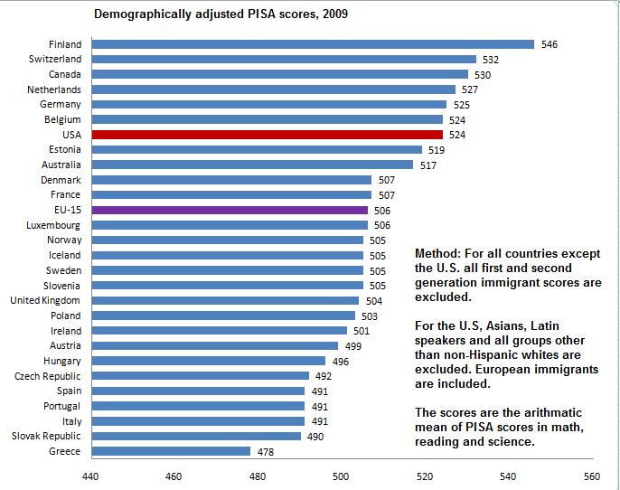
    There are 3 parts to the PISA test, Reading, Math, and Science. I will just make it simple and use the average score of the 3 tests. This is not strictly correct, but in practice it doesn’t influence the results, while making it much easier for the reader. (the reason it doesn’t influence the results is that countries that are good at one part tend to be good at other parts of the test.)

    The simplest thing to do in order to get an apples-to-apples comparison is to at least correct for demography and cultural background. For instance, Finland scores the best of any European country. However first and second generation immigrant students in Finland do not outperform native Swedish, and score 50 points below native Finns (more on this later).

    On PISA, 50 points is a lot. To give you a comparison, 50 points is larger than the difference between Sweden and Turkey. A crude rule of thumb here is that 50 points is 0.5 standard deviations.

    The problem is that different countries have different share of immigrants. Sweden in 2009 PISA data had 17%, and Finland 4%. It’s just not fair to the Swedish public school system to demand that they must produce the same outcome, when Sweden has many more disadvantaged students. Similarly schools with African-American students who are plagued by racism, discrimination, crime, broken homes, poverty and other social problems are not necessarily worse just because their students don’t achieve the same results as affluent suburbs of Chicago. In fact, the most reliable data I have seen suggests that American minority schools on average have slightly more money than white schools. It’s just that the social problems they face are too much to overcome for the schools. It is illogical to blame the public school system for things out of its hands.

    So let’s start by removing those with foreign background immigrants from the sample when comparing European countries with each other. I define immigrants here as those with a parent born outside the country, so it includes second generation immigrants. This is fairly easy for Europe.

    In the case of America, 99% of the population originates from other countries, be they England, Italy, Sweden, India, Africa, Hong-Kong or Mexico. If we want to isolate the effect of the United States public school system, we should compare the immigrant groups with their home country. For those majority of Americans whose ancestors originate from Europe, we obviously want to compare them with Europe. For some groups, such as Indians, this is inappropriate. The reason is that mainly the most gifted Indians get to migrate to America to work or study.

    However, as I have argued previously, there is strong reason to believe that this problem of so called biased selection does not apply to historic European migration to the United States at the aggregate level. The people who left Europe were not better educated than those who stayed. Immigrants were perhaps more motivated, but often poorer than average.

    So similar to my comparison of GDP levels, let us compare Americans with European ancestry (about 65% of the U.S population, and not some sort of elite) with Europeans in Europe. We remove Asians, Mexicans, African-Americans and other countries that are best compared to their home nations. In Europe, we remove immigrants.

    The results are astonishing at least to me. Rather than being at the bottom of the class, United States students are 7th best out of 28, and far better than the average of Western European nations where they largely originate from.


    The mean score of Americans with European ancestry is 524, compared to 506 in Europe, when first and second generation immigrants are excluded. So much for the bigoted notions that Americans are dumb and Europeans are smart. This is also opposed to everything I have been taught about the American public school system.

    For Asian-American students (remember this includes Vietnam, Thailand and other less developed countries outside Northeast Asia), the mean PISA score is 534, same as 533 for the average of Japan, South Korea, Singapore and Hong Kong. Here we have two biases going in opposite directions: Asians in the U.S are selected. On the other hand we are comparing the richest and best scoring Asian countries with all Americans with origin in South and East Asia.


    2. Policy-Implications

    Libertarians in the United States have often claimed that the public school system (which has more than 90% of the students) is a disaster. They blame this on government control and on teachers unions. However, it is completely unfair to demand that a public school in southern California where most of the students are recent immigrants from Mexico whose parents have no experience in higher education (only 4% of all Mexican immigrates have a college degree, compared to over 50% of Indian immigrants) should perform as well as a private school in Silicon Valley.

    The libertarians have no answer why European and Asian countries that also have public school systems score higher than the United States (unadjusted for demography). Top scoring Finland has strong teacher unions, just as California.

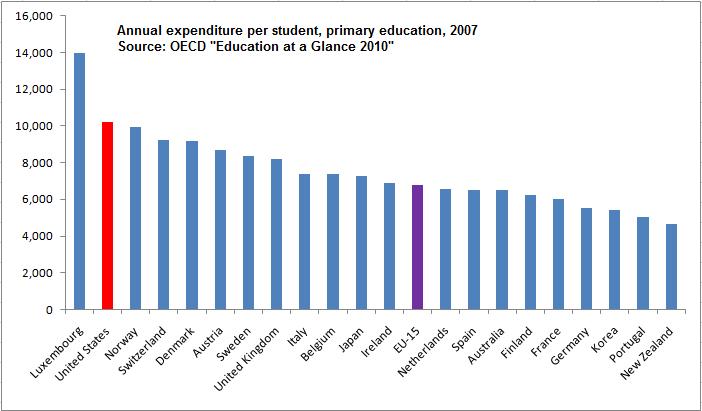
    Similarly, the left claims that the American education system is horrible, because Americans don’t invest enough in education. The left has no answer when you point out that the United States spends insanely more than Europe and East Asia on education. According to the OECD, the United States spends about 50% more per pupil than the average for Western Europe, and 40% more than Japan.


    Another policy implication is that Europe can learn from American public schools, which appear to be better than most European countries. I can only compare Sweden with the U.S, but I can tell you that from my experience, the American system is superior. I always thought this was just anecdotal evidence, but I am beginning to realize that American schools are indeed better.

    For example, we don’t have any real equivalent to Advanced Placements classes. We have cheaper and worse textbooks. The teachers on average have far less education. I could go on.

    Nor is it any longer a mystery to me why Americans spend so much more on education and (falsely appear) to get out less in output.

    But of course the biggest implication is that most Europeans and all American liberals have lost the bragging right about their side being smarter than Americans.

    3. Immigrant PISA scores compared to natives

    This is again the mean difference of the 3 parts of PISA.


    Australia is the only country with a negative gap, which means Australian immigrants actually score better than natives. Canada is similar. The Australian-Canadian skill based migration system is at work here, generating less inequality (even short term).

    The other pattern appears to be that the gap is almost constant in the remaining Western European countries. This may be important to keep in mind, whenever people claim that uniquely Swedish policies are causing poor immigrant educational outcomes.

    Tino Sanandaji is of Kurdish origins, and was born in Iran in 1980. In 1989 he moved together with his mother and brother to Sweden. He has a degree from the Stockholm School of Economics, his M.A in Economics from the University of Chicago and is expected to receive his PhD in Public Policy from the University of Chicago in 2011. His work has appeared in The Wall Street Journal, The New York Times, National Review, and numerous Swedish newspapers. Tino has been a resident of Hyde Park Chicago, since 2004.

  • State GDP Performance

    Gross Domestic Product is the basic measure of economic output. The government released 2009 GDP data for US states recently, so it’s worth taking a look. Here’s a map of percent change in total real GDP from 2000 to 2009, with increases in blue, decreases in red:

    As you can see, Michigan actually experienced a decline in its total real output over the last decade. Given the restructuring of the auto industry, that’s not surprising.

    Here’s another view, this one a similar percent change view of real per capita GDP:

    Here you can see that Michigan is not alone. Some of the fast growing Sun Belt states added people at a faster rate than they grew economic output. Georgia in particular is worth noting, because even metro Atlanta has been showing declining real per capita GDP. In fact, Georgia actually declined by more than Michigan did on this metric, so obviously all is not well down there. Texas, despite its vaunted jobs engine, is expanding almost totally horizontally. It is 9th lowest in the US on real per capita GDP growth, with a nearly flat 2% performance over the last decade.

    North Dakota is also interesting. They are leading the charts, I presume driven by energy and high tech. (Thanks to Great Plains software, I believe Fargo is now Microsoft’s biggest software development center in the US outside Redmond).

    This post originally appeared at The Ubanophile.

  • Missing the Point on Jobs: The “More Transit – More Jobs” Report

    The Transit Equity Network has just published a study called More Transit – More Jobs in which it suggests switching 50% of highway funding to transit in 20 metropolitan areas to create an additional 180,000 jobs over the next five years. Their basic thesis is that each kajillion in spending can produce more jobs in transit than in highways. We don’t comment on that, because, frankly, the purpose of transportation spending is neither to create transit jobs nor highway jobs.

    We spend on transit and highways because of benefits that extend beyond any direct employment. And, the extent of those benefits cannot be compared between the two modes. At current rates of spending each billion dollars spent on highways supports about 25 times as much personal mobility as one spent on transit. Beyond that, highway spending supports the movement of more than 1.25 billion ton miles of truck freight, which keeps product prices low and supports our affluent life style. Transit carries 0.0 ton miles of freight. Researchers such as Prud’homme & Chang-Wong and Hartgen & Fields have shown that the type of ubiquitous mobility provided by road systems produce greater economic growth. Moving money out of roads would increase traffic congestion, destroy jobs and increase product prices by slowing down trucks.

    Why, on earth, then would anyone make such a dubious proposal? To paraphrase Bill Clinton, “It’s the ideology, stupid.” As we wrote within the past week, much of transportation spending over the last 25 years has been solidly based in an anti-mobility ideology that has produced virtually nothing in return. Already, transit, which accounts for one percent of national travel and no freight movement, accounts for more than 20% of spending on highways and transit combined. Things would be better if that were raised to 60%?

    If the Transit Equity Network were right (which it is not), then why stop at 50% for transit? Why not take all of the transit and highway money and just employ people to dig holes with shovels and then fill them up again. The only costs would be wages, benefits, shovels and administration. We could save money by not buying concrete, rails, fancy trains or palatial administrative buildings. Another advantage is that the holes would require no longer term operating subsidies.

    So, we need to do more than dump the ideology. We need also to dump the stupidity. Government does not exist for the purpose of government services and transportation programs do not exist for the good of transportation employees or vendors. Each dollar of infrastructure expenditures should be used to facilitate the greatest economic benefit throughout society as a whole, not just among people employed in transit (or highways for that matter).