Tag: employment

  • The 2012 Year in Unemployment

    I recently looked at the changes in jobs in metro areas for 2012. Here’s a follow-on look at unemployment. First a look at the national unemployment rate picture, which has improved remarkably.


    2012 Unemployment Rate by County

    To put this in perspective, here’s the corresponding map for 2009:


    2009 Unemployment Rate by County

    It’s interesting to see where there has been improvement versus where there hasn’t, though I stop thresholding at 10% so that if people we well above it but dropped to just merely above it, my maps wouldn’t show that improvement.

    Here’s a look at the large metro areas, ranked by total decline in unemployment rate.

    Rank by Total Improvement Metro Area 2011 2012 Total Change
    1 Las Vegas-Paradise, NV 13.5 11.2 -2.3
    2 Orlando-Kissimmee-Sanford, FL 10.2 8.4 -1.8
    3 Tampa-St. Petersburg-Clearwater, FL 10.6 8.8 -1.8
    4 Miami-Fort Lauderdale-Pompano Beach, FL 10.2 8.5 -1.7
    5 Jacksonville, FL 9.9 8.3 -1.6
    6 Sacramento–Arden-Arcade–Roseville, CA 11.9 10.4 -1.5
    7 Birmingham-Hoover, AL 7.9 6.4 -1.5
    8 Cincinnati-Middletown, OH-KY-IN 8.6 7.1 -1.5
    9 Riverside-San Bernardino-Ontario, CA 13.6 12.1 -1.5
    10 Nashville-Davidson–Murfreesboro–Franklin, TN 8.1 6.6 -1.5
    11 Louisville/Jefferson County, KY-IN 9.7 8.3 -1.4
    12 San Jose-Sunnyvale-Santa Clara, CA 10.0 8.6 -1.4
    13 Columbus, OH 7.5 6.1 -1.4
    14 Kansas City, MO-KS 8.0 6.6 -1.4
    15 Houston-Sugar Land-Baytown, TX 8.1 6.8 -1.3
    16 Charlotte-Gastonia-Rock Hill, NC-SC 10.8 9.5 -1.3
    17 Seattle-Tacoma-Bellevue, WA 8.7 7.4 -1.3
    18 San Francisco-Oakland-Fremont, CA 9.4 8.1 -1.3
    19 Los Angeles-Long Beach-Santa Ana, CA 11.4 10.1 -1.3
    20 Salt Lake City, UT 6.7 5.5 -1.2
    21 Phoenix-Mesa-Glendale, AZ 8.5 7.3 -1.2
    22 St. Louis, MO-IL 8.8 7.6 -1.2
    23 Dallas-Fort Worth-Arlington, TX 7.8 6.7 -1.1
    24 San Diego-Carlsbad-San Marcos, CA 10.0 8.9 -1.1
    25 Detroit-Warren-Livonia, MI 11.6 10.5 -1.1
    26 Portland-Vancouver-Hillsboro, OR-WA 9.3 8.2 -1.1
    27 Atlanta-Sandy Springs-Marietta, GA 9.8 8.8 -1.0
    28 Austin-Round Rock-San Marcos, TX 6.8 5.8 -1.0
    29 San Antonio-New Braunfels, TX 7.5 6.5 -1.0
    30 Memphis, TN-MS-AR 10.0 9.0 -1.0
    31 Chicago-Joliet-Naperville, IL-IN-WI 9.8 8.9 -0.9
    32 Minneapolis-St. Paul-Bloomington, MN-WI 6.3 5.5 -0.8
    33 Raleigh-Cary, NC 8.5 7.7 -0.8
    34 Providence-Fall River-Warwick, RI-MA – Metro 11.1 10.3 -0.8
    35 Richmond, VA 7.1 6.4 -0.7
    36 New Orleans-Metairie-Kenner, LA 7.2 6.5 -0.7
    37 Cleveland-Elyria-Mentor, OH 7.8 7.1 -0.7
    38 Oklahoma City, OK 5.5 4.8 -0.7
    39 Denver-Aurora-Broomfield, CO 8.6 7.9 -0.7
    40 Hartford-West Hartford-East Hartford, CT – Metro 9.0 8.4 -0.6
    41 Milwaukee-Waukesha-West Allis, WI 8.0 7.4 -0.6
    42 Indianapolis-Carmel, IN 8.4 7.8 -0.6
    43 Baltimore-Towson, MD 7.7 7.2 -0.5
    44 Virginia Beach-Norfolk-Newport News, VA-NC 7.1 6.6 -0.5
    45 Boston-Cambridge-Quincy, MA-NH – Metro 6.6 6.1 -0.5
    46 Washington-Arlington-Alexandria, DC-VA-MD-WV 6.0 5.6 -0.4
    47 Philadelphia-Camden-Wilmington, PA-NJ-DE-MD 8.6 8.6 0.0
    48 Pittsburgh, PA 7.2 7.2 0.0
    49 New York-Northern New Jersey-Long Island, NY-NJ-PA 8.6 8.8 0.2
    50 Rochester, NY 7.8 8.1 0.3
    51 Buffalo-Niagara Falls, NY 8.1 8.5 0.4
  • Infographic: Growth of All Occupations by Industry & Education, 2001-2011

    We recently partnered with Catherine Mulbrandon at VisualizingEconomics.com to create a series of treemaps that illustrate important aspects of the labor market. In this post we provide a sneak peek at two of the graphics she created. The remainder will be posted in An Illustrated Guide to Income in the United States, a booklet from Catherine set to be released this summer.

    These two graphics are based on EMSI’s labor market database, which is a combination of over 80 public and private data sources. More specifically, the first table shows job change for all occupations by industry (based on 2-digit supersectors, as defined by the North America Industry Classification System) and the second shows occupation change by education level. The data is from 2001-2011.

    Red indicates decline and blue indicates growth.

    Each square on the graphic indicates a specific 5-digit occupation classified by the Standard Occupational Classification system. There are over 800 unique squares present on the charts. Large squares, like the ones on the upper right and in the retail trade sector, indicate a lot of jobs for the specific occupation code. Smaller squares indicate occupations with less jobs.

    In the graphic above we have pulled together occupation data related to all 20 NAICS supersectors. Government, health care, and retail trade have the largest employment. Utilities, mining, and management of companies have the fewest jobs. Also note the size of the squares within each industry sector. Here are a few observations:

    • Broad momentum. It is interesting to note how each broad industry sector tended to either be dominated by growth or decline. For instance, with very few exceptions, almost every occupation within the manufacturing sector declined from 2001-2011. The same holds true for construction, information, agriculture, and, to a certain extent, retail trade. Conversely, sectors like health care, educational services, professional/scientific/technical services, accommodation and even arts tended to show occupational growth.
    • Mixed sectors. Other industry sectors like finance, administrative, real estate, wholesale trade, and government were much more mixed.

    The graphic above shows the distribution of jobs across all levels of educational attainment. We use the same 5-digit SOC codes and group them according to what their typical educational attainment is. Where possible, occupation titles are included so you can get a sense of where certain jobs fall. Here are a few quick observations:

    • The OJT sectors (on-the-job training) are huge. This includes short-term OJT (lower right), moderate-term OJT (upper left), long-term OJT (middle right), and work experience in a related field (center). Also notice how the occupations in these sectors are less stable than the others. This is consistent with what was observed in the latest recession — jobs with higher education levels tend to perform better in tough economic times.
    • Advanced degrees showed growth. Over the past 10 years, every occupation associated with a more advanced degree (master’s, doctoral, professional) showed some sort of growth.
    • The other sectors have mixed results. Bachelor’s degrees showed more stability over the past 10 years, but there are a handful of occupations that declined since 2001. The same holds true for associate’s, postsecondary vocational awards, and degrees plus work experience.
  • Metro Job Recovery in 2011

    The latest BLS release for metro area unemployment has full year averages for 2011 available, so we can see which cities added the most jobs last year. On the whole, it was a much better year for metros than we’ve seen in the recent past. The national economy added jobs, and all but two large metros did as well. New York City added the most jobs of any region, but given that it is far and away the biggest city in America, it should do so. NYC ranked only the middle of the pack on a percentage growth basis. On that measure, Austin, Texas was number one.

    The top percentage gainer in the Midwest region? Detroit, Michigan. Perhaps this shouldn’t be surprising either, as manufacturing is pro-cyclical.

    Here is the performance of the metro areas in the United States with more than one million people, ranked by percentage change. The data is also available in spreadsheet form.

    Rank Metro Area 2010 2011 Total Change Pct Change
    1 Austin-Round Rock-San Marcos, TX 769.5 791.4 21.9 2.85%
    2 San Jose-Sunnyvale-Santa Clara, CA 855.2 878.2 23.0 2.69%
    3 Houston-Sugar Land-Baytown, TX 2528.1 2593.1 65.0 2.57%
    4 Charlotte-Gastonia-Rock Hill, NC-SC 807.5 826.7 19.2 2.38%
    5 Nashville-Davidson–Murfreesboro–Franklin, TN 734.3 751.7 17.4 2.37%
    6 Salt Lake City, UT 608.1 622.0 13.9 2.29%
    7 Detroit-Warren-Livonia, MI 1737.1 1775.3 38.2 2.20%
    8 Dallas-Fort Worth-Arlington, TX 2860.9 2921.7 60.8 2.13%
    9 Raleigh-Cary, NC 498.1 508.6 10.5 2.11%
    10 Pittsburgh, PA 1125.3 1148.6 23.3 2.07%
    11 Oklahoma City, OK 558.5 569.6 11.1 1.99%
    12 Tampa-St. Petersburg-Clearwater, FL 1112.0 1132.3 20.3 1.83%
    13 Portland-Vancouver-Hillsboro, OR-WA 968.8 986.1 17.3 1.79%
    14 Minneapolis-St. Paul-Bloomington, MN-WI 1697.1 1727.1 30.0 1.77%
    15 Baltimore-Towson, MD 1274.0 1293.5 19.5 1.53%
    16 Seattle-Tacoma-Bellevue, WA 1641.2 1666.1 24.9 1.52%
    17 Denver-Aurora-Broomfield, CO 1193.5 1211.6 18.1 1.52%
    18 Columbus, OH 903.3 916.9 13.6 1.51%
    19 Miami-Fort Lauderdale-Pompano Beach, FL 2185.6 2218.3 32.7 1.50%
    20 Phoenix-Mesa-Glendale, AZ 1688.9 1712.8 23.9 1.42%
    21 Atlanta-Sandy Springs-Marietta, GA 2272.6 2302.9 30.3 1.33%
    22 New Orleans-Metairie-Kenner, LA 519.1 526.0 6.9 1.33%
    23 San Antonio-New Braunfels, TX 843.0 853.2 10.2 1.21%
    24 Richmond, VA 602.4 609.5 7.1 1.18%
    25 New York-Northern New Jersey-Long Island, NY-NJ-PA 8306.8 8403.9 97.1 1.17%
    26 Indianapolis-Carmel, IN 871.1 881.2 10.1 1.16%
    27 Jacksonville, FL 583.1 589.6 6.5 1.11%
    28 Rochester, NY 503.1 508.7 5.6 1.11%
    29 Washington-Arlington-Alexandria, DC-VA-MD-WV 2962.9 2995.5 32.6 1.10%
    30 Hartford-West Hartford-East Hartford, CT – Metro 533.2 538.9 5.7 1.07%
    31 Chicago-Joliet-Naperville, IL-IN-WI 4246.6 4291.4 44.8 1.05%
    32 Milwaukee-Waukesha-West Allis, WI 805.8 814.1 8.3 1.03%
    33 Louisville/Jefferson County, KY-IN 592.9 599.0 6.1 1.03%
    34 Kansas City, MO-KS 971.6 981.4 9.8 1.01%
    35 Orlando-Kissimmee-Sanford, FL 1001.1 1011.0 9.9 0.99%
    36 Memphis, TN-MS-AR 589.8 595.4 5.6 0.95%
    37 Cincinnati-Middletown, OH-KY-IN 980.8 989.4 8.6 0.88%
    38 Buffalo-Niagara Falls, NY 538.2 542.7 4.5 0.84%
    39 San Francisco-Oakland-Fremont, CA 1880.2 1894.3 14.1 0.75%
    40 Boston-Cambridge-Quincy, MA-NH – Metro 2426.5 2443.3 16.8 0.69%
    41 Los Angeles-Long Beach-Santa Ana, CA 5126.8 5162.2 35.4 0.69%
    42 San Diego-Carlsbad-San Marcos, CA 1222.8 1231.2 8.4 0.69%
    43 St. Louis, MO-IL 1286.9 1295.4 8.5 0.66%
    44 Las Vegas-Paradise, NV 803.6 808.3 4.7 0.58%
    45 Riverside-San Bernardino-Ontario, CA 1125.9 1129.7 3.8 0.34%
    46 Philadelphia-Camden-Wilmington, PA-NJ-DE-MD 2697.0 2705.9 8.9 0.33%
    47 Providence-Fall River-Warwick, RI-MA – Metro 541.3 542.8 1.5 0.28%
    48 Virginia Beach-Norfolk-Newport News, VA-NC 735.2 736.8 1.6 0.22%
    49 Cleveland-Elyria-Mentor, OH 991.1 992.7 1.6 0.16%
    50 Birmingham-Hoover, AL 489.5 488.6 -0.9 -0.18%
    51 Sacramento–Arden-Arcade–Roseville, CA 809.9 802.0 -7.9 -0.98%

    This first appeared at Aaron’s blog, Urbanophile.com.

  • Urban Densities Exclude Rural Areas: Avent Postscript

    We recently noted that Ryan Avent was one third right in his recent Sunday New York Times article on urban density. Avent has posted a response suggesting that it is inappropriate to use average urban densities in urban productivity analyses, as we had done, but that "weighted average densities" should be used instead. Weighted average density was not mentioned in his New York Times article.

    In the interim, we were able to find the studies on urban density and productivity that seem to match those Avent refers to in his New York Times article. There are two studies concluding that doubling employment (not population) density increases productivity by six percent (Ciccone & Hall, 1996 and Harris & Ioannides, 2000), as Avent noted.  Another study (Davis, Fisher & Whited, 2007) indicates that doubling employment densities could increase productivity by as much as 28 percent, also as Avent noted.

    Urban and Rural Density Combined Are Not Urban Density: In contrast to Avent’s preference for weighted average density, each of the studies uses average density, like with our analysis. More importantly the econometric formulas in the studies do not include an urban density variable. The density variables in all three studies include rural areas.

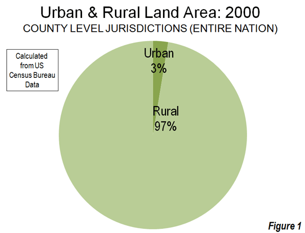
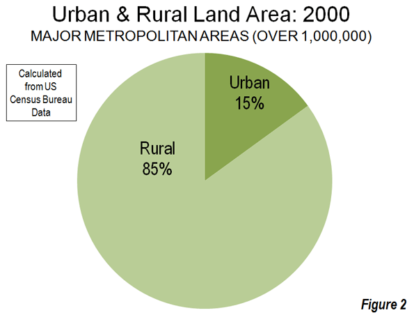
    The studies use county, metropolitan area and sub-metropolitan area densities, each of which contain far more rural land than urban land. By definition, urban areas exclude rural areas and, as a result, the moment rural areas become a part of the calculation, the result cannot be urban densities. In 2000, Census Bureau data showed counties (county equivalent level jurisdictions), which comprise the entire nation, to be less than three percent urban and more than 97 percent rural (Figure 1). Metropolitan areas also have a similar predominance of rural land (Figure 1). Among major metropolitan areas (those with more than 1,000,000 population) in 2000, approximately 85 percent of the land was rural and 15 percent of the land was urban (Figure 2).

    Ciccone & Hall use employment density at the county level and thus mix urban and rural densities. Harris & Ioannides use employment densities at the metropolitan statistical area or the primary metropolitan statistical area level (a sub-metropolitan designation since replaced by the more appropriately titled "metropolitan division"). Davis, Fisher & Whited use employment densities at the metropolitan statistical area level. The two studies using metropolitan areas or parts of metropolitan areas also mix urban and rural densities.

    Urban Area Densities: Urban density is calculated at the urban area level, which is the area of continuous urban development. This is also called the urban footprint, which is generally indicated by the lights of the city one would see from an airplane on a clear night. Urban areas are delineated using the smallest census geographical units ("census blocks," which are smaller than census tracts) each ten years. The 2010 data will be released next year. Among urban areas, the highest density core urban area in a major metropolitan area (Los Angeles) is approximately four times the lowest (Birmingham).

    Nonsensical Metropolitan Area Densities: Theoretically, metropolitan areas are labor market areas, which include a core urban area (and sometimes more than one urban area) and nearby rural areas from which people commute to work in the urban area (can be called the "commuter shed"). However, in the United States, metropolitan areas are too coarsely defined for density comparisons with one another. US metropolitan areas are composed of complete counties or, in the six New England states, complete towns. This jurisdictionally based criteria can produce metropolitan areas that are much larger than genuine labor markets in a number of cases and some that are smaller. American metropolitan areas are not spatially consistent by any functional labor market definition. Metropolitan densities are thus nonsensical, no matter what density is being measured (such as population or employment density). Among major metropolitan areas, the highest density metropolitan area (New York) is 24 times that of the lowest density (Salt Lake City), six times the maximum difference in urban area density.

    Metropolitan Ireland and Happenstance: In the similarly sized San Francisco (as used by Davis, Fisher and Whited) and Riverside-San Bernardino metropolitan areas, San Francisco has 1,700 square miles of rural land, while Riverside-San Bernardino has 26,000, approximately 15 times as much. At more than 27,000 square miles, Riverside-San Bernardino covers more land area than the Republic of Ireland. The difference in population densities between metropolitan areas is determined in considerable measure by the size (land area) of the included counties, not by the number of people in cities.

    If the state of California were to carve out a new county composed of western Riverside and San Bernardino counties (as Colorado created Bloomfield County in the early 2000s), the land area of the metropolitan area could be reduced 95 percent, because the remainder would not meet the criteria for inclusion in Riverside-San Bernardino. The importance of the density variable for Riverside-San Bernardino in econometric formulas would be increased many times. With only 3,100 county level jurisdictions of varying sizes, this kind of incomparability cannot help but occur. The boundaries of metropolitan areas are defined by political happenstance.

    On the other hand, the nation’s urban areas are built up from 7,000,000 census blocks. This permits a fine grained definition that makes urban areas appropriate for density comparisons. The definition of urban areas is beyond political fiat.

    Metropolitan areas in the United States could be readily defined at the census block level, just like urban areas. Regrettably, the Office of Management and Budget missed another opportunity in the 2010 census to make the necessary criteria change. U.S. metropolitan area data is of great value for most analysis, but misleading for spatial or density analysis.

    Low-Density Productivity: Subregionalizing the density and productivity analysis would pose problems. Avent uses household incomes as his standard (and we agree that cost of living differentials are important). The San Jose metropolitan area has the highest household incomes of any major metropolitan area and would therefore be among the most productive. Yet, San Jose’s automobile-oriented Silicon Valley, to which much of the productivity is attributable, has a far lower employment density than the transit and pedestrian oriented cores of Manhattan and San Francisco (and yes, even not-so-transit oriented downtown Phoenix). In low-density Seattle, Microsoft’s automobile oriented Redmond campus probably ranks among the most productive real estate in the country, yet its employment density (like that of Silicon Valley) pales by comparison to the higher density cores of Seattle, Phoenix, Nashville, Oklahoma City and virtually every other downtown core of a major metropolitan area.

    At the End, Agreement: Avent concludes, "I just want to make sure we stop costing ourselves easy opportunities for growth." I could not agree more. It is time to abandon regulations that artificially raise housing prices, deprive households of a better standard of living, and drive them to places they would rather not live. For centuries, people have flocked to urban areas for better economic opportunities. Urban areas should be places where people can realize their aspirations, not places that repel them because it doesn’t suit the interests of those already there.

  • Interactive Graphic: Job Growth by Sector for all Counties in the Nation

    The fully interactive map below indicates job growth and decline for all US counties from 2006 to 2011. These show up as hot or cold spots; red for growth, blue for decline. You can select a state to zoom in on and find a county that way, or simply click on a county to drill in. Once you’ve chosen a county, the table under the map will show you job numbers by industry category.

    The data for this graphic comes from EMSI’s Complete 2011.3 dataset, based on data from the Bureau of Labor Statistics and many other sources. Many thanks to Tableau for putting this together. If you have questions or comments about the graphic or the data behind it, please email EMSI’s Josh Stevenson.

  • Chicago, Portland: Employment Dispersion from Downtown Continues

    New data shows that the downtown areas of both Chicago and Portland (Oregon) are modestly dispersing and losing market share in relation to metropolitan area employment.

    Chicago: The Chicago Loop Alliance reports that private sector employment in the Loop, the core of the Chicago downtown area, fell from 338,000 to 275,000 between 2000 and 2010. An additional 30,000 government workers are employed in the Loop, however 2000 data was not provided for the government sector. As a result of the loss, the Loop private sector share of total Chicago metropolitan area employment fell 13 percent, from 7.7 percent in 2000 to 6.7 percent in 2010.

    The larger downtown area, including areas to the north (North Michigan Avenue area) and to the south had total private sector employment of 480,000. Chicago had the second largest downtown (central business district) in the nation in 2000, with an employment density of more than 160,000 per square mile and a transit work trip market share of 55 percent, trailing only the Manhattan business district (south of 59 Street) and the Brooklyn central business district).

    Portland: The Portland Business Alliance reported that downtown Portland employment had fallen from 86,800 in 2001 to 83,400 in 2009. This represents a four percent market share loss in comparison to the metropolitan area over the period. All of Portland’s growth over the period has been in suburban Clark and Skamania counties in Washington, which added 12,700 jobs, while the Oregon portion of the metropolitan area was losing 4,500 jobs.

    In 2000, Portland had the nation’s 22nd largest central business district, and the 12th highest transit work trip market share, at 30 percent (Brooklyn included).

  • Decentralized Growth and “Interstate” Highways in China

    Andrew Batston of The Wall Street Journal writes of China’s decentralization, with the growing employment in interior urban areas. Until the last decade, most of China’s spectacular urban population and employment growth had occurred on the East Coast, especially in the world’s largest megaregions of the Pearl River Delta (Hong Kong-Shenzhen-Dongguan-Guangzhou-Foshan-Jiangmin-Zhongshan-Zhuhai-Macao), the Yangtze Delta (Ningbo-Shaoxing-Hangzhou-Shanghai-Suzhou-Wuxi-Changzhou-Nangjing) and Beijing-Tianjin. Millions of migrant workers had traveled to the East Coast from the interior to take jobs paying far more than they could earn at home.

    But that has changed. Industrial production and jobs have expanded substantially in the interior, making it possible for people to take jobs closer to home, in Chongqing, Chengdu, Xian, Changsha, Wuhan, Shenyang, Taiyuan and many more urban areas. This is a fortuitous development, because the mega-regions are already sufficiently populated and could have well grown far larger if the interior development had not taken place.

    However, jobs have become more plentiful in the interior. China’s growing US interstate standard expressway (freeway) system has been an important contributor to this development. Like the US system, there are no grade crossings and all roadways have at least two lanes of traffic in each direction.

    Now, a number of interior urban areas are now within a day’s truck drive of the East Coast ports and those that are not are within two days. According to China Daily, the 65,000 kilometers (over 40,000 miles) of the national expressway system is open. This does not include extensive provincially administered systems, such as in Beijing, where four full freeway ring roads are open and a fifth is at least half complete (Beijing has six ring roads, but the first is not a freeway). Shanghai has an extensive locally administered freeway system, as do some other urban areas.

    By comparison, the US interstate system is approximately 46,000 miles (this excludes 1,000 miles of 2-lane interstate designated conventional highway in Alaska), and a total of 57,000 miles including non-interstate freeways. China is expected to displace the United States in freeway mileage by the end of the decade, when plans call for more than 60,000 miles.

    Photograph: National Expressway Route G-040 near Taiyuan, Shanxi

  • What Jobs?

    According to the Bureau of Labor Statistics, there were 290,000 more jobs in the US this month than there were last month. Twenty percent of those jobs were added by the federal government. While the federal government added 69,000 new jobs last month, every other level of government – including the post office – cut an average of 2,250 jobs. State governments were hardest hit last month, cutting 5,000 jobs.

    Since April 2009, the federal government has added 119,000 jobs while state and local governments cut 215,000 jobs.

    Compared to April 2009, more than 500,000 jobs have been added in employment services. Another 329,000 jobs were added in the healthcare industry. These must be the “green shoots” that we were so looking forward to last summer because the overall economy lost 1,380,000 jobs in the last year.

    Eighty percent of the jobs increase last month was added in the private sector. Of the jobs created in the private sector, only 22 percent were in goods producing industries; about half of the goods producing jobs added in the last month can be attributed to the bailout of the auto industry. In the last 12 months, the U.S. civilian population increased by 2.1 million persons. The labor force has remained about constant at 154.7 million. The difference – explained in the details of today’s jobs report – is attributable to discouraged workers, involuntary part-time workers, and marginally attached workers.

  • The Downtown Seattle Jobs Rush to the Suburbs

    There are few downtown areas in the nation that are more attractive than Seattle. Downtown Seattle is a dream of spontaneous order and a fascinating place well worth exploring. It is one of the nation’s great walkable downtown areas, with a mixture of older and newer buildings, hills, Ivars Acres of Clams and the Chief Seattle fire boat on Elliot Bay, Pioneer Square, the Pike Place Market (itself the home of the first Starbuck’s coffee) and a hyper-dense 100,000 jobs per square mile.

    Downtown boasts the L. C. Smith Tower, which from 1914 to 1966 was the tallest office tower in the west, at 42 floors and nearly 500 feet. Now Smith Tower ranks no better than 35th tallest downtown. Seattle has built so aggressively that a visitor to the observation deck would see more looking up than down. Smith Tower is dwarfed by a skyline containing some of the nation’s most impressive office architecture, such as Columbia Center and the Washington Mutual Building, which was named for the subprime mortgage lending champion.

    Downtown has many more historic landmarks, such as the Olympic Hotel and the Washington Athletic Club. The art-deco Northern Life Tower was the second tallest until the building boom of the 1960s and would have been the pride of more downtown areas than not. The 1970s Henry M. (Scoop) Jackson federal building is a rare gem of its age, while the Rainier Bank Building is perched on a tapered base that begs the question as to whether it will collapse before the Alaskan Way Viaduct in the great Cascadian subduction zone earthquake (which is due to strike sometime between now and the end of time).

    The Condominium Bust: Downtown Seattle has experienced one of the nation’s strongest central city condominium booms, though its success (and that of others) has long been drowned out by the high pitched chorus of the Portland missionary society. As in Portland, Atlanta, San Diego, Los Angeles and other newly resurgent downtown areas, Seattle’s condominium boom is now a bust as resembling that of a subprime-baby remote desert exurb halfway between San Bernardino and Las Vegas. Even so, the condominium neighborhoods of downtown Seattle are more attractive than what they replaced. Eventually, the large inventory of empty units will be sold or converted into rental units.

    The Office Bust: Downtown’s condominium bust has spread to its office market as well. The vacancy rate is now over 20%.

    The Employment Bust: Data from the Puget Sound Regional Council of Governments (PSRG) indicates the depth of the problem. From 2000 to 2009, employment in the downtown core declined more than 12%, with a loss of 20,000 jobs. But it would be a mistake to conclude that downtown Seattle’s employment decline stems from the Great Recession. The losses occurred before. In 2007, the last year before the recession, employment had fallen nearly 18,000 from 2000.

    Downtown Seattle’s employment decline mirrors trends around the nation and around the world. Now, downtown Seattle accounts for only 8.4% of employment in the four county area, something that would surprise an airline passenger looking at its verticalness from above.

    The balance of the city of Seattle has done somewhat better, having lost 3% of its employment since 2000.

    Suburban Job Ascendancy: All of the employment growth in the Seattle area has been in the suburbs. While the city, including downtown, was losing nearly 30,000 jobs, the suburbs of King, Pierce, Snohomish and Kitsap counties added 90,000 jobs (Table). Suburban Redmond, home of Microsoft, added 19,000 jobs all by itself. Even Tacoma, the old second central city and long since defeated challenger to Seattle added a modest number of jobs between 2000 and 2009.

    EMPLOYMENT IN THE SEATTLE AREA: 2000-2009
    Area 2000 2009 Change % Change
    Downtown         164,255         143,952       (20,303) -12.4%
    Balance: Downtown         338,580         329,182        (9,398) -2.8%
    Balance: King County         646,807         662,470        15,663 2.4%
    Kitsap County           70,854           81,617        10,763 15.2%
    Pierce County         234,619         264,402        29,783 12.7%
    Snohomish County         207,764         241,569        33,805 16.3%
    4-County Area       1,662,879       1,723,192        60,313 3.6%
    Compiled from Puget Sound Regional Council of Governments data.

    If You Built it, They Must be Going: With these trends, it might be expected that local transportation agencies would be rushing to provide sufficient infrastructure to the growing suburbs. Not so. Planners are scurrying about to build one of the nation’s most expensive light rail systems with lines converging on downtown, to feed 20,000 fewer jobs today and perhaps 30,000 or 40,000 fewer in the future. Perhaps this is the train “got a whole city moving again” as the television commercials put it?

    What about growing Redmond? It’s on the map. The line is scheduled to reach Redmond sometime between now and the end of time.

  • Forgetting Middle Skill Jobs

    A new report from Skills2Compete attempts to address a national problem which continues to diminish our country’s competitive edge in the global economy. The loss of middle-skill jobs and the lack of qualified workers to fill the remaining jobs are major barriers, not only to our economic recovery, but also to our ability to sustain a high quality of life for succeeding generations. The report concludes that a new state policy is needed to align the workforce and education and training to better meet California’s labor market demand. Accomplishing that goal means improving basic skills in the workforce and ensuring that skills training and education is available to anyone post high school. A major policy change is a good start, but the report does not go far enough in addressing what is needed to restore the importance of middle-skill jobs to the economy.

    Part of the challenge lies with the current mindset of the public education system and parents who value and push college as the only track to a well-paying and satisfying job. This leaves out a large segment of youth and the workforce who are not college bound and who need training and skills and encouragement to fill middle-skill jobs. Where does a high school student get vocational training or learn about middle skill jobs? Remember woodworking? Metal shop? Drafting?

    Vocational education was the name of the program that provided these courses, but now it’s labeled “career tech” and the classes are no longer available in most public high schools. As a result, students have little awareness of these careers. A few years ago, while conducting focus groups of freshman and sophomore students, I was stunned to learn that many did not know what an electrician, welder, auto technician, or HVAC technician did and worse, they disdained those jobs because they thought they were “dirty” and didn’t pay well. This doesn’t bode well for a functioning society or economy. Who will service our cars, fix our plumbing, and build machinery to process our food or the solar panels to heat our homes? It will take more than a policy change to transform awareness, perceptions and values about middle-skill jobs.

    The last economic boom was sustained, not by wealth created by high value manufacturing jobs, but by unbridled consumer spending particularly for houses and retail goods. If we want that standard of living to return, then we must address the greater challenge of how to grow and sustain an economy driven by production of goods instead of consumption. Along with a paradigm shift in our educational system that recognizes the importance of middle skill jobs, we must change our attitudes about work and what creates value not only for our economy but our worth to society.

    We continue to hold on to arcane principles and entitled expectations about work that are increasingly less relevant in a fast-paced globalized world. We are not prepared to re-invent ourselves and our careers in terms of continuous learning of new skills and training either for middle-skill or knowledge jobs. That is what is ultimately needed to succeed in the rapidly changing workplace.

    Leslie Parks has spent over ten years as a practitioner and consultant in the fields of economic and workforce development. She recently served as Director of Downtown Management and Industrial Development for the San Jose Redevelopment Agency until September 23, 2009 when she and 24 colleagues were laid off due to significant budget cuts. Leslie is now preparing for yet another career in the 21st Century workplace.