Tag: employment

  • The Fog of Stimulus

    The news is full of stories about the the impact of the ARRA on job creation, including this one from the The Wall Street Journal about a shoe store owner who created or saved nine jobs with less than $900.

    In the story, the Army Corps of Engineers spent $889.60 buying boots from shoe store owner Buddy Moore of Kentucky. Because the boots were purchased with ARRA funds, the Corps asked Buddy to report how many jobs the boot order had “created or saved.” He and his daughter struggled with paperwork, online forms, and a “helpline,” only to make a wild guess 15 minutes before the reporting deadline that they had created nine jobs.

    Though not completely spelled out in the article, the impression is that Buddy and his daughter reasoned that they had created or saved nine jobs, because their boots had “helped nine members of the Corps to work.”

    This sort of misreporting is now fodder for ARRA opponents, and is the last thing that the White House wanted on its hands. In July the Office of Management and Budget (OMB) issued this memorandum and created a series of PowerPoints and PDFs intended to assist ARRA recipients with their reporting.

    These documents do not appear to be currently available on the White House website, but you can find the Google doc here. This list (also not directly available) shows that the Army Corps of Engineers is and was considered a primary recipient. Given its status, it is the one required in the initial PowerPoint to report the “job creation narrative and number.”

    As a prime recipient, the Corps should have been briefed on the fact that the key data issue to avoid was: “Significant Reporting Errors: (which are) instances where required data is not reported accurately and such erroneous reporting results in significant risk that the public will be misled or confused by the recipient report in question.”

    They also would have had to listen in to this presentation on data quality, which stresses that prime recipients are fully responsible for the quality of the data. The Corps could have caught the reporting mistake by running a simple math equation, which would have indicated that the shoe store had created a full-time job for every $98.84.

    If this were true, only $2 billion (administered by Buddy Moore) would have reemployed every single unemployed person in the US, a savings of $785 billion to the American taxpayer.

    In the end, it turns out that because the payment made by the Corps was less than $25,000, the Corps (while responsible for reporting the total number and amount of small sub-awards less than $25,000) was not required to have Buddy Moore report anything.

    Prime recipients are still responsible to report a total jobs creation estimate based off what sub-recipients and vendors do with the funds they disperse. To do that, the Corps could have called up Buddy and asked him to estimate the extra hours he worked for that specific order, and calculated Full Time Equivalents using those hour(s) by “… adding the total hours worked by all employees in the quarter, and dividing by the total hours in a full-time schedule.”

    In this case, let’s assume he worked an extra hour filling the boot order. A quarter-year full-time job would take 520 hours to complete, so he would report that the Corps funds created 1/520 of a quarterly FTE (.001923 FTE), or just about 2/1000th’s of a full-time job for a quarter of the year. The shoe store’s estimate of job creation, therefore, was 4,680 times too big.

    The OMB’s method of job reporting is, by our estimation, a good way of quantifying job creation. The problem, highlighted by the WSJ article, is that average businesses and recipients have had a hard time understanding what data was needed in the first place, and then what they were supposed to do with it.

    Mark Beauchamp is a customer service representative at Economic Modeling Specialists Inc., an Idaho-based data and economic analysis firm.

    Illustration by Mark Beauchamp.

  • Riding Out the Recession in the Forty Strongest Metropolitan Economies

    A few days ago BusinessWeek released a list of the top 40 metropolitan economies based on data compiled at the Brookings Institution’s Metromonitor project. But, as many old media sites tend to do, they’ve locked the list behind a slow-loading slide show in a cheap attempt to drum up page views. Many of the commenters to the original article couldn’t even find the list.

    So, in the interest of usability, here’s the top 40 in boring list format:

    1 San Antonio, TX
    2 Austin-Round Rock, TX
    3 Oklahoma City, OK
    4 Little Rock-North Little Rock-Conway, AR
    5 Dallas-Fort Worth-Arlington, TX
    6 Baton Rouge, LA
    7 Tulsa, OK
    8 Omaha-Council Bluffs, NE-IA
    9 Houston-Sugar Land-Baytown, TX
    10 El Paso, TX
    11 Jackson, MS
    12 McAllen-Edinburg-Mission, TX
    13 Washington-Arlington-Alexandria, DC-VA-MD-WV
    14 Columbia, SC
    15 Pittsburgh, PA
    16 Harrisburg-Carlisle, PA
    17 Des Moines-West Des Moines, IA
    18 Virginia Beach-Norfolk-Newport News, VA-NC
    19 Honolulu, HI
    20 Rochester, NY
    21 Buffalo-Niagara Falls, NY
    22 Scranton-Wilkes-Barre, PA
    23 Augusta-Richmond County, GA-SC
    24 Colorado Springs, CO
    25 Madison, WI
    26 Albuquerque, NM
    27 Syracuse, NY
    28 Albany-Schenectady-Troy, NY
    29 Kansas City, MO-KS
    30 Raleigh-Cary, NC
    31 Ogden-Clearfield, UT
    32 Boston-Cambridge-Quincy, MA-NH (tied)
    32 New Haven-Milford, CT (tied)
    33 Bridgeport-Stamford-Norwalk, CT
    34 Denver-Aurora-Broomfield, CO (tied)
    34 Baltimore-Towson, MD (tied)
    35 Poughkeepsie-Newburgh-Middletown, NY
    36 Hartford-West Hartford-East Hartford, CT
    37 Indianapolis-Carmel, IN
    38 Memphis, TN-MS-AR

    Trends? Looks like energy economies, state capitals, university-heavy towns, generally affordable regions that avoided the housing boom, and a few old industrial centers that suffered the brunt of decline 25 years ago and now may be positioned for an up-swing.

    Here’s an explanation of the list methodology:

    The Brookings Institution ranked the 100 largest metros by averaging the ranks for four key indicators: employment change, unemployment change, gross metropolitan product, and home price change. Employment was measured by the change from the peak quarter for each metro to the second quarter of 2009. The peak was the quarter in which the metro had the most jobs during the past five years. Unemployment was ranked by measuring the percentage-point change from the first quarter of 2009 to the second quarter of 2009. Gross metropolitan product was measured from the peak quarter to the second quarter of 2009. And the ranking of home prices compared the second quarter of 2009 to the previous quarter. The employment data were provided by Moody’s Economy.com, the unemployment data were collected from the U.S. Bureau of Labor Statistics, and the home price index came from the Federal Housing Finance Agency.

    Source: The Brookings Institution’s MetroMonitor

  • Recession Job Losses and Recovery in Midwest Cities

    The Windy Citizen pointed me at coverage of metro area job losses in the recession. Here is how the 12 cities I principally cover in this blog stacked up, sorted in descending order of percentage losses:

    1. Detroit; 139,600 jobs; -7.5%
    2. Milwaukee; 44,800; -5.2%
    3. Cleveland; 54,100; -5.1%
    4. Chicago; 206,200; -4.5%
    5. Indianapolis; 40,200; -4.4%
    6. Cincinnati; 42,200; -4.0%
    7. Louisville; 22,900; -3.7%
    8. Minneapolis-St. Paul; 63,100; -3.5%
    9. St. Louis; 43,900; -3.3%
    10. Pittsburgh; 32,800 – 2.8%
    11. Kansas City; 21,900; -2.1%
    12. Columbus, Ohio; 19,600; -2.1%

    A couple things that jump out of me from this are that Chicago and Indianapolis are doing far worse than conventional wisdom views of their overall economic health. Both regions are getting clobbered. The Pittsburgh story gets some additional ammunition, as does my view that Columbus is the next Midwestern star.

    Recession Job Recovery

    So when will the jobs come back? Nobody knows for sure, but an organization called IHS Global Insight has predicted the year in which employment will match its pre-recession peak in various major US cities (via IBJ News Talk):

    • Kansas City: 2011
    • Columbus: 2012
    • Indianapolis: 2012
    • Louisville: 2013
    • Minneapolis-St. Paul: 2013
    • Pittsburgh: 2013
    • Chicago: 2014
    • Cincinnati: 2014
    • St. Louis: 2014
    • Cleveland: After 2015
    • Detroit: After 2015
    • Milwaukee: After 2015

    Visit Aaron’s blog at The Urbanophile.

  • Mapping Industry Employment Trends by State

    Mark Hovind at Jobbait.com has released another fascinating set of maps and data on industry employment trends by state over the past few months. Here’s a taste:

    The maps below show the employment trends by state and industry sector for the 12 months ending June 2009 (July will be available August 21). Green is growing faster than the workforce. Grey is growing slower. Red is declining. Black is declining more than 8%. White is not available.

    Head over to Jobbait.com for the full analysis.

  • Mapping US Metropolitan Unemployment Rates, May 2009

    Here’s a quick map of the newly released May 2009 metropolitan area unemployment numbers. On this map, color signifies the rate in May 2009 and size of bubble indicates the rate point change since May of last year. Green dots are below the national unemployment level of 9.1 in May, and red dots are above the national number.

    We can see that highest unemployment is concentrated on the west coast and California, manufacturing dependend Michigan, Indiana, and Ohio, parts of Appalachia, the Carolinas, and Florida.

    Unemployment is increasing the fastest in Kokomo and Elkhart-Goshen, IN; Bend, Eugene, Medford, and Portland, OR; Hickory-Lenoir-Morganton, NC; and Muskegon and Monroe, MI.

    While every metropolitan area of the country saw increased unemployment over May 2008, the Great Plains from Texas to North Dakota, the Mountain West, and parts of New England are still holding employment better than the rest of the nation.

  • Manhattan’s Declining Share of New York City Jobs

    The amount of private sector jobs in Manhattan has been declining since 1958, according to the Center for an Urban Future. An increase in job-spread among the other four boroughs – Queens, Brooklyn, the Bronx, and Staten Island – has led to a shift in the New York City job market.

    Still, Manhattan has the largest slice of the Big Apple job pie with a share of 61.59 % in 2008. This number has fallen about 6 percentage points over the past 5 decades. In 1958 Manhattan had a hefty 67.59% share of private sector jobs.

    Needless to say, as Manhattan’s shares have declined, the other borough’s collective shares have increased overall. However, Queens has grown to eclipse Brooklyn with the second largest share in 1978 and has yet to rescind the title. Queens share of private sector jobs sits at 15.07%, while Brooklyn has a 14.09% share. From 1958 to 2008, the Bronx’s share has increased from 5.36% to 6.50% while Staten Island’s share has grown from a minute 0.75% to 2.76%.

    This shift away from the city’s traditional financial sector of Manhattan can seem alarming to those not living in the Outer Boroughs. However, Manhattan-ites can take comfort in the fact that the city’s unemployment rate remains slightly lower than the national average.

  • A Look at the Information Sector

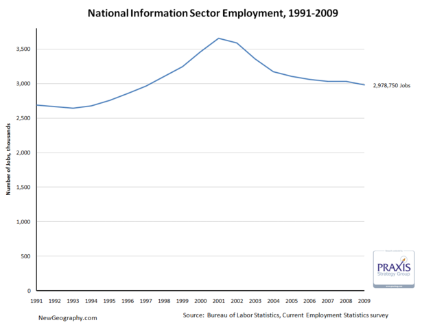
    Between economic development strategies targeting software firms, the deflation of the tech bubble, talk of “broadband,” and recent consternation about failing publishing business models, we seem to hear a lot about the information sector. Recognizing that, it’s interesting that the information sector only comprises about 2.2% of total employment in the US.

    On top of that, after a big decline since the tech bubble peak in 2001, in February the sector has receded to just more than 2.9 million jobs, a level not seen since April 1996.

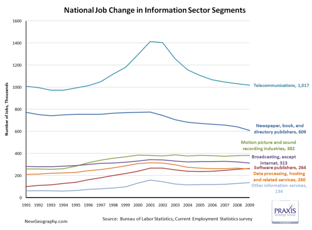
    The telecommunications subsector accounts for just more than 1/3 of information employment, and saw the biggest boom and bust. Publishing has declined since 2000, and motion picture and sound recording industries are larger than either software publishing or data processing.

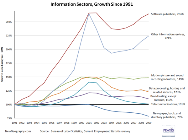
    Looking at percent change, software has recovered from the tech bust, while the movie business has remained steady since topping off in 2000. Worse off are telecom and data processing, which continue the post bust slide.

    One fifth of the jobs in the publishing industry have vanished since 2001.

    This is not to say technology occupations are not a key part of the nation’s economy and productivity gains over the past decade, but the importance of the information sector itself is overstated. High-tech industries that produce products generally fall into manufacturing sectors while things like systems design, web design, or even custom programming are business services.

    The next post will look at regional shifts in information employment, but until then check out Ross Devol’s more comprehensive study on regional tech poles.

    Other Information services includes: news syndicates, libraries, archives, exclusive Internet publishing and/or broadcasting, and Web Search Portals.

  • Deconstructing the Meltdown, National Job Losses by Sector

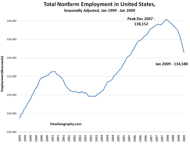
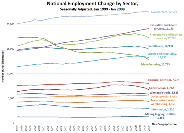
    Here’s a look at national employment change in the United States over the past 10 years. Nonfarm employment peaked in the US in December of 2007 at 138.1 million jobs. After a record loss of 598,000 jobs in the last month, we’re now at 134.5 million. Thats a loss of more than 3.5 million jobs over the past year. Conveniently, 3.5 million jobs is exactly what Obama administration economists plan to create or save with the stimulus package.

    If we cut it by sector, recent job losses in manufacturing, construction, and professional and business services are striking. Over this same time period, we’ve added roughly 4.5 million jobs in education and health and another 2.5 million in government jobs. Perhaps the president is planning to hire those 3.5 million new employees directly?

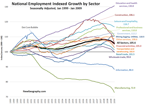
    If we index each sector back to January 1999, we can begin to see the trajectory of each industry over time. For this chart, the height of each line at a given point of time indicates percent growth over the January 1999 level. The heavy black line shows growth for all sectors.

    From here, the dot-com bust is obvious, as is the fact that the information sector has not recovered to pre-2000 levels. Information may be even more trouble in the short term, as that sector includes media and publishing.

    The construction employment boom began in mid 2003 and eventually reached more that a 20% premium over 1999 before falling back to mid 2003 levels last month.

    Manufacturing has fallen precipitously with this bust, we are now seeing marked declines in other goods-supporting industries: wholesale trade and transportation and warehousing.

    Again, institutional sectors of Government (up 12%) and eds and meds (up 30%) lead the way. The other fastest growing sector since 1999? Leisure and hospitality. Staycation, anyone?