Tag: geography

  • Tambora vs. Krakatoa: Which was Worse?

    An April 27 Wall Street Journal book review by Simon Winchester descends into a petty squabble about whether the volcanic eruptions on Mount Tambora (1815) and Krakatoa (1883), both located in Indonesia, was more significant. After a few positive paragraphs reviewing Gillen D’Arcy Wood’s Tambora: The Eruption That Changed the World, Winchester takes exception to Wood’s comparison of the Tambora eruption with that of Krakatoa. Winchester writes:

    "I have one argument. Mr. Wood’s intention in writing the story of Tambora, in time for its bicentenary, is to stake the eruption’s claim for global primacy—to knock Krakatoa off its long-held pedestal. The celebrity of [Krakatoa’s] more modest eruption in 1883 seems undeserved,’ he writes. ‘Only the historical accident of the telegraph’s invention allowed news of it to travel instantly across the world.’"

    Which is the More Significant?

    Winchester introduces his defense of Krakatoa, admitting that he has a "dog in the fight," as author ofKrakatoa: The Day the World Exploded: August 27, 1883. He claims that Krakatoa "was the biggest volcanic explosion in what one may call fully recorded human history." He then spends a third of the article seeking to prove that the Krakatoa eruption was the more significant than that of Tambora.

    Winchester describes the Krakatoa eruption and how the rapid communications that had recently become available amplified its significance in  the decades that followed. He points out that there were more than 40,000 fatalities and that Krakatoa generated the most extensive tsunami ever generated by a volcano. Finally, he claims that Krakatoa "contributed to the creation of the Republic of Indonesia."

    I have long asked the same question that Woods poses and concluded that history had slighted Tambora. So, I spent some time the other evening reacquainting myself with the subject, using Internet sources (such as Wikipedia), which do not rise to academic standards, but certainly paint a picture supporting Woods’ position.

    As for the 40,000 fatalities, there appears to be no question but that fatalities from Tambora were nearly twice as great. It is not really surprising that Krakatoa is a more extensive tsunami than Tambora, since Krakatoa was a fairly modest mountain (less than 3,000 feet or 1,000 meters) sitting in the Sunda Strait between Java and Sumatra. Much of the volcano collapsed into the sea, which will obviously produce a larger tsunami than when the mountain is at least 10 miles (16 kilometers) from the sea and principally collapsed upon itself, rather than the sea.

    The claim that the Krakatoa eruption was instrumental in creating the Republic of Indonesia is bizarre. Krakatoa surely did not provide any incentive to the Dutch to rule longer, or for the Indonesians to extend colonial rule. Indonesia was among the first to shake off colonialism following World War II (1945). Nor is it likely that an unexploded Krakatoa would have advanced independence to before the War.

    Fully Recorded History as of 1981: St. Helen’s Exceeds Krakatoa

    Winchester overreaches in noting that Krakatoa was the "biggest volcanic explosion "in fully recorded human history." Fully recorded human history is in the eye of the beholder. Yet, the Krakatoa eruption was not recorded by motion pictures or video, which were not yet invented and did not thus occur in "fully recorded history" as we know it.

    For example, in 1981, a few months after Washington’s Mount St. Helen’s blew its side out, it would have been fair to characterize its 1980 eruption as being more significant than Krakatoa, by virtue of having been captured on video (and thus in "fully recorded history” at them time). Certainly, scientists have learned much from Mount St. Helens. However, its greater significance due to its capture on video was a function of technology, not volcanism.

    Tambora’s Significance

    By any measure, Tambora was a substantially larger volcanic eruption that Krakatoa. Its Volcanic Explosive Index (VEI) was 7, the only confirmed rating of that intensity since the Lake Taupo eruption in New Zealand 1,600 years before. By comparison, Krakatoa earned a VEI of only 6. Further, Tambora spewed a far greater volume, at 38 cubic miles (160 cubic kilometers). By comparison, Krakatoa’s volume was less than one-third that of Tambora, at 11 cubic miles (45 cubic kilometers). Both ejected far greater volumes than the 1980 eruption of Mount Saint Helens (less than one quarter cubic mile or one cubic kilometer), which had a VEI of 5.

    Moreover, Tambora set off the "year without summer" in 1816, when a June snow storm dumped six to twelve inches (15 to 30 centimeters) on northern New England and snow drifts of two feet (60 centimeters) in the ville de Quebec.

    Indonesia’s Disasters

    Interestingly, neither the Tambora nor the Krakatoa eruption ranks as the largest in Indonesian history (or perhaps more properly, pre-history). The Lake Toba eruption on Sumatra occurred 75,000 years ago and is reputed to have been the most intensive in the world in the last 2 million years. Lake Toba ejected approximately 675 cubic miles (2,800 cubic kilometers) of material. This is 17 times the Tambora volume and more than 60 times the Krakatoa volume. But none of the three killed as many people (230,000) as the Boxing Day tsunami (December 26, 2004), which was set off by a 9.0 earthquake off Sumatra. Population had exploded between 1883 and 2004, which drove the Boxing Day tsunami fatalities far above those of the Krakatoa tsunami.

    Tambora v. Krakatoa: Volcanism v. Telecommunications

    Winchester confuses technology with history. Woods is exactly right. But for the historical accident of the telegraph, Krakatoa might have been as largely forgotten, not unlike another VEI-6 event — the 1912 Novarupta volcanic eruption in Alaska. Had the telecommunications of 1815 been equal to those of 1883, no one would remember Krakatoa. Telecommunications explains its prominence, not volcanism.
    —————–
    Wendell Cox is principal of Demographia, an international public policy and demographics firm. He is co-author of the "Demographia International Housing Affordability Survey" and author of "Demographia World Urban Areas" and "War on the Dream: How Anti-Sprawl Policy Threatens the Quality of Life." He was appointed to three terms on the Los Angeles County Transportation Commission, where he served with the leading city and county leadership as the only non-elected member. He was appointed to the Amtrak Reform Council to fill the unexpired term of Governor Christine Todd Whitman and has served as a visiting professor at the Conservatoire National des Arts et Metiers, a national university in Paris.

    Photo: Tambora: Depiction of 1815 Eruption (from http://cdn-2.vivalascuola.it/o/orig/scienze-classificazione-vulcanica_b2a5e9a592a9ff2585850e6b6006f595.jpg

  • The Geography of Cultural Attitudes

    The cultural and political division of America, the gap between “red” and ”blue” with respect to economic and social liberalism or conservatism is a constant and dominant theme in American discourse. Here’s some narrowly specific measures of social liberalism based on actual votes by citizens or legislatures, not polls or broader indices available.   

    We would have liked to use more measures, but data problems restricted us to only 8 measures: women’s suffrage and state votes on the ERA (Equal Rights Amendment), the right to die, the legalization of marijuana, gay sex (sodomy laws), same sex marriage, racial intermarriage, contraception, and abortion (current state).  Data for religion-state separation were inadequate, although we include some extra data on religiosity.

    For women’s suffrage our index notes when suffrage was granted (states which did not until after the 19th Amendment get the lowest score).  Similarly for the ERA, we give high scores to states which early granted rights to women, with low scores for states which did not pass the ERA, or rescinded an earlier yes vote. For racial intermarriage, scores were based on when intermarriage became legal, with the lowest scores for those states where it was still illegal before the 1967 Supreme Court decision. Gay sex similarly gives lowest scores with anti-sodomy laws still in force at the time of the Lawrence vs Texas case in 2003. The same sex marriage measure gives high scores to states which now accept same sex marriage. The contraception measure is based on current restrictions on emergency contraception, as data on earlier history were poor. The “right to die” or “death with dignity” cause is more recent. The abortion measure is based on a state by state analysis of when and if it was accepted by states before Roe, and the degree of current constraints. Finally the marijuana measure considers the vote in CO and WA, and also states with medical marijuana provisions. 

    These nine values are summed to give a score to the states (listed in table 1 below). The table is arranged in order from the lowest total (most conservative) to the highest (most liberal).

    This scaling is compared to the right in the table with a measure of religiosity, two indices of social liberalism from the web (also published) and the Gallup poll. Since the data on the 9 measures and for the other indices were in varying units, I converted all to a simple scale from 1 (extremely conservative) to 10 (extremely liberal).  The Gallup poll was for 2010-2012 surveys, the “religiosity” ranking on a separate Gallup poll on the “importance of religion,” the “Free state liberal” index is from the Free State Project Forum, State Policy Liberalism Rankings,  by Jason Sorens , the social science model rankings from Andrew Gelman , Statistical modeling, causal inference and social science statistics, and based on the 2000 Annenberg Survey.

    Since our analysis was based on varying measures, some quite recent and others quite old, our numbers are rather different from most of the other comparison indices. These are broadly similar to contemporary rankings of conservatism or liberalism, with some intriguing differences, which reflect our choice of measures.

    Consider our low ranking of Virginia and Florida, which actually voted for Obama in 2008 and 2012! The reason is not that there is a dearth of liberals, but that they have not been very effective.  If the state legislatures and courts don’t pass “liberal” measures because they are consistently controlled by conservative tradition and majorities, then many liberal voters are ineffective and irrelevant, except for statewide votes for senate or governor or president. The same principle applies to a lesser extent to Pennsylvania, Ohio, Michigan, and perhaps even Wisconsin. At the opposite end, there are many conservative voters in states like Washington, Oregon, Maine, California, New York and Vermont, but their effectiveness is low, since the governor and legislatures are often controlled by more liberal majorities. Washington may be the extreme in this respect, where the voters themselves, not the legislatures, twice affirmed  abortion rights, then the right to same sex marriage, death with dignity (right to die), and the legalization of marijuana.  Maine and Minnesota affirmed same sex marriage, and Oregon the right to die.    

    The relatively low ranking for the District of Columbia, often the most liberal in other surveys, probably reflects the fact that it was part of the South culturally and perhaps more importantly subject to congressional oversight.

    The story is different for the states which are widely proclaimed to be conservative, but are in the lower “liberal” part of my table.  Most noteworthy is Montana, but also Arkansas, Iowa, New Mexico, and Wyoming, noted among the most conservative in polls and other rankings. The reason again is my particular choice of measures.  Western conservative states tend to embrace a libertarian point of view which can translate into social liberalism despite economic conservatism. Wyoming and then Montana were the first to give women the right to vote, and supported the ERA early on. Montana was the 3rd state to recognize a right to die; it also tried to defy the Supreme Court with respect to corporate political contributions (Citizens United).

    The other main reason for difference is that my ranking is based solely on social issues, while the other ranking all have some degree of economic liberalism affecting their results. This is why many Northeastern states are lower in my more strictly social liberalism ranking. The data show that some states have become more liberal over time while some states in the wide open west have become more conservative (WY, NV, ID AZ).

    The social geography of American states is a fascinating story of tradition and consistency, selective change.  The deeper South (not DE and MD) remains astoundingly monolithic. It is hard to escape the conclusion that to many the Civil War is not over, that race still rules, but also that for less obvious reasons, more fundamentalist religious denominations dominate, while in much of the country, religious adherence has diminished.

    At the other extreme, the “Left coast” and the Megalopolitan Northeast, (except for Pennsylvania!) exhibit a remarkable social liberalism. While the root may lie in a New England moralist or ethical tradition of tolerance, associated with the Congregational and Episcopal churches, this somehow became amplified in the 1960s and since through rising levels of education, professional occupations, and societal experimentation.  To some degree this relatively liberal ideology moved westward across the “northern tier” to the rise of a “progressive” movement in the Great Lakes states, and on to Iowa and Minnesota, (still  apparent!) and even on to Washington and Oregon.

    The Mountain states, including probably Alaska, are more complex, with increasing conservatism, especially in the “Mormon realm” – Utah, Idaho, Arizona, and Wyoming, while New Mexico and Colorado have even become more liberal. Education?  I’ll leave the explanation to the readers!

    This leaves the great Midwestern heartland – the Great Lakes, the northern Plains, and Appalachia. Appalachia was Democratic, a legacy of mining and unions, but social change seemed to pass the region by, as historic forces of fundamentalist religion and traditional values and small-townness, resisted the social change associated with the large metropolis.

    The Great Lakes states (MI, OH, IN, WI, IL) are remarkably alike in the middle ground between liberal and conservative on the social dimension, and seem to defy any simple understanding. They are metropolitan, and historically industrially vibrant, but also retain extensive small-town and farming areas, with a stronger religious tradition than the Left Coast or the megalopolitan realm. Thus they are resistant to the more ‘radical’ social changes, like same sex marriage. And Illinois just changed on same sex marriage! Other states may soon follow.

    The northern Plains, the region from MO and KS to the Dakotas and Minnesota, is more socially diverse, with Minnesota and Iowa far more socially liberal than the other states, especially the less metropolitan western area from Kansas through the Dakotas.

    I would conclude with a warning that this ranking is social, and ignores economic values and votes. Thus while WA maybe the most socially liberal, it is much lower on economic measures. While WA does have the highest minimum wage, it is 50th, yes last, in its regressive tax structure.

    Table 1: Index of Social Liberalism by State
    State Women Vote Equal Rights Act Racial Intermarry Gay Sex Same Sex Marriage Contraception Right to Die Abortion Marijuana Total Score
    AL 1 1 1 1 1 1 1 1 1 9
    VA 1 1 1 1 1 1 1 1 1 9
    MS 3 1 1 1 2 1 1 1 1 12
    FL 2 4 1 1 1 1 1 1 1 13
    GA 2 1 1 3 1 1 1 3 1 14
    LA 3 4 1 1 1 1 1 1 1 14
    NC 1 4 1 1 1 1 1 4 1 15
    SC 1 4 1 1 1 8 1 1 1 19
    OK 9 4 1 1 1 1 1 1 1 20
    AR 5 1 1 3 1 7 1 1 1 21
    KY 6 4 1 5 1 1 1 1 1 21
    ID 9 4 4 1 1 1 1 1 1 23
    TN 5 4 1 5 2 1 1 3 1 23
    MO 6 9 1 2 2 1 1 1 1 24
    NE 5 4 4 8 1 1 1 1 1 26
    UT 9 1 4 1 1 8 1 1 1 27
    TX 5 9 1 1 1 7 1 1 1 27
    AZ 9 1 4 3 2 1 1 3 5 29
    SD 9 4 4 8 1 1 1 1 1 30
    KS 9 9 7 1 1 1 1 1 1 31
    ND 5 9 4 8 1 1 1 1 1 31
    WV 1 9 1 8 4 1 1 7 1 33
    IN 6 9 4 8 3 1 1 1 1 34
    MI 9 9 7 1 1 1 1 1 5 35
    PA 1 9 7 6 3 7 1 1 1 36
    OH 4 9 7 8 1 7 1 1 1 39
    WY 10 9 4 8 3 1 1 4 1 41
    DC 5 9 4 6 9 7 1 1 1 43
    DE 3 9 1 8 9 1 1 6 5 43
    MD 1 9 4 4 10 1 1 9 4 43
    NV 9 4 4 5 5 1 1 9 5 43
    RI 6 9 7 5 9 1 1 4 5 47
    WI 6 10 9 6 3 8 1 4 1 48
    IA 6 9 7 8 9 1 1 6 1 48
    MT 10 9 4 4 2 1 8 9 5 52
    IL 5 4 7 10 9 8 1 7 1 52
    MA 3 9 7 7 9 9 1 7 1 53
    NH 3 9 9 8 9 9 1 7 1 56
    MN 6 9 9 3 9 8 1 6 5 56
    NM 3 9 7 8 7 9 1 9 5 58
    AK 9 9 9 6 2 9 1 9 5 59
    NJ 3 9 9 8 7 8 1 9 5 59
    CO 9 9 4 8 5 7 1 6 10 59
    CT 3 9 9 8 9 8 1 8 5 60
    HI 5 9 9 8 5 9 1 10 5 61
    NY 9 9 9 6 9 8 1 9 1 61
    CA 9 9 4 8 9 9 1 9 5 63
    ME 6 9 7 8 10 9 1 9 5 64
    OR 9 9 4 8 5 8 10 9 5 67
    VT 3 9 9 8 9 9 9 9 5 70
    WA 9 9 7 8 10 9 9 10 10 81


    Table 2: Comparison to Other Indexes
    State Religious Separation Freestate Liberal Socsci model rank Gallup My Ranking
    AL 1 1 3 1 1
    VA 3 3 5 5 1
    MS 1 1 1 1 2
    FL 4 6 4 5 2
    GA 2 2 3 3 2
    LA 1 3 2 2 2
    NC 2 4 4 4 2
    SC 1 2 3 3 2
    OK 1 1 2 2 3
    AR 1 1 1 2 2
    KY 2 2 1 4 3
    ID 8 2 2 2 3
    TN 2 1 2 3 3
    MO 3 2 3 4 4
    NE 4 3 3 2 4
    UT 3 2 3 1 4
    TX 2 1 3 4 4
    AZ 7 4 4 4 4
    SD 3 2 2 4 5
    KS 3 2 4 4 5
    ND 3 1 3 1 5
    WV 3 4 1 3 5
    IN 3 2 3 3 5
    MI 5 6 5 7 5
    PA 4 5 5 6.7 5
    OH 4 7 4 5 5
    WY 7 1 3 1 6
    DC 6 5 9 10 6
    DE 6 7 7 9 6
    MD 4 9 7 6 6
    NV 9 5 4 7 6
    RI 9 8 10 9 7
    WI 3 5 5 4 7
    IA 5 4 5 4 7
    MT 6 5 3 3 8
    IL 6 7 6 6 8
    MA 9 10 10 9 8
    NH 10 6 7 7.8 8
    MN 5 6 6 6 8
    NM 4 4 4 7 8
    AK 9 5 6 1 8
    NJ 7 10 8 6 8
    CO 7 6 5 7 8
    CT 9 8 9 9 9
    HI 8 8 7 8 9
    NY 8 10 9 8 9
    CA 8 9 7 6 9
    ME 10 7 6 7.5 9
    OR 9 7 7 9 9
    VT 10 7 10 9 9
    WA 9 7 6 5 10
    Correlation with My Ranking 0.83 0.74 0.68 0.66

    Richard Morrill is Professor Emeritus of Geography and Environmental Studies, University of Washington. His research interests include: political geography (voting behavior, redistricting, local governance), population/demography/settlement/migration, urban geography and planning, urban transportation (i.e., old fashioned generalist).

  • History, Landscape, Beauty on the American Freeway

    Freeways, particularly urban freeways, have had a bad press for several decades now.  They are accused of despoiling scenery, destroying habitat and causing urban sprawl.  Many observers report with glee on the latest news of a small segment of urban freeway being dismantled.

    This blanket condemnation makes it easy to overlook the remarkable contribution that these freeways have made to the American economy and to American culture.  It is hard to imagine the growth in productivity in the country during the postwar years without these roads, which vastly increased the mobility of goods and people and connected parts of the country together in ways that were unprecedented.

    The constant criticism also makes it difficult to appreciate these roads as cultural artifacts and a wonderful way to see the country.  This is all the more surprising since Americans in recent years have been discovering the rich legacy of our nation’s highways. There has been spate of books that celebrate travel on America’s pre-freeway-era highways. Many authors wax eloquent over the remaining motels, fast food restaurants and drive in theatres along US 66 or advise motorists on finding abandoned segments of roadway by passed by later highway alignments.   There has also been a remarkable surge of interest in America’s parkways, from the earliest parkways like the Bronx River Parkway in Westchester County New York, started in 1907, to parkways at the end of the parkway era in the years immediately before and after World War II when they gradually became more like freeways, for example the Arroyo Seco Parkway in Los Angeles, or the later segments of Lake Shore Drive in Chicago, the Taconic Parkway in New York State or the George Washington Parkway outside Washington.   

    America’s postwar freeways merit a similar rediscovery.   I think that one of the biggest obstacles to appreciating them has been a question of scale.  Driving along a two-lane roadway it is possible to pull off the pavement and look at an historic courthouse or a particularly interesting agricultural landscape or early gasoline station. That is not possible on a freeway. It is also true that the engineers who designed the nation’s postwar freeways were probably less conscious of the aesthetic dimensions of the roadways than the designers of the German autobahn, who set a standard for integration of landscape and roadway  never surpassed, or American designers like landscape architect Gilmore Clarke who played important role in designing the parkways of metropolitan New York.   There is, moreover, no doubt that the push to accommodate increasing traffic loads and to make freeways safer in this country has led to a certain uniformity of standards that some people find boring.  Finally, the proliferation of sound walls over the last few decades all too often makes driving through urban areas like driving through a tunnel. 

    Still, there is no better way to get a good view of the larger features of the American landscape or cityscape than looking through the windshield of an automobile rolling along a freeway at 65 miles per hour. At that speed it is often easier than on a slower road to appreciate the changes that occur in plant species as the highway climbs a steep ridge or to appreciate the way massive cuts to lower the grades on the climb over a hill that provide a graphic illustration of the underlying geology.  It might be difficult for many people to appreciate long stretches of flat country but, if a driver can put herself into the proper frame of mind, this experience can have its own rewards because of the way it accentuates the scale of the landscape. Even the billboards, which many drivers consider simply objectionable intrusions into the natural landscape, can, by their style and content, illustrate a great many regional differences.

    And fortunately, there has been over the last two decades a growing recognition of the aesthetic dimensions of freeways.   In some ways this marks a reversion to ideas that were common in the parkway era when there was almost always a conscious attempt to integrate road and landscape into a successful composition reflecting  the landscape and culture of the region through which it passed. 

    A pioneer postwar example of this push to bring conscious aesthetic design to the freeway can be seen in I-280, the Junipero Serra freeway, which runs between San Francisco and San Jose.  Here the engineers worked with Lawrence Halprin, the landscape architect, and architect Mario Ciampi to create a road that was widely considered the “most beautiful freeway in the world” when the initial segment was opened in the 1960s.  This highway, with its careful alignment, minimizing cut and fill, and the bold, sculptural concrete overpasses does little to diminish the spectacular landscape of the San Francisco Peninsula.  In fact it affords a wonderful way to experience the golden hills on one side of the roadway and the coastal range on the other, often seen in the morning or late afternoon with fog pouring over the crest.

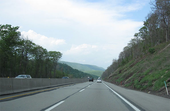
    In recent years the highway departments in an increasing number of American states have attempted to be more attuned to the aesthetic dimensions of freeways and of the places through which the roads run.   Wildflowers now bloom in medians and margins of a great many American freeways.   In arid landscapes engineers and landscape architects have worked to preserve native plants and use them as elements in a kind of idealized desert landscape in the median and along the berms.    In one of the most impressive achievements, a twelve mile stretch of I-70 passing through the tortuously narrow Glenwood Canyon west of Denver, opened in 1992, the designers went to great length to fit the roadway into the landscape in the least obtrusive way possible.  They accomplished this by splitting the roadway alignments, reducing the section of the roadway structure to a minimum, cantilevering both alignments from the canyon walls to reduce their bulk, pushing tunnels through the most difficult spurs of land and even treating the rocks that were scarred by excavation so they would not produce jarring juxtapositions.

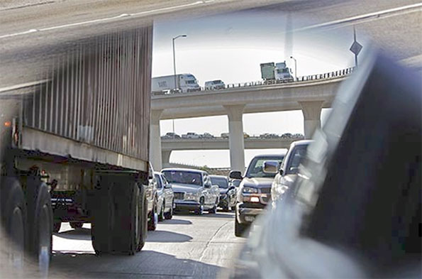
    Even the urban freeway, target of the most vociferous criticism, offers interesting perspectives for those willing to look.  Unlike the case in much of Europe, where planners have often attempted to create a parkway-like driving experience by providing a wide buffer between the roadway and nearby urban areas and tightly restricting new development along the highways, American freeways have become the new main streets of many cities.  Driving along the ring roads around American’s large cities can offer some of the most compelling views of these metropolitan areas. For the motorist driving along I-80, the Ohio Turnpike, there is the view from the giant viaduct crossing the Cuyahoga River.  There, 20 miles to the north, up the heavily wooded deep gash created by the river, the gleaming tip of the Key Bank Building peaks out  above the intervening ridges in clear weather, unfortunately all too rare in Northeast Ohio.  Likewise, very few urban views can compare with the panorama that suddenly unfolds for motorists as, emerging from I-376’s Fort Pitt Tunnel under Mount Washington, they suddenly burst out onto a bridge over the Monongahela River and a view of the Golden Triangle and the entire skyline of Pittsburgh. 

    A drive along a city’s freeways is often the best way to get a good grasp of a region’s economic geography.   It would be hard to miss the contrast between the view from the Indiana Toll Road across the grimy industrial landscape of steel mills and refineries just east of Chicago, on the one hand, with the landscape of heavily planted berms and expensive new houses along the Tri-State Expressway in the north suburbs.

    Many of the earliest freeways have crossed the 50 year threshold and deserve a closer look as some of the country’s most important historical and cultural artifacts.  And they provide a wonderful way to observe America’s landscape and cityscape.


    Taconic State Parkway north of New York City.  The New York area had the first and largest set of parkways in the nation.  The Taconic, running along the Taconic Mountains from the Kensico Dam in Westchester County to Chatham near Albany, was not finished until 1960, but it maintains the earlier parkway standards rather than those of the later freeway era.   Because of its careful alignment and roadway design by landscape architect Gilmore Clarke and the beauty of the rugged countryside which it runs, it remains one of the country’s great driving experiences.


    I-280, Junipero Serra freeway, south of San Francisco.  Although a much wider highway than the prewar parkways, this road, constructed in the 1960s, maintains much of the feel of the earlier parkways though the use of alignments carefully fitted into the rolling hills, integrating the road beautifully into the spectacular landscape of the San Francisco peninsula.    


    I-20 east of Birmingham Alabama.  The undulating line that marks the edge of the pine forest and the beginning of the mowed grass in the freeway margins recalls the long curving vistas of English 18th century picturesque landscape tradition. On an overcast morning the resemblance to the British landscape tradition is particularly striking.


    I-10 and I-215 at Colton, California.   No place in the United States is so associated with freeways as the Los Angeles region, but actually this region has fewer lane miles of freeway than most large American metropolitan areas.  Because freeway construction pretty much stopped in the 1970s but the population continued to grow and the density rose, this region has some of the most congested roads in the country.  If there is any consolation, they offer some remarkable displays of engineering bravado and urban intensity.


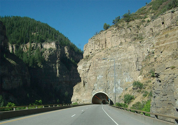
    I-70 west of Denver, Colorado.  The construction of this roadway through the Glenwood Canyon in the Rockies is both an engineering feat and an aesthetic tour de force.  By separating the alignments and cantilevering the roadway from the canyon wall, the designers were able to minimize the visual impact of the road and provide spectacular vistas for travelers.

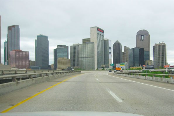
    US 75 approaching downtown Dallas.  This short piece of roadway completes a loop around downtown Dallas that allows two interstate roads to bypass downtown.  A drive around the loop provides a kaleidoscopic sequence of views of tall buildings and a highly effective orientation to downtown Dallas.


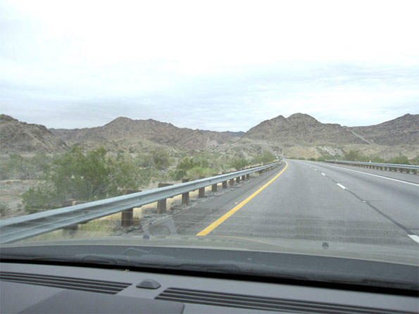
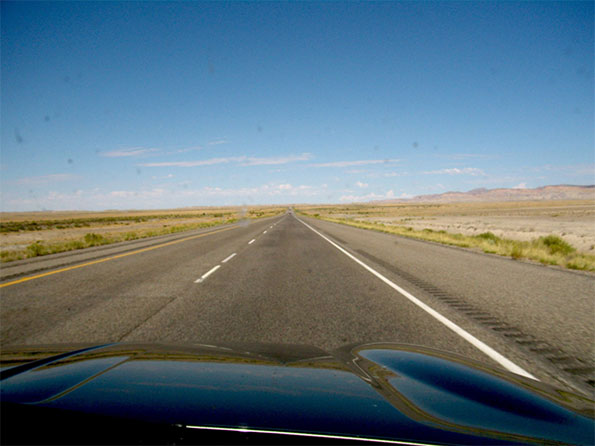
    I-10 east of Blythe Arizona.  Perhaps even more than in the East, the great distances of the American West make the freeway a lifeline for residents who live far from population centers.  The smooth roadway makes a striking contrast with the great rock outcrops and vast stretches of scrubland.


    I-80 and I-94 Pennsylvania Turnpike north of Pittsburgh.  The era of the parkway ended at about the time of the second world war as a new generation of freeways started to emerge.  One of the interesting features of the interstate system today is the way it provides testimony to the shifting ideals of roadway design.  Although large stretches of the Pennsylvania turnpike, whose initial segment opened in 1940, have been upgraded, the narrow right of ways and steep gradients of the older portions of the road as well as the streamlined design of the overpasses recall the transition from one age to the next.


    I-20 between Covington and Augusta Georgia.  A classic piece of interstate road with the smooth ribbon of pavement gliding effortlessly through a landscape of low hills and dense forest.


    I-10 west of downtown Phoenix.  The state of Arizona has been particularly active in trying to create an appropriate landscape for the state’s highways.   They have pioneered techniques for saving cacti and other native species in the path of the roadway and then re-installing them alongside the new roads to create an idealized desert landscape.


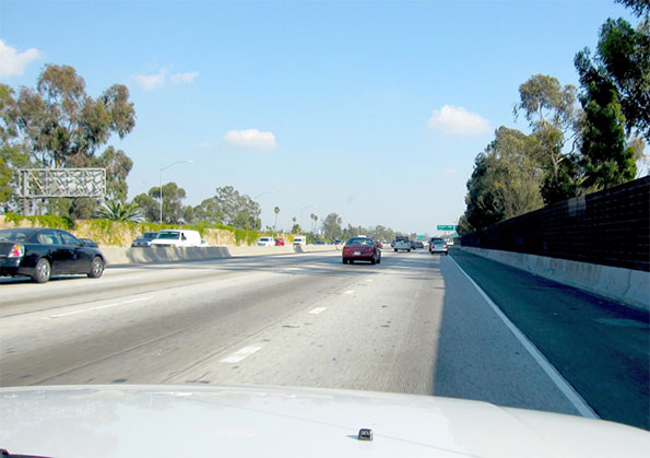
    I-10 approaching downtown Los Angeles, California.  The advent of sound walls has changed the driving experience in some profound ways.  In places it has severed the visual connection between the roadway and the city around it.  On the other hand, in some places, as here, when vines and other plants grow up over the walls and trees overtop them, the result is a curious but not entirely unpleasant sensation of floating through a city without being part of it.  Until the traffic backs up, of course.


    I-27 between Amarillo and Lubbock, Texas.  The long flat stretches of the Llano Estacado of northwest Texas produce an almost hypnotic effect.  Even highway signs and telephone poles take on a monumental character, and train elevators loom up in the distance like the skyline of a great city.


    I-70 in eastern Utah.   Although freeways can seem intrusive and over-scaled in the city, they are often dwarfed by the huge open spaces in states like Utah or Nevada.


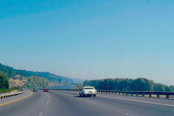
    I-5 south of Longview, Washington.   A trip across the country on the interstate roadway system allows for a panoramic view of the regional differences between, for example, the flat, semi-tropical landscape of central Florida and the deep green evergreen forests of the Pacific Northwest.


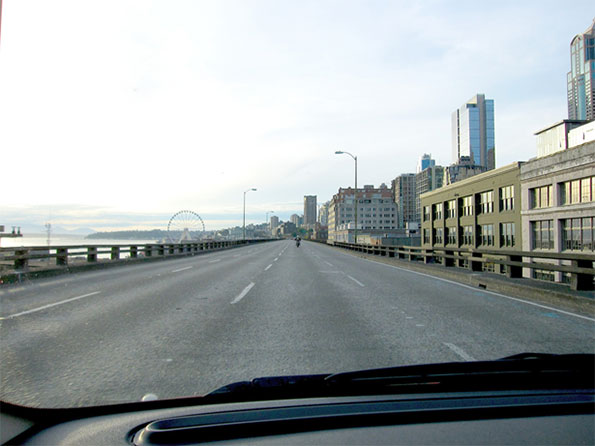
    State route 99, the Alaskan Way Viaduct, downtown Seattle.   Completed in 1953, this roadway, this roadway like a number of freeways built in the heart of American cities, created a barrier in the city.  Some of these highways, for example the Central Artery in Boston have been relocated underground. In other cases, like the Embarcadero Freeway in San Francisco the replacement was a surface boulevard.  In this case, after a considerable debate, officials made the decision to create a massive tunnel.  It is difficult to argue that a road like this should be preserved, given its structural problems and the way it cuts off Seattle from its waterfront.  Still, it is almost inevitable that some of the drivers navigating the new tunnel will keenly miss the spectacular urban spectacle that unfolds today as they sweep along the viaduct.

    Robert Bruegmann is professor emeritus of Art history, Architecture and Urban Planning at the University of Illinois at Chicago.

  • Job Dispersion in Major US Metropolitan Areas: 1960-2010

    The continuing dispersion of employment in the nation’s major metropolitan areas has received attention in two recent reports. The Brookings Institution has published research showing that employment dispersion continued between 2000 and 2010, finding job growth was greater outside a three mile radius from central business districts between 2000 and 2010 in 100 metropolitan areas Note 1). This assessment probably underestimates the extent of job dispersion, since it includes some suburban centers as central business districts (such as West Palm Beach, FL and Palo Alto, CA).

    Recently I showed that employment dispersion has reached a point that there is a virtual balance of jobs and housing in suburban areas, which contrasts with the continuing excess of jobs in core municipalities relative to resident workers. After that article was published, Richard L. Forstall forwarded me research he presented to the Southern Demographic Association in the 1990s that examined employment trends in core municipalities and suburban areas between 1960 and 1990. At the time, Forstall was at the United States Bureau of the Census. He also spent years supervising Rand McNally international metropolitan area population estimates (Note 2).

    Major Metropolitan Job Dispersion: 1950 to 2010 and

    Forstall provides detailed information for the 35 major metropolitan areas as of 1990 (over 1,000,000 population). This article augments the Forstall research with data from the 2010 census (Note 3).

    Consistent with both national and international trends, the half century between 1960 and 2010 indicated significant dispersion in metropolitan areas. This, of course, was a continuation of a trend that accelerated from the first quarter of the 19th century, when early mass transit systems allowed people to live in larger spaces, farther away from their work.

    The movement of residents from the urban core to the suburbs followed the even greater exodus from small towns and rural areas. But it was not long before residents of the homogeneous bedroom suburbs of the 1950s began to find more nearby employment opportunities.

    In 1960, 54% of the employment in the 35 major metropolitan areas was in the historical core municipalities, with the balance of 46% of the jobs in suburban and exurban areas. By 2010, the corner municipality share had dropped to 30%, while suburban and exurban areas contained 70% of the employment (Figure 1). Between 1960 and 2010, 88% of the new jobs were in the suburbs and exurbs, leaving only 12% of the growth in the core municipalities (Figure 2).

    Dispersion Greater in Metropolitan Areas with Pre-War Non-Suburban Cores

    However, even this distribution appears to mask an even greater dispersion. Among the metropolitan areas with "Pre-war non-suburban core municipalities," (such as San Francisco, Baltimore, Providence, New York, etc.) a full 102% of job growth was in suburban and exurban areas. Core city employment accounted for a minus two percent of employment growth (in other words, it declined). These are metropolitan areas with core cities that were virtually fully developed before World War II and which have added little to their land areas by annexation.

    The other metropolitan areas have core cities with large swaths of suburbanization and some, like Phoenix and Sacramento are virtually all suburban. In these metropolitan areas, approximately 25% of the job growth since 1960 has been in the core cities (Figure 3).

    Pre-War Non-Suburban Core Municipalities Losses and Gains

    Among the 18 metropolitan areas with "Prewar non-suburban" core municipalities, two thirds experienced losses in their core cities. The Rust Belt "ground zero" core cities of Detroit, Cleveland, and Buffalo all lost 40 percent or more of their employment, and were joined by second tier Rust Belter St. Louis. The core city of Pittsburgh, typically one of the Rust Belt’s big four, did much better, losing only five percent of its employment. Across the state, however, the core city of Philadelphia did much worse, dropping 23 percent of its employment. The core city of Chicago lost 20 percent of its employment.

    Perhaps most notable was the core city of Hartford, which lost 9 percent of its employment between 1960 and 2010. According to data in the Brookings Institution Global Metro Monitor, Hartford has emerged as the world’s most affluent major metropolitan area (measured by gross domestic product per capita) over the same period. All of Hartford’s job growth was in the suburbs and exurbs.

    The core city of New York did the best among the metropolitan areas with "Pre-War non-suburban" cores, attracting 16 percent of the employment growth over the half-century. Washington (DC) also did well, with a 12 percent share of new employment.

    Urban Dispersion and the Quality of Life

    The dispersed metropolitan area, along with its comprehensive roadway networks, has served the US well, especially in two important measures of the quality of life — housing affordability and mobility. Major metropolitan areas in the United States have some of the most affordable housing in the high-income world. The US has shorter work trip travel times than Canada or Western Europe and much shorter than the major metropolitan areas of Japan (with the most comprehensive rail systems in the world) and East Asia.

    This advantage was reiterated with the recent release of the Tom Tom Congestion Index, which showed traffic congestion in the metropolitan areas of Australia and New Zealand to be far worse than in US metropolitan areas of similar size. For example, Sydney is as congested as Los Angeles, despite having only one-third the population. Auckland (New Zealand) has worse traffic congestion than any US metropolitan area of similar size.

    Peter Gordon and Harry W. Richardson spotted this advantage nearly two decades ago (See Are Compact Cities a Desirable Planning Goal?), before there was international traffic congestion comparison data. Based upon their review of national travel surveys, they concluded:

    Suburbanization has been the dominant and successful mechanism for reducing congestion. It has shifted road and highway demand to less congested routes and away from core areas.

    Wendell Cox is a Visiting Professor, Conservatoire National des Arts et Metiers, Paris and the author of “War on the Dream: How Anti-Sprawl Policy Threatens the Quality of Life.

    ——-
    Note 1: The Brookings Institution report indicates that employment within a 3 mile radius of downtown (the central business district) increased in number and share only in the Washington, DC metropolitan area. However, this may not indicate an increase in central business district (downtown) employment. The large, nearby, but suburban employment centers of Rosslyn, Crystal City and downtown Alexandria may be located within the three mile radius (the report does not indicate the point from which the radius is drawn). The three mile radius used in the report is useful and represents the best reported data. However, it may not be representative of central business district employment encloses a huge area (28 square miles), which is more than 25 times the typical central business district geographical size and larger than the land areas of the core cities of Providence and Hartford and nearly two-thirds the size of the core city of San Francisco. Transit commuting to such nearby employment centers is routinely far lower than the share that ride transit to downtown.

    Note 2: Forstall is co-author (with Richard P. Greene and James B. Pick of seminal research that estimated the population densities of the largest metropolitan areas in the world (Which Are the Largest: Why Lists of Metropolitan Areas Vary So Greatly). Normally, metropolitan area densities cannot be validly compared because of widely varying criteria between nations. Further, in the United States, metropolitan area densities are nonsensical, because their building blocks vary in size too much. With its County-based definitions, US metropolitan areas include building blocks ranging from half the size of Orlando’s Walt Disney World (New York County, or Manhattan borough) to the size of the nation of Costa Rica (San Bernardino County). The use of such a crude building block results in the inclusion of huge amounts of rural territory that is outside the labor market or the commuting shed (metropolitan areas are typically defined as labor markets). Forstall and his coauthors applied criteria that was both consistent and rational. This exhaustive process limited the number of metropolitan areas for which they were able to make estimates to 28.

    Note 3: This analysis differs from Forstall’s approach in defining core cities using the historical core municipality classification. It should be noted that there have been changes in metropolitan definitions over the 50 years.

    Photo: Suburban employment in Chicago (by author)

  • Tokyo Dust: The Geography of Pollen

    TOKYO – The weather here is turning warmer, the cherry trees are blossoming and the waiting rooms in clinics that specialize in nose and eye problems are filling up with people suffering from runny noses, sneezing and bloodshot eyes.

    Tokyo is known for many things: the Imperial Palace gardens, cherry trees in the springtime, super-crowded commuter trains. But it has a more dubious distinction. It is also the world capital for allergies, especially for hay fever, known to the Japanese as pollen sickness.

    Of course this is no secret to the bulk of the people living here, especially the estimated six or seven million who are prone to pollen allergies (based on general rule that 15- 20 percent of the Japanese population suffers from hay fever).

    Tokyoites know that by the time the plum trees start to blossom in March, it’s time to stock up on antihistamine tablets, eye drops, herbal medicines and face masks. Those most susceptible to pollen sometimes also avail themselves of allergy shots and other more exotic remedies.

    One might wonder, why Tokyo? The answer goes back to just before World War II, and just after its end. In those hardscrabble years, people denuded the forests of the nearby mountains to repair burned out homes, keep warm and cook food.

    In the 1950s and 1960s the Japanese government undertook a successful reforestation program, planting millions of cedars, a cheap, fast-growing native tree and a prodigious pollen producer. Unlike the US, where ragweed is the main pollen source, most of Japan’s suffering is caused by cedar and cypress trees.

    It was expected that these trees would be cut to produce timber, but Japan has found it more economical to import lumber from the US and Canada, so they have been left standing. Now 40 to 50 years old, they have reached their pollen producing peak, pumping literally tons of the irritant into the atmosphere.

    The cedar pollen season peaks in March, but just as it dies down the pollination of the cypress trees begins to kick in. So for those who suffer from both pollens, there is an unbroken period of sneezing and sniffling through the end of April.

    Ironically, it is Tokyo’s urban nature that compounds the problem, since the pollen particles fall on asphalt pavements or on the roofs of buildings rather than being absorbed in the soil. From there, they are picked up and blown around in little invisible eddies and whirlwinds.

    The inexorable march of suburbia to the west has eliminated many of the farms and windbreaks that had once helped keep much of the pollen from reaching the city. But now the urban area of Tokyo extends to the very foothills of the mountains.

    The forest agency, which had planted 4.5 million hectares (11.1 million acres) of cedar trees, now proposes to cut them down and reseed the areas with different broadleaf trees that produce less pollen. The goal is to halve the number of cedar trees by 2017.

    Hay fever is thought to have a measurable impact on Japan’s economy, both in a negative and a positive way. The Dai-Ichi Life Insurance Research Institute estimates that the economy lost about $3 billion due to absenteeism in the memorable hay fever year of 2005. On the other hand, Dai-Ichi Life also estimates that Japanese spend more than $6 billion a year on hay fever prevention products, such as eye drops and face masks.

    Dust that originates in China’s Inner Mongolia province and other parts of Central Asia and is blown east in prevailing winds is called “yellow dust” by the Japanese. In recent years, the hay fever season has merged with the yellow dust peril to aggravate the woes of allergy sufferers.

    When it settles, cities are bathed in a kind of yellow haze, similar to smog, and the dust particles get into everything. Weather reports on local television stations plot the approaching dust and recommend that people refrain from hanging washed clothing out of doors. In more extreme cases, the yellow dust can cut visibility to the point where airports close temporarily.

    Of late, the yellow dust has been augmented by real smog from China. In Fukuoka city on Kyushu, the average amount of particulates is estimated to have reached 50 micrograms per cubic meter. The air pollution from China has caused the first official smog alerts in Japan.

    This being Japan, various exotic remedies have been proposed over the years to lessen the burden. One pharmaceutical company touts its olive leaf extraction as a way of alleviating hay fever symptoms without causing side effects such as drowsiness.

    An institute associated with the Ministry of Agriculture, Forestry and Fisheries touts a new kind of genetically engineered rice. Eating it may produce an immune tolerance. The rice is said to produce an amino acid that mimics the cedar pollen and helps produce immunities.

    However, the Health, Labor and Welfare Ministry has been slow to classify the engineered rice as a safe food, disappointing many sufferers who had hoped it would be available from this year’s harvest.

    Several Japanese companies are increasing the production of face masks for sale in Japan. One firm, Ohyama, has developed an improved mask to screen out micro particles. The masks are made in Dailin China.

    At this time of year newspapers carry stories filled with tips on how to prevent, or at least alleviate, the symptoms of hay fever. They all seem to boil down to the same piece of advice: find and wear a good face mask or stay indoors.

    Todd Crowell is a writer based in Tokyo.

    Flickr photo by OiMax: Yellow Dust , Tokyo, Japan

  • The Beauty of Urban Planning from the Ground

    In a piece called The Beauty of Urban Planning from Space, the Sustainable Cities Collective highlights views from space of uniquely designed street pattern designs in various cities around the world. There are ten examples that illustrate the zenith of urban planning.

    As attractive as the street patterns are, they highlight the inevitable inability of designers, or anyone else for that matter, to influence much more than small changes in the overall urban form.

    The Incomplete Street Patterns

    This point is evident in eight of the 10 urban areas illustrated, where the unique street pattern comprise only part of a much bigger city. The eight are Belo Horizonte, Brazil; Brasilia, Brazil, Washington, DC; New Haven, CT; La Plata, Argentina; Jaipur, India; Adelaide, Australia; and Canberra, Australia.

    The best known example may be Washington, DC, where L’Enfant’s street pattern served most of the city for more than a century, which is probably a world record for a growing urban area. Yet, today, L’Enfant’s design covers less than five percent of the urban area that today has more people than the nation at the time L’Enfant received his position.

    In La Plata (See end note on La Plata) the street design comes the closest to covering the whole urban area (Figure 1, from Google Maps). Taking design a bit further, every street is numbered in this city that was planned to be the capital of Argentina’s largest province (Buenos Aires, which is separate from the provincial equivalent city of Buenos Aires). Three other of the examples were also new cities planned as capitals, including Brasilia, Canberra and, of course, Washington.

    Stagnant Cities

    The other two examples are a dying mining town (El Salvador, Chile), which has lost more than two thirds of its population and an Italian medieval fortress town, Palmanova. The latter is more a museum than a dynamic urban area. It is confined to its original area and its population could fit into London’s Royal Albert Hall (approximately 5,000).

    Belo Horizonte, Brazil

    The Belo Horizonte Centro (Note on Belo Horizonte) street pattern is unique. It was part of the inspiration for my Urban Tours by Rental Car website (rentalcartours.net) and a map of Centro was incorporated into the logo (Figure 2).


    Figure 2

    In Centro, diagonals are superimposed on a conventional north-south/east-west street pattern (Figure 3, from Google Earth). However Centro’s street pattern covers less than one percent of the Belo Horizonte urban area, three square miles out of more than 400 (five square kilometers out of 650). Figure 4 shows Centro in red, engulfed by the much larger urban area, outlined in yellow.

    The first rental car tour described the Belo Horizonte Centro street pattern:

    Belo Horizonte represents both the best and worst in urban planning. The core has, at least from map inspection, a pleasing street layout. In a flair that outdid L’Enfant’s Washington diagonals, Belo Horizonte Centro has a grid of streets on which is superimposed a grid of diagonals. Of course, the resulting eight street intersections make traffic more of a difficulty than with the four that are usual or the grade separations of Brasilia. Centro has a number of wide boulevards, many with green, treed medians and, in the Brazilian style, some with four roadways — center express lanes and outside local lanes. These “three median” streets, give a pleasing feeling. The overall result is an impression similar to that of Barcelona, and a particularly attractive core that would do most European cities proud. 

    But, not far from Centro the randomness begins. To the north is the river, and clearly no attempt
    was made to continue the pattern beyond that. To the south are hills that would have precluded expansion of the plan. Nor does the pattern extend far to the less challenging east or west

    Unscrambling Means and Ends

    Street patterns from space provide no indication of urban planning’s effectiveness, nor of urban policy of which planning is a part. Planning is a means, not the end of cities.

    Over the past two centuries, billions of people have moved to cities. They did not move for the fountains, architecture, or museums (otherwise they would all live in the ville de Paris or Manhattan). In short, urban planning principles of any era have had little impact in the growth of cities.

    Urban planning’s current "top-down" genre is rather new. Until the British Town and Country Planning Act of 1947 and similar measures, planners contented themselves to design street networks (which the Sustainable Cities Coalition highlights so well) and other necessary infrastructure, such as water and sewer networks. Their handiwork is obvious in the 19th century designed street grid of Manhattan, the straight streets of Phoenix and the modified grid of the Toronto metropolitan area. These are the broad functions emphasized by New York University Professor Shlomo Angel in his Planet of Cities.

    Now, urban planning can work against the very justification of cities, the prosperity of its residents.

    Successful Cities

    The success of urban policy (and urban planning) can be judged by how well the purpose of the city is served – the reason people moved there in the first place. The purpose of the city was well articulated by former World Bank principal planner Alain Bertaud:  Large labor markets are the only raison d’être of large cities. Cities are much more about economics than aesthetics. (See end note on Sustainability).

    The successful city will facilitate greater affluence – higher discretionary incomes – among its residents.

    Regrettably, there are notable failures in this regard. For example, the urban containment policies of smart growth, which ration land and raise the price of housing relative to incomes, have been adopted in cities from Sydney to Toronto and Portland. As a result, residents have less money to spend after taxes and paying for necessities and are less affluent than they would be without such policies. In his introduction to the 9th Annual Demographia Housing Affordability Survey, New Zealand’s Deputy Prime Minister Bill English pointed out that higher house prices that occur when land is "made artificially scarce by regulation that locks up land for development."

    Another problem is evident in excessive traffic congestion and slower travel times. Getting around town quickly contributes to greater economic growth and discretionary incomes. Public policy must facilitate mobility throughout the urban area. The mode — the means — is not important, the access is. Transit services are appropriate where time competitive with the automobile, such as to the largest downtowns (See Transit Legacy Cities). However, because of its unparalleled ability to provide rapid mobility throughout the urban area, public policy must also ensure a minimum of traffic congestion and effective access by cars and commercial trucks. The evidence is clear that the higher densities preferred by modern urban planning impede rapid mobility throughout the urban area (see Urban Travel and Urban Population Density).

    Finally, by facilitating housing affordability and more free-flowing traffic, the important objective of alleviating poverty is served (an objective that cannot sustainably be served without economic growth)

    The Beauty of Urban Planning from the Ground

    The "beauty of urban planning" is reliably appreciated from the ground, not from space. The test is how well people live, not what the city looks like. The subject is people, not architecture or urban form (see Toward More Prosperous Cities: A Framing Essay on Urban Policy, Planning, Transport and the Dimensions of Sustainability).

    Wendell Cox is a Visiting Professor, Conservatoire National des Arts et Metiers, Paris and the author of “War on the Dream: How Anti-Sprawl Policy Threatens the Quality of Life.

    —–

    Note on La Plata: La Plata is in the Buenos Aires metropolitan area, approximately 35 miles (60 kilometers) south of Centro in Buenos Aires. However, it is a separate urban area because of a comparatively break in the continuous urbanization between La Plata and Buenos Aires. Buenos Aires province is by far the nation’s largest provincial level jurisdiction, with a population five times as great as the city of Buenos Aires. Much of the population is concentrated near the city of Buenos Aires, with which it forms one of the world’s megacities. The Buenos Aires also has the largest land area and would rank 6th if it were in the United States (nearly as large as New Mexico).

    Note on Belo Horizonte: Belo Horizonte is capital of the state of Minas Gerais. Belo Horizonte is Brazil’s third largest urban area, after Sao Paulo and Rio de Janeiro, with a population of more than 5 million — approximately the population of the Miami urban area (which stretches from southern Dade County to northern Palm Beach County)

    Note on Sustainability: Urban policies that would artificially constrain urban expansion (such as with urban growth boundaries) and discourage automobile travel have often been cited as principal strategies for reducing greenhouse gas emissions. However, important reports indicate little potential for greenhouse gas reductions from these policies, with the overwhelming share resulting from improved fuel economy. Moreover, recent research in England suggested that such policies should not "automatically be associated with the preferred growth strategy" (see Questioning the Messianic Conception of Smart Growth).

    Photo: Belo Horizonte Centro from Nova Lima (by author)

  • Dispersion in the World’s Largest Urban Areas

    No decade in history has experienced such an increase in urban population as the last. From Tokyo-Yokohama, the world’s largest urban area (population: 37 million) to Godegård, Sweden, which may be the smallest (population: 200), urban areas added 700 million people between 2000 and 2010.

    Nearly one in 10 of the world’s new urban residents were in the fastest growing metropolitan regions (see: Definition of Terms used in "The Evolving Urban Form" Series), which added nearly 60 million residents. They ranged from a an estimated increase of more than 8.5 people in Karachi (Note 1) to 3.9 million people in Mumbai (Figure 1). The average population growth in these 10 metropolitan regions was 6 million, approximately the population of Dallas-Fort Worth or Toronto, which were fast-growers on their own in comparison to other high income world cities.

    By comparison, the largest growth over any single decade over the past half century in US metropolitan areas has been less than one half of the 6 million average: 2.43 million in New York (1920s) and 2.37 million in Los Angeles (1950s). Only Tokyo-Yokohama (1960s) and Shenzhen (1990s) have added more than 5 million people in a single decade before the last decade.

    Growth has been overwhelmingly concentrated outside the urban cores (Note 2) in these 10 fastest growing metropolitan region. Excluding Karachi (for which sufficient data is unavailable), approximately 85 percent of the growth was outside the urban cores (A 42 million increase in the suburbs and 8 million in the urban cores).

    Dispersion in World Megacities

    This is consistent with the findings of The Evolving Urban Form series, which is now two years old. These analyses have generally demonstrated that urban spatial expansion (pejoratively called "sprawl") is world-wide and contrary to some perceptions, not limited to the United States. Cities expand geographically as they add population, though this organic tendency is sometimes contained by urban planning. Peripheral growth is virtually always at lower densities than in urban cores, which means that as cities grow they tend to become less dense (Note 3).

    This process ironically is sometimes accelerated by planning decision-making. London‘s greenbelt —which banned the extension of housing into the near periphery of the city — has result in even greater sprawl to far outside the principal urban area. This trend since World War II, has forced commuters to travel longer times and distances to the urban core (All of metropolitan London’s growth has been suburban for 100 years, with a loss of 1.8 million in inner London, while the suburbs and exurbs grew by 10.5 million).

    The Evolving Urban Form has now covered 23 of the world’s 28 megacities (Note 4). As the Table indicates, population growth has been strongly oriented away from the urban cores and toward more suburban areas

    Table
    Summary of Megacity Population Trends
    URBAN AREA CORRESPONDING METROPOLITAN REGION
    Bangkok 10 Years: 55% of growth outside core municipality
    Beijing 10 Years: 99% of growth outside core districts
    Buenos Aires 60 Years: 100%+ of growth outside core municipality
    Cairo 16 Years: 2/3 of growth outside core governate
    Delhi 10 Years: 90% of growth outside core districts
    Dhaka 10 Years: 50% of growth outside core municipalities
    Guangzhou-Foshan 10 Years: 75%+ of growth outside core districts
    Istanbul 25 Years: 100%+ growth outside core districts
    Jakarta 20 Years: 85% of growth outside core jurisdiction
    Kolkata 20 Years: 95% of growth outside core municipality
    Los Angeles 60 Years: 85% growth outside core municipality
    Manila 60 Years: 95% growth outside core municipality
    Mexico City 60 Years: 100%+ of growth outside core districts
    Moscow 8 Years: 95% of growth outside core districts
    Mumbai 50 Years: 98% of growth outside core districts
    New York 60 Years: 95% growth outside core municipality
    Osaka-Kobe-Kyoto 50 Years: 95% of growth outside core municipalities
    Rio de Janeiro 10 Years: 95% of growth outside core districts
    Sao Paulo 20 Years: 2/3 of growth outside core municipality
    Seoul 20 Years: 115%+ of growth outside core municipality
    Shanghai 10 Years: 99% of growth outside core districts
    Shenzhen 10 Years: 70%+ of growth outside core districts
    Tokyo 50 Years: 95% of growth outside core municipalities


    In US examples, New York and Los Angeles, 95 percent and 85 percent of growth respectively of their corresponding metropolitan region growth has occurred outside the core municipalities since 1950. But these US regions are joined by middle income Buenos Aires and Mexico City where all growth has been outside urban core since 1950. In lower income Manila, 95 percent of the growth has been outside the urban core since 1950.

    The world’s largest metropolitan region, Tokyo-Yokohama, has experienced a virtual monopoly of suburban growth over the past 50 years, as has Japan’s second largest metropolitan region, Osaka-Kobe-Kyoto.

    Over the past quarter century, all of Istanbul‘s growth has been outside the urban core. The urban expansion has been going on for much longer, as is illustrated over the past 60 years (Figure 2). Cairo‘s urban expansion is similarly substantial (Figure 3). In one of the developing world’s poorer megacities, nearly all population growth in the Mumbai region has been outside the urban core for 50 years

    For the last 20 years, more than 115 percent of the growth in the Seoul-Incheon metropolitan region has been outside the core city. In the world’s second largest urban area, Jakarta (Jabotabek), growth is also strongly suburban, accounting for 85 percent of growth over the past two decades. In Kolkata suburban growth has been 95 percent over the same two decades.

    The same tendency is evident in the other megacities. Over the past decade or two, nearly all population growth in China’s four megacities (Shanghai, Beijing, Guangzhou-Foshan and Shenzhen), Delhi and Rio de Janeiro has been outside the urban cores.

    Dispersion in Other Large Urban Areas

    The Evolving Urban Form has also examined smaller urban areas. The same pattern of dispersal is evident there as well even in traditionally compact cities. Zürich, for example has had all of its growth outside the core city since 1950. All of the growth in Barcelona and Milan has been outside the core cities for 40 years. Even high density Hong Kong has experienced all of its growth outside the urban core for three decades. Low income Addis Abeba indicates a pattern of urban expansion is not unlike that of Istanbul or Cairo (Figure 4). In megacity wannabe Chicago (1.4 million short), 125 percent of growth since 1950 has been outside the core; this number reflects that the central city has been shrinking even as the periphery expands. Even in fast-growing Dallas-Fort Worth, more than 80 percent of population growth over the past 60 years has been outside the city of Dallas (which itself is largely suburban in form, see Suburbanized Core Cities).

    The one notable exception to the peripheral growth model is Quanzhou (Fujian, China), which is developing under an even more dispersed pattern, described by Yu Zhu, Xinhua Qi, Huaiyou Shao and Kaijing He at Fujian Normal University. Typically, urban areas expand from an urban core on the periphery. Quanzhou is experiencing "in situ" urbanization, the spontaneous conversion of rural areas into urban development that does not expand from the urban core. The result is a sparsely developed urban area (especially for China), with plenty of land for potential infill development in the future.

    The Future of Urbanization

    It is likely that urban areas will continue to expand as they grow larger, consistent with what appears to be both economic pressures and market preferences for lower cost, more spacious housing. For example, fast growing Ho Chi Minh City is expected to see virtually all of its population increase over the next 15 years outside the urban core. Not surprisingly Shlomo Angel, Jason Parent, Daniel Civco, Alexander Blei and David Potere at the Lincoln Land Institute project significant expansions of urban land by mid-century. And, Angel, in his Planet of Cities, notes how important it is to allow the expansion, in order to improve the quality of life for the majority of people, who deserve to live as well as people in the West.

    —-

    Note 1: Incomplete results of the 2011 Pakistan census have been reported by media in both Pakistan and India. However, no official announcement of the results has been identified from Pakistan census authorities. The Karachi population increase would be the largest metropolitan region 10 year rate of increase in history.

    Note 2: Urban cores are generally the core historical jurisdiction, which often contains substantial non-core areas, even outside the United States. Core district data within these jurisdictions is used where available. Thus, this estimate over-states the urban core population increase.

    Note 3: The driving factor in declining densities is principally transportation advances. Substantial urban expansion began with the coming of mass transit in the 19th century. However an even greater expansion began occurring with the availability of the automobile. As automobile orientation replaces transit orientation, densities tend to decline until it nearly all travel is by automobile. Even among automobile oriented urban areas, there can be large differences in urban densities. For example, transit’s market share in the Boston urban area is substantially greater than in the Los Angeles urban area. Yet the Los Angeles urban area has a population density of 7000 per square mile (2,700 per square kilometer), more than three times that of the Boston urban area, at 220 per square mile (850 per square kilometer). The difference is that in Los Angeles residential development has largely occurred densities determined by the market, with single-family housing being typically built on 1/4 acre lots. In Boston, suburban lot sizes were forced higher by urban planning requirements for large lot zoning. The result is much greater land consumption than would have occurred if people’s preferences (the market) had driven development. If Los Angeles had been developed at the same low density as Boston, its urban land area would equal that of the state of Connecticut.

    Note 4: Megacities are urban areas with more than 10 million population. Five megacities remain to be described in The Evolving Urban Form (Karachi, Lagos, Nagoya, Paris and Teheran). Corresponding metropolitan regions are used for this analysis, since historic urban area data (areas of continuous urban development) is not available for most nations.

    Wendell Cox is a Visiting Professor, Conservatoire National des Arts et Metiers, Paris and the author of “War on the Dream: How Anti-Sprawl Policy Threatens the Quality of Life.”

    —–

    Photo: New detached housing, suburban Tokyo-Yokohama (by author).

  • Our Dysfunctional Housing Market

    This is the story of how elites prospered while killing the singular trend that built America, and all that you proles got in return was a dysfunctional housing market. In a reversal of more than 100 years of American history, the unique force that built the United States and the wealth of its inhabitants – geographic convergence – has been stopped. Based on labor mobility and the income convergence it engendered, geographic convergence was our great equalizer, our economy’s ace in the hole: even in the worst of times people could always move from where they were to somewhere else to improve their prospects. Well, they can’t anymore, and the reason is housing.

    Who killed geographic and income convergence? Well, we wealthy, older, property-rich elites in desirable zip codes did. Call us the new landed gentry if you like. I would like to say we’re really, really, sorry but I don’t see us doing anything to correct it. It wasn’t on purpose; it was an inadvertent, unintended consequence of well-intentioned laws and regulations concerning land use, zoning, building codes, permits, property taxes and the like. We didn’t undertake those restrictions on building and development specifically to exclude you people (wait – did I really just say “you people?”). Why heck, we’re concerned as all get-out about rising inequality and income disparity, just not in our own neighborhoods, okay? And besides, residential segregation is voluntary, isn’t it? Didn’t you read Bill Bishop’s “The Big Sort”? We all naturally prefer to cluster with the like-minded and socioeconomically similar, don’t we?

    We used to have a housing market that consisted of buyers, sellers, and the supply of homes for sale. Today, the housing market is artificial and even fraudulent — it’s anything but a free market in which inventory is allowed to clear. Millions have defaulted, and millions more are in the pipeline to do so. Because of this massive shadow inventory of underwater and foreclosed homes that is only slowly being leaked out to market, there are millions of people who can’t sell the houses where they live, millions who can’t buy houses where they want to live, and millions who may never get a foot on the housing ladder at all.

    The government response — bless ’em, they do represent us — is to do everything possible to keep housing prices inflated. Interest rates are kept absurdly low (if you can qualify, and we do!), and the federal government now guarantees 90% of all mortgage loans (defaults and delinquencies are staggering, but so what?). Inventory is being constrained by banks which have not only been bailed out, but given the ability to rewrite accounting rules, for example, suspending mark-to-market and taking years to move on non-performing loans. Some of your neighbors haven’t made a mortgage payment in years but have yet to receive a notice of default. The result? In some markets, housing mania has returned. Flippers and non-resident investors are flooding in and crowding out people who actually want to buy homes in which to live. We’re inflating the bubble again. Thank you so much — don’t mind the feudalism!

    All of this allows us to continue to buy expensive homes with low down payments and monthly payments (relative to income, of course, and ours is larger than yours), max out the tax deduction on the back-end, and escape capital gains taxes on the first $500,000 of profit on the sale of a home. Sweet. I guess they’re trying to goose consumption, but with your flat household incomes, it doesn’t seem to be working.

    How We Got Here – In a recent working paper two Harvard economists, Peter Ganong and Daniel Shoag, explain how geographic and income convergence started to slow in the 1960s, when rich people in rich places started constraining land use through regulation. This limited the housing supply in those places, which forced prices up, and started to squeeze out those with lower incomes.

    Housing prices have always been more expensive in high-income places, but the difference now is unbridgeable. The result is that people can’t get on the upward mobility ladder, thus increasing the inequality that these same elites bemoan. But they don’t see or understand the connection between this income divergence and their own regulations and restrictions.

    What to Do? – I recently had the opportunity to contribute to a symposium hosted by CORE (National Community Renaissance), one of the largest nonprofit affordable housing development corporations in the United States. As a catalyst we used an article by Joel Kotkin and Steve PonTell, CORE’s President and CEO, “Is the Dream Dead? Housing’s Next Challenge.” The authors note that homeownership is at a 15-year low, despite the fact that owning a home is now cheaper than renting in most of the top 100 metro areas, but that lower housing prices have not done much to improve the conditions for lower-income people. Indeed, as people who would normally own housing become renters, price pressure has actually worsened for renters.

    Housing has traditionally been the main way Americans accumulated assets, created wealth, raised families, became part of communities, and contributed to social stability. But housing is only one factor squeezing lower and middle income Americans. The real culprit has been stagnant and even declining incomes. The authors conclude, as I read it, that if you want to champion those less well-off, the way to do it is with solutions that are less government-centric: not to give them housing and income, but to take away the barriers to housing, allow the construction of new, market-friendly housing, and boost wealth creation through economic development.

    What If Housing Declines For A Generation? – A strong case can be made that the fundamental supports of the housing market – demographics, employment, creditworthiness and income – will not recover for a generation, and that housing has lost its status as the foundation of middle class wealth, not for a generation, but for the long term.

    Charles Hugh Smith has written that rising rates of home-ownership require five conditions: favorable demographics, rising household formation rates, a large cohort of creditworthy potential buyers, an economy that generates rising incomes to support home-ownership, and an unshakable belief that owning a house is a favorable and secure investment that will rise in value in the decades ahead.

    If the first four conditions have eroded, then the belief in the permanence of a rising housing market will also erode. And they all have in fact eroded:

    • Today’s demographics are not favorable to housing on a number of fronts.
    • Household formation is in a long-term decline.
    • Labor’s share of the national income has plummeted to historic lows, and
      income has declined, especially for young workers.

    • Part-time jobs and temp jobs do not generate enough stable income to support a mortgage. It’s easy to qualify people for a mortgage. The hard part is making sure that they will have enough income and faith to service the mortgage for the next 30 years.

    Arnold King of George Mason University has argued that home ownership subsidies have imposed costs on the economy and society that are large and clear, while the benefits of such subsidies are, at best, small and vague. His conclusion: Who needs home ownership?

    I’m more worried about Smith’s conclusion, which is an idea that few are willing to entertain: the possibility that housing is no longer the foundation of middle class wealth, and that its decline is structural, not cyclical. What if he’s right?

    Dr. Roger Selbert is a trend analyst, researcher, writer and speaker. Growth Strategies is his newsletter on economic, social and demographic trends. Roger is economic analyst, North American representative and Principal for the US Consumer Demand Index, a monthly survey of American households’ buying intentions.

    Flickr photo by Sean Dreilinger: For Sale signs posted in Lake Oswego, Oregon

  • South Pacific Island “Undiscovered” by Scientists

    Have you ever tried to visit a South Pacific island near New Caledonia called Sandy Island? A team of Australian scientists attempted just that and found no sign of the supposedly sizeable landmass. Instead, the team from the University of Sydney were greeted by open ocean and nothing more.

    In the 21st century, stories like this are rare. Exciting tales of exploration surface from time to time, like Curiosity’s ongoing scientific expedition to Mars. Such occurrences on Earth are now fleeting – it feels like we have discovered almost everything there is to discover. So, maybe it shouldn’t prove too surprising that the Australian scientists actually ‘undiscovered’ some charted and documented territory.

    Sandy Island was located somewhere between northern Australia and New Caledonia, albeit closer to the latter. Supposedly, it measured 24 km by 4 km and has been ever-present in maps and publications for the last ten years. Praised continuously for its reliability and accuracy, Google’s mapping program also prominently featured this phantom island. According to statistics released in April 2012, Google Maps is the most popular travel website in the United States.

    The entire story seems extremely bizarre – nobody can account for the origin of Sandy Island nor its inclusion on countless maritime charts, maps and online navigation programs. According to Australian news sources, the island would sit within French territorial waters but no trace of it can be found on French government maps.

    A marine research vessel named ‘The Southern Surveyor’ was in the region documenting fragments of the Australian continental crust under the Coral Sea. Passing near Sandy Island, navigational charts displayed the considerable depth of 1,400 meters, generating a sense of curiosity amongst the Australian scientists onboard. They investigated further and were quite surprised by what they found…or more specifically, what they did not find.  Instead of a white sandy beach lined with palm trees and coconuts, they found the clear undisturbed waters of the Coral Sea.

    Dr. Steven Micklethwaite was present on the ship and he shared his views with the Guardian on the expedition to find Sandy Island: “We went upstairs to the bridge and found that the navigation charts the ship uses didn’t have it. And so at that point we thought: Well, who do we trust? Do we trust Google Earth or do we trust the navigation charts? This was one of those intriguing questions. It wasn’t far outside of our path. We decided to actually sail through the island … Lo and behold there was nothing! The ocean floor didn’t ever get shallower than 1300 metres below the wave-base. There’s an island in the middle of nowhere that doesn’t actually exist."

    Apparently, the captain of the Southern Surveyor was concerned about running aground as his ship approached the phantom island. Once they were sailing through it, however, the entire crew had a laugh at Google’s expense. The search engine giant said it always welcomes feedback on its maps and “continuously explore(s) ways to integrate new information from our users and authoritative partners into Google Maps”.

    Experts seemed equally puzzled by Sandy Island’s undiscovery, but most agreed it was probably down to human error or oversight. While some map makers intentionally include phantom streets to avoid copyright violations, maritime charts are usually made as accurate as possible due to the hazards of navigation on the open ocean. Some analysts pointed out that this kind of mistake would never happen in a busy international shipping lane, but due to the immense isolation of the Coral Sea, it escaped attention.

    It is quite possible that Sandy Island does exist somewhere nearby – somebody might have just placed it in the wrong location. People have been making maps for thousands of years and many older charts were compiled through the use of watches and longitude measurements. Before that, sailors travelled using the stars, a technique which can still be used today if our GPS systems and maps somehow fail us.

    Even though there may be one less island in the world today, the map is constantly changing anyway. New island chains sometimes appear and disappear through volcanic activity, so this certainly won’t be the end of the discovery versus undiscovery topic. Even though the mistake may seem embarrassing for Google, it’s nothing compared to the disastrous debut of Apple’s mapping software which, among other things, was missing Israel’s capital and gave the incorrect address for Dulles Airport in Washington D.C. At the end of the day, a small uninhabited island in the South Pacific is just a tiny speck of dust on a massive picture of the world.

    Seamus Murphy grew up in Limerick, Ireland and has since lived in the Netherlands, Germany and Poland. He has a background in public relations and teaching and has become an enthusiastic blogger. Seamus enjoys writing about international affairs, communication, technology and environmental issues at Trenditionist.com. He is a keen fan of traditional Irish music.

  • What’s in a (Metropolitan Area) Name?

    Only two of the world’s megacities (metropolitan areas or urban areas with more than 10 million people) have adopted names that are more reflective of their geographical reality than their former core-based names. It is likely that this will spread to other megacities and urban areas as the core jurisdictions that supplied the names for most become even less significant in the dispersing urban area.

    The first metropolitan area to make a change was Jakarta which became "Jabotabek," a title derived from the names of four major municipalities in the metropolitan area, Jakarta, Bogor, Tangerang and Bekasi. However, since that name did not include letters from the fifth largest municipality, Depok, the metropolitan area is sometimes called Jabodetabek. But adding a couple of letters for municipalities could lead to an exceedingly long name. For example, a new municipality of South Tangerang was recently created, representing the sixth municipality with nearly 1,000,000 people or more in Jabotabek. Presumably there will be those who will insist on calling the metropolitan area Jabodetabekst, a more Russian than Indonesian sounding name.

    Further, a large part of the metropolitan area is not in one of the six larger municipalities and instead is in one of the many smaller jurisdictions. There is thus the potential of the name even longer than the present world record holder, "Taumatawhakatangihangakoauauotamateahaumaitawhitiurehaeaturipuk-
    akapikimaungahoronukupokaiwhenuakitanatahu
    ," which is the 105 letter name of a hill in the Hawks Bay area of New Zealand.

    The second mega-city with a new name is the Mexico City area. Mexico’s national statistics bureau, the Instituto Nacional de Estadística y Geografía (INEGI) has designated the Mexico City metropolitan area as the "Zona Metropolitana del Valle de México," which translates to the Valley of Mexico metropolitan area.

    Alternate names for metropolitan areas or urban areas are not unusual. One of the earliest may have been the "Southland," a name apparently given to the Los Angeles area or Southern California many decades ago by the Los Angeles Times. There are Tri-State areas, such as New York and Cincinnati and Seattleites refer to the Puget Sound area. However all of these names have varying definitions depending upon who is using them and none directly corresponds to the boundaries of either an urban area or a metropolitan area.

    Perhaps better defined is the Randstad area of the Netherlands, which includes at least the urban areas of Amsterdam, Rotterdam and The Hague. However this area is too large to be considered a single metropolitan area or a single urban area.

    Similarly, there is the Pearl River Delta, made up of Hong Kong, Shenzhen, Dongguan, Guangzhou, Foshan, Jiangmen, Zhongshan, Zhuhai and Macau. This area of virtually continuous urbanization is by far the largest in the world, but does not qualify as a metropolitan area or an urban area because each one of the jurisdictions is essentially a separate labor market. Further, despite the fact that Hong Kong and Macau are a part of China, the border controls between Shenzhen and Hong Kong and Zhuhai and Macau make it structurally impossible for those areas to merge into single labor markets.

    The Yangtze River Delta is another accurate title for a large area of urbanization. This includes the city/province of Shanghai, and up to 14 city/prefectures, such as Nanjing, Suzhou, Ningbo, Yangzhou and Hangzhou. However, as in the case of the Pearl River Delta each of these represents a separate labor market and urban area.