Tag: Heartland

  • Enterprising States: Recovery and Renewal for the 21st Century

    This is an excerpt from "Enterprising States: Creating Jobs, Economic Development, and Prosperity in Challenging Times" authored by Praxis Strategy Group and Joel Kotkin. The entire report is available at the National Chamber Foundation website, including highlights of top performing states and profiles of each state’s economic development efforts.

    Read the full report.

    Read part two in this series.

    Restoring Growth and Upward Mobility: A Call to the States

    Over a year and a half into the recovery, the condition of the American economy is far from satisfactory. For the vast majority of Americans, conditions have improved only marginally since the onset of the Great Recession. Unemployment remains high, job creation meager, and American workforce participation has dropped to near record depths — the lowest rate in a quarter of a century.

    Not surprisingly, this spring’s Washington Post-ABC poll revealed that far more Americans feel the economy is getting worse than getting better. There seems to be what the New York Times described as “a darkening mood” among Americans about the future. Confidence in the Federal Reserve’s policies on the money supply has eroded among economists, as few benefits have accrued to smaller businesses and middle-class households.3 Times are particularly tough for entry level workers, including those with educations, and have been worsening since at least the mid-2000s.

    This stress is felt keenly by state and local officials, even in areas that aren’t suffering from the highest rates of indebtedness or pension liabilities. Without pension reform, the state of Utah, for example, would have seen its contributions to government workers’ pensions rise by about $420 million a year, an amount equivalent to roughly 10 percent of Utah’s spending from its general and education funds. The states often must deal with declining revenues at a time when the demand for services caused by the recession has increased. And, unlike the federal government, states can neither print their own money nor buy their own bonds.

    In the past, states could look to Washington for assistance. Now, whatever the intentions or real achievements of the stimulus package, future increases in federal spending seem likely to be meager at best. The 2010 election effectively ended the nation’s experiment with massive fiscal stimulus from Washington. Indeed, leaders of both parties, President Obama, and perhaps most importantly the capital markets, now acknowledge that deficit reduction will be a priority in the coming years.

    This presents a new, and perhaps unprecedented, challenge for the states. With Washington effectively forced to the sidelines, states will now have to address fundamental economic issues relating to growth and employment on their own. Most will have to do so without significantly increasing their own spending.

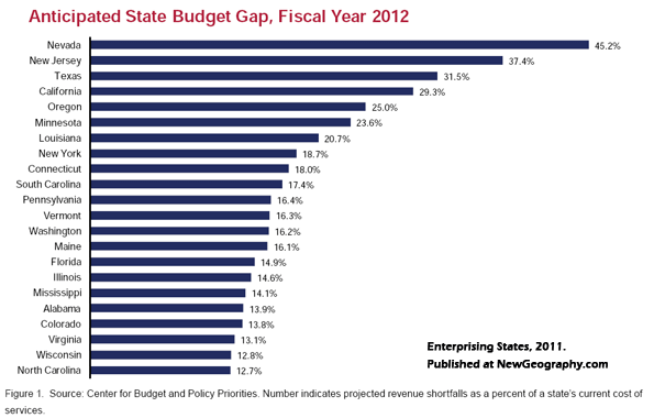
    For many states, the short-term prognosis is dire. Altogether, 44 states and the District of Columbia are projecting budget shortfalls for 2012 amounting to $112 billion. The upcoming fiscal year, according to the Center on Budget and Policy Priorities, will be “one of the states’ most difficult budget years on record. Retiree benefits for state employees add yet another strain, with the states facing a $1.26 trillion shortfall.”

    As a result, states and localities increasingly find themselves forced to impose tough, even draconian cuts in spending. This affects not only newly minted conservative Republicans, but new liberal Democratic governors such as California’s Jerry Brown and New York’s Andrew Cuomo. The only real debate now is how much to rely on taxes and how much on cuts in spending to address the fiscal issues ahead. One casualty: infrastructure spending, which was boosted by the stimulus, now seems to be winding down as well.

    This report will try to address the nature of this dilemma and suggest ways to best deal with it. Although we agree with the notion of fiscal probity, ultimately, states can deal with the fundamental problems only by spurring growth and upward mobility. This will not only create new revenues, but also dampen the demand for social services.

    A state can neither cut nor tax itself into prosperity. Weak public infrastructure combined with low taxes has failed through history to create strong state economies, as was long the case in the Southeast. But at the same time many large states—California, New York, Illinois—have raised taxes and spending and have suffered a strong out-migration of middle class citizens and jobs for decades.

    Now, faced with enormous deficits, there is a temptation to reduce those very “crown jewels,” such as the California public university system, into what University of California President Mark Yudof describes as “tatters.” In trying to balance their budgets, states run the risk of undermining their own long-term recoveries.

    The great danger that looms here, in our estimation, is not bankruptcy. Rather, it is long-term stagnation, in which growing demands for social services, combined with weak revenues. foster pressure for more taxes, reduced services or a deadly combination of both. This represents something of a existential problem in a country where the prospect for a better future has long been a hallmark.

    The founders of the republic understood the critical importance of maintaining this aspiration, and European observers were struck by the remarkable social mobility in America’s cities. In the 19th century, American factory workers and their offspring had a far better chance of entering the middle or upper classes than their European counterparts. In politics and in daily life, expansion of opportunity was seen as essential to the American experiment. Writing in 1837, one Whig lawyer in Pittsburgh suggested, “If you deny the poor man the means to better his condition . . . you have destroyed republican principles in their very germ.”

    Today, this traditional faith is being sorely tested in much of the country. Although both stock prices and corporate profits have rebounded, little has been done that has stimulated employment. Large companies may be sitting on large caches of cash, in part due to low interest rates and a buoyant stock market, but capital remains scarce for the small businesses that create most of America’s new jobs. Indeed, entrepreneurial growth, as the Kauffman Foundation recently found, has now slowed down among most segments of the population.

    Of course, there have been remarkable stories of wealth creation and success despite these hard times. But even in Silicon Valley—home to such high-fliers as Google, Apple and Facebook—the overall impact on jobs has been minimal. Of the nation’s 51 largest metropolitan regions, San Jose, the Valley’s heartland, has suffered the largest net loss of jobs over the past decade of any major metropolitan region outside Detroit. The San Francisco area suffered job losses only slightly lower, on a percentage basis, than hard-hit Cleveland.11 Due in part to financial controls, investment in promising new companies has become ever more undemocratic, with the bulk of new money pouring into firms like Facebook coming not from public markets, but from a small, well-heeled cadre of private investors. Venture-backed technology companies, notes Intel co-founder Andy Grove, now find it expensive to “scale” their operations and add employees in California or even the United States. As a result, he suggests, companies tend to indulge in “an undervaluing of manufacturing” that erodes employment. This contrasts with, for example, China, where job creation is considered “the number one objective of state economic policy.”

    Much the same can be said of New York, where the paper economy has been boosted by Fed policy but the creation of middle-income jobs continues to lag. New York City’s current financial boom—Wall Street pay hit a new record in 2011—simply reinforces a level of income inequality that is the highest in the nation. Unemployment in the toniest Manhattan precincts reaches barely five percent, while it’s 20 percent in working-class Brooklyn. Not surprisingly, the city’s distribution of wealth is now twice as unequal as in the rest of the nation. It may seem a model recovery on Wall Street, but it is less so on the streets of the nation’s premier city.

    In contrast, the states that have fared best in creating middle-class jobs have been either those close to the expanding federal government, another major beneficiary of the stimulus, or those that have attended to more basic industries, such as energy production, agriculture and manufacturing. These industries have propelled widespread expansions in the Great Plains, parts of the Intermountain West, Alaska and Texas.

    More interestingly, many of these states have also experienced a surge in STEM—science, technology, engineering and mathematics—related employment. In some states, this has come as a result of continuing state investment in education and training; in most cases, these states have simply tended to create a business-friendly atmosphere for companies of all sorts. They have also generally kept housing costs low, something critical to young families.

    Perhaps the best way to look at our evolving economy is not so much from the point of view of companies or industries, but of individuals. States often focus on their largest employers, but those companies have been cutting jobs for the past decade. Since 2000, large corporations—which employ roughly one-fifth of American workers— have stopped hiring, as they did in the previous decade, and actually reduced their payrolls by nearly three million while adding 2.4 million jobs abroad.

    Andrei Cherny, an Arizona Democrat writing in the journal Democracy, suggests that “both progressives and conservatives have offered little in the way of new answers as their long-held orthodoxies run headlong into new realities.” Cherny admits that the stimulus and the Fed’s strategy of loose money—what he calls “government by hot check”—failed to address the needs of the nation’s large class of small entrepreneurs.

    Left out of the equation are the small businesses that, according to the Bureau of Labor Statistics, employ half of all workers and create 65 percent of all new jobs. Most of these firms are small, under-capitalized, and run by single proprietors or families.

    In this environment, notes economist Ying Lowery, “Business creation is job creation.” The states that will do best are those that create the conditions to lure and retain those who start companies or who are selfemployed. Policies that target managers of hedge funds, venture firms, or large corporations have their place, but the real action—particularly in a world of ever-changing technology and declining long term employment—lies in the movement of individuals.

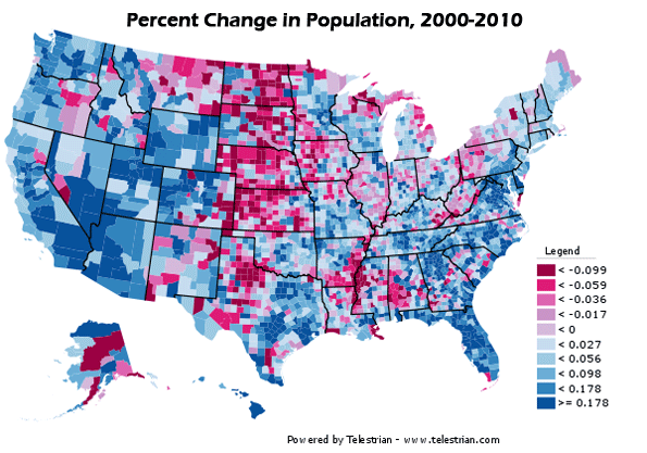
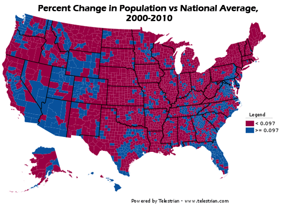
    Under these conditions, where individuals migrate or decide to settle will have a critical impact on which states or regions grow. Three dynamic population segments— educated workers, immigrants and downshifting boomers—illustrate the factors that drive their migration patterns. In many ways they represent the “canaries in the coal mine”; where they go is generally where the air is good for entrepreneurship.

    The movement of educated workers has become a much discussed topic among pundits and economic developers in recent years. One common assumption is that “the best” migrants tend to move to “hip and cool” locales, generally on one of the coasts. These workers then form the core of growing industries and, more importantly, new ones. Yet the evidence tells a somewhat different, perhaps surprising, story. An analysis of recent Census data on the migration of educated workers finds that the biggest net growth has taken place not in New York, San Francisco and Boston, but in places like Nashville, Houston, Dallas, Austin, and Kansas City. Indeed, many of the leading “creative class” states, notably California, Massachusetts and New York, fared considerably worse than regions in states such as Missouri, Kansas, Texas and Tennessee in terms of net migration numbers.

    These location choices have to do with how individuals make decisions: people move primarily for reasons related to jobs, family, and housing. An analysis of the migration of educated workers, for example, reveals that, for the most part, these workers are moving away from expensive, dense regions to more affordable, generally less dense places. This migration also tends to parallel moves to those states that generally impose fewer regulatory burdens on business.

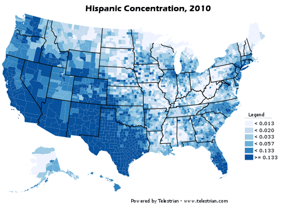
    Perhaps even more surprisingly, we see a similar pattern in minority and immigrant entrepreneurship. These groups now constitute a growing percentage of business startups. Overall, according to the Kauffman Foundation, foreignborn immigrants in 2010 constituted nearly 30 percent of all new businesses owners, up from 13.4 percent in 1996. This has also been the one outstanding segment of the population whose entrepreneurship rate has grown throughout the current recession.

    As with the case of educated migrants, minority entrepreneurs tend to establish themselves in less expensive, more business-friendly, and generally less heavily regulated metropolitan regions. A recent survey of minority migration and self employment by Forbes found that the best conditions for non-white entrepreneurs were in metropolitan areas in Georgia (Greater Atlanta), Tennessee (Nashville), Arizona (Phoenix), Oklahoma (Oklahoma City), and several Texas cities (Houston, Dallas, San Antonio and Austin). In contrast, most regions in California and the Northeast, outside of the Washington, D.C. metropolitan area, did quite poorly.

    Jonathan Bowles, president of the New York-based Center for an Urban Future, has traced this poor performance to a myriad of factors including sky-high business rents, which stymie would-be entrepreneurs in minority communities. “[Entrepreneurs] face incredible burdens here when they start and try to grow a business,” Bowles suggests. “Many go out of business quickly due to the cost of real estate and things like high electricity costs. It’s an expensive city to do business in without a lot of cash.”

    Boomers are unique compared to traditional senior populations. According to the Kauffman Foundation, they tend to be more likely to start businesses than are younger age groups. In 1996, people between 55 and 64 years of age accounted for 14 percent of entrepreneurs; in 2010 they represented 23 percent.

    Less is known about the migration of aging boomers, a large segment of the population, but evidence so far suggests that they, too, are moving to such states. According to AARP, most boomers prefer to stay close to where they live—mostly in suburbs—or where their children tend to move, that is, to the low-regulation states of the South and West.

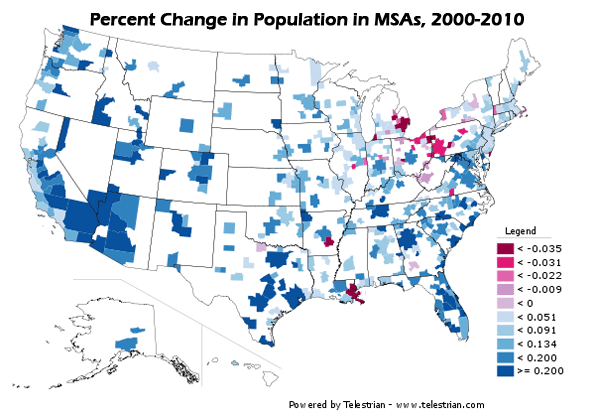
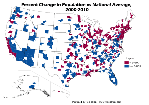
    States can draw on these migration patterns in developing their economic policies. Generally, people migrate to states with jobs, and states with population gains generally produce more employment than those with slower growth. Indeed, despite the great disruptions of the mortgage crisis, regions such as Orlando, San Bernardino-Riverside and Las Vegas all recorded double-digit employment gains over the last decade.

    More recent developments suggest that future growth may depend on several critical factors. It is clear, for example, that investments in education—for example in Austin, Raleigh-Durham and parts of the Great Plains—have paid off by attracting both individuals and industries, and have made these areas among the healthiest employment markets in the country. Some of these states have suffered less fiscal distress than states elsewhere in the nation, and have benefited from their educational investment through hard times. Investments in community colleges may prove to be particularly essential, since their role in providing skilled workers has been critical in many states.

    States that have invested in new infrastructure such as ports, airports, roads and improved transit tend to have a leg up on others that have failed to do so. Even relatively low-tax states such as Texas have invested heavily in recent years in roads and port facilities, which are critical to industries locating there. Even during the recession, many industries—from manufacturing and environmental firms to health care and information technology—have had trouble hiring skilled workers. States are responding by creating job-oriented training programs in states like Ohio, New York, Tennessee, Washington and Wisconsin, which have all established technical institutions separate from community colleges. Tennessee alone has 27 such “technical centers” offering one-year certificates for certain jobs.

    Overall, as Delaware Governor Jack Markell has pointed out, businesses generally do not want to eliminate government, but rather want it to be useful for economic growth. Markell, who has done some considerable budgetcutting himself, believes that the focus needs to be on expanding the economy, which will requires improvements not only in schools, but in transportation infrastructure that will make the free market work better.

    Perhaps even more important has been creating a favorable business climate. California, for example, possesses the greatest basic economic attributes of any state: a mild climate, location on the Pacific Rim, a world-class university system, and a legacy of strong infrastructure investment. Yet today, despite the presence of leading global industrial zones such as Hollywood and Silicon Valley, as well as the country’s richest agricultural sector, California’s unemployment remains well above the national average and job growth has remained relatively tepid. After many years in denial, even some of the state’s most progressive politicians realize that something is amiss. In a remarkable development, for example, California leaders including Lieutenant Governor Gavin Newsom recently visited Texas to learn from the large state that has fared best during the long recessionary period. Given the political gap between Californians like Newsom, a former mayor of San Francisco, and Texas Governor Rick Perry, this represents something of a “Nixon in China” moment.

    This is not to say that California, or any other state, should draw its economic policy from another state. Those states that attempt to use tax incentives to “lure” industries with no overwhelming need to relocate — as shown in recent findings about Illinois incentives to movie-makers — are often disappointed. In many cases, the incentive game becomes a classic “race to the bottom,” in which the benefits of new jobs often prove transitory. Since the 1990s, just two percent of job growth and decline has been due to businesses relocating across state borders, yet the costly practice of using unfocused tax expenditures to poach companies continues.

    Nor can states reliably predict which industries will need more workers over the long term. In the 1990s, economist Michael Mandell predicted that cutting-edge industries like high-tech would create 2.8 million new jobs; in reality, notes a 2010 New America Foundation report, they actually shed 68,000.30 Each state and each region has its own peculiar economic DNA. States with exportable products—for example the Great Plains or the Upper Midwest—may need to focus on ways to get their output efficiently to market. Already affordable, they may also choose to increase their attractiveness to high value-added companies and educated individuals by boosting their education systems and making their metropolitan regions more congenial to well-educated migrants.

    In other states such as New York or Massachusetts, the economy is focused on intangible exports like financial services and software. Making themselves more affordable for both individuals and companies may be the best way for states to improve competitiveness. Over the long term, no state economy can sustain its people if it only focuses on the “luxury” sectors; the large number of unemployed and underemployed workers will drain state resources. As those state resources become more limited, decisions about how to structure tax incentives or where to place education and infrastructure investments must be based upon a deep understanding of this economic DNA. Strategic investments will limit wasteful spending and maximize impact in the economic sectors where a state is most likely to grow.

    Ultimately, there is only one route to sustainable state economies, and that is through broad-based economic growth. The road to that objective can vary by state, but the fundamental goal needs to be kept in mind if we wish to see a restoration of hope and American optimism about the future.

    Read the full report, including highlights of top performing states and profiles of job creation efforts in all 50 states.

    Praxis Strategy Group is an economic research, analysis, and strategic planning firm. Joel Kotkin is executive editor of NewGeography.com and author of The Next Hundred Million: America in 2050

  • The Explosion of Oil and Gas Extraction Jobs

    From Appalachia to Alaska, the growth is eye-popping. Thousands of new jobs have sprouted up, most well-paying and all boons to their regions. There’s no denying oil and gas extraction jobs are on the rise, and not just in Texas and Oklahoma.

    North Dakota is drilling oil at a blistering pace. Pennsylvania and West Virginia, along with parts of New York and Ohio, are seeing a natural gas boom with their Marcellus Shale reserves. And Colorado, Wyoming, Alaska, and other Western states are adding extraction jobs in droves.

    The six fastest-growing jobs for 2010-11, according to EMSI’s latest quarterly employment data, are related to oil and gas extraction. This includes service unit operators, derrick operators, rotary drill operators, and roustabouts. Each is expected to grow anywhere from 9% to 11% this year, in an otherwise stagnant economy.

    But that’s not all. A mixed bag of other extraction and petroleum-related jobs—wellhead pumpers, all other extraction workers, geological and petroleum technicians—are also expected to see healthy gains. In total, nine of the top 11 fast-growing jobs in the nation are tied in one way or another to oil and gas extraction.

    Occupation

    2010 Jobs

    2011 Jobs

    Change

    % Change

    Service unit operators, oil, gas, and mining

    42,110

    46,766

    4,656

    11%

    Derrick operators, oil and gas

    23,323

    25,747

    2,424

    10%

    Rotary drill operators, oil and gas

    28,116

    30,981

    2,865

    10%

    Roustabouts, oil and gas

    75,636

    82,678

    7,042

    9%

    Helpers, extraction workers

    44,303

    47,247

    2,944

    7%

    Petroleum engineers

    29,063

    30,917

    1,854

    6%

    Biomedical engineers

    16,065

    17,061

    996

    6%

    Wellhead pumpers

    24,186

    25,616

    1,430

    6%

    Extraction workers, all other

    23,423

    24,784

    1,361

    6%

    Geological and petroleum technicians

    35,304

    37,205

    1,901

    5%

    What’s driving this employment spike? A push for increased domestic oil production is certainly a factor, as are technology breakthroughs in collecting massive shale gas deposits. But more subtle shifts are also happening, including how federal and state agencies track the oil and gas extraction workforce.

    A Prime Example

    For a case study on the skyrocketing employment picture on the shale front, just look at Pennsylvania. Without a tax on natural gas extraction and perfectly located to take advantage of the Marcellus Shale formation, parts of the commonwealth have become a hotbed for drilling. More than 3,000 wells have been drilled in the last three years, and much more is expected in coming years.

    Since 2008, Pennsylvania has added more than 15,000 jobs in the mining, quarrying, and oil and gas extraction industry, a 41% jump. Only Texas and Oklahoma have added more of these jobs in the last three years. Meanwhile, North Dakota has seen an 80% jump in employment in this sector, second only to Delaware since 2008.

    Where are these well-performing oil and gas jobs located? We mapped the data for the four fastest-growing jobs — roustabouts, service unit operators, derrick operators, and rotary drill operators. Here’s what we found: Texas and Oklahoma of course have a large percentage of these jobs, but California, Alaska, and other Western states have a fair share, too.

    The map below shows 2-year job growth in these oil and gas extraction jobs for every county in the continental US. Williams County, North Dakota is No. 1 with 1,539 jobs added, which amounts to 80% growth.

    More Than a One-Year Trend

    Mining, quarrying, and oil and gas extraction is expected to grow 6% in the US from 2010-2011. That’s the fastest projected growth among the 20 broadest-level industries—twice the rate in fact, as the next fastest-growing industry (administrative and support and waste management and remediation services,).

    This is hardly a one-year bump, though. Over the last five years, the explosion in the sector has been than staggering—even with a minor employment dip from 2009-2010. The industry added more than 345,000 jobs nationally from 2007 to 2009, and is expected add another 85,000 this year, which equals 11% growth.

    It’s also helpful to break out mining and oil and gas extraction from the broad sector to more specific industries to locate the real driver of the growth. In this case, it’s easy to see: Of the 506,401 new jobs in the sector since 2006, more than 431,000 have been in the crude petroleum and natural gas extraction industry (NAICS 211111). This sub-sector has grown by a whopping 113% nationally in the last six years while mining (except oil and gas) remains at its ’06 employment level.

    Every state except for Maine has added jobs in crude petroleum and natural gas extraction since 2006, with Texas, Oklahoma, California, and Kansas leading the way.

    The Rise of Contract Oil and Gas Workers

    In last month’s GOVERNING Magazine, William Fulton wrote about the “1099 economy”—the shift by employers to hire temporary workers who file a 1099 form with the IRS rather than a W-2 and don’t receive benefits. No other industry has seen this move to 1099 workers more dramatically than mining, quarrying, and oil and gas extraction.

    A recent EMSI analysis revealed that the share of 1099 workers in this sector increased from 33% in 2005 to 53% in 2010, the biggest percentage jump among the 20 broadest-level industries. Mining, quarrying, and oil, and gas extraction now has the third-highest share of contract workers, behind real estate (74%) and agriculture, forestry, fishing and hunting (68%).

    At least part of this influx could be attributed to land owners cashing in on royalties after leasing their property for drilling. Through the quirks of how the Census’ Bureau of Economic Analysis* tracks the oil and gas extraction industry — and how the industry data is tied to occupations — some of these jobs could be counts of landowners who are claiming additional income from oil and gas royalties. If that’s the case, these jobs would be better placed in the real estate and leasing industry.

    Please note: For these reasons, EMSI “noncovered” data (i.e., data on 1099 workers plus more traditional state data, etc.) for oil and gas jobs should be treated with caution. Also, the jobs numbers for 2010 are estimates at this point, so it will take more time to see how these trends play out.

    *The Bureau of Labor Statistics measures only workers covered by unemployment insurance and who thereby file a W-2. EMSI’s “complete” dataset adds proprietors and other “noncovered” workers by combining BLS and state data with various Census datasets.

    Joshua Wright is an editor at EMSI, an Idaho-based economics firm that provides data and analysis to workforce boards, economic development agencies, higher education institutions, and the private sector. He manages the EMSI blog and is a freelance journalist. Contact him here.

    Lead illustration by Mark Beauchamp.

  • Fifty Years of Population Change in the US: 1960-2010

    A new census leads us to ask how population has changed, but usually discussion is focused on changes since the last census. But even more interesting is to appreciate the vaster changes over a greater sweep of time, for example: the fifty years since 1960, when the United States had 179 million people, toward the end of the post-war Baby Boom.

    Over this fifty year period, the country experienced a tremendous economic expansion and metropolitan growth. The attatched maps and charts display these changes, both in the greatest absolute and relative (percentage) losses and gains. We can then assess areas and regions that changed the most – or the least – and how this pattern differs from the most recent decade.

    Looking at both the maps and the tables, high absolute losses are in large northeastern metropolitan counties, plus, because of Katrina, Orleans (New Orleans).  Next most prominent in terms of losses are mining and small industrial counties in Appalachia as well as the largely rural Black majority counties in the Mississippi delta (Arkansas and Mississippi). Far more widespread in terms of space are small absolutely but often high percentage losses across the Great Plains, the rural small town heartland of the country. Losses do extend to the west, in a few mining and farming counties, as in MT, ID, OR and WA, as well as a few Native American reservation areas. 

    From Table 1 (below), 12 counties lost more than 100,000 people since 1960, most in the northeastern historic urban industrial core, including two New York City boroughs. The bigger loser by far, however, was Wayne (Detroit) . Next were Philadelphia, which lost 477,000 and St. Louis, falling 57 percent from 750,000 to 319,000.   Among non-metropolitan counties, the largest absolute losses were in West Virginia, Kentucky and Pennsylvania (mining), and Arkansas and Mississippi (high Black population).

    High relative losses (table 2) of over 50 percent beset 69 counties, all non-metropolitan   except one: St Louis. States with the greatest number of declining counties included North Dakota, 19; Texas, 16; South Dakota, 6, Kansas, Montana and Nebraska, 4; Arkansas, 3; and Missouri, 2. Most were in the Plains states. It is also clear that a high proportion of counties – both metropolitan and non metropolitan – with high Black populations have experienced losses, a sad commentary on disinvestment in areas with high African-American shares.

    In contrast, the pattern of gains is more complex.  Overwhelmingly, the highest absolute amounts (table 3) – and often percentage gains (table 4) – are in mostly larger metropolitan complexes. For the largest areas, the core counties often had lesser rates of growth, even if the absolute amounts were very large (e.g., Los Angeles, Cook, Dallas-Fort Worth, Houston). In contrast the highest rates of growth, often over 400 percent, took place in their satellite or suburban counties. Most obvious are greater Los Angeles and San Francisco, Denver, the large Texas metropolitan areas, Minneapolis, Chicago-Milwaukee, Atlanta, Indianapolis, Seattle, Portland and Washington, DC.  More recent, less suburban (at least in terms of jurisdiction) dominated areas, often in the Sunbelt, include especially Maricopa (Phoenix), Las Vegas, Salt Lake, Nashville, Charlotte, Raleigh, and Richmond.

    This leaves perhaps the two most spectacular (along with California, obviously: the northeastern Megalopolis and Florida. Florida clearly has the highest overall rate of change over this period. The northeastern Megalopolis is highly varied, but overall now spreading from Richmond, Virginia to Portland, Maine. It has developed into an astounding agglomeration of growth, with the locus of fastest absolute as well as percentage growth in its suburban and exurban portions.

    Growth was also often substantial in non-metropolitan or now small metropolitan areas in many parts of the country. An especially remarkable belt of growth – including small towns – extends from Memphis across Tennessee and North Carolina. Another span of significant growth – despite decline or slower growth in the recent past – lies in the Midwest (Indiana, Ohio, Michigan, Wisconsin and Minnesota). Belts of growth follow the I-5 corridor from California to Canada, the corridor from Tulsa through Fayetteville and Springfield to St Louis, and the I95 coastal south Atlantic strip.

    Sixteen counties gained a million or more: Los Angeles, Orange, San Diego, Riverside and San Bernardino, a southwestern megalopolis; Santa Clara (San Jose); Harris (Houston); Dallas and Fort Worth (Tarrant) and Bexar (San Antonio) in Texas; Miami, Ft. Lauderdale (Broward) and Palm Beach, Florida; Clark (Las Vegas); King (Seattle); and Maricopa (Phoenix).

    Finally the counties which grew at the fastest rate over the 50 years include some 118 that grew by 400 percent or more, and 27 that expanded more than ten-fold. States with the most such counties (400 to 1000 % ) include Florida, 15; Georgia, 11; Colorado, 8; Texas, 6; Virginia 6; California, 4; AZ,MN, MO, NC, and NV, 3 each; MD, NM, OR, TN, WY, 2 each; with 1 each in AL, AR, AK, IL, IN, KY, LA, MS, NE, OK, PA,  SC, UT and WA. Among the over 1000 percent growth, AK and AZ, 1; CO, 3; FL, 8; GA, 4; NV, 2; TX, 6; UT, 1; and VA, 1. 

    Types of counties with over 400 percent growth include 3 core metropolitan, 69 suburban, 44 environmental, and 2 others, often resource development. The fastest growth county was Douglas in suburban Denver, followed by environmentally attractive Mohave, AZ, and Flagler and Collier, FL, followed by Dallas suburb, Collin, and Atlanta suburb Gwinnett.

    Conclusion
    People continue to come to the US in large numbers, and people move from place to place in remarkable numbers.  Don’t count on the current pattern of population to remain very stable, just as the last fifty years have not been.  For example, while the northeastern “Rustbelt” seems in trouble, it is a region of vast plant capacity, superior universities, and a high quality labor force. A reaction to the high cost of excessive outsourcing, and even  some shifts from the “new South” could bring about a surprising restoration.

    Table 1: Largest Absolute Losses, 1960-2010
    Name
    1900
    1960
    2000
    2010
    Change 1960-2010
    Percent Change, 1960-2010
    MI Wayne County 348,793 2,666,297 2,061,162 1,820,584 -845,713 -31.7%
    PA Philadelphia County 1,293,697 2,002,512 1,517,550 1,526,006 -476,506 -23.8%
    MO St. Louis city 575,238 750,026 348,189 319,294 -430,732 -57.4%
    PA Allegheny County 775,058 1,628,587 1,281,666 1,223,348 -405,239 -24.9%
    OH Cuyahoga County 439,120 1,647,895 1,393,978 1,280,122 -367,773 -22.3%
    MD Baltimore city 508,957 939,024 651,154 620,961 -318,063 -33.9%
    LA Orleans Parish 287,104 627,525 484,674 343,829 -283,696 -45.2%
    DC District of Columbia 278,718 763,956 572,059 601,723 -162,233 -21.2%
    NY Erie County 433,686 1,064,688 950,265 919,040 -145,648 -13.7%
    NJ Essex County 359,053 923,545 793,633 783,969 -139,576 -15.1%
    NY Kings County 1,166,582 2,627,319 2,465,326 2,504,700 -122,619 -4.7%
    NY New York County 2,050,600 1,698,281 1,537,195 1,585,873 -112,408 -6.6%
    WI Milwaukee County 330,017 1,036,041 940,164 947,735 -88,306 -8.5%
    MA Suffolk County 611,417 791,329 689,807 722,023 -69,306 -8.8%
    VA Norfolk city 46,624 305,872 234,403 242,803 -63,069 -20.6%
    OH Hamilton County 409,479 864,121 845,303 802,374 -61,747 -7.1%
    OH Mahoning County 70,134 300,480 257,555 238,823 -61,657 -20.5%
    WV Kanawha County 54,696 252,925 200,073 193,063 -59,862 -23.7%
    PA Cambria County 104,837 203,283 152,598 143,679 -59,604 -29.3%
    Table 2: Greatest Relative Losses 1960-2010
    Name
    1900
    1960
    2000
    2010
    Change 1960-2010
    Percent Change, 1960-2010
    ND Sheridan County 4,350 1,710 1,321 -3,029 -69.6%
    WV McDowell County 18,747 71,359 27,329 22,113 -49,246 -69.0%
    HI Kalawao County 1,177 279 147 90 -189 -67.7%
    ND Burke County 5,886 2,242 1,968 -3,918 -66.6%
    TX Cottle County 1,002 4,207 1,904 1,505 -2,702 -64.2%
    TX Loving County 33 226 67 82 -144 -63.7%
    ND Logan County 1,625 5,369 2,308 1,990 -3,379 -62.9%
    NM Harding County 1,874 810 695 -1,179 -62.9%
    ND Divide County 5,566 2,283 2,071 -3,495 -62.8%
    TX Terrell County 2,600 1,081 984 -1,616 -62.2%
    CO La Plata County 7,016 19,225 43,941 7,310 -11,915 -62.0%
    ND Grant County 6,248 2,841 2,394 -3,854 -61.7%
    ND Slope County 1,893 767 727 -1,166 -61.6%
    MS Quitman County 5,435 21,019 10,117 8,223 -12,796 -60.9%
    ND Hettinger County 6,317 2,715 2,477 -3,840 -60.8%
    MS Issaquena County 10,400 3,576 2,274 1,406 -2,170 -60.7%
    ND Cavalier County 12,580 10,064 4,831 3,993 -6,071 -60.3%
    ND Towner County 6,491 5,624 2,876 2,246 -3,378 -60.1%
    SD Campbell County 4,527 3,531 1,782 1,466 -2,065 -58.5%
    ND Steele County 5,888 4,719 2,258 1,975 -2,744 -58.1%
    ND McIntosh County 4,818 6,702 3,390 2,809 -3,893 -58.1%
    ND Emmons County 4,349 8,462 4,331 3,550 -4,912 -58.0%
    TX Motley County 1,257 2,870 1,426 1,210 -1,660 -57.8%
    SD McPherson County 6,327 5,821 2,904 2,459 -3,362 -57.8%
    MO St. Louis city 575,238 750,026 348,189 319,294 -430,732 -57.4%
    Table 3: Largest Absolute Gains, 1960-2010
    Name
    1900
    1960
    2000
    2010
    Change 1960-2010
    Percent Change, 1960-2010
    CA Los Angeles County 170,298 6,038,771 9,519,338 9,818,605 3,779,834 63%
    AZ Maricopa County 20,457 663,510 3,072,149 3,817,117 3,153,607 475%
    TX Harris County 63,786 1,243,158 3,400,578 4,092,459 2,849,301 229%
    CA Orange County 19,696 703,925 2,846,289 3,010,232 2,306,307 328%
    CA San Diego County 35,090 1,033,011 2,813,833 3,095,313 2,062,302 200%
    CA Riverside County 17,897 306,191 1,545,387 2,189,641 1,883,450 615%
    NV Clark County 127,016 1,375,765 1,951,269 1,824,253 1436%
    FL Dade County 4,955 935,047 2,253,362 2,496,435 1,561,388 167%
    CA San Bernardino County 27,929 503,591 1,709,434 2,035,210 1,531,619 304%
    TX Dallas County 82,726 951,527 2,218,899 2,368,139 1,416,612 149%
    FL Broward County 333,946 1,623,018 1,748,066 1,414,120 423%
    TX Tarrant County 52,376 538,495 1,446,219 1,809,034 1,270,539 236%
    CA Santa Clara County 60,216 642,315 1,682,585 1,781,642 1,139,327 177%
    FL Palm Beach County 228,106 1,131,184 1,320,134 1,092,028 479%
    TX Bexar County 69,422 687,151 1,392,931 1,714,773 1,027,622 150%
    WA King County 110,053 935,014 1,737,034 1,931,249 996,235 107%
    CA Sacramento County 45,915 502,778 1,223,499 1,418,788 916,010 182%
    FL Orange County 11,374 263,540 896,344 1,145,956 882,416 335%
    FL Hillsborough County 36,013 397,788 998,948 1,229,226 831,438 209%
    NY Suffolk County 77,582 666,784 1,419,369 1,493,350 826,566 124%
    TX Travis County 47,386 212,136 812,280 1,024,266 812,130 383%
    VA Fairfax County 18,580 275,002 969,749 1,081,726 806,724 293%
    GA Gwinnett County 25,585 43,541 588,448 805,321 761,780 1750%
    TX Collin County 50,087 41,247 491,675 782,341 741,094 1797%
    NC Wake County 54,626 169,082 627,846 900,993 731,911 433%
    AZ Pima County 14,689 265,660 843,746 980,263 714,603 269%
    NC Mecklenburg County 55,268 272,111 695,454 919,628 647,517 238%
    UT Salt Lake County 77,725 383,035 898,387 1,029,655 646,620 169%
    Table 4: Largest Relative Gains, 1960-2010
    Name
    1900
    1960
    2000
    2010
    Change 1960-2010
    Percent Change, 1960-2010
    CO Douglas County 3,120 4,816 175,766 285,465 280,649 5827%
    AZ Mohave County 3,426 7,736 155,032 200,186 192,450 2488%
    FL Flagler County 4,566 49,832 95,696 91,130 1996%
    FL Collier County 15,753 251,377 321,520 305,767 1941%
    TX Collin County 50,087 41,247 491,675 782,341 741,094 1797%
    GA Gwinnett County 25,585 43,541 588,448 805,321 761,780 1750%
    AK Matanuska-Susitna Borough 5,188 59,322 88,995 83,807 1615%
    TX Montgomery County 17,067 26,839 293,768 455,746 428,907 1598%
    FL Hernando County 3,638 11,205 130,802 172,778 161,573 1442%
    NV Clark County 127,016 1,375,765 1,951,269 1,824,253 1436%
    FL Citrus County 5,391 9,268 118,085 141,236 131,968 1424%
    TX Fort Bend County 16,538 40,527 354,452 585,375 544,848 1344%
    GA Forsyth County 11,550 12,170 98,407 175,511 163,341 1342%
    FL Osceola County 3,444 19,029 172,493 268,685 249,656 1312%
    TX Denton County 28,318 47,432 432,976 662,614 615,182 1297%
    CO Summit County 2,744 2,073 23,548 27,994 25,921 1250%
    NV Douglas County 1,534 3,481 41,259 46,997 43,516 1250%
    UT Washington County 4,612 10,271 90,354 138,115 127,844 1245%
    TX Rockwall County 8,531 5,878 43,080 78,337 72,459 1233%
    GA Fayette County 10,114 8,199 91,263 106,567 98,368 1200%
    VA Loudoun County 21,948 24,549 169,599 312,311 287,762 1172%
    FL Charlotte County 12,594 141,627 159,978 147,384 1170%
    FL Pasco County 6,054 36,785 344,765 464,697 427,912 1163%
    TX Williamson County 38,072 35,044 249,967 422,679 387,635 1106%
    GA Henry County 18,602 17,619 119,341 203,922 186,303 1057%
    FL Lee County 3,071 54,539 440,888 618,754 564,215 1035%

    Richard Morrill is Professor Emeritus of Geography and Environmental Studies, University of Washington. His research interests include: political geography (voting behavior, redistricting, local governance), population/demography/settlement/migration, urban geography and planning, urban transportation (i.e., old fashioned generalist).

  • Manufacturing Stages A Comeback

    This year’s survey of the best cities for jobs contains one particularly promising piece of news: the revival of the country’s long distressed industrial sector and those regions most dependent on it. Manufacturing has grown consistently over the past 21 months, and now, for the first time in years, according to data mined by Pepperdine University’s Michael Shires, manufacturing regions are beginning to move up on our list of best cities for jobs.

    The fastest-growing industrial areas include four long-suffering Rust Belt cities Anderson, Ind. (No. 4), Youngstown, Ohio (No. 5), Lansing, Mich. (No. 9) and Elkhart-Goshen, Ind. (No. 10). The growth in these and other industrial areas influenced, often dramatically, their overall job rankings. Elkhart, for example, rose 137 places, on our best cities for jobs list; and Lansing moved up 155. Other industrial areas showing huge gains include Niles-Benton Harbor, Mich., up 242 places, Holland-Grand Haven, Mich., (up 172),  Grand Rapids, Mich., (up 167)   Kokomo Ind., (up 177) ; and Sandusky, Ohio, (up 128).

    Industrial growth also affected some of the largest metros, whose economies in other areas, such as business services, often depend on customers from the industrial sector. Economist Hank Robison, co-founder of the forecasting firm EMSI, points out that manufacturing jobs — along with those in the information sector — are unique in creating high levels of value and jobs across other sectors in the economy.  They constitute a foundation upon which other sectors, like retail and government, depend on.

    Take the case of Milwaukee. The Wisconsin city rode a nearly 3% boost in industrial employment to increase its ranking among the best large metros for jobs: It rose from a near-bottom No. 49 (out of 65) to a healthy No. 23. As manufacturing employment surged, others sectors, notably business services, warehousing and hospitality, showed solid increases after years of slow or even negative growth.

    Milwaukee’s growth reflects some of the greater trends affecting the industrial sector, whose overall income is up 21% since mid-2009.  The Fed’s monetary policy, combined with deficit-related concerns, has certainly helped by depressing the value of the dollar, keeping American prices more competitive with foreign producers. Low prices have helped U.S. industrial exporters gain sales, much as it has boosted agricultural commodity producers to sell their goods to growing countries like China, India and Brazil. Exports now account for 12.8% of all U.S. output, the largest percentage since the Commerce Department starting tracking in 1929.

    These new markets are particularly strategic to regions like Milwaukee and other parts of the Great Lakes. Despite the industry’s massive shrinkage of the past decade, these areas retain significant specialized skills in fields like machine tools, automotive parts and temperature controls, which are all in demand in the developing world as well as at locally based firms, many of which are enjoying high profits. Allen-Edmunds, a high-end shoe maker based in the region, has seen export business surge.

    Similarly Peoria, Ill., has benefited from a boom in overseas orders for heavy equipment from Caterpillar, its dominant industrial company. Caterpillar sells the kind of heavy moving and mining machinery now in great demand, particularly in developing countries.

    One big driver of industrial growth has come from the source of so much pain in the past: the auto industry. Although production remains 25% below its 2007 peak, the industry, which accounts for roughly one-fifth of the nation’s industrial output, is on the rebound.  Ford Motor is achieving its best profits in over a decade, and both Chrysler and General Motors are officially in the black.

    Long-depressed industry center Warren-Troy-Farmington Hills, Mich., topped our list of manufacturing job-creators, with an impressive 8.2% increase. Second place went to the Detroit-Livonia-Dearborn area, which experienced 3.5% growth. Of course this recent expansion hardly makes up for decades of decline — auto industry employment, for example, is still down over 34% from its 2005 peak. But industrial expansion has clearly improved job prospects across the board; over the past year, for example, Warren experienced healthy growth in its information, business services and wholesale trade sectors.

    Of course, not all the big gainers in the industrial sphere are located in Great Lakes. The movement of manufacturing to other parts of the country, particularly to Texas and the Southeast means a better industrial climate helps those regions as well.  The list of fastest-growing industrial areas among our big metros includes San Antonio, Texas (No. 3); Atlanta (No. 7); Oklahoma City (No. 8) and Austin-Roundrock, Texas (No. 10) — all of which did very well in our overall jobs survey. Many of these areas are business-friendly, have low housing costs, reasonable taxation and business-friendly regulatory environments that induce industrial expansions.

    Another contributing factor to industrial growth in places like Austin is high-tech manufacturing. Covering everything from servers to specialized production equipments, the expansion of this sector accounts for a healthy 1.7% upturn in San Jose, No. 6 among our large metro regions, a welcome turnaround for an area that shed some 17% of its industrial jobs over the past decade.

    But some of the best progress took place in smaller communities spread across the country. Take Yakima, Wash., which came out first on our manufacturing job growth list with a heady 19% growth in industrial jobs.  Metal fabrication plants companies such as Canam Steel have led the way, with some of the new demand coming from Canadian sources.

    Other strong performers included Midland, Texas, which ranked sixth in our industrial rankings — fifth  among the smaller cities. Here an expanding oil and gas sector has sparked a strong revival not only in manufacturing but also in business services and finance.

    If manufacturing growth has become a new shaper of overall job growth, some regions may need to move beyond the post-industrial mindset that dominates so much of regional e development orthodoxy. Take the coastal areas in California: Los Angeles-Long Beach, which has the nation’s largest industrial base and high unemployment, continues to lose manufacturing jobs – over 28% gone over the past decade — in part due to strict regulatory controls and a basic inattention to this sector by government officials.

    In contrast, some hard-hit economic regions like Modesto, in California’s Central Valley, have promoted industrial growth. Last year, a nearly 14% increase in manufacturing jobs — much of it food related — helped the area gain some 92 places on our survey . They have not exactly won a gold medal, but certainly the improvement amount to  more than chopped liver.

    To be sure, cities can grow without robust manufacturing. Take financial centers like New York, university towns or Washington, D.C., where paper-pushing remains the core competency. But for many areas, particularly those beyond the urban “glamour zone,” getting down and dirty at the factory represents a solid economic strategy. In fact, it may be one of the best way to nurture your region back to health.

    Top Cities for Manufacturing Job Growth, 2009-2010
    Yakima, WA 19.0%
    Sebastian-Vero Beach, FL 17.4%
    Palm Coast, FL 16.7%
    Anderson, IN 14.3%
    Youngstown-Warren-Boardman, OH-PA 13.2%
    Midland, TX 13.0%
    Modesto, CA 12.0%
    Yuma, AZ 9.8%
    Lansing-East Lansing, MI 9.3%
    Elkhart-Goshen, IN 9.3%
    Top Big Cities for Manufacturing Job Growth, 2009-2010
    Warren-Troy-Farmington Hills, MI 8.2%
    Detroit-Livonia-Dearborn, MI  3.5%
    San Antonio-New Braunfels, TX 3.2%
    Milwaukee-Waukesha-West Allis, WI 2.9%
    Louisville-Jefferson County, KY-IN 2.0%
    San Jose-Sunnyvale-Santa Clara, CA 1.7%
    Atlanta-Sandy Springs-Marietta, GA 1.7%
    Oklahoma City, OK 1.6%
    Pittsburgh, PA 1.6%
    Austin-Round Rock-San Marcos, TX 1.5%

    This piece originally appeared in Forbes.com

    Joel Kotkin is executive editor of NewGeography.com and is a distinguished presidential fellow in urban futures at Chapman University, and an adjunct fellow of the Legatum Institute in London. He is author of The City: A Global History. His newest book is The Next Hundred Million: America in 2050, released in February, 2010.

    Photo by bobengland

  • The New Geography of Population Loss and Gain

    Dramatic shifts in population growth across the United States in the last decade should surprise no one. Some patterns are continuing trends of earlier decades, but other patterns show substantial change.  I show these changes in three ways, first a conventional choropleth map coloring counties by broad classes from high losses to moderate and high percent gain, second a map in which absolute gains and losses are depicted by proportional symbols, with colors showing the rate of change, and third, a look a counties that experienced either extreme loss and gain. 

    There are four major regions that experienced population loss. The largest covers the rural high plains from Texas to Canada, and most marked in Kansas, Nebraska, Iowa, North and South Dakota, and eastern Montana in a continuation of at least 60 years, and no surprise, as farms get larger and more mechanized, small towns decline. Yet these losses are less pervasive than earlier, especially due to energy development in Wyoming, North and South Dakota and Montana, and energy and agricultural change in Oklahoma and Texas. 


    The second area of decline, also continuing a long historic trend, can be seen in the heavily African-American dominated areas in the Mississippi Delta, in Arkansas, Louisiana and Mississippi, and across the Black belt, Alabama, Georgia, and South Carolina, where significant development investment simply did not occur—race matters.

    Third, we see continued population reductions  across Appalachia from eastern Kentucky, through West Virginia, but this loss has now taken gotten more severe in western Pennsylvania and New York, largely due reductions in  mining and manufacturing as well as a dearth  of new investment.

    Fourth is decline across many urban as well as rural counties in the upper Midwest, in Illinois, Indiana, Ohio and Michigan, due to a complex mix of deindustrialization and related forces.

    Looking at losses from the map emphasizing absolute number of population change reduces the significance of the losses in the Plains, as most were small, reveals somewhat larger absolute losses in the Mississippi delta, and the specific Katrina-led losses in greater New Orleans. It highlights the concentration of larger losses in core metropolitan counties, not only in northern Appalachia and the upper Midwest, particularly in Ohio, Pennsylvania and Michigan, but also in other large cities, as St. Louis and Chicago.


    At least eight regions of significant growth can be described. Territorially, the most obvious can be seen in the Mountain stares, from Arizona, through Utah and much of Colorado, Wyoming into parts of Idaho and Montana. The reasons vary, from energy in Wyoming, to more amenity based growth in western Colorado and Montana, to broader, across the board expansions in Arizona, Utah and Idaho. The high fertility in the Mormon realm also played a role. Nevada is, well, Nevada.

    A second area of continuing growth is across the Pacific coast, but especially the entire I-5 corridor, the spillover counties surrounding Los Angeles, California’s Central valley, largely due to high Latino growth (which was a major factor way to the north in Washington state).

    Third is the continuing and large scale boom in and around the largest Texas cities, Dallas, Houston, Austin and San Antonio. All have enjoyed a combination of population and economic growth.

    Fourth is a pickup in growth from Oklahoma across the Ozarks, through northwestern Arkansas and across southern Missouri, from a mixture of industrial development and amenity migration.

    Fifth is a less expected belt of growth from the Chicago suburbs, across western Wisconsin, and Minnesota (especially northern), to Fargo, ND.

    Sixth is the never ending growth of Florida. Seventh is the continuing significant urban and industrial based growth in the middle South, from Tennessee and Kentucky, northern Georgia, through South and North Carolina, into Virginia. Then, eighth, is the high level of growth over what we might call the outer, exurban edges of Megalopolis, from Richmond, Virginia, to southern Maine.

    Looking at absolute gains from the second map shows a quite widespread geography of growth, many micropolitan and small metropolitan counties across the west registered  the highest rates of gain. Similarly across the Plains, while the greatest growth is in suburban counties around the Texas giants, growth was robust in many smaller metropolitan areas and cities, from the Mexican border up to Canada.  Likewise, in the upper Midwest, despite problem in the declining big city cores, growth was stronger in exurban and small metropolitan areas. Across the southeast, despite the stupendous growth around Atlanta, Nashville, Raleigh and Washington DC, the significant pattern is how widespread growth was across much of the region. Florida, too, perhaps grew less fast in its long time biggest cities, but is now filling up the remaining space!

    Finally Megalapolis is far from dormant. The old cores of Baltimore, Philadelphia, New York and Boston may be slow growing or even declining a little,but  the satellite and exurban belt show remarkable gains, especially in Maryland, Delaware and eastern Pennsylvania, in a kind of spillover of investment and residence to its outer limits.

    The Biggest Losers and Gainers

    Absolute losses: The largest loss numbers are in core counties of de-industrializing metropolitan areas in the north. Among just the 21 counties losing more than 10,000, Michigan has 3 for a loss of 260,000, Ohio, 6, for a loss of 228,000, and Pennsylvania 3, for a loss of 81,000. Others include Cook county (Chicago), St Louis city and county, Erie (Buffalo), and Baltimore. Greater New Orleans includes three counties, with a loss of 195,000. The one non-metropolitan county is highly African-American Washington County, MS (Greenville). Indeed, high Black concentration is a common denominator among all these areas.  Race continues to rule demography in much of the south.

    Relative losses:  Most of the counties with the highest loss rate (48 counties with over a 17 percent loss) are rural or small town. The only exceptions are Orleans and St. Bernard (New Orleans). States with high rate loss counties include Texas (7), Mississippi and North Dakota (6), Louisiana (5) Arkansas and Kansas (4), South Dakota, Nebraska, Montana and Alaska (2), and one each in Colorado, Minnesota, Nevada, New Mexico, Oklahoma and West Virginia.  The AR, LA and MS counties are heavily African American.

    Absolute Gains

    51 counties gained more than 100,000 residents. The top 11 are
    Wake, NC :: 273,000
    San Diego :: 281,000
    Collin, TX (Dallas suburb) :: 291,000
    Los Angeles :: 299,000
    Bexar (San Antonio :: 322,000
    San Bernardino :: 326,000
    Tarrant (Ft. Worth) :: 363,000
    Clark, NV (Las Vegas) :: 576,000
    Riverside :: 644,000
    Harris (Houston) :: 692,000
    Maricopa (Phoenix) :: 745,000

    Of the 51 big gainers, ALL are metropolitan, as the 12 in Texas gained 3,171,000, the 12 in California 2,640,000, 7 in Florida 1,335,000, two in North Carolina 497,000, three in Virginia 384,000, and two in Georgia 332000. Many of these counties are Sunbelt core counties, or satellite or spillover counties. Many are suburbs of large metropolitan centers. Of the 51, only 8 are in the “north” of the country (Illinois, Utah, Washington and northern California).

    Relative Gains

    The eight counties gaining more than 75% are
    Sumter, FL :: 75%
    Forsyth GA  ::  78
    Rockwall, TX :: 82
    Loudon, VA :: 84
    Lincoln, WY  :: 86
    Flagler, FL :: 92
    Pinal, AZ :: 109
    Kendall, IL :: 110

    Of the top 35 counties, gaining over 50 percent, Texas had seven, Georgia, six, Florida four, Utah 2, with one each in AK, AZ, CO,ID, IL, IN, IA, MS, NV,NC, OH, PA, SD, VA, WA and WY. Twenty-eight are metropolitan suburbs, three are new small metropolitan areas (FL UT), two are energy development areas (SD, WY) and two more environmental (PA, ID). Finally of the 35, 11 are in the North, 24 in the South.  Eight counties are in both the highest absolute and highest relative lists—Pinal, AZ, Douglas, CO, Loudon, VA, and five in Texas, Collin, Denton, Montgomery, Ft. Bend, and Williamson. Overall, in terms of growth, Texas wins.

    Conclusion

    I know a lot about population in the US, but still I’m glad I didn’t venture predictions ten years ago, as population change is more than a little unpredictable. Yes, Sunbelt growth was expected, but the details were sometimes as expected but there were unusual gains and losses. The data reviewed here are just the totals for redistricting, so no attempt was made to relate population change to economic change. Still, while some of the redistribution to the Sunbelt, or to the Mountain states was amenity or retirement driven, much more seems to be a consequence of massive shifts of industry and services from the higher cost north to the lower cost south. But there is a vast amount of talent and physical plant in these areas so I would not dare to predict that 2020 would be a simple continuation of the last decade.

    Richard Morrill is Professor Emeritus of Geography and Environmental Studies, University of Washington. His research interests include: political geography (voting behavior, redistricting, local governance), population/demography/settlement/migration, urban geography and planning, urban transportation (i.e., old fashioned generalist).

  • Census 2010 Offers Portrait of America in Transition

    The Census Bureau just finished releasing all of the state redistricting file information from the 2010 Census, giving us a now complete portrait of population change for the entire country.  Population growth continued to be heavily concentrated in suburban metropolitan counties while many rural areas, particularly in the Great Plains, continue to shrink.


    Percentage change in population, 2000-2010. Counties that grew in population in blue, decliners in red. Note: Legend values not multiplied by 100.

    Dividing counties by those growing faster or slower than the US average paints the picture even more starkly:


    Percentage change in population, 2000-2010.  Counties growing faster than the US average in blue, slower than the US average in red.  Note: Legend values not multiplied by 100.

    The release of all county data means it is also possible to take an unofficial, preliminary look at metropolitan area growth.  The biggest gainers were Sunbelt cities in the South, Texas, and the Midwest, while the Midwest and Northeast continued to lag, particularly the old heavy manufacturing axis stretching from Detroit to Pittsburgh. But this picture was not monolithic. Many Southern cities with Rust Belt profiles like Birmingham failed to grow much compared to neighbors, nor did coastal California with its development restrictions.


    Percentage change in population, 2000-2010. MSAs that grew in population in blue, decliners in red. Note: Legend values not multiplied by 100.


    Percentage change in population, 2000-2010.  Counties growing faster than the US average in blue, slower than the US average in red.  Note: Legend values not multiplied by 100.

    A full table of population change for large metro areas (greater than one million people) is available at the bottom of this post.

    Basic race information is also available in this data release, since it is used to ensure redistricting complies with the requirements of the Voting Rights Act.  Here’s a map showing the concentration of Hispanic population the US:


    Population of Hispanic Origin, as a percentage of total population. Note: Legend values not multipled by 100.

    Hispanic population remains heavily concentrated in the Southwest, but the interior, and especially parts of the South one would not expect, such as Alabama, posted significant gains in Hispanic population share.


    Hispanic population as change in percentage of total population, 2000-2010.  Note: Legend values not multiplied by 100.

    As the highest concentrations of Hispanics remain in the Southwest, similarly the Black population is at its heaviest concentrations in the South:

    Black Alone population as a percentage of total population, 2010.  Note: Legend percentages not multiplied by 100.

    A lot has been written about the so-called reverse Great Migration of blacks from the North to the South.  These results show something of that effect, but less of a general than a specific migration. Some cities both North and South are becoming magnets for Blacks, while other traditional Black hubs like Chicago are no longer favored. Note that some northern cities that showed a larger increase in concentration started off on a low base, like Minneapolis-St. Paul:


    Black Alone population as change in percentage of total population, 2000-2010.  Note: Legend values not multiplied by 100.

    As noted above, here are all US metro areas with a population greater than one million people in 2010, ranked by percentage change in population:

    2000-2010 Population Growth, MSAs of 1 Million or More
    Rank Metropolitan Area 2000 2010 Total Change Pct Change
    1 Las Vegas-Paradise, NV 1,375,765 1,951,269 575,504 41.8%
    2 Raleigh-Cary, NC 797,071 1,130,490 333,419 41.8%
    3 Austin-Round Rock-San Marcos, TX 1,249,763 1,716,289 466,526 37.3%
    4 Charlotte-Gastonia-Rock Hill, NC-SC 1,330,448 1,758,038 427,590 32.1%
    5 Riverside-San Bernardino-Ontario, CA 3,254,821 4,224,851 970,030 29.8%
    6 Orlando-Kissimmee-Sanford, FL 1,644,561 2,134,411 489,850 29.8%
    7 Phoenix-Mesa-Glendale, AZ 3,251,876 4,192,887 941,011 28.9%
    8 Houston-Sugar Land-Baytown, TX 4,715,407 5,946,800 1,231,393 26.1%
    9 San Antonio-New Braunfels, TX 1,711,703 2,142,508 430,805 25.2%
    10 Atlanta-Sandy Springs-Marietta, GA 4,247,981 5,268,860 1,020,879 24.0%
    11 Dallas-Fort Worth-Arlington, TX 5,161,544 6,371,773 1,210,229 23.4%
    12 Nashville-Davidson–Murfreesboro–Franklin, TN 1,311,789 1,589,934 278,145 21.2%
    13 Jacksonville, FL 1,122,750 1,345,596 222,846 19.8%
    14 Sacramento–Arden-Arcade–Roseville, CA 1,796,857 2,149,127 352,270 19.6%
    15 Denver-Aurora-Broomfield, CO 2,179,240 2,543,482 364,242 16.7%
    16 Washington-Arlington-Alexandria, DC-VA-MD-WV 4,796,183 5,582,170 785,987 16.4%
    17 Tampa-St. Petersburg-Clearwater, FL 2,395,997 2,783,243 387,246 16.2%
    18 Salt Lake City, UT 968,858 1,124,197 155,339 16.0%
    19 Portland-Vancouver-Hillsboro, OR-WA 1,927,881 2,226,009 298,128 15.5%
    20 Indianapolis-Carmel, IN 1,525,104 1,756,241 231,137 15.2%
    21 Richmond, VA 1,096,957 1,258,251 161,294 14.7%
    22 Oklahoma City, OK 1,095,421 1,252,987 157,566 14.4%
    23 Columbus, OH 1,612,694 1,836,536 223,842 13.9%
    24 Seattle-Tacoma-Bellevue, WA 3,043,878 3,439,809 395,931 13.0%
    25 Miami-Fort Lauderdale-Pompano Beach, FL 5,007,564 5,564,635 557,071 11.1%
    26 Kansas City, MO-KS 1,836,038 2,035,334 199,296 10.9%
    27 Minneapolis-St. Paul-Bloomington, MN-WI 2,968,806 3,279,833 311,027 10.5%
    28 Louisville/Jefferson County, KY-IN 1,161,975 1,283,566 121,591 10.5%
    29 San Diego-Carlsbad-San Marcos, CA 2,813,833 3,095,313 281,480 10.0%
    30 Memphis, TN-MS-AR 1,205,204 1,316,100 110,896 9.2%
    31 Birmingham-Hoover, AL 1,052,238 1,128,047 75,809 7.2%
    32 Baltimore-Towson, MD 2,552,994 2,710,489 157,495 6.2%
    33 Virginia Beach-Norfolk-Newport News, VA-NC 1,576,370 1,671,683 95,313 6.0%
    34 Cincinnati-Middletown, OH-KY-IN 2,009,632 2,130,151 120,519 6.0%
    35 San Jose-Sunnyvale-Santa Clara, CA 1,735,819 1,836,911 101,092 5.8%
    36 Hartford-West Hartford-East Hartford, CT 1,148,618 1,212,381 63,763 5.6%
    37 San Francisco-Oakland-Fremont, CA 4,123,740 4,335,391 211,651 5.1%
    38 Philadelphia-Camden-Wilmington, PA-NJ-DE-MD 5,687,147 5,965,343 278,196 4.9%
    39 St. Louis, MO-IL 2,698,687 2,812,896 114,209 4.2%
    40 Chicago-Joliet-Naperville, IL-IN-WI 9,098,316 9,461,105 362,789 4.0%
    41 Los Angeles-Long Beach-Santa Ana, CA 12,365,627 12,828,837 463,210 3.7%
    42 Milwaukee-Waukesha-West Allis, WI 1,500,741 1,555,908 55,167 3.7%
    43 Boston-Cambridge-Quincy, MA-NH 4,391,344 4,552,402 161,058 3.7%
    44 New York-Northern New Jersey-Long Island, NY-NJ-PA 18,323,002 18,897,109 574,107 3.1%
    45 Rochester, NY 1,037,831 1,054,323 16,492 1.6%
    46 Providence-New Bedford-Fall River, RI-MA 1,582,997 1,600,852 17,855 1.1%
    47 Buffalo-Niagara Falls, NY 1,170,111 1,135,509 -34,602 -3.0%
    48 Pittsburgh, PA 2,431,087 2,356,285 -74,802 -3.1%
    49 Cleveland-Elyria-Mentor, OH 2,148,143 2,077,240 -70,903 -3.3%
    50 Detroit-Warren-Livonia, MI 4,452,557 4,296,250 -156,307 -3.5%
    51 New Orleans-Metairie-Kenner, LA 1,316,510 1,167,764 -148,746 -11.3%

    Aaron M. Renn is an independent writer on urban affairs based in the Midwest. His writings appear at The Urbanophile. Maps and analysis done using Telestrian.

  • Asthma: The Geography of Wheezing

    Are you familiar with the Hygiene Hypothesis? The HH — or, as some of us call it, the “pound of dirt theory” — is grabbing attention again. A minor medical press feeding frenzy followed the publication in the New England Journal of Medicine of a study based on data from Europe. The summary?

    “Children living on farms were exposed to a wider range of microbes than were children in the reference group, and this exposure explains a substantial fraction of the inverse relation between asthma and growing up on a farm.”

    This is the Hygiene Hypothesis incarnate. The HH posits that part of our immune system produces an antigen called IgE, which evolved to fight parasites in unhygienic conditions that have prevailed for most of human history, and since we are now cleaner, these antigens attack otherwise harmless proteins in some of us, making us sick, in the form of allergies. Instead of attacking, say, hookworms, the antigen goes after that just-chomped peanut butter sandwich.

    Proponents of the HH compare the prevalence of allergies in East and West Germany before and after unification. East Germany had more children growing up on farms and in larger families than West Germany, and much lower rates of allergies and asthma. Now, with its more westernized culture, East German rates of allergies and asthma have nearly caught up with West Germany.

    It makes a great story. The whole farm-city thing resonates deep in the American mind. It evokes the mythic hold that farm life has over our national psyche. Farms good; cities bad. Wholesome Jeffersonian America is good for our children not only morally, but physically. The implication is that if we all grew up on farms, asthma wouldn’t be at the epidemic levels we now have. The trouble is that in medical science there are too many variables to draw sweeping conclusions from one set of data, and anyone who would do so is not a serious scientist, or is driven by an agenda (or both).

    A case in point is a Forbes blogger who took a pot shot at mold-inspired litigation against landlords, interpreting the study to mean that mold is good for us. The Forbes blogger mentioned the case of Bianca Jagger, who sued her landlord about mold growing in her Park Avenue apartment. Erin Brockovich, Michael Jordan, and Ed McMahon are other celebrities who have coped with mold contamination, along with countless sufferers whose names are not familiar to us.

    Some mold is, undoubtedly, good. Without it, we wouldn’t have penicillin or blue cheese. But some mold can kill, particularly stachybotrys chartarum – a toxic black mold – which is often found in buildings with water damage. Other molds, while not immediately life threatening, are still potent allergens, including the ones you find in the woods behind the back 40, in Central Park, and in virtually any basement anywhere. In fairness, it’s not as easy for landlords to decide which molds to allow in their properties as it is, say, to choose between Stilton or Roquefort. As for that wet laundry you left in the washing machine for two days, it may not make you sneeze, let alone kill you, but it does stink.

    As objectionable as I find enlisting a specious inference in service of an ideological argument against the American tort bar, there are medical considerations to look at before we let the kids run barefoot through the barnyard as immunotherapy against asthma.

    First, these were European farms under study. The European farm population may or may not be a fairly homogeneous group compared to city dwellers, and genetics make a large difference in who develops asthma. It stands to reason that generations of working the family farm may have bred a hearty cohort of kids who can breathe the local air without wheezing.

    Second, there may be something about European farming practices that makes their farm/city dynamic different from ours. European farms are regulated very differently from our own, in part because of the health fears of the European commissioners. For example, genetically modified food is much more tightly restricted in Europe, if it is legal at all. This means that Europeans use different fertilizers and pesticides than the ones we use here, which undoubtedly affects the rural health picture.

    And European farm asthma may just be lagging behind ours. Typical farms are rampant with chemicals. Add to that the effects of weather on the pollen count and the aromatic plumes from manure lagoons, and no wonder rural America is suffering from an asthma epidemic that rivals the one we’re seeing in urban America.

    CDC researcher Dr. Teresa Morrison, medical epidemiologist in the Air Pollution and Respiratory Health Branch, was lead author of an article in the Journal of Asthma which concluded that “Asthma prevalence is as high in rural as in urban areas.” The goal of their research is “… to document patterns of asthma symptoms among rural residents in Midwestern states, and learn more about possible environmental exposures that potentially lead to asthma attacks.”

    David Van Sickle, who has worked with Morrison, holds a doctorate from the University of Wisconsin, and is founder of a Madison-based company called Reciprocal Sciences. In a guest editorial for www.asthmaallergieschildren.com in November, he wrote that studies of farm workers in California showed that exposures to agricultural dusts were associated with the development of persistent wheeze, exposure to pesticides was associated with the development of asthma in women, and that community exposures to airborne waste from large scale animal agriculture might also be associated with exacerbations of asthma. As he also pointed out, this may have remained hidden because it’s hard to study, but that is changing, in no small part because Van Sickle has developed an iPhone app called Asthmopolis, which can transmit information to doctors every time the patient—say a farmer—toots on his inhaler.

    No one who has studied immunology, as I have, can ignore the contribution farms have made to the treatment of the human immune system. As every biology student should know, vaccination began because Edward Jenner noticed that milk maids exposed to cow pox gained immunity from small pox. I have my doubts that a similar benefit can be derived with asthma.

    The country — where the air is full of all kinds of pollen and chemicals — is probably not the ideal choice for a Fresh Air Fund-style migration of wheezing children. But who knows? Maybe some of those farm microbes do have a salutary effect on kids’ immune systems. I wouldn’t recommend sending the kids to the city, either (check out some of the reasons a Bronx neighborhood has the nation’s highest asthma rates). If I sound equivocal, it’s because I am. Maybe sneezing, wheezing, and itching are the price we — that’s an urban and rural “us” — pay for “progress.”

    Dr. Paul Ehrlich is co-author with Dr. Larry Chiaramonte and Henry Ehrlich of Asthma Allergies Children: A Parent’s Guide (Third Avenue Books), available only from Amazon.com and from Barnes & Noble. He is co-founder of asthmaallergieschildren. He is a fellow of the American Academy of Pediatrics, the American Academy of Allergy, Asthma & Immunology, and the American College of Allergy, Asthma & Immunology, as well as a clinical assistant professor of pediatrics at New York University School of Medicine, and an attending physician at Beth Israel Medical Center and at the New York Eye & Ear Infirmary. He has been featured as one of the top pediatric allergy and immunology specialists in New York Magazine for the last 10 years and counting.

    Photo by Nathan T. Baker: “I might have to get a cooler style for this asthma inhaler.”

  • Why North Dakota Is Booming

    Living on the harsh, wind-swept northern Great Plains, North Dakotans lean towards the practical in economic development. Finding themselves sitting on prodigious pools of oil—estimated by the state’s Department of Mineral Resources at least 4.3 billion barrels—they are out drilling like mad. And the state is booming.

    Unemployment is 3.8%, and according to a Gallup survey last month, North Dakota has the best job market in the country. Its economy “sticks out like a diamond in a bowl of cherry pits,” says Ron Wirtz, editor of the Minneapolis Fed’s newspaper, fedgazette. The state’s population, slightly more than 672,000, is up nearly 5% since 2000.

    The biggest impetus for the good times lies with energy development. Around 650 wells were drilled last year in North Dakota, and the state Department of Mineral Resources envisions another 5,500 new wells over the next two decades. Between 2005 and 2009, oil industry revenues have tripled to $12.7 billion from $4.2 billion, creating more than 13,000 jobs.

    Already fourth in oil production behind Texas, Alaska and California, the state is positioned to advance on its competitors. Drilling in both Alaska and the Gulf, for example, is currently being restrained by Washington-imposed regulations. And progressives in California—which sits on its own prodigious oil supplies—abhor drilling, promising green jobs while suffering double-digit unemployment, higher utility rates and the prospect of mind-numbing new regulations that are designed to combat global warming and are all but certain to depress future growth. In North Dakota, by contrast, even the state’s Democrats—such as Sen. Kent Conrad and former Sen. Byron Dorgan—tend to be pro-oil. The industry services the old-fashioned liberal goal of making middle-class constituents wealthier.

    Oil also is the principal reason North Dakota enjoys arguably the best fiscal situation in all the states. With a severance tax on locally produced oil, there’s a growing state surplus. Recent estimates put an extra $1 billion in the state’s coffers this year, and that’s based on a now-low price of $70 a barrel.

    North Dakota, however, is no one-note Prairie sheikdom. The state enjoys prodigious coal supplies and has—yes—even moved heavily into wind-generated electricity, now ranking ninth in the country. Thanks to global demand, North Dakota’s crop sales are strong, but they are no longer the dominant economic driver—agriculture employs only 7.2% of the state’s work force.

    Perhaps more surprising, North Dakota is also attracting high-tech. For years many of the state’s talented graduates left home, but that brain drain is beginning to reverse. This has been critical to the success of many companies, such as Great Plains Software, which was founded in the 1980s and sold to Microsoft in 2001 for $1.1 billion. The firm has well over 1,000 employees.

    The corridor between Grand Forks and Fargo along the Red River (the border between North Dakota and Minnesota) has grown rapidly in the past decade. It now boasts the headquarters of Microsoft Business Systems and firms such as PacketDigital, which makes microelectronics for portable electronic devices and systems. There are also biotech firms such as Aldevron, which manufactures proteins for biomedical research. Between 2002 and 2009, state employment in science, technology, engineering and math-related professions grew over 30%, according to EMSI, an economic modeling firm. This is five times the national average.

    While the overall numbers are still small compared to those of bigger states, North Dakota now outperforms the nation in everything from the percentage of college graduates under the age of 45 to per-capita numbers of engineering and science graduates. Median household income in 2009 was $49,450, up from $42,235 in 2000. That 17% increase over the last decade was three times the rate of Massachussetts and more than 10 times that of California.

    Some cities, notably Fargo (population 95,000), have emerged as magnets. “Our parking lot has 20 license plates in it,” notes Niles Hushka, co-founder of Kadrmas, Lee and Jackson, an engineering firm active in Great Plains energy development. Broadway Drive in Fargo’s downtown boasts art galleries, good restaurants and young urban professionals hanging out in an array of bars. This urban revival is a source of great pride in Fargo.

    What accounts for the state’s success? Dakotans didn’t bet the farm, so to speak, on solar cells, high-density housing or high-speed rail. Taxes are moderate—the state ranks near the middle in terms of tax per capita, according to the Tax Foundation—and North Dakota is a right-to-work state, which makes it attractive to new employers, especially in manufacturing. But the state’s real key to success is doing the first things first—such as producing energy, food and specialized manufactured goods for which there is a growing, world-wide market. This is what creates the employment and wealth that can support environmental protection and higher education.

    Thankfully, this kind of sensible thinking is making a comeback in some other states, such as Ohio and Pennsylvania. These hard-pressed states realize that attending to basic needs—in their case, shale natural gas—could be just the elixir to resuscitate their economies.

    This piece originally appeared in the Wall Street Journal.

    Joel Kotkin is executive editor of NewGeography.com and is a distinguished presidential fellow in urban futures at Chapman University, and an adjunct fellow of the Legatum Institute in London. He is author of The City: A Global History. His newest book is The Next Hundred Million: America in 2050, released in February, 2010.

    Photo by SnoShuu

  • The Death of Earmarks

    Record deficit spending in Washington has many faces: Defense, Medicare, Social Security. But none has received more criticism in recent months than the infamous and notorious earmark. Conjuring up images of “Bridges to Nowhere” or “Teapot Museums”, earmarks, or Congressionally Directed Funding, have become the poster child for irresponsible, out of control, big government spending. But is the earmarking practice by Congressional representatives really pushing our country to the brink of bankruptcy? That is what many critics would have the public believe. By playing on the public’s disgust with overspending and sensationalizing it with examples of wasteful projects that abuse the system, earmarks have been turned into a proverbial whipping boy for all forms of government spending.

    Sources of criticism are not limited to the media or political newcomers trying to make a name by misdirecting supporters from the true causes of our spending crisis. President Obama has recently come out in strong opposition to the earmarking process. During the State of the Union speech, he called for a ban of all earmarks and has threatened to veto any bill that contains them.

    Senator Daniel Inouye (HI), Chairman of the Senate Appropriations Committee, issued a statement on February 1 announcing the Committee will place a moratorium on earmarks for the current session of Congress. Yet he does not concede and end the war on earmarks, later committing to revisiting the issue once “the consequences of the decision are fully understood”. I think that what Senator Inouye is trying to say is be careful what you wish for because you just might get it.

    Certainly, I am not suggesting that the current level of our federal expenditures is acceptable. But it seems a bit disingenuous to target a spending practice that makes up three tenths of one percent of our federal budget. By comparison, Social Security and Defense spending make up 21 and 20 percent of the federal budget, respectively. Much of the political grandstanding to abolish earmarks is merely distraction from the real cause of damage.

    Eliminating earmarks does not actually curb spending at all. It merely moves the decision of which projects get funded from Congressional members to the administrators of federal agencies. By the time earmarking occurs through the appropriations process, the budgets of the federal agencies have already been authorized. Earmarks merely provide legislators the ability to further divvy up a very small portion of those budgets to meet local needs of those they represent.

    The good projects that benefit our nation and local communities are often overshadowed by the abuses and frivolous projects of a few. But for every “Bridge to Nowhere” there are examples of projects and program that fulfill a specific national interest and uplift local economies. Unfortunately, the examples of money well spent do not garner as much attention as the more rare occasions when taxpayer dollars are frivolously wasted on pet projects.

    Forget about funding directed for regions in need of important flood control projects or high tech vaccine research and development to create life-saving Staph vaccines (the number one killer of wounded soldiers in the battlefield) for the military. These things are not important as long as an abomination like the “Bridge to Nowhere” has been perpetrated upon the taxpaying public. Small businesses and startup companies capable of producing high tech products that the government wants will now suffer as large corporate interests with unfair advantages deploy extensive resources to access fresh funding that now flows through federal agencies located far from Middle America.

    It’s terrible timing for small business. Whispers in the U.S. House of Representatives of the impending doom of the federal Small Business Innovation Research Program could be a double gut punch for small research and manufacturing companies. Small companies get only 4.3% of federal research dollars, but produce five times as many patents per dollar as large companies and 20 times as many as universities.

    What does this mean for local community leaders? Communities and small businesses must become more competitive. With the departure of earmarking, much of this funding will be redirected through agency grant programs. Unfortunately, the pool of recipients is often smaller and is more concentrated in large east and west coast interests. How do small interests compete? Companies may need to invest more time and money into pursuing procurement and contracting opportunities with the federal government. They may need to consider hiring experts to write grants, monitor agency program funding, or hire consultants to broker connections with program directors, contract managers, and decision makers within federal agencies. Often times, half the battle can be won by conveying your message to the proper audience.

    If beauty is in the eye of the beholder, then I would suggest that wasteful spending is in the eye of those not receiving it. It has been my experience that the same people denouncing earmarks and government spending are the first ones with their hands out when they catch the slightest whiff of federal funding that may benefit their own interests. “It is not wasteful spending until it goes to someone who isn’t me”.

    The future of earmarks remains an uncertain one. What is certain, however, is that the debate will rage on and good projects, small business and high tech startups will bear the consequences of tired rhetoric and political showmanship.

    Ryan Aasheim is an Associate with Praxis Strategy Group where he works extensively with the Red River Valley Research Corridor technology-based economic development initiative. He was formerly Economic Development Director for U.S. Senator Byron Dorgan.

    Photo by Nick Ares

  • The Midwest: Coming Back?

    Oh my name it is nothing
    My age it is less
    The country I come from
    Is called the Midwest

    –Bob Dylan, “With God on Our Side,” 1964

    For nearly a half century since the Minnesota-raised Robert Zimmerman wrote those lines, the American Midwest has widely been seen as a “loser” region–a place from which talented people have fled for better opportunities. Those Midwesterners seeking greater, glitzier futures historically have headed to the great coastal cities of Miami, New York, San Diego or Seattle, leaving behind the flat expanses of the nation’s mid-section for the slower-witted, or at least less imaginative.

    Today that reality may be shifting. While some parts of the heartland, particularly around Detroit, remain deeply troubled, the Midwest boasts some of the lowest unemployment rates in the country, luring back its native sons and daughters while attracting new residents from all over the country.

    For example, Des Moines, Omaha, Kansas City, Columbus, Minneapolis, Milwaukee and Madison have all kept their unemployment rates lower than the national average, according to a recent Brookings survey. They are also among the regions that have been able to cut their jobless rates the most over the past three years.

    This contrasts sharply with the travails of the metropolitan economies of the Southeast, Nevada, Arizona and California. Of course, other regions are doing better than the Sun Belt sad sacks. The stimulus and TARP benefited some parts of the Northeast, but even those areas haven’t performed as well as the nation’s mid-section. The only other arc of prosperity has grown around the Washington leviathan, largely a product of an expanded government paid for by the rest of the country.

    In contrast, the relative prosperity in parts of the Midwest largely stems from the private sector. Take the rise in the price for agricultural commodities, global energy demand, greater home affordability and a  slow but perceptible pickup in domestic manufacturing. According to University of Iowa researcher Jacob Langenfeld, these factors suggest that it’s time to stop seeing the Heartland as a perennial loser and to start seeing it as a “[model] for effective economic development.”

    The new reality is reflected in several ways.  In terms of personal-income growth last decade, several Midwest regions ranked  among the top ten in the U.S., including Milwaukee, Cleveland, Kansas City and Cincinnati.

    These cities all performed better than Seattle, Denver or Portland. San Jose and San Francisco, those perennial darlings of the information age,  sat around the bottom of the list. The mid-section also boasts many of the nation’s healthiest real estate markets, according to Realtor.com. Three of the top five markets–Kansas City, Kansas, Omaha and Fargo–are located in the region

    An analysis of shifting migration patterns provides even more intriguing evidence. Over the past century the Midwest’s share of the nation’s population fell from nearly 35% of the total to barely 21%. Only the Northeast, now less than a fifth of the population, has experienced a similar decline, while the West and South have registered impressive gains.

    Now some of the very regions that experienced losses over the past few decades, such as St. Louis, suffer much lower rates of out-migration than a similarly sized area like San Diego. Others, such as Indianapolis, Columbus, Madison and Kansas City, have enjoyed strong rates of domestic migration. In sharp contrast, coastal giants like metropolitan Los Angeles or New York have worse domestic out-migration rates than Detroit.

    The outcome of the recent midterm elections means that political changes may further propel the Midwest express. The new Congress is largely dominated by representatives of the heartland such as Speaker John Boehner of Ohio and Budget Committee Chairman Paul Ryan of Wisconsin. This marks a powerful shift from the previous Congress, controlled by iron-fisted coastal Democrats like former Speaker Nancy Pelosi of San Francisco.

    We can expect the new Congress to adhere more closely to Midwestern interests on a host of issues. Energy legislation will now reflect the interests of Midwestern states, which depend heavily on coal, rather than the renewable dreams of the coastal big cities. In transportation we may see a shift in priorities from high-speed rail to such mundane things as roads and bridges.

    More important still may be changes at the local level. For decades Midwestern governors and mayors tried to emulate the Northeast and West Coast. Historian John Teaford observed that the struggling Midwestern cities in the 1960s and 1970 employed “cookie cutter” redevelopment in a vain effort to replicate the great coastal cities. Ultimately the building of “international style” towers, sports stadia and cultural palaces did little to restore places whose economies had become increasingly uncompetitive.

    In recent years, the most risible example of coastal aping could be found in Michigan, the nation’s most economically ravaged state. Under Gov. Jennifer Granholm Michigan focused on a strategy of promoting “cool cities” to lure the young entrepreneurial hipsters away from the coasts. Like California, Michigan placed huge bets on renewable fuels and other green industries.

    By the end of Granholm’s term this winter the state suffered one the country’s highest unemployment rates, a falling population and epic out-migration. She has been replaced by a pragmatic pro-business conservative, Rick Snyder, who is focused on a practical economic-development agenda. Similar shifts have taken place in Ohio and Wisconsin.

    The new brand of Midwestern realism has been embraced for years by some regions. For example, non-partisan business and civic leaders in Kalamazoo, Mich., have pushed both educational reform and economic diversification. The region, though hardly booming, has done better than the state overall and is experiencing an entrepreneurial and community renaissance.

    Kalamazoo entrepreneurs tend to understand that the key to Midwestern renewal lies with the region’s core competencies and attractions. David Zimmermann, founder of Kalexsyn, a flourishing biotech company, identifies these assets:  Michigan’s resident pool of skilled labor, a low cost of living and a generally community-oriented, family-friendly atmosphere.

    Zimmermann says his company, which now employs 30 workers and has revenues of $5.4 million, has surprisingly little trouble attracting younger skilled workers. The median age at the company, he notes, is only 36, and many have come to Kalamazoo from traditional coastal biotech hot spots. This includes several researchers some who originally left the Midwest in their teens and twenties.

    “People are looking at the Midwest and crunching the numbers,” Zimmermann says. “Maybe you take a 20% pay cut from San Francisco but you buy a nice house for $200,000. You come out way ahead. We think this a very strong advantage.”

    Such a newfound appreciation for the Midwest represents a critical element in expanding the region’s turnaround. With enhanced power in Washington and more common sense government at home, the Midwest could be poised to regain a competitive advantage that has been missing for several generations.

    This piece originally appeared in Forbes.

    Joel Kotkin is executive editor of NewGeography.com and is a distinguished presidential fellow in urban futures at Chapman University, and an adjunct fellow of the Legatum Institute in London. He is author of The City: A Global History. His newest book is The Next Hundred Million: America in 2050, released in February, 2010.

    Photo by Paladin27