Tag: Heartland

  • Who Benefits From Other People’s Transit Use?

    In the May 11 issue of Finance and Commerce, Matt Kramer, a local Chamber of Commerce representative lobbying for additional public transit and transportation spending (currently being debated at the Minnesota Legislature) is quoted as saying “Every person who is riding transit is one less person in the car in front of us.”

    This is a fascinating quote. First is the use of “us.” So the Chamber of Commerce (probably correctly) identifies riding transit as something someone else does (since “we” are still in the car) and goes on to imply that it benefits us because there will be fewer cars. (Actually he says fewer people per car, but I think he meant fewer cars, not that it would reduce carpooling.) And I suppose he could mean he rides the bus, and the car in front has fewer people (or there were fewer cars in front), but I don’t think that’s what he meant, since the arguments in the legislature are mostly about building and operating new facilities — such as LRT lines or freeway BRT, rather than supporting existing buses driving in traffic.

    This evokes the famous Onion article: Report: 98 Percent Of U.S. Commuters Favor Public Transportation For Others.

    But it also suggests transit reduces auto travel. The converse is almost equally true, building roads reduces transit crowding. But that is not an argument road-builders make. (It is an argument urbanists make against roads.)

    Of course, some transit users would have otherwise driven, but many would have been passengers in cars, walked, ridden bikes, or telecommuted. No one really knows what the alternative untaken mode would be. We have models, but the form of those models dictates the answer. Logit models, which are widely used by travel demand forecasters to predict mode choice (and whose development resulted in a Nobel Prize in Economics for University of Minnesota graduate Daniel McFadden), have the property called “IIA”, which is short for Independence of Irrelevant Alternatives. In short, if you take away a mode, IIA means people choose the other modes in proportion to their current use. So let’s say there are 3 modes: walk 25%, transit 25%, drive 50%, and there is a transit shutdown (like in 2004). IIA implies the 25% of former transit users would split 1/3 (25%/75%) for walk and 2/3 (50%/75%) for driving. We all know that is not true (and there are various techniques to try to fix the models and use more complicated functional forms), but the question of what istrue is not at all clear.

    While there are surveys that have answered those questions, they are all context specific. For instance, Googling turns up a Managed Lanes Case Study report:

    95 Express bus riders were asked how long they have been traveling by bus and what was their previous mode of travel before using the bus service. 92 percent of respondents (307 out of 334) mentioned they have been traveling the 95 Express bus before the Express Lanes started. Only, 8 percent of respondents (27 out of 334) began using the bus after the Express Lanes opened. Among them, 50 percent (13 out of 27) had their previous mode as drive alone and none of them carpooled previously. Therefore, 95 Express bus ridership consisted primarily of those who have been using the service prior to Express Lanes implementation and the small mode shift from highway to transit was mostly from SOVs. Note that the number of respondents is too small to make any conclusions (Cain, 2009).

    Undoubtedly other services would have different numbers, but transit lines are not generally a direct substitute for driving.

    The line of reasoning in the opening quote suggests the primary purpose of transit is reducing auto travel, rather than serving people who want to or must use transit. In other words, building transit is good because it reduces traffic congestion (and almost no one argues building roads is good because it reduces transit crowding).

    That is at best a secondary benefit, a benefit which could be achieved must more simply and less expensively through the use of prices as we do with almost all other scarce goods in society, even necessities like water.

    Transit today is, in almost all US markets, slower than driving. People who depend on transit can reach fewer jobs than those who have automobiles available. Some people use transit by choice, for instance to save money (if they need to pay for parking), and the rest without choice. In my opinion, it is more important to spend scarce public dollars to improve options for those without choices than to improve the choices for those who already have alternatives. Perhaps ideally we could do both, in practice, one comes at the expense of other.

    The idea that transit is for the other person is true for the 95.5% of people who don’t use transit regularly. But it warps thinking that the aim of public transit funding is to benefit those non-transit users.

    This post was written by David Levinson and originally published on streets.mn. Follow streets.mn on Twitter: @streetsmn.

    David Levinson is a Professor in the Department of Civil Engineering at the University of Minnesota and Director of the Networks, Economics, and Urban Systems (NEXUS) research group. He also blogs at The Transportationist and can be found [@trnsprttnst]. Levinson has authored or edited several books, including Planning for Place and Plexus: Metropolitan Land Use and Transport and numerous peer reviewed articles. He is the editor of the Journal of Transport and Land Use.

    Photo Metro Transit Stop at Coffman Memorial Union by Runner1928 (Own work) [CC BY-SA 3.0], via Wikimedia Commons

  • The Uncelebrated Places Where America’s Farm Economy Is Thriving

    We consume their products every day but economists give them little attention, and perhaps not enough respect. Yet America’s agriculture sector is not only the country’s oldest economic pillar but still a vital one, accounting for some 3.75 million jobs — not only in the fields, but in factories, laboratories and distribution. That compares to about 4.3 million jobs in the tech sector (which we analyzed last month here). Net farm income totaled $108 billion in 2014, according to preliminary figures from the USDA, up 24% from 2004.

    This growth may not be impressive by Silicon Valley standards, but most farms and agribusinesses are likely to be with us longer than the latest social media darlings. Online crazes like FarmVille may come and go, but people always have to eat, and in the rest of world, many of them are eating more, and, as the old saying goes, “higher on the hog.” As the world’s leading exporter of agricultural products, the U.S. farm sector is capitalizing on that. The dollar value of U.S. agricultural exports rose to a record $152.5 billion in 2014, making up about 9% of total U.S. goods exports for the year. It’s one of a short list of sectors in which the United States has continued to consistently post a trade surplus — $42 billion last year.

    For 2013, the USDA estimated that agricultural exports supported about 1.1 million full-time private-sector jobs, which included 793,900 off the farm (in the food processing industry, the trade and transportation sector and in other supporting industries).

    There are many communities in America where agriculture is still a primary industry — even the dominant one. Working with Mark Schill, head of research at the Grand Forks, N.D.-based Praxis Strategy Group, we analyzed the performance of the nation’s largest 124 agriculture economies and put together a list of the strongest ones. We ranked the 124 metropolitan statistical areas based on short- and long-term job growth (2004-14 and 2012-14) in 68 agriculture-related industries (including food processing and manufacturing, wholesaling and farm equipment), average earnings in these communities, earnings growth, and the share of agribusiness in the local workforce.

    Short On Water, But Still In The Lead

    California may be struggling with a terrible drought, but its agricultural economy still thrives in the domestic and international markets. Six of our top 10 U.S. agricultural economies are in California, including No. 1 Madera, No. 3 Merced and No. 6 Bakersfield. These California regions have a similar profile: an outsized concentration in agribusiness, roughly 10 times the national average, reasonable growth, and low but rising wages.

    All these areas did poorly during the recession, and some, notably Merced, have served as exemplars of what The New York Times described as the “ruins of the American dream.” Many California farm communities, particularly those closer to the ultra-pricey Bay Area, hoped that lower land prices would bring skilled workers, and maybe jobs, to their towns from places like Silicon Valley.

    But if this aspiration to become a high-tech exurb has floundered in many places, the traditional agricultural economy has continued to roll along. Since 2004, agribusiness employment in our top-ranked agricultural economy, Madera, has surged 36.6%, which is impressive given that nationwide over the same time span, agribusiness employment has remained pretty much unchanged. Although pay for local agriculture-related jobs remains relatively low, wages have risen 15.7% over the past decade to $26,557 for the 14,700 people in this sector. (Note that farm owners on the whole are doing quite well. In 2013, the average farm household income was $118,373, according to the Congressional Research Service, 63% higher than the average U.S. household income of $72,641.)

    The key to California farming is dominance in specialized, high-value sectors. California accounts for a remarkable 80% of the world’s almonds, and that lucrative cash crop has been key to Madera’s prosperity — the county produced $623 million worth of almonds in 2013. The area is a big producer of milk and grapes as well, and has a thriving organic farm sector.

    Most of the other California leaders share a similar profile, but with sometimes different specializations. Grapes dominate No. 3 Bakersfield’s agricultural production, while Salinas (eighth), where we have both worked as consultants, describes itself as “the salad bowl of the world,” growing 70% of the nation’s lettuce. The area’s specialization in “fresh” has also made it a center of agricultural research and marketing, which provide higher-income opportunities than more traditional farm-based activities. The Salinas area  has also developed a thriving winery scene along the nearby Santa Lucia Mountains as well as a burgeoning number of organic farms production sector in recent years.

    Heartland Hotspots

    The other hot spot for the agriculture economy is the nation’s breadbasket. Our second-ranked agriculture hub, Decatur, Ill., grows the cash crops that built Middle America — corn and soybeans cover 80% of the area’s land. Due largely to the more mechanized nature of the area’s wet corn milling industry, and the large related industries, notably Archer Daniels Midland, the average local agribusiness worker makes $85,900 a year, almost three times the wages in Madera and other California farm areas.

    In fourth place is St. Joseph, a metropolitan statistical area that straddles the Missouri and Kansas border. The area has become a major center for food processing companies – particularly meat — as well as animal pharmaceuticals. It’s a major hub along the Kansas City Animal Health Corridor, where nearly a third of the $19 billion global animal health industry is concentrated.

    Other heartland growth areas include No. 11 Grand Island, Neb., No. 12 Evansville, Ind., and No. 14 Waterloo-Cedar Falls, Iowa. All these areas specialize in the agribusinesses that have long defined agriculture in the Midwest: cattle, grains and corn.

    Just two areas in our top 10 are outside California and the heartland. Yakima, Wash., markets itself as the “fruit bowl of the nation,” and accounts for roughly 60% of the nation’s apple production, as well as a major share of cherries and pears. About 30% of the local workforce is employed in agriculture or related businesses. Perhaps the most surprising entrant on our list is the only large metro area in the top 10: ninth place Atlanta-Sandy Springs-Roswell. While agribusiness is not dominant in Atlanta, it makes the list due to high rankings in agribusiness wages ($74,932, 2nd) and wage growth (up 24.5% since 2004). This is driven by high-value sectors such as flavoring syrups and concentrates for the beverage industry (Coca-Cola is based in the city), farm machinery manufacturing, coffee and tea, and breweries. Its high ranking also reflects the vast sprawl of the area, which still also includes many large poultry producers, as well growers of rye, peanuts and pecans.

    The Agricultural Future

    Even as population growth slows in the United States and other developed nations, higher birth rates in emerging markets mean the world will require a 70% increase in food production by 2050. The shift of China alone from self-sufficiency in grains such as wheat, corn and soybeans to import dependence all but guarantees growth opportunities for American producers.

    To be sure, agricultural producers and the areas they are concentrated in face many challenges. Climate change is expected to impact the growing of certain crops. Severe water shortages, like the one California is experiencing, could threaten many agricultural areas throughout the traditionally arid West.

    These challenges will force food producers and processors to adapt. But what kind of farms will meet the challenge? It seems likely that most of the demand will be filled by large, often family-controlled concerns, as has been the trend for decades. As of 2012, some 66% of U.S. farm production by dollar value was accounted for by just 4% of the country’s farms. The century-long process of mechanization that has steadily reduced the numbers of farm workers has moderated in recent decades. The farms of the future are increasingly high-tech and run by highly skilled professionals and technicians.

    Simply put, large producers tend to be better suited to adapt to change, and particularly at marketing abroad. But at the same time, we can expect growth in more specialized fields, such as organic fruits, vegetables and meat as well as wine and specialty products, like olive oil. In fact two California areas known for artisanal production have logged considerable growth in recent years and placed highly on our list: Napa (13th) and Santa Maria-Santa Barbara (16th). In future years, we can expect that many other areas, even in the heartland, may look to these niches for profits.

    The notion of a stable peasantry, so important in a country like France, and the romantic attachment to farming among many urbanities, does not apply to most of rural America.

    As de Tocqueville noted in the first half of the 19th century, agriculture in America is a business. “Almost all farmers of the United States,” he observed,” combine industry with agriculture; most of them make agriculture a trade.”

    The idea of living on the land may impress old hippies, urban exiles and hipsters, but for most U.S. agricultural communities, the attachment comes from producing jobs, incomes and opportunities for local residents. This may not be as utopian an approach as some might like, but it has brought more food to more tables than any farming economy in the world.

    Rank Region (MSA) Score 2004 – 2014 %  Job Change 2012 – 2014 % Job Change 2014 Wages, Salaries, & Proprietor Earnings 2004-2014 Earnings Change 2014 Location Quotient 2014 Sector Jobs
    1 Madera, CA 63.3 36.6% 9.2%  $ 26,557 15.7% 11.5   14,730
    2 Decatur, IL 59.7 7.7% 1.8%  $ 85,907 13.8% 4.4     5,768
    3 Merced, CA 58.8 14.9% 10.2%  $ 33,383 3.9% 11.2   22,770
    4 St. Joseph, MO-KS 58.4 159.9% -0.1%  $ 44,800 11.9% 3.5     5,333
    5 Yakima, WA 56.9 27.9% 2.3%  $ 27,075 14.2% 12.0   34,537
    6 Bakersfield, CA 55.2 44.6% 10.7%  $ 26,594 3.2% 8.3   70,559
    7 Visalia-Porterville, CA 54.7 14.2% 2.9%  $ 30,536 12.0% 11.1   44,799
    8 Salinas, CA 53.8 17.2% 5.8%  $ 32,509 -0.9% 11.7   57,221
    9 Atlanta-Sandy Springs-Roswell, GA 53.0 2.8% 1.0%  $ 74,932 24.5% 0.5   30,758
    10 Hanford-Corcoran, CA 52.3 0.7% 1.3%  $ 38,676 14.1% 9.3   11,559
    11 Grand Island, NE 51.4 32.3% -0.2%  $ 41,632 14.5% 7.0     8,158
    12 Evansville, IN-KY 50.6 21.2% 10.3%  $ 46,548 12.5% 1.3     5,041
    13 Napa, CA 50.0 15.5% 4.2%  $ 51,483 -4.8% 7.7   15,008
    14 Waterloo-Cedar Falls, IA 47.0 6.9% -0.9%  $ 62,298 5.1% 4.7   11,155
    15 Modesto, CA 46.6 -2.9% 1.7%  $ 42,215 10.3% 6.2   28,978
    16 Santa Maria-Santa Barbara, CA 46.1 23.2% 8.0%  $ 29,722 5.3% 4.5   24,148
    17 Chico, CA 46.0 19.6% 8.0%  $ 37,430 7.6% 2.6     5,485
    18 Yuma, AZ 45.6 -18.7% -1.6%  $ 27,921 22.7% 7.9   14,062
    19 Santa Rosa, CA 45.3 7.9% 7.6%  $ 41,952 3.5% 3.3   17,864
    20 Kennewick-Richland, WA 44.9 29.8% 1.2%  $ 29,603 8.2% 6.3   19,308
    21 Wenatchee, WA 44.4 10.2% 0.0%  $ 21,851 4.8% 10.1   14,404
    22 Gettysburg, PA 44.4 16.9% 2.2%  $ 37,146 2.9% 6.1     6,032
    23 Davenport-Moline-Rock Island, IA-IL 44.4 10.4% 0.8%  $ 61,311 3.5% 2.6   12,469
    24 Walla Walla, WA 43.9 2.5% -1.4%  $ 32,919 6.3% 8.6     6,907
    25 Boston-Cambridge-Newton, MA-NH 43.6 27.1% 8.2%  $ 46,168 2.2% 0.4   27,025
    26 Grand Rapids-Wyoming, MI 43.3 16.8% 6.7%  $ 37,050 9.5% 1.6   20,959
    27 Sioux Falls, SD 43.2 0.4% 4.2%  $ 43,743 11.9% 1.9     7,326
    28 Louisville/Jefferson County, KY-IN 43.0 -15.2% -1.1%  $ 53,691 24.1% 0.7   11,775
    29 New Orleans-Metairie, LA 42.8 -8.0% 1.4%  $ 59,275 13.3% 0.5     6,968
    30 Omaha-Council Bluffs, NE-IA 42.0 5.4% 3.9%  $ 46,590 7.3% 1.6   20,208
    31 Santa Cruz-Watsonville, CA 41.9 2.0% 2.9%  $ 33,401 10.8% 3.9   11,167
    32 Canton-Massillon, OH 41.7 25.1% 8.6%  $ 40,484 -2.6% 1.4     6,009
    33 Fresno, CA 41.5 4.0% -0.3%  $ 29,168 7.6% 6.8   66,982
    34 Amarillo, TX 41.5 14.7% 4.2%  $ 38,692 6.1% 2.4     7,411
    35 Des Moines-West Des Moines, IA 41.4 5.4% 0.1%  $ 59,584 4.8% 1.5   13,798
    36 Cincinnati, OH-KY-IN 41.3 3.6% 7.8%  $ 49,291 -0.2% 0.6   16,821
    37 Kalamazoo-Portage, MI 41.1 6.4% 5.0%  $ 32,065 12.5% 1.9     7,031
    38 Minneapolis-St. Paul-Bloomington, MN-WI 40.9 -1.5% 3.3%  $ 49,930 8.6% 0.8   39,300
    39 Houston-The Woodlands-Sugar Land, TX 40.8 -7.3% 6.5%  $ 51,866 3.5% 0.3   21,060
    40 Birmingham-Hoover, AL 40.5 1.3% 10.9%  $ 38,714 0.3% 0.5     6,401
    41 San Diego-Carlsbad, CA 39.9 4.6% 10.1%  $ 33,886 3.3% 0.5   19,359
    42 Bellingham, WA 39.7 19.8% 4.5%  $ 30,171 6.5% 2.3     5,441
    43 Oxnard-Thousand Oaks-Ventura, CA 39.4 26.2% 0.2%  $ 31,156 7.8% 3.5   30,982
    44 Appleton, WI 39.3 7.6% 0.5%  $ 43,222 5.0% 2.9     9,032
    45 Cedar Rapids, IA 39.1 7.1% 1.2%  $ 60,098 -4.5% 1.6     5,922
    46 Gainesville, GA 39.1 19.7% 4.2%  $ 34,848 -9.1% 5.1   10,420
    47 Columbus, OH 39.1 -15.7% 0.0%  $ 60,747 7.4% 0.6   14,524
    48 Peoria, IL 39.0 -5.6% -4.0%  $ 48,075 20.9% 1.1     5,132
    49 San Jose-Sunnyvale-Santa Clara, CA 39.0 -5.0% 9.2%  $ 38,179 2.5% 0.4   11,750
    50 Grand Forks, ND-MN 38.9 -10.8% -4.2%  $ 39,268 19.3% 3.5     5,303
    51 Phoenix-Mesa-Scottsdale, AZ 38.8 -2.2% 6.5%  $ 37,495 7.5% 0.4   22,154
    52 San Luis Obispo-Paso Robles-Arroyo Grande, CA 38.6 26.0% -0.7%  $ 32,695 11.1% 2.5     7,682
    53 Portland-Vancouver-Hillsboro, OR-WA 38.6 2.6% 7.1%  $ 34,455 4.8% 1.0   29,146
    54 Sioux City, IA-NE-SD 38.5 -4.7% -1.0%  $ 42,084 -1.9% 5.8   13,565
    55 Greeley, CO 37.6 11.8% 2.1%  $ 32,324 -3.4% 4.8   12,935
    56 Reading, PA 37.5 5.0% 5.8%  $ 38,675 -2.7% 1.9     8,553
    57 Fargo, ND-MN 37.5 3.9% -3.3%  $ 53,253 6.0% 1.9     6,805
    58 Joplin, MO 37.4 -21.2% -1.4%  $ 40,138 15.9% 2.4     5,003
    59 Yuba City, CA 37.2 -14.0% -3.1%  $ 32,690 13.9% 4.6     6,050
    60 Green Bay, WI 37.1 20.6% 3.3%  $ 36,437 -4.0% 2.8   12,150
    61 Stockton-Lodi, CA 37.1 -2.4% -2.4%  $ 35,861 8.1% 4.3   25,296
    62 Salem, OR 36.7 3.2% 3.2%  $ 26,949 1.6% 4.0   17,217
    63 Chicago-Naperville-Elgin, IL-IN-WI 36.7 -7.5% 2.2%  $ 51,126 2.0% 0.6   67,224
    64 Seattle-Tacoma-Bellevue, WA 36.7 0.6% 5.6%  $ 39,415 2.7% 0.3   16,642
    65 Wichita, KS 36.5 7.1% 3.1%  $ 51,114 -5.5% 0.9     7,260
    66 St. Cloud, MN 36.3 13.1% 3.6%  $ 34,545 -0.8% 2.2     5,877
    67 Richmond, VA 36.2 -5.2% 8.2%  $ 38,672 -2.3% 0.4     5,900
    68 Hartford-West Hartford-East Hartford, CT 35.7 12.0% 4.8%  $ 37,100 0.6% 0.4     6,376
    69 Rochester, NY 35.3 5.7% 5.6%  $ 36,398 -3.1% 1.1   14,768
    70 Charlotte-Concord-Gastonia, NC-SC 35.2 -0.2% 3.3%  $ 40,743 2.3% 0.5   15,328
    71 Baltimore-Columbia-Towson, MD 35.1 13.4% 2.8%  $ 46,016 -3.7% 0.4   13,801
    72 Vineland-Bridgeton, NJ 34.8 34.2% -2.9%  $ 36,070 -4.2% 3.9     6,008
    73 El Centro, CA 34.6 -5.7% -9.0%  $ 27,952 10.9% 7.3   12,420
    74 Ogden-Clearfield, UT 34.5 33.6% 2.7%  $ 33,771 -2.4% 0.8     5,185
    75 Jackson, MS 34.4 -14.0% -1.2%  $ 36,223 16.1% 0.8     5,237
    76 Kansas City, MO-KS 33.8 -9.3% -0.9%  $ 50,538 2.8% 0.5   14,001
    77 Harrisonburg, VA 33.6 -10.4% 0.0%  $ 34,844 -4.3% 4.6     7,585
    78 Indianapolis-Carmel-Anderson, IN 33.5 12.4% -0.9%  $ 51,997 -4.9% 0.6   16,132
    79 Memphis, TN-MS-AR 33.5 -17.5% -2.3%  $ 55,272 3.0% 0.6     9,734
    80 Boise City, ID 33.3 -5.1% -1.8%  $ 36,627 8.3% 1.7   12,560
    81 San Francisco-Oakland-Hayward, CA 32.9 -2.1% 2.8%  $ 44,038 -3.7% 0.4   21,369
    82 Fort Smith, AR-OK 32.6 -22.2% -2.3%  $ 34,447 8.0% 3.0     8,706
    83 Rochester, MN 32.5 9.2% -0.4%  $ 36,864 -1.1% 1.8     5,470
    84 San Antonio-New Braunfels, TX 32.5 10.4% -4.9%  $ 39,201 12.2% 0.5   11,860
    85 Las Cruces, NM 32.4 -12.9% -1.1%  $ 23,719 12.3% 2.7     5,506
    86 Salt Lake City, UT 32.3 -1.1% -0.1%  $ 39,698 4.4% 0.3     6,090
    87 Harrisburg-Carlisle, PA 32.2 -19.9% -2.2%  $ 47,083 5.2% 0.9     7,431
    88 Denver-Aurora-Lakewood, CO 31.8 -2.2% 2.6%  $ 48,162 -9.4% 0.4   14,651
    89 Sacramento–Roseville–Arden-Arcade, CA 31.6 9.9% 1.0%  $ 38,510 -3.0% 0.7   16,298
    90 Lancaster, PA 31.2 -18.0% -2.3%  $ 45,489 -2.5% 2.4   15,195
    91 Goldsboro, NC 30.9 -6.0% -0.2%  $ 31,551 -6.1% 3.9     5,053
    92 Knoxville, TN 30.8 1.2% -0.9%  $ 36,956 2.9% 0.6     5,745
    93 Fayetteville-Springdale-Rogers, AR-MO 30.7 -14.2% -2.8%  $ 33,593 3.0% 3.0   17,130
    94 Milwaukee-Waukesha-West Allis, WI 30.7 -13.6% 3.3%  $ 43,829 -8.4% 0.6   14,113
    95 Detroit-Warren-Dearborn, MI 30.0 -7.5% 4.3%  $ 33,166 -3.8% 0.2   10,978
    96 Providence-Warwick, RI-MA 30.0 -5.5% 0.7%  $ 33,580 2.7% 0.3     6,187
    97 Columbia, SC 29.5 0.0% 0.8%  $ 32,795 -1.6% 0.9     8,184
    98 Urban Honolulu, HI 29.5 -6.3% 2.8%  $ 29,767 -1.1% 0.6     7,576
    99 York-Hanover, PA 29.5 -1.9% -2.3%  $ 43,359 -4.7% 1.4     6,338
    100 St. Louis, MO-IL 29.3 -19.6% -7.4%  $ 55,033 4.5% 0.6   20,054
    101 New York-Newark-Jersey City, NY-NJ-PA 29.3 0.9% 2.0%  $ 42,074 -9.8% 0.3   63,059
    102 Miami-Fort Lauderdale-West Palm Beach, FL 29.1 -0.7% 1.0%  $ 32,275 -1.1% 0.5   31,740
    103 Virginia Beach-Norfolk-Newport News, VA-NC 29.0 -26.5% -4.2%  $ 45,284 6.8% 0.4     8,457
    104 Cleveland-Elyria, OH 28.7 -7.1% 2.1%  $ 35,946 -5.8% 0.5   13,914
    105 Nashville-Davidson–Murfreesboro–Franklin, TN 27.4 3.0% -3.8%  $ 39,609 -1.3% 0.5   10,847
    106 Lexington-Fayette, KY 27.3 -15.2% -6.2%  $ 32,557 9.7% 1.4     9,763
    107 Riverside-San Bernardino-Ontario, CA 27.3 -15.0% -0.8%  $ 32,745 0.5% 0.7   26,357
    108 Philadelphia-Camden-Wilmington, PA-NJ-DE-MD 26.9 -6.9% 0.2%  $ 40,376 -9.6% 0.5   38,965
    109 Pittsburgh, PA 26.7 -20.2% 0.1%  $ 34,121 -0.5% 0.3     7,765
    110 Raleigh, NC 26.4 -17.6% 1.0%  $ 40,219 -9.4% 0.4     6,022
    111 Oklahoma City, OK 26.3 -12.3% -5.2%  $ 37,948 4.6% 0.4     6,099
    112 Lakeland-Winter Haven, FL 25.6 -14.9% -8.7%  $ 43,105 -0.4% 2.2   11,733
    113 Orlando-Kissimmee-Sanford, FL 25.2 -4.8% -0.2%  $ 33,141 -7.5% 0.4   12,851
    114 Buffalo-Cheektowaga-Niagara Falls, NY 25.1 -21.6% -1.4%  $ 41,848 -8.4% 0.6     7,851
    115 Naples-Immokalee-Marco Island, FL 24.9 -22.9% -8.2%  $ 25,014 13.7% 1.9     6,572
    116 Dallas-Fort Worth-Arlington, TX 24.7 -9.1% 0.0%  $ 47,118 -18.2% 0.3   28,697
    117 Los Angeles-Long Beach-Anaheim, CA 24.6 -19.1% -3.7%  $ 43,853 -5.8% 0.4   59,217
    118 Tampa-St. Petersburg-Clearwater, FL 23.6 -14.5% 1.3%  $ 26,027 -7.7% 0.6   20,043
    119 Chattanooga, TN-GA 22.8 -18.2% -8.1%  $ 42,812 -2.2% 0.9     5,466
    120 Salisbury, MD-DE 22.3 -13.6% -9.3%  $ 32,913 -2.2% 2.7   10,914
    121 McAllen-Edinburg-Mission, TX 22.0 -38.2% -11.7%  $ 26,476 20.1% 1.1     7,330
    122 North Port-Sarasota-Bradenton, FL 20.7 -5.3% -4.6%  $ 32,039 -11.5% 1.3     9,269
    123 Washington-Arlington-Alexandria, DC-VA-MD-WV 18.9 -19.7% -3.8%  $ 31,162 -8.9% 0.1   10,945
    124 Allentown-Bethlehem-Easton, PA-NJ 13.2 -16.4% -10.8%  $ 49,598 -24.4% 0.6     5,176


    To determine the top regions for agribusiness, Mark Schill of Praxis Strategy Group, mark@praxissg.com, examined employment data in 68 ag- and food production-related industries, including crop and animal production. Only metropolitan areas with at least 5,000 total jobs in the 68 industries are included in the analysis. The five measures are equally-weighted. Location quotient is the local share of jobs in agribusiness divided by the national share in the same industry group. Data is from Economic Modeling Specialists, Intl (EMSI).

    Joel Kotkin is executive editor of NewGeography.com and Roger Hobbs Distinguished Fellow in Urban Studies at Chapman University, and a member of the editorial board of the Orange County Register. He is also executive director of the Houston-based Center for Opportunity Urbanism. His newest book, The New Class Conflict is now available at Amazon and Telos Press. He is also author of The City: A Global History and The Next Hundred Million: America in 2050.  He lives in Los Angeles, CA.

    Mark Schill is a community process consultant, economic strategist, and public policy researcher with Praxis Strategy Group.

  • Minneapolis-St. Paul: Capital of the New North?

    There’s been a lot of discussion in Minneapolis-St. Paul about whether they should try to dissociate themselves from the Midwest by rebranding themselves as the Capital of the North.

    This immediately raises three questions:

    1. Is “The North” really a distinct region?
    2. Are the Twin Cities the capital of it?
    3. Is branding the Twin Cities as “the Capital of the North” a good idea and likely to succeed?

    What Is “The North”?

    Is the North a distinct region from the Midwest? While popular maps of the nine (or eleven) nations of North American don’t include a cohesive North region, there are some reasons that suggest so. The areas of northern Wisconsin, the Upper Peninsula of Michigan, the Dakotas, etc. were more sparsely populated than the rest of the Midwest. They also had a different economic structure.

    This map highlights the area whose economy was driven by heavy industry and manufacturing.  Most of the North was outside of this zone. The economy of that area was more dependent on natural resources (mining, such as copper in Michigan’s Upper Peninsula), farming, and grain processing.  Fracking for oil in North Dakota is a continuation of this resource based economic heritage.

    The area is also demographically distinct. It was more heavily settled from northern Europe, notably Scandinavia, versus the Eastern European influence felt elsewhere. The Great Migration of blacks to the industrial north also had much less of an effect on this area, which was historically very white, and still is less diverse than the rest of the country.

    Climatically, the North, as the name implies, is the coldest region of the continental United States.

    So there are some attributes of this region that do set it apart from the rest of the Midwest.

    Are the Twin Cities that Capital of the North?

    Where the capital idea doesn’t hold up is in looking at contemporary migration.  The map below shades in blue any county that had people move to or from Minneapolis’ Hennepin County between 2001 and 2011, using IRS tax return data:

    Outside of Minnesota itself, the only place in the North of which the Twin Cities are the capital from a migration perspective is part of Wisconsin.

    Are there other areas where the Twin Cities look more like a capital? One of them would be sports fandom.  Here’s a map of football team spheres of influence based on the number of Facebook “likes.”

    Here the Minnesota Vikings get no love in Wisconsin, which is owned by the Packers.  But the Vikings do have strong followings in much of Iowa and the Dakotas, which fits well to a concept of the North.

    The area encompassed by the North is for the most part sparsely populated, with the Twin Cities being the only major urban area (more than a million people) for quite a distance.  The closest other city of that size is Milwaukee, about 300 miles away.  Minneapolis-St. Paul is about as far away from Chicago as Kansas City.  This by itself creates a sort of capital effect, as there is a pretty large swath of territory which logically looks to the Twin Cities for big city amenities and attributes. Pro sports would definitely fall into this category. So perhaps there is some level of “capital” attribute here.

    Should the Twin Cities Brand Themselves As the Capital of the North?

    If there is conceivably a North and the Twin Cities can potentially claim be or push to develop itself as the capital of this region, is that the best way to brand itself?

    There are two basic approaches cities are pursuing today. One is the regional capital approach of a Barcelona. (It would perhaps like to see itself as a national capital).  The other is the global city approach of Chicago in which the city seeks to brand itself as a stand alone entity directly in the marketplace while actively divorcing itself from the region.

    The global city model seems more popular at present. In Chicago’s case it’s easy to understand why; the Midwestern Rust Belt has struggled so why hitch yourself to that wagon?  This has had some good success and Chicago’s brand image is strong. The challenge for Chicago is that its wagon is economically hitched to the Midwest whether it wants it to be or not, at least to some extent. Chicago is the business services, tourism, etc. capital of the Midwest. The struggles of that region explain a chunk of that city’s now well-publicized travails.  Chicago’s fiscal weakness, inequality, etc. problems would likely be less if it were in the middle of a booming region.

    So if the Twin Cities are functionally a capital, this regional relationship will assert itself organically, however it seeks to brand itself.

    Where the branding idea falls flat is in two areas.  First, unlike Catalonia, the North isn’t an area with any sort of existing public resonance. Thus the Twin Cities would have to create a brand not just for itself – where they already feel they have weaker marketplace awareness – but also for the North itself, which is presently non-existent. This just makes things harder.

    The second is the cultural disconnect between the Twin Cities and the rest of the North. Yes, one can look to Madison, Wisconsin (which probably more connected to Chicago in any case) as sympatico. But the rest of the North seems quite different. Don’t forget, there are a lot of Republican voters in Minnesota. The state had a very conservative Republican governor in Tim Pawlenty until recently.  Can the Twin Cities embrace them?  Natural resources has always played a key role in the North – 3M is Minnesota Mining and Manufacturing, don’t forget. Can the Twin Cities embrace the North Dakota fracking boom as its own?

    Color me skeptical.  Given our politically polarized environment, the time does not seem ripe for a city to actively embrace its hinterland, and the politics and economic activity it contains. That’s not to say it shouldn’t.  America needs more bridge building than ever, not just politically, but between large urban and small urban and rural areas. But I don’t think it likely a region that prides itself on progressivism (e.g., environmentalism) and is already concerned about its standing in elite circles is ready to take that step.

    Aaron M. Renn is a senior fellow at the Manhattan Institute and a Contributing Editor at City Journal. He writes at The Urbanophile.

    Minneapolis on Mississippi River” by JdkoenigOwn work. Licensed under Public Domain via Wikimedia Commons.

  • The Emerging New Aspirational Suburb

    Urban form in American cities is in a constant state of evolution. Until recent years, American suburbia was often built without an appreciation for future evolution. This has left many older suburbs in a deteriorated state, and has accelerated claims of a more generalized suburban decline.

    The Indianapolis suburb of Carmel represents a response to this historic pattern. While responding to today’s market demands with a new aspiration level designed to make it nationally competitive, it’s also trying to position itself for success tomorrow and over the longer term.

    This is a critical issue for many suburbs. Like big cities before them, many older suburbs have now aged, and no longer necessarily meet the requirements of the marketplace.  

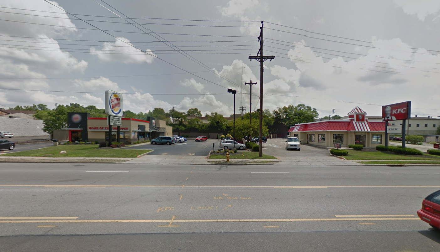
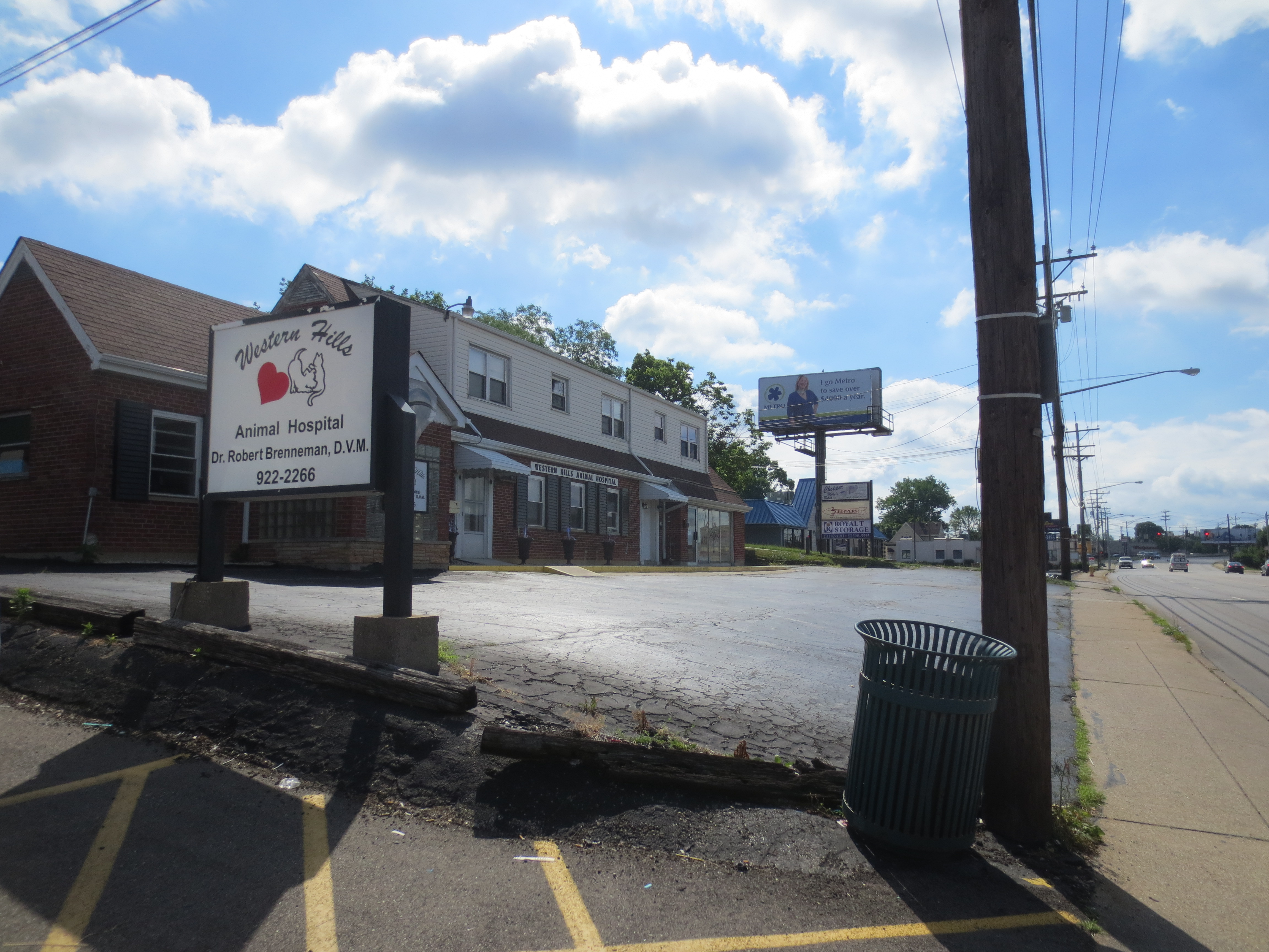
    There are many reasons for this.  The early, usually small-scale Cape Cod-style housing common to many 50s vintage suburbs is not what today’s market is demanding. It’s the same for older enclosed malls – today “lifestyle centers” and other formats are preferred – many of which are now vacant, their grim remains featured on web sites such as DeadMalls.com. Many suburban areas were also built out with “infrastructure light” without upgraded streets, sidewalks, etc. leaving a big backlog of infrastructure need.

    Across the country many of these older districts have fallen into decay and become increasingly poor, taking on many of the characteristics of the inner city. As the Brookings Institution noted  over a decade ago, they “are experiencing some signs of distress—aging infrastructure, deteriorating schools and commercial corridors, and inadequate housing stock.”1 Today, the public is more aware of the trend, and events in Ferguson, MO recently gave a wakeup call to newer and still-thriving suburbs that they too may be troubled at some point.

    Like other American cities, Indianapolis has many of these older, struggling suburban areas. In its case, many of them are within the core city limits due to a 1970 city-county merger. As regional growth continues to expand outside the central urban county, newer generation suburbs have a chance to learn from the struggles of many of their predecessors.

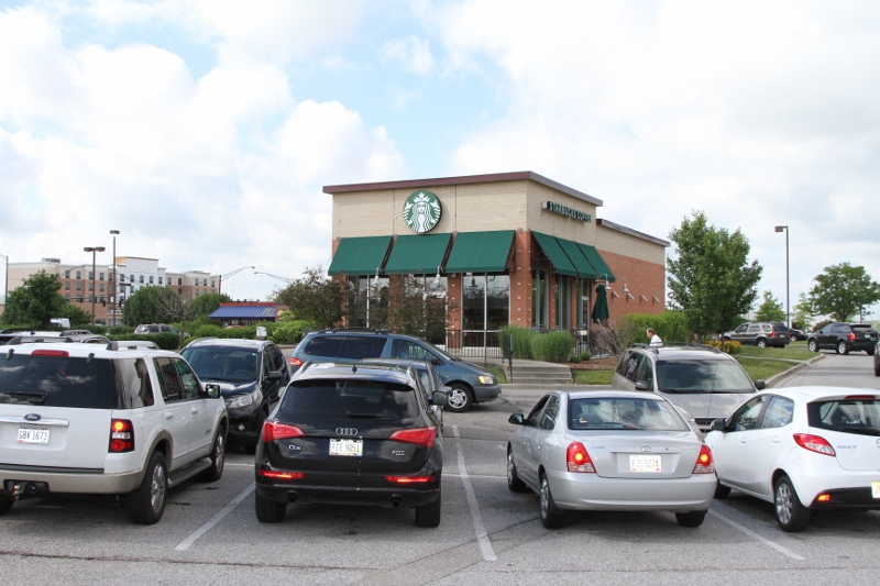
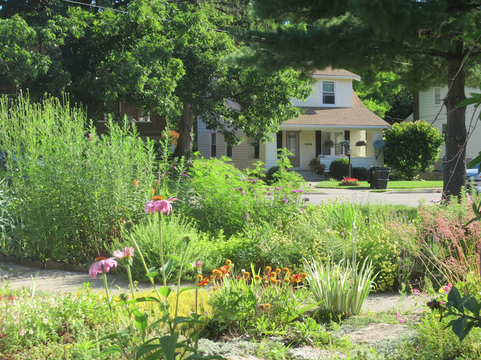
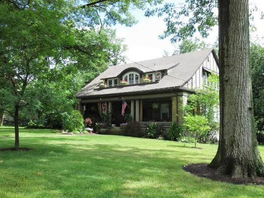
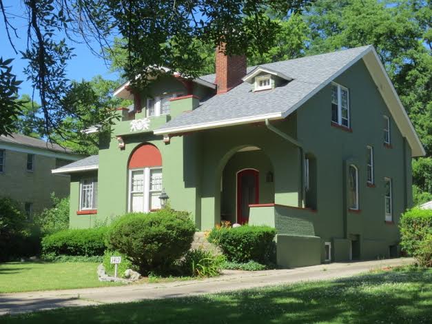
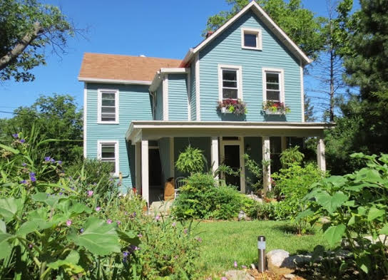
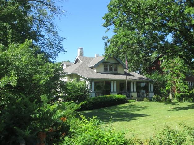
    Carmel – pronounced like the Biblical Carmel – is the first suburb directly north of the city of Indianapolis. It is an upscale residential and business suburb similar to many others around the country such as Dublin, OH; Naperville, IL; and the Cool Springs, TN area.  Its 2013 population of 83,573 made it the 5th largest municipality in the state. While not monolithically wealthy, its 2013 median household income of $100,358 is the 14th highest in the United States among communities of 65,000 people or more.2 It’s a preferred area for the estate homes of wealthy Indianapolis area residents, such as Indianapolis Colts owner Jim Irsay. But it’s not just a bedroom suburb; real estate brokerage Cassidy Turley reports that the Carmel submarket has over six million square feet of office space.3

    Being located in the center of the favored quarter of the Indianapolis region, Carmel grew as an upscale area. This gives it a leg up in long term sustainability out of the gate.  

    Yet Carmel has not relied just on its wealth to insure against decline. Rather, it has embarked on a transformation program now nearly 20 years old from which three major themes emerge:

    1. Responding to current market forces to build a “state of the art” community that is competitive globally, not just within the Indianapolis region.

    2. Building a full spectrum of amenities and infrastructure to create a “complete city” with a high quality of life and intrinsic appeal that is a) not based solely on newness or low costs, and b) which has broad demographic appeal.

    3. Attempting to create unique cultural and regional attractions  to turn Carmel into a destination in its own right, as much city as suburb.

    The primary driver of this transformation has been Mayor Jim Brainard, a Republican currently in his fifth term.  Carmel long had top performing schools – it’s the top rated district in the state   – houses with generous yards, low taxes, and other standard attractors of suburbia. Previous administrations had put in place key policies such as reserving the Meridian St. corridor for high end office space and banning billboards. But Brainard brought numerous changes in Carmel during his tenure including:

    Annexation. Carmel has undertaken a series of annexations – nearly 20,000 acres since 2001 alone.4 With over 47 square miles of territory, Carmel has now largely achieved its desired geographic scale.

    Parks. Carmel’s park acreage increased from 50 to 1000 acres and it has spent heavily on building out its parks. This includes building a $55 million Central Park, which includes a showplace community and fitness facility called the Monon Center.5 And the popular Monon Trail, a rail-trail through the length of the city that extended a previous project built by the City of Indianapolis.


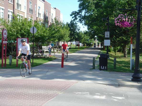
    Monon Trail at Main St.

    Road Infrastructure. Carmel has invested heavily in upgrading the legacy network of county roads that it overgrew. This includes an aggressive deployment of modern roundabouts. Carmel now has over 80 of these, more than any community in the United States.6 It has upgraded miles of collector roads to urban standards with enclosed drainage, curbs, extra-wide travel lanes, landscaped medians, eight foot multi-use side paths on both sides of the street protected by a landscaped buffer zone, and decorative street signs and other detailing.

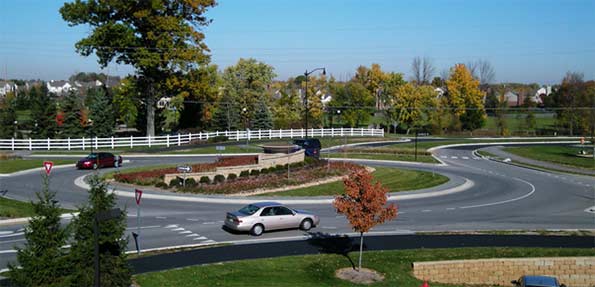
    Roundabout at Main St. and Illinois St. in the fall


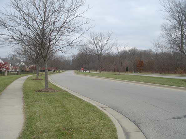
    An upgraded segment of River Rd. in early winter

    Two major state highways passed through the town, Meridian St. (US 31) and Keystone Ave. (SR 431). These were designed as rural style divided surface highways as is common in Indiana. Carmel convinced the state to relinquish Keystone Ave. to the city and give it $90 million for upgrades and future maintenance. Carmel converted this into a mostly free flowing parkway by spending $108 million to replace stoplight intersections with roundabout interchanges. These not only dramatically improved traffic flow, the bridges over the busy highway provided a high quality, safe connection – especially for pedestrians and bicyclists – connecting eastern and central Carmel, which had previously been separated by this “great wall” of a road. The state is currently performing a similar freeway upgrade on Meridian St., the principal office corridor.


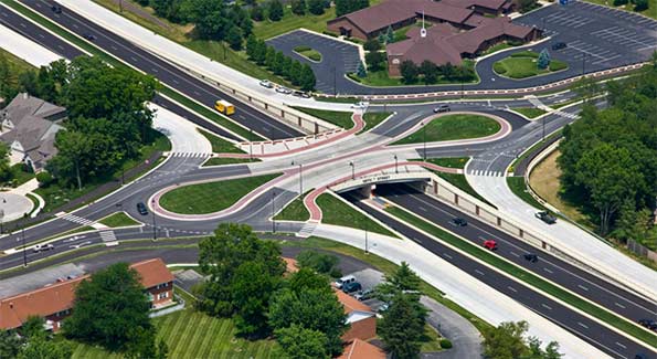
    Roundabout interchange at 126th St. and Keystone Parkway.

    Water and Sewer Upgrades. Part of Carmel previously received water from the Indianapolis water utility. The City of Indianapolis had privatized this utility but sought to repurchase it. Carmel intervened in the process to pressure Indianapolis into selling it the water lines inside Carmel. Carmel has since undertaken significant infrastructure upgrades such as new wells and pumping stations. During a recent summer drought, Carmel, unlike Indianapolis, did not put in place a mandatory restriction on lawn watering.7

    New Urbanism. Beyond core infrastructure, Carmel under Brainard has sought to change its style of development to embrace some of the more positive aspects of New Urbanism such as creating more urban nodes and walkability.

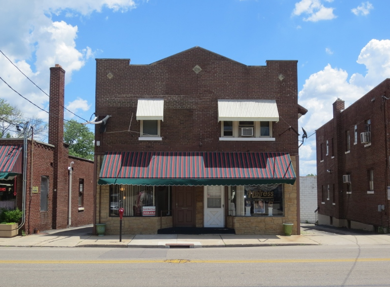
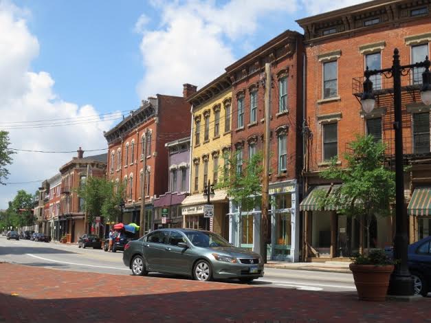
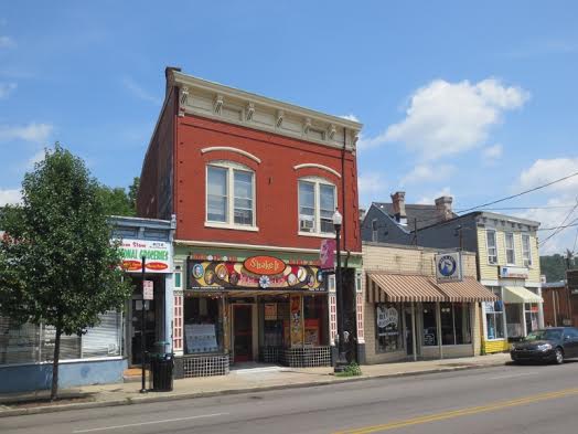
    Unlike some traditional railroad suburbs or county seats, the historic center of Carmel was very tiny, and its Main Street populated mostly with one story buildings and empty lots. This was the first focus area, and started with fixing the physical infrastructure.  

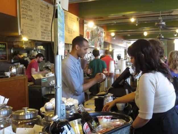
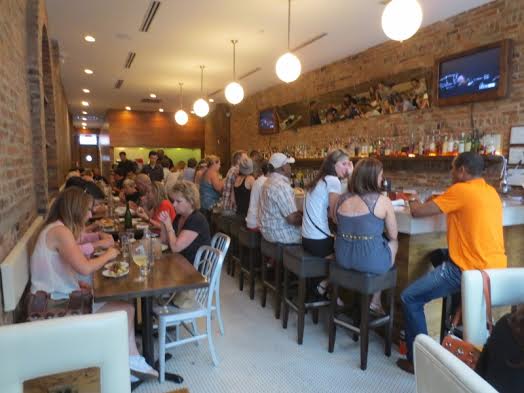
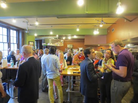
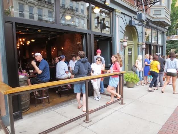
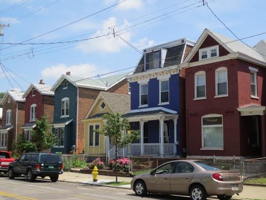
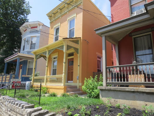
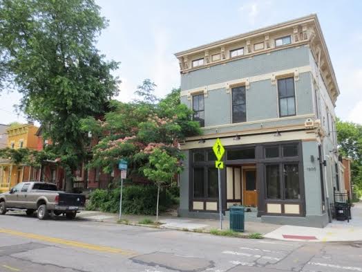
    The city rebranded the area as the “Arts and Design District” and utilized Tax Increment Financing to promote multi-story, mixed use development. The result is a mostly occupied and often well-patronized Main Street district. The surrounding historic residential blocks have seen significant redevelopment activity as well.


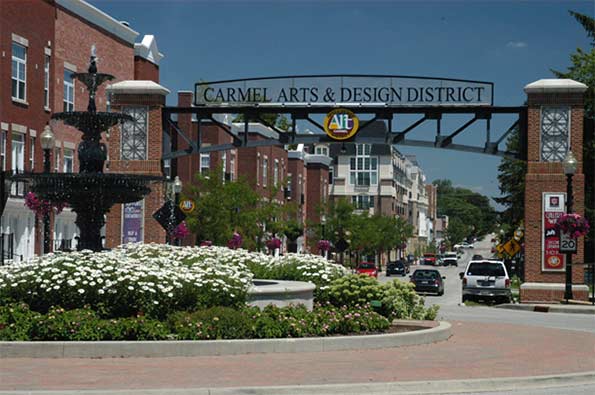
    Main St. at western fountain and gateway arch entryway to rebranded “Arts and Design Distrct.”

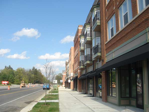
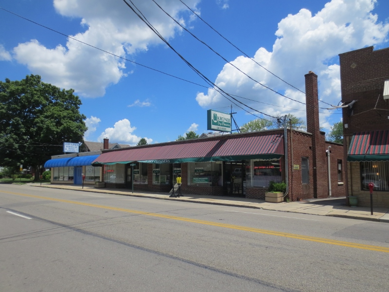
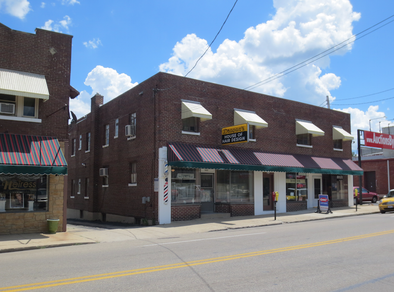
    Beyond the historic downtown, Carmel has also implemented multiple New Urbanist style zoning overlays, including on Old Meridian St. and Range Line Rd. (the city’s original suburban commercial strip). These promote mixed use development, buildings that front the street, and multi-story structures. Infrastructure improvements and TIF have been used in these areas as well. There’s also a major New Urbanist type subdivision in western Carmel called the Village of West Clay.

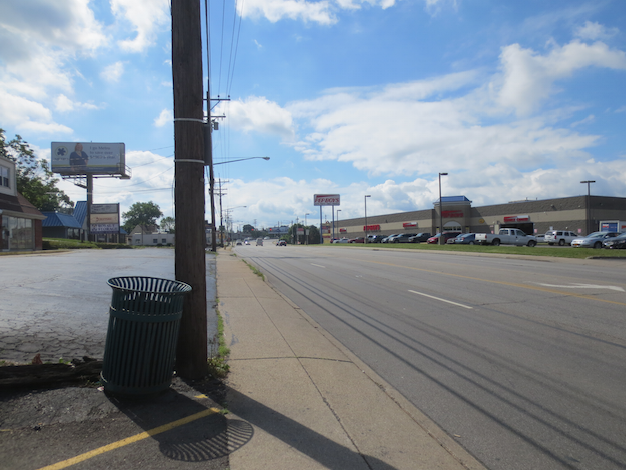
    Strip mall and traditional suburban development along Range Line Rd.


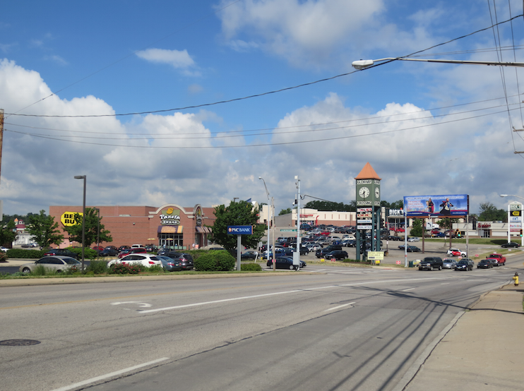
    New Urbanist style development along Range Line Rd.


    New Urbanist development and street improvements under construction on Old Meridian St.

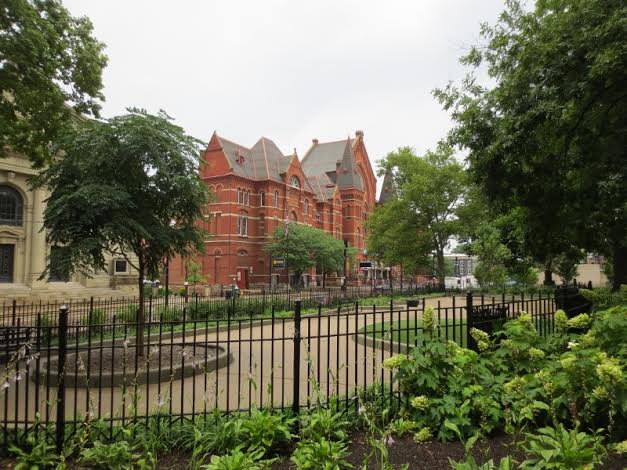
    The historic downtown was deemed too small to function effectively as the downtown of a city the size of Carmel today. The city thus decided to create a new downtown area called City Center. The location for this is an area south of the historic downtown area in an older suburban industrial zone that had fallen into a blight pattern. Much of it was vacant and what’s now the principal City Center development was built on the site of a failed strip mall. TIF was aggressively used here as well to redevelop the area.

    The City Center development is only partially complete. A veterans memorial and other civic spaces are complete, as are several small office buildings, apartments, and a large mixed use complex. The anchor is a publicly funded $175 million concert hall called the Palladium and an associated theater complex with three stages.8 While these are complete, significant development remains to complete the City Center vision. The city also wants to redevelop the area between City Center and the old downtown, which they now label Midtown, but very little has been done to date.


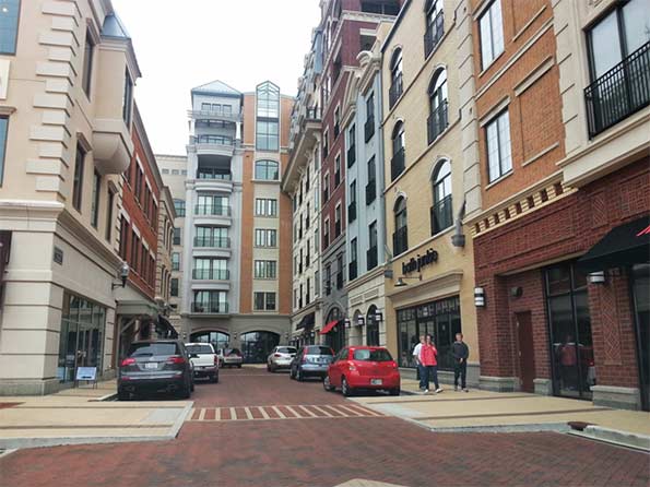
    Interior street of City Center development.

    The goal of all this development is not the full urbanization of Carmel; this city does not aspire to be dense metropolis, or even Indianapolis. It’s rather about creating more town center type districts with the walkable feel that’s increasingly in favor, but without compromising the fundamental suburban character of the city. It’s also designed to create a city with options. Having a diversity of development styles within the city is part of a strategy of appealing to a more diverse demographic base, including singles and retirees, not just the stereotypical younger family with kids. Traffic flow has been improved, but short trips are now easier to undertake by foot or bicycle, not just by car.

    Retro Architecture. Carmel has de facto mandated traditional architectural styles. There’s no one consistent style. Major buildings have been done in Georgian, Second Empire, and Neoclassical type designs. But modernism has been rejected, further differentiating suburban Carmel from urban areas that frequently elect for starchitecture that is unapologetically “of the now.”

    The city has also attempted to prevent large corporations from building their standard architectural templates. Brick is effectively mandated, even for big box retailers like Lowes. Retailers like CVS and Kentucky Fried Chicken were forced to build second stories on their structures to locate in certain areas. Another Carmel CVS has an art deco façade.

    The city wants high quality aesthetics and a unique sense of place. They also want “timeless” design, though like much New Urbanism architecture it can sometimes come across as pastiche.

    Arts and Culture. As part of the attempt to appeal to more arts minded middle aged consumers, as well as members of the  so-called “Creative Class,” Carmel has heavily invested in the arts. The City Center performing arts center was paid for almost entirely with public funds (TIF), an investment in the arts dwarfing even that of Indianapolis. The city has also paid for an extensive public art program, mostly statues by Seward Johnson. And it makes operating grants to local arts organizations such as the Carmel Symphony Orchestra.


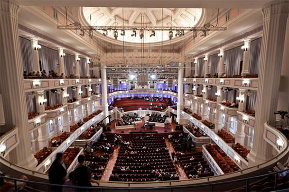
    Interior of the Palladium concert hall. Photo by Zach Dobson.

    Seward Johnson is not a favorite of urban sophisticates. His statutes illustrate the type of play it safe art generally featured by Carmel. More sophisticated or cutting edge fare is not as prevalent. And there have even been some complaints by a limited number of citizens about items such as the classical nudes featured on the door handles of the Evan Lurie Gallery.

    Brainard is thinking about the long term when Carmel is no longer the shiny new thing. As he put it, “Because we are designing a new city that will be in place for hundreds of years, the responsibility of doing it right falls to this generation…Carmel is a young city – we are still building our parks, trails, roads and sanitary sewer and water systems that will be here for centuries.”9

    He’s also keenly aware of global economic competition and the fact that Indiana lacks the type of geographic and weather amenities of other places. He frequently uses slides to illustrate this point. In one talk he said, “Now this picture, guess what, that’s not Carmel; but this picture is the picture of some of our competition. Mountains – that’s San Diego of course, mountains, beautiful weather, you know I think they have sunshine what, 362 days out of the 365…. What we’ve tried to do is to design a city that can compete with the most beautiful places on earth. We’ve tried to do it through the built environment because we don’t have the natural amenities.”10  While the claims to want to equal the most beautiful places in the world may be grandiose, the key is that mayor believes Carmel’s undistinguished natural setting and climate requires a focus on creating aesthetics through the built environment.

    What have the results been to date?  Economically and demographically, the city has performed well. It has managed to create an environment that is proving competitive for business opportunities that might have previously bypassed Indiana. For example, American Specialty Health relocated its headquarters to Carmel from San Diego, with the CEO of the company personally making the move from La Jolla to Carmel.11 Geico also recently expanded. Numerous other corporations are either based in Carmel or have major white collar facilities there. The income levels are very strong, as noted above.

    The city’s demographics have also expanded to become much more diverse. The minority population grew 295% between 2000 and 2010, adding 9,630 people and growing minority population share from 8.7% to 16.3%.12 12% of the city’s households speak a language other than English at home.13 Many of these are highly skilled Chinese and Indian immigrants working for companies like pharmaceutical giant Lilly. Even black professionals are increasingly moving to Carmel, with the black population growing 324% in the 2000s and black population share doubling to 3%.14 Carmel is not a polyglot city today, but it’s far more diverse than in the past.

    Carmel has also attracted both national press and national awards. Money magazine ranked Carmel as the #1 best small city to live in 201215, and it’s scored highly in other surveys as well. Drew Klacik of the Indiana University Public Policy Institute notes that in an echo of the transformation of the city of Indianapolis since the 1970s, “Carmel has transformed itself from a desirable community within Indiana to a desirable and competitive community nationally.”16

    However, it’s hard to argue that Carmel’s results materially outperform peer cities in other regions. Places like Dublin, OH and Cool Springs, TN have significantly more office space, for example. Many of those places are, however, implementing policies similar to those in Carmel . Most Carmel New Urbanist development continues to require TIF subsidies and is not yet sustainable at market rates. The city has obtained better financial terms in some recent deals, however.  And despite major public investment and construction in the central city, many central area census tracts lost population during the 2000s.

    The changes have also attracted significant criticism and opposition in some quarters.  While the public remains largely positive on the results, there have been many critiques of the way they were done, some of them legitimate.  A number of the projects had significant cost overruns. The mayor originally said that the Keystone project could be completed for the $90 million the state gave it. The actual cost was nearly $20 million higher.17 The Palladium was originally sold as an $80 million facility, but ended up costing $175 million. The city also said it planned to pay for ongoing operations by raising a $40 million endowment, but was unable to raise the funds, leaving it on the hook for $2 million in annual operating costs. These are not small misses.

    Critics also pointed to state figures showing Carmel with nearly $900 million in total debt.18 While it is a wealthy community that can afford the payments, in a conservative state like Indiana, a suburb accumulating nearly a billion dollars in debt raises eyebrows. Carmel’s tax rates remain among the lowest the state, however.

    The way the debt was accumulated has been criticized as well. The Palladium was paid for with TIF funds. Rather than bonds, the Carmel Redevelopment Commission – the authority that manages the TIF program and which was controlled by mayoral appointees – structured the Palladium debt as Certificates of Participation to circumvented the need for city council approval, incurring higher interest rates in the process. The city council later refinanced the debt at a lower rate using a general taxing power guarantee in what some called a bailout. In return for the refinancing, the council obtained more oversight over TIF activity.19

    Though some controversy is inevitable and some criticisms are legitimate, ultimately the change program in Carmel has proven popular with the public and the city is booming, a boom that’s lending an increasingly bitter tone to the longstanding hostility Carmel has enjoyed from the region due to its status as the highest profile “rich suburb” in the region.

    Yet for all the controversy, many regional suburbs are copying some aspects of Carmel’s approach, with roundabouts now a regular feature in area communities and major park programs and New Urbanist style town center developments as well. This includes the massive sports-oriented Grand Park in Westfield and the Nickel Plate District in next door Fishers’ town center.20

    It’s also clear that peer type suburbs around the country are adopting similar strategies, such as Dubin, OH’s Bridge Street Corridor proposal21 or Sugar Land, TX’s $84 million performing arts center.22 Imitation, they say, is the sincerest form of flattery. Carmel represents the leading edge of the emergence of a new type of post-Edge City aspirational suburb. It’s something we may be seeing a lot more of in the future.

    Aaron M. Renn is a senior fellow at the Manhattan Institute and a Contributing Editor at City Journal. He writes at The Urbanophile.

    ————————————-

    1 Robert Puentes and Myron Orfield. “Valuing America’s First Suburbs: A Policy Agenda For Older Suburbs in the Midwest,” Brookings Institution, 2002.

    2 U.S. Census Bureau, “American Community Survey 2013 1-yr”, Table B19013.

    3 Cassidy Turley, Indianapolis Office Market Snapshot (Third Quarter 2014), 3.

    4 Ellen Cutter. “Explaining the annexation process,” Greater Fort Wayne Business Weekly, June 12, 2014. Accessed January 8, 2015. http://www.fwbusiness.com/opinions/columnist/businessweekly/article_f42da036-6182-575a-8445-274cd82ca296.html

    5 Matthew VanTryon. “Carmel then and now: World’s Apart,” IndianapolisNewsBeat.com, December 16, 2014. Accessed January 8, 2015. http://blogs.butler.edu/multimedia-journalism/2014/12/16/carmel-worlds/

    6 James Brainard, transcript of speech at 2014 International Making Cities Livable Conference, June 23-27, 2013.

    7 “Why no watering ban in Carmel,” WISH-TV News, July 12, 2012. Accessed January 8, 2015. https://www.youtube.com/watch?v=y51BJYM4Fgc

    8 David Hoppe. “The Palladium’s boffo budget,” Nuvo Newsweekly, June 20, 2011. Accessed on January 8, 2015. http://www.nuvo.net/indianapolis/the-palladiums-boffo-budget/Content?oid=2275080

    9 James Brainard, notes for 2014 State of the City Address.

    10 James Brainard, transcript of speech at 2014 International Making Cities Livable Conference, June 23-27, 2013.

    11 Andrea Muirragui Davis. “Wellness provider beefing up new Carmel office,” Indianapolis Business Journal, October 29, 2014. Accessed on January 8, 2015. http://www.ibj.com/blogs/11-north-of-96th/post/50241-wellness-provider-beefing-up-new-carmel-office?id=11-north-of-96th

    12 U.S. Census Bureau, calculations by author from Census 2000 and Census 2010.

    13 U.S. Census Bureau, “American Community Survey 2013 1-yr”, Table B05007.

    14 U.S. Census Bureau, calculations by author from Census 2000 and Census 2010.

    15 “CNNMoney Ranks Americas Best Places to Live,” Daily Finance, August 20, 2012. Accessed January 8, 2015. http://www.dailyfinance.com/2012/08/20/cnn-money-ranks-americas-20-best-places-to-live/

    16 Drew Klacik, telephone interview with author, December 29, 2014.

    17 “Brainard seeks bonds to finish Keystone,” The Indianapolis Star, October 18, 2009. Accessed January 8, 2015. http://archive.indystar.com/article/20091018/LOCAL/910180409/Brainard-seeks-bond-finish-Keystone

    18 Indiana Department of Local Government Finance. “Local Government Debt Report,” September 21, 2012, 15.

    19 Kathleen McLaughlin. “Brainard seeks deal on maxed-out TIF,” Indianapolis Business Journal, March 31, 2012. Accessed January 8, 2015. http://www.ibj.com/articles/33569-brainard-seeks-deal-on-maxed-out-tif

    20 Cara Anthony. “New look for the Nickel Plate District in Fishers,” The Indianapolis Star, June 28, 2014. Accessed January 16, 2015. http://www.indystar.com/story/news/local/hamilton-county/fishers/2014/06/27/new-look-nickel-plate-district-fishers/11537251/

    21 Brent Warren. “Dublin Moves Ahead With Bridge Street Corridor Plans, Connecting Across River,” Columbus Underground, March 23, 2013. Accessed January 8, 2015. http://www.columbusunderground.com/dublin-moves-ahead-with-bridge-street-corridor-plans-looks-to-connect-across-river-bw1

    22 Rebecca Elliott. “Sugar Land breaks ground on $84 million performing arts center,” Houston Chronicle, December 9, 2014. Accessed January 12, 2015. http://www.houstonchronicle.com/neighborhood/fortbend/news/article/Sugar-Land-breaks-ground-on-84M-performing-arts-5946247.php

  • Towns With a Past, Towns With a Future

    Over the last fifty or sixty years most towns have been dedicated to accommodated cars in order to cultivate business and permit people to live better more convenient lives. For new developments out in a former corn field this was effortless since everything was custom built with the automobile in mind. But older towns that had been built prior to mass motoring were at a distinct disadvantage.

      Screen Shot 2014-12-04 at 12.57.53 AM Screen Shot 2014-12-05 at 1.15.13 AM Screen Shot 2014-12-05 at 1.16.43 AM

    In order to keep up with changing times older neighborhoods, particularly older Main Street business districts, did whatever possible to retrofit themselves. The roads were widened, sidewalks were narrowed, street trees were removed, obsolete buildings were torn down to make way for parking lots, new zoning regulations and building codes were introduced to ease traffic and ensure abundant free parking. Unfortunately for many historic towns there simply was no contest. New strip malls and office parks could provide endless free parking and massively wide roads. If you add in the competition from big box national chains and the politics of race and class driving people across municipal borders for lower taxes and segregated school districts… Main Street never had a chance. The irony is that the more towns tried to accommodate cars the less pleasant they became.

    Screen Shot 2014-12-03 at 10.31.41 PM Screen Shot 2014-12-03 at 7.00.56 PM Screen Shot 2014-12-05 at 1.06.03 AM
    Screen Shot 2014-12-03 at 10.33.08 PM Screen Shot 2014-12-05 at 12.31.52 AM
    Screen Shot 2014-12-05 at 12.32.11 AM
    Screen Shot 2014-12-03 at 11.14.20 PM Google Earth

    This is a Google Earth image of the area around Cheviot, Ohio. The people of Cheviot self-identify with the fictional 1950’s TV town of Mayberry made famous by The Andy Griffith Show. It really is a lovely place, but it effectively has no business district anymore thanks to the Western Hills Plaza Shopping Center half a mile away which straddles Green Township and the Westwood district of suburban Cincinnati. Harrison Avenue, Cheviot’s century old Main Street, is circled at top right. Western Hills Plaza is circled at bottom left. The Home Depot, Target, Kroger, and Dillard’s make it impossible for mom and pop shops on Harrison Avenue in Cheviot to sustain themselves. Half the shops are empty and the others limp along. It’s a shame, because Cheviot is a charming town full of great old commercial buildings and solid housing stock. It’s a good town full of good people. The German Catholics who settled and built this part of Ohio have managed to hold on to a fair-to-middling set of arrangements through the worst years of decline, but the town is a shadow of its former self. It has excellent bones, but the flesh is sagging through no fault of its own.

    Screen Shot 2014-12-03 at 11.22.36 PM Screen Shot 2014-12-03 at 6.47.29 PM IMG_9387 (800x600) Screen Shot 2014-12-05 at 1.12.50 AM

    However, Cheviot has one thing that Western Hills Plaza doesn’t – a walkable, bikable, fine-grained pleasant neighborhood. That may not sound like much, but it’s more than nearly anyplace built after 1950 anywhere in North America can boast. Cheviot is an actual town, not just mindless suburban sprawl. That’s a rare commodity these days and a lot of people are hungry for it. Just about every home in Cheviot is within a five or ten minute walk of the old business district, local public schools, library, churches, and parks. It has become unusual in America for people to live in this kind of environment and it’s coming back in fashion with increasing demand and limited supply. There’s an opportunity here for people with the right attitude.

    Screen Shot 2014-12-04 at 1.09.07 AM Screen Shot 2014-12-04 at 1.08.19 AMGoogle Earth

    In contrast let’s say that you lived here on this cul-de-sac in Green Township and you wanted to go to one of the fast food places directly behind your back fence. This is the route you’d need to take.

    Screen Shot 2014-12-04 at 1.10.14 AM Google Earth

    If you’re used to driving everywhere everyday you might not think twice about hopping in the car. In fact, you might not even realize that the Burger King and KFC are so close. But if you were somehow forced to walk one day you might be surprised at how hard it would be given all the walls, fences, and drainage ditches that stand between you and your fast food. And the walk would be a miserable and potentially dangerous experience. The highway and its cavalcade of concrete and plastic bunkers is so wretched when you aren’t in a car that developers and city planners go out of their way to keep homes as isolated and buffered as possible. This radical separation of uses makes perfect sense in a car-oriented environment. Who wants to look out at a highway strip mall from the back yard? But it’s Hell on foot. And don’t even think of riding a bike. You’ll either get hit by a speeding car or attract the attention of the local police who will immediately identify you as a deviant. Being a pedestrian or cyclist in this environment constitutes “probable cause”. You must be unsavory if you lower yourself to such desperation here. Sitting at a bus stop in this setting is no joy either.

    Screen Shot 2014-12-04 at 12.51.28 AM Screen Shot 2014-12-04 at 12.53.48 AM Screen Shot 2014-12-04 at 12.23.18 AM Screen Shot 2014-12-04 at 12.55.51 AM IMG_9626 Screen Shot 2014-12-05 at 1.14.48 AM

    So here’s the challenge of the next few decades. The aging sprawl in Green Township and similar nearby post war suburbs like White Oak, Sharonville, and Deer Park on the edge of Cincinnati aren’t aging well. Their roads and sewer systems are right at the point where they need complete overhauls and there’s no money for any of it. Don’t expect Columbus or Washington to send big checks because they’re broke too. The housing stock in these places is neither charming in a Norman Rockwell sort of way, nor sufficiently Mad Men modern. Their roofs, windows, kitchens, baths and furnaces all need replacing right about now and there isn’t a lick of insulation in most of them. Fifty years ago these suburbs were white middle class havens with their backs to inner city decay and race riots.

    IMG_6149 (800x533) IMG_6126 (800x533) IMG_6164 (800x533) IMG_6155 (800x533) IMG_6128 (800x533)

    Now newer more prosperous suburbs Like Mason and Beavercreek farther out attract wealthier residents looking for larger homes with all the latest bells and whistles along with premium public schools and lower taxes. Green Township has less than half the average family income of Mason. Homes in Green Township and other similar areas sell for $75,000 although many homes can be found for considerably less. Mason homes sell for north of $250,000 with many at much higher price points. Meanwhile downtown Cincinnati and Over-the-Rhine are rapidly gentrifying as people who prefer an urban environment reinvigorate long abandoned neighborhoods. The poor are being displaced in the process and they’re going to have to live somewhere. Given the trajectory of these shifts it isn’t looking good for the so-so suburbs in the middle distance. We can expect more “Fergusons” on the horizon although the particulars are unknowable at this time. This economically induced migration won’t be good for the poor either. They just spent the last few generations sucking up the desiccated crumbs of 19th Century industrialism and now they’re being shunted off to the stale left overs of 20th Century sprawl just in time for it to die.

    Screen Shot 2014-12-05 at 1.06.38 AM Screen Shot 2014-12-05 at 1.07.09 AM Screen Shot 2014-12-05 at 1.13.14 AM Screen Shot 2014-12-05 at 1.08.55 AM  IMG_9203 (800x600) IMG_9191 (800x600) IMG_9197 (1024x768) (800x600) Screen Shot 2014-12-05 at 1.14.02 AM Screen Shot 2014-12-05 at 1.11.41 AM Screen Shot 2014-12-05 at 1.05.23 AM Screen Shot 2014-12-05 at 1.09.52 AM Screen Shot 2014-12-05 at 1.11.59 AM Screen Shot 2014-12-05 at 1.11.18 AM

    But there’s hope for some of these places. Pressed up against both Cheviot and Green Township is Westwood, a former streetcar suburb that also uses Harrison Avenue (the old streetcar route) as its long-lost Main Street. Westwood was once an independent town, but was annexed by Cincinnati a hundred years ago. It fell out of favor beginning in the 1950’s when the streetcar was ripped up and shiny new subdivisions and shopping centers were built-in places like Green Township. Moving children out of Cincinnati public schools to another jurisdiction a mile away was one of the primary motivations as racial tensions in the city grew. Taxes were also lower in the new suburbs. (Is any of this ringing a bell?) Cincinnati has recently figured out that it can’t compete with Mason or Beavercreek for that particular share of the upscale suburban real estate market, but it’s looking at the success of Over-the-Rhine and wondering what the family friendly conservative Republican Catholic version of revitalization might look like in Westwood. In other words, what can parts of Cincinnati provide in the way of a value-added “product” or “experience” in their century old neighborhoods of single family homes that Mason can’t. There’s a chance that Westwood’s competitive advantage might just be walkability and historic charm. The city adopted a form based code for this part of Westwood and has been investing money in the schools and parks with plans to create a town square in what is now an awkward triangular intersection next to the Carnegie library. There are also existing businesses and subtle interdependent institutions that simply don’t exist out in new suburban locations. If you want your cello or violin repaired you’re not going to find that sort of thing at the mall between the food court and the Sunglass Hut. A more pedestrian oriented Westwood with unique family oriented destinations and activities could be an engine that pulls the area in a better direction. Sooner or later all those Hipsters downtown are going to start getting married and having kids and their going to want a house with a patch of garden. There could be an advantage to having that life three miles from downtown instead of twenty-two miles out in Mason. On the other hand, Westwood could simply languish and be dragged down by the failing sprawl that surrounds it. It could go either way. Time will tell.

    John Sanphillippo lives in San Francisco and blogs about urbanism, adaptation, and resilience at granolashotgun.com. He’s a member of the Congress for New Urbanism, films videos for faircompanies.com, and is a regular contributor to Strongtowns.org. He earns his living by buying, renovating, and renting undervalued properties in places that have good long term prospects. He is a graduate of Rutgers University.

  • Would the Twin Cities Survive New Urbanism?

    In December, the Metropolitan Council of Minneapolis and St. Paul is scheduled to vote on a vision for the region’s housing and transportation future. “Thrive MSP 2040” is the council’s comprehensive development plan for the seven-county Twin Cities metro area for the next 30 years. It’s a regional growth plan that will result not in a cure for the area’s ills, though, but in a virus that will kill its vitality.

    The Minneapolis/ St. Paul area is one of the most livable regions in the nation. That’s not because residents were forced onto transit and into high density housing, as ‘Thrive’ will do. Growth occurred in a natural manner, in an area with great schools, because people here had the freedom to choose the size of yard for their kids, and the ability to embrace the natural openness of the region. The vigorous suburban growth that resulted has helped our vitality, despite past decisions from the Met Council to neutralize it.

    The Metropolitan Council isn’t alone in adopting New Urbanist plans on a wholesale basis. Their approach, and the problems that go with it, are being repeated by many planning boards nationwide. The 350-page ‘Detroit Future City’ plan is a tunnel-vision strategy based on the same New Urbanist thought. With the best of intentions — goals of avoiding pre-fabricated monotony and sprawl, and creating affordable, livable communities — municipalities are actually writing prescriptions that will do just the opposite.

    I speak with the perspective of a locally-based development consultant, and as an observer and resident of the region for 31 years. I’ve witnessed what has actually helped make this area succeed. At my company, we’ve designed hundreds of sustainable neighborhoods that don’t adhere to the New Urbanist principles of high density and only public transit.

    Two decades ago, the Met Council placed its faith in an urban growth boundary, limiting sewer development in the metro area to inoculate itself against “sprawl”. The result was an increase in the very sprawl the council sought to avoid, as development leap-frogged outside the seven-county area to escape the high land prices created by the artificial land limitation.

    The Met Council hired Peter Calthorpe, founder of Congress for the New Urbanism, for several million in tax dollars, to provide a vision for our region’s future growth. The ‘one size fits all’ approach resulted in projects like Clover Ridge in Chaska, Ramsey Town Center, and indirectly, others like St. Michaels ‘Town Center’, none of which delivered the promises that had been made.

    Calthorpe’s attempt to create a ‘sense of place’ failed to sufficiently attract home buyers. For example, the ‘conventionally planned’ sections of Clover Ridge sold well. But, with their sardine-like density, the housing along alleys remained vacant. Because the development did not attract as many homebuyers as anticipated, among other reasons, local shopping and restaurants did not materialize as the Met Council had promised.

    More recently, ‘Smart Growth’ planners of projects such as ‘Excelsior and Grand’ in St. Louis Park failed to acknowledge why retailers were abandoning their spaces. A spokeswoman for Panera Bread cited poor location and lack of convenience for customers. Yet ‘Excelsior and Grand’ is a model New Urbanist plan, complete with the obligatory central ‘traffic circle’ with a ‘sense of place’ sculpture.

    These smart-growth projects are examples of architects preaching a singular growth model that does not work for all people, in all climates. Those who assume that working class residents will appreciate waiting outside in 20 below zero weather at an architecturally designed “sense of place” bus stop, and then coming home to the 14th floor of a high rise, are clueless. And the dense projects being built in this region have the same sort of repetition of design that smart-growth planners criticize in suburbia.

    Today in the Twin Cities, sales of new, single-family homes are rebounding, creating a catalyst for economic stability. Despite this market reality, some developers are still submitting new multifamily housing proposals. That’s due to Met Council density mandates, not because of market demand. The Council’s assumption is that the population will migrate to the urban core for its (expensive) restaurants and its 19th century rail technology, abandoning spacious suburbs and cars. But sales suggest otherwise.

    The Met Council’s ‘Thrive 2040′ vision will undermine the American Dream of obtaining an affordable single-family home in an area where one desires to live, with the freedom of travel (and protection from our harsh winters) that only personal vehicles currently provide. Under the ‘Thrive’ mandates, more workers will need to live in ‘affordable housing’ (mid- or high rises) and take mass transit to their jobs. Yet ‘affordable housing’ remains elusive in ‘Smart Growth’ projects, unless it is heavily subsidized with tax dollars.

    Calthorpe’s Congress for the New Urbanism actually boasts of the gentrification it produces. But when home prices go up, what happens to the living standard for displaced low-income families? The working class, regardless of race, should be outraged by ‘Thrive’.

    Density does not guarantee affordability. We cannot forever throw tax dollars at high-density development solutions in an effort to make them economically feasible. A successful, balanced housing market drives the economy. At their December meeting, let’s hope the Met Council recognizes that the ‘Thrive’ vision is anything but balanced.

    Rick Harrison is President of Rick Harrison Site Design Studio and Neighborhood Innovations, LLC. He is author of Prefurbia: Reinventing The Suburbs From Disdainable To Sustainable and creator of Performance Planning System. His websites are rhsdplanning.com and pps-vr.com.

    Flickr photo by Adelie Freyja Annabel: Edina, a suburb of Minneapolis. “This is the original Caribou Coffee, which opened in 1992 on France Avenue between Sunnyside and 44th Street.”

  • Affordable Cities are the New Sweet Spots

    I’ve lived in San Francisco long enough (I’m getting old) that I’ve seen several waves of bright young people arrive, burn out, then move away. For some they were looking for adventure, found it, and then carried on with normal life elsewhere. But for most it was simply a matter of the numbers not adding up. Working a dead end low wage job while sharing a two bedroom apartment with seven room mates is only romantic for so long. I’m fairly inquisitive so I’ve kept up with many of these folks to see how they manage after they leave. I travel a lot and pop in to visit on occasion. The big surprise is that they aren’t moving to the suburbs the way previous generations did when they were done with their youthful excursions in the city.

    Cincy 23  Cincy 3  Cincy 7

    Cincy 2  Cincy 24
    Cincy 25
    Cincy 1

    Instead, they’re seeking out smaller less expensive cities with the same basic characteristics as the pricey places that squeezed them out. I’m very fond of one young couple in particular who spent time in Los Angeles, Baltimore, and Portland before finally settling down and buying a house in Cincinnati. Why Cincinnati? It’s a great town at a fantastic price. They bought a charming four bedroom century old home in an historic neighborhood a couple of miles from downtown for $50,000. Their mortgage is $300 a month. Okay, with tax and insurance it’s more like $500. And it wasn’t a fixer-upper in a slum. It’s a genuinely lovely place with amazing neighbors.

    Cincy 6
    Cincy 5
    Cincy 51 -1
    Cincy 8

    Who needs New Urbanism or Smart Growth when so many amazing old neighborhoods are just sitting out there in under-appreciated and radically undervalued cities all across North America? The Rust Belt has long since hit bottom and has already adjusted to every indignity that the Twentieth Century could throw at it: deindustrialization, race riots, white flight to the suburbs, population shifts to the Sun Belt… Now that the unpleasantness has run its course what’s left are magnificent towns ripe for reinvention. Personally I believe many of the boom towns of the last fifty or sixty years have peaked and are about to enter the kinds of steep decline we currently associate with Detroit – except the dried up stucco and Sheetrock ruins of Phoenix and Las Vegas won’t age as well as the handsome brick buildings of the Midwest.

    Cincy 33
    3 Cincy 34
    4

    Don’t get me wrong. Cincinnati isn’t San Francisco. It isn’t Brooklyn either, although they do have an elegant bridge by the same engineer. If you want to be a Master of the Universe in international finance, or the next super genius computer whiz, or a millionaire movie star you probably need to be in a bigger place. But most of us just want ordinary comfortable rewarding lives surrounded by good people. The big question is pretty simple. Do you want that life to involve a $500,000 mortgage on a bungalow in a coastal city, or a $50,000 place in the Midwest. Will you earn less money in Ohio? Probably. But since your overhead is one tenth the California or New York price you really don’t need the big salary or the stress that comes with it. It’s like moving to the suburbs except you get to live in a great vibrant city instead of a crappy tract house on a cul-de-sac an hour from civilization.

    Cincy 46

    John Sanphillippo lives in San Francisco and blogs about urbanism, adaptation, and resilience at granolashotgun.com. He’s a member of the Congress for New Urbanism, films videos for faircompanies.com, and is a regular contributor to Strongtowns.org. He earns his living by buying, renovating, and renting undervalued properties in places that have good long term prospects. He is a graduate of Rutgers University.

  • America’s Fastest-Growing Small Cities

    Coverage of America’s changing urban scene tends to focus heavily on large metropolitan areas and the “megaregions” now often said to dominate the economic future. Often missed has been a slow, but inexorable, shift of migration and economic growth to smaller cities, a geography usually ignored or dismissed, with the exception of college towns, as doomed to lag behind by urban boosters.

    Part of the problem is that analysts often assume that the decline of small towns, which have been losing population, also means small cities are in trouble. Yet this is simply not true. Since 2000 small cities with between 100,000 and 250,000 residents have enjoyed a 13.6% population growth rate, more than twice that of New York, Los Angeles and Chicago, and roughly 10% faster than the national growth rate. The main driving force, notes demographer Wendell Cox, appears to be domestic migration, which is negative in the largest cities as well as in small towns. However the 167 metropolitan statistical areas with between 100,000 to 250,000 in population have added a net 675,000 people due to domestic migration since 2000.

    This performance is also seen in the economic sphere. All five of the nation’s fastest growing economies in 2013 were small cities, which, despite their smaller size, possess the basic infrastructure — hospitals, schools, airports, broadband — that are essential to economic growth.

    Of course, not all small cities are doing well. Many, particularly in the industrial heartland, continue to suffer; virtually all the bottom 10 small cities on our list are in old industrial areas in the Great Lakes, the Southeast and Massachusetts,  the birthplace of America’s first manufacturing boom.

    In order to determine which small metro areas are booming, and help us understand why, we asked Mark Schill at the Praxis Strategy Group to rank them based on four factors: population growth (2000-13), job growth (2001-14), real per capita personal income growth (2000-12), and growth of regional GDP per job (2001-12) — if GDP per job is increasing, it’s an indicator that the metro area is adding high-value, productive industries to its economy, as opposed to lower-wage jobs.

    Boomer Boomtowns

    Over the next decade, one major driver for growth in small cities may be demographic factors, notably the aging of the baby boom generation. Contrary to popular press accounts that suggest boomers are gravitating to big cities, demographic evidence suggests the opposite is the case. Demographer Cox says boomers appear to be, on net, leaving both big cities and older suburbs in favor either of exurbs or smaller cities.

    Some small cities already appear to benefiting from this trend, including the top-ranked city on our list: The Villages, Fla. This relatively new community, which focuses on “active” seniors has doubled in population since 2000, and last year was the nation’sfastest-growing metropolitan area. The area also has expanded its job base by 186% since 2001. Yet as much of the employment is in services, growth in economic productivity has been lackluster. Critically, this does not mean the area has been getting poorer. Personal income growth, largely from assets owned by seniors, has soared by some 60% since 2000, 10 times the national average growth rate of 6%.

    Thriving senior-oriented economies can be found throughout Florida, but they are also emerging elsewhere. St. George, Utah, which ranks 12th on our list, has long attracted downshifting boomers from the West Coast as well as the rest of the Intermountain West. This has helped to power its construction sector, a key element of the local economy. Another hot spot for boomers is No. 17 Bellingham, Wash., which is home to Western Washington University. In the coming decade, we can expect a growing competition among smaller towns for boomer residents, and their sometimes significant assets.

    Energy Towns

    The oil and gas industry doesn’t need bright lights, but sometimes its presence can create some. Of our top 10 fastest-growing small cities, five are energy-driven boom towns. This includes No. 2 Midland, Texas, which has logged 60% job growth since 2001 and 30% population growth since 2000. The west Texas  city, located in the heart of the booming Permian Basin is also getting richer, with personal income growth of over 96.7% since 2000, a rate well above the national average of 6% and the median for small cities of 10.2%. Last year, Midland led the nation in GDP growth at 14%.

    Other high-ranked energy cities include No. 3 Odessa, Texas,  and No. 8 Houma-Thibadaoux, La., which this February boasted the lowest unemployment rate in the nation at 2.8%.

    College Towns

    One would expect this list to be chock full of university towns, but to our surprise, only one made the top 10: Fargo, North Dakota-Minnesota. The metro area has caught our eye before. Fargo is far more than home to North Dakota State, with almost 15,000 students, but the school’s  expertise in engineering and energy dovetails perfectly with the state’s boom not only in energy but it’s rapidly growing tech and manufacturing sectors. Since 2010, manufacturing employment is up 18% in Fargo, to go along with 21% growth at corporate managing offices, 20% in wholesale trade, 17% in finance, and 14% in professional services.

    Perhaps a better example of a small city benefiting from university connections is  No. 12 Morgantown, W.V. The metro area of 135,000 is home to the nearly 30,000 people working or studying at the University of West Virginia. Other college towns that made it to the upper tier include No. 11 Hammond, home to Southeast Louisiana University , with 15,000 students; No. 13 Logan, Utah, which hosts Utah State’s 28,000 students; and No. 25 Auburn, Alabama, home to the 25,000-student university of the same name.

    Government Centers

    Throughout the Bush years and in the first years of the recession, government centers — such as greater Washington, D.C., Madison, Wisc., as well as towns with military bases — out-performed the overall economy. Today many of the small cities that are thriving remain largely dependent on government spending, including  No. 5 Jacksonville, N.C., home to the Marine Corps’ Camp Lejeune.

    Given the long-term fiscal crisis facing many communities, this dependence on government spending could prove problematic, leaving a metro area’s fate in the hands of others. Planned cuts in military spending could undermine growth in many of these communities and is already raising the hackles of some public sector unions.

    The Road Ahead

    These trends suggest that the future of small city America may be far brighter than suggested by many urban pundits. The movement of boomers and the growth of resource-based industries seem likely to accelerate this trend, although declines in government, and particularly military, spending may impact some communities negatively. Like big cities, their small brethren seem to be divided between those that are thriving and those that are not.

    Perhaps the biggest challenge facing small cities will be retaining or attracting enough young families. Already roughly two out of every five millennials lives in one of the country’s smaller communities, and proportionately this population grew faster in these small metro areas than in either core cities or suburbs. In the future the key question is how to get more of them, particularly the better educated, to stay.

    Economically, these areas also need to diversify, taking advantage of new technologies that allow many businesses to operate remotely. Too great dependence on government spending, or on boomer migration, tends to distort local economies by fostering too much dependence on Washington or  creates a labor market overly tilted towards low-paying service workers. These smaller places still have their work cut out from them, but their prospects may overall be brighter than many suspect.

    Fastest Growing Small Cities
    Rank Region (MSA) Score Growth GDP/Job, 2001-2012 Job Growth, 2001-2014 PCPI Growth, 2000-2012 Population Growth, 2000-2013
    1 The Villages, FL 76.4 2.0% 186.0% 59.2% 99.2%
    2 Midland, TX 60.4 15.8% 59.7% 96.7% 30.3%
    3 Odessa, TX 54.4 32.9% 45.0% 49.4% 23.8%
    4 Fargo, ND-MN 43.4 24.8% 28.4% 23.5% 27.7%
    5 Jacksonville, NC 41.8 15.3% 27.2% 42.2% 22.9%
    6 Longview, TX 41.1 29.7% 18.0% 25.0% 11.5%
    7 Bismarck, ND 41.0 15.2% 35.5% 34.9% 22.5%
    8 Houma-Thibodaux, LA 40.7 18.0% 22.0% 49.7% 7.9%
    9 Watertown-Fort Drum, NY 39.9 22.1% 19.8% 39.5% 6.9%
    10 Madera, CA 39.4 20.1% 25.6% 22.0% 23.3%
    11 Hammond, LA 39.1 18.6% 20.5% 25.2% 24.5%
    12 Morgantown, WV 39.1 19.8% 22.7% 23.9% 22.3%
    13 Logan, UT-ID 39.0 23.1% 23.8% 12.4% 25.7%
    14 Las Cruces, NM 38.7 20.0% 21.0% 23.2% 21.9%
    15 Elizabethtown-Fort Knox, KY 37.9 27.8% 9.9% 18.6% 12.6%
    16 St. George, UT 36.9 -2.0% 48.7% 6.4% 62.1%
    17 Bellingham, WA 35.2 15.8% 20.1% 15.7% 23.1%
    18 Rochester, MN 35.1 24.7% 7.0% 12.7% 14.2%
    19 Sioux Falls, SD 34.9 13.6% 19.7% 13.0% 29.3%
    20 California-Lexington Park, MD 34.7 12.6% 20.0% 17.0% 26.7%
    21 Hanford-Corcoran, CA 34.7 10.2% 12.0% 36.6% 16.3%
    22 Sherman-Denison, TX 34.4 27.7% 3.1% 9.4% 10.3%
    23 College Station-Bryan, TX 33.8 9.0% 26.1% 16.5% 27.5%
    24 Elkhart-Goshen, IN 33.4 31.9% 3.8% -3.1% 9.4%
    25 Auburn-Opelika, AL 33.3 8.7% 33.9% 7.3% 30.8%
    26 St. Joseph, MO-KS 33.1 24.8% 8.7% 14.4% 3.0%
    27 Tuscaloosa, AL 32.7 19.4% 11.0% 10.2% 15.2%
    28 Billings, MT 32.6 13.2% 16.1% 17.3% 18.0%
    29 Grand Forks, ND-MN 32.3 13.5% 8.6% 34.2% 3.4%
    30 Hattiesburg, MS 32.3 13.3% 13.7% 15.9% 19.0%
    31 Idaho Falls, ID 32.3 10.8% 12.0% 10.6% 30.5%
    32 Charlottesville, VA 31.6 12.8% 12.7% 16.0% 17.5%
    33 Lawton, OK 31.5 15.4% 7.1% 23.2% 7.7%
    34 Burlington-South Burlington, VT 31.4 20.0% 4.9% 14.2% 7.6%
    35 Coeur d’Alene, ID 31.3 6.9% 23.9% 7.1% 31.8%
    36 Alexandria, LA 31.2 16.6% 4.8% 21.8% 6.6%
    37 Daphne-Fairhope-Foley, AL 31.2 3.2% 27.3% 5.9% 38.3%
    38 Johnson City, TN 31.2 19.5% 1.6% 13.2% 10.5%
    39 Bend-Redmond, OR 30.6 2.4% 23.9% 2.6% 42.4%
    40 Yuma, AZ 30.4 8.7% 13.1% 11.4% 25.3%
    41 Waterloo-Cedar Falls, IA 30.0 15.2% 6.8% 21.6% 3.5%
    42 El Centro, CA 30.0 -0.2% 28.2% 21.9% 24.0%
    43 Binghamton, NY 30.0 27.1% -10.5% 11.1% -1.7%
    44 Grand Junction, CO 30.0 12.2% 13.7% 2.0% 25.4%
    45 Jonesboro, AR 29.9 9.8% 11.9% 17.0% 16.2%
    46 Eau Claire, WI 29.7 15.8% 9.3% 10.1% 10.7%
    47 Sierra Vista-Douglas, AZ 29.7 7.1% 8.2% 30.0% 9.6%
    48 State College, PA 29.6 10.6% 3.5% 20.2% 14.3%
    49 Iowa City, IA 29.6 6.3% 21.1% 12.4% 21.9%
    50 Winchester, VA-WV 29.6 9.7% 12.2% 4.3% 27.4%
    51 Greenville, NC 29.4 6.8% 13.6% 6.3% 29.8%
    52 Lafayette-West Lafayette, IN 29.0 17.6% 5.8% -0.9% 16.8%
    53 Tyler, TX 28.8 5.8% 16.4% 11.3% 23.0%
    54 Bowling Green, KY 28.4 9.2% 16.8% 4.5% 20.8%
    55 Bloomington, IN 28.2 15.0% 8.5% 2.5% 14.3%
    56 Champaign-Urbana, IL 28.2 17.5% -5.0% 6.9% 11.7%
    57 Yakima, WA 27.9 9.0% 12.9% 14.5% 11.0%
    58 Homosassa Springs, FL 27.9 8.7% 11.2% 9.5% 17.4%
    59 Carbondale-Marion, IL 27.8 13.7% 0.8% 16.9% 4.8%
    60 Rapid City, SD 27.8 4.9% 7.7% 19.0% 17.4%
    61 Panama City, FL 27.6 4.5% 15.7% 15.1% 17.1%
    62 Anniston-Oxford-Jacksonville, AL 27.5 17.7% -5.2% 10.0% 5.1%
    63 Columbia, MO 27.3 2.5% 20.8% 6.7% 25.6%
    64 La Crosse-Onalaska, WI-MN 27.3 11.9% 6.1% 13.8% 6.7%
    65 Chico, CA 27.2 10.5% 6.5% 13.6% 9.0%
    66 Abilene, TX 27.1 7.7% 10.2% 21.8% 4.5%
    67 Yuba City, CA 27.1 6.8% 4.4% 10.2% 20.9%
    68 Terre Haute, IN 27.0 18.8% -2.7% 8.7% 0.8%
    69 Kahului-Wailuku-Lahaina, HI 27.0 1.4% 13.0% 13.0% 24.2%
    70 St. Cloud, MN 26.9 8.0% 10.7% 10.8% 13.8%
    71 Chambersburg-Waynesboro, PA 26.9 7.5% 17.1% 4.7% 17.2%
    72 Oshkosh-Neenah, WI 26.8 15.4% 1.4% 5.3% 7.9%
    73 Dover, DE 26.6 -2.8% 23.0% 6.0% 33.2%
    74 Texarkana, TX-AR 26.6 12.4% -0.3% 15.1% 4.5%
    75 Dothan, AL 26.4 9.6% -2.5% 13.4% 12.7%
    76 Lake Havasu City-Kingman, AZ 26.3 2.8% 8.5% 3.9% 30.0%
    77 Lawrence, KS 26.3 10.2% 2.0% 7.9% 14.0%
    78 Fairbanks, AK 26.3 1.3% 8.5% 15.8% 21.0%
    79 Missoula, MT 26.3 5.4% 13.7% 9.4% 16.3%
    80 Joplin, MO 26.2 12.0% 2.0% 6.6% 11.1%
    81 Owensboro, KY 26.2 11.4% 5.2% 11.5% 5.8%
    82 Lake Charles, LA 26.2 6.8% 5.4% 22.4% 4.4%
    83 Williamsport, PA 26.2 12.5% 0.4% 20.0% -2.6%
    84 San Angelo, TX 26.1 5.0% 5.4% 20.1% 10.1%
    85 Flagstaff, AZ 26.0 6.2% 9.3% 8.3% 16.9%
    86 Glens Falls, NY 25.9 8.6% 3.7% 19.5% 3.4%
    87 Cumberland, MD-WV 25.8 9.6% 0.3% 22.4% -0.6%
    88 New Bern, NC 25.8 9.8% -1.1% 11.2% 10.9%
    89 Beckley, WV 25.7 6.2% 3.3% 28.7% -1.7%
    90 Bloomington, IL 25.5 9.5% -2.6% 8.4% 14.0%
    91 Longview, WA 25.4 12.2% -5.4% 8.2% 9.5%
    92 Kingston, NY 25.3 9.5% -4.7% 20.9% 1.8%
    93 Wheeling, WV-OH 25.3 14.2% 0.7% 14.7% -4.7%
    94 Florence-Muscle Shoals, AL 25.1 12.0% -0.7% 11.4% 3.0%
    95 Dalton, GA 25.1 19.3% -15.8% -10.6% 17.6%
    96 Sioux City, IA-NE-SD 25.1 10.5% 0.7% 16.2% 0.6%
    97 Sebastian-Vero Beach, FL 25.0 1.9% 12.8% 2.4% 25.3%
    98 Wenatchee, WA 24.8 1.3% 17.1% 11.5% 14.2%
    99 Blacksburg-Christiansburg-Radford, VA 24.8 6.9% 3.4% 12.4% 9.0%
    100 Harrisonburg, VA 24.7 3.8% 7.7% 6.2% 19.1%
    101 Albany, OR 24.5 9.8% 2.6% -0.8% 15.3%
    102 Battle Creek, MI 24.2 17.5% -9.7% 6.1% -2.2%
    103 Ithaca, NY 24.2 3.1% 5.9% 18.3% 7.3%
    104 Warner Robins, GA 24.1 -3.9% 13.5% 7.2% 28.6%
    105 Lebanon, PA 24.0 0.9% 13.0% 13.0% 12.6%
    106 Goldsboro, NC 23.9 7.8% -2.2% 9.2% 9.6%
    107 Monroe, LA 23.8 6.7% -2.5% 15.6% 5.0%
    108 Lewiston-Auburn, ME 23.7 9.1% 0.3% 9.9% 3.6%
    109 Sumter, SC 23.6 9.1% -9.1% 15.1% 3.2%
    110 Prescott, AZ 23.4 -3.7% 11.5% 5.4% 27.6%
    111 Vineland-Bridgeton, NJ 22.9 3.5% -0.4% 14.9% 7.6%
    112 Wichita Falls, TX 22.8 6.5% -9.7% 21.3% -0.4%
    113 Jackson, TN 22.8 6.5% 3.8% 6.6% 7.0%
    114 Decatur, AL 22.8 12.2% -7.7% 2.4% 5.0%
    115 Cleveland, TN 22.7 2.7% 7.5% 5.6% 13.6%
    116 Janesville-Beloit, WI 22.5 11.0% -3.7% 1.4% 5.4%
    117 Napa, CA 22.3 0.1% 15.0% 6.2% 12.7%
    118 Decatur, IL 22.3 11.6% -9.6% 12.2% -4.6%
    119 Sheboygan, WI 22.2 6.1% -3.1% 13.7% 1.9%
    120 Athens-Clarke County, GA 22.2 -3.3% 17.9% 5.3% 18.7%
    121 Kankakee, IL 21.9 7.1% -1.8% 3.2% 8.0%
    122 Morristown, TN 21.8 6.9% -4.8% 0.9% 12.1%
    123 Brunswick, GA 21.7 3.9% -4.9% -3.1% 21.9%
    124 Medford, OR 21.6 0.3% 7.9% 4.4% 14.7%
    125 Topeka, KS 21.4 6.4% -4.2% 7.7% 4.2%
    126 Wausau, WI 21.3 4.9% -1.6% 5.9% 7.5%
    127 Hilton Head Island-Bluffton-Beaufort, SC 21.3 -8.7% 8.4% -2.7% 38.8%
    128 Mount Vernon-Anacortes, WA 21.3 -1.3% 8.2% 6.0% 14.9%
    129 East Stroudsburg, PA 21.1 -0.3% 7.3% -1.1% 19.6%
    130 Bangor, ME 21.1 3.4% -0.9% 9.4% 5.8%
    131 Valdosta, GA 21.0 -6.2% 6.7% 11.6% 19.4%
    132 Gadsden, AL 20.9 5.1% -2.2% 11.0% 0.6%
    133 Jefferson City, MO 20.9 3.6% -1.4% 6.7% 7.3%
    134 Altoona, PA 20.8 6.7% -1.2% 9.2% -2.1%
    135 Appleton, WI 20.8 -0.6% 5.5% 5.2% 13.5%
    136 Gettysburg, PA 20.7 2.2% 6.3% 1.0% 11.0%
    137 Staunton-Waynesboro, VA 20.5 0.9% -3.2% 9.3% 9.5%
    138 Michigan City-La Porte, IN 20.3 11.8% -12.6% -0.8% 1.1%
    139 Lima, OH 19.9 12.6% -11.3% -0.6% -3.0%
    140 Springfield, IL 19.7 8.1% -12.6% 0.0% 5.0%
    141 Fond du Lac, WI 19.6 3.8% -1.5% 3.7% 4.5%
    142 Charleston, WV 19.5 3.4% -9.0% 16.9% -4.6%
    143 Redding, CA 19.0 -2.1% -1.6% 8.5% 9.4%
    144 Pueblo, CO 18.9 -4.2% 6.5% 3.6% 13.9%
    145 Farmington, NM 18.8 -15.5% 9.6% 28.5% 10.8%
    146 Gainesville, GA 18.8 -12.1% 13.9% -3.4% 33.2%
    147 Jackson, MI 18.3 7.8% -7.0% -4.0% 1.1%
    148 Monroe, MI 18.1 5.9% -5.8% -3.1% 2.7%
    149 Bay City, MI 18.1 9.4% -10.9% -2.1% -3.0%
    150 Florence, SC 18.0 -2.3% -3.4% 8.0% 6.7%
    151 Santa Fe, NM 17.9 -5.4% 4.5% 3.2% 13.7%
    152 Niles-Benton Harbor, MI 17.4 4.7% -9.0% 5.3% -4.4%
    153 Burlington, NC 17.3 -0.6% -6.2% -7.8% 17.5%
    154 Racine, WI 17.2 0.4% -5.4% 3.6% 3.2%
    155 Johnstown, PA 17.0 0.1% -6.0% 14.5% -7.6%
    156 Muncie, IN 16.7 7.2% -13.8% -4.1% -1.1%
    157 Punta Gorda, FL 16.3 -11.2% 12.9% 2.0% 15.8%
    158 Mansfield, OH 15.6 5.2% -16.6% 1.3% -5.5%
    159 Rocky Mount, NC 15.6 -0.1% -13.7% -0.1% 5.3%
    160 Pittsfield, MA 15.3 -5.7% -1.4% 13.2% -3.8%
    161 Barnstable Town, MA 15.3 -10.8% 3.2% 21.1% -3.6%
    162 Weirton-Steubenville, WV-OH 13.8 -1.6% -15.8% 9.0% -7.4%
    163 Albany, GA 13.7 -9.5% -5.7% 13.8% -1.2%
    164 Springfield, OH 13.1 -2.7% -10.4% 4.0% -5.8%
    165 Saginaw, MI 11.8 -1.3% -10.6% -4.0% -6.4%
    166 Muskegon, MI 10.8 -9.7% -4.1% -0.7% 0.4%
    167 Macon, GA 9.1 -18.3% -3.1% 5.6% 4.0%

    Analysis by Mark Schill, mark@praxissg.com. Measures are normalized and equally weighted. Sources: U.S. BEA (GDP/Job, PCPI growth), EMSI (employment growth), U.S. Census Population Estimates Program (population growth).

    This piece originally appeared at Forbes..

    Joel Kotkin is executive editor of NewGeography.com and Distinguished Presidential Fellow in Urban Futures at Chapman University, and a member of the editorial board of the Orange County Register. His newest book, The New Class Conflict is now available at Amazon and Telos Press. He is author of The City: A Global History and The Next Hundred Million: America in 2050. His most recent study, The Rise of Postfamilialism, has been widely discussed and distributed internationally. He lives in Los Angeles, CA.

    Fargo photo by David Kohlmeyer.

  • Millennial Boomtowns: Where The Generation Is Clustering (It’s Not Downtown)

    Much has been written about the supposed preference of millennials to live in hip urban settings where cars are not necessary. Surveys of best cities for millennials invariably feature places like New York, San Francisco, Chicago and Boston, cities that often are also favorites of the authors.

    Yet there has been precious little support for such assertions. I asked demographer Wendell Cox to do a precise, up-to-date analysis of where this huge generation born between 1983 and 2003 actually resides. Using Census American Community Survey data, Cox has drawn an intriguing picture of millennial America, one that is often at odds with the conventional wisdom of many of their elders.

    The Hidden Millennials

    We focused on individuals aged 20 to 29, which represents most of the millennial generation that is finishing post-secondary education and getting established in the workforce. Much of the writing about millennials focuses on their impact on downtowns and urban cores. And to be sure, the numbers of millennials living in urban cores has grown, as downtowns and inner-city neighborhoods have gentrified, particularly in cities such as Boston, Seattle, San Francisco, New York and Chicago. Overall, from 2010 to 2013, the population of 20- to 29-year-olds in core counties (which in most cases are identical to the core city of the metropolitan area) rose by 407,400, or 3.2%.

    However, that must be put in the context of the overall increase nationwide of that age group in that time span: 4%. Despite the growth in raw numbers of 20- to 29-year-olds living in core counties, the share of the age group living in these areas actually declined slightly, by 0.78%, compared to 2010. Meanwhile, the share of the age group living in the less dense portions of metropolitan and micropolitan statistical areas  increased. Overall roughly 30% of all millennials live in core counties, which means 70% live somewhere else. In the last three years, the number of millennials outside core counties increased by 1.28 million. In 2010, the functional urban cores, characterized by higher density and higher reliance on transit, were home to 19% of the 20-29s in major metropolitan areas, down from 20% in 2000.

    In contrast to the constantly reported on urban hipsters, the vast majority of this generation, who get precious little attention from the media or marketing gurus, might be best described as “hidden millennials.” We have to assume some of these young people are still living, primarily in suburbia, with their parents; a recent Pew study put the percentage of people 18 to 31 living at home at 36%, up from 32% before the recession, as well as the 34% level registered in 2009.

    This constitutes a population of over 20 million and not all are hopeless slackers — the vast majority have at least some college education. But they are also disproportionately unemployed or out of the workforce, and, living in their parents’ homes, they are pretty much ignored by everyone except perhaps their friends and relatives. Other millennials may well be living in suburban apartments, which tend to be somewhat less expensive, and others, perhaps the oldest of the group, have begun to “launch” starting families and buying houses, which would tend to put them in the suburbs and smaller cities as well.

    Millennial Boomtowns

    Equally surprising are those cities that have seen the largest increases in their millennial population. It is dogma among greens, urban pundits, planners and developers that the under 30 crowd doesn’t like what Grist called “sprawling car dependent cities.” Too bad no one told most millennials. For the most part, looking at America’s largest metro areas (the 52 metropolitan statistical areas with populations over a million) the fastest growth in millennial populations tend to be in the Sun Belt and Intermountain West. Leading the way is, San Antonio, Texas, where the 20 to 29 population grew 9.2% from 2010-13, an increase of 28,600.

    Right behind it, also in the Sun Belt, are Riverside-San Bernardino, Calif. (8.3%); Orlando, Fla. (8.1%); and Miami (7.7%).

    Surprisingly Detroit, long considered a demographic basket case, comes in it at No. 5 in our study, with an impressive 6.8% increase. Given the implosion in the population in the city of Detroit, this growth is likely to have taken place almost entirely in the region’s suburbs, which have done far better both economically and demographically than the core.

    The Hipster Capitals Lag

    For the most part the “capitals of cool” allegedly so irresistible to millennials rank further down the list. The only two arguable hipster magnets to make the top ten were the Denver metro area (seventh) and  Seattle (ninth). The New York metro area ranks 39th with a 3.2% increase, lagging the national expansion in this age group of 4%. The San Francisco-Oakland region, despite the tech boom, places 37th, while the Portland area, renowned as a place where millennials supposedly “go to retire,” ranks 44th. The Chicago metro area’s 20-29 population was essentially unchanged, putting it 49th on our list.

    One reason may be that core urban areas are not experiencing the surge in millennials widely asserted. Indeed the millennial populations of the five core counties (or boroughs) of New York grew only 2%, half the national rate of increase and below that of the metro area as a whole.

    The same pattern can be seen in the cores of such attractive hipster magnets as San Francisco and Boston, both of which have seen negligible growth among millennials. It appears these areas always attract young people, but also lose them over time. Even more shocking, the 20-29 populations have actually declined since 2010 in the core areas of such much celebrated youth magnets as Chicago (-0.6%) and Portland(-2.5%). Besides Seattle and Denver, the only hip core city showing expanding appeal to millennials is the anomaly of resurgent New Orleans, where the ranks of 20-29 old has grown over 5% since 2010.

    The Future of Millennial America

    What emerges from this survey is a  picture of a millennial America that does not much mirror the one suggested in most media and pundit accounts. The metro areas with the highest percentages of millennials tend, for the most part, to be not dense big cities but either college towns — Austin, Texas; Columbus, Ohio, for example — or Sun Belt cities. Virginia Beach leads the pack, with 17% of its population aged 20 to 29, compared to 14% nationwide.

    But overall  the towns with the biggest share of millennials today are also those growing this population the fastest:  Southern or Intermountain West cities. One big contributing factor is their large Hispanic communities, which for the last three decades have had a far higher birthrate than whites. Latinos constitute 20% of all millennials. This may help explain the large presence of millennials in places like Orlando, Riverside-San Bernardino, and Los Angeles. Other factors may be places where there tend to be high numbers of children, such as Mormon-dominated Salt Lake City.

    What these results suggest is that marketers, homebuilders and politicians seeking to target the increasingly important millennial population need to look beyond urban cores. The vast majority of millennials do not live in dense inner city neighborhoods — in fact less than 12% of the nation’s 20-29s did in 2010. Rather than white hipsters, many millennials are working class and minority;  in 2012, Hispanics and African-Americans represented 34% of the 20-29 population. Presumably many of them are more concerned with making a living than looking out for “fair trade” coffee or urban authenticity.

    Like most of America, the millennials are far more suburban, more dispersed and less privileged than what one sees on shows such as “Girls” or read about in accounts in theNew York Times and the Wall Street Journal. Reality is often more complex, and less immediately compelling, than the preferred media narrative. But understanding the actual geography of this generation may provide a first step to gaining wisdom how to approach and understand this critically important generation.

    20-29 Population Change: Major Metropolitan Areas: 2010-2013
    Rank Major Metropolitan Area (MMSA) 2010 2013 Change
    1 San Antonio, TX         311        340 9.2%
    2 Riverside-San Bernardino, CA         605        655 8.3%
    3 Orlando, FL         322        348 8.1%
    4 Miami, FL         716        771 7.7%
    5 Detroit,  MI         506        541 6.8%
    6 Houston, TX         856        909 6.2%
    7 Denver, CO         357        378 6.0%
    8 Charlotte, NC-SC         288        304 5.8%
    9 Seattle, WA         499        528 5.7%
    10 Virginia Beach-Norfolk, VA-NC         274        290 5.6%
    11 Buffalo, NY         153        162 5.4%
    12 Jacksonville, FL         187        197 5.3%
    13 Grand Rapids, MI         141        148 5.2%
    14 Tampa-St. Petersburg, FL         341        359 5.1%
    15 Rochester, NY         146        153 4.8%
    16 Dallas-Fort Worth, TX         911        954 4.7%
    17 Raleigh, NC         154        161 4.7%
    18 Los Angeles, CA      1,941     2,032 4.7%
    19 Richmond, VA         167        174 4.6%
    20 Nashville, TN         242        253 4.6%
    21 Indianapolis. IN         253        264 4.5%
    22 Phoenix, AZ         592        618 4.3%
    23 Sacramento, CA         307        321 4.3%
    24 Cleveland, OH         242        252 4.3%
    25 Austin, TX         295        307 4.2%
    26 Boston, MA-NH         663        690 4.1%
    27 Memphis, TN-MS-AR         182        189 4.1%
    28 Oklahoma City, OK         195        203 4.0%
    29 Atlanta, GA         719        747 4.0%
    30 Hartford, CT         154        160 3.9%
    31 San Jose, CA         254        263 3.9%
    32 Pittsburgh, PA         293        305 3.8%
    33 Providence, RI-MA         217        224 3.6%
    34 San Diego, CA         521        540 3.5%
    35 Baltimore, MD         381        394 3.5%
    36 Washington, DC-VA-MD-WV         818        846 3.4%
    37 San Francisco-Oakland, CA         605        625 3.4%
    38 New Orleans. LA         176        181 3.3%
    39 New York, NY-NJ-PA      2,740     2,828 3.2%
    40 Columbus, OH         283        291 3.0%
    41 Louisville, KY-IN         159        164 3.0%
    42 Philadelphia, PA-NJ-DE-MD         823        848 3.0%
    43 Las Vegas, NV         277        285 2.9%
    44 Portland, OR-WA         306        311 1.8%
    45 Cincinnati, OH-KY-IN         280        285 1.7%
    46 Kansas City, MO-KS         263        267 1.3%
    47 St. Louis,, MO-IL         371        372 0.2%
    48 Chicago, IL-IN-WI      1,326     1,328 0.2%
    49 Minneapolis-St. Paul, MN-WI         470        471 0.2%
    50 Birmingham, AL         151        151 -0.4%
    51 Milwaukee,WI         216        215 -0.4%
    52 Salt Lake City, UT         178        177 -0.5%
    MMSAs    23,827   24,780 4.0%
    Outside MMSAs    18,862   19,595 3.9%
    United States    42,688   44,376 4.0%
    In thousands

    Analysis by Wendell Cox.

    This story originally appeared at Forbes.

    Joel Kotkin is executive editor of NewGeography.com and Distinguished Presidential Fellow in Urban Futures at Chapman University, and a member of the editorial board of the Orange County Register. He is author of The City: A Global History and The Next Hundred Million: America in 2050. His most recent study, The Rise of Postfamilialism, has been widely discussed and distributed internationally. He lives in Los Angeles, CA.

  • Agrarianism Without Agriculture?

    The ever-surprising Ralph Nader has recently been reading some paleo-conservative sources, and has written a book entitled Unstoppable; the Emerging Left-Right Alliance to Dismantle the Corporate State. In the Acknowledgements at the end, he specifically thanks Intercollegiate Studies Institute, a conservative think tank, for keeping in print a tome from the 1930s called Who Owns America? A New Declaration of Independence. Nader devotes the seventh chapter of his book to a discussion of this volume. He quotes Edward Shapiro’s 1999 foreword at some length:

    In his 1999 foreword to the reissued edition, historian Edward S. Shapiro called Who Owns America? “one of the most significant conservative books published in the United States during the 1930s” for its “message of demographic, political, and economic decentralization and the widespread ownership of property” in opposition “to the growth of corporate farming, the decay of the small town, and the expansion of centralized political and economic authority.” ……

    In this mix, there was espoused a political economy for grass-roots America that neither Wall Street nor the socialists nor the New Dealers would find acceptable. It came largely out of the agrarian South, casting a baleful eye on both Wall Street and Washington, D. C. To these decentralists, the concentrated power of bigness would produce its plutocratic injustices whether regulated through the centralization of political authority in Washington or left to its own monopolistic and cyclical failures. They were quite aware of both the corporate state fast maturing in both Italy and Nazi Germany and the Marxists in the Soviet Union ……

    Nor did they believe that a federal government with sufficient political authority to modestly tame the plutocracy and what they called “monopoly capitalism” could work, because its struggle would end either in surrender or with the replacing of one set of autocrats with another. As Shapiro wrote in the foreward, “while the plutocrats wanted to shift control over property to themselves, the Marxists wanted to shift this control to government bureaucrats. Liberty would be sacrificed in either case. Only the restoration of the widespread ownership of property, Tate said, could ‘create a decent society in terms of American history.’”

    Although the decentralists were dismissed by their critics as impractical ….. their views have a remarkable contemporary resonance given today’s globalized gigantism, absentee control, and intricate corporate statism, which are undermining both economies and workers. They started with the effects of concentrated corporate power and its decades-long dispossession of farmers and small business. They rejected abstract theories by focusing instead on such intensifying trends as the separation of ownership from control; the real economy of production in contrast to the manipulative paper economy of finance; and the growth of “wage slavery,” farm tenancy, and corporate farming. One can only imagine what they would say today! (Nader, pp. 139-141.)

    I apologize for the long quote. These people advocated doing away with the “joint stock corporation” for the most part, to be replaced by cooperatives. I’m not sure about the liability of members of these cooperatives, but that’s a major issue. Without limited liability, I would hesitate to co-invest in any project unless all the partners were as liquid and wealthy as myself, otherwise guess who ends up holding the bag! And it is to be noted that many insurance companies, and some savings and loans, including, until the 1980s, all federally chartered ones, were in fact “mutual” and owned by their depositors or policy holders.

    They did not succeed as far as agricultural land was concerned. The concentration of agricultural land under fewer and fewer owners, and even more the oligopolies of processing food through such entities as Cargill, Tyson, and Archer Daniels Midland, proceeded apace. But “widely distributed property ownership” resurfaced on another front; the urban-suburban one. The New Deal first chartered the Federal Housing Administration to underwrite and guarantee loans for homes, and in Truman’s time the Veterans Administration and other reforms brought this regime into full flower. So instead of their forty acres and a mule, people got their ¼ acre and an automobile, the only practical way to travel from their ¼ acre to wherever they wanted to go.

    Eventually people came to see their ¼ acre with a house on it as an “investment,” and further, a “source of wealth.” But this was not a truly agrarian source of wealth. Farms depend for their value on the quality of their soil and their productivity as farms. They are truly commercial real estate. But residences depend for their value only to a minor degree on what is on the property itself, but rather on what is around it; and suburbanites demanded that covenants, or the Government in the form of City Hall or County Hall, control their neighbors and what is around them. Part of the reason for living in the suburbs, after all, is the presence of trees and green space. (The suburbanites have therefore been friendly to the environmental cause, as long as it did not touch their automobiles.) There was also the factor that just as printing money dilutes its value, “printing” a large number of houses in an area dilutes their value as well. And, the more development, the more traffic comes to resemble that of the centralized portion of the city and one’s automobile gets stuck in it. Fact: the borough of Irvine, where my office is, imposes a “cap and trade” system on those who would desire to build or repair commercial structures, and what one buys in this marketplace is not carbon or pollution, but potential car trips that one’s project might be potentially using. The suburban model, in the end, demanded that to preserve suburban values, that the building of suburbs be stopped! That’s the irony of the whole thing.

    Howard Ahmanson of Fieldstead and Company, a private management firm, has been interested in these issues for many years.