Tag: Heartland

  • Confessions of a Rust Belt Orphan

    How I Learned to Stop Worrying and Love Northeast Ohio

    Go to sleep, Captain Future, in your lair of art deco
    You were our pioneer of progress, but tomorrow’s been postponed
    Go to sleep, Captain Future, let corrosion close your eyes
    If the board should vote to restore hope, we’ll pass along the lie

    -The Secret Sound of the NSA, Captain Future

    As near as I can tell, the term “Rust Belt” originated sometime in the mid-1980s. That sounds about right.

    I originated slightly earlier, in 1972, at St. Thomas Hospital in Akron, Ohio, Rubber Capital of the World. My very earliest memory is of a day, sometime in the Summer of 1975, that my parents, my baby brother, and I went on a camping trip to Lake Milton, just west of Youngstown. I was three years old. To this day, I have no idea why, of all of the things that I could remember, but don’t, I happen to remember this one. But it is a good place to start.
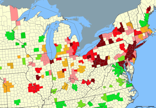
    image
    Image Source: Wikipedia: Change in total number of manufacturing jobs in metropolitan areas, 1954-2002. Dark red is very bad. Akron is dark red.

    The memory is so vivid that I can still remember looking at the green overhead freeway signs along the West Expressway in Akron. Some of the signs were in kilometers, as well as in miles back then, due to an ill-fated attempt to convert Americans to the Metric system in the 1970s. I remember the overpoweringly pungent smell of rubber wafting from the smokestacks of B.F. Goodrich and Firestone. I recall asking my mother about it, and her explaining that those were the factories where the tires, and the rubber, and the chemicals were made. They were made by hard-working, good people – people like my Uncle Jim – but more on that, later.

    When I was a little bit older, I would learn that this was the smell of good jobs; of hard, dangerous work; and of the way of life that built the modern version of this quirky and gritty town. It was the smell that tripled Akron’s population between 1910 and 1920, transforming it from a sleepy former canal-town to the 32nd largest city in America. It is a smell laced with melancholy, ambivalence, and nostalgia – for it was the smell of an era that was quickly coming to an end (although I was far too young to be aware of this fact at the time). It was sometimes the smell of tragedy.

    We stopped by my grandparents’ house, in Firestone Park, on the way to the campground. I can still remember my grandmother giving me a box of Barnum’s Animals crackers for the road. She was always kind and generous like that.

    Who were my grandparents? My grandparents were Akron. It’s as simple as that. Their story was Akron’s story. My grandfather was born in 1916, in Barnesboro, a small coal-mining town in Western Pennsylvania, somewhere between Johnstown, DuBois, and nowhere. His father, a coal miner, had emigrated there from Hungary nine years earlier. My grandmother was born in Barberton, in 1920. Barberton was reportedly the most-industrialized city in the United States, per-capita, at some point around that time.

    They were both factory workers for their entire working lives (I don’t think they called jobs like that “careers” back then). My grandfather worked at the Firestone Tire & Rubber Company. My grandmother worked at Saalfield Publishing, a factory that was one of the largest producers of children’s books, games, and puzzles in the world. Today, both of the plants where they worked form part of a gutted, derelict, post-apocalyptic moonscape in South Akron, located between that same West Expressway and perdition. The City of Akron has plans for revitalizing this former industrial area. It needs to happen, but there are ghosts there…

    My name is Ozymandias, King of Kings, 
    Look on my works, ye Mighty, and despair!
    Nothing beside remains. Round the decay 
    Of that colossal wreck, boundless and bare 
    The lone and level sands stretch far away.

    -Percy Bysshe Shelley, Ozymandias

    My grandparents’ house exemplified what it was to live in working-class Akron in the late 1970s and early 1980s. My stream-of-consciousness memories of that house include: lots of cigarettes and ashtrays; Hee-HawThe Joker’s Wild; fresh tomatoes and peppers; Fred & Lamont Sanford; Archie & Edith Bunker; Herb Score and Indians baseball on the radio on the front porch; hand-knitted afghans; UHF/VHF; 3, 5, 8, and 43; cold cans of Coca-Cola and Pabst Blue Ribbon (back when the pop-tops still came off of the can); the Ohio Lottery; chicken and galuskas (dumplings); a garage floor that you could eat off of; a meticulously maintained 14-year-old Chrysler with 29,000 miles on it; a refrigerator in the dining room because the kitchen was too small; catching fireflies in jars; and all being right with the world.

    I always associate the familiar comfort of that tiny two-bedroom bungalow with the omnipresence of cigarette smoke and television. I remember sitting there on May 18, 1980. It was my eighth birthday. We were sitting in front of the TV, watching coverage of the Mount St. Helens eruption in Washington State. I remember talking about the fact that it was going to be the year 2000 (the Future!) in just twenty years. It was an odd conversation for an eight year old to be having with adults (planning for the future already, and for a life without friends, apparently). I remember thinking about the fact that I would be 28 years old then, and how inconceivably distant it all seemed. Things seem so permanent when you’re eight, and time moves ever-so-slowly.

    More often than not, when we visited my grandparents, my Uncle Jim and Aunt Helen would be there. Uncle Jim was born in 1936, in West Virginia. His family, too, had come to Akron to find work that was better-paying, steadier, and (relatively) less dangerous than the work in the coal mines. Uncle Jim was a rubber worker, first at Mohawk Rubber and then later at B.F. Goodrich. Uncle Jim also cut hair over at the most-appropriately named West Virginia Barbershop, on South Arlington Street in East Akron. He was one of the best, most decent, kindest people that I have ever known.

    I remember asking my mother once why Uncle Jim never washed his hands. She scolded me, explaining that he did wash his hands, but that because he built tires, his hands were stained with carbon-black, which wouldn’t come out no matter how hard you scrubbed. I learned later, that it would take about six months for that stuff to leach out of your pores, once you quit working.

    Uncle Jim died in 1983, killed in an industrial accident on the job at B.F. Goodrich. He was only 47. The plant would close for good about a year later.

    It was an unthinkably tragic event, at a singularly traumatic time for Akron. It was the end of an era.

    Times Change

    My friend Della Rucker recently wrote a great post entitled The Elder Children of the Rust Belt over at her blog, Wise Economy. It dredged up all of these old memories, and it got me thinking about childhood, about this place that I love, and about the experience of growing up just as an economic era (perhaps the most prosperous and anomalous one in modern history) was coming to an end.

    That is what the late 1970s and early 1980s was: the end of one thing, and the beginning of a (still yet-to-be-determined) something else. I didn’t know it at the time, but that’s because I was just a kid.

    In retrospect it was obvious: the decay; the deterioration, the decomposition, the slow-at-first, and then faster-than-you-can-see-it unwinding of an industrial machine that had been wound-up far, far, too-tight. The machine runs until it breaks down; then it is replaced with a new and more efficient one – a perfectly ironic metaphor for an industrial society that killed the goose that laid the golden egg. It was a machine made up of unions, and management, and capitalized sunk costs, and supply chains, and commodity prices, and globalization. Except it wasn’t really a machine at all. It was really just people. And people aren’t machines. When they are treated as such, and then discarded as obsolete, there are consequences.

    You could hear it in the music: from the decadent, desperately-seeking-something (escape) pulse of Disco, to the (first) nihilistic and (then) fatalistic sound of Punk and Post-Punk. It’s not an accident that a band called Devo came from Akron, Ohio. De-evolution: the idea that instead of evolving, mankind has actually regressed, as evidenced by the dysfunction and herd mentality of American society. It sounded a lot like Akron in the late 1970s. It still sounds a little bit like the Rust Belt today.

    As an adult, looking back at the experience of growing up at that time, you realize how much it colors your thinking and outlook on life. It’s all the more poignant when you realize that the “end-of-an-era” is never really an “end” as such, but is really a transition to something else. But to what exactly?

    The end of that era, which was marked by strikes, layoffs, and unemployment, was followed by its echoes and repercussions: economic dislocation, outmigration, poverty, and abandonment; as well as the more intangible psychological detritus – the pains from the phantom limb long after the amputation; the vertiginous sensation of watching someone (or something) die.

    And it came to me then 
    That every plan 
    Is a tiny prayer to Father Time

    As I stared at my shoes
    In the ICU
    That reeked of piss and 409

    It sung like a violent wind
    That our memories depend
    On a faulty camera in our minds

    ‘Cause there’s no comfort in the waiting room
    Just nervous paces bracing for bad news

    Love is watching someone die…

    -Death Cab For Cutie, What Sarah Said

    But it is both our tragedy and our glory that life goes on.

    Della raised a lot of these issues in her post: our generation’s ambivalent relationship with the American Dream (like Della, I feel the same unpleasant taste of rust in my mouth whenever I write or utter that phrase); our distrust of organizations and institutions; and our realization that you have to keep going, fight, and survive, in spite of it all. She talked about how we came of age at a time of loss:

    not loss like a massive destruction, but a loss like something insidious, deep, pervasive.

    It is so true, and it is so misunderstood. One of the people commenting on her blog post said, essentially, that it is dangerous to romanticize about a “golden age”; that all generations struggle; and that life is hard.

    Yes, those things are all true. But they are largely irrelevant to the topic at hand.

    There is a very large middle ground between a “golden age” and an “existential struggle”. The time and place about which we are both writing (the late 1970s through the present, in the Rust Belt) is neither. But it is undoubtedly a time of extreme transition. It is a great economic unraveling, and we are collectively and individually still trying to figure out how to navigate through it, survive it, and ultimately build something better out of it.

    History is cyclical. Regardless of how enamored Americans, in general, may be with the idea, it is not linear. It is neither a long, slow march toward utopia, nor toward oblivion. When I look at history, I see times of relative (and it’s all relative, this side of paradise) peace, prosperity, and stability; and other times of relative strife, economic upheaval, uncertainty, and instability. We really did move from one of those times to the other, beginning in the 1970s, and continuing through the present.

    The point that is easy to miss when uttering phrases like “life is hard for every generation” is that none of this discussion about the Rust Belt – where it’s been, where it is going – has anything to do with a “golden age”. But it has everything to do with the fact that this time of transition was an era (like all eras) that meant a lot (good and bad) to the people that lived through it. It helped make them who they are today, and it helped make where they live what it is today.

    For those that were kids at the time that the great unraveling began (people like me, and people like Della) it is partially about the narrative that we were socialized to believe in at a very young age, and how that narrative went up in a puff of smoke. In 1977, I could smell rubber in the air, and many of my family members and friends’ parents worked in rubber factories. In 1982, the last passenger tire was built in Akron. By 1984, 90% of those jobs were gone, many of those people had moved out of town, and the whole thing was already a fading memory. Just as when a person dies, many people reacted with a mixture of silence, embarrassment, and denial.

    As a kid, especially, you construct your identity based upon the place in which you live. The whole identity that I had built, even as a small child, as a proud Akronite: This is the RUBBER CAPITAL OF THE WORLD; this is where we make lots and lots of Useful Things for people all over the world; this is where Real Americans Do Real Work; this is where people from Europe, the South, and Appalachia come to make a Better Life for themselves; well, that all got yanked away. I couldn’t believe any of those things anymore, because they were no longer true, and I knew it. I could see it with my own two eyes. Maybe some of them were never true to begin with, but kids can’t live a lie the way that adults can. When the place that you thought you lived in turns out not to be the place that you actually live, it can be jarring and disorienting. It can even be heartbreaking.

    We’re the middle children of history, man. No purpose or place. We have no Great War. No Great Depression. Our great war is a spiritual war. Our great depression is our lives.

    Tyler Durden, Fight Club

    I’m fond of the above quote. I was even fonder of it when I was 28 years old. Time, and the realization that life is short, and that you ultimately have to participate and do something with it besides analyze it as an outside observer, has lessened its power considerably. It remains the quintessential Generation X quote, from the quintessential Generation X movie. It certainly fits in quite well with all of this. But, then again, maybe it shouldn’t.

    I use the phrase “Rust Belt Orphan” in the title of this post, because that is what the experience of coming of age at the time of the great economic unraveling feels like at the gut-level. But it’s a dangerous and unproductive combination, when coupled with the whole Gen-X thing.

    In many ways, the Rust Belt is the “Generation X” of regions – the place that just doesn’t seem to fit in; the place that most people would just as soon forget about; the place that would, in fact, just as soon forget about itself; the place that, if it does dare to acknowledge its own existence or needs, barely notices the surprised frowns of displeasure and disdain from those on the outside, because they have already been subsumed by the place’s own self-doubt and self-loathing.

    A fake chinese rubber plant
    In the fake plastic earth
    That she bought from a rubber man
    In a town full of rubber plans
    To get rid of itself

    -Radiohead, Fake Plastic Trees

    The whole Gen-X misfit wandering-in-the-Rust Belt-wilderness meme is a palpably prevalent, but seldom acknowledged part of our regional culture. It is probably just as well. It’s so easy for the whole smoldering heap of negativity to degenerate into a viscous morass of alienation and anomie. Little good can come from going any further down that dead-end road.

    Whither the Future?

    The Greek word for “return” is nostosAlgos means “suffering.” So nostalgia is the suffering caused by an unappeased yearning to return.
    – 
    Milan Kundera, Ignorance

    So where does this all leave us?

    First, as a region, I think we have to get serious about making our peace with the past and moving on. We have begun to do this in Akron, and, if the stories and anecdotal evidence are to be believed, we are probably ahead of the region as a whole.

    But what does “making our peace” and “moving on” really mean? In many ways, I think that our region has been going through a collective period of mourning for the better part of four decades. Nostalgia and angst regarding the things that have been lost (some of our identity, prosperity, and national prominence) is all part of the grieving process. The best way out is always through.

    But we should grieve, not so we can wallow in the experience and refuse to move on, but so we can gain a better understanding of who we are and where we come from. Coming to grips with and acknowledging those things, ultimately enables us to help make these places that we love better.

    We Americans are generally not all that good at, or comfortable with, mourning or grief. There’s a very American idea that grieving is synonymous with “moving on” and (even worse) that “moving on” is synonymous with “getting over it”.

    We’re very comfortable with that neat and tidy straight, upwardly-trending line toward the future (and a more prosperous, progressive, and enlightened future it will always be, world without end, Amen.)

    We’re not so comfortable with that messy and confusing historical cycle of boom-and-bust, of evolution and de-evolution, of creation and destruction and reinvention. But that’s the world as we actually experience it, and it’s the one that we must live in. It is far from perfect. I wish that I had another one to offer you. But there isn’t one on this side of the Great Beyond. For all of its trials and tribulations, the world that we inhabit has one inestimable advantage: it is unambiguously real.

    “Moving on” means refusing to become paralyzed by the past; living up to our present responsibilities; and striving every day to become the type of people that are better able to help others. But “moving on” doesn’t mean that we forget about the past, that we pretend that we didn’t experience what we did, or that we create an alternate reality to avoid playing the hand that we’ve actually been dealt.

    Second, I don’t think we can, or should, “get over” the Rust Belt. The very phrase “get over it” traffics in denial, wishful thinking, and the estrangement of one’s self from one’s roots. Countless attempts to “get over” the Rust Belt have resulted in the innumerable short-sighted, “get rich quick” economic development projects, and public-private pyramid-schemes that many of us have come to find so distasteful, ineffective, and expensive.

    We don’t have to be (and can’t be, even if we want to) something that we are not. But we do have to be the best place that we can be. This might mean that we are a smaller, relatively less-prominent place. But it also means that we can be a much better-connected, more cohesive, coherent, and equitable place. The only people that can stop us from becoming that place are we ourselves.

    For a place that has been burned so badly by the vicissitudes of the global economy, Big Business, and Big Industry, we always seem to be so quick to put our faith in the Next Big Project, the Next Big Organization, and the Next Big Thing. I’m not sure whether this is the cause of our current economic malaise, or the effect, or both. Whatever it is, we need to stop doing it.

    Does this mean that we should never do or dream anything big? No. Absolutely not. But it does mean that we should be prudent and wise, and that we should tend to prefer our economic development and public investment to be hyper-nimble, hyper-scalable, hyper-neighborhood-focused, and ultra-diverse. Fetishizing Daniel Burnham’s famous “Make no little plans…” quote has done us much harm. Sometimes “little plans” are exactly what we need, because they often involve fundamentals, are easier to pull-off, and more readily establish trust, inspire hope, and build relationships.

    Those of us that came of age during the great economic unraveling and (still painful) transition from the Great American Manufacturing Belt to the Rust Belt might just be in a better position to understand our challenges, and to find the creative solutions required to meet them head-on. Those of us that stuck it out and still live here, know where we came from. We’re under no illusions about who we are or where we live. I think Della Rucker was on to something when she listed what we can bring to the table:

    • Determination
    • Long-game focus
    • Understanding the depth of the pit and the long way left to climb out of it
    • Resourcefulness
    • Ability to salvage
    • Expectation that there are no easy answers
    • Disinclination to believe that everything will be all right if only we do this One Big Thing

    When I look at this list, I see pragmatism, resilience, self-knowledge, survival skills, and leadership. It all rings true.

    He wanted to care, and he could not care. For he had gone away and he could never go back any more. The gates were closed, the sun was gone down, and there was no beauty but the gray beauty of steel that withstands all time. Even the grief he could have borne was left behind in the country of illusion, of youth, of the richness of life, where his winter dreams had flourished.

    “Long ago,” he said, “long ago, there was something in me, but now that thing is gone. Now that thing is gone, that thing is gone. I cannot cry. I cannot care. That thing will come back no more.”

    -F. Scott Fitzgerald, Winter Dreams

    So, let’s have our final elegy for the Rust Belt. Then, let’s get to work.

    This post originally appeared in Jason Segedy’s Notes From the Underground on November 2, 2013.

    Segedy is the Director of the Akron Metropolitan Area Transportation Study, the Metropolitan Planning Organization serving Akron, Ohio.  As a native of Akron, and as an urban planner, he has a strong interest in the future of places throughout the Great Lakes region, and in the people that inhabit them.
  • Enterprising States 2014: Re-creating Equality of Opportunity

    This is the executive summary for the U.S. Chamber of Commerce Foundation’s 5th Annual Enterprising States report, authored annually by Praxis Strategy Group. View the interactive map with state-by-state data and download the full report here.

    The growing skills gap is one of the most persistent challenges affecting thriving and lagging state economies—the disparity between the skills companies need to drive growth and innovation versus the skills that actually exist within their organizations and in the labor market. This disconnect, expected to grow substantially as the boomer generation retires, causes workers and companies to miss out on realizing their full potential. A sizable skills gap impacts virtually every aspect of the economy, thereby affecting our national competitiveness and, in turn, causing the economy to fall short of its potential.

    The nature of the skills gap that employers face varies by geography. Each state has its own economic DNA with varying levels of growth and specialization for each industry. The energy-related skills gap in Texas or North Dakota, for example, is different from a manufacturing-driven gap in Michigan, aerospace in Washington, information technology in Utah, or the chemical industry in Louisiana.

    Businesses and the public sector must work side by side to identify where there is a deficit of talent, reskill incumbent workers, and skill new entrants into the workforce to close the gaps within their communities. This is not a problem that can be solved quickly, but it can be solved. Strengthening America’s science, technology, engineering, and mathematics (STEM) and middle-skills pipeline will require public-private partnerships as well as collaborations across federal, state, and local governments.

    States as a Focal Point for Action

    States and their governors play a pivotal role in filling the talent pipeline, providing critical leadership to link businesses with the education, workforce, and economic development systems. Solutions will vary by state of course, but there is an emerging framework built on a foundation of both basic education and an employer-responsive workforce pipeline.

    Economic development starts with strong schools focused on 21st century skills. For the past three decades, efforts by U.S. businesses, government, and educational organizations focused on retooling K–12 science, mathematics, and reading education and on addressing persistently high dropout rates in inner cities. Progress has been slow to remedy the looming skills shortage, but there is a growing sense of optimism that industry sector partnerships, greater attention to career pathways, and the implementation of integrated education and training will help to close the gap.

    An employer-responsive talent pipeline requires aligning education, workforce development, and economic development. Postsecondary education institutions now get a considerably lower percentage of their funding from state sources than just a decade ago, but states continue to make significant financial investments in higher education. Yet, a common refrain is that postsecondary offerings—at both two- and four-year institutions—are not sufficiently aligned with the skills needed in the workforce. For years, knowledge creation, research and development, and technology transfer have dominated higher education’s economic development role. However, higher education’s most important contribution to state economic competitiveness in the future might be teaching and talent production because states with the most high-level talent will have a leg up in the future economy of decentralized global networks.

    Investing in people is perhaps the most effective long-term economic growth strategy. Training and education offer the best chance for workers to find well-paying long-term employment, while providing businesses and employers in every sector with the talent they need to grow.

    Coordinating education, workforce development, and economic development has proven to be challenging among the states because the three fields are historically separate systems, with separate cultures and perspectives. States that are successful in navigating program integration and facilitating collaboration between these traditionally separate institutions will put themselves in the forefront of meeting one of the primary challenges to building a 21st century economy.

    Because of these complexities, a governor serves the issue best by playing a leadership role in forming partnerships – particularly between business and education – and creating the structure to ensure effectiveness and efficiency in a demand-driven education to workforce pipeline. Often this involves a decentralized approach so that more decisions can be made at the local level.

    Enterprising States 2014

    Now in its fifth edition, the Enterprising States study measures state performance overall and across five policy areas important for job growth and economic prosperity. Those five areas include:

    • Talent Pipeline
    • Exports and International Trade
    • Technology and Entrepreneurship
    • Business Climate
    • Infrastructure

    The 2014 report relates these policies and practices to the need for collaboration between education, workforce development, and economic development to positively combat the nation’s growing skills gap.  

    Top Performers

    Utah lands in the top 6 in each of the five policy categories and 3rd in overall economic performance. It is the only state to finish in the top 10 on all six lists.

    Colorado appears on 5 top 10 lists, Texas on 4, and Washington is in the top 15 of five lists.

    North Dakota is another strong performer, leading by a large margin in economic performance and ranking 1st in talent metrics and 9th in business climate.

    Florida and Nevada rank well on many policy measures, a sign that the economies of those states may be ripe for a turnaround.

    Virginia ranks 5th in technology and entrepreneurship, and talent metrics, helping it land just outside the top 10 in economic performance.

    Minnesota ranks 10th in economic performance, partly due to its second place in talent pipeline. 

    See how your state ranks by viewing our interactive map. Or view a PDF of the full report.

    Enterprising States is authored by Praxis Strategy Group along with Joel Kotkin. Praxis Strategy Group is an economic research, analysis, and strategic planning firmJoel Kotkin is executive editor of NewGeography.com and author of the forthcoming The New Class Conflict.

  • The Best Small And Midsize Cities For Jobs 2014

    In the classic television show “The Honeymooners,” many jokes were wrung out of bus driver Ralph Cramden’s membership in the International Brotherhood of Loyal Raccoons, headquartered in Bismarck, North Dakota. When Ralph mentioned in one episode to his wife, Alice, that among the privileges is that they could be buried at the “Raccoon National Cemetery” in Bismarck, Alice’s reply was that it made her not know “if I want to live or die.”

    That’s worth a chuckle, but perhaps it’s time to reconsider Bismarck, which ranked first out of the 398 metro areas we considered for our annual roundup of The Best Cities For Jobs. A metro area of 120,000 located in the country’s fastest-growing state and near the vast Bakken oil fields, the number of jobs in Bismarck is up 3% over the last year and a sizzling 32.4% since 2002. You might not want to be buried there, but at least you can get a job before that.

    Bismarck’s growth, although remarkable, is mirrored in many smaller places. When we look at economic growth in America, we tend to focus on large metropolitan areas (we draw the bar at 5 million people and up). However over 40% of Americans live outside these big cities and their much more populous suburbs, notes demographer Wendell Cox. They reside in smaller cities and towns, the destination of choice for many of the domestic migrants fleeing the largest metropolitan areas for the better part of the last decade.

    View the Best Cities for Jobs 2014 List

    These places are often seen by pundits as economic backwaters, but in fact small and mid-sized metro areas take up 16 of the top 20 spots of our overall list of The Best Cities For Jobs. For the most part, it is the smaller markets with under 150,000 jobs that are growing the fastest, but several mid-sized cities (between 150,000 and 450,000 nonfarm jobs) also are outperforming, including Boulder, Colo., which ranks first on our medium-sized cities list, and Provo-Orem, Utah, which ranks second. These areas are as varied as America. Some fit the resource-dominated archetype often associated with smaller cities and towns but others are driven by industry and even tech growth.

    The Energy Hubs

    As we saw with our large cities list, metro areas that are connected to the energy economy have been peak performers. Beyond Bismarck, our list of the Best Small Cities For Jobs includes Greeley (fifth) and Ft. Collins (17th), both located near the oilfields of northern Colorado; and near the west Texas oilfields, the cities of Midland (sixth), San Angelo (11th), Odessa (15th) and Lubbock (16th).

    Energy jobs pay an average of about $80,000 a year according to BLS data. But this wealth is not only for geologists or those with oil stains on the hands. The money brought into these communities has also sparked strong growth in such fields as manufacturing, construction and business services in virtually all these towns. In Midland, for example, natural resources and construction employment has surged 50% since 2008, but wholesale trade, manufacturing, business and financial services have also expanded strongly.

    Manufacturing Comeback Cities

    Plenty of old industrial cities are at the bottom of the 240 MSAs we ranked for our small cities list, including 238th place Danville, Ill., which has lost 6% of its jobs since 2008, and second from last, Michigan City-La Porte, Ind., where employment has dropped 6.8% over the same span. But some of the highest fliers are also industrial towns. This includes second-ranked Elkhart-Goshen, Ind., which rose a remarkable 63 places from last year on our list, and from 233rd back in 2010. The recreational vehicle manufacturing hub suffered steep job losses during the Recession, but industrial employment has risen 24% since 2010.

    Like energy, industrial jobs tend to pay more than most, and have a strong effect on other sectors. Since 2010 in the Elkhart-Goshen area, employment in wholesale trade and business services has expanded at double-digit percentage paces, while retail employment has shot up a healthy 7.4%. In Grand Rapids-Wyoming, Mich., which ranks third on our list of the Best Midsize Cities For Jobs, manufacturing employment is up almost 14.7% since 2010 while job growth has also been strong in medical services, education, and business services. Grand Rapids has 4.9% more jobs now than in 2002, a far sight better than larger industrial metro areas like Detroit, where employment has declined 16.2% over the same period.

    But most of the comeback industrial towns are not in the Midwest but the Southeast, which has gotten the bulk of new investment from foreign automakers and steelmakers. This includes Auburn-Opelika, Ala., No. 7 on our small cities list, where there has been a surge in employment by auto parts suppliers. The home of 25,000-studentAuburn University, it has also seen strong growth in business services and hospitality. Two South Carolina metro areas, Anderson (12th) and Spartanburg (13th), have also benefited from the industrial resurgence in the region.

    College Towns

    We may be approaching the end of a “higher education bubble,” as Glenn Reynolds and others have suggested, but at least for now many college towns in the Midwest, the southeast and the Intermountain West continue to show strong job growth.

    In Columbia, Mo., home to the 35,000-student University of Missouri, employment has expanded 9.7% since 2008 and 4% in 2013, placing it third on our small cities list. In ninth-place College Station, Texas, the presence of Texas A&M (56,000 students) has sparked growth in the information and business services sectors, in which employment has expanded 18.2% and 14.2%, respectively, since 2008, while leisure and hospitality employment is up 29.5% over the same period. Higher education has continued to be a strong and growing industry for these small towns, although its long-term sustainability may be hampered by a lethargic economy and burgeoning student debt.

    Places For The Rich And Famous

    In this most unequal of recoveries, some of the biggest winners are cities that cater to the rich and aging baby boomers. People over 55 control upward of three-quarters of the country’s wealth and more than half all discretionary dollars. And unlike the millennials and Xers who follow them, this generation has generally profited more from the recent jump in equity and property prices.

    Fourth on our small cities list is St. George in scenic southwestern Utah, a fast-growing community for retirees, where employment shot up 5.38% in 2013. Naples-Marco Island, Fla. (eighth), long a major lure to northern snowbirds, is home to a fast-growing economy built around hospitality and construction. Napa, Calif. (18th), has emerged as a major beneficiary of spending by wealthy retirees from the booming San Francisco Bay Area.

    The Future For Smaller Cities

    Big city mayors are wont to proclaim that they’re on the cutting edge of economic life. Big cities are where “the action is,” Atlanta’s Karim Reed said at a recent confab in Chicago. But as our roundup of the cities with the strongest employment growth shows, many of the hottest economies in the country are in places that most urbanistas would write off as the boondocks. Some of them, may only do well as long the energy and agriculture booms continue, but many other will benefit as boomers continue to seek out comfortable, less congested, and often less expensive, places to retire. These smaller places may also benefit as millennials start seeking to buy homes and raise families. And with the expansion of communication technology, they may find it increasingly easy to perform sophisticated work from smaller places. America’s economy may still remain dominated by its giant metro areas, but it would be inaccurate to discount the role of smaller places in the evolving American economy.

    View the Best Cities for Jobs 2014 List

    This story originally appeared at Forbes.

    Joel Kotkin is executive editor of NewGeography.com and Distinguished Presidential Fellow in Urban Futures at Chapman University, and a member of the editorial board of the Orange County Register. He is author of The City: A Global History and The Next Hundred Million: America in 2050. His most recent study, The Rise of Postfamilialism, has been widely discussed and distributed internationally. He lives in Los Angeles, CA.

    Michael Shires, Ph.D. is a professor at Pepperdine University School of Public Policy.

    Boulder, CO photo by Phil Armitage.

  • No Joke: It Couldn’t Get Much Better In Fargo

    This week the coastal crowd will get another opportunity to laugh at the zany practices of those living in the frozen reaches of the Great Plains. The new television series “Fargo,” based on the 1996 Coen brothers movie, will no doubt be filled with fearsome violence mixed with the proper amount of Scandinavian reserve and wry humor — the very formula that made the original such a hit.

    Yet how much will “Fargo” the series resemble the real places? Probably not much. For one thing the series only uses Fargo as a kind of marker; the action actually takes place in Bemidji, Minn., a small town of 12,000 over two hours away. I know distances are seen differently in the northern Plains, but the whole idea seems a bit of a stretch. Located in forest and lake country, many locals would not even consider the Minnesota town part of the Plains.

    Less known to the sophistos who will watch the show is that Fargo, a metro area with over 200,000 people, and the state of North Dakota have been enjoying a sustained boom for a decade. This resurgence — in demographics, economics and real estate — follows decades of relative decline and an almost sullen sense of isolation that drove many people out of the state.

    In a state where the unofficial motto seems to be “it could be worse” — not a bad notion given the often miserable weather — things couldn’t be much better. North Dakota leads the nation in virtually every indicator of prosperity: the lowest unemployment rate, and the highest rates of net in-migration, income growth and job creation. Last year North Dakota wages rose a remarkable 8.9%, twice as much as Utah and Texas, which shared honors for second place, and many times the 1% rise experienced nationwide.

    The once dreary predictions of demographic decline — epitomized by the proposal two New Jersey academics to turn the area into a “Buffalo Commons” — have been reversed. North Dakota now lures many college graduates from out of state and keeps more of its own as well. Today more than half of North Dakotans aged 25-44 have post-secondary degrees, among the highest percentages in the nation, and well above the roughly 40% number for the rest of the country.

    Many will ascribe the state’s rise primarily to the energy boom. To be sure the fastest growth in North Dakota and other Plains states has been in the areas closest to the oil and gas finds. But over the past decade, the population of the Plains has expanded by 14%, well above the national average and far faster than the Midwest, the Northeast or California.

    This Plains resurgence is taking place even in areas far from energy development. Fargo, for example, is six hours hard driving from Williston, the center of the Bakken range. Yet despite this the area’s population has been growing, up 20% in the last decade, twice the national average. Since 2010, over 8,000 more people have come to the Fargo metro area, which extends to the Minnesota city of Moorhead, than have left. In fact, the small cities of the Dakotas have been growing faster than the nation for well more than a decade, before the recent energy boom took off.

    The growth in Fargo has come not so much from energy, but an expanding industrial and technology sector. STEM employment is up nearly 40% since 2001, compared to 3% nationally. It also leads all other U.S. metro areas in the growth in the number of mid-skilled jobs, providing good wages to people with two-year or certificate degrees. Between 2009 and 2011, mid-skilled employment grew 5%, roughly 10 times the national average. No surprise then that the population with BAs in Fargo has grown 50% in the last decade, well above the 40% rate for the rest of the country.

    Yet perhaps nothing illustrates the dramatic changes in Fargo better than its downtown area. Twenty years ago, when I first visited the city, downtown was torpid on a good day. Storefronts were old, funky and often empty. The local hotels ranged between acceptable to sorry.

    But in the past decade downtown Fargo has seen a crush of new investment; property values have more than doubled since 2000. Mid-range apartment complexes are sprouting up, all pitching themselves to millennial professionals who value a more pedestrian-oriented environment. The founder of Great Plains Software, now Microsoft Business Systems, Doug Burgum, has proposed to build a 23-story office tower downtown. Not surprisingly, it would be the tallest building in the state.

    Some are rightfully skeptical about some of these ambitious plans given the low cost of development on the periphery and the region’s basically non-urban mindset. But the feel has certainly changed, with several high-end restaurants, huge numbers of bars (befitting the German and Scandinavian roots of the area’s population), offering a rising number of local brews. There’s even a boutique hotel, the Donaldson, founded by Burgum’s ex-wife Karen, decorated with Plains art, and run by a friendly, highly professional staff.

    The people even look different than a decade or two ago. The bars and restaurants now host a more attractive group of young professionals and meandering divorcees. The change is so striking that I have been pitching friends in L.A. to produce a North Dakota version of the “Real Housewives” reality series.

    None of this is likely to be revealed in the new “Fargo” TV show. After all, the place has one of the lowest crime rates in the country, a full third below the national average; with only 11 murders since 2000, it’s hardly the Baltimore of the “Wire” or “Treme.” But murder sells better than contentment, or at least makes for more riveting entertainment about the place, unless I can find buyers for my “Housewives” idea. But unlike in the past, Fargo residents don’t have to cringe about this latest Hollywood assault and its impact on their image. Things are good enough that they can afford to laugh; it certainly could be a lot worse.

    This piece originally appeared in Forbes.

    Joel Kotkin is executive editor of NewGeography.com and Distinguished Presidential Fellow in Urban Futures at Chapman University, and a member of the editorial board of the Orange County Register. He is author of The City: A Global History and The Next Hundred Million: America in 2050. His most recent study, The Rise of Postfamilialism, has been widely discussed and distributed internationally. He lives in Los Angeles, CA.

    Hotel Donaldson photo By jeffreykreger

  • The Evolution of Red and Blue America 1988-2012

    David Jarman of Daily Kos Elections provides an excellent analysis of the absolute change in the Democratic and Republican vote for president from the 1988 through the 2012 elections, together with valuable tables and maps. The maps, tables, and narrative clearly demonstrate that, while the map looks mostly red as if Republicans were the big winners, the reality is that the Democrats were the beneficiaries of vastly more added votes, because of Democrats’ stupendous domination of the denser, bigger, metropolitan territory. For example, Los Angeles County by itself provided a Democratic gain of 1.2 MILLION, while the largest Republican gain was Utah county, Utah (Provo) with a paltry 90,000 gain. Republicans dominate the vast non-metropolitan expanses, Democrats the urban cores.

    But the title of the piece, “Democrats are from cities, Republicans from exurbs”, is not quite right. Density is only one factor in elections; Democrats did quite well in much of exurbia as well as much of suburbia, relegating Republicans to rural, small city, non-metropolitan America. But the story is as much one of social change as of city versus country. Not only the big central cities, but their suburbs and even exurbs have evolved to house the more socially liberal population, with issues of race, women’s rights, and sexuality converting many middle and upper class to the Democratic side, even while rural small town America and much of the South remain socially conservative and supportive of Republicans.

    This analysis extends Jarman’s findings by disaggregating the net change in the D and R vote by first looking at the degree of change in the Democratic share of the presidential vote from 1988 to 2012 and second by classifying by the change by such categories as:

    • increased R vote shares, 1,
    • declining R votes, 2,
    • shift to Democratic to Republican,3,
    • increased D vote shares, 4,
    • decreased D vote shares, 5,  and
    • 6, a shift from Republican to a Democratic majority

    This permits a more subtle geographic evaluation of the evolution of Red and Blue America. I want to thank the Daily Kos Elections which generously provided the necessary data files. This analysis considers only the vote for president, as the story of votes for congress is complicated by gerrymandering and other issues.

    Change in the Democratic vote by type of change (see Table 1)

    Table 1: Net Change by Type of Change
    Number of Counties 2012 %D 1988 %D Change in D% 88-12 net change County Type (Code)
    1411 30.8 39.8 -9 -4,605,125 1 Total
    448 40.3 55.1 -14.5 -1,517,300 3 Total
    108 55.8 57.2 -1.4 -62,214 5 Total
    -6,184,639 R gain
    274 71.1 58 12.8 8,835,866 4 Total
    313 59.7 42.9 16.4 8,917,699 6 Total
    572 42.4 35.3 7.1 463,743 2 Total
    18,217,308 D gain
    12,032,669 Net D Gain

    Almost half of all counties, 1411, experienced Democratic declines and net Republican gains, totaling  a  net change of 4,605,000, with the Democratic share dropping nine points from 39.8% to 30.8%.  Next in importance for Republicans was the gain of 1,517,000 votes in 448 counties taken from the Democratic column in 1988, with a decline in the Democratic share from 55.1% to 40.3%, a big drop of 14.8 points.  Finally a smaller number of counties, 108, remained Democratic but with a declining share (type 5), giving Republicans a small net gain of 62,000. These Republican gains totaled 6,184,000 and look impressive on a US map.

    But what the Democrats lose in vast America, they make up in the crowded parts. Although their increased shares took place in only 274 counties, the gains were populous enough to provide the Democrats with a massive gain of 8,836,000 total votes. The D share rose an impressive 12.5 points from 58.8% to 71.1%. (This exceeds even the R share in the R gaining counties). But even this big number was exceeded by the gain of 8,918,000 in the again fairly small number of counties which switched from Republican to Democratic, with a change in share up 16.4 points from 46.1% D to 59.3%. Finally the Democrats gained a net 464,000 votes in 572 counties carried by Republicans but by a lesser margin than in 1988, with the D share rising from 35.3% to 42.4%.  Overall the net Republican gains of 6,184,000 were surpassed by Democratic gains of 18,717,000 for a net D growth of 12,032,000, a rise in the D share of 5.9 points from 46.1% in 1988 to 52.6% in 2012.

    Change By State

    A short look at the state level is interesting (Table 2).  Sixteen states became even more Republican, with a net gain of 2,681,000.  Most important in total numbers is the southwestern set of  TX, OK, LA, and AR (1,143,000), then the northern mountain states of UT,ID, WY, and MT (477,000), followed by the Great Plains states of ND,SD, NE, KS, and MO (376,000), and the Appalachian set of TN  and KY (488,000). To the latter should be added West Virginia, 210,000, the only state which switched from Democratic to Republican and an apt example of the non-big-metropolitan and ideological shift in the US electorate.  Only one state, Iowa, experienced a small Democratic decline.

    Nine states became even more Democratic, but sixteen switched from Republican to Democratic, and thus spurring the major numeric and geographic manifestation of the 1988-2012 realignment, a total of 15,342,000.  Combining the Democratic states into subregions reveals the overwhelming importance of greater northeastern Megalopolis, yielding a net vote gain of 5,660,000 and of the “Left Coast” with 4,115,000, both dwarfing the total Republican gains. And the gains in the Great Lakes of 2,740,000, northern New England of 443,000, and the southern Mountain states of 431,000 were significant. Finally the major change in the South Atlantic region is notable, with a gain of 1,383,000 in SC, NC, GA, and FL, even though all but Florida remained Republican. At the individual state level California is dominant, 3,367,000, followed by NY-NJ. For Republicans Texas dominated with 578,000 followed by much smaller Utah with 268,000.

    County level

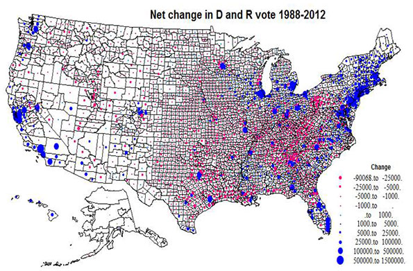
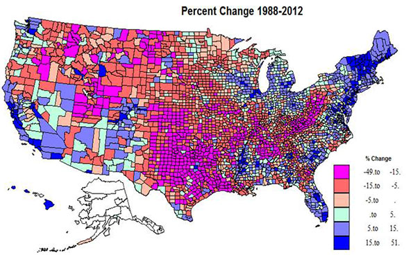
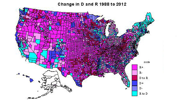
    The first two maps are the traditional red and blue (sort  of) choropleth maps, showing in Map 1 change in the share voting Democratic and in Map 2, the type of change. Map 3 depicts via graduated circles the absolute net change by counties, like the similar map in the Jarman article.

    Percent change in the Democratic and Republican shares, 1988-2012, Map 1

    Somewhat over half the territory of the US experienced Republican gains, in red shadings, but on average, the populations of the counties are smaller than for the Democratic counties in the blue shades. The dominant swath of red in the center third of the country from TX and LA north through the Dakotas and MN is impressive, but also prominent is the extension across the border south from MO and southern IL to KY, WV and into western PA, and then the northwestern extension to the mountain west, as far as the Cascade range. The most extreme Republican gains were in the two cores of southern Appalachia and eastern TX and OK into LA, plus UT. Most are non-metropolitan. A few most extreme R gains were in Knott, KY, 50%, Cameron, LA, 45, Mingo and Logan, WV, 44 and 43, and Kent, TX, 43%.

    Democratic gains were far more concentrated: in the northeast, in the urban Great Lakes, in much of FL, in the Black Belt of the south, in the metropolitan Left Coast, and in the southern mountain states. The highest gains were in central and suburban-exurban counties in the northeast, the west coast, and Great Lakes, and also in non-metropolitan northern New England. Lower Democratic gains were common beyond the big metropolitan cores or on the edges of the Black Belt in the south.  A few of the more extreme Democratic increases were in Clayton, GA, 51%, Rockdale, GA, 33, both suburban Atlanta, Osceola, FL, 31, Prince George, MD, 30, and Hinds, MS (Jackson), 28%. 

    Kind of change, 1988-2012, Map 2

    The 1411 counties becoming even more Republican (type 1) certainly dominate the interior Plains from Canada to the Gulf and the interior, mainly non-metropolitan far northwest. There are a few counties (typically university counties) in this heartland with counties still red, but less so in 2012. The dominant areas for Republican decline (type 2) are found in the Great Lakes states, in the non-metropolitan, often exurban edges of Megalopolis (NY, PA, NJ, MD, VA). Other areas of Republican decline include rural areas in the interior west, especially areas with environmental attractions and/or increasing Latino populations, and even in parts of the traditional south, such as MS, FL, SC,NC, and VA.

    Most notable are such long term Republican strongholds as Orange, CA, Duval (Jacksonville), FL, and Maricopa, (Phoenix).  Counties which switched from Democratic to Republican (type 3) are first and most impressively in Appalachia from western PA, then including most of WV, and into western VA, central TN into northern AL, second in the TX-OK-AR-LA zone, almost totally non-metropolitan.

    Areas of Democratic gains, type 4, darkest blue, require a close look at the map, as they are mainly the metropolitan cores, most notably Los Angeles, Cook, King (Seattle), much of the New York SMSA, San Francisco-Oakland, Detroit, and Philadelphia. However there are also many majority-minority counties: in the Black Belt across the south, in a few Hispanic areas along the Rio Grande, and Native American areas across the west. Highest Democratic share gains were in metropolitan CA,  FL, in exurban New York, Philadelphia, Washington, DC, and Chicago, northern New England and select amenity areas, popular with metropolitan migrants, even in WY and ID!

    Democratic voter share declined (type 5) in  some urban cores, like Allegheny (Pittsburgh), but the most prominent areas are in farming and forestry  areas in the upper Midwest (IA, WI, MN, often adjacent to counties which switched from D to R), and traditionally D forest industry counties in OR and WA. Especially interesting are the counties switching from Republican to Democratic, type 6, most critical to understanding the connection to social liberalism. The most prominent area is northern New England and NY, and extending through Megalopolis snatching a large number of very populous suburban and EXURBAN counties (MA, CT, NY, NJ, MD, VA, PA).

    A second large swath in territory and population is in CA, switching major metropolitan-suburban counties, and also increasingly Hispanic counties to the D column. This switching of suburban and exurban counties was also prevalent in CO, OR, WA, IL, and MI, as well as in parts of the south, e.g., FL and NC. Less visible is the shift of many university counties in most parts of the country. Last and increasingly important is the shift of rural environmentally attractive areas, mostly across the west, but also in the south Atlantic, upper New England and the upper Great Lakes, in part due to retirement of urban professionals. Some of the most important switches were Riverside, San Bernardino, San Diego, Sacramento in CA; Miami and Orlando, FL; Oakland, MI; Suffolk, Bergen and Westchester (all exurban New York); Mecklenburg (Charlotte); and Marion, IN (Indianapolis).

    Absolute change in the D and R vote, 1988-2012, Map 3

    Map 3 plots the absolute size variation in the Democratic versus Republican change, via a simple blue versus red, to assist the reader in properly interpreting Maps 1 and 2. The map highlights the tremendous concentration of Democratic gains in the northeastern Megalopolis, metropolitan California, the big cities of the Great Lakes, and Florida, versus the much more widespread pattern  of Republican gains, extensive in area but small in voter magnitude across the Plains, Mountain states, and most notably, Appalachia .

    Overall, what emerges is a picture far more subtle than simply cities versus exurbs. The bad news for Republicans is that most of their gains occur in rural areas with little population while the Democrats have consolidated their increases in more populous urban, suburban, and in some places exurban areas. Whether these trends spell the death knell for the GOP in the post-Obama period may turn on how they learn to appeal to the next generation of suburban and exurban voters – many of them Hispanic or Asian – as they enter their 30s, buy houses and start businesses. Economic issues could help here, but an emphasis on social issues, or simple anti-tax dogmatism could spell the GOP’s descent into permanent minority status.

    Table 2: Greatest Changes by State
    State 2012% 1988% % Change Code Net change (000)
    TX 42 43.7 -1.7 1 -578
    UT 25.4 32.6 -7.2 1 -268
    KY 36 44.7 -8.7 1 -254
    OK 33.3 41.6 -8.3 1 -253
    TN 39.5 41.8 -2.3 1 -234
    WV 36.3 52.4 -16.1 3 -210
    WY 28.6 39.5 -10.9 1 -62
    DE 59.6 43.5 16.1 4 114
    VT 68.2 48.3 19.9 6 115
    NV 53.3 39.2 14.1 6 141
    NH 52.9 37.7 15.2 6 157
    ME 57.8 44.3 13.5 6 171
    WA 58.2 50.8 7.4 4 435
    MA 61.7 54 7.7 4 516
    VA 51.9 39.7 12.2 6 598
    OH 51.5 43.9 7.6 6 643
    MI 54.8 46 8.8 6 739
    MD 62.6 48.5 14.1 6 756
    IL 58.6 49 9.6 6 979
    FL 50.4 38.8 11.6 6 1,036
    NJ 59 43.1 15.9 6 1,068
    NY 66.2 52.1 14.1 4 1,720
    CA 61.9 45.2 16.7 4 3,367

    Richard Morrill is Professor Emeritus of Geography and Environmental Studies, University of Washington. His research interests include: political geography (voting behavior, redistricting, local governance), population/demography/settlement/migration, urban geography and planning, urban transportation (i.e., old fashioned generalist).

  • What America’s Fastest-Growing Economies Have in Common

    Midland and Odessa in West Texas. Pascagoula, a port town on the Mississippi Gulf Coast. Fargo and Bismarck, the two largest cities in North Dakota. These were among the USA’s 10 fastest-growing metro economies in 2013, as ranked by growth in real gross metropolitan product (GMP), and they have a few things in common.

    For one thing, none are huge population magnets. They’re also either at the center of the energy boom or indirectly benefiting from the advances in fracking technology. And they share another common trait, too: along with Columbus, Ind., also in the top 10, most of these metro areas depend on one major, export-oriented industry sector to bring in outside income and drive growth.

    In Columbus’ case, it’s manufacturing. In Odessa and Midland’s, it’s oil and gas extraction. Fargo and Bismarck have diversified economies, but they’ve a seen surge in economic activity because of North Dakota’s oil and gas boom. And in Pascagoula, it’s shipbuilding (and shipments of liquefied natural gas through the Port of Pascagoula).

    USA TODAY had a good rundown from 24/7 Wall St. of the top 10 (and bottom 10) economies, which were based on a Conference of Mayors report released in January. The authors of the piece touched on the reliance most of these metros have on one industry, and the ups and downs that can come with that. In the case of Columbus, they pointed to EMSI’s recent analysis:

    The area is highly dependent on manufacturing, and according to a 2012 report from Economic Modeling Specialists Intl., it highly “exemplifies the intriguing potential, and inherent risks, that come with relying on the manufacturing sector.” Engine and motor vehicle parts makers are a huge part of the area’s economy, where manufacturing jobs accounted for nearly 20,000 of the 53,000 total jobs as of November.

    Columbus, Ind., which was No. 9 on the fastest-growing economy list, is home to engine-maker Cummins. The central Indiana metro has a remarkable concentration of manufacturing jobs — more than a third of jobs in Columbus are manufacturing-based, and it has the highest share of mechanical engineers in the U.S. (just ahead of Peoria and Bloomington-Normal, Ill.). In recent years, employment growth in Columbus has sizzled, while Cummins continues to prosper.

    When a regional economy relies on a single basic industry like manufacturing or energy for much of its employment and exports, it can mean lots of prosperity — and a big jump in gross metro product, as USA TODAY’s list indicates. But it’s also a risky proposition. For every spike in manufacturing production, there are pullbacks and plant shutdowns. Energy booms don’t (usually) last for decades.

    “If you’re a small metro area depending on a vulnerable export sector, once that industry goes, you’re in big trouble,” Alec Friedhoff of the Brookings Institution told 24/7 Wall St.

    For metros like Midland and Odessa, the natural multiplier effects that come with energy booms will lead to more jobs in business services, retail, and especially transportation. Public-sector infrastructure jobs also usually follow. But the end goal is to spur innovation and sustainable job creation elsewhere in the economy.

    With that in mind, which of these 10 fastest-growing metros based on GMP growth is the most diversified already? The following table shows the largest contributor to gross regional product (as shown EMSI’s Analyst), as well as the sector with the largest share of jobs in each metro. The table is ranked by how the 10 metros fared in 2010-2013 job growth.

    Fastest-Growing MSAs (Based on 2013 GMP Growth) 2013 Jobs 2010-2013 % Job Growth Largest Sector Largest Contributor to 2012 GRP (Private)
    Source: QCEW Employees, Non-QCEW Employees & Self-Employed – EMSI 2013.4 Class of Worker; EMSI Social Accounting Matrix model (2012)
    Midland, TX 92,857 23% Mining/Oil & Gas Extraction (22% of jobs) Mining/Oil & Gas Extraction (55% of total)
    Odessa, TX 80,360 23% Mining/Oil & Gas Extraction (15% of jobs) Mining/Oil & Gas Extraction (28% of total)
    Columbus, IN 52,014 18% Manufacturing (36% of jobs) Manufacturing (50% of total)
    Bismarck, ND 75,090 10% Government (19% of jobs) Health Care (13% of total)
    Fargo, ND-MN 143,563 9% Health Care (13% of jobs) Manufacturing, Wholesale Trade, Finance/Insurance, and Health Care (each 10% of total)
    Sioux Falls, SD 153,358 6% Health Care (17% of jobs) Finance/Insurance (18% of total)
    Cheyenne, WY 53,917 6% Government (32% of jobs) Manufacturing and Real Estate (each 10% of total)
    Trenton-Ewing, NJ 253,751 4% Government (27% of jobs) Professional, Scientific, and Technical Services (13% of total)
    St. Joseph, MO-KS 60,643 2% Manufacturing (17% of jobs) Manufacturing (25% of total)
    Pascagoula, MS 60,214 -3% Manufacturing (22% of jobs) Manufacturing (46% of total)

    Manufacturing in Columbus makes up the highest percentage of jobs (36%), and mining and oil and gas extraction in Midland is the most dominant GRP force (55% of the total in 2012). Fargo and Bismarck, despite getting lumped in with other North Dakota oil hubs, are fairly spread out in both employment and contributors to GRP. And Pascagoula, where manufacturing accounted for 46% of GRP in 2012, is the only one of the fastest-growing metros to see an employment decline (-3% since 2010).

    Sioux Falls, however, stands out in terms of industry mix and GRP — finance and health care are strong industries, and the metro has seen seen steady job growth.

    SiouxFalls_2003-2013

    Employment has increased 17% since 2003, and the gains have been broad-based. Nine major sectors, including health care, retail trade, finance, government, and professional, scientific, and technical services, have added at least 1,000 jobs in the last decade.

    That’s a diversified economy, all right. But most of the other less-diversified economies on this list are doing just fine, too.

    Joshua Wright is an editor at EMSI, an Idaho-based economics firm that provides data and analysis to workforce boards, economic development agencies, higher education institutions, and the private sector. He manages the EMSI blog and is a freelance journalist. Contact him here.

  • Where New Yorkers are Moving

    The American Community Survey has released domestic migration data that was collected over a five year period (2007 to 2011).  There is newer domestic migration data available, such as is annually provided by the Census Bureau’s population estimates program, but not in the detail that the latest data provides.

    The new release is significant because domestic migration data is provided between each of the nation’s more than 3,100 counties. Because the survey was taken over a five-year period, the data represents, in effect, a one-fifth snapshot of domestic migration for each of the years from 2007 to 2011. Each year respondents are asked where they lived a year ago. It is thus a rolling annual figure, rather than a picture of a single year.

    The Uniqueness of New York City

    The city of New York provides an interesting case for many reasons. The city is by far the largest municipality in the United States and the only municipality composed of at least two complete counties. New York is coterminous with five counties. New York also has by far the greatest extent of high density in the United States, comprising more than 85 percent population of zip codes with greater than 25,000 per square mile density (10,000 per square kilometer).

    Finally, New York is at the center of the largest metropolitan area in the United States, which in its expanded, combined form (combined statistical area) has a population of 23.1 million, most of which (20.7 million) is in a built-up urban area that covers the largest land area in the world (has the largest urban footprint). This is more than a third larger than Tokyo, the world’s largest urban area by population, with an 80 percent higher population. It is surprising to many that New York’s urban area covers nearly twice the land area of Los Angeles and is nearly one-quarter less dense.

    Domestic Migration and New York City

    New York’s broad suburban expanse generally resembles the suburbs of Dallas-Fort Worth, Seattle or Toronto and much of its Staten Island borough (county of Richmond) looks more like suburban New Jersey than New York, most of its urban core – the city of New York – is unique.

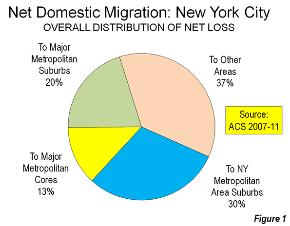
    And the city continues to export large numbers of people – 90,000 more than arrived in the rolling year represented by the latest ACS data. This is a big number, representing 1.1 percent of the city’s 2010 population. This is a larger loss than Philadelphia (0.5 percent), but smaller than Washington (1.4 percent).

    This has been evident in the large numbers net domestic migrants reported each year in the Census Bureau estimates. The data shows that people are leaving not only the city of New York not only for the suburbs, but moving in even greater numbers to beyond the metropolitan area. Approximately 27,000 more New Yorkers moved to the suburbs than to the city of New York over the period. However, an even larger 63,000 net domestic migrants left the city of New York for areas outside the metropolitan area.

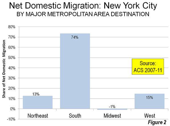
    Approximately 30,000 of these inter-regional migrants moved to other major metropolitan areas (those with more than 1 million population). By far the largest share – 74 percent – of the city’s net domestic migrants to other major metropolitan areas moved to the South. Four of the five largest major metropolitan gainers at the city’s expense were Miami (net 5,600) and Atlanta (net 4,300), followed by Tampa-St. Petersburg, and Dallas-Fort Worth.

    Another 13 percent of the city’s net domestic migrants moved to other major metropolitan areas in the Northeast. Rochester was the largest gainer with nearly 1000 net domestic migrants from the city of New York, followed by Philadelphia. The city gained more than 250 residents from Boston.

    Approximately 9 percent of the city’s net domestic migrants moved to major metropolitan areas in the West. Los Angeles led in the West, gaining 1,800 net migrants from the city. The outlier was the Midwest, which sent more than 300 net migrants to the city (Figure 1).

    City residents tended to move to the suburbs of the major metropolitan areas, which attracted 60 percent, while the core cities received 40 percent of the net migrants.

    Dispersing Beyond the Larger Metropolitan Areas

    However, the most striking trend is that most of the net domestic migrants who left the city of New York to move outside the New York metropolitan area moved to areas outside the major metropolitan areas. In this regard, New Yorkers who move seem to be more inclined toward the greater dispersion of the nation’s smaller metropolitan areas and micropolitan areas.

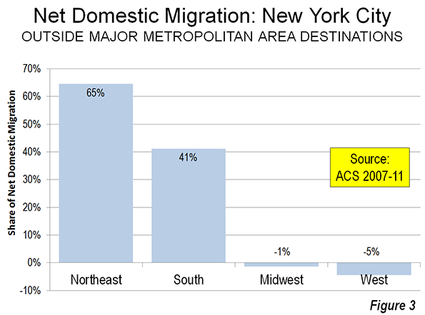
    Over the period, approximately 32,500 net domestic migrants left the city for areas outside major metropolitan areas. This is more than moved to the other major metropolitan areas or to the New York metropolitan area suburbs (Figure 2).

    The most surprising finding is that the majority (65 percent) of net domestic migrants from the city who moved to outside the major metropolitan areas settled in the Northeast. Most of these 23,000 residents moved to smaller areas in Upstate New York and Pennsylvania. Virtually all of the other migrants not moving to major metropolitan areas moved to states in the South (41 percent). In contrast, there was a small amount of migration to New York from the West and Midwest totaling less than 2,000 (Figure 3).

    Outside New York and New Jersey, which contain nearly all of the New York metropolitan area, Florida received the largest number of net migrants from the city (11,000), followed by Pennsylvania (8,000). Only 100 of the Pennsylvania migrants were to Pike County, which is in the New York metropolitan area. Georgia, Texas and North Carolina all received approximately 5,000 net migrants from the city. The top ten destinations were rounded out by Virginia, Connecticut and South Carolina. A total of 37 states received net domestic migrants from the city. Only Alaska and the District of Columbia sent more than 1,000 net domestic migrants to New York City.

    Conclusion

    The New York City migration data indicates continuing dispersion of the population. People are moving from the core to the periphery in New York, and many going beyond to less urban areas in the Northeast. More are moving to other major metropolitan and other smaller areas, located for the most part in the South. This year’s brutal winter could make the South look even better to New Yorkers.

    Wendell Cox is a Visiting Professor, Conservatoire National des Arts et Metiers, Paris and the author of “War on the Dream: How Anti-Sprawl Policy Threatens the Quality of Life.

    Photo: Leaving New York City via the Holland Tunnel (by author)

  • Has Scott Walker Really Turned Around Wisconsin?

    I’ve seen a few pieces in the conservative press lately boasting about Scott Walker’s performance as governor of Wisconsin. For example, the American Spectator ran an article called “Wisconsin Thrives Under Scott Walker“:

    In 2011, Wisconsin had a whopping deficit of $3.6 billion dollars. But a cooperate tax cut and collective bargaining reforms invigorated the state economy. Now, the state is boasting a $911 million surplus, credited to “good stewardship of the taxpayers’ money.”

    And what will Walker do? Buy his wife a $19,000 dress? Increase his paycheck? Go on vacation? Nope. He’s proposing $800 million in tax cuts. “What do you do with a surplus? Give it back to the people who earned it. It’s your money,” Walker said.

    I find these articles revealing because they show how the Tea Party mindset has affected the definition of success in Republican circles generally. Why has Scott Walker been a success in their view? Because Wisconsin’s state government is financially healthy. The actual people of Wisconsin take a back seat to that. A friend of mine in Indiana summed up the mindset when she noted that many people today equate the financial health of government with the well-being of the people in the state.

    This I think is the Tea Party mindset writ large. As I’ve noted before, under Tea Party influence, Republicans have come to see government as purely a fiscal machine in which nearly the entirety of good policy consists in reducing the amount of money flowing through it. This is rooted in a single factor determinism view of economics. Much like Marxism, it has a base and a superstructure. The base in Tea Party thinking is government. If you shrink it, the theory goes, prosperity must inevitably follow.

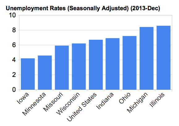
    The fiscal health of government is no doubt important. But to determine if Wisconsin is actually “thriving” you need to look at statistics that actually affect people. So let’s do that. Scott Walker took office in January 2011. So here is the percentage change in jobs in Midwest states between December 2010 and December 2013 from the Bureau of Labor Statistics:


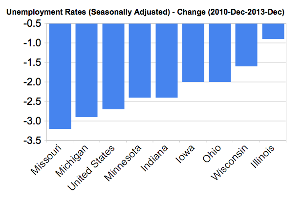
    Wisconsin actually doesn’t rank that well in job growth during Scott Walker’s administration, barely beating fiscal basket case Illinois. The state looks better in its unemployment rate:


    However, in part that’s because Wisconsin’s unemployment rate was already low on a relative basis when Walker took over. It ranks near the bottom in reducing its unemployment rate, though obviously reductions are harder to come by when you’re already lower. Michigan had nowhere to go but down.


    I actually support many of Scott Walker’s reforms. Public sector unions clearly need to be reigned in or even eliminated as they are a huge barrier to rational fiscal management and effective service delivery in addition to being an inherently corrupting political force. Items like allowing unions to force localities to buy health insurance through union affiliated firms at inflated rate were clearly abusive.

    It’s also early to judge, and this is monthly data that is fairly volatile, even though it’s seasonably adjusted and with a same month comparison. There just isn’t that much other data available.

    What I object to is declaring victory when the budget is balanced. The attitude exposed by this is profoundly revealing and shows everything that’s wrong with Tea Party type thinking. It’s obvious that people claiming Wisconsin has thrived under Walker didn’t even take a cursory look at the actual economic performance of the state.

    Wisconsin balanced its budget? Big deal. You’re supposed to balance the budget. That’s just doing your job. It shows how far we’ve come that you can receive plaudits simply for meeting what should have been the baseline expectation.

    The charts above should also cause a reconsideration of the notion that government finances are the primary determinant of business climate and economic growth. There are states on both the left and right of that issue that are both thriving and struggling. Part of it is that states have limited power in the modern economy. There’s only a limited amount they can do to make things better, whereas they can definitely screw it up.

    Also, the natural condition of a participant in a marketplace is failure. The vast majority of new businesses fail. Similarly, places can fail too, and having a budget surplus can’t necessarily stave that off.

    My view is that while state governments are weak actors and there’s a risk of screwing it up, the likelihood of failure in the marketplace is high enough that government does actually have to try to do things. By all means prudent finances and a good regulatory climate need to be maintained, but if you think that’s enough to save you, you’ve got another thing coming. Now that Scott Walker has repaired the budget, what’s his actual plan moving forward to try to build actual personal and marketplace success for Wisconsin residents and businesses? That’s what will determine his actual legacy. It’s in whether he boosts the fortunes of the state’s residents over the longer term, and manages to bend the curve of progress in a positive direction over time.

    Aaron M. Renn is an independent writer on urban affairs and the founder of Telestrian, a data analysis and mapping tool. He writes at The Urbanophile, where this piece originally appeared.

    Scott Walker photo by AndyLindgren.

  • Rich, Poor, and Unequal Zip Codes

    Income inequality is an increasingly dominant theme in American culture and politics. Data from the IRS covering mean and median income of filing households for 2012 by zipcode allow us to map and interpret the fascinating geography of income differences. Where are the richest areas, the poorest and the most unequal?

    The IRS data do not give us the distributions of incomes, so this report does not tell us where the largest numbers of rich or poor populations will be found; this can be done from the American Community Survey for large enough units of geography. With the IRS data, the median is the income of the household halfway between poorest to richest after all are ranked by income. The mean, or average income, is the aggregate income of all households divided by the number of households filing a return. 

    Most of the over 44,000 US zip codes have a sufficient mix of lower to higher income households that they do not stand out as extremely rich or poor. Even many zips with very low mean or median incomes are not so extreme since most of the poor population actually lives in more mixed income areas. Very unequal areas are defined here as having a far higher mean than median income, indicating an imbalance of incomes, e.g. a few very high income households inflate the average over the more typical, median income.

    The Richest Zip Codes

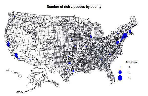
    Figure 1 maps the 170 zip codes with more than 1000 people and median incomes over $150,000 or mean incomes over $200,000. The most astounding thing about the map (which shows the number of rich zip codes by the county they are part of) is their  concentration  in a few areas, led by the country’s premier global city, greater New York city, with 75 of the 170. New York is followed by Washington DC with 23, another sign of the growing wealth of the national capital.  Boston follows with 10, Los Angeles, 18, San Francisco (14), and Chicago (6) and then a scattering in other leading metropolitan areas. There is no such concentration of the super-rich in any rural or small town area. But many are quasi-rural suburban and exurban.

    Richest Zip Codes
    State County Place Zipcode Mean (thousands)
    NY Westchester Purchase 10577 363
    NY Nassau Westbury 11568 351
    IL Cook Kenilworth 60043 342
    NY Westchester Pound Ridge 10576 338
    CA San Mateo Atherton 94027 337
    PA Montgomery Gladwyne 19035 333
    CA Los Angeles Bel Air 90077 327
    NJ Essex Short Hills 07078 322
    NY Nassau Glen Head 11548 316
    CT Fairfield Weston 06883 286
    CT Fairfield New Canaan 06840 308
    IL Cook Glencoe 60022 297


    But, the reader will protest, there are huge numbers of rich folk in Texas, Florida, Ohio, Pennsylvania, and other states. The reason is that these many rich households are “diluted” in impact because the zip codes are more variable in income. There really is something remarkable about the overwhelming affluence of the key suburban areas of Westchester and Nassau, New York; Fairfield, CT; Fairfax, VA; and Howard and Montgomery, MD. But I believe the map is telling and accurate at highlighting the utter dominance of the economic power of New York and then Washington. Boston retains power beyond its size, while Los Angeles, Chicago, San Francisco, and upstarts in the South scramble for a place.

    The Richest Areas

    The zip code with the highest and the 4th highest incomes are in Westchester County, close to the Connecticut border. The second richest, Westbury, is in Nassau county, New York, which also has the 9th richest. Also in the NYC suburbs are the 8th, in New Jersey just 20 miles west of New York, while 10th and 11th richest are both located  in Fairfield County, CT.

    Chicago’s north Cook county has the 3rd (Kenilworth) and 12th (Glencoe) richest areas.  Los Angeles is home to the 7th richest, Bel Air (northwest of Beverly Hills), Atherton, in San Mateo county, is the 5th richest, and Gladwyne in Montgomery County, PA is the 6th richest.  Greater New York then is home to 7 of the 12 richest, followed by Chicago with 2.  Quite a concentration. 

    The Poorest Zip Codes

    The list and map (Figure 2) of counties with poor zip codes may surprise the reader more. I divide the 94 poorest areas into five types:

    • minority population domination, 35 areas,
    • college or university student majorities, with 25 places,
    • rural (in the sense of small communities in these counties having been left behind or declined) some 25 areas,
    • five inner city areas dominated by single men, 5, and
    • two areas dominated by a large military base.

    The poor college areas are zip codes for student dormitory housing, people who are temporarily poor; some military base areas are similarly poor because of barrack housing of single people.

    The poorest minority dominated areas are mainly Black and in the rural to small city South, except for a few Hispanic dominated areas in the west. The college poor areas are scattered across the country, especially in the East, the military base communities in Texas and Oklahoma. The rural set is surprisingly concentrated mainly in the north, especially in Michigan. The few inner city poor areas are in Los Angeles, Waterbury, CT: Portland, OR; Youngstown and Canton, OH; an odd set. A few of the rural areas also have correctional institutions.

    Poorest Zip Codes
    State County Place Zipcode Median
    NE Douglas Omaha 68178 $2,499
    KY Elliott Burke 41171 $3,494
    GA Clinch Cogdell 31634 $3,886
    FL Gulf Wawahitchka 32465 $4,481
    CT Tolland Storrs 06269 $6,124
    WI Dane Madison 53706 $6,359
    VA Nottoway Blackstone 23824 $6,421
    MI Clare LeRoy 49665 $6,639
    TN Rutherford Murfreesboro 37132 $7,125
    IN Delaware Muncie 47306 $6,750
    NY Cattaraugus Salamanca 14779 $7,395


    If I had relaxed limit by including more smaller population areas, or not quite such low incomes, many more college, military base, minority majority counties would appear on the map. But as noted up front, virtually none of these poorest zip codes are in big cities or their metropolitan areas, where millions of poor households live, simply because these metro zip codes tend to be large and more heterogeneous. This also does not factor in the cost of living, which can be high in some regions, particularly on the east and west coasts.

    The Poorest Areas

    The 12 poorest zip codes are different and quite varied in character. Five of the zip codes are essentially college or university student housing, and thus not indicative of an adult working population. Three areas are in part poor because of the presence of correctional institutions or adult care institutions. Two of these also have a significant minority (Black) population. Two rural areas, in GA and VA have high Black shares. This leaves two northern rural areas in Michigan (high seasonal dependency) and in New York, Salamanca, also a seasonal resort, as well as an Indian reservation.

    Unequal Zip Code

    The unequal zip codes (67) are mainly areas where the mean is at least twice the median, showing the disproportionate effect of a few very wealthy households. One critical area for high inequality are primarily beach or mountain communities with richer retirees serviced by lower-paid workers; these include 13 areas in California, South Carolina, Florida, New York, Nevada, North Carolina, and Colorado. Downtowns (8 areas) include a few actual downtown CBD zip codes with an older poor population and newer rich folk. Rural here identifies mainly small Kentucky zip codes with a very imbalanced income pattern (7 areas). Finally I note a few zip codes in exurban areas where there appears to be a juxtaposition of an older resident population, and newer wealthier households (3 areas). This pattern may become more common in both exurban and rural small-town environmental amenity areas.

    Most Unequal Zip Codes
    State County Place Zipcode Median Mean
    CA Alameda Berkeley 94720 $16,192 $79,238
    SC Pickens Clemson 29634 $12,159 $51,444
    LA E Carroll Transylvania 71286 $28,961 $96,377
    TX Starr 3 zips 78536etc $29,722 $98,048
    KY Elliott Ezel 41425 $29,980 $65,676
    TN Rutherford Murfreesboro 37132 $7,125 $21,863
    MA Suffolk Boston 02111 $31,442 $62,087
    VA Radford Radford 24142 $15,931 $46,860
    ND Cass Fargo 58105 $24,750 $70,633
    DC DC WashingtonDC 20006 $12,103 $32,155
    TX Bexar San Antonio 78205 $25,779 $69,628
    NC New Hanover WrightsvilleBch 28480 $70,375 $184,658
    NV Douglas Glenbrook 89413 $68,512 $172,004


    The Most Unequal Areas

    Of the 13 most unequal areas, 6 are college or university zip codes, areas with poor students and much higher income professionals. Two are downtown zip codes, Boston and San Antonio, two are minority population areas, Louisiana and Texas. Two are resort areas, in Nevada and North Carolina, but several similar areas are not far down on the list. One Kentucky area is classed as just rural, but again other similar counties are on the fuller list.

    Several zip codes are on both the poorest and the unequal zip code lists, most commonly the college and the minority-dominated areas. Rich suburban and exurban areas tend to be fairly consistently rich, resort areas tend to be more unequal.

    Conclusion

    The zip code data provide a partial, highly localized look at the geography of inequality. If American society continues to accept extreme income, the geography of inequality will only become not only more extreme, but more pronounced in a diverse set of locations.

    Richard Morrill is Professor Emeritus of Geography and Environmental Studies, University of Washington. His research interests include: political geography (voting behavior, redistricting, local governance), population/demography/settlement/migration, urban geography and planning, urban transportation (i.e., old fashioned generalist).

  • From Balkanized Cleveland to Global Cleveland: A Theory of Change for Legacy Cities

    Legacy cities have legacy costs, including disinvestment from the inner city, as well as regional economic decline. The spiral has been ongoing for decades. The new white paper by consultants Richey Piiparinen and Jim Russell entitled “From Balkanized Cleveland to Global Cleveland”, funded by the Cleveland-based neighborhood non-profit Ohio City Inc., examines the systemic reasons behind legacy city decline, all the while charting a path to possible solutions.

    Shrinking city theorists say the problem with the legacy city is that people leave. But urban powerhouses such as New York lose more people in a day than the Clevelands of the world do in a month. The real problem with legacy cities is an absence of newcomers, as it is this lack of “demographic dynamism”, or “churn,” which has inhibited economic evolution.

    To arrest economic decline, cities commonly undertake a patchwork of strategies. These include retention strategies that supposedly “plug” the brain drain; attraction strategies that emphasize placemaking, residential density, and urban amenities; or “big ticket” developments such as convention centers and casinos. The authors take another stance, theorizing that migration is the key to economic development. Cities that lack churn need churn. Without it, legacy cities can act as echo chambers of patronage and provincial thinking.

    But churn in itself is not enough. Often, the importance of inmigrants equates to filling condos or restaurant booths. Take the case of Ohio City, an inner city neighborhood bordering Cleveland’s central business district. The neighborhood, home to the iconic West Side Market, has made strides in its recovery. Investment is coming in. Condos are being built. Restaurants are opening. But this is not enough.

    In fact the mistake cities make when it comes to reinvestment is to settle with the low-hanging fruit of gentrification. Here, the neighborhood is seen as a center of consumption, with trickle-down effects from increased commerce said to reach low-income residents living in gentrifying, or potentially gentrifying, neighborhoods. This does not happen.

    This does not mean the reinvestment going on in neighborhoods such as Ohio City is unwelcome. It is only to say something else is needed. Ohio City needs to be made into a neighborhood that produces, not simply one that consumes.

    One way to do this is to ensure that the diversity of race, class, and businesses that currently exist in the neighborhood continue in the face of increasing market demand. For instance, Ohio City is 36% Black, 20% Hispanic, and 54% White. The neighborhood’s race and class mixing has increased over the last decade. Ensuring such heterogeneity can remain in the face of market demand is the challenge of the day. To date, no city has systematically ensured a process of policies that prioritizes the long-term benefits of integrated communities over the short-term benefits of consumer-driven gentrification.

    The benefits include increased economic mobility for individuals who grow up in integrated neighborhoods. For instance, a new study called “The Equality of Opportunity Project” found that Cleveland ranked 45th out of 50 metro areas in terms of upward mobility. A child in Cleveland raised in the bottom fifth of an income class only has a five percent chance of rising to the top fifth in her lifetime. The study, however, concludes that “upward mobility tended to be higher in metropolitan areas where poor families were more dispersed among mixed-income neighborhoods”.

    Cleveland is at a threshold. The re-investment is coming, and the importance of this infill as a means to arrest its economic and demographic decline cannot be overstated. Yet this will only occur if re-investment is leveraged so as to develop real economic growth. In other words, simply developing “creative class” enclaves in the likes of Ohio City and Tremont will do nothing to transition Cleveland from a segregated, siloed city with high rates of poverty into a globalized, integrated city comprised of neighborhoods that produce human capacity.

    Where people live informs them no less than where they work or go to school. Neighborhoods are factories of human capital. Equitable, integrated environments maximize potential. America needs to go past the gentrification model of revitalization. The cities that still have a fighting chance, like Cleveland, should lead.

    Read the white paper here.