Tag: income

  • Canada’s Changing Income Patterns

    Statistics Canada’s newly released National Household Survey indicates changes in the distribution of median household incomes among the provinces and territories. The new data is for 2010, and indicates that an increase of 13.9 percent per household at the national level from the 2005 data collected in the 2006 census.

    The big story, however, is the progress in parts of Canada that have grown used to laggard economic performance. In 2005, few would have expected the progress made in the provinces of Saskatchewan and Newfoundland & Labrador. In both cases, the resource boom had much to do with the turnaround.

    Gains in Saskatchewan and the Prairies

    Saskatchewan’s median household income grew 32.1 percent, out-distancing perennial champion Alberta and emerging Newfoundland & Labrador by nearly a third (Figure). Alberta’s income was up 22.9 percent, while Newfoundland & Labrador experienced a nearly as great 22.7 percent increase. Saskatchewan had trailed British Columbia by more than 10 percent five years before, but had edged ahead by 2010. Saskatchewan’s income level now leads all of the provinces except Alberta and Ontario.

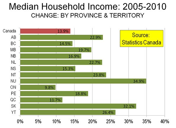
    All three of the Prairie Provinces did well. In addition to Saskatchewan and Alberta, household income in Manitoba grew at a 20 percent, stronger than all provinces outside the prairies except for Newfoundland & Labrador.

    A New Day in Newfoundland and Labrador

    While Saskatchewan has experienced prosperity from time to time in its history, the same is not so true in Newfoundland and Labrador. In fact, in 1933, the government of Newfoundland (as it was then known) voted itself out of existence as a Dominion of the British Empire because of its serious financial difficulties. Effectively, the Dominion was relegated to the status of a British crown colony (like former Hong Kong). Newfoundland joined Canada as the 10th province in 1949. With that, representative government was restored, but Newfoundland always lagged behind (generally along with the Maritime provinces of New Brunswick, Nova Scotia and Prince Edward Island). In 2005, Newfoundland and Labrador ranked 10th out of the 10 provinces in median household income. By 2010, the ranking had improved to 7th.

    The Prosperous Territories

    The greatest income growth (35 percent) was in the territory of Nunavut, which was created by carving out the eastern portion of the Northwest Territories in 1999. Nunavut covers a land area about 1.3 times that of Alaska, but has only 30,000 residents (about the same as live in a square kilometer of Manhattan or Paris). The Yukon experienced a 26 percent increase, while the Northwest Territories had a 24 percent increase. The Yukon and the Northwest Territories had stronger income growth than all of the provinces, except Saskatchewan.

    The Old Dynamos Trail

    Meanwhile, the economic dynamo of the nation, Ontario experienced household income growth of less than 10 percent, nearly a third less than the national average, and less than one-third of Saskatchewan. Ontario is home to more than one-third of the national population. British Columbia, which has historically experienced strong economic growth, could muster only slightly above average household income growth (14.4 percent compared to the national 13.9 percent).

  • Infographic: Growth of All Occupations by Industry & Education, 2001-2011

    We recently partnered with Catherine Mulbrandon at VisualizingEconomics.com to create a series of treemaps that illustrate important aspects of the labor market. In this post we provide a sneak peek at two of the graphics she created. The remainder will be posted in An Illustrated Guide to Income in the United States, a booklet from Catherine set to be released this summer.

    These two graphics are based on EMSI’s labor market database, which is a combination of over 80 public and private data sources. More specifically, the first table shows job change for all occupations by industry (based on 2-digit supersectors, as defined by the North America Industry Classification System) and the second shows occupation change by education level. The data is from 2001-2011.

    Red indicates decline and blue indicates growth.

    Each square on the graphic indicates a specific 5-digit occupation classified by the Standard Occupational Classification system. There are over 800 unique squares present on the charts. Large squares, like the ones on the upper right and in the retail trade sector, indicate a lot of jobs for the specific occupation code. Smaller squares indicate occupations with less jobs.

    In the graphic above we have pulled together occupation data related to all 20 NAICS supersectors. Government, health care, and retail trade have the largest employment. Utilities, mining, and management of companies have the fewest jobs. Also note the size of the squares within each industry sector. Here are a few observations:

    • Broad momentum. It is interesting to note how each broad industry sector tended to either be dominated by growth or decline. For instance, with very few exceptions, almost every occupation within the manufacturing sector declined from 2001-2011. The same holds true for construction, information, agriculture, and, to a certain extent, retail trade. Conversely, sectors like health care, educational services, professional/scientific/technical services, accommodation and even arts tended to show occupational growth.
    • Mixed sectors. Other industry sectors like finance, administrative, real estate, wholesale trade, and government were much more mixed.

    The graphic above shows the distribution of jobs across all levels of educational attainment. We use the same 5-digit SOC codes and group them according to what their typical educational attainment is. Where possible, occupation titles are included so you can get a sense of where certain jobs fall. Here are a few quick observations:

    • The OJT sectors (on-the-job training) are huge. This includes short-term OJT (lower right), moderate-term OJT (upper left), long-term OJT (middle right), and work experience in a related field (center). Also notice how the occupations in these sectors are less stable than the others. This is consistent with what was observed in the latest recession — jobs with higher education levels tend to perform better in tough economic times.
    • Advanced degrees showed growth. Over the past 10 years, every occupation associated with a more advanced degree (master’s, doctoral, professional) showed some sort of growth.
    • The other sectors have mixed results. Bachelor’s degrees showed more stability over the past 10 years, but there are a handful of occupations that declined since 2001. The same holds true for associate’s, postsecondary vocational awards, and degrees plus work experience.
  • Curbing Euro-Envy

    Times are tough in the newspaper business. For example, The New York Times used to have a robust fact-checking department. Either the staff has been laid off or maybe they can’t keep up with the errors, either of which could explain the op-ed piece “Europe Energized.”

    Hill’s piece is classic cheerleading. He would have us believe that Europe has significantly reduced its reliance on oil, as its governments have enticed the citizenry out of cars and into mass transit and planes. Starting with the contention that Europe has the same standard of living as the United States, he indicates that Europe has made much greater progress in reducing energy use and carbon emissions.

    In fact, Europe does not enjoy the same standard of living as the United States. In 2009, the gross domestic product (purchasing power parity) was approximately one-third less ($14,000 less). For most households in Europe and the United States, that is a not an inconsequential amount of money. One reason for Europe’s lower rates of energy consumption is its historically lower income levels.

    Hill claims substantial reductions in oil consumption relative to the United States. However, Europe has not sworn off oil. Indeed, according to International Energy Agency (IEA) data, Europe’s oil consumption per capita dropped only marginally more than that of the United States between 1980 and 2006. Nor has Europe done a better job of becoming more energy efficient. Measured in tons of oil equivalence, the United States has reduced its per capita energy consumption more than Europe since 1980, again based upon IEA data. It is, of course, easier to reduce oil consumption with near static population growth.

    EU data indicates that mass transit’s market share in Europe has been declining for decades (like in the United States). Further, despite all the new high speed rail lines, cars and airplanes have accounted for the greatest travel increases. In 1995, airplanes carried a slightly smaller volume (passenger kilometers) than passenger railways, including high speed rail. By 2008, airlines were carrying 37% more passenger kilometers than rail, despite a huge expansion of high speed rail. Since 1995, at least 15 passenger kilometers have been traveled by car for every additional passenger kilometer traveled by rail, high speed or not. Meanwhile, Europe’s truck dependent freight system is less fuel efficient than America’s, which relies to a greater degree on freight railroads.

    None of this is to suggest that Europe does not lead the United States in some fields. There is no question that cars get much better mileage in Europe. By 2020, new cars are scheduled to achieve more than 60 miles per gallon, which is near double the US expectation. Europe is leading the way in automobile fuel efficiency and is demonstrating the massive extent to which improved fuel efficiency can accomplish tough environmental goals.

    Yet, curiously, no interest has been expressed by the Euro-Envious to implement European highway speed limits. Recently, Italy raised maximum speeds on some roads to 93 miles per hour, France, Austria, Denmark, Slovenia and others have 81 mile per hour limits and there are no speed limits on much of the German autobahn system. No US speed limits are this high.

    Having happily lived both within the pre-1200 (AD) boundaries of Paris and the urban fringes of four major US urban areas, it seems that both sides of the Atlantic have their strengths and weaknesses. Detailing them requires getting the facts right.

  • A Bad Business Cycle for the Creative Economy

    Here’s a simple question for you…which metro areas did prospered the most during the past business cycle? (2000-2008)  Were the winners the highly-educated communities that make up the Creative Economy?  Or did someone else zoom ahead?

    I asked myself these questions when I was preparing for a talk that I was giving at the Rochester Institute of Technology on innovation and economic development.  Being a man of numbers,  I calculated the gains in real-per capita income for all metro areas. Who do  you think was #1, and who do you think was #366 (out of 366)?

    A bit surprising, isn’t it?  The common themes are guns and oil. The big gains in the #1-ranked Houma region are mainly connected with the increase in oil drilling, since BLS data shows that wages in the mining/oil industry in Terrebonne Parish, where Houma is located, soared from $58K a year to $78K from 2005 to 2008.  #2 Jacksonville (NC) is the location of Camp Lejeune. Fayetteville (NC). #5 Fayettville (NC) is home to Fort Bragg, one of the larget military bases in the world. #6 Killeen is obviously home to Fort Hood.  #8 Odessa, Texas, is  riding the oil boom.

    Now let’s look at the metro areas which were the biggest losers in real per-capita income, 2000-2008.

    Uh, oh.  This is not the list you might have expected, in a world where brains and innovation are supposed to be important. There’s Silicon Valley at the top (or the bottom) of the list, where incomes didn’t recover from the popping of the tech bubble that peaked in 2000.  But other tech-type metro areas, such as Raleigh and Austin were hit hard as well.

    Brains and education did not seem to count too much in success in the last business cycle. Overall, the top ten cities, measured by growth in per capita income, had an average college graduate rate of 17.7% The bottom ten cities had a college graduate rate of 31.8%.

    Is this inverse relationship between growth and education going to persist into the future? Impossible to say. My personal view is that the lack of rewards for education–which show up in the individual income statistics as well–is correlated to the lack of commercially-successful breakthrough innovations, which would immediate sop up all the excess college graduates.

    To put it another way, innovative industries tend to locate where they can get a lot of college graduates. That means high education areas attract new companies, boosting growth.

    But without innovation,  the whole economic development dynamic changes. You can’t attract growing innovative companies because they are few and far between. For their part,   companies are more likely to view cost as a main consideration in deciding where to locate.  Goodbye San Jose and Austin, hello China and India.

    Mike Mandel is Editor-in-Chief of Visible Economy. This post originally appeared on his blog “Mandel on Innovation and Growth.”

  • Ryan Streeter Making Poverty History: A Short History

    Former chief economist of the Organization for Economic Cooperation and Development David Henderson coined the appellation, “Global Salvationism,” to describe the kind of behavior one witnesses at gatherings such as this past week’s World Economic Forum (WEF) in Davos, Switzerland. WEF was created in 1971 so that elites from around the world could gather to “map out solutions to global challenges,” according to WEF’s website. This year’s forum is entitled, “Improve the State of the World: Rethink, Redesign, Rebuild.” WEF’s program summary explains the urgency of the task facing those gathered in beautiful eastern Switzerland this way: “Improving the state of the world requires catalyzing global cooperation to address pressing challenges and future risks.” In an effort to compound jargon with alliteration, WEF uses “rethinking” in the titles of 29 conference sessions, “redesign” 16 times, and “rebuild” 9 times, for a total of nearly one-quarter of all the sessions. With all the turmoil created by the global recession and other “pressing challenges” in 2009, the world’s elites came together this week ready to re-do about everything.

    Central to WEF’s annual objectives is what to do about life’s inequities and imbalances. Hardly anything warrants “catalyzing global cooperation” more than the ongoing effort to make poverty history, reduce inequality, and correct global imbalances. WEF has announced that global development is taking center stage on the third day of the event.

    How ironic, then, that just prior to their gathering, Maxim Pinkovskiy and Xavier Sala-i-Martin updated findings from their 2009 National Bureau of Economic Research paper, “Parametric Estimations of the World Distribution of Income,” on the economics website VOX. Their findings show precipitous drops in global poverty since 1970—just about the same time WEF began meeting in Davos (Mark Perry wrote about the original paper here).

    Between 1970 and 2006, the global poverty rate fell nearly 75 percent. During this period, the percentage of the world’s population living on less than a dollar a day fell from 26.8 to 5.4 percent. The world’s population grew 80 percent during the same period, which makes the poverty reduction all the more astounding. The global Gini coefficient, a standard measure of inequality, fell from 67.6 to 61.2 percent, indicating a drop in inequality as well as poverty. The same trend is found in other measures of inequality besides Gini.

    And when one computes a measure of global “welfare” understood in the old-fashioned sense of well-being, we find that life has gotten better faster for a larger share of the world’s population than perhaps any time in history. By deriving a calculation of well-being from GDP and inequality measures, the authors show that between 1970 and 2006, global welfare more than doubled, growing faster than GDP.

    The authors also consider the World Bank’s new purchasing power parity (PPP)–adjusted measures of GDP and find that while global poverty increases overall, the rate of poverty actually drops faster since 1970 than it does under more conventional GDP measures. In other words, under the PPP model, the world looks a lot poorer in 1970 than it does using more traditional measures of poverty, but today, the poverty rate is nearly the same regardless of whether one uses the PPP or more traditional measures (see the graph below). Using the World Bank’s adjustment actually has the effect of making it look like we have been doing a better job of reducing poverty over the past three decades, despite how the world looks poorer in any given year.

    graph
    (Chart available at http://www.voxeu.org/index.php?q=node/4508.)

    Now, just days before Pinkovskiy and Sala-i-Martin published their VOX article, Princeton’s Angus Deaton shot to pieces the idea that one can accurately measure global poverty and inequality across countries in his presidential address to the American Economic Association. Deaton’s argument is persuasive and serves as a good reminder that economic measures across different societies are nearly impossible to establish with perfection and complete accuracy. That said, it is interesting that Pinkovskiy and Sala-i-Martin find the same drops in poverty across the various methodologies they test. Something is going on here.

    One might draw the conclusion that the precipitous drop in poverty corresponds with the beginning of the WEF meetings in 1971. Maybe the elite gathering has worked! Or, one might conclude liberalization of states and economies is working. During roughly the same period covered by the authors, the percentage of free countries in the world increased from 29 to 46 percent, according to Freedom House’s annual ratings. Liberalization and economic growth go together. One might also conclude that China’s explosive growth, which has carried Asia as a whole from 19 percent to 28 percent of the global economy during this period, has had a significant impact on poverty reduction, not to mention India’s rapid rise in its share of global GDP.

    Instead of rethinking, redesigning, and rebuilding the world, WEF’s best minds might consider devoting a full day to understanding what worked the past forty years and figuring out how to “repeat” it.

    This post originally appeared at The Enterprise Blog at The American.

    Ryan Streeter is a senior fellow at the London-based Legatum Institute and can be followed on Twitter here.

  • Mapping Urban Income Dispersion

    Here’s some cool maps from radicalcartography.net looking at income dispersion in the country’s 25 largest metropolitan areas by population. From the page:

    These maps show the distribution of income (per capita) around the 25 largest metropolitan areas in the US (all those with population greater than 2,000,000). The goal was to test the “donut” hypothesis — the idea that a city will create concentric rings of wealth and poverty, with the rich both in the suburbs and in the “revitalized” downtown, and the poor stuck in between.

    This does seem to have some validity in older cities like Boston, New York, Philadelphia, or Chicago, but in newer cities it is not the case. Instead of donuts, one finds “wedges” of wealth occupying a continuous pie-slice from the center to the periphery.

    Just from visual inspection, it also seems that poverty donuts all tend to have about a five-mile radius, regardless of the size of the city. Perhaps this is the practical limit for commuting without a car?

    All maps are at the same scale, and all use the same color values for income.

  • Local and State Tax Burden Maps

    The Tax Foundation calculates the taxes paid per capita, including what is spent by people on average in neighboring states, including state and local fees. The two maps show, first, the tax burden, taxes paid as a percent of income, the second, the difference in the ranks of states in tax burden and in income.

    The map for tax burden is colorful, so one might suppose there is a big difference in the local and state burden. There is variation, but the amazing story is how small the differences really are. The variation is from a maximum of 11.8 percent in New Jersey (note that Taxachusetts is in the middle of the pack) to a low of 6.4 percent in Alaska. But most states, 38, are in between 8.6 and 10.2 percent.

    The lowest tax burdens are not surprising – Alaska (6.4) and Nevada (6.6), but the next lowest, Wyoming (7) and Florida (7.4), may be a surprise. The highest tax burdens, as may be expected, are megalapolitan New Jersey, New York (11.7), Connecticut (11.1) and Maryland (10.8), but Hawaii (10.6) in this group may be a surprise. The states in the middle, besides Massachusetts, include a contiguous set centered in Chicago – Illinois, Indiana, Iowa, Michigan, Kentucky and West Virginia (all 9.3 to 9.5).

    The modest range of burdens implies that generally richer states have higher tax burdens and poorer states have lower burdens, but the second map shows that there are many exceptions. Richer states with higher tax burdens include (a small difference in tax and income ranks) District of Columbia, New Jersey, Connecticut, New York and Maryland, and poorer states with a moderately low tax burden are few – Alabama, New Mexico and Montana. Poorer states but with a high tax burden are Arkansas, Kentucky, Utah and Idaho, but this finding perhaps tells us the statistical problem or risk in using per capita rather than per household measures. Strongly Mormon Utah and Idaho, indeed all four states have high average household size, so are not as disadvantaged as the data suggest. For a similar reason, Florida may not be as good as it looks, since it has a quite low average household size.

    Most interesting may be the richer states with lower ranking tax burdens, notably Wyoming, New Hampshire, Washington and Nevada. Other states with a relatively low burden (lower tax rank than income rank) include Alaska, Colorado, Florida, Massachusetts, and Texas and other states with a relatively high burden (much higher tax rank than income rank) include Georgia, Kentucky, Ohio and West Virginia.

    Finally states with close to the same rank in income and tax burden include a set of contiguous Midwestern states, Iowa, Minnesota, Missouri, and Kansas, then Michigan, Oregon and California.

    But in sum, choosing a state based on its local and state tax burden could be worth the effort, but the effects by themselves could be more limited than commonly supposed.